
Kyle set the #WOW2025 challenge this week, using a summarised data set based on Superstore that he included in the challenge page.
Building out the core data fields
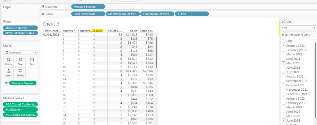
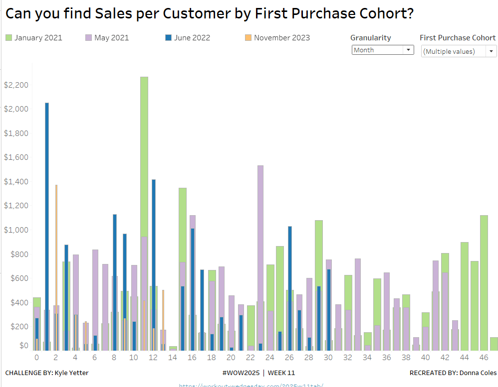
I started this challenge, by building out the data in a tabular format, so I could verify the calculations I needed. I focused on the ‘month’ level to start with before tackling the ‘year’ level which had the added requirement of containing ‘complete years only’, which I did find a bit tricky. Anyway, to start we need to determine the number of months between the First Order Date and the Order Date.
Months from 1st Purchase
DATEDIFF(‘month’, [First Order Date], [Order Date])
and we also need to identify the number of customers
Move this pill into the Dimension section of the left hand pane (drag it up to the top section above the line)
Count Customers
COUNTD([Customer ID])
and calculate the sales per customer
Sales per Customer
SUM([Sales])/[Count Customers]
format this to $ with 0 dp. Also format Sales to $ with 0 dp.
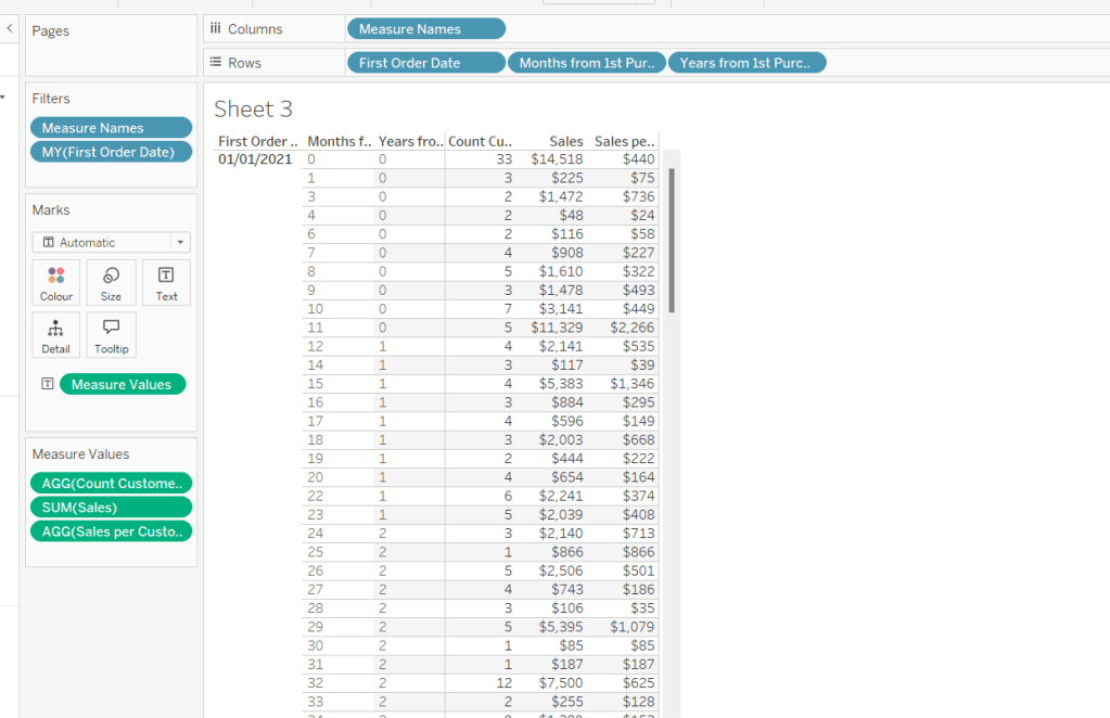
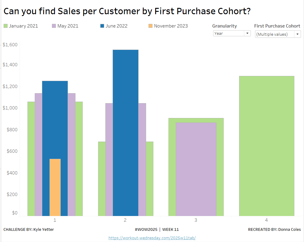
On a new sheet, add First Order Date to Rows as an exact date dimension (blue pill). Add Months from 1st Purchase Date to Rows. Then add Count Customers, Sales and Sales per Customer into the view.
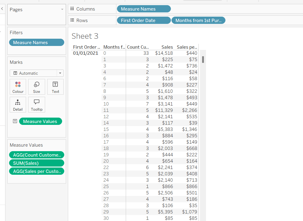
Add First Order Date to the Filter shelf and select the Month/Year format, then select the 4 months Kyle used – Jan 2021, May 2021, Jun 2022, Nov 2023). Show the filter on the sheet.
Building the Month Level Viz
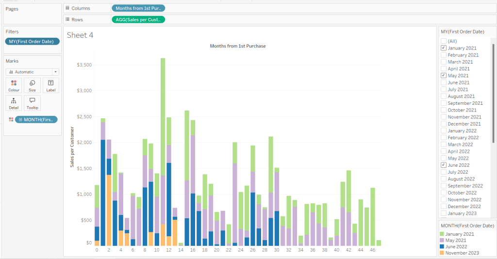
With the information we have, we can build out the viz at the ‘month’ level of granularity.
On a new sheet, add Months from 1st Purchase Date to Columns and Sales per Customer to Rows. Add First Order Date to the Filter shelf at the Month/Year level and restrict to the relevant dates. Show the filter control. Add First Order Date to Colour and set to the Month/Year level as a discrete (blue) pill. Adjust the colours to suit. I used colours from a palette called CB_Paired I had installed.
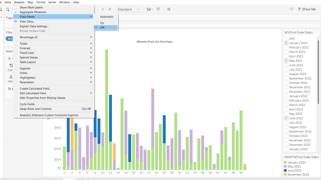
Set Stacked Marks to Off (Analysis Menu > Stack Marks > Off).
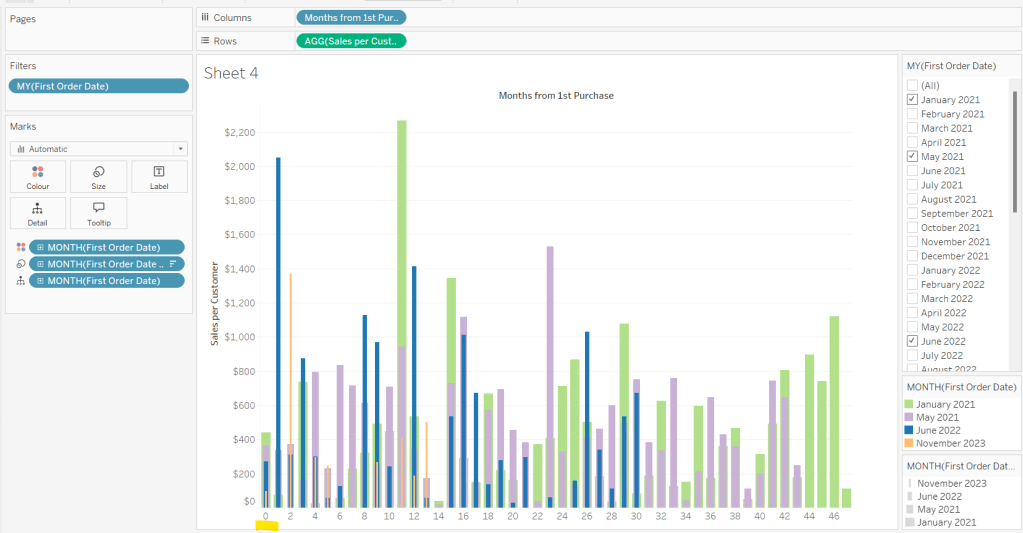
Create another instance of First Order Date (right click the field and select Duplicate) to crate First Order Date (copy). Rename this First Order Date (for Size). Add to the Size shelf, and set it to be at the Month/Year level and discrete (blue) pill.
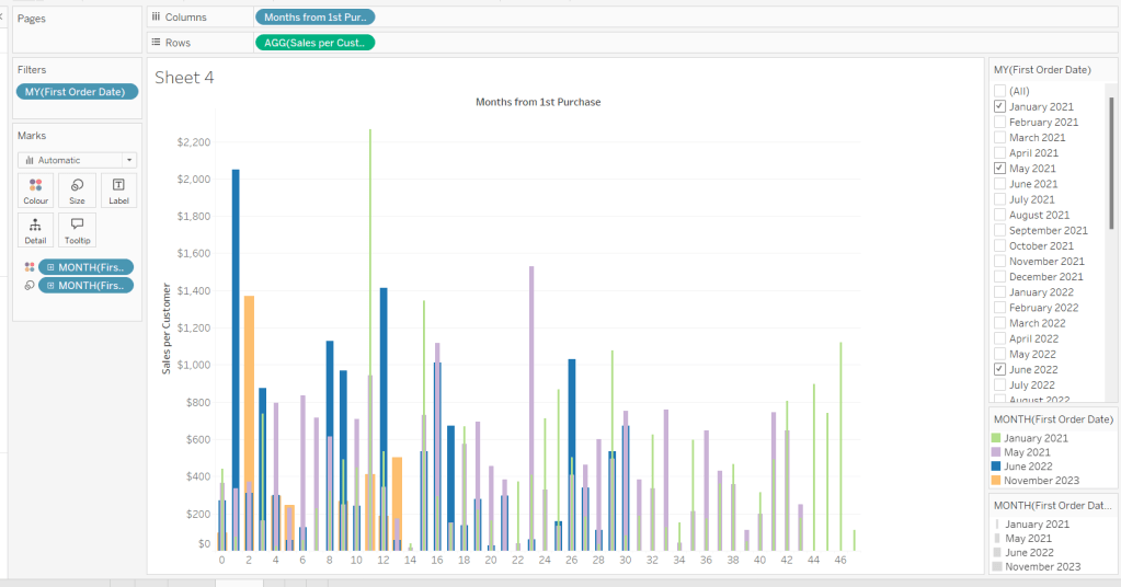
Adjust the Sort on the First Order Date (for Size) pill to be by Data source order Descending. This now makes January wider than November.
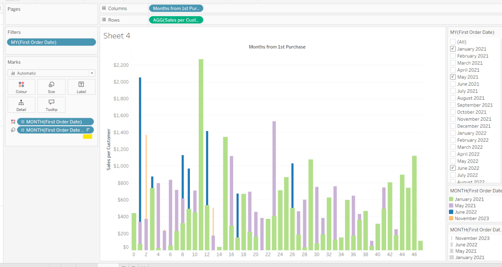
And then add First Order Date to the Detail shelf at the Month/Year level as a discrete (blue) pill. By default this pill is sorted ascending, and has the effect of moving January to the back and November to the front so all the bars (at least for the 0 entry) are visible. This is why we needed a duplicate instance of First Order Date and we needed it to be sorted in one direction to make the correct months at the front, and in another direction to get the required bar widths.
Add Sales and Count Customer to the Tooltip shelf and adjust the Tooltip as required.
Handling the ‘Year’ requirement
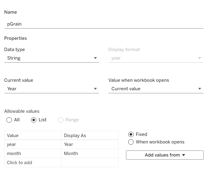
Firstly for this, we need a parameter to drive the change in visual.
pGrain
string parameter listing ‘month; and ‘year’ and defaulted to ‘year’
Our Columns is currently listing the Months from 1st Purchase. We need this to be reflective of the years from 1st purchase instead based on the parameter selected.
Years from 1st Purchase
FLOOR([Months from 1st Purchase]/12)
this rounds the calculation down to the nearest whole number.
Move this into the dimension section of the data pane, and add to Rows of our tabular display, so you can see what it’s doing.
Our X-Axis will then be based on either of these 2 fields
X-Axis
IF [pGrain] = ‘month’ THEN [Months from 1st Purchase]
ELSE [Years from 1st Purchase]+1
END
Add this into the table, and show the pGrain parameter and see the change as you flip the options.
We then need to handle the ‘incomplete year’ requirement. This did take some trial and error, and I’m not totally convinced what I’ve done will work in all scenarios, but it seems to match Kyle’s results for the spot checks I did…
I started by determining the maximum month from 1st purchase in each cohort.
Max months per cohort
{FIXED [First Order Date]: MAX([Months from 1st Purchase])}
Add this into the table as a discrete dimension (blue pill), and each row should match the final Months from 1st Purchase value for each First Order Date
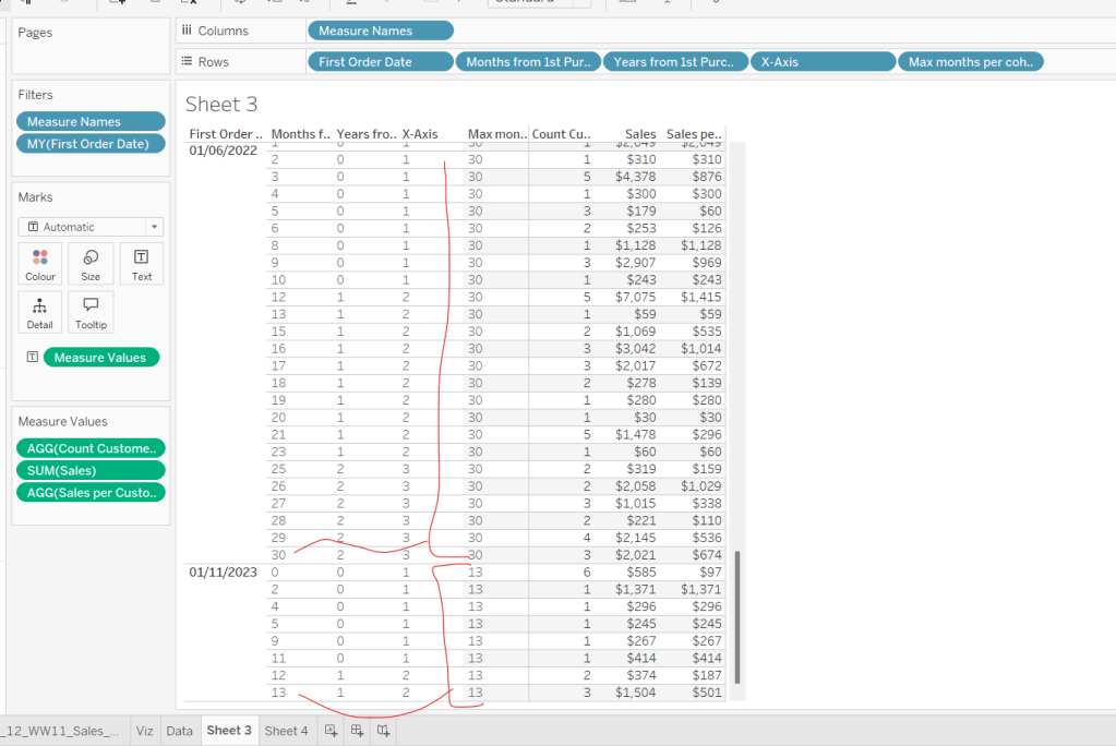
I then created a field to identify which of the rows in the data I wanted to keep. So in the case of the above examples for 01/11/2023, I want the rows where Months from 1st Purchase is from 0 to 11 as these represent a whole year’s worth of data for Years from 1st Purchase = 0 (even though there isn’t a a purchase every month in the year). I ended up doing this with the following calculation
Identify Cut Off
[Months from 1st Purchase] < 12 * (FLOOR(([Max months per cohort]+1)/12))
so based on the above example for 01/11/2023, get me all the rows where Months from 1st Purchase is less than 12 * (FLOOR((13+1)/12) = 12 * (FLOOR(14/12)) = 12 *1 = 12.
Add this into the table
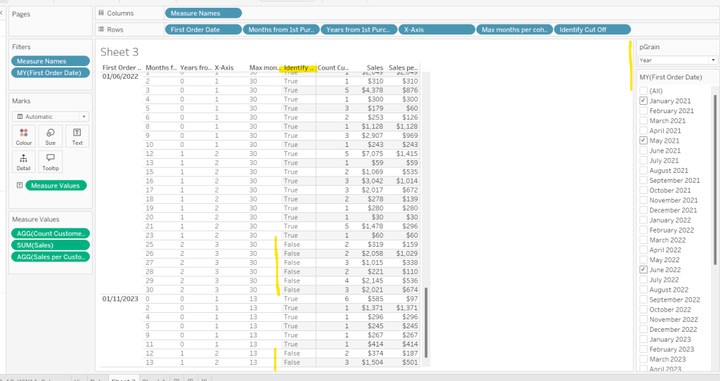
I then created an additional field to filter by
Records to Display
[pGrain] = ‘month’ OR [Identify Cut Off]
and added this to the Filter shelf and set to True.
When we’re at the ‘month’ level, all rows will be included, otherwise, just those we identified will be.
So now we have this, we can adjust the visual (you may choose to take a copy of what was initially built, just in case).
Adjusting the Viz for the Granularity parameter
Show the pGrain parameter on the viz sheet and set to Year. Add Records to Display to the Filter shelf and set to True. Add X-Axis to Columns and remove Months from 1st Purchase Date. Set sheet to Fir Width.
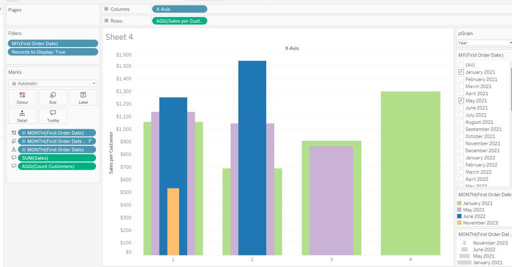
Test changing the parameter and altering the selected dates and verify the behaviour is as expected.
Finally tidy up the formatting – remove all gridlines; edit the axis and remove the title; hide the X-Axis label heading (right click > hide field labels for columns). Add to a dashboard and arrange the colour legend in a single row, and set the First Purchase Date filter to be a multi-value dropdown.
My published viz is here.
Happy vizzin’!
Donna
