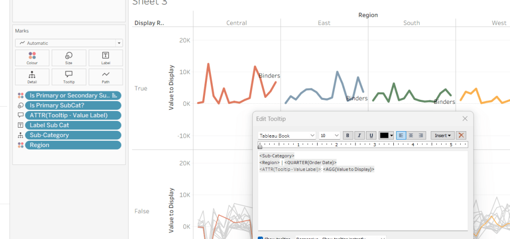
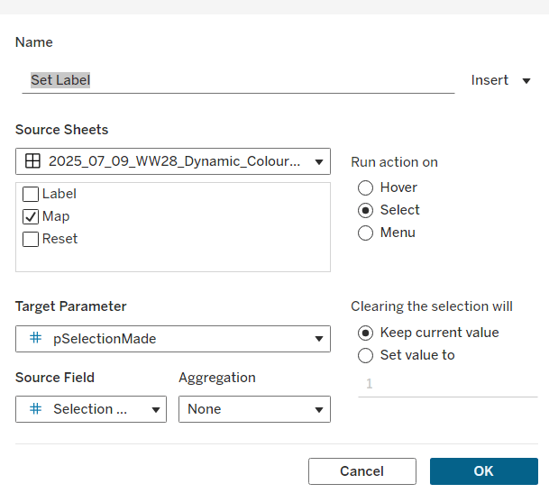
Erica collaborated with Giulio D’Errico for this week’s #WOW2025 challenge, which contained lots of features, though the main challenge was to display filter on Region, which along with the Region name also displayed a KPI indicator that could change based on selection from other parameters.
Defining the parameters
We need 3 parameters for this challenge
pMeasure
strig parameter that lists the two options Profit and Sales; defaulted to Profit.

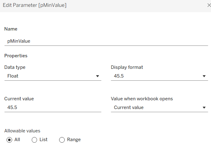
pProfitThreshold
integer parameter that lists the specified values, defaulted to 2,000

pSalesThreshold
integer parameter that lists the specified values, defaulted to 30,000

Building the core scatter plot
Add Sales to Columns and Profit to Rows and Sub-Category to Detail. Show the 3 parameters.

When pMeasure = Profit, we need to display horizontal reference lines against the Profit axis, and when Sales is selected we need to display vertical reference lines against the Sales axis. We need the following fields to return the user defined thresholds:
Ref – Profit Threshold
IF [pMeasure] = ‘Profit’ THEN [pProfitThreshold] END
Ref – Sales Threshold
IF [pMeasure] = ‘Sales’ THEN [pSalesThreshold] END
We also need to define the average per measure for each region:
Sales Avg Per Region
{FIXED [Region]: SUM([Sales])} / {FIXED: COUNTD([Sub-Category])}
Profit Avg Per Region
{FIXED [Region]: SUM([Profit])} / {FIXED: COUNTD([Sub-Category])}
and then we can create
Ref – Profit Avg
IF [pMeasure] = ‘Profit’ THEN [Profit Avg Per Region] END
Ref – Sales Avg
IF [pMeasure] = ‘Sales’ THEN [Sales Avg Per Region] END
Add the 4 Ref – XXX fields to the Detail shelf. Then add 2 reference lines to the Sales axis; one referencing Ref – Sales Avg (coloured as a purple dashed line at 100% opacity) and one referencing Ref – Sales Threshold (coloured as a black dashed line at 50% opacity). Display a custom label and then format the label to be aligned vertically and coloured based on the relevant line, and with a 0% shading. Set the pMeasure to Sales to make these display.

Then repeat, adding 2 reference lines to the Profit axis instead. Change pMeasure to Profit for these to appear.

Change the mark type to square. Each mark needs to be coloured whether it is above or below the average for the measure selected.
Colour
IF [pMeasure] = ‘Profit’ THEN
IIF(SUM([Profit]) >= SUM([Profit Avg Per Region]),1,0)
ELSE
IIF(SUM([Sales]) >= SUM([Sales Avg Per Region]),1,0)
END
Set this to be discrete and then add to the Colour shelf and adjust accordingly.

Creating the colour-coded filter
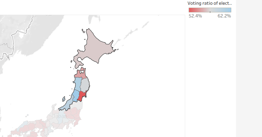
The viz needs to be filtered by Region, but the filter displayed needs to show the region name along with an indicator based on whether the average for the region is above the threshold or not. This took a bit of an effort, but I finally managed it.
We need a field to capture the ‘KPI indicator’ based on which measure was selected. It also needs to be computed per region. We need a FIXED LoD for this, and I made use of coloured unicode characters from this site.: https://unicode-explorer.com/ (large yellow circle and large green circle which you can just ‘copy and paste’ into the calculation)
Region Indicator
{FIXED [Region]: (
IF [pMeasure] = ‘Profit’ THEN
IIF(SUM([Profit Avg Per Region])>=[pProfitThreshold],’🟢’,’🟡’)
ELSE
IIF(SUM([Sales Avg Per Region])>=[pSalesThreshold],’🟢’,’🟡’)
END
)}
I then created
Filter – Region
[Region Indicator] + ‘ ‘ + [Region]
Add this to the Filter shelf, select all values and show the filter. If you change the pProfitMeasure to Profit and pProfitThreshold to 6,000, you’ll see the KPI indicators change.

Format the Tooltip
The tooltip requires several calculated fields to be created. Certain fields only need a value based on the pMeasure and others have conditional formatting (different colours) applied. For the tooltip, I created all these fields:
Tooltip – Measure Value
IIF([pMeasure]=’Profit’,[Profit],[Sales])
Tooltip -Threshold
IIF([pMeasure]=’Profit’, [pProfitThreshold], [pSalesThreshold])
Tooltip – Measure Value Above Avg
IF [Colour] = 1 THEN SUM([Tooltip – Measure Value]) END
Tooltip – Measure Value Below Avg
IF [Colour] = 0 THEN SUM([Tooltip – Measure Value]) END
Tooltip – Above text
IF [Colour] = 1 THEN ‘above’ END
Tooltip – Below text
IF [Colour] = 0 THEN ‘below’ END
Label – Region
IIF(COUNTD([Region])>1, ‘All regions’, MIN([Region]))
Add all these fields to the Tooltip. Update the Tooltip to reference the fields and the pMeasure parameter, colouring the text as required. Some of the fields will only display based on the filters selected, so they get places side by side with no spacing.

Finalise the viz by updating the title to reference the pMeasure and the Label – Region field. Remove all gridlines, axis rulers, zero lines etc. Colour the background of the sheet to pale blue.

Building the Overall Indicator
For the bonus challenge, we need to display an indicator that is green if all the regions are green and yellow if at least 1 region is yellow.
On a new sheet, add Region and Region Indicator to Rows and show the 3 parameters.

We’re going to create a field that will return 1 if the Region Indicator is yellow and 0 otherwise.
Region Indicator – Is Below
IIF( [Region Indicator] = ‘🟡’,1,0)
Set to be discrete and add to Rows. Change the pProfitThreshold to 6000 to see the flag change.

Create
Overall Region Indicator
IIF(WINDOW_MAX(MAX([Region Indicator – Is Below]))=1,’🟡’, ‘🟢’)
This says, if the maximum value of the rows ‘in the window’ is 1, then display a yellow indicator, else green. Add to Rows, and adjust the pProfitThreshold to see the behaviour.

Create a field
Filter – Index = 1
INDEX() = 1
Add to Filter shelf and set to True
Move Region to Detail. Remove Region Indicator and Region Indicator – Is Below. Adjust the table calculation setting of Overall Region Indicator to compute using Region only, and do the same for the tableau calculation on Filter – Index = 1 (re-edit the filter after changing, so only True is selected).

Note – originally I used a transparent shape mark type and displayed the indicator as a label, but after publishing to Tableau Public, the indicator became distorted, so I adjusted how this was built.
Set the mark type to circle and add Overall Region Indicator to Colour. Adjust to be green or yellow, depending on the colour of the KPI indicator (you’ll need to change the pProfitThreshold value to ensure you set the colour for both the yellow and green options).

Finally create
Tooltip – Overall Indicator
IIF([Overall Region Indicator]=’🟢’,’All regions meet the ‘ + [pMeasure] + ‘ target’, ‘At least one region does NOT meet the ‘ + [pMeasure] + ‘ target’)
Add this to Tooltip and then set the background colour to pale blue.

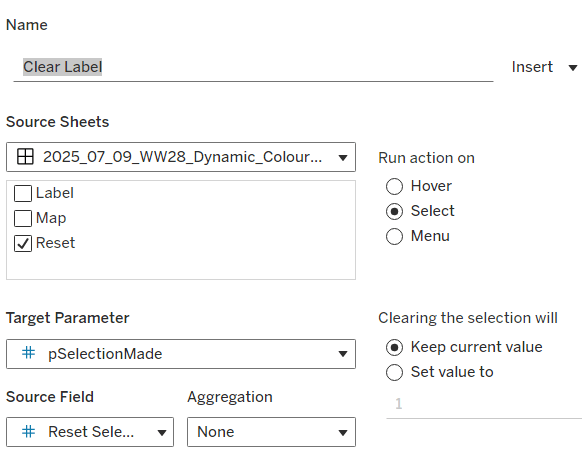
Building the dashboard & adding dynamic zone visibility
Using layout containers, add the viz to a dashboard. Use a horizontal layout container to arrange the parameters, the Region filter and the Overall Indicator sheet. I used a floating text object to display the ‘legend key’ again copying come unicode characters from the website referenced earlier.

Then create 2 new boolean calculated fields
Is Profit
[pMeasure] = ‘Profit’
Is Sales
[pMeasure] = ‘Sales’
Select the Sales Threshold parameter object, then update the visibility so it only displays if Is Sales is true (via the Layout > Control visibility using value option)

Repeat the same for the Profit Threshold object, but reference the Is Profit field instead.
Now as you switch the measure between Sales and Profit, the relevant threshold parameter will display. My published viz is here.
Happy vizzin!
Donna