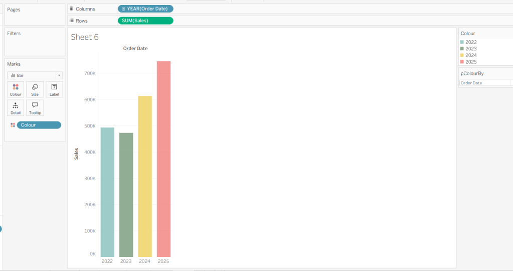
It was my turn to set the 1st challenge for #WOW2026, and I went back in time to recreate something from over 10 years ago! I was at #DataFam Europe in December and the marvellous Andy Cotgreave represented Team DataFam at the tips and tricks battle against Team Tableau, and showcased this technique which he originally blogged about a long time ago. But for a lot of the audience, this was something they hadn’t seen before, so I figured I’d share it here too (as I’d never actually tried it out myself back then). This technique is limited in it’s use – it only really works if you are depicting a % value, and are using a dimension which has a small number of different, but well known values (in this case Segment only has 3 options which don’t change) – but it is a lot faster to render ‘on hover’ than the traditional VIT.
Build the basic map
Connect to the Superstore dataset and construct the basic filled map
- Double click on State/Province to automatically generate a map of the US (set the Country/Region to USA via the Map > Edit Locations menu option if the US isn’t initially displayed)
- Add Sales to Colour to change to a filled map
- Format Sales to $ with 0dp
- Edit the background layers of the map (Map > Background layers menu option) to remove all the pre-selected options, to produce a ‘clean’ outline of the US on a white background.
- Hide the map option which allow you to pan/zoom etc (Map > Map Options menu option and uncheck all the preselected options)
- Hide the unknown indicator in the bottom right (right-click > hide indicator)

Create the calculations
We need to capture the % sales for each Segment per State into it’s own ‘segment specific’ field (which is why this technique could be a bit onerous if you had a high cadence of values in your chosen dimension).
Consumer % Sales
(SUM(IIF([Segment]=”Consumer”, [Sales],0))/SUM([Sales]))*100
Typically, when working with a % value, we would just do SUM(IIF([Segment]=”Consumer”, [Sales],0))/SUM([Sales]), then format this to a %. The value actually stored in the calculation would be a number <= 1. But we need the number to be between 0 and 100 for a step later on, so we perform the % conversion in the calculation by multiplying by 100. To display as a %, the field is just then formatted to a number with 0 dp and with a % suffix
Corporate % Sales
(SUM(IIF([Segment]=”Corporate”, [Sales],0))/SUM([Sales]))*100
format as above
Home Office % Sales
(SUM(IIF([Segment]=”Home Office”, [Sales],0))/SUM([Sales]))*100
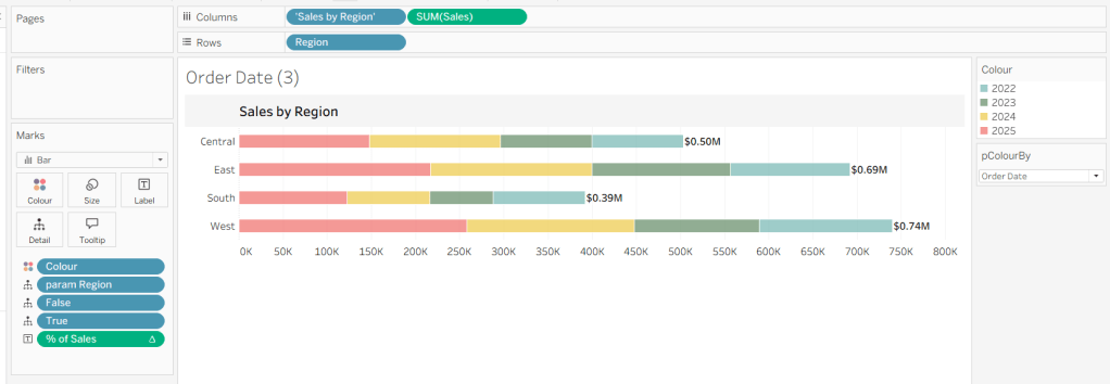
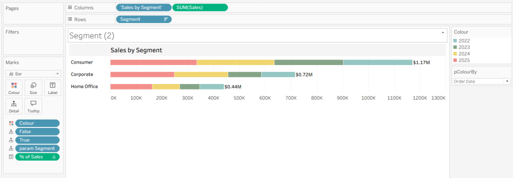
If you pop these fields onto a new sheet and build a tabular view, you can see them working

Now we know the % values for each Segment, we can create a calculation to represent the bars. Firstly copy the █ unicode block into notepad or similar. Then paste 9 more instances directly alongside. The copy all 10 instances and paste that another 10 times, so you have a string of 100 blocks like below
████████████████████████████████████████████████████████████████████████████████████████████████████
Create a parameter
100 Blocks
string parameter which contains this 100 block string of characters

Create a new field for each Segment which represents the ‘bar’ of % sales
% Consumer Bar
LEFT([100 Blocks],ROUND([Consumer % Sales]))
% Corporate Bar
LEFT([100 Blocks],ROUND([Corporate % Sales]))
% Home Office Bar
LEFT([100 Blocks],ROUND([Home Office % Sales]))
This is basically truncating the string of 100 blocks to the number of characters represented by the % value. So if the % value is 39%, the result will be a string of 39 blocks.
Add Consumer % Sales, Corporate % Sales, Home Office % Sales, % Consumer Bar, % Corporate Bar and % Home Office Bar to the Tooltip shelf then edit the Tooltip and arrange the layout like the visual below, colour coding the % Bar and % Sales values for each Segment as you wish (make sure you use <tab> on your keyboard after the Segment label to ensure the bars all start at the same point on each row.

Resolve wrapping
On testing this, I found that some lines in the Tooltip wrapped the text onto another line depending on how long the line was. And I couldn’t control the width of the window the tooltip would display in to prevent this.

I figured I needed to make all the lines shorter, so need to adjust the bar calculation to halve the length of the ‘bars’, but to be accurate, I need to incorporate the smaller block character
Half block
string parameter storing the single value of ▌
and then adjust the fields
% Consumer Bar
//to reduce length of bars, only display half the number of blocks – so 100% shows 50 blocks
//but if 99% need to show 49 1/2 blocks, so add on the half block when number is odd (%2=1)
IF ROUND([Consumer % Sales]) = 1 THEN [Half block]
ELSEIF ROUND([Consumer % Sales])%2 =1 THEN LEFT([100 Blocks],(ROUND([Consumer % Sales])/2)) + [Half block]
ELSE LEFT([100 Blocks],(ROUND([Consumer % Sales])/2)) END
% Corporate Bar
//to reduce length of bars, only display half the number of blocks – so 100% shows 50 blocks
//but if 99% need to show 49 1/2 blocks, so add on the half block when number is odd (%2=1)
IF ROUND([Corporate % Sales]) = 1 THEN [Half block]
ELSEIF ROUND([Corporate % Sales])%2 =1 THEN LEFT([100 Blocks],(ROUND([Corporate % Sales])/2)) + [Half block]
ELSE LEFT([100 Blocks],(ROUND([Corporate % Sales])/2)) END
% Home Office Bar
//to reduce length of bars, only display half the number of blocks – so 100% shows 50 blocks
//but if 99% need to show 49 1/2 blocks, so add on the half block when number is odd (%2=1)
IF ROUND([Home Office % Sales]) = 1 THEN [Half block]
ELSEIF ROUND([Home Office % Sales])%2 =1 THEN LEFT([100 Blocks],(ROUND([Home Office % Sales])/2)) + [Half block]
ELSE LEFT([100 Blocks],(ROUND([Home Office % Sales])/2)) END

Ta-dah!
Note – I did find that Wyoming with a 100% bar still wrapped on Desktop, but was fine when published to Tableau Public.
I finished up by removing row & column dividers, updating the title of the sheet, and then adding the sheet to a dashboard. My published viz is here.
Happy vizzin’!
Donna