This week, Sean decided to revisit a challenge from 2017, week 12, which was originally posted by Emma Whyte, one of the #WorkoutWednesday founding coaches.
I’ve been completing the #WOW challenges since their inception, so had the original solution already published to my Tableau Public.
Back then, parameter actions didn’t exist, so I decided to build this latest version using them instead of the parameter dropdown list included in the original requirement.
Building the basic viz
Create a new parameter to capture the Sub-Category we want to highlight
pSubCat
string parameter defaulted to ‘Bookcases’.
(NOTE – if I wanted to use a drop down for the user selection, I would instead have set this parameter to be a list populated from the Sub-Category field when the workbook opens).
I can’t always recall quickly the positioning of all the fields I need to build a treemap, so I started by simply double clicking the fields I needed in turn : Category, Sub-Category, Sales to add them onto the canvas, and then selecting the TreeMap icon in the Show Me tab to reposition the fields as required.
Then move the Category field from Text to Detail.
Colouring the blocks
The requirement is to show the selected Sub-Category in one colour, but also show a graduated colour palette for the non selected Sub-Categories.
First, let’s identify the selected Sub-Category.
Show the pSubCat parameter on the canvas. Then create
Is Selected Sub Cat
[Sub-Category] = [pSubCat]
Change the Sales pill on the Colour shelf from continuous (green) to discrete (blue). This will result in a rainbow of colours
Then add Is Selected Sub Cat to the Detail shelf. Then click on the icon next to the pill that indicates it’s on the detail shelf, and change it to Colour, so 2 fields are now on the Colour shelf.
Move the Is Selected Sub Cat field on the colour shelf so it is listed above the Sales field on the colour shelf. The selected sub-Category should now be highlighted, and the other blocks are graduated.
However, the highlighted sub-category is ‘separated’ from the Category block it belongs in. To resolve this, change the Is Selected Sub Cat field on the colour shelf so it is an Attribute. By setting this, the treemap is now only dividing itself by the Dimension fields of Category and Sub-Category.
Format the Sales field to $ with 0dp, and update the Tooltip as required.
Create the sheet title
Create a new fields
Selected Sales
{FIXED:SUM(IF [Is Selected Sub Cat] THEN [Sales] END)}
format to $ with 0dp and add to the Detail shelf.
Update the title of the sheet to reference the pSubCat parameter and the Selected Sales field and format as desired.
Add the interactivity
Add the sheet to a dashboard ,then add a dashboard parameter action
Set Sub Cat
On select of the treemap sheet on the dashboard, set the pSubCat parameter, passing in the value from the Sub-Category field. When the selection is cleared, keep the current value
However, when the treemap is clicked, the selected block gets ‘highlighted’ and the rest fade. To prevent this, create a new field
HL
‘dummy’
and add to the Detail shelf of the Treemap sheet. Then create a new dashboard Highlight action
Deselect
On select of the Treemap sheet on the dashboard , target the same sheet with the HL field only
As all marks have this HL value set, this has the effect of actually highlighting all marks ‘on click’ rather than just the actual one clicked, so making it look like nothing is actually highlighted.
For this week’s #WOW2023 challenge, Lorna asked us to recreate this small multiple (or trellis) chart which organises the time series charts per Sub-Category into a grid format, where the number of columns is determined by the user.
Whenever I need to build these types of charts, I often end up referencing this blog post by Chris Love from 2014, as this has the basis for the calculations required.
To get started, we need to capture the number of columns based on a parameter
pCols
integer parameter ranging from 1 to 5 with a step size of 1, that is defaulted to 5
On a new sheet, display the parameter, and add Sub-Category to Rows. Apply a sort to Sub-Category based on the field Sum of Sales descending.
Based on the pCols parameter, we need to determine which column and subsequently which row each Sub-Category should be positioned in. We will make use of the index of each entry in the list. Double click into the Rows shelf and manually type in INDEX(). Change the field to be discrete (blue). This will number every Sub-Category row from 1 upwards. To be explicit, edit the table calculation, to explicitly set it to compute using the Sub-Category dimension.
To determine the column for each sub-category
Column
(INDEX()-1)%[pCols]
the % symbol, is the modulo and returns the remainder when the INDEX()-1 is divided by pCols – ie if INDEX() = 12, then 12-1 = 11 and 11 divided by 5 is 2 with 1 left over, so the result is 1.
Add this to the sheet, set it to be discrete (blue) and also edit the table calculation to compute using Sub-Category. You can see that Chairs and Machines are in the same column. If you adjust pCols, the values will adjust too.
To determine which row each Sub-Category will be positioned in we need
Row
INT((INDEX()-1) / [pCols])
This divides INDEX()-1 by pCols and just returns the whole number. ie if INDEX() = 8, then 8-1 = 7, and 7 divided by 5 = 1.4. The integer part of 1.4 is 1.
Add this to Rows and set to be discrete, and adjust the table calculation as before. You can see Chairs and Phones are in the same row (but different columns), which Chairs and Machines are in the same column, but different rows.
Let’s rearrange – Move Column to Columns, Sub-Category to Text and remove INDEX() altogether, and you’ll get the basic grid layout we need.
Create a new field to store the date part we’re going to present
Month Order Date
DATE(DATETRUNC(‘month’,[Order Date]))
Add this to Columns, and set as exact date and add Sales to Rows and move Sub-Category to Detail. At first gland this may look ok, but if you look closely, you’ll notice that there are multiple lines on some of the charts.
This is because there are some states that didn’t sell some of the sub-categories on the month, and this affects the index() calculation when the Month Order Date is set to be a continuous (green) pill (the viz below highlights this better – Accessories is now indexed with 6 and 7…
So to resolve this, add Month Order Date as a discrete (blue) exact date to the Detail shelf underneath the Sub-Category field. Then change the Month Order Date field in the Columns shelf to be a Continuous (green) attribute. Then adjust the table calculation on both the Column and the Row fields, so they are computing over both Sub-Category and Month Order Date, but at the level of Sub-Category.
Format the ATTR(Month Order Date) field on Columns to be the custom format of yyyy, so the axis just display years
and then format the Month Order Date field on the Detail shelf, to be the custom format of mmmm yyyy, so the information in the Tooltip will display the date as March 2001 etc. Adjust the Tooltip to match.
The label for each Sub-Category needs to be positioned based on the y-axis at the maximum sales across the whole display, and on the x-axis at the last point in the date scale ie December 2023. For this we need
Max Sales in Table
WINDOW_MAX(MAX([Sales]))
Label Position
IF LAST()=0 THEN [Max Sales in Table] END
Add Label Position to Rows and adjust the table calculation so the Max Sales in Table nested calculation is computing by both Sub-Category and Month Order Date, and the Label Position nested calculation is computing by Month Order Date only. This should result in a single mark per Sub-Category displaying.
Make the chart dual axis and synchronise the axis. Remove Measure Names from the All marks card. On the Label Position marks card, change the Mark type to shape and select a transparent shape (see this post for details on how to get this set up). Move Sub-Category to Label and align top right.
Finalise the display by hiding the Column and Row fields (uncheck show header), hiding the right hand axis (uncheck show header). Format to remove all gridlines & zero lines and hide the null indicator. Remove the axis title.
You should then be able to just add this to a dashboard. My published viz is here.
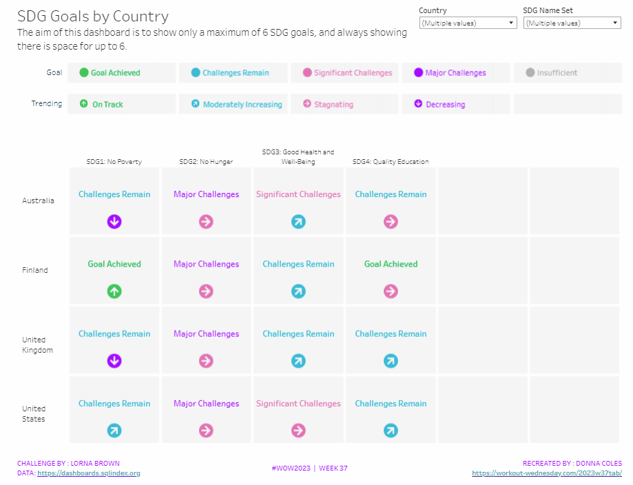
It was Lorna’s turn to set the challenge this week, based on a real world scenario she’s encountered with a colleague. The premise was to be able to show the progress, by country, against a maximum of 6 goals selected by the user. Placeholders for the 6 options had to remain visible at all times (unless the user selected more than 6, in which case a message should appear).
Building the core viz
As Lorna alludes to in the requirements, we will use sets to capture the goals the user can select.
SDG Name Set
Right click on SDG Name > Create > Set. Select up to 4 options.
On a new sheet, add SDG Name Set and SDG Name to Columns, Country to Rows and add Country to the filter shelf, and limit to Australia, Finland, UK & USA. Right click on the SDG Name Set field in the data pane and select Show Set
We need the SDG Name value to only display for the values selected
SDG Name Header Label
IF [SDG Name Set] THEN [SDG Name] ELSE ” END
Add this to Columns before the SDG Name field.
Now we need to always display 6 columns of data, ie in this case, all the SDG Name values In the set and the first SDG Name values not in the set. We will use the INDEX() function to help us label the columns position.
INDEX
INDEX()
Right click this field and Convert to discrete, then add it to the Columns after SDG Name.
Edit the table calculation (click on the triangle symbol on the blue INDEX pill), and adjust so it is computing by Specific Dimensions. This should be all the fields except Country. The columns should be labelled sequentially from 1 to 17.
Add INDEX to the Filter shelf as well. Initially just select 1. Then adjust the table calculation of this field to match above, and once done, edit filter and select values 1 through to 6. This should leave you with 6 columns
Now we have the structure, we can start building the core contents of the table. For this we’ll be using what I refer to as ‘fake axis’.
Double click in the Rows shelf and manually type in MIN(0.2), then double click again and manually type in MIN(0.6). This results in the creation of a MIN(0.2) and a MIN(0.6) marks card on the left hand side.
The MIN(0.2) marks card is going to be used to show the information about how the goal is trending (ie the arrow symbol), while the MIN(0.6) marks card will be used to show the status of the goal (the text displayed). We need new fields for this, so the values only display for the selected goals.
Trend
IF [SDG Name Set] THEN [SDG Trend] END
Goal
IF [SDG Name Set] THEN [SDG Value] END
Click on the MIN(0.2) marks card. Change the mark type to shape. Add Trend to the Shape card. Right click on the Trend pill and change the field from a Dimension to an Attribute.
Doing this stops the field from impacting the table calculation, and you should get back to having 6 columns displayed.
Adjust the shapes using the Arrows shape palette. For the Null value, I set it to use a transparent shape, a custom shape added to my shape palette. See this blog for more information on doing this.
Also add Trend to the Colour shelf. Once again, adjust the pill to be Attribute and then adjust the colours.
Now click on the MIN(0.6) marks card. Adjust the Mark Type to be Text. Add Goal to the Text shelf and change to be and Attribute. Add Goal to the Colour shelf, change to be Attribute and adjust colours to suit. I also adjusted the font to be bold & size 10pt.
Set the chart to be dual axis and synchronise the axis. Edit the axis (Right click on the left hand axis) and fix the axis from 0 to 1.
Hide the axis, the IN/OUT SDG Name Set pill, the SDG Name and INDEX pills (right click the pills and uncheck Show header).
Right click on the Country row label and the SDG Name Header Label column label in the viz and hide field labels for rows/columns.
Right click within the viz to format. Set the background colour of the pane to light grey.
Remove all gridlines, axis rules, zero lines. Set the column and row dividers to thick white lines
Click the Tooltip button on the All marks card, and uncheck show tooltips. Set the viz to Fit width.
Building the Goal legend
On a new sheet, add SDG Value to Columns. Change the mark type to Circle then add SDG Value to Label and Colour. Manually re-order the columns and adjust the colours as required.
Double click in the Columns shelf and type in MIN(0.0). Edit the axis and fix from -0.1 to 0.5 – this will shift the symbols and text to the left.
Adjust the size of the circle shape to suit, and set the font of the label to match mark colour. I also set it to be bold.
Remove all gridlines, axis ruler, zero lines. Set the background of the pane to be grey and the row/column dividers to be thick white lines. Hide the axis and the column headers, and uncheck show tooltips.
Double click into the Rows shelf, and type the text ‘Goal’ (including the quotation marks). Hide the ‘Goal’ label that then displays.
Building the Trend legend
Repeat similar steps for above but add the SDG Trend field to the Colour, Label and Shape shelf. Adjust the shape & colours to those used before.
Handling more than 6 selections
For this requirement, we need to determine the number of items in the set.
Count Set Members
{COUNTD(IF [SDG Name Set] THEN [SDG Name] END)}
and then use this to create some boolean fields
More than 6 Selected
[Count Set Members] > 6
Less than 6 Selected
[Count Set Members] <= 6
Ensuring that less than 6 items are selected, add the Less than 6 Selected field to the Filter shelf of the main table viz and set to True.
If you select more than 6 goals, the viz should disappear.
On a new sheet, double click into the space beneath the marks card where the pills usually sit, and type ‘Dummy’ (with quotes). Change the mark type to shape and set to use the transparent custom shape. Move the Dummy pill to the label shelf, then edit the label and change the text to the error message.
Align the text middle centre and fit to entire view. Uncheck show tooltips. Add More than 6 Selected to the filter shelf and select true (if true isn’t an option, go back to the main viz, and select more options sp the viz disappears, then come back to this sheet and try again).
All the sheets can now be added to the dashboard. Ensure the core table viz and the error sheets are added to a vertical container without the title showings – the charts should expand and collapse as the selections are made – this can be a bit tricky to get right.
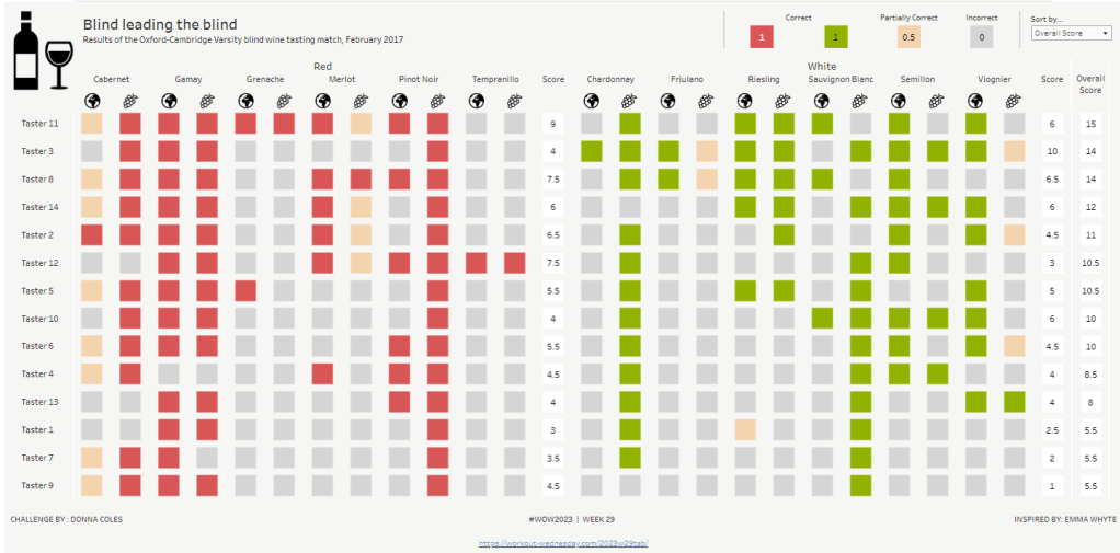
This week, it was my turn to set the #WOW2023 challenge for ‘retro’ month, and I chose to revisit a challenge from May 2017, that was originally set by one of the original ‘founders’ of WorkoutWednesday, Emma Whyte.
The original challenge looked like this :
As I said in the challenge post, I chose this I this challenge as it’s a different type of visual we don’t often see in WOW; it uses a different dataset that interests me – wine!; and as Emma’s website, where she hosted the original requirements for her challenges, is no longer active, it’s possible many won’t know of the existence of this challenge (it pre-dates the current WOW tracking data we have).
Building the core viz
Firstly, we want to build out the basic grid. For that we need a couple of calculated fields
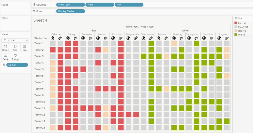
Right click on the Icon field and select Image Role > URL
Add Wine Type, Wine and Icon to Columns and Display:Taster to Rows
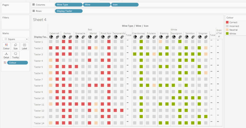
Change the mark type to square.
Here we’re making use of the image role functionality in the header of the table to display images stored on the web, without the need to download them locally.
Create a new field
Colour
IF [Score] = 1 THEN [Wine Type] ELSEIF Score = 0 THEN ‘Grey’ ELSE ‘Neutral’ END
Add this to the Colour shelf and adjust colours accordingly. Increase the size of the squares so they fill the space better, but still have separation between them.
Set the background colour of the worksheet to the grey/beige (#f6f6f4).
Note – I noticed later on that the colour legend in the screen shots has the words ‘correct’ and incorrect’ rather than ‘red’ and ‘grey’. This was due to an un-needed alias I had set against the field, so please ignore
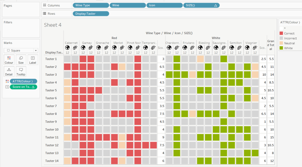
Via the Analysis -> Totals menu, add all subtotals & also show row grand totals. This will make the display look a bit odd initially.
Right-click on the Wine pill in the Columns and uncheck the Subtotals option. This should mean there are 3 additional columns only – a total for each wine type and the grand total.
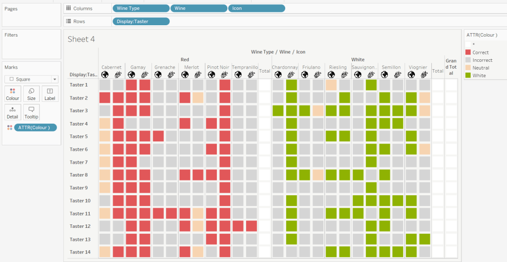
To get a single square to display in the totals columns, right-click on the Colour field in the marks card area, and change from a dimension to an attribute. The field will change from displaying Colour to ATTR(Colour) and an additional option for * will display in the colour legend – set this to be white
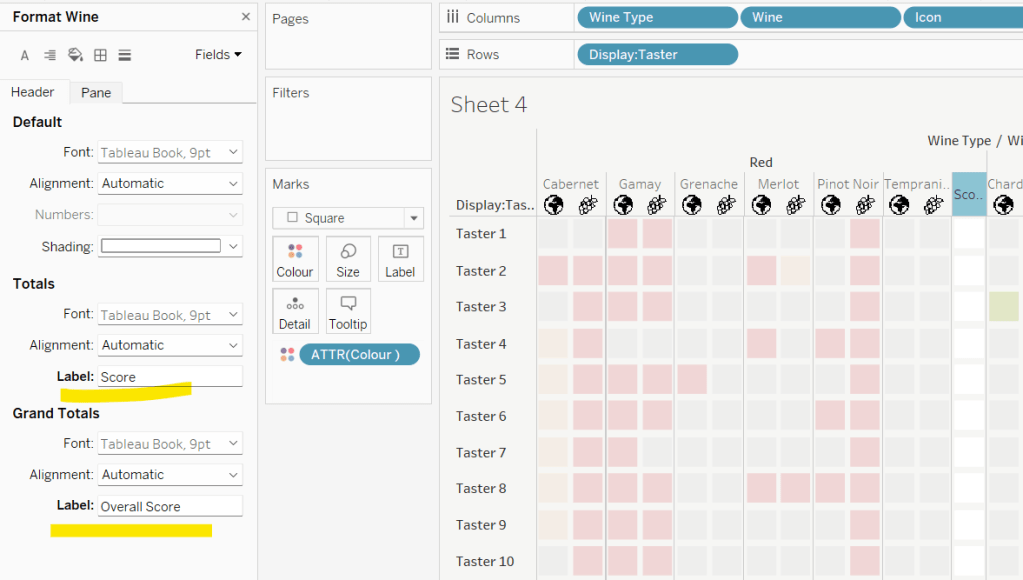
To change the word ‘Total’ in the heading to ‘Score’, right click on the word ‘Total’ and select format. In the left hand pane, change the Label of the Totals section to Score. Repeat for the ‘Grand Totals’ by right clicking on ‘Grand Totals’ in the table, selecting format and changing the label for that too to ‘Overall Score’.
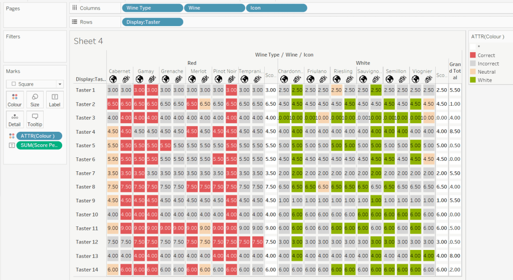
We need to label the totals with the score. For this we first need to get a score for each taster per wine
Score Per Taster
{FIXED [Taster], [Wine Type]:SUM([Score])}
If we just added this to the Label shelf, every square gets labelled with the total, which isn’t what we want.
We need to work out a way to just show the label on the total columns only. For this we can make use of the SIZE() table calculation.
To see how we’re going to use this, double click into the Columns and type SIZE(), then change the field to be a blue discrete pill. Edit the table calculation and set the field to compute by Wine and Icon only.
You’ll see that the SIZE() field in the Columns has added the number 12 as part of the heading, which is the count of wines associated to the wine type (ie 12 red wines and 12 white wines). There is no SIZE() value displayed under the total columns, but these actually have a size of 1, so we’re going to exploit this to display the labels (note – this approach wouldn’t work if where was only 1 wine for one of the wine types).
Score on Total
IF SIZE() = 1 THEN SUM([Score Per Taster]) END
Set the default number format of this field to be Standard, which means the result will display either whole or decimal numbers.
Add this onto the Label shelf instead of the other field, and adjust the table calculation as described above to compute by Wine and Icon only.
You can now remove the SIZE() field from the Columns.
Align the scores centrally.
Remove row & column dividers from each cell, and the totals, but set a white column divider for both the pane & header of the Grand Total column.
Format the text for the Wine Type and Wine and Totals fields. Align the text for the Wine field to the Top.
Hide field labels for rows and columns.
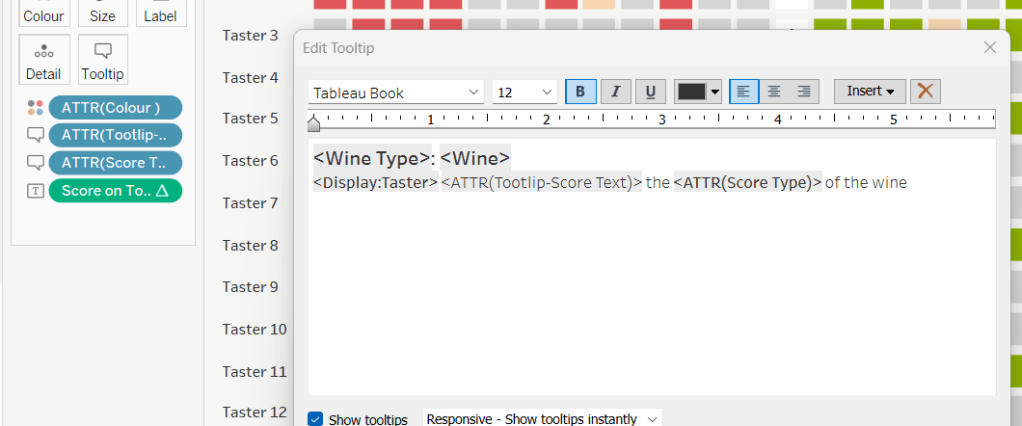
Applying the Tooltip
The text when hovering over each square needs to display different wording depending on the score.
Tooltip – Score Text
IF [Score] = 1 THEN ‘correctly identified’ ELSEIF [Score] = 0.5 THEN ‘partially identified’ ELSE ‘was unable to identify’ END
Add this to the Tooltip shelf along with the Score Type field. Modify the text accordingly
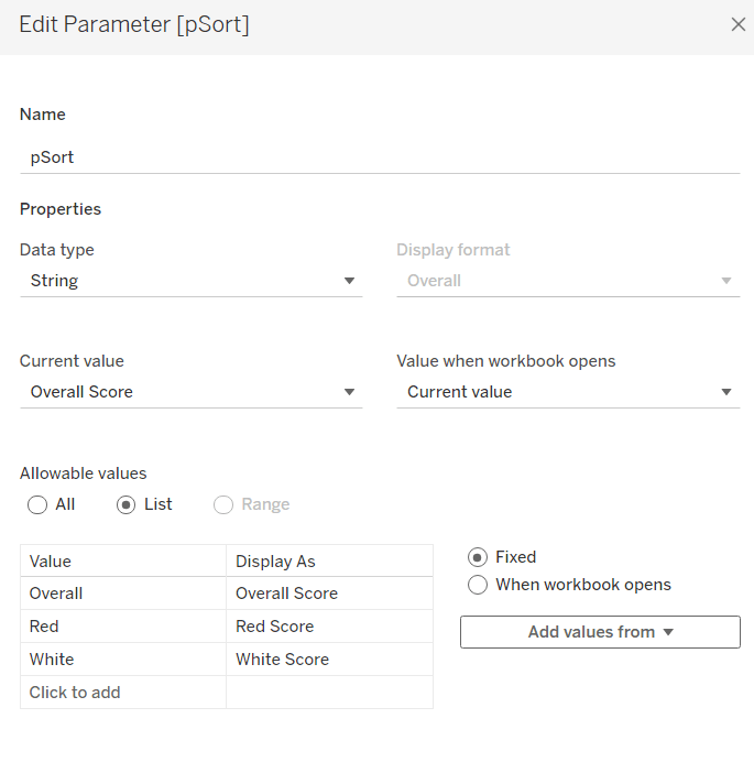
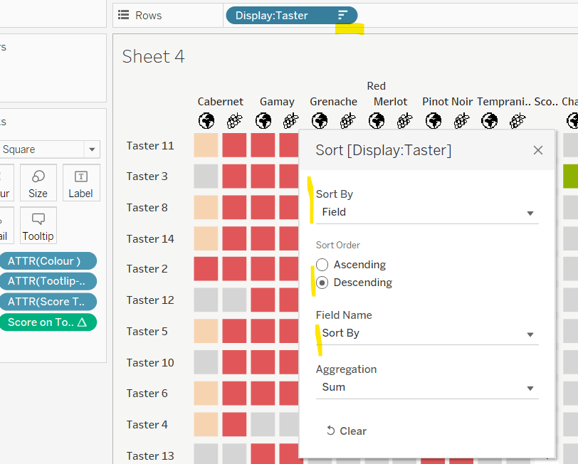
Applying the sort
To control the sorting, we need a parameter
pSort
string parameter with list options, defaulted to ‘Overall Score’
and we also need fields to capture the different scores for each type of wine per taster
Red Score
{FIXED [Taster]:SUM( IF [Wine Type] = ‘Red’ THEN [Score] END)}
White Score
{FIXED [Taster]:SUM( IF [Wine Type] = ‘White’ THEN [Score] END)}
Overall Score
[White Score] + [Red Score]
Then we need a calculated field to drive sorting based on the option selected and the fields above
Sort By
CASE [pSort] WHEN ‘Overall’ THEN [Overall Score] WHEN ‘Red’ THEN [Red Score] ELSE [White Score] END
Then right click on the Display:Taster field on the Rows and select Sort, and amend the values to sort by field Sort By descending
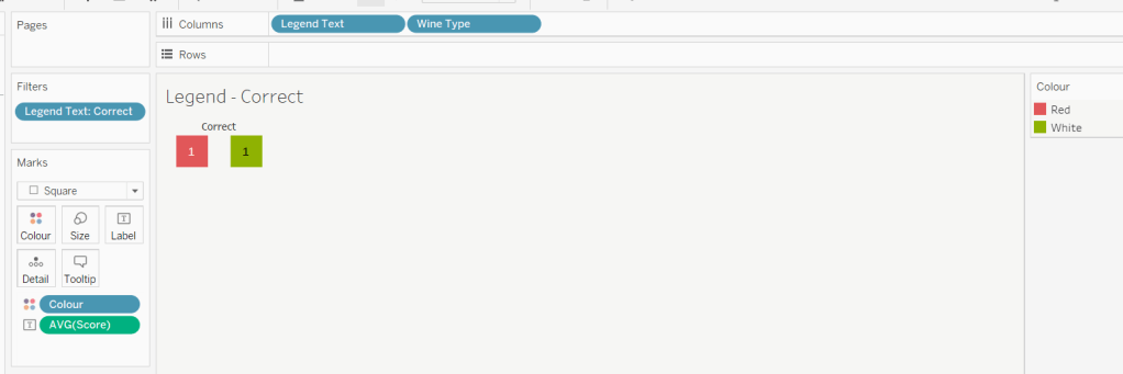
Building the legend
I did this using 2 sheets. First I created a new field
Legend Text
IF [Score] = 1 THEN ‘Correct’ ELSEIF Score = 0 THEN ‘Incorrect’ ELSE ‘Partially Correct’ END
Then I create a viz as follows
Add Legend Text and Wine Type to Columns
Add Legend Text to Filter and set to ‘Correct’
Change Mark type to Square and increase size
Add Colour to Colour shelf
Add Score as AVG to Label and format to number standard. Align centrally
Uncheck show header against the Wine Type field , and hide field labels for columns against the ‘legend Text’ column heading.
Remove all column/row dividers and set the worksheet background colour.
Turn off tooltips
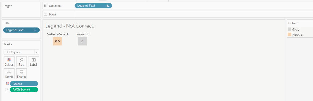
Duplicate the sheet, and edit the filter so it excludes Correct instead. Remove Wine Type from the columns shelf. Reorder the columns.
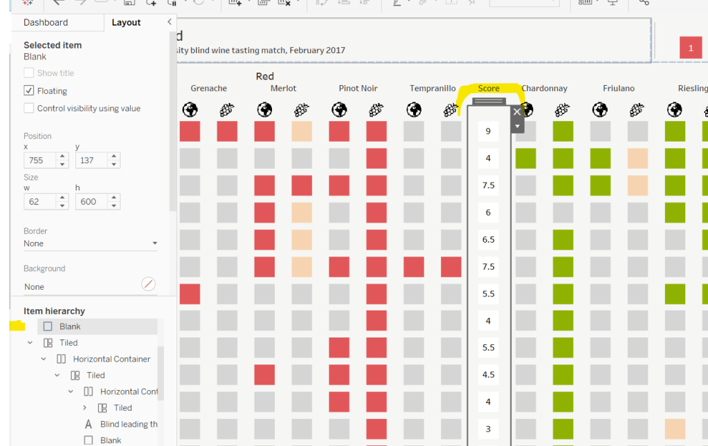
Building the dashboard
When building the dashboard, I just used a floating image object to add the bottle & glass image in the top left of the dashboard.
I set the background colour of the whole dashboard to match that I’d set on the worksheets too.
To stop the tooltips from displaying when hovering over the Scores, I simply placed floating blank objects over the score columns – this is a simple, but effective trick – you just need to be mindful of the placement if you ever revisit the dashboard and move objects around. I placed a floating blank over the legends too to stop them being clicked on.


