Yoshi & Yusuke presented this week’s #WOW2025 challenge live at the Agentforce World Tour in Tokyo. The key feature of this challenge is utilising the Pages shelf to step through how the shipment rankings for a set of products changes on a month-by-month basis.
Gathering the required files & modelling the data
I downloaded the Sample Super factory (subset).xlsx file from the provided google drive and connected directly to it. Relate Production_Plan_Output_Shipment to Product Master via the Product ID fields. I then added a Data Source Filter to restrict the data to Date: Year = 2025
I also downloaded all the images from the images folder and saved them in a new WOW2025_47 directory I created within my …\My Tableau Repository\Shapes\ directory.
Building the core rank calculation
On a new sheet, add Date to Columns and set to the Month level as a discrete (blue) pill. Add Product Name to Rows and Shipment Qty to Text.
Create a new field
Shipment Rank
RANK_UNIQUE(SUM([Shipment Qty]))
and add to the table. Adjust the table calculation setting, so the field is being computed explicitly by Product Name only.
Create another new field
Rank Display
IF [Shipment Rank] = 1 THEN ‘1st’ ELSEIF [Shipment Rank] =2 THEN ‘2nd’ ELSEIF [Shipment Rank] =3 THEN ‘3rd’ ELSE STR([Shipment Rank]) + ‘th’ END
Build the bar chart
On a new sheet, add Shipment Rank as a discrete (blue) pill to Rows and Shipment Qty to Columns and Product Name to Text.
Add Spiciness Level to Colour and change the field to be an Attribute so the table calc doesn’t break. Then add another instance of Product Name to the Detail shelf, and then click the icon to the left of the pill to add it to the Colour shelf, so there are 2 dimensions on the colour shelf. Adjust the colours to suit.
Tip – the quickest way to get the colours to be in a range is to edit colours > ctrl-click to multi select a set of colours, choose a diverging colour palette and click assign palette.
Edit the axis and reverse the axis. Adjust the size of the bars to make them a bit smaller. Adjust the label and match mark colour. Hide both the axis and the Shipment Rank header and all gridlines, and row/column dividers. Add Date at the Month level to the Pages shelf and update the sheet title.
Creating the Viz in Tooltip
On a new sheet ad Product ID to Rows. Change the mark type to Shape and add Product ID to shape. Edit the shapes to use the WOW2025_47 shapes added. As they are stored in alphabetical ordered, just use Assign Palette to set the right images to the right products. Hide the Product ID header row and remove any row/column dividers. Set the sheet to Entire View.
Back on the bar chart sheet, add Product ID to Detail and set as an Attribute so the table calc doesn’t break. Update the Tooltip to reference the relevant pieces of text and then add a reference to the VIT worksheet
The image should now display on hover of a bar.
Creating the bump chart
On a new sheet, add Date at the month level as a discrete (blue) pill to Columns and Rank Display to Rows. Add Product Name to Detail. Change the mark type to circle.
Add Spiciness Level to Colour and change the field to be an Attribute. Change the icon next to Product Name from Detail to Colour. The colours should automatically change and match the settings made against the bar chart.
Add Date at the month level as a discrete (blue) pill to the Pages shelf. The table will be filtered to January.
On the pages control, check the show history checkbox, then click on the ‘down arrow’ to display the additional history options. Set them as follows : show All marks, show both marks, allow fade and adjust the range, then format the trails to a narrower line at a lower opacity.
As you now press ‘play’ on the pages, the trails will display. HOWEVER (and this took some time to realise), in Desktop, the display of a circle on previous months does not work. Publish to cloud and it does. I did go down some dual axis related route until I discover this 😦
Add Product ID as an attributeto the Detail shelf and Shipment Qty to the Tooltip shelf and update the Tooltip and reference the Viz in Tooltip images sheet as before.
Then tidy up by
Removing row dividers
Adding column dividers
Adding column banding
Hide the Date label heading (right click > hide field labels for columns)
Hide the Rank Display label heading (right click > hide field labels for rows)
Update the title
Then add the sheets onto a dashboard and you should be good to go:-) My published viz is here.
It was Kyle’s turn to set the challenge this week. Like him, I don’t have a need to use map / spatial data much, so whenever there’s a WOW challenge involving them it always makes me think a bit harder (and usually refer to some documentation).
Connecting to & modelling the data
I followed the links in the challenge requirements and downloaded the Shapefile option from each page
This downloaded zip files (one did take some time to download). I then extracted the zip files which generated several files.
In Desktop, I then chose to connect to the Spatial file option and when I navigated to the file location where I had unzipped the data, only the .shp file was available for selection.
I connected to the School District Characteristics data source first, then clicked the ‘carrot’ to access the context menu of the data source, and selected open to access the physical layer of the data canvas
I then clicked Add against the connections section to add another spatial file data source, selecting the School Neighbourhood Poverty file this time and changed the join type between the two data source fields to use the intersects option.
Building the bar chart
On a new sheet add Statename to the Filter shelf, and select Washington. Add Lea Name to the Rows. Create a new field
and add this to Columns and sort descending. Widen each row slightly, and increase the width of the Lea Name column a bit. Remove all gridlines, and remove the axis title, and hide the Lea Name column heading. Update the Tooltip as required and update the sheet title.
Building the map
Create a new sheet. Add the Geometry field from the School District Characteristicsset of data to the Detail shelf.
Go back to the bar chart sheet, and update the Satename filter so that it also applies to the sheet you’re building the map on. The map should now be filtered to Washington too. Add Lea Name to the Detail shelf and # Schools to the Tooltip and adjust accordingly.
From the Map > Background Layers menu option, uncheck the options on the Background Map Layers section, so just the Cities and Streets, Highways/Motorways.. options remain selected. Adjust the Colour of the map (via the colour shelf)
Then drag the Geometry field from the School Neighbourhood Poverty data source section onto the canvas and drop it when the Add a Marks Layer section appears
This will add a second marks card. Name this marks card Schools and the other one Districts.
On the Schools marks card, add Name to the Detail shelf and then update the tooltip as required. Remove the row & column dividers.
Adding the interactivity
Add the 2 sheets onto a dashboard side by side and show the Statename filter. Add a dashboard filter action
Filter District
On Select of the bar chart, target the Map passing all fields. Show all values when selection is cleared.
Clicking on a bar should now filter the map and ‘zoom in’ just to that district with the relevant school marks visible.
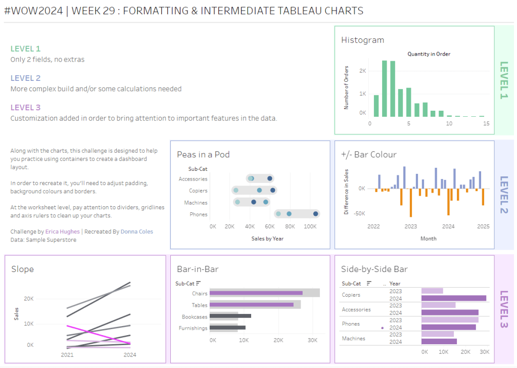
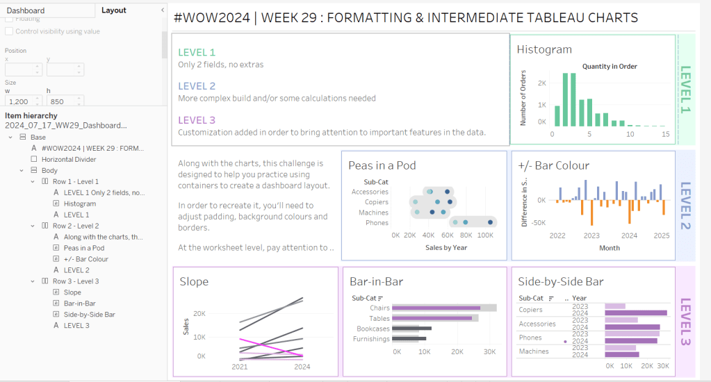
Erica set this challenge primarily aimed at building a beautifully presented dashboard, with the requirement to consider the use of layout containers and padding. She threw in creating some very specific chart types too. The easiest way to blog this, is by chart type.
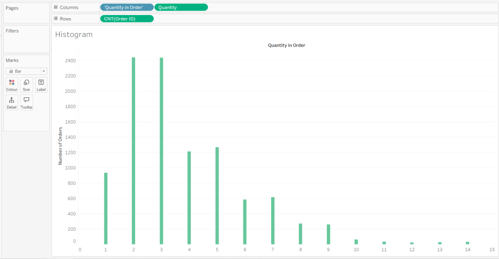
Building the Histogram
Add Quantity to Columns as continuous dimension (green unaggregated pill) and add Order ID as a measure using the CNT aggregation to Rows. The easiest way to do this is right click and drag Order ID from the left hand date pane and drop onto rows. When you release the mouse, the option to select the aggregation should be available.
Change the mark type to bar and adjust the colour. Edit the title of the y-axis and remove the title from the x-axis. Update the Tooltip.
Double -click into Columns and manually type ‘Quantity in Order’ (including the quotes). Right click on the first text displayed and hide field labels for columns. Adjust the font of the Quantity in Order label that remains.
Remove row and column dividers and column gridlines. Remove Row axis rulers.
Note, when you add to the dashboard , you may find you want to adjust the Size of the bars.
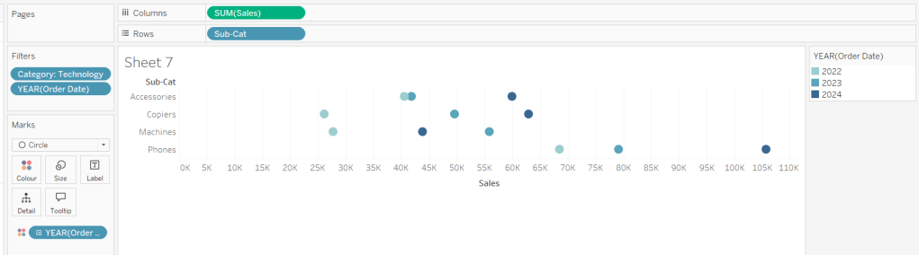
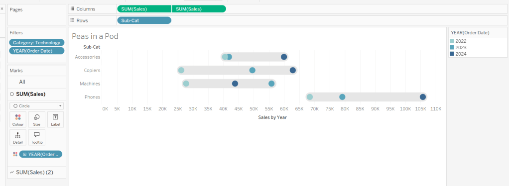
Building the Peas in a Pod chart
On a new sheet, add Category to Filter and select Technology. Add Order Date to Filter and select Years then choose 2022,2023 and 2024.
Rename the Sub-Category field to Sub-Cat and add to Rows. Add Sales to Columns. Change the mark type to circle. Add Order Date to Colour. By default it should display YEAR(Order Date). Adjust colours to suit. Widen each row a bit.
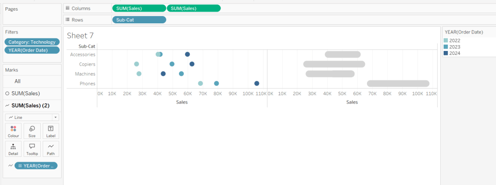
Add another instance of Sales to Columns.
On the Sale (2) marks card change the mark type to line and move YEAR(Order Date) to Path. Increase the size and adjust the colour so it’s a grey lozenge.
Make the chart dual axis and synchronise the axis. Right click the top axis and move marks to back. Adjust the Tooltip. Edit the title of the x-axis.
Hide the top axis. Remove row and column dividers. Remove row gridlines. Remove axis rulers for both columns and rows.
Note, when you add to the dashboard , you may find you want to adjust the Size of the circles and the line. I found it was best adjusted on the web after I published to Tableau Public.
Building the +/- Bar Chart
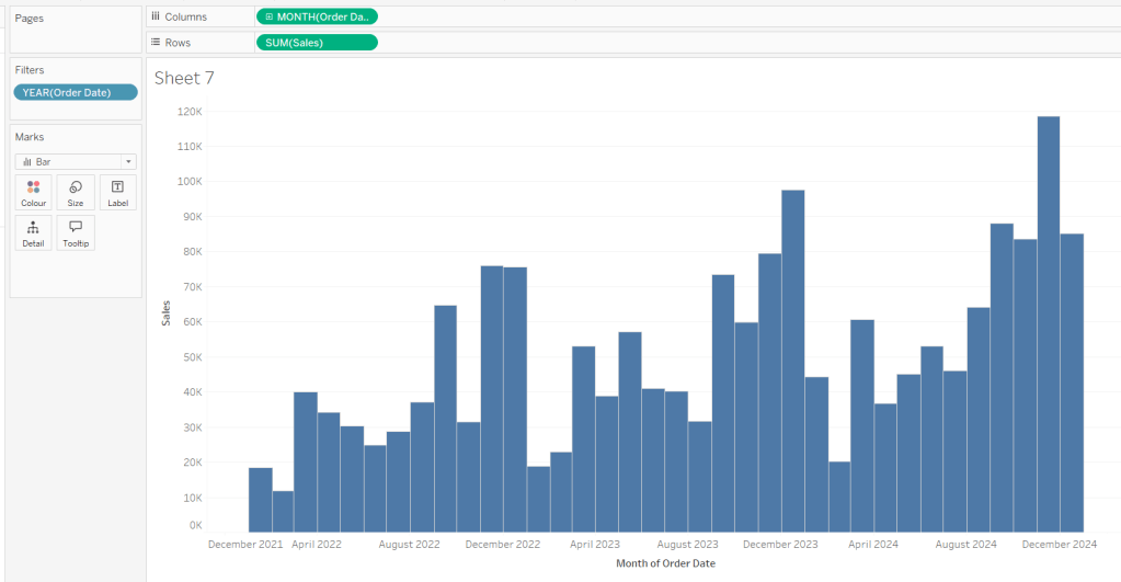
On a new sheet add Order Date to Filter and select Years then choose 2022,2023 and 2024. Add Order Date to Columns and select to be at the continuous month level (green pill, May 2015 format). Add Sales to Rows and change the mark type to bar.
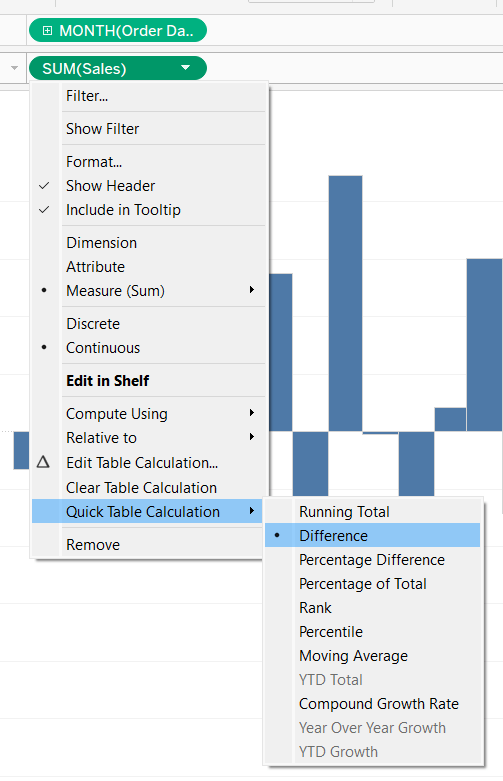
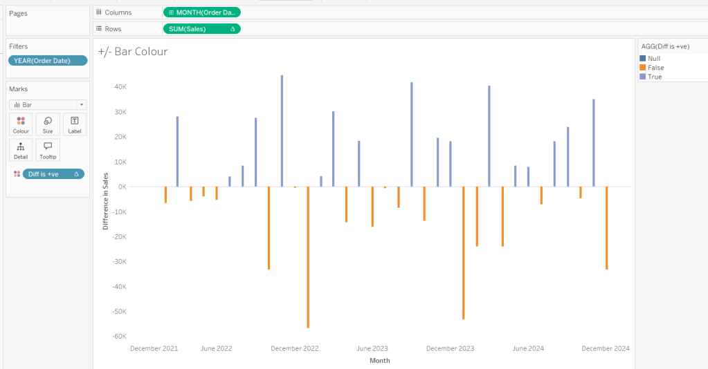
Add a quick table calculation of Difference to the Sales pill.
Adjust the size of the bars (select manual over fixed and adjust the slider).
and add to the Colour shelf. Adjust colours to suit. Hide the null indicator. Adjust the Tooltip. Adjust the title of the x-axis.
Remove all gridlines and axis rulers. Remove the columns zero line. Set the rows zero line to be a continuous unbroken line.
Note – once again the size may need further adjusting once on the dashboard and/or after publishing.
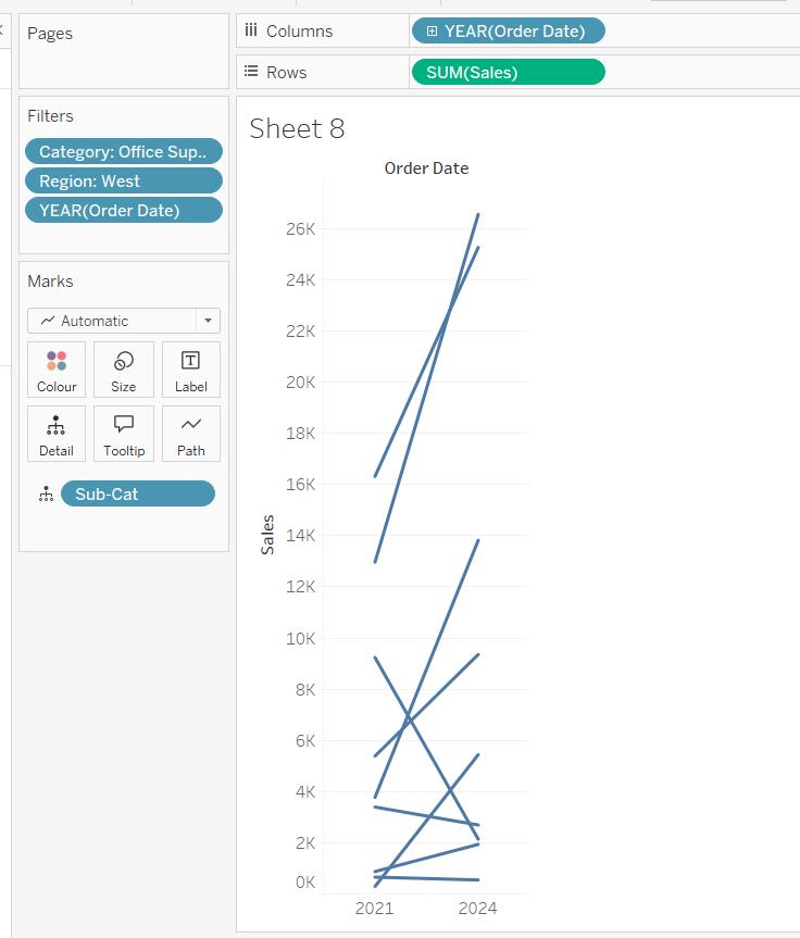
Building the slope chart
Add Category to filter and select Office Supplies. Add Region to filter and select West. Add Order Date to filter and select Years then choose 2021 and 2024 only.
Add Order Date to Columns and Sales to Rows. Add Sub-Cat to Detail.
Add Sales to Colour then add a quick table calculation of Percentage Difference. This only sets a value against the 2024 marks though, whereas we want a value for the whole line for each Sub-Cat.
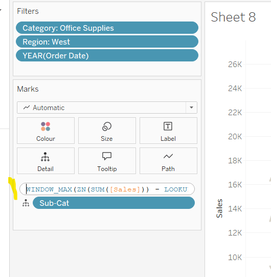
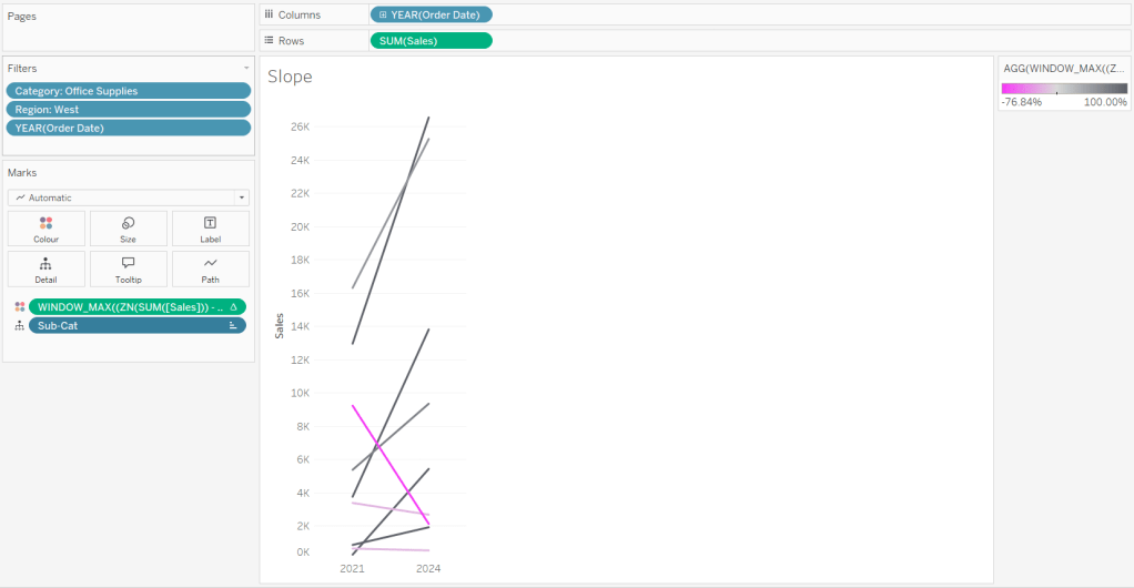
Double-click into the Sales pill on Colour to edit it, and wrap the whole calculation in a WINDOW_MAX() function – the whole calculation should look like
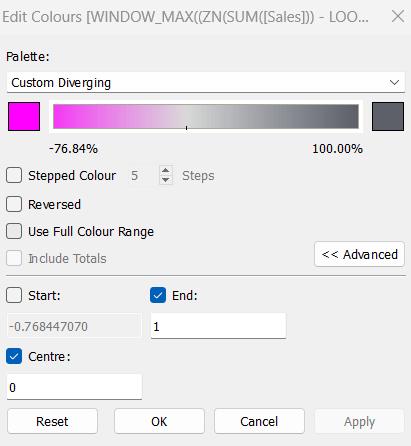
Adjust the colour legend. I set the start & end colours to #ff00ff (hot pink) and #5d6068 (dark grey) and then applied an upper limit to the range and centred at 0 as below.
Hide the Order Date heading at the top of the chart. Adjust the Tooltip.
Remove column gridlines, zero lines and axis rulers.
Edit the Sort of the Sub-Cat pill on the Detail shelf, so it is sorting by % Difference ascending. This will ensure the lines are displayed overlapping in the expected manner.
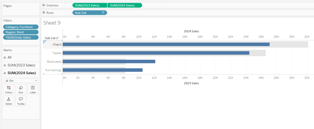
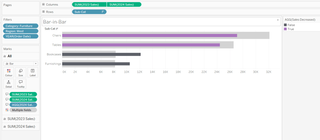
Building the Bar-in-Bar Chart
On a new sheet, add Category to filter and select Furniture. Add Region to filter and select West. Add Order Date to filter and select Years then choose 2023 and 2024 only.
Create a new field
2023 Sales
IF YEAR([Order Date]) = 2023 THEN [Sales] END
Add Sub Cat to Rows and 2023 Sales to Columns. Add a sort to the Sub-Cat pill to sort by 2024 Sales descending. Add 2024 Sales to Columns. Make the chart dual axis and synchronise the axis. Change the mark type on the All marks card to bar. Remove Measure Names from the Colour shelf on the All marks card. Set the colour of the 2023 Sales marks card to light grey. Increase the width of each row, then reduce the size of the bar on the 2024 Sales marks card.
Create a new field
Sales Decreased
SUM([2024 Sales]) < SUM([2023 Sales])
and add to the Colour shelf of the 2024 Sales marks card. Adjust colours to suit.
In the solution, the Tooltip shows an indicator – I’m not sure if this was necessary, but I added it just in case
2024 Sales > 2023 Sales
IF [Sales Decreased] THEN ‘●’ END
Add this to the Tooltip shelf of the All marks card, along with the 2023 Sales and 2024 Sales fields. Adjust the Tooltip accordingly.
Hide the top axis. Remove the title of the x-axis.
Remove row and column dividers. Remove row gridlines and row axis rulers and ticks. Remove all zero lines.
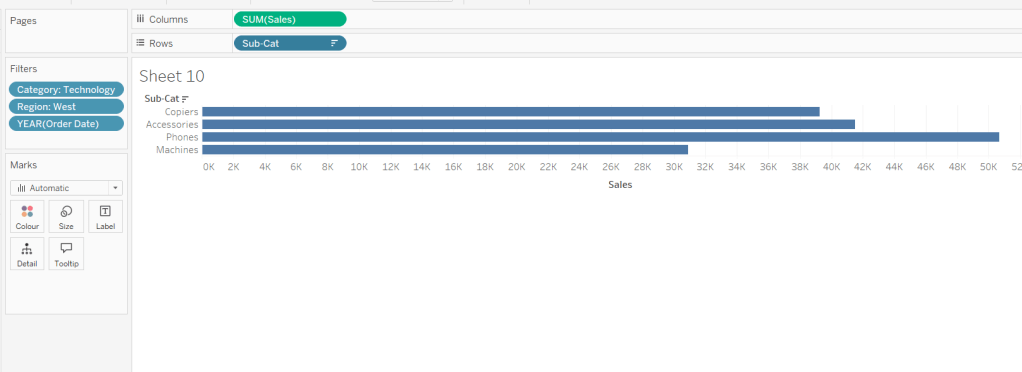
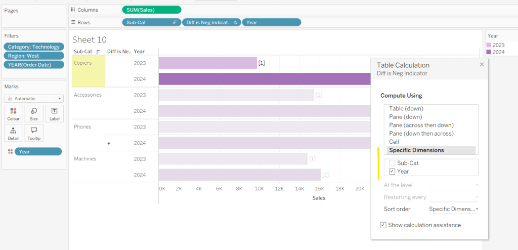
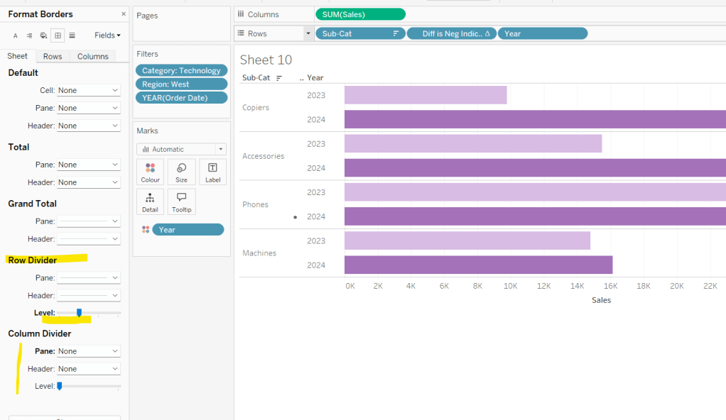
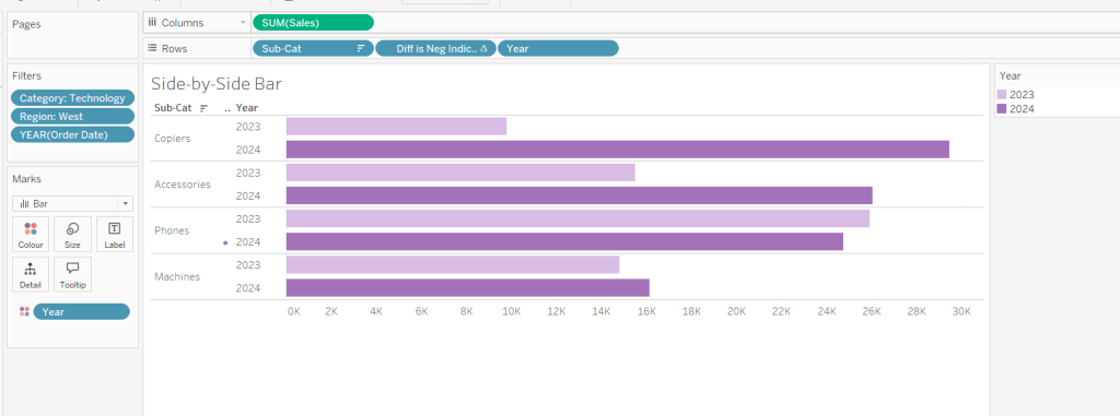
Building the side-by-side bar chart
On a new sheet, add Category to filter and select Technology. Add Region to filter and select West. Add Order Date to filter and select Years then choose 2023 and 2024 only.
Add Sub Cat to Rows and Sales to Columns. Apply a Sort to Sub-Cat based on 2024 Sales descending.
Create a new field
Year
YEAR([Order Date])
And add to Rows and Colour. Adjust colour to suit. Widen each row.
Create new field
Diff is Neg Indicator
IF NOT([Diff is +ve]) THEN ‘●’ ELSE ” END
Add to Rows before Year and then adjust the table calculation setting so it is just computing by Year only.
Adjust the alignment of the Sub-Cat column so it is aligned middle right. Narrow the width of the Diff is Neg Indicator column to try to remove all the column heading text. If some still shows, rename the field so it is padded with some spaces at the front. Adjust the Tooltip.
Remove the x-axis title. Remove Column dividers. Adjust the row dividers so they are at level 1 and are partitioning each Sub Cat only and not splitting the Year column.
Remove all gridlines
Building the dashboard
It’s always hard to walk through the steps for placing objects on a dashboard in the specified places. My general rules are
Start with a floating vertical container that is positioned 0,0 and set to the dashboard height and width. I name this Base.
Then add tiled objects such as a text object for the title, blank objects, other containers, charts etc.
When you add a container, add a blank object initially to help get everything into place. Remove once you have at least 2 objects side by side / on top of each other depending on the direction you’re organising.
The item hierarchy shouldn’t have any containers of type Tiled listed.
Try to name your containers to help maintenance in the future
Below is a picture of the item hierarchy I ended up with using this approach
I created a floating vertical container called Base, positioned 0,0 and 1200 x 850. Background set to None, no border and inner and outer padding all 0.
I added a text object to contain the title. Background set to None and no border. Outer padding set to 10 all round, and inner padding 0.
I added a blank object, which I renamed Horizontal divider. Background set to light grey, no border. Outer padding set to left and right 10 and top and bottom 0. Inner padding all 0. Height set to 2.
I added another Vertical container, which I renamed Body. Background set to None, no border and all inner and outer padding set to 0.
I added 3 horizontal containers on top of each other, and set the property of the Body vertical container to distribute contents evenly so each horizontal container was the same height.
1st horizontal container
I named Row 1 – Level 1. I set the background to the pale green. No border. Outer padding set to left & right 10, top & bottom 5. Inner padding all 0.
Into this I added a text field to describe the levels. Background of this was white, no border and outer padding set to 0 (so the green background disappears). Inner padding was set to top: 20 and 10 for the rest.
Next the Histogram chart. Border set to green. Background white. Outer padding right:5, rest 2. Inner padding set to 10 all round. Width of chart fixed to 380 px.
Next the Level 1 text object. No border, no background. Outer padding 4 all round; inner padding 0. Formatted text object to rotate text. Width of object set to 40 px.
2nd horizontal container
I named Row 2- Level 2. I set the background to the pale blue. No border. Outer padding set to left & right 10, top & bottom 5. Inner padding all 0.
Into this I added a text field to describe the challenge. Background of this was white, no border and outer padding set to 0 (so the blue background disappears). Inner padding was set to 10 all round. Width of object set to 380px.
Next the Peas in a Pod chart. Border set to blue. Background white. Outer padding right:5, rest 2. Inner padding set to 10 all round.
Next the +/- bar chart. Border set to blue. Background white. Outer padding right and left 5, top & bottom 2. Inner padding set to 10 all round. Width of object set to 380px.
Next the Level 2 text object. No border, no background. Outer padding 4 all round; inner padding 0. Formatted text object to rotate text. Width of object set to 40 px.
3rd horizontal container
I named Row 3- Level 3. I set the background to the pale purple. No border. Outer padding set to left & right 10, top & bottom 5. Inner padding all 0.
I added the Slope chart. Border set to purple. Background white. Outer padding right:5, rest 2. Inner padding set to 10 all round. Width of object set to 380px.
Next the bar-in -bar chart. Border set to purple. Background white. Outer padding right & left 5, top & bottom 2. Inner padding set to 10 all round.
Next the side-by-side bar chart. Border set to purple. Background white. Outer padding right and left 5, top & bottom 2. Inner padding set to 10 all round. Width of object set to 380px.
Next the Level 3 text object. No border, no background. Outer padding 4 all round; inner padding 0. Formatted text object to rotate text. Width of object set to 40 px.
It was a bit of trial and error to get the spacing as required, and a few calculations to work out how wide I wanted each chart to be, based on the width of the dashboard and the other items in each row.
For this week’s #WOW2023 challenge, Kyle wanted us to build a viz that used selections on the viz rather than a set of filter controls to show how the sales for those selections were distributed.
This concept is referred to as proportional brushing and makes use of set actions to achieve the results. The complexity added here was the multiple selections being made.
6 sheets make up this dashboard – 1 for each bar chart, 1 for the KPI and 1 for the breadcrumb trail.
Building the basic bar charts
Create 4 sheets, one for each of the Region, Segment, Ship Mode and Sub-Category dimensions. The simplest way is to build one sheet, get all the formatting applied etc, then duplicate and replace the dimension on the duplicated sheet with the new one.
When building the first sheet, place the dimension (eg Region) on Rows and Sales on Columns, sorted descending. Adjust the Sales to be formatted to $ with 0dp. Hide the Sales axis, and format to remove all gridlines/axis lines/ zero lines and row/column dividers. Show mark labels and align centrally. Adjust the font label to 8pt. Widen each column if need be. Hide the dimension label from displaying (hide field label for columns). Adjust the tooltip to suit. Name the sheet based on the dimension.
Then duplicate this sheet, and drag the next dimension, eg Segment, and drop it directly on Region. If done properly, everything should seamlessly update. Re-name this sheet accordingly, then repeat the process until you have a sheet for each of the four dimensions.
Applying the proportional brushing
Create a set for each of the relevant dimensions.
Region Set – right click on the Region field in the data pane and select Create > Set. Select all the options to be in the set.
Repeat and do the same for each dimension, so you end up with Segment Set, Ship Mode Set and Sub-Category Set.
We need to determine the combination of all the values selected in each set. So we need
Is Selected Options
[Segment Set] AND [Ship Mode Set] AND [Region Set] AND [Sub-Category Set]
This returns true for all the records in the data which match the combined selections of the individual sets.
On the Region sheet, add Is Selected Options to the Colour shelf. The right click on each set in the data and and select Show Set, so the set of selections are listed on the canvas.
Change the options so only the Segment Consumer and rthe Ship Mode Standard Class are selected, along with all Region and Sub-Category values. Adjust the colours associated to the True and False values that are now presented
If need be, adjust the tooltip so the Is Selected Options is not displaying, then add the Is Selected Options field to the Colour shelf of the Segment, Ship Mode and Sub-Category sheets. Play with the set selections to see how the bars change. Once you’re familiar with the behaviour, reset all the sets so they all contain all the values.
Building the KPI sheet
On a new sheet add Sales to Text. Change the mark type to shape and select a transparent shape (see this blog to get this set up). Adjust the Label to include the text ‘Sales’ and format accordingly. Align middle centre. Add Is Selected Options to the Filter shelf and set to True.
Again, if you adjust the set selections, the value will adjust accordingly.
Building the Dashboard interactivity
Add the sheets onto a dashboard. I used both vertical and horizontal layout containers to get the objects positioned where I wanted. I also used blank objects set to height/width of 1px and with a black background colour to create the horizontal and vertical divider lines. You can see from the item hierarchy in the image below, how I laid out my dashboard (I like to rename my containers to help understanding)
Now add a dashboard change set values action for each of the 4 bar chart sheets.
Select Region
On select of the Region sheet only, target the Region Set. On running the action (ie clicking the bar), assign values to set, and when clearing the selection (clicking the bar again), add all values to the set.
Note – While not specified in the requirements, I noticed that the breadcrumbing functionality in Kyle’s solution didn’t behave if multiple selections of the same dimension were made – eg 2 regions were selected. I decided to add the requirement of only allowing a single dimension to be clicked (ie the single-select only box is checked).
Create a Select Segment, Select Ship Mode and Select Sub-Category set action using the same principals described above.
Creating the breadcrumb
I’ve added this last, so you understand how we can ensure each set only has either all the values in it, or just 1 value.
To create the breadcrumb, we’re going to build up some strings based on what the state of each set looks like. This involved several calculated fields…. I’m not sure if I’ve over complicated this though..
Anyway firstly, we want to capture the values that have been added to each set, so we need
Regions in Set
IF [Region Set] THEN [Region] END
Segments in Set
IF [Segment Set] THEN [Segment] END
Ship Modes in Set
IF [Ship Mode Set] THEN [Ship Mode] END
SubCats in Set
IF [Sub-Category Set] THEN [Sub-Category] END
The image below shows how each of these fields are behaving based on the set selections – if the value is not selected in the set, the Regions in Set field is Null.
Next we have fields to count how many different values exist in each of these fields.
Count Selected Regions
{FIXED: COUNTD([Regions in Set])}
Count Selected Segments
{FIXED: COUNTD([Segments in Set])}
Count Selected Ship Modes
{FIXED: COUNTD([Ship Modes in Set])}
Count Selected SubCats
{FIXED: COUNTD([SubCats in Set])}
Again you can see from the sheet below, this is counting the number of selections, which is ‘fixed’ (ie the same) for every row.
Now, while this is showing 2, as we’ve manually clicked on the set options, in practice when driven from the dashboard, we’re either going to have all values in the set, or just 1. So based on this assumption, we now just want to get the name of the single selection
Selected Region
IF SUM([Count Selected Regions]) = 1 THEN MAX([Regions in Set]) ELSE ” END
If there’s only 1 item in the set, then get it’s value, otherwise return ‘blank’.
Just testing this behaviour, we can see below that with all the Regions selected, the Selected Region field is empty, but with 1 value selected, we show that value.
Create equivalent fields for each dimension
Selected Segment
IF SUM([Count Selected Segments]) = 1 THEN MAX([Segments in Set]) ELSE ” END
Selected Ship Mode
IF SUM([Count Selected Ship Modes]) = 1 THEN MAX([Ship Modes in Set]) ELSE ” END
SelectedSubCat
IF SUM([Count Selected SubCats]) = 1 THEN MAX([SubCats in Set]) ELSE ” END
The order of the dimensions displayed in the breadcrumb is fixed, regardless of the order in which you click the options. That is, if you click a Segment then a Region, the breadcrumb will display the <segment> followed by the <region>. But if you click the Region first and then the Segment, the breadcrumb will still display the<segment> followed by the <region>. Based on this, we can create string values for each dimension that differ depending on whether we know there is a selection made against a subsequent dimension (ie should we include the ‘>’ character or not).
Let’s go through in order. Firstly, no selections made
All Segmentations BC
IF [Selected Segment]=” AND [Selected Ship Mode]=” AND [Selected Region]=” AND [Selected SubCat]=” THEN ‘All Segmentations’ END
If all the ‘selected’ values are empty, then all the sets contain all the values, so display ‘All Segmentations’.
If there are selections made, then the dimensions are ordered as Segment > Ship Mode > Region > Sub-Category
Segment BC
IF [Selected Segment]<>” AND ([Selected Ship Mode]<>” OR [Selected Region]<>” OR [Selected SubCat]<>”) THEN [Selected Segment] + ‘ > ‘ ELSE [Selected Segment] END
If there is only 1 Segment selected and at least 1 of the other dimensions has been selected too, then add the ‘>’ character after the Segment name, otherwise just show the Segment.
Ship Mode BC
IF [Selected Ship Mode]<>” AND ([Selected Region]<>” OR [Selected SubCat]<>”) THEN [Selected Ship Mode] + ‘ > ‘ ELSE [Selected Ship Mode] END
Similar to above, but this time, we only need to compare with the dimensions that are below Ship Mode in the display hierarchy.
Region BC
IF [Selected Region]<>” AND [Selected SubCat]<>” THEN [Selected Region] + ‘ > ‘ ELSE [Selected Region] END
There is only one dimension below Region. As Sub-Category is at the bottom of the ordering, we don’t need anything special – the value of the Selected SubCat field will do.
On a new sheet, add All Segmentations BC, Segment BC, Ship Mode BC, Region BC and Selected SubCat to the Text shelf. Change the mark type to shape and change to use a transparent shape.
Adjust the label, so all the fields are ordered correctly and positioned exactly next to each otherwith no spacing/carriage returns between. Align the label middle left.
Show the set controls, and then test the functionality by altering the selections, ensuring either only 1 value or all values are selected
Once you’ve finished testing, ensure all values are selected in all sets.
The add this sheet to the dashboard – I had the title and the breadcrumb in a vertical container, which was the left hand side of a horizontal container
And hopefully that should be it. My published viz is here.
Lorna created this challenge for #WOW2021 this week incorporating tips from the Speed Tipping session she and fellow WOW leader Ann Jackson had presented at TC21.
Defining the calculations
The requirements were to ensure there were only 7 calculated fields used, and no date hardcoding (including in the title – a feature I missed to start with). So let’s start by just going through the required calculations.
We need to identify the latest year in the data set
Current Year
YEAR({FIXED:MAX([Order Date])})
This uses an LoD (Level of Detail) calculation to identify the maximum date in the whole data set, which is 31st Dec 2021, and then extracts the Year of this ie 2021.
From this, we work out
Previous Year
[Current Year] – 1
Both of these fields return numbers, so automatically sit in the measures section of the left hand data pane (ie under the horizontal line). I want to treat these as dimensions, so I just drag the fields above the line.
We now need to create dedicated fields to store the Sales values for both years
CY Sales
IF YEAR([Order Date])=[Current Year] THEN [Sales] END
PY Sales
IF YEAR([Order Date])=[Previous Year] THEN [Sales] END
and with both of these, we can work out the
Difference
SUM([CY Sales])-SUM([PY Sales])
[TIP] This is custom formatted to △#,##0;▽#,##0.
I googled ‘UTF 8 triangles’ and used this link to find the suitable shapes which I just copied and pasted into the number format field.
We’re going to need to determine whether the difference is positive or not.
Is Loss?
MAX(0,[Difference]) =0
This is another [TIP] making use of the array function. If the Difference is negative, it will return 0 as this is the maximum of the two numbers. I’m not entirely sure if this is more efficient than simply writing Difference<=0, but I wanted to incorporate another of the tips presented.
The final calculation we need is another of the PY Sales field, as we need another distinct Measure Name value to display. I simply chose to duplicate the existing field to have a PY Sales (copy) field.
Building the viz
Add Category to Columns, Segment to Rows and then add CY Sales to Columns, which will create a horizontal bar chart. Then drag PY Sales to the CY Sales axis, and when the ‘two columns’ icon appears, drop the field.
This will automatically change the pills so Measure Values is on Columns and Measure Names is on Rows.
Swap the order of the pills on the Measure Values section on the left hand side, so PY Sales is listed before CY Sales.
Add Measure Names to the Colour shelf and adjust. Increase the width of the rows.
Check the Show Mark Labels option on the Label shelf and adjust alignment to display the text to the left
Increase the Size of the bars to the maximum size, and add a white border (via option on Colour shelf)
Add PY Sales (Copy) to Columns, and change the mark type to GanttBar. Remove Measure Names from the Colour shelf of this marks card, as it will automatically have been added. Instead add the Is Loss? field to Colour and adjust.
Add Difference to the Size shelf, then click on Size, and reduce it to as small as possible. Set the border of this mark to Automatic (it should become a little thicker).
Next add the Difference field to the Label shelf, align right and set the font colour to match mark colour.
Now make the chart dual axis, synchronise axis, and set the mark type of the Measure Names mark type back to a bar.
On the All marks card, add CY Sales, PY Sales and Difference to the Tooltip shelf. And add Current Year and Previous Year to the Detail shelf.
Adjust the Tooltip against the All marks card, so it is the same when you hover on all of the marks. And edit the title of the chart, referencing the Current Year and Previous Year fields.
The challenge has a ‘space’ between each Segment, and this is the final TIP I used.
On the Measure Values section on the left below the marks card, type in MIN(NULL). This will initially create a new ‘blank’ row between the bars and the gantt marks, which isn’t where we want the blank row to be.
To resolve this, simply click on the MIN(NULL) text in the chart and drag the text below the PY Sales (copy) text
And now you just need to uncheck Show Header against the Measure Names pill on Rows, and the Measure Values and PY Sales (copy) fields on the Columns. Then remove all row and column borders and gridlines and hide labels for rows and columns.
Hopefully you’ve got the final viz which you can now add to a dashboard. My published version is here.