The data provided contained 1 row per person. I started by creating a bin based on the Age field, which I dragged into the dimensions section of the data pane (above the line) after I connected to the data. Right click Age > Create Bins
Age Group
Create bins every 5 ‘units’
Adding this on to Rows you’ll see you get the relevant values
With this field, we can create the other calculations we will need
{FIXED [Age Group]:SUM( IIF([Gender]<>’Female’ AND [Gender]<>’Male’,1,0))}
Format both of these to 0 dp
Males
IIF([Gender]=’Male’,1,0)
Format this to 0dp
Females
IIF([Gender]=’Female’,-1,0)
Note, this is -1 due to how we’re going to plot on the chart, but we don’t want the labels displayed with negative numbers, so custom format this field to ,##0;#,##0
Headcount Gap
SUM([Males]) + SUM([Females])
Note – we’re adding since the Females value is actually a negative number
Also custom format this to ,##0;#,##0
Add Total Headcount to Rows and change to be discrete (blue pill). Add Other Gender to Rows too, and again change to discrete.
Add Females to Columns and then add Males to Columns too.
Make the chart dual axis and synchronise the axis. Change the mark type on the All marks card to bar. Adjust the Measure Names colour legend.
Make the rows a bit wider. On the All marks card, on the Label shelf, tick show mark labels and align the labels middle centre and bold.
Add Headcount Gap to Columns. Remove the Measure Names field from the Colour shelf on the Headcount Gap marks card.
Create a new field
Colour – Headcount Gap
[Headcount Gap] <0
and add to the Colour shelf on the Headcount Gap marks card and adjust colours accordingly.
I chose to make the tooltip on all the bars to match exactly and reference the information shown. For this I created some other fields
Tooltip – Least Gender
IIF(NOT([Colour – Headcount Gap]),’women’, ‘men’)
Tooltip – Most Gender
IIF([Colour – Headcount Gap],’women’, ‘men’)
On the All marks card, add Males, Females, Headcount Gap, Tooltip – Least Gender and Tooltip – Most Gender to the Tooltip shelf and adjust the tooltip as required
Add a constant 0 reference line that displays a solid black line to both the Female axis and the Headcount Gap axis.
Finally tidy up by
Hide the top axis (uncheck show header)
Editing the title of the Female axis to read Headcount
Remove all gridlines
Remove column dividers
Update the viz title.
Add the sheet to a dashboard and ta-dah! My published viz is here.
Kyle set the challenge this week to recreate a drill-down, but with the stipulation that no parameters were to be used. I immediately figured this would be a challenge requiring set actions, and indeed the hint on the splash page of the #WOW site, confirmed this
Building the Viz
After connecting to the data source, create a Set off of the Category field (right click > create > Set). Select a single option eg Technology
Category Set
Create fields
Display Value
IF [Category Set] THEN [Sub-Category] ELSE [Category] END
and
Expand Indicator
IF [Category Set] THEN [Category] ELSE ‘+’ END
Add Category, Expand Indicator and Display Value to Rows and Sales to Columns and press the sort desc button in the toolbar, to sort all the bars . The click the Category pill to add another sort by sales descending.
Hide the Category pill (uncheck show header).
Format the Expand Indicator column, so the text is aligned vertically
Right click on the Expand Indicator text heading displayed in the view and hide field labels for rows. Widen each row a bit, remove all gridlines, remove the Sales axis title (right click axis > edit axis). Add a title to the sheet. Adjust the Tooltip.
Adding the interactivity
Add the sheet to a dashboard, then add a dashboard set action
Select Cat
On select of the viz on the dashboard, target the Category Set, adding values to the set when the viz is clicked (selected), and remove all values when the selection is cleared. Only allow 1 selection at a time to be made.
My inspiration for this week’s #WOW challenge came from Sarah Palette’s post on X from last year, and has been something I’d been meaning to try for ages, so figured a #WOW challenge was the perfect opportunity. Sarah has her own blog post which contains the core ‘trick’ to nailing the display, but as usual I’m going to walk you through step by step 🙂
After connecting to the data, start by adding Sub-Category to Rows, Sales to Columns, Category to Colour and sort by Sales descending. Adjust the colours to suit.
Format Sales to be $ to 0 dp, and add to Label. Apply a quick table calculation of Percentage of total to the Sales pill, and then format the pill to be % to 1 dp. Add another instance of Sales to Label. Adjust the layout and format the label to 8pt bold and match mark colour. Reduce the Size of the mark.
Double click into the Columns shelf, and manually type MIN(0). Then drag the MIN(0) pill from Columns and drop it on the Sales axis when the green ‘2-column’ icon appears. This automatically adds Measure Names and Measure Values into the view. Re-order the pills in the Measure Values section. This display now has 2 measures sharing a single axis.
Change the mark type to Line and line type to stepped (via the Path pill). Adjust the Label so it is labelling line ends and start of line only. Align label top right. Adjust the size of the line as required.
Click on the MIN(0) pill in the Measure Values section, and while holding down Ctrl drag the pill to Columns to create a copy of the same measure. This is important as typing in another instance of MIN(0) will create another separate measure, and we need it to be the same one.
This will create another marks card (MIN(0)). Remove the Sales pills from the Label shelf, and add Sub-Category instead. Align the label middle right, and add a couple of spaces before the Sub-Category text. Set the chart to be dual axis, synchronise the axis and then remove Measure Names from the All marks card. Adjust the width of each row to push the Sub-Category label into the corner of the L.
To give the labels at the end of the bar some ‘breathing room’, create a field
Max Sales + 10%
WINDOW_MAX(SUM([Sales])) * 1.1
Add this to the Detail shelf on the All marks card. Adjust the table calculation so it is computing by both Category and Sub-Category. Then right click on the bottom axis and Add Reference Line that uses the average of the Max Sales + 10% field for the Entire Table. Don’t display and lines/labels/tooltip
Finally tidy up by
Hiding both axis (right click -> uncheck show header)
Hiding both the Sub Category and Measure Names headers (right click, uncheck show header)
Remove all gridlines, zero lines, row & column dividers
Adjust Tooltip as required
Add a title colouring the text of the words to match the colours used in the legend.
For this week’s challenge, Lorna visualised the output of a crazy golf game she had with the latest Data School cohort, and thought it would be a fun challenge to share.
While the data set is very small, there’s several core calculations required, which we’ll start off creating.
Defining the core calculations
After connecting to the data, I initially dragged the Hole field from Measures to Dimensions (dragged it to be above the line on the data pane).
We need to know the average score per person (across all 11 holes)
Overall Average Score
{FIXED [Person]: AVG([Score])}
format this to 1dp
We also need the average score per hole
Avg Score Per Hole
{FIXED [Hole]: AVG([Score])}
format this to 1 dp
We need each person’s score up to 9 holes
Score up to 9
{FIXED [Person]:SUM( IF [Hole]<=9 THEN [Score] END)}
We need the tie break score for the 10th & 11th holes
Tie Break
{FIXED [Person]:SUM( IF [Hole]>9 THEN [Score] ELSE 0 END)}
We need the average score across 9 holes
Avg Score
[Score up to 9]/9
format to 1 dp
We need to the lowest score per person
Lowest
{FIXED [Person]: MIN([Score])}
With this information, we can then define a field we can use for sorting which is a numeric field that is a combination of multiple fields as stated in the requirements
Sort
(SUM([Score up to 9])*10000) + (SUM([Tie Break]) * 1000) + (SUM([Avg Score]) * 100)+ SUM([Lowest])
Building the Heat Map
On a new sheet add Score up to 9 to Rows and change it to be discrete. Repeat the same for Tie Break, Avg Score and Lowest. Then add Person to Rows and Hole to Columns.
Double click into Columns and manually type MIN(1.0) to create a ‘fake axis’. Change the mark type to bar and increase the Size to the maximum. Edit the axis to be fixed from 0 to 1 and the hide the axis. Manually increase the width of each row and set the chart to fit width.
Add Score to Colour and choose a diverging colour palette and then manually change the start & end colours to match the solution (or define your own colour style). I used #62a14b (green) and #13316d (dark blue). Check the box to use full colour range
Update the Tooltip as required.
We then need to include some indicators on the heat map. To determine the arrow indicator we first need
Previous Score
LOOKUP(SUM([Score]),-1)
and then create
Change Indicator
IF SUM([Score]) > [Previous Score] THEN ‘↗’ ELSEIF SUM([Score]) < [Previous Score] THEN ‘↘’ ELSEIF SUM([Score]) = [Previous Score] THEN ‘→’ END
Add these to Label too and adjust label so it is aligned bottom centre, and coloured white. You may need to adjust size of font for each label item, and increase the height of each row to get the information to display.
Finalise the formatting by
Set the background colour of the whole sheet to #7299aa
Set the font of all the column headings and label headings to Tableau Medium, 9pt, white
Hide the Hole label heading (right click the label and hide field labels for columns)
Add a white border to the bars via the Colour shelf
Remove all column dividers
Remove row dividers from the pane only, ensure the row dividers for the headers remain.
Remove all gridlines , zero lines, axis rulers & ticks
Name the sheet HeatMap or similar.
Building the Average Score Per Person bar chart
On a new sheet, add Person to Rows and Overall Avg Score to Columns. Add a Sort to the Person pill that references the Sort field ascending
Add Overall Avg Score to the Colour shelf, and then adjust the colour scale so it uses a diverging colour scale which is then edited to use the same colour range as before and spans the same range, which means explicitly stating the start (-1) , middle (0) and end (10) values
We want to display a * against the winner
Winner Icon
IF SUM([Overall Avg Score]) = WINDOW_MIN(SUM([Overall Avg Score])) THEN ‘★’ ELSE ” END
Add this to Rows and adjust the table calculation so it is explicitly computing by Person only.
Create
Winner Label
IF SUM([Overall Avg Score]) = WINDOW_MIN(SUM([Overall Avg Score])) THEN ‘Coach Always Wins!’ END
and add this to Label along with Overall Avg Score. Increase the width of the bars to see the text and align middle left and change the font to white. Adjust the Tooltip.
Format the sheet
Set the worksheet background colour
Hide the Person column (uncheck Show Header)
Hide the Overall Avg Score axis (uncheck Show Header)
Remove all column/row dividers, gridlines, axis lines, zero lines
Add a white border around the bars (via the Colour shelf)
Increase the Size of the bars so there is a small gap between
Format the * to be white font
Hide the Winner Icon label (right click > hide field labels for rows)
Make the Winner Icon column as narrow as possible
Name the Sheet Avg Per Person or similar.
Building the Average Score Per Hole bar chart
On a new sheet, add Hole to Columns and Avg Score Per Hole to Rows. Add Avg Score Per Hole to Colour and adjust the scale as we did above so it ranges from green to blue and -1 to 10.
Show mark labels, adjust the tooltip. Set the background colour of the worksheet and remove all gridlines, zero lines, row/column dividers etc. Hide the Avg Score Per Hole axis and the hole labels (uncheck show header on the Hole pill). Adjust the font of the labels to be Tableau Medium and white. Add a white border around the bars. Increase the Size to leave a small gap.
Name the sheet Avg Per Hole or similar.
Building the dashboard
Set the background of the dashboard to the same colour of the worksheets.
Using containers, add a horizontal container and add a text object (for the title), the Avg Per Hole sheet and then a blank object. Remove the container that gets added with the colour legend.
Add another Horiztonal container beneath and add the Heatmap sheet and the Avg Per Person sheet.
Remove all padding. Remove all titles from the sheets. Set all the charts to fit entire view. Manually line up everything, but you’ll find you have an issue getting your horizontal bar chart to align to the player rows due to the header in the heatmap
(Note – you may notice your labels on the heat map aren’t displaying due to the space available). You can continue to adjust on Desktop so they do appear (make the heatmap have more vertical space), or wait until you’ve published to Tableau Public and see if you get the desired result… although at the point of writing , Tableau Public is having issues with the table calcs and causing odd behaviour with the display).
To fix this, go back to the Avg Per Person sheet and double click into column and manually type “” to create a dummy header row with no text. Hide the “” label (right click > hide field labels for columns). You can then adjust the height of this header label section to help get the alignment right.
Then make any final adjustments required – add the title, and any imagery etc. My published viz is here.
For #WOW2025 Week 25, Kyle challenged us to make use of Set Actions to recreate a viz where the ‘viz in tooltip’ updates based on the option the user interacts with on the base viz.
Modelling the data
The excel file provided contained 3 sheets which needed to be combined to use for this challenge. My data model looks like this
Attendance is related to Divisions on the fields Tm = Team
Attendance is also related to Record on the fields Tm = Tm.
Building the Base Bar Chart
On a new sheet, add Division to Rows and Attend/G to Columns changing the aggregation to AVG.Sort the data descending.
Change the Colour of the bars to dark grey and show mark labels to display the average attendance per game value. Add W-L% and Est.Payroll fields to the Tooltip shelf and set both to be AVG. Format Est. Payroll to be $ with 0dp. Format W-L% to be formatted to 3dp, but then adjust again and use a custom format to remove the leading 0 (,##.000;-#,##.000)
Format the label to be bold and to match mark colour. Format the row labels, remove the row label heading (right click > hide field labels for rows). Hide the axis and remove all gridlines, axis rulers etc. Update the viz title and name the sheet Bar-Division or similar.
Build the Scatter Plot
On a new sheet add W-L% to Columns and Attend/G to Rows, setting both the use an AVG aggregation, and then add Tm (from the Attendance table) to Detail. Adjust the W-L% axis so it doesn’t always include 0 (right click axis > edit axis> uncheck include zero). Adjust the title of the axis too. Adjust the title of the Attend/G axis too. Change the mark type to circle and increase the size.
We need the chart to show a difference between the marks related to a selected Division and those which aren’t. Create a set from the Division field (right click the field > create > and select NL West.
Add Division Set to Colour and adjust accordingly. Add a dark grey border to the circles. Remove all gridlines and name the sheet Scatter or similar.
Build the Attendance by Team Bar Chart
On a new sheet, add Tm (from the Attendance table) to Rows and Attend/G to Columns, setting the aggregation to AVG. Sort descending. Add Division Set to Colour.
Create a new field
Label Attendance
IF [Division Set] THEN [Attend/G] END
and add to the Label shelf. Format the label so it is bold and set to match mark colour. Hide the row label heading and the axis. Hide all gridlines, zero lines et. Name the sheet Bar-Team or similar.
Adding the Viz in Tooltip
Navigate back to the Bar-Division sheet. Update the Tooltip to reference the Division and the other top level measures. I used a double tab between the headings on one line and again on the values on the next line to make the information line up on hover (even though they look misaligned on the tooltip dialog).
To add each sheet to the tooltip, use Insert > Sheets button in toolbar and select the Scatter sheet and then press tab and select the Bar Team sheet.
Then adjust the text inserted so both filtering sections state filter=”None”. This stops the VIT filtering out by default all the data that isn’t associated to the selection you’re coming from. Adjust maxwidth and maxheight to 350 (I had it set larger, but then it didn’t display properly on Tableau Public, so had to adjust there.
Adding the interactivity
Create a dashboard and add the Bar-Divison sheet. At this point showing the tooltip on each bar will always show the information related to NL West since that was the option selected when we created the set. To fix this, create a new dashboard set action
Set Division
On hover of the Bar-Division sheet, target the Division Set, and assign values to the set. When the selection is cleared, keep set values. Only allow this to be run on single-select only
And now as you hover over different bars, the highlighted circles and bars in the viz in tooltip will change.
Yoshi chose to challenge us this week to try using the multi-fact relationship model, something I hadn’t used before so I was keen to have a go.
I have to admit, I did ultimately find the challenge a bit tricky… I did have to look at the hint in the challenge to see how Yoshi had folded in the additional month data source, and then when building the vizzes, I was getting slightly different numbers on occasion. I wasn’t sure whether this was due to differences in how I’d applied the actual relationship fields between the tables in the model, but can’t actually get to Yoshi’s data model in the solution to tell. I used the information on the help article to determine the linking fields, so I think it’s right…
I also struggled with the final requirement – to always show all the libraries in the display, even when there were no copies of the selected book. As soon as I restricted the display to just show the data for the selected book, the libraries which didn’t stock the book disappeared, which with relationships is what I expected as they act like ‘inner joins’. Even looking at Yoshi’s solution, I can’t see what magic trick has been applied, unless there’s something in the model I haven’t applied..
So I’ll explain what I did, and if you can figure out where I may have gone wrong, or if you concur with my set up, then please let me know 🙂
Modelling the data
Download the 3 data sources from Yoshi’s link.
Connect to the Bookshop excel file. Drag Checkouts onto the canvas first – this is one of the base tables.
Drag Book onto the canvas and verify the tables are related by the Book ID field from each table.
Drag Author onto the canvas after Book and verify the tables are related on the Auth ID fields.
Drag Award onto the canvas after Book and verify the tables are related on the Title fields.
Drag Edition onto the canvas after Book and verify the tables are related on Book ID
Drag Info onto the canvas after Book. This time you’ll need to join Book ID from Book to a relationship calculation from Info of [BookID1]+[BookID2]
Drag Ratings onto the canvas after Book and verify the tables are related on Book ID
Add a new connection to the BookshopLibraries excel file and then drag in Catalog after Edition and verify the tables are related on ISBN
Drag in Library Profile after Catalog and verify the tables are related on Library ID
Next from the Bookshop excel data source, add Sales Q1 onto the canvas and drop when the New BaseTable option appears
Multi select the Sales Q2, Sales Q3 and Sales Q4 tables then drag onto the canvas and drop onto the Sales Q1 table when the Union option appears
Right click on the Sales Q1 unioned object and rename to Sales. Add a relationship from Sales to Edition verifying the tables are related on ISBN.
Add a new connection to the Months csv file, then add the Month.csv object onto the canvas so it is related to the Sales table. This time you’ll need to create a relationship calculation on Sales as DATEPART(‘month’, [Sale Date]) and join to Month
Finally also add a relationship from Checkouts to Month.csv, creating a relationship on Checkout Month to Month.
Now we have a model, we can start building the vizzes.
Building the scatter plot
To start, to verify I’m getting the data I expect, I’ll build out a table
Add BookID (Book) and Title to Rows. We need to indicate if the book has won an award.
Awarded?
COUNT([Award])>0
Add this to Rows.
We will be plotting the average number of checkouts per month against the average number of orders per month., so create
Avg Checkouts per Month
SUM([Number of Checkouts])/COUNTD([Checkout Month])
Then create
Avg Orders per Month
COUNT([Order ID])/COUNTD(MONTH([Sale Date]))
Add into the table. The number won’t be correct though, as we are displaying data from the Checkouts base table and the Sales base table without including any field from any tables that link them. To resolve this add BookID (Edition) onto Rows, and if you spot check some of the numbers against the scatter plot solution, they should match (or be very close). – figures for Portmeirion matched for me.
We also need to highlight which book is selected, so create a parameter
pSelectedBookID
string parameter defaulted to <emptystring>
Then create field
Is Selected Book
[BookID (Edition)] = [pSelectedBookID]
Show the parameter and enter the string PP866 (for Portmeirion). Add Is Selected Book to Rows to verify true is displayed against this row.
On a new sheet, add Avg Checkouts per Month to Columns and Average Orders per Month to Rows. Add Book ID (Edition) to Detail. Add Awarded to Shape and adjust shapes as required. Add Awarded to Size and adjust. Add Is Selected Book to Colour and adjust to suit. Make sure True is listed before False for the Colour legend to ensure the selected book mark is always ‘on top’. Hide the null indicator
Create a new field
Label: Selected Title
IF [Is Selected Book] THEN [Title] END
Add this to Label, adjust the font style, match mark colour and align top centre. Adjust the tooltip. Update the title and name the sheet Scatter or similar.
Building the Ratings Bar
Add Rating as a discrete dimension (blue disaggregated field) to Rows. Add Is Selected Book to Columns and add Ratings (Count) to Text. Exclude the Null column that appears (Filter for Is Selected Book). Add a percent of totalquick table calculation to CNT(Ratings) and adjust to compute using Rating.
Duplicate the sheet. Move CNT(Ratings) to Columns and Is Selected Book to Colour. Adjust colours to suit. Unstack the marks (Analysis menu > stack marks off). Add Is Selected Book to Size. Adjust so that True is listed first on the size legend, so it is both narrower than false, and will also now be ‘in front’. Update the tooltip and hide the Rating label heading (right click > hide field labels for rows).
Create a new field
Selected Book Ratings
IF [Is Selected Book] THEN {FIXED [Title]: COUNT([Ratings])} END
and add to Detail. Then update the title of the sheet adding a reference to this field. Exclude the Null option that now appears (Rating is added to the Filter shelf). Name the sheet Ratings Bar or similar.
Build the trend line
We need to show the average number of books ordered and the average number of books checked out each month. For this we need
Avg Orders per Book
COUNTD([Order ID])/COUNTD([BookID (Edition)])
and
Avg Checkouts per Book
SUM([Number of Checkouts])/COUNTD([BookID (Edition)])
On a new sheet, add Month (from Months.csv) to Rows as a discrete dimension (blue pill) and add Avg Checkouts per Book and Avg Orders per Book into the table text. Then add Is Selected Book to Columns.
This is where some of my numbers don’t align with the values in Yoshi’s solution, but it’s not clear why… Exclude the Null columns (Is Selected Book added to Filter).
We’re going to want to display the month numbers as the month names, so create a new field to create a ‘date’ out of the number
Month Name
//convert to a date, then use month/formatting functions in display MAKEDATE(2000, [Month],1)
On a new sheet add Month Name to Columns as a continuous pill at the month (May) level (green pill). Add Avg Orders per Book and Avg Checkouts per Book to the Rows and add Is Selected Book to the Colour shelf of the All marks card. Adjust colour if needed, and ensure True is listed first (on top).
Adjust the y-axis titles, and update tooltip if required. Remove the title from the x-axis. Format the x-axis so the scale uses abbreviated month names
Add Is Selected Book to Filter and exclude Null. Update the sheet title, Name the sheet Monthly Trend or similar.
Building the Library Bar
Add Library to Rows and Number of Copies to Columns. Add Is Selected Book to Filter and set to True. Show mark labels, and adjust to match mark colour. Hide the x-axis. Hide the Library row header. Apply row banding so every other row is shaded. Update the tooltip and sheet title. Name the sheet Library Bar or similar.
Creating the title sheet
On a new sheet add Is Selected Book to Filter and set to True. Then add Title, First Name, Last Name and Genre to Text. Set the mark type to shape and select a transparent shape (see here for info on how to set this up). Set the sheet to Entire View. Organise the text as required and align middle left. Stop the tooltip from showing. Name the sheet Title or similar.
Building the dashboard and interactivity
Use layout containers to position the objects onto the dashboard, and use padding to provide the relevant spacing between objects.
The Title, Ratings Bar, Monthly Trend and Library Bar sheets should all be in a single vertical container which has a dotted blue border surrounding it.
Create a dashboard parameter action
Set Book
on select of the Scatter sheet, set the pSelectedBookID parameter with the value from the BookID (Editiion) field. When the selection is cleared, retain the value.
The layout of my dashboard including the item hierarchy is below
Lorna provided this week’s challenge, drawing on some tips she’d picked up from Nhung Lee at #TC25. We’re building 2 charts, but for the second we need some supplementary data, and for this we need to start with some data modelling.
Modelling the data
I downloaded the ChatGPT Android reviews data from Kaggle into a csv file called chatgpt_reviews.csv. I also then copied the additional data Lorna provided in the challenge into another csv called WOW2025_19_Additional Data.csv.
I chose to model the data using a physical model rather than relationships, as I needed to ensure all the review data would always exist in the view. To do this I started by connecting to the chatgpt_reviews.csv. From the context menu of the sheet added to the datasource canvas, I selected Open to ‘open’ the physical model ‘window’
I then added a new connection to the WOW2025_19_Additional Data.csv file And added a Left Join to it, joining from the chatgpt_reviews.csv using a join calculation of
DATE(DATETRUNC(‘day’,[At]))
and joining this to the Release Date field from the WOW2025_19_Additioanal Data.csv file
Now with this set up, we can start to build.
Creating the bar chart
Add Score as a discrete dimension (blue disaggregated pill) to Rows and chatgtp_reviews.csv (Count) to Columns.
Add Score as a discrete continuous (green disaggregated pill) to Colour and adjust to use a grey colour palette. Make each row a bit wider, and show labels
Hide the Score column (uncheck show header), increase the size of the font for the Star Rating field, hide the Count of chatgpt_reviews axis (uncheck show header), hide all gridlines/axis rulers/ zero lines and row and column dividers. Adjust the font style of the label, hide the ‘Star Rating’ column label (right click > hide field labels for rows). AAjust the Tooltip as desired and update the sheet title. Name the sheet star Rating Bar or similar.
Building the line chart
On a new sheet, add At as a continuous pill at the ‘1st May 2025‘ day level (green pill) to Columns and add chatgpt_reviews.csv (Count) to Rows. Change the Colour of the line to dark grey.
For the ‘reference lines’ we’re actually adding bars all at the same height. The height we’re going to use is the maximum number of reviews, so create
Max Review Count
IF NOT ISNULL(MIN([Release Date (WOW2025 19 Additional Data.csv1)])) THEN WINDOW_MAX(COUNT([chatgpt_reviews.csv])) END
Add this to Rows and hide the null indicator (right click > hide indicator). Change the Mark type to bar.
Add Product to the Label of the Max Review Date marks card, and align as below
Adjust the table calculation of the Max Review Count field so it is computing by both the At and Product fields.
Make the chart dual axis and synchronise the axis. Adjust the Label to explicitly add a couple of carriage returns after the Product text. This has the effect of shifting the text to the left of the bars.
Fix the Count of chatgpt_reviews axis from -100 to 10,800
Ensure mark labels are set to allow labels to overlapother marks.
Tidy up by
hiding the right hand axis (uncheck show header)
Updating the title of both axis (right click > edit axis)
remove all gridlines, zero lines, row & columns dividers
show axis rulers
update tooltips as required
update the sheet title
name the sheets Trend or similar.
Then add both charts to a dashboard. My published viz is here.
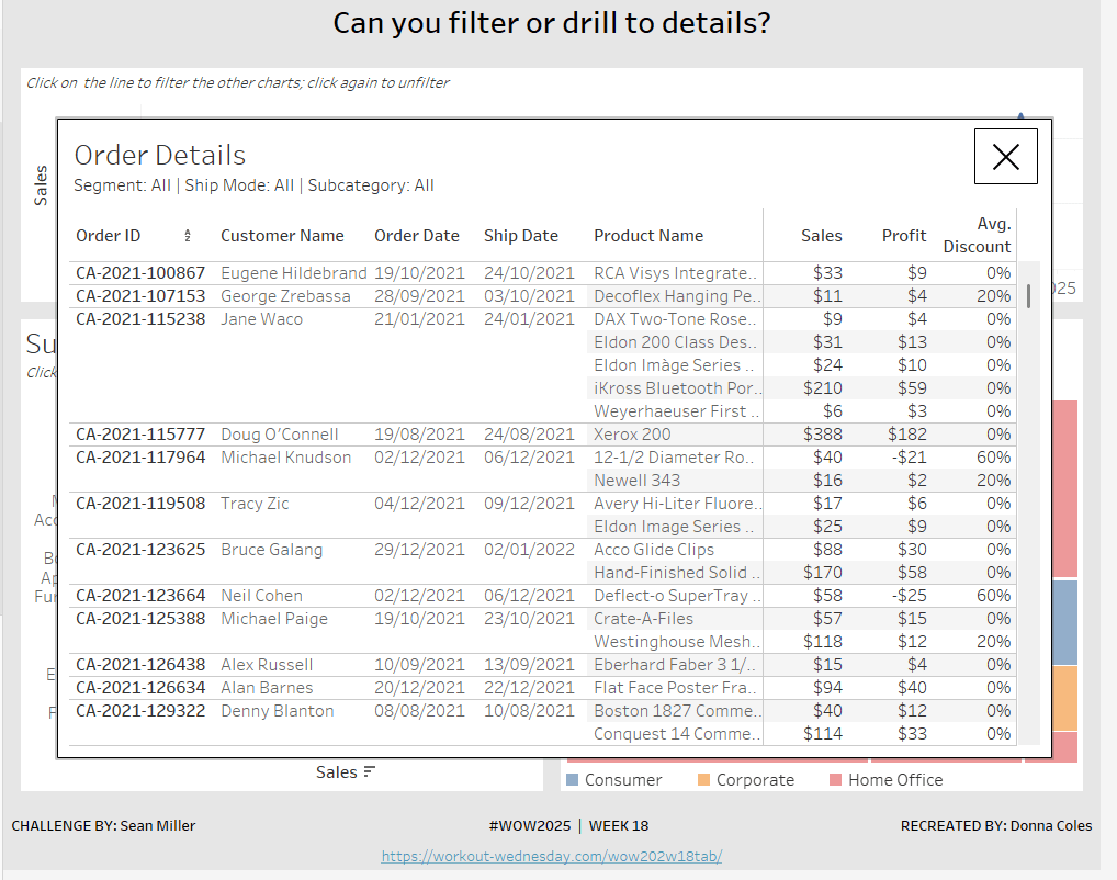
Sean set this week’s challenge to give an alternative solution to displaying a table of details rather than the traditional ‘pancake table’ (his words not mine 🙂 ).
The main crux of the challenge relates to the dashboard actions and interactivity, so I’ll be brief(ish) in describing how to build the charts.
Creating the line chart
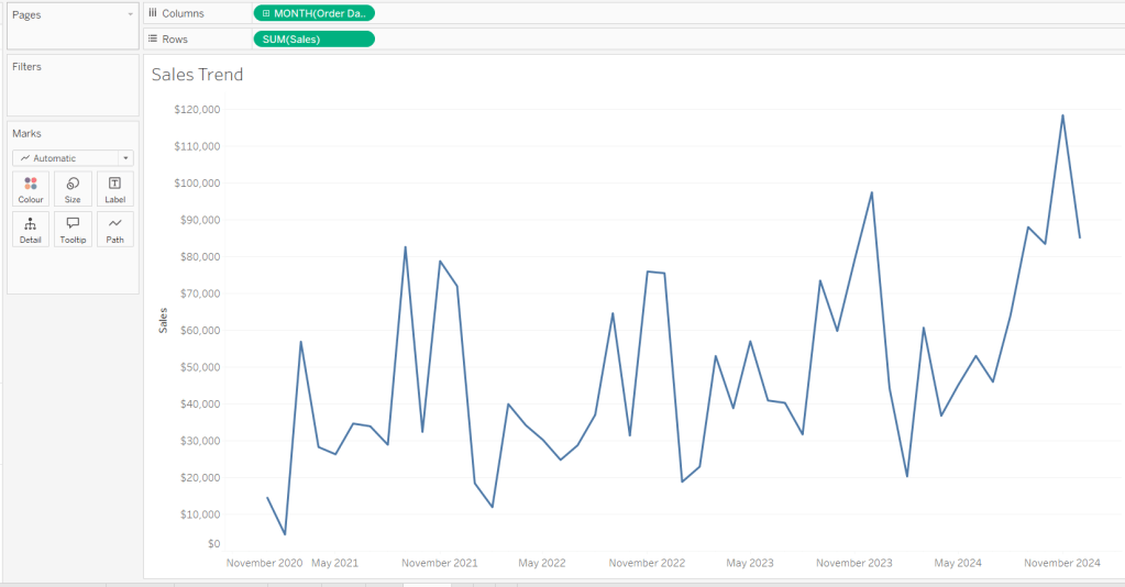
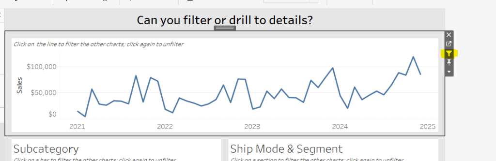
Add Order Date to Columns at the month-yearcontinuous (green pill) level. Add Sales to Rows. Format Sales to $ with 0 dp. Remove the title on the Order Date axis. Update the Tooltip to give an instruction to ‘click the line to filter’. Rename the sheet Sales Trend or similar.
Creating the bar chart
Add Sub-Category to Rows and Sales to Columns. Sort by Sales descending. Hide the Sub-Category row heading label (right click > hide field labels for rows). Update the Tooltip to give an instruction to ‘click the bar to filter’. Rename the sheet Sales by Sub Bar or similar.
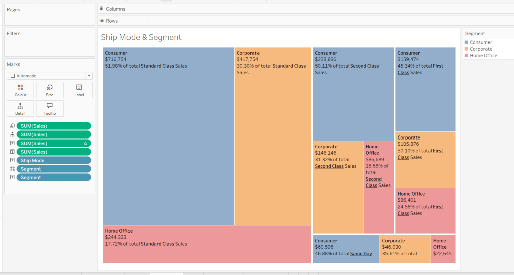
Creating the Tree Map
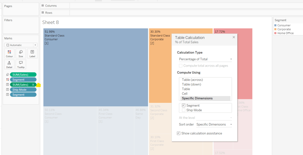
Add Segment and Ship Mode to Detail and Sales to Size. Move Segment to Colour and reduce opacity to about 60%. Move Ship Mode to Label and then add additional Segment and Sales pills to Label. Add a table calculation against the Sales pill on the Label shelf, so it is applying a percentage of Total by Segment only.
Add another instance of the Sales pill to Label and then update the layout of the label.
Move the Segment pills on the marks shelf so they are positioned below the Ship Mode to ensure the tree map is segmented based on the Ship Mode (there should be four blocks divided by the thicker white lines).
Update the Tooltip to give an instruction to ‘click the treemap to filter’. Rename the sheet Treemap or similar.
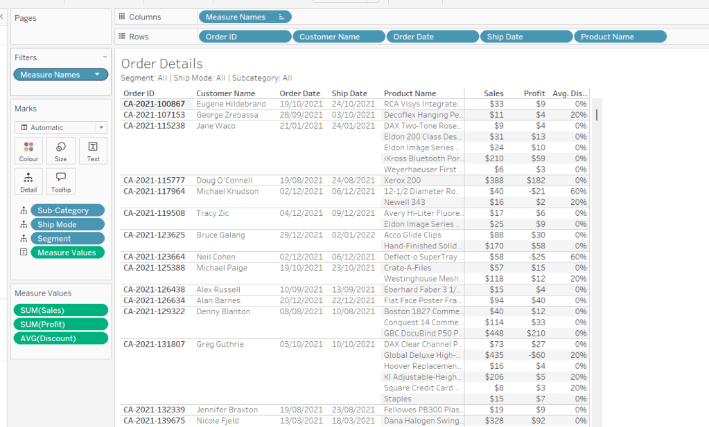
Build the Details table
On a new sheet add Order ID, Customer Name, Order Date (as a discrete exact date – blue pill), Ship Date(as a discrete exact date – blue pill) and Product Name to Rows. Add Sales to Text. Format Profit to $ with 0 dp and drag onto the canvas over the columns of Sales numbers, and release the mouse when the Show Me option appears. Add Discount into the Measure Values section. Change the aggregation to Average and then format to be % to 0 dp. Rearrange the order of the pills in the Measure Values section as required. Add Segment, Sub-Category and Ship Mode to the Detail shelf. Update the title to reference these 3 pills. Hide the Tooltip. Rename the sheet Details or similar.
Building the additional calculations needed
In clicking around Sean’s solution, I was finding what I had initially built wasn’t quite doing what Sean did. If I clicked on the bar chart and then the tree map, the details were only filtered based on the tree map and vice versa. There were ways to solve this, but this then resulted in other issues, in that after closing the details table, the charts remained filtered, but it wasn’t obvious as nothing was highlighted. Basically what I’m trying to say, is the filtering seemed like it should be straightfoward, but wasn’t. I ended up using a combination of parameters and filter actions.
So we’ll start by dealing with the parameters we need.
Create the following parameters
pSelectedDate
date parameter defaulted to 01 Jan 1900
pSelectedSegment
string parameter defaulted to <emptystring>
pSelectedShipMode
string parameter defaulted to <emptystring>
pSelectedSubCat
string parameter defaulted to <emptystring>
Then create the following calculated fields
Filter: Date
[pSelectedDate] = #1900-01-01# OR [pSelectedDate]=DATETRUNC(‘month’,[Order Date])
add this to the Filter shelf on the bar chart, tree map and details sheets and set to True.
Filter: SubCat
[pSelectedSubCat]=” OR [pSelectedSubCat]=[Sub-Category]
add this to the filter shelf on the line chart, tree map and details sheets and set to True
Filter: Segment
[pSelectedSegment]=” OR [pSelectedSegment]=[Segment]
add this to the filter shelf on the line chart, bar chart and details sheets and set to True
Filter: Ship Mode
add this to the filter shelf on the line chart, bar chart and details sheets and set to True
We also need a parameter to capture when we want to show the details table.
pClickMade
boolean parameter defaulted to False.
and to supplement it, we need a calculated field to use to set this parameter to true
Click Made
TRUE
Add Click Made to the Detail shelf of the line chart, bar chart and tree map.
We’ll set these parameters later.
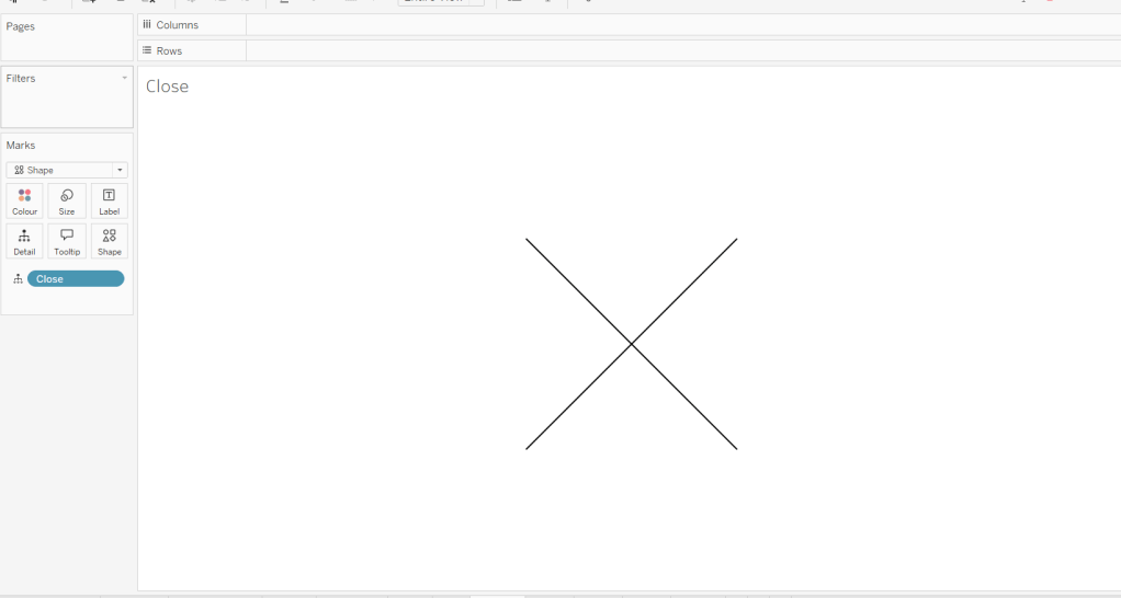
Building the Close icon
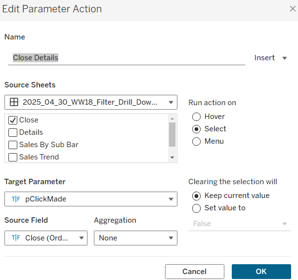
The ‘close’ cross when the details sheet is displayed is another sheet. On clicking on it, we will want to set the pClickMade parameter to False so the Details will no longer show. For this we will need
Close
FALSE
Add this field to the Detail shelf on a new sheet. Change the mark type to shape and change the shape to a X. Set the colour to black and set to fit entire view. Hide the Tooltip. Name the sheet Close or similar.
Building the dashboard and interactivity
Using layout containers, arrange the line chart, bar chart and tree map into a dashboard. Use padding and background colours to get the layout as desired.
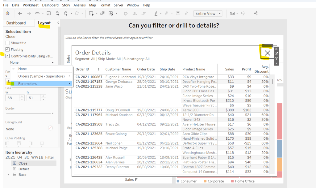
The add the Details sheet as a floating object and position over the top of the other charts. Set the background to white and add a black border. Also float the Close sheet into position too. Hide the title and also add a black border.
Select the Close sheet object, and then from the Layout tab in the left hand nav, check the Control visibility using value checkbox and select the pClickMade parameter
It should disappear if the parameter is still set to false. Repeat the same process with the Detail sheet object.
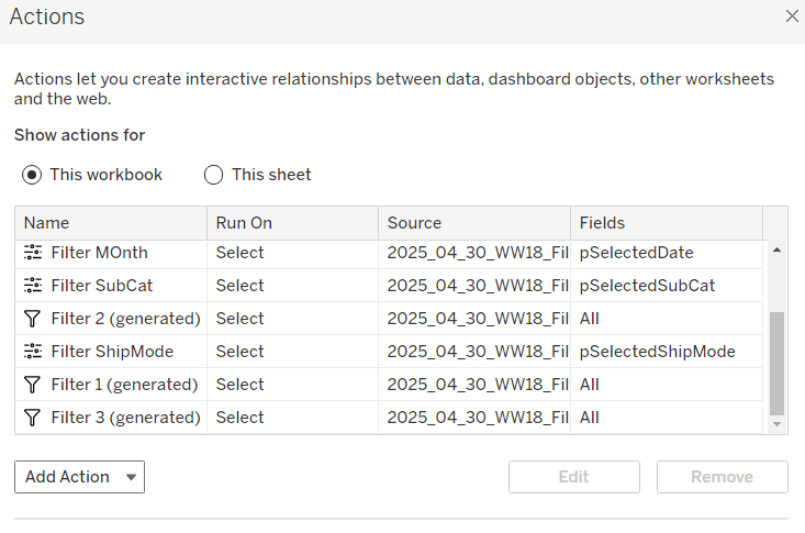
Now create the following dashboard parameter actions
Filter Month
On select of the Sales Trend sheet, target the pSelectedDate parameter, passing in the value from the Order Date. When the selection is cleared, reset to 01 Jan 1900.
Filter SubCat
On select of the Sales by Sub Bar sheet, target the pSelectedSubCat parameter, passing in the value from the Sub-Category. When the selection is cleared, reset to <emptystring>.
Filter Ship Mode
On select of the Treemap sheet, target the pSelectedShipMode parameter, passing in the value from the Ship Mode. When the selection is cleared, reset to <emptystring>.
Filter Segment
On select of the Treemap sheet, target the pSelectedSegment parameter, passing in the value from the Segment. When the selection is cleared, reset to <emptystring>.
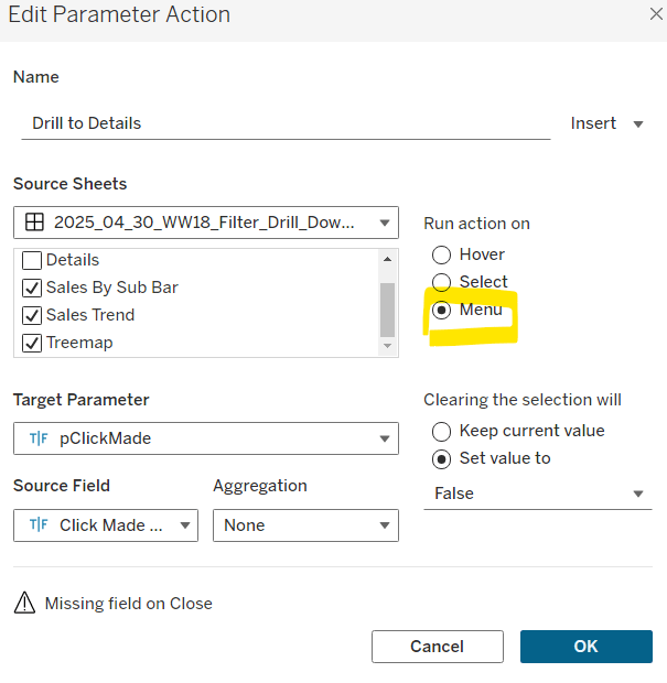
Drill to Details
Via the menu of the Sales by Sub Bar, Sales Trend, and Treemap sheets, target the pClickMade parameter passing in the value from the Click Made field. When the selection is cleared, set the value to False.
Close Details
On select of the Close sheet, target the pClickMade parameter, passing in the value from the Close field. When the selection is cleared, keep the value.
If you start clicking around, you should find that all these actions do provide some level of filtering, but if you for example, click on the bar (to filter the line and treemap), and then click on a section in the tree map and use the ‘Drill down to details’ menu option, the details table has lost the filtering of the bar chart as the bar has become unselected when the treemap chart was clicked.
To resolve this, apply filter actions to the line chart, bar chart and tree map objects (the quickest way to do this is just select the object on the dashboard and click the ‘filter’ icon in the context menu.
If you do this on all 3 sheets and then look at the list of dashboard actions you’ll see 3 ‘Filter x (generated)’ entries.
By applying this mix of filtering through ‘default’ dashboard filter actions in conjunction with parameters, I think you have a more complete and understandable experience. And you will have to explicitly unselect each of the marks you clicked on to remove that filter. I added instructions on the dashboard to aid with this.
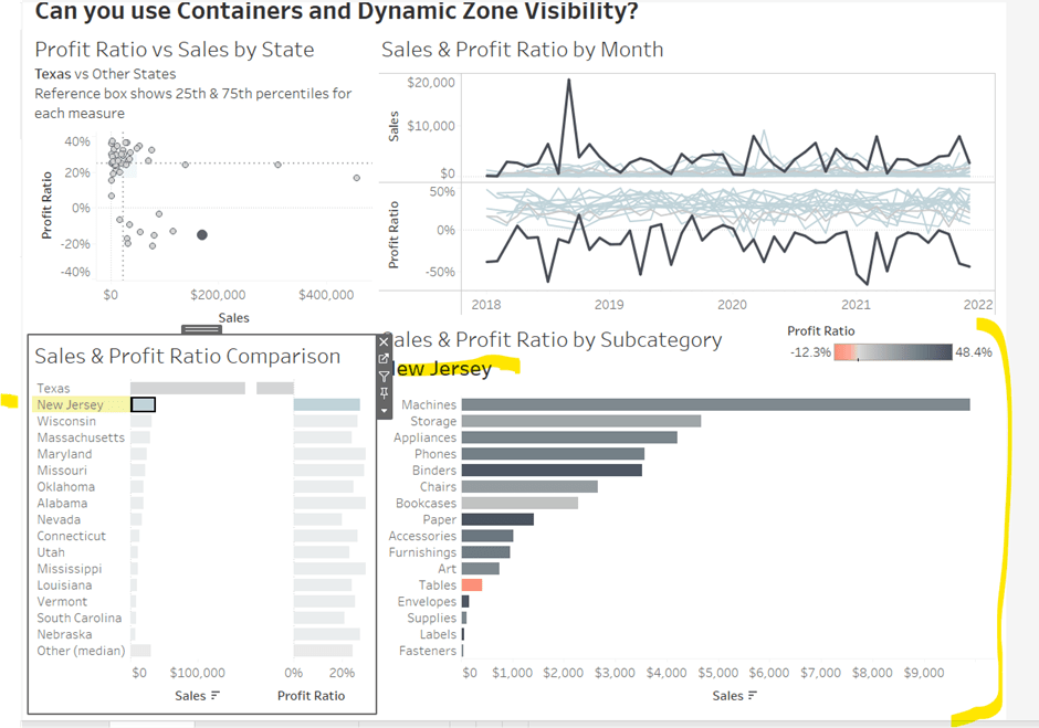
This week’s #WOW2025 challenge was set live as part of TC25. Unfortunately, this year I couldn’t be there in person to meet everyone, which for the last 3 years has been my conference highlight 😦
Anyway, Kyle set the challenge, and conscious of time, provided a starting workbook, so the focus could be on the container and DZV functionality. For those who nailed this, he added some additional interactivity with dashboard actions.
So the first thing is to download the starter workbook from the challenge page.
I’m going to attempt to build this in the order of Kyle’s requirements.
Layout out the dashboard
So the requirement states that no floating objects are allowed. Typically when I build a dashboard for business purposes or where the layout is a little complicated, I always start by adding a floating container sized to the exact dashboard size and positioned 0,0. I then add tiled objects into it. Doing this means I don’t end up with Tiled container objects on my dashboard (or if any get added when legends/filters get automatically added, I just move any items I want to retain and then delete the Tiled container).
However, as Kyle says ‘no floating’, I will build adding to the ‘default’ dashboard which means there will be containers on there I don’t really want.
Now blogging about containers is usually very tricky as it’s hard to explain where things need to go. So I’ll be supplementing this with a lot of screen shots – fingers crossed following along works out ok!
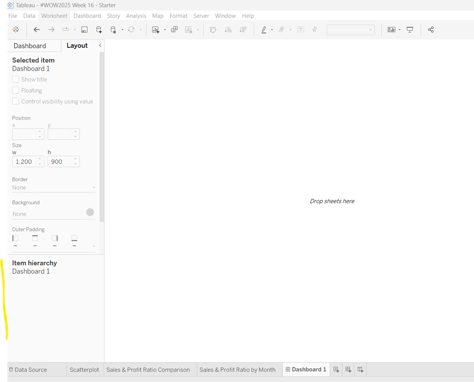
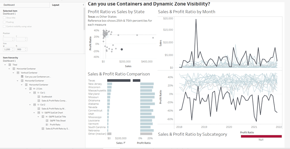
To start, create a dashboard sheet and resize to 1200 x 900 as required. Observe the item hierarchy section of the Layout pane as this is where you’ll see all the containers and objects as we add them to the dashboard.
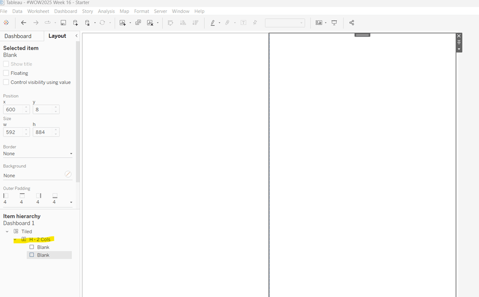
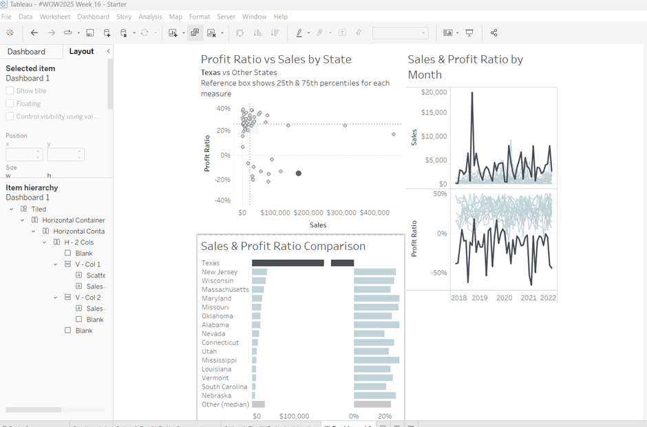
The main structure of the display is split into 2 columns, so start by adding a horizontal layout container to the dashboard. Once added, add 2 blank objects side by side to give the basic layout. Adding blank objects helps when positioning the required objects and is recommended when dealing with layout containers, especially if you’re new to them. They will ultimately be deleted as we go. Rename the horizontal container H – 2 cols or similar (right click on the container in the item hierarchy > rename).
Notice how a Tiled container has now also appeared on the dashboard, even though we only added a horizontal container.
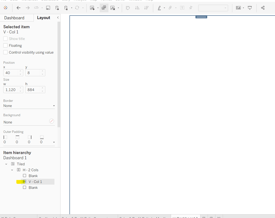
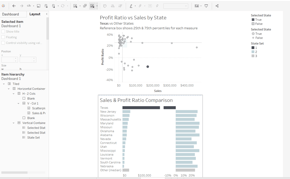
The first column of the dashboard contains 2 charts – the Scatterplot and the Sales & Profit Ratio Comparison sheets – stacked on top of each other. For this, add a vertical layout container between the two blank objects. Rename this V – Col 1.
Add the Scatterplot sheet into the vertical container and then add Sales & Profit Comparison underneath it.
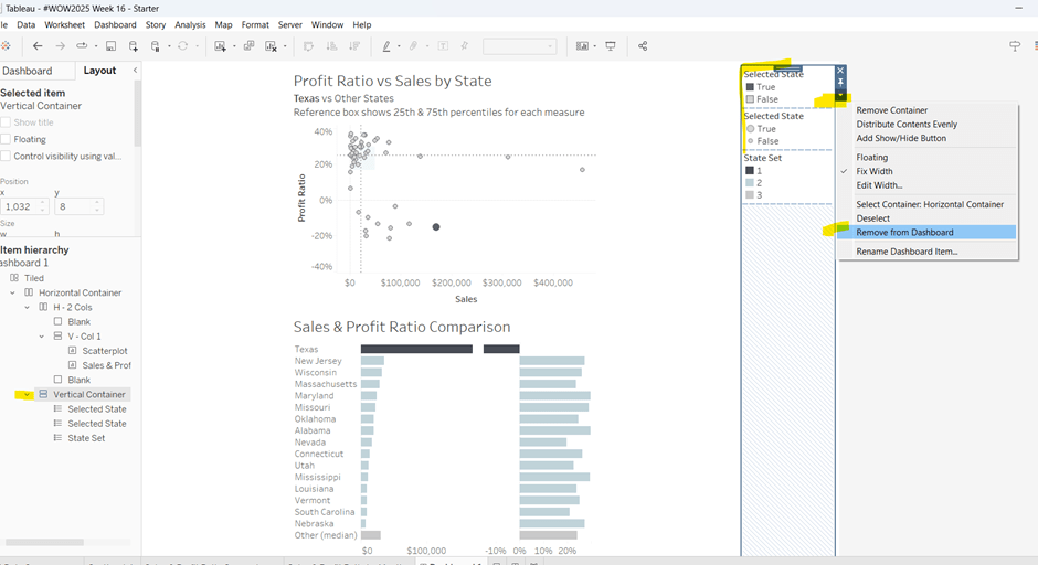
The various legends associated with these 2 sheets, automatically get added into their own vertical container on the right hand side. These aren’t required, so from the item hierarchy, select the Vertical container and then Remove from dashboard.
The right hand column of the display will show the Sales & Profit Ratio by Month sheet and another (hidden) chart that needs to be built.
Add another vertical container between the V – Col 1 container and the right hand blank object. Name this V – Col 2, and add the Sales & Profit Ratio by Month sheet and then another blank object underneath it. Once again remove the right hand vertical container that is automatically added with all the legends/filters.
Now we have the ‘core’ layout, the 2 blank objects we added to the horizontal container, H – 2 Cols, right at the start, can be removed, so hopefully you should have a layout organised as below.
Now add the dashboard title (Dashboard menu > Show Title, and then update the text). This will automatically add a vertical layout container around all the existing contents.
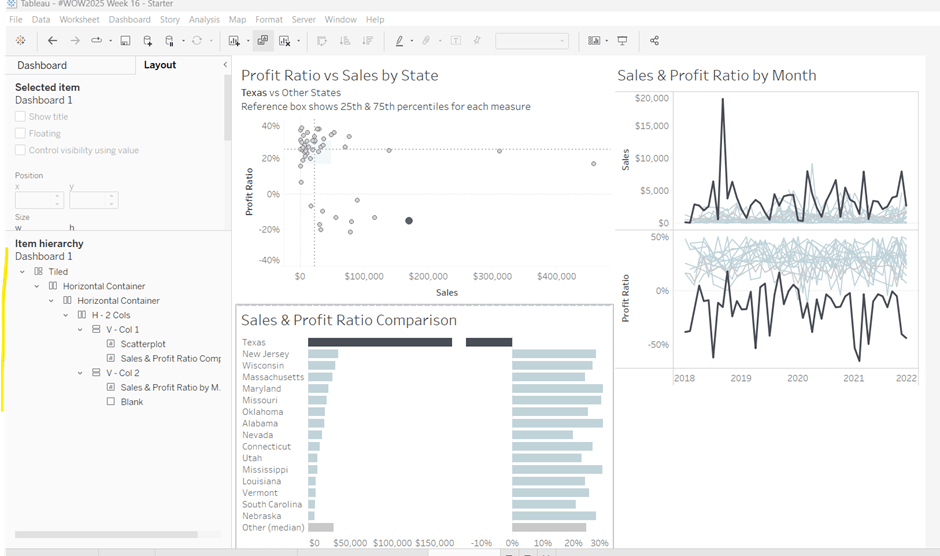
Building the Sales & Profit Ratio by Sub-Category bar chart
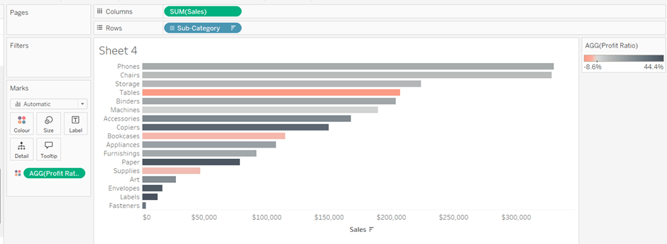
On a new sheet, add Sub-Category to Rows and Sales to Columns. Add Profit Ratio to Colour and adjust the colour legend to use the Red-Black Diverging colour palette. Hide the Sub-Category row label heading (right click > hide field labels for rows).
The bar chart needs to be filtered when a State in the Sales & Profit Ratio Comparison chart is clicked on, or when a Date is selected in the Sales & Profit Ratio by Month chart. However, I noticed when clicking around, that when clicking the Sales & Profit Ratio by Month chart, it filtered the above bar chart by both the State and Date. So based on this, create 3 parameters.
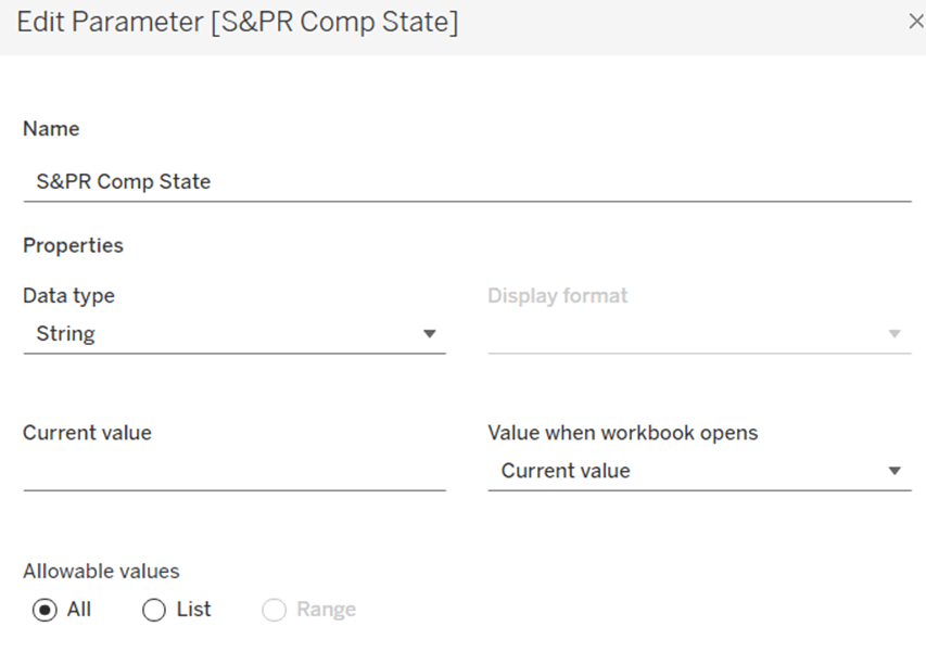
S&PR Comp State
String parameter defaulted to empty string
S&PR by Month State
String parameter defaulted to empty string
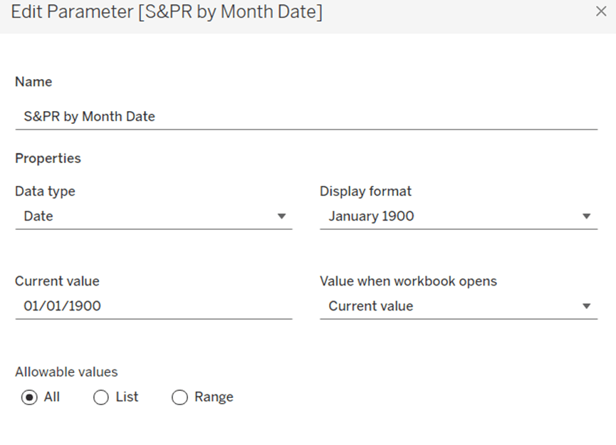
S&PR by Month Date
Date parameter defaulted to 01 Jan 1900 (essentially a null date)
Show these parameters on the sheet.
We want to filter the chart if the S&PR Comp State has a value and the S&PR by Month Date is the ‘null’ date (which means we’ve interacted with the Sales & Profit Ratio Comparison chart), or if the S&PR Monthly State has a value AND the S&PR by Month Date has a value (which means we’ve interacted with the Sales & Profit Ratio by Month chart). So create
Filter – S&PR by SubCat
([State Name] = [S&PR Comp State] AND ([S&PR by Month Date]=#1900-01-01#))
OR
(([State Name] = [S&PR by Month State]) AND (DATETRUNC(‘month’, [Order Date]) = DATETRUNC(‘month’, [S&PR by Month Date])))
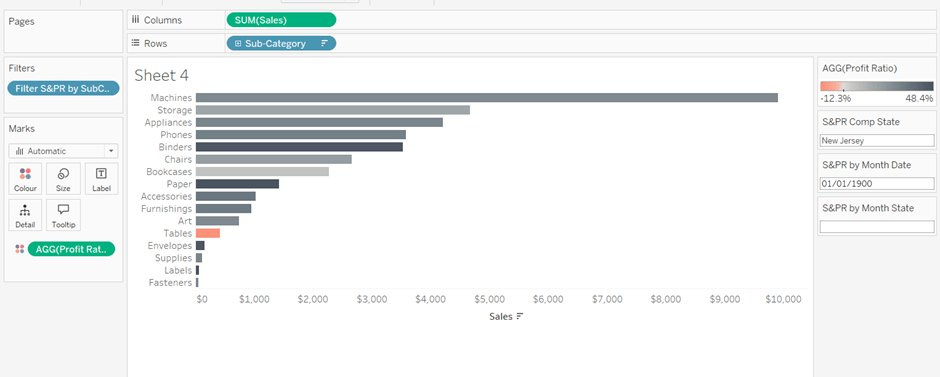
Enter a State name into the S&PR Comp State parameter (eg New Jersey), then add the Filter – S&PR by SubCat field to the Filter shelf and set to True. The chart should change.
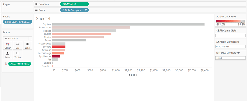
Verify the functionality by adding a state and date into the other parameters eg 01 March 2021 and Texas
Empty the state parameters and set the date back to 01 Jan 1900. Name the sheet Sales & Profit Ratio by SubCat. The chart contents will disappear.
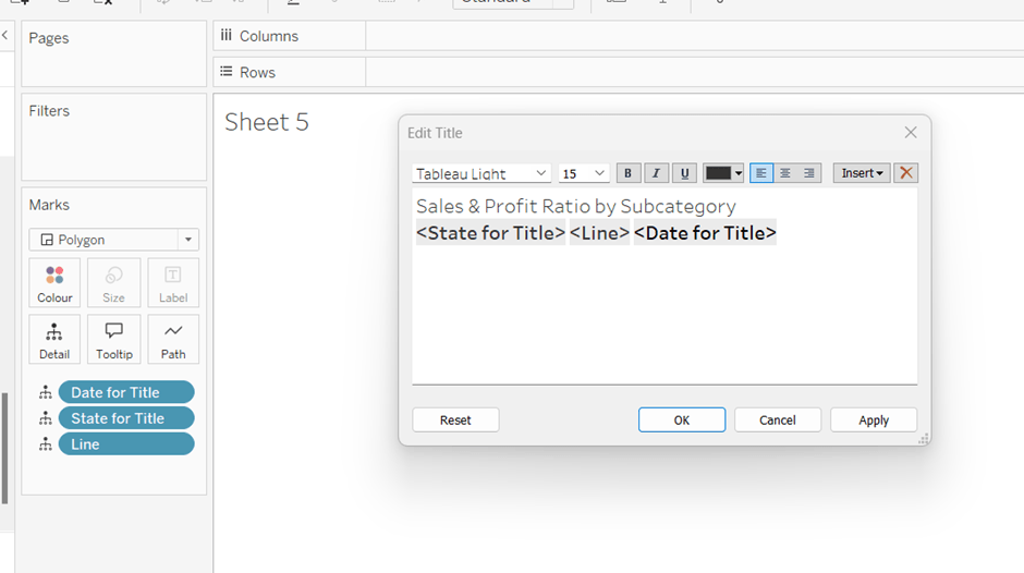
Creating a dynamic title sheet
Originally I hoped to do this without using another sheet and just using the title of the bar chart, but I need the date to show nothing rather than Jan 1900 depending on the user interactivity, so a new sheet is required.
But for it, we need some additional calculated fields.
State for Title
IIF([S&PR by Month State]<>”,[S&PR by Month State], [S&PR Comp State])
We only want to show the name of the state once, and both parameters may have it set.
Date for Title
IF [S&PR by Month Date]=#1900-01-01# THEN ” ELSE DATENAME(‘month’,[S&PR by Month Date]) + ‘ ‘ + STR(YEAR([S&PR by Month Date])) END
Line
IF [S&PR by Month Date]<>#1900-01-01# THEN ‘|’ ELSE ” END
Add all 3 fields to the Detail shelf of a new sheet. Change the mark type to polygon. Update the sheet title as below
Name the sheet S&PR Title Sheet or similar
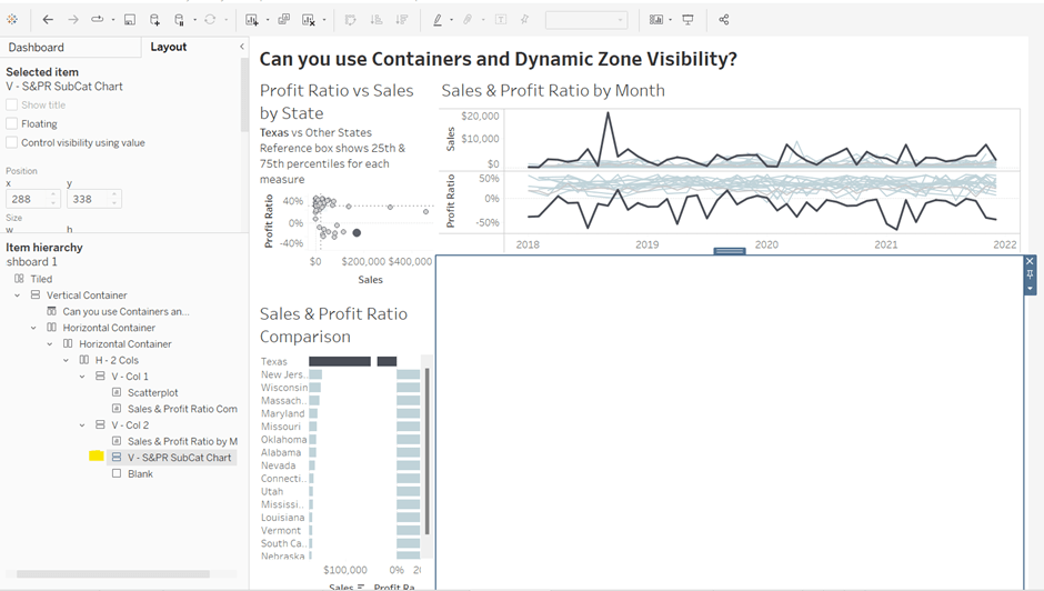
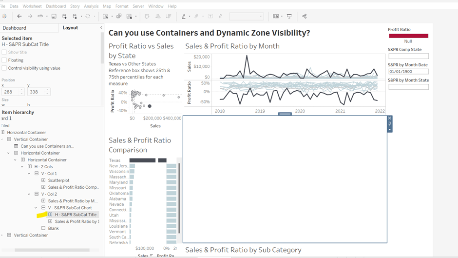
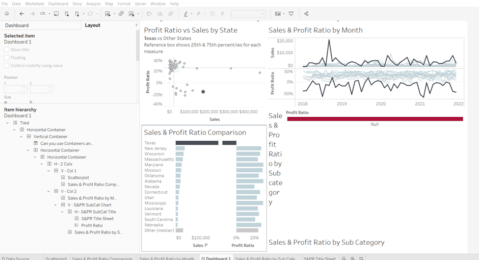
Adding the bar chart, title & legend to the dashboard
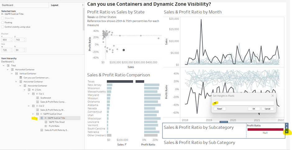
All 3 of these objects – the bar chart, the title sheet and the profit ratio legend need to show or hide based on interactivity. To do this in one step, we can encapsulate the 3 objects within containers within another ‘parent’ container and control the visibility on the ‘parent’ container.
Add a vertical container between the Sales & Profit Ratio by Month chart and the blank object. Name this V – S&PR SubCat Chart
Add the Sales & Profit Ratio by SubCat sheet into this. Then add another horizontal container and place it above the Sales & Profit Ratio by Sub Cat chart (making sure it’s within the V – S&PR Sub Cat Chart container. Rename this H – S&PR Sub Cat Title.
Add the S&PR by Title sheet into this horizontal container, and then click on the Profit Ratiolegend on the right hand side and move this object to sit to the right of the title sheet. Then click on the right hand column containing all the remaining legends, and delete this container from the dashboard. Then remove the blank object that’s sitting beneath the Sales & Profit Ratio by SubCat sheet. You should have something like below…
Adjust the width of the S&PR Title sheet so its wider. Set the sheet to Fit Entire View. Then select the H – S&PR SubCat Title container and edit the height to be 90 px.
Hide the title of the Sales &Profit Ratio by SubCat sheet.
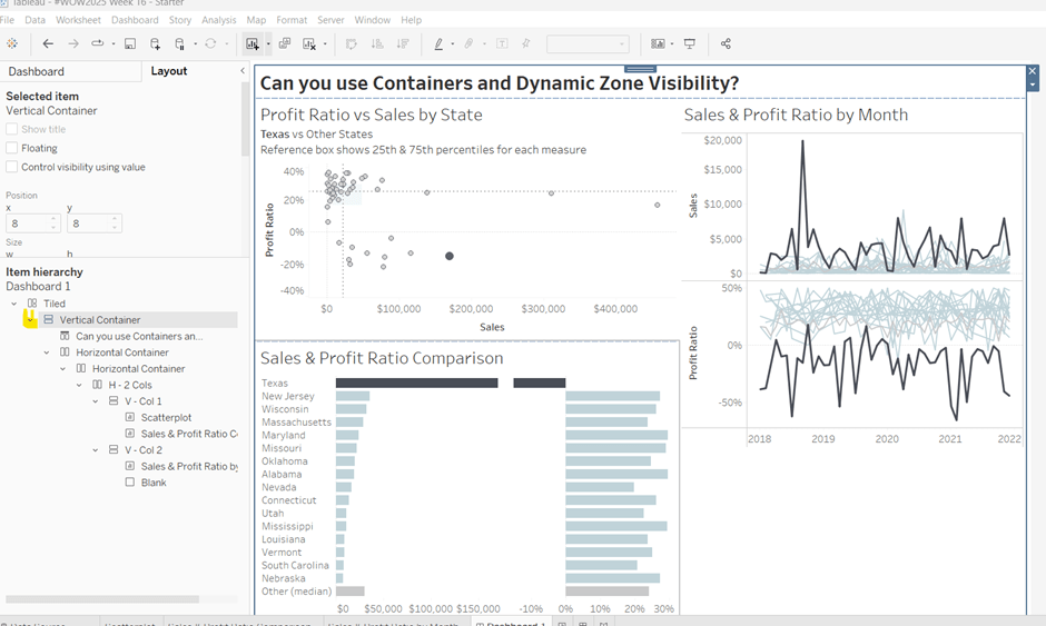
Hiding and showing the Sales & Proft Ratio by Sub Category section
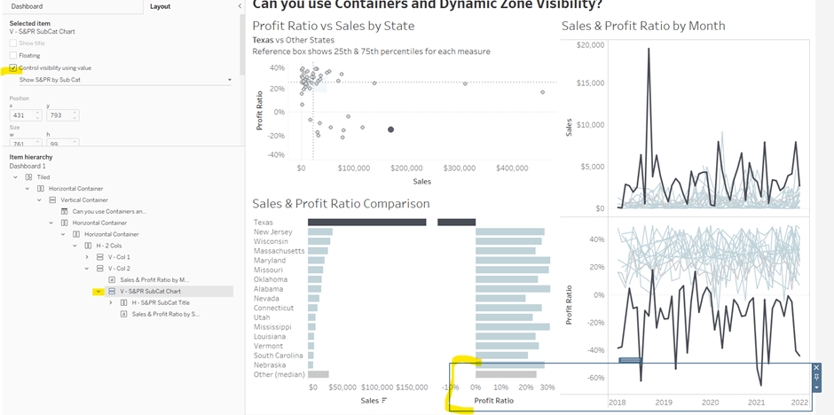
Create a new calculated field
Show S&PR by Sub Cat
[S&PR by Month State]<>” OR [S&PR Comp State]<>”
On the dashboard, select the V – S&PR SubCat Chart container and on the Layout pane, check the Control visibility using value checkbox, and select the Show S&PR by Sub Cat field. Assuming all the parameters are set to their default values, then the whole section should disappear, although the container will still be selected.
To make the section show, we need to set the parameters using dashboardparameter actions.
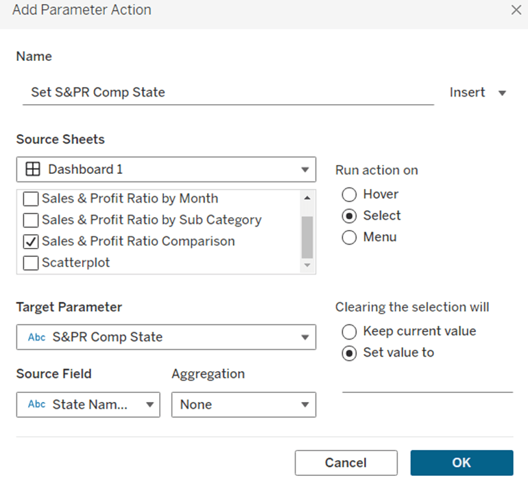
Set S&PR Comp State
On select of the Sales & Profit Ratio Comparison sheet, set the S&PR Comp State parameter passing in the value of the State Name field. When the selection is cleared, set the value back to <emptysrting>
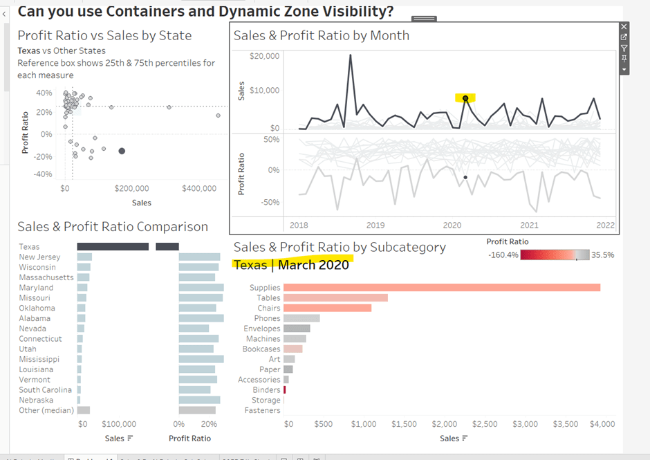
Click on a row in the Sales & Profit Ratio Comparison bar chart, and the Sales & Profit Ratio by SubCat chart should display, filtered to that State, with the selected state name in the title.
Click the state again, and the chart disappears.
Create 2 further dashboard parameter actions
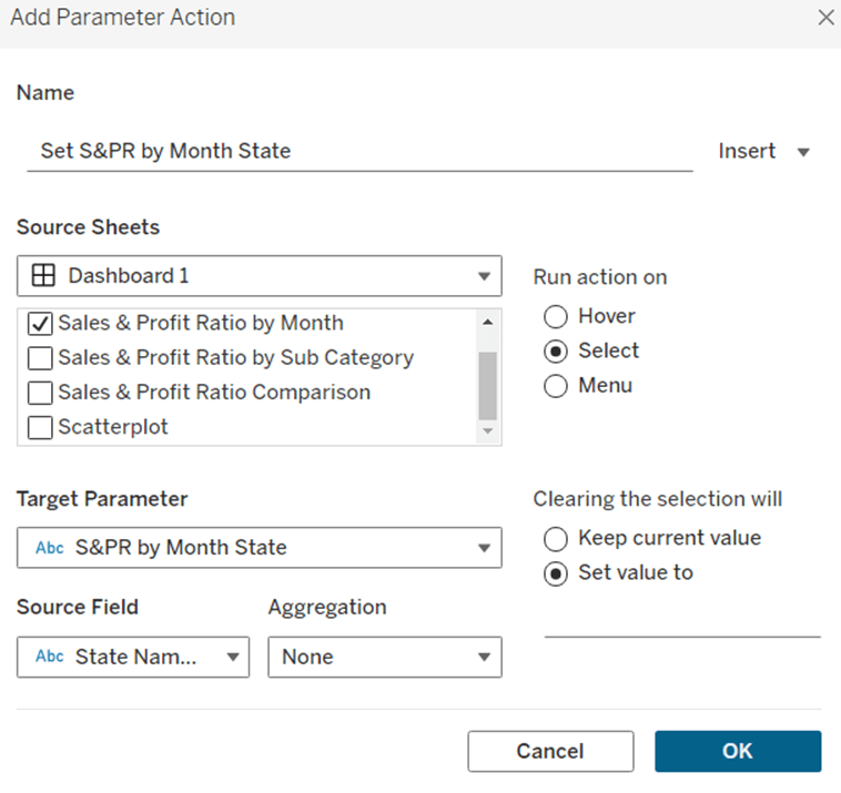
Set S&PR by Month State
On select of the Sales & Profit Ratio by Month sheet, set the S&PR by Month State parameter, passing in the value from the State Name field. When the selection is cleared, set it back to <emptystring>
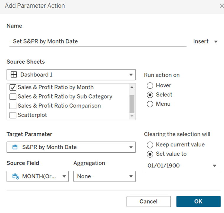
Set S&PR by Month Date
On select of the Sales & Profit Ratio by Month sheet, set the S&PR by Month Date parameter, passing in the value from the Month([Order Date]) field. When the selection is cleared, set it back to 01/01/1900
Now click on a point in the line chart, and the Sales & Profit Ratio by SubCat chart should display filtered to the relevant state and month
Adding the Additional Interactivity
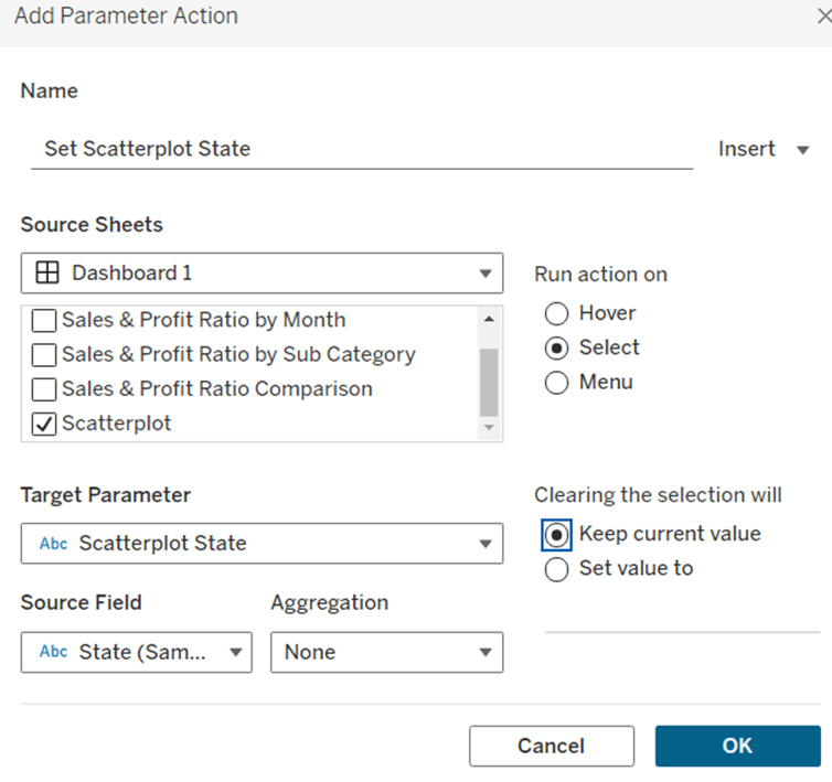
When the Scatterplot is clicked, the State in the existing ScatterplotState parameter should be updated. Create a dashboard parameter action
Set Scatterplot State
On select of the Scatterplot sheet, set the Scatterplot State parameter, passing in the value from the State field. When the selection is cleared, retain the value
If you click around the scatterplot, the Sales & Profit Ratio by Month line chart and Sales & Profit Ratio Comparison charts should update.
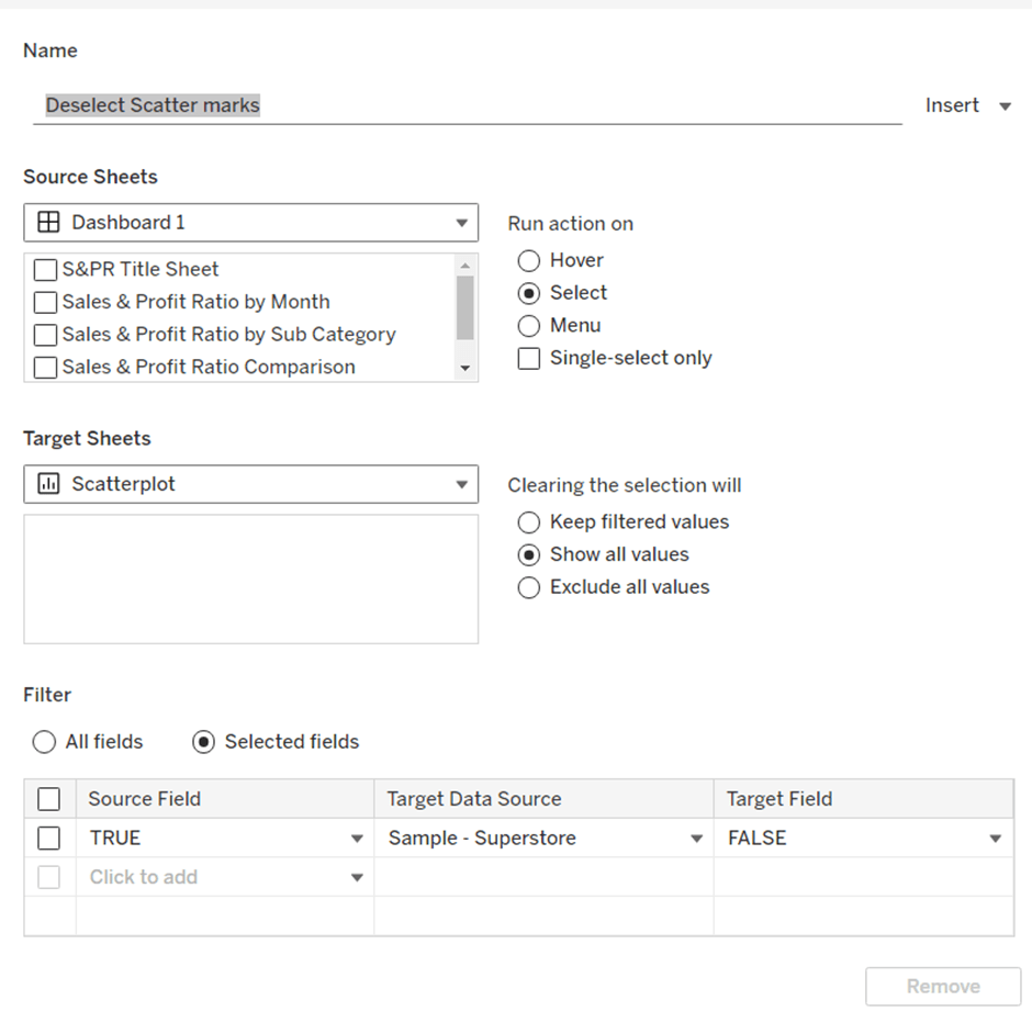
But we don’t want the other marks on the scatter plot to ‘fade’. To solve this, create a dashboard filter action.
Deselect Scatter marks
On select of the Scatterplot sheet on the dashboard, target the Scatterplot sheet directly, setting the fields TRUE = FALSE. On clearing the selection, show all values.
Finally, the last requirement is to highlight the line in the Sales & Profit Ratio by Month chart associated to the State selected in the Sales & Profit Ratio Comparison chart. For this first create a dashboard set action to capture the selected state
Add State to Set
On select of the Sales & Profit Ratio Comparison sheet, target the State Name Set. Check the single-select only checkbox. Running the action should Assign value to set and clearing the selection should remove all values from set
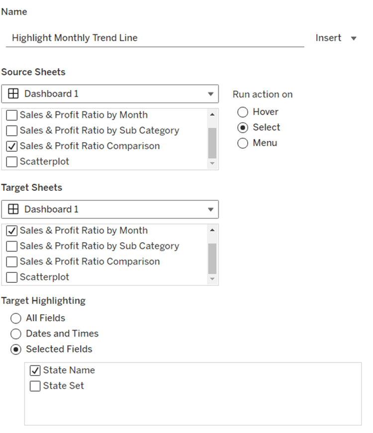
Then add a dashboard highlight action
Highlight Monthly Trend Chart
On select of the Sales & Profit Ration Comparison sheet, target the Sales & Profit Ratio by Month sheet targeting the State Name field only
And hopefully, with all this, you should have a fully interactive dashboard. My published viz is here.
For this week’s challenge, we’re still in community month, so guest poster, Anna Clara Gatti, provided us with this challenge – to represent the spread of population in a pyramid. Anna provided 3 levels to the challenge, so I’m going to write this blog, building on each challenge.
Beginner Challenge
Defining the calculations
To start this we need to create some calculations. Firstly we have measures Male and Female which provide us with the population for each of the associated genders. But we need to ascertain the total population for each Country and Year so we can then calculate a % of total. So we need
These are the core measures we want to plot, but we want to plot this against the Age. But the Age provided is ‘text’ and not a pure number. So to make life easier, we’re going to extract the number out
Age Axis
IF [Age] = ‘Less than 1 year’ THEN 0 ELSEIF [Age]= ‘100+ years’ THEN 100 ELSE INT(LEFT([Age],FIND([Age],’ ‘,1)-1)) END
Move this into the Dimensions section of the data pane (above the line ).
Now we can start to build the required viz.
Building the Pyramid
On a new sheet add Country to the Filter shelf and select Italy. Add Year to the Filter shelf. By default it will add as a green continuous pill. Just click OK to the filter dialog presented.
Then right click on the Year pill in the Filter shelf, and select discrete. Another filter selection dialog will appear. Select 2024.
Add Age Axis to Rows and change to be a continuous (green) pill. Add Male – % of Total Population to Columns, and then add Female – % of Total Population to Columns too.
Change the mark type on the All marks card to bar and reduce the size a bit. Add Measure Names to Colour and adjust accordingly.
Right click on the Male – % of Total Population axis and
Fix the axis from 0 to 0.01
Reverse the scale
Change the axis title
Then edit the Female – % of Total Population axis and fix the scale from 0 to 0.01 and rename the axis title to give you a symmetrical display
Add the following fields to the Tooltip of the All marks card, and then update accordingly :
Male
Female
Female – % of Total Population
Male – % of Total Population
Age
Finally tidy up the display by removing row & column dividers, hiding the Age Axis (right click > uncheck show header) and removing the row gridlines.
Building the KPI
On a new sheet add Total Population to Text. Revert back to the Pyramid sheet, and set the both the filters to also apply to new KPI sheet you’re creating.
Update the text to include the ‘Total Population’ label and adjust size of font and align middle centre. Change the mark type to shape and select a transparent shape (for details on how to do this refer to this blog). Set the sheet to Entire View then apply a grey background. Ensure the Tooltip doesn’t show.
Creating the dashboard
Add the Pyramid chart and the KPI chart to a dashboard. I used a vertical layout container to organise the ‘rows’ , and then placed horizontal containers within, so I had a ‘row’ to show the filter controls, and a ‘row’ to show the KPI and then a ‘row’ to display the chart.
In the ‘row’ showing the KPI I added a text object alongside and used the wingdings character set to display a square symbol which I could then just colour to represent the legend.
For this challenge, I started by simply duplicating the Pyramid built for the Beginner challenge. I then created a new field
Age Bracket
IF [Age Axis] <=14 THEN ‘Young’ ELSEIF [Age Axis] >= 65 THEN ‘Elder’ ELSE ‘Active population’ END
and added this to the Detail shelf of the All marks card. I then added this to be on the Colour shelf as well as Measure Names by updating the symbol to the left of the pill
Adjust the colours on the colour legend accordingly, and then update the Tooltip to include a reference to the Age Bracket.
Building the dashboard
Duplicate the original dashboard you built, then swap the pyramid chart by clicking on the Pyramid chart object in the dashboard. Then on the left hand side in the dashboardpane, click on the 2nd pyramid sheet, and click the ‘swap’ icon to replace the chart..
Remove the title that’s automatically added. Then update the legend text box.
For this challenge, we’re going to need a lot more fields, including the following parameters
Country 1
string parameter, that is a list, and is populated from the Country field when the workbook is opened. Defaulted to Italy.
Country 2
As above but defaulted to Austria
Year 1
integer parameter, that is a list that is populated from the Year field when the workbook is opened. Defaulted to 2024 that is formatted to display as a number with 0 dp and no thousands separator.
Year 2
As above, also defaulted to 2024.
With these parameters, we also need to redefine the the total population values
Total Pop – Year & Country 1
IF [Year] = [Year 1] and [Country] = [Country 1] THEN [Total Population] END
Total Pop – Year & Country 2
IF [Year] = [Year 2] and [Country] = [Country 2] THEN [Total Population] END
and we also need to capture the male and female populations for these parameters
Male Pop – Year & Country 1
[Year] = [Year 1] AND [Country] = [Country 1] THEN [Male] END
Male Pop – Year & Country 2
[Year] = [Year 2] AND [Country] = [Country 2] THEN [Male] END
Female Pop – Year & Country 1
[Year] = [Year 1] AND [Country] = [Country 1] THEN [Female] END
Female Pop – Year & Country 2
[Year] = [Year 2] AND [Country] = [Country 2] THEN [Female] END
and then in turn, we redefine the % of total calculations
Male – % of Total 1
SUM([Male Pop – Year & Country 1])/ SUM([Total Pop – Year & Country 1])
Male – % of Total 2
SUM([Male Pop – Year & Country 2])/ SUM([Total Pop – Year & Country 2])
Female – % of Total 1
SUM([Female Pop – Year & Country 1])/ SUM([Total Pop – Year & Country 1])
Female – % of Total 2
SUM([Female Pop – Year & Country 2])/ SUM([Total Pop – Year & Country 2])
Set all the % of total calcs to be % with 1 dp.
Building the Pyramid
Once again start by duplicating the pyramid chart sheet built for the intermediate solution
Drag Male – % of Total 1 and drop it directly onto the existing Male = % of Total Population pill on the Columns shelf, so it basically replaces it.
Repeat the process by dragging Female – % of Total 1 and dropping it directly over Female – % of Total Population. Adjust the colours if required.
Remove the Country and Year field from the Filter shelf and show the 4 parameters.
Drag Male – % of Total 2 and add to Columns between the two existing pills.
On the Male – % of Total 2 marks card, change the mark type to Line , remove Measure Names from Colour and move Age Bracket to Tooltip. Change the colour to dark grey/black.
Make the % of total male pills dual axis and synchronise the axis.
Repeat the process by adding Female – % of Total 2 to Columns to the right hand side of the existing Female field, adjusting the mark type and colouring and making dual axis.
Right click on the top axis and uncheck show header to hide them. Then right click on the Male – % of Total 1 axis at the bottom, as as before, fix the axis from 0 to 0.01, reverse the axis, and update the title. Repeat for the Female axis (though don’t reverse).
On the All marks card, make sure all the following fields exist on the tooltip, then adjust the tooltip as required, referencing the parameters as well.
Male Pop – Year & Country 1
Male Pop – Year & Country 2
Female Pop – Year & Country 1
Female Pop – Year & Country 2
Male – % of Total 1
Male – % of Total 2
Female – % of Total 1
Female – % of Total 2
Age
Age Bracket
Building the KPI cards
Duplicate the original KPI card
Drag Total Pop – Year & Country 1 directly onto the existing Total Population field. Then add the Country 1 and Year 1 parameters to the Label shelf, and update the text as required. Remove the fields from the Filter shelf.
Repeat this process again but add the appropriate ‘2’ versions of the fields to create the 2nd KPI card.
Building the dashboard
Once again, duplicate the dashboard and swap the pyramid charts. Replace the filter controls (if still present) with a row of parameter controls.
Swap/add the KPI sheets, and add an additional Text object. Update the text to display the ‘legends’ as required.
I chose to add navigation buttons to my dashboard to move between the 3 versions of the challenge.