Sean Miller decided to use the data gathered by the #WorkoutWednesday team in this week’s challenge, to visualise how people use the submission tracker. I try to fill it in immediately after publishing and tweeting my solution, which is usually within the same week as when the challenge is set, unless I’m on holiday. Sometimes I do forget and as I know I’ve completed every challenge, I will fill it in if I see gaps in the tracker. However, I do think there’s something a bit awry with my submission data as there’s a few holes that don’t seem to tally properly with the weeks in the month…. there’s probably a typo or duplication in my data (if any of the team happen to read this, could you have a look.. or let me see my data to see if I can find the problem 😉 )
Anyway onto the challenge – we’re going to build a heat map and 2 bar charts and then add some interactivity between the two – nothing majorly taxing this week, so hopefully this blog won’t take too long to write… I’m prepping for Christmas so have lots to do 🙂
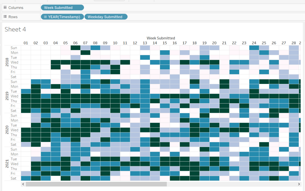
Building the heat map
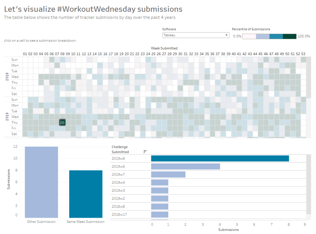
The heat map displays the week number in the year across the top, and year and day of week down the side. We need to create some calculated fields to extract some of these values from the Timestamp date field provided (note if your Timestamp field doesn’t import automatically as a date, then right click > Change Data Type > Date to convert it).
Week Submitted
DATEPART(‘week’,[Timestamp])
Format this to custom format of 00, so you display 01 rather than 1. Drag the pill into the top half of the data pane, so it’s stored as a dimension.
Weekday Submitted
LEFT(DATENAME(‘weekday’,[Timestamp]),3)
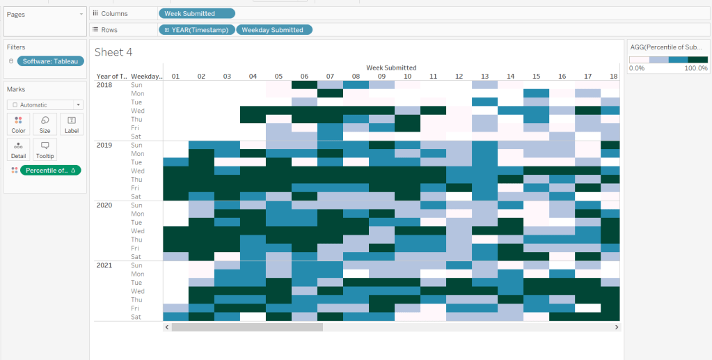
Add Week Submitted to Columns and then YEAR(Timestamp) and Weekday Submitted to Rows.
To get the numbers and display to match Sean, you will need to ensure your week starts on a Sunday. If you’re in the UK like me, you may have it set to Monday. To change this right-click on the data source > Date Properties > Week start = Sunday.
To colour the cells, we need
Submissions
COUNT([2021-12-22-WW51-WOW_Challenge_Tracker.txt])
where the field referenced is automatically generated field that is created (ie what used to be Number of Records).
And then we need to calculate the Rank Percentile, which isn’t as scary as it sounds – there’s a handy function…
Percentile of Submissions
RANK_PERCENTILE([Submissions])
Format to a percentage with 1 dp.
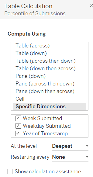
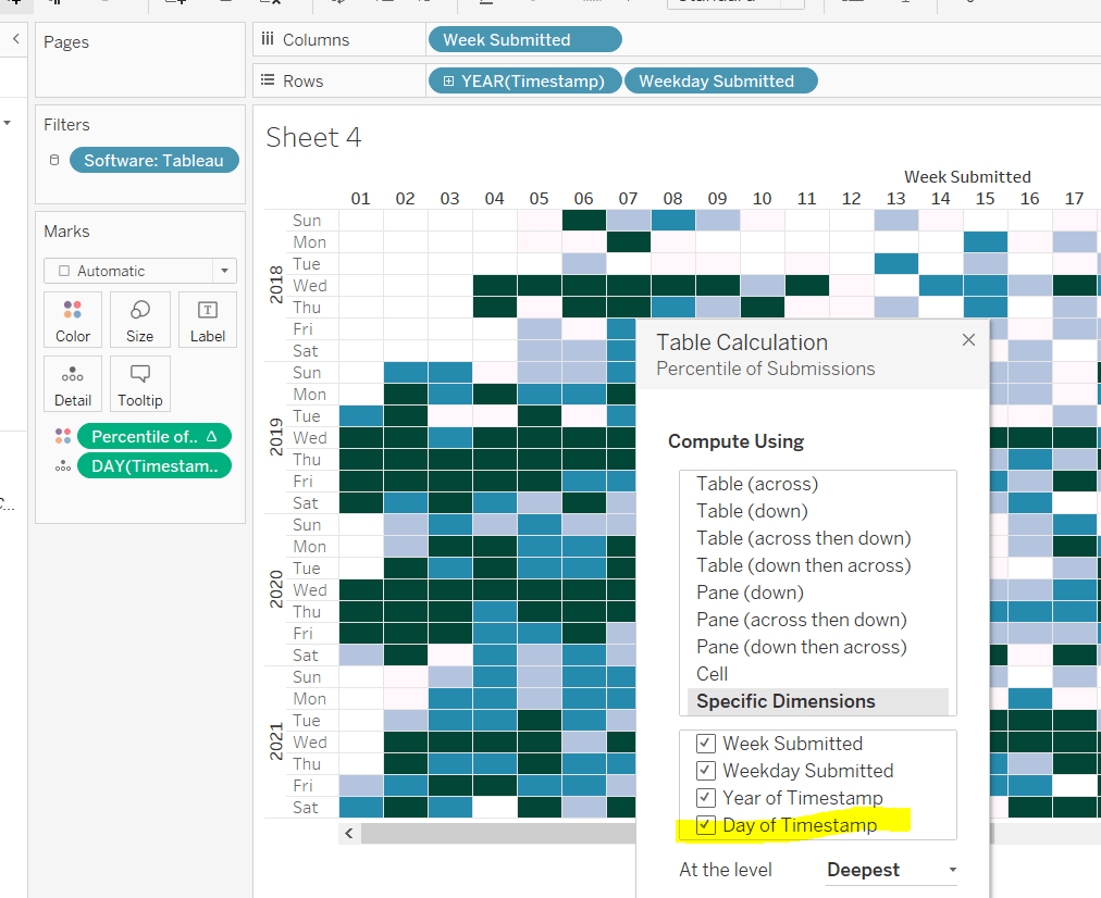
Add this onto the Colour shelf, and adjust the table calculation so it is computing by all the fields.
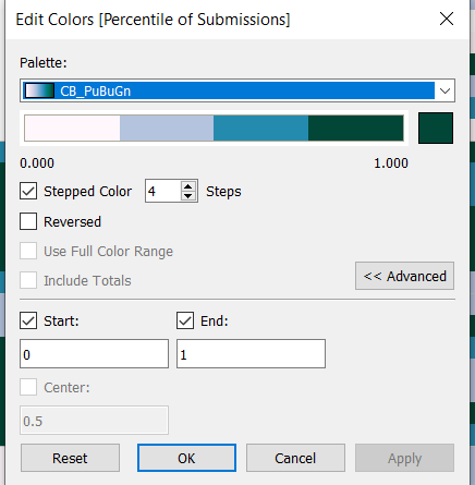
Edit the colour range to use the one specified, and adjust the settings so it only uses 4 colours, and ranges from 0 to 1
Add Software to the Filter shelf and select Tableau
This is the core of the chart complete. Add column and row dividers, rotate the Year headings, narrow the columns and hide the row label headings.
Now we just need to sort the Tooltip. Add Timestamp to the Detail shelf, and change to the Day May 8, 2015 display. This will change the viz, but don’t panic. Re-edit the table calculation so Day of Timestamp is also checked.
Then add Submissions to Tooltip and adjust the tooltip text as required.
Finally, also add Submissions to the Label shelf and edit so the value on shows on selection.
Building the bar charts
Firstly, amend the Software filter on the heatmap so it is set to apply to worksheets > all using this data source.
Next wee need to identify whether the challenge was submitted in the same wee as it was set
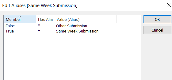
Same Week Submission
([Challenge Week]=[Week Submitted]) AND ([Challenge Year]=YEAR([Timestamp]))
This returns a boolean of true or false, but we can alias these values (right click field > Aliases) to give the displayed options
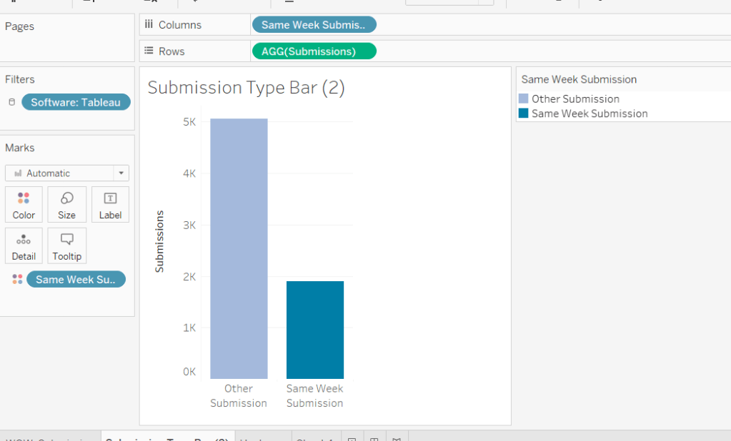
Now add Same Week Submssions to Columns, Submissions to Rows and Same week Submissions to Colour and adjust accordingly. Amend gridelines, borders etc to get the required display format
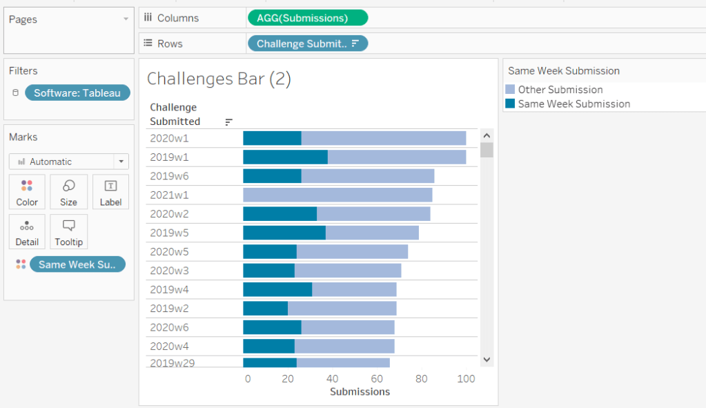
For the next bar chart we need to build the text for
Challenge Submitted
STR([Challenge Year])+’w’+STR([Challenge Week])
Add this to Rows and Submissions to Columns and add Same Week Submission to Colour. Again adjust formatting accordingly.
Adding the Interactivity
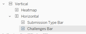
On a dashboard, add a Vertical container. Drop the Heat map into it. Then underneath, still within the Vertical container, add a Horizontal container. Add the two bar charts side by side. You may have other objects, but part of your layout hierarchy should look like
Add a dashboard filter action to the heatmap chart that on select affects the two bar charts, but when unselecting, excludes all values.
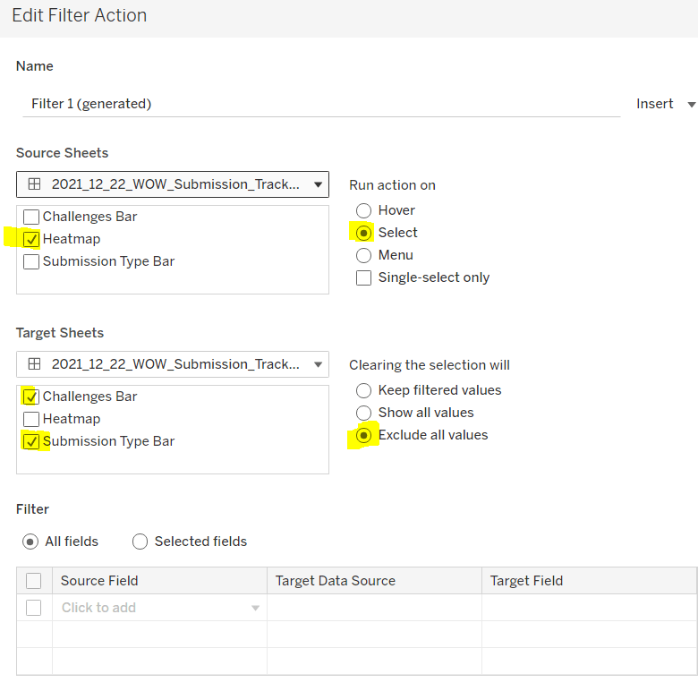
As you click on the heatmap and then unclick, the bar charts should disappear and the heat map should fill out the space.
Finalise the dashboard adding a title, supplementary text, the software filter and colour legend.
My published viz is here.
Happy vizzin’!
Donna


