When do extracts run during the day?

When I was approached by the #WOW crew to provide a guest challenge, I was a little unsure as to what I could do. I primarily work as a Tableau Server admin, so rarely have a need to build dashboards (which is why I like to do the weekly #WOW challenges, to keep up my Desktop skills). Then the next day I was looking at a dashboard I’d built to monitor extracts on our Tableau Servers, and I thought it would be an ideal candidate for a challenge. I also thought it would provide any users of Tableau Server with the opportunity to implement this dashboard in their own organisation if they wished, by sharing with their Server Admins.

As a Tableau Server Admin, you get access to a set of ‘out of the box’ Admin views, one of which is called ‘Background Tasks for Extracts’ which gives you a view of when extracted data sources and workbooks run on the server. However while the provided view is fine if you want to quickly see what’s going on now, it’s not ideal if you want to see how things ran over a longer timeframe – it involves a lot of horizontal scrolling.

Many server admins will have ‘opened’ up access to the Tableau repository, the PostgreSQL database which stores a rich array of data, all about your Tableau Server [see here for further info], and enables admins to extend their analysis beyond the provided Admin views. This site even provides a set of pre-curated data sources to help you get started! These aren’t formally supported by Tableau, but is the brain-child of Matt Coles, a server admin at Tableau (no relation to me though!).

My dashboard doesn’t actually use one of these data sources though. For the challenge, I’ve just created some sample, anonymised data in the required structure. I’ll explain later at the end of the post how to go about converting this to use ‘real’ server data, if you do want to plug it into your own server environment.

Understanding the data

When using Tableau Server, published data sources and workbooks can connect to their underlying data source (eg a SQL Server database, an Excel file etc) directly (ie via a live connection) or via an extract. An extract means that a copy of the data is pulled from the underlying data source and stored on Tableau Server utilising Tableau’s ‘in memory’ engine when the data is then queried. An extract gets added to a schedule which dictates the time when the extract will get refreshed; this may be weekly, daily, hourly etc. Every time the extract runs, a background task is created which provides all the relevant details about that task. The data for this challenge provides 1 row for each extract task that was created between Monday 11th Jan 2021 and Friday 5th Feb 2021. The key fields of note are:

  • Id – uniquely identifies a task
  • Created At – when the task was created
  • Started At – when the task actually started running (if too many tasks are set to run at the same time, they will queue until the server resources are available to execute them).
  • Completed At – when the task finished, will be NULL if task hasn’t finished.
  • Finish Code – indicates the completion status of the job (0=success, 1=failed, 2= cancelled)
  • Progress – supposed to define the % complete, but has been observed to only ever contain 0 or 100, where 100 is complete.
  • Title – the name of the extract
  • Site – the name of the site on the server the extract is associated to

Based on the Finish Code and Progress, I have derived a calculated field to determine the state of the extract (to be honest, I think this is a definition I have inherited from closer analysis of the Background Tasks for Extracts Server Admin view, so am trusting Tableau with the logic).

Extract Status

IF [Finish Code] = 1 AND [Progress] <> 100 THEN ‘In Progress’
ELSEIF [Finish Code] = 0 AND NOT [Progress] = 1 THEN ‘Success’
ELSE ‘Failed’
END

Building the required calculated fields

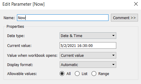
The intention when being used ‘in real life’, is to have visibility of what’s going on ‘Now’ as well as how extracts over the previous few days have performed. As we’re working with static data, we need to hardcode what ‘Now’ is. I’ll use a parameter for this, so that in the event you do choose to plug this into your own server, you only have to replace any reference to the Now parameter with the function NOW().

Now

Datetime parameter defaulted to 05 Feb 2021 16:30

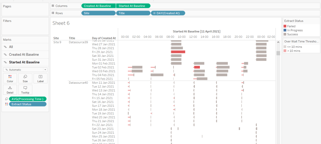
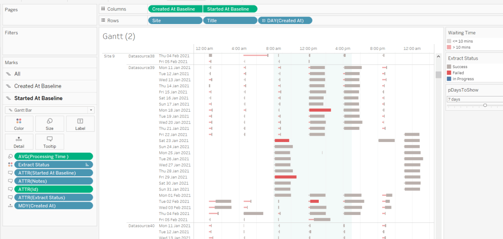
The chart we are going to build is a Gantt chart, with 1 bar related to the waiting time of the task, and 1 bar related to the running time of the task. We only have the dates, so need to work out the duration of both of these. These need to be calculated as a proportion of 1 day, since that is what the timeframe is displayed over.

Waiting Time

(DATEDIFF(‘second’, [Created At], IF ISNULL(Started At]) THEN [Now] ELSE [Started At ] END))/86400

Find the difference in seconds, between the create time and start time (or Now, if the task hasn’t yet started), and divide by 86400 which is the number of seconds in a day.

We repeat this for the processing/running time, but this time comparing the start time with the completed time.

Processing Time

(DATEDIFF(‘second’, [Started At], IF ISNULL([Completed At]) THEN [Now] ELSE [Completed At] END))/86400

As mentioned the timeframe we’re displaying over is a 24 hr period, and we want to display the different days over multiple rows, rather than on a single continuous time axis spanning several days.

To achieve this, we need to ‘baseline’ or ‘normalise’ the Created At field to be the exact same day for all the rows of data, but the time of day needs to reflect the actual Created At time . This technique to shift the dates to the same date, is described in this Tableau Knowledge Base article.

Created At Baseline

DATEADD(‘day’, DATEDIFF(‘day’, [Created At], #2021-01-01#), [Created At])

And again, we’re going to need to do a similar thing with the Started At field

Started At Baseline

DATEADD(‘day’, DATEDIFF(‘day’, [Started At], #2021-01-01#), [Started At])

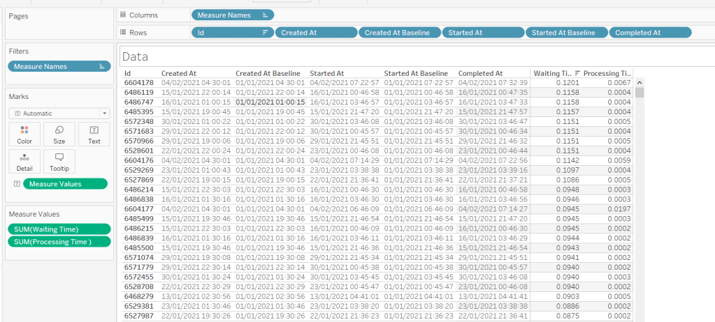
Putting this out into a table, you can see what this data all looks like (note, I’m just choosing a arbitrary date of 01 Jan 2021, so my baseline dates are all on this date:

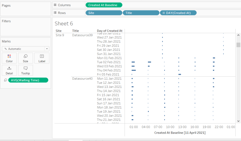
Building the Gantt chart

We’re going to build a dual axis Gantt chart for this.

  • Add Site to Rows
  • Add Title to Rows
  • Add Created At to Rows. Set it to the day/month/year level and set to be discrete (ie blue pill). Format the field to custom format of ddd dd mmm yyyy so it displays like Mon 11 Jan 2021 etc
  • Add Created At Baseline to Columns, set to exact date
  • Add Waiting Time (Avg) to Size and adjust to be thin

This will automatically create a Gantt chart view

Next

  • Add Started At Baseline to Columns, set to exact date, and move so the pill is now placed to the right of the Created At Baseline pill
  • On the Started At Baseline marks card, remove Waiting Time and add Processing Time (Avg) to the Size shelf instead. Adjust so the size is thicker.
  • Set the chart to be dual axis and synchronise the axes

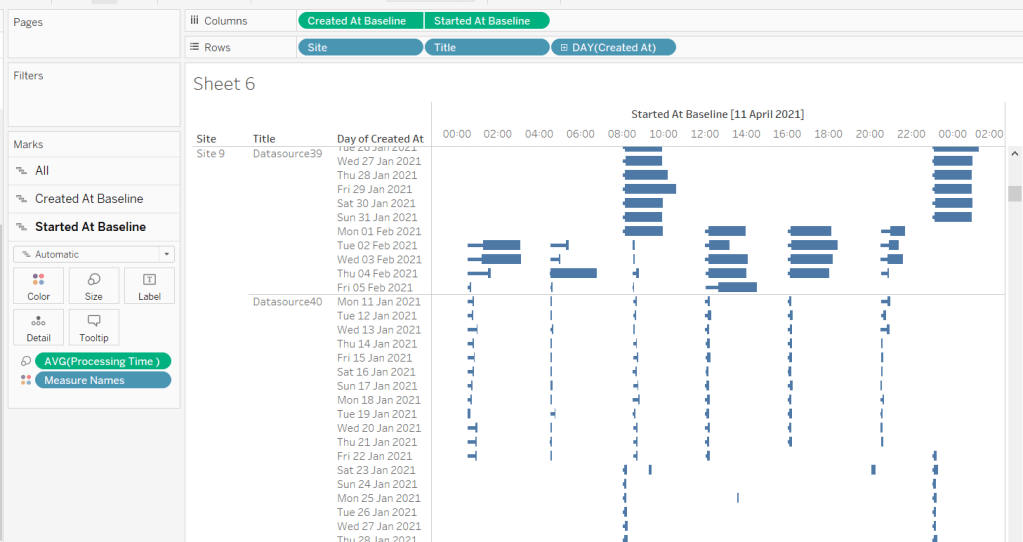
The thicker bars based on the Started At / Processing Time need to be coloured based on Extract Status. Add this field to the Colour shelf of the Started At Baseline marks card and adjust accordingly.

The thinner bars based on the Created At / Waiting Time need to be coloured based on how long the wait time is (over 10 mins or not).

Over Wait Time Threshold

[Waiting Time] > 0.007

0.007 represents 10 mins as a proportion of the number of minutes in a day (10 / (60*24) ).

Add this field to the Colour shelf of the Created At Baseline marks card and adjust accordingly (I chose to set to the same red/grey values used to colour the other bars, but set the transparency of these bars to 50%).

Formatting the Tooltips

The tooltip for the Waiting Time bar displays

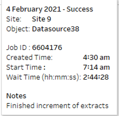
The Created At Baseline and Started At Baseline should both be added to the Tooltip shelf and then custom formatted to h:mm am/pm

The Waiting Time needs to be custom formatted to hh:mm:ss

The tooltip for the Processing Time bar is similar but there are small differences in the display,
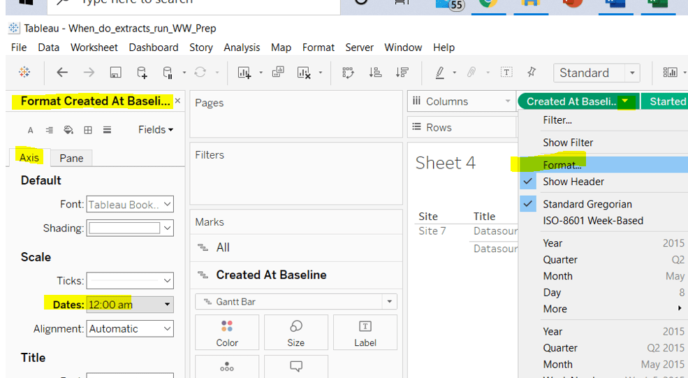
Formatting the axes

The dates on the axes are displayed as time in am/pm format.

To set this, the Created At Baseline / Started At Baseline pills on the Columns shelf need to be formatted to h:mm am/pm

Adding the reference band

The reference band is used to highlight core working hours between 8am and 5pm. Right click on the Created At Baseline axis and Add Reference Line. Create a reference band using constants, and set the fill colour accordingly.

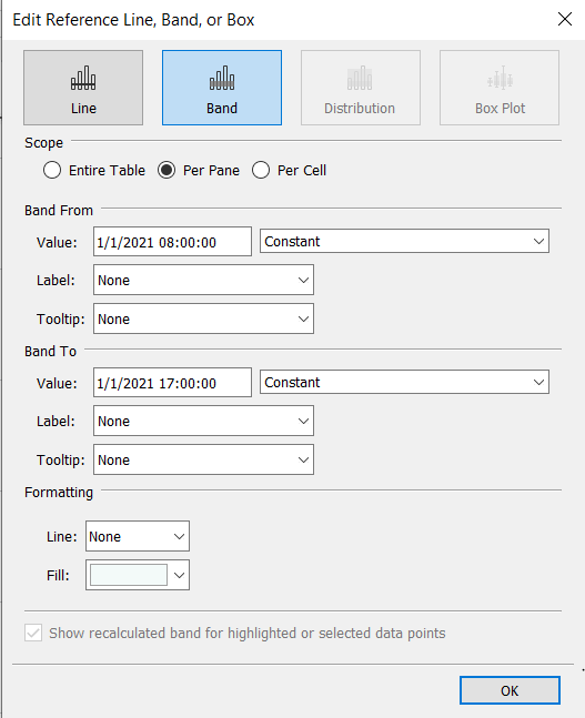
Apply further formatting to suit – adjust sizes of fonts, add vertical gridlines, hide column/axes titles.

Filtering the dates displayed

As discussed above, when using this chart in my day to day job, I’d be looking at the data ‘Now’. As a consequence I can simply use a relative date quick filter on the Started At field, which I default to Last 7 days.

However, as this challenge is based on static data, we need to craft this functionality slightly differently.

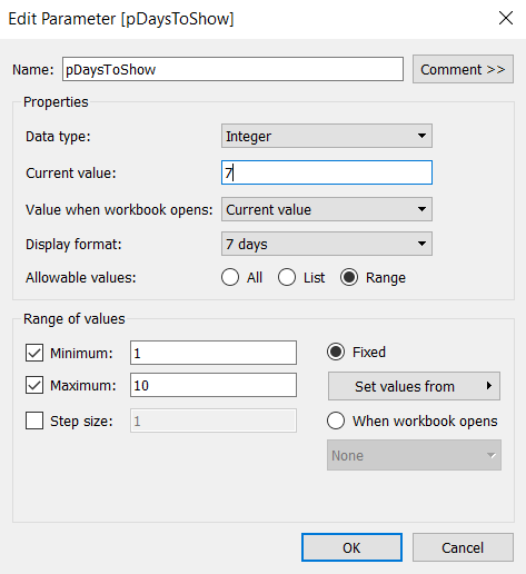
We’re only going to show up to 10 days worth of data, and will drive this using a parameter.

pDaysToShow

An integer parameter, ranging from 1 to 10, defaulted to 7, and formatted to display with a suffix of ‘ days’.

We then need a calculated field to use to filter the dates

Filter : Days to Show

DATETRUNC(‘day’,[Created At]) >= DATEADD(‘day’,([pDaysToShow]-1)*-1,DATETRUNC(‘day’,[Now]))

Add this to the Filter shelf and set to True.

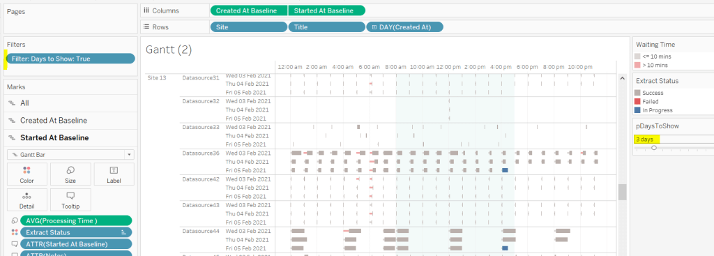
Additionally, the chart can be filtered by Site, so add this to the Filter shelf too.

Building the Key legend

Some people may build this by adding a separate data source, but I’m just going to work with the data we have. This technique is reliant on knowing your data well and whether it will always exist.

On a new sheet, add Site to the Filter shelf and filter to sites 7 and 9.

Create a new field

Key Label

If [Site] = ‘Site 9’ THEN ‘Waiting’ ELSE ‘Processing’ END

and add this to the Columns shelf and sort the field descending, so Waiting is listed before Processing.

Alongside this field, type directly into the Columns shelf MIN(1).

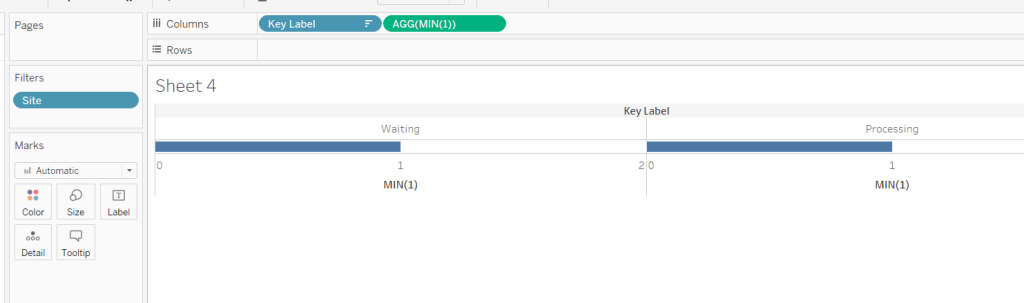
Edit the axes to be fixed to from 0 to 1. Then add the Site field to the Colour shelf and also to the Size shelf and adjust accordingly (you may need to reverse the sizes). I lightened the colour by changing the opacity to 50%.

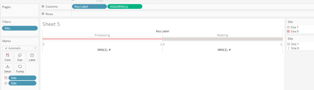
Now hide the axes, remove row & column borders, hide the column title and turn off tooltips.

The information can all now be added to a dashboard.

Using your own data

To use this chart with your own Tableau Server instance, you need to create a data source against the Tableau postgres repository that connects to the _background_tasks (bgt) table with an inner join to the _sites (s) table on bgt.site_id = s.Id. Rename the name field from the _sites table to Site. If you don’t use multiple sites on your Tableau Server instance, then the join is not required. The sole purpose of the join is to get the actual name of the site to use in the display/filter.

You should then be able to repoint the data source from the Excel sheet to the postgres connection. You may find you need to readjust some of the colours though.

When I run this, I’m using a live connection so I can see what is happening at the point of viewing, rather than using a scheduled extract. To help with this, I add a data source filter to limit the days of data to return from the query (eg Created at <=10 days), which significantly reduces the data volume returned with a live connection.

Hopefully you enjoyed this ‘real world’ challenge, and your server admins are singing your praises over the brilliance of this dashboard 🙂

My published version is here.

If you’ve got any feedback or suggestions on improvements to enhance the viz even further, please do let me know.

Happy vizzin’! Stay safe!

Donna

Can you build a comparative line chart with dynamic inputs?

My initial thoughts when I first saw this week’s challenge posted by Ann Jackson, was this would be pretty straightforward. And on the whole it was. I’ve dealt with defining specific date periods for comparison in the past, both with other #WorkoutWednesday challenges and within my job too. But Ann threw a curveball with her dynamic input requirement using what she termed as ‘custom buttons’.

The date listing didn’t phase me – the date forms part of the dataset, so displaying that to look like formatted ‘buttons’ (aka circle marks) was something I knew I could do.

It was the time range options that had me puzzled. The values ‘Last 3 Months’, ‘Last 6 Months’ etc aren’t values associated to any field in the dataset. Typically they would be options of a parameter. However parameters can’t be formatted in the way Ann presented. The closest you can get with a traditional parameter is a radio button list, where you have limited formatting options – certainly nothing as colourful as Ann’s requirement.


When I came to tackle this challenge, as this was the area I was most stumped over, I chose to just use the basic parameter concept to start with to get everything else working as I hoped. When I finally figured out how to do it, I adapted what I’d built to incorporate my change. For the purposes of this write up though, I’m going to start with the ‘dynamic inputs’.

Pick Time Range

From observing the PICK TIME RANGE selector in Ann’s published viz and interacting with it (hovering over the marks, clicking on an option etc) I deduced I needed to build a viz using Circle marks, and a row per option. The problem, as discussed above, was there was no dimension in the dataset that I could use to give me the values I wanted.

I needed to create one, but how?

By using a type of data densification technique, that I’ve used on other challenges, to essentially ‘fake’ a new field. My fellow #WorkoutWednesday pal, Rosario Gauna, recently co-authored a blog all about this technique, which you can read here. As a consequence I’m not going to go into too much detail about this.

I created the following calculated field

Pick Time Range

IF MONTH([Order Date]) = 1 THEN ‘LAST 3 MONTHS’
ELSEIF MONTH([Order Date]) = 2 THEN ‘LAST 6 MONTHS’
ELSEIF MONTH([Order Date]) = 3 THEN ‘LAST 9 MONTHS’
ELSEIF MONTH([Order Date]) = 4 THEN ‘LAST 12 MONTHS’
ELSE ‘YEAR TO DATE’
END

Given the dataset contains records for every month in the 4 years, I could guarantee there would be a record for each of these options.

I used the MIN(0) trick (or MIN(0.0) to create the display I was after, as this ensured I could align the text to the right of the circle mark I needed. This was plotted against my new Pick Time Range field (which has Show Header unchecked). Using MIN(0.0) meant I had a bit more precision when it came to fixing my axis to keep everything starting from the left when I eventually put on the dashboard. My axis were fixed from -0.01 to 0.1.

To make a value look like it is ‘selected’ did still require the use of a parameter….

Time Range

… and another calculated field

Time Selected

[Pick Time Range]=[Time Range]

This was then added to the Colour shelf, with the colours adjusted accordingly

Finally to make the colour change ‘on selection’, I needed a Parameter Action.

First I added the sheet created above to a dashboard. By default, this automatically displays the Time Range parameter and the colour legend to the dashboard. Leave these for now. I then selected Dashboard > Actions > Add Action > Change Parameter, and configured the options as below

When an option is clicked on, the Time Range parameter can be seen to change, and in turn, the selected option changes to pink.

The legend, and the Time Range parameter can now be removed from the display on the dashboard. This bit is done, onto the Date Selector 🙂

Pick End Month

Initially this follows similar principles to the above. I created a calculated field to store the month of the date

Order Date Month

DATE(DATETRUNC(‘month’,[Order Date]))

This sets every date to be the 1st of the associated month. I formatted this date to display as <month> <year>, and added these to a view in the same way I did the above, using MIN(0.0), a circle mark and, right aligning the label. The dates need to be sorted to descending.

Another parameter is needed to store the ‘selected’ end month, which I defaulted to 01 October 2019 (aka October 2019)

Date

But this time, we don’t just need to highlight the date selected, we need to colour the circles based on whether the date is within the ‘current period’, which in turn is based on the Time Range selected above, or within the ‘previous period’.

So if the end month is October 2019 and the Time Range is LAST 6 MONTHS, the Current period is the dates from May 2019 to October 2019, and the previous period is the 6 months prior to that.

To determine all this, I need to determine the start and end of the current period and the start and end of the previous period.

The end of the current period is simple, its the date selected

End Date Current Period

DATETRUNC(‘month’,DATE([Date]))

this is probably a bit overkill, as the default date is 1st October and all the other dates have been truncated to be the 1st of the month, but this just ‘makes sure’ 🙂

To get the end of the previous period, I need to either go back a number of months from the end date, or set to the same date of the previous year, if Year To Date is selected. I need to use a DATEADD function, but I need the number of months as an integer, so I need another calculated field to help with this, which will return me a number based on the value in the Time Range parameter

Time Value

CASE [Time Range]
WHEN ‘LAST 3 MONTHS’ THEN 3
WHEN ‘LAST 6 MONTHS’ THEN 6
WHEN ‘LAST 9 MONTHS’ THEN 9
WHEN ‘LAST 12 MONTHS’ THEN 12
ELSE 0
END

So now I have this, I can work out

End Date Previous Period

IF [Time Value] = 0 THEN
//take off a year
DATEADD(‘year’,-1,[End Date Current Period])
ELSE
//go back a few months
DATEADD(‘month’,([Time Value] * -1), [End Date Current Period])
END

and

Start Date Current Period

IF [Time Value] = 0 THEN
//1st of Jan for current year
DATETRUNC(‘year’,[End Date Current Period])
ELSE
//calc start time period as 1 month on from previous period end
DATEADD(‘month’, 1, [End Date Prior Period])
END

and

Start Date Prior Period

IF [Time Value] = 0 THEN
//1st of Jan for previous year
DATETRUNC(‘year’,[End Date Prior Period])
ELSE
//calc start time period (x months – 1) before end date
DATEADD(‘month’, ([Time Value]*-1)+1, [End Date Prior Period])
END

With all the dates now sorted, we can determine which colour each month should be set to

COLOUR:Date Selector

IF [Order Date Month]>=[Start Date Current Period] AND [Order Date Month]<=[End Date Current Period] THEN ‘blue’ ELSEIF [Order Date Month]>=[Start Date Prior Period] AND [Order Date Month]<=[End Date Prior Period] THEN ‘dark grey’
ELSE ‘grey’
END

which can then be added to the Colour shelf of my date list sheet.

To get the Date parameter to change on selection of the sheet, we need to use parameter actions again, so add the sheet to the dashboard, and create a new Dashboard Action

Now we’re ready to build the line chart…

Period by Period Line Chart

This is essentially a ‘Sales Over Time’ chart, but we can’t just plot a date on the columns shelf as we need to be able to compare the time periods, ie the value of sales associated to the date of the current start period must be plotted in the same ‘column’ as the value of the sales associated to the the date of the previous start period.

This is managed using the table calculation INDEX() to essentially number the dates from 1 to x for each period band (which I could use my COLOUR:Date Selector field to segregate). This concept of plotting dates from a set point is sometimes referred to as a rocket chart, although there are other names for them.

My Order Date Month field has to exist on the Detail shelf, and and the Index is set to compute using that field too


However, as you can see, I have 3 date periods – the dates based on the current period, the dates in the previous, and all other dates (the light grey line). We don’t want these, so another calculated field…

Dates To Include

([Order Date Month]>=[Start Date Prior Period] AND [Order Date Month]<=[End Date Prior Period]) OR ([Order Date Month]>=[Start Date Current Period] AND [Order Date Month]<=[End Date Current Period])

… is added to the Filter shelf and set to True (the dates to display must either be within the Current Period, or within the Previous Period).

Add this to the Dashboard, and you can now start to see how the line chart will change as the dates are changed and the time period are changed.

So final step now…

Title

The title of the dashboard updates based on the inputs selected, so the title is just built on another sheet, placing all the relevant fields on the Text shelf and formatting accordingly

Adding this onto the dashboard too, and you have all the components this challenge requires. You just need to sort any formatting/placement changes.

My version can be viewed here.

Happy vizzin!

Donna

Can you build a sales comparison chart with performance indicators?

This weeks #WorkoutWednesday was set by the lovely Ann Jackson who often delivers some ‘challenging’ problems, all beautifully presented to fool you into thinking it’s going to be straightforward.

This week was no different. Time constraints meant I couldn’t dedicate the usual time to it on Wednesday, and then when I did get to it, I ended up with several false starts, that got very nearly there, but just fell at the final hurdle. I started again this evening, and finally got to something I’m happy with. So let’s get to it.

Ann’s challenge here, was to show a set of monthly KPI BANs (big-ass numbers) with a day by day comparison to the same time month in the previous year. From initial inspection, I figured that several table calculations were going to be needed. She also stated that we could use as many sheets as we liked. I ended up with 4 in my final viz; 1 displaying the BAN numbers, 1 displaying the trend chart, 1 displaying the red/green indicators to the left and 1 for the ‘days until month end’ subtitle.

Let’s start with the BAN numbers.

Ann wanted the chart to be dynamic, to be based as if you were looking at the data based on the month of ‘today’, and for it to change if you looked at it tomorrow. Since the Superstore dataset being used only contains data from 2015-2018, you can’t use the real ‘today’ date.

I authored my viz on 20th Sept 2019. I set up a table calculation to simulate today’s date as follows

Today

//simulate today to be based on the latest year in the dataset
MAKEDATE(
YEAR({FIXED:MAX([Order Date])}),
MONTH(TODAY()),
DAY(TODAY())
)

This produces a date of 20 Sept 2018 (or whatever date in 2018 you happen to be building your viz).

Since the data set is fixed, I could have simply hardcoded the year to 2018, but used the above FIXED LoD expression to be more generic. This LoD finds the year of the maximum date in the whole dataset.

I need to know the month to date sales for the month I’m in (in this case sales from the 1st to 20th September).

Sales MTD This Year

IF [Order Date]>=DATETRUNC(‘month’, [Today]) AND [Order Date]<= [Today] THEN [Sales] ELSE 0 END

This returns the Sales value for the records dated between 01 Sept 2018 and 20 Sept 2018.

This gives me my basic headline BAN number

For the BAN, I also need % change from previous year which requires

Today Last Year

DATEADD(‘year’, -1,[Today])

which returns 20 Sept 2017

Sales MTD Last Year

IF [Order Date]>=DATETRUNC(‘month’, [Today Last Year]) AND [Order Date]<= [Today Last Year] THEN [Sales] ELSE 0 END

which returns the Sales value for the records dated between 01 Sept 2017 and 20 Sept 2017.

% Change

(SUM([Sales MTD This Year]) – SUM([Sales MTD Last Year]))/Sum([Sales MTD Last Year])

This gives me the YoY difference, which I then custom formatted to

▲ 0%;▼ 0%

I could then set up my BAN sheet, by adding the relevant fields to the Text shelf, and formatting accordingly

For the KPI indicator, I required an additional field to set the colouring based on the value of %Change

Colour:BAN

IF [% Change] < 0 THEN ‘red’ ELSE ‘green’ END

I then created a very simple bar chart using an ‘old favourite’ MIN(1) to create an axis for a bar chart. The axis was fixed to end at 1, so the bar fills the space.

So that’s the straightforward bits… now onto the more challenging part – the trend chart.

This chart is showing the following:

  • The daily month to date sales for the current month up to ‘today’. This is the red/green line which is labelled with the total MTD sales as at today. At the point I’m writing this is the sales from 1-20 Sept 2018.
  • The daily month to date sales for the equivalent month last year, from the start of the month up to the same date last year (in my case 1-20 Sept 2017). This is the darker grey area chart up to the dotted ‘today’ reference line.
  • The daily month to date sales for the equivalent month last year from the start of the month up to the end of the month (in my case 1-30 Sept 2017). This is the dark + light grey area chart.

For this I knew I’d need a dual axis chart using an area chart for one and line chart for the other.

Given there’s a reference line on the axis indicating ‘Today’, I know I needed a continuous date axis, and chose to use the idea of baselining all the dates to the same year, and then filtering the viz just to use the dates in the current month (in this case September).

Date Aligned

//reset all data to pretend all against same year
MAKEDATE(YEAR([Today]),MONTH([Order Date]), DAY([Order Date]))

You can see from above regardless of the year of the actual Order Date, the re-aligned date field, has the same date.

Month To Include

MONTH([Order Date]) = MONTH(TODAY())

adding this to the filter shelf and setting to True filters to just the September dates in the data set.

Area Chart

The area chart is last year’s data. So far I’ve only built a Sales MTD – Last Year field, but plotting this as a running total table calc against Date Aligned (exact date), doesn’t give me what I need….

…as it flattens out after 20 Sept, as that is when I defined the Sales value to stop being counted. I need a Sales field that continues to grow until the end of the month. I also need a Sales field that gives me my running total up to 20 Sept, but then stops.

Sales Full Month Last Year

IF DATETRUNC(‘month’,[Order Date]) = DATETRUNC(‘month’,[Today Last Year]) THEN [Sales] ELSE 0 END

Adding this to the view and changing to use a Running Total quick table calc gives me what I need

Running Sum Sales MTD Last Year

IF ATTR([Date Aligned])<=ATTR([Today]) THEN
RUNNING_SUM(SUM([Sales MTD Last Year])) ELSE NULL END

This is basically only storing the running sum if the date is prior or on today.

I then changed these to sit on the same axis, rather than side by side, changed the mark type to Area, turned stack marks to off, and changed the colour to grey. As there are measures that overlap each other they give the appearance of a darker shade (sneaky huh?).

Line Chart

In a similar way described above, I can’t just use a running total of my existing Sales MTD – This Year field for the line, as that will also continue beyond 20 Sept. So I need

Running Sum Sales MTD This Year

IF ATTR([Date Aligned])<=ATTR([Today]) THEN
RUNNING_SUM(SUM([Sales MTD This Year])) ELSE NULL END

Added to the view as a dual axis (synchronised) and mark type of line I get

To change the colour of the line I can’t just use the field I used to make the KPI indicator above, as my data is now at a much more granular level, and it will return me multiple % changes. I just want the overall % change. I had to create more calculated fields for this :

Total Sales MTD

WINDOW_SUM(SUM([Sales MTD This Year]))

Total Sales MTD – Last Year

WINDOW_SUM(SUM([Sales MTD Last Year]))

% Total Change

([Total Sales MTD] -[Total Sales MTD – Last Yr]) / [Total Sales MTD – Last Yr]

Colour : Line

IF [% Total Change ] < 0 THEN ‘red’ ELSE ‘green’ END

You can obviously combine all these steps into one, but I find it easier to read this way. No doubt there’s also another way I could have achieved this.

So that’s the main trend chart complete you think (don’t forget to add Today as a reference line, and label the end of the line chart), until you examine the tooltips and notice things aren’t quite giving you what you need.

Against each mark, Ann wants us to show:

  • Sales MTD for this year, which rises until ‘today’, then remains the same
  • Sales MTD for previous year, which also rises until ‘today’, then remains the same
  • Sales MTD for previous year, which continues until the end of the month

With the measures I’ve got on the view, the MTD Sales up to today for this year and last year stop once I pass ‘today’.

But not to worry, this actually isn’t too hard; I just need to add Sales MTD This Year, Sales MTD Last Year and Sales Full Month Last Year to the tooltip and change all the be Running Total table calcs.

Apply relevant formatting to the tooltip, and gridlines etc, hide headers & axis and this chart is now good to go!

When I then added these 3 views to the dashboard, I placed them side by side in a horizontal container, and changed the padding on each view to 0 on all sides, so they all butted up against each other and the lines for each row appeared joined up.

The subtitle showing the days until the end of month is simply a sheet showing another calculated field Days Until End of Month in the text

DATEDIFF(‘day’,[Today],DATEADD(‘month’,1,DATETRUNC(‘month’,[Today])))

And so that’s about it I think… on reflection I wonder why I was being such a knob with my initial attempts where the table calcs I was using seemed to be getting out of hand…. we just all have those days I guess 🙂

My published viz is here

Happy vizzin!

Donna