It was Lorna’s turn to set the challenge this week, and she opted for a gentle workout to soothe us into the Christmas holidays – I certainly appreciated it as I am super busy and super stressed trying to finalise Christmas presents and preparations!
I built this with 4 calculations in total. Let’s start by just building out a tabular view of the data, so we know what we’re looking for.
Add Customer ID and Order Date set to be a discrete (blue) exact date onto Rows.
To start with, we want to capture, against each customer, the earliest order date
First Purchase Date
{FIXED [Customer ID]: MIN([Order Date])}
Add this into Rows as a discrete exact date.
You can see that for every row associated to the same customer, the First Purchase Date matches the first row.
Now I want to identify the row that represents the first order for each customer
Order is first order
[Order Date] = [First Purchase Date]
Add this onto Rows and we can see the first row against each customer is True, while the rest are False.
I can now use this to identify the date of the 2nd order for each customer – it is the earliest date where the order isn’t the first order
Second Purchase Date
{FIXED [Customer ID]: MIN(IF NOT [Order is first order] THEN [Order Date] END)}
Add this onto Rows as a discrete exact date, and you can see that every row associated to the customer, now has the date that matches the 2nd Order Date listed.
Remove Order Date and Order is first order from the Rows and we have 1 row per customer with the 2 dates we’re interested in.
Add this onto Text, so you can validate the result.
Now we can build out the matrix.
On a new sheet add First Purchase Date to Rows and set to be at the discrete (blue) quarter level. Then add Quarters Since First Purchase to Columns and change to be a discrete Dimension.
This already gives us the shape we’re after. Right click on the Null value in the column heading and select Edit Alias and update the word to Lapsed.
Add Customer ID to the Colour shelf, and the click on the pill and change to be a Measure of Count Distinct. This will change how the viz is displayed. Adjust the colours accordingly.
Finally update the Tooltip to match the required text, and adjust the formatting so there are pale grey thin dotted row and column dividers on the pane only, but not the header.
Add the viz to a dashboard, and you’re done! My published viz is here.
Ann Jackson challenged us this week to build this matrix depicting the average worth of customer cohorts during their lifetime.
This challenge involves a mix of LoDs (Level of Detail calculations) and table calculations.
First up , we need to define our customer cohorts (ie group the customers), which for this challenge is based on identifying the quarter they placed their first order in. This will involve an LoD calculation. For a good introduction to LoDs with some worked examples (including a similar cohort analysis example), check out this Tableau blog post.
The 2nd part of the formula in the { … } returns the earliest Order Date associated to the Customer ID, which is then truncated to the 1st day of the quarter that date falls in ie 23 Feb 2019 is truncated to 01 Jan 2019.
For the ‘quarters since birth’ field, we need to calculate the difference in quarters, between the ACQUISITION QUARTER and the ‘quarter’ associated to the Order Date of each order in the dataset.
Drag this field into the ‘dimensions’ area of the left hand data pane (above the line if you’re using later versions of Tableau).
Lets sense check what this looks like, by adding
ACQUISITION QUARTER to Rows (Discrete, Exact Date)
ORDER DATE to Rows, set to Quarter (quarter year ie May 2015 format which will make a green pill), then set to discrete to change to blue
QUARTERS SINCE BIRTH to Rows
You can see that while the first row against each cohort starts with a different quarter, the QUARTERS SINCE BIRTH always starts at 0 and counts sequentially down the table.
Next we want to count the number of distinct customers in each cohort, and we’ll use another LOD for this.
Once again move this field into the Dimensions section of the data pane.
Add this onto the Rows of the above data table, and you should get every row for the same cohort displaying the same number
Add Sales onto Text to get the value of sales made by the customer in each cohort in each quarter. The ‘customer lifetime value’ we need is defined as the total sales so far / number of customers in the cohort.
Remove the QUARTER(Order Date) field from the table, as we’re not going to need this for the display, and it’ll affect the next steps if it’s left.
To get the cumulative sales, we need a Running Total Quick Table Calculation. Click on the Sales pill on the Text shelf and select Quick Table Calculation -> Running Total. The click again and Compute By -> QUARTERS SINCE BIRTH. Add Sales back into the table, so you can see the quarterly Sales value and how it’s cumulating until it reaches the next cohort.
We’ve now got the building blocks we need for the CLTV value we need to plot
Avg Lifetime Value
RUNNING_SUM(SUM([Sales])) / SUM([CUSTOMERS])
Note – I purposefully haven’t called this field what you might expect, as I’m going to ‘fill in the gaps’ that Ann describes in the requirements, and I’ll use that name then.
Pop this field into the table above, again setting the table calculation to compute by QUARTERS SINCE BIRTH
You can now use the data table above to validate the calculation is what you expected.
Now let’s build the viz out.
On a new sheet
QUARTERS SINCE BIRTH to Columns
ACQUISITION QUARTER (exact date, discrete blue pill) to Rows
Avg Lifetime Value to Text, setting the table calculation to Compute ByQUARTERS SINCE BIRTH
From this basic text table, you can see the ‘blank’ fields, Ann mentioned. In the data table view, it’s not so obvious. The blank is there because there are no sales in those quarters for those cohorts. To fix we need another table calculation
CUSTOMER LIFETIME VALUE (CLTV)
IF ISNULL([Avg Lifetime Value]) AND NOT ISNULL(LOOKUP([Avg Lifetime Value],-1)) AND NOT ISNULL(LOOKUP([Avg Lifetime Value],1))
THEN LOOKUP([Avg Lifetime Value],-1) ELSE [Avg Lifetime Value] END
This says, if the Avg Lifetime Value field is NULL but neither the previous or the subsequent values are NULL, then use the Avg Lifetime Value value from the previous column (LOOKUP).
Replace the Avg Lifetime Value with the CUSTOMER LIFETIME VALUE (CLTV) field (setting the Compute By again), and the empty spaces have disappeared.
If you hover over the cells in the lower right hand side of the view, you’ll see tooltips showing, indicating that a mark has been drawn on the viz with Null data. To fix this, add CUSTOMER LIFETIME VALUE (CLTV) to the Filter shelf and specify non-null values only to show via the Special tab.
Now if you hover over that area you don’t get any tooltips displaying, as there aren’t any marks there.
Now it’s just a case of formatting the viz a bit more
Add CUSTOMERS to Rows
Add CUSTOMER LIFETIME VALUE (CLTV) to the Colour shelf by holding down the Ctrl key then clicking on the field that’s already on the Text shelf, and dragging via the mouse onto the Colour shelf. Using Ctrl in this way has the effect of copying the field including the table calculation settings, so you don’t need to apply them again. This will change the colour of the Text.
Then change the mark type to Square, which will then fill out the background based on the colour.
Then edit the colour legend to the relevant palette (which you may need to install via Ann’s link).
Set the border of the mark via the Colour shelf to white
Remove the row & column dividers
Set the row Axis Ruler to a dark black/grey line
Format the 1st 2 columns so the font is the same and centred. Widen the columns if required.
Update the tooltip
And then you should be ready to add the viz to your dashboard. My published version is here.
This blog is a bit more detailed that my recent posts, but I’m also conscious I’ve skipped over some bits that if you’re brand new to Tableau, you may not be sure how to do. Feel free to add comments if you need help!
The number of unique customers making a purchase is a simple calculation
Customer Count
COUNTD([customer_id])
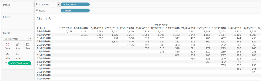
and plotting these fields alongside order_week, we start to see where we’re heading
But we need to index each order_week in relation to the cohort: For the cohort dated 01 Jan, week 1 is order_week 08 Jan, but for the cohort dated 08 Jan, week 1 is order_week 15 Jan.
Week Index
DATEDIFF(‘week’,[Cohort],[order_week])
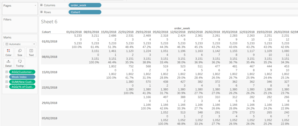
We also need against each row, the number of customers in the cohort, which is equivalent to the number of customers in week 0.
New Customers
{FIXED [Cohort]: COUNTD(IF ([order_week])=([Cohort]) THEN [customer_id] END)}
This is saying for each cohort, count the number of distinct customers when the order week is the same as the cohort week.
Now we’ve got that, we can work out the % of returning customers each week:
% of Customers
[Customer Count]/SUM([New Customers])
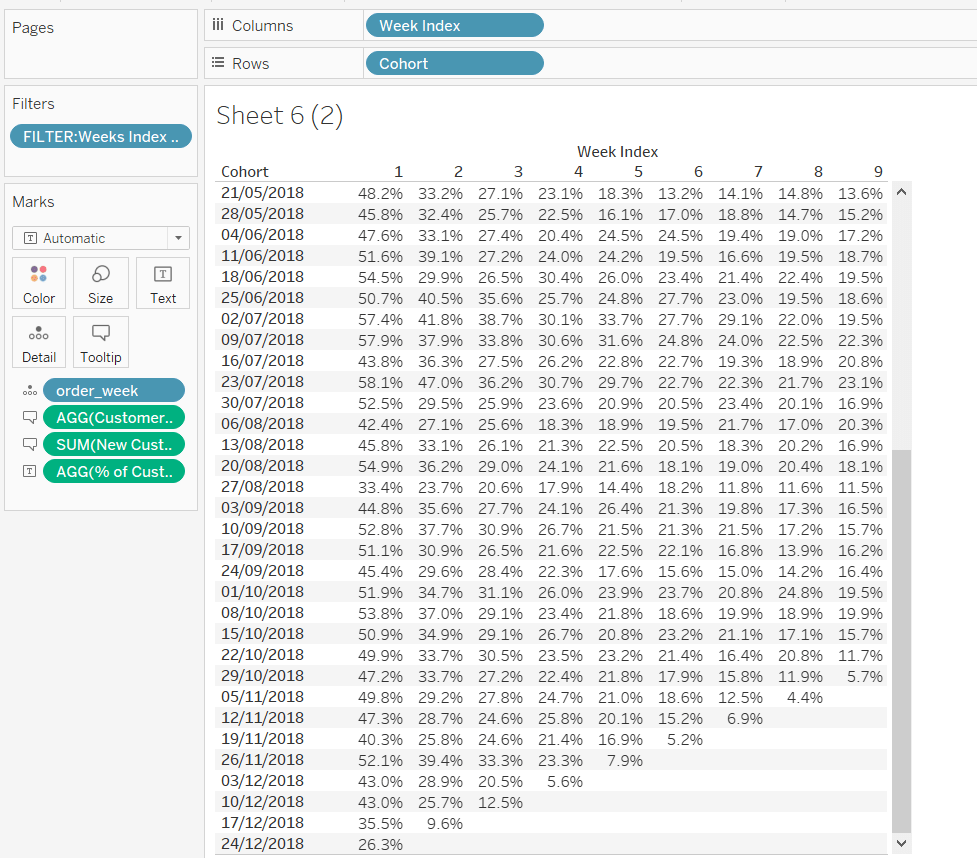
Putting all these onto a data table, we can see all the figures are making sense
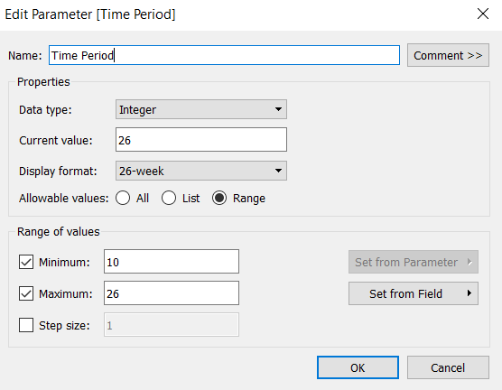
But we want to limit the number of weeks, based on the user input, so we need a parameter, that is limited to range between 10 and 26 weeks. Note how the display format of the parameter is set.
Time Period
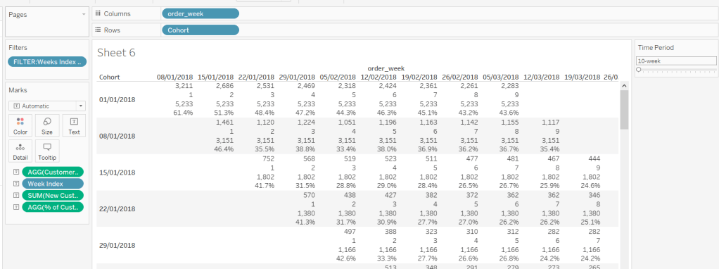
To restrict the weeks, we need another calculated field we can filter by
FILTER:Weeks Index to Display
[Week Index]> 0 AND [Week Index]<[Time Period]
This is added to the filter shelf and set to True.
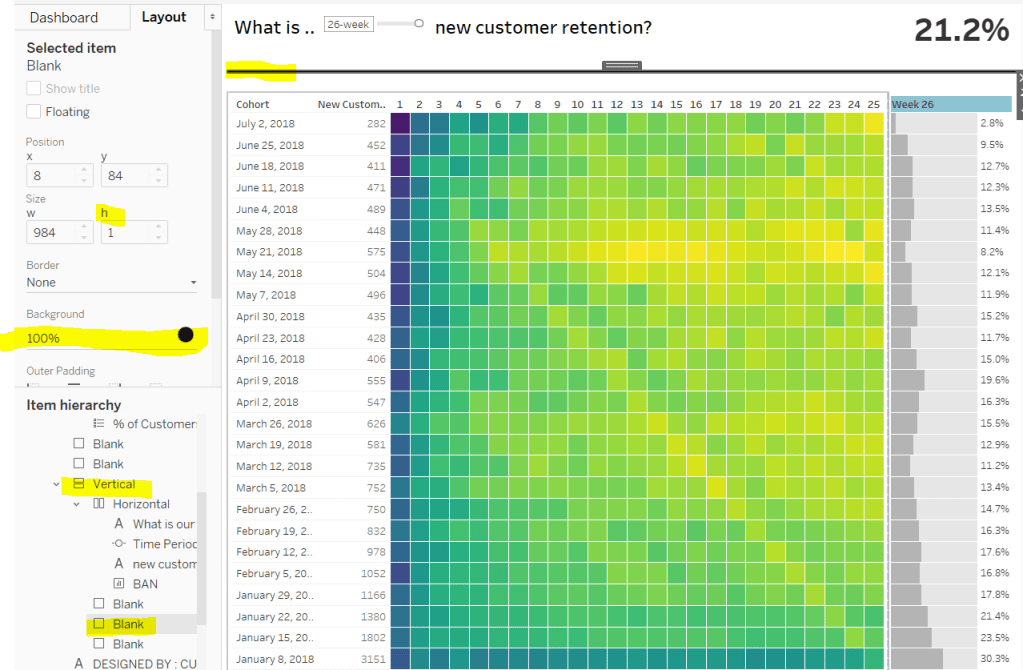
This verifies we’ve got the numbers we need to start to build the heat map.
Heat Map
Duplicating the data sheet I’ve created above, then moving the pills around, we get the ‘bones’ of what we’re after, but you can see towards the bottom of the cohort list, that we have missing entries, where there aren’t enough weeks for the cohort week being considered. We don’t want these rows to display, so need to filter the data someway.
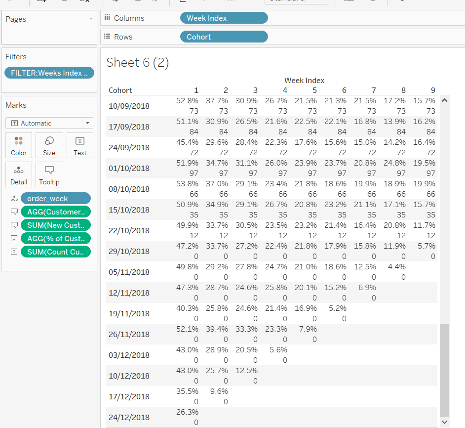
I approached this by determining the number of unique customers at week x, then seeing whether there was any or not :
Count Customers at Time PeriodParam
{FIXED [Cohort]: COUNTD(IF ([Week Index])=([Time Period]) THEN [customer_id] END)}
FILTER: Complete Cohorts
[Count Customers at Time Period Param]>0
Adding the Count Customers at Time Period Param field to the view, you can see that for a 10 week time period, from the cohort dated 29th October onwards, the count of customers is 0, so these are the rows I’m going to filter out, by adding the Filter : Complete Cohorts field to the filter shelf, and setting to True.
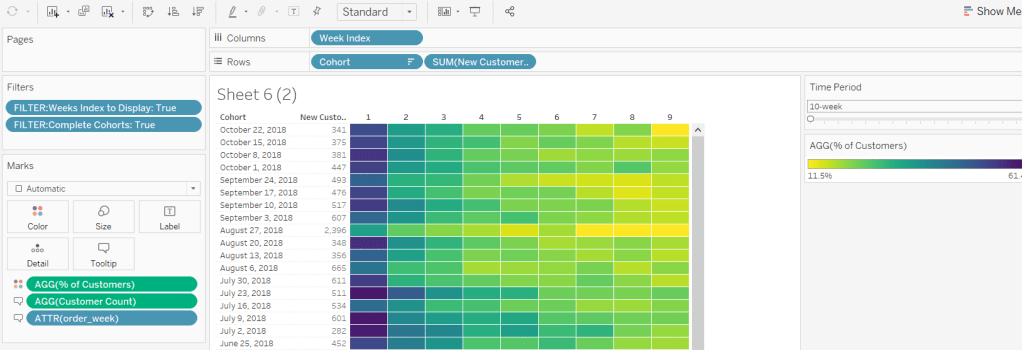
So lets turn this into the heat map display:
Remove the Count Customers at Time Period Param field
Move % of Customers onto the colour shelf
Move order_week and Customer Count onto the Tooltip shelf
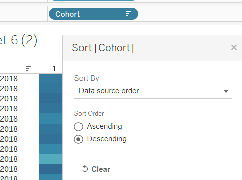
Change the Sort of the Cohort to descending
Add New Customers as a discrete field next to Cohort
Change the colour palette to use Vidris
Change the formatting of the Cohort and order_week fields to suit
Set the tooltips
Apply other formatting changes to adjust font size, alignment, row/column lines etc
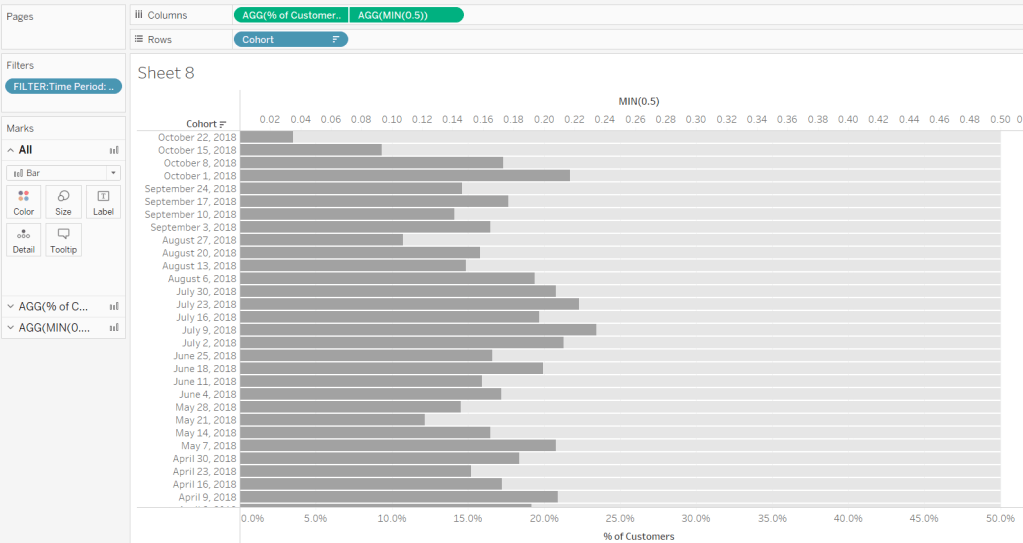
Bar Chart
For the bar chart, we only want the data for week x, so we need to filter the data just to this week again
FILTER : Time Period
[Week Index]=[Time Period]
The bar is basically plotting Cohort against % of Customers, but we need some additonal wizardy to get the desired display.
The requirement states the bar chart needs to be hardcoded from 0-50%, and so we need the light grey bars behind each bar to ‘fill up’ to 50%.
We do this using a synchronised dual axis, with the secondary axis set to MIN(0.5), coloured light grey, and the secondary axis ‘pushed to the back’. Adjust the size of the bars to suit.
But we need to label the end of the secondary axis with the % of Customers, and the label needs to be displayed to the right of the bar.
As we haven’t fixed the axis at all, adding % of Customers to the label shelf of the secondary axis, and reducing the font size and setting to be right- aligned, we get what we need. Then just add all the relevant fields to both marks cards that are needed for the tooltip, and hide both axes and the Cohort field.
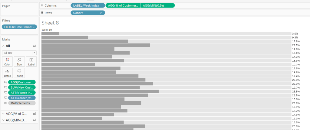
But the chart does need to be labelled with Week x. So this requires a calculated field
LABEL: Week Index
‘Week ‘ + STR([Week Index])
which is then added to the Columns shelf and left aligned, and Hide Field Labels for Columns
Other formatting of the chart is applied to ensure no row/column borders or gridlines are being displayed.
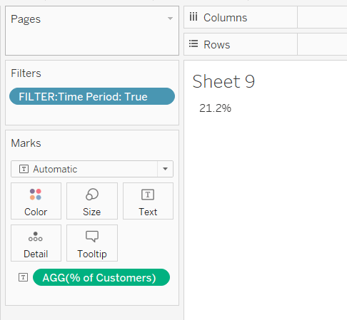
Summary BAN
The summary BAN is simply % of Customers displayed as Text but filtered by FILTER: Time Period = True, with the formatting of the text adjusted to suit.
Putting it all together
When adding it all to the dashboard, the heat map and the bar chart need to be sited side by side and both set to Fit Entire View so the rows for each cohort line up. The colour legend is then sited below the heat map, and I then used blank objects either side to make the legend line up with the heat map.
The line at the top of the dashboard is created by using a vertical container object, where a blank object within is then set to height 0 with a black background. Working with containers can be a bit fiddly at times.
I found this a really enjoyable challenge – thanks Curtis!