Dynamic Dates in a Heat Map

Erica set the challenge this week using a custom made dataset. The focus was to handle viewing different aggregations of the dates based on the date range selected, ie for short date ranges seeing the data at a day level, for medium ranges, view at the week level and then at a monthly level for larger ranges. This type of challenge has been set before, but the visual is typically a line chart rather than a heat map. The principles are similar though.

Determining the Date to Display

Each row in the data set has a Date associated to it. For this challenge we need to ‘truncate’ the date to the appropriate level depending on the date range and the date level selected by the user. By that I mean that if the level is deemed to be weekly, we need to ‘reset’ each date to be the 1st day of the week.

To start with, we need to set up some parameters which drives the initial user input.
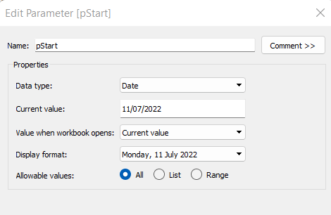
pStart

Date parameter defaulted to 11/07/2022 (11th July 2022), with a display format of <weekday>, <date>

pEnd

As above, but defaulted to 24/07/2022 (24th July 2022).
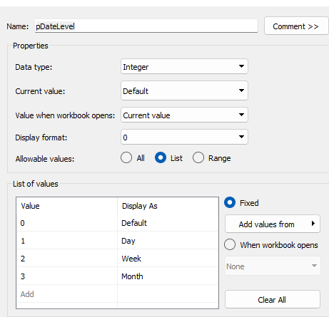
pDateLevel

integer with values 0-3 as listed below, with a text Display As. Defaulted to ‘Default’. Note, I am using integers as we will be referencing them in IF statements later, and integers are more performant than comparing strings.

With these parameters, we can then build

Date To Display

DATE(
IF [pDateLevel] = 0 THEN
IF DATEDIFF(‘day’, [pStart], [pEnd]) < 28 THEN DATETRUNC(‘day’,[Date])
ELSEIF DATEDIFF(‘day’, [pStart], [pEnd]) < 90 THEN DATETRUNC(‘week’, [Date])
ELSE DATETRUNC(‘month’, [Date])
END
ELSEIF [pDateLevel] = 1 THEN DATETRUNC(‘day’,[Date])
ELSEIF [pDateLevel] = 2 THEN DATETRUNC(‘week’,[Date])
ELSE DATETRUNC(‘month’, [Date])
END
)

If the pDateLevel is set to 0 (ie Default), then compare the difference between the dates entered and truncate to the ‘day’ level if the difference is less than 28 days, the ‘week’ level if the difference is less than 90 days, else truncate to the month level (which will return 1st of the month). Otherwise, if the pDateLevel is 1 (ie Day), truncate to the day level, if it’s 2 (ie Week), truncate to the week level, else use the month level.

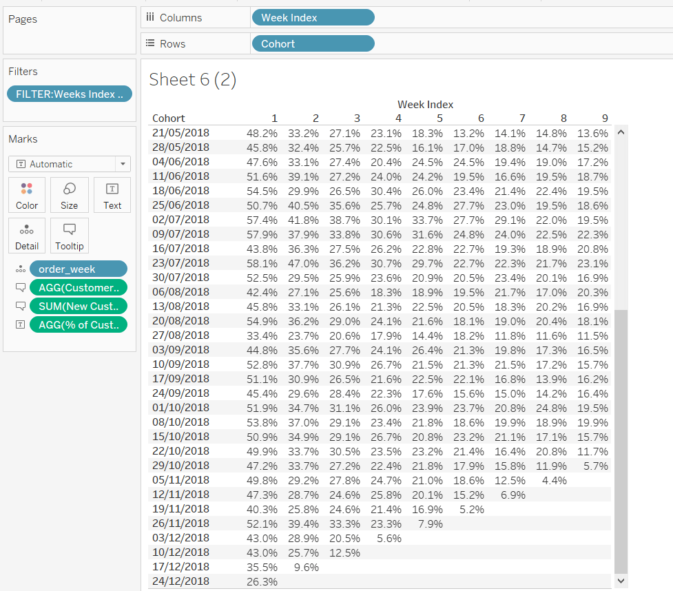
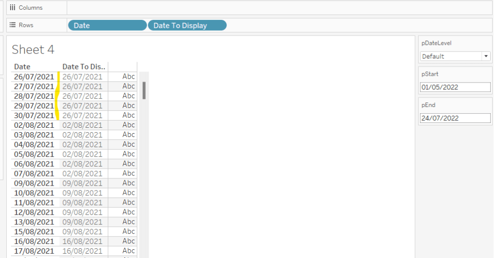
To see how this field is working, add Date and Date To Display to Rows, both as discrete exact dates (blue pills), display the parameter fields, and adjust the values. Below you can see that using the Default level, between 1st May and 24th July, the 1st day of the associated week against each date is displayed.

Building the Bar Chart

This is the simpler of the two charts to build, so we’ll start with this.

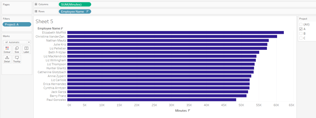
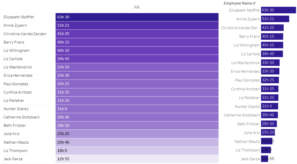
Add Employee Name to Rows, and Minutes to Columns. and sort by Minutes descending (just click the sort descending button in the toolbar). Add Project to Filter, select ‘A’ and then show the filter. Adjust the colour of the bars. I used #311b92

We need to restrict the data displayed based on the date range defined.

Dates to Include

[Date]>=[pStart] AND [Date]<=[pEnd]

Add this to the Filter shelf and set to True.

Now, we need to label the bars, and need new fields for this.

Duration (hrs)

FLOOR(SUM([Minutes])/60)

Using the FLOOR function means the value is always rounded down to the relevant whole number (eg 60.5 and above will still result in 60).

Format this field to be 0 decimal places with a ‘h’ suffix

Duration (mins)

SUM([Minutes])%60

Modulo (%) 60 means return the remainder when divided by 60. Format this to be 0 dp.

Add both these fields to the Label shelf, and adjust so the labels are displaying on the same line and are aligned to the left. You may need to increase the width of each row to see them.

Add Project to the Tooltip shelf and update, then remove all gridlines and the axis. Leave the Employee Name column visible for now. We’ll come back to this later.

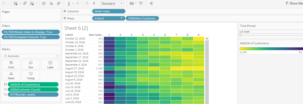
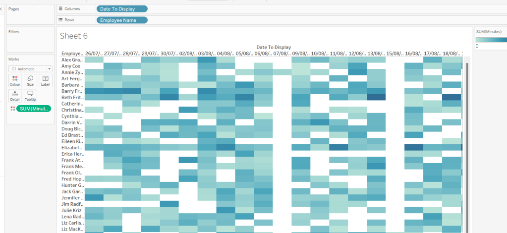
Building the Heat Map

On a new sheet, add Employee Name to Rows and Date to Display as a discrete exact date (blue pill) to Columns. Add Minutes to Colour and a heat map should automatically display.

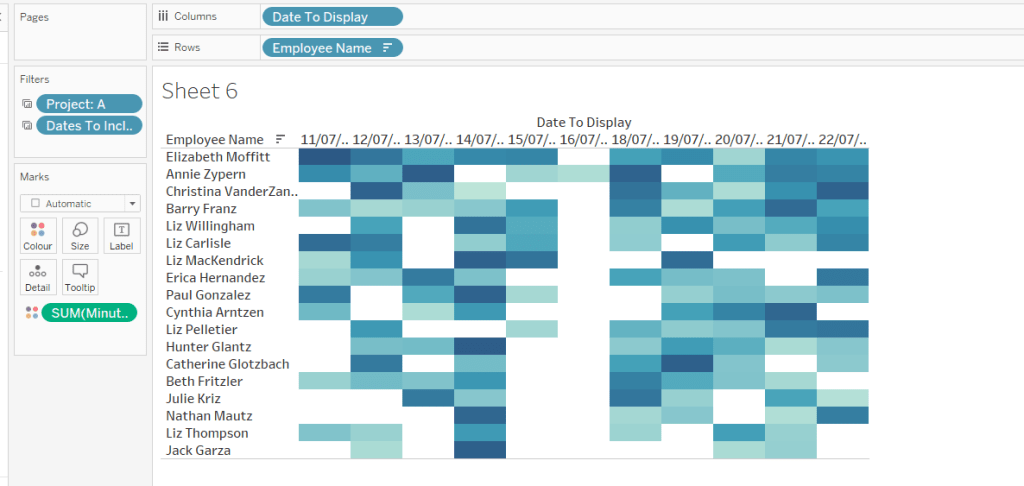
Go back to the bar sheet, and set both the Project and the Dates To Include filters to apply to the heat map worksheet as well (right click each pill on the filter shelf -> Apply to Worksheets -> Selected Worksheets and select the other one you’re building).

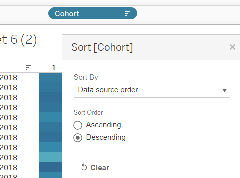
Then click the sort descending button in the toolbar, to order the data as per the bar.

Add both Duration (hrs) and Duration (mins) to the Label shelf and change the mark type to Square. Adjust the label so it is on the same line and left aligned (I added a couple of spaces to the front of the text so it isn’t so squashed).

Edit the colours of the heat map – I used a colour palette I had installed called Material Design Deep Purple Seq which seemed to match, but may not be installed by default.

Format the main heat map section to have a light grey background by right clicking on the table -> format and setting the shading of the pane only to pale grey

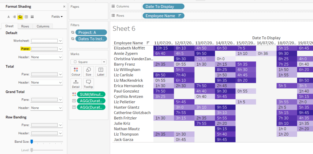
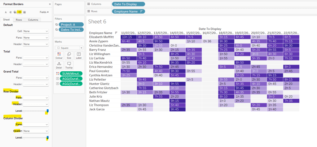
Then adjust the row dividers of the pane to be white, and the header to be pale grey (set the level to the max).

Adjust the column dividers similarly, setting the pane to be white, the header to none, and level to max

Next we want to deal with the column labels. By default they’re showing the date, but we want this to show something different depending on the date level being displayed.

Column Label

IF (([pDateLevel] = 1) OR (([pDateLevel] = 0) AND (DATEDIFF(‘day’, [pStart],[pEnd])<28))) THEN UPPER(LEFT([Weekday],3))
ELSEIF (([pDateLevel] = 2) OR (([pDateLevel] = 0) AND (DATEDIFF(‘day’, [pStart],[pEnd])<90))) THEN ‘w/c ‘ + IIF(LEN(STR(DATEPART(‘day’, [Date To Display])))=1,’0’+STR(DATEPART(‘day’, [Date To Display])), STR(DATEPART(‘day’, [Date To Display]))) + ‘-‘ + UPPER(LEFT(DATENAME(‘month’, [Date To Display]),3))
ELSE UPPER(LEFT(DATENAME(‘month’, [Date To Display]),3))
END

If the date level is ‘day’ or the date level is the default and the start & end are less than 28 days apart, then show the day of the week (1st 3 letters only in upper case).

Else if the date level is ‘week’ or the date level is the default and the start & end are less than 90 days apart, then show the text ‘w/c’ along with the day number (which should be 01 to 09 if the day is < 10) a dash (-) and then the 1st 3 letters of the month in upper case.

Else, we’re in monthly mode, so show the 1st 3 letters of the month in upper case.

Add this to the Columns shelf, then hide the Date To Display field (uncheck show header), hide field label for columns and hide field label for rows. Format the Employee Name field so its a different font (I changed to Tableau Book).

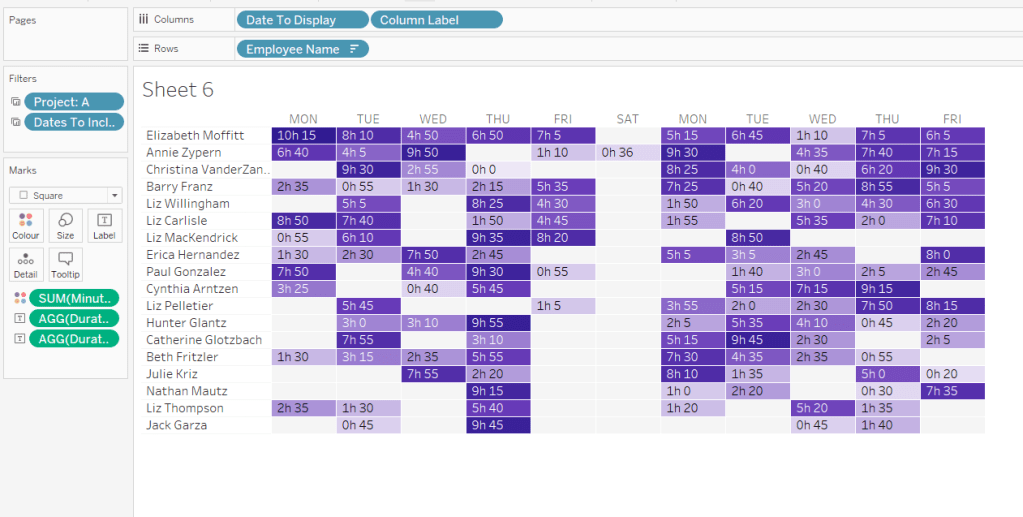
Again play around with the parameters and see the changes to the column label.

Finally, add Project to the Tooltip and update. You’ll need to adjust the formatting of the Date To Display field to get it into <day of week>, <date> format.

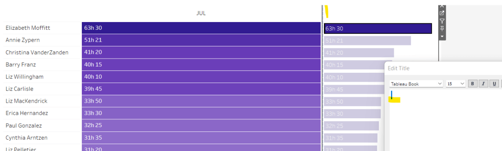
Adding to the Dashboard

When you add the two charts to the dashboard, you’ll need to set them side by side within a horizontal layout container. Remove the titles. They both need to be set to ‘fit entire view’, and the width of the heat map chart should be fixed (I set it to 870px), so it retains the space it stays in, even when you only have 1 month displayed.

Once you’re happy the order of the heat map employees matches the order of your bar chart, uncheck show header against the Employee Name field on the bar chart.

To get the bars to align with the heat map, I showed the title of the bar, removed the text and just entered a space. This dropped the bars so they just about aligned. You may need to tweak by increasing the size of the bars slightly.

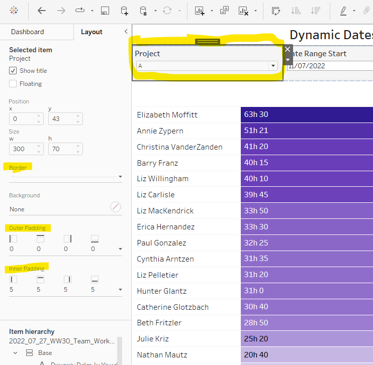
Finally, you need to move your parameters around. I placed them in a horizontal container, whose background colour was set to pale grey. I then set the objects within to be equally spaced by setting the container to Distribute Contents Evenly.

I then altered the padding of each of the parameter objects to have outer padding = 0 and inner padding = 5 and added a pale grey border surrounding each.

And that should be it. My published viz is here.

Happy vizzin’!

Donna

Can you build smart ranked lists?

It was Ann’s turn this week to post the weekly #WOW challenge. There’s a fair bit going on here, so let’s get cracking.

Building the main chart

There’s essentially 3 instances of this chart. I’ll walk through the steps to create the Sales version. All the fields just need to be duplicated to build the Orders & Quantity versions.

First up we need a parameter to store the date the user selects. This needs to be a date parameter that allows all dates and is set to 8th May 2019 by default: Order Date Parameter

Based on this parameter value, we need to work out the day of the week of the parameter date, the date 12 weeks ago, and then filter all the dates to just include the dates that match the day of the week. So we need

Day of Week

UPPER(DATENAME(‘weekday’,[Order Date Parameter],’Monday’))

(the UPPER is necessary for the display Ann has stated).

Dates to Include

[Order Date]>=DATEADD(‘day’,-84,[Order Date Parameter])
AND [Order Date]<= [Order Date Parameter]

This identifies the dates in the 12 week period we’re concerned with.

I played around with ‘week’ and ‘day’, as I noticed when playing with Ann’s published solution that sometimes there were 12 dates displayed, other times there were 13, but this is just down to how the number of days in a month fall, and whether there’s actually orders on the days.

Weekdays to Include

[Day of Week] = UPPER(DATENAME(‘weekday’,[Order Date],’Monday’))

This identifies all the dates that are on the same day of the week as the Order Date Parameter.

Add both Dates to Include and Weekdays to Include to the Filters shelf and set both to True.

Add Order Date to Rows and set to be a discrete exact date. Add Sales to Text. Sort Order Date by Sales DESC

The colouring of the cells is based on 4 conditions

  • being the max value
  • being above the average value
  • being the min value
  • being below the average value

I used table calcs to work this out, giving each condition a numeric value

Colour:Sales

IF SUM([Sales]) = WINDOW_MAX(SUM([Sales])) THEN 1
ELSEIF SUM([Sales]) = WINDOW_MIN(SUM([Sales])) THEN 4
ELSEIF SUM([Sales]) >= WINDOW_AVG(SUM([Sales])) THEN 2
ELSE 3
END

Add this to the Colour shelf and change it to be a continuous (green) pill, which will enable you to select a ‘range’ colour palette rather than a discrete one. Temperature Diverging won’t be available for selection unless the pill is green; on selection, the colours will automatically be set as per the requirement. Change the mark type to Square.

We also need to identify an above & below average split so create

Sales Header

UPPER(IF [COLOUR:Sales]<=2 THEN ‘Above
Average’
ELSE ‘Below
Average’
END)

Note the carriage return/line break, which is necessary to force the text across 2 lines.

Add this to the Rows shelf in front of Order Date, and format to rotate label

Finally we need to show a triangle indicator against the selected date.

Selected Date

IF [Order Date]=[Order Date Parameter] THEN ‘►’ ELSE ” END

I use this site to source the shapes I need.

Add this to Rows between Sales Header and Order Date

Format to remove all column & row lines, then add row banding set to the appropriate level, and a mid grey colour

Finally Hide Field Labels for Rows, format the font of the date and set the tooltip.

Now we need to set the title to include the rank of the selected date.

Selected Date Sales Rank

IF ATTR([Order Date])=[Order Date Parameter] THEN RANK_UNIQUE(SUM([Sales]))END

Add this to the Detail shelf, and the field will then be available to reference when you edit the title of the sheet

Name this sheet Sales Rank or similar.

You can now repeat the steps to build versions for Orders (COUNTD(Order ID)) and Quantities (SUM(Quantity)).

Dynamic Title

To build the title that will be displayed on the dashboard, create a new sheet, and add Order Date Parameter and Day of Week to the Text shelf. Then format the text to suit

Building the Dashboard

The ‘extra’ requirement Ann added to this challenge, was to display a ‘grey shadow’ beneath each of the rank tables. This is done using containers, setting background colours and applying padding. When building this took a bit of trial & error. Hopefully in documenting I’ll get the steps in the right order…. fingers crossed…

On a new dashboard, set the background colour to a pale grey.

Add a vertical container.

Add the Title sheet into the container, and remove the sheet title

Add a blank object into the container, beneath the Title sheet.

Add another blank object into the container, between the Title and the blank, set the background of this object to dark grey, reduce the padding to 0 and the edit the height to 2.

This will give the impression of a ‘line’ on the dashboard

Now add a horizontal container beneath the ‘line’ and the blank object at the bottom. You may need to adjust the heights of the objects

Set the outer padding of this object to 5.

Add a blank object into this horizontal container. Blank objects help when organising objects when working with containers, and will be removed later.

Add another horizontal container into this container next to the blank object. Set the background to a dark gray and set the outer padding to left 10, top 5, right 5, bottom 0.

Into this dark grey layout container add the Sales Rank sheet. Set the backgroud of this object to white, and the outer padding as left 0, top 0, right 0, bottom 4. Make sure the sales rank sheet is set to Fit Entire View.

Add another horizontal container to the right of the Sales Rank sheet, between that and the blank object. Set the background to the dark grey, and outer padding to left 5, top 5, right 5, bottom 0.

Add the Orders Rank sheet into this container, again set to Fit Entire View, set the background to white and outer padding to left 0, top 0, right 0, bottom 4.

Add another horizontal container, this time between the Order Rank sheet and the blank object. Set the background to dark grey, and outer padding to left 5, top 5, right 10, bottom 0.

Add the Qty Rank sheet into this container, again set to Fit Entire View, set the background to white and outer padding to left 0, top 0, right 0, bottom 4.

Now delete the blank object to the right, and delete the blank object at the bottom. Also delete the container in the right hand panel that has been automatically added and contains all the legends etc.

Set the dashboard to the required 700 x 450 size.

Select the ‘outer’ horizontal container that has all the charts in it, and Distribute Contents Evenly

You may need to adjust the widths of the columns within the ranking charts to get everything displayed in the right way.

But fingers crossed, you should have the desired display.

Calendar icon date selector

The final requirement, is to show the date selected on click of a calendar icon. This is managed using a floating container to store the Order Date Parameter, and using the Add Show/Hide Button option of the container menu.

Select Edit Button and under Item Hidden choose the calendar icon you can get off the site Ann provided a link for.

You’ll just then have to adjust the position of the container with the parameter and the button to suit.

Phew! all done. My published viz is here.

Note – I did find after publishing on Tableau Public, I had some erroneous horizontal white lines displaying across my ranking charts. I’m putting this down to an issue with rendering on Public, as I can’t see anything causing this, and it’s not visible on Desktop.

Happy vizzin’!

Donna

Can you use spatial BUFFER() functions in two ways?

Week 10 of #WOW2020 was set by guest challenger Sean Miller, who chose to demonstrate a ‘hot off the press’ feature released in v2020.1 (so having this version is a prerequisite to completing this challenge).

I was excited to see this as I don’t use maps often in my day job, and I love being able to have the opportunity to try the new stuff.

Sean provided references to two blog posts, which are a must read as they will definitely help guide you through the challenge, and explain in more detail what’s going on ‘under the bonnet’. I’m not therefore going to repeat any of this.

Sean provided 2 versions for the challenge with supporting datasets.

Intermediate challenge – Can you isolate pubs within 500m of a hotel?

For this we are provided with a set of hotels in London and a set of pubs. The requirement is to only include on the display the pubs which are within a 500m radius (ie buffer) of each hotel.

Join the data

The provided data consisted of a sheet of Pubs with a Lat & Lon field, and a sheet of Hotels with a LAT & LON field

These 2 data sets need to be Inner Joined together as

(Pubs data) MAKEPOINT([Lat],[Lon])

INTERSECTS

(Hotels data) BUFFER(MAKEPOINT([LAT],[LON]),500,’m’)

In the join clause window, you have the option to Edit Join Calculation which lets you type the calculation you need

Mapping the Hotels

Whilst the join has been made, we will need the ‘buffer’ calculation to display on the viz, so create

Buffer Hotel

BUFFER(MAKEPOINT([LAT],[LON]),500,”m”)

Then double click the Latitude (generated) and Longitude (generated) fields which will automatically display a map on screen.

Add Buffer Hotel to the Detail shelf and you’ll get the following (and the mark type will change to Map)

The circles look to be representing each hotel, but if you hover over one circle, all get selected. Add Hotel Name to Detail to allow individual selection.

Add Number of Records to the Label shelf, and format to suit.

Change the Colour of the mark to be pale orange and adjust the Opacity to suit.

Set the map background by choosing Map -> Map Layers from the menu and selecting Streets from the background style section

Mapping the Pubs

As with the hotel, we’re going to need the Pub Location spatial point to display on the viz, so create

Pub Location

MAKEPOINT([Lat],[Lon])

Duplicate/drag another instance of Latitude (generated) onto the Rows shelf.

On the second marks card, remove all the fields, and change the mark type to circle, then add Pub Location onto the Detail shelf, along with Pub Name.

You might be struggling to see the marks, but they are there – change the colour to grey, add a white border and adjust the size… found them?

The Tooltip on the pub marks, displays the distance from the hotel to the pub, so create

Distance

DISTANCE(MAKEPOINT([Lat],[Lon]), MAKEPOINT([LAT],[LON]), ‘m’)

which is the distance in metres from the Pub Location to the Hotel Location (I could have used my Pub Location field and created a Hotel Location field to put into this calculated field.

Add Distance to the Tooltip field for the pub marks, and adjust to match.

Now make dual axis

Hotel List – Viz in Tooltip

On hover over the hotel buffer circle, a full list of the pubs in range is displayed. This a managed using another sheet and the Viz in Tooltip functionality.

Create a basic table with Hotel Name, Pub Name on Rows and Distance on Text. Type in the word ‘Distance’ into the Columns to make a ‘fake’ column label.

Hide Hotel Name from displaying by unchecking Show Header on the field, then Hide Field Labels for Rows and Hide Field Labels for Columns. Format to remove the column divider

Name the sheet Pubs or similar

On the Tooltip of the hotels buffer marks, adjust the initial text required, then insert the sheet by Insert -> Sheets -> <select sheet>

This will insert text as below

At the point it says ‘<All Fields>’, delete the text, then Insert -> Hotel Name

Now, if you hover over the buffer circle on the map, the list of pubs associated to just that hotel should display.

Note – when adding the sheets into the viz in tooltip, or changing the fields to filter by, always use the insert & select options rather than just typing in, as I find it doesn’t always work otherwise….may be just me though….

Phew! That’s the intermediate challenge completed (well once you’ve tidied and added to a dashboard of course.

onto the next….

Jedi Challenge – Can you find the pubs closest to a chosen hotel?

Sean provided a separate pre-combined dataset for this, as the display needs to show all the pubs, regardless of which hotel is selected, whereas in the intermediate challenge, the spatial join meant all the pubs outside of the buffer zones were excluded.

The map itself follows very similar principles. We need a dual axis, where one axis is plotting a selected hotel with it’s buffer, and the other axis, the pub locations.

The selected hotel is ultimately going to be derived from a parameter action, but we’ll set that later. For now, let’s just create the string parameter, Selected Hotel, to store the name of the hotel, which is just set to a ‘default’ value of “The Hoxton – Shoreditch”

Additionally, the buffer radius can be changed in this challenge, so we have another parameter, Buffer Radius, this time an integer with a max value of 500, and defaulted to 500 as well.

To draw the selected hotel with buffer on the map, we first need to isolate the selected hotel’s latitude & longitude, to determine the location, and store it against every row in the dataset via a LoD calculation

Is Selected Hotel?

[Name]=[Selected Hotel]

Selected Hotel Lat

{FIXED : MIN(IIF([Is Selected Hotel?], [LAT],NULL))}

Selected Hotel Long

{FIXED : MIN(IIF([Is Selected Hotel?], [LON],NULL))}

Selected Hotel Location

MAKEPOINT([Selected Hotel Lat],[Selected Hotel Long])

Now we know the location, we can create the buffer around it

Hotel Buffer

BUFFER([Selected Hotel Location],[Buffer Radius],’m’)

The Hotel Buffer and the Selected Hotel parameter are needed to display the hotel on the map.

We then need to create the fields used to display the pubs.

Pub Name

IF [Location Type]=’Pub’ THEN [Name] END

Pub Location

IF [Location Type]=’Pub’ THEN MAKEPOINT([LAT],[LON]) END

You should now be able to create the map following the steps outlined above in the intermediate challenge. One axis will show the buffer around the selected hotel, the other will show all the pubs.

The pubs need to be sized & coloured based on the distance from the selected hotel, so we need

Distance Selected Hotel-Pub

DISTANCE([Selected Hotel Location],[Pub Location],’m’)

Add this to the Size & Colour shelf of the pubs marks card, and adjust to suit (you’ll need to reverse the colour range). Also note, there are 2 pubs named Alchemist, so add Neighbourhood to the Detail shelf too to make sure the distance calcs returns the correct values. Update the tooltip on the pubs mark too.

Finally

  • update the tooltip on the pubs mark
  • add the Selected Hotel parameter to the Label of the hotel mark and adjust font to suit
  • remove the tooltip from the hotel mark

At this point the main map is built, but Sean has added a bit extra to this challenge, a bar chart to drive the hotel selection with a sort selector to drive the ranking of the hotels; all of this is wrapped up in a collapsible container – phew!

Let’s break this down and start with the bar chart.

Hotel Selector Bar Chart

Build a bar chart as follows :

  • Name, Yelp Rating (as discrete field), Price Rating on Rows
  • Yelp # of Ratings on Columns
  • Location Type = Hotel on Filter
  • Is Selected Hotel on Colour
  • Show mark labels so Yelp # of Ratings is displayed at the end of the bars

Adjust formatting to match (remove column/row lines, set the row banding, hide headers etc)

Set the Alias of the Price Rating field, so Null displays as <blank>

Name the sheet Hotel List or similar.

On a dashboard, add the Hotel List and the Map, so we can create the parameter action (Dashboard -> Actions -> Add Action -> Set Parameter) to interact between the list and map.

Clicking a hotel in the bar chart should now change which hotel is selected in the map.

Bar Chart Sort Selector

The bar chart can be sorted based on the 3 measures displayed; Price Rating, Number of Ratings, YELP Rating. We need to build the selector to allow a choice, and then change the bar chart based on the selection. This again is parameter actions, and builds on techniques used in previous WoW challenges blogged about here and here and here.

As a result, I’ll be relatively brief about how the selector is built, as the blogs should help with this.

I used 3 instances of MIN(0.0) on the Columns, and aliased the Measure Name of these to ‘ Yelp Rating ‘, ‘ Price Rating ‘, ‘ Number of Ratings ‘ (Note the spaces either side). I also adjusted the axis of each measure to make them all appear left aligned,(this was a bit trial & error).

I also needed a parameter Selected Sort Measure defaulted to ‘ Price Rating ‘

Three calculated fields are used to set the Shape of the displayed mark for each measure

Sort – Price Rating

[Selected Sort Measure] = ‘ Price Rating ‘

Sort – Number of Ratings

[Selected Sort Measure] = ‘ Number of Ratings ‘

Sort – Yelp Rating

[Selected Sort Measure] = ‘ Yelp Rating ‘

I also added the True = False url action trick to ensure the marks all appeared ‘selected’ when only one was selected.

To invoke the sort on the bar chart itself, create a calculated field

Chart Sort

CASE [Selected Sort Measure]
WHEN ‘ Yelp Rating ‘ THEN SUM([Yelp Rating])
WHEN ‘ Price Rating ‘ THEN SUM([Price Rating Sort]) * -1
WHEN ‘ Number of Ratings ‘ THEN SUM([Yelp # of Ratings])
END

Note the Price Rating Sort field is multiple by -1 to ensure it displays from lowest to highest on the sort, whilst the other fields will display highest to lowest.

Alter the Hotel Name field on the Hotel list bar chart to sort descending by Chart Sort

Add the Sort Selector sheet to the dashboard, and add a parameter action

You should now be able to play around, selecting a sort option to change the order of the hotel list, then selecting a hotel to change the map.

Hiding the hotel list / sort selector

On the dashboard add a vertical container, then place the Sort Selector sheet and the Hotel List bar chart inside.

Remove the chart titles, set the background of the container to white, then set the container to be floating and select the container option to Add Show/Hide Button.

A Cross image will appear, select to Edit Button and change the button style to Text Button

In the Title section enter the required text for when the section is displayed (Item Shown) and then for when the section is collapsed (Item Hidden). Adjust the font too.

After hitting apply, the button section, will need resizing to get the text to display

The show/hide functionality needs to be manually selected on Desktop. When on server the interactivity will work. So to close the container, on the button menu, select Hide

and the container with the selector and the bar chart will disappear

Now it’s all just about finalising the dashboard to display all the objects in the appropriate locations. The colour/size legend and Buffer parameter are also within a container, which is floated and positioned bottom left.

Hopefully I’ve covered everything. There’s a fair bit going on in this Jedi version!

My published versions are here.

Happy vizzin’!

Donna

Can you build a retention heat map with a marginal histogram?

Week 50 of #WorkoutWednesday saw Curtis deliver a heatmap based challenge with a few twists.

The challenge consisted of the following main components :

  • Identify a ‘cohort’ for each customer based on first week of sale
  • Understand the % of customers in each cohort making purchases per week for the following x weeks, where x was driven by a user defined input.
  • Build a heat map for weeks 1 to x-1, but only include ‘full’ weeks
  • Build a bar chat for week x
  • Display a summary BAN for volume of week x returning customers as a proportion of the customers in the cohorts displayed.

Identify cohort

Each customer needed to be put in a cohort based on the week of their first order, which uses a FIXED LoD (level of detail) calculation.

Cohort

DATE({FIXED [customer_id]: MIN(DATETRUNC(‘week’, [order_week]))})

% of Customers

The number of unique customers making a purchase is a simple calculation

Customer Count

COUNTD([customer_id])

and plotting these fields alongside order_week, we start to see where we’re heading

But we need to index each order_week in relation to the cohort: For the cohort dated 01 Jan, week 1 is order_week 08 Jan, but for the cohort dated 08 Jan, week 1 is order_week 15 Jan.

Week Index

DATEDIFF(‘week’,[Cohort],[order_week])

We also need against each row, the number of customers in the cohort, which is equivalent to the number of customers in week 0.

New Customers

{FIXED [Cohort]: COUNTD(IF ([order_week])=([Cohort]) THEN [customer_id] END)}

This is saying for each cohort, count the number of distinct customers when the order week is the same as the cohort week.

Now we’ve got that, we can work out the % of returning customers each week:

% of Customers

[Customer Count]/SUM([New Customers])

Putting all these onto a data table, we can see all the figures are making sense

But we want to limit the number of weeks, based on the user input, so we need a parameter, that is limited to range between 10 and 26 weeks. Note how the display format of the parameter is set.

Time Period

To restrict the weeks, we need another calculated field we can filter by

FILTER:Weeks Index to Display

[Week Index]> 0 AND [Week Index]<[Time Period]

This is added to the filter shelf and set to True.

This verifies we’ve got the numbers we need to start to build the heat map.

Heat Map

Duplicating the data sheet I’ve created above, then moving the pills around, we get the ‘bones’ of what we’re after, but you can see towards the bottom of the cohort list, that we have missing entries, where there aren’t enough weeks for the cohort week being considered. We don’t want these rows to display, so need to filter the data someway.

I approached this by determining the number of unique customers at week x, then seeing whether there was any or not :

Count Customers at Time Period Param

{FIXED [Cohort]: COUNTD(IF ([Week Index])=([Time Period]) THEN [customer_id] END)}

FILTER: Complete Cohorts

[Count Customers at Time Period Param]>0

Adding the Count Customers at Time Period Param field to the view, you can see that for a 10 week time period, from the cohort dated 29th October onwards, the count of customers is 0, so these are the rows I’m going to filter out, by adding the Filter : Complete Cohorts field to the filter shelf, and setting to True.

So lets turn this into the heat map display:

  • Remove the Count Customers at Time Period Param field
  • Move % of Customers onto the colour shelf
  • Move order_week and Customer Count onto the Tooltip shelf
  • Change the Sort of the Cohort to descending
  • Add New Customers as a discrete field next to Cohort
  • Change the colour palette to use Vidris
  • Change the formatting of the Cohort and order_week fields to suit
  • Set the tooltips
  • Apply other formatting changes to adjust font size, alignment, row/column lines etc

Bar Chart

For the bar chart, we only want the data for week x, so we need to filter the data just to this week again

FILTER : Time Period

[Week Index]=[Time Period]

The bar is basically plotting Cohort against % of Customers, but we need some additonal wizardy to get the desired display.

The requirement states the bar chart needs to be hardcoded from 0-50%, and so we need the light grey bars behind each bar to ‘fill up’ to 50%.

We do this using a synchronised dual axis, with the secondary axis set to MIN(0.5), coloured light grey, and the secondary axis ‘pushed to the back’. Adjust the size of the bars to suit.

But we need to label the end of the secondary axis with the % of Customers, and the label needs to be displayed to the right of the bar.

As we haven’t fixed the axis at all, adding % of Customers to the label shelf of the secondary axis, and reducing the font size and setting to be right- aligned, we get what we need. Then just add all the relevant fields to both marks cards that are needed for the tooltip, and hide both axes and the Cohort field.

But the chart does need to be labelled with Week x. So this requires a calculated field

LABEL: Week Index

‘Week ‘ + STR([Week Index])

which is then added to the Columns shelf and left aligned, and Hide Field Labels for Columns

Other formatting of the chart is applied to ensure no row/column borders or gridlines are being displayed.

Summary BAN

The summary BAN is simply % of Customers displayed as Text but filtered by FILTER: Time Period = True, with the formatting of the text adjusted to suit.

Putting it all together

When adding it all to the dashboard, the heat map and the bar chart need to be sited side by side and both set to Fit Entire View so the rows for each cohort line up. The colour legend is then sited below the heat map, and I then used blank objects either side to make the legend line up with the heat map.

The line at the top of the dashboard is created by using a vertical container object, where a blank object within is then set to height 0 with a black background. Working with containers can be a bit fiddly at times.

I found this a really enjoyable challenge – thanks Curtis!

My published viz is here.

Happy vizzin’

Donna

Can you build a sales comparison chart with performance indicators?

This weeks #WorkoutWednesday was set by the lovely Ann Jackson who often delivers some ‘challenging’ problems, all beautifully presented to fool you into thinking it’s going to be straightforward.

This week was no different. Time constraints meant I couldn’t dedicate the usual time to it on Wednesday, and then when I did get to it, I ended up with several false starts, that got very nearly there, but just fell at the final hurdle. I started again this evening, and finally got to something I’m happy with. So let’s get to it.

Ann’s challenge here, was to show a set of monthly KPI BANs (big-ass numbers) with a day by day comparison to the same time month in the previous year. From initial inspection, I figured that several table calculations were going to be needed. She also stated that we could use as many sheets as we liked. I ended up with 4 in my final viz; 1 displaying the BAN numbers, 1 displaying the trend chart, 1 displaying the red/green indicators to the left and 1 for the ‘days until month end’ subtitle.

Let’s start with the BAN numbers.

Ann wanted the chart to be dynamic, to be based as if you were looking at the data based on the month of ‘today’, and for it to change if you looked at it tomorrow. Since the Superstore dataset being used only contains data from 2015-2018, you can’t use the real ‘today’ date.

I authored my viz on 20th Sept 2019. I set up a table calculation to simulate today’s date as follows

Today

//simulate today to be based on the latest year in the dataset
MAKEDATE(
YEAR({FIXED:MAX([Order Date])}),
MONTH(TODAY()),
DAY(TODAY())
)

This produces a date of 20 Sept 2018 (or whatever date in 2018 you happen to be building your viz).

Since the data set is fixed, I could have simply hardcoded the year to 2018, but used the above FIXED LoD expression to be more generic. This LoD finds the year of the maximum date in the whole dataset.

I need to know the month to date sales for the month I’m in (in this case sales from the 1st to 20th September).

Sales MTD This Year

IF [Order Date]>=DATETRUNC(‘month’, [Today]) AND [Order Date]<= [Today] THEN [Sales] ELSE 0 END

This returns the Sales value for the records dated between 01 Sept 2018 and 20 Sept 2018.

This gives me my basic headline BAN number

For the BAN, I also need % change from previous year which requires

Today Last Year

DATEADD(‘year’, -1,[Today])

which returns 20 Sept 2017

Sales MTD Last Year

IF [Order Date]>=DATETRUNC(‘month’, [Today Last Year]) AND [Order Date]<= [Today Last Year] THEN [Sales] ELSE 0 END

which returns the Sales value for the records dated between 01 Sept 2017 and 20 Sept 2017.

% Change

(SUM([Sales MTD This Year]) – SUM([Sales MTD Last Year]))/Sum([Sales MTD Last Year])

This gives me the YoY difference, which I then custom formatted to

▲ 0%;▼ 0%

I could then set up my BAN sheet, by adding the relevant fields to the Text shelf, and formatting accordingly

For the KPI indicator, I required an additional field to set the colouring based on the value of %Change

Colour:BAN

IF [% Change] < 0 THEN ‘red’ ELSE ‘green’ END

I then created a very simple bar chart using an ‘old favourite’ MIN(1) to create an axis for a bar chart. The axis was fixed to end at 1, so the bar fills the space.

So that’s the straightforward bits… now onto the more challenging part – the trend chart.

This chart is showing the following:

  • The daily month to date sales for the current month up to ‘today’. This is the red/green line which is labelled with the total MTD sales as at today. At the point I’m writing this is the sales from 1-20 Sept 2018.
  • The daily month to date sales for the equivalent month last year, from the start of the month up to the same date last year (in my case 1-20 Sept 2017). This is the darker grey area chart up to the dotted ‘today’ reference line.
  • The daily month to date sales for the equivalent month last year from the start of the month up to the end of the month (in my case 1-30 Sept 2017). This is the dark + light grey area chart.

For this I knew I’d need a dual axis chart using an area chart for one and line chart for the other.

Given there’s a reference line on the axis indicating ‘Today’, I know I needed a continuous date axis, and chose to use the idea of baselining all the dates to the same year, and then filtering the viz just to use the dates in the current month (in this case September).

Date Aligned

//reset all data to pretend all against same year
MAKEDATE(YEAR([Today]),MONTH([Order Date]), DAY([Order Date]))

You can see from above regardless of the year of the actual Order Date, the re-aligned date field, has the same date.

Month To Include

MONTH([Order Date]) = MONTH(TODAY())

adding this to the filter shelf and setting to True filters to just the September dates in the data set.

Area Chart

The area chart is last year’s data. So far I’ve only built a Sales MTD – Last Year field, but plotting this as a running total table calc against Date Aligned (exact date), doesn’t give me what I need….

…as it flattens out after 20 Sept, as that is when I defined the Sales value to stop being counted. I need a Sales field that continues to grow until the end of the month. I also need a Sales field that gives me my running total up to 20 Sept, but then stops.

Sales Full Month Last Year

IF DATETRUNC(‘month’,[Order Date]) = DATETRUNC(‘month’,[Today Last Year]) THEN [Sales] ELSE 0 END

Adding this to the view and changing to use a Running Total quick table calc gives me what I need

Running Sum Sales MTD Last Year

IF ATTR([Date Aligned])<=ATTR([Today]) THEN
RUNNING_SUM(SUM([Sales MTD Last Year])) ELSE NULL END

This is basically only storing the running sum if the date is prior or on today.

I then changed these to sit on the same axis, rather than side by side, changed the mark type to Area, turned stack marks to off, and changed the colour to grey. As there are measures that overlap each other they give the appearance of a darker shade (sneaky huh?).

Line Chart

In a similar way described above, I can’t just use a running total of my existing Sales MTD – This Year field for the line, as that will also continue beyond 20 Sept. So I need

Running Sum Sales MTD This Year

IF ATTR([Date Aligned])<=ATTR([Today]) THEN
RUNNING_SUM(SUM([Sales MTD This Year])) ELSE NULL END

Added to the view as a dual axis (synchronised) and mark type of line I get

To change the colour of the line I can’t just use the field I used to make the KPI indicator above, as my data is now at a much more granular level, and it will return me multiple % changes. I just want the overall % change. I had to create more calculated fields for this :

Total Sales MTD

WINDOW_SUM(SUM([Sales MTD This Year]))

Total Sales MTD – Last Year

WINDOW_SUM(SUM([Sales MTD Last Year]))

% Total Change

([Total Sales MTD] -[Total Sales MTD – Last Yr]) / [Total Sales MTD – Last Yr]

Colour : Line

IF [% Total Change ] < 0 THEN ‘red’ ELSE ‘green’ END

You can obviously combine all these steps into one, but I find it easier to read this way. No doubt there’s also another way I could have achieved this.

So that’s the main trend chart complete you think (don’t forget to add Today as a reference line, and label the end of the line chart), until you examine the tooltips and notice things aren’t quite giving you what you need.

Against each mark, Ann wants us to show:

  • Sales MTD for this year, which rises until ‘today’, then remains the same
  • Sales MTD for previous year, which also rises until ‘today’, then remains the same
  • Sales MTD for previous year, which continues until the end of the month

With the measures I’ve got on the view, the MTD Sales up to today for this year and last year stop once I pass ‘today’.

But not to worry, this actually isn’t too hard; I just need to add Sales MTD This Year, Sales MTD Last Year and Sales Full Month Last Year to the tooltip and change all the be Running Total table calcs.

Apply relevant formatting to the tooltip, and gridlines etc, hide headers & axis and this chart is now good to go!

When I then added these 3 views to the dashboard, I placed them side by side in a horizontal container, and changed the padding on each view to 0 on all sides, so they all butted up against each other and the lines for each row appeared joined up.

The subtitle showing the days until the end of month is simply a sheet showing another calculated field Days Until End of Month in the text

DATEDIFF(‘day’,[Today],DATEADD(‘month’,1,DATETRUNC(‘month’,[Today])))

And so that’s about it I think… on reflection I wonder why I was being such a knob with my initial attempts where the table calcs I was using seemed to be getting out of hand…. we just all have those days I guess 🙂

My published viz is here

Happy vizzin!

Donna