I built an initial version of the heatmap only, which I’ve published here, but I couldn’t get the display to match Valerija’s when I clicked on it. (Note – I wasn’t bothered about Viz in Tooltip part at this point). I used 2 dimensions to display the yellow header section, and you can see below, when clicking, this is noticeable. But Valerija’s solution treats the header as a single entity.
I couldn’t figure out how she’d managed this, so I had to have a look at the solution, and then I built my own instance, which is what I’ll now blog about.
Defining the core fields
Connect to the datasource and add a data source filter to restrict the data by the latest year (as I used Superstore 2025, I filtered to 2025). Doing this meant I didn’t have to worry about adding worksheet level filter fields.
On a new sheet add Category and Sub-Category to Rows and add Sales to Text and then sort descending so you can see the data we need to work with. Format Sales to be $ to 0 dp.
Create a new field
Sales by Cat Rank
RANK(SUM([Sales]))
change it to be discrete and then add to Rows. Adjust the setting of the table calculation so it is computing by Sub-Category only, so the ranking restarts for each Category
We will also need to display the Category in upper case, so create
Category Upper
UPPER([Category])
and add to Rows.
Having this tabular layout just lets us clarify how the table calculation will be working.
Building the Heatmap Table
On a new sheet, add Category to Columns and Sub-Category and Sales to Text and align centrally (Note – I originally put Category Upper on the columns, and then changed later after taking all the screen shots)
Add Sales by Cat Rank to Rows. Change it to a continuous (green) pill and edit the axis to be reversed. Adjust the table calculation so it is computing by Sub-Category only.
Create a new field
One
1
Change the mark type to ganttbar and add One to the Size shelf, setting the aggregation to Avg. Increase the size of the mark via the Size shelf to as large as possible. Add Sales to Colour then add a white border.
We need the axis numbers to be central to the ‘row’, so to fix this, double click into the Sales by Cat Rank pill and change it to subtract 0.5 ( [Sales by Cat Rank] -0.5 )
Re-edit the axis to reverse it again.
So our ‘table’ is now displaying data on a axis from 0.5 up to 9.5. To add the header, we’re going to plot another mark at -0.5, so we can display a section of the same size as the existing ones. For this, double click into Rows and type MIN(-0.5).
This has the effect of creating a second marks card
Remove Sales from Colour and Sub-Category from Label. Add Category Upper to Label. Adjust the label text alignment and formatting and change the Colour to yellow.
Make the chart dual axis and synchronise the axis and we now have the required display.
Tidy up by
Remove row & column dividers
Remove gridlines, zero lines & axis ticks
Hide the right hand axis (right click > uncheck show header)
Hide the Category Upper column labels (right click pill > uncheck show header)
Remove the left hand axis title
Fix the left hand axis from -0.5 to 9.5
Format the axis with a custom formatting of #,##0;-#,##0;TOTAL so that 0 is displayed as the word TOTAL (this is very sneaky by the way, and took me a while to work out)
Then format the font to be bold
Adjust the Tooltip on the Sales by Cat Rank marks card to display the Sub-Category and Sales value.
Delete the text from the Tooltip on the MIN(-0.5) marks card
Name the sheet Table or similar
Building the Viz in Tooltip
On a new sheet add Order Date to Columns at the discrete month level (blue pill) and add Sales to Rows. Add Sub-Category and Category to Detail. Format the date axis so the dates are just using First Letter.
Create a new parameter
pSubCat
string parameter defaulted to Bookcases
Then create a field
Is Selected SubCat
[Sub-Category] = [pSubCat]
and add to the Colour shelf. Adjust accordingly, then make sure True is listed first in the legend, so the line is ‘on top’
Create a new field
Label Line
IF [Is Selected SubCat] THEN [Sub-Category] END
and add to the Label shelf and update to allow marks to overlap. Hide the Order Date label heading (right click > hide field labels for columns). Title the chart Line or similar
Remove gridlines and row/column dividers
Go back to the Table sheet, and update the Tooltip of the Sales by Cat Rank marks card to reference the Line chart and update the filter to pass as just <Category>
Adding the final interactivity
Create a dashboard and add the Table sheet. Then add a parameter action
Set Sub Cat Param
On hover of the Table sheet, set the pSubCat parameter with the value from the Sub-Category field, setting the value to <empty string> when the selection is cleared.
If all has been applied, then the line chart should just display the lines associated to the Sub-Categories in the same Category
For the challenge this week, Sean wanted us to identify the sales of ‘new’ products compared to previous years. This challenge was born out of a requirement he had at work, where he discovered the definition of a ‘new product’ was different to what he’d assumed.
In this instance, the ‘client’ only cared about comparing sales in the same month across the years. Any sales related to the products outside of the specific month were irrelevant and were to be ignored. A product was then counted as ‘new’ in the first year (of the specified month) that there was a sale.
In this case we are always looking at the month of September (the previous month to ‘today), so if Product X was sold in Sept 2021 and Sept 2023 only, then Product X would count as new in Sept 2021, and only the sales for Product X in Sept 2021 would be included in the subsequent values displayed.
Now I thought I’d nailed my understanding of the requirement, and went ahead building out a tabular view of the data using table calculations, but my final output did not match Sean’s result – in fact it was quite way off. I stepped through my logic, even sharing some samples with Sean to sense check, and we seemed to concur on the products identified as new, so I was incredibly puzzled as to what was causing the value discrepancy.
I messaged my friend, Rosario Gauna, to share my numbers and see what she came up with…. she matched Sean! Doh! I then had to spend time dissecting my solution and Rosario’s to see which products I was/wasn’t counting. Eventually I found the problem….
In using table calculations, I had included all the fields the viz required which included the Segment (Home Office, Corporate, Consumer). This meant that in my logic to identify a ‘new product’, I was counting the product as new in the first year that the product was sold in each Segment – ie if Product X sold in Sept 2022 against Segment Home Office and then sold in Sept 2023 against Segment Corporate, I counted both sales as being ‘new’ as the segment differed. However I only wanted the Sept 2022 sale to count as ‘new’.
With this understood, I tried to revise my initial table calc build, but to no avail. So I opened up a new workbook and started again, this time taking a different track. This is what I’ll blog, but I felt it important to explain how even a requirement I thought I’d understood, could still get mis-interpreted.
Building out the calculations
The first requirement is that we’re only looking at comparing the data for the previous month to ‘today’. If this was being developed for a live business application we’d reference the TODAY() function, but since I want this viz to continue to display on Tableau Public after we hit 2024, then I’m going to use a parameter to hardcode ‘today’.
pToday
date parameter defaulted to 4th October 2023
From this, I can then determine the month we need to compare
working from right to left (inside to out), this takes ‘today’ and finds the 1st of the month (ie 1st October), then goes back 1 month (ie 1st September), then gets the month number ie 9.
As this returns a number, it automatically is listed in the ‘measures’ section of the data pane (under the line), but I dragged it into the top half as I want the number to be discrete.
I then created
Filter Month
DATEPART(‘month’, [Order Date]) = [Month to Compare]
which returns true for all the orders where the month of the Order Date is in September.
Let’s build up a table so we can start to see what we’re working with
Add Product Name and Filter Month to Rows, Order Date (at the Year level) to Columns and Sales to Text.
In the example above, 3-ring staple pack has sales in September 2022 and in other months in 2020 and 2021, but we don’t care about those months, so this product is counted as new in 2022, with a value of $11.
3M Hangers With… have no sales in September in any year, so we won’t be counting that product at all.
6″ Cubicle Wall Clock has sales in both September 2022 and 2023, so this product will be counted as new in 2022 with a value of $83.
So we can filter the date just to Filter Month = True (move Filter Month from Rows to the Filter shelf).
Now we want to identify the earliest year for each Product Name.
Add this onto Rows, and you can see below we’re picking up the right year.
Now we can identify the value of the sales we want to count.
New Product Sales
IF [Year First Purchased in Month] = YEAR([Order Date]) THEN [Sales] END
Only get Sales for the year that matches the minimum year. Format this field to $ with 0 dp.
Adding this in to the table, we can see we only have a value against the first year.
So we’ve identified the sales values of the products we care about. We can now aggregate this at a higher level, and incorporate the other dimensions.
Remove Sales from Text, add Category to Rows and Segment to Columns. Remove Product Name and Year First Purchased in Month.
The viz displays the % of total new product sales by Category per Segment. Right click on the New Product Sales pill and add Quick Table Calculation, selecting Percent of Total. Right click on the pill again and select Compute Using -> Category. Right click on the pill and Format and format to % with 0dp. Add another instance of New Product Sales back into the table.
Now we want to be able to compare the sales for the current year/category/segment against that of the previous year.
Previous Year Sales
LOOKUP(SUM([New Product Sales]),-1)
This looks up the New Product Sales value of the previous (-1) field. Add this field into the table, and right click and Edit Table Calculation. Adjust so the calculation is computing by Year of Order Date only.
You should be able to see that the values from the previous year for each Segment & Category are now displayed against each cell. As there is no data for 2019, there are no values listed for this field against the 2020 fields.
Now we have the values we want to compare in the same ‘row’ of data, we can compute
% Diff From Previous Year
(SUM([New Product Sales]) – [Previous Year Sales]) / [Previous Year Sales]
custom format this to ▲0%;▼0% (use this site to get the images to copy & paste), and add this into the table ensuring the table calculation is set to compute using Year of Order Date only, as you did above.
And now we have all the components needed to build the viz.
Building the bar chart
Duplicate the table sheet, then apply the following steps
Move % of Total New Product Sales to Rows
Move Category to Colour and adjust accordingly
Move New Product Sales and % Diff from Previous Year to Label
Remove Previous Year Sales
Add another instance of % of Total New Product Salesto Label ( I tend to do this by pressing ctrl, and then clicking on the pill in the Rows and dragging onto Text – this creates a duplicate of the pill and preserves the table calculation settings. Otherwise add an instance of New Product Sales to Label, then add the Percent of Total Quick Table Calculation and ensure the pill is set to compute by Category.)
Move Segment to be in front of the Year(Order Date) field on Columns – if this changes the viz display, ensure the mark type is set to bar.
Tidy up the display by
removing all gridlines/zero lines etc
remove row dividers
Adjust title of the y-axis
Hide the Segment/Order Date column heading
Hide the tooltips
The text and formatting of the labels also needs to be adjusted. We don’t want the ‘vs PY’ text displaying for the 2020 years when there is no difference from previous year.
Label PY Text
IF NOT ISNULL([Previous Year Sales]) THEN ‘vs PY’ END
Add this to the Label shelf and ensure the table calculation is set to compute using YEAR of Order Date only. Then adjust the layout of the label text and the format the size of the text.
The requirement involved both the use of the Superstore data set and a custom Target data set, so these need to be combined. In the data pane, relate the two data sets together applying the fields below in the screen shots as the relationship fields (not you’ll need to create a relationship calculation to build the 3rd relationship.
Building the table
The table displays Category & Sub-Category along with a 3rd dimension which will differ depending on user selection. So we need to enable this choice.
pBreakdown
string parameter containing a list of options, defaulted to Ship Mode
Then create a calculated field to determine the actual field to show based on the parameter selection
Breakdown Dimension
CASE [pBreakdown] WHEN ‘Segment’ THEN [Segment] WHEN ‘Region’ THEN [Region] WHEN ‘Ship Mode’ THEN [Ship Mode] END
The user will also need to select a month. I chose to use a calculated field and parameter to drive this.
Month
DATE(DATETRUNC(‘month’, [Order Date]))
and this then feeds the parameter
pMonth
date parameter, formatted to custom date format of mmmm yyyy (to display September 2023). The list is populated when the workbook opens from the Month calculated field created above. Default date is 01 Sept 2023.
The report will need to be filtered based on the date selected in the parameter, so create
Filter Date
[Month] = [pMonth]
On a new sheet, add Category & Sub-Category (from the Orders data set) and Breakdown Dimension to Rows. Show the parameters. Add Filter Date to the Filter shelf and set to True.
Now, the table shows some conditional formatting, which is a clue that we’re not going to building this table in the basic way. Instead we’ll be using what I refer to as ‘fake axis’ to define placeholder columns, which we can then use to have more flexibility on how the data is displayed.
Double click into the Columns shelf and type MIN(0.0).
Change the mark type to Shape and use a transparent shape (see this blog for more information on doing this). Add Sales to the Label shelf and align left. Add all subtotals (Analysis > Totals > Add All Subtotals) and then set the all to display at the top (Analysis > Totals > Column Totals to Top).
Adjust the formatting, so the row dividers are at the highest level
and the row banding is also at the total pane/header level
Type in another instance of MIN(0.0). This will create a second marks card. Adjust the Sales pill and apply a quick table calculation of percent of total. Set to compute using the Breakdown Dimension field. Format the field to % with 0dp.
To stop the % displaying on the Total rows, click the table calc field and select Total using > Hide
Add another instance of MIN(0.0) and this time add Sales Target value from the Sheet1 data set to the Label shelf.
You can see the target values fill down against the Breakdown Display rows, but we don’t want this.
So to work out whether we’re on a Total row or not, we’re going to make use of the SIZE() table calculation.
We want to count the number of Breakdown Dimension rows being shown.
Count Breakdown Dimension Rows
SIZE()
change this to be discrete, add this to Rows and adjust the table calculation so it is compute using the Breakdown Dimension field. You can see the value against each row represents the number of (in this case)different Ship Mode values.
What isn’t visible is the fact that the SIZE() values against the Total rows are actually 1. Move the Count Breakdown Dimension Rows to the Tooltip shelf on the All marks card. If you now hover over the rows of data, the tooltip should display 1 against this field when it’s a total row and the count otherwise. We’ll use this to identify the Total rows.
This is a common technique that is used. Note though, that if the ‘variable’ you’re counting over only has 1 value, then any logic based on this will apply to that row too (see the Copiers row for Ship Mode & Sept 2023).
So to display the Target Sales as we want, we need
Sales Target to Display
IF [Count Breakdown Dimension Rows] = 1 THEN SUM([Sales Target]) END
ie only show the value of the target on the total rows (or when there’s only 1 value in the dimension being counted).
Replace the Sales Target pill on the 3rd MIN(0.0) marks card with this Sales Target to Display field. Make sure the table calculation is set to compute using Breakdown Dimension
Now we need the variance
Variance
(SUM(Sales)-[Sales Target to Display])/SUM([Sales])
Format this to ▲0.0%;▼0.0%
and we need to identify if it’s +ve or -ve
Variance is +ve
[Variance] >=0
Create another instance of MIN(0.0). Add the Variance field to the Label shelf and verify it is computing by Breakdown Dimension
Add Variance is +ve to the Colour shelf. Adjust the colours, then on the Label shelf, set the font to match mark colour.
To change the ‘Total’ labels to ‘All’, right click on one of the labels, and change the label in the left hand pane.
Finally, adjust the formatting – I set the font throughout to be a darker colour, set the All labels to be bold, removed all gridlines, zero lines and column dividers, hid the MIN(0) axes and also hide field labels for rows. Turn off tooltips for the whole table.
Building the dashboard
I then added the sheet to a dashboard, and placed it within a vertical container. Above the vertical container, I used a horizontal container in which I added text boxes for the column headers. The text box for the variable dimension, referenced the pBreakdown parameter value. I also then used a floating blank set to a height of 2px with a background colour of grey to give the appearance of a line above the column headings.
In the dashboard heading, refer to the pMonth parameter to display the date.
Once published, I did have to tweak the width of the heading text boxes and the position of the floating line within the web edit view.
I essentially ‘faked’ the table header row but I still only used 1 sheet to build the table and I was able to dynamically change the title of the dimension column, so hey I hit the brief 🙂 If you want to understand how to build the header row into the actual table itself, then check out Rosario Gauna’s blog.
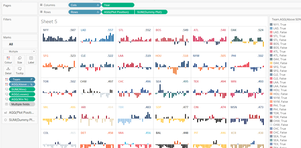
A colourful #WOW2022 challenge this week set by Kyle Yetter and using his favourite data – Baseball. Let’s jump straight in.
Building the required calculations
First up we need to calculate the core measure the viz is based on – % of wins
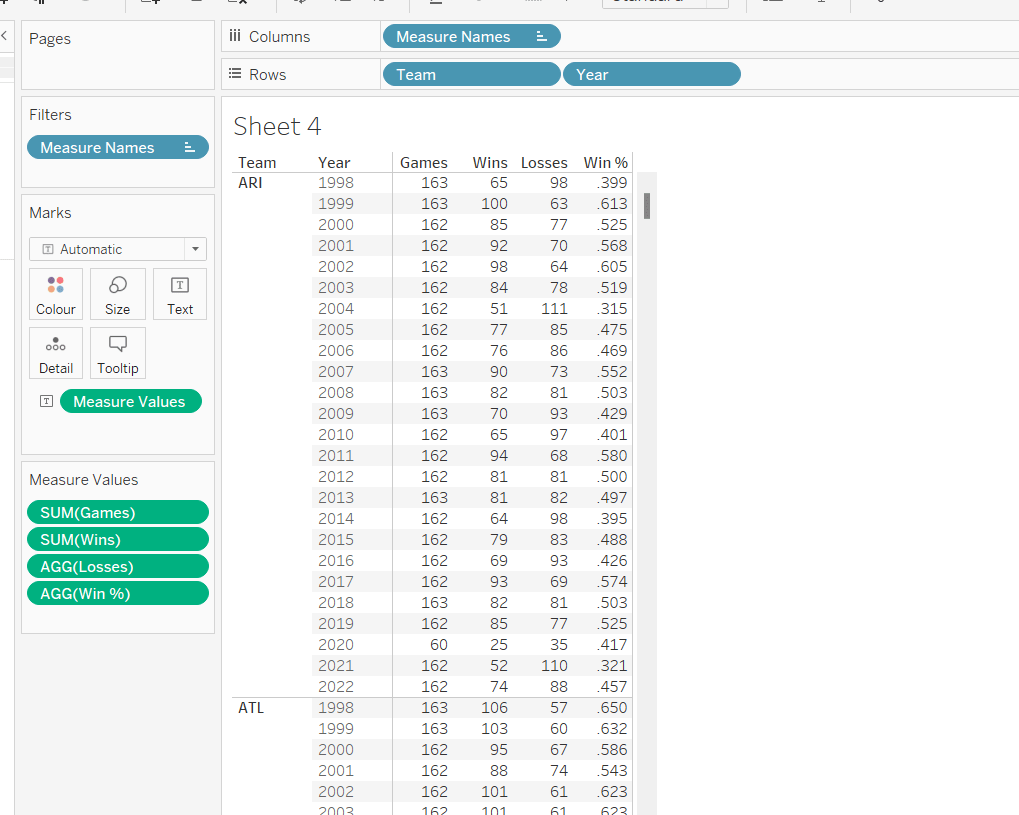
Win %
SUM([Wins])/SUM([Games])
I formatted this to 3 decimal places, then applied a custom number format to remove the leading 0 (custom number format looks like ,##.000;-#,##.000).
We also need to know the number of losses as this is part of the tooltip.
Losses
SUM([Games]) – SUM([Wins])
Let’s pop all these out into a table (I formatted all the whole numbers to display without any decimal places).
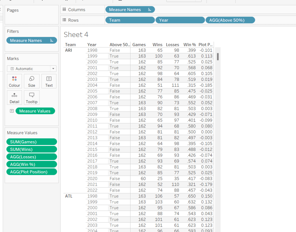
The viz however isn’t plotting the actual Win%, it’s plotting the difference from 50% (or 0.5), so values less than 50% are negative and those above are positive.
Plot Postion
[Win %] – 0.5
And we also need to know whether the Win% is above 50% or not
Above 50%
[Win %]>0.5
Pop these out onto the table too
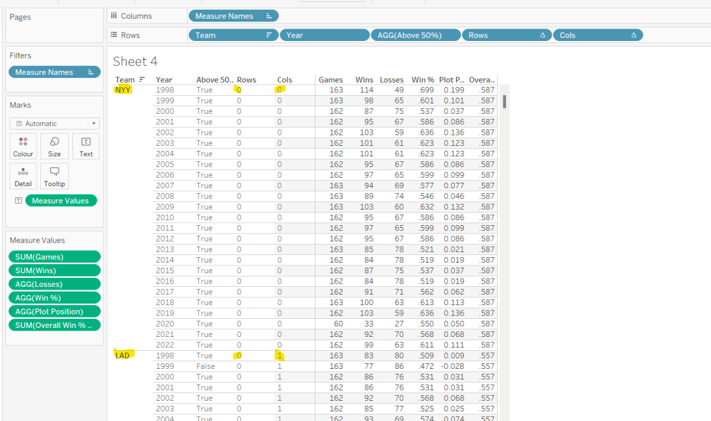
The viz also displays the overall Win% for each team, and also uses this to sort the data. As it is used for sorting, we need to use an LoD calculation (rather than a table calculation).
for each team, get the total wins, and divide by the total games for the team. Format this to 3 dp with no leading 0 as before.
pop this into the view (you’ll see it’s the same value for each row for a single team), and then apply a Sort on the Team field to sort descending by the Overeall Win% LOD.
Now we have the data sorted, we can create the fields needed to build the trellis chart.
I have already blogged challenges relating to trellis charts / small multiples (see here) which in turn reference other blogs in the community, so I’m not going to go into all the details. We just need to build two calculated fields to identify which row and which column each Team will sit in. The table is fixed at 6 columns wide as the data wea re using is static. Some solutions work with a more dynamic layout depending on how many entities you need to display. We’re keeping things simpler.
Cols
FLOAT(INT((INDEX()-1)%6))
Rows
FLOAT(INT((INDEX()-1)/6))
Add both these fields to the table as discrete dimensions (blue pills), and as they are both table calculations, set them both to Compute Using – > Team.
Building the Core Viz
On a new sheet, add Cols to Columns as discrete dimension, Rows to Rows as discrete dimension and Team to Detail. Set both Rows and Cols to Compute Using Team.
Add Year as continuous (green) pill to Columns and Plot Position to Rows and change the mark type to Bar and reduce the size. Sort the Team field based on Overall Win% LOD descending.
Add Wins, Losses, and Win% to the Tooltip shelf and adjust the tooltip to display as required. Add Above 50% to the Colour shelf (you may need to readjust the size). Leave the colours as they are for now – we’ll deal with this later.
Adding the labels
Create a new calculated field
Dummy Plot
FLOAT(IF [Year]=2000 OR Year = 2020 THEN 0.35 END)
This is basically going to position a mark at height 0.35 but only if the year is either 2000 or 2020. These values were all just based on a bit of trial and error as to what worked to get the desired result.
Also create a field
LABEL:Team
IF [Year]=2000 THEN [Team] END
and
LABEL:Win%
IF [Year]=2020 THEN [Overall Win % LOD] END
format this to 3dp and exclude the leading 0.
Add DummyPlot onto Rows and change the mark type of this measure to circle. Amend the Tooltip of this marks card so it’s empty.
Add LABEL:TEAM and LABEL:Win% to the Label shelf, and adjust the label so both fields sit side by side (only 1 value will only ever actually display). Adjust the table calculation of both the Rows and Cols pills so they now compute using both the Team and the LABEL:Team fields.
Adjust the alignment of the labels so they are positioned bottom centre. Set the font colour to match mark colour and bold.
Then reduce the size of the circle mark to as small as possible, reduce the opacity of the mark colour to 0.
Now make the chart dual axis and synchronise the axis. Remove the Measure Names field that has automatically been added to the All marks card.
Hide all the headers and axis (uncheck Show Header), remove all grid lines, zero line, axis rulers.
Hide the null indicator (bottom right).
Colouring by Team
Copy the colour palette text Kyle provided into your preferences.tps file (usually located in the My Tableau Repository directory). For more information on working with custom colour palettes see this Tableau help article.
You’ll need to save your workbook and re-open for the new palette to be available for use.
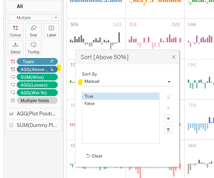
In order to prevent having to manually set all the colours (and believe me you don’t want to do this!), perform the following steps in order
Add Team to also be on the Colour shelf. Click on the 3 dots (…) that are to the left of the Team pill on the All marks card, and change it to Colour. This means there are now 2 fields on colour. Move the Team field so it is listed above the Above 50% pill. This means your colour legend should be listed as <Team>, <True|False>
Adjust the Sort of the Above 50% pill, so it is manually sorted to list True before False.
Now change the Sort on the Team field so it is sorted alphabetically ascending instead. This will cause the viz to change its sort order, but don’t worry for now. It also changes the list on the colour legend, so ARI, True is listed first then ARI, False etc.
Now edit the Colour Legend and select the new MLB Team Colours palette we added. Click the Assign Palette button to automatically assign the colours. As we’ve made sure the entries listed are in the right order, they should get the correct colours.
Change the Sort on the Team field back to be based on Overall Win% LOD descending
And that should be it. You can now add the viz to a dashboard and publish. My published version is here.
Ann Jackson made a special guest appearance this week, setting this challenge to introduce the newly released 2022.3 feature of dynamic zone visibility. As a consequence, a pre-requisite to completing this challenge is to install v2022.3 🙂
I used 6 sheets to build my solution, and I’ll step through each one, and then what’s required to put it all together.
Building the Sub-Category Picker
Building the Sub-Category Counter
Building the Bar Chart
Building the Line Chart
Building the Viz in Tooltip
Building the Dot Plot
Hiding & Showing the Charts
Adding & Removing Sub-Categories
Building the Sub-Category Picker
On a new sheet, add Sub-Category to Rows and change the mark type to circle. Right click on the Sub-Category field in the Data pane, and Create -> Set. Select the entries from Accessories down to Copiers. This will create a new field in the data pane called Sub-Category Set. Add this field to the Colour shelf, and adjust colours according to whether the values are In or Out of the set.
Add a grey border around the circles (via the Colour shelf) and increase the size a bit. Format the text of the sub-categories so its larger and right aligned. Remove all row/column dividers and hide field labels for rows to remove the Sub-Category column title (right-click on the column title). Adjust the Tooltip. Add a title to the sheet and then name the sheet Sub Cat Picker or similar.
Building the Sub-Category Counter
Create a new calculated field
Count Sub Cats Selected
COUNTD(IF [Sub-Category Set] THEN [Sub-Category] END)
If the Sub-Category is in the set, the return the Sub-Category and count the number of distinct entries.
Then create
Count Total Sub Cats
COUNTD([Sub-Category])
This just counts them all.
On a new sheet, add both fields to the Text shelf, and adjust the text accordingly.
Remove the tooltip so it doesn’t display. Name the sheet Set Count Label or similar.
Building the Bar Chart
Create a new field
Profit Ratio
SUM([Profit])/SUM([Sales])
and format to a % with 0 dp.
On a new sheet, add Profit Ratio to Rows and Sub-Category Set to Columns and also to Colour.
Right click on the text ‘In’ either on the colour legend or at the bottom of the bar, and Edit Alias. Change the text to SELECTED. Do the same thing for the text ‘Out’ and change to OTHER.
Add a row grand total (Analysis menu -> Totals -> Show Row Grand Totals). Adjust the colour of the grand total bar. Right click on the text ‘Grand Total’ and select Format. In the pane on the left hand side, change the Grand Total Label to read ALL PRODUCTS.
Create a calculated field
Overall PR
{SUM([Profit])}/{SUM([Sales])}
The { } make this a FIXED Level of Detail (LoD) calculation, so calculates over the complete data set.
Then create
PR Difference from Overall
[Profit Ratio]-SUM([Overall PR])
and format this to a custom number format of +0.0%;-0.0%;
Adding the second semi-colon implies there is a format for +ve numbers, -ve numbers and zero. In this instance we want zero difference to be displayed as blank.
Add both these fields the the Label shelf and adjust the font/layout accordingly, and match mark colour. Adjust the tooltip too.
Remove the profit ratio axis, remove all gridlines and row/column dividers. Add an axis ruler to the columns. Adjust the colour/size of the column labels. Hide the In/Out of Sub-Category Set column label (hide field label for columns). Add a title to the sheet and name the sheet Bar Chart or similar.
Building the Line Chart
On a new sheet, and Order Date to Columns and set to be a continuous (green) pill at the Quarter-Year level. Add Profit Ratio to Rows and Sub-Category Set to Colour.
Make the chart dual axis and synchronise the axis. Remove Measure Names from the All marks card, and remove the In/Out Sub-Category Set pill from the colour shelf of the PR Per Quarter marks card. Manually adjust the colour of this line to the appropriate shade.
On the All marks card, click the Label shelf, and check the Show mark labels option and select line ends. Adjust the font of the labels to be smaller, bold and to match mark colour.
Right click on the PR Per Quarter axis on the right hand side and select move marks to back, the right click again and uncheck Show Header to hide that axis.
Right click on the bottom axis, and Edit Axis and remove the axis title. Edit the left hand axis and amend the title so its capitalised.
Format the font of both axis, so the text is smaller, and then remove all row/column dividers, and all gridlines and zero lines. Add axis rulers for both the rows and columns.
Then add a sheet title and subtitle and name the sheet Line Chart or similar. I use this site to get the circular symbols used in the subtitle.
Building the Viz in Tooltip
The line chart shows another chart on hover.
On a new sheet, add Order Date as a blue discrete pill set to the Quarter-Year level, to Rows then add Sub-Category Set to Rows too. On the Columns shelf, double click and manually type in MIN(1). Add Sub-Category Set to Colour, then edit the MIN(1) axis to fix it from 0 to 1.
Add subtotals (Analysis menu -> Totals -> Add all subtotals). This will add a Total row to each section. Manually adjust the colour of the Total bar if need be via the colour legend.
Right click on the text ‘Total’ in the chart, and format. Amend the Total label to read ‘ALL PRODUCTS’ instead.
Add Profit Ratio to the Label and ensure the font matches mark colour. You may need to adjust the font size and boldness, and expand the row height a bit to see the text.
Hide the Order Date column, adjust the font of the Sub-Category Set column to be darker/bolder and right aligned, and adjust the column width so all the text is displayed.
Hide the MIN(1) axis, remove all row/column dividers and hide the Sub-Category Set column label. Then set the sheet to Entire View, and name the sheet VIT or similar.
Return the Line Chart sheet, and on the Tooltip shelf of the All marks card, adjust the tooltip to display the Order Date and insert a reference to the VIT sheet via the Insert -> Sheets -> VIT option
Adjust the height and width to suit.
Building the Dot Plot
On a new sheet, add Sub-Category Set to Rows and Profit Ratio to Columns. Change the mark type to circle. Then add Product ID to the Detail shelf and Sub-Category Set to Colour. Add column grand totals and adjust the colour of the grand total if need be. Format the ‘Grand Total’ text so it reads ALL PRODUCTS.
To get a clearer idea of how many products there are, we are going to randomly spread the dots across a vertical y-axis. For this we create
Jitter
RANDOM()
This just returns a number between 0 and 1.
Add this field to Rows and change it to be a Dimension. Adjust the opacity of the Colour to 50%.
Hide the Jitter axis. Make the header column wider, so the text doesn’t wrap, and adjust the text to b bigger and bolder and right aligned. Hide the Sub-Category Set column heading. Adjust the size and title of the Profit Ratio axis. Remove all gridlines and column dividers.
Right click on the Profit Ratio axis and add a reference line, which is set per pane to the the Total of the Profit Ratio. Use the Value as label and set the line to be a dotted black line at 100% opacity.
Add Product Name to the Tooltip and adjust accordingly. Add a title and name the sheet Dot Plot or similar.
Hiding & Showing the Charts
We’re going to control which sheet displays by use of a parameter, so I created
pChartSelector
an integer list from 1-3 which are mapped to the 3 display values
Then create a dashboard sheet and using layout containers build out the dashboard. I used a horizontal container in the centre of my dashboard. Within that I used a vertical container to house the Sub-Category Picker and the Sub-Category Counter. Then the 3 charts (bar, line and dot plot) were arranged next to that. I fixed the width of the vertical container with the picker and counter. The pChartSelector parameter is then added at the top right. I made use of both inner and outer padding and background colours of pale grey and white to get the look as reqiured.
To make the hide/show functionality, I created the following fields
Show bar
[pChartSelector]=1
Show line
[pChartSelector]=2
Show dot plot
[pChartSelector]=3
I added Show bar to the Detail shelf of the bar chart sheet, Show line to the Detail shelf of the line chart sheet and Show dot plot to the Detail shelf of the dot plot sheet.
Then back on the dashboard, I selected the bar chart sheet (so it’s surrounded by a dark grey border), and on the Layout tab on the left hand side, I checked the Control visibility using value checkbox and selected the Show bar field
I then repeated this process, this time selecting the line chart sheet, and when I checked the Control visibility checkbox, I selected the show line field instead. this made the line chart disappear, since my parameter was set to ‘Compared to the Total’ which was equivalent to the parameter = 1 and not 2. Changing the parameter to ‘Over Time’ and my line chart showed and the bar disappeared.
Repeat the process again for the dot plot, selecting the show dot plot field instead. Now only 1 chart should display at a time.
Adding & Removing Sub-Categories
The final step is to add the interactivity to allow selection and removal of a sub-category when clicking on the circles of the Sub-Category Picker sheet.
First, you need to add a dashboard action which changes set values
Add Sub-Categories
Uses the Sub Cat Picker sheet as source and on Select targets the Sub-Category Set by Adding values to the set. The values are retained when the selection is cleared.
Then add another dashboard action to change set values. This one is called
REMOVE
Uses the Sub Cat Picker sheet as source and via the Menu targets the Sub-Category Set by Removing values from the set. The values are retained when the selection is cleared.
The title of REMOVE is what is then displayed in the text of the tooltip when a circle that has been added is the clicked again.
Phew!
Quite a lengthy post this week, but there’s a lot going on. My published viz is here.
It’s community month still for #WOW2022, and this week saw Samuel Epley set this challenge to visualise the home run trajectories of Aaron Judge.
I had a little mini-break to Rome this week, so was hoping I was going to be able to get this week’s challenge done and dusted on the Tuesday evening if it landed early enough, as I wasn’t going to be around.
It did land on the Tuesday for me, but wow! it was not going to be easy! I managed to build the KPIs & the scatter plots on the Tuesday evening, and knowing I didn’t have much time, just chose to use the Home Runs stats data set only. I knew these charts weren’t going to need any data densification, so found this approach simpler.
I’m afraid I’m still constrained by time at the moment, so this post isn’t going to be the detailed walkthrough you might usually expect – sorry! I’m just going to try to pull out key points from each chart.
KPIs
I built this on a single sheet, using Measure Names and Measure Values.
I used aliases on the Measure Names (right click -> Aliases) to change the label you can see displayed ie the Distance pill is aliased to ‘Average Distance’
I also custom formatted the various numbers and applied suffixes to display the unit of measure
Note – to To get the degree symbol, I typed Alt+ 0176
Scatter Plots
I built the Exit Velocity by Distance scatter plot first, and completed all the formatting & tooltips. Then I duplicated the sheet to form the basis of the other scatter plots, and just swapped the relevant pills as needed.
For the ball shape, I loaded the provided images as custom shapes into my shapes repository. I then just created the following calculated field to use as a discrete dimension I could add to the Shape shelf
Ball Shape
[HR Number]%9
It’s not as completely randomised as perhaps it should be, but it looks random enough on the display.
The Pitcher in the data is in the format <Surname>, <Forename>, but on the tooltip it needs to display as <Forename> <Surname>, so I just used a transformation on the Pitcher field to split the field based on the comma (right click Pitcher -> Transform -> Split). This automatically created 2 fields I could use on the Tooltip.
I also noticed a very subtle wording change in the tooltip based on whether the match was Home or Away. If Home, the tooltip read ‘New York Yankees vs. <Opposition>’ otherwise it read ‘New York Yankees at <Opposition>’. I used a calculated field for this logic
TOOLTIP: vs or at
IIF([Location]=’Home’,’vs.’, ‘at’)
The Trajectory Plot
OK, so this was the hardest part of this challenge, and mainly due to getting your head round the physics involved, as so many of the calculations are dependent on each other.
I’m generally pretty confident with my maths, but this was complex, especially with the force calculations for the y-axis. Samuel stated that both gravity and drag impacted the Y-axis calcs, but it wasn’t clear to me how both these forces should be applied (a bit of trial and error and I ended up adding them within the formula).
By the time I came to tackle this challenge, Samuel had already posted a video walkthrough, which can be viewed here and is another reason why I’m not going down to the nth degree in this post.
My suggestion is to watch Samuel’s video and/or feel free to download my workbook. I built my workbook independent of Samuel’s video, so there may be steps/calculations that differ.
However, I have tried to number my calculations in the order in which I created them, so you can hopefully follow the thought process. I have also left a CHK:Data sheet in the workbook, which I used to sense check what I was doing.
All the table calculations in the CHK:Data sheet are just set to the default ‘table down’ as I have filtered the sheet to a specific Home Run (HR Number = 1) only (ie I didn’t change any of the table calc settings as I added the pills to the sheet).
However, when you build the main trajectory chart, you have multiple HR Numbers in the view, so all the table calculations must be set so that calculations are only working for each HR Number. This means that any table calc (and any nested calculations) need to have all the fields except HR Number checked
When using the Pages shelf, which isn’t something I’ve ever really had to do before, you need to Show History and adjust the various settings to get the trail lines to show
To rotate the ball (the bonus option), you need another field to use on the Shape shelf. I had lost the will to live a bit by this point, so used the formula from my friend Rosario Gauna’s solution.
Rotation Shape
STR(IIF([14-Start Position Y m] <= 0, 0, (MIN([Time Interval]) * 1000 / 25) % 9))
Note – when you add this to the Shape shelf, and select your baseball palette, just then use the Assign Palette button to automatically assign a ball to a number – this will get them into the correct order, without you having to do it one by one.
Finally, when adding the reference average lines, be sure to set the scope to per pane rather than table, otherwise you’ll end up with the wrong figures.
I think I’ve pretty much covered all the ‘little’ points that I came across that may trip you up, aside from all the tricky calcs of course!
My published workbook is here. I hope what I’ve written is enough for you to build it yourself. I think I’d still be here next year if I tried to do anything more fully! I’m off for a lie down now!
Week 2 of #WOW2022 was Kyle Yetter’s first challenge as official WOW coach. On first glance when it was posted on Twitter, I thought it didn’t look too bad… I figured they’d be some ‘baselining’ of dates that I’d need to do to get the axis to display.
However, it was a little trickier than I first anticipated, mainly in trying to ensure I got the right values to match with Kyle’s posted solution (which at one point seemed to change while I was building). I’ve also realised since clicking on the link to the challenge again, that it was tagged as an LoD challenge, although there was nothing specific in the requirements indicating this was a requirement. I don’t think I used any LoDs…
Anyway onto the build, and I’m going to start by getting the dates all sorted, as this I found was the trickiest part.
Firstly connect to the data, then verify that the date properties of the data source are set to start the week on a Monday (right click data source > Date Properties
Build a basic view that displays Sales by the week of Order Date and the year of Order Date. Exclude 2018 since we’re only focussing on up to the last 2 years of data.
Examining this data compared to the solution, the first points of each line relate to the data shown against the 7 Jan 2019, 6 Jan 2020 and 4 Jan 2021. Ie the first point for each line is the first Monday in the year.
For simplicity, to make some of the calculations easier to read , I’m going to store the start date of the order date week in a field.
Order Date Week Start
DATE(DATETRUNC(‘week’, [Order Date]))
This means I can easily work out the last day of the week
Order Date Week End
DATE(DATEADD(‘day’,6,[Order Date Week Start]))
Add these fields as discrete exact dates (blue pills) onto the table and remove the existing WEEK(Order Date) field since this is the same as Order Date Week Start
When we examine the end points of each line in the solution, the points relate to the data shown against the week starting 30 Dec 2019 to 5 Jan 2020, 28 Dec 2020 to 3 Jan 2021 and 22 Nov to 28 Nov 2021. For the first 2 points, we can see the data is ‘spread’ across 2 years (ie 2 columns), which means when categorising the data ‘by year’, using the Year associated to the Order Date itself isn’t going to work. We need something else
Year Group
YEAR([Order Date Week Start])
Move this field into the Dimensions pane (above the line), then add to the table, replacing the existing YEAR(Order Date) field. 2018 will appear due to the very first row of data, but don’t worry about this for now.
If you scroll down to the week starting 30 Dec 2019, all the data is now aggregated in a single Year Group.
So things are starting to take shape. We can now work on how to filter the data.
The requirements indicate we should imagine ‘today’ is 1st Dec 2021, so we’ll use a parameter to hold this value.
Today
Date parameter defaulted to 1 Dec 2021
We only want to show data for the last 2 years and for complete weeks up to today
Core Data to Include
[Order Date Week End] < [Today] AND YEAR([Order Date Week Start]) >= YEAR([Today])-2
Remove the existing filter and add this field instead, set to True. You should now have just 3 columns and the data starting and ending at the right points.
The next area of focus is to think about how the data is going to be presented – the lines are all plotted against a single continuous (green) date axis, so we need to ‘baseline’ the dates, that is adjust the dates so they are all on the same year.
Date To Plot
MAKEDATE(2021, MONTH([Order Date Week Start]), DAY([Order Date Week Start]))
this is basically setting the week start dates to the equivalent date in 2021.
In the table we’ve been building, add Date To Plot to Rows and set to the week level and be discrete (blue). Remove the Order Date Week Start pill and move the Order Date Week End to the Tooltip as this is where this pill will be relevant in the final viz.
We’re starting to now see how the data comes together, but we’ve still got some steps to go.
I’m going to adjust the Year Group, so we can present the Current, Previous, Last 2 Yrs labels. Change as follows
Year Group
YEAR([Order Date Week Start]) – YEAR([Today])
This returns values -2, -1, 0 which means the values will be consistent even if the ‘Today’ value changes. The values can then be aliased (right click Year Group > Aliases
Next focus is on the % difference in sales. Add a Percent Difference quick table calculation to the existing Sales pill. The vales will change to those we can see when hovering over the points in the solution.
Edit the table calculation and modify to explicitly compute by Year Group, which is important to understand as, when we build the viz, whether the data is going across or down may change, so ‘fixing’ like this ensures we retain the values we know are correct.
In order to manage the custom colour formatting in the tooltip, we’re going to ‘bake’ this field as a calculated field. Press CTRL, then click and drag the pill into the data pane and name the field accordingly. If you examine the field, it’ll probably look quite complex
I’m going to start building the viz now, and then we’ll add the final calcs needed for the formatting later.
On a new sheet
Add Core Data to Include to Filter and set to True
Add Date to Plot to Columns and set to a continuous week level (green pill)
Add Sales to Rows
Add Year Group to Colour and adjust accordingly
Reorder the values in the Year Group colour legend, so the ‘current’ line in the chart is displayed on the top, and the ‘2 yrs ago’ line is at the bottom
Format the WEEK(Date To Plot) field to be a custom date of dd mmm (ie 10 Jan)
Format the Sales axis to be $ with 0 dp
Add Order Date Week End to the Tooltip shelf and format the field to custom date format of mmm dd (ie Jan 10).
Now we need a couple of additional calcs to help format the % sales difference displayed on the tooltip.
% Sales Diff +ve
IF [% Sales Diff] >= 0 THEN [% Sales Diff] END
% Sales Diff -ve
IF [% Sales Diff] < 0 THEN [% Sales Diff] END
Format both these fields with a custom number format as ▲0.0%;▼0.0%
Add both these fields onto the Tooltip and adjust the table calculation settings of each to compute using by Year Group only
The 2 yrs ago line has no % Sales Diff value, and also no label, so we need a field to help this too
TOOLTIP: Label YoY%
IF NOT(ISNULL([% Sales Diff])) THEN ‘YoY%:’ END
This means the text ‘YoY%’ will only display if there is a % Sales Diff value.
Add this field onto the Tooltip too, and again adjust the table calculation settings.
Now format the text and tooltip as below, setting the two % Sales Diff pills to be side by side and colouring accordingly.
Hopefully, this means you now have a completed viz
My published viz is here. And nope… no LODs used 🙂 There are a few more calculated fields than what Kyle mentioned, but I could have condensed these by not having so many ‘building blocks’, but this may have made it harder to read.
I’m now off to check out Kyle’s solution and see whether I really over complicated anything…
When I was approached by the #WOW crew to provide a guest challenge, I was a little unsure as to what I could do. I primarily work as a Tableau Server admin, so rarely have a need to build dashboards (which is why I like to do the weekly #WOW challenges, to keep up my Desktop skills). Then the next day I was looking at a dashboard I’d built to monitor extracts on our Tableau Servers, and I thought it would be an ideal candidate for a challenge. I also thought it would provide any users of Tableau Server with the opportunity to implement this dashboard in their own organisation if they wished, by sharing with their Server Admins.
As a Tableau Server Admin, you get access to a set of ‘out of the box’ Admin views, one of which is called ‘Background Tasks for Extracts’ which gives you a view of when extracted data sources and workbooks run on the server. However while the provided view is fine if you want to quickly see what’s going on now, it’s not ideal if you want to see how things ran over a longer timeframe – it involves a lot of horizontal scrolling.
Many server admins will have ‘opened’ up access to the Tableau repository, the PostgreSQL database which stores a rich array of data, all about your Tableau Server [see here for further info], and enables admins to extend their analysis beyond the provided Admin views. This site even provides a set of pre-curated data sources to help you get started! These aren’t formally supported by Tableau, but is the brain-child of Matt Coles, a server admin at Tableau (no relation to me though!).
My dashboard doesn’t actually use one of these data sources though. For the challenge, I’ve just created some sample, anonymised data in the required structure. I’ll explain later at the end of the post how to go about converting this to use ‘real’ server data, if you do want to plug it into your own server environment.
Understanding the data
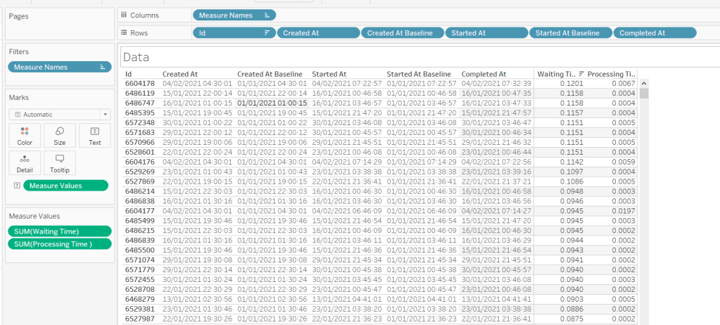
When using Tableau Server, published data sources and workbooks can connect to their underlying data source (eg a SQL Server database, an Excel file etc) directly (ie via a live connection) or via an extract. An extract means that a copy of the data is pulled from the underlying data source and stored on Tableau Server utilising Tableau’s ‘in memory’ engine when the data is then queried. An extract gets added to a schedule which dictates the time when the extract will get refreshed; this may be weekly, daily, hourly etc. Every time the extract runs, a background task is created which provides all the relevant details about that task. The data for this challenge provides 1 row for each extract task that was created between Monday 11th Jan 2021 and Friday 5th Feb 2021. The key fields of note are:
Id – uniquely identifies a task
Created At – when the task was created
Started At – when the task actually started running (if too many tasks are set to run at the same time, they will queue until the server resources are available to execute them).
Completed At – when the task finished, will be NULL if task hasn’t finished.
Finish Code – indicates the completion status of the job (0=success, 1=failed, 2= cancelled)
Progress – supposed to define the % complete, but has been observed to only ever contain 0 or 100, where 100 is complete.
Title – the name of the extract
Site – the name of the site on the server the extract is associated to
Based on the Finish Code and Progress, I have derived a calculated field to determine the state of the extract (to be honest, I think this is a definition I have inherited from closer analysis of the Background Tasks for Extracts Server Admin view, so am trusting Tableau with the logic).
Extract Status
IF [Finish Code] = 1 AND [Progress] <> 100 THEN ‘In Progress’ ELSEIF [Finish Code] = 0 AND NOT [Progress] = 1 THEN ‘Success’ ELSE ‘Failed’ END
Building the required calculated fields
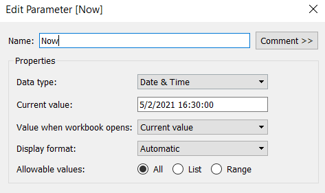
The intention when being used ‘in real life’, is to have visibility of what’s going on ‘Now’ as well as how extracts over the previous few days have performed. As we’re working with static data, we need to hardcode what ‘Now’ is. I’ll use a parameter for this, so that in the event you do choose to plug this into your own server, you only have to replace any reference to the Now parameter with the function NOW().
Now
Datetime parameter defaulted to 05 Feb 2021 16:30
The chart we are going to build is a Gantt chart, with 1 bar related to the waiting time of the task, and 1 bar related to the running time of the task. We only have the dates, so need to work out the duration of both of these. These need to be calculated as a proportion of 1 day, since that is what the timeframe is displayed over.
Waiting Time
(DATEDIFF(‘second’, [Created At], IF ISNULL(Started At]) THEN [Now] ELSE [Started At ] END))/86400
Find the difference in seconds, between the create time and start time (or Now, if the task hasn’t yet started), and divide by 86400 which is the number of seconds in a day.
We repeat this for the processing/running time, but this time comparing the start time with the completed time.
Processing Time
(DATEDIFF(‘second’, [Started At], IF ISNULL([Completed At]) THEN [Now] ELSE [Completed At] END))/86400
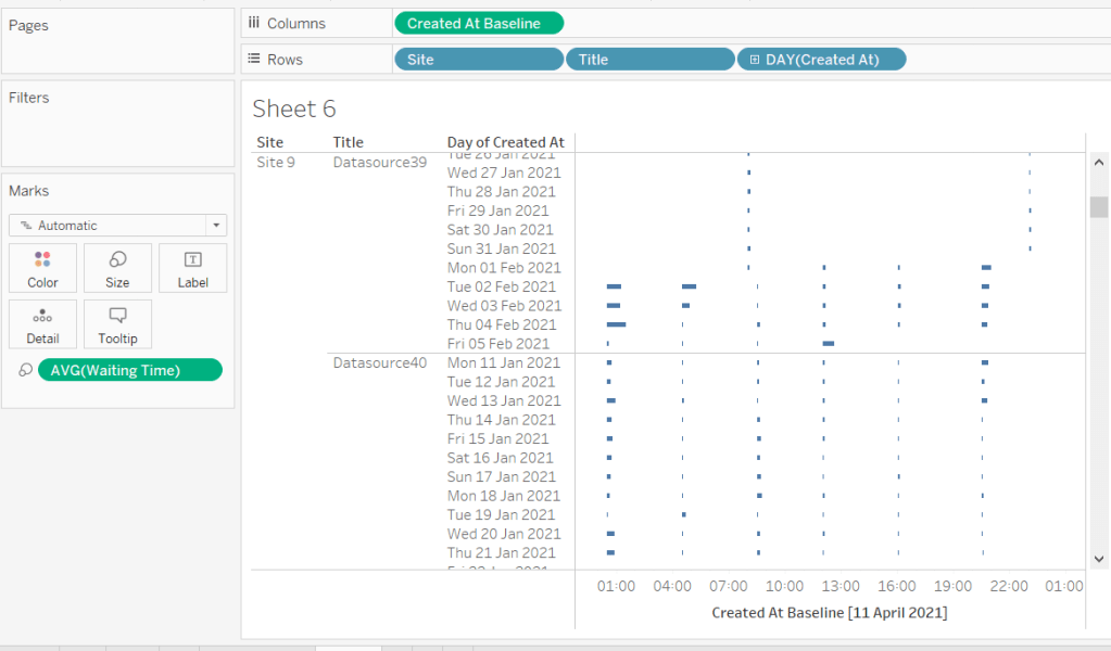
As mentioned the timeframe we’re displaying over is a 24 hr period, and we want to display the different days over multiple rows, rather than on a single continuous time axis spanning several days.
To achieve this, we need to ‘baseline’ or ‘normalise’ the Created At field to be the exact same day for all the rows of data, but the time of day needs to reflect the actual Created At time . This technique to shift the dates to the same date, is described in this Tableau Knowledge Base article.
Putting this out into a table, you can see what this data all looks like (note, I’m just choosing a arbitrary date of 01 Jan 2021, so my baseline dates are all on this date:
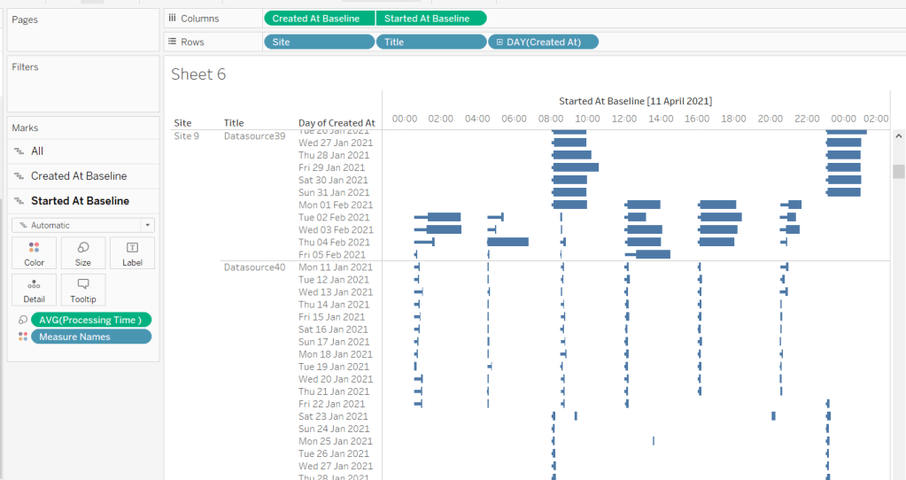
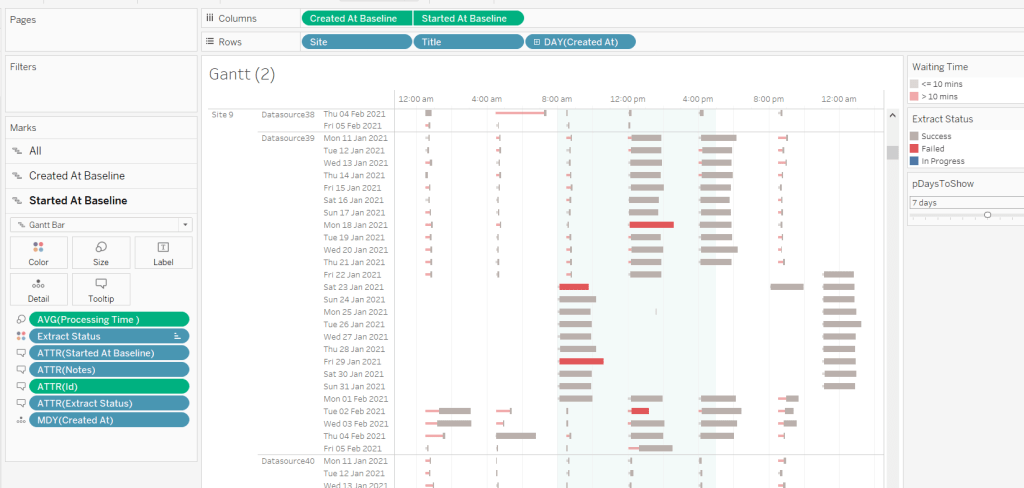
Building the Gantt chart
We’re going to build a dual axis Gantt chart for this.
Add Site to Rows
Add Title to Rows
Add Created At to Rows. Set it to the day/month/year level and set to be discrete (ie blue pill). Format the field to custom format of ddd dd mmm yyyy so it displays like Mon 11 Jan 2021 etc
Add Created At Baseline to Columns, set to exact date
Add Waiting Time (Avg) to Size and adjust to be thin
This will automatically create a Gantt chart view
Next
Add Started At Baseline to Columns, set to exact date, and move so the pill is now placed to the right of the Created At Baseline pill
On the Started At Baseline marks card, remove Waiting Time and add Processing Time (Avg) to the Size shelf instead. Adjust so the size is thicker.
Set the chart to be dual axis and synchronise the axes
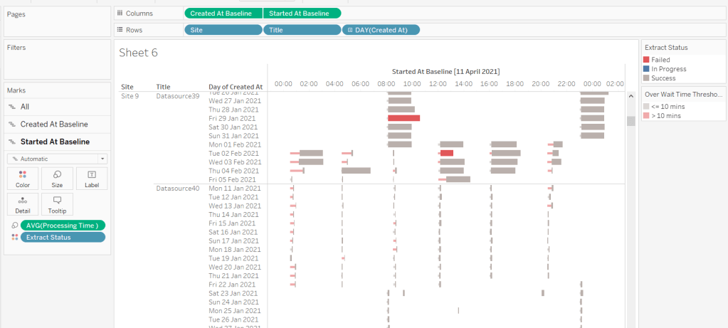
The thicker bars based on the Started At / Processing Time need to be coloured based on Extract Status. Add this field to the Colour shelf of the Started At Baseline marks card and adjust accordingly.
The thinner bars based on the Created At / Waiting Time need to be coloured based on how long the wait time is (over 10 mins or not).
Over Wait Time Threshold
[Waiting Time] > 0.007
0.007 represents 10 mins as a proportion of the number of minutes in a day (10 / (60*24) ).
Add this field to the Colour shelf of the Created At Baseline marks card and adjust accordingly (I chose to set to the same red/grey values used to colour the other bars, but set the transparency of these bars to 50%).
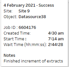
Formatting the Tooltips
The tooltip for the Waiting Time bar displays
The Created At Baseline and Started At Baseline should both be added to the Tooltip shelf and then custom formatted to h:mm am/pm
The Waiting Time needs to be custom formatted to hh:mm:ss
The tooltip for the Processing Time bar is similar but there are small differences in the display,
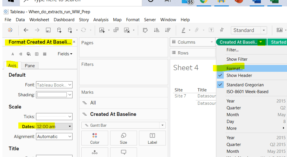
Formatting the axes
The dates on the axes are displayed as time in am/pm format.
To set this, the Created At Baseline / Started AtBaseline pills on the Columns shelf need to be formatted to h:mm am/pm
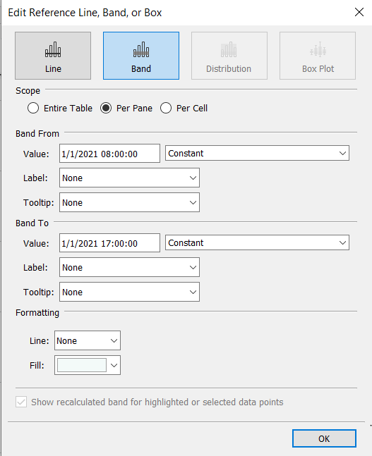
Adding the reference band
The reference band is used to highlight core working hours between 8am and 5pm. Right click on the Created AtBaseline axis and Add Reference Line. Create a reference band using constants, and set the fill colour accordingly.
Apply further formatting to suit – adjust sizes of fonts, add vertical gridlines, hide column/axes titles.
Filtering the dates displayed
As discussed above, when using this chart in my day to day job, I’d be looking at the data ‘Now’. As a consequence I can simply use a relative date quick filter on the Started At field, which I default to Last 7 days.
However, as this challenge is based on static data, we need to craft this functionality slightly differently.
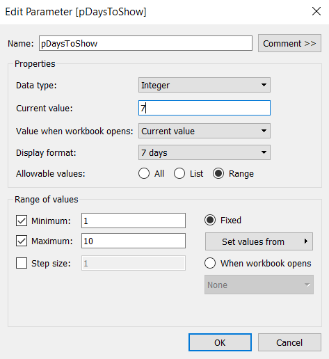
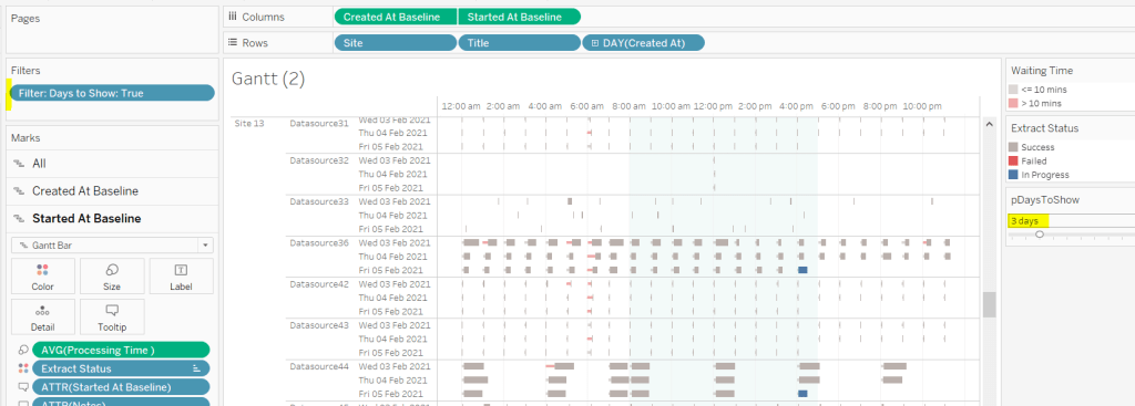
We’re only going to show up to 10 days worth of data, and will drive this using a parameter.
pDaysToShow
An integer parameter, ranging from 1 to 10, defaulted to 7, and formatted to display with a suffix of ‘ days’.
We then need a calculated field to use to filter the dates
Additionally, the chart can be filtered by Site, so add this to the Filter shelf too.
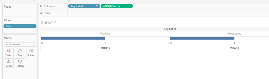
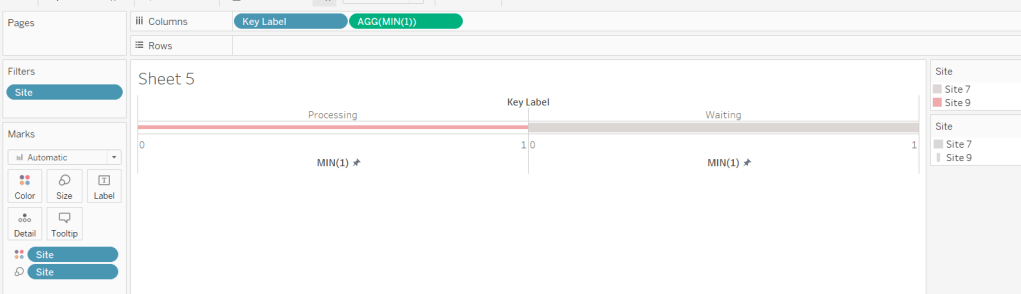
Building the Key legend
Some people may build this by adding a separate data source, but I’m just going to work with the data we have. This technique is reliant on knowing your data well and whether it will always exist.
On a new sheet, add Site to the Filter shelf and filter to sites 7 and 9.
Create a new field
Key Label
If [Site] = ‘Site 9’ THEN ‘Waiting’ ELSE ‘Processing’ END
and add this to the Columns shelf and sort the field descending, so Waiting is listed before Processing.
Alongside this field, type directly into the Columns shelf MIN(1).
Edit the axes to be fixed to from 0 to 1. Then add the Site field to the Colour shelf and also to the Size shelf and adjust accordingly (you may need to reverse the sizes). I lightened the colour by changing the opacity to 50%.
Now hide the axes, remove row & column borders, hide the column title and turn off tooltips.
The information can all now be added to a dashboard.
Using your own data
To use this chart with your own Tableau Server instance, you need to create a data source against the Tableau postgres repository that connects to the _background_tasks (bgt) table with an inner join to the _sites (s) table on bgt.site_id = s.Id. Rename the name field from the _sites table to Site. If you don’t use multiple sites on your Tableau Server instance, then the join is not required. The sole purpose of the join is to get the actual name of the site to use in the display/filter.
You should then be able to repoint the data source from the Excel sheet to the postgres connection. You may find you need to readjust some of the colours though.
When I run this, I’m using a live connection so I can see what is happening at the point of viewing, rather than using a scheduled extract. To help with this, I add a data source filter to limit the days of data to return from the query (eg Created at <=10 days), which significantly reduces the data volume returned with a live connection.
Hopefully you enjoyed this ‘real world’ challenge, and your server admins are singing your praises over the brilliance of this dashboard 🙂
A relatively straightforward challenge was set by Luke this week, to visualise the difference in Sales between 2020 and 2021 in a slightly different format than what you might usually think of.
Start by filtering the data to just the years 2020 and 2021 (add Order Date to the Filter shelf and select specific years, or add a data source filter to limit the whole data set).
Add Sub-Category to Rows, and Sales to Columns, then add Order Date to Colour which by default will display as YEAR(Order Date). Colour the years appropriately.
Now unstack the marks (Analysis menu -> Stack Marks -> Off), and re-order the colour legend, so 2021 is listed first (this makes the 2021 bars sit ‘on top’ of 2020).
Adjust the size to make the bars thinner.
Now add another instance of Sales to the Columns shelf, and make the chart dual axis (synchronising the axis). Reset the mark type of the original SUM(Sales) marks card back to bar.
We need the circle mark for the 2021 Sales to be blue. To do this, duplicate the Order Date field, then add Order Date (copy) to the Colour shelf of the SUM(Sales)(2) marks card. This will show another colour legend, and you can set the colours accordingly. Add a white border around the circle marks.
To work out the % difference to display on the label, we need the following fields
2021 Sales
{FIXED [Sub-Category]: SUM(IF YEAR([Order Date])=2021 Then [Sales] END)}
This returns the value of the 2021 sales for each Sub-Category against all the years in the data set. Similarly we need
2020 Sales
{FIXED [Sub-Category]: SUM(IF YEAR([Order Date])=2020 Then [Sales] END)}
Sean Miller provided the challenge for this week, resurrecting a challenge originally set by Emma Whyte in 2017. Revisiting these older challenges is great fun, as often newer product features provide a different way of solving. For me, I also like the fact I know I’ve already solved it once, and have my own work to reference if I get stuck – ha ha!
Sean hinted that this wasn’t a challenge to ‘overthink’ – no table calcs or LoDs required. You need to be able to display average responses per question per university alongside the overall average response for the question. Simply filtering by university isn’t going to cut it, as the quick filter will immediately eliminate all the data that isn’t associated to the selected university, which means you can’t compute an ‘overall average’ without using LoDs.
The key to this challenge is to use a parameter to drive the University selection. Create this by right clicking on the University field -> Create > Parameter. This will create the parameter dialog box, prepopulated with all the university values. Set the default to University of Liverpool.
pUniversity
With this, we can now create calculated fields to store the values associated to the selected university only.
Note 1, there is already field called Sample Size in the data set. The actual name of this field is <space>Sample Size<space> which Tableau sees as a different name. In hindsight I should have just renamed the original field, so I could then have ‘Sample Size‘. Be mindful of this when I refer to the field later; unless I call it out, I’m referring to my version.
Note 2, I chose to apply the AVG aggregation within the calc rather than changing the default aggregation on the pill when added to the view. There was a reason I did this, but I can’t recall what it was, and think it wasn’t necessary in the end….
University Avg
AVG(IF [University] = [pUniversity ] THEN [% Agree] END)
formatted to percentage, 1 dp
We can also then define the overall average for comparison
Overall Avg
AVG([% Agree])
formatted to percentage, 1 dp
and with that can calculate the variance between the two
Delta
([University Avg]) – ([Overall Avg])
This is custom formatted to 0.00%▲;0.00%▼ (I use this site to get the arrow characters)
And then we need a field to define how the mark needs to be coloured
Colour
[Delta]>=0
We can put these all out in a view
Question Number (which I renamed to No) on Rows
Question Text on Rows
Sample Size on Rows (set to be a discrete blue pill)
University Avg on Rows (set to be discrete)
Overall Avg on Rows (set to be discrete)
Delta on Rows (set to be discrete)
University Avg on Columns (continuous green pill)
Change Mark Type to Circle
Add Colour to the Colour shelf and adjust
Now we need to work on adding the various lines and bands on the chart. This is all managed by adding reference lines (or bands).
Drag % Agree to the Detail shelf, and change to be AVG.
The drag the same field % Agree on Detail again, this time change to MIN. Repeat again, and change to MAX.
Right click on the University Avg axis > Add Reference Line. Create a line, per pane using the AVG(% Agree) field.
Add another reference line (by right clicking on the axis again). This time create a band that starts at MIN(% Agree) and ends at MAX(% Agree). Set the Fill colour to light grey.
We need to create some new fields for the quartile values.
Lower Quartile
PERCENTILE([% Agree],0.25)
Upper Quartile
PERCENTILE([% Agree],0.75)
Add both these fields to the Detail shelf again, then add another reference line (band) similar to that above, but referencing the quartile fields. Set the Fill colour to be a darker grey.
Adjust the formatting and set the tooltips and you’ve got the main chart…. well almost…
In the solution, the first column, the question no, is not labelled. I couldn’t figure out how to do this, which is why I relabelled to simply No. I tried various things, including using text boxes as column headings on the dashboard, but the layout just didn’t work.
BUT I’ve now found out how to do it… because I googled, and I didn’t yesterday when I was building 😦 Andy Kriebel explains it all here. He searches for a ‘zero width space’ character on this site , and then copies the resulting ‘character image’ displayed and pastes into the label of a calculated field. Watch the video to see it in action, but I’ve noted the steps here, just as much for my own benefit when I can’t remember what to do in future… I can see this type of feature cropping up often 🙂
The legend utilises a lot of the concepts above, but we don’t what the mark changing with each university selection. So let’s just hardcode
Legend Avg
AVG(IF [University] = ‘Middlesex University’ THEN [% Agree] END)
and we’ll need a dedicated field for the colour
Legend Colour
[Legend Avg] – [Overall Avg] >=0
The legend sheet can then be built just by plotting the Legend Avg pill on the Columns shelf, with a mark type of circle, the Legend Colour on the Colour shelf, and the same pills used in the reference lines above on the Detail shelf.
When adding the reference lines and bands this time, you will need to add labels and format their position.
The quartile band, also has dotted lines indicating the end of the band, which you can apply as part of the band properties. However the quartile band also has one label left aligned, while the other is right aligned. For a single reference band, the labels can either both be formatted left aligned or both right aligned. To resolve this, don’t add a label to the ‘band to’ section. Create another reference line for the Upper Quartile value, and you can then format the label of this independently.
My published via associated to this challenge is here.
My version based on the original challenge from 2017 is here. The requirement was a bit more complicated it would seem, and it looks like I utilised FIXED LODs quite heavily.