
Erica set the challenge this week using a custom made dataset. The focus was to handle viewing different aggregations of the dates based on the date range selected, ie for short date ranges seeing the data at a day level, for medium ranges, view at the week level and then at a monthly level for larger ranges. This type of challenge has been set before, but the visual is typically a line chart rather than a heat map. The principles are similar though.
Determining the Date to Display
Each row in the data set has a Date associated to it. For this challenge we need to ‘truncate’ the date to the appropriate level depending on the date range and the date level selected by the user. By that I mean that if the level is deemed to be weekly, we need to ‘reset’ each date to be the 1st day of the week.
To start with, we need to set up some parameters which drives the initial user input.
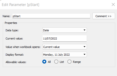
pStart
Date parameter defaulted to 11/07/2022 (11th July 2022), with a display format of <weekday>, <date>
pEnd
As above, but defaulted to 24/07/2022 (24th July 2022).
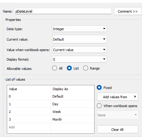
pDateLevel
integer with values 0-3 as listed below, with a text Display As. Defaulted to ‘Default’. Note, I am using integers as we will be referencing them in IF statements later, and integers are more performant than comparing strings.
With these parameters, we can then build
Date To Display
DATE(
IF [pDateLevel] = 0 THEN
IF DATEDIFF(‘day’, [pStart], [pEnd]) < 28 THEN DATETRUNC(‘day’,[Date])
ELSEIF DATEDIFF(‘day’, [pStart], [pEnd]) < 90 THEN DATETRUNC(‘week’, [Date])
ELSE DATETRUNC(‘month’, [Date])
END
ELSEIF [pDateLevel] = 1 THEN DATETRUNC(‘day’,[Date])
ELSEIF [pDateLevel] = 2 THEN DATETRUNC(‘week’,[Date])
ELSE DATETRUNC(‘month’, [Date])
END
)
If the pDateLevel is set to 0 (ie Default), then compare the difference between the dates entered and truncate to the ‘day’ level if the difference is less than 28 days, the ‘week’ level if the difference is less than 90 days, else truncate to the month level (which will return 1st of the month). Otherwise, if the pDateLevel is 1 (ie Day), truncate to the day level, if it’s 2 (ie Week), truncate to the week level, else use the month level.
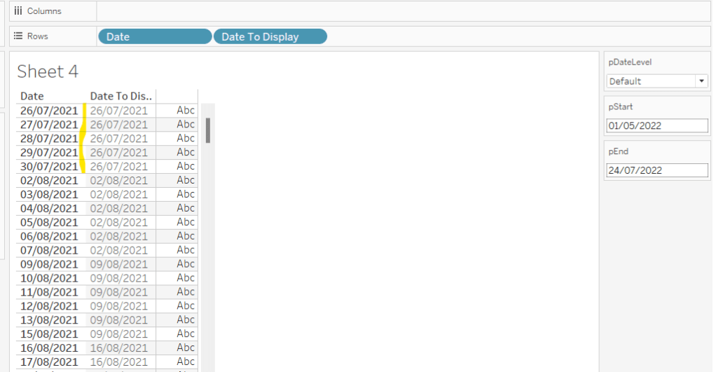
To see how this field is working, add Date and Date To Display to Rows, both as discrete exact dates (blue pills), display the parameter fields, and adjust the values. Below you can see that using the Default level, between 1st May and 24th July, the 1st day of the associated week against each date is displayed.
Building the Bar Chart
This is the simpler of the two charts to build, so we’ll start with this.
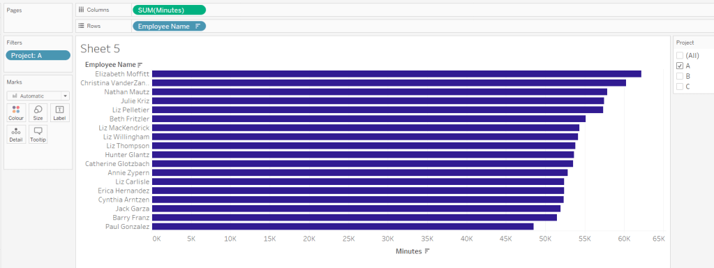
Add Employee Name to Rows, and Minutes to Columns. and sort by Minutes descending (just click the sort descending button in the toolbar). Add Project to Filter, select ‘A’ and then show the filter. Adjust the colour of the bars. I used #311b92
We need to restrict the data displayed based on the date range defined.
Dates to Include
[Date]>=[pStart] AND [Date]<=[pEnd]
Add this to the Filter shelf and set to True.
Now, we need to label the bars, and need new fields for this.
Duration (hrs)
FLOOR(SUM([Minutes])/60)
Using the FLOOR function means the value is always rounded down to the relevant whole number (eg 60.5 and above will still result in 60).
Format this field to be 0 decimal places with a ‘h’ suffix

Duration (mins)
SUM([Minutes])%60
Modulo (%) 60 means return the remainder when divided by 60. Format this to be 0 dp.
Add both these fields to the Label shelf, and adjust so the labels are displaying on the same line and are aligned to the left. You may need to increase the width of each row to see them.

Add Project to the Tooltip shelf and update, then remove all gridlines and the axis. Leave the Employee Name column visible for now. We’ll come back to this later.
Building the Heat Map
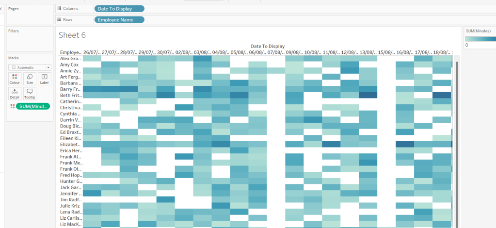
On a new sheet, add Employee Name to Rows and Date to Display as a discrete exact date (blue pill) to Columns. Add Minutes to Colour and a heat map should automatically display.
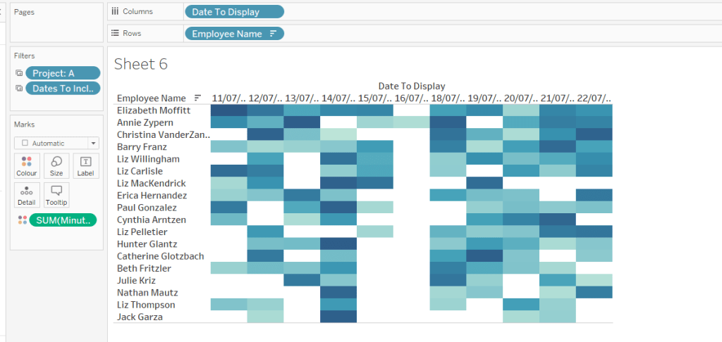
Go back to the bar sheet, and set both the Project and the Dates To Include filters to apply to the heat map worksheet as well (right click each pill on the filter shelf -> Apply to Worksheets -> Selected Worksheets and select the other one you’re building).
Then click the sort descending button in the toolbar, to order the data as per the bar.
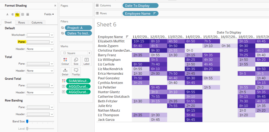
Add both Duration (hrs) and Duration (mins) to the Label shelf and change the mark type to Square. Adjust the label so it is on the same line and left aligned (I added a couple of spaces to the front of the text so it isn’t so squashed).
Edit the colours of the heat map – I used a colour palette I had installed called Material Design Deep Purple Seq which seemed to match, but may not be installed by default.
Format the main heat map section to have a light grey background by right clicking on the table -> format and setting the shading of the pane only to pale grey
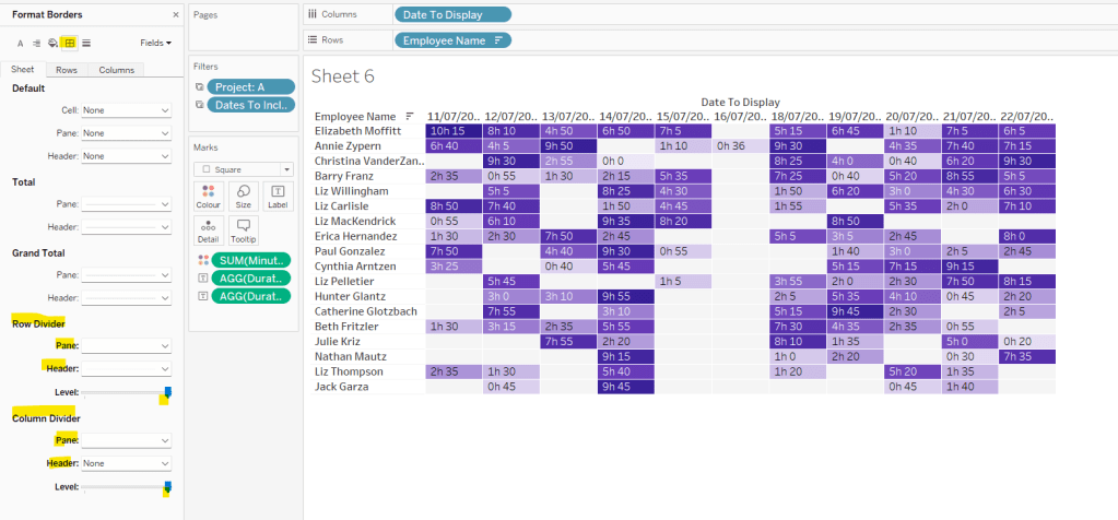
Then adjust the row dividers of the pane to be white, and the header to be pale grey (set the level to the max).
Adjust the column dividers similarly, setting the pane to be white, the header to none, and level to max
Next we want to deal with the column labels. By default they’re showing the date, but we want this to show something different depending on the date level being displayed.
Column Label
IF (([pDateLevel] = 1) OR (([pDateLevel] = 0) AND (DATEDIFF(‘day’, [pStart],[pEnd])<28))) THEN UPPER(LEFT([Weekday],3))
ELSEIF (([pDateLevel] = 2) OR (([pDateLevel] = 0) AND (DATEDIFF(‘day’, [pStart],[pEnd])<90))) THEN ‘w/c ‘ + IIF(LEN(STR(DATEPART(‘day’, [Date To Display])))=1,’0’+STR(DATEPART(‘day’, [Date To Display])), STR(DATEPART(‘day’, [Date To Display]))) + ‘-‘ + UPPER(LEFT(DATENAME(‘month’, [Date To Display]),3))
ELSE UPPER(LEFT(DATENAME(‘month’, [Date To Display]),3))
END
If the date level is ‘day’ or the date level is the default and the start & end are less than 28 days apart, then show the day of the week (1st 3 letters only in upper case).
Else if the date level is ‘week’ or the date level is the default and the start & end are less than 90 days apart, then show the text ‘w/c’ along with the day number (which should be 01 to 09 if the day is < 10) a dash (-) and then the 1st 3 letters of the month in upper case.
Else, we’re in monthly mode, so show the 1st 3 letters of the month in upper case.
Add this to the Columns shelf, then hide the Date To Display field (uncheck show header), hide field label for columns and hide field label for rows. Format the Employee Name field so its a different font (I changed to Tableau Book).
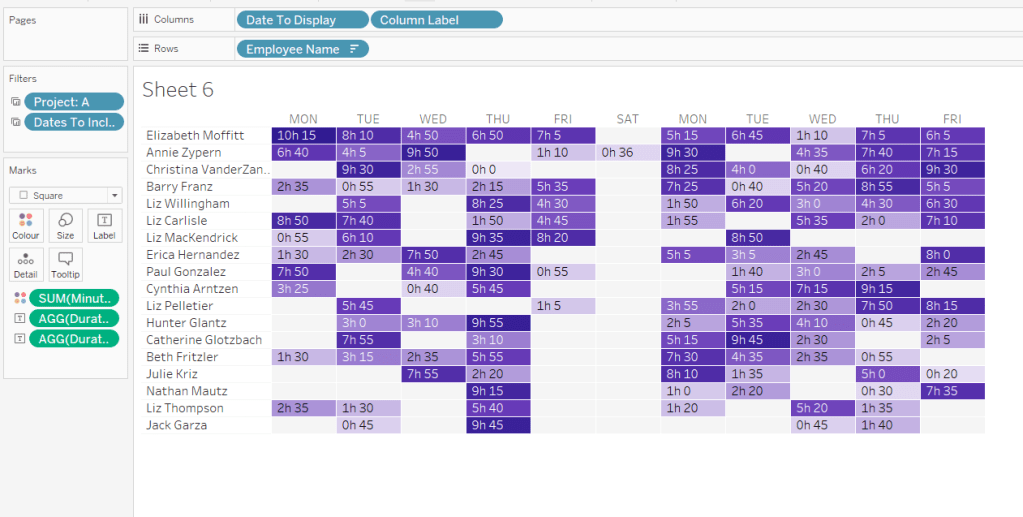
Again play around with the parameters and see the changes to the column label.
Finally, add Project to the Tooltip and update. You’ll need to adjust the formatting of the Date To Display field to get it into <day of week>, <date> format.
Adding to the Dashboard
When you add the two charts to the dashboard, you’ll need to set them side by side within a horizontal layout container. Remove the titles. They both need to be set to ‘fit entire view’, and the width of the heat map chart should be fixed (I set it to 870px), so it retains the space it stays in, even when you only have 1 month displayed.
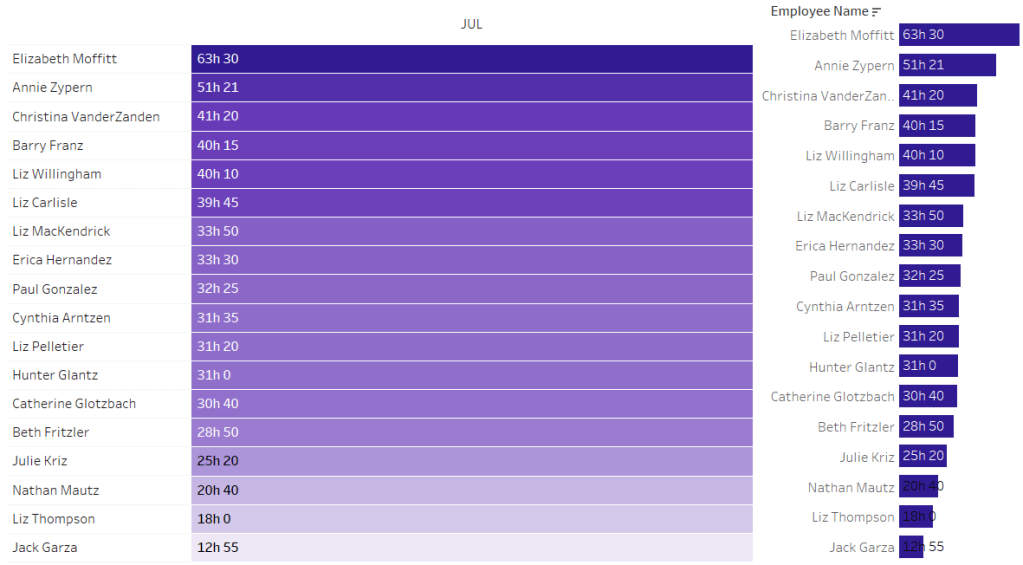
Once you’re happy the order of the heat map employees matches the order of your bar chart, uncheck show header against the Employee Name field on the bar chart.
To get the bars to align with the heat map, I showed the title of the bar, removed the text and just entered a space. This dropped the bars so they just about aligned. You may need to tweak by increasing the size of the bars slightly.

Finally, you need to move your parameters around. I placed them in a horizontal container, whose background colour was set to pale grey. I then set the objects within to be equally spaced by setting the container to Distribute Contents Evenly.
I then altered the padding of each of the parameter objects to have outer padding = 0 and inner padding = 5 and added a pale grey border surrounding each.
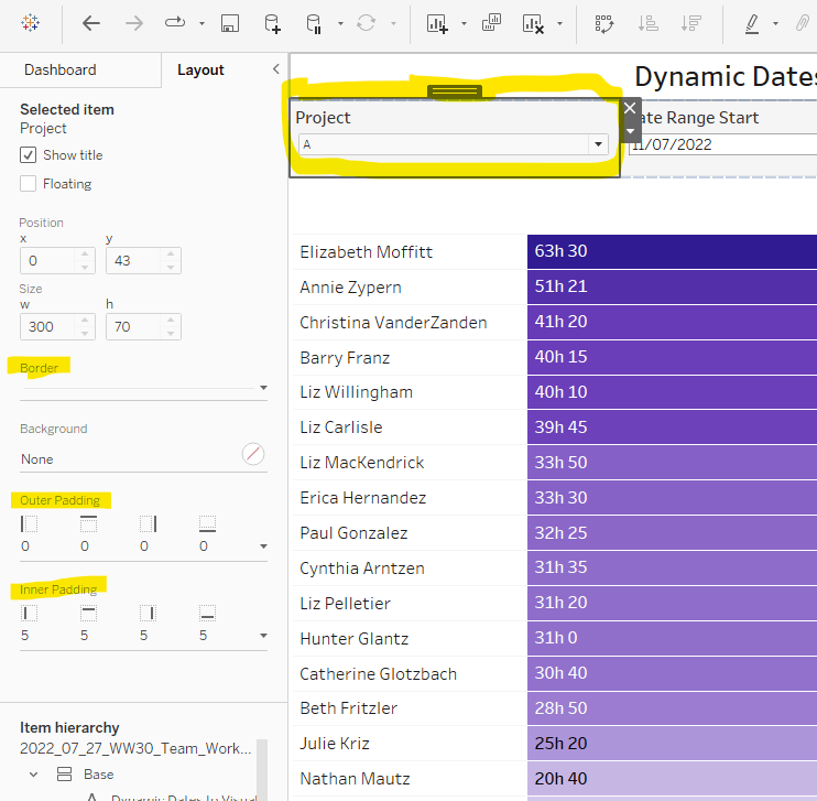
And that should be it. My published viz is here.
Happy vizzin’!
Donna


