Erica set this fun and incredibly useful challenge this week, based on the TC25 talk by Lorna Brown & Robbin Vernooij, to showcase different methods of normalising data when comparing measures which have drastically different scales.
Building the Raw Values chart
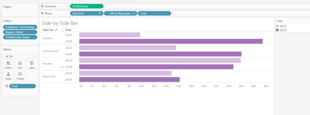
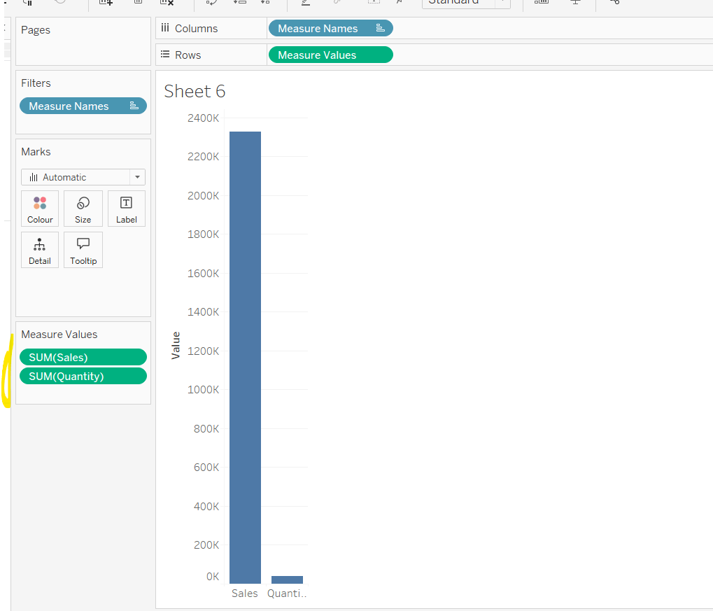
Add Sales to Rows. Then drag Quantity on to the canvas and drop the pill on the Sales axis (when you see the ‘2 column’ icon appear). This has the affect of adding the fields onto a shared axis, and the sheet will update to automatically reference Measure Names and Measure Values. Swap Quantity so it is displayed below Sales in the Measure Values section.
Add Region and Category to Detail and change the Mark type to Circle.

I’m going to incorporate the last requirement at this stage, as it helps with the build, so create parameters
pSelectedRegion
string parameter, defaulted to West
pSelectedCategory
string parameter, defaulted to Furntiture
show both these parameters on the sheet.
Create a new field
Is Selected Region & Category
[pSelectedCategory]=[Category] AND [pSelectedRegion]=[Region]
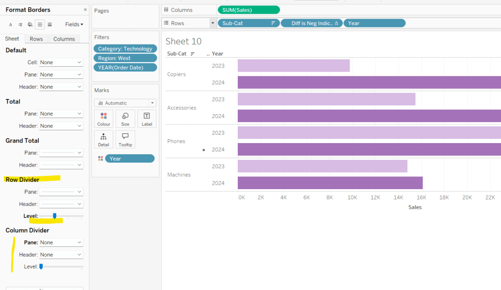
Add this field to Colour, and swap the values in the legend, so True is listed first. Then change the Region on the Detail shelf, so it is also on colour, by adjusting the icon to the left of the pill. Adjust the colours as required and then reduce the opacity on colour to 80%.

Manually update the entry in the pSelectedRegion parameter to each Region, so the True-<Region> colour combination can be updated to the dark grey.
Add Is Selected Region & Category to Size. Edit the size so they are reversed and the range in size is closer than the default. Once done, then manually adjust the dial on the Size shelf.
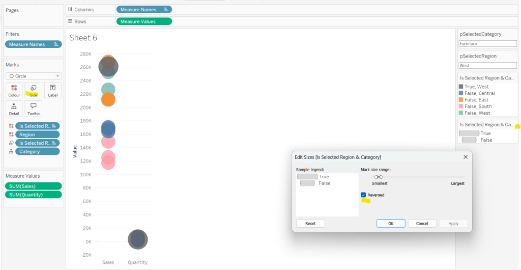
Show mark labels, selecting the option to only show the min & max values per cell and aligning middle right
Update the Tooltip. Then create fields True = TRUE and False = FALSE and add both of these to the Detail shelf. We’ll need these to disable the default highlighting later (adding now, as for all the other sheets, we’ll duplicate this one, so makes things easier).
Show the caption (Worksheet menu > show caption) and update the caption to reference the website Erica refers to. Then update the title of the sheet, and name the tab Raw or similar.

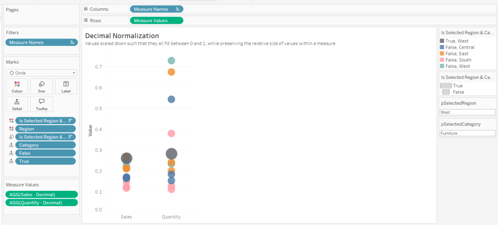
Building the Decimal Normalisation chart
Duplicate the Raw sheet, and name Decimal or similar. Update the title.
Create new fields
Sales – Decimal
SUM([Sales]) / 10^6
Quantity – Decimal
SUM([Quantity]) / 10^4
Drag Sales – Decimal onto the canvas and drop directly over the existing Sales pill in the Measure Values section, so it replaces it. Do the same with the Quantity – Decimal pill. Uncheck Show Labels.
Add constant reference line of 0 that displays as a black solid line at 100% opacity
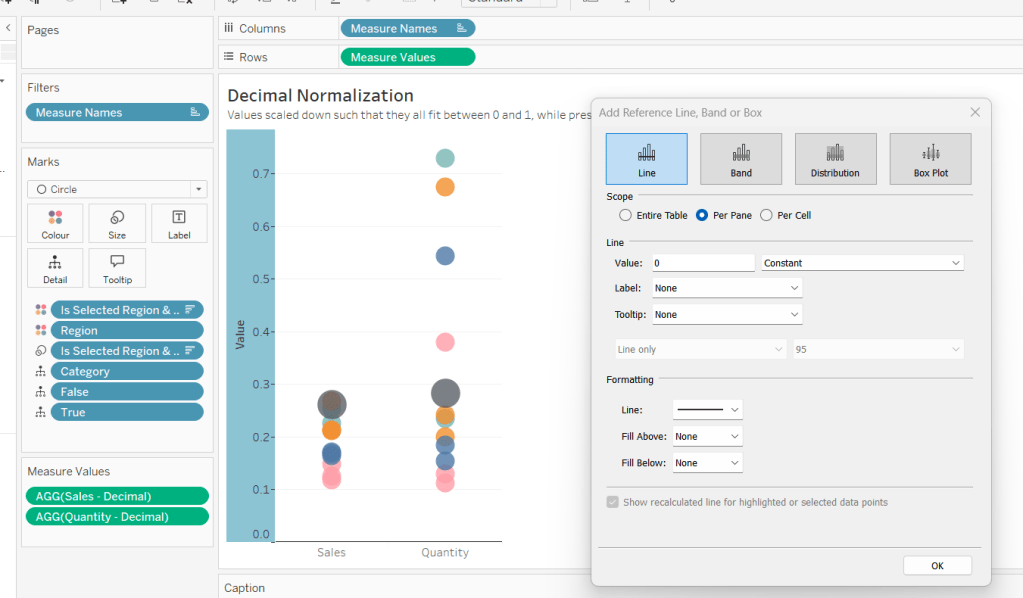
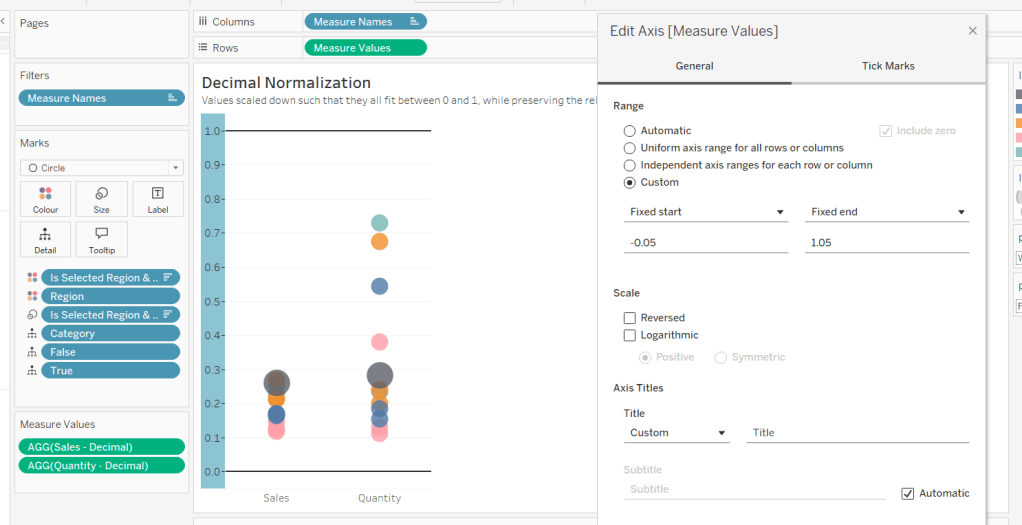
Repeat and create a constant reference line with value of 1. Edit the axis and fix from -0.05 to 1.05 and remove the axis title.
Update the text in the caption.
Building the Max-Min Normalisation Chart
Duplicate the Decimal sheet and rename Max-Min or similar. Update the title.
Create new fields
Sales – Max-Min
(SUM([Sales])- WINDOW_MIN(SUM(Sales))) / (WINDOW_MAX(SUM(Sales)) – WINDOW_MIN(SUM(Sales)))
Quantity – Max-Min
(SUM([Quantity])- WINDOW_MIN(SUM([Quantity]))) / (WINDOW_MAX(SUM([Quantity])) – WINDOW_MIN(SUM([Quantity])))
Drag Sales – Max-Min onto the canvas and drop directly over the existing Sales – Decimal pill in the Measure Values section, so it replaces it. Do the same with the Quantity – Max-Min pill.
Adjust the table calculation setting for each of the measures so they are computing by Category, Region and Is Selected Region & Category.

Adjust the Tooltip if required. Right click on the bottom column headings and Edit Alias to update the text- you may not be able to rename Sales – Max-Min along xyz… just to ‘Sales’, so you may need to be creative and add spaces eg ‘ Sales ‘ or similar. Update the caption.

Building the Z-Score Normalisation Chart
Duplicate the Max-Min sheet, and name Z-Score or similar. Update the title.
Create new fields
Sales – Z-Score
(SUM([Sales]) – WINDOW_AVG(SUM([Sales]))) / WINDOW_STDEV(SUM([Sales]))
Quantity – Z-Score
(SUM([Quantity]) – WINDOW_AVG(SUM([Quantity]))) / WINDOW_STDEV(SUM([Quantity]))
Drag Sales – Z-Score onto the canvas and drop directly over the existing Sales – Max-Min pill in the Measure Values section, so it replaces it. Do the same with the Quantity – Z-Score pill.
Adjust the table calculation setting for each of the measures so they are computing by Category, Region and Is Selected Region & Category. Remove the reference line for the constant value of 1. Edit the axis, so the range is now Automatic rather than fixed.
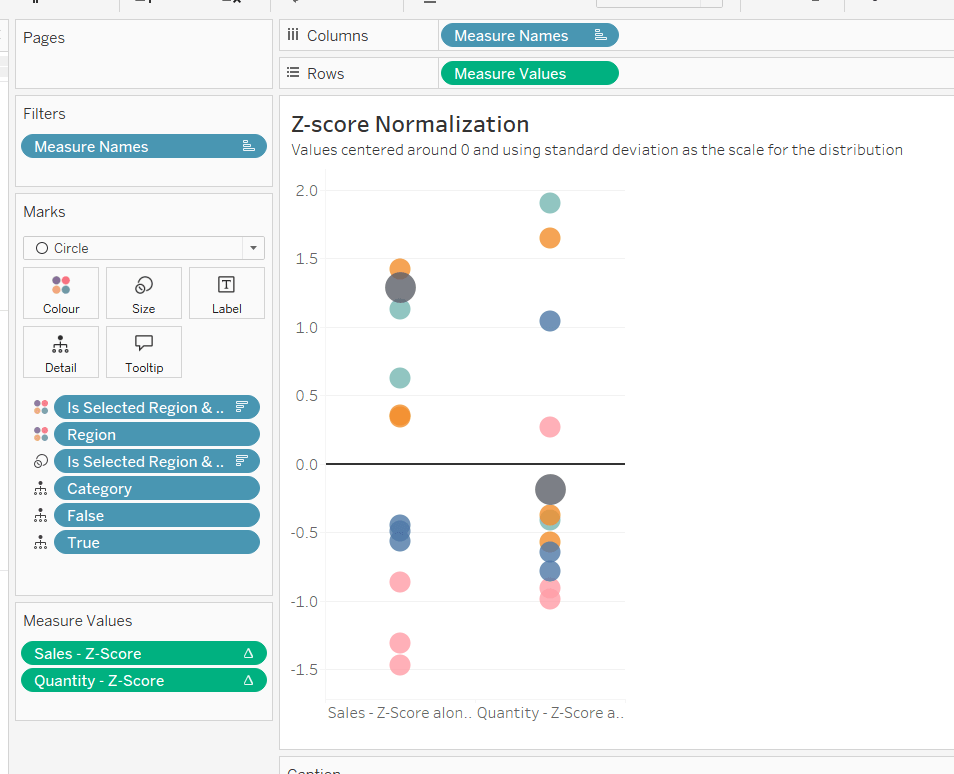
As before, adjust the Tooltip again if required, edit the column labels using the alias feature, and update the caption.
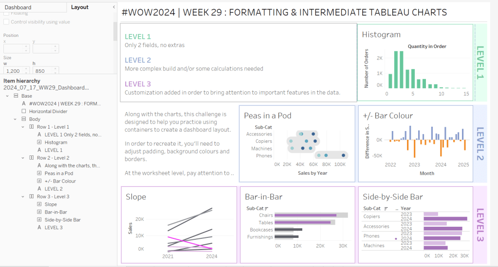
Creating the dashboard and adding the interactivity
Add all 4 charts onto a dashboard, using a horizontal container to arrange the charts side by side. From the object context menu on the dashboard, select the option to show the caption

To disable the default highlighting ‘on click’ create a dashboard filter action based on the True/False method described here – you’ll need to create an action per sheet.
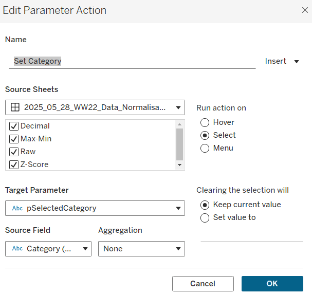
To set the parameters, create a parameter action
Set Category
On select of all the sheets, set the pSelectedCategory parameter passing in the value from the Category field.
Create another similar action called Set Region which sets the pSelectedRegion parameter with the value from the region field.
Finally, add a text section to the top right of the dashboard that references the pSelectedRegion and pSelectedCategory parameters.

And that should be it. My published via is here.
Happy vizzin’!
Donna