Can you compare an Olympic medallist’s age to a user’s age?

As the Paris 2024 Olympic Games continues, then #WOW continues with another Olympic themed challenge, this time set by Kyle.

Defining the core calculations

There’s a lot of LoD calcs used in this, so let’s set this up to start with.

Avg Age Per Sport

INT({FIXED [Sport]: AVG([Age])})

Avg Age Per Sport – Gold

INT({FIXED [Sport]: AVG(IF [Medal]=’Gold’ THEN [Age] END)})

Avg Age Per Sport – Silver

INT({FIXED [Sport]: AVG(IF [Medal]=’Silver’ THEN [Age] END)})

Avg Age Per Sport – Bronze

INT({FIXED [Sport]: AVG(IF [Medal]=’Bronze’ THEN [Age] END)})

Oldest Age Per Sport

INT({FIXED [Sport]: MAX([Age])})

Youngest Age Per Sport

INT({FIXED [Sport]: MIN([Age])})

Format all these fields to use Number Standard format so just whole numbers are displayed.

Let’s put all these out in a table – add Sport to Rows and then add all these measures

Kyle hinted that while the display looks like a trellis chart, it’s been built with multiple sheets – 1 per row. So we need to identify which row each set of sports is associated to, given there are 5 sports per row.

Row

INT((INDEX()-1)/5)

Make this discrete, and add this to Rows, and then adjust the table calculation so that it is explicitly computing by Sport, and we can see how each set of sports is ‘grouped’ on the same row.

Building the core viz

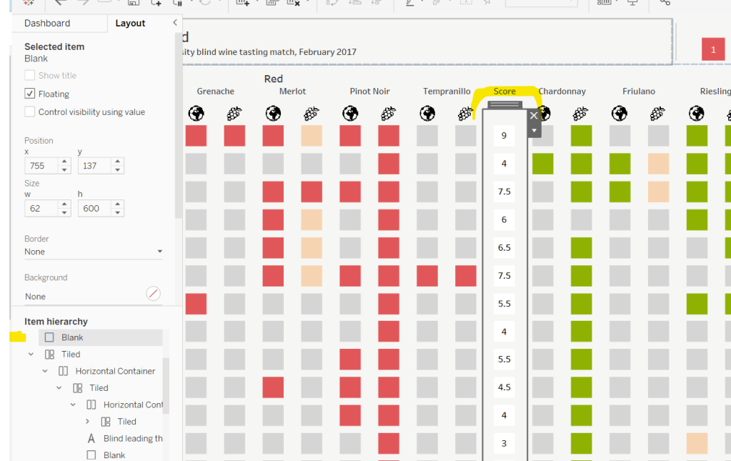
The viz is essentially a stacked bar chart of number of medallists by Age. But the bars are segmented by each individual medallist, and uniquely identified based on Name, Medal, Sport, Event, Year.

Add Sport to Columns, Age to Columns (as a continuous dimension – green pill) and Summer Olympic Medallists (Count) to Rows.

Change the mark type to Bar and reduce the Size a bit. Add Year, Event and Name to the Detail shelf, then add Medal to the Colour shelf and adjust accordingly. Re-order the colour legend, so it’s listed Bronze, Silver , Gold.

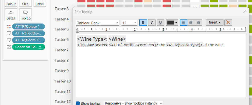
For the Tooltip we need to colour the type of medal, so need to create

Tooltip: Bronze

UPPER(IF [Medal] = ‘Bronze’ THEN [Medal] END)

Tooltip: Silver

UPPER(IF [Medal] = ‘Silver’ THEN [Medal] END)

Tooltip: Gold

UPPER(IF [Medal] = ‘Gold’ THEN [Medal] END)

Add all these to the Tooltip shelf, then adjust the Tooltip accordingly, referencing the 3 fields above and colouring the text.

The summary information for each sport displayed above each bar chart, is simply utilising the ‘header’ section of the display. We need to craft dedicated fields to display the text we need (note the spaces)

Heading – Medal Age

“Avg Medalling Age: ” + STR([Avg Age Per Sport])

Heading: Age per Medal

“Gold: ” + STR(IFNULL([Avg Age Per Sport – Gold],0)) + ” Silver: ” + STR(IFNULL([Avg Age Per Sport – Silver],0)) + ” Bronze: ” + STR(IFNULL([Avg Age Per Sport – Bronze],0))

Heading: Young | Old

“Youngest: ” + STR([Youngest Age Per Sport]) + ” Oldest: ” + STR([Oldest Age Per Sport])

Add each of these to Rows in the relevant order. Widen each column and reduce the height of each header row if need be

Adjust the font style of all the 4 fields in the header. I used

  • Sport – Tableau Medium 14pt, black, bold
  • Heading – Medal Age – Tableau Book 12pt, black, bold
  • Heading: Age per Medal – Tableau Book 10pt, black bold
  • Heading: Young | Old – Tableau Book 9pt, black

The title needs to reflect the number of medallists above a user defined age. To capture the age we need a parameter

pAge

integer parameter defaulted to 42

Then we can create

Total Athletes at Age+

{FIXED:COUNTD( IF [Age]>= [pAge] THEN [Name] END)}

Add this to the Detail shelf, then update the title of the viz to reference this field. Note the spacing to incorporate the positioning of the parameter later.

The chart also needs to show background banding based on the selected age. Add a reference line to the Age axis (right click axis > add reference line), which references the pAge parameter, and fills above the point with a grey colour

Ultimately this viz is going to be broken up into separate rows, but we need the Age axis to cover the same range. To ensure this happens, we need

Ref Line – Oldest Age

{FIXED: MAX([Oldest Age Per Sport])}

Add this to the Detail shelf, then add a reference line which references this field, but doesn’t actually ‘display’ anything (it’s invisible).

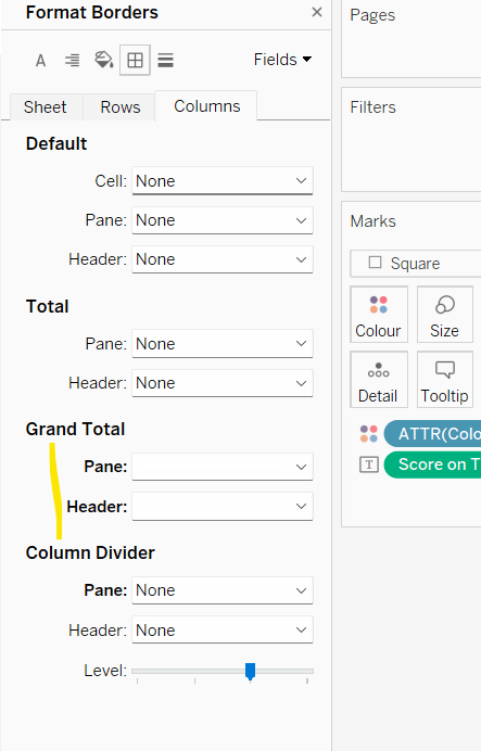
Tidy up the visual – remove gridlines, zero lines, row & column dividers. Hide the y-axis (uncheck show header). Remove the x-axis title. Hide the heading label (right click > hide field labels for columns). Hide the null indicator.

Filtering per row

Add the Row field to the Filter shelf and select the only option displayed (0). Then edit the table calculation and select all the fields to compute by, but set the level to Sport.

Show the Row filter and select the 0 option only. – only the first 5 sports are now displayed.

Name this sheet Row1. Then duplicate the sheet, set the Row filter to 1 and name the sheet Row2. Repeat so you have 7 sheets.

Building the dashboard

Use vertical containers to help position each of the 7 rows on the dashboard. For 6 of the sheets, the title needs to be hidden. I used a vertical container nested within another vertical container to contain the 6 sheets with no title. I then fixed the height of this ‘nested’ container and ‘distributed” the contents evenly. But I did have to do some maths based on the space the other objects (title & footer) used up on my dashboard, to work out what the height should be.

You’ll then need to float the pAge parameter onto your layout, and may find that after publishing to Tableau Public, you’ll need to edit online to tweak the positioning further.

My published viz is here.

Happy vizzin’!

Donna

Can you create an area chart tile map?

This week, Kyle set the challenge of recreating area charts combined with a tile map / small multiple. He’d been inspired by a viz he uses at work, which he then realised had actually been inspired by a previous #WorkoutWednesday challenge from 2020 which I actually blogged about here.

So some of the steps for this solution guide, I’ll lift from my existing blog :-), but there are no table calcs in this instance.

Building the basic tile map

As per Kyle’s instructions, I started by building a new field that I could then format to millions

Pop

[Population (Population)] * 1000

I formatted this to be a custom number with 2 dp and displayed with Millions unit.

Put this into a table where State and Date on Rows and Pop on Text, just so we can validate what we’re up to…

We need to standardise/normalise the display, so the population for each State is ranging from 0 to 1. For this we need to determine

Min Pop Per State

{FIXED [State]:MIN([Pop])}

Max Pop Per State

{FIXED [State]:MAX([Pop])}

and we can then work out

Standardised Pop

(SUM([Pop]) – SUM([Min Pop per State]))/(SUM([Max Pop per State]) – SUM([Min Pop per State]))

Format this to display as a number with 2 dp. Add all 3 fields to the table. For each state the Standardised Pop should have a year when then value is 0 (equivalent to when the population is lowest for the state) and a year when the value is 1 (equivalent to when the population is highest for the state).

For the tile map, we also need fields Rows and Cols which are calculations that map each State to a number (and can be copied straight from the challenge sheet).

On a new sheet, add Rows to Rows (as a discrete dimension) and Cols to Columns (also as a discrete dimension). Add State to Detail. Your initial ‘map’ layout should start to take shape.

Add Date to Columns and set to be a the continuous Year level (green pill) and add Standardised Pop to Rows. Set the display to Entire View, so all the tiles are visible.

Change mark type to Area and add Pop to the Tooltip. Update the Tooltip as required.

Adding the State label and max value

For this we’re going to plot a single point that will be at the centre of the Date axis and slightly higher than 1. For this we need

Centre Date

DATE(DATEADD(‘year’,
FLOOR((YEAR({FIXED:MAX([Date])}) – YEAR({FIXED:MIN([Date])}))/2),
{FIXED:MIN([Date])}
))

This looks a bit complex, so I’ll break it down. What we’re doing is finding the number of years between the minimum year in the whole data set (1900) and the maximum year in the data set (2023). This is

YEAR({FIXED:MAX([Date])}) – YEAR({FIXED:MIN([Date])})

We’re then halving this value ( /2) and rounding it down to the nearest whole number (FLOOR).

We then add this number of years to the minimum date in the data set (DATEADD), to get our central year – 1961.

Now we need a point where we can plot a mark against that date. It needs to be above the maximum value in the area chart (which is 1). Based on what I did before, I decided 1.75 worked

Plot State Label

IF YEAR([Date]) = YEAR([Centre Date]) THEN 1.75 END

Add Plot State Label to Rows between Rows and Standardised Pop. Change the mark type of this axis to shape and use a transparent shape (see here for info). Note you can use a circle and reduce size to smallest and opacity to 0% if you wish. However, this will show a small dot when hovering, which you don’t get with a transparent shape.

Add Max Pop per State to Label and change State from Detail to Label. Adjust the Label accordingly

Remove all text from the Tooltip dialog of the Plot State Label marks card, and hide the Nulls indicator label. Make the chart dual axis and synchronise the axis. Remove Measure Names from the All marks card.

Then remove all gridlines, zero lines, axis lines and row/column dividers. Hide all the axis and the Cols and Rows pills (uncheck show header).

Building the bar chart

Create a new field

Latest Pop per State

IF [Date] = {FIXED [State]:MAX([Date])} THEN [Pop] END

If the date is the maximum date for the state, then get the population. Format this to be 2dp in Millions.

Add State to Rows and Latest Pop for State to Columns and sort descending. Adjust the colour to suit. Show mark labels, and remove all gridlines etc and row/column dividers and hide the axis. Adjust the Tooltip.

Creating the highlight action

Add the two sheets to a dashboard. Add a dashboard highlight action

Highlight State

On hover of the bar chart, target the map, via the State field only.

And that should be it! My published viz is here.

Happy vizzin’!

Donna

Re-Viz : Blind leading the blind

This week, it was my turn to set the #WOW2023 challenge for ‘retro’ month, and I chose to revisit a challenge from May 2017, that was originally set by one of the original ‘founders’ of WorkoutWednesday, Emma Whyte.

The original challenge looked like this :

As I said in the challenge post, I chose this I this challenge as it’s a different type of visual we don’t often see in WOW; it uses a different dataset that interests me – wine!; and as Emma’s website, where she hosted the original requirements for her challenges, is no longer active, it’s possible many won’t know of the existence of this challenge (it pre-dates the current WOW tracking data we have).

Building the core viz

Firstly, we want to build out the basic grid. For that we need a couple of calculated fields

Display:Taster

‘Taster ‘ + STR([Taster])

and

Icon

IF [Score Type] = ‘Grape’ THEN “https://workout-wednesday.com/wp-content/uploads/2023/07/Grapes.png”
ELSE “https://workout-wednesday.com/wp-content/uploads/2023/07/Globe.png”
END

Right click on the Icon field and select Image Role > URL

Add Wine Type, Wine and Icon to Columns and Display:Taster to Rows

Change the mark type to square.

Here we’re making use of the image role functionality in the header of the table to display images stored on the web, without the need to download them locally.

Create a new field

Colour

IF [Score] = 1 THEN [Wine Type]
ELSEIF Score = 0 THEN ‘Grey’
ELSE ‘Neutral’
END

Add this to the Colour shelf and adjust colours accordingly. Increase the size of the squares so they fill the space better, but still have separation between them.

Set the background colour of the worksheet to the grey/beige (#f6f6f4).

Note – I noticed later on that the colour legend in the screen shots has the words ‘correct’ and incorrect’ rather than ‘red’ and ‘grey’. This was due to an un-needed alias I had set against the field, so please ignore

Via the Analysis -> Totals menu, add all subtotals & also show row grand totals. This will make the display look a bit odd initially.

Right-click on the Wine pill in the Columns and uncheck the Subtotals option. This should mean there are 3 additional columns only – a total for each wine type and the grand total.

To get a single square to display in the totals columns, right-click on the Colour field in the marks card area, and change from a dimension to an attribute. The field will change from displaying Colour to ATTR(Colour) and an additional option for * will display in the colour legend – set this to be white

To change the word ‘Total’ in the heading to ‘Score’, right click on the word ‘Total’ and select format. In the left hand pane, change the Label of the Totals section to Score. Repeat for the ‘Grand Totals’ by right clicking on ‘Grand Totals’ in the table, selecting format and changing the label for that too to ‘Overall Score’.

We need to label the totals with the score. For this we first need to get a score for each taster per wine

Score Per Taster

{FIXED [Taster], [Wine Type]:SUM([Score])}

If we just added this to the Label shelf, every square gets labelled with the total, which isn’t what we want.

We need to work out a way to just show the label on the total columns only. For this we can make use of the SIZE() table calculation.

To see how we’re going to use this, double click into the Columns and type SIZE(), then change the field to be a blue discrete pill. Edit the table calculation and set the field to compute by Wine and Icon only.

You’ll see that the SIZE() field in the Columns has added the number 12 as part of the heading, which is the count of wines associated to the wine type (ie 12 red wines and 12 white wines). There is no SIZE() value displayed under the total columns, but these actually have a size of 1, so we’re going to exploit this to display the labels (note – this approach wouldn’t work if where was only 1 wine for one of the wine types).

Score on Total

IF SIZE() = 1 THEN SUM([Score Per Taster]) END

Set the default number format of this field to be Standard, which means the result will display either whole or decimal numbers.

Add this onto the Label shelf instead of the other field, and adjust the table calculation as described above to compute by Wine and Icon only.

You can now remove the SIZE() field from the Columns.

Align the scores centrally.

Remove row & column dividers from each cell, and the totals, but set a white column divider for both the pane & header of the Grand Total column.

Format the text for the Wine Type and Wine and Totals fields. Align the text for the Wine field to the Top.

Hide field labels for rows and columns.

Applying the Tooltip

The text when hovering over each square needs to display different wording depending on the score.

Tooltip – Score Text

IF [Score] = 1 THEN ‘correctly identified’
ELSEIF [Score] = 0.5 THEN ‘partially identified’
ELSE ‘was unable to identify’
END

Add this to the Tooltip shelf along with the Score Type field. Modify the text accordingly

Applying the sort

To control the sorting, we need a parameter

pSort

string parameter with list options, defaulted to ‘Overall Score’

and we also need fields to capture the different scores for each type of wine per taster

Red Score

{FIXED [Taster]:SUM( IF [Wine Type] = ‘Red’ THEN [Score] END)}

White Score

{FIXED [Taster]:SUM( IF [Wine Type] = ‘White’ THEN [Score] END)}

Overall Score

[White Score] + [Red Score]

Then we need a calculated field to drive sorting based on the option selected and the fields above

Sort By

CASE [pSort]
WHEN ‘Overall’ THEN [Overall Score]
WHEN ‘Red’ THEN [Red Score]
ELSE [White Score]
END

Then right click on the Display:Taster field on the Rows and select Sort, and amend the values to sort by field Sort By descending

Building the legend

I did this using 2 sheets. First I created a new field

Legend Text

IF [Score] = 1 THEN ‘Correct’
ELSEIF Score = 0 THEN ‘Incorrect’
ELSE ‘Partially Correct’
END

Then I create a viz as follows

  • Add Legend Text and Wine Type to Columns
  • Add Legend Text to Filter and set to ‘Correct’
  • Change Mark type to Square and increase size
  • Add Colour to Colour shelf
  • Add Score as AVG to Label and format to number standard. Align centrally
  • Uncheck show header against the Wine Type field , and hide field labels for columns against the ‘legend Text’ column heading.
  • Remove all column/row dividers and set the worksheet background colour.
  • Turn off tooltips

Duplicate the sheet, and edit the filter so it excludes Correct instead. Remove Wine Type from the columns shelf. Reorder the columns.

Building the dashboard

When building the dashboard, I just used a floating image object to add the bottle & glass image in the top left of the dashboard.

I set the background colour of the whole dashboard to match that I’d set on the worksheets too.

To stop the tooltips from displaying when hovering over the Scores, I simply placed floating blank objects over the score columns – this is a simple, but effective trick – you just need to be mindful of the placement if you ever revisit the dashboard and move objects around. I placed a floating blank over the legends too to stop them being clicked on.

My published viz is here!

Happy vizzin’!

Donna

Can you quickly tell the net change between two dates?

Continuing with ‘Community Challenge’ month, it was the turn of Will Perkins to set the challenge for this week; a challenge inspired by Google’s stock tracker.

By interacting with the published solution and reading the requirements, I deduced that I was likely to need 3 sheets – 1 for the Region headings & KPIs, 1 for the trend line chart, and 1 to drive the timeframe selections. The trend line chart looked like it was going to involve a dual axis combining a line and and area chart, along with ‘filled’ reference bands, although exactly how it would work I wasn’t entirely sure initially. Finally, there was going to be some ‘parameter actions’ action along with the ‘true = false’ trick to ensure selected marks didn’t remain highlighted.

But before we can tackle the actual chart build, we need to nail some of the calculations involved.

Identifying the date range to highlight

The intention of the chart is that on initial load, it has highlighted the timeframe for the last 14 days up to ‘today’. As this chart is being built with a static data set, which only has data up to the end of 2021, I chose to ‘hardcode’ my ‘today’ value into a parameter. This is so that in a year’s time when I might look at this again, I won’t be presented with a broken looking viz.

pToday

Date parameter defaulted to 20 Sept 2021

The user also has the ability to highlight/select dates on the chart itself, which will define a start and end date range. So we also need some additional parameters to capture this information.

pStartRange

Date parameter defaulted to 01 Jan 1900

Similarly you’ll need a pEndRange parameter too, also defaulted to 01 Jan 1900.

Later on we’ll define parameter actions which will ‘set’ these values based on user interaction.

With these fields, we can then define calculated fields to store the start and end dates depending on whether we’re using the defaults due to initial load (ie 14 days to today), or a user selected range.

Selected Range Start Date

IF [pStartRange] = #1900-01-01# THEN DATE(DATEADD(‘day’,-14,[pToday]))
ELSE DATE([pStartRange])
END

Selected Range End Date

IF [pEndRange] = #1900-01-01# THEN DATE([pToday])
ELSE DATE([pEndRange])
END

We’re going to be plotting Order Date on our axis at the day level, and so to simplify things IMO, I created

Order Date Day

DATE(DATETRUNC(‘day’,[Order Date]))

which I then reference in the following calculated field, which is just to capture all the days within the range selected

Selected Dates To Plot

IF [Order Date Day]>= [Selected Range Start Date] AND [Order Date Day]<=[Selected Range End Date] THEN [Order Date Day] END

We can now start to build out the basic chart

Plotting Order Date Day and Selected Dates to Plot side by side you can see the date axis differ, with only the dates from 06 Sep – 20 Sep 21 displaying on the right hand side. The marks type for Selected Date to Plot is set to Area, and to get the marks to join up, you need to turn Stack Marks Off (Analysis -> Stack Marks -> Off menu).

Defining the Timeframe to Display

We’re going to use another parameter to store the timeframe value

pTimeframe

String parameter defaulted to 6 MONTHS (note the case – it’s simpler to match it to the display format that’s going to be used)

We then need a calculated field to tell us what to do with this value

Timeframe to Display

CASE [pTimeframe]
WHEN ‘1 MONTH’ THEN [Order Date Day]>=DATEADD(‘month’,-1,[pToday]) AND [Order Date Day]<= [pToday]

WHEN ‘6 MONTHS’ THEN [Order Date Day]>=DATEADD(‘month’, -6, [pToday]) AND [Order Date Day]<= [pToday]

WHEN ‘YTD’ THEN [Order Date Day]>=DATETRUNC(‘year’,[pToday]) AND [Order Date Day]<= [pToday] WHEN ‘1 YEAR’ THEN [Order Date Day]>= DATEADD(‘year’,-1,[pToday]) AND [Order Date Day]<= [pToday]
ELSE [Order Date Day] <= [pToday]
END

This field will return true for all the dates that fall within each statement and false otherwise.

Add this field to the Filter shelf and select True.

You can test how the left hand side of the chart is affected by manually typing the different values into the parameter

Colouring the chart

The line and area charts are coloured based on whether dates fall in the selected range and whether the difference between the sales values at the start and end of the selected range is positive or not. We need several more calculated fields to work this out.

We firstly need to capture the min and max dates of the selected area for each region. Now, you initially might think that the Selected Range Start Date and Selected Range End Date fields already have these values. However there isn’t always a sale in every region for these dates. You could argue, that in that case, the sales value for that date should be 0 (ie there were no sales on that day), but to match the solution (and it was easier), we just get the min and max dates within the selected range that have a sales value for each region.

Min Selected Date Per Region

{FIXED [Region]: MIN([Selected Dates to Plot])}

Max Selected Date Per Region

{FIXED [Region]: MAX([Selected Dates to Plot])}

Pop these out into a quick view, and you can see how the dates differ per region compared to the default start & end date values

Now we want to work out the sales value on these dates

Min Date Sales

{FIXED [Region]: SUM(IF [Order Date Day]=[Min Selected Date Per Region] THEN [Sales] END)}

Max Date Sales

{FIXED [Region]: SUM(IF [Order Date Day]=[Max Selected Date Per Region] THEN [Sales] END)}

and then we can work out the difference and the % difference

Range Sales Diff

SUM([Max Date Sales])-SUM([Min Date Sales])

custom formatted to +”$”#,##0.00;-“$”#,##0.00 to show a ‘+’ prefix for positive values

Range Sales % Diff

[Range Sales Diff]/SUM([Min Date Sales])

custom formatted to â–²0.0%;â–¼0.0%

Now we can compute a field to use to colour the line/area chart

Colour – Trend

IF MIN([Order Date Day]) >= [Selected Range Start Date] AND MIN([Order Date Day])<= [Selected Range End Date] THEN

IF [Range Sales Diff]>= 0 THEN 1 ELSE -1 END
ELSE 0
END

If we’re within the selected date range, then test to see if the value is positive (set to 1) or negative (set to -1), otherwise we’re outside the selected date range, so set to 0

Go back to the trend chart and add this field to the Colour shelf of the All Marks card (so it gets added to both sets of marks). Change it to be a discrete (blue) pill and the adjust the colours accordingly. At this point you may want to change the background colour if you’re using a white line. I’m just setting it to a light grey at this point, but eventually it’ll get set to black.

Adding the highlight band

This took a lot of thinking. I knew I’d need a reference band, but it took some time to figure out how to get the backgrounds coloured differently, since you only have the option to fill between the band with one colour.

The trick is to make use of the two date axes we have and to apply a band per pane.

But we need some more fields to make this happen.

Ref Line Start Date -ve

IF [Range Sales Diff]<0 THEN [Selected Range Start Date] END

Ref Line End Date -ve

IF [Range Sales Diff]<0 THEN [Selected Range End Date] END

Add these fields to the Detail shelf of the Order Date Day card and set to be continuous (green). Then add a reference band to this axis, applying the settings as below (note, the Line is a white dotted line, so isn’t showing up in the field setting, though you can see it on the viz).

Because the reference band has been set at the pane level, and the reference line dates are only relevant if the difference is negative, then the band is just showing on one row.

We then do something very similar, but this time we get some dates only if the difference is positive.

Ref Line Start Date +ve

IF [Range Sales Diff]>=0 THEN [Selected Range Start Date] END

Ref Line End Date +ve

IF [Range Sales Diff]>=0 THEN [Selected Range End Date] END

Add these as continuous pills on the Detail shelf of the Selected Dates to Plot card, and add another reference band to this axis instead.

Now you can set the chart to be a dual axis, synchronising the axes, and removing the Measure Names field from the All Marks card which will have automatically been added

This is the core viz, that will need further formatting before its ready to put on the dashboard – remove gridlines, borders etc, set background, remove headers. NOTE– You’ll need to manually re-sort the Regions before the field is hidden.

The KPI table

We need to build a ‘fake table’ for this, by putting Region on Rows and typing MIN(0) on Columns, then adding the Range Sales Diff and Range Sales % Diff fields to the Text shelf. We need an additional field to colour the text though.

Colour – KPI

[Range Sales Diff]>=0

Finally, I capitalised the Region values by using Aliases. This is a quick method when there aren’t many values, but otherwise I would usually create a field with UPPER([Region}).

Once again don’t forget to sort the Regions, and the apply relevant formatting.

The Timeframe Selector

Will states you can use a separate data source for this, so create the list in Excel

and then copy and paste (via the Data > Paste) menu into your workbook

On a new sheet add Date Range to Columns and Date Range to Text. The size and colour of the text differs based on which one has been selected. So create a field

Timeframe Selected

[Date Range] = [pTimeframe]

and add this field to both the Size and Colour shelves. You’ll need to adjust the settings, and hide headers, remove gridlines etc. Try to avoid touching the Text formatting directly, as you might find the Size then doesn’t adjust.

Adding the interactivity

You’ll need to use layout containers to organise all the objects on the dashboard. Then you can add the various dashboard parameter actions needed

Selecting the timeframe

Add a parameter action that on select passes the Date Range field into the pTimeframe parameter

Selecting the date range to highlight

You’ll need 2 parameter actions for this, one that passes the minimum Order Date Day selected into the pStartRange parameter, and the other that passes the maximum Order Date Day selected into the pEndRange parameter.

Deselecting the highlighted marks

By default when you click on a mark/select marks in Tableau, they are highlighted/selected and the other marks are faded, until you ‘click’ again. To stop this from happening I use a ‘true = false’ trick, that has become very common in #WOW challenges, and I’ve blogged many times before.

Create calculated fields

True

True

and

False

False

and add these to the Detail shelf of the All Marks card on the trend line chart.

Then on the dashboard add a Filter action that on select targets the sheet directly, mapping the true field to the false field. As this can never be ‘true’ the filter doesn’t apply, and the marks become unselected.

Repeat the same on the Timeframe Selector sheet.

Hopefully that’s covered all the core points. My published viz is here.

Happy vizzin’! Stay Safe!

Donna

How much change has occurred?

A relatively straightforward challenge was set by Luke this week, to visualise the difference in Sales between 2020 and 2021 in a slightly different format than what you might usually think of.

Start by filtering the data to just the years 2020 and 2021 (add Order Date to the Filter shelf and select specific years, or add a data source filter to limit the whole data set).

Add Sub-Category to Rows, and Sales to Columns, then add Order Date to Colour which by default will display as YEAR(Order Date). Colour the years appropriately.

Now unstack the marks (Analysis menu -> Stack Marks -> Off), and re-order the colour legend, so 2021 is listed first (this makes the 2021 bars sit ‘on top’ of 2020).

Adjust the size to make the bars thinner.

Now add another instance of Sales to the Columns shelf, and make the chart dual axis (synchronising the axis). Reset the mark type of the original SUM(Sales) marks card back to bar.

We need the circle mark for the 2021 Sales to be blue. To do this, duplicate the Order Date field, then add Order Date (copy) to the Colour shelf of the SUM(Sales)(2) marks card. This will show another colour legend, and you can set the colours accordingly. Add a white border around the circle marks.

To work out the % difference to display on the label, we need the following fields

2021 Sales

{FIXED [Sub-Category]: SUM(IF YEAR([Order Date])=2021 Then [Sales] END)}

This returns the value of the 2021 sales for each Sub-Category against all the years in the data set. Similarly we need

2020 Sales

{FIXED [Sub-Category]: SUM(IF YEAR([Order Date])=2020 Then [Sales] END)}

which means we can then create

% Difference

(SUM([2021 Sales])-SUM([2020 Sales]))/SUM([2020 Sales])

format this using custom formatting to display as +0%;-0%

Now we can add % Difference to the Label field of the Sum(Sales)(2) marks card.

You’ll notice you’ll have duplicate labels displayed. To resolve this, you need to adjust the label settings as below

To sort the rows, you need to sort the Sub-Category field by 2021 Sales descending

And finally to show the value of the 2021 Sales, add this field to the Rows shelf, and change to be discrete (blue pill).

All that’s left to do now is adjust the wording of the tooltips as you see fit, and format to remove gridlines, headers etc.

My published version is here.

Happy vizzin’! Stay Safe!

Donna

Can you find the needle in the haystack?

It was Candra’s turn to ‘set’ the #WOW2021 challenge this week providing a hint in the challenge description that the solution would involve sets.

As with many challenges, I built the data out in tabular format to start with to verify I had all the components and calculations correct. The areas of focus are

  • Identify number of distinct customers per product
  • Identify overall average number of distinct customers per product
  • Identify if product above or below average distinct customers
  • Identify Top 50 products by Sales
  • Identify Unprofitable Products
  • Identify products that are both in the top 50 AND unprofitable
  • Building the viz

Identify number of distinct customers per product

To start off, add Product Name, Sub-Category, Category to the Rows shelf to begin building out a table. Add Sales (formatted to $k 0dp) and Profit (formatted to $k 0dp with negative values as () ) to Text and sort by Sales descending.

To identify the distinct customers per product, we can create

Customer Count per Product

{FIXED [Product Name] : COUNTD([Customer ID])}

Add this to the view.

Identify overall average number of distinct customers per product

What we’re looking for here is the average of all the values we’ve got listed in the Customer Count per Product column. Ie we want to sum up those values displayed and divide by the number of rows.

The number of rows is equivalent to the number of products, which we can get from

Count Products

{FIXED : COUNTD([Product Name])}

And so to get the overall average we calculate

Avg Overall Customer Count

{FIXED: SUM([Customer Count Per Product])} / [Count Products]

Add these fields to the view as well, so you can see how the values work per row. The last two calculations give you the same value across all rows.

Identify if product above or below average distinct customers

Given the above display, this is just a case of comparing values in 2 columns

Higher than Avg Customer Count

AVG([Customer Count Per Product]) > SUM([Avg Overall Customer Count])

this returns true or false – add this to the view too.

Identify Top 50 products by Sales

We can create a set for this. Right click on Product Name > Create > Set. Name the set something suitable eg Top 50 Products, and on the Top tab, state the number (50) and the field (Sales) and the aggregation (Sum)

Add this to the view, and if you’ve sorted by the sales, you should find the top 50 rows are all In the set, and the rest are Out.

Identify Unprofitable Products

We can use another set for this. Again create a set off of Product Name, call it Unprofitable Products, and on the Condition tab, set the condition so that the Sum of Profit is less than 0

Add this onto the view too.

Identify products that are both in the top 50 AND unprofitable

For this, we’re explicitly looking for the rows that are both In the Top 50 Products set and In the Unprofitable Products set.

We can use the Combined Set functionality to do this.

In the left hand data pane, select both the Top 50 Products and the Unprofitable Products sets (hold down ctrl to multi select), then right click and Create Combined Set. I called the set Products to Include, and select to combine the sets by including Shared members in both sets

If you then add this field to the Filter shelf, you will be left with just the 13 Products that match

This is the single filter field you can use as per Candra’s requirements.

Building the viz

To get the text to display to the left of the bar, you actually need to create a ‘fake’ bar chart.

  • Add Products to Include to Filter
  • Add Product Name to Rows
  • On the Columns shelf, double click and type in MIN(1)
  • Add Sales to Columns to the right of MIN(1)
  • Sort by Sales descending

Against the MIN(1) marks card

  • Change the Size to small
  • Set the Opacity of the Colour to 0% and the border to None
  • Add Product Name, Sub-Category and Category to the Label shelf and adjust accordingly, aligning left
  • Increase the height of each row to make the text visible

On the Sales marks card

  • Add Higher than Avg Customer to the Colour shelf and adjust
  • Show mark labels
  • Create a new field Profit Ratio : SUM([Profit])/SUM([Sales]) Format to % with 0dp and add to Tooltip
  • Add Profit, and Customer Count by Product to Tooltip and adjust accordingly

Finally, uncheck Show Header against Product Name and MIN(1) and Sales and format the borders/gridlines etc. Add the title, then add to the dashboard.

All done (I hope…)! My published version is here.

Happy vizzin’! Stay Safe!

Donna

Can you visualise the Cholera Outbreak?

Lorna delivered an exciting map based challenge this week, to recreate one of the most famous visualisations ever created. If you’re part of the data viz community and never heard of John Snow and his cholera map, then I suggest you go and google now 🙂

While I love map based challenges, as its an area I don’t get to use regularly, they’re also the ones that can give me the most frustrations/take the longest to complete, as the functions and concepts I need to use don’t come as readily as with other challenges. I had to refer back to my own blogs on previous map based challenges (specifically this one and this one), to help me out. However these were written before map layers were introduced, so not everything was applicable.

  • Modelling the data
  • Building the Avg Distance to Pump bar chart
  • Building the Total Deaths within Avg Distance bar chart
  • Building Map
  • Adding the dashboard interactivity

Modelling the data

3 sets of data was provided

  • Pumps – 1 row per pump with its location
  • Deaths – 1 row per death and its location (can be multiple rows for the same location)
  • Deaths aggregated – 1 row per location where at least 1 death was recorded, including the count of deaths at that location

This all needed to be ‘combined’ so we can work across all 3 sets of data and compare the locations. I used relationship calculations to create a relationship of 1=1 between the related data sets, which means all the aggregated deaths are mapped to each pump, and all the individual deaths are mapped to each pump too.

Building the Avg Distance to Pump bar chart

I chose to start building the bar charts first so I could get better acquainted with how the data was working together, and I knew the maps would take more effort.

To start we need to figure out the distance from each pump to each death, so we need to get the location of each pump, and the location of each death

Pump Location

MAKEPOINT([Pump Lat],[Pump Lon])

Individual Death Location

MAKEPOINT([Death Lat],[Death Lon])

These will both create calculated fields of a geographic data type as indicated by the globe icon to the left of the field.

And with these fields, we can then work out the distance between them in metres

Distance Pump to Death

DISTANCE([Pump Location], [Individual Death Location],’m’)

Now we want the average distance per pump

Avg Distance

{FIXED [Pump ID]: AVG([Distance Pump to Death])}

I formatted this to 0 dp and added a suffix of ‘m’

And with this, we can build the first bar chart – Pump ID on Rows and Avg Distance on Columns. You need to apply formatting

  • Change the font – I set the font to Times New Roman at the Workbook level, to make life easier (Format menu > Workbook).
  • Set the worksheet background colour. I used #f5f1f0
  • Add a black border to each bar (via the Colour shelf)
  • Show labels on bars (via Label shelf)
  • Hide Avg Distance axis (uncheck show header on the Avg Distance pill)
  • Remove all row & column borders
  • Set the Axes Ruler on Rows to black
  • Set the Tooltips

A parameter is needed to store the selected pump

pSelectedPump – an integer defaulted to 1

With this, we can then create a field to indicate which pump is selected

Is Selected Pump?

[Pump ID]=[pSelectedPump]

Add this field to the Colour shelf and set the True option to black and the false option to match the background colour you used.

Building the Total Deaths within Avg Distance bar chart

We now need to identify if the death occurred within the average distance that has been calculated.

Number Deaths within Avg Distance

SUM(INT([Distance Pump to Death] <= [Avg Distance]))

This is a bit of short hand instead of writing IF [Distance Pump to Death] <= [Avg Distance] THEN 1 ELSE 0, and summing up the result. It relies on the the fact that the equation [Distance Pump to Death] <= [Avg Distance] returns a boolean of true or false, which can be converted to an integer as true =1 and 0 = false.

At a row level, the field just returns 1 or 0, but just plot this field against Pump ID, you get the desired count

And the easiest way to build this bar chart, is to duplicate the one created above (on the worksheet tab, right click & duplicate sheet), then replace the Avg Distance pill with the Number Deaths within Avg Distance pill (simply drag the latter from the data pane and drop directly onto the former in the columns shelf). Then adjust tooltips etc to suit. Doing it this way preserves (most of) the formatting.

Building the Map

We’re going to use 4 layers in creating the map, and I’m documenting from the bottom upwards (although this isn’t the order in which I actually built the viz in practice – I shuffled things round afterwards).

We’ll start with the density layer – the blue coloured area on the map.

On a new sheet, add Individual Death Location and Death ID to the Detail shelf. This should automatically create a map view with the auto generated lat & long fields. Then

  • Change the mark type to Density
  • Change the colour to Density Blue-Teal Light
  • Alter the Intensity to 75%, the Opacity to 60%
  • Increase the Size to maximum
  • Delete the info in the tooltip

We need to set the background map

Via the Map > Map Layers menu option, set the Style to Normal and uncheck all options and set Streets, Highways, Routes

Then set the worksheet background to the colour we’ve used before

Onto Layer 2 – the pump buffer circle.

We’ve already identified the selected pump, but now we need to get it’s location, and for that we need the lat and long of the selected pump.

Selected Pump Lat

{FIXED: MIN(IIF([Is Selected Pump?],[Pump Lat],NULL))}

This essentially gets the latitude of the selected pump and sets that value across all the rows in the data.

Selected Pump Long

{FIXED: MIN(IIF([Is Selected Pump?],[Pump Lon],NULL))}

And with these we can get

Selected Pump Location

MAKEPOINT([Selected Pump Lat],[Selected Pump Long])

We also need to get the average distance of the selected pump spread across every row

Selected Pump Avg Distance

{FIXED :SUM( IF [Is Selected Pump?] THEN [Avg Distance] END)}

Now we have this, we can build the buffer field

Pump Buffer

BUFFER([Selected Pump Location],[Selected Pump Avg Distance],’m’)

Drag this Pump Buffer field onto the map and drop it onto the ‘Add a Marks Layer’ section that should appear. This will create an additional marks card.

Set the colour to the same background colour previously used, and drop the opacity to around 5%. Add Pump ID to Detail and Selected Pump Avg Distance to the Tooltip shelf. Adjust tooltip to match.

Onto Layer 3 – the pumps

Drag Pump Location onto the map and Add a Marks Layer.

Add Pump ID to Text and Location to Tooltip to the relevant marks card. Change mark type to circle, increase the size and change colour to red and add a dark grey border. Adjust text to be centred, and set the tooltips accordingly.

Onto the final layer now, the aggregated death locations. We need a further location field

Death Location

MAKEPOINT([DeathLat (deaths aggregate.csv)], [DeathLon (deaths aggregate.csv)])

Drag this onto the map to Add a Marks Layer then on the subsequent marks card add Loc ID to the Detail shelf. Change the mark type to circle, and add Deaths to the Size shelf – adjust accordingly. Change the colour to black with a white border. Adjust tooltip.

Adding the dashboard interactivity

Add the 3 sheets onto a new dashboard sheet. Create a new dashboard action to Change Parameter, that runs on select of any of the 3 charts, and targets the pSelectedPump parameter by setting it with the value from the Pump ID field.

Now if you select a pump on the map, or a bar on either of the bar charts, all the charts will reflect the selection made.

The other interactvity you may notice, is that on click, of the bars, or the pumps, the other data ‘fades’ (or the selected data is highlighted). We don’t want this.

To resolve, create a calculated field

True

True

and another

False

False

Add both these fields to the Detail shelf on both bar chart sheets and to the Detail shelf on the Pumps marks card.

Then on the dashboard, create a dashboard filter action which filters on selected fields setting True = False (see below). You’ll need to create one of these actions for each of the 3 sheets.

And hopefully, you now have a working viz. My published version is here.

Happy vizzin’! Stay Safe!

Donna

Generation Population

For week 17 of #WOW2021, Sean Miller decided to challenge us with recreating a chart by Nathan Yau (see here for the original). The aim was to recreate within 1 sheet, which I managed to do. So how did I do it? Read on 🙂

  • The groundwork
  • Colouring the bars
  • Adding the year labels
  • Final formatting

The groundwork

The chart itself follows a straight forward structure of multiple blue dimension fields on Columns with a green measure on Rows similar to this view below based on Superstore Sales data – it’s just formatted a bit more creatively!

The data provided just contains 3 fields : SEX, AGE and 2019 Population. We want to present the 2019 Population measure for the Total SEX only by Year. We need to create the Year field, which is simply

Year

2019-[AGE]

I dragged this into the ‘dimensions’ section of the data pane (above the line).

This allows us to create the basic bar chart required

We now need to define the various fields that we will need to add as additional dimensions on the Columns shelf to create the ‘generation’ data panes.

Generation

IF [Year]<= 1927 THEN ‘Greatest
Generation’
ELSEIF [Year]<= 1945 THEN ‘Silent Generation’
ELSEIF [Year]<=1964 THEN ‘Baby Boomer’
ELSEIF [Year] <= 1980 THEN ‘Generation X’
ELSEIF [Year]<=1996 THEN ‘Millennials’
ELSEIF [Year]<=2012 THEN ‘Generation Z’
ELSE ‘Gen
Alpha’
END

NOTE – there is a deliberate carriage return in the condition for ‘Greatest Generation’ and ‘Gen Alpha’ which will force the field to ‘wrap’ when displayed.

Having defined the above, we need to determine

Total Population Per Generation

{FIXED [Generation], [SEX]: SUM([2019 Population])}

and then

% of Total Population

SUM([Total Population Per Generation]) / TOTAL(SUM([Total Population Per Generation]))

NOTE – to create this field, I originally created a ‘quick table calculation’ against the Total Population Per Generation field which I’d displayed on a view, and then dragged the resulting pill into the measures pane to create the new field with the desired calc.

Let’s put these in a table, so we can then check the values, and see that the 2nd and 3rd columns are the same value for each row associated to a particular generation, which is what we need.

Right, so now we need to determine the rank based on the Total Population Per Generation

Rank

RANK_DENSE(SUM([Total Population Per Generation]))

Format this to a custom number with 0 decimal places, but prefixed with #

When added to the table we get

The intention, is that Rank will be displayed as discrete ‘header’ pill rather than a measure, so let’s move Rank to be the 1st pill on the Rows shelf and change to be discrete.

But we need the Total Population Per Generation and % of Total Population fields to be combined into a single pill. So we need to do a bit of string manipulation/ number formatting for this

Total | Percent

STR(ROUND(SUM([Total Population Per Generation])/1000000,1)) + ‘M’ + ‘ | ‘ + STR(ROUND([% of Total Population] * 100,1)) +’%’

This looks complicated, but its because even though you may have applied the relevant display number formatting against the individual numeric measures of Total Population Per Generation and % of Total Population, the formatting is not preserved, when converted into a string field, which this field needs to be. So the relevant calculations need to be applied within the field itself.

This outputs the below

Now we need a way to sort the data so the ‘Greatest Generation’ associated to the earliest years is listed first. I did this by determining the minimum date within each Generation.

Min Year Per Generation

{FIXED [Generation], [SEX]: MIN([Year])}

Add this into the view as the first pill in Rows, and the data should automatically sort from lowest to highest

We can now build the viz – duplicate the table sheet, remove Total Population Per Generation and % of Total Population from the Measure Values section. Drag 2019 Population to Columns, then click the swap rows & columns button :

Colouring the bars

The bars are coloured based on each ‘Generation’ pane. You could hardcode this along the lines of ‘Generation = x OR Generation = y or Generation = z etc’ where x, y and z etc are generations of the same colour. This would return true or false, which you can then add to the colour shelf and adjust accordingly.

I decided to be a bit more dynamic, deciding I wanted to set the colour based on whether it was an odd or even pane.

For this I created another ‘rank’ field based on the field I’d used to ‘sort’ the data, the Min Year Per Generation field.

Sort Position

RANK_DENSE(MIN([Min Year per Generation]),’asc’)

If you add this into the data table, you’ll see each section is numbered 1 -7

From this, we can then determine if the number is even (or not)

Sort Position is even number

[Sort Position]%2=0

Add this onto the Colour shelf which will return True or False and colour accordingly.

Adding the year labels

The year labels are achieved by using a dual axis chart, to plot a point for each specific year (based on the Min Year Per Generation field) at some arbitrary value.

Point to Plot Year Label

IF [Year]=[Min Year per Generation] AND [Year]<>1919 THEN 4700000 END

For each ‘min year’ that isn’t 1919, plot a value at 4.7M.

Add this field to the Rows shelf, change mark type to circle, reduce size to as small as it can, and set the colour transparency to 0.

Add Min Year Per Generation to the Label shelf, then change the alignment to vertical.

Now you make the chart dual axis and synchronise the axis. Some of the colours/marks may change, so reset by removing Measure Names from the Colour shelf and changing the mark types bar to bar & circle.

Final formatting

So at this point all the main components are there. It’s now a case of formatting – removing right and bottom axes, removing gridlines. The vertical dashed lines, are column dividers, set at the pane level only.

The solid left hand axis is set via

The text is formatted using the fonts advised in the requirements and sizes adjusted to suit.

Add on a tooltip, and set the background colour of the worksheet and you should be done.

My published viz is here.

Happy vizzin’! Stay Safe!

Donna

Can you use Quick LoDs to recreate this view?

It was Lorna’s turn to set the challenge this week, and she took the opportunity to ask us to use a new feature in Tableau v2021.1 – Quick LoDs (you’ll obviously need v2021.1 to use the functionality, but the LoDs can be created manually in earlier versions if need be).

This blog will focus on

  • Creating the Sub-Category Average Sales by Category LoD using Quick LoDs
  • Formatting the difference calculation
  • Colouring the bars
  • Text for Tooltip
  • Putting it all together

The viz itself isn’t that complex once you’ve nailed the LoD, so lets’ start with that bit.

Creating the Sub-Category Average Sales by Category LoD using Quick LoDs

The what…? It’s a bit of a mouthful,.. the “Sub-Category Average Sales by Category”. What we’re essentially after here is the Total Sales per Category / No of Sub-Categories in the Category. To do this with LoDs, we first need to create an LoD to represent the total sales in each Sub-Category.

As mentioned in the requirements / referenced in the KB article above, you use a combination of ctrl/command click & drag to create an LoD via the Quick LoD feature. In this case I dragged the Sales measure onto the Sub-Category dimension, and this automatically created

Sales (Sub-Category)

{ FIXED [Sub-Category]: SUM([Sales]) }

which is the sales per sub-category.

From this, I then dragged this measure onto the Category dimension, which automatically then created

Sales (Sub-Category) (Category)

{ FIXED [Category]: SUM([Sales (Sub-Category)]) }

BUT I then edited this to change the aggregation to AVG, so the field became

{ FIXED [Category]: AVG([Sales (Sub-Category)]) }

This gives the average value required, which you can see is the same across the rows in a single Category :

Formatting the difference calculation

The viz displays the % difference between the Sub-Category sales and the average. This is calculated with

Difference

(SUM([Sales])- SUM([Sales (Sub-Category) (Category)])) / SUM([Sales (Sub-Category) (Category)])

This is then custom formatted as â–²0%;â–¼0% (I use this site to get my shapes from).

Colouring the bars

The bars need to be coloured based on the value of the Difference field, so another calculated field is required

Colour

[Difference]>0

This will just return true or false and can dropped on the Colour shelf of the bars.

Text for Tooltip

Within the tooltip, the % difference is displayed, along with some text which indicates if it is above or below the average. For this we need another calculated field to reference in the Tooltip.

Above | Below

IF [Difference]>0 THEN ‘Above’ ELSE ‘Below’ END

Putting it all together

With all the calculated fields built, the the chart itself is a relatively simple dual axis chart

  • Add Category then Sub-Category to Rows
  • Add Sales to Columns and sort descending
  • Add Sales (Sub-Category) (Category) to Columns. Make dual axis and synchronise axis
  • Click on the All marks card and remove Measure Names from the Colour shelf.
  • Click on the Sales marks card and change mark type to bar; add the Colour field to the Colour shelf and adjust accordingly; add Difference to the Label shelf and format appropriately.
  • Click on the Sales (Sub-Category) (Category) marks card and change mark type to Gantt; adjust the Size to be as large as possible; set the colour to the relevant grey.
  • On the All marks card, add the Above | Below field to the Tooltip shelf, then edit the Tooltip on the All marks card to create the required text.
  • Finally, remove axis, remove the column heading labels, remove grid lines and column borders and format the displayed text appropriately. Title the viz.

A very brief post today, but hopefully I’ve ticked off all the required elements, My published viz is here.

Happy vizzin’! Stay Safe!

Donna

Tableau Website Analytics

This week’s #WOW2021 challenge by Ann Jackson is focussed on dashboard design/layout, reference lines and formatting time, so that will be the focus of this blog too. I’m hoping it might be a fairly short post this week 🙂

  • Filtering the data
  • Creating the key measures, formatting time, adding average lines
  • Dashboard layout

Filtering the data

The data Ann provided is based on the Google Analytics data the team have harnessed related to the activity on the #WOW website. It’s a static data set, which contains data from 29 Dec 2019 up to 12 April 2021, but Ann states her solution only includes data up to 10 April 2021. I therefore added the Date field to the Filter shelf on the sheet and set it to end on 10 April 2021

Knowing I’d be building multiple sheets for this challenge, I set this filter to be a global filter by setting it to apply to worksheets – > all using this data source

Creating the key measures, formatting time, adding average lines

For this challenge, we’ll be creating a sheet for each BAN, and a sheet for each trend line depicting a measure by week, so 8 sheets in total.

For the Sessions measure, both the BAN and the trend chart are straightforward.

The BAN just shows SUM([Sessions]) on the Text shelf, appropriately formatted. The other BAN sheets are pretty much the same, but just show the appropriate measure in the appropriate colour.

The trend line displays Week([Date]) by SUM([Sessions]), with the average line added by dragging Average Line from the Analytics pane onto the chart and then formatting.

If the numbers don’t quite match up, it may be because your week is set to start on a different day. By default as I’m UK based, dates are set to start their week on a Monday. For this challenge to match Ann’s solution, your week needs to start on a Sunday. You can set this by right clicking on the data source itself and changing via the Date Properties option

To determine the average session duration, we need to build a calculated field, that then needs to be formatted to show minutes and seconds.

Average Session Duration

(SUM([Session Duration]) / SUM([Sessions]))/86400

Session Duration / Sessions will return a value in seconds. To be able to format this in the way required, we need to get the number of seconds as a proportion of a day. There are 86400 seconds in a day (60 * 60 * 24), so we divide by this.

We can then use a custom format on this field and use the nn:ss notation. NOTE not mm:ss. If you needed to format this as hours:minutes:seconds, the format would be hh:mm:ss, but mm:ss does not provide you with the right values. This video demonstrates all this, if you’re interested.

When it comes to building the trend line for this measure, the average line, can’t be added as simply in the way it could for the Sessions trend chart (at least I couldn’t get it to work that way…).

We need to build a calculated field that will show the same overall average value alongside the weekly averages. This value needs to match what’s displayed in the BAN chart.

Overall Session Duration mm:ss

{FIXED : [Avg Session Duration]}

This is returning the Avg Session Duration based on all the rows in the data. As the Date field has been added as a global filter, it is acting like a data source filter, so the dates we don’t want have been excluded from the data set that the FIXED LoD is being applied against. If the Date filter was a simple ‘quick filter’, this calculation wouldn’t work, as the data for the 11th & 12th April would also be included in the calculation.

Format this to nn:ss as well. Add this field to the Detail shelf of the trend chart, then right click on the Average Session Duration axis and Add Reference Line, and reference the Overall Session Duration mm:ss field.

For the bounce rate, we simply need

Bounce Rate

SUM([Bounces])/SUM([Sessions])

which is formatted to a percentage of 1 dp.

When building the trend line, I added the average line from the analytics pane, but that gave me a different value from my BAN. So I built

Overall Bounce Rate

{FIXED : [Bounce Rate]}

This was formatted to % 1dp, and added as a reference line as described above.

Finally the last measure, we need

Avg Time on Page

(SUM([Time on Page])/(SUM([Pageviews])- SUM([Exits])))/86400

formatted to nn:ss

and

Overall Time on Page mm:ss

{FIXED : [Avg Time on Page]}

and again formatted to nn:ss.

The charts for these are built exactly like the Average Session Duration.

Dashboard Layout

The easiest way to describe the layout I built is to show it 🙂 Note the Item Hierarchy on the left hand side of the image below.

I have a vertical container as the Main page.

The first row in this container is the title in a Text object.

The second row is a Blank object and is the yellow line. The background of the blank object is set to the relevant yellow, the outer padding is set to 0 all round, and then the height is set to 4. This gives the appearance of a thick coloured line.

The third row is another vertical container, and I’ve done this, so I can ultimately use the option to Distribute Contents Evenly on the container to ensure the horizontal container ‘rows’, which I’ll be adding into this container, are evenly spaced.

So ‘within’ the 3rd row, the 4th-7th rows are managed using a horizontal container, which in turn contains a blank object (the coloured vertical line), the BAN sheet and the trend sheet. Around each horizontal container I set the outer padding to 10 all round to give some spacing. The blank object in each ‘row’ is given the relevant background colour and set to a width of 15.

Finally, I finished off with an additional horizontal container at the bottom which is where I added my standard #WOW footer. Note this horizontal container is essentially the 4th row of the original Main vertical container though.

Hopefully I’ve provided enough for you to build the challenge yourself / resolve any issues you might have. If there’s anything I’ve missed, do please comment to let me know.

My published viz is here. Please note, that for some reason (and I don’t know why), Tableau Public does not seem to display my time axis properly (just shows 0). As the workbook renders on Public, the values on the axis show, but once fully loaded, they change. If you download the workbook, the values are fine. I published from Tableau Desktop 2021.1.0. I’m putting this down to an issue with Tableau Public.

Happy vizzin’! Stay Safe!

Donna