Erica set the challenge this week, which involved building the same visualisation in two ways – one using Table Calcs only and one using LODs.
To test the functionality and validate what’s going, I’m going to build the data out in a tabular format first.
The Table Calc Table
On a new sheet add Region and Category to Rows and Sales to Text. Sort by Sales descending. Then add Region and Segment to Filter, selecting all options, and show the filters.
Create a new field
Total Sales
TOTAL(SUM([Sales]))
and add into the table. This won’t be used later, but I’ve created so you can see the filtering behaviour.
This is a table calculation, and, by default when added to the table, it shows the total of all the rows against each row. We want to display the total per Region, so every row for a specific region shows the total of that region only. Adjust the table calc setting so it is computing by Category only.
Create a new field
TC – % of Sales
SUM([Sales]) / TOTAL(SUM([Sales]))
format to be % with 1dp and add into the table. By default it should have inherited the table calc settings we just applied for Total Sales, but if not apply the same settings, so it is computing by Category only.
If you do the maths taking the value in the Sales column and dividing by the value in the Total Sales column, you should be able to validate the result.
And if you test by adjusting the Segment and Region filters, everything should work as expected :
Filter out a Segment and the Sales and Total Sales adjust to exclude the value and the TC – % of Sales for a Region still totals 100%
Filter out a Region and that whole block is removed, but the values for all the other rows remain unchanged.
Now add Category to Filter and show the filter. Filter out a Category, and what we now see is the Total Sales now just reflects the total for the selected categories, and the TC – % of Sales still totals 100%. This isn’t the requirement. The % of Sales needs to calculate over all Categories regardless if it is excluded in the display.
To handle this, we create
TC – Filter Category
LOOKUP(MIN([Category]),0)
This is using a table calculation to basically return the value of the Category associated to the current row, which is basically looking up itself. However, as this is a table calculation, when added to the Filter shelf, it applies the filter after other computations (this is Tableau’s order of operations’), whereas the ‘quick filter’ applied above, is filtering the data first before then computing the total sales.
Remove Category from the Filter shelf, and add TC – Filter Category to the Filter shelf instead, selecting all options and showing the filter on the view. By default the table calc setting is set to table down which is fine – it is computing by both Region and Category. Now if you exclude a Category, the relevant rows disappear, but the Total Sales and therefore TC – % of Sales values remain unchanged.
The Table Calc Viz
The simplest way to build this (IMO) is to duplicate the table sheet then
Remove Total Sales and Sales
Move TC – % of Sales to Columns
Show mark labels
Adjust colour of bar
Adjust colour of worksheet background
Widen each row slightly
Make the width of bars slightly smaller
Edit title of % of Sales axis
Adjust fonts of label headers and bar label and axis labels (I set to 8pt)
The LOD Table
Let;s repeat this now using LODs instead.
On a new sheet, once again add Region and Category to Rows and Sales to Text. Add Region and Segment to Filter and show the filter options.
Create a field
LOD – Sales per Region and Segment
{FIXED [Region], [Segment]:SUM([Sales])}
Add into the table. With all segments selected, we can see the total sales for each Region listed
and filtering out a Segment, the totals adjust as required.
If we now add Category to Filter, show the options and filter one out, the totals now no longer change, as the LOD – Sales per Region and Segment doesn’t include Category in its definition – its FIXED to just account for changes to Region and Segment.
So we can now create
LOD – % of Sales
SUM([Sales]) / SUM([LOD – Sales per Region & Segment])
and format to % with 1dp and add into table to validate.
You can now apply similar steps to those detailed above to recreate the bar chart viz for this data.
And once done, add both charts onto a dashboard with their relevant filters.
For the challenge this week, Yoshi wanted us to recreate this summary KPI card detailing the latest Profit Ratio, the change from the previous day, and comparisons against equivalent timeframes.
Defining the calculations
In a usual scenario, we would utilise the TODAY() function to base the rest of the measures being displayed. However given the dataset we’re using and the desire to ensure the viz doesn’t eventually display nothing on my Tableau Public page, ‘Today’ will be harded coded in the parameter
pToday
date parameter defaulted to 04 Feb 2025.
We have 3 timeframes we need to visualise, so we need to find the dates these relate to
Today Last Month
DATE(DATEADD(‘month’, -1, [pToday]))
Today Last Year
DATE(DATEADD(‘year’, -1, [pToday]))
I also want to group these ‘timeframes’ and created
Recent | Prior Mth | Prior Yr
IF [Order Date] >= DATEADD(‘day’, -14, [pToday]) AND [Order Date] <= [pToday] THEN ‘Recent’ ELSEIF [Order Date] >= DATEADD(‘day’, -14, [Today Last Month]) AND [Order Date] <= DATEADD(‘day’, 14, [Today Last Month]) THEN ‘Prior Month’ ELSEIF [Order Date] >= DATEADD(‘day’, -14, [Today Last Year]) AND [Order Date] <= DATEADD(‘day’, 14, [Today Last Year]) THEN ‘Prior Year’ ELSE NULL END
Add this to Rows on a sheet , then add Order Date as a discrete exact date (blue pill). Add Recent | Prior Mth | Prior Yr to Filter and exclude Null. All the dates we want to plot will be displayed against their relevant ‘category’
Create a new field
Profit Ratio
SUM([Profit]) / SUM([Sales])
and format to % with 1 dp
Additionaly create fields
PR -Recent
IF MIN([Recent | Prior Mth | Prior Yr]) = ‘Recent’ THEN [Profit Ratio] END
and
PR – Not Recent
IF MIN([Recent | Prior Mth | Prior Yr]) <> ‘Recent’ THEN [Profit Ratio] END
and format these to % with 1dp too.
Add these 3 fields into the table
Finally we need to create the field for the x-axis based on the number of days, so create
X-Axis
CASE [Recent | Prior Mth | Prior Yr] WHEN ‘Recent’ THEN DATEDIFF(‘day’,[pToday],[Order Date]) WHEN ‘Prior Month’ THEN DATEDIFF(‘day’,[Today Last Month],[Order Date]) WHEN ‘Prior Year’ THEN DATEDIFF(‘day’,[Today Last Year],[Order Date]) END
Add this onto Rows
Now we have the core fields needed for the line chart.
Building the Line Chart
On a new sheet, add Recent | Prior Mth | Prior Yr to Filter and exclude NULL. Then add X-Axis as a continuous (green) pill to Columns and PR – Recent to Rows. Add Recent | Prior Mth | Prior Yr to Colour. The add PR-Not Recent to Rows. Make the chart dual axis, synchronise the axis and then remove Measure Names from the All marks card. Adjust the colour legend associated to the Recent | Prior Mth | Prior Yr field.
Reorder the pills on the Rows so PR-Not Recent is first, which makes the ‘recent’ line in front of the others.
On the PR-Not Recent marks card, adjust the Path, to be a dashed line. On the PR-Recent marks card, add circle line markers (via the colour shelf options). Hide the right hand axis, and hide the null indicator
On the All marks card, add Profit Ratio to the Tooltip shelf and also add Order Date as a discrete exact date (blue bill) to Tooltip. Adjust to suit.
The Hide the X-Axis (uncheck show header), remove the title of the Y-axis, remove row & column dividers and vertical gridlines.
Building the KPI Card
Create new fields
PR-Today
{FIXED:SUM(IF [Order Date]=[pToday] THEN [Profit] END)}/{FIXED:SUM(IF [Order Date]=[pToday] THEN [Sales] END)}
format to % with 1 dp
PR-Yesterday
{FIXED:SUM(IF [Order Date]=DATEADD(‘day’, -1,[pToday]) THEN [Profit] END)}/{FIXED:SUM(IF [Order Date]=DATEADD(‘day’, -1,[pToday]) THEN [Sales] END)}
format to % with 1 dp
PR – Difference
[PR – Today] – [PR – Yesterday]
format to % with 1 dp
PR Direction Up
IF [PR Difference]>=0 THEN ‘Up’ END
PR Direction Down
IF [PR Difference]<0 THEN ‘Down’ END
On a new sheet add PR Difference, PR Direction Up, PR Direction Down, PR-Today and pToday to the Text shelf. Set the mark type to shape and use a transparent shape (see here for details on how to set this up). Then adjust the text as required, formatting as necessary and add a title that references pToday
The add these two sheets to a dashboard and you’re done. My published viz is here.
IF [Count Regions] = 1 THEN MIN([Region]) + ‘ (‘ + STR([Count Regions]) + ‘)’ ELSEIF ([Count Regions]) = SUM({FIXED:COUNTD([Region])}) THEN ‘All Regions (‘ + STR([Count Regions]) + ‘)’ ELSE ‘Multiple Regions (‘ + STR([Count Regions]) + ‘)’ END
BC – Years
IF [Count Years] = 1 THEN STR(MIN(YEAR([Order Date]))) + ‘ (‘ + STR([Count Years]) + ‘)’ ELSEIF ([Count Years]) = SUM({FIXED:COUNTD(YEAR([Order Date]))}) THEN ‘All Years (‘ + STR([Count Years]) + ‘)’ ELSE ‘Multiple Years (‘ + STR([Count Years]) + ‘)’ END
On a new sheet, double click into the section beneath the marks card and create an ad-hoc dimension called ‘dummy’. Add BC-Region, BC- Ship Modes and BC – Years to the Detail shelf. From the Viz sheet you built the chart on, select each filter and set to Apply to Worksheets and select the new sheet. Show all the filters.
Change the mark type to polygon which will make the displayed mark disappear. Then update the sheet title referencing the breadcrumb fields we created. Test the functionality by changing the filter values. Name the sheet BC or similar.
On a dashboard, use a Vertical layout container and add a text field for the title, the BC sheet underneath (set to fit entire view), then add a horizontal layout container and move/add the filters into it. Then add the Viz sheet below, also set to fit entire view.
Format the horizontal container with a grey background then select the option to add hide/show button to it. The button will automatically be a floating object, so move it to where you want it to be. And then that should be it.
The data provided contained 1 row per person. I started by creating a bin based on the Age field, which I dragged into the dimensions section of the data pane (above the line) after I connected to the data. Right click Age > Create Bins
Age Group
Create bins every 5 ‘units’
Adding this on to Rows you’ll see you get the relevant values
With this field, we can create the other calculations we will need
{FIXED [Age Group]:SUM( IIF([Gender]<>’Female’ AND [Gender]<>’Male’,1,0))}
Format both of these to 0 dp
Males
IIF([Gender]=’Male’,1,0)
Format this to 0dp
Females
IIF([Gender]=’Female’,-1,0)
Note, this is -1 due to how we’re going to plot on the chart, but we don’t want the labels displayed with negative numbers, so custom format this field to ,##0;#,##0
Headcount Gap
SUM([Males]) + SUM([Females])
Note – we’re adding since the Females value is actually a negative number
Also custom format this to ,##0;#,##0
Add Total Headcount to Rows and change to be discrete (blue pill). Add Other Gender to Rows too, and again change to discrete.
Add Females to Columns and then add Males to Columns too.
Make the chart dual axis and synchronise the axis. Change the mark type on the All marks card to bar. Adjust the Measure Names colour legend.
Make the rows a bit wider. On the All marks card, on the Label shelf, tick show mark labels and align the labels middle centre and bold.
Add Headcount Gap to Columns. Remove the Measure Names field from the Colour shelf on the Headcount Gap marks card.
Create a new field
Colour – Headcount Gap
[Headcount Gap] <0
and add to the Colour shelf on the Headcount Gap marks card and adjust colours accordingly.
I chose to make the tooltip on all the bars to match exactly and reference the information shown. For this I created some other fields
Tooltip – Least Gender
IIF(NOT([Colour – Headcount Gap]),’women’, ‘men’)
Tooltip – Most Gender
IIF([Colour – Headcount Gap],’women’, ‘men’)
On the All marks card, add Males, Females, Headcount Gap, Tooltip – Least Gender and Tooltip – Most Gender to the Tooltip shelf and adjust the tooltip as required
Add a constant 0 reference line that displays a solid black line to both the Female axis and the Headcount Gap axis.
Finally tidy up by
Hide the top axis (uncheck show header)
Editing the title of the Female axis to read Headcount
Remove all gridlines
Remove column dividers
Update the viz title.
Add the sheet to a dashboard and ta-dah! My published viz is here.
It was Yoshi’s turn to set the challenge this week. The requirement was to build a waterfall chart, and I have to confess I did end up having to have a sneak peak at Yoshi’s solution to point me in the right direction.
I tend to always be looking for generic solutions, and in this case trying to make use of Measure Names / Measure Values, but struggled to do this. When I peaked at the solution, I found there was an element of ‘hardcoding’ being applied for the specific layout. Armed with that knowledge, I was then able to build a solution which ended up differing from Yoshi’s, but (looks to) produces the same outcome.
Defining the reporting period
The viz is driven by a Base Date input control that allows the user to select a date. Based on the date selected, the viz then displays information for the whole of the previous month, and compares that to the same month in the previous year. This means if the user selects any date from 01 Aug 2025 to 31 Aug 2025, the viz shows the information related to the whole of July 2025 and compares it to July 2024.
We will use a parameter to capture the date inputted by the user, but rather than ‘hardcode’ the data to use, I’m going to set it based on a field in the data set that I’ll create
Date Default
IIF(YEAR(TODAY())>2025, #2026-01-01#, TODAY())
The data set we’re using goes up to 31 Dec 2025. To ensure the viz still shows data if it’s accessed in 2026 or beyond, I’m going to set the date to 01 Jan 2026 if we’re looking at the viz in 2026 or later, otherwise I’ll default to whatever ‘today’ may be. This means that from 01 Jan 2026 onwards, the viz by default will always show the data for December 2025 compared to December 2024.
With this field, I can then create the parameter
pDate
Date parameter that references the Date Default field when the workbook is first opened
And with the date captured by the user, we can then determine the date of the previous month we’ll be reporting over
This truncates the pDate value to the 1st day of that month, then subtracts a month to return the 1st day of the previous month. Eg if pDate is 20 Aug 2025, it is first truncated to 1st Aug 2025, then 1 month is subtracted to return 1st July 2025.
We’ll then refer to this field when determining all the measures we need to build.
Calculating the measures
There are multiple measures we need to determine to build this viz – information for the previous month, the previous month last year and then the difference between the two. So what follows is just a list of all these 🙂
Sales – Last Month
IIF(DATETRUNC(‘month’, [Order Date]) = [Date – Last Month], [Sales], NULL)
format this to $ with 0 dp.
Sales – Last Month LY
IIF(DATETRUNC(‘month’, [Order Date]) = DATEADD(‘year’,-1,[Date – Last Month]), [Sales], NULL)
format this to $ with 0 dp.
Sales – Last Month YoY
(SUM([Sales – Last Month]) – SUM([Sales – Last Month LY])) / SUM([Sales – Last Month LY])
custom format this to a % with 0 dp with an explicit + or – prefix : +0.0%;-0.0%;0.0%
Profit – Last Month
IIF(DATETRUNC(‘month’, [Order Date]) = [Date – Last Month], [Profit], NULL)
format this to $ with 0 dp.
Profit – Last Month LY
IIF(DATETRUNC(‘month’, [Order Date]) = DATEADD(‘year’,-1,[Date – Last Month]), [Profit], NULL)
format this to $ with 0 dp.
Profit – Last Month YoY
(SUM([Profit – Last Month]) – SUM([Profit – Last Month LY])) / SUM([Profit – Last Month LY])
custom format this to a % with 0 dp with an explicit + or – prefix : +0.0%;-0.0%;0.0%
Profit Margin – Last Month
SUM([Profit – Last Month])/SUM([Sales – Last Month])
format to % with 1 dp
Profit Margin – Last Month LY
SUM([Profit – Last Month LY])/SUM([Sales – Last Month LY])
format to % with 1 dp
Profit Margin – Last Month YoY
[Profit Margin – Last Month] – [Profit Margin – Last Month LY]
custom format this to a % with 0 dp with an explicit + or – prefix : +0.0%;-0.0%;0.0%
SUM([Discount – Last Month]) – SUM([Discount – Last Month LY])
Cost
[Sales]-[Profit]
Cost – Last Month
IIF(DATETRUNC(‘month’, [Order Date]) = [Date – Last Month], [Cost], NULL)
Cost – Last Month LY
IIF(DATETRUNC(‘month’, [Order Date]) = DATEADD(‘year’,-1,[Date – Last Month]), [Cost], NULL)
Cost – Last Month YoY
SUM([Cost – Last Month]) – SUM([Cost – Last Month LY])
There are additional fields we’ll need, but we’ll define these at the point we need them, as it’ll make more sense.
Building the KPIs
On a new sheet, double click into the Columns shelf and manually type MIN(0) to create a ‘fake axis’. Repeat this 2 more times, so 3 instances of MIN(0) exist and 3 marks cards exist. These are the placeholders for each of the KPIs we need to display.
On the 1st MIN(0) marks card, add Profit-Last Month and Profit – Last Month YoY to Label. Widen the row so you can see the text and change the mark type explicitly to Text. Adjust the label wording, layout and formatting as required, but don’t adjust the font colour. Instead create a new field
Colour – Profit
[Profit – Last Month YoY]>=0
and add this to the Colour shelf and adjust accordingly. Note – you will only ever get a true or false displayed and never both. You will need to adjust the date parameter to find a time period when the value is the opposite in order to set the opposite colour value.
Hide the Tooltip.
Repeat the process, adding Sales – Last Month and Sales – Last Month YoY to the 2nd MIN(0) marks card. Create
Colour – Sales
[Sales – Last Month YoY]>=0
and add to the Colour shelf.
The add Profit Margin – Last Month and Profit Margin – Last Month YoY to the 3rd MIN(0) marks card. Create
Colour – Profit Margin
[Profit Margin – Last Month YoY]>=0
and add to the Colour shelf. Hide column & row dividers, and name the sheet KPIs or similar.
Building the Waterfall
As mentioned above, this Waterfall chart involves a bit more “hardcoding” and the ‘explicit placement’ of the various measures into the viz.
We are displaying 5 different measures, each one in a ‘specific column’. We’re going to make use of the Row ID field to define what measure is displayed where and how it will be formatted.
Add Row ID to the Dimensions pane (drag above the line in the data pane, so it is above Measure Names). On a new sheet, add Row ID to Filter and filter to rows 1-5 only. Then add Row ID to Columns. Create a new field
Header
CASE [Row ID] WHEN 1 THEN ‘Profit (LY)’ WHEN 2 THEN ‘List Price Sales YoY’ WHEN 3 THEN ‘Total Discount’ WHEN 4 THEN ‘Total Cost YoY’ WHEN 5 THEN ‘Profit (TY)’ END
add this to Columns. Set the sheet to Fit Width.
This gives the start of the structure. We now want to display the relevant measure in each column, but we need a single field to do this, and the values of the fields need to be cumulative based on the preceding values.
Display Value
CASE [Row ID] WHEN 1 THEN {FIXED: SUM([Profit – Last Month LY])} WHEN 2 THEN {FIXED:SUM([Profit – Last Month LY])} + {FIXED:([List Price – Last Month YoY])} WHEN 3 THEN {FIXED:SUM([Profit – Last Month LY])} + {FIXED:([List Price – Last Month YoY])} + (-1*{FIXED:[Discount – Last Month YoY]}) WHEN 4 THEN {FIXED:SUM([Profit – Last Month LY])} + {FIXED:([List Price – Last Month YoY])} + (-1*{FIXED:[Discount – Last Month YoY]}) – {FIXED: [Cost – Last Month YoY]} WHEN 5 THEN {FIXED: SUM([Profit – Last Month])} END
Here, we’re using a FIXED LoD calculation to ensure the measures we need are calculating across the whole data set and not segmented by the Row ID which we’re just using as an arbitrary placeholder.
Add this to Rows and change the mark type to gantt bar.
The size of the gantt bar is determined by the specific measures (rather than the cumulative values)
Size
(CASE [Row ID] WHEN 1 THEN {FIXED: SUM([Profit – Last Month LY])} WHEN 2 THEN {FIXED:([List Price – Last Month YoY])} WHEN 3 THEN (-1*{FIXED:[Discount – Last Month YoY]}) WHEN 4 THEN -1*{FIXED: [Cost – Last Month YoY]} WHEN 5 THEN {FIXED: SUM([Profit – Last Month])} END) -1
Add this to Size
To label the bars create
Label
ABS([Size])
format this to $ with 0 dp. Add to Label and align centrally.
For the colouring create
Colour
IF ([Row ID]) = 1 THEN ‘Light’ ELSEIF ([Row ID]) = 5 THEN ‘Dark’ ELSEIF -1 * [Size] > 0 THEN ‘Blue’ ELSE ‘Red’ END
and add to Colour and adjust accordingly. And then create
Label Indicator
IF [Row ID] = 2 AND [Colour]= ‘Blue’ THEN ‘+’ ELSEIF (([Row ID] =3) OR ([Row ID]) = 4) THEN IF [Colour]=’Blue’ THEN ‘-‘ ELSE ‘+’ END END
Add to Label and adjust the font and layout of the label text accordingly.
Tidy up the formatting by
Adjust font style of the Header label.
Hide the Row ID pill (uncheck show header)
Hide the ‘header’ label (right click > hide field labels for columns)
Hide the axis title
Adjust the font style of the axis
Hide all axis lines/zero line, row & column dividers
Adjust the Tooltip
Name the sheet Waterfall or similar
Add the two sheets onto a dashboard and arrange with the parameter as required.
Yusuke set the #WOW2025 challenge this week, asking us to build a chart that was drill downable and drill uppable 🙂
I had a fair idea of how this was going to play out, knowing it would involve parameter actions and built the main table fairly quickly. Then it came to the parameter actions, and defining the logic to get them set to the right values. This was very tricky, and I confess I couldn’t completely manage it. The behaviour just wasn’t doing what I wanted 😦
So I looked at Yusuke’s solution, and even after using the exact same logic, field naming and parameter actions (including the names of these), it still wouldn’t quite do what Yusuke’s did. At the point the bars are expanded down to Manufacturer, if a Category is selected, Yusuke’s solution collapses back to the Category > Sub-Category level. Mine expands down to Manufacturer for the Sub-Category listed first (see below).
I spent a considerable amount of time trying to get this to work. Ultimately, I believe it’s something to do with the order in which the parameter actions get applied. In Yusuke’s solution, there are 4 parameter actions firing on each ‘click’, but they only affect 2 parameters. So one change it being applied before the other. But figuring out the order is tricky. From what I understand, actions of the same type (ie all parameter actions as opposed to filter actions, or set actions say), are applied based on alphabetical order. But, as I say, I tried naming my actions exactly like Yusuke’s (even copying and pasting from his solution), and I still couldn’t get his behaviour, and with all 4 actions applied, the drill-down from Sub-Category to Manufacturer didn’t work at all. I couldn’t get my actions to be displayed in the same order as Yusuke’s solution either, even by removing them and then adding them in the order listed, when I closed the dialog and re-opened, the order changed. So, as a result of this, my solution only has 3 actions and doesn’t quite behave exactly like Yusuke’s…. maybe I missed a tiny detail.. who knows, or maybe it’s just Tableau and some quirk in how things get applied…
Anyway, now I’ve said all that, let’s get on to the solution I did manage 🙂
Building out the calculations
For a challenge like this, I’m going to build out all my calculations into tabular form, so I can get the display and sorting as required, especially since table calculations are involved.
We need to capture the selections made ‘on click’ into parameters
pSelectedCategory
string parameter, defaulted to Furniture
pSelectedSubCat
string parameter, defaulted to Bookcases
The Sub-Category and Manufacturer to display will be based on the values in these parameters
On a sheet, add Category, Display – Sub Cat, and Display – Manufacturer to Rows and show the two parameters
If you change the values in the parameters, you’ll see how the display changes.
We want to get the total sales for each ‘level of the hierarchy’, so we can the compute the % sales, and apply sorting. We’ll used Fixed Level of Detail calculations for this.
Format all these to $ with 0 dp, add into the table and note how the values are duplicated across each row, depending on what ‘level of the hierarchy’ we’re looking at
Adjust the sort on the Category pill, to sort by Sales per Category descending – this will move the Technology row to the top.
Sort the Display – Sub Cat pill to sort by Sales per Sub-Category descending and sort the Display – Manufacturer pill to sort by Sales per Manufacturer descending.
With these fields, we can calculate the % of sales
% Sales per Category
SUM([Sales per Category]) / SUM({FIXED:SUM([Sales])})
% Sales per Sub-Category
SUM([Sales per Sub-Category]) / SUM([Sales per Category])
% Sales per Manufacturer
SUM([Sales per Manufacturer]) / SUM([Sales per Sub-Category])
format all these to % with 1 dp and add into the table
For the final display, we don’t want values in every row. We need values displayed at the first row of every level of the hierarchy. I’m going to use the INDEX() tableau calculation to help with this.
Index – Category
INDEX()
Index – Sub-Category
INDEX()
Make both of these fields discrete (right click > convert to discrete).
Add Index – Category to Rows to the right of the Category pill. Adjust the table calculation on the pill so it is computing using Display – Sub Cat and Display – Manufacturer only. This should index the rows so that the numbering restarts when the Category changes.
Add Index – Sub-Category to Rows to the right of the Display – Sub Cat pill. Adjust the table calculation on the pill so it is computing using Display – Manufacturer only. This should index the rows so that the numbering restarts when the Sub–Category changes.
We can then use this information to determine which rows need to display the % Sales values.
Display – % Sales per Category
IIF([Index – Category] = 1, [% Sales per Category],NULL)
Display – % Sales per Sub-Category
IIF([Index – Sub-Category] = 1 AND MIN([Category]) = [pSelectedCategory], [% Sales per Sub-Category],NULL)
Display – % Sales per Manufacturer
IIF(MIN([Sub-Category]) = [pSelectedSubCat], [% Sales per Manufacturer],NULL)
format all these to % with 1 dp, and add to the table (sense check that the table calculations for each field have the settings we applied to the Index fields above.
These 3 fields, are the core fields we need to use in the viz.
Building the Viz
On a new sheet, add Category, Display – Sub Cat, Display – Manufacturer to Rows and apply the sorting on each pill described above, and how the parameters.
Add Display – % Sales per Category to Columns and apply the table calculation settings described above. Add Display – % Sales per Sub-Category to Columns too, and again apply the table calc settings. Then add Display – % Sales per Manufacturer to Columns. Change the mark type on each of the 3 marks cards, specifically to use bar.
Add Category to the Colour shelf on the All marks card, and adjust accordingly.
On the Display – % Sales per Category marks card, add Category and Display – % Sales per Category to Label. Adjust the table calc settings of the % field as required. Adjust the layout of the label. Add Sales per Category to Tooltip and update the tooltip to suit.
On the Display – % Sales per Sub-Category marks card, add Display – Sub Cat and Display – % Sales per Sub-Category to Label. Adjust the table calc settings of the % field as required. Adjust the layout of the label. Add Sales per Sub-Category to Tooltip and update the tooltip to suit.
On the Display – % Sales per Manufacturer marks card, add Display – Manufacturer and Display – % Sales per Manufacturer to Label. Adjust the layout of the label. Add Sales per Manufacturer to Tooltip and update the tooltip to suit.
You may need to widen each row to see the labels displayed.
The axis titles on the top of the chart adjust based on the selections made. To present this within the chart itself (rather than using carefully positioned text fields on a dashboard), we need to make the chart dual axis using ‘fake axes’.
Double click into the space in Columns to the right of the last pill, and manually type MIN(0). Drag this field to sit between Display – % Sales per Sub-Category and Display – % Sales per Manufacturer.
Remove all pills from the MIN(0) marks card. Change the mark type to Shape and select a transparent shape for this (refer to this article to set this up – you can also use any other type of mark but set to very small, and 0% opacity on the colour to make it “invisible”, though a mark could appear on hover, which is why I prefer to use transparent shapes).
Click on the MIN(0) pill and set it to be dual axis, so 2nd column now has a MIN(0) axis heading.
Right click on this top axis, to Edit the axis – Change the Title to reference the pSelectedCategory parameter and set the tTck Marks to None
Repeat the process, creating another instance of MIN(0) to the right of the Display – % Sales by Manufacturer, but this time the axis title should reference the pSelectedSubCat field.
Tidy up the display formatting by
Add row banding with Band Size = 1and Level = 0, so the whole of the Furniture block is coloured grey.
Remove column dividers
Remove gridlines and zero lines
Hide the 3 pills on the Rows (right click each pill and uncheck show header).
Hide the null indicator (right click > hide)
Edit the bottom 3 axis to remove the titles and hide the tick marks on all
Make the axis heading section narrower
Add a border around each of the bars, and make each bar narrower if required
Add some space to the start of each bar, by adjusting the bottom axis to be fixed from -0.1 to 1
Update the title of the sheet, and name the sheet.
Adding the interactivity
Add the sheet to a dashboard.
Firstly, we’re going to stop the bars from being ‘highlighted’ when clicked. we’ll use the True/False filter action technique described here. Create 2 calculated fields True = TRUE and False = FALSE and add to the Detail shelf on the All marks card of the viz. Add a dashboard filter action
Deselect Marks
On select of the the Viz sheet on the dashboard, target the Viz sheet directly, setting True = False.
Now we need to deal with the parameter values. As I discussed at the start of this blog, getting the calculations required and making the functionality work was pretty tricky, so I’m just going to document what I’ve ended up using, that seems to mostly work. Note the names of the parameter actions which both affect the pSelectedCategory param are pre-fixed with a number to force the order (I did test with them the other way round, and things broke).
Create fields
Category for Param_1
IF (([pSelectedCategory]<> [Category]) OR ([pSelectedCategory]=[Category] AND [pSelectedSubCat]=[Display – Sub Cat]) AND ISNULL([Display – Manufacturer])) THEN ‘ ! Please select a Category !’ ELSE [Category] END
Category for Param_2
[Category]
SubCat for Param
IF (([pSelectedCategory]<> [Category]) OR([pSelectedSubCat]=[Display – Sub Cat])) AND NOT(ISNULL([Display – Manufacturer])) THEN ‘ ! Please select a Sub-Category !’ ELSE [Display – Sub Cat] END
Then create 3 parameter actions
Set SubCategory
On select of the viz, set the pSelectedSubCat parameter passing in the value from the SubCat for Param field.
1. Set Category
On select of the viz, set the pSelectedCategory parameter passing in the value from the Category for Param_1 field.
2. Set Category
On select of the viz, set the pSelectedCategory parameter passing in the value from the Category for Param_2 field.
And fingers crossed, that should work, at least work the same as mine… my published viz is here. Note – when I uploaded to Tableau Public, the dynamic axes seemed to break, so I had to manually reset them on public…. or it may have broken before I published and didn’t realise.. the feature does seem to be a bit temperamental.
For this week’s challenge, we’re still in community month, so guest poster, Anna Clara Gatti, provided us with this challenge – to represent the spread of population in a pyramid. Anna provided 3 levels to the challenge, so I’m going to write this blog, building on each challenge.
Beginner Challenge
Defining the calculations
To start this we need to create some calculations. Firstly we have measures Male and Female which provide us with the population for each of the associated genders. But we need to ascertain the total population for each Country and Year so we can then calculate a % of total. So we need
These are the core measures we want to plot, but we want to plot this against the Age. But the Age provided is ‘text’ and not a pure number. So to make life easier, we’re going to extract the number out
Age Axis
IF [Age] = ‘Less than 1 year’ THEN 0 ELSEIF [Age]= ‘100+ years’ THEN 100 ELSE INT(LEFT([Age],FIND([Age],’ ‘,1)-1)) END
Move this into the Dimensions section of the data pane (above the line ).
Now we can start to build the required viz.
Building the Pyramid
On a new sheet add Country to the Filter shelf and select Italy. Add Year to the Filter shelf. By default it will add as a green continuous pill. Just click OK to the filter dialog presented.
Then right click on the Year pill in the Filter shelf, and select discrete. Another filter selection dialog will appear. Select 2024.
Add Age Axis to Rows and change to be a continuous (green) pill. Add Male – % of Total Population to Columns, and then add Female – % of Total Population to Columns too.
Change the mark type on the All marks card to bar and reduce the size a bit. Add Measure Names to Colour and adjust accordingly.
Right click on the Male – % of Total Population axis and
Fix the axis from 0 to 0.01
Reverse the scale
Change the axis title
Then edit the Female – % of Total Population axis and fix the scale from 0 to 0.01 and rename the axis title to give you a symmetrical display
Add the following fields to the Tooltip of the All marks card, and then update accordingly :
Male
Female
Female – % of Total Population
Male – % of Total Population
Age
Finally tidy up the display by removing row & column dividers, hiding the Age Axis (right click > uncheck show header) and removing the row gridlines.
Building the KPI
On a new sheet add Total Population to Text. Revert back to the Pyramid sheet, and set the both the filters to also apply to new KPI sheet you’re creating.
Update the text to include the ‘Total Population’ label and adjust size of font and align middle centre. Change the mark type to shape and select a transparent shape (for details on how to do this refer to this blog). Set the sheet to Entire View then apply a grey background. Ensure the Tooltip doesn’t show.
Creating the dashboard
Add the Pyramid chart and the KPI chart to a dashboard. I used a vertical layout container to organise the ‘rows’ , and then placed horizontal containers within, so I had a ‘row’ to show the filter controls, and a ‘row’ to show the KPI and then a ‘row’ to display the chart.
In the ‘row’ showing the KPI I added a text object alongside and used the wingdings character set to display a square symbol which I could then just colour to represent the legend.
For this challenge, I started by simply duplicating the Pyramid built for the Beginner challenge. I then created a new field
Age Bracket
IF [Age Axis] <=14 THEN ‘Young’ ELSEIF [Age Axis] >= 65 THEN ‘Elder’ ELSE ‘Active population’ END
and added this to the Detail shelf of the All marks card. I then added this to be on the Colour shelf as well as Measure Names by updating the symbol to the left of the pill
Adjust the colours on the colour legend accordingly, and then update the Tooltip to include a reference to the Age Bracket.
Building the dashboard
Duplicate the original dashboard you built, then swap the pyramid chart by clicking on the Pyramid chart object in the dashboard. Then on the left hand side in the dashboardpane, click on the 2nd pyramid sheet, and click the ‘swap’ icon to replace the chart..
Remove the title that’s automatically added. Then update the legend text box.
For this challenge, we’re going to need a lot more fields, including the following parameters
Country 1
string parameter, that is a list, and is populated from the Country field when the workbook is opened. Defaulted to Italy.
Country 2
As above but defaulted to Austria
Year 1
integer parameter, that is a list that is populated from the Year field when the workbook is opened. Defaulted to 2024 that is formatted to display as a number with 0 dp and no thousands separator.
Year 2
As above, also defaulted to 2024.
With these parameters, we also need to redefine the the total population values
Total Pop – Year & Country 1
IF [Year] = [Year 1] and [Country] = [Country 1] THEN [Total Population] END
Total Pop – Year & Country 2
IF [Year] = [Year 2] and [Country] = [Country 2] THEN [Total Population] END
and we also need to capture the male and female populations for these parameters
Male Pop – Year & Country 1
[Year] = [Year 1] AND [Country] = [Country 1] THEN [Male] END
Male Pop – Year & Country 2
[Year] = [Year 2] AND [Country] = [Country 2] THEN [Male] END
Female Pop – Year & Country 1
[Year] = [Year 1] AND [Country] = [Country 1] THEN [Female] END
Female Pop – Year & Country 2
[Year] = [Year 2] AND [Country] = [Country 2] THEN [Female] END
and then in turn, we redefine the % of total calculations
Male – % of Total 1
SUM([Male Pop – Year & Country 1])/ SUM([Total Pop – Year & Country 1])
Male – % of Total 2
SUM([Male Pop – Year & Country 2])/ SUM([Total Pop – Year & Country 2])
Female – % of Total 1
SUM([Female Pop – Year & Country 1])/ SUM([Total Pop – Year & Country 1])
Female – % of Total 2
SUM([Female Pop – Year & Country 2])/ SUM([Total Pop – Year & Country 2])
Set all the % of total calcs to be % with 1 dp.
Building the Pyramid
Once again start by duplicating the pyramid chart sheet built for the intermediate solution
Drag Male – % of Total 1 and drop it directly onto the existing Male = % of Total Population pill on the Columns shelf, so it basically replaces it.
Repeat the process by dragging Female – % of Total 1 and dropping it directly over Female – % of Total Population. Adjust the colours if required.
Remove the Country and Year field from the Filter shelf and show the 4 parameters.
Drag Male – % of Total 2 and add to Columns between the two existing pills.
On the Male – % of Total 2 marks card, change the mark type to Line , remove Measure Names from Colour and move Age Bracket to Tooltip. Change the colour to dark grey/black.
Make the % of total male pills dual axis and synchronise the axis.
Repeat the process by adding Female – % of Total 2 to Columns to the right hand side of the existing Female field, adjusting the mark type and colouring and making dual axis.
Right click on the top axis and uncheck show header to hide them. Then right click on the Male – % of Total 1 axis at the bottom, as as before, fix the axis from 0 to 0.01, reverse the axis, and update the title. Repeat for the Female axis (though don’t reverse).
On the All marks card, make sure all the following fields exist on the tooltip, then adjust the tooltip as required, referencing the parameters as well.
Male Pop – Year & Country 1
Male Pop – Year & Country 2
Female Pop – Year & Country 1
Female Pop – Year & Country 2
Male – % of Total 1
Male – % of Total 2
Female – % of Total 1
Female – % of Total 2
Age
Age Bracket
Building the KPI cards
Duplicate the original KPI card
Drag Total Pop – Year & Country 1 directly onto the existing Total Population field. Then add the Country 1 and Year 1 parameters to the Label shelf, and update the text as required. Remove the fields from the Filter shelf.
Repeat this process again but add the appropriate ‘2’ versions of the fields to create the 2nd KPI card.
Building the dashboard
Once again, duplicate the dashboard and swap the pyramid charts. Replace the filter controls (if still present) with a row of parameter controls.
Swap/add the KPI sheets, and add an additional Text object. Update the text to display the ‘legends’ as required.
I chose to add navigation buttons to my dashboard to move between the 3 versions of the challenge.
Community month continues this week with Yama G posing us this challenge to analyse profit ratio.
Building the basic bubble chart
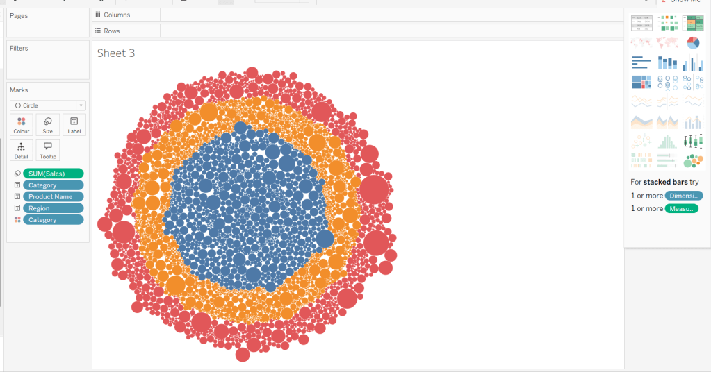
The simplest way I found to start this, was to use ctl-click to multi-select Category, Region, Product Name and Sales from the data pane, and then select the packed bubbles option from the Show Me menu.
Then move Category from Text to Columns and Region from Text to Rows, and remove Category from Colour.
Create a new field
Profit Ratio
SUM(Profit)/SUM([Sales])
and apply a custom number format of 0%;▲0%;0% (in this instance I think the intention is to use the ▲ as ‘warning’ indicator).
Add this to Colour. To cluster the lower profit ratios towards the centre of the bubbles, add a sort to the Product Name pill on the Text shelf, to sort ascending by Profit Ratio.
Note – you can’t influence quite how the bubbles are arranged, so it’s possible the layout you see may differ slightly from the solution.
Showing details for selected Sub-Category
Clicking on a Category in the bubble viz should expand to show the Sub-Categories. To support this we need a parameter
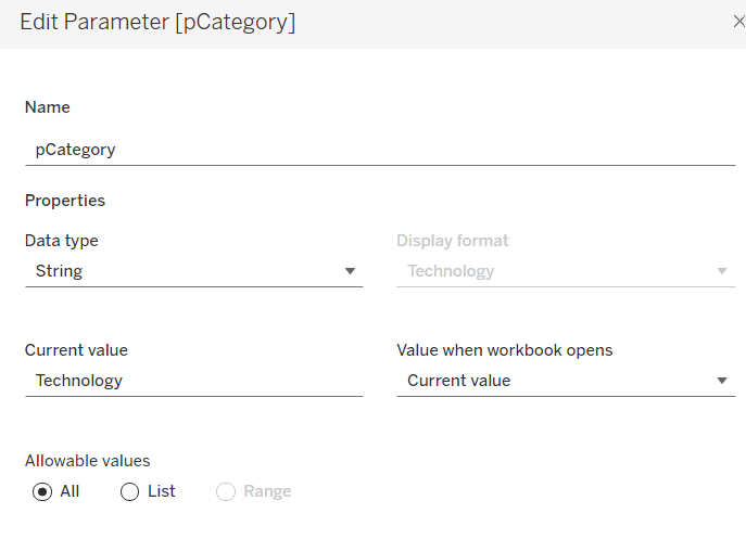
pCategory
string parameter defaulted to Technology
The Category label displayed needs to show an arrow indicator based on whether the Category is selected or not
We want to show Sub-Category details for the selected Category, so create
Label – SubCat
IIF([pCategory]=[Category], [Sub-Category], ”)
Add this to Columns too.
There is a need to capture the Region too, as part of the sorting on the tabular viz. But the Region header label needs to indicate the selected region. We will need a parameter
pRegion
string field defaulted to East
And then a new field
Region * Sortkey
[Region] + IIF([pRegion]=[Region],’*’,”)
Add this to Rows.
Finally tidy up by
adjusting the Tooltip
hide the Region pill (uncheck show header)
hide the Category pill (uncheck show header)
hide the Region * Sortkey row heading label (right click -> hide field labels for rows)
hide the Label – Cat / Label SubCat column heading label (right click -> hide field labels for columns)
remove the row dividers in the body of the viz (set the Level to 0)
Update the sheet title and name the sheet Bubble or similar.
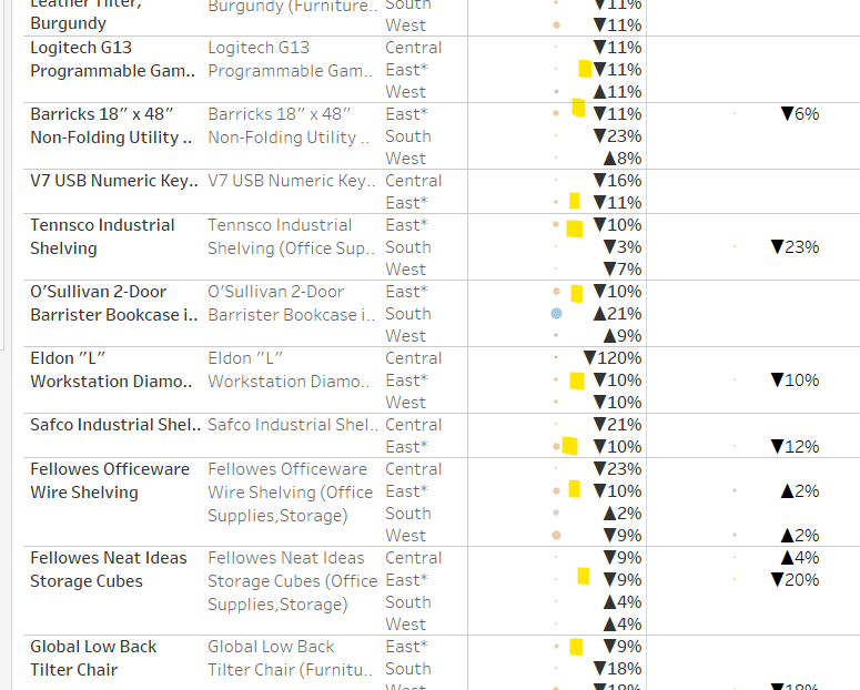
Building the basic Product Detail table
The first column is a combination of fields, so create
Add Product Name,Product Name (Cat, SubCat) and Region * Sortkey to Rows and Order Date as a discrete (blue) pill at the Year level to Columns. Change the mark type to circle. Add Sales to Size and Profit Ratio to Colour. Add Profit Ratio to Label and align right. Set the table to Fit Width. Increase the Size of the circles a bit.
Add totals via Analysis > Totals > Show Row Grand Totals and then via the same menu, select the Row Totals to Left option. Edit the Colour Legend and select the Include Totals option, so the circles in the total column are also coloured.
Applying the table sort
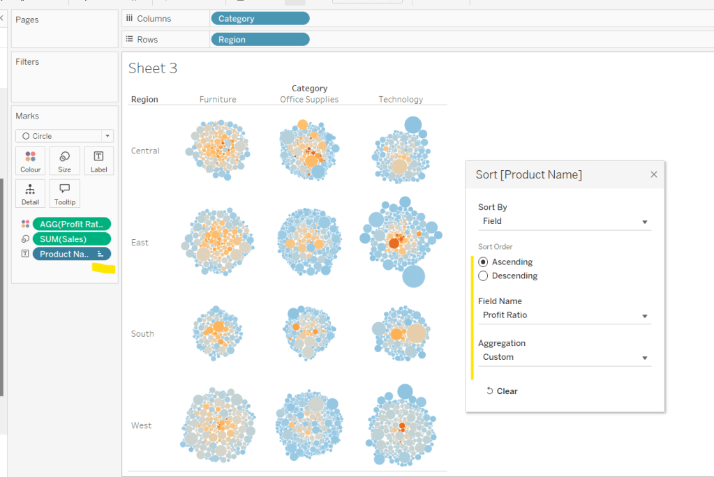
The requirement is to sort each Product Name based on the value of the Profit Ratio associated to the selected Region. The data should be sorted ascending.
This took me a little while to figure out – initially I wanted to use a table calculation, but you can’t apply a sort to a field based on that, and if you then add it as a discrete measure, you can’t have total columns. So I figured it out eventually. Firstly, I need to capture the Profit Ratio for each Product Name and Region (essentially the value listed in the Grand Total column). I can use an LOD for this.
but I then only want the value associated to the selected Region, and I want to ‘spread’ this across every row for the Product Name. So I can use another LOD but just at the Product Name level, which in turn uses a nested IF statement, to just return the value we care about.
Sort
{FIXED [Product Name]: AVG(IIF([Region]=[pRegion],[PR by Product & Region],NULL))}
Apply a Sort to the Product Name pill in Rows to sort by the field Sort ascending
You should find that when you see some Product Names that have sales in the selected region (in this case East), that the products are listed based on this value with the lowest Profit Ratio first (note the East row isn’t listed first if there are sales for the Central region, as the rows within each product are listed alphabetically based on the region name.
Finally tidy up by
Adjusting the Tooltip to suit
Hide the Product Name pill (right click, uncheck show header)
Adjusting the font style of the fields and label headings.
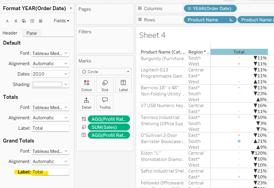
Rename the Grand Total label to Total (right click the label > format and update the Label value)
hide the Order Date column heading label (right click > hide field labels for columns)
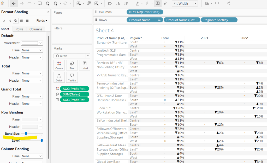
add row banding (right click viz to format), then adjust band size to level 1
Update the sheet title and name the sheet Table or similar.
Building the dashboard and adding the interactivity
Using layout containers, add the two sheets onto the dashboard, adding a title and the relevant legends (note I used text objects for the Profit Ratio legend title and the Sales ‘legend’.
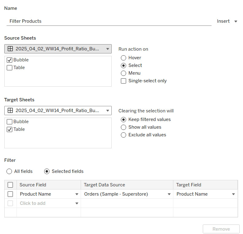
We need several dashboard actions:
Filter Products
Dashboard filter action, that on select of the Bubble sheet, targets the Table sheet, passing through the Product Name only. The set of products is retained when the selection is cleared.
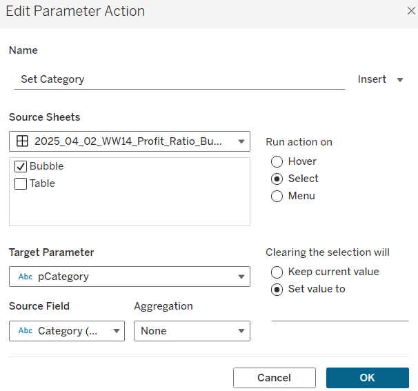
Set Category
Dashboard parameter action, that on select of the Bubble sheet, sets the pCategory parameter with the value from the Category field. When the selection is cleared, the parameter is reset to <empty string>
This action will allow the bubble chart to ‘expand and collapse’ on click.
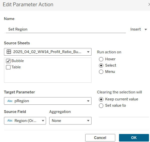
Set Region
Dashboard parameter action, that on select of the Bubble sheet, sets the pRegion parameter with the value from the Region field. When the selection is cleared, the parameter is retained
This action will apply the ‘niche’ sort and the relevant region labels will be updated with an * too.
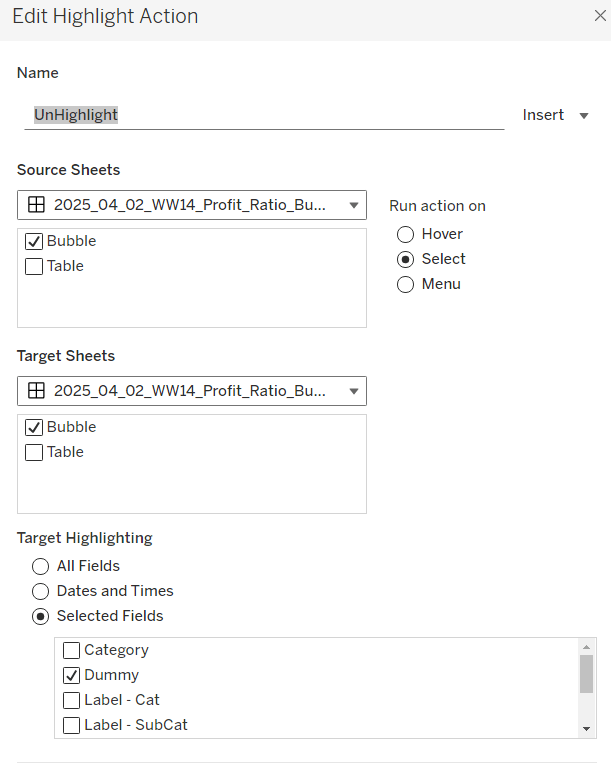
Finally, on selection of products in the bubble viz, we don’t want the other marks to ‘fade’ To stop this from happening, create a new field
Dummy
‘Dummy’
and add to the Detail shelf on the Bubble sheet.
Then add a dashboard highlight action
UnHighlight
On select of the Bubble sheet, target the Bubble sheet selecting the field Dummy only
And with that you should have a functioning dashboard. My published viz is here.
Note, after testing, I did notice a difference in the behaviour of my version to the solution. When I deselect all products from the bubble chart when in an expanded state, the section will collapse. The solution uses a ‘fake header’ sheet to stop this from happening, which is then carefully positioned above the bubble chart sheet. I’m ultimately happy with my 2-sheet solution, but feel free to check out the challenge solution for a better understanding.
For Community Month at #WOW2025 towers, Lorna presented a challenge one of her colleagues had brought to her which they solved together. The need is to identify the top X customers in each year (which may not contain the same set of customers each year), and then present the sales contribution, either as a group or individually compared to the rest. Lorna gave a hint in the challenge that sets would help : “Your job is to figure out the best way to SET this up with the last 3 years dynamically”.
It took me a bit of a while to figure out how to make this work, and at the point of writing, haven’t looked at the solution to know if there was a better way. I ultimately ended up creating 3 sets to fulfil this challenge.
Setting up the parameters
This challenge requires 3 parameters
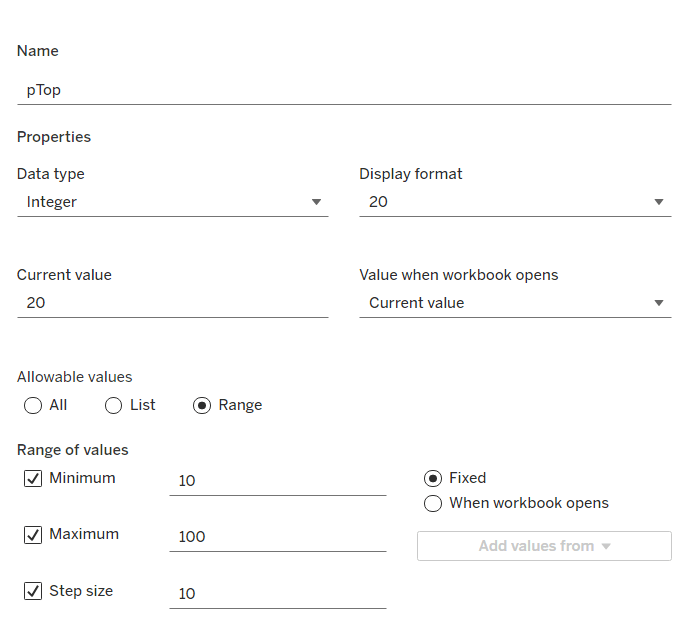
pTop
This identifies how many ‘top’ customers we want to consider. Defined as an integer from 10 to 100, defaulted to 20, that increments every 10 units
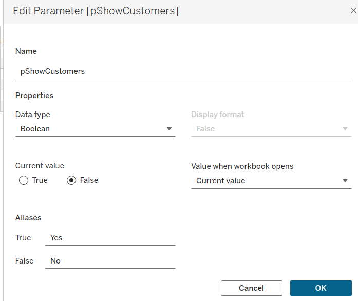
pShowCustomers
Determine whether the top customers’ contributions are displayed individually or as a group. Defined as a boolean, defaulted to False, and aliased to Yes or No
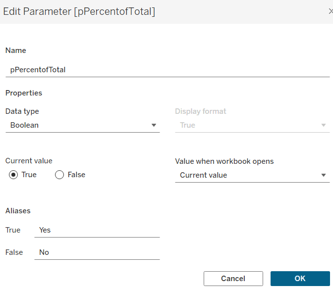
pPercentofTotal
Indicate whether the information is displayed as a % of total sales for that year, or as absolute sales values. Defined as a boolean, defaulted to True, and aliased to Yes or No.
Defining the core calculations
The requirement states to be able to determine the last 3 years ‘dynamically’. For this I created
Max Date
{FIXED: MAX([Order Date])}
to return the maximum Order Date in the whole data set.
We want to be able to restrict the data to the last 3 years, so create
Records to Show
DATEDIFF(‘year’, [Order Date], [Max Date]) <=2
I need to create a set for each of the 3 cohorts – the top customers for the latest year, the top for the previous year and the top for the year before that. For this I first need to determine the Sales for each of those timeframes.
The sales for the current year
Sales – CY
IF YEAR([Order Date]) = YEAR([Max Date]) THEN [Sales] END
The sales for the previous year
Sales – PY
IF YEAR([Order Date]) = YEAR([Max Date])-1 THEN [Sales] END
and the sales for the previous previous year
Sales – PPY
IF YEAR([Order Date]) = YEAR([Max Date])-2 THEN [Sales] END
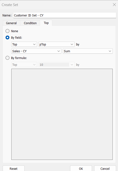
I can then create the sets of customer I need (right click on Customer ID > Create > Set)
Customer ID Set – CY
get the Top number of records using the pTop parameter, and based on the sum of the Sales – CY field
Repeat the same process to create
Customer ID Set – PY
get the Top number of records using the pTop parameter, and based on the sum of the Sales – PY field
and
Customer ID Set – PPY
get the Top number of records using the pTop parameter, and based on the sum of the Sales – PPY field
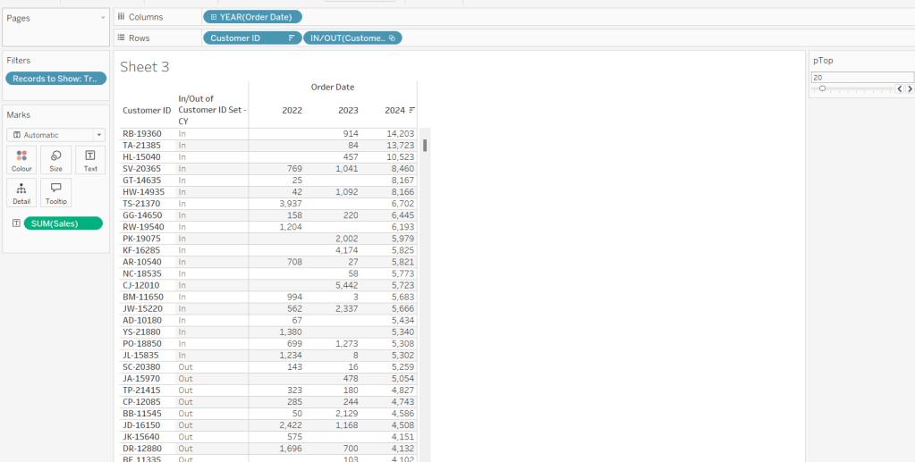
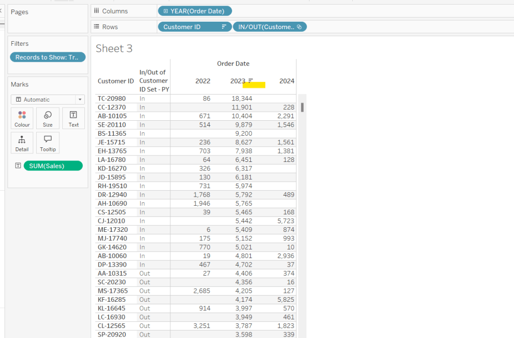
To verify/understand what we’ve created, on a new sheet
Add Customer ID to Rows
Add Order Date to Columns at the Year level as a discrete (blue) pill
Add Records to Show to Filter and set to True.
Add Sales to Text.
Sort by the 2024 Sales value descending.
Add Customer ID Set – CY to Rows.
You should see the first 20 rows (assuming you haven’t changed the pTop value, display as In
If you now change the sort to sort by 2023 Sales descending, and swap the Customer ID Set – CY with the Customer ID Set – PY, you’ll get the same
So now that’s understood, we want to tag each of our customers based on the year of the order, whether they’re in the top n or not, and whether we want to display the customers individually or not
Group – Detail
IF (YEAR([Order Date]) = YEAR([Max Date]) AND [Customer ID Set – CY]) THEN IF [pShowCustomers] THEN [Customer ID] ELSE ‘Top N’ END ELSEIF (YEAR([Order Date]) = YEAR([Max Date])-1 AND [Customer ID Set – PY]) THEN IF [pShowCustomers] THEN [Customer ID] ELSE ‘Top N’ END ELSEIF (YEAR([Order Date]) = YEAR([Max Date])-2 AND [Customer ID Set – PPY]) THEN IF [pShowCustomers] THEN [Customer ID] ELSE ‘Top N’ END ELSE ‘Other’ END
We’re also going to want to count customers, so need
Count Customers
COUNTD([Customer ID])
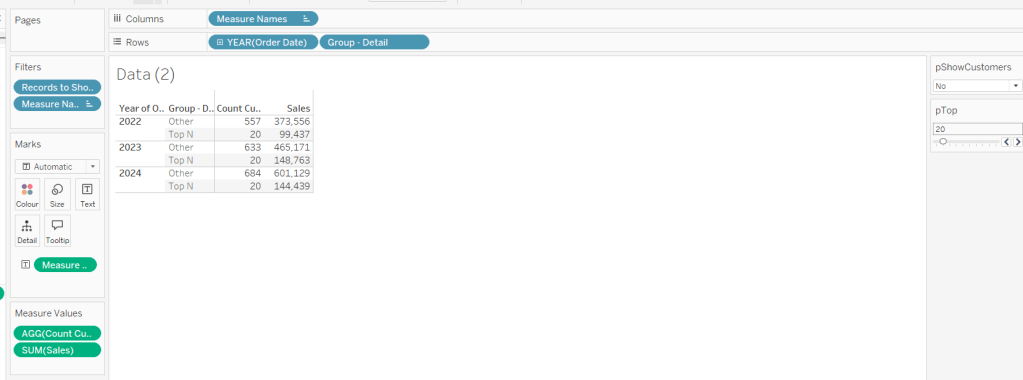
On a new sheet add Order Date at the year level as a discrete (blue) to Rows and add Group Detail to Rows too. Add Records to Display to Filter and set to True. Add Sales and Count Customers into the table. Show the pTop and pShowCustomers parameters
When pShowCustomers is set to No, you should just see 2 groupings per year
When set to Yes, you’ll get the Customer IDs listed
Note – the Sales numbers should reconcile to the solution – the count might not, which I believe is due to the solution counting distinct Customer Names rather than Customer ID.
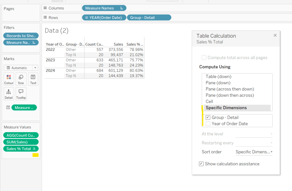
To finalise the core calculations we need to build the initial viz, we have a different display depending whether we’re displaying the absolute or % Sales values.
Create
Sales % Total
SUM([Sales]) / TOTAL(SUM([Sales]))
format to decimal to 2 dp and add into table, adjusting the table calculation so it is computing by the Group – Detail only, so the percentage per year is being displayed.
Then we need
Measure to Plot
IF [pPercentofTotal] THEN [Sales % Total] ELSE SUM([Sales]) END
format this to a number to 2 dp (just so you can see it has a value) and add to the table, applying the same table calculation settings. Display the pPercentofTotal parameter and flip between to see the column change.
Building the Viz
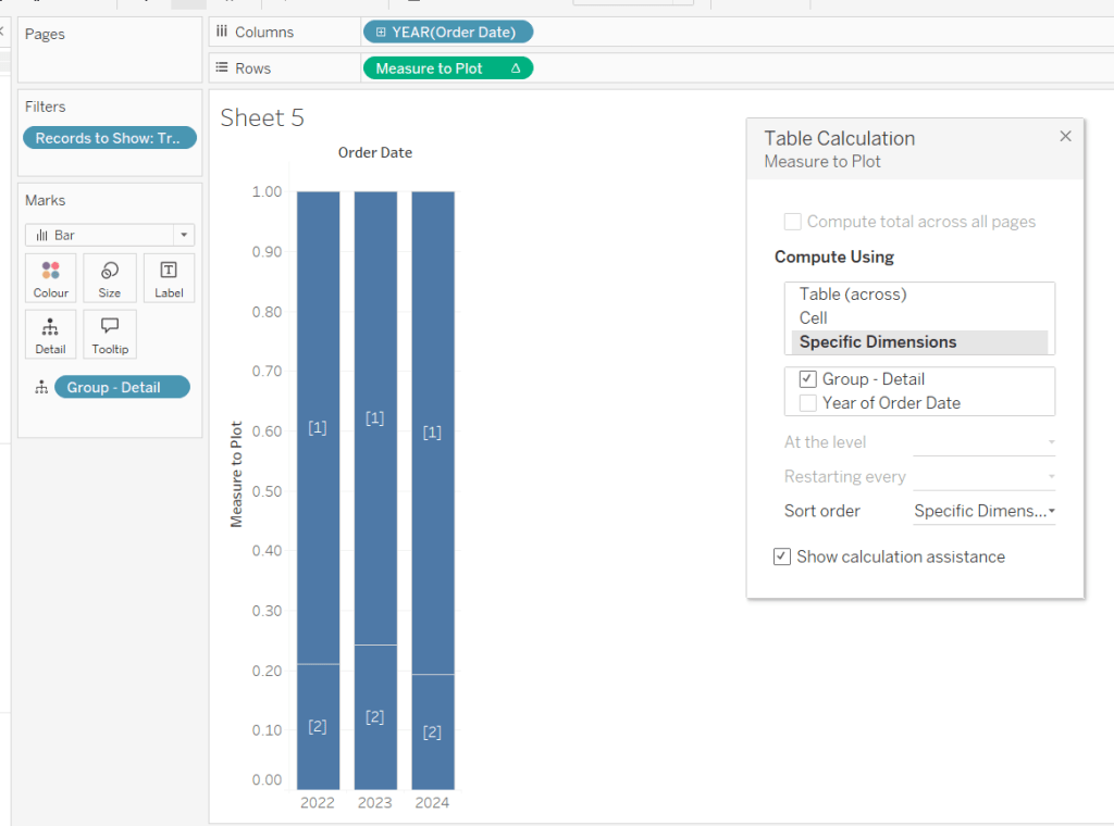
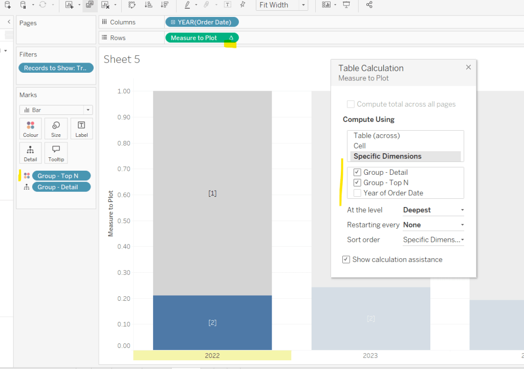
On a new sheet, add Records to Show to filter and set to True. Add Order Date at the year level as a discrete (blue) pill to Rows. Add Group – Detail to Detail. Change the mark type to bar. Add Measure to Plot to Columns and adjust the table calculation, so it’s computing just by Group-Detail.
Ste the sheet to fit width and show the 3 parameters.
Create a new field
Group – Top N
IF (YEAR([Order Date]) = YEAR([Max Date]) AND [Customer ID Set – CY]) THEN ‘Top N’ ELSEIF (YEAR([Order Date]) = YEAR([Max Date])-1 AND [Customer ID Set – PY]) THEN ‘Top N’ ELSEIF (YEAR([Order Date]) = YEAR([Max Date])-2 AND [Customer ID Set – PPY]) THEN ‘Top N’ ELSE ‘Other’ END
and add to Colour, adjusting the colours to suit. You’ll then need to update the table calculation of the Measure to Plot field to ensure Group – Top N is also checked.
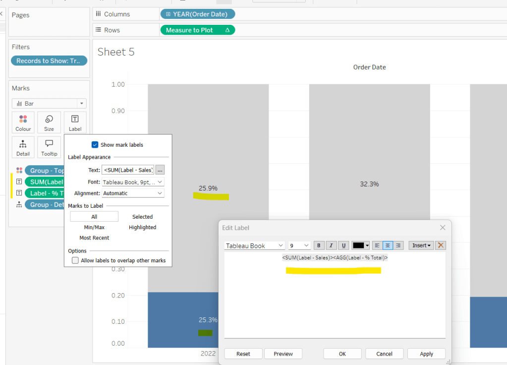
We need to display labels, but these need to differ based what measure we’re showing, and the format is different, so create
Label – % Total
IF [pPercentofTotal] THEN [Sales % Total] END
format this to % with 1 dp and
Label – Sales
IF NOT([pPercentofTotal]) THEN [Sales] END
format this $ K to 1 dp.
Add both of these to the Label shelf and ensure they are listed directly side by side. Only 1 will ever actually display.
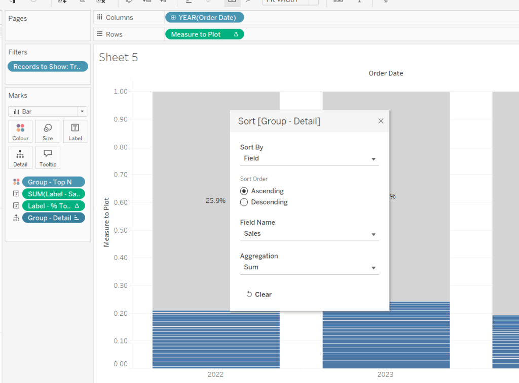
Change the pShowCustomers to Yes, and then add a white border via the Colour shelf. Add a Sort to the Group – Detail pill to sort by Sales ascending.
Add Sales, Sales % Total and Count Customers to the Tooltip shelf. additionally create
Tooltip – Customer
IF [pShowCustomers] AND [Group – Detail] <> ‘Other’ THEN [Customer Name] END
and add this to Tooltip too. Adjust the Tooltip to suit (make sure Sales % Total)is computing by both Group – Top N and Group – Detail so has the correct numbers.
Finally, hide the axis (uncheck show header on the Measure to Plot pill) and hide the Order Date label (right click and hide field label for columns).
Then add the sheet to a dashboard, and arrange the parameters suitably.
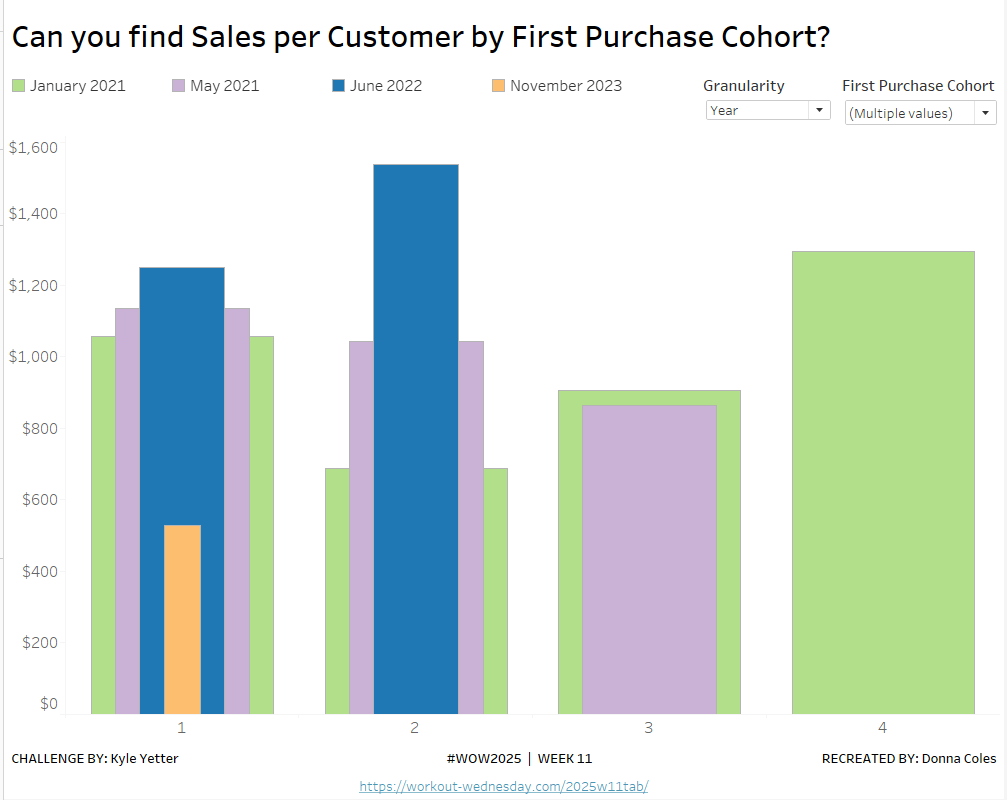
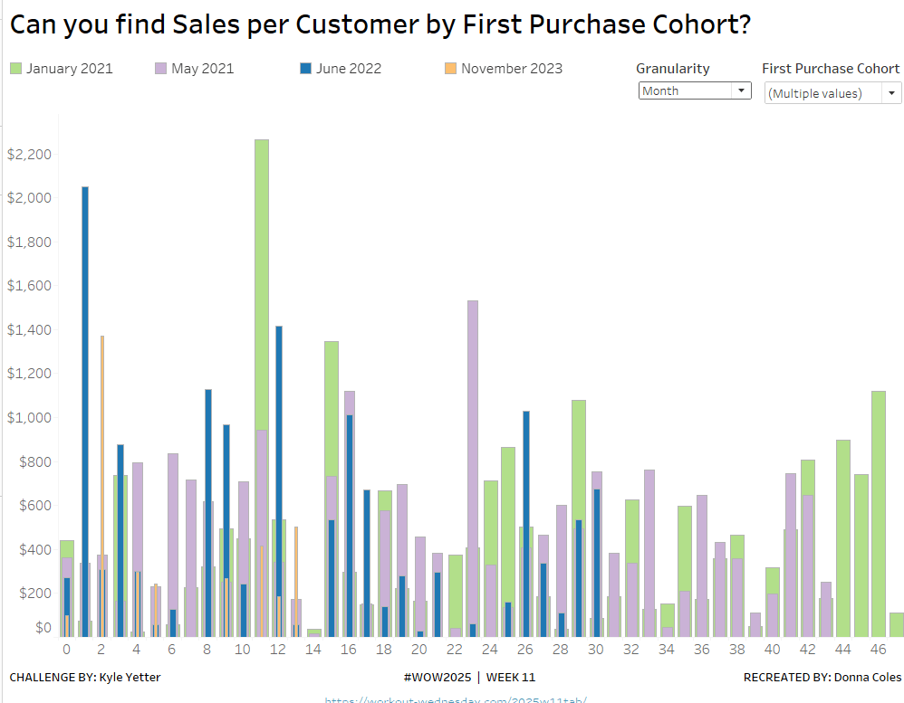
Kyle set the #WOW2025 challenge this week, using a summarised data set based on Superstore that he included in the challenge page.
Building out the core data fields
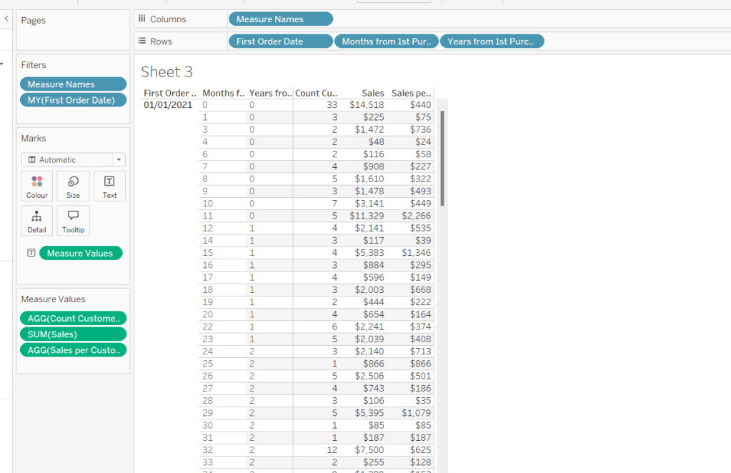
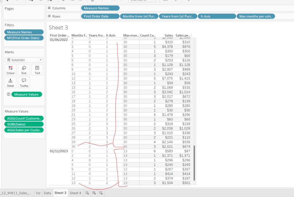
I started this challenge, by building out the data in a tabular format, so I could verify the calculations I needed. I focused on the ‘month’ level to start with before tackling the ‘year’ level which had the added requirement of containing ‘complete years only’, which I did find a bit tricky. Anyway, to start we need to determine the number of months between the First Order Date and the Order Date.
Months from 1st Purchase
DATEDIFF(‘month’, [First Order Date], [Order Date])
and we also need to identify the number of customers
Move this pill into the Dimension section of the left hand pane (drag it up to the top section above the line)
Count Customers
COUNTD([Customer ID])
and calculate the sales per customer
Sales per Customer
SUM([Sales])/[Count Customers]
format this to $ with 0 dp. Also format Sales to $ with 0 dp.
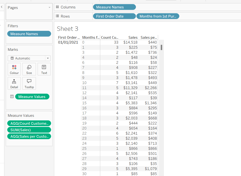
On a new sheet, add First Order Date to Rows as an exact date dimension (blue pill). Add Months from 1st Purchase Date to Rows. Then add Count Customers, Sales and Sales per Customer into the view.
Add First Order Date to the Filter shelf and select the Month/Year format, then select the 4 months Kyle used – Jan 2021, May 2021, Jun 2022, Nov 2023). Show the filter on the sheet.
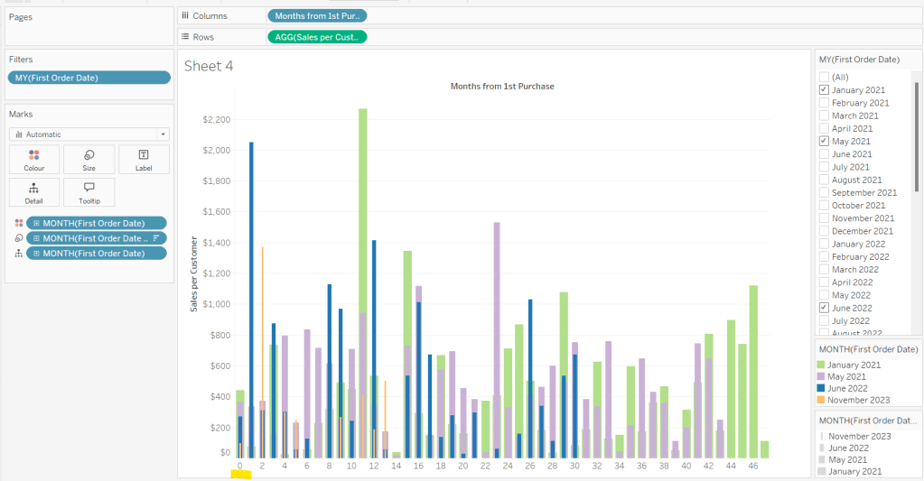
Building the Month Level Viz
With the information we have, we can build out the viz at the ‘month’ level of granularity.
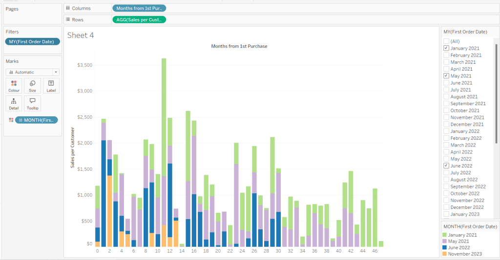
On a new sheet, add Months from 1st Purchase Date to Columns and Sales per Customer to Rows. Add First Order Date to the Filter shelf at the Month/Year level and restrict to the relevant dates. Show the filter control. Add First Order Date to Colour and set to the Month/Year level as a discrete (blue) pill. Adjust the colours to suit. I used colours from a palette called CB_Paired I had installed.
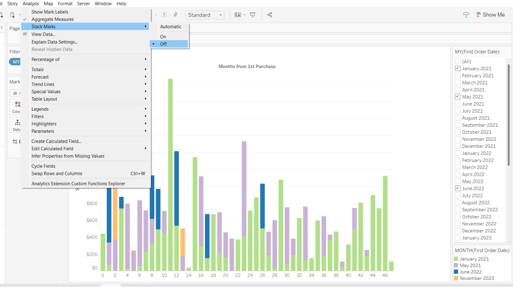
Set Stacked Marks to Off (Analysis Menu > Stack Marks > Off).
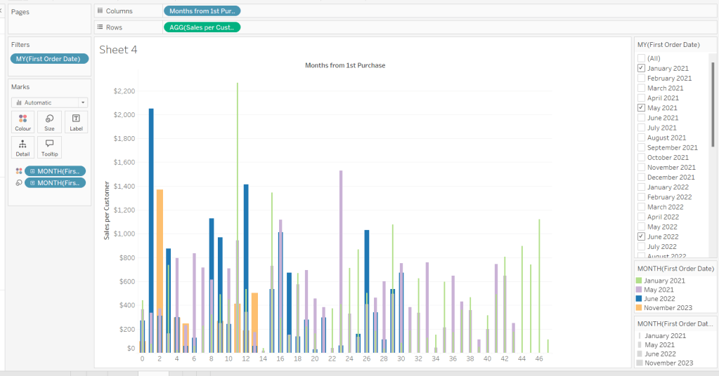
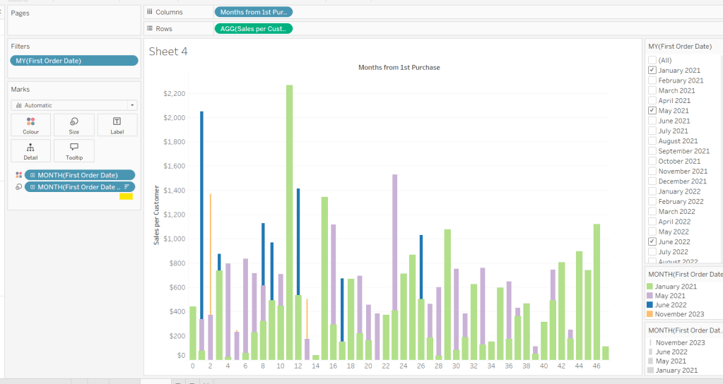
Create another instance of First Order Date (right click the field and select Duplicate) to crate First Order Date (copy). Rename this First Order Date (for Size). Add to the Size shelf, and set it to be at the Month/Year level and discrete (blue) pill.
Adjust the Sort on the First Order Date (for Size) pill to be by Data source order Descending. This now makes January wider than November.
And then add First Order Date to the Detail shelf at the Month/Year level as a discrete (blue) pill. By default this pill is sorted ascending, and has the effect of moving January to the back and November to the front so all the bars (at least for the 0 entry) are visible. This is why we needed a duplicate instance of First Order Date and we needed it to be sorted in one direction to make the correct months at the front, and in another direction to get the required bar widths.
Add Sales and Count Customer to the Tooltip shelf and adjust the Tooltip as required.
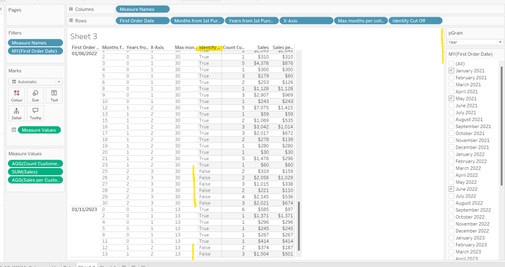
Handling the ‘Year’ requirement
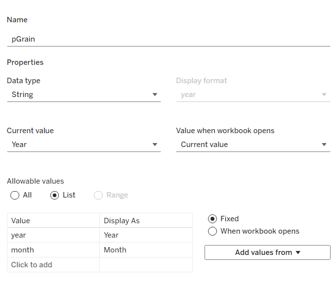
Firstly for this, we need a parameter to drive the change in visual.
pGrain
string parameter listing ‘month; and ‘year’ and defaulted to ‘year’
Our Columns is currently listing the Months from 1st Purchase. We need this to be reflective of the years from 1st purchase instead based on the parameter selected.
Years from 1st Purchase
FLOOR([Months from 1st Purchase]/12)
this rounds the calculation down to the nearest whole number.
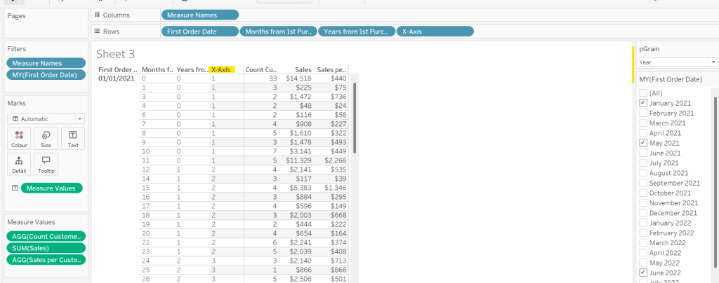
Move this into the dimension section of the data pane, and add to Rows of our tabular display, so you can see what it’s doing.
Our X-Axis will then be based on either of these 2 fields
X-Axis
IF [pGrain] = ‘month’ THEN [Months from 1st Purchase] ELSE [Years from 1st Purchase]+1 END
Add this into the table, and show the pGrain parameter and see the change as you flip the options.
We then need to handle the ‘incomplete year’ requirement. This did take some trial and error, and I’m not totally convinced what I’ve done will work in all scenarios, but it seems to match Kyle’s results for the spot checks I did…
I started by determining the maximum month from 1st purchase in each cohort.
Max months per cohort
{FIXED [First Order Date]: MAX([Months from 1st Purchase])}
Add this into the table as a discrete dimension (blue pill), and each row should match the final Months from 1st Purchase value for each First Order Date
I then created a field to identify which of the rows in the data I wanted to keep. So in the case of the above examples for 01/11/2023, I want the rows where Months from 1st Purchase is from 0 to 11 as these represent a whole year’s worth of data for Years from 1st Purchase = 0 (even though there isn’t a a purchase every month in the year). I ended up doing this with the following calculation
Identify Cut Off
[Months from 1st Purchase] < 12 * (FLOOR(([Max months per cohort]+1)/12))
so based on the above example for 01/11/2023, get me all the rows where Months from 1st Purchaseis less than 12 * (FLOOR((13+1)/12) = 12 * (FLOOR(14/12)) = 12 *1 = 12.
Add this into the table
I then created an additional field to filter by
Records to Display
[pGrain] = ‘month’ OR [Identify Cut Off]
and added this to the Filter shelf and set to True.
When we’re at the ‘month’ level, all rows will be included, otherwise, just those we identified will be.
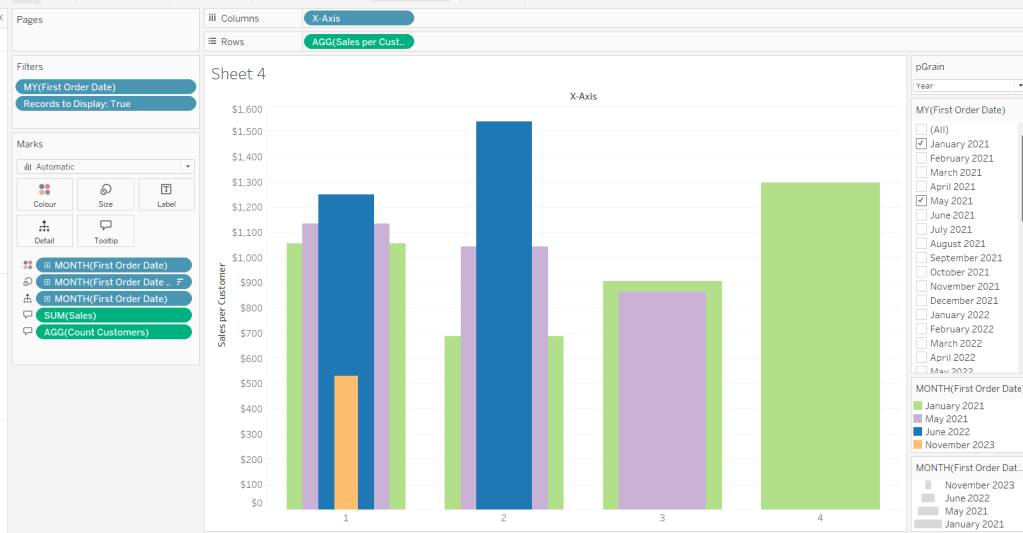
So now we have this, we can adjust the visual (you may choose to take a copy of what was initially built, just in case).
Adjusting the Viz for the Granularity parameter
Show the pGrain parameter on the viz sheet and set to Year. Add Records to Display to the Filter shelf and set to True. Add X-Axis to Columns and remove Months from 1st Purchase Date. Set sheet to Fir Width.
Test changing the parameter and altering the selected dates and verify the behaviour is as expected.
Finally tidy up the formatting – remove all gridlines; edit the axis and remove the title; hide the X-Axis label heading (right click > hide field labels for columns). Add to a dashboard and arrange the colour legend in a single row, and set the First Purchase Date filter to be a multi-value dropdown.