Sean provided this week’s #WOW2024 challenge, to produce a dual axis chart which he labelled a ‘candle line’ chart. The line displays the 2024 sales per month, while the candles represent the absolute difference from the previous year.
Setting up the calculations
Rather than ‘hardcode’ to 2024, I decided to use a calculation to get the latest year in the data set
Latest Year
{MAX(YEAR([Order Date]))}
which I formatted to a number with 0dp which did not use thousand separators
and then created
Previous Year
[Latest Year] – 1
I moved both of these up into the ‘dimensions’ section of the data pane (above the line).
To get the latest year sales I created
Latest Year Sales
IF YEAR([Order Date]) = [Latest Year] THEN [Sales] END
and then created
Prev Year Sales
IF YEAR([Order Date]) = [Previous Year] THEN [Sales] END
Both these fields I formatted to $ with 0 dp
We need to know the difference between these values, so I created
Sales Diff
SUM([Latest Year Sales]) – SUM([Prev Year Sales])
which I formatted to $ with 0 dp.
and we also need the percentage difference
% Diff
[Sales Diff] / SUM([Prev Year Sales])
which was formatted to a % with 0 dp.
We need to know if the Sales Diff is positive or negative, so create
Diff is +ve
[Sales Diff]>=0
Finally, when we hover on the tooltip we can see the values are coloured based on whether the difference is +ve or not, so we need some additional fields for the tooltip
Tooltip Sales Diff +ve
IF [Diff is +ve] THEN [Sales Diff] END
and
Tooltip Sales Diff -ve
IF NOT([Diff is +ve]) THEN [Sales Diff] END
both these fields I custom formatted to +”$”#,##0;-“$”#,##0 (essentially this is $ with 0 dp, but positive values are prefixed with an explicit + sign).
And then we also need
Tooltip Sales Diff % +ve
IF [Diff is +ve] THEN ‘(‘ + STR(ROUND([% Diff]* 100,0)) + ‘%)’ END
and
Tooltip Sales Diff % -ve
IF NOT(Diff is +ve]) THEN ‘(‘ + STR(ROUND([% Diff]* 100,0)) + ‘%)’ END
Now we have all the fields, we can build the viz.
Building the viz
On a new sheet, add Order Date at the discrete month level (blue pill) to Columns and add Latest Year Sales to Rows.
Then add another instance of Latest Year Sales to Rows. On the second marks cards, change the mark type to Gantt Bar and add Sales Diff to Size. Reduce the Size to make the bars that display narrower.
Add Diff is +ve to the Colour shelf, and adjust accordingly. Change the colour of the line chart on the other marks card. Make the chart dual axis and synchronise the axis.
On the All marks card, add Latest Year and the four Tooltip xxx fields we created to the tooltip shelf, then update the tooltip to reference all the relevant fields, and colour them accordingly
Add Region, Category and Segment to the Filter shelf, selecting all values.
Then finally, tidy up the sheet by removing all row/column dividers, the right hand axis (uncheck show header), and the Order Date label (right click and hide field labels for columns). Rename the left hand axis Sales.
Add to a dashboard and position as appropriate adding a title and updating the filters to be single value drop downs.
That ultimately is the core of the challenge, but Sean did suggest to use the new Google font Poppins. I’m on Windows and that font isn’t visible by default/installed, so after publishing, I then edited on Tableau Public and changed the fonts throughout via the Format > Workbook menu option and setting All fonts to Poppins.
Erica set this week’s challenge and provided multiple levels specifically aimed a newer users of Tableau. My solution is for Level 3.
Setting up the calculations
First, create a parameter to capture the Sub-Category we care about
pSelectedSubCat
string parameter defaulted to Tables
Create a new field
Is Selected SubCat
[pSelectedSubCat]= [Sub-Category]
then create another field
Product to Display – Step 1
IIF([Is Selected SubCat], [Product Name], ”)
On a new sheet add Sub-Category and Product to Display – Step 1 to Rows. Show the pSelectedSubCat parameter. You will see that the Product rows only show for the Sub Category entered in the pSelectedSubCat parameter
We want to show the average of the product sales for each Sub-Category, so we can create
Add this to Text. By default it will aggregate this value to SUM, change it to AVG. For the rows associated to the selected Sub-Category the value of this field is the same whether its SUM or AVG, as it has been calculated at the level of detail being displayed on the row (Sub-Category and Product Name). For the other rows, by changing the aggregation to AVG we are getting the required value, which is essentially the sum of all sales associated to the Sub-Category divided by the number of distinct products. Sort the Sub-Category pill by the Average of the Sales by Sub Cat & Product field descending
Additionally, sort the Product to Display – Step 1 field the same way
We need to identify the top 5 records for the products associated to the selected Sub-Category. We will use a set for this. Right click on Product to Display – Step 1 > Create > Set
Product to Display Set
Select the Top tab and select the top 5 by formula
AVG(IF [Is Selected SubCat] THEN [Sales by Sub Cat & Product] END)
Add this to Rows and you should get In displayed against the product rows with the highest values
With this we can start to think about the ‘other’ text we need to display, but for this we need a handle on the number of products in each Sub-Category. Create
Count Products Per Sub-Category
{FIXED [Sub-Category]: COUNTD([Product Name])}
Add to Text so you can see the value, and then subsequently we can create
Product to Display – Step 2
IF NOT([Is Selected SubCat]) THEN ” ELSEIF [Product to Display Set] THEN [Product Name] ELSE ‘Other: ‘ + STR([Count Products Per Sub-Category] – 5) + ‘ Products’ END
Add to Rows to see the behaviour
The viz also needs to show an index value against the top 5 rows, so create
Index to Display
IF MIN([Is Selected SubCat]) AND MIN([Product to Display Set]) THEN STR(INDEX()) ELSE ” END
Add this to Rows as a blue discrete pill in front of the Product to Display – Step 2 field. Adjust the table calculation setting so the Sub-Category field is unchecked.
Next, we’re going to need to display a reference line that is the overall average product sales for the Sub-Category. This may sound like it’s what we already have, but that field is at the Sub-Category and Product Name level of detail, and we need to aggregate this back up to be at the Sub-Category level, so we create
Avg Sales by Sub Cat and Product
{FIXED [Sub-Category]: AVG([Sales by Sub Cat & Product])}
which is the average of the field we previous created but per Sub-Category. Pop this into the table to see what is happening. For the rows where the Products aren’t showing, the values match, but for the rows where the Products are displayed, you get the overall average, which is the same for all the rows.
If we now remove Product to Display – Step 1 from Rows (and amend the Index to Display table calc so it is not longer computing by this field too), we should have the data we expect. Format the Sales by Sub Cat & Product field to be $ with 0 dp.
Building the Viz
On a new sheet add Sub-Category, Product to Display Set, Index to Display and Product to Display – Step 2 to Rows and Sales by Sub Cat & Product to Columns and aggregate to AVG.
Sort the Sub-Category pill by the Average of the Sales by Sub Cat & Product field descending and apply the same sort to the Product to Display – Step 2 field. Edit the table calculation of the Index to Display field so it is not computing by Sub-Category.
Create a new field
Colour
IF [Is Selected SubCat] AND [Product to Display Set] THEN ‘Dark’ ELSEIF [Is Selected SubCat] THEN ‘Light’ ELSE ‘Grey’ END
Add this to Colour shelf and adjust accordingly.
Add Avg Sales by Sub Cat & Product to the Detail shelf, then add a reference line based on the Average of this field
Widen each row and from the Label shelf check Show mark labels. From the Tooltip shelf uncheck Show tooltips.
Hide the In/Out Product to Display Set field in Rows (uncheck show header). Format the font and style of the header columns, then hide the header field labels and hide the axis. Adjust the row banding and set all gridlines, zero lines, axis rulers and column dividers to none. Change the title of the sheet.
Test the behaviour by manually changing the value of the parameter.
Adding the interactivity
Add the sheet to a dashboard, then create a parameter dashboard action
Set SubCat
On select of the viz, update the pSelectedSubCat parameter passing in the value from the Sub-Category field.
A guest post this week from Hannah Bartholomew asked us to show a filtered and unfiltered view of data in the same viz.
Building the calculations
We need to show the total sales and the total sales by Sub-Category which won’t be impacted by any filters. We can use a level of detail (LODs) for this.
Sales per Sub Cat
{FIXED [Sub-Category]:SUM([Sales])}
format to £ with 0 dp
Pop this and Sales into a table. The total value is identical.
Create a new field
Order Date (Year)
Year([Order Date])
Add Region, Customer Name, Manufacturer and Order Date (Year) to the Filter shelf and show all the filters (display as multiple value drop down to save space). If you now adjust any of the filter values, the Sales value will change, but Sales per SubCat won’t.
We need to show the % of total, so create
% Total
SUM([Sales]) / SUM([Sales per Sub Cat])
and format to % with 0 dp. Add to the table.
This essentially are the measures needed for the overall bar at the top of the display.
Now add Sub-Category to Rows. and you can see the data is now simply broken down to this level without any adjustments to the calculations.
If you reset all the filters back to ‘All’ the Sales per Sub Cat and Sales columns should match with 100% .
Lastly, we need to be able to filter by a start and end date. We need some parameters and additional calculated fields for this.
Create new fields
Max Date
{MAX([Order Date])}
Min Date
{MIN([Order Date])}
Create a new parameter
pStartDate
date parameter that refers to the Min Date field when workbook opens, and displays a range of values based on the values in the Order Date field when the workbook is opened.
Create another parameter pEndDate which is similar except it refers to the Max Date field when opened.
Show these 2 parameters. We then need
Filter – Order Date
[Order Date]>=[pStartDate] AND [Order Date]<=[pEndDate]
Add this to the Filter shelf and set to True.
Then set all the filters to ‘apply to worksheets > all using this data source‘so that when you create new sheets, they will get automatically added. Test changing the dates and the Sales and %Total will adjust.
Building the Total Sales Bar
On a new sheet, add Sales to Rows and add Sales per Sub Cat to Rows. Show the relevant filter controls and the two parameters.
Add % Total to the Tooltip shelf of the All marks card, then adjust the tooltip on each of the Sales and Sales per SubCat marks cards as required.
Make the chart dual axis and synchronise the axis. Change the mark type on the All marks card to be bar. Adjust the colours of the Measure Names legend to suit. Click the top axis and select move marks to back. Reduce the size of the Sales bar.
Hide the top axis, edit the title of the bottom axis, remove all column and row dividers, make the column axis rules & tick lines slightly more prominent. Edit the title of the sheet.
Building the Sub-Category by Sales Bar
The simplest way for this is to duplicate the above sheet. Then add Sub-Category to Rows, and apply a sort to sort by the Sales per Sub Cat field descending.
Then update the title on the sheet.
Building the ‘Filtered Options’ List
There is a section on the display that shows the values selected in the filters. For this, create a new sheet and then double click in to the area below the marks card and type ‘dummy’ (including quotes) and press enter/return. At this point a mark should display and all the filters get added.
Change the mark type to polygon. Then update the text of the sheet title to reference the filters. Format the background of the whole worksheet to be pale blue.
Now the sheets all need to be arranged on a dashboard. Use layout containers and outer/inner padding to help build the design. I just took a screen snip of the logo Hannah used and then added that as an image to my right hand vertical container. I also created another sheet using a similar ‘dummy’ technique but changed the mark type to shape and added a ‘help’ icon shape I already had.
This week’s #WOW2024 challenge was a guest post from Dan Wade using an alternative custom data set focused on staff resource planning.
Creating the parameters
We need 3 parameters for this challenge
pMeasure
string parameter containing a list of 3 options: Budget, Demand, Supply and defaulted to Supply.
pAttrition_Actual
string parameter containing a list of 2 options: Actuals and Attrition and defaulted to Attrition
pRate
a float parameter containing a list of values from 0.05 to 0.12, defaulted to 0.06 and formatted as % with 0 dp.
Building out the calculations
On a new sheet add Forecast Date as a discrete (blue) pill at the month-year level to Rows and add Budget FTE, Demand FTE and Supply FTE and Actuals FTE to Columns vis Measure Names/Measure Values, so you have a tabular display. Show the 3 parameters.
The first 3 measures will be plotted as 3 of the lines on the chart. The 4th line – the Actuals/Attrition line is a calculation based on the parameter selections.
If the pAttrition_Actual parameter displays ‘Actuals’ then we need to show the Actuals FTE as a constant value across every row. From the above, we can see it’s only set against Jan 2024. We will make use of a FIXED LOD calculation to ‘spread’ this value across every row.
However if the pAttrition_Actual displays ‘Attrition’ then we want to calculate a value which is initially a proportion of the Actual FTE, but then is a proportion of the value calculated against the previous month. The requirements also state the rate in the pRate parameter is an annual attrition rate, so we need to apply 1/12 of this value against each month (assuming a linear decline). The calculation we end up with is
Actuals/AttritionFTE
IF [pAttrition_Actual] = ‘Actuals’ THEN SUM({MAX([Actuals FTE])}) ELSE IF FIRST()=0 THEN SUM([Actuals FTE]) ELSE PREVIOUS_VALUE(0) * (1-([pRate]/12)) END END
{MAX([Actuals FTE])} is the Fixed LOD which spreads the Actuals FTE value across every row. FIRST() is a table calculation which identifies the first row in the table. PREVIOUS_VALUE(0) looks at the previous value compared to the current row we’re on, and then is reducing it by 1/12 of the pRate parameter. Format this to a number with 2 decimal places.
Add this field to the table and explicitly set the table calculation to compute by Forecast Date.
Adjust the values of the pAttrition_Actual and pRate parameters to see the behaviour of the calculation.
Next we need to calculate the actual difference between this value and the value of the measure selected in the pMeasure parameter. To start we need
Selected Measure
CASE [pMeasure] WHEN ‘Supply’ THEN SUM([Supply FTE]) WHEN ‘Demand’ THEN SUM([Demand FTE]) WHEN ‘Budget’ THEN SUM([Budget FTE]) END
and then we can create
FTE Difference
[Selected Measure] – [Actuals / Attrition]
Add this to the table. Verify the setting of the table calculation. Adjust the pMeasure value to see the changes.
In order to colour the bars on the viz, we need to know the % difference
% FTE Difference
[FTE Difference]/[Selected Measure]
format this to % with 2 dp and then create
% Diff > 20%
IF [% FTE Difference] > 0.2 THEN ‘Outside 20% range’ ELSE ‘Within range’ END
Add this to Rows and verify the output.
Building the Viz
On a new sheet add Forecast Date as a continuous (green) pill at the month/year level to Columns. Add Budget FTE, Demand FTE and Supply FTE to the same axis, using Measure Values/Measure Names. Adjust colours accordingly. Edit the y-axis and uncheck Include zero and change the axis title.
Add Actuals/Attrition FTE to the Measure Values section and ensure the table calculation is set to compute by Forecast Date. Adjust colour.
Add Measure Names to the Label shelf. Adjust to align right and central and set the font to match mark colour. Edit the date axis, adjust the axis title, then set the axis to have a fixed end of 31 Jul 2027. This gives some space for the labels to display.
Adjust the Tooltip to suit.
Then add Actuals/Attrition FTE to Rows, making sure the table calculation is set as it should. Change the mark type to Gantt Bar. Remove Measure Names from the Label and Colour shelf of this marks card.
Add FTE Difference to the Size shelf, adjusting the table calc setting. Then add % Diff > 20% to the colour shelf. Set the colours accordingly, and reduce the opacity to 25%.
Add Budget FTE, DemandFTE and Supply FTE to the Tooltip shelf then adjust the tooltip as required, making reference to the parameters to make the tooltip ‘dynamic’
Make the chart dual axis and synchronise the axis.
Show the parameters and adjust to see how the chart behaves with the different settings. Hide the right hand axis, remove row/column dividers, but make the axis lines slightly more prominent than the gridlines. Update the title and again reference the parameters so the text is dynamic.
Then add the chart to a dashboard and edit the parameter/legend titles as required.
This week’s #WOW2024 challenge was set by Yusuke, challenging us to create a filter for the line chart, using selections from the bar chart. The main aim was to make it as easy to select months with low sales as it is to select months with higher sales.
Building the bar chart
Create a new field
Monthly Sales
[Sales]
and format to $ Thousands (K) with 0 dp.
Also create
Order Date Month
DATE(DATETRUNC(‘month’, [Order Date]))
Add Order Date Month to Columns at the continuous month level (green pill) and add Monthly Sales to Rows. Change the mark type to Bar and set the size of the bar to as wide as possible. Edit the date axis, and remove the title, then fix the tick marks to start on 1st Jan 2021 with an interval of every 1 year.
Create a set call Order Date Month Set, based off of the Order Date Month field (right click the field > create > set, and select a set of dates). Add Order Date Month Set to the Colour shelf and adjust the colours accordingly. Add a dark grey border to the bars too. Modify the Tooltip to suit.
Create a new field
Max Monthly Sales
{MAX({FIXED [Order Date Month]: SUM([Sales])})}
(for each month, get the sum of sales, then return the maximum of all these).
Add this field to Rows. On the Max Monthly Sales marks card, reduce the opacity to 25% and remove the border (all on the Colour shelf)
Set the char to Dual Axis and synchronise the axis. Remove the Measure Names field from the All marks card.
Hide the right hand axis, remove all row and column dividers. Darken the row gridlines slightly, and add the instructional text as the title of the sheet.
We are ultimately going to make use of set actions to define the dates selected by the user. For this we will need to pass the exact date selected, so add Order Date Month to the Detail shelf of the All marks card as a continuous exact date (green pill).
We’re also going to not want the bars to be ‘highlighted’ when selected, so create fields
True
TRUE
and
False
FALSE
and add both to the Detail shelf of the All marks card.
Building the Line Chart
Create a new field
Selected Sales
IF [Order Date Month Set] THEN [Sales] END
and format to $ Thousands to 2dp.
On a new sheet add Order Date to Columns at the continuous day level (green pill), add Region to Rows and add Selected Sales to Rows.
Change the colour of the line and set line markers (via the colour shelf) and reduce the size of the line. Show mark labels, and set to just label the maximum value per pane.
Adjust the row banding so the band size is set to 1
Remove the column dividers, but set the row dividers to be darker grey. Adjust the row gridlines to be a slightly darker grey. Adjust the title of the Selected Sales axis, and remove the title from the date axis. Format the data axis, so it displays a custom date format of mmm dd. Right click the Region label at the top of the chart and hide field labels for rows.
Create fields
Min Date
{MIN(IF [Order Date Month Set] THEN [Order Date Month] END)}
which will return the date of the earliest month selected in the set and
Max Date
DATE(DATEADD(‘day’, -1, DATEADD(‘month’, 1, {MAX(IF [Order Date Month Set] THEN [Order Date Month] END)}) ))
which finds the maximum month selected in the set (which will be 1st of the max month), adds on a month, and takes off a day to get the last day of the maximum month.
Add these to the Detail shelf as continuous exact dates, and then update the Title of the sheet to reference the fields.
Then create
Tooltip: Date
[Order Date]
and add to the Tooltip and adjust the Tooltip to suit.
Finally, depending how the user selects the dates, there may end up being a break in dates. Right click on the Order Date MonthSet and select Show Set. Adjust the dates, so there is at least 1 unselected value between the dates.
To make a continuous line between the dates, click the context menu against the Selected Sales pill on Rows and select Format. On the options on the left hand side, select Pane and at the Special Values option, select Marks: Hide (Connect Lines).
Adding the interactivity
Put the 2 sheets onto a dashboard. Create a dashboard set action
Select Months
On select of the bar chart, target the Order Date Month Set by assigning values to the set when the action is run, and keeping set values when the selection is cleared.
To stop the bars from highlighting on selected, create a dashboard filter action
Deselect Marks
On select of the bar chart on the dashboard, target the Bar Chart sheet, passing in the fields True = False.
And this should now complete the challenge. My published viz is here.
It’s Community Month at #WOW2024 HQ, and for the first challenge, Jack Hineman (a long time participant of WOW) asked us to create gauge charts using map layers. Not only that, he wanted them displayed in a trellis format, with a specific requirement to ensure the number of columns was always >= number of rows displayed. Errr…..
This was tough! I tried to start the challenge one evening and after pouring through Ken Flerlages’s blog post that was referenced, reading the hints, and looking at Jessica Moon’s Tableau Public page referenced, I was none the wiser. The blog post did not mention map layers at all in building a gauge, and was purely mentioned as inspiration for the design of the gauge.
I happen to have some time off work, so reattempted the challenge the next day. After several hours, I got there, somehow! I did another google : “Gauge charts in Tableau” and hit upon this blog, which gave me a few pointers, although most of the time it really was a lot of trial and error based on Jack’s hints, and to be honest I surprised myself that I actually hit all the requirements, except one, without the need to look at the solution.
The one thing I had to look at was the calculations required to get the trellis to always have more columns than rows. My ‘go to’ formula didn’t work. More on that later.
As for my solution… well it’s a solution…. how elegant/efficient it is – who knows. It was something built very much in stages as I tried to get my head around what was being asked. As I rebuild as part of the process I go through when writing this blog, I may find ways of improving what I did to start with. I will do my best to explain what I think is going on, what my thought process was, but apologise in advance if you get to the end of all this, and still don’t have a ‘scooby’ 😦
Strap yourself in! This is going to be a long one!!!!
Modelling the data
Connect to the provided data source and create relationship calculations to relate Manufacturers to Gauge_Definition with 1=1 and Gauge_Definition to Gauge_Points with 1=1 as well.
Understanding the data
Let’s start by looking at the data provided. Jack provided 3 data sets:
Manufacturers
A simplified instance of Superstore just listing Manufacturers with Sales & Profit data.
Gauge Definition
A data set of 1 row essentially containing some ‘constants’ to be referenced within the challenge
Gauge Success Amount = 0.15
Profit Ratios >= to 0.15 (15%) are deemed successful. This is essentially the Goal indicator value.
Gauge Concern Amount = 0
Profit Ratios >=0 (but < 0.15) are deemed a concern
Gauge Start Profit Ratio = -0.3
The left hand point on the semi-circular gauge should indicate a -30% profit ratio
Gauge End Profit Ration = 0.3
The right hand point on the semi-circular gauge should indicate a 30% profit ratio
Gauge Success Pct of Gauge = 0.75
15% Profit Ratio represents 75% of the gauge displayed (ie 0% of gauge = -30% Profit Ratio and 100% of gauge = 30% profit ratio)
Gauge Concern Pct of Gauge = 0.5
0% Profit Ratio represents 50% of the gauge displayed.
Gauge Points
This is essentially a template/scaffold to help build the gauge and the various features on the gauge. It defines all the points that need to be plotted and in most cases then connected to create the various ‘shapes’ displayed eg the gauge semi circle for the actual profit ratio and the legend indicator; the small angled rectangle that represents the goal ‘reference line’; the positions for the 3 labels.
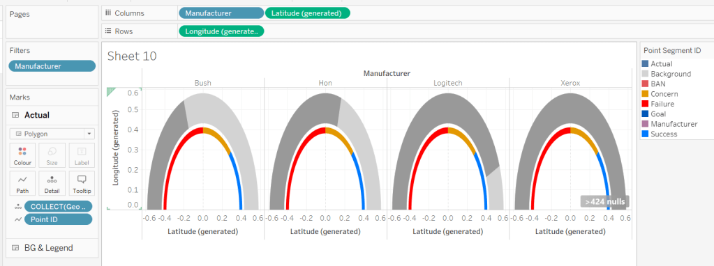
To start getting an understanding, let’s just focus on Point Type = Actual and Point Segment ID = Background
This is the data to build the complete grey semi circle of the main gauge. 50 rows represent points on the inner arc of the semi circle (Point Arc = In). They all have a Point Radius = 0.43 (ie the distance from the 0,0 centre position of a circle to the bottom edge of the gauge is 0.43). The other 50 rows represent points on the outer arc of the semi circle (Point Arc = Out). They all have a Point Radius = 0.58 (ie the distance from the 0,0 centre position of a circle to the top edge of the gauge is 0.58). Point Angle Rads defines the angle in radians (rather than degrees) from the circle centre to edge of the circle. The Point ID defines the order to ‘join the dots’ when the points are made into a polygon.
Here’s a diagram to help try and explain the maths we’re going to need to use based on the data we have
For each point on the circle, we will need to identify the x & y position of where the radius intersects the edge of the circle. We know the angle, and we know the radius, so we can use trigonometry to work that out, and then use the MAKEPOINT() function in Tableau to covert that into a spatial/geometric field to use on a map.
Let’s do this in Tableau.
Create field
X
[Point Radius] *SIN([Point Angle Rads])
Y
[Point Radius] * COS([Point Angle Rads])
Note – based on my diagram above, X = a and would be derived from the Cosine of the angle, while Y = o and be based on the Sine of the angle. However, Jack gave hints based on the above calcs which hold true if you adjust the diagram and assume the angle is positioned between the y-axis and the radius, rather than the x-axis and the radius.
Now create the point
Geo
MAKEPOINT([X],[Y])
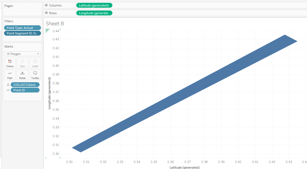
On a sheet, add Point Type to Filter and set to Actual, and add Point Segment ID to Filter and set to Background.
Double click on Geo to automatically add Longitude and Latitude fields to the sheet.
We have the basics of a semi-circle… not in the right direction, but it’s something… Add Point ID to Detail, then click the Swap Axis button and hey presto…
It appears a bit more ‘ovel’ than circular as the axis aren’t aligned, so don’t worry about this – set the display to Entire View will help. Then change the mark type to Line, move Point ID to Path and then change mark type to Polygon.
We now have a filled semi circle. We’re not going to use this sheet, but hopefully, this has helped a bit with some fundamental understanding.
When building we’re going to be using map layers (and at this point, we can’t add a layer to this sheet). We’ll also be defining calculations based on which feature of the viz we’re focussed on, as we can’t apply filters to the sheet (if you remove the ones applied, it will look a little crazy!). But if you change the Point Segment ID filter to Goal, you’ll get the shape of the goal indicator ‘reference line’.
You might want to play around with the filters to examine the behaviour.
Are you still with me…? Take a break, grab a cuppa, we haven’t even started building yet, but I’ll still be here when you get back 🙂
Setting up the map layers
Using Jack’s hints, create a field to help ‘initialise’ the map layers
Zero
MAKEPOINT(0,0)
Double click this to create a basic ‘map’ with a single point.
Then drag another instance of Zero onto the canvas and drop on the Add a Marks Layer section that appears
You’ll now have 2 marks layers, which means whatever we now do, we can always add more.
Building the Gauge Background & Legend layer
Note – in building I ended up with more mark layers than Jack suggested. I’ve subsequently seen other versions but am sticking to what I managed for now.
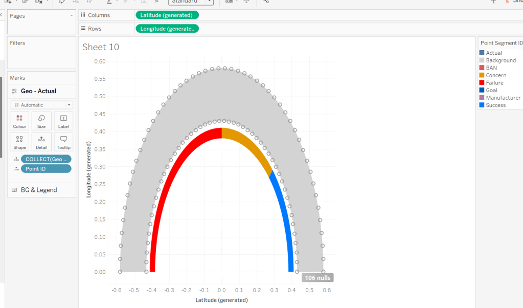
The first layer I’m going to build is the ‘grey’ semi circle of the main gauge and the coloured legend ‘inner’ semi circle.
I want to identify those points only.
Geo: BG-Legend Layer
IF [Point Type] <> ‘Label’ AND [Point Segment ID] IN (‘Background’, ‘Concern’, ‘Failure’, ‘Success’) THEN [Geo] END
On the Zero marks card, drop this field directly on top of the COLLECT(Zero) to replace it. Add Point ID to Detail, then flip the axis using the switch axis button. Add Point Segment ID to Colour and adjust the colours of the Background, Failure, Concern and Success values to suit.
Change the mark type to polygon, and move Point ID to Path. Name this layer BG & Legend
We need to understand where on the gauge, the Profit Ratio for each Manufacturer falls. We know that the gauge starts at -30% Profit Ratio (ie 0% of the gauge is equivalent to -30% Profit Ratio) and the gauge ends at +30% Profit Ratio (ie 100% of the gauge is equivalent to +30% Profit Ratio). Therefore if the Manufacturer’s Profit Ratio >= 30% it fills 100% of the gauge, anything less needs to be partially through. We can calculate this (using one of Jack’s hints) with
PR % of Gauge
([Profit Ratio] + [Gauge End Profit Ratio]) / ([Gauge End Profit Ratio]- [Gauge Start Profit Ratio])
To then determine the angle in degrees (and again using Jack’s hints), we want to find the proportion of 180 degrees that the PR % of Gauge represents, and then take off 90 degrees based on the gauge rotation.
PR Angle (Degrees)
([PR % of Gauge] * 180)-90
We can then convert this to radians
PR Angle Rads
RADIANS([PR Angle (Degrees)])
This gives us information to help determine a singular point on the gauge we need to ‘draw’ up to. But I want to ‘draw’ a polygon that goes from the left end (-30% mark) to this point, and for this, I need to know all the other points up to that point.
The way I came up with isn’t what Jack did. My result means I don’t get an exactly accurate marker, but it is so close to it’s position, and is ‘good enough’ for the viz type and how it’s being displayed.
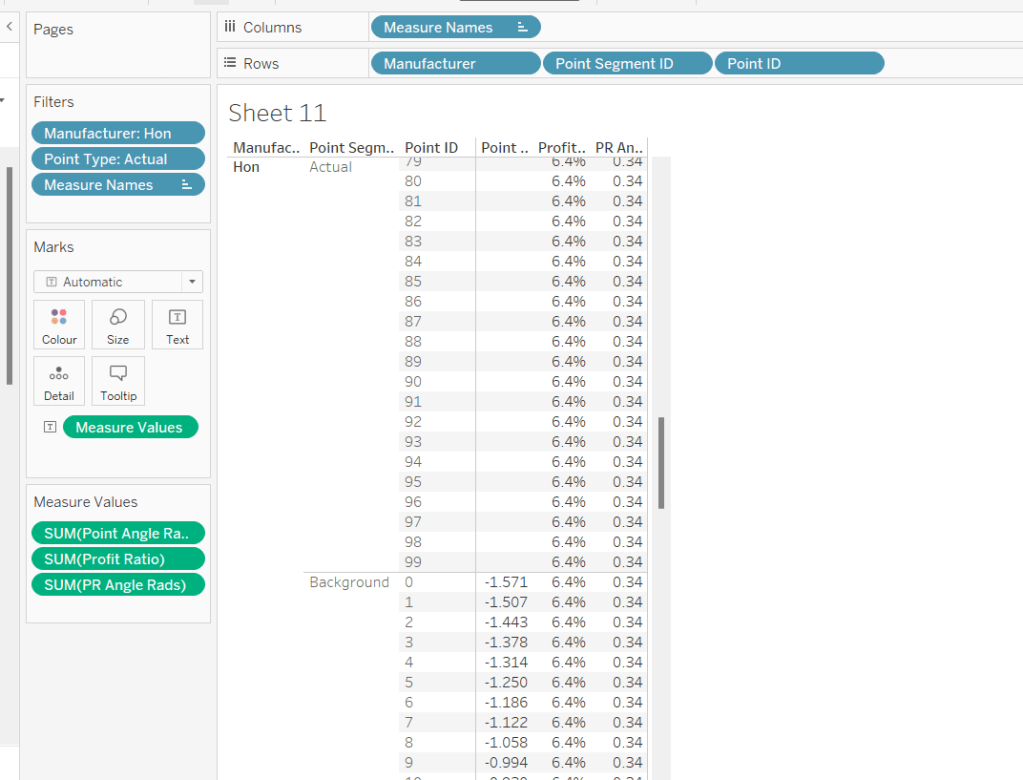
To understand what I did, build out a tabular sheet that is filtered to Manufacturer = Honand Point Type = Actual, and shows Manufacturer, Point Segment ID and Point ID on Rows with Point Angle Rads,Profit Ratio and PR Angle Rads as measures.
The Profit Ratio for the Manufacturer =Hon is 6.4% which is at an angle of 0.34 radians around the semi circle.
You can also see that while we have values for the Point Angle Radians field associated to the Point Segment ID = Background, we don’t have any for the Point Segment ID = Actual, as this is what we’re trying to find out.
Given that I know that all the Point Angle Radians values associated to the Point Segment ID = Background build a complete semi circle, I figured, to display up to my ‘actual’ Profit Ratio, I just want to get all the points associated to background which are less than the PR Angle Rads value.
PR Point Angle Radians
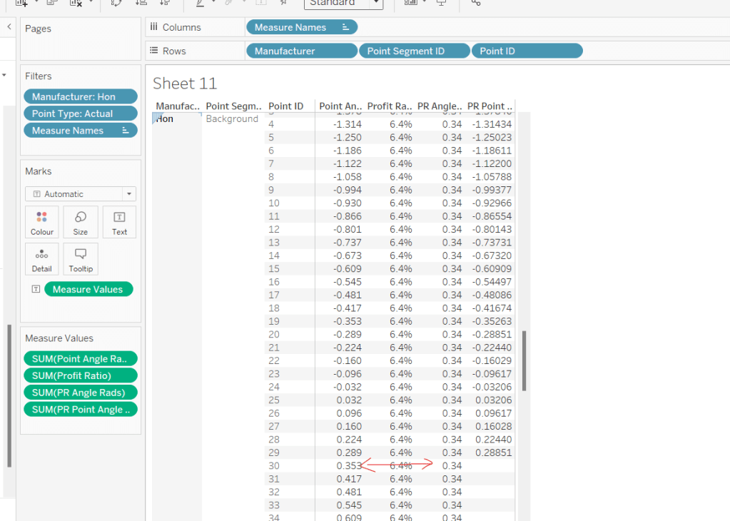
IF [Point Angle Rads] <= [PR Angle Rads] THEN [Point Angle Rads] END
Pop this into the table, and when you scroll down, you’ll see I’ve only got values in my new field up to where the PR Angle Rads is less
Using this field, I’ll create some new X & Y fields which I can make make into a spatial field
X (actual)
[Point Radius] *SIN([PR Point Angle Radians])
Y (actual)
[Point Radius] * COS([PR Point Angle Radians])
Geo – Actual
IF [Point Type] = ‘Actual’ AND [Point Segment ID] = ‘Background’ THEN MAKEPOINT([X (actual)], [Y (actual)]) END
On the Zero(2) marks card, Replace the COLLECT(Zero) pill with the Geo – Actual pill by dragging the latter and dropping it directly on the former. Add Point ID to Detail.
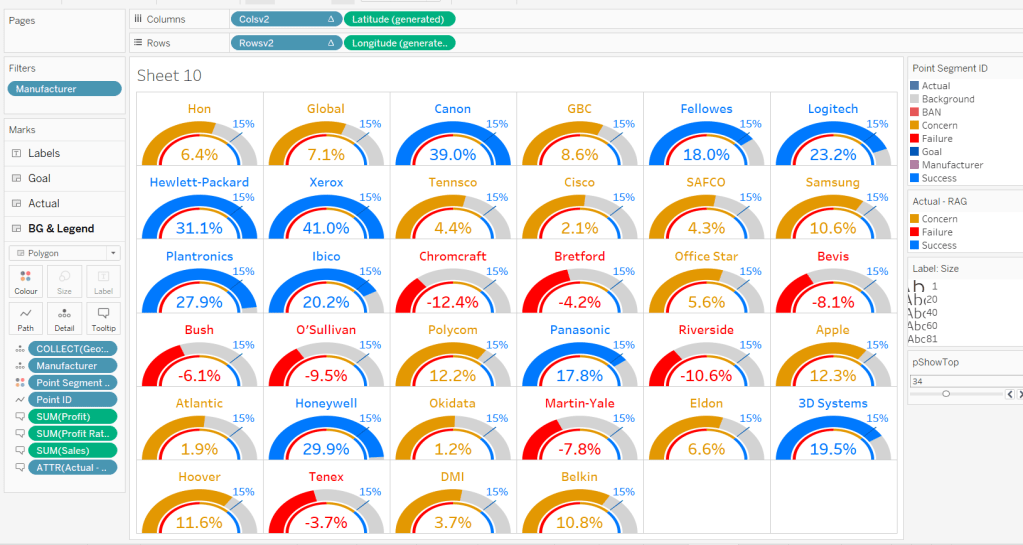
It’s drawing the points for a complete semi-circle, as every Manufacturer is being included. To help get the rest of the display right, for the various permutations, add Manufacturer to filter and filter to Hon, Bush, Logitech and Xerox. Add Manufacturer to Columns too. You should now see the marks stop at various positions around the arc. The filters will be adjusted later when we tackle the trellis.
Change the mark type to polygon and move Point ID to Path. Rename the layer to Actual.
For the colouring, we need to determine the RAG status of each Profit Ratio – where does the PR % of Gauge sit in comparison the constants we know
Actual RAG
IF [PR % of Gauge] <= [Gauge Concern Pct of Gauge] THEN ‘Failure’ ELSEIF [PR % of Gauge] <= [Gauge Success Pct of Gauge] THEN ‘Concern’ ELSE ‘Success’ END
Add this to the Colour shelf and adjust accordingly.
Building the Goal Indicator Layer
Create a new spatial field
Geo: Goal Layer
IF [Point Type] = ‘Actual’ AND [Point Segment ID] = ‘Goal’ THEN [Geo] END
and then drag this onto the canvas and drop on the Add A Marks Layer option.
Change the mark Type to Polygon and add Point ID to path. Add Point Segment ID to Colour and adjust the colour of the Goal value to suit. Rename the layer to Goal.
Building the Label layer
Create a new spatial field
Geo: Labels
IF [Point Type] = ‘Label’ THEN [Geo] END
and then drag this onto the canvas and drop on the Add A Marks Layer option. Add Point Segment ID to Detail. 3 marks should now displayed in the positions we need them
This bit took a bit of time to get right, as I had 3 requirements I wanted to satisfy: 1 – display a text or a numeric field as a label depending on what label I wanted to display (I attempted to have a single ‘label’ field converting numbers to strings with the relevant formatting, but the Profit Ratio % just wouldn’t show how I wanted when converted to string); 2 – adjust the colour of (some) of the labels depending on the RAG status of the profit ratio value; 3 – adjust the size of the Profit Ratio label based on how many gauges were displayed.
I needed several label fields
Label: Goal
IF [Point Segment ID] = ‘Goal’ THEN [Gauge Success Amt] END
formatted to % with 0 dp.
Label: Manufacturer-Fail
IF [Point Segment ID] = ‘Manufacturer’ AND [PR % of Gauge]<=[Gauge Concern Pct of Gauge] THEN [Manufacturer] END
Label: Manufacturer-Concern
IF [Point Segment ID] = ‘Manufacturer’ AND ([PR % of Gauge]<=[Gauge Success Pct of Gauge] AND [PR % of Gauge]>[Gauge Concern Pct of Gauge]) THEN [Manufacturer] END
Label: Manufacturer-Success
IF [Point Segment ID] = ‘Manufacturer’ AND [PR % of Gauge]>[Gauge Success Pct of Gauge] THEN [Manufacturer] END
Label: PR-Fail
IF [Point Segment ID] = ‘BAN’ AND [PR % of Gauge]<=[Gauge Concern Pct of Gauge] THEN [Profit Ratio] END
formatted to % with 1 dp
Label: PR-Concern
IF [Point Segment ID] = ‘BAN’ AND [PR % of Gauge]>[Gauge Concern Pct of Gauge] AND [PR % of Gauge]<= [Gauge Success Pct of Gauge] THEN [Profit Ratio] END
formatted to % with 1 dp
Label: PR-Success
IF [Point Segment ID] = ‘BAN’ AND [PR % of Gauge]>[Gauge Success Pct of Gauge] THEN [Profit Ratio] END
formatted to % with 1 dp
Add all these fields to the Label shelf, and adjust the label so that all are positioned on the same line, with no spaces, and add a carriage return beneath the text. Colour each field accordingly (DO NOT ADJUST THE FONT SIZE).
Change the mark type to text and align the label top centre. Rename the mark type to Labels and Disable Selection
To adjust the size of the labels, create a new parameter which we’ll need for the trellis.
pShowTop
integer parameter, defaulted to 7 which is a range from 5 to 81 with a step size of 1.
Show the parameter.
Create a new field
Label: Size
IF [Point Segment ID] = ‘BAN’ THEN [pShowTop] ELSEIF [Point Segment ID] = ‘Manufacturer’ THEN 60 ELSE 80 END
We want the size of the BAN label to decrease as the number of manufacturers displayed increases.
Add this filed to the Size shelf as a continuous dimension (green pill, not aggregated).
Edit the Size legend so that sizes varyby range, the range is reversed, and the range starts from 1 to 81. Adjust the mark size range slider to a suitable start and spread.
As you change the value of the pShowTop parameter, the Profit Ratio BAN should adjust in size.
Format Sales and Profit to be $ with 0dp and to display as () when negative, then on all marks cards, add Manufacturer to Detail and Sales, Profit, Profit Ratio and Actual RAG to Tooltip, and adjust Tooltip on all the layers to suit.
Finally remove all gridlines/zero lines/axis ticks and hide the longitude & latitude axis. Hide the null indicator.
Building the Trellis
So now we’ve got the core viz nailed, we need to address the layout, which is to show a gauge for each of the top n manufacturers based on Sales. This means we need to have the gauges indexed/ranked from 1 to n based on total Sales, and then arrange in a grid so that top left is the manufacturer with the highest sales, and bottom right is the manufacturer with the lowest sales. For this we need to assign a row and column number against each manufacturer.
There are multiple blog posts about creating trellis charts. My go to post has always been this one by Chris Love, especially when the requirement is for the trellis to be dynamic (the number of rows/columns can vary) depending on the number of items to be displayed.
However in this instance, using the calculations referenced in the blog doesn’t meet the requirement of ensuring there are more columns than rows. This was an area that got me stumped. As a result, I finished the viz with a version that utilises my ‘go to’ calculations (published here), before then looking at Jack’s solution to get the calculations, which are
Cols Count
//If Rounded value = Value without Round then no remainder, use that number if SIZE()/round(SQRT(SIZE()),0) = int(SIZE()/round(SQRT(SIZE()),0)) THEN SIZE()/round(SQRT(SIZE()),0) //Otherwise add 1 to the number of columns ELSE int(SIZE()/round(SQRT(SIZE()),0)) + 1 END
Size() is reflective of the number of items (in this case Manufacturers) to be displayed… as I write this down, for this specific instance, you could probably replace SIZE() with the parameter pShowTop.
Rowsv2
//For Each Manufacturer, what Row should it be in the Trellis? //Rank the Manufacturer, Find the Integer portion when dividing by # of Columns int((INDEX()-1)/ [Cols Count])
Colsv2
//For Each Manufacturer, what Column should it be in the Trellis? //Rank the Manufacturer, Find the Remainder when dividing by # of Columns int((INDEX()-1) % [Cols Count])
Make both Rowsv2 and Colsv2 discrete.
Add Rowsv2 to Rows and Colsv2 to Columns. Remove Manufacturer from Columns. It’ll look a bit odd, but be patient.
Edit the Manufacturer pill on the Filter shelf. On the General tab, select None, to remove everything from the filter, then on the Top tab adjust to be based on the top pShowTop by Sales
Now edit the table calculation associated to the Rowsv2 pill, so that it computes by specific dimensions and every field except Point ID is selected. Ensure Manufacturer and Point Segment ID are listed at the top in that order. Set the level to be Manufacturer and apply a custom sort based on Sum of Sales descending
As this is a nested table calculation, select the drop down arrow at the top and apply the same settings to the nested Cols Count field.
Then do exactly the same again for the Colsv2 table calculation settings. If all has been applied successfully, then you should get a grid
where you can then adjust the pShowTop parameter
Hide the Rowsv2 and ColsV2 fields from displaying (uncheck show header). Show the Longitude axis, and fix it to start at 0 but end ‘automatic’. Then hide the axis again (this ensures the arc lands on the row divider).
Then add the viz to a dashboard. My published version based on the trellis using Jack’s calculations is published here.
If you’ve made it to the end – well done! It was a bit of a marathon to do the challenge and another to write this blog. I’m sure it’s been quite an effort to read too, but hopefully you’ve learnt something, and I’ll certainly be referencing this again when a map layer and/or gauge based scenario occurs again.
For the first WOW challenge of 2024, I set the task of completing a viz related to HR salary data.
Creating the calculations
To start, we’ll build out all the necessary calculations required, and display them in tabular form. First create
Employee
[Forename] + ‘ ‘ + [Surname]
then add Employee ID and Employee to Rows, along with Department and Job Title. Add Pay Level as a discrete dimension (blue pill) to Rows too, then format Salary to £ with 0 dp, and add to Text.
We want to compare each employee’s salary with the median salary of all the employees in the same pay level. For this we need
Median Salary per Pay Level
{FIXED [Pay Level]: MEDIAN([Salary])}
Add this to the view too. You should see that the value is the same for those rows where the Pay Level is the same.
We need to compute the difference between these numbers (to draw a line from the median to the salary)
Difference From Median
SUM([Salary])- SUM([Median Salary per Pay Level])
and we also need to understand the salary as a proportion of the median
Salary / Median %
SUM([Salary])/SUM([Median Salary per Pay Level])
format this to % with 0 dp and add both these fields to the table
Each employee is given a scale value based on the proportion
Salary Scale
IF [Salary / Median %] > 1.2 THEN 6 ELSEIF [Salary / Median %] >1.1 AND [Salary / Median %] <=1.2 THEN 5
ELSEIF [Salary / Median %] >1 AND [Salary / Median %] <= 1.1 THEN 4
ELSEIF [Salary / Median %] > 0.9 AND [Salary / Median %] <= 1 THEN 3
ELSEIF [Salary / Median %] > 0.8 AND [Salary / Median %] <=0.9 THEN 2 ELSE 1 END
Set this to be discrete, then add to the view on Rows.
Finally we need the markers for the 80%, 90% etc of the median salary
80% Median
0.8 * [Median Salary per Pay Level]
90% Median
0.9 * [Median Salary per Pay Level]
110% Median
1.1 * [Median Salary per Pay Level]
120% Median
1.2 * [Median Salary per Pay Level]
Building the Viz
On a new sheet, add Employee ID, Employee, Department and Job Title to Rows. Add Salary to Columns and set the mark type to Circle. Set the Colour of the circle to suit (or use #64cdcc).
Add Median Salary per Pay Level, 80% Median, 90% Median, 100% Median, 120% Median to the Detail shelf. Add Pay Level, Salary Scale and Salary / Median % to Tooltip.
Format the axis (right click) and set the scale to be at £k with 0dp
This will also change the formatting of the salary on the tooltip, but we want it to be more detailed so create
Tooltip-Salary
[Salary]
and format this to £ with 0 dp. Add this to Tooltip too and adjust tooltip to match.
Add a reference line to the axis (right click axis > add reference line) for the Median Salary per Pay Level. Set it to be per cell and display a dashed line with no labels/tooltips displaying.
Add another reference line. This time set it to be a band at the cell level which ranges from the 80% Median to the 90% Median. Don’t display any labels or tooltips or lines and fill the band with the appropriate colour.
Repeat the above process, adding a reference band from 90% – 110% of the median, and a further band from 110% – 120% of the median.
Add another instance of Salary to Columns. Change the mark type of the 2nd Salary marks card to gantt and adjust the colour. Add Difference From Median to Size and decrease the size as small as possible. Double click into the Difference From Median pill on the size shelf and manually type in * -1 to the end.
Now make the chart dual axis and synchronise the axis. Right click on the top axis and move marks to back.
We want the user to be able to filter the chart, so add Department, Pay Level (select All values) and Salary Scale to the Filter shelf.
Finally, format the chart – make each row a bit wider; set the background colour of the worksheet to #f9f8f7; remove column dividers; set row dividers to a thick white line; remove all gridlines, zero lines and axis rulers. Reduce the size of the axis values and increase the width of the initial 3 columns so the text doesn’t wrap as much. Test your filters.
If all working, then add the sheet to a dashboard.
Building the Legend
To build the legend, I simply duplicated the core sheet, then filtered to a specific Employee ID and hid the Employee ID, Employee, Department and Job Title fields. I then edited the reference lines to add custom labels to label each line band, formatting the text to display to the top or bottom. I added an annotation to the Salary circle mark to label that as ‘Employee Salary’ which I then manually moved into position.
When I added this to the dashboard, I then floated a blank object over the top so the legend could not be interacted with.
For this week’s challenge, Luke asked us to recreate this KPI card on a single sheet.
We needed to display data for the last 2 years up to the latest complete month. If this was being built for a business situation, we’d make use of the TODAY() function to get a handle on the current date. Since this is being built with a static dataset which includes data up until 31st Dec 2023, I am using a parameter to ‘hardcode’ the ‘today’ date, as I want this viz to still present the relevant data on my public profile if it’s accessed in a year’s+ time.
pToday
date parameter defaulted to 12th Dec 2023
With this I can the define the data I want to include within the viz
based on pToday = 12th Dec 2023, this includes records where the Order Date is less than 01 Dec 2023 and greater or equal to 01 Dec 2021.
Add this to the Filter shelf and set to True. Then add Order Date set to the Continuous Month level (green pill) to Columns and Sales to Rows.
The add another instance of Sales to Rows and change the Mark type on the ‘Sales 2’ marks card to Area. Make the chart dual axis and synchronise the axis. Adjust the opacity of the area chart via the Colour shelf as required, and amend the Tooltip on the All marks card to display the month and sales value in the relevant format.
This has formed the basis of the sparkline. Now we need to determine the calculations we need which are displayed in the text.
The text displays information related to the month the user ‘selects’ by hovering over the sparkline. By default the information for the latest full month (in this case Nov 2023) is displayed. We need to capture this latest month in a field
To sense check what we’ve got, on a new sheet display the pSelectedMonth parameter then build a sheet as below
with the parameter set to 01 Nov 2023 we can see the values for Nov 2023 and Nov 2022 and captured in the relevant fields, and then the % change between the two also reflected.
But the % change is displayed on the KPI in different coloured text depending on whether the field is +ve or -ve. FOr this we need
Change from PY +ve
IF [Change from PY] >=0 THEN [Change from PY] END
and
Change from PY -ve
IF [Change from PY] <0 THEN [Change from PY] END
apply a custom number format to both fields of ↑0%;↓0% and add both fields to the sheet. Only 1 of these columns will ever be populated. If you change the parameter to 01 Aug 2022, you’ll see a negative change.
Now we have these fields, we can start to add the text element to the sparkline chart.
We’re going to plot a ‘mark’ against the first point in the x-axis, in this instance the point associated to the 1st Dec 2021. But we don’t want to ‘hardcode’ this date, so we can use
Dummy Y-Axis
IF FIRST() = 0 THEN 1 END
where FIRST() is a table calculation that is 0 for the first point on the month axis.
Add this to Rows before the Sales pills.
We have a single mark plotted for 1st Dec 2021 on a second Y-axis at position 1 on the axis. But no other marks. Change this mark type to shape and use a transparent shape (see this blog for details on how to do this).
Add Selected Month as an exact date to the Label shelf, along with Selected Month Sales, Change from PY +ve and Change from PY -ve. We also need
Previous Year
YEAR(DATEADD(‘year’,-1,[Selected Month]))
convert this to a dimension (drag to be above the line in the left hand data pane) and then add to Label too. Adjust the layout of the label as below and align top left. Note I added some spaces to the front on each line of text.
You should have something that looks similar to
To get the vertical line to display on hover, we need to create
Ref Line
IF [pSelectedMonth]<>#1900-01-01# THEN [pSelectedMonth] END
Add this to the Detail shelf of the Area chart sales marks card and set to be exact date (green pill). The right click on the date axis and Add Reference Line
Changing the pSelectedMonth parameter the line will display
Finally clean up the chart by hiding all the axis, removing all row & column dividers, gridlines, axis lines and zero lines. Hide the ‘null’ indicator.
Add the sheet to a dashboard, then create a parameter action
Select Month
on hover of the KPI card,update the pSelectedMonth parameter with the value from the Month(Order Date) field. When the selection is cleared, set the value to 01 Jan 1900.
Note – you may find that based on the size of the dashboard, you don’t get the text part to display. This is an annoyance in Desktop, that it isn’t completely WYSIWIG (what you see is what you get). I spent time adjusting font sizes etc to make the text display in Desktop, but once published to Tableau Public, it all looked too small. After setting it all back to the sizes I wanted in Desktop and re-publishing, I found it did actually display ok on Public. So you may find you just need to play around a bit to get the display as you want.
For the challenge this week, Sean wanted us to identify the sales of ‘new’ products compared to previous years. This challenge was born out of a requirement he had at work, where he discovered the definition of a ‘new product’ was different to what he’d assumed.
In this instance, the ‘client’ only cared about comparing sales in the same month across the years. Any sales related to the products outside of the specific month were irrelevant and were to be ignored. A product was then counted as ‘new’ in the first year (of the specified month) that there was a sale.
In this case we are always looking at the month of September (the previous month to ‘today), so if Product X was sold in Sept 2021 and Sept 2023 only, then Product X would count as new in Sept 2021, and only the sales for Product X in Sept 2021 would be included in the subsequent values displayed.
Now I thought I’d nailed my understanding of the requirement, and went ahead building out a tabular view of the data using table calculations, but my final output did not match Sean’s result – in fact it was quite way off. I stepped through my logic, even sharing some samples with Sean to sense check, and we seemed to concur on the products identified as new, so I was incredibly puzzled as to what was causing the value discrepancy.
I messaged my friend, Rosario Gauna, to share my numbers and see what she came up with…. she matched Sean! Doh! I then had to spend time dissecting my solution and Rosario’s to see which products I was/wasn’t counting. Eventually I found the problem….
In using table calculations, I had included all the fields the viz required which included the Segment (Home Office, Corporate, Consumer). This meant that in my logic to identify a ‘new product’, I was counting the product as new in the first year that the product was sold in each Segment – ie if Product X sold in Sept 2022 against Segment Home Office and then sold in Sept 2023 against Segment Corporate, I counted both sales as being ‘new’ as the segment differed. However I only wanted the Sept 2022 sale to count as ‘new’.
With this understood, I tried to revise my initial table calc build, but to no avail. So I opened up a new workbook and started again, this time taking a different track. This is what I’ll blog, but I felt it important to explain how even a requirement I thought I’d understood, could still get mis-interpreted.
Building out the calculations
The first requirement is that we’re only looking at comparing the data for the previous month to ‘today’. If this was being developed for a live business application we’d reference the TODAY() function, but since I want this viz to continue to display on Tableau Public after we hit 2024, then I’m going to use a parameter to hardcode ‘today’.
pToday
date parameter defaulted to 4th October 2023
From this, I can then determine the month we need to compare
working from right to left (inside to out), this takes ‘today’ and finds the 1st of the month (ie 1st October), then goes back 1 month (ie 1st September), then gets the month number ie 9.
As this returns a number, it automatically is listed in the ‘measures’ section of the data pane (under the line), but I dragged it into the top half as I want the number to be discrete.
I then created
Filter Month
DATEPART(‘month’, [Order Date]) = [Month to Compare]
which returns true for all the orders where the month of the Order Date is in September.
Let’s build up a table so we can start to see what we’re working with
Add Product Name and Filter Month to Rows, Order Date (at the Year level) to Columns and Sales to Text.
In the example above, 3-ring staple pack has sales in September 2022 and in other months in 2020 and 2021, but we don’t care about those months, so this product is counted as new in 2022, with a value of $11.
3M Hangers With… have no sales in September in any year, so we won’t be counting that product at all.
6″ Cubicle Wall Clock has sales in both September 2022 and 2023, so this product will be counted as new in 2022 with a value of $83.
So we can filter the date just to Filter Month = True (move Filter Month from Rows to the Filter shelf).
Now we want to identify the earliest year for each Product Name.
Add this onto Rows, and you can see below we’re picking up the right year.
Now we can identify the value of the sales we want to count.
New Product Sales
IF [Year First Purchased in Month] = YEAR([Order Date]) THEN [Sales] END
Only get Sales for the year that matches the minimum year. Format this field to $ with 0 dp.
Adding this in to the table, we can see we only have a value against the first year.
So we’ve identified the sales values of the products we care about. We can now aggregate this at a higher level, and incorporate the other dimensions.
Remove Sales from Text, add Category to Rows and Segment to Columns. Remove Product Name and Year First Purchased in Month.
The viz displays the % of total new product sales by Category per Segment. Right click on the New Product Sales pill and add Quick Table Calculation, selecting Percent of Total. Right click on the pill again and select Compute Using -> Category. Right click on the pill and Format and format to % with 0dp. Add another instance of New Product Sales back into the table.
Now we want to be able to compare the sales for the current year/category/segment against that of the previous year.
Previous Year Sales
LOOKUP(SUM([New Product Sales]),-1)
This looks up the New Product Sales value of the previous (-1) field. Add this field into the table, and right click and Edit Table Calculation. Adjust so the calculation is computing by Year of Order Date only.
You should be able to see that the values from the previous year for each Segment & Category are now displayed against each cell. As there is no data for 2019, there are no values listed for this field against the 2020 fields.
Now we have the values we want to compare in the same ‘row’ of data, we can compute
% Diff From Previous Year
(SUM([New Product Sales]) – [Previous Year Sales]) / [Previous Year Sales]
custom format this to ▲0%;▼0% (use this site to get the images to copy & paste), and add this into the table ensuring the table calculation is set to compute using Year of Order Date only, as you did above.
And now we have all the components needed to build the viz.
Building the bar chart
Duplicate the table sheet, then apply the following steps
Move % of Total New Product Sales to Rows
Move Category to Colour and adjust accordingly
Move New Product Sales and % Diff from Previous Year to Label
Remove Previous Year Sales
Add another instance of % of Total New Product Salesto Label ( I tend to do this by pressing ctrl, and then clicking on the pill in the Rows and dragging onto Text – this creates a duplicate of the pill and preserves the table calculation settings. Otherwise add an instance of New Product Sales to Label, then add the Percent of Total Quick Table Calculation and ensure the pill is set to compute by Category.)
Move Segment to be in front of the Year(Order Date) field on Columns – if this changes the viz display, ensure the mark type is set to bar.
Tidy up the display by
removing all gridlines/zero lines etc
remove row dividers
Adjust title of the y-axis
Hide the Segment/Order Date column heading
Hide the tooltips
The text and formatting of the labels also needs to be adjusted. We don’t want the ‘vs PY’ text displaying for the 2020 years when there is no difference from previous year.
Label PY Text
IF NOT ISNULL([Previous Year Sales]) THEN ‘vs PY’ END
Add this to the Label shelf and ensure the table calculation is set to compute using YEAR of Order Date only. Then adjust the layout of the label text and the format the size of the text.
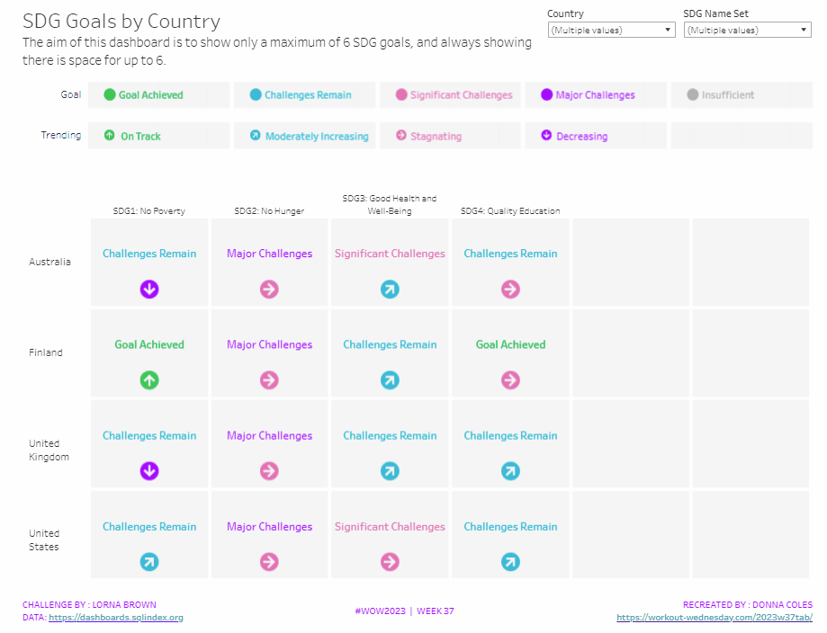
It was Lorna’s turn to set the challenge this week, based on a real world scenario she’s encountered with a colleague. The premise was to be able to show the progress, by country, against a maximum of 6 goals selected by the user. Placeholders for the 6 options had to remain visible at all times (unless the user selected more than 6, in which case a message should appear).
Building the core viz
As Lorna alludes to in the requirements, we will use sets to capture the goals the user can select.
SDG Name Set
Right click on SDG Name > Create > Set. Select up to 4 options.
On a new sheet, add SDG Name Set and SDG Name to Columns, Country to Rows and add Country to the filter shelf, and limit to Australia, Finland, UK & USA. Right click on the SDG Name Set field in the data pane and select Show Set
We need the SDG Name value to only display for the values selected
SDG Name Header Label
IF [SDG Name Set] THEN [SDG Name] ELSE ” END
Add this to Columns before the SDG Name field.
Now we need to always display 6 columns of data, ie in this case, all the SDG Name values In the set and the first SDG Name values not in the set. We will use the INDEX() function to help us label the columns position.
INDEX
INDEX()
Right click this field and Convert to discrete, then add it to the Columns after SDG Name.
Edit the table calculation (click on the triangle symbol on the blue INDEX pill), and adjust so it is computing by Specific Dimensions. This should be all the fields except Country. The columns should be labelled sequentially from 1 to 17.
Add INDEX to the Filter shelf as well. Initially just select 1. Then adjust the table calculation of this field to match above, and once done, edit filter and select values 1 through to 6. This should leave you with 6 columns
Now we have the structure, we can start building the core contents of the table. For this we’ll be using what I refer to as ‘fake axis’.
Double click in the Rows shelf and manually type in MIN(0.2), then double click again and manually type in MIN(0.6). This results in the creation of a MIN(0.2) and a MIN(0.6) marks card on the left hand side.
The MIN(0.2) marks card is going to be used to show the information about how the goal is trending (ie the arrow symbol), while the MIN(0.6) marks card will be used to show the status of the goal (the text displayed). We need new fields for this, so the values only display for the selected goals.
Trend
IF [SDG Name Set] THEN [SDG Trend] END
Goal
IF [SDG Name Set] THEN [SDG Value] END
Click on the MIN(0.2) marks card. Change the mark type to shape. Add Trend to the Shape card. Right click on the Trend pill and change the field from a Dimension to an Attribute.
Doing this stops the field from impacting the table calculation, and you should get back to having 6 columns displayed.
Adjust the shapes using the Arrows shape palette. For the Null value, I set it to use a transparent shape, a custom shape added to my shape palette. See this blog for more information on doing this.
Also add Trend to the Colour shelf. Once again, adjust the pill to be Attribute and then adjust the colours.
Now click on the MIN(0.6) marks card. Adjust the Mark Type to be Text. Add Goal to the Text shelf and change to be and Attribute. Add Goal to the Colour shelf, change to be Attribute and adjust colours to suit. I also adjusted the font to be bold & size 10pt.
Set the chart to be dual axis and synchronise the axis. Edit the axis (Right click on the left hand axis) and fix the axis from 0 to 1.
Hide the axis, the IN/OUT SDG Name Set pill, the SDG Name and INDEX pills (right click the pills and uncheck Show header).
Right click on the Country row label and the SDG Name Header Label column label in the viz and hide field labels for rows/columns.
Right click within the viz to format. Set the background colour of the pane to light grey.
Remove all gridlines, axis rules, zero lines. Set the column and row dividers to thick white lines
Click the Tooltip button on the All marks card, and uncheck show tooltips. Set the viz to Fit width.
Building the Goal legend
On a new sheet, add SDG Value to Columns. Change the mark type to Circle then add SDG Value to Label and Colour. Manually re-order the columns and adjust the colours as required.
Double click in the Columns shelf and type in MIN(0.0). Edit the axis and fix from -0.1 to 0.5 – this will shift the symbols and text to the left.
Adjust the size of the circle shape to suit, and set the font of the label to match mark colour. I also set it to be bold.
Remove all gridlines, axis ruler, zero lines. Set the background of the pane to be grey and the row/column dividers to be thick white lines. Hide the axis and the column headers, and uncheck show tooltips.
Double click into the Rows shelf, and type the text ‘Goal’ (including the quotation marks). Hide the ‘Goal’ label that then displays.
Building the Trend legend
Repeat similar steps for above but add the SDG Trend field to the Colour, Label and Shape shelf. Adjust the shape & colours to those used before.
Handling more than 6 selections
For this requirement, we need to determine the number of items in the set.
Count Set Members
{COUNTD(IF [SDG Name Set] THEN [SDG Name] END)}
and then use this to create some boolean fields
More than 6 Selected
[Count Set Members] > 6
Less than 6 Selected
[Count Set Members] <= 6
Ensuring that less than 6 items are selected, add the Less than 6 Selected field to the Filter shelf of the main table viz and set to True.
If you select more than 6 goals, the viz should disappear.
On a new sheet, double click into the space beneath the marks card where the pills usually sit, and type ‘Dummy’ (with quotes). Change the mark type to shape and set to use the transparent custom shape. Move the Dummy pill to the label shelf, then edit the label and change the text to the error message.
Align the text middle centre and fit to entire view. Uncheck show tooltips. Add More than 6 Selected to the filter shelf and select true (if true isn’t an option, go back to the main viz, and select more options sp the viz disappears, then come back to this sheet and try again).
All the sheets can now be added to the dashboard. Ensure the core table viz and the error sheets are added to a vertical container without the title showings – the charts should expand and collapse as the selections are made – this can be a bit tricky to get right.