Sean used some Super Bowl data for this week’s #WOW2026 challenge , using Gantt charts to display ‘arrowed bars’.
Creating the calculations
It took me a little bit of time to understand what I needed from the data to create the required visualisation, so let’s tackle that first.
We need to know the Season and the number of the Super Bowl in roman numerals. The Super Bowl field has this info as it displays <Super Bowl Number as integer> (<year>) ie 4 (1970) – the 4th Super Bowl for Season 1970.
To quickly generate the data I needed, I used the Split function on the Super Bowl. field (Right click > Transform > Split). This automagically generates fields Super Bowl – Split 1 containing the numeric number and Super Bowl – Split 2 containing the year.
I simply renamed Super Bowl – Split 2 to Season, but for completeness, this is what the calculated field looks like
I then renamed Super Bowl – Split 1 to SB Number (int) and changed the data type from string to whole number. Again the field looks like
SB Number (int)
INT(TRIM( SPLIT( [Super Bowl], “(“, 1 ) ))
But I want the number in the format SB + roman numerals. A quick search on the web, and I found the required logic needed to make the conversion, so I created
SB #
“SB ” + // Thousands Place CASE INT([SB Number (int)] / 1000) WHEN 1 THEN “M” WHEN 2 THEN “MM” WHEN 3 THEN “MMM” ELSE “” END +
// Hundreds Place CASE INT(([SB Number (int)] % 1000) / 100) WHEN 1 THEN “C” WHEN 2 THEN “CC” WHEN 3 THEN “CCC” WHEN 4 THEN “CD” WHEN 5 THEN “D” WHEN 6 THEN “DC” WHEN 7 THEN “DCC” WHEN 8 THEN “DCCC” WHEN 9 THEN “CM” ELSE “” END +
// Tens Place CASE INT(([SB Number (int)] % 100) / 10) WHEN 1 THEN “X” WHEN 2 THEN “XX” WHEN 3 THEN “XXX” WHEN 4 THEN “XL” WHEN 5 THEN “L” WHEN 6 THEN “LX” WHEN 7 THEN “LXX” WHEN 8 THEN “LXXX” WHEN 9 THEN “XC” ELSE “” END +
// Ones Place CASE INT([SB Number (int)] % 10) WHEN 1 THEN “I” WHEN 2 THEN “II” WHEN 3 THEN “III” WHEN 4 THEN “IV” WHEN 5 THEN “V” WHEN 6 THEN “VI” WHEN 7 THEN “VII” WHEN 8 THEN “VIII” WHEN 9 THEN “IX” ELSE “” END
Let’s add the fields we need into the table; add Season and SB# into Rows and sortSeason to be listed descending.Then add O/U Line to Rows as a discrete dimension (blue dis-aggregated pill).
Note – I added the results of the 2026 Super Bowl into the provided data set.
We need to compare the O/U Line number with the combined score of the match. The score can be found in the Final field which has info of the winning team and score eg for PHI 40-22, the combined score is 40+22 = 62. I again used the Split functionality to extract the data needed.
The automatically created field Final – Split 2 contains the 2nd half of the score. I renamed this and changed the data type to a whole number
Result Part 2
INT(TRIM( SPLIT( [Final], “-“, 2 ) ))
I then ‘split’ Final – Split 1 again. The automatically created field Final – Split 1 – Split 2 contains the 1st half of the score. I again renamed and changed data type to int.
Result Part 1
INT( SPLIT( [Final – Split 1], ” “, 2 ) )
I then created
Combined Score
[Result Part 1] + [Result Part 2]
and
O/U Difference
[Combined Score]-[O/U Line]
Pop these onto the table along with the Result field and we have all the fields we need to build the viz
Building the viz
ON a new sheet, again add add Season and SB# into Rows and sortSeason to be listed descending.Then add O/U Line to Rows as a discrete dimension (blue dis-aggregated pill). Add Combined Score to Columns and change the mark type to shape. Add Result to Shape and set the filled arrows shapes accordingly. And add Result to Colour and adjust that too.
Add O/U Line to Columns which will create a 2nd marks card. Click on this marks card, and change the mark type to Gantt Bar. Remove the Result pill that is now listed on the Detail shelf (keep the one on Colour). Add O/U Difference to the Size shelf, and then click on the Size shelf, and reduce the width a little.
Make the chart dual axis and synchronise the axis. Remove the Measure Values pill from the colour shelf of the All marks card.
Now add O/U Difference to Columns and change the mark type to bar. Remove the Result pill from this card. Adjust the colour and reduce the Size.
In the solution, these bars have rounded ends, so add another instance of O/U Difference to Columns. Change the mark type to Circle, and set the Colour to match the bars. Make the char dual axis and synchronise axes. Adjust the size of the circle and/or bar marks, so the circle makes the bar look like it has a rounded end.
And that’s the crux of the challenge. Formatting changes include
Set background colour of worksheet
Remove all gridlines, zero lines, axis rules/tick marks
Remove all row & column dividers
Add row banding
Add Season to Filter and exclude 1967
Adjust axis titles
Adjust formatting style of the Season, SB #, O/U Line values
Add title and description
And then add to a dashboard, and you’re all set. My published viz is here.
Lorna wanted us to practice layout containers this and also sprinkled in a bit of new functionality – rounded corners! As a result you’ll need to use Tableau Desktop v2026.1 to complete this challenge.
Lorna provided a starter workbook with all the required sheets – we had to build the dashboard.
Describing how to do this is tricky, so I’m going to show a picture of my item hierarchy, and then describe some key points.
Lorna challenged us to use no more than 11 containers. I have 12 as I’ve included my standard ‘footer’ in a horizontal container, which isn’t part of the solution. When working with containers, it’s often useful to add blank objects as placeholders to help ensure the layout. and while you add and position the actual objects. The blank objects then get deleted. Padding is very helpful to reposition objects and add whitespace, but getting the values right can take a bit of trial and error and lots of tweaking.
I have renamed all the containers and numbered them, so you can see the number there are. I’ve named them with an ‘h’ or ‘v’ prefix depending on whether the container is vertical or horizontal.
When dealing with tricky layouts, I always start with a floating container that is positioned at point 0,0 and has the height and width of the dashboard. In this case, this is the container labelled 1.vBase. When I add other containers/objects into this base container, they are set to be tiled. I remove the automatic ’tiled’ container that exists initially, and if any reappear as I’m adding objects, I delete them too.
To generate the bordered shadow effect around the Superstore Overview title, the 2.hHeader container has the following properties:
no border
background set to light grey
corners set to a radius of 5
outer padding all 0
inner padding all 0
The Superstore Overview title Text object that sits inside this container, then has the following properties
no border
background set to white
corner radius all 0
outer padding: left 5, top, bottom, right all 2
inner padding all 15
A similar principal is applied to the 11.hRightPane container and the Scatter plot object contained within. The 11.hRightPane container does additionally have a left outer padding of 5 and a bottom padding of 10.
The 4.vLeftPane container just has a right outer padding of 5. This along with the 5 left outer padding of the 11.hRightPane container above gives the 10 pixel spacing between the 2 columns of data in the main body of the chart. There will ultimately be 3 ‘KPI’ rows within this container, so the 4.vLeftPane should be set to distribute contents evenly (only apply once you’ve built all the rows as described below).
Each KPI ‘row’ is constructed in the following manner; I’ll describe the top row, but just repeat for the other rows:
5.hTopKPI-Outer has the following properties
no border
background of light grey
corner radius of 5 all round
outer padding all 0
inner padding all 0
The 6.hKPI-Inner then has the properties
no border
background is white
corner radius all 0
outer padding: left 5, top, bottom, right all 2
inner padding all 0
Having the 2 horizontal containers set up this way creates the bordered, shadowed effect.
The Total Sales CY vs PY sheet is then set to a fixed width of 140 and inner padding all round of 10.
The Sales % Change sheet is then set with a fixed width of 130, corner radius of 20 all round, and outer padding of left 15, top 80, right 15 and bottom 20. Note, I also reduced the label text on the sheet itself from 20 to 15 pt.
Finally the Sales over Time sheet is set to have inner padding of 15 all round.
Hopefully all this helps, though as mentioned, I can imagine they’ll be a bit of fiddling to get things right. My published viz is here.
In this week’s challenge Yusuke wanted us to ensure filtering by date didn’t actually exclude any dimension values (so null values displayed as 0) and average calculations then accounted for those null value entries too.
Setting up the core data requirements
Yusuke provided a link to a version of Superstore which I used, since the requirements included the Manufacturer field which isn’t in the usual Excel file. I first created the hierarchy of Category > Sub-Category > Manufacturer.
Category Hierarchy
Right-click the Category field and select Hierarchy > Create Hierarchy. Name it Category Hierarchy, then drag Sub-Category and Manufacturer to be positioned under the Category field.
The display shows the number of orders, so we need
#Orders
COUNTD([Order ID])
Add Category to Rows and then expand to display Sub-Category and Manufacturer. Add #Orders to Text and add Order Date as a discrete (blue) pill at the Weekday level. This table highlights the ‘gaps’ which we need to display as 0. It also shows us how many rows of data we should always expect regardless of the date being filtered.
A standard ‘quick filter’ on date will just remove the rows that aren’t included in the filter, so we need to handle the date filtering using parameters.
Add this into the table, and we can see we still have blank entries.
Now the trick here, which I have to admit I just couldn’t resolve until I looked at Yusuke’s solution, is to create a new field
Index
INDEX()
and add this to the Detail shelf, and all the gaps in the #Orders in Date Range measure will be replaced by 0.
Adding the average
Move the #Orders from the Measure Values section onto Tooltip.
The add column totals (Analysis menu > Show All Subtotals). Then go into the menu again and select Total All Using > Average. You’ll have totals at the Manufacturer level and the Sub-Caetgory level
Right click on the Total label in the Manufacturer column, and Format. In the left hand pane, update the Label to read Avg.
Repeat the same by formatting the Total label against the Sub-Category column.
Now format the numbers displayed by right-clicking on the #Orders in Date Range field on the Text shelf and formatting. In the left hand pane, select the Pane tab and set the format of the Numbers in the Default section to standard and the format of the Numbers in the Totals section to 2dp.
Formatting the rest of the table
Add #Orders in Date Range to Colour. Change the mark type to Square. Edit the Colour palette and select a diverging palette (eg red-blue-white diverging) but set the centre to 0 and check the include totals checkbox.
Format the table, and select the shading tab. Set the Total header to pale orage, and row banding to pale grey at band size 1.
Then select the borders option and set the default options against cell, pane and header to dark grey. Then add thicker orange borders against the totals, and remove row dividers. Add grey column dividers.
Hide the Order Date column heading (right click the Order Date label and hide field labels for columns). Right click the Order Date pill in Columns and format; set the Dates option to display abbreviation
Format the font of all columns to be the same (I used Tableau Medium, black).
We want to display a * to indicate null values, so create
Number prefix *
IIF(([#Orders in Date Range])=0,’*’,NULL)
Add to the label shelf and adjust the position of the fields on that shelf.
The create
Tooltip – 0 orders
IIF([Number Prefix ]= ‘‘, ‘* No orders found for this period’, NULL)
and add to the Tooltip shelf and adjust the Tooltip to suit. Then add Category to filter and select all options.,
Collages / expand the viz and adjust the dates to test the functionality and display.
Creating the date filter & Apply button
On a new sheet, double click in to the space below the Marks shelves and the type ‘Apply’. Move the field created from Detail to Label. Change the mark type to square, adjust the size to be as large as possible and then set the fit to entire view. Format the Apply label to be centred and larger font.
Add Order Date to the Filter shelf, select range oi dates and enter values from 11 Jul 2025 to 23 Jul 2025. Show the filter, and the add the Order Date filter to context.
Create new fields
Min Date
MIN([Order Date])
and
Max Date
MAX([Order Date])
and add both to the Detail shelf.
Create a new field
Colour
[Min Date]= [pMinDate] AND [Max Date]= [pMaxDate]
And add to the Colour shelf. Adjust the colour of the true option to pale grey. Then change the value in the Order Date filter, so the colour shows as false and adjust colour to orange. Hide the tooltip.
Finally create fields
True
TRUE
and
False
FALSE
and add both to the Detail shelf.
Building the dashboard
Use layout containers with padding to add the table viz and the apply button viz to a dashboard. Show the Category filter for the table viz, and the Order Date filter for the apply button viz. Below is how I arranged my layout containers
Create the following dashboard actions:
Set Min Date
On select of the Apply Button viz, target the pMinDate parameter passing in the value from the Min Date field.
Set Max Date
On select of the Apply Button viz, target the pMaxDate parameter passing in the value from the Max Date field.
Deselect Button
On select of the Apply Button viz on the dashboard, target the Apply Button sheet directly, selecting the fields True = False.
Finally add a floating text box to provide a key for the * indicator.
For the challenge this week, Yoshi wanted us to recreate this summary KPI card detailing the latest Profit Ratio, the change from the previous day, and comparisons against equivalent timeframes.
Defining the calculations
In a usual scenario, we would utilise the TODAY() function to base the rest of the measures being displayed. However given the dataset we’re using and the desire to ensure the viz doesn’t eventually display nothing on my Tableau Public page, ‘Today’ will be harded coded in the parameter
pToday
date parameter defaulted to 04 Feb 2025.
We have 3 timeframes we need to visualise, so we need to find the dates these relate to
Today Last Month
DATE(DATEADD(‘month’, -1, [pToday]))
Today Last Year
DATE(DATEADD(‘year’, -1, [pToday]))
I also want to group these ‘timeframes’ and created
Recent | Prior Mth | Prior Yr
IF [Order Date] >= DATEADD(‘day’, -14, [pToday]) AND [Order Date] <= [pToday] THEN ‘Recent’ ELSEIF [Order Date] >= DATEADD(‘day’, -14, [Today Last Month]) AND [Order Date] <= DATEADD(‘day’, 14, [Today Last Month]) THEN ‘Prior Month’ ELSEIF [Order Date] >= DATEADD(‘day’, -14, [Today Last Year]) AND [Order Date] <= DATEADD(‘day’, 14, [Today Last Year]) THEN ‘Prior Year’ ELSE NULL END
Add this to Rows on a sheet , then add Order Date as a discrete exact date (blue pill). Add Recent | Prior Mth | Prior Yr to Filter and exclude Null. All the dates we want to plot will be displayed against their relevant ‘category’
Create a new field
Profit Ratio
SUM([Profit]) / SUM([Sales])
and format to % with 1 dp
Additionaly create fields
PR -Recent
IF MIN([Recent | Prior Mth | Prior Yr]) = ‘Recent’ THEN [Profit Ratio] END
and
PR – Not Recent
IF MIN([Recent | Prior Mth | Prior Yr]) <> ‘Recent’ THEN [Profit Ratio] END
and format these to % with 1dp too.
Add these 3 fields into the table
Finally we need to create the field for the x-axis based on the number of days, so create
X-Axis
CASE [Recent | Prior Mth | Prior Yr] WHEN ‘Recent’ THEN DATEDIFF(‘day’,[pToday],[Order Date]) WHEN ‘Prior Month’ THEN DATEDIFF(‘day’,[Today Last Month],[Order Date]) WHEN ‘Prior Year’ THEN DATEDIFF(‘day’,[Today Last Year],[Order Date]) END
Add this onto Rows
Now we have the core fields needed for the line chart.
Building the Line Chart
On a new sheet, add Recent | Prior Mth | Prior Yr to Filter and exclude NULL. Then add X-Axis as a continuous (green) pill to Columns and PR – Recent to Rows. Add Recent | Prior Mth | Prior Yr to Colour. The add PR-Not Recent to Rows. Make the chart dual axis, synchronise the axis and then remove Measure Names from the All marks card. Adjust the colour legend associated to the Recent | Prior Mth | Prior Yr field.
Reorder the pills on the Rows so PR-Not Recent is first, which makes the ‘recent’ line in front of the others.
On the PR-Not Recent marks card, adjust the Path, to be a dashed line. On the PR-Recent marks card, add circle line markers (via the colour shelf options). Hide the right hand axis, and hide the null indicator
On the All marks card, add Profit Ratio to the Tooltip shelf and also add Order Date as a discrete exact date (blue bill) to Tooltip. Adjust to suit.
The Hide the X-Axis (uncheck show header), remove the title of the Y-axis, remove row & column dividers and vertical gridlines.
Building the KPI Card
Create new fields
PR-Today
{FIXED:SUM(IF [Order Date]=[pToday] THEN [Profit] END)}/{FIXED:SUM(IF [Order Date]=[pToday] THEN [Sales] END)}
format to % with 1 dp
PR-Yesterday
{FIXED:SUM(IF [Order Date]=DATEADD(‘day’, -1,[pToday]) THEN [Profit] END)}/{FIXED:SUM(IF [Order Date]=DATEADD(‘day’, -1,[pToday]) THEN [Sales] END)}
format to % with 1 dp
PR – Difference
[PR – Today] – [PR – Yesterday]
format to % with 1 dp
PR Direction Up
IF [PR Difference]>=0 THEN ‘Up’ END
PR Direction Down
IF [PR Difference]<0 THEN ‘Down’ END
On a new sheet add PR Difference, PR Direction Up, PR Direction Down, PR-Today and pToday to the Text shelf. Set the mark type to shape and use a transparent shape (see here for details on how to set this up). Then adjust the text as required, formatting as necessary and add a title that references pToday
The add these two sheets to a dashboard and you’re done. My published viz is here.
Erica collaborated with Giulio D’Errico for this week’s #WOW2025 challenge, which contained lots of features, though the main challenge was to display filter on Region, which along with the Region name also displayed a KPI indicator that could change based on selection from other parameters.
Defining the parameters
We need 3 parameters for this challenge
pMeasure
strig parameter that lists the two options Profit and Sales; defaulted to Profit.
pProfitThreshold
integer parameter that lists the specified values, defaulted to 2,000
pSalesThreshold
integer parameter that lists the specified values, defaulted to 30,000
Building the core scatter plot
Add Sales to Columns and Profit to Rows and Sub-Category to Detail. Show the 3 parameters.
When pMeasure = Profit, we need to display horizontal reference lines against the Profit axis, and when Sales is selected we need to display vertical reference lines against the Sales axis. We need the following fields to return the user defined thresholds:
Ref – Profit Threshold
IF [pMeasure] = ‘Profit’ THEN [pProfitThreshold] END
Ref – Sales Threshold
IF [pMeasure] = ‘Sales’ THEN [pSalesThreshold] END
We also need to define the average per measure for each region:
IF [pMeasure] = ‘Profit’ THEN [Profit Avg Per Region] END
Ref – Sales Avg
IF [pMeasure] = ‘Sales’ THEN [Sales Avg Per Region] END
Add the 4 Ref – XXX fields to the Detail shelf. Then add 2 reference lines to the Sales axis; one referencing Ref – Sales Avg (coloured as a purple dashed line at 100% opacity) and one referencing Ref – Sales Threshold (coloured as a black dashed line at 50% opacity). Display a custom label and then format the label to be aligned vertically and coloured based on the relevant line, and with a 0% shading. Set the pMeasure to Sales to make these display.
Then repeat, adding 2 reference lines to the Profit axis instead. Change pMeasure to Profit for these to appear.
Change the mark type to square. Each mark needs to be coloured whether it is above or below the average for the measure selected.
Colour
IF [pMeasure] = ‘Profit’ THEN IIF(SUM([Profit]) >= SUM([Profit Avg Per Region]),1,0) ELSE IIF(SUM([Sales]) >= SUM([Sales Avg Per Region]),1,0) END
Set this to be discrete and then add to the Colour shelf and adjust accordingly.
Creating the colour-coded filter
The viz needs to be filtered by Region, but the filter displayed needs to show the region name along with an indicator based on whether the average for the region is above the threshold or not. This took a bit of an effort, but I finally managed it.
We need a field to capture the ‘KPI indicator’ based on which measure was selected. It also needs to be computed per region. We need a FIXED LoD for this, and I made use of coloured unicode characters from this site.: https://unicode-explorer.com/ (large yellow circle and large green circle which you can just ‘copy and paste’ into the calculation)
Region Indicator
{FIXED [Region]: (
IF [pMeasure] = ‘Profit’ THEN IIF(SUM([Profit Avg Per Region])>=[pProfitThreshold],’🟢’,’🟡’) ELSE IIF(SUM([Sales Avg Per Region])>=[pSalesThreshold],’🟢’,’🟡’) END )}
I then created
Filter – Region
[Region Indicator] + ‘ ‘ + [Region]
Add this to the Filter shelf, select all values and show the filter. If you change the pProfitMeasure to Profit and pProfitThreshold to 6,000, you’ll see the KPI indicators change.
Format the Tooltip
The tooltip requires several calculated fields to be created. Certain fields only need a value based on the pMeasure and others have conditional formatting (different colours) applied. For the tooltip, I created all these fields:
Add all these fields to the Tooltip. Update the Tooltip to reference the fields and the pMeasure parameter, colouring the text as required. Some of the fields will only display based on the filters selected, so they get places side by side with no spacing.
Finalise the viz by updating the title to reference the pMeasure and the Label – Region field. Remove all gridlines, axis rulers, zero lines etc. Colour the background of the sheet to pale blue.
Building the Overall Indicator
For the bonus challenge, we need to display an indicator that is green if all the regions are green and yellow if at least 1 region is yellow.
On a new sheet, add Region and Region Indicator to Rows and show the 3 parameters.
We’re going to create a field that will return 1 if the Region Indicator is yellow and 0 otherwise.
Region Indicator – Is Below
IIF( [Region Indicator] = ‘🟡’,1,0)
Set to be discrete and add to Rows. Change the pProfitThreshold to 6000 to see the flag change.
Create
Overall Region Indicator
IIF(WINDOW_MAX(MAX([Region Indicator – Is Below]))=1,’🟡’, ‘🟢’)
This says, if the maximum value of the rows ‘in the window’ is 1, then display a yellow indicator, else green. Add to Rows, and adjust the pProfitThreshold to see the behaviour.
Create a field
Filter – Index = 1
INDEX() = 1
Add to Filter shelf and set to True
Move Region to Detail. Remove Region Indicator and Region Indicator – Is Below. Adjust the table calculation setting of Overall Region Indicator to compute using Region only, and do the same for the tableau calculation on Filter – Index = 1 (re-edit the filter after changing, so only True is selected).
Note – originally I used a transparent shape mark type and displayed the indicator as a label, but after publishing to Tableau Public, the indicator became distorted, so I adjusted how this was built.
Set the mark type to circle and add Overall Region Indicator to Colour. Adjust to be green or yellow, depending on the colour of the KPI indicator (you’ll need to change the pProfitThreshold value to ensure you set the colour for both the yellow and green options).
Finally create
Tooltip – Overall Indicator
IIF([Overall Region Indicator]=’🟢’,’All regions meet the ‘ + [pMeasure] + ‘ target’, ‘At least one region does NOT meet the ‘ + [pMeasure] + ‘ target’)
Add this to Tooltip and then set the background colour to pale blue.
Building the dashboard & adding dynamic zone visibility
Using layout containers, add the viz to a dashboard. Use a horizontal layout container to arrange the parameters, the Region filter and the Overall Indicator sheet. I used a floating text object to display the ‘legend key’ again copying come unicode characters from the website referenced earlier.
Then create 2 new boolean calculated fields
Is Profit
[pMeasure] = ‘Profit’
Is Sales
[pMeasure] = ‘Sales’
Select the Sales Threshold parameter object, then update the visibility so it only displays if Is Sales is true (via the Layout > Control visibility using value option)
Repeat the same for the Profit Threshold object, but reference the Is Profit field instead.
Now as you switch the measure between Sales and Profit, the relevant threshold parameter will display. My published viz is here.
Yusuke set this interesting challenge : to combine a ‘bump’/’slope’ chart visualising the change in rank whilst also visually displaying the Sales value for the relevant Sub-Category in the ranked position.
Defining the calculations
This challenge will involve table calculations, so I’m going to start by building out the various calculations that will be required and displaying in a tabular view.
Add Category to Filter and select Office Supplies. Then add Sub-Category and Order Date at the Year level as a discrete (blue) pill to Rows. Add Sales to Text.
Create a new field
Sales Rank
RANK(SUM([Sales]))
And add to the table, and verify the table calculation is set to compute by Sub-Category only.
We will need to ‘colour’ the viz based on the rank compared to the previous year. For this create
Is Min Year
{MIN(YEAR([Order Date]))} = YEAR([Order Date])
which will return true for the first year in the data (in this instance 2022) and then create
Colour
IF [Sales Rank] = LOOKUP([Sales Rank],-1) OR ATTR([Is Min Year]) THEN ‘Same as last year’ ELSE ‘Different from last year’ END
If the rank is the same as the previous one, or it’s the first year, then treat as the same, otherwise treat as different.
Add the Colour field to the table, and this time make sure the table calculation for Colour is computing by Year of Order Date only (while the nested calc for Sales Rank should still be computed by Sub-Category only)
The labels on the viz only want to show in certain scenarios – if it’s the first record (ie for 2022) or there has been a change in rank. We need
Label : Rank & Sub Cat
IF ATTR([Is Min Year]) OR [Colour] = ‘Different from last year’ THEN STR([Sales Rank]) + ‘ | ‘ + MIN([Sub-Category]) END
and
Label : Sales
IF ATTR([Is Min Year]) OR [Colour] = ‘Different from last year’ THEN SUM([Sales]) END
format this to $ with 0dp
Add these to the sheet, and double check the nested table calculations on each pill are computing as required (Sales Rank by Sub-Category only, Colour by Year Order Date only)
Now we have all this, we can start building
Creating the Viz
On a new sheet, add Category to Filter and select Office Supplies. The add Order Date to Columns, but set to be continuous (green) pill at the Year level. Add Sub-Category to Detail and add Sales Rank to Rows as a discrete (blue) pill. Verify the table calculation setting against the Sales Rank pill is by Sub-Category only.
Change the mark type to line and then add Order Date to Path. By default it should be at the Year level as a discrete pill.
This is the ‘bump’ chart.
Now add another instance of Order Date to Columns as a continuous pill at the Year level to essentially duplicate the display. On the 2nd marks card, change the mark type to Gantt
This gives us the ‘starting point’ for each ‘bar’. But we need to determine the size for each bar. First we’re going to ‘normalise’ the sales values for all the sales being displayed so we get a value between 0 and 1, where 0 is the smallest sale, and 1 is the largest.
To see what this is doing, format the field to 2dp, then add the field to the tabular view, and ensure the table calculation is computing by both Sub-Category and Year Order Date.
But the ‘axis’ we want to plot the bar length against is in years, so we need to adjust this size to be a proportion of a year (ie 365 days)
Gantt Size
//proportion of a year [Normalised Sales] * 365
Add this to the Size shelf on the 2nd marks card on the viz. Adjust the table calc setting so it is computing by all the fields listed.
We now have the core concept so now we can start finalising the display.
Make the chart dual axis and synchronise the axis.
Set the view to fit height.
On the 1st marks card (that represents the line)
change the line style to dotted (via the Path shelf)
reduce the Size to suit
change the colour to pale grey
Add Label : Sales and Label : Rank & Sub Cat to the Label shelf.
Adjust the table calc settings of each so the nested table calcs in each have Sales Ranks by Sub Category only and Colour by both the Year Order Date fields only.
Adjust the layout of the text as required
Align the font to be top right
Change the font style (bold & black)
Ensure the Label is set to ‘allow labels to overlap marks’
Remove the Tooltip
On the 2nd marks card, the gantt bar
Add Colour to the Colour shelf and adjust the colours accordingly.
Verify the table calc settings are as expected
I chose to reduce the opacity slightly, so I could see the dotted line underneath (set to 70%)
Add Sales to Tooltip (format to $ with 0 dp) and the adjust Tooltip as required
Then we just ned to finalise the formatting/display
Set the font of the years and rank numbers to black & bold.
hide the Sales Rank label heading (right click > hide field labels for rows)
remove row & column dividers
Add black column gridlines (I set to the 2nd thickness level), and remove any row gridlines
Edit the top axis to have a fixed start (use default option) and end at 31/12/2025 so the 2026 label and line disappears.
Remove the title from the top axis.
Edit the bottom axis – remove the tile, and then set the tick marks to None, so the bottom axis now looks empty.
And that should be it. Now add the sheet to a dashboard and display the category filter as a single select, customising the remove the ‘all’ option.
For this week’s challenge we’re going to look at building an alternative to a stacked bar chart. This challenge was inspired by this post by the Flerlage twins, which in turn was inspired by other members of the #datafam community. Once again, we’re making use of some Premier League data.
Building the viz
Add Team to filter and select Manchester United, Chelsea, Arsenal and Manchester City then add Season to filter and select the last five seasons. Then add Team and Season to Columns and Points to Rows.
Sort team by the field Points descending. Add Team to colour and adjust accordingly. Show Mark labels to display the number of points for each bar.
Add subtotals via the analysis menu > totals > show all subtotals
Hide the subtotal bar by clicking on one of the total bars and selecting hide from the drop down which is defaulted to automatic
Right click on the Total label on the axes and select format – in the left hand side, delete the label field
Create a new calculated field
Total Points
WINDOW_SUM(SUM([Points]))
And add this to rows. Remove Team from the colour shelf on the marks card, and change the colour to pale grey. Increase the size of the bars to be as wide as possible. Uncheck show mark labels. Hide the total bar like we did above.
Make the chart dual axis and synchronise axis. If need be, right click the right axis and move marks to back. Adjust the table calculation on Total Points so it is computing by Season only. Hide the total bar again if it reappears.
We want to label the total bar with the Team and the Total Points so we need to create some more calculated fields
Label: Team
IF [Season] = ‘2021-22’ THEN [Team] ELSE NULL END
We’re being sneaky here, and just labelling the central bar.
Label: Total Points
IF MIN([Season]) = ‘2021-22’ THEN [Total Points] END
Add Label: Team to the label shelf of the Total Points marks card and adjust so it is an attribute – this means it’s not referenced in any table calculations. Add Label: Total Points to the label shelf too.
Adjust the label as required and then change the alignment so the direction of the text is swapped. Format the font as desired.
Delete all the text from the Tooltip on the Total Points marks card and adjust the text on the Points marks card to match the required format.
Hide the right hand axes (right click axis > uncheck show header). Hide the Team column heading. Remove all gridlines/ axis lines/ zero lines and row and column dividers.
Hide the Season label heading (right click on the label > hide field labels for columns).
Format the axes font to be smaller and rotate the axes labels on the Season axis.
Name the sheet Bar chart or similar and add to dashboard.
This week’s challenge once again has 3 levels, so I will blog the first solution and then build on/adapt from there. The main requirement is focused on working out how to rank the football teams based on multiple measures, and this is relevant for all the levels. Once again, we’re looking at data related to football teams in the English Premier league, and where they finished each season.
Defining the calculation to rank by
A team’s finishing position is based on a combination of points scored, goal difference and goals scored. But on rare occasions, a team is deducted points in the season, so we need to account for that.
Adjusted Points
SUM([Points]) – ZN(SUM([Points Deducted]))
Putting the key measures (Adjusted Points, Goal Difference and Goals For) per Team into a tabular view for just a single Season (eg 1993), we can see multiple instances of teams ending on the same number of Adjusted Points
Just ranking on this field, won’t necessarily order the teams in the correct order as Goal Difference and Goals For also need to be taken into consideration. We need to create a field we can rank based on a combination of all three fields, and to do this we’ll ‘weight’ each field by multiplying each field by a suitable proportion based on precedence. In the example shared via the community forum post the leading indicator was multiplied by 1000. In my case I’m going to divide.
Add this field into the table, and sort by it descending. You can see that for the 3 teams with 52 points, two of those teams have the same Goal Difference too, but are being correctly ordered based on the Goals For due to the result of the Adj Points | GD | GF calculation
Now we’ve got the core calculation nailed, we can start to build the viz.
Building the Beginner viz
On a new sheet, add Team to Rows and Season End Year to Columns.
We want to be more specific about the season, so create
Label Season
STR([Season End Year]-1) + ‘-‘ + RIGHT(STR([Season End Year]),2)
and add to Columns too.
To make the ‘squares’ rather than use the square mark type which can sometimes be a bit fiddly to get the size just right, I’m going to use a fake axis and a bar mark type.
Double click into Columns and type MIN(1.0) and change the Mark type to Bar. Adjust the Size to be as big as possible. Edit the axis to be fixed from 0-1.
Hide the Season End Year (right click the pill and uncheck Show Header). Rotate the Label Season (right click on the actual label and Rotate Label). Then make each column narrower and widen each row until you’re happy with the sizing.
We want to the Teams to remain listed in alphabetical order, but we want to know the position the team finished in the season, so we create
Rank Desc
RANK([Adj Points | GD | GF], ‘desc’)
Initially add this to Label, and then adjust the table calculation so it is explicitly computing by Team only.
You can verify the number associated to the teams in the 1993 season with the sorted table you made earlier.
But we’re not going to show the rank for every square, so move the Rank Desc from Label to Tooltip.
We do want to label just the team in first though so create
Is First
IF [Rank Desc] = 1 THEN ‘1st’ END
and add this to the Label shelf instead. Again adjust the table calculation as described above.
For the Tooltip we need to create
Tooltip Rank Suffix
IF [Rank Desc] = 1 OR [Rank Desc] = 21 THEN ‘st’ ELSEIF [Rank Desc] = 2 OR [Rank Desc] = 22 THEN ‘nd’ ELSEIF [Rank Desc] = 3 OR [Rank Desc] = 23 THEN ‘rd’ ELSE ‘th’ END
add this to the Tooltip shelf, adjust the table calculation as required. Also create
Tooltip – Note
IF ZN([Points Deducted])<>0 THEN ‘Additionally the team was deducted ‘ + STR([Points Deducted]) + ‘ points due to ‘ + [Notes] END
And then add Adjusted Points and Tooltip – Note to the Tooltip too. Adjust the Tooltip as required.
Finally adjust the look and feel by
Set the background colour of the worksheet to pale lilac (#f1eff6)
Set the mark colour to purple (#938bc1) and add a pale grey border
Set row and column dividers to a thin solid pale grey line (#e6e6e6)
Adjust the font colour of the row and column labels to black
Hide the Team row heading label (right click > hide field labels for rows).
Hide the Label Season column heading label ((right click > hide field labels for columns).
Hide the MIN(1.0) axis (right click pill – uncheck show header)
Make the mark label bold and centred
Set the sheet to fit width
Add a title
Name the sheet Beginner or similar
Building the Intermediate Viz
The requirement here, is we now need to highlight the teams that won and those that were relegated each season.
For this, we’re going to create another ranking field, but this time ranking in the other direction
Rand Asc
RANK([Adj Points | GD | GF], ‘asc’)
and then determine the team’s position in the season, giving consideration to the fact that in the 1994-95 season, 4 teams were relegated instead of the usual 3.
Position
IF [Rank Desc] = 1 THEN ‘C’ ELSEIF (MIN([Season End Year]) =1995 AND [Rank Asc] <=4) OR ([Rank Asc] <=3) THEN ‘R’ END
Duplicate the Beginner viz. Remove Is First from Label and add Position instead. Add Position to Colour and adjust accordingly.
Building the Advanced Viz
Now we want to extend the colouring, so the teams who were not the champions and who weren’t relegated, are coloured based on their league position.
For this duplicate the Intermediate sheet. Add Rank Desc to the Detail shelf, verifying the table calc is computing by Team only. Change it to be a discrete (blue) pill, and the change the pill so it is also on the Colour shelf, by updating the ‘detail’ icon to the left of the pill.
This will result in 2 pills on the Colour shelf and the Colour Legend listing all the permutations.
Adjust the colour legend, so all the R’s are red, the C is yellow, and the Nulls are set from automatically assigning the BuPu 3 Color Seq Palette. Use ctrl (windows) to select multiple entries in the colour legend, rather than assigning one by one.
Note if you don’t already have the BuPu 3 Color Seq Palette in your preferences file, you will need to add and then reload Tableau. For further information see here.
And that should complete all levels of the challenge. My published viz is here.
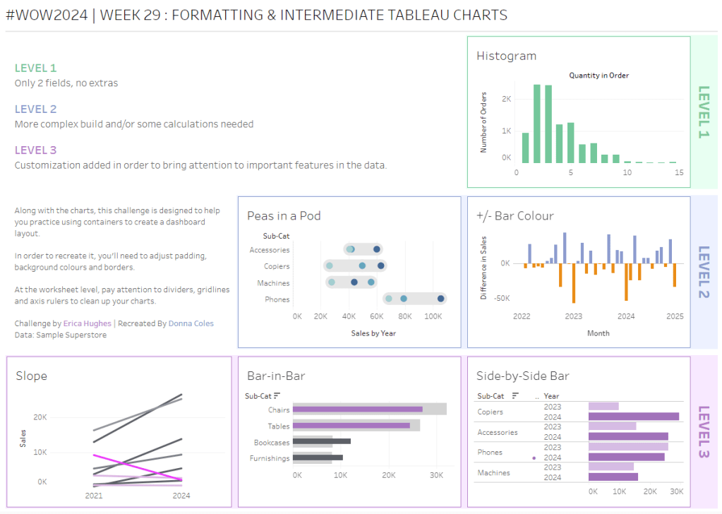
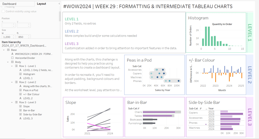
Erica set this challenge primarily aimed at building a beautifully presented dashboard, with the requirement to consider the use of layout containers and padding. She threw in creating some very specific chart types too. The easiest way to blog this, is by chart type.
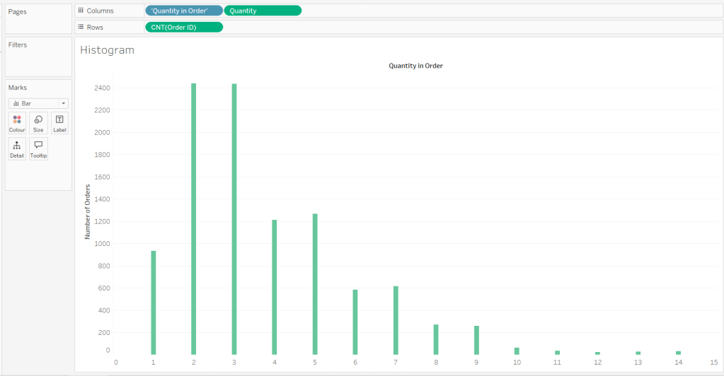
Building the Histogram
Add Quantity to Columns as continuous dimension (green unaggregated pill) and add Order ID as a measure using the CNT aggregation to Rows. The easiest way to do this is right click and drag Order ID from the left hand date pane and drop onto rows. When you release the mouse, the option to select the aggregation should be available.
Change the mark type to bar and adjust the colour. Edit the title of the y-axis and remove the title from the x-axis. Update the Tooltip.
Double -click into Columns and manually type ‘Quantity in Order’ (including the quotes). Right click on the first text displayed and hide field labels for columns. Adjust the font of the Quantity in Order label that remains.
Remove row and column dividers and column gridlines. Remove Row axis rulers.
Note, when you add to the dashboard , you may find you want to adjust the Size of the bars.
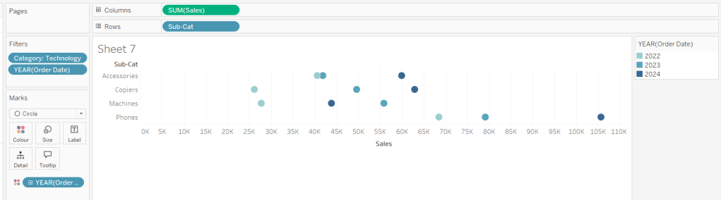
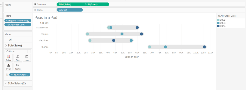
Building the Peas in a Pod chart
On a new sheet, add Category to Filter and select Technology. Add Order Date to Filter and select Years then choose 2022,2023 and 2024.
Rename the Sub-Category field to Sub-Cat and add to Rows. Add Sales to Columns. Change the mark type to circle. Add Order Date to Colour. By default it should display YEAR(Order Date). Adjust colours to suit. Widen each row a bit.
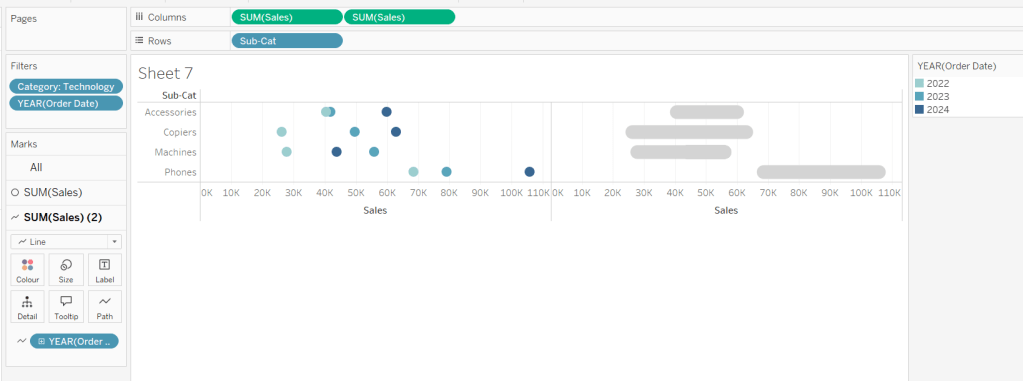
Add another instance of Sales to Columns.
On the Sale (2) marks card change the mark type to line and move YEAR(Order Date) to Path. Increase the size and adjust the colour so it’s a grey lozenge.
Make the chart dual axis and synchronise the axis. Right click the top axis and move marks to back. Adjust the Tooltip. Edit the title of the x-axis.
Hide the top axis. Remove row and column dividers. Remove row gridlines. Remove axis rulers for both columns and rows.
Note, when you add to the dashboard , you may find you want to adjust the Size of the circles and the line. I found it was best adjusted on the web after I published to Tableau Public.
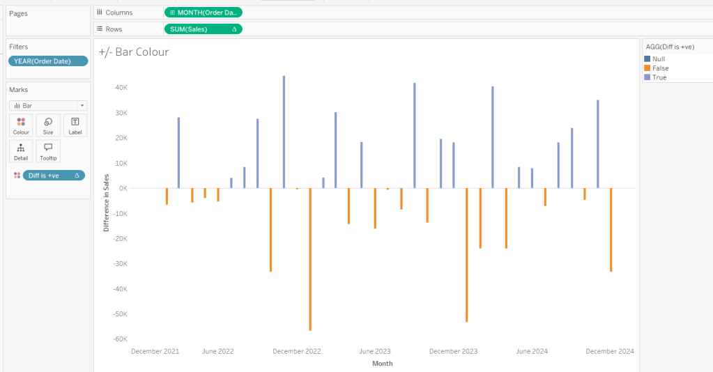
Building the +/- Bar Chart
On a new sheet add Order Date to Filter and select Years then choose 2022,2023 and 2024. Add Order Date to Columns and select to be at the continuous month level (green pill, May 2015 format). Add Sales to Rows and change the mark type to bar.
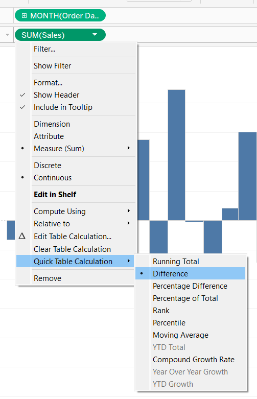
Add a quick table calculation of Difference to the Sales pill.
Adjust the size of the bars (select manual over fixed and adjust the slider).
and add to the Colour shelf. Adjust colours to suit. Hide the null indicator. Adjust the Tooltip. Adjust the title of the x-axis.
Remove all gridlines and axis rulers. Remove the columns zero line. Set the rows zero line to be a continuous unbroken line.
Note – once again the size may need further adjusting once on the dashboard and/or after publishing.
Building the slope chart
Add Category to filter and select Office Supplies. Add Region to filter and select West. Add Order Date to filter and select Years then choose 2021 and 2024 only.
Add Order Date to Columns and Sales to Rows. Add Sub-Cat to Detail.
Add Sales to Colour then add a quick table calculation of Percentage Difference. This only sets a value against the 2024 marks though, whereas we want a value for the whole line for each Sub-Cat.
Double-click into the Sales pill on Colour to edit it, and wrap the whole calculation in a WINDOW_MAX() function – the whole calculation should look like
Adjust the colour legend. I set the start & end colours to #ff00ff (hot pink) and #5d6068 (dark grey) and then applied an upper limit to the range and centred at 0 as below.
Hide the Order Date heading at the top of the chart. Adjust the Tooltip.
Remove column gridlines, zero lines and axis rulers.
Edit the Sort of the Sub-Cat pill on the Detail shelf, so it is sorting by % Difference ascending. This will ensure the lines are displayed overlapping in the expected manner.
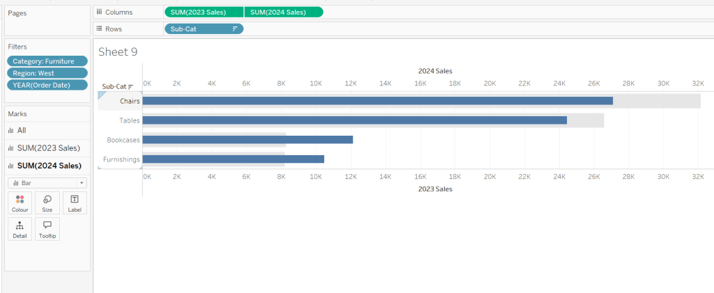
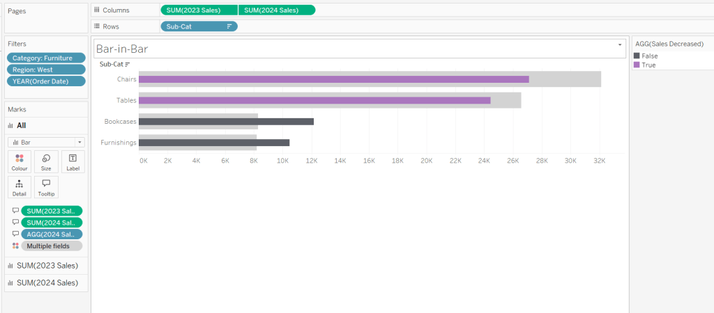
Building the Bar-in-Bar Chart
On a new sheet, add Category to filter and select Furniture. Add Region to filter and select West. Add Order Date to filter and select Years then choose 2023 and 2024 only.
Create a new field
2023 Sales
IF YEAR([Order Date]) = 2023 THEN [Sales] END
Add Sub Cat to Rows and 2023 Sales to Columns. Add a sort to the Sub-Cat pill to sort by 2024 Sales descending. Add 2024 Sales to Columns. Make the chart dual axis and synchronise the axis. Change the mark type on the All marks card to bar. Remove Measure Names from the Colour shelf on the All marks card. Set the colour of the 2023 Sales marks card to light grey. Increase the width of each row, then reduce the size of the bar on the 2024 Sales marks card.
Create a new field
Sales Decreased
SUM([2024 Sales]) < SUM([2023 Sales])
and add to the Colour shelf of the 2024 Sales marks card. Adjust colours to suit.
In the solution, the Tooltip shows an indicator – I’m not sure if this was necessary, but I added it just in case
2024 Sales > 2023 Sales
IF [Sales Decreased] THEN ‘●’ END
Add this to the Tooltip shelf of the All marks card, along with the 2023 Sales and 2024 Sales fields. Adjust the Tooltip accordingly.
Hide the top axis. Remove the title of the x-axis.
Remove row and column dividers. Remove row gridlines and row axis rulers and ticks. Remove all zero lines.
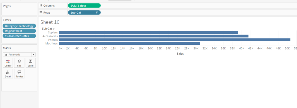
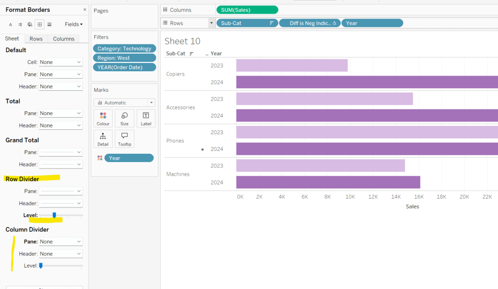
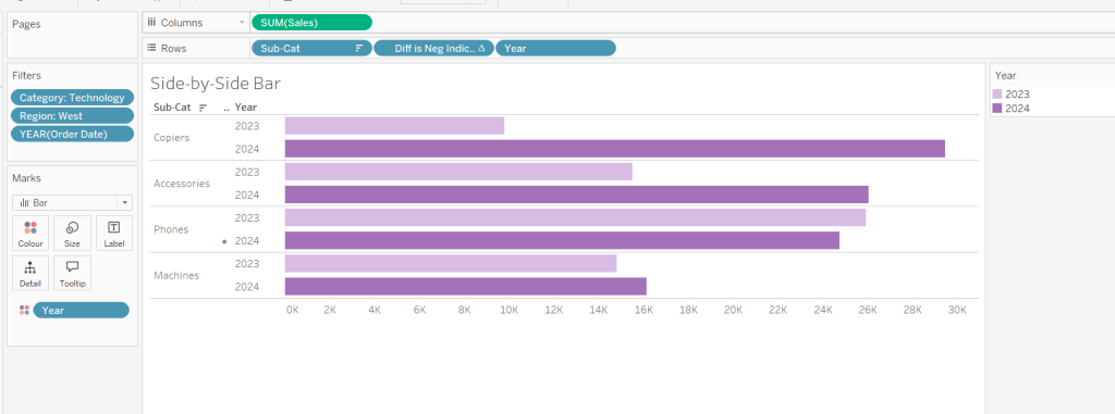
Building the side-by-side bar chart
On a new sheet, add Category to filter and select Technology. Add Region to filter and select West. Add Order Date to filter and select Years then choose 2023 and 2024 only.
Add Sub Cat to Rows and Sales to Columns. Apply a Sort to Sub-Cat based on 2024 Sales descending.
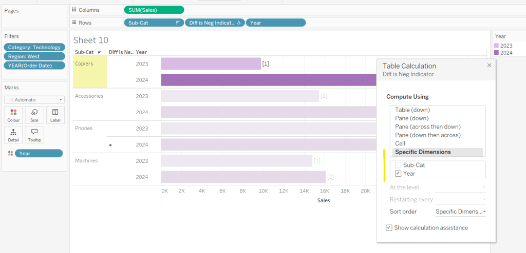
Create a new field
Year
YEAR([Order Date])
And add to Rows and Colour. Adjust colour to suit. Widen each row.
Create new field
Diff is Neg Indicator
IF NOT([Diff is +ve]) THEN ‘●’ ELSE ” END
Add to Rows before Year and then adjust the table calculation setting so it is just computing by Year only.
Adjust the alignment of the Sub-Cat column so it is aligned middle right. Narrow the width of the Diff is Neg Indicator column to try to remove all the column heading text. If some still shows, rename the field so it is padded with some spaces at the front. Adjust the Tooltip.
Remove the x-axis title. Remove Column dividers. Adjust the row dividers so they are at level 1 and are partitioning each Sub Cat only and not splitting the Year column.
Remove all gridlines
Building the dashboard
It’s always hard to walk through the steps for placing objects on a dashboard in the specified places. My general rules are
Start with a floating vertical container that is positioned 0,0 and set to the dashboard height and width. I name this Base.
Then add tiled objects such as a text object for the title, blank objects, other containers, charts etc.
When you add a container, add a blank object initially to help get everything into place. Remove once you have at least 2 objects side by side / on top of each other depending on the direction you’re organising.
The item hierarchy shouldn’t have any containers of type Tiled listed.
Try to name your containers to help maintenance in the future
Below is a picture of the item hierarchy I ended up with using this approach
I created a floating vertical container called Base, positioned 0,0 and 1200 x 850. Background set to None, no border and inner and outer padding all 0.
I added a text object to contain the title. Background set to None and no border. Outer padding set to 10 all round, and inner padding 0.
I added a blank object, which I renamed Horizontal divider. Background set to light grey, no border. Outer padding set to left and right 10 and top and bottom 0. Inner padding all 0. Height set to 2.
I added another Vertical container, which I renamed Body. Background set to None, no border and all inner and outer padding set to 0.
I added 3 horizontal containers on top of each other, and set the property of the Body vertical container to distribute contents evenly so each horizontal container was the same height.
1st horizontal container
I named Row 1 – Level 1. I set the background to the pale green. No border. Outer padding set to left & right 10, top & bottom 5. Inner padding all 0.
Into this I added a text field to describe the levels. Background of this was white, no border and outer padding set to 0 (so the green background disappears). Inner padding was set to top: 20 and 10 for the rest.
Next the Histogram chart. Border set to green. Background white. Outer padding right:5, rest 2. Inner padding set to 10 all round. Width of chart fixed to 380 px.
Next the Level 1 text object. No border, no background. Outer padding 4 all round; inner padding 0. Formatted text object to rotate text. Width of object set to 40 px.
2nd horizontal container
I named Row 2- Level 2. I set the background to the pale blue. No border. Outer padding set to left & right 10, top & bottom 5. Inner padding all 0.
Into this I added a text field to describe the challenge. Background of this was white, no border and outer padding set to 0 (so the blue background disappears). Inner padding was set to 10 all round. Width of object set to 380px.
Next the Peas in a Pod chart. Border set to blue. Background white. Outer padding right:5, rest 2. Inner padding set to 10 all round.
Next the +/- bar chart. Border set to blue. Background white. Outer padding right and left 5, top & bottom 2. Inner padding set to 10 all round. Width of object set to 380px.
Next the Level 2 text object. No border, no background. Outer padding 4 all round; inner padding 0. Formatted text object to rotate text. Width of object set to 40 px.
3rd horizontal container
I named Row 3- Level 3. I set the background to the pale purple. No border. Outer padding set to left & right 10, top & bottom 5. Inner padding all 0.
I added the Slope chart. Border set to purple. Background white. Outer padding right:5, rest 2. Inner padding set to 10 all round. Width of object set to 380px.
Next the bar-in -bar chart. Border set to purple. Background white. Outer padding right & left 5, top & bottom 2. Inner padding set to 10 all round.
Next the side-by-side bar chart. Border set to purple. Background white. Outer padding right and left 5, top & bottom 2. Inner padding set to 10 all round. Width of object set to 380px.
Next the Level 3 text object. No border, no background. Outer padding 4 all round; inner padding 0. Formatted text object to rotate text. Width of object set to 40 px.
It was a bit of trial and error to get the spacing as required, and a few calculations to work out how wide I wanted each chart to be, based on the width of the dashboard and the other items in each row.
Lorna set a table calculation filled challenge this week to recreate some KPI cards using an aggregated and amended version of the Superstore data set.
Lorna purposefully used a string Period field to define the timeframe to encourage the use of table calculations. No doubt, there are ways you could use string functions/regex to extract the relevant year and month number to come up with a different solution, but I’m going to head down the intended route.
And as with any table calculation based challenge, I find it best to always build out all the calculations I need into a tabular display to start with before building the viz. So let’s get started…
Building out the Calculations
We need to have a handle on more of the data than just that associated to the Period we’re interested in, so we can’t use a simple Quick Filter on the Period field to restrict the data, otherwise we can’t ‘access’ data for the previous period. So to manage which Period we want to focus on, I created a parameter
pSelectedPeriod
string field that uses a list where the values are added from the Period field. Default to P12 Y2022/23
On a new sheet, add Period to Rows and then add the Sales , Profit and Quantity measures to Text. Show the pSelectedPeriod parameter
What we’re going to do is get the values for each measure that is associated to the pSelectedPeriod, and display that value over every row.
Curr Sales
WINDOW_MAX(SUM(IF [Period] = [pSelectedPeriod] THEN [Sales] END))
If the Period matches that in the parameter, then get the Sales value and then use Window_MAX to ‘spread’ that value over every row
Add this to the table, and edit the table calculation to ensure the value is being computed by Period.
Repeat the same for Profit and Quantity
Curr Profit
WINDOW_MAX(SUM(IF [Period] = [pSelectedPeriod] THEN [Profit] END))
Curr Qty
WINDOW_MAX(SUM(IF [Period] = [pSelectedPeriod] THEN [Quantity] END))
If you change the parameter, you should see all the values in the last 3 columns changing to reflect the value from the first 3 columns of the relevant row.
Now we need to get the value from the previous period, ie the data from the previous row
Prev Sales
WINDOW_MAX(IF MIN([Period]) = [pSelectedPeriod] THEN LOOKUP(SUM([Sales]),-1) END)
The LOOKUP function is taking the Sales value from the previous 1 row (-1), and then WINDOW_MAX is once again ‘spreading’ this value across every row. We also need
Prev Profit
WINDOW_MAX(IF MIN([Period]) = [pSelectedPeriod] THEN LOOKUP(SUM([Profit]),-1) END)
Prev Qty
WINDOW_MAX(IF MIN([Period]) = [pSelectedPeriod] THEN LOOKUP(SUM([Quantity]),-1) END)
Add these to the table, and again adjust the table calc settings for every field to compute by Period.
Now we have the current and previous values for each measure, we can work out the % difference
Diff Sales %
([Curr Sales]-[Prev Sales])/[Prev Sales]
Format this to a % with 1 dp
Diff Profit %
([Curr Profit]-[Prev Profit])/[Prev Profit]
Diff Qty %
([Curr Qty]-[Prev Qty])/[Prev Qty]
Add all these onto the sheet, and remember the table calc settings (for these, there are nested table calcs, so make sure both are set properly).
We now need an arrow indicator to display up or down depending on the % value, and this needs to display as a different colour, so we need two fields per measure.
Add these to the sheet if you wish too (apply the table calc settings), but you’ll only get a value for one or the other field depending on whether the difference was +ve or -ve. Below I’ve just added the two Sales indicators
The Tooltip displays the value of the two Periods being compared. One of these is in the parameter, but we need to capture the other
Previous Period
WINDOW_MAX(IF [pSelectedPeriod] = MIN([Period]) THEN LOOKUP(MIN([Period]),-1) END)
So now we have all the values we need for the KPIs captured against every row in the dataset. So now we want to just show a single row. It could be the first, it could be the last… based on Lorna’s hint, let’s filter to just show the row related to the pSelectedPeriod value.
Filter Selected Period
[pSelectedPeriod] = LOOKUP(MIN([Period]),0)
Using the offset of 0 with the LOOKUP, returns the value for the row you’re on, so adding this to the FIlter shelf and selecting True, filters the display to the row where the Period matches the parameter. NOTE if you adjust the table calc settings of this field after adding to the filter shelf, you’ll need to reselect the option to filter to True.
As this is a table calculation, the ‘filter’ is applied later in the order of operations, so information about the other rows in the table can be referenced. Filtering just by Period as a quick filter, is essentially a dimension filter and that happens earlier on in the process, meaning the data about the other rows would be inaccessible.
So we have all the fields, now build the cards.
Building the KPI Cards
On a new sheet, double click into Columns and type in MIN(0). Repeat this 2 more times. This gives us 3 axis to build each of the 3 cards.
On the All marks card, add Period to the Detail shelf. Show the pSelectedPeriod parameter. Add the Filter Selected Period to the Filter shelf and set to true (adjusting the table calc and resetting the filter value as required).
Change the mark type of the All marks card to shape and select a transparent shape (see here for more details).
On the first MIN(0) marks card, add Curr Sales, Prev Sales, Diff Sales %, Diff Sales Indicator +ve and Diff Sales Indicator -ve to the Label shelf. Remember to apply the table calc settings for all of the fields!
Adjust the text within the label, so it is formatted and positioned as required and then align middle centre.
On the middle MIN(0) marks card, do similar by adding the equivalent profit fields onto the Label shelf, and then repeat again for the bottom MIN(0) marks card, adding the quantity fields to the Label shelf.
On the All marks card, add Previous Period, Curr Sales, Curr Profit, Curr Qty Prev Sales, Prev Profit, Prov Qty, Diff Sales %, Diff Profit % and Diff Qty % to the Tooltip shelf (remember to set those table calc settings!) Then adjust the Tooltip to display the text as required. I used the ruler to shift the starting position, along with tabs (the tab keyboard button) to ‘try’ to get everything to align, and it works for most circumstances….
Finally format the KPI card
Set the worksheet background colour to light grey
Remove all gridlines, zero line, axis lines
Set the column divider to be a thick white line
Set the row divider to be a thick white line
Hide the axis
Add the sheet onto a dashboard, and you should be done.