Can you build a scatterbox?

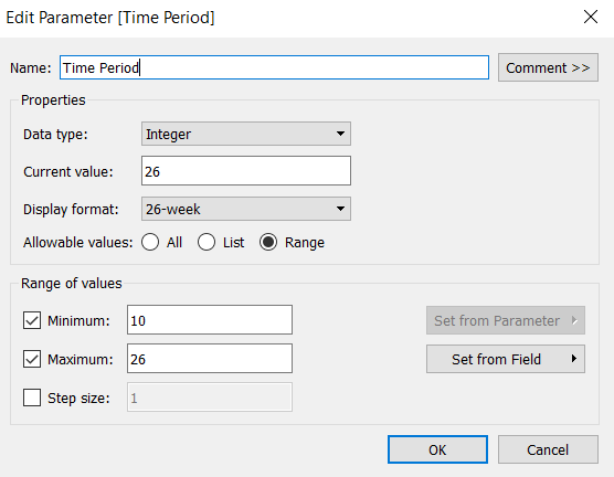
I’m back from my holibobs, so back to solving #WOW2023 challenges and writing up the solutions – it’s tough to get back into things after a couple of weeks of sunshine and cocktails!

Anyway, this week, Sean set this challenge from Felicia Styler to build a scatterplot / heat map combo chart, affectionally termed the ‘scatterbox’.

Phew! This took some thinking… I certainly wasn’t gently eased back into a challenge!

Modelling the data

We were given a hint that the data needed to be unioned to build this viz. I connected to the Sample-Superstore.xls file shipped with 2023.2 instance of Tableau Desktop. After adding the Orders sheet to the canvas, I then added another instance, dragging the second instance until the Union option appeared to drop it on.

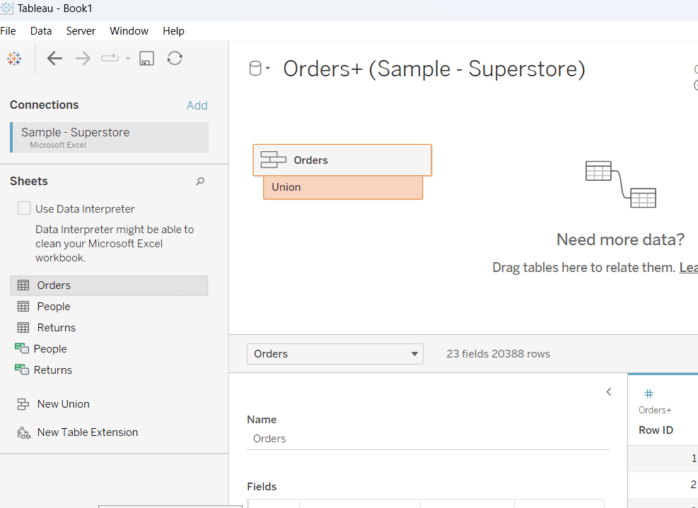
The union basically means the rows in the Orders data set are all duplicated, but an additional column called Table Name gets automatically added

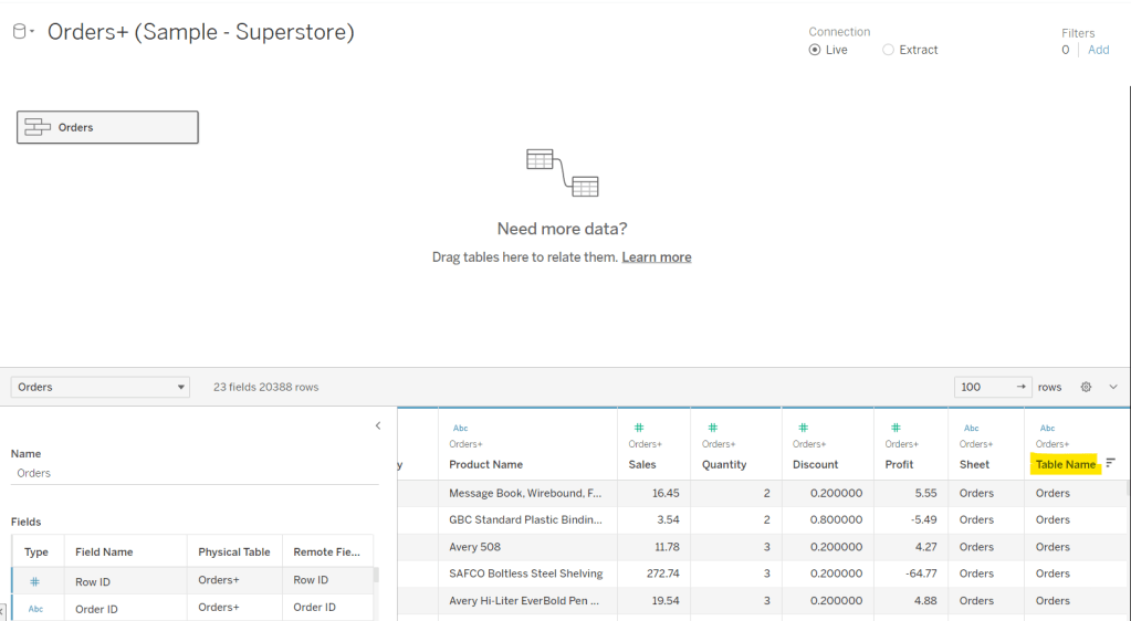
This field contains the value Orders and Orders1 which provides the distinction between the duplicated fields caused by the union. It is this field that will be used to determine which data is used to build the scatter plot and which to build the heat map.

Building out the calculated fields

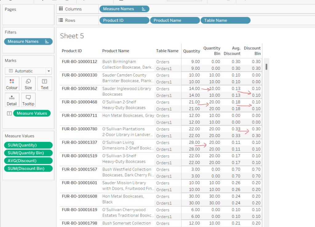
Let’s start just by seeing how the data looks with the measures we care about.

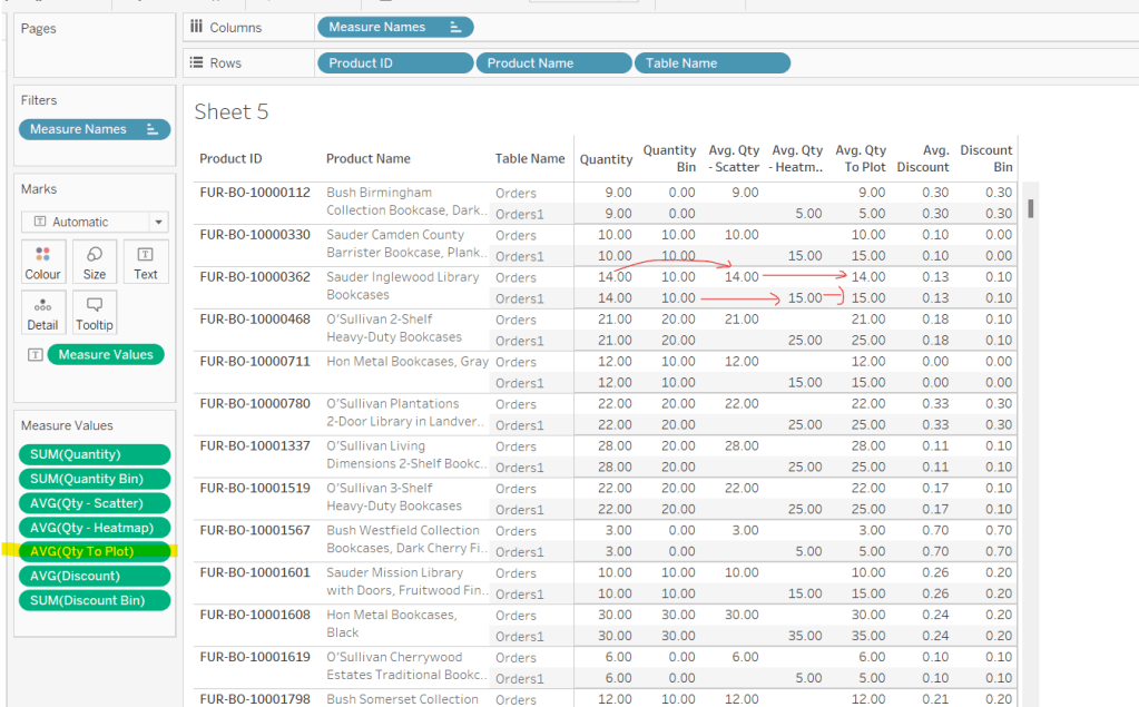
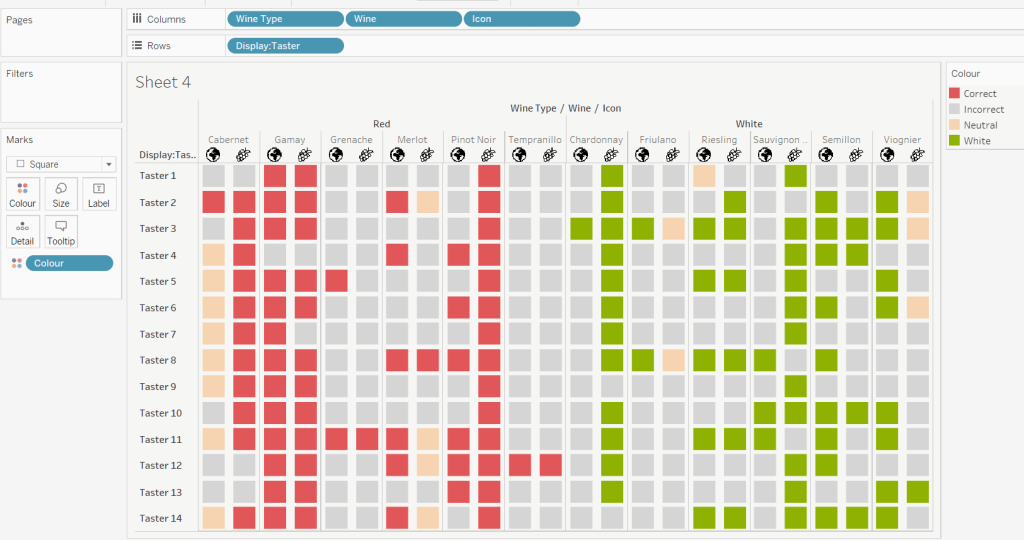
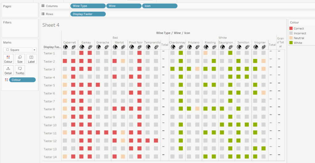
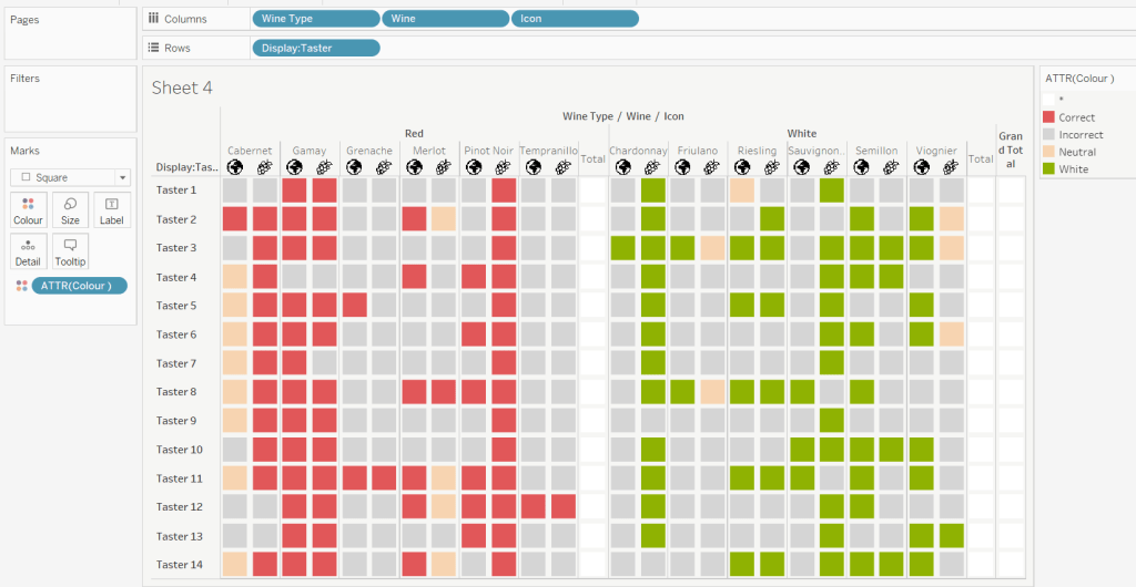
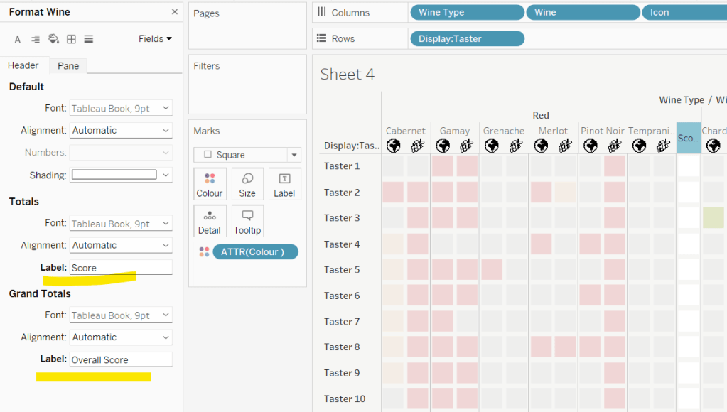
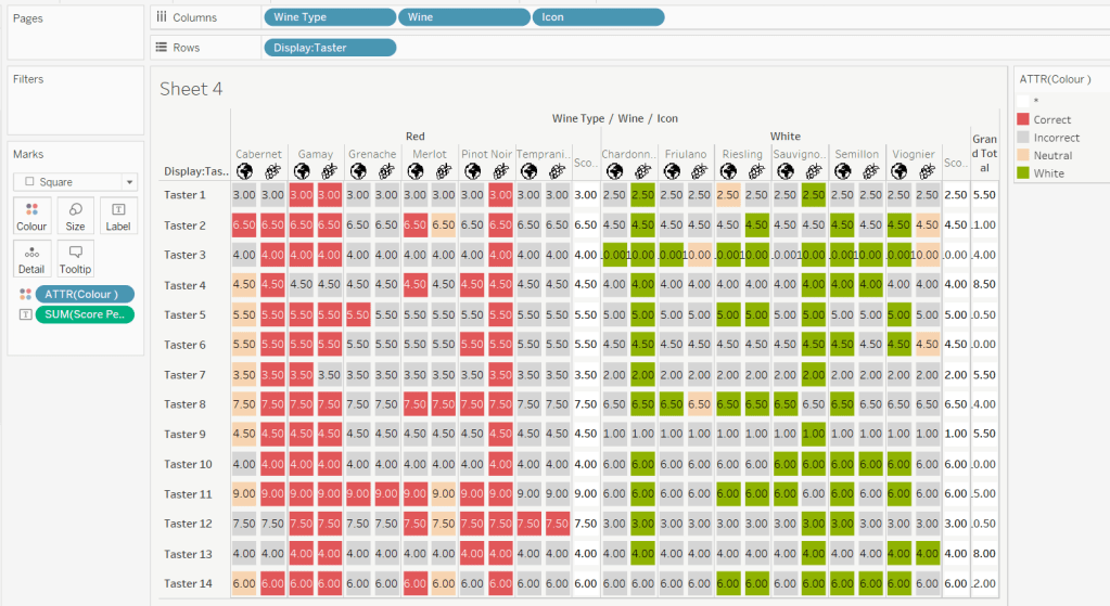
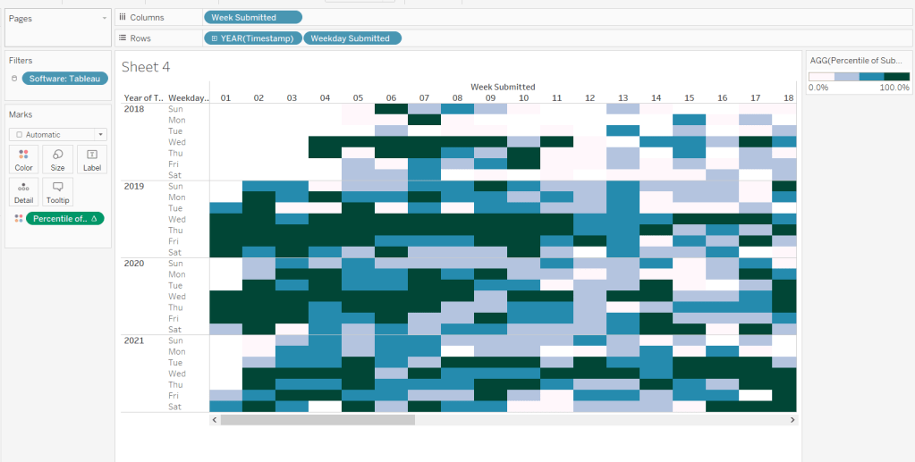
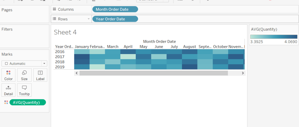
Onto a sheet add Product ID, Product Name and Table Name to Rows (Note – there are multiple Product Names with the same Product ID, so I’m treating the combination as a unique product). Then add Quantity to Text. The drag Discount and drop onto the table when it says ‘Show Me’, which should automatically add Measure Name/Measure Values into the view. Aggregate Discount to AVG. We can see that we’re getting the same values for each Table Name, which is expected.

When plotting the scatter plot, we’re plotting at the Product level, so the values above is what we’ll want to plot. But when building the heatmap, we need to ‘bin’ the values.

For the Quantity, we’re grouping into bins of size 10, where if the Quantity is from 0-9 the bin value is 0, 10-19, the bin value is 10 etc.

Quantity Bin

FLOOR({FIXED [Product ID], [Product Name], [Table Name]: SUM([Quantity])}/10) * 10

The LoD (the bit between the {} is returning the same values listed above, but we’re using an LoD, as when we build the heat map, we don’t want the Product fields in the view, but we need to calculate the Quantity values at the product level (ie at a lower level of detail than the view we’ll build). Dividing the value by 10, then allows us to get the FLOOR value, which ’rounds’ the value to the integer of equal or lesser value (ie with FLOOR, 0.9 rounds to 0 rather than 1). Then the result is re-multiplied by 10 to get the bin value.

So if the Quantity is 9, dividing by 10 returns 0.9. Taking the FLOOR of 0.9 gives us 0. Multiplying by 10 returns 0.

But if the Quantity is 27, dividing by 10 returns 2.7. The FLOOR of 2.7 is 2, which when multiplied by 10 is 20.

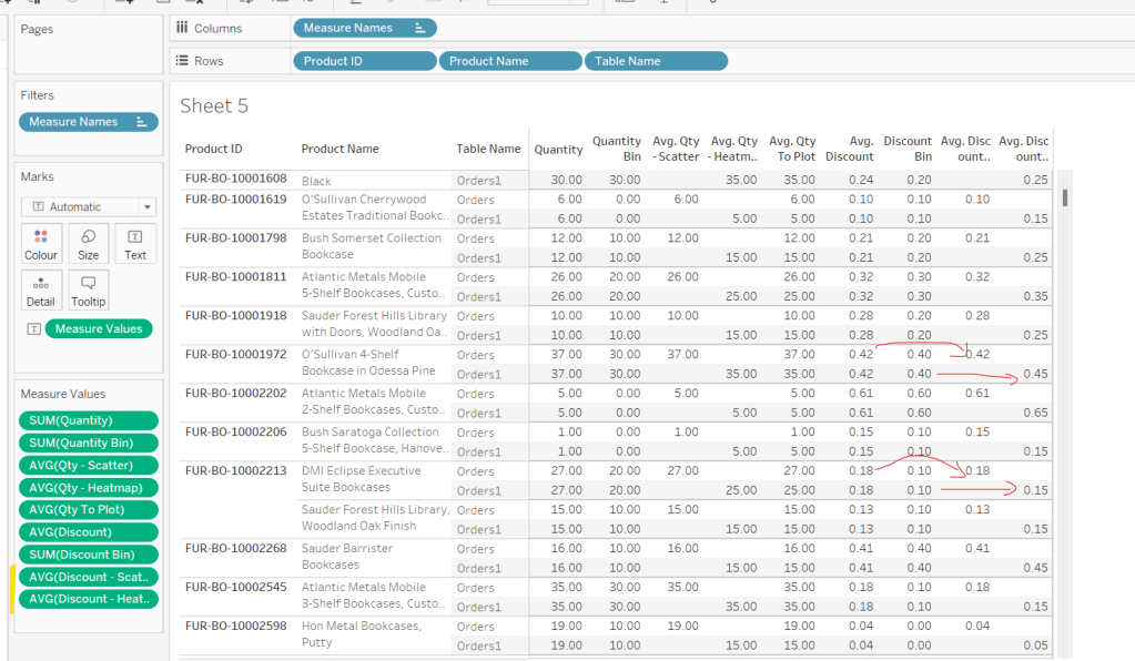
We apply a similar technique for the Discount bins, which are binned into groups of 0.1 instead.

Discount Bin

FLOOR({FIXED [Product ID], [Product Name], [Table Name]: AVG(Discount)}*10) / 10

Add these into the table to sense check the results are as expected.

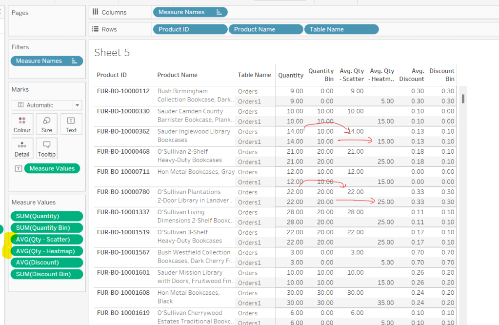
Next we’re going to determine the values we want based on whether we’re building the scatter or the heat map.

Qty – Scatter

IF [Table Name] = ‘Orders’ THEN {FIXED [Product ID], [Product Name], [Table Name]: SUM([Quantity])} END

ie only return the Quantity value for the data from the Orders table and nothing for the data from the Orders1 table.

Qty – Heatmap

IF [Table Name] = ‘Orders1’ THEN [Quantity Bin] + 5 END

so, this time, we’re only returning data for the Orders1 table and nothing for the Orders table. But we’re also adjusting the value by 5. This is because by default, when using the square mark type which we’ll use for the heatmap, the centre of the square is positioned at the plot point. So if the square is plotted at 10, the vertical edges of the square will be above and below 10. However, we need the square to be centred between the bin range points, so we shift the plot point by half of the bin size (ie 5).

Adding these into the table, and aggregating to AVG we can see how these values are behaving.

As we’re building a dual axis, one of the axis will need to be combined within a single measure, so we create

Qty to Plot

IF ([Table Name]) = ‘Orders’ THEN ([Qty – Scatter]) ELSE ([Qty – Heatmap]) END

Now we move onto the Discount values, which we apply similar logic to

Discount – Scatter

IF [Table Name] = ‘Orders’ THEN {FIXED [Product ID], [Product Name],[Table Name]: AVG([Discount])} END

Discount – Heatmap

IF [Table Name] = ‘Orders1’ THEN [Discount Bin] + 0.05 END

We’ll need is to be able to compute the number of unique products to colour the heatmap by. As mentioned earlier, I’m determining a unique product based on the combination of Product Id and Product Name. To count these we first need

Product ID & Name

[Product ID] + ‘-‘ + [Product Name]

and then we can create

Count Products

COUNTD([Product ID & Name])

The final calculations we need are required for the heatmap tooltips and define the range of the bins.

Qty Range Min

[Qty To Plot] – 5

Qty Range Max

[Qty To Plot] + 5

Discount Range Min

[Discount – Heatmap] – 0.05

Discount Range Max

[Discount – Heatmap] + 0.05

Now we can build the viz

Building the Scatterbox

On a new sheet, add Qty to Plot to Columns and change to be a dimension (so not aggregated to SUM) and Discount – Scatter (set to AVG) to Rows. Add Product ID and Product Name to Detail. Change the mark type to Circle and adjust the size. Adjust the Colour and reduce the opacity (I used #4a9aab at 50%)
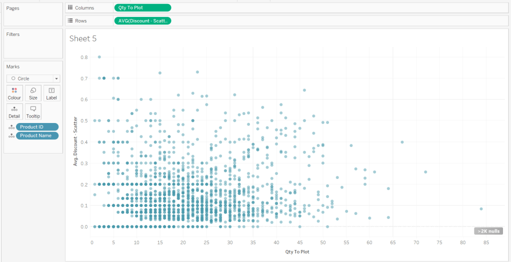
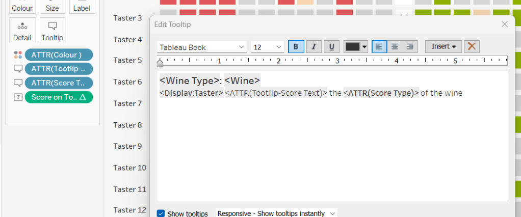
Adjust the Tooltip.

Then add Discount – Heatmap to Rows. This creates a 2nd marks card. Change to be a dimension, and change the mark type to square. Remove Product ID and Product Name from the Detail shelf

Add Count Products to Colour and ensure the opacity is 100%. Adjust the sequential colour palette to suit and set the end of the range to be fixed to 300

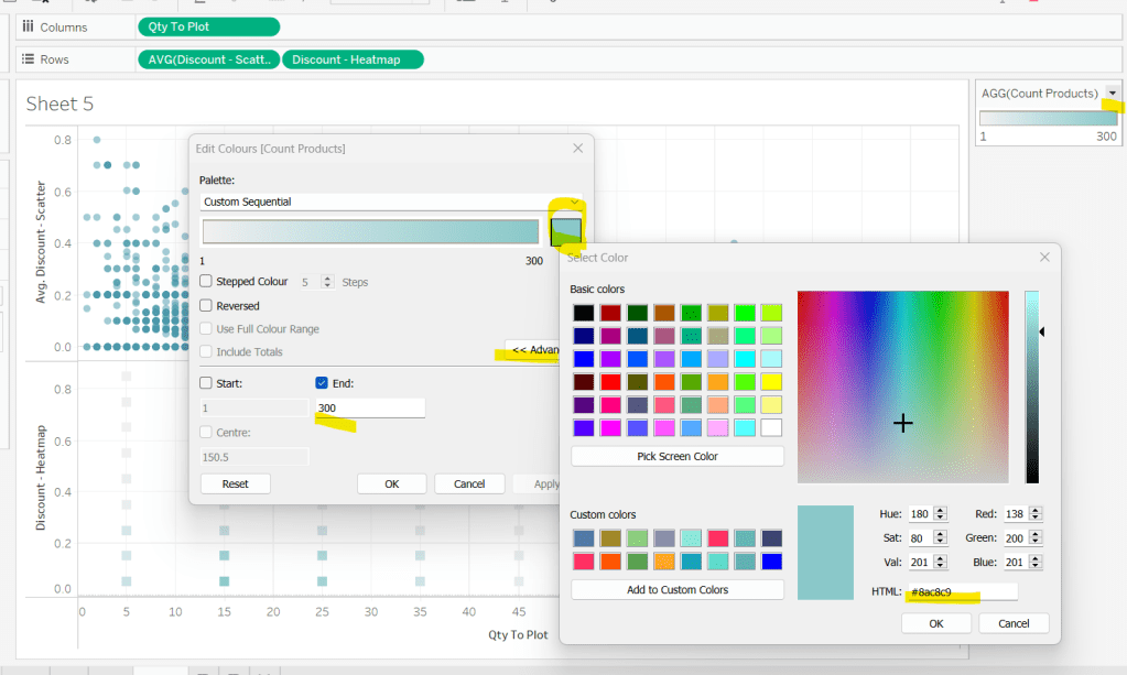
Add Qty Range Min, Qty Range Max, Discount Range Min, Discount Range Max to the Tooltip shelf of the heatmap marks card. Set all to aggregate to AVG and adjust tooltip to suit.

Then make the chart dual axis and synchronise axis. Increase the size of the square heat map marks (note don’t worry how these look at this point, the layout will adjust when added to the dashboard. Right click on the Discount – Heatmap axis on the right and move marks to back. Hide that axis too.

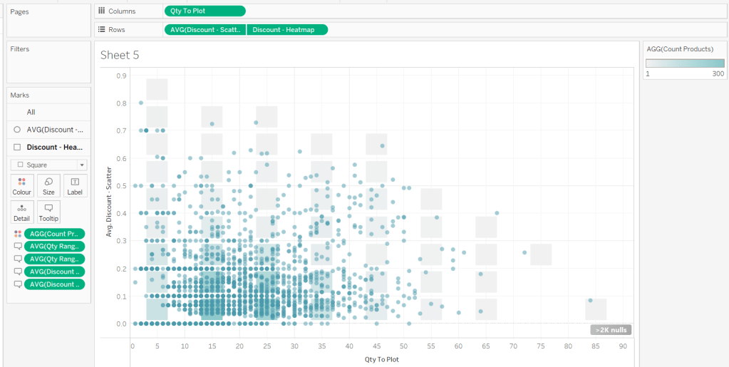
Edit the Qty to Plot axis so the tick marks are fixed to increment every 10 units.

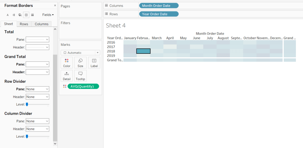
Adjust axis titles, remove row/column dividers and hide the null indicator.

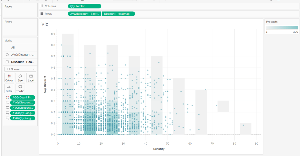
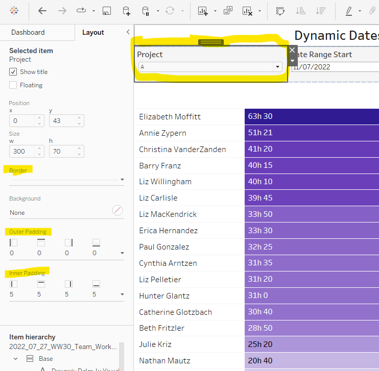
Then add the sheet to an 800 by 800 sized dashboard. You will need to make tweaks to the padding and potentially sizing of the heat map marks again to get the squares to position centrally with white surround. I added inner padding of 60px to the left & right of the chart on the dashboard, to help make the chart itself squarer.

My published viz is here .

Happy vizzin’!

Donna

Re-Viz : Blind leading the blind

This week, it was my turn to set the #WOW2023 challenge for ‘retro’ month, and I chose to revisit a challenge from May 2017, that was originally set by one of the original ‘founders’ of WorkoutWednesday, Emma Whyte.

The original challenge looked like this :

As I said in the challenge post, I chose this I this challenge as it’s a different type of visual we don’t often see in WOW; it uses a different dataset that interests me – wine!; and as Emma’s website, where she hosted the original requirements for her challenges, is no longer active, it’s possible many won’t know of the existence of this challenge (it pre-dates the current WOW tracking data we have).

Building the core viz

Firstly, we want to build out the basic grid. For that we need a couple of calculated fields

Display:Taster

‘Taster ‘ + STR([Taster])

and

Icon

IF [Score Type] = ‘Grape’ THEN “https://workout-wednesday.com/wp-content/uploads/2023/07/Grapes.png”
ELSE “https://workout-wednesday.com/wp-content/uploads/2023/07/Globe.png”
END

Right click on the Icon field and select Image Role > URL

Add Wine Type, Wine and Icon to Columns and Display:Taster to Rows

Change the mark type to square.

Here we’re making use of the image role functionality in the header of the table to display images stored on the web, without the need to download them locally.

Create a new field

Colour

IF [Score] = 1 THEN [Wine Type]
ELSEIF Score = 0 THEN ‘Grey’
ELSE ‘Neutral’
END

Add this to the Colour shelf and adjust colours accordingly. Increase the size of the squares so they fill the space better, but still have separation between them.

Set the background colour of the worksheet to the grey/beige (#f6f6f4).

Note – I noticed later on that the colour legend in the screen shots has the words ‘correct’ and incorrect’ rather than ‘red’ and ‘grey’. This was due to an un-needed alias I had set against the field, so please ignore

Via the Analysis -> Totals menu, add all subtotals & also show row grand totals. This will make the display look a bit odd initially.

Right-click on the Wine pill in the Columns and uncheck the Subtotals option. This should mean there are 3 additional columns only – a total for each wine type and the grand total.

To get a single square to display in the totals columns, right-click on the Colour field in the marks card area, and change from a dimension to an attribute. The field will change from displaying Colour to ATTR(Colour) and an additional option for * will display in the colour legend – set this to be white

To change the word ‘Total’ in the heading to ‘Score’, right click on the word ‘Total’ and select format. In the left hand pane, change the Label of the Totals section to Score. Repeat for the ‘Grand Totals’ by right clicking on ‘Grand Totals’ in the table, selecting format and changing the label for that too to ‘Overall Score’.

We need to label the totals with the score. For this we first need to get a score for each taster per wine

Score Per Taster

{FIXED [Taster], [Wine Type]:SUM([Score])}

If we just added this to the Label shelf, every square gets labelled with the total, which isn’t what we want.

We need to work out a way to just show the label on the total columns only. For this we can make use of the SIZE() table calculation.

To see how we’re going to use this, double click into the Columns and type SIZE(), then change the field to be a blue discrete pill. Edit the table calculation and set the field to compute by Wine and Icon only.

You’ll see that the SIZE() field in the Columns has added the number 12 as part of the heading, which is the count of wines associated to the wine type (ie 12 red wines and 12 white wines). There is no SIZE() value displayed under the total columns, but these actually have a size of 1, so we’re going to exploit this to display the labels (note – this approach wouldn’t work if where was only 1 wine for one of the wine types).

Score on Total

IF SIZE() = 1 THEN SUM([Score Per Taster]) END

Set the default number format of this field to be Standard, which means the result will display either whole or decimal numbers.

Add this onto the Label shelf instead of the other field, and adjust the table calculation as described above to compute by Wine and Icon only.

You can now remove the SIZE() field from the Columns.

Align the scores centrally.

Remove row & column dividers from each cell, and the totals, but set a white column divider for both the pane & header of the Grand Total column.

Format the text for the Wine Type and Wine and Totals fields. Align the text for the Wine field to the Top.

Hide field labels for rows and columns.

Applying the Tooltip

The text when hovering over each square needs to display different wording depending on the score.

Tooltip – Score Text

IF [Score] = 1 THEN ‘correctly identified’
ELSEIF [Score] = 0.5 THEN ‘partially identified’
ELSE ‘was unable to identify’
END

Add this to the Tooltip shelf along with the Score Type field. Modify the text accordingly

Applying the sort

To control the sorting, we need a parameter

pSort

string parameter with list options, defaulted to ‘Overall Score’

and we also need fields to capture the different scores for each type of wine per taster

Red Score

{FIXED [Taster]:SUM( IF [Wine Type] = ‘Red’ THEN [Score] END)}

White Score

{FIXED [Taster]:SUM( IF [Wine Type] = ‘White’ THEN [Score] END)}

Overall Score

[White Score] + [Red Score]

Then we need a calculated field to drive sorting based on the option selected and the fields above

Sort By

CASE [pSort]
WHEN ‘Overall’ THEN [Overall Score]
WHEN ‘Red’ THEN [Red Score]
ELSE [White Score]
END

Then right click on the Display:Taster field on the Rows and select Sort, and amend the values to sort by field Sort By descending

Building the legend

I did this using 2 sheets. First I created a new field

Legend Text

IF [Score] = 1 THEN ‘Correct’
ELSEIF Score = 0 THEN ‘Incorrect’
ELSE ‘Partially Correct’
END

Then I create a viz as follows

  • Add Legend Text and Wine Type to Columns
  • Add Legend Text to Filter and set to ‘Correct’
  • Change Mark type to Square and increase size
  • Add Colour to Colour shelf
  • Add Score as AVG to Label and format to number standard. Align centrally
  • Uncheck show header against the Wine Type field , and hide field labels for columns against the ‘legend Text’ column heading.
  • Remove all column/row dividers and set the worksheet background colour.
  • Turn off tooltips

Duplicate the sheet, and edit the filter so it excludes Correct instead. Remove Wine Type from the columns shelf. Reorder the columns.

Building the dashboard

When building the dashboard, I just used a floating image object to add the bottle & glass image in the top left of the dashboard.

I set the background colour of the whole dashboard to match that I’d set on the worksheets too.

To stop the tooltips from displaying when hovering over the Scores, I simply placed floating blank objects over the score columns – this is a simple, but effective trick – you just need to be mindful of the placement if you ever revisit the dashboard and move objects around. I placed a floating blank over the legends too to stop them being clicked on.

My published viz is here!

Happy vizzin’!

Donna

Dynamic Dates in a Heat Map

Erica set the challenge this week using a custom made dataset. The focus was to handle viewing different aggregations of the dates based on the date range selected, ie for short date ranges seeing the data at a day level, for medium ranges, view at the week level and then at a monthly level for larger ranges. This type of challenge has been set before, but the visual is typically a line chart rather than a heat map. The principles are similar though.

Determining the Date to Display

Each row in the data set has a Date associated to it. For this challenge we need to ‘truncate’ the date to the appropriate level depending on the date range and the date level selected by the user. By that I mean that if the level is deemed to be weekly, we need to ‘reset’ each date to be the 1st day of the week.

To start with, we need to set up some parameters which drives the initial user input.

pStart

Date parameter defaulted to 11/07/2022 (11th July 2022), with a display format of <weekday>, <date>

pEnd

As above, but defaulted to 24/07/2022 (24th July 2022).

pDateLevel

integer with values 0-3 as listed below, with a text Display As. Defaulted to ‘Default’. Note, I am using integers as we will be referencing them in IF statements later, and integers are more performant than comparing strings.

With these parameters, we can then build

Date To Display

DATE(
IF [pDateLevel] = 0 THEN
IF DATEDIFF(‘day’, [pStart], [pEnd]) < 28 THEN DATETRUNC(‘day’,[Date])
ELSEIF DATEDIFF(‘day’, [pStart], [pEnd]) < 90 THEN DATETRUNC(‘week’, [Date])
ELSE DATETRUNC(‘month’, [Date])
END
ELSEIF [pDateLevel] = 1 THEN DATETRUNC(‘day’,[Date])
ELSEIF [pDateLevel] = 2 THEN DATETRUNC(‘week’,[Date])
ELSE DATETRUNC(‘month’, [Date])
END
)

If the pDateLevel is set to 0 (ie Default), then compare the difference between the dates entered and truncate to the ‘day’ level if the difference is less than 28 days, the ‘week’ level if the difference is less than 90 days, else truncate to the month level (which will return 1st of the month). Otherwise, if the pDateLevel is 1 (ie Day), truncate to the day level, if it’s 2 (ie Week), truncate to the week level, else use the month level.

To see how this field is working, add Date and Date To Display to Rows, both as discrete exact dates (blue pills), display the parameter fields, and adjust the values. Below you can see that using the Default level, between 1st May and 24th July, the 1st day of the associated week against each date is displayed.

Building the Bar Chart

This is the simpler of the two charts to build, so we’ll start with this.

Add Employee Name to Rows, and Minutes to Columns. and sort by Minutes descending (just click the sort descending button in the toolbar). Add Project to Filter, select ‘A’ and then show the filter. Adjust the colour of the bars. I used #311b92

We need to restrict the data displayed based on the date range defined.

Dates to Include

[Date]>=[pStart] AND [Date]<=[pEnd]

Add this to the Filter shelf and set to True.

Now, we need to label the bars, and need new fields for this.

Duration (hrs)

FLOOR(SUM([Minutes])/60)

Using the FLOOR function means the value is always rounded down to the relevant whole number (eg 60.5 and above will still result in 60).

Format this field to be 0 decimal places with a ‘h’ suffix

Duration (mins)

SUM([Minutes])%60

Modulo (%) 60 means return the remainder when divided by 60. Format this to be 0 dp.

Add both these fields to the Label shelf, and adjust so the labels are displaying on the same line and are aligned to the left. You may need to increase the width of each row to see them.

Add Project to the Tooltip shelf and update, then remove all gridlines and the axis. Leave the Employee Name column visible for now. We’ll come back to this later.

Building the Heat Map

On a new sheet, add Employee Name to Rows and Date to Display as a discrete exact date (blue pill) to Columns. Add Minutes to Colour and a heat map should automatically display.

Go back to the bar sheet, and set both the Project and the Dates To Include filters to apply to the heat map worksheet as well (right click each pill on the filter shelf -> Apply to Worksheets -> Selected Worksheets and select the other one you’re building).

Then click the sort descending button in the toolbar, to order the data as per the bar.

Add both Duration (hrs) and Duration (mins) to the Label shelf and change the mark type to Square. Adjust the label so it is on the same line and left aligned (I added a couple of spaces to the front of the text so it isn’t so squashed).

Edit the colours of the heat map – I used a colour palette I had installed called Material Design Deep Purple Seq which seemed to match, but may not be installed by default.

Format the main heat map section to have a light grey background by right clicking on the table -> format and setting the shading of the pane only to pale grey

Then adjust the row dividers of the pane to be white, and the header to be pale grey (set the level to the max).

Adjust the column dividers similarly, setting the pane to be white, the header to none, and level to max

Next we want to deal with the column labels. By default they’re showing the date, but we want this to show something different depending on the date level being displayed.

Column Label

IF (([pDateLevel] = 1) OR (([pDateLevel] = 0) AND (DATEDIFF(‘day’, [pStart],[pEnd])<28))) THEN UPPER(LEFT([Weekday],3))
ELSEIF (([pDateLevel] = 2) OR (([pDateLevel] = 0) AND (DATEDIFF(‘day’, [pStart],[pEnd])<90))) THEN ‘w/c ‘ + IIF(LEN(STR(DATEPART(‘day’, [Date To Display])))=1,’0’+STR(DATEPART(‘day’, [Date To Display])), STR(DATEPART(‘day’, [Date To Display]))) + ‘-‘ + UPPER(LEFT(DATENAME(‘month’, [Date To Display]),3))
ELSE UPPER(LEFT(DATENAME(‘month’, [Date To Display]),3))
END

If the date level is ‘day’ or the date level is the default and the start & end are less than 28 days apart, then show the day of the week (1st 3 letters only in upper case).

Else if the date level is ‘week’ or the date level is the default and the start & end are less than 90 days apart, then show the text ‘w/c’ along with the day number (which should be 01 to 09 if the day is < 10) a dash (-) and then the 1st 3 letters of the month in upper case.

Else, we’re in monthly mode, so show the 1st 3 letters of the month in upper case.

Add this to the Columns shelf, then hide the Date To Display field (uncheck show header), hide field label for columns and hide field label for rows. Format the Employee Name field so its a different font (I changed to Tableau Book).

Again play around with the parameters and see the changes to the column label.

Finally, add Project to the Tooltip and update. You’ll need to adjust the formatting of the Date To Display field to get it into <day of week>, <date> format.

Adding to the Dashboard

When you add the two charts to the dashboard, you’ll need to set them side by side within a horizontal layout container. Remove the titles. They both need to be set to ‘fit entire view’, and the width of the heat map chart should be fixed (I set it to 870px), so it retains the space it stays in, even when you only have 1 month displayed.

Once you’re happy the order of the heat map employees matches the order of your bar chart, uncheck show header against the Employee Name field on the bar chart.

To get the bars to align with the heat map, I showed the title of the bar, removed the text and just entered a space. This dropped the bars so they just about aligned. You may need to tweak by increasing the size of the bars slightly.

Finally, you need to move your parameters around. I placed them in a horizontal container, whose background colour was set to pale grey. I then set the objects within to be equally spaced by setting the container to Distribute Contents Evenly.

I then altered the padding of each of the parameter objects to have outer padding = 0 and inner padding = 5 and added a pale grey border surrounding each.

And that should be it. My published viz is here.

Happy vizzin’!

Donna

Let’s visualise #WorkoutWednesday submissions

Sean Miller decided to use the data gathered by the #WorkoutWednesday team in this week’s challenge, to visualise how people use the submission tracker. I try to fill it in immediately after publishing and tweeting my solution, which is usually within the same week as when the challenge is set, unless I’m on holiday. Sometimes I do forget and as I know I’ve completed every challenge, I will fill it in if I see gaps in the tracker. However, I do think there’s something a bit awry with my submission data as there’s a few holes that don’t seem to tally properly with the weeks in the month…. there’s probably a typo or duplication in my data (if any of the team happen to read this, could you have a look.. or let me see my data to see if I can find the problem 😉 )

Anyway onto the challenge – we’re going to build a heat map and 2 bar charts and then add some interactivity between the two – nothing majorly taxing this week, so hopefully this blog won’t take too long to write… I’m prepping for Christmas so have lots to do 🙂

Building the heat map

The heat map displays the week number in the year across the top, and year and day of week down the side. We need to create some calculated fields to extract some of these values from the Timestamp date field provided (note if your Timestamp field doesn’t import automatically as a date, then right click > Change Data Type > Date to convert it).

Week Submitted

DATEPART(‘week’,[Timestamp])

Format this to custom format of 00, so you display 01 rather than 1. Drag the pill into the top half of the data pane, so it’s stored as a dimension.

Weekday Submitted

LEFT(DATENAME(‘weekday’,[Timestamp]),3)

Add Week Submitted to Columns and then YEAR(Timestamp) and Weekday Submitted to Rows.

To get the numbers and display to match Sean, you will need to ensure your week starts on a Sunday. If you’re in the UK like me, you may have it set to Monday. To change this right-click on the data source > Date Properties > Week start = Sunday.

To colour the cells, we need

Submissions

COUNT([2021-12-22-WW51-WOW_Challenge_Tracker.txt])

where the field referenced is automatically generated field that is created (ie what used to be Number of Records).

And then we need to calculate the Rank Percentile, which isn’t as scary as it sounds – there’s a handy function…

Percentile of Submissions

RANK_PERCENTILE([Submissions])

Format to a percentage with 1 dp.

Add this onto the Colour shelf, and adjust the table calculation so it is computing by all the fields.

Edit the colour range to use the one specified, and adjust the settings so it only uses 4 colours, and ranges from 0 to 1

Add Software to the Filter shelf and select Tableau

This is the core of the chart complete. Add column and row dividers, rotate the Year headings, narrow the columns and hide the row label headings.

Now we just need to sort the Tooltip. Add Timestamp to the Detail shelf, and change to the Day May 8, 2015 display. This will change the viz, but don’t panic. Re-edit the table calculation so Day of Timestamp is also checked.

Then add Submissions to Tooltip and adjust the tooltip text as required.

Finally, also add Submissions to the Label shelf and edit so the value on shows on selection.

Building the bar charts

Firstly, amend the Software filter on the heatmap so it is set to apply to worksheets > all using this data source.

Next wee need to identify whether the challenge was submitted in the same wee as it was set

Same Week Submission

([Challenge Week]=[Week Submitted]) AND ([Challenge Year]=YEAR([Timestamp]))

This returns a boolean of true or false, but we can alias these values (right click field > Aliases) to give the displayed options

Now add Same Week Submssions to Columns, Submissions to Rows and Same week Submissions to Colour and adjust accordingly. Amend gridelines, borders etc to get the required display format

For the next bar chart we need to build the text for

Challenge Submitted

STR([Challenge Year])+’w’+STR([Challenge Week])

Add this to Rows and Submissions to Columns and add Same Week Submission to Colour. Again adjust formatting accordingly.

Adding the Interactivity

On a dashboard, add a Vertical container. Drop the Heat map into it. Then underneath, still within the Vertical container, add a Horizontal container. Add the two bar charts side by side. You may have other objects, but part of your layout hierarchy should look like

Add a dashboard filter action to the heatmap chart that on select affects the two bar charts, but when unselecting, excludes all values.

As you click on the heatmap and then unclick, the bar charts should disappear and the heat map should fill out the space.

Finalise the dashboard adding a title, supplementary text, the software filter and colour legend.

My published viz is here.

Happy vizzin’!

Donna

Can you dynamically display a label on a heat map?

Ivett Kovacs returned with the #WOW challenge for this week, providing 2 versions. She provided some hints in the requirements which helped. With a bit of head scratching I managed to deliver an advanced version too. It didn’t exactly match what Ivett had delivered, but I was quite happy with my version. Until my follow #WOW participant Rosario Guana pointed out that the display ‘on click’ of a row or column total didn’t work properly 😦

I’ve spent A LOT of time trying to figure out what’s required but can’t resolve it. I’ve checked out Ivett’s solution and noticed a slight flaw in her logic too, so I feel uncomfortable changing my flaw for another. I’ve also looked at other solutions, and all are showing slightly different behaviour when you click on a column or row cell total. As a result, I’ve decided to blog based on the Intermediate version only. Others have posted blogs about their Advanced versions, so I’m going to save some time today, and reference them instead.

Building the basic heat map

The core of this challenge is going to involve Sets, and we’re going to use Set Actions to identify which cell is being interacted with.

For the intermediate version, we’re interacting based on hover actions.

The heatmap displays a grid of months by years, and we need to build sets based off of these. So we’ll start by creating dedicated calculated fields storing these values

Month Order Date

DATENAME(‘month’,[Order Date])

Year Order Date

YEAR([Order Date])

Add Month Order Date to Columns and Year Order Date to Rows, then drag Quantity onto Colour and change to AVG. You should have your basic heatmap.

From the Analysis -> Totals menu, select to shoe row & column grand totals. They will initially display as white cells, so you need to Edit Colours on the colour legend and select Include Totals/

Let’s sort some formatting out at this point.

Set the mark type to Square

Format the borders by setting the row & column dividers to none, but setting the Grand Total pane & header to be thick, white lines

And change the word Grand Total, by right clicking -> format on each cell and changing the Grand Total label.

Adjust the size of the Month & Year labels and remove header labels from displaying and you have

Labelling the total cells

We need to permanently display the label on the total row/column, and only show the label on the cells ‘on hover’.

We need a way to identify when we’re on a total cell. Ivett gave a hint “What is the Size() of the totals and the cells?“. This is a trick I’ve read about and discussed here. Basically the size() of the grand total row or column will be 1, so this is what we’re going to base some logic on.

Size of Months

SIZE()

Size of Years

SIZE()

Total Label

IF [Size of Years]= 1 OR [Size of Months] = 1 THEN AVG([Quantity]) END

If we’re on a row or column grand total, then show the AVG(Quantity). Add this onto the Label shelf, and edit the table calculation so the Size of Years nested calc is computing by Year Order Date, and the Size of Months nested calc is computing by Month Order Date.

Labelling the central cells

We need to create some sets, as these are going to determine whether we are hovering on a cell or not. The dashboard action will add values to a set on hover.

Right click on Month Order Date and Create Set, selecting an arbitrary month.

Hover Month Set

Do the same with Year Order Date

Hover Year Set

We then need a field to label the cell

Cell Label

IF ATTR([Hover Month Set]) AND ATTR([Hover Year Set]) AND [Size of Months]>1 AND [Size of Years]>1 THEN AVG([Quantity])
END

If something has been selected in the Hover Month Set and something has been selected in the Hover Year Set, and we’re not on a grand total row/column, then show the AVG(Quantity).

Add this to the Label shelf, and edit the table calculation settings as above.

Tooltip

The tooltip displays the Profit Ratio

SUM([Profit])/SUM([Sales])

so you’ll need to create this field, add to the tooltip and adjust the display accordingly.

Add the interactivity

Add the above sheet onto a dashboard, then create a dashboard action to Change Set Values, which is set to

  • run on Hover
  • Target the Hover Month Set
  • Assign values to the set when run and remove values from the set when cleared

Repeat to create a set action to target the Hover Year Set.

Test it out – hover your mouse over the cells. If you hover on a total, you should get the values displayed for all the values in the row or column

Advanced Version

As I stated in the intro, I didn’t end up with something I was entirely happy with. While writing this up, I’ve tried to rebuild using ideas from other published solutions, but I still have got anything ‘perfect’.

Ivett’s solution is obviously the closest to what we’re aiming for, since that is the challenge. The minor flaw I found in that though was that in some of the labelling logic there’s a step which compares the ‘average of the selected cell’ with the ‘average of the current cell’, and if they match, display the AVG(Quantity), otherwise show the difference. This logic is basically trying to work out ‘if current cell = selected cell’, but it doesn’t fully work, as there are other cells where the values match – it’s subtle as the displayed values are faded out with the cell highlighting, as I’ve shown in the example below.

Kyle Yetter has blogged his solution here, but if you click on a row or a column total in his solution, the values are all the same, and not showing a difference.

Rosario Guana has blogged her solution here. Rosario has adapted her solution slightly and displays both the average values and the difference ‘on select’, so the logic I was struggling with, isn’t being used in the same way here.

No doubt with a bit more time, I might finally crack this one, but for now, I need to ‘put it to bed’ 🙂

Happy vizzin’! Stay safe!

Donna

Can you build a retention heat map with a marginal histogram?

Week 50 of #WorkoutWednesday saw Curtis deliver a heatmap based challenge with a few twists.

The challenge consisted of the following main components :

  • Identify a ‘cohort’ for each customer based on first week of sale
  • Understand the % of customers in each cohort making purchases per week for the following x weeks, where x was driven by a user defined input.
  • Build a heat map for weeks 1 to x-1, but only include ‘full’ weeks
  • Build a bar chat for week x
  • Display a summary BAN for volume of week x returning customers as a proportion of the customers in the cohorts displayed.

Identify cohort

Each customer needed to be put in a cohort based on the week of their first order, which uses a FIXED LoD (level of detail) calculation.

Cohort

DATE({FIXED [customer_id]: MIN(DATETRUNC(‘week’, [order_week]))})

% of Customers

The number of unique customers making a purchase is a simple calculation

Customer Count

COUNTD([customer_id])

and plotting these fields alongside order_week, we start to see where we’re heading

But we need to index each order_week in relation to the cohort: For the cohort dated 01 Jan, week 1 is order_week 08 Jan, but for the cohort dated 08 Jan, week 1 is order_week 15 Jan.

Week Index

DATEDIFF(‘week’,[Cohort],[order_week])

We also need against each row, the number of customers in the cohort, which is equivalent to the number of customers in week 0.

New Customers

{FIXED [Cohort]: COUNTD(IF ([order_week])=([Cohort]) THEN [customer_id] END)}

This is saying for each cohort, count the number of distinct customers when the order week is the same as the cohort week.

Now we’ve got that, we can work out the % of returning customers each week:

% of Customers

[Customer Count]/SUM([New Customers])

Putting all these onto a data table, we can see all the figures are making sense

But we want to limit the number of weeks, based on the user input, so we need a parameter, that is limited to range between 10 and 26 weeks. Note how the display format of the parameter is set.

Time Period

To restrict the weeks, we need another calculated field we can filter by

FILTER:Weeks Index to Display

[Week Index]> 0 AND [Week Index]<[Time Period]

This is added to the filter shelf and set to True.

This verifies we’ve got the numbers we need to start to build the heat map.

Heat Map

Duplicating the data sheet I’ve created above, then moving the pills around, we get the ‘bones’ of what we’re after, but you can see towards the bottom of the cohort list, that we have missing entries, where there aren’t enough weeks for the cohort week being considered. We don’t want these rows to display, so need to filter the data someway.

I approached this by determining the number of unique customers at week x, then seeing whether there was any or not :

Count Customers at Time Period Param

{FIXED [Cohort]: COUNTD(IF ([Week Index])=([Time Period]) THEN [customer_id] END)}

FILTER: Complete Cohorts

[Count Customers at Time Period Param]>0

Adding the Count Customers at Time Period Param field to the view, you can see that for a 10 week time period, from the cohort dated 29th October onwards, the count of customers is 0, so these are the rows I’m going to filter out, by adding the Filter : Complete Cohorts field to the filter shelf, and setting to True.

So lets turn this into the heat map display:

  • Remove the Count Customers at Time Period Param field
  • Move % of Customers onto the colour shelf
  • Move order_week and Customer Count onto the Tooltip shelf
  • Change the Sort of the Cohort to descending
  • Add New Customers as a discrete field next to Cohort
  • Change the colour palette to use Vidris
  • Change the formatting of the Cohort and order_week fields to suit
  • Set the tooltips
  • Apply other formatting changes to adjust font size, alignment, row/column lines etc

Bar Chart

For the bar chart, we only want the data for week x, so we need to filter the data just to this week again

FILTER : Time Period

[Week Index]=[Time Period]

The bar is basically plotting Cohort against % of Customers, but we need some additonal wizardy to get the desired display.

The requirement states the bar chart needs to be hardcoded from 0-50%, and so we need the light grey bars behind each bar to ‘fill up’ to 50%.

We do this using a synchronised dual axis, with the secondary axis set to MIN(0.5), coloured light grey, and the secondary axis ‘pushed to the back’. Adjust the size of the bars to suit.

But we need to label the end of the secondary axis with the % of Customers, and the label needs to be displayed to the right of the bar.

As we haven’t fixed the axis at all, adding % of Customers to the label shelf of the secondary axis, and reducing the font size and setting to be right- aligned, we get what we need. Then just add all the relevant fields to both marks cards that are needed for the tooltip, and hide both axes and the Cohort field.

But the chart does need to be labelled with Week x. So this requires a calculated field

LABEL: Week Index

‘Week ‘ + STR([Week Index])

which is then added to the Columns shelf and left aligned, and Hide Field Labels for Columns

Other formatting of the chart is applied to ensure no row/column borders or gridlines are being displayed.

Summary BAN

The summary BAN is simply % of Customers displayed as Text but filtered by FILTER: Time Period = True, with the formatting of the text adjusted to suit.

Putting it all together

When adding it all to the dashboard, the heat map and the bar chart need to be sited side by side and both set to Fit Entire View so the rows for each cohort line up. The colour legend is then sited below the heat map, and I then used blank objects either side to make the legend line up with the heat map.

The line at the top of the dashboard is created by using a vertical container object, where a blank object within is then set to height 0 with a black background. Working with containers can be a bit fiddly at times.

I found this a really enjoyable challenge – thanks Curtis!

My published viz is here.

Happy vizzin’

Donna