New year means only one thing – a change to the WorkoutWednesday hashtag! We’re now #WOW2023, and it was Lorna’s turn to kick the next year of challenges off with a focus on the latest Tableau features. This challenge uses the image role function introduced in 2022.4 and the dynamic role visibility feature introduced in 2022.3 (so you need to make sure you’re using at least 2022.4 to complete this).
Setting up the data source
Lorna provided an excel based data sheet which I downloaded. It contains several tabs, but the two you need to relate are Player Stats and Player Positions, relating as Lorna describes on both the Game ID and the Player Name

The data needs to be filtered to just the men’s competition, so I did this by adding a data source filter (right click on the data source -> Edit Data Source Filter) where Comp = Rugby League World Cup. Doing this meant I didn’t have to worry about adding fields to the Filter shelf at all.
Building the scatter plot
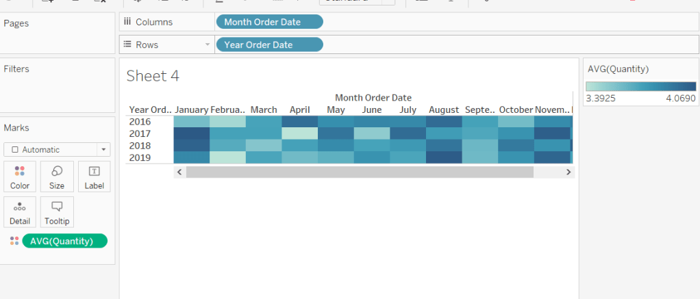
For the basic chart, simply add All Run Metres to Columns and Passes to Rows, then add Game ID and Name to the Detail shelf.

We need to identify which player and game is selected when a user clicks, so we need parameters to capture these.
pSelectedGameID
integer parameter defaulted to 0

pSelectedPlayer
string parameter defaulted to nothing/empty string/ ”

Show these parameters on the canvas, and then manually enter Brandon Smith and 21.
We now need calculated fields to reference the parameter values
Is Selected Player
[Name] = [pSelectedPlayer]
Is Selected Game
[Game ID] = [pSelectedGameID]
Both return a boolean True / False value, and we can then determine which combination of player/game each mark represents, which we need in order to colour the marks.
Colour : Scatter
IF [Is Selected Game] AND [Is Selected Player] THEN ‘Both’
ELSEIF [Is Selected Player] THEN ‘Player’
ELSEIF [Is Selected Game] THEN ‘Game’
ELSE ‘Neither’
END
Add this field to the Colour shelf, change the mark type to Circle and adjust the colours accordingly. Manually sort the order of the values so that the light grey ‘Neither’ option is listed last (which means it will always be underneath any other mark).

While not stated in the requirements, the marks for the selected player are larger than the others, so add Is Selected Player to the Size shelf, and adjust the size range to suit.

Adjust the tooltip and name the sheet Scatter.
Building the Bar Chart
On a new sheet, add Player Image and Game ID to Rows and All Run Metres and Passes to Columns. Add Is Selected Player to Filter and set to True. Edit the title of the sheet so it references the pSelectedPlayer parameter, and align centre.

Set the Player Image field to use the actual image of the player stored at the URL, by clicking on the ABC datatype icon to the left of the field in the data pane, and selecting Image Role -> URL

This will change the data type icon and update the view to show the actual player image

Add Is Selected Game to the Colour shelf on the All marks card and adjust accordingly. Remove the tooltips.
We need to show the axis titles at the top, rather than bottom. To do this add another instance of the All Run Metres field to the right of the existing one. Make dual axis and synchronise axis. Repeat with the Passes field by adding another instance to the right of the existing one and making dual axis again.

Set the mark type on the All marks card back to bar.
Right click on the All Run Metres bottom axis, remove the title, and set the tick marks to none. Repeat for the Passes bottom axis.
Right click on the All Run Metres top axis, and just set the tick marks to none. Again repeat for the Passes top axis.
Adjust the font of both axis title (right click axis -> format; I just set to Tableau Book) and then manually decrease the height of the axis.
Finally click the Label button on the All marks card and check the Show mark labels check box.
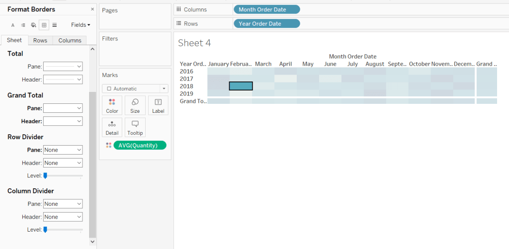
Then remove all column and row divider lines.

Adding the interactivity
On a dashboard, add a Vertical Layout Container, then add the bar chart into it and then add the scatter plot underneath. Remove the container that contains all the legends and parameters – we don’t need to show any of these. Hide the title of the scatter plot.
Add a dashboard parameter action to set the pSelectedPlayer parameter on select of a circle on the scatter plot. Set this parameter to pass the Name field into the parameter, and when clearing the selection, set the value to empty string/ nothing / ”
Select Player

Add another similar dashboard parameter action, which sets the pSelectedGame parameter in a similar way. This time, the Game ID field is passed into the parameter which is then set to 0 when the selection is cleared.
Select Game

If you test clicking on the scatter plot, you should now see the bar chart data disappear (although some white space about the height of the title remains) and you’ll also see that the circle selected is ‘highlighted’ compared to all the others.
To resolve the highlighting issue, navigate back to the scatter plot sheet, create a new calculated field called Dummy which just contains the string ‘Dummy’. Add this field to the Detail shelf.
Navigate back to the dashboard, and add a dashboard highlight action, that on select on the scatter plot, targets the same sheet on the same dashboard, but only focus on the Dummy field.
Deselect Marks

To make the whole section where the player bar chart is displayed, completely collapse, we need another parameter
pShowPlayerDetail
boolean parameter defaulted to false

We also need a boolean calculated field called
Show Player Detail
TRUE
Add this to the Detail shelf of the Scatter plot sheet.
Then navigate back to the dashboard, and create another parameter dashboard action, which on select of a circle on the scatter plot, sets the pShowPlayerDetail parameter based on the value from the Show Player Detail field. When the selection is cleared, reset the parameter to False.
Show Player Detail

Finally select the bar chart on the dashboard, then click the Layout tab on the left and side, and tick the Control visibility using value check box, and in the drop down select Parameters – > pShowPlayerDetail.
Now when a circle is clicked on, the bar chart section will completely disappear and the scatter plot will fill up the whole space.
Finalise the dashboard by adding the title and legend. My published viz is here.
Happy vizzin’!
Donna