
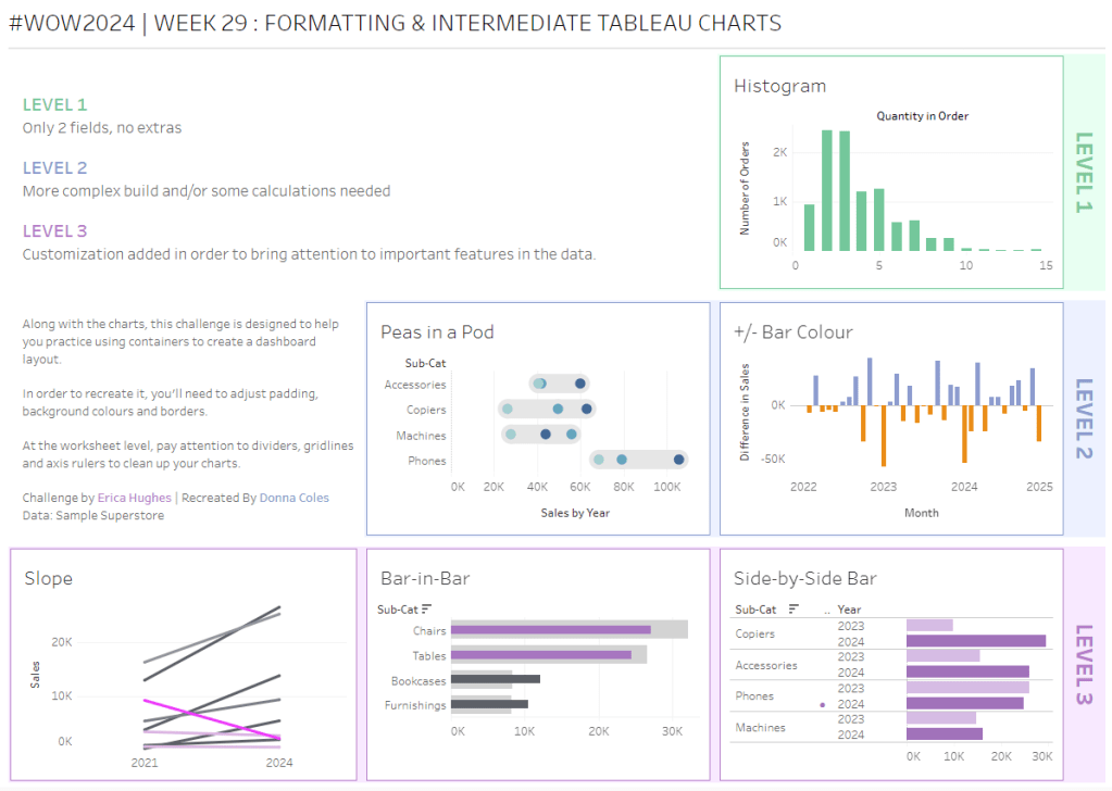
This week’s #WOW2025 challenge was set live as part of TC25. Unfortunately, this year I couldn’t be there in person to meet everyone, which for the last 3 years has been my conference highlight 😦
Anyway, Kyle set the challenge, and conscious of time, provided a starting workbook, so the focus could be on the container and DZV functionality. For those who nailed this, he added some additional interactivity with dashboard actions.
So the first thing is to download the starter workbook from the challenge page.
I’m going to attempt to build this in the order of Kyle’s requirements.
Layout out the dashboard
So the requirement states that no floating objects are allowed. Typically when I build a dashboard for business purposes or where the layout is a little complicated, I always start by adding a floating container sized to the exact dashboard size and positioned 0,0. I then add tiled objects into it. Doing this means I don’t end up with Tiled container objects on my dashboard (or if any get added when legends/filters get automatically added, I just move any items I want to retain and then delete the Tiled container).
However, as Kyle says ‘no floating’, I will build adding to the ‘default’ dashboard which means there will be containers on there I don’t really want.
Now blogging about containers is usually very tricky as it’s hard to explain where things need to go. So I’ll be supplementing this with a lot of screen shots – fingers crossed following along works out ok!
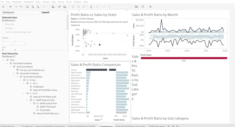
To start, create a dashboard sheet and resize to 1200 x 900 as required. Observe the item hierarchy section of the Layout pane as this is where you’ll see all the containers and objects as we add them to the dashboard.
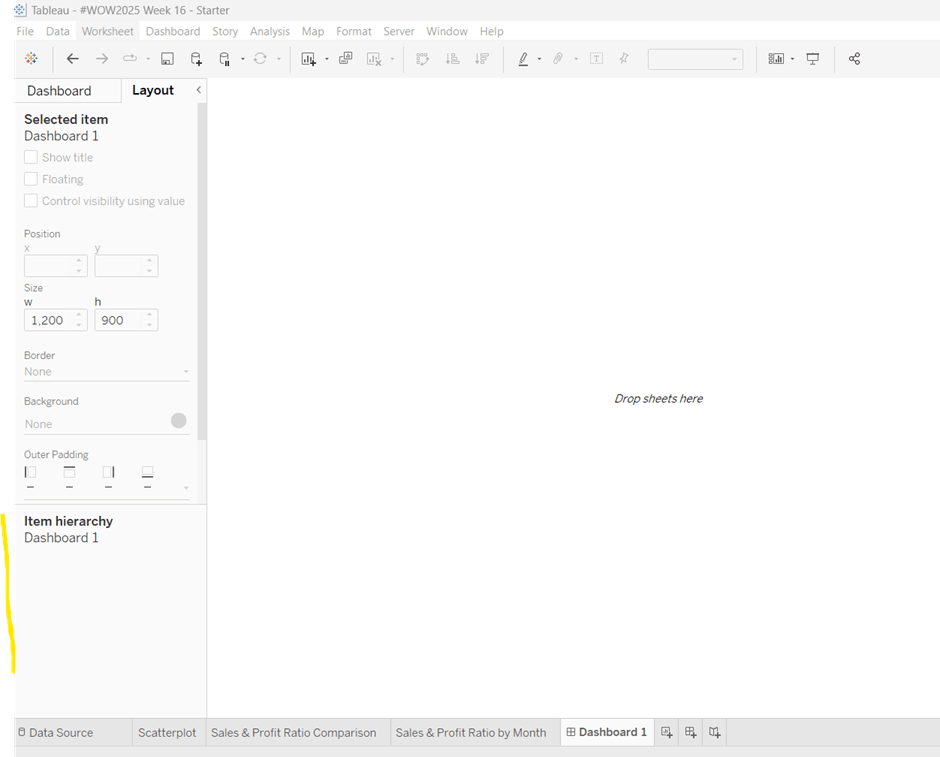
The main structure of the display is split into 2 columns, so start by adding a horizontal layout container to the dashboard. Once added, add 2 blank objects side by side to give the basic layout. Adding blank objects helps when positioning the required objects and is recommended when dealing with layout containers, especially if you’re new to them. They will ultimately be deleted as we go. Rename the horizontal container H – 2 cols or similar (right click on the container in the item hierarchy > rename).
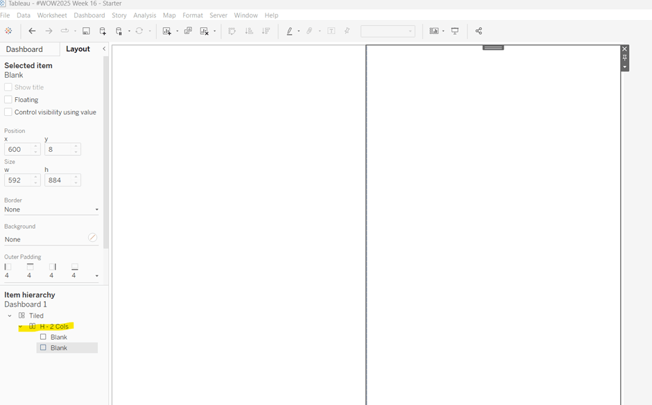
Notice how a Tiled container has now also appeared on the dashboard, even though we only added a horizontal container.
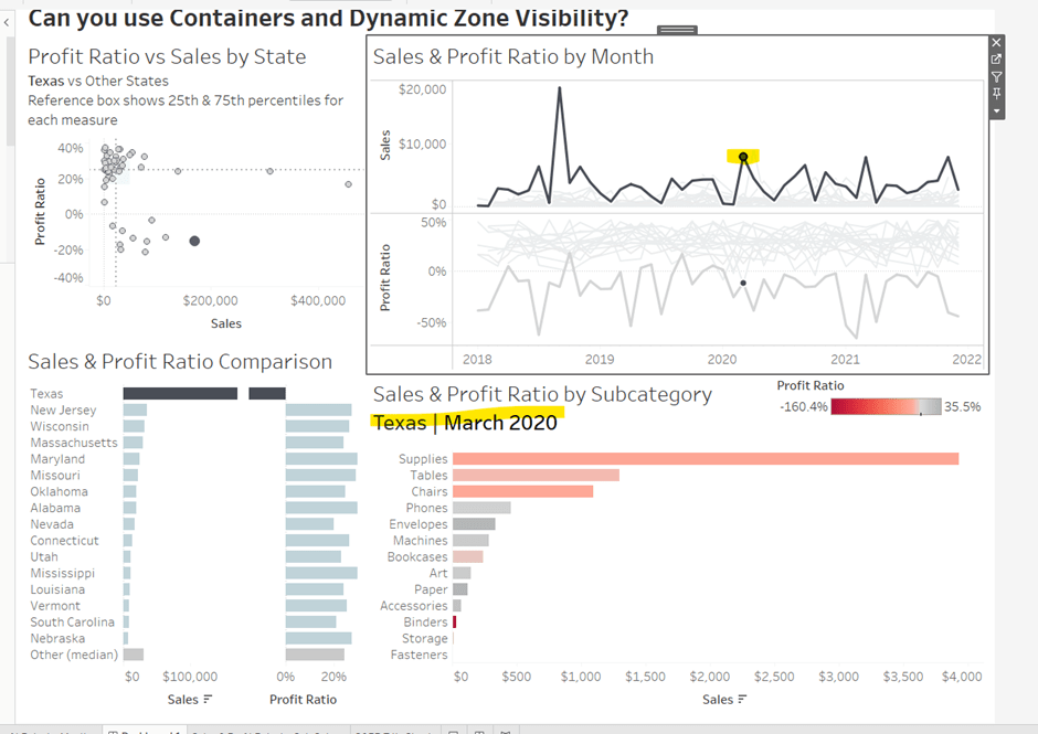
The first column of the dashboard contains 2 charts – the Scatterplot and the Sales & Profit Ratio Comparison sheets – stacked on top of each other. For this, add a vertical layout container between the two blank objects. Rename this V – Col 1.
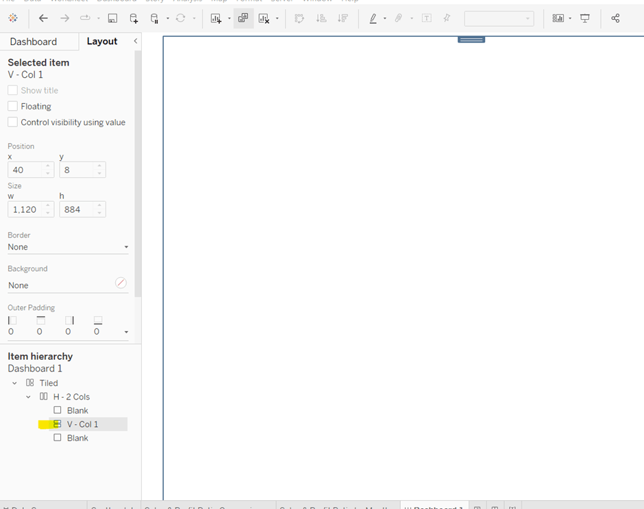
Add the Scatterplot sheet into the vertical container and then add Sales & Profit Comparison underneath it.
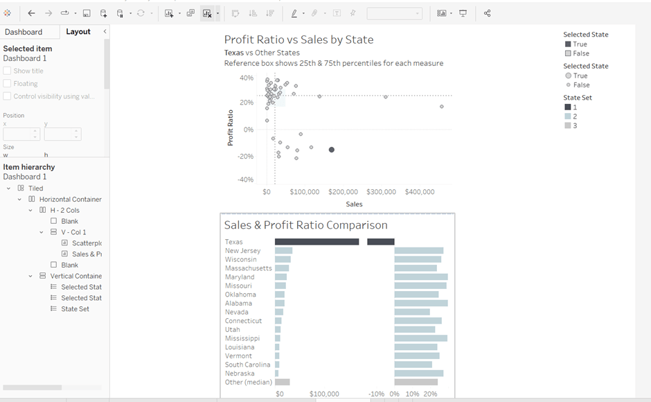
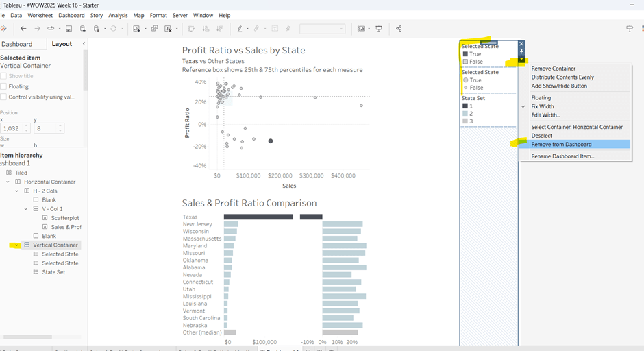
The various legends associated with these 2 sheets, automatically get added into their own vertical container on the right hand side. These aren’t required, so from the item hierarchy, select the Vertical container and then Remove from dashboard.
The right hand column of the display will show the Sales & Profit Ratio by Month sheet and another (hidden) chart that needs to be built.
Add another vertical container between the V – Col 1 container and the right hand blank object. Name this V – Col 2, and add the Sales & Profit Ratio by Month sheet and then another blank object underneath it. Once again remove the right hand vertical container that is automatically added with all the legends/filters.
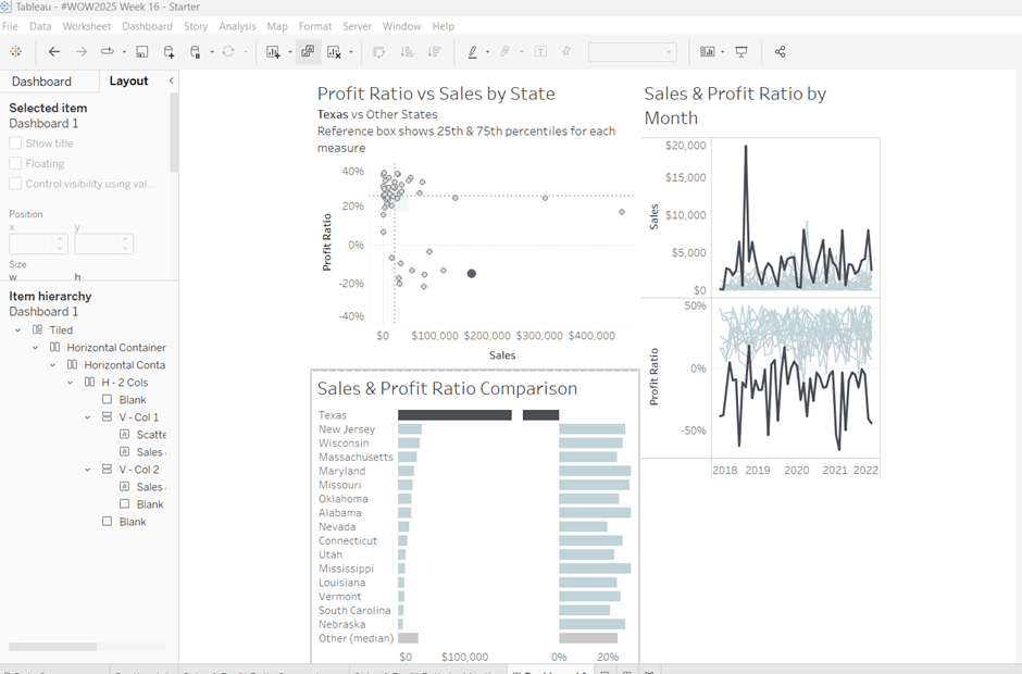
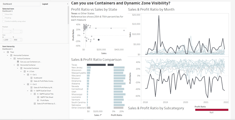
Now we have the ‘core’ layout, the 2 blank objects we added to the horizontal container, H – 2 Cols, right at the start, can be removed, so hopefully you should have a layout organised as below.
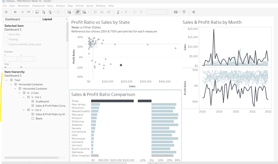
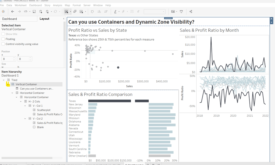
Now add the dashboard title (Dashboard menu > Show Title, and then update the text). This will automatically add a vertical layout container around all the existing contents.
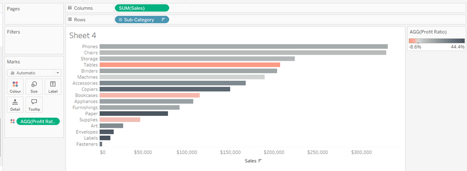
Building the Sales & Profit Ratio by Sub-Category bar chart
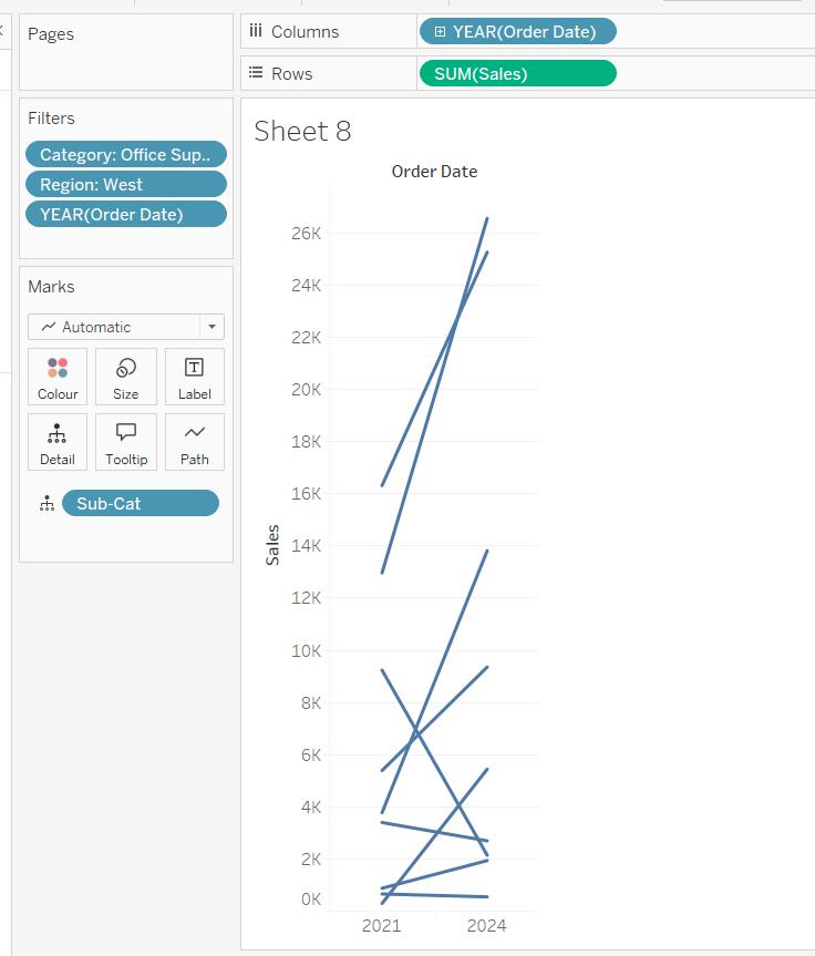
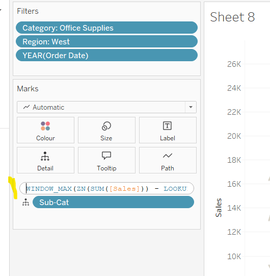
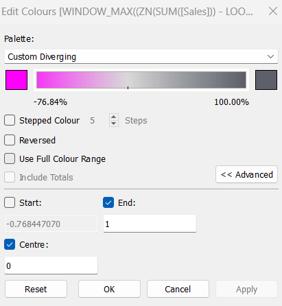
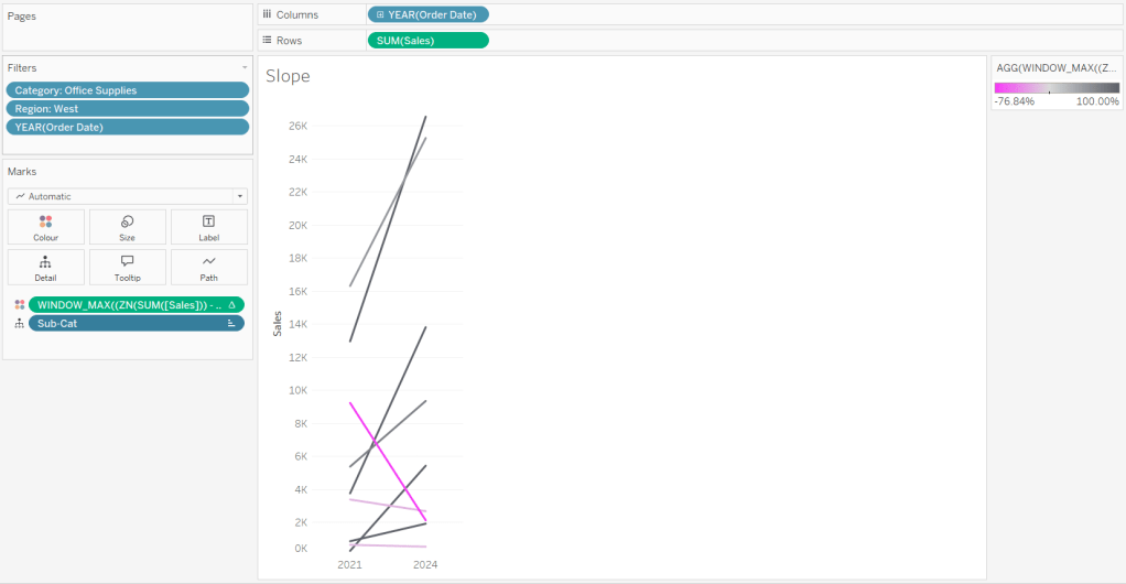
On a new sheet, add Sub-Category to Rows and Sales to Columns. Add Profit Ratio to Colour and adjust the colour legend to use the Red-Black Diverging colour palette. Hide the Sub-Category row label heading (right click > hide field labels for rows).
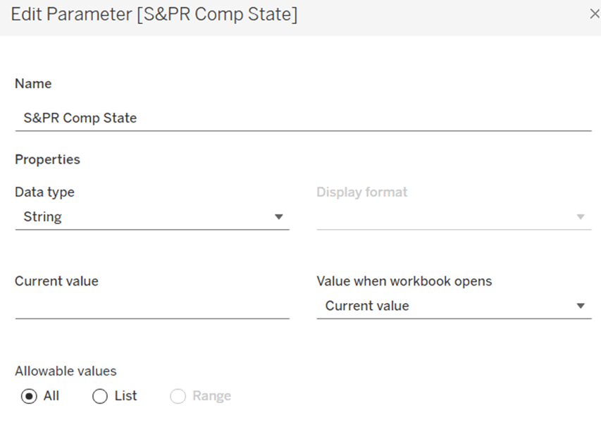
The bar chart needs to be filtered when a State in the Sales & Profit Ratio Comparison chart is clicked on, or when a Date is selected in the Sales & Profit Ratio by Month chart. However, I noticed when clicking around, that when clicking the Sales & Profit Ratio by Month chart, it filtered the above bar chart by both the State and Date. So based on this, create 3 parameters.
S&PR Comp State
String parameter defaulted to empty string
S&PR by Month State
String parameter defaulted to empty string
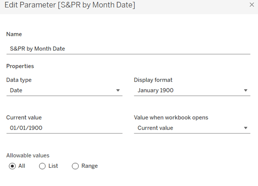
S&PR by Month Date
Date parameter defaulted to 01 Jan 1900 (essentially a null date)
Show these parameters on the sheet.
We want to filter the chart if the S&PR Comp State has a value and the S&PR by Month Date is the ‘null’ date (which means we’ve interacted with the Sales & Profit Ratio Comparison chart), or if the S&PR Monthly State has a value AND the S&PR by Month Date has a value (which means we’ve interacted with the Sales & Profit Ratio by Month chart). So create
Filter – S&PR by SubCat
([State Name] = [S&PR Comp State] AND ([S&PR by Month Date]=#1900-01-01#))
OR
(([State Name] = [S&PR by Month State]) AND (DATETRUNC(‘month’, [Order Date]) = DATETRUNC(‘month’, [S&PR by Month Date])))
Enter a State name into the S&PR Comp State parameter (eg New Jersey), then add the Filter – S&PR by SubCat field to the Filter shelf and set to True. The chart should change.
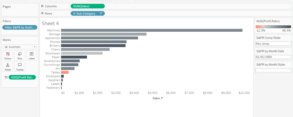
Verify the functionality by adding a state and date into the other parameters eg 01 March 2021 and Texas
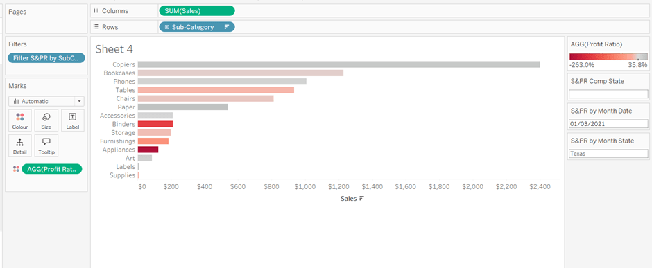
Empty the state parameters and set the date back to 01 Jan 1900. Name the sheet Sales & Profit Ratio by SubCat. The chart contents will disappear.
Creating a dynamic title sheet
Originally I hoped to do this without using another sheet and just using the title of the bar chart, but I need the date to show nothing rather than Jan 1900 depending on the user interactivity, so a new sheet is required.
But for it, we need some additional calculated fields.
State for Title
IIF([S&PR by Month State]<>”,[S&PR by Month State], [S&PR Comp State])
We only want to show the name of the state once, and both parameters may have it set.
Date for Title
IF [S&PR by Month Date]=#1900-01-01# THEN ” ELSE DATENAME(‘month’,[S&PR by Month Date]) + ‘ ‘ + STR(YEAR([S&PR by Month Date])) END
Line
IF [S&PR by Month Date]<>#1900-01-01# THEN ‘|’ ELSE ” END
Add all 3 fields to the Detail shelf of a new sheet. Change the mark type to polygon. Update the sheet title as below
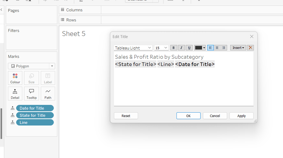
Name the sheet S&PR Title Sheet or similar
Adding the bar chart, title & legend to the dashboard
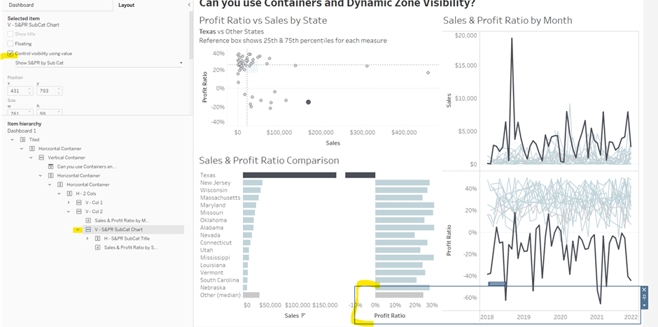
All 3 of these objects – the bar chart, the title sheet and the profit ratio legend need to show or hide based on interactivity. To do this in one step, we can encapsulate the 3 objects within containers within another ‘parent’ container and control the visibility on the ‘parent’ container.
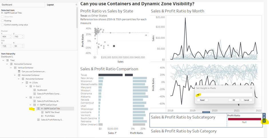
Add a vertical container between the Sales & Profit Ratio by Month chart and the blank object. Name this V – S&PR SubCat Chart
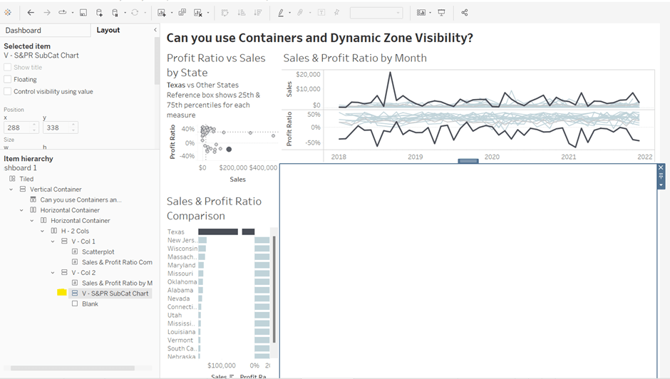
Add the Sales & Profit Ratio by SubCat sheet into this. Then add another horizontal container and place it above the Sales & Profit Ratio by Sub Cat chart (making sure it’s within the V – S&PR Sub Cat Chart container. Rename this H – S&PR Sub Cat Title.
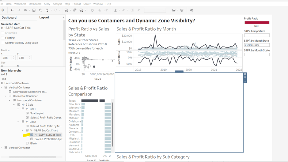
Add the S&PR by Title sheet into this horizontal container, and then click on the Profit Ratio legend on the right hand side and move this object to sit to the right of the title sheet. Then click on the right hand column containing all the remaining legends, and delete this container from the dashboard. Then remove the blank object that’s sitting beneath the Sales & Profit Ratio by SubCat sheet. You should have something like below…
Adjust the width of the S&PR Title sheet so its wider. Set the sheet to Fit Entire View. Then select the H – S&PR SubCat Title container and edit the height to be 90 px.
Hide the title of the Sales & Profit Ratio by SubCat sheet.
Hiding and showing the Sales & Proft Ratio by Sub Category section
Create a new calculated field
Show S&PR by Sub Cat
[S&PR by Month State]<>” OR [S&PR Comp State]<>”
On the dashboard, select the V – S&PR SubCat Chart container and on the Layout pane, check the Control visibility using value checkbox, and select the Show S&PR by Sub Cat field. Assuming all the parameters are set to their default values, then the whole section should disappear, although the container will still be selected.
To make the section show, we need to set the parameters using dashboard parameter actions.
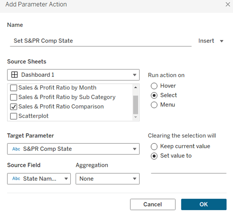
Set S&PR Comp State
On select of the Sales & Profit Ratio Comparison sheet, set the S&PR Comp State parameter passing in the value of the State Name field. When the selection is cleared, set the value back to <emptysrting>
Click on a row in the Sales & Profit Ratio Comparison bar chart, and the Sales & Profit Ratio by SubCat chart should display, filtered to that State, with the selected state name in the title.
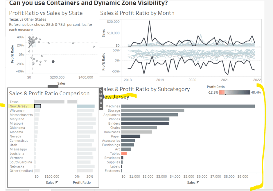
Click the state again, and the chart disappears.
Create 2 further dashboard parameter actions
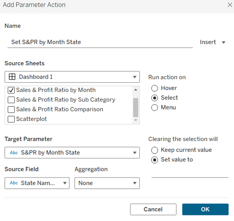
Set S&PR by Month State
On select of the Sales & Profit Ratio by Month sheet, set the S&PR by Month State parameter, passing in the value from the State Name field. When the selection is cleared, set it back to <emptystring>
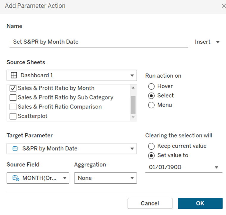
Set S&PR by Month Date
On select of the Sales & Profit Ratio by Month sheet, set the S&PR by Month Date parameter, passing in the value from the Month([Order Date]) field. When the selection is cleared, set it back to 01/01/1900
Now click on a point in the line chart, and the Sales & Profit Ratio by SubCat chart should display filtered to the relevant state and month
Adding the Additional Interactivity
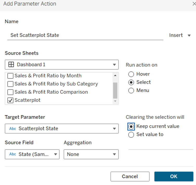
When the Scatterplot is clicked, the State in the existing Scatterplot State parameter should be updated. Create a dashboard parameter action
Set Scatterplot State
On select of the Scatterplot sheet, set the Scatterplot State parameter, passing in the value from the State field. When the selection is cleared, retain the value
If you click around the scatterplot, the Sales & Profit Ratio by Month line chart and Sales & Profit Ratio Comparison charts should update.
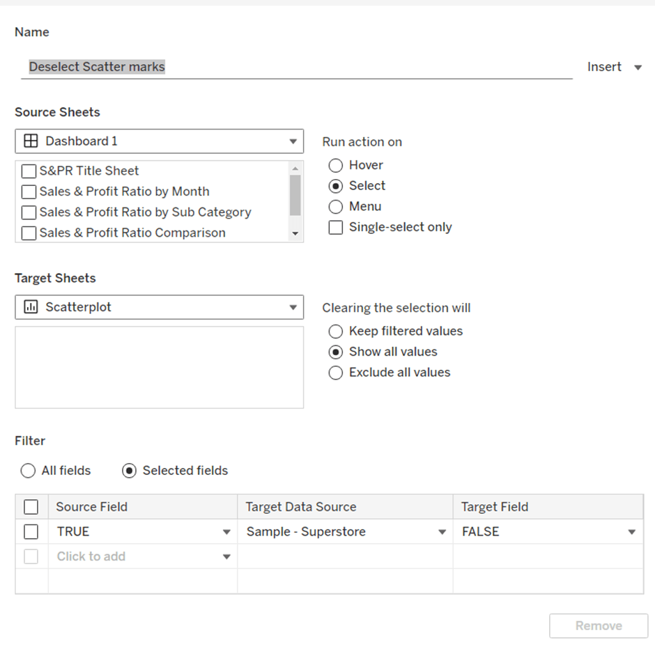
But we don’t want the other marks on the scatter plot to ‘fade’. To solve this, create a dashboard filter action.
Deselect Scatter marks
On select of the Scatterplot sheet on the dashboard, target the Scatterplot sheet directly, setting the fields TRUE = FALSE. On clearing the selection, show all values.
Finally, the last requirement is to highlight the line in the Sales & Profit Ratio by Month chart associated to the State selected in the Sales & Profit Ratio Comparison chart. For this first create a dashboard set action to capture the selected state
Add State to Set
On select of the Sales & Profit Ratio Comparison sheet, target the State Name Set. Check the single-select only checkbox. Running the action should Assign value to set and clearing the selection should remove all values from set

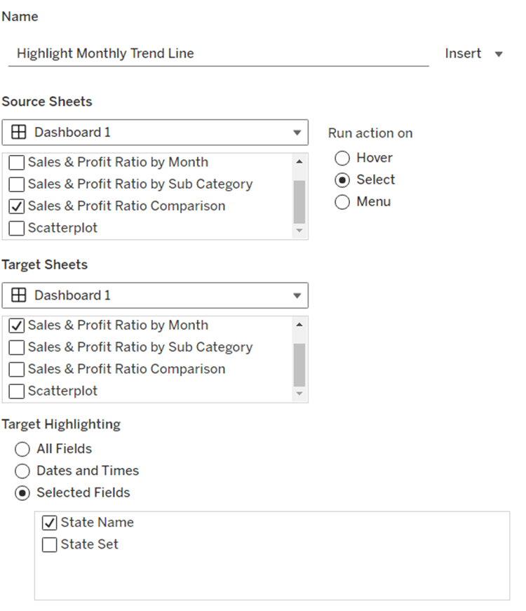
Then add a dashboard highlight action
Highlight Monthly Trend Chart
On select of the Sales & Profit Ration Comparison sheet, target the Sales & Profit Ratio by Month sheet targeting the State Name field only
And hopefully, with all this, you should have a fully interactive dashboard. My published viz is here.
Happy vizzin!
Donna


 Donna + DataViz