Yusuke set this interesting challenge : to combine a ‘bump’/’slope’ chart visualising the change in rank whilst also visually displaying the Sales value for the relevant Sub-Category in the ranked position.
Defining the calculations
This challenge will involve table calculations, so I’m going to start by building out the various calculations that will be required and displaying in a tabular view.
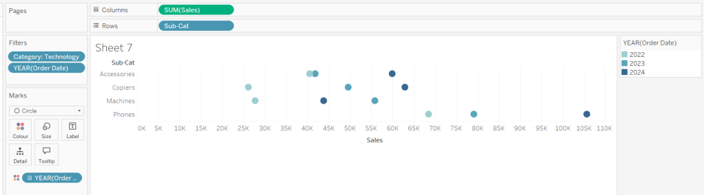
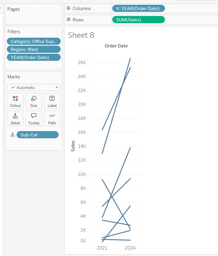
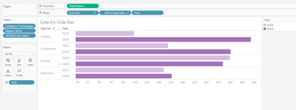
Add Category to Filter and select Office Supplies. Then add Sub-Category and Order Date at the Year level as a discrete (blue) pill to Rows. Add Sales to Text.

Create a new field
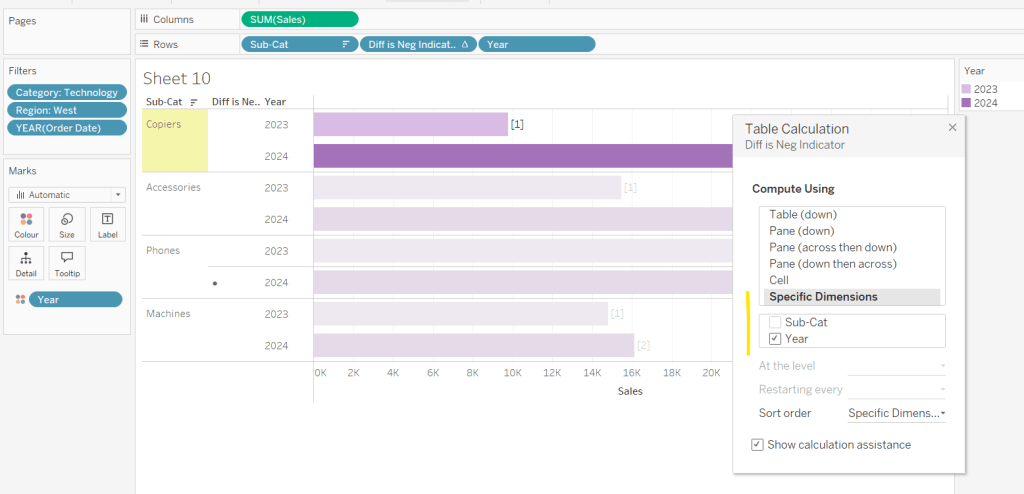
Sales Rank
RANK(SUM([Sales]))
And add to the table, and verify the table calculation is set to compute by Sub-Category only.

We will need to ‘colour’ the viz based on the rank compared to the previous year. For this create
Is Min Year
{MIN(YEAR([Order Date]))} = YEAR([Order Date])
which will return true for the first year in the data (in this instance 2022) and then create
Colour
IF [Sales Rank] = LOOKUP([Sales Rank],-1) OR ATTR([Is Min Year]) THEN ‘Same as last year’
ELSE ‘Different from last year’
END
If the rank is the same as the previous one, or it’s the first year, then treat as the same, otherwise treat as different.
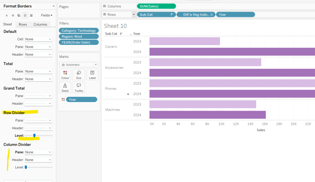
Add the Colour field to the table, and this time make sure the table calculation for Colour is computing by Year of Order Date only (while the nested calc for Sales Rank should still be computed by Sub-Category only)

The labels on the viz only want to show in certain scenarios – if it’s the first record (ie for 2022) or there has been a change in rank. We need
Label : Rank & Sub Cat
IF ATTR([Is Min Year]) OR [Colour] = ‘Different from last year’ THEN STR([Sales Rank]) + ‘ | ‘ + MIN([Sub-Category]) END
and
Label : Sales
IF ATTR([Is Min Year]) OR [Colour] = ‘Different from last year’ THEN SUM([Sales]) END
format this to $ with 0dp
Add these to the sheet, and double check the nested table calculations on each pill are computing as required (Sales Rank by Sub-Category only, Colour by Year Order Date only)

Now we have all this, we can start building
Creating the Viz
On a new sheet, add Category to Filter and select Office Supplies. The add Order Date to Columns, but set to be continuous (green) pill at the Year level. Add Sub-Category to Detail and add Sales Rank to Rows as a discrete (blue) pill. Verify the table calculation setting against the Sales Rank pill is by Sub-Category only.

Change the mark type to line and then add Order Date to Path. By default it should be at the Year level as a discrete pill.

This is the ‘bump’ chart.
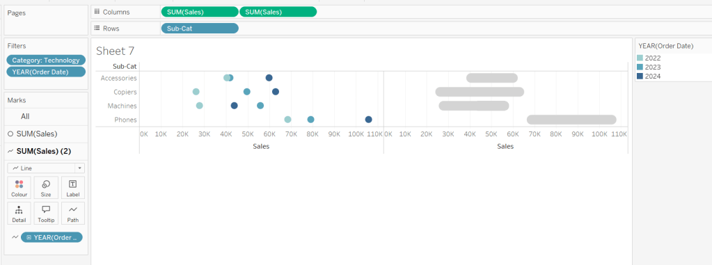
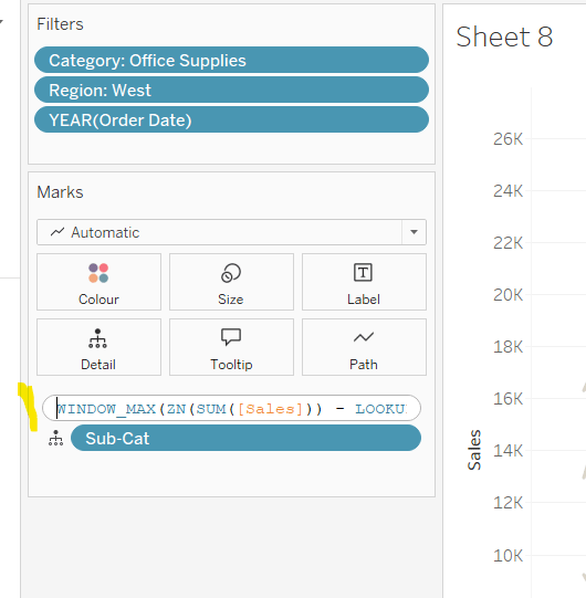
Now add another instance of Order Date to Columns as a continuous pill at the Year level to essentially duplicate the display. On the 2nd marks card, change the mark type to Gantt

This gives us the ‘starting point’ for each ‘bar’. But we need to determine the size for each bar. First we’re going to ‘normalise’ the sales values for all the sales being displayed so we get a value between 0 and 1, where 0 is the smallest sale, and 1 is the largest.
Normalised Sales
((SUM([Sales]) – WINDOW_MIN(SUM([Sales]))) / (WINDOW_MAX(SUM([Sales])) – WINDOW_MIN(SUM([Sales]))))
To see what this is doing, format the field to 2dp, then add the field to the tabular view, and ensure the table calculation is computing by both Sub-Category and Year Order Date.

But the ‘axis’ we want to plot the bar length against is in years, so we need to adjust this size to be a proportion of a year (ie 365 days)
Gantt Size
//proportion of a year
[Normalised Sales] * 365
Add this to the Size shelf on the 2nd marks card on the viz. Adjust the table calc setting so it is computing by all the fields listed.

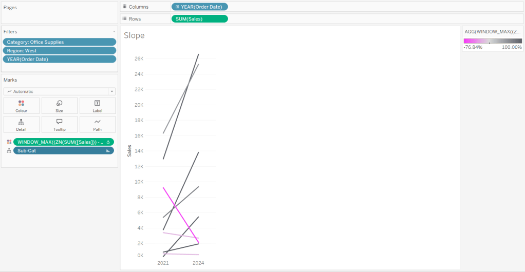
We now have the core concept so now we can start finalising the display.
Make the chart dual axis and synchronise the axis.

Set the view to fit height.
On the 1st marks card (that represents the line)
- change the line style to dotted (via the Path shelf)
- reduce the Size to suit
- change the colour to pale grey
- Add Label : Sales and Label : Rank & Sub Cat to the Label shelf.
- Adjust the table calc settings of each so the nested table calcs in each have Sales Ranks by Sub Category only and Colour by both the Year Order Date fields only.
- Adjust the layout of the text as required
- Align the font to be top right
- Change the font style (bold & black)
- Ensure the Label is set to ‘allow labels to overlap marks’
- Remove the Tooltip

On the 2nd marks card, the gantt bar
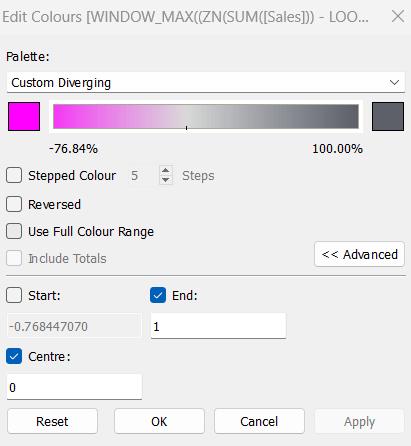
- Add Colour to the Colour shelf and adjust the colours accordingly.
- Verify the table calc settings are as expected
- I chose to reduce the opacity slightly, so I could see the dotted line underneath (set to 70%)
- Add Sales to Tooltip (format to $ with 0 dp) and the adjust Tooltip as required

Then we just ned to finalise the formatting/display
- Set the font of the years and rank numbers to black & bold.
- hide the Sales Rank label heading (right click > hide field labels for rows)
- remove row & column dividers
- Add black column gridlines (I set to the 2nd thickness level), and remove any row gridlines
- Edit the top axis to have a fixed start (use default option) and end at 31/12/2025 so the 2026 label and line disappears.
- Remove the title from the top axis.
- Edit the bottom axis – remove the tile, and then set the tick marks to None, so the bottom axis now looks empty.

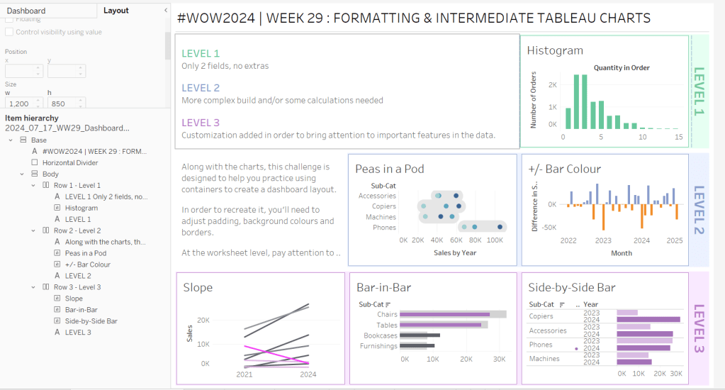
And that should be it. Now add the sheet to a dashboard and display the category filter as a single select, customising the remove the ‘all’ option.
My published viz is here
Happy vizzin’!
Donna