My inspiration for this week’s #WOW challenge came from Sarah Palette’s post on X from last year, and has been something I’d been meaning to try for ages, so figured a #WOW challenge was the perfect opportunity. Sarah has her own blog post which contains the core ‘trick’ to nailing the display, but as usual I’m going to walk you through step by step 🙂
After connecting to the data, start by adding Sub-Category to Rows, Sales to Columns, Category to Colour and sort by Sales descending. Adjust the colours to suit.
Format Sales to be $ to 0 dp, and add to Label. Apply a quick table calculation of Percentage of total to the Sales pill, and then format the pill to be % to 1 dp. Add another instance of Sales to Label. Adjust the layout and format the label to 8pt bold and match mark colour. Reduce the Size of the mark.
Double click into the Columns shelf, and manually type MIN(0). Then drag the MIN(0) pill from Columns and drop it on the Sales axis when the green ‘2-column’ icon appears. This automatically adds Measure Names and Measure Values into the view. Re-order the pills in the Measure Values section. This display now has 2 measures sharing a single axis.
Change the mark type to Line and line type to stepped (via the Path pill). Adjust the Label so it is labelling line ends and start of line only. Align label top right. Adjust the size of the line as required.
Click on the MIN(0) pill in the Measure Values section, and while holding down Ctrl drag the pill to Columns to create a copy of the same measure. This is important as typing in another instance of MIN(0) will create another separate measure, and we need it to be the same one.
This will create another marks card (MIN(0)). Remove the Sales pills from the Label shelf, and add Sub-Category instead. Align the label middle right, and add a couple of spaces before the Sub-Category text. Set the chart to be dual axis, synchronise the axis and then remove Measure Names from the All marks card. Adjust the width of each row to push the Sub-Category label into the corner of the L.
To give the labels at the end of the bar some ‘breathing room’, create a field
Max Sales + 10%
WINDOW_MAX(SUM([Sales])) * 1.1
Add this to the Detail shelf on the All marks card. Adjust the table calculation so it is computing by both Category and Sub-Category. Then right click on the bottom axis and Add Reference Line that uses the average of the Max Sales + 10% field for the Entire Table. Don’t display and lines/labels/tooltip
Finally tidy up by
Hiding both axis (right click -> uncheck show header)
Hiding both the Sub Category and Measure Names headers (right click, uncheck show header)
Remove all gridlines, zero lines, row & column dividers
Adjust Tooltip as required
Add a title colouring the text of the words to match the colours used in the legend.
It was Yoshi’s turn to set the challenge this week. The requirement was to build a waterfall chart, and I have to confess I did end up having to have a sneak peak at Yoshi’s solution to point me in the right direction.
I tend to always be looking for generic solutions, and in this case trying to make use of Measure Names / Measure Values, but struggled to do this. When I peaked at the solution, I found there was an element of ‘hardcoding’ being applied for the specific layout. Armed with that knowledge, I was then able to build a solution which ended up differing from Yoshi’s, but (looks to) produces the same outcome.
Defining the reporting period
The viz is driven by a Base Date input control that allows the user to select a date. Based on the date selected, the viz then displays information for the whole of the previous month, and compares that to the same month in the previous year. This means if the user selects any date from 01 Aug 2025 to 31 Aug 2025, the viz shows the information related to the whole of July 2025 and compares it to July 2024.
We will use a parameter to capture the date inputted by the user, but rather than ‘hardcode’ the data to use, I’m going to set it based on a field in the data set that I’ll create
Date Default
IIF(YEAR(TODAY())>2025, #2026-01-01#, TODAY())
The data set we’re using goes up to 31 Dec 2025. To ensure the viz still shows data if it’s accessed in 2026 or beyond, I’m going to set the date to 01 Jan 2026 if we’re looking at the viz in 2026 or later, otherwise I’ll default to whatever ‘today’ may be. This means that from 01 Jan 2026 onwards, the viz by default will always show the data for December 2025 compared to December 2024.
With this field, I can then create the parameter
pDate
Date parameter that references the Date Default field when the workbook is first opened
And with the date captured by the user, we can then determine the date of the previous month we’ll be reporting over
This truncates the pDate value to the 1st day of that month, then subtracts a month to return the 1st day of the previous month. Eg if pDate is 20 Aug 2025, it is first truncated to 1st Aug 2025, then 1 month is subtracted to return 1st July 2025.
We’ll then refer to this field when determining all the measures we need to build.
Calculating the measures
There are multiple measures we need to determine to build this viz – information for the previous month, the previous month last year and then the difference between the two. So what follows is just a list of all these 🙂
Sales – Last Month
IIF(DATETRUNC(‘month’, [Order Date]) = [Date – Last Month], [Sales], NULL)
format this to $ with 0 dp.
Sales – Last Month LY
IIF(DATETRUNC(‘month’, [Order Date]) = DATEADD(‘year’,-1,[Date – Last Month]), [Sales], NULL)
format this to $ with 0 dp.
Sales – Last Month YoY
(SUM([Sales – Last Month]) – SUM([Sales – Last Month LY])) / SUM([Sales – Last Month LY])
custom format this to a % with 0 dp with an explicit + or – prefix : +0.0%;-0.0%;0.0%
Profit – Last Month
IIF(DATETRUNC(‘month’, [Order Date]) = [Date – Last Month], [Profit], NULL)
format this to $ with 0 dp.
Profit – Last Month LY
IIF(DATETRUNC(‘month’, [Order Date]) = DATEADD(‘year’,-1,[Date – Last Month]), [Profit], NULL)
format this to $ with 0 dp.
Profit – Last Month YoY
(SUM([Profit – Last Month]) – SUM([Profit – Last Month LY])) / SUM([Profit – Last Month LY])
custom format this to a % with 0 dp with an explicit + or – prefix : +0.0%;-0.0%;0.0%
Profit Margin – Last Month
SUM([Profit – Last Month])/SUM([Sales – Last Month])
format to % with 1 dp
Profit Margin – Last Month LY
SUM([Profit – Last Month LY])/SUM([Sales – Last Month LY])
format to % with 1 dp
Profit Margin – Last Month YoY
[Profit Margin – Last Month] – [Profit Margin – Last Month LY]
custom format this to a % with 0 dp with an explicit + or – prefix : +0.0%;-0.0%;0.0%
SUM([Discount – Last Month]) – SUM([Discount – Last Month LY])
Cost
[Sales]-[Profit]
Cost – Last Month
IIF(DATETRUNC(‘month’, [Order Date]) = [Date – Last Month], [Cost], NULL)
Cost – Last Month LY
IIF(DATETRUNC(‘month’, [Order Date]) = DATEADD(‘year’,-1,[Date – Last Month]), [Cost], NULL)
Cost – Last Month YoY
SUM([Cost – Last Month]) – SUM([Cost – Last Month LY])
There are additional fields we’ll need, but we’ll define these at the point we need them, as it’ll make more sense.
Building the KPIs
On a new sheet, double click into the Columns shelf and manually type MIN(0) to create a ‘fake axis’. Repeat this 2 more times, so 3 instances of MIN(0) exist and 3 marks cards exist. These are the placeholders for each of the KPIs we need to display.
On the 1st MIN(0) marks card, add Profit-Last Month and Profit – Last Month YoY to Label. Widen the row so you can see the text and change the mark type explicitly to Text. Adjust the label wording, layout and formatting as required, but don’t adjust the font colour. Instead create a new field
Colour – Profit
[Profit – Last Month YoY]>=0
and add this to the Colour shelf and adjust accordingly. Note – you will only ever get a true or false displayed and never both. You will need to adjust the date parameter to find a time period when the value is the opposite in order to set the opposite colour value.
Hide the Tooltip.
Repeat the process, adding Sales – Last Month and Sales – Last Month YoY to the 2nd MIN(0) marks card. Create
Colour – Sales
[Sales – Last Month YoY]>=0
and add to the Colour shelf.
The add Profit Margin – Last Month and Profit Margin – Last Month YoY to the 3rd MIN(0) marks card. Create
Colour – Profit Margin
[Profit Margin – Last Month YoY]>=0
and add to the Colour shelf. Hide column & row dividers, and name the sheet KPIs or similar.
Building the Waterfall
As mentioned above, this Waterfall chart involves a bit more “hardcoding” and the ‘explicit placement’ of the various measures into the viz.
We are displaying 5 different measures, each one in a ‘specific column’. We’re going to make use of the Row ID field to define what measure is displayed where and how it will be formatted.
Add Row ID to the Dimensions pane (drag above the line in the data pane, so it is above Measure Names). On a new sheet, add Row ID to Filter and filter to rows 1-5 only. Then add Row ID to Columns. Create a new field
Header
CASE [Row ID] WHEN 1 THEN ‘Profit (LY)’ WHEN 2 THEN ‘List Price Sales YoY’ WHEN 3 THEN ‘Total Discount’ WHEN 4 THEN ‘Total Cost YoY’ WHEN 5 THEN ‘Profit (TY)’ END
add this to Columns. Set the sheet to Fit Width.
This gives the start of the structure. We now want to display the relevant measure in each column, but we need a single field to do this, and the values of the fields need to be cumulative based on the preceding values.
Display Value
CASE [Row ID] WHEN 1 THEN {FIXED: SUM([Profit – Last Month LY])} WHEN 2 THEN {FIXED:SUM([Profit – Last Month LY])} + {FIXED:([List Price – Last Month YoY])} WHEN 3 THEN {FIXED:SUM([Profit – Last Month LY])} + {FIXED:([List Price – Last Month YoY])} + (-1*{FIXED:[Discount – Last Month YoY]}) WHEN 4 THEN {FIXED:SUM([Profit – Last Month LY])} + {FIXED:([List Price – Last Month YoY])} + (-1*{FIXED:[Discount – Last Month YoY]}) – {FIXED: [Cost – Last Month YoY]} WHEN 5 THEN {FIXED: SUM([Profit – Last Month])} END
Here, we’re using a FIXED LoD calculation to ensure the measures we need are calculating across the whole data set and not segmented by the Row ID which we’re just using as an arbitrary placeholder.
Add this to Rows and change the mark type to gantt bar.
The size of the gantt bar is determined by the specific measures (rather than the cumulative values)
Size
(CASE [Row ID] WHEN 1 THEN {FIXED: SUM([Profit – Last Month LY])} WHEN 2 THEN {FIXED:([List Price – Last Month YoY])} WHEN 3 THEN (-1*{FIXED:[Discount – Last Month YoY]}) WHEN 4 THEN -1*{FIXED: [Cost – Last Month YoY]} WHEN 5 THEN {FIXED: SUM([Profit – Last Month])} END) -1
Add this to Size
To label the bars create
Label
ABS([Size])
format this to $ with 0 dp. Add to Label and align centrally.
For the colouring create
Colour
IF ([Row ID]) = 1 THEN ‘Light’ ELSEIF ([Row ID]) = 5 THEN ‘Dark’ ELSEIF -1 * [Size] > 0 THEN ‘Blue’ ELSE ‘Red’ END
and add to Colour and adjust accordingly. And then create
Label Indicator
IF [Row ID] = 2 AND [Colour]= ‘Blue’ THEN ‘+’ ELSEIF (([Row ID] =3) OR ([Row ID]) = 4) THEN IF [Colour]=’Blue’ THEN ‘-‘ ELSE ‘+’ END END
Add to Label and adjust the font and layout of the label text accordingly.
Tidy up the formatting by
Adjust font style of the Header label.
Hide the Row ID pill (uncheck show header)
Hide the ‘header’ label (right click > hide field labels for columns)
Hide the axis title
Adjust the font style of the axis
Hide all axis lines/zero line, row & column dividers
Adjust the Tooltip
Name the sheet Waterfall or similar
Add the two sheets onto a dashboard and arrange with the parameter as required.
Yusuke set the #WOW2025 challenge this week, asking us to build a chart that was drill downable and drill uppable 🙂
I had a fair idea of how this was going to play out, knowing it would involve parameter actions and built the main table fairly quickly. Then it came to the parameter actions, and defining the logic to get them set to the right values. This was very tricky, and I confess I couldn’t completely manage it. The behaviour just wasn’t doing what I wanted 😦
So I looked at Yusuke’s solution, and even after using the exact same logic, field naming and parameter actions (including the names of these), it still wouldn’t quite do what Yusuke’s did. At the point the bars are expanded down to Manufacturer, if a Category is selected, Yusuke’s solution collapses back to the Category > Sub-Category level. Mine expands down to Manufacturer for the Sub-Category listed first (see below).
I spent a considerable amount of time trying to get this to work. Ultimately, I believe it’s something to do with the order in which the parameter actions get applied. In Yusuke’s solution, there are 4 parameter actions firing on each ‘click’, but they only affect 2 parameters. So one change it being applied before the other. But figuring out the order is tricky. From what I understand, actions of the same type (ie all parameter actions as opposed to filter actions, or set actions say), are applied based on alphabetical order. But, as I say, I tried naming my actions exactly like Yusuke’s (even copying and pasting from his solution), and I still couldn’t get his behaviour, and with all 4 actions applied, the drill-down from Sub-Category to Manufacturer didn’t work at all. I couldn’t get my actions to be displayed in the same order as Yusuke’s solution either, even by removing them and then adding them in the order listed, when I closed the dialog and re-opened, the order changed. So, as a result of this, my solution only has 3 actions and doesn’t quite behave exactly like Yusuke’s…. maybe I missed a tiny detail.. who knows, or maybe it’s just Tableau and some quirk in how things get applied…
Anyway, now I’ve said all that, let’s get on to the solution I did manage 🙂
Building out the calculations
For a challenge like this, I’m going to build out all my calculations into tabular form, so I can get the display and sorting as required, especially since table calculations are involved.
We need to capture the selections made ‘on click’ into parameters
pSelectedCategory
string parameter, defaulted to Furniture
pSelectedSubCat
string parameter, defaulted to Bookcases
The Sub-Category and Manufacturer to display will be based on the values in these parameters
On a sheet, add Category, Display – Sub Cat, and Display – Manufacturer to Rows and show the two parameters
If you change the values in the parameters, you’ll see how the display changes.
We want to get the total sales for each ‘level of the hierarchy’, so we can the compute the % sales, and apply sorting. We’ll used Fixed Level of Detail calculations for this.
Format all these to $ with 0 dp, add into the table and note how the values are duplicated across each row, depending on what ‘level of the hierarchy’ we’re looking at
Adjust the sort on the Category pill, to sort by Sales per Category descending – this will move the Technology row to the top.
Sort the Display – Sub Cat pill to sort by Sales per Sub-Category descending and sort the Display – Manufacturer pill to sort by Sales per Manufacturer descending.
With these fields, we can calculate the % of sales
% Sales per Category
SUM([Sales per Category]) / SUM({FIXED:SUM([Sales])})
% Sales per Sub-Category
SUM([Sales per Sub-Category]) / SUM([Sales per Category])
% Sales per Manufacturer
SUM([Sales per Manufacturer]) / SUM([Sales per Sub-Category])
format all these to % with 1 dp and add into the table
For the final display, we don’t want values in every row. We need values displayed at the first row of every level of the hierarchy. I’m going to use the INDEX() tableau calculation to help with this.
Index – Category
INDEX()
Index – Sub-Category
INDEX()
Make both of these fields discrete (right click > convert to discrete).
Add Index – Category to Rows to the right of the Category pill. Adjust the table calculation on the pill so it is computing using Display – Sub Cat and Display – Manufacturer only. This should index the rows so that the numbering restarts when the Category changes.
Add Index – Sub-Category to Rows to the right of the Display – Sub Cat pill. Adjust the table calculation on the pill so it is computing using Display – Manufacturer only. This should index the rows so that the numbering restarts when the Sub–Category changes.
We can then use this information to determine which rows need to display the % Sales values.
Display – % Sales per Category
IIF([Index – Category] = 1, [% Sales per Category],NULL)
Display – % Sales per Sub-Category
IIF([Index – Sub-Category] = 1 AND MIN([Category]) = [pSelectedCategory], [% Sales per Sub-Category],NULL)
Display – % Sales per Manufacturer
IIF(MIN([Sub-Category]) = [pSelectedSubCat], [% Sales per Manufacturer],NULL)
format all these to % with 1 dp, and add to the table (sense check that the table calculations for each field have the settings we applied to the Index fields above.
These 3 fields, are the core fields we need to use in the viz.
Building the Viz
On a new sheet, add Category, Display – Sub Cat, Display – Manufacturer to Rows and apply the sorting on each pill described above, and how the parameters.
Add Display – % Sales per Category to Columns and apply the table calculation settings described above. Add Display – % Sales per Sub-Category to Columns too, and again apply the table calc settings. Then add Display – % Sales per Manufacturer to Columns. Change the mark type on each of the 3 marks cards, specifically to use bar.
Add Category to the Colour shelf on the All marks card, and adjust accordingly.
On the Display – % Sales per Category marks card, add Category and Display – % Sales per Category to Label. Adjust the table calc settings of the % field as required. Adjust the layout of the label. Add Sales per Category to Tooltip and update the tooltip to suit.
On the Display – % Sales per Sub-Category marks card, add Display – Sub Cat and Display – % Sales per Sub-Category to Label. Adjust the table calc settings of the % field as required. Adjust the layout of the label. Add Sales per Sub-Category to Tooltip and update the tooltip to suit.
On the Display – % Sales per Manufacturer marks card, add Display – Manufacturer and Display – % Sales per Manufacturer to Label. Adjust the layout of the label. Add Sales per Manufacturer to Tooltip and update the tooltip to suit.
You may need to widen each row to see the labels displayed.
The axis titles on the top of the chart adjust based on the selections made. To present this within the chart itself (rather than using carefully positioned text fields on a dashboard), we need to make the chart dual axis using ‘fake axes’.
Double click into the space in Columns to the right of the last pill, and manually type MIN(0). Drag this field to sit between Display – % Sales per Sub-Category and Display – % Sales per Manufacturer.
Remove all pills from the MIN(0) marks card. Change the mark type to Shape and select a transparent shape for this (refer to this article to set this up – you can also use any other type of mark but set to very small, and 0% opacity on the colour to make it “invisible”, though a mark could appear on hover, which is why I prefer to use transparent shapes).
Click on the MIN(0) pill and set it to be dual axis, so 2nd column now has a MIN(0) axis heading.
Right click on this top axis, to Edit the axis – Change the Title to reference the pSelectedCategory parameter and set the tTck Marks to None
Repeat the process, creating another instance of MIN(0) to the right of the Display – % Sales by Manufacturer, but this time the axis title should reference the pSelectedSubCat field.
Tidy up the display formatting by
Add row banding with Band Size = 1and Level = 0, so the whole of the Furniture block is coloured grey.
Remove column dividers
Remove gridlines and zero lines
Hide the 3 pills on the Rows (right click each pill and uncheck show header).
Hide the null indicator (right click > hide)
Edit the bottom 3 axis to remove the titles and hide the tick marks on all
Make the axis heading section narrower
Add a border around each of the bars, and make each bar narrower if required
Add some space to the start of each bar, by adjusting the bottom axis to be fixed from -0.1 to 1
Update the title of the sheet, and name the sheet.
Adding the interactivity
Add the sheet to a dashboard.
Firstly, we’re going to stop the bars from being ‘highlighted’ when clicked. we’ll use the True/False filter action technique described here. Create 2 calculated fields True = TRUE and False = FALSE and add to the Detail shelf on the All marks card of the viz. Add a dashboard filter action
Deselect Marks
On select of the the Viz sheet on the dashboard, target the Viz sheet directly, setting True = False.
Now we need to deal with the parameter values. As I discussed at the start of this blog, getting the calculations required and making the functionality work was pretty tricky, so I’m just going to document what I’ve ended up using, that seems to mostly work. Note the names of the parameter actions which both affect the pSelectedCategory param are pre-fixed with a number to force the order (I did test with them the other way round, and things broke).
Create fields
Category for Param_1
IF (([pSelectedCategory]<> [Category]) OR ([pSelectedCategory]=[Category] AND [pSelectedSubCat]=[Display – Sub Cat]) AND ISNULL([Display – Manufacturer])) THEN ‘ ! Please select a Category !’ ELSE [Category] END
Category for Param_2
[Category]
SubCat for Param
IF (([pSelectedCategory]<> [Category]) OR([pSelectedSubCat]=[Display – Sub Cat])) AND NOT(ISNULL([Display – Manufacturer])) THEN ‘ ! Please select a Sub-Category !’ ELSE [Display – Sub Cat] END
Then create 3 parameter actions
Set SubCategory
On select of the viz, set the pSelectedSubCat parameter passing in the value from the SubCat for Param field.
1. Set Category
On select of the viz, set the pSelectedCategory parameter passing in the value from the Category for Param_1 field.
2. Set Category
On select of the viz, set the pSelectedCategory parameter passing in the value from the Category for Param_2 field.
And fingers crossed, that should work, at least work the same as mine… my published viz is here. Note – when I uploaded to Tableau Public, the dynamic axes seemed to break, so I had to manually reset them on public…. or it may have broken before I published and didn’t realise.. the feature does seem to be a bit temperamental.
For this week’s challenge, Kyle looked to solve a problem that he’s seen discussed within another blog – how to solve a highlighting problem when filtering donut charts.
I’ve been away on a little holiday abroad for a family wedding, so am on catch up this week. So I’m going to make this as brief as I can as time is limited.
Building the donut charts
Use the steps described in this blog post I wrote for my company to build a donut chart using the dual axis method.
For the Category donut chart, you will need Category on Colour and Sales on Angle of the outer Pie Chart. For the inner circle, you will need to add Sales to Text. Adjust the text as required. Sales needs to be formatted to $ with 0 dp.
For the Sub-Category donut chart, you will need to add Category to Colour. Then add Sub-Category to Detail and click on the 3 dots to the left of the Sub-Category pill and change to also add to Colour.
To adjust the colours, edit the colour legend, select all the options within the same Category. Select a sequential colour palette that matches the core colour for the category, then select Assign Palette. The colours should change to a range of that colour.
Create a new field
# Products
COUNTD([Product ID])
and add this to the Angle shelf. Add Sales to the Tooltip shelf and adjust the tooltip.
For the inner circle, add #Products to Text. Adjust the text as required
Filtering the donut
Add the two sheets to a dashboard. Add a dashboard filter action
Filter Cat
On select of the Category donut, target the Sub-Category donut chart passing in all fields. Keep filtered values when selection cleared.
Stopping the Category donut from being highlighted
Create new fields
True
TRUE
False
FALSE
and add these to the Detail shelf on the All Marks card of the Category donut sheet.
Then create a dashboard filter action
Unhighlight
On select of the Category donut on the dashboard, target the Category donut sheet itself, passing in the fields Tue = False. Show all values when selection cleared.
Now when the Category donut is clicked on, the other segments won’t fade. However, the selection is still visible – the edges of the pie are displayed.
Stop showing the selected section of the pie
For this we employ a trick mentioned in the blog post referenced in the challenge. Create a new field
Dummy
‘Dummy’
and add this the Detail shelf of a new sheet. Change the mark type to polygon so nothing is visible.
Add this to the dashboard as a floating object – make it small and place somewhere inconspicuous
Whilst the selections will still be visible when testing on Desktop, once published to Tableau Public, the presence of the polygon forces the whole dashboard to be rendered server side rather than client side. This reduces the amount of interactivity, and consequently the pie chart segments don’t display when clicked.
Lorna set a table calculation filled challenge this week to recreate some KPI cards using an aggregated and amended version of the Superstore data set.
Lorna purposefully used a string Period field to define the timeframe to encourage the use of table calculations. No doubt, there are ways you could use string functions/regex to extract the relevant year and month number to come up with a different solution, but I’m going to head down the intended route.
And as with any table calculation based challenge, I find it best to always build out all the calculations I need into a tabular display to start with before building the viz. So let’s get started…
Building out the Calculations
We need to have a handle on more of the data than just that associated to the Period we’re interested in, so we can’t use a simple Quick Filter on the Period field to restrict the data, otherwise we can’t ‘access’ data for the previous period. So to manage which Period we want to focus on, I created a parameter
pSelectedPeriod
string field that uses a list where the values are added from the Period field. Default to P12 Y2022/23
On a new sheet, add Period to Rows and then add the Sales , Profit and Quantity measures to Text. Show the pSelectedPeriod parameter
What we’re going to do is get the values for each measure that is associated to the pSelectedPeriod, and display that value over every row.
Curr Sales
WINDOW_MAX(SUM(IF [Period] = [pSelectedPeriod] THEN [Sales] END))
If the Period matches that in the parameter, then get the Sales value and then use Window_MAX to ‘spread’ that value over every row
Add this to the table, and edit the table calculation to ensure the value is being computed by Period.
Repeat the same for Profit and Quantity
Curr Profit
WINDOW_MAX(SUM(IF [Period] = [pSelectedPeriod] THEN [Profit] END))
Curr Qty
WINDOW_MAX(SUM(IF [Period] = [pSelectedPeriod] THEN [Quantity] END))
If you change the parameter, you should see all the values in the last 3 columns changing to reflect the value from the first 3 columns of the relevant row.
Now we need to get the value from the previous period, ie the data from the previous row
Prev Sales
WINDOW_MAX(IF MIN([Period]) = [pSelectedPeriod] THEN LOOKUP(SUM([Sales]),-1) END)
The LOOKUP function is taking the Sales value from the previous 1 row (-1), and then WINDOW_MAX is once again ‘spreading’ this value across every row. We also need
Prev Profit
WINDOW_MAX(IF MIN([Period]) = [pSelectedPeriod] THEN LOOKUP(SUM([Profit]),-1) END)
Prev Qty
WINDOW_MAX(IF MIN([Period]) = [pSelectedPeriod] THEN LOOKUP(SUM([Quantity]),-1) END)
Add these to the table, and again adjust the table calc settings for every field to compute by Period.
Now we have the current and previous values for each measure, we can work out the % difference
Diff Sales %
([Curr Sales]-[Prev Sales])/[Prev Sales]
Format this to a % with 1 dp
Diff Profit %
([Curr Profit]-[Prev Profit])/[Prev Profit]
Diff Qty %
([Curr Qty]-[Prev Qty])/[Prev Qty]
Add all these onto the sheet, and remember the table calc settings (for these, there are nested table calcs, so make sure both are set properly).
We now need an arrow indicator to display up or down depending on the % value, and this needs to display as a different colour, so we need two fields per measure.
Add these to the sheet if you wish too (apply the table calc settings), but you’ll only get a value for one or the other field depending on whether the difference was +ve or -ve. Below I’ve just added the two Sales indicators
The Tooltip displays the value of the two Periods being compared. One of these is in the parameter, but we need to capture the other
Previous Period
WINDOW_MAX(IF [pSelectedPeriod] = MIN([Period]) THEN LOOKUP(MIN([Period]),-1) END)
So now we have all the values we need for the KPIs captured against every row in the dataset. So now we want to just show a single row. It could be the first, it could be the last… based on Lorna’s hint, let’s filter to just show the row related to the pSelectedPeriod value.
Filter Selected Period
[pSelectedPeriod] = LOOKUP(MIN([Period]),0)
Using the offset of 0 with the LOOKUP, returns the value for the row you’re on, so adding this to the FIlter shelf and selecting True, filters the display to the row where the Period matches the parameter. NOTE if you adjust the table calc settings of this field after adding to the filter shelf, you’ll need to reselect the option to filter to True.
As this is a table calculation, the ‘filter’ is applied later in the order of operations, so information about the other rows in the table can be referenced. Filtering just by Period as a quick filter, is essentially a dimension filter and that happens earlier on in the process, meaning the data about the other rows would be inaccessible.
So we have all the fields, now build the cards.
Building the KPI Cards
On a new sheet, double click into Columns and type in MIN(0). Repeat this 2 more times. This gives us 3 axis to build each of the 3 cards.
On the All marks card, add Period to the Detail shelf. Show the pSelectedPeriod parameter. Add the Filter Selected Period to the Filter shelf and set to true (adjusting the table calc and resetting the filter value as required).
Change the mark type of the All marks card to shape and select a transparent shape (see here for more details).
On the first MIN(0) marks card, add Curr Sales, Prev Sales, Diff Sales %, Diff Sales Indicator +ve and Diff Sales Indicator -ve to the Label shelf. Remember to apply the table calc settings for all of the fields!
Adjust the text within the label, so it is formatted and positioned as required and then align middle centre.
On the middle MIN(0) marks card, do similar by adding the equivalent profit fields onto the Label shelf, and then repeat again for the bottom MIN(0) marks card, adding the quantity fields to the Label shelf.
On the All marks card, add Previous Period, Curr Sales, Curr Profit, Curr Qty Prev Sales, Prev Profit, Prov Qty, Diff Sales %, Diff Profit % and Diff Qty % to the Tooltip shelf (remember to set those table calc settings!) Then adjust the Tooltip to display the text as required. I used the ruler to shift the starting position, along with tabs (the tab keyboard button) to ‘try’ to get everything to align, and it works for most circumstances….
Finally format the KPI card
Set the worksheet background colour to light grey
Remove all gridlines, zero line, axis lines
Set the column divider to be a thick white line
Set the row divider to be a thick white line
Hide the axis
Add the sheet onto a dashboard, and you should be done.
The requirement involved both the use of the Superstore data set and a custom Target data set, so these need to be combined. In the data pane, relate the two data sets together applying the fields below in the screen shots as the relationship fields (not you’ll need to create a relationship calculation to build the 3rd relationship.
Building the table
The table displays Category & Sub-Category along with a 3rd dimension which will differ depending on user selection. So we need to enable this choice.
pBreakdown
string parameter containing a list of options, defaulted to Ship Mode
Then create a calculated field to determine the actual field to show based on the parameter selection
Breakdown Dimension
CASE [pBreakdown] WHEN ‘Segment’ THEN [Segment] WHEN ‘Region’ THEN [Region] WHEN ‘Ship Mode’ THEN [Ship Mode] END
The user will also need to select a month. I chose to use a calculated field and parameter to drive this.
Month
DATE(DATETRUNC(‘month’, [Order Date]))
and this then feeds the parameter
pMonth
date parameter, formatted to custom date format of mmmm yyyy (to display September 2023). The list is populated when the workbook opens from the Month calculated field created above. Default date is 01 Sept 2023.
The report will need to be filtered based on the date selected in the parameter, so create
Filter Date
[Month] = [pMonth]
On a new sheet, add Category & Sub-Category (from the Orders data set) and Breakdown Dimension to Rows. Show the parameters. Add Filter Date to the Filter shelf and set to True.
Now, the table shows some conditional formatting, which is a clue that we’re not going to building this table in the basic way. Instead we’ll be using what I refer to as ‘fake axis’ to define placeholder columns, which we can then use to have more flexibility on how the data is displayed.
Double click into the Columns shelf and type MIN(0.0).
Change the mark type to Shape and use a transparent shape (see this blog for more information on doing this). Add Sales to the Label shelf and align left. Add all subtotals (Analysis > Totals > Add All Subtotals) and then set the all to display at the top (Analysis > Totals > Column Totals to Top).
Adjust the formatting, so the row dividers are at the highest level
and the row banding is also at the total pane/header level
Type in another instance of MIN(0.0). This will create a second marks card. Adjust the Sales pill and apply a quick table calculation of percent of total. Set to compute using the Breakdown Dimension field. Format the field to % with 0dp.
To stop the % displaying on the Total rows, click the table calc field and select Total using > Hide
Add another instance of MIN(0.0) and this time add Sales Target value from the Sheet1 data set to the Label shelf.
You can see the target values fill down against the Breakdown Display rows, but we don’t want this.
So to work out whether we’re on a Total row or not, we’re going to make use of the SIZE() table calculation.
We want to count the number of Breakdown Dimension rows being shown.
Count Breakdown Dimension Rows
SIZE()
change this to be discrete, add this to Rows and adjust the table calculation so it is compute using the Breakdown Dimension field. You can see the value against each row represents the number of (in this case)different Ship Mode values.
What isn’t visible is the fact that the SIZE() values against the Total rows are actually 1. Move the Count Breakdown Dimension Rows to the Tooltip shelf on the All marks card. If you now hover over the rows of data, the tooltip should display 1 against this field when it’s a total row and the count otherwise. We’ll use this to identify the Total rows.
This is a common technique that is used. Note though, that if the ‘variable’ you’re counting over only has 1 value, then any logic based on this will apply to that row too (see the Copiers row for Ship Mode & Sept 2023).
So to display the Target Sales as we want, we need
Sales Target to Display
IF [Count Breakdown Dimension Rows] = 1 THEN SUM([Sales Target]) END
ie only show the value of the target on the total rows (or when there’s only 1 value in the dimension being counted).
Replace the Sales Target pill on the 3rd MIN(0.0) marks card with this Sales Target to Display field. Make sure the table calculation is set to compute using Breakdown Dimension
Now we need the variance
Variance
(SUM(Sales)-[Sales Target to Display])/SUM([Sales])
Format this to ▲0.0%;▼0.0%
and we need to identify if it’s +ve or -ve
Variance is +ve
[Variance] >=0
Create another instance of MIN(0.0). Add the Variance field to the Label shelf and verify it is computing by Breakdown Dimension
Add Variance is +ve to the Colour shelf. Adjust the colours, then on the Label shelf, set the font to match mark colour.
To change the ‘Total’ labels to ‘All’, right click on one of the labels, and change the label in the left hand pane.
Finally, adjust the formatting – I set the font throughout to be a darker colour, set the All labels to be bold, removed all gridlines, zero lines and column dividers, hid the MIN(0) axes and also hide field labels for rows. Turn off tooltips for the whole table.
Building the dashboard
I then added the sheet to a dashboard, and placed it within a vertical container. Above the vertical container, I used a horizontal container in which I added text boxes for the column headers. The text box for the variable dimension, referenced the pBreakdown parameter value. I also then used a floating blank set to a height of 2px with a background colour of grey to give the appearance of a line above the column headings.
In the dashboard heading, refer to the pMonth parameter to display the date.
Once published, I did have to tweak the width of the heading text boxes and the position of the floating line within the web edit view.
I essentially ‘faked’ the table header row but I still only used 1 sheet to build the table and I was able to dynamically change the title of the dimension column, so hey I hit the brief 🙂 If you want to understand how to build the header row into the actual table itself, then check out Rosario Gauna’s blog.
Regular #WOW participant, Caroline Swiger, set the guest challenge for community month this week, to recreate a visual table in a single sheet. She was heavily inspired by this Super Advanced Tables viz built by my colleague Sam Parsons which he discusses in this YouTube video. This was a concept I’d been meaning to try for a while, so having this set was ideal, as I now get to try it out and blog about it 🙂
I think the easiest way to approach this blog is simply column by column. When I tackled this initially, I ticked off as much as I could remember to do initially, and then referenced Sam’s video when it came to building the bars. As a consequence of that, I did then have to add a field that meant I had to adjust all the existing columns I’d made. If you follow this blog from start to finish, you shouldn’t need to do that.
This table revolves around utilising what I refer to as ‘fake axis’ to allow you to use different mark types other than text within each cell of the table. All of the columns in this table make use of a MIN(0) measure to act as the ‘fake axis’. Whilst we can just type MIN(0) into the Columns shelf each time, we’ll give these measures a specific name relating to the data being presented in each column, so we can easily find them on the Marks card if ever we need to make an adjustment.
Initial Set Up
Create a new field
Y-Axis Position
MIN(0.5)
Add Sub-Category to Rows and add Y-Axis Position to Rows as well. Having a measure on the Rows shelf is necessary for when we come to build the bar chart columns, and I’ll explain why in that section. Edit the Y-Axis Position axis to be fixed from -1 to 2.
Sales Rank Column
The main focus of the data is for the latest year values. So we need to identify various measures relating to just this year.
Latest Year
{MAX(YEAR([Order Date]))}
For the data I’m working with, this returns the year 2023, and from this we can then determine
Current Sales
IF YEAR([Order Date]) = [Latest Year] THEN [Sales] END
Format this to $ with 0 dp.
Apply a Sort to the Sub-Category pill on Rows based on this field.
Create a new field
Sales Rank
RANK(SUM([Current Sales]))
and a field for the ‘axis’
Sales Rank Axis
MIN(0)
Add Sales Rank Axis to Columns. Change the mark type to circle, increase the size a bit. Change the Colour to dark grey.
Add Sales Rank to the Label shelf and edit the table calculation so that it is computing by Sub-Category. Align the text middle centre and bold the text.
Current Sales Bar
Create a new field
Current Sales Axis
MIN(0)
and add to the Column shelf. Change the mark type of this to a bar. Remove Sales Rank from the Label shelf, and replace with Current Sales. Change the alignment of the label to be top left, and ‘un-bold’ the font. Add Current Sales to the Size shelf, then click on the Size shelf button, and change the size from Manual to Fixed, aligned left. This action will make the bars look like proper horizontal bars, with the same starting position, and a length proportionate to the value of Current Sales.
The manual vs fixed sizing option only becomes available when there is a measure (green pill) on both the Rows and the Columns, which is why we needed to create the Y-Axis Position field. Without this, we would only have had a slider size option which wouldn’t have achieved the desired result. The ‘height’ or depth of the bar is based around the position on the Y-Axis (ie 0.5) and the scale of the axis. Fixing the axis from -1 to 2 as mentioned at the start, positions the bar roughly central to where we want it and with a relatively narrow height. If you adjust the axes, you will see how this impacts the bar chart.
YoY Sales Column
For this column, we need to know what the previous year’s sales were, the % YoY difference and whether that difference was positve, negative or didn’t change
PY Sales
IF YEAR([Order Date]) = [Latest Year]-1 THEN [Sales] END
The SIGN() function is a more efficient way than saying IF value is >0 THEN… ELSEIF value < 0 THEN…. ELSE … END. SIGN() returns +1, 0 , -1 depending whether difference is positive, negative or the same.
We also need
YoY Sales Axis
MIN(0)
Add this field to the Columns shelf. Change the mark type to shape and add YoY Sales as a blue discrete pill to the Shape shelf. Use the arrow shapes and assign to the 1, 0 -1 values accordingly. The arrow shapes are available on the challenge page if they’re not already available for you (you might find them in the Arrows shape palette if that exists). Refer to this blog to understand how to add custom shapes.
Add YoY Sales as a discrete blue pill to the Colour shelf and adjust the colours using the blue, red and light grey options referenced in the requirements.
Add YoY Sales Diff to the Label shelf and align middle right. Unbold the text.
Profit Rank Column
Create new fields
Profit Rank Axis
MIN(0)
and
Current Profit
IF YEAR([Order Date]) = [Latest Year] THEN [Profit] END
formatted to $ with 0dp, and then create
Profit Rank
RANK(SUM([Current Profit]))
Add Profit Rank Axis to Columns and then add Profit Rank to the Label shelf. The mark type should already be set to a circle and coloured correctly to dark grey. Align the label middle centre (if it’s not already), and adjust the table calculation so it is computing by Sub-Category.
Current Profit Column
Create
Current Profit Axis
MIN(0)
Add to Columns and change the mark type to square. Add Current Profit to the Label shelf – align middle centre and un-bold. Add Current Profit to Colour. Edit the diverging colour legend. Click on the dark orange coloured square at the left side of the colour scale and change the colour to match the red hex code provided. Similarly click on the blue colour square at the right side and change the colour to match the blue provided. Tick the Use Full Colour Range option.
Create a new field
Current Profit – Size
MIN(1)
and add to the Size shelf, then increase the Size slider to as large as possible.
Change in Profit Columns
The positive and negatives values indicating the change in profit from the previous year is built as two separate columns. So we need
Change in Profit Neg Axis
MIN(0)
Change in Profit Pos Axis
MIN(0)
We need to determine the profit for the previous year
PY Profit
IF YEAR([Order Date]) = [Latest Year]-1 THEN [Profit] END
and with this we can work out the change
Change in Profit
SUM([Current Profit]) – SUM([PY Profit])
We then also need to explicit fields to plot on each axis.
Profit Change -ve
IF SIGN([Change in Profit]) = -1 THEN [Change in Profit] END
This field will only contain a value if the Change in Profit field is negative. Format this to $ with 0dp
Profit Change +ve
IF SIGN([Change in Profit]) = 1 THEN [Change in Profit] END
This field will only contain a value if the Change in Profit field is positive. Format this to $ with 0dp
Add Change in Profit Neg Axis to Columns and change the mark type to bar. Add Profit Change -ve to the Size shelf, and adjust the Size so it is Fixed and left aligned. Add Profit Change -ve to the Label shelf and align top right and un-bold. Add Change in Profit to the Colour shelf, and adjust the diverging colour legend exactly as described above.
Now repeat. Add Change in Profit Pos Axis to Columns and change the mark type to bar. Add Profit Change +ve to the Size shelf, and adjust the Size so it is Fixed and left aligned. Add Profit Change +ve to the Label shelf and align top right and un-bold. Add Change in Profit to the Colour shelf, and adjust the diverging colour legend exactly as described above.
Then right click on the Change in Profit Pos Axis and Add Reference Line. Create a Constant reference line of 0 value. This line won’t be that visible at this point, but once we remove all the other formatting, it will display.
Profit Ratio Column
Create the field
Profit Ratio Axis
MIN(0)
and
Current Profit Ratio
SUM([Current Profit])/SUM([Current Sales])
format this to % with 1 dp.
and
Profit Ratio – Colour
SIGN([Current Profit Ratio])
Add Profit Ratio Axis to Columns and change the mark type to Shape. Select the rounded shape from the shape palette (again this is provided on the requirements page and needs to be added as a custom shape).
Add Profit Ratio – Colour to the Colour shelf as a blue discrete pill and adjust accordingly to use the red and light grey options provided. Increase the Size of the shape as necessary, and then add Current Profit Ratio to the Label shelf.
Tidying up
So we’ve built the table, just need to clean it up by
Right click the y-axis and uncheck show header
Right click one of the x-axis and uncheck show header
Right click on the Sub-Category label at the top of the column and select hide field labels for rows
Format the chart and remove all column dividers
Remove all grid lines, zero line, axis rulers and axis ticks.
Select the All Marks card and click on the Tooltip button and uncheck show tooltips
The sheet can now be added to a dashboard. Use a horizonal container positioned above the chart and add text objects to create the column labels. My published viz is here.
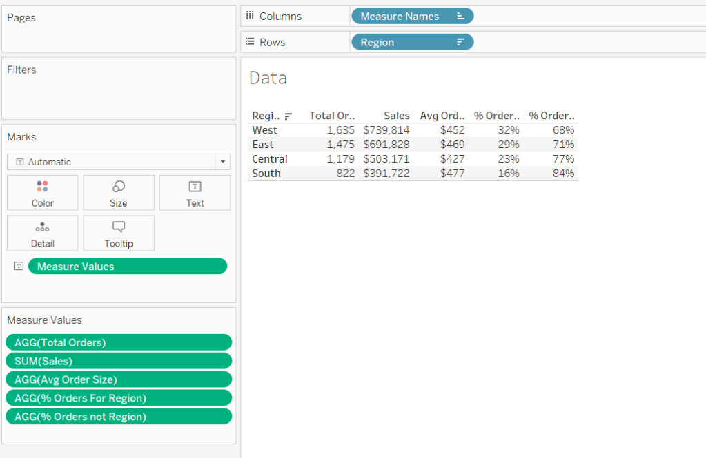
For Luke’s first challenge of 2023, he asked us to recreate this visualisation which showed multiple chart types (donut charts and bar charts) within a tabular layout, all built on a single sheet.
As with most challenges, I’m going to first work on building out the calculations needed to provide the data being presented.
Building the calculations
Firstly we need to identify the number of orders, based on unique Order IDs
Total Orders
COUNTD([Order ID])
and then to get the average order value we need
Avg Order Size
SUM([Sales]) / [Total Orders]
format this to $ with 0 dp.
In order to build the donut chart, we will need two measures for each region; one which shows the % number of orders for that region, and one which shows the % number of orders across the remaining regions.
% Orders for Region
[Total Orders]/SUM({FIXED:COUNTD([Order ID])})
Format this to % with 0 dp
and then
% Orders for not Region
1 – [% Orders For Region]
format this to % with 0 dp.
Pop all these out in a table along with Sales formatted to $ with 0 dp, and Sort the Region field based on Total Orders descending.
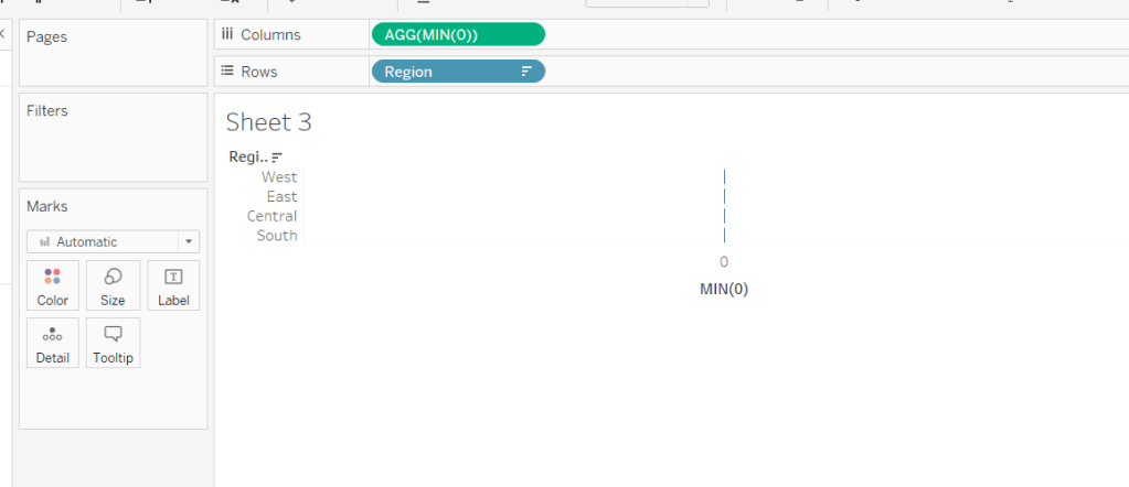
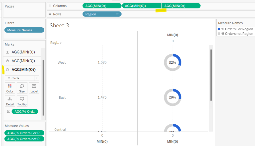
Building the table view
Add Region to Rows and sort by Total Orders descending.
All the columns are going to be managed by what I refer to as a ‘fake axis’. Double click into the Columns shelf and type in MIN(0). This will create an axis.
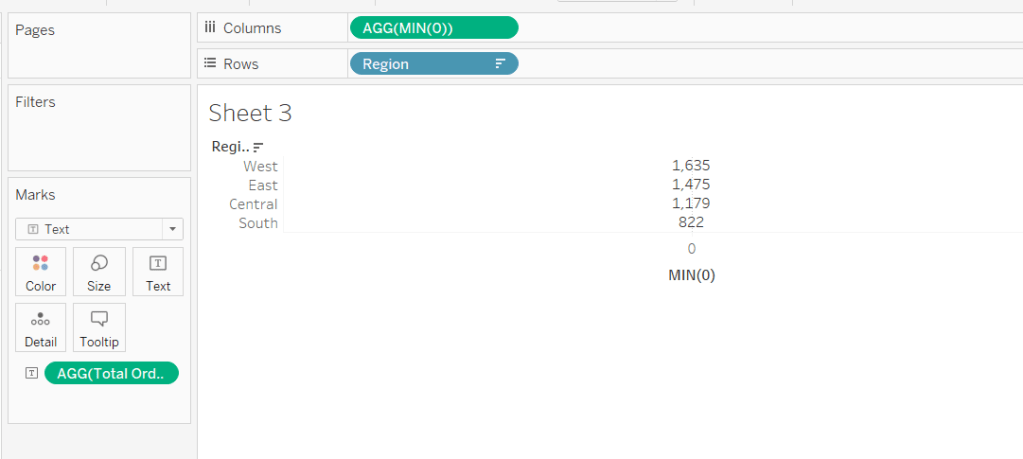
Change the mark type to Text and add Total Orders to the Text shelf. Remove all the text from the Tooltip dialog box.
This is our 1st ‘column’ in the table.
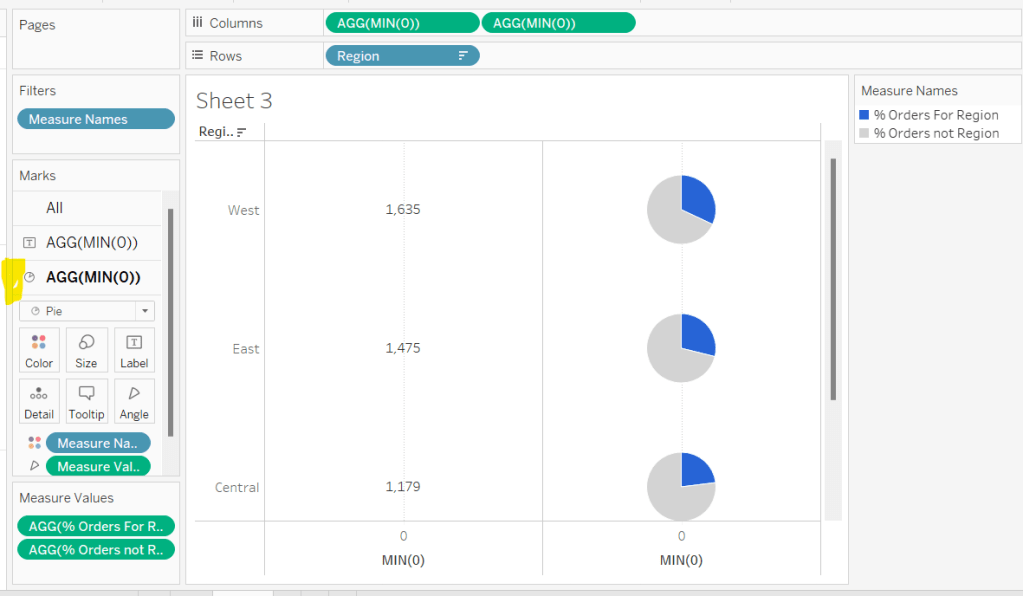
Create another column by adding another instance of MIN(0) to Columns.
Change the mark type of this 2nd MIN(0) marks card to Pie Chart and remove Total Orders from the text shelf.
Add Measure Names to the Filters shelf, and ensure only % Orders for Region and % Orders for not Region are selected.
Add Measure Values to the Angle shelf of the pie chart, and add Measure Names to Colour. Adjust the colours to suit and ensure a white border is added (via the Colour shelf options). Again remove all the text in the Tooltip dialog.
Now add another instance of MIN(0) to Columns.
Change the mark type of this marks card to Circle and set the colour to white. Add % Orders for Region to the Label and align centre.
Now make this Min(0) pill to be dual axis and synchronise the axis. Reduce the size of the circle mark type marks card, so some of the pie chart is visible. Remove Tooltip text again.
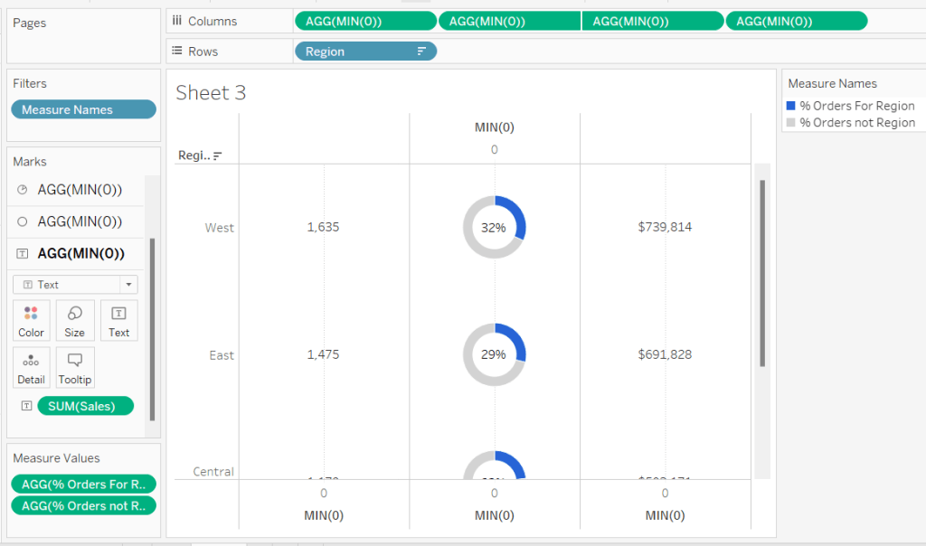
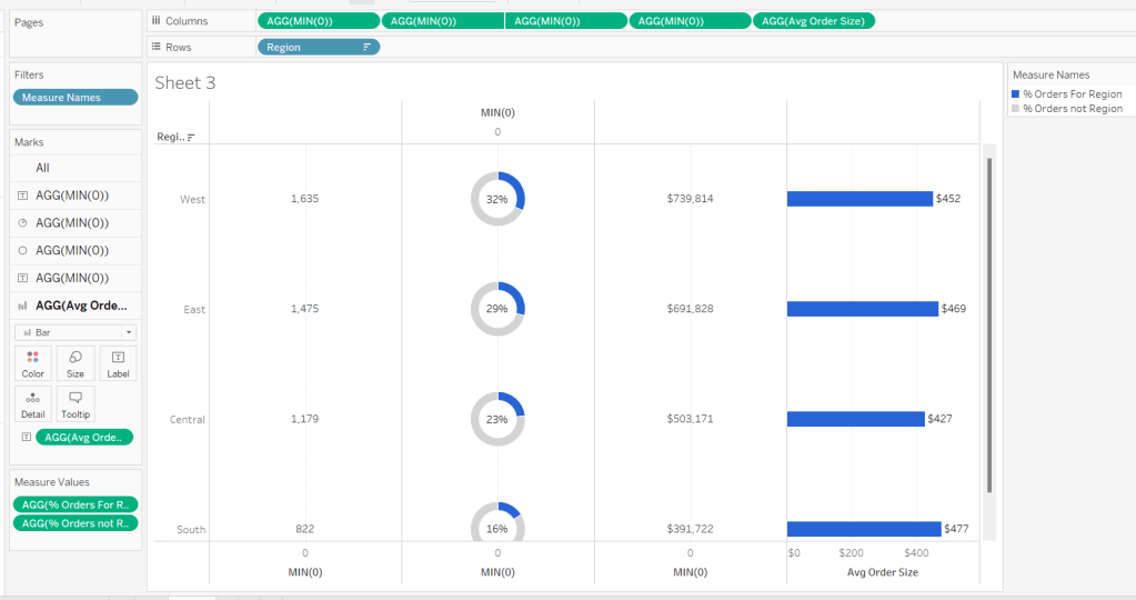
Add another instance of MIN(0) for our ‘3rd’ column. Set the mark type to Text and add Sales to the Text shelf, and remove the tooltip text.
For the final column, add Avg Order Size to Columns. Change the mark type to bar. Reduce the size and adjust the Colour to suit. Add Avg Order Size to the Label and remove all tooltip text.
Remove all gridlines zero lines and column dividers. Add row dividers at the highest level so you have a divider per row. Uncheck Show Header on the first MIN(0) pill to hide the axes, and right click the Region column label and Hide field labels for rows.
This gives you the viz you need to add to a dashboard. Use a horizontal container with a blank and 4 text boxes positioned above the viz to provide the label heading to the columns.
OR…
you can do what I did, and having not noticed the comment about the textboxes, used further instances of MIN(0) to make every ‘column’ a dual axis so I could use the axis label for the secondary axis displayed at the top to provide the required labels.
I set the mark type of these additional MIN(0) axis to polygon, and ensured no other pills existed on the marks shelf. The tick marks on all the top and bottom axes had to be set to none, and the title on all the bottom axis had to be deleted.
The benefit of using the text boxes option is that you aren’t left with a ‘blank’ space underneath the chart. However wide your axis is at the top to display the labels, will be repeated as ‘blank space’ underneath the chart too (vote up this idea to prevent this).
Ann Jackson set this week’s #WOW2021 challenge, based on a recent ‘real world’ situation she had encountered.
Analysing Ann’s solution (by interacting with her published solution), I deduced we’d need to use set actions to add and remove the selected Sub-Categories into and out of the set (I hadn’t noticed Ann had tagged the challenge on the main page with Set Actions 🙂 ). I also realised the initial visual in the first column, wasn’t using reference lines to depict the target, as the tooltip displayed on hover, was much more detailed than what you can add to a reference line tooltip.
So armed with this knowledge, I set about building what was required.
Defining the required calculations
Building the BANs
Building the viz
Adding the interactivity
Defining the required calculations
This is one of those challenges where I want to get all the calcs sorted up front in a tabular view, before even attempting the viz. I’ll go through what I ended up with, but be assured this did take a bit of time and change of direction to get what I needed.
Let’s start with parameters. Firstly I created a parameter to simulate ‘today’, that is hardcoded to 9th June 2021
I then created a parameter to store the % uplift we want to use for one of the goal options. I default this to 0.1 (ie 10%)
We need to work out the sales so far this year (ie the sales in 2021 up to and including 9th June 2021), and the equivalent sales for the previous year (ie the sales in 2020 up to and including 9th June 2020).
SALES YTD by Sub Cat
IF YEAR([Order Date]) = YEAR([pToday]) AND [Order Date] <= [pToday] THEN [Sales] END
SALES LY YTD by Sub Cat
IF YEAR([Order Date]) = YEAR([pToday])-1 AND [Order Date] <= DATEADD(‘year’,-1,[pToday]) THEN [Sales] END
Let’s pop these into a table with the Category and Sub-Category fields, and add grand totals, so we can see what figures we need to be aiming for the BANs at the top.
Now let’s work out the values for the goals.
One goal is based on finding the average sales per day in 2021, then extrapolating this across the whole year.
So firstly, we need to know how many days in the year up to ‘today’.
This finds the number of days between 01 Jan 2021 and 01 Jan 2022.
These methods ensure the right number of days is recorded if the ‘current’ year happens to be a leap year.
We can now work out one of the goals
Same Pace Goal
(SUM([SALES YTD by Sub Cat])/[# Days So Far This Year]) * [# Days In Year]
Add up the Sales so far this year and divide by the number of days so far to get the average sales value per day, then multiply by the total number of days in the year.
For the other goal, we need to determine the sales for the whole of the previous year, and multiple by the uplift %.
SALES LY
IF YEAR([Order Date]) = YEAR([pToday])-1 THEN [Sales] END
This gives the total sales for 2020.
LY + Percent Increase
SUM([SALES LY])*(1+[pPercentIncrease])
This applies the % increase parameter to the total sales for 2020.
Now we want to decide which of the goal values to use based on ‘selection’. To define the selected Sub-Categories, we’re going to use a set. Right-click on Sub-Category > Create > Set, name accordingly and select ‘Phones’ as the initial value in the set.
Use Last Year With Increase
Now we can use whether the record is in or out of the set in the logic to determine the goal to use
YEAR_END GOAL per Sub-Cat
IF ATTR([Use Last Year With Increase]) then [LY + Percent Increase Goal] ELSE [Same Pace Goal] END
Add the set and the goal field to the table, and you’ll see the value in the final column is matching the relevant previous columns, depending on whether the Sub-Category is IN or OUT of the set.
NOTE – when you do this, you’ll get In or Out displayed against each row. To get the description as I’ve got displayed, right click on the text In or Out and Edit Alias.
These data fields are going to be used to build out the central viz. There’s a couple of other fields we need to finish off the data requirements for the viz
Value to Goal
[YEAR-END GOAL Per Sub Cat]-SUM([SALES YTD by Sub Cat])
and
% of Goal
SUM([SALES YTD by Sub Cat])/[YEAR-END GOAL Per Sub Cat]
This field needs to be formatted to percentage with 0 dp (all other monetary fields need to be formatted to $ with 0 dp).
So now we have the core fields stored against each row that will help us build out the main viz. You can edit the set and add further sub-categories, so you can validate how the values change.
Now we want to work on the data we need for the BANs. You may think the grand totals sum up all the rows above, however while this works fine for the SALES YTD by Sub Cat and SALES LY YTD by Sub Cat columns, it isn’t the case for the YEAR-END GOAL by Sub Cat column.
If we select all the rows in that column, and examine the tooltip that appears on hover, the total of the selected columns differs from the total at the bottom of the column.
The value in the hover text is what we need. The discrepancy with the column grand total is because it’s working across the whole data and not row by row. Because at least 1 record is in the set, its taking the logic to use the same pace goal. You’ll notice the total of this column matches the total of the Same Pace Goal column. In fact as you add more values to the set, the total will match the Same Pace Goal total up until all values are in the set. At that point the total will match the LY + Percent Increase column.
So back to the summary measures. We’re going to use table calcs to solve this.
SALES YTD
WINDOW_SUM(SUM([SALES YTD by Sub Cat]))
SALES LY YTD
WINDOW_SUM(SUM([SALES LY YTD by Sub Cat]))
YEAR-END GOAL
WINDOW_SUM([YEAR-END GOAL Per Sub Cat])
These are all basically summing up the values displayed in the rows on the screen. Add them to the table, and you can see the same values are displayed on each row which tally to other data in the table
Right, we have all the data fields we need, let’s start building.
Building the BANs
On a new sheet, add the fields as below
We want to turn this into 1 row.
Create a field called
Index
INDEX()
and add this to the Rows shelf and change to be discrete (blue pill). Each row should be numbered from 1 to 17.
Now drag the Index field from the Rows shelf onto the Filter shelf and when prompted select 1.
You’ve now got 1 row displayed, but the data associated to all the rows is being included in the calcs (if you’d filtered just to Sub Category = Accessories for example, the date would be just related to the rows with the Accessories value).
Now we can tidy this to look how we want
Add Measure Names to Text shelf (change display to entire view if need be).
Hide Sub-Category from displaying (uncheck Show Header)
Right Click on each column title and Edit Alias to remove the ‘along…’ text
Format the text appropriately and align centrally
Adjust the tooltip to remove the Sub-Category info
Hide the Measure Names from displaying (uncheck Show Header).
Format the Row Dividers to be thick
Building the Viz
Add Category and Sub-Category to the Rows shelf on a new sheet. Change the sort of the Category field to sort by data source order, descending. Change the sort of the Sub-Category field to sort as below
Add SALES YTD by Sub Cat to Columns, then drag SALES LY YTD by Sub Cat onto the canvas and drop onto the SALES YTD by Sub Cat axis when you see the 2 columns appear
Drag Measure Names from the Rows shelf to the Size shelf. Add Measure Names to the Colour shelf. Adjust sizes and colours accordingly. Add a white border to the bars on the colour shelf.
Turn stack marks off (Analysis > Stack Marks > Off) to allow the bars to overlay each other.
Add both SALES YTD by Sub Cat and SALES LY YTD by Sub Cat to the Tooltip shelf, so you can reference both values regardless which bar you’re hovering over.
Add YEAR-END GOAL by Sub Cat to the Columns shelf and set to dual axis and synchronise axis. Reset the mark type of the Measure Values card to bar, and of the YEAR-END GOAL by Sub Cat card to Gantt.
Remove the Measure Names from the Size and Colour on the YEAR-END GOAL by Sub Cat card. Set the colour of this mark to black.
On the All marks card, add YEAR-END GOAL by Sub Cat to the Tooltip shelf so once again it’s value can be referenced by all marks.
Adjust the tooltip on the All marks card to match.
‘Type in’ MIN(0) to the Columns shelf (double click in the space next to the pills to enable the text edit feature). On this MIN(0) marks card, change mark type to Text and add Value to Goal to the Text shelf. Adjust the text to include the additional wording and adjust size too if need be. Adjust tooltip too.
Repeat this process for the % of Goal field too.
For the circles, create another MIN(0) column in the same way, but this time change mark type to circle, and add Use Last Year with Increase set to the Colour shelf and adjust. Adjust tooltips.
Format axes/gridlines/text/row banding accordingly and rotate text of the Category field.
Adding the interactivity
Add the sheets to a dashboard. Add a set action to add Sub-Categories to the set on click (Dashboard > Action > Add Action > Change Set Values). Set the action to run on select (on click) of the chart viz, to add values to the Use Last Year with Increase set.
We then need another set action to remove the Sub-Categories, but this needs to work by clicking a link in the tooltip which displays. The name of this action will display on the tooltip.
And fingers crossed.. that should be it! My published viz is here.