Can you visualise yearly rank change in Sub-Category sales?

Yusuke set this interesting challenge : to combine a ‘bump’/’slope’ chart visualising the change in rank whilst also visually displaying the Sales value for the relevant Sub-Category in the ranked position.

Defining the calculations

This challenge will involve table calculations, so I’m going to start by building out the various calculations that will be required and displaying in a tabular view.

Add Category to Filter and select Office Supplies. Then add Sub-Category and Order Date at the Year level as a discrete (blue) pill to Rows. Add Sales to Text.

Create a new field

Sales Rank

RANK(SUM([Sales]))

And add to the table, and verify the table calculation is set to compute by Sub-Category only.

We will need to ‘colour’ the viz based on the rank compared to the previous year. For this create

Is Min Year

{MIN(YEAR([Order Date]))} = YEAR([Order Date])

which will return true for the first year in the data (in this instance 2022) and then create

Colour

IF [Sales Rank] = LOOKUP([Sales Rank],-1) OR ATTR([Is Min Year]) THEN ‘Same as last year’
ELSE ‘Different from last year’
END

If the rank is the same as the previous one, or it’s the first year, then treat as the same, otherwise treat as different.

Add the Colour field to the table, and this time make sure the table calculation for Colour is computing by Year of Order Date only (while the nested calc for Sales Rank should still be computed by Sub-Category only)

The labels on the viz only want to show in certain scenarios – if it’s the first record (ie for 2022) or there has been a change in rank. We need

Label : Rank & Sub Cat

IF ATTR([Is Min Year]) OR [Colour] = ‘Different from last year’ THEN STR([Sales Rank]) + ‘ | ‘ + MIN([Sub-Category]) END

and

Label : Sales

IF ATTR([Is Min Year]) OR [Colour] = ‘Different from last year’ THEN SUM([Sales]) END

format this to $ with 0dp

Add these to the sheet, and double check the nested table calculations on each pill are computing as required (Sales Rank by Sub-Category only, Colour by Year Order Date only)

Now we have all this, we can start building

Creating the Viz

On a new sheet, add Category to Filter and select Office Supplies. The add Order Date to Columns, but set to be continuous (green) pill at the Year level. Add Sub-Category to Detail and add Sales Rank to Rows as a discrete (blue) pill. Verify the table calculation setting against the Sales Rank pill is by Sub-Category only.

Change the mark type to line and then add Order Date to Path. By default it should be at the Year level as a discrete pill.

This is the ‘bump’ chart.

Now add another instance of Order Date to Columns as a continuous pill at the Year level to essentially duplicate the display. On the 2nd marks card, change the mark type to Gantt

This gives us the ‘starting point’ for each ‘bar’. But we need to determine the size for each bar. First we’re going to ‘normalise’ the sales values for all the sales being displayed so we get a value between 0 and 1, where 0 is the smallest sale, and 1 is the largest.

Normalised Sales

((SUM([Sales]) – WINDOW_MIN(SUM([Sales]))) / (WINDOW_MAX(SUM([Sales])) – WINDOW_MIN(SUM([Sales]))))

To see what this is doing, format the field to 2dp, then add the field to the tabular view, and ensure the table calculation is computing by both Sub-Category and Year Order Date.

But the ‘axis’ we want to plot the bar length against is in years, so we need to adjust this size to be a proportion of a year (ie 365 days)

Gantt Size

//proportion of a year
[Normalised Sales] * 365

Add this to the Size shelf on the 2nd marks card on the viz. Adjust the table calc setting so it is computing by all the fields listed.

We now have the core concept so now we can start finalising the display.

Make the chart dual axis and synchronise the axis.

Set the view to fit height.

On the 1st marks card (that represents the line)

  • change the line style to dotted (via the Path shelf)
  • reduce the Size to suit
  • change the colour to pale grey
  • Add Label : Sales and Label : Rank & Sub Cat to the Label shelf.
    • Adjust the table calc settings of each so the nested table calcs in each have Sales Ranks by Sub Category only and Colour by both the Year Order Date fields only.
    • Adjust the layout of the text as required
    • Align the font to be top right
    • Change the font style (bold & black)
    • Ensure the Label is set to ‘allow labels to overlap marks’
  • Remove the Tooltip

On the 2nd marks card, the gantt bar

  • Add Colour to the Colour shelf and adjust the colours accordingly.
    • Verify the table calc settings are as expected
    • I chose to reduce the opacity slightly, so I could see the dotted line underneath (set to 70%)
  • Add Sales to Tooltip (format to $ with 0 dp) and the adjust Tooltip as required

Then we just ned to finalise the formatting/display

  • Set the font of the years and rank numbers to black & bold.
  • hide the Sales Rank label heading (right click > hide field labels for rows)
  • remove row & column dividers
  • Add black column gridlines (I set to the 2nd thickness level), and remove any row gridlines
  • Edit the top axis to have a fixed start (use default option) and end at 31/12/2025 so the 2026 label and line disappears.
  • Remove the title from the top axis.
  • Edit the bottom axis – remove the tile, and then set the tick marks to None, so the bottom axis now looks empty.

And that should be it. Now add the sheet to a dashboard and display the category filter as a single select, customising the remove the ‘all’ option.

My published viz is here

Happy vizzin’!

Donna

Data Normalisation Methods

Erica set this fun and incredibly useful challenge this week, based on the TC25 talk by Lorna Brown & Robbin Vernooij, to showcase different methods of normalising data when comparing measures which have drastically different scales.

Building the Raw Values chart

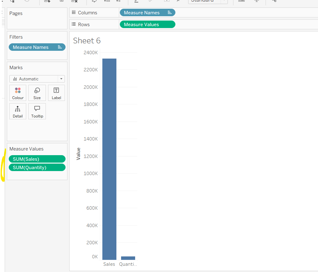
Add Sales to Rows. Then drag Quantity on to the canvas and drop the pill on the Sales axis (when you see the ‘2 column’ icon appear). This has the affect of adding the fields onto a shared axis, and the sheet will update to automatically reference Measure Names and Measure Values. Swap Quantity so it is displayed below Sales in the Measure Values section.

Add Region and Category to Detail and change the Mark type to Circle.

I’m going to incorporate the last requirement at this stage, as it helps with the build, so create parameters

pSelectedRegion

string parameter, defaulted to West

pSelectedCategory

string parameter, defaulted to Furntiture

show both these parameters on the sheet.

Create a new field

Is Selected Region & Category

[pSelectedCategory]=[Category] AND [pSelectedRegion]=[Region]

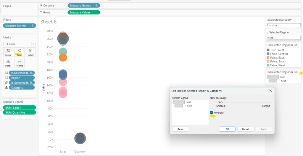
Add this field to Colour, and swap the values in the legend, so True is listed first. Then change the Region on the Detail shelf, so it is also on colour, by adjusting the icon to the left of the pill. Adjust the colours as required and then reduce the opacity on colour to 80%.

Manually update the entry in the pSelectedRegion parameter to each Region, so the True-<Region> colour combination can be updated to the dark grey.

Add Is Selected Region & Category to Size. Edit the size so they are reversed and the range in size is closer than the default. Once done, then manually adjust the dial on the Size shelf.

Show mark labels, selecting the option to only show the min & max values per cell and aligning middle right

Update the Tooltip. Then create fields True = TRUE and False = FALSE and add both of these to the Detail shelf. We’ll need these to disable the default highlighting later (adding now, as for all the other sheets, we’ll duplicate this one, so makes things easier).

Show the caption (Worksheet menu > show caption) and update the caption to reference the website Erica refers to. Then update the title of the sheet, and name the tab Raw or similar.

Building the Decimal Normalisation chart

Duplicate the Raw sheet, and name Decimal or similar. Update the title.

Create new fields

Sales – Decimal

SUM([Sales]) / 10^6

Quantity – Decimal

SUM([Quantity]) / 10^4

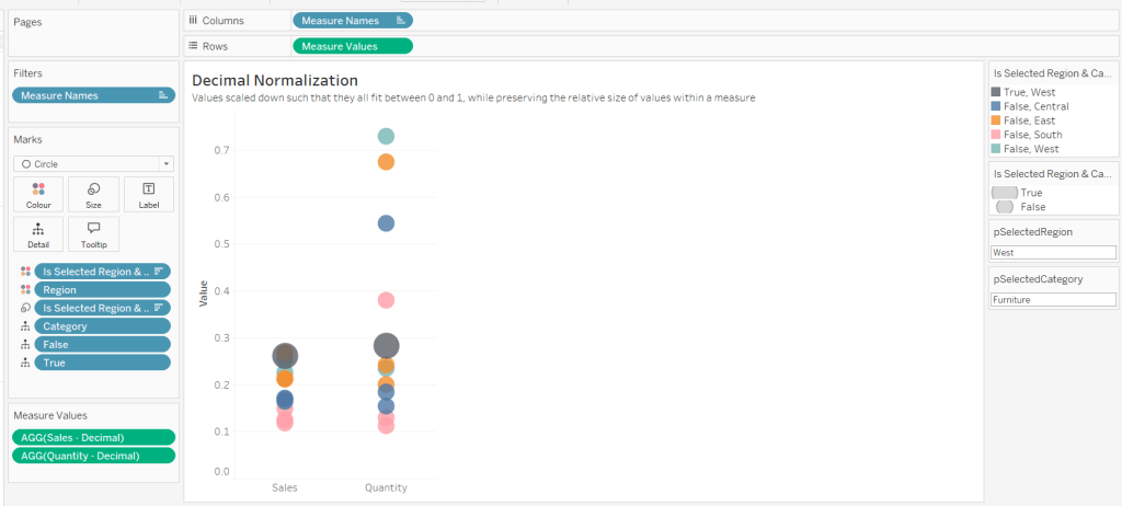
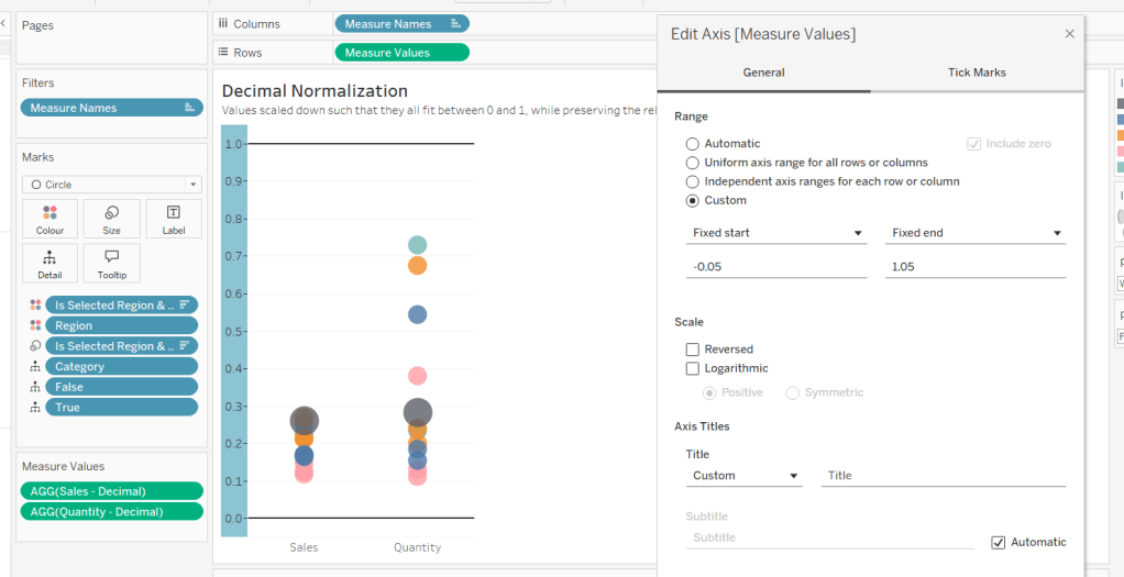
Drag Sales – Decimal onto the canvas and drop directly over the existing Sales pill in the Measure Values section, so it replaces it. Do the same with the Quantity – Decimal pill. Uncheck Show Labels.

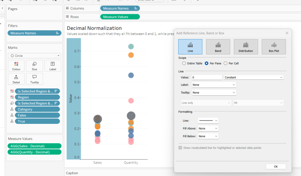
Add constant reference line of 0 that displays as a black solid line at 100% opacity

Repeat and create a constant reference line with value of 1. Edit the axis and fix from -0.05 to 1.05 and remove the axis title.

Update the text in the caption.

Building the Max-Min Normalisation Chart

Duplicate the Decimal sheet and rename Max-Min or similar. Update the title.

Create new fields

Sales – Max-Min

(SUM([Sales])- WINDOW_MIN(SUM(Sales))) / (WINDOW_MAX(SUM(Sales)) – WINDOW_MIN(SUM(Sales)))

Quantity – Max-Min

(SUM([Quantity])- WINDOW_MIN(SUM([Quantity]))) / (WINDOW_MAX(SUM([Quantity])) – WINDOW_MIN(SUM([Quantity])))

Drag Sales – Max-Min onto the canvas and drop directly over the existing Sales – Decimal pill in the Measure Values section, so it replaces it. Do the same with the Quantity – Max-Min pill.

Adjust the table calculation setting for each of the measures so they are computing by Category, Region and Is Selected Region & Category.

Adjust the Tooltip if required. Right click on the bottom column headings and Edit Alias to update the text- you may not be able to rename Sales – Max-Min along xyz… just to ‘Sales’, so you may need to be creative and add spaces eg ‘ Sales ‘ or similar. Update the caption.

Building the Z-Score Normalisation Chart

Duplicate the Max-Min sheet, and name Z-Score or similar. Update the title.

Create new fields

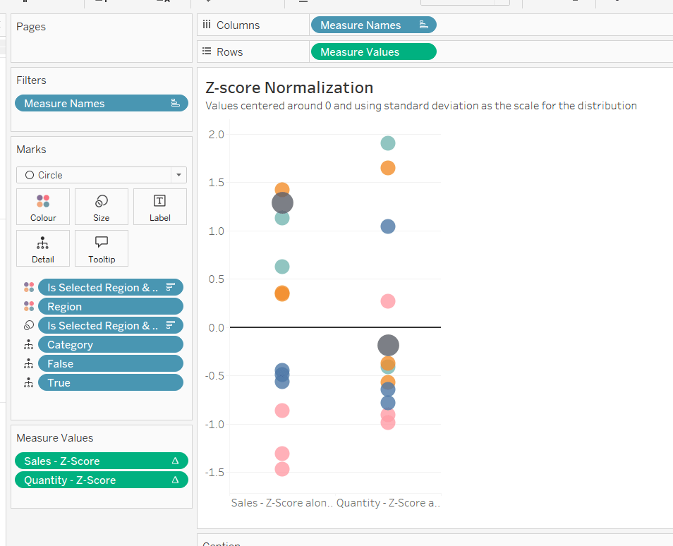
Sales – Z-Score

(SUM([Sales]) – WINDOW_AVG(SUM([Sales]))) / WINDOW_STDEV(SUM([Sales]))

Quantity – Z-Score

(SUM([Quantity]) – WINDOW_AVG(SUM([Quantity]))) / WINDOW_STDEV(SUM([Quantity]))

Drag Sales – Z-Score onto the canvas and drop directly over the existing Sales – Max-Min pill in the Measure Values section, so it replaces it. Do the same with the Quantity – Z-Score pill.

Adjust the table calculation setting for each of the measures so they are computing by Category, Region and Is Selected Region & Category. Remove the reference line for the constant value of 1. Edit the axis, so the range is now Automatic rather than fixed.

As before, adjust the Tooltip again if required, edit the column labels using the alias feature, and update the caption.

Creating the dashboard and adding the interactivity

Add all 4 charts onto a dashboard, using a horizontal container to arrange the charts side by side. From the object context menu on the dashboard, select the option to show the caption

To disable the default highlighting ‘on click’ create a dashboard filter action based on the True/False method described here – you’ll need to create an action per sheet.

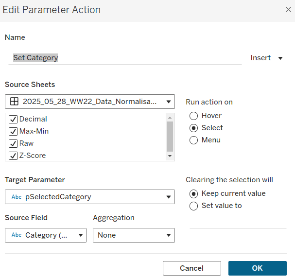
To set the parameters, create a parameter action

Set Category

On select of all the sheets, set the pSelectedCategory parameter passing in the value from the Category field.

Create another similar action called Set Region which sets the pSelectedRegion parameter with the value from the region field.

Finally, add a text section to the top right of the dashboard that references the pSelectedRegion and pSelectedCategory parameters.

And that should be it. My published via is here.

Happy vizzin’!

Donna

Can you create an area chart tile map?

This week, Kyle set the challenge of recreating area charts combined with a tile map / small multiple. He’d been inspired by a viz he uses at work, which he then realised had actually been inspired by a previous #WorkoutWednesday challenge from 2020 which I actually blogged about here.

So some of the steps for this solution guide, I’ll lift from my existing blog :-), but there are no table calcs in this instance.

Building the basic tile map

As per Kyle’s instructions, I started by building a new field that I could then format to millions

Pop

[Population (Population)] * 1000

I formatted this to be a custom number with 2 dp and displayed with Millions unit.

Put this into a table where State and Date on Rows and Pop on Text, just so we can validate what we’re up to…

We need to standardise/normalise the display, so the population for each State is ranging from 0 to 1. For this we need to determine

Min Pop Per State

{FIXED [State]:MIN([Pop])}

Max Pop Per State

{FIXED [State]:MAX([Pop])}

and we can then work out

Standardised Pop

(SUM([Pop]) – SUM([Min Pop per State]))/(SUM([Max Pop per State]) – SUM([Min Pop per State]))

Format this to display as a number with 2 dp. Add all 3 fields to the table. For each state the Standardised Pop should have a year when then value is 0 (equivalent to when the population is lowest for the state) and a year when the value is 1 (equivalent to when the population is highest for the state).

For the tile map, we also need fields Rows and Cols which are calculations that map each State to a number (and can be copied straight from the challenge sheet).

On a new sheet, add Rows to Rows (as a discrete dimension) and Cols to Columns (also as a discrete dimension). Add State to Detail. Your initial ‘map’ layout should start to take shape.

Add Date to Columns and set to be a the continuous Year level (green pill) and add Standardised Pop to Rows. Set the display to Entire View, so all the tiles are visible.

Change mark type to Area and add Pop to the Tooltip. Update the Tooltip as required.

Adding the State label and max value

For this we’re going to plot a single point that will be at the centre of the Date axis and slightly higher than 1. For this we need

Centre Date

DATE(DATEADD(‘year’,
FLOOR((YEAR({FIXED:MAX([Date])}) – YEAR({FIXED:MIN([Date])}))/2),
{FIXED:MIN([Date])}
))

This looks a bit complex, so I’ll break it down. What we’re doing is finding the number of years between the minimum year in the whole data set (1900) and the maximum year in the data set (2023). This is

YEAR({FIXED:MAX([Date])}) – YEAR({FIXED:MIN([Date])})

We’re then halving this value ( /2) and rounding it down to the nearest whole number (FLOOR).

We then add this number of years to the minimum date in the data set (DATEADD), to get our central year – 1961.

Now we need a point where we can plot a mark against that date. It needs to be above the maximum value in the area chart (which is 1). Based on what I did before, I decided 1.75 worked

Plot State Label

IF YEAR([Date]) = YEAR([Centre Date]) THEN 1.75 END

Add Plot State Label to Rows between Rows and Standardised Pop. Change the mark type of this axis to shape and use a transparent shape (see here for info). Note you can use a circle and reduce size to smallest and opacity to 0% if you wish. However, this will show a small dot when hovering, which you don’t get with a transparent shape.

Add Max Pop per State to Label and change State from Detail to Label. Adjust the Label accordingly

Remove all text from the Tooltip dialog of the Plot State Label marks card, and hide the Nulls indicator label. Make the chart dual axis and synchronise the axis. Remove Measure Names from the All marks card.

Then remove all gridlines, zero lines, axis lines and row/column dividers. Hide all the axis and the Cols and Rows pills (uncheck show header).

Building the bar chart

Create a new field

Latest Pop per State

IF [Date] = {FIXED [State]:MAX([Date])} THEN [Pop] END

If the date is the maximum date for the state, then get the population. Format this to be 2dp in Millions.

Add State to Rows and Latest Pop for State to Columns and sort descending. Adjust the colour to suit. Show mark labels, and remove all gridlines etc and row/column dividers and hide the axis. Adjust the Tooltip.

Creating the highlight action

Add the two sheets to a dashboard. Add a dashboard highlight action

Highlight State

On hover of the bar chart, target the map, via the State field only.

And that should be it! My published viz is here.

Happy vizzin’!

Donna

How is the Arctic ice melt trending?

This week’s #WOW2022 challenge required us to build an horizon chart. While I’m familiar with them, I haven’t had to build one before.

Luke provided references to a workbook and blog post as part of the challenge. I was also aware that Marc Reid had recently published this blog post on the subject and that in turn referenced this Tableau guest blog post by Yves Fornes. Reading through them both I hoped I’d have the clues I’d need to build the chart.

Note – the blogs referenced all give a good explanation on the process we’re trying to achieve with the horizon chart (divide into equal sized layers and ‘merge’), so I’m not going to spend time repeating that in this post.

Unfortunately, despite a good start, I couldn’t just couldn’t quite manage it – I tried both Marc’s and Yves techniques and also downloaded Joe Mako’s workbook and tried to follow his method, but I just couldn’t get the display to match up, and there were minimal clues in Luke’s published solution.

My fellow #WOW participant Rosaria Guana also pinged me, as she had got further than I had, but wasn’t matching Luke’s solution either. With some assistance from Rosario I managed to build the solution that matched hers and seemed the closest fit to Luke’s. As yet we can’t figure out where the discrepancy may lie… maybe we’ve overthought the issue… who knows.

For now though, I’ll step through the solution as per my published workbook.

Sorting out the dates

The data needs to be segregated into decades, so first I created

Decade

IF [Year]>=1990 AND [Year]<2000 THEN ‘1990s’

ELSEIF [Year]>=2000 AND [Year]<2010 THEN ‘2000s’

ELSEIF [Year]>=2010 AND [Year]<2020 THEN ‘2010s’

ELSEIF [Year]>=2020 THEN ‘2020s’

ELSE NULL
END

In the requirements, it mentions using data from the 1980s onwards, but the solution only presents 1990s onwards. I interpreted this as a typo in the requirements, so I added a Data Source Filter (right click data source > Edit Data Source Filters), and added Decade excludes Null to eliminate all the unnecessary rows.

The chart shows 10 years worth of data at the day level across the x-axis. We can’t just use the existing Date field to plot as this will extend for 30+ years. Instead we need to ‘baseline’ the dates to a fixed set of 10 years.

Firstly we need to know what year in the decade it is (ie the 1st, 2nd, 3rd year etc).

Year Index

RIGHT(STR([Year]),1)

This returns values of 0, 1, 2, 3… or 9

I then create the years I’ll baseline my dates against – this can start at any year. I chose 1980.

Baseline Year

INT(STR(198) + [Year Index])

So this will result in years 1980, 1981, 1982… up to 1989.

I can then create a new date which I’ll use to plot against

Baseline Date

MAKEDATE([Baseline Year], MONTH([Date]), DAY([Date]))

If we pop some of this data into a table, you can see how the Date field relates to this revised date

The 1st of January for the 1st year in each decade will all be plotted against 1st Jan 1980 etc.

Normalising the Arctic ice (NH) value

The NH values need to be adjusted so that they all sit on a scale of 0-1. This means the date with the lowest NH value across all the years will have a value of 0, and the date with the highest NH value across all the years will have a value of 1, and all the values in between will sit proportionally between. To compute this we need

Max NH

{FIXED : MAX([NH])}

Min NH

{FIXED : MIN([NH])}

Normalise NH

(AVG(NH) – SUM([Min NH])) / (SUM([Max NH]) – SUM([Min NH]))

take the difference between the NH value and the minimum as a proportion of the difference between the max and min values. This gives us the scale we need – the image below is sorted based on the Normalise NH value descending (so the dates aren’t in order)

Creating the Levels & the chart

All of the above I managed with no issue. It was this section that I struggled with 😦 As mentioned I tried all sorts of calculations, and after discussions with Rosario, the calcs I was using based on Yves blog post came closest…

We’re aiming to get bands which are 20% (0.2) in width.

Range 0.8-1

IF ([Normalise NH]) > 1 THEN 0.2
ELSE
IF ([Normalise NH])<0.8 THEN NULL
ELSE ([Normalise NH]) – 0.8
END
END

If the normalised value is over 1 then draw a mark at 0.2, our band size (there won’t be any values, but I did this for completeness). Otherwise if we’re below our lower threshold of 0.8, don’t draw anything, else as we’re within our specific range, draw a mark at the point which is the difference between our normalised value and our lower threshold of 0.8 ( ie a record with a normalised value of 0.91 will plot at 0.11).

On a new sheet add Baseline Date as a continuous exact date to Columns and Decade to Rows. Then add Range 0.8-1 to Rows too. Change to an Area chart.

Now let’s build the next level based on the same principals

Range 0.6-0.8

IF ([Normalise NH]) > 0.8 THEN 0.2
ELSE
IF ([Normalise NH])<0.6 THEN NULL
ELSE ([Normalise NH]) – 0.6
END
END

As you can see this is very similar to the above calculation, but this time, we will have values greater than the upper threshold of 0.8, which will all be plotted at 0.2.

Drag this field on the Range 0.8-1 axis and drop when you see the ‘two column’ symbol appear. This will make the chart a Combined Axis chart and Measure Names and Measure Values will automatically get added to the view. Colour the Measure Names accordingly, and up the transparency on the Colour shelf to 100%.

This looks very close to what we need, but you can see the axis is plotting values at >0.2. This is because the measures are stacked on top of each other. We need to turn this off via the Analysis > Stack Marks > Off menu.

When you do this, it’ll look like some marks have disappeared, but they are just hidden behind the other marks. Use the Measure Names colour legend on the right to drag and re-order the options listed.

Let’s now add the next level

Range 0.4-0.6

IF ([Normalise NH]) > 0.6 THEN 0.2
ELSE
IF ([Normalise NH])<0.4 THEN NULL
ELSE ([Normalise NH]) – 0.4
END
END

And drag the field into the Measure Values box. For the purposes of display at this point, I have coloured this measure a light grey, when it should be white (but that won’t show up at this point).

Now if we continue with the pattern and create similar calculated field for the next 2 ranges, we end up with something that isn’t right… too much red, and white in places we shouldn’t have white… 😦

This is where I started having discussions with Rosario. I could see by observing Luke’s solution that the dark reds were ‘inverted’ ie looked like humps coming ‘down’ from the top line, rather than humps ‘going up’ from the bottom line, but I was stumped where I needed to go next. Rosario confirmed this was her thinking too, and provided alternative computations for the light and dark red levels.

Range 0.2-0.4

IF [Normalise NH] < 0.2 THEN -0.2
ELSE
IF [Normalise NH]<0.4 THEN [Normalise NH] – 0.4
ELSE NULL
END
END

If we’re below the lower threshold, plot at -0.2 (minus 0.2) instead. If we’re within the lower and higher threshold, plot the difference between the Normalise NH value and 0.4 (which will be a negative number), otherwise plot nothing.

and finally for the last band

Range 0-0.2

IF ([Normalise NH]) < 0.2 THEN [Normalise NH]-0.2
ELSE NULL
END

Add this to the view, but you’ll need to change the order, so this measure is sitting above the Range 0.2-0.4 one.

Ok, so the shapes look like they might be correct, although we are missing some dark red in the 1990s compared to Luke’s solution, and as mentioned at the start, we don’t know where the discrepancy comes from.

So how do we make this all be ‘above the line’.

Drag another instance of Measure Values onto Rows so it’s sitting next to the existing one.

The make the chart dual axis BUT DON’T synchronise axis.

Instead, right click on the left axis to edit it, and fix the axis from 0-0.2

Then right click on the right axis to edit, and fix this from -0,2 to 0.

Set the colour of the Range 0.4-0.6 back to white, and you should have

Now you just need to

  • add tooltips
  • Edit the date axis and fix from 01/01/1980 to 31/12/1989
  • hide all 3 axis
  • remove row gridlines
  • remove column dividers
  • hide the null indicator
  • hide field labels for rows
  • adjust the font side and alignment of the Decade header

My published viz is here.

A few days later…

Since authoring this blog, Luke has made his workbook available to download. I have looked at it, and the calculations he uses are much much simpler. However I’m still struggling with the concept and not fully convinced with it all. I have played around with the workbook, and try to step through based on how the horizon chart is described in the various blogs, but I’m not entirely sure I know what the right answer might be in order to know whether what I’m seeing is actually correct or not. Feels like this is one I could do with a face to face discussion over, and ultimately is probably one for another day. ..

Happy vizzin’!

Donna