
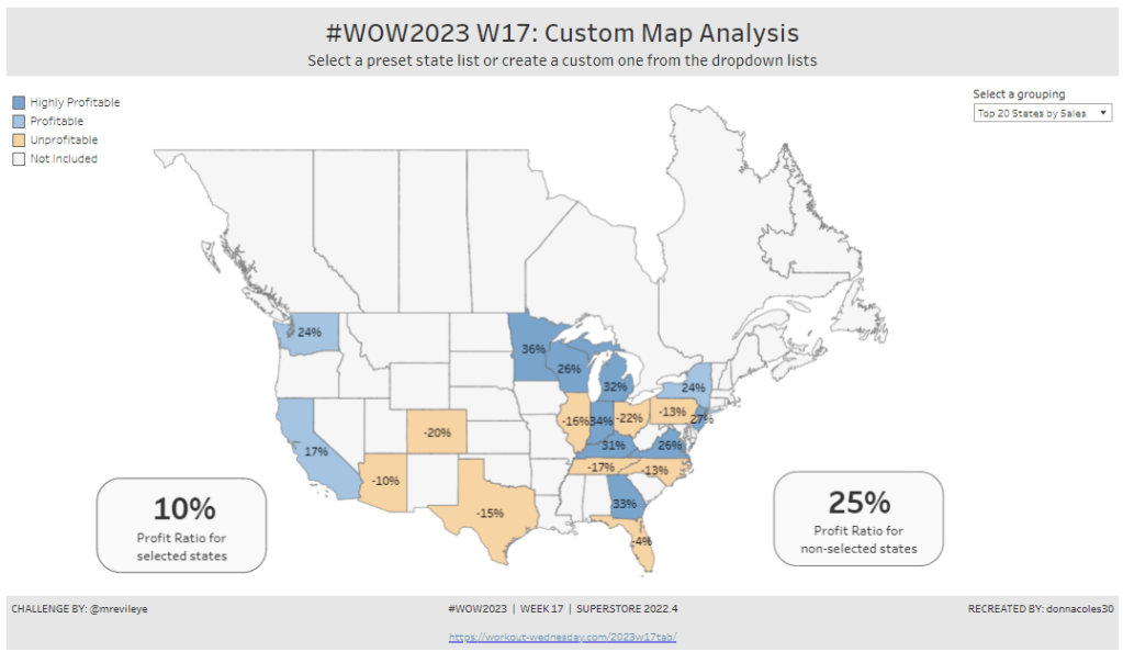
Community month continues this week with Yama G posing us this challenge to analyse profit ratio.
Building the basic bubble chart
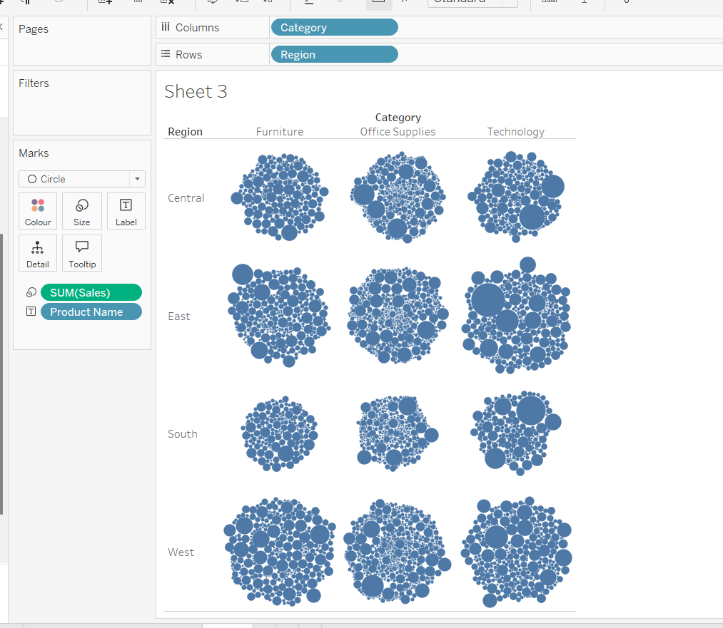
The simplest way I found to start this, was to use ctl-click to multi-select Category, Region, Product Name and Sales from the data pane, and then select the packed bubbles option from the Show Me menu.
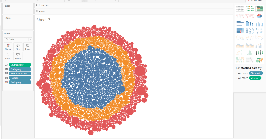
Then move Category from Text to Columns and Region from Text to Rows, and remove Category from Colour.
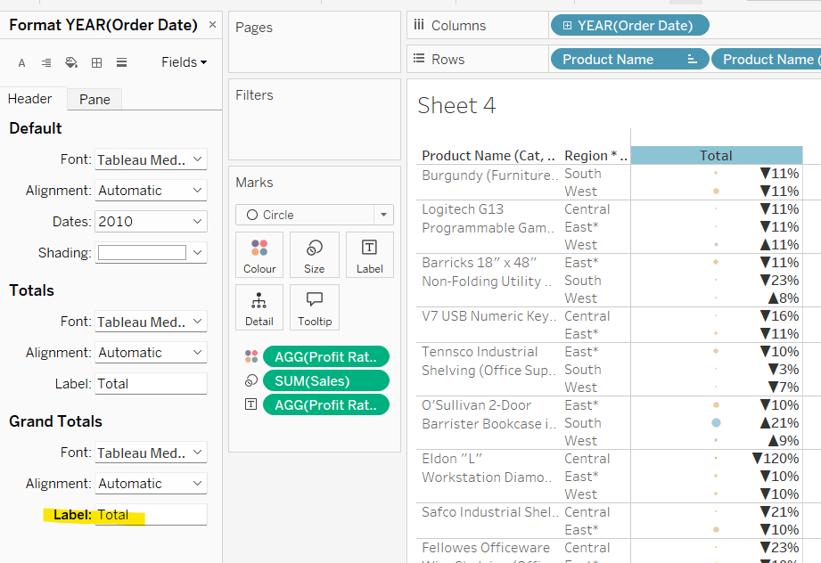
Create a new field
Profit Ratio
SUM(Profit)/SUM([Sales])
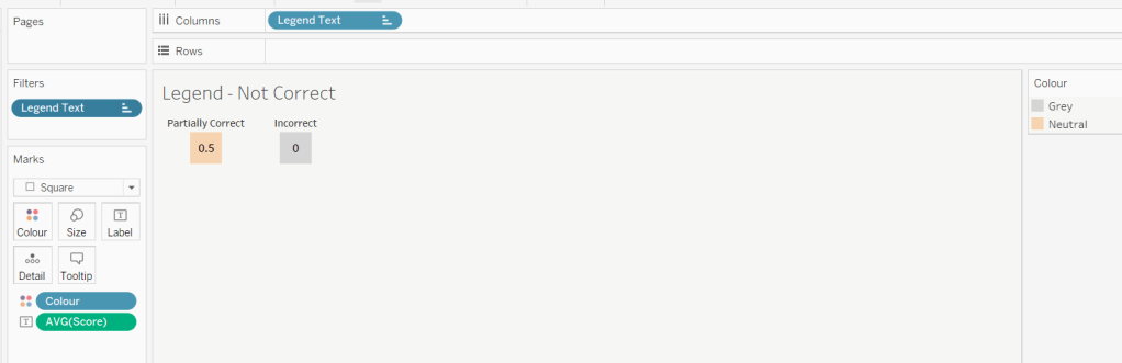
and apply a custom number format of 0%;▲0%;0% (in this instance I think the intention is to use the ▲ as ‘warning’ indicator).
Add this to Colour. To cluster the lower profit ratios towards the centre of the bubbles, add a sort to the Product Name pill on the Text shelf, to sort ascending by Profit Ratio.
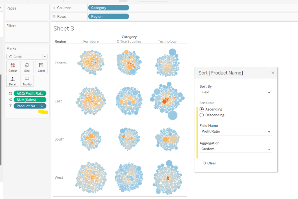
Note – you can’t influence quite how the bubbles are arranged, so it’s possible the layout you see may differ slightly from the solution.
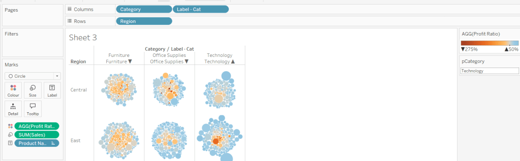
Showing details for selected Sub-Category
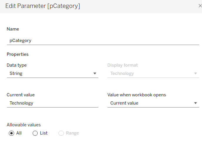
Clicking on a Category in the bubble viz should expand to show the Sub-Categories. To support this we need a parameter
pCategory
string parameter defaulted to Technology
The Category label displayed needs to show an arrow indicator based on whether the Category is selected or not
Label – Cat
[Category] + ‘ ‘ + IIF([Category]=[pCategory],’▲’,’▼’)
Add this to Columns
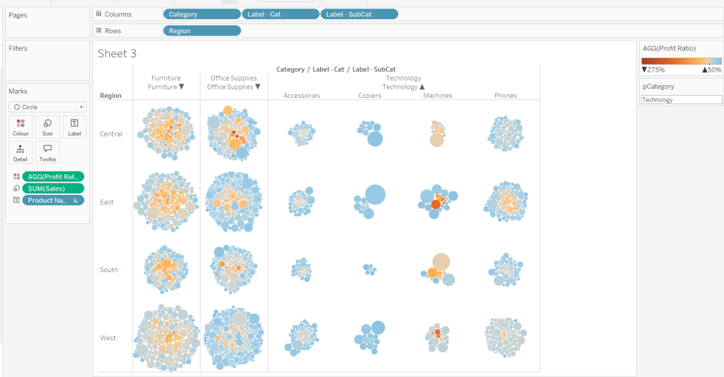
We want to show Sub-Category details for the selected Category, so create
Label – SubCat
IIF([pCategory]=[Category], [Sub-Category], ”)
Add this to Columns too.
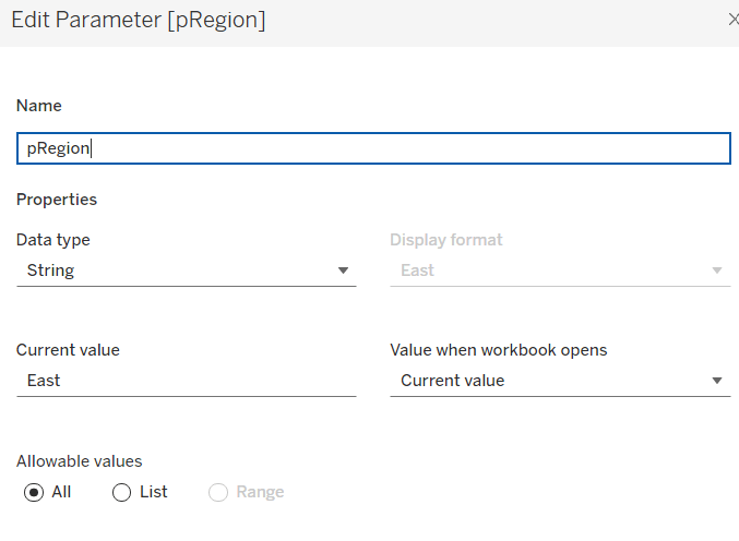
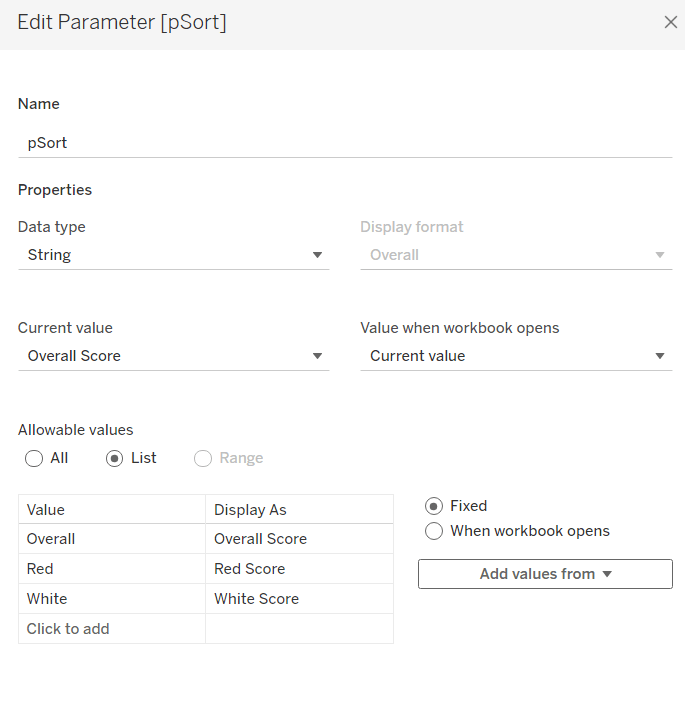
There is a need to capture the Region too, as part of the sorting on the tabular viz. But the Region header label needs to indicate the selected region. We will need a parameter
pRegion
string field defaulted to East
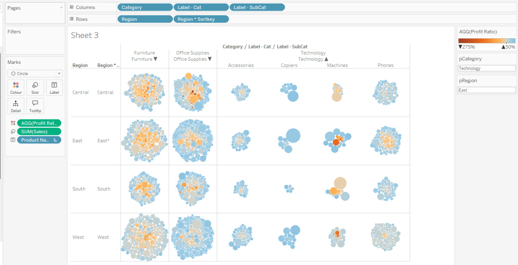
And then a new field
Region * Sortkey
[Region] + IIF([pRegion]=[Region],’*’,”)
Add this to Rows.
Finally tidy up by
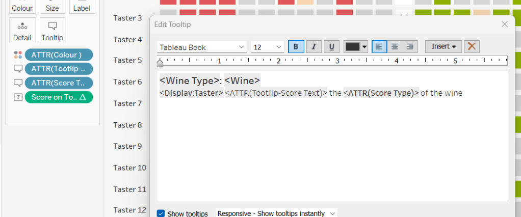
- adjusting the Tooltip
- hide the Region pill (uncheck show header)
- hide the Category pill (uncheck show header)
- hide the Region * Sortkey row heading label (right click -> hide field labels for rows)
- hide the Label – Cat / Label SubCat column heading label (right click -> hide field labels for columns)
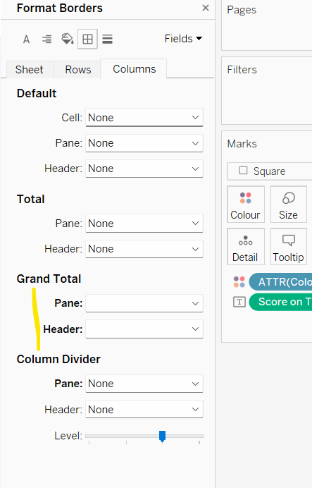
- remove the row dividers in the body of the viz (set the Level to 0)
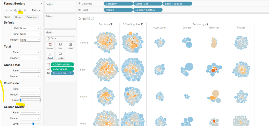
Update the sheet title and name the sheet Bubble or similar.
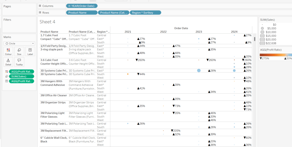
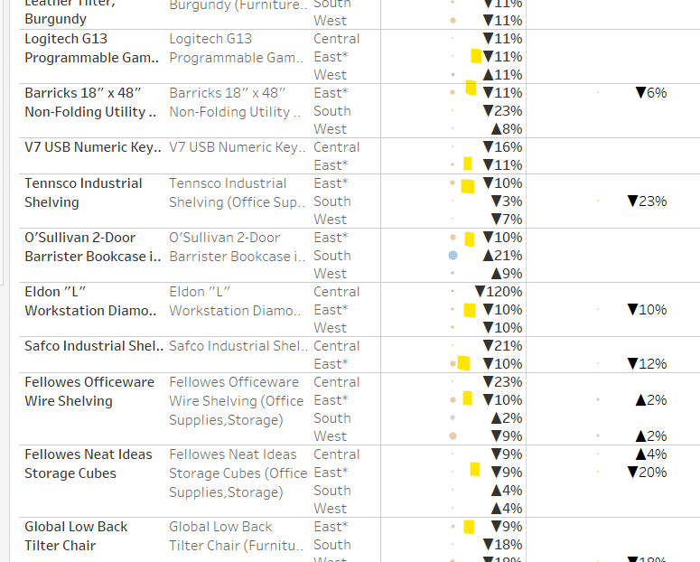
Building the basic Product Detail table
The first column is a combination of fields, so create
Product Name (Cat, SubCat)
[Product Name] + ‘ (‘ + [Category] + ‘,’ + [Sub-Category] + ‘)’
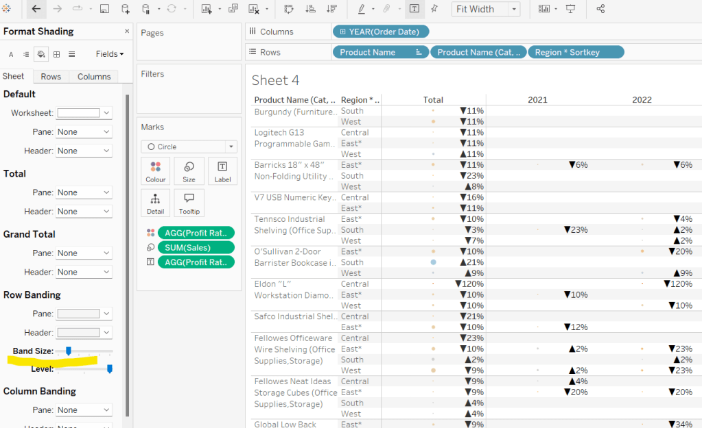
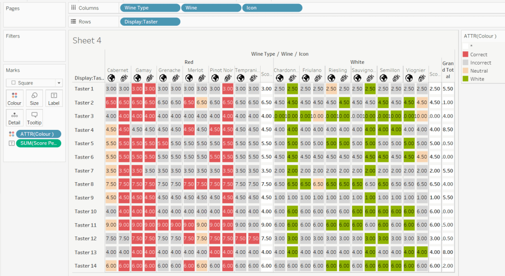
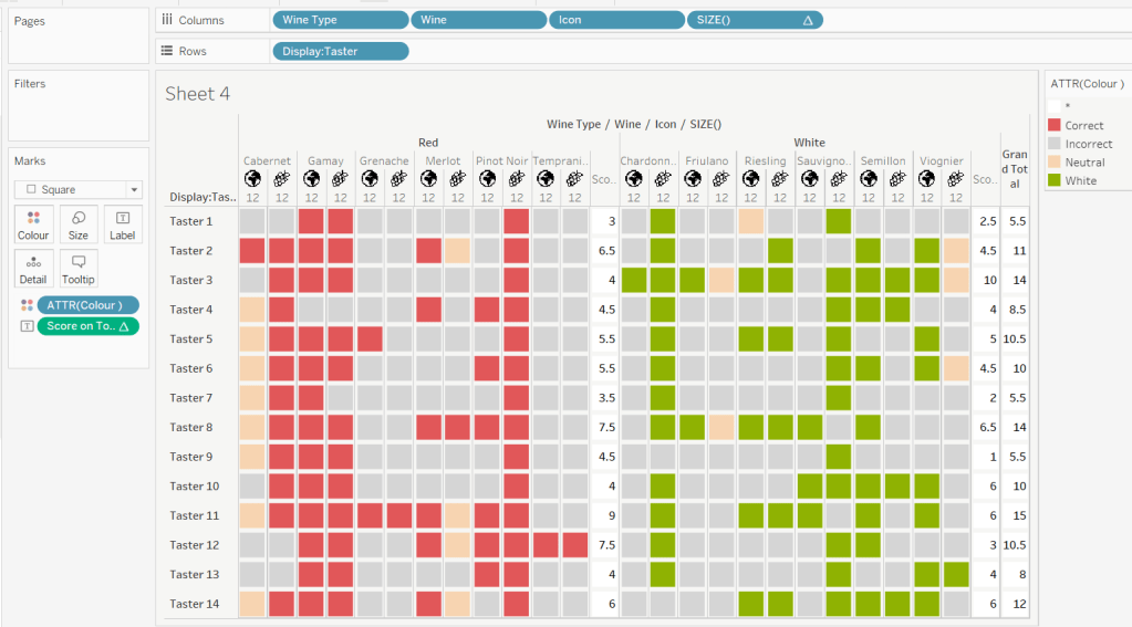
Add Product Name, Product Name (Cat, SubCat) and Region * Sortkey to Rows and Order Date as a discrete (blue) pill at the Year level to Columns. Change the mark type to circle. Add Sales to Size and Profit Ratio to Colour. Add Profit Ratio to Label and align right. Set the table to Fit Width. Increase the Size of the circles a bit.
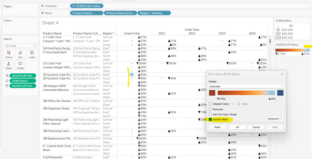
Add totals via Analysis > Totals > Show Row Grand Totals and then via the same menu, select the Row Totals to Left option. Edit the Colour Legend and select the Include Totals option, so the circles in the total column are also coloured.
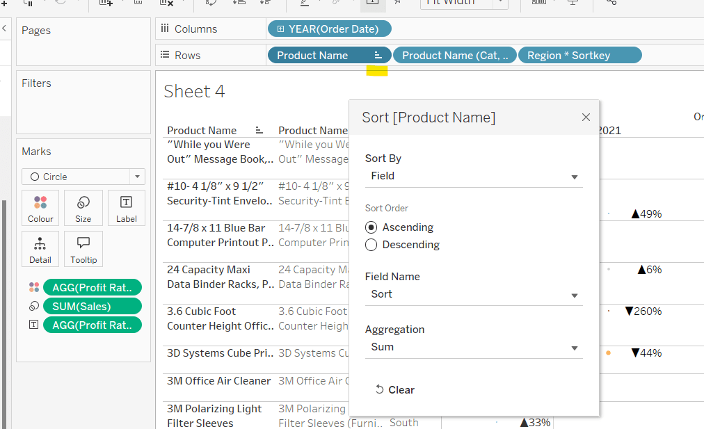
Applying the table sort
The requirement is to sort each Product Name based on the value of the Profit Ratio associated to the selected Region. The data should be sorted ascending.
This took me a little while to figure out – initially I wanted to use a table calculation, but you can’t apply a sort to a field based on that, and if you then add it as a discrete measure, you can’t have total columns. So I figured it out eventually. Firstly, I need to capture the Profit Ratio for each Product Name and Region (essentially the value listed in the Grand Total column). I can use an LOD for this.
PR by Product & Region
{FIXED [Product Name], [Region]: SUM([Profit])/SUM([Sales])}
but I then only want the value associated to the selected Region, and I want to ‘spread’ this across every row for the Product Name. So I can use another LOD but just at the Product Name level, which in turn uses a nested IF statement, to just return the value we care about.
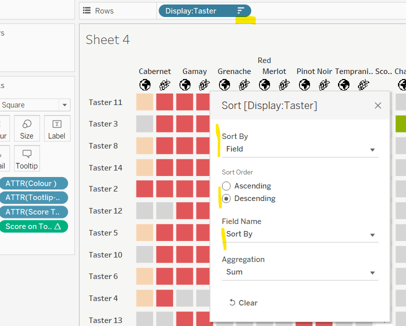
Sort
{FIXED [Product Name]: AVG(IIF([Region]=[pRegion],[PR by Product & Region],NULL))}
Apply a Sort to the Product Name pill in Rows to sort by the field Sort ascending
You should find that when you see some Product Names that have sales in the selected region (in this case East), that the products are listed based on this value with the lowest Profit Ratio first (note the East row isn’t listed first if there are sales for the Central region, as the rows within each product are listed alphabetically based on the region name.
Finally tidy up by
- Adjusting the Tooltip to suit
- Hide the Product Name pill (right click, uncheck show header)
- Adjusting the font style of the fields and label headings.
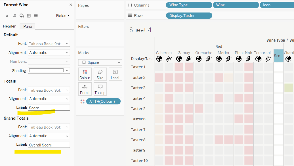
- Rename the Grand Total label to Total (right click the label > format and update the Label value)
- hide the Order Date column heading label (right click > hide field labels for columns)
- add row banding (right click viz to format), then adjust band size to level 1
Update the sheet title and name the sheet Table or similar.
Building the dashboard and adding the interactivity
Using layout containers, add the two sheets onto the dashboard, adding a title and the relevant legends (note I used text objects for the Profit Ratio legend title and the Sales ‘legend’.
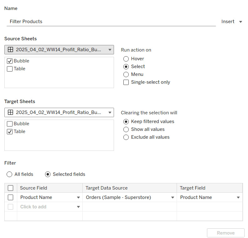
We need several dashboard actions:
Filter Products
Dashboard filter action, that on select of the Bubble sheet, targets the Table sheet, passing through the Product Name only. The set of products is retained when the selection is cleared.
Set Category
Dashboard parameter action, that on select of the Bubble sheet, sets the pCategory parameter with the value from the Category field. When the selection is cleared, the parameter is reset to <empty string>
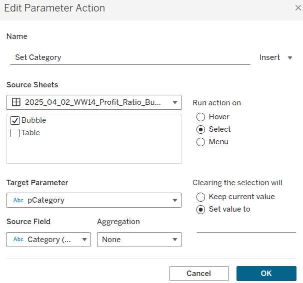
This action will allow the bubble chart to ‘expand and collapse’ on click.
Set Region
Dashboard parameter action, that on select of the Bubble sheet, sets the pRegion parameter with the value from the Region field. When the selection is cleared, the parameter is retained
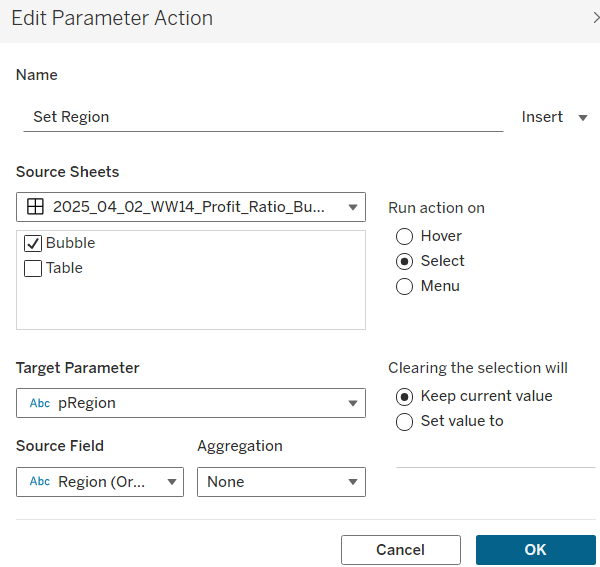
This action will apply the ‘niche’ sort and the relevant region labels will be updated with an * too.
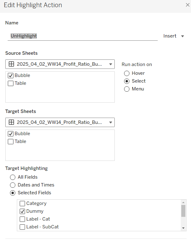
Finally, on selection of products in the bubble viz, we don’t want the other marks to ‘fade’ To stop this from happening, create a new field
Dummy
‘Dummy’
and add to the Detail shelf on the Bubble sheet.
Then add a dashboard highlight action
UnHighlight
On select of the Bubble sheet, target the Bubble sheet selecting the field Dummy only
And with that you should have a functioning dashboard. My published viz is here.
Note, after testing, I did notice a difference in the behaviour of my version to the solution. When I deselect all products from the bubble chart when in an expanded state, the section will collapse. The solution uses a ‘fake header’ sheet to stop this from happening, which is then carefully positioned above the bubble chart sheet. I’m ultimately happy with my 2-sheet solution, but feel free to check out the challenge solution for a better understanding.
Happy vizzin’!
Donna


