To build anything Tableau, you need to connect to some data. I used Superstore as suggested by Kyle, and within my solution did actually utilise one of the data fields to help build each row.
The challenge relies on the use of some custom shapes that Kyle provided. Refer to this KB to understand how to store the shapes for use in Tableau Desktop.
Building the Star
Create calculated field
Dummy
‘dummy’
Add to the Detail shelf and change the mark type to shape. Select the star shape you have saved. Set the view to Entire View and the format the sheet and set the worksheet background colour to green. Remove the Tooltip.
Name the sheet Star or similar.
Building the Bauble sheets
Duplicate the star sheet. Change the shape to the bauble image. Add Customer ID to the Filter shelf and select 2 records only (doesn’t matter what IDs are selected). Then add Customer ID to Columns.
Uncheck Show Header from the Customer ID pill to hide the column header, then remove all row and column dividers. Name the sheet Bauble 2 or similar.
Then to create the other Bauble sheets, just duplicate the sheet again, and select another entry in the Customer ID filter, and rename the sheet.
Repeat this 6 more times, so you end up with 8 bauble sheets and 1 star sheet.
Building the Christmas Tree
On a dashboard sized to 1000 x 1200, add a vertical layout container, and add all the sheets in the correct order
Remove the title from each sheet and set the outer padding of each object to 0, so everything ‘butts up’ against each other
Add a blank object to the bottom (within the same layout container). Set the background colour to brown and remove all padding.
Select the vertical layout container, and then select the option to Distribute Contents Evenly which will adjust every row within the container to be the same height.
To make the sheet on each row narrower, we use padding for the left and right, with different values on each row. I did some calculations based on how wide the dashboard was (1000) and how wide each ‘image section’ should be – 9 baubles at the widest point, so each section was 1000/9 = 111 px wide.
So for the top row, the padding on each side I calculated to be (1000-111)/2 = 444px each. For the second row, the padding on each side I calculated to be (1000 – (2×111))/2 = 389px and so on.
I then added a title and footer, and my Christmas Tree was complete. My published viz is here.
Erica set this challenge primarily aimed at building a beautifully presented dashboard, with the requirement to consider the use of layout containers and padding. She threw in creating some very specific chart types too. The easiest way to blog this, is by chart type.
Building the Histogram
Add Quantity to Columns as continuous dimension (green unaggregated pill) and add Order ID as a measure using the CNT aggregation to Rows. The easiest way to do this is right click and drag Order ID from the left hand date pane and drop onto rows. When you release the mouse, the option to select the aggregation should be available.
Change the mark type to bar and adjust the colour. Edit the title of the y-axis and remove the title from the x-axis. Update the Tooltip.
Double -click into Columns and manually type ‘Quantity in Order’ (including the quotes). Right click on the first text displayed and hide field labels for columns. Adjust the font of the Quantity in Order label that remains.
Remove row and column dividers and column gridlines. Remove Row axis rulers.
Note, when you add to the dashboard , you may find you want to adjust the Size of the bars.
Building the Peas in a Pod chart
On a new sheet, add Category to Filter and select Technology. Add Order Date to Filter and select Years then choose 2022,2023 and 2024.
Rename the Sub-Category field to Sub-Cat and add to Rows. Add Sales to Columns. Change the mark type to circle. Add Order Date to Colour. By default it should display YEAR(Order Date). Adjust colours to suit. Widen each row a bit.
Add another instance of Sales to Columns.
On the Sale (2) marks card change the mark type to line and move YEAR(Order Date) to Path. Increase the size and adjust the colour so it’s a grey lozenge.
Make the chart dual axis and synchronise the axis. Right click the top axis and move marks to back. Adjust the Tooltip. Edit the title of the x-axis.
Hide the top axis. Remove row and column dividers. Remove row gridlines. Remove axis rulers for both columns and rows.
Note, when you add to the dashboard , you may find you want to adjust the Size of the circles and the line. I found it was best adjusted on the web after I published to Tableau Public.
Building the +/- Bar Chart
On a new sheet add Order Date to Filter and select Years then choose 2022,2023 and 2024. Add Order Date to Columns and select to be at the continuous month level (green pill, May 2015 format). Add Sales to Rows and change the mark type to bar.
Add a quick table calculation of Difference to the Sales pill.
Adjust the size of the bars (select manual over fixed and adjust the slider).
and add to the Colour shelf. Adjust colours to suit. Hide the null indicator. Adjust the Tooltip. Adjust the title of the x-axis.
Remove all gridlines and axis rulers. Remove the columns zero line. Set the rows zero line to be a continuous unbroken line.
Note – once again the size may need further adjusting once on the dashboard and/or after publishing.
Building the slope chart
Add Category to filter and select Office Supplies. Add Region to filter and select West. Add Order Date to filter and select Years then choose 2021 and 2024 only.
Add Order Date to Columns and Sales to Rows. Add Sub-Cat to Detail.
Add Sales to Colour then add a quick table calculation of Percentage Difference. This only sets a value against the 2024 marks though, whereas we want a value for the whole line for each Sub-Cat.
Double-click into the Sales pill on Colour to edit it, and wrap the whole calculation in a WINDOW_MAX() function – the whole calculation should look like
Adjust the colour legend. I set the start & end colours to #ff00ff (hot pink) and #5d6068 (dark grey) and then applied an upper limit to the range and centred at 0 as below.
Hide the Order Date heading at the top of the chart. Adjust the Tooltip.
Remove column gridlines, zero lines and axis rulers.
Edit the Sort of the Sub-Cat pill on the Detail shelf, so it is sorting by % Difference ascending. This will ensure the lines are displayed overlapping in the expected manner.
Building the Bar-in-Bar Chart
On a new sheet, add Category to filter and select Furniture. Add Region to filter and select West. Add Order Date to filter and select Years then choose 2023 and 2024 only.
Create a new field
2023 Sales
IF YEAR([Order Date]) = 2023 THEN [Sales] END
Add Sub Cat to Rows and 2023 Sales to Columns. Add a sort to the Sub-Cat pill to sort by 2024 Sales descending. Add 2024 Sales to Columns. Make the chart dual axis and synchronise the axis. Change the mark type on the All marks card to bar. Remove Measure Names from the Colour shelf on the All marks card. Set the colour of the 2023 Sales marks card to light grey. Increase the width of each row, then reduce the size of the bar on the 2024 Sales marks card.
Create a new field
Sales Decreased
SUM([2024 Sales]) < SUM([2023 Sales])
and add to the Colour shelf of the 2024 Sales marks card. Adjust colours to suit.
In the solution, the Tooltip shows an indicator – I’m not sure if this was necessary, but I added it just in case
2024 Sales > 2023 Sales
IF [Sales Decreased] THEN ‘●’ END
Add this to the Tooltip shelf of the All marks card, along with the 2023 Sales and 2024 Sales fields. Adjust the Tooltip accordingly.
Hide the top axis. Remove the title of the x-axis.
Remove row and column dividers. Remove row gridlines and row axis rulers and ticks. Remove all zero lines.
Building the side-by-side bar chart
On a new sheet, add Category to filter and select Technology. Add Region to filter and select West. Add Order Date to filter and select Years then choose 2023 and 2024 only.
Add Sub Cat to Rows and Sales to Columns. Apply a Sort to Sub-Cat based on 2024 Sales descending.
Create a new field
Year
YEAR([Order Date])
And add to Rows and Colour. Adjust colour to suit. Widen each row.
Create new field
Diff is Neg Indicator
IF NOT([Diff is +ve]) THEN ‘●’ ELSE ” END
Add to Rows before Year and then adjust the table calculation setting so it is just computing by Year only.
Adjust the alignment of the Sub-Cat column so it is aligned middle right. Narrow the width of the Diff is Neg Indicator column to try to remove all the column heading text. If some still shows, rename the field so it is padded with some spaces at the front. Adjust the Tooltip.
Remove the x-axis title. Remove Column dividers. Adjust the row dividers so they are at level 1 and are partitioning each Sub Cat only and not splitting the Year column.
Remove all gridlines
Building the dashboard
It’s always hard to walk through the steps for placing objects on a dashboard in the specified places. My general rules are
Start with a floating vertical container that is positioned 0,0 and set to the dashboard height and width. I name this Base.
Then add tiled objects such as a text object for the title, blank objects, other containers, charts etc.
When you add a container, add a blank object initially to help get everything into place. Remove once you have at least 2 objects side by side / on top of each other depending on the direction you’re organising.
The item hierarchy shouldn’t have any containers of type Tiled listed.
Try to name your containers to help maintenance in the future
Below is a picture of the item hierarchy I ended up with using this approach
I created a floating vertical container called Base, positioned 0,0 and 1200 x 850. Background set to None, no border and inner and outer padding all 0.
I added a text object to contain the title. Background set to None and no border. Outer padding set to 10 all round, and inner padding 0.
I added a blank object, which I renamed Horizontal divider. Background set to light grey, no border. Outer padding set to left and right 10 and top and bottom 0. Inner padding all 0. Height set to 2.
I added another Vertical container, which I renamed Body. Background set to None, no border and all inner and outer padding set to 0.
I added 3 horizontal containers on top of each other, and set the property of the Body vertical container to distribute contents evenly so each horizontal container was the same height.
1st horizontal container
I named Row 1 – Level 1. I set the background to the pale green. No border. Outer padding set to left & right 10, top & bottom 5. Inner padding all 0.
Into this I added a text field to describe the levels. Background of this was white, no border and outer padding set to 0 (so the green background disappears). Inner padding was set to top: 20 and 10 for the rest.
Next the Histogram chart. Border set to green. Background white. Outer padding right:5, rest 2. Inner padding set to 10 all round. Width of chart fixed to 380 px.
Next the Level 1 text object. No border, no background. Outer padding 4 all round; inner padding 0. Formatted text object to rotate text. Width of object set to 40 px.
2nd horizontal container
I named Row 2- Level 2. I set the background to the pale blue. No border. Outer padding set to left & right 10, top & bottom 5. Inner padding all 0.
Into this I added a text field to describe the challenge. Background of this was white, no border and outer padding set to 0 (so the blue background disappears). Inner padding was set to 10 all round. Width of object set to 380px.
Next the Peas in a Pod chart. Border set to blue. Background white. Outer padding right:5, rest 2. Inner padding set to 10 all round.
Next the +/- bar chart. Border set to blue. Background white. Outer padding right and left 5, top & bottom 2. Inner padding set to 10 all round. Width of object set to 380px.
Next the Level 2 text object. No border, no background. Outer padding 4 all round; inner padding 0. Formatted text object to rotate text. Width of object set to 40 px.
3rd horizontal container
I named Row 3- Level 3. I set the background to the pale purple. No border. Outer padding set to left & right 10, top & bottom 5. Inner padding all 0.
I added the Slope chart. Border set to purple. Background white. Outer padding right:5, rest 2. Inner padding set to 10 all round. Width of object set to 380px.
Next the bar-in -bar chart. Border set to purple. Background white. Outer padding right & left 5, top & bottom 2. Inner padding set to 10 all round.
Next the side-by-side bar chart. Border set to purple. Background white. Outer padding right and left 5, top & bottom 2. Inner padding set to 10 all round. Width of object set to 380px.
Next the Level 3 text object. No border, no background. Outer padding 4 all round; inner padding 0. Formatted text object to rotate text. Width of object set to 40 px.
It was a bit of trial and error to get the spacing as required, and a few calculations to work out how wide I wanted each chart to be, based on the width of the dashboard and the other items in each row.
For this week’s challenge, Erica wanted us to be able to set a discount value for a Sub-Category which once set, overwrote the value displayed in the table and applied the discount to the other visuals. She added an additional complexity to display the input field aligned with the selected Sub-Category. She alluded to the fact this last requirement was likely to be tricky, and she wasn’t wrong. I managed to build a solution, and I’ll walk through the principles, but there will be a bit of trial and error involved….
Building the table
We will need to capture the discount value to apply in a parameter, so create
pDiscount
integer parameter defaulted to 5
and we also need capture the Sub-Category to apply the discount to
pSubCat
string parameter defaulted to Art
The discount to display will need to be adjusted for the selected Sub-Category
Discount to Display
IF [Sub-Category] = [pSubCat] THEN [pDiscount]/100 ELSE [Discount] END
format this to % with 1 dp.
Add Category and Sub-Category to Rows. Double-click into rows and manually type in MIN(1). Change the mark type to shape and change the shape to be a transparent shape (see this blog for more details). Add Discount to Display to the Label shelf, and change the aggregation to Average. Align middle centre. You should see that the value associated to Art is 5%.
Note – you may be wondering why this is not being displayed in a standard table – why the need for the fake axis? I can’t recall exactly why I ended up with this, but it will have been borne out of later steps, and the need to try and get the input parameter aligned – by all means feel free to try without and see how it goes 🙂
Hide the MIN(1) axis, remove column dividers and gridlines / zero lines, axis rulers etc. Add subtotals (Analysis menu > Totals > Add all subtotals). Stop the Tooltip from displaying. Adjust the height and width of the cells so you can see all the rows on the screen. Show the parameters, and test the functionality by manually changing the parameters.
Create a new field
Index
INDEX()
Set this to be a discrete field and add to Rows after Sub-Category. Adjust the table calculation so it is set to compute using both Category and Sub-Category, and you show see the rows numbered from 1 to 17 (except for the total rows).
In order to help us position the input parameter, we will need to capture the index of the selected Sub-Category, so create a parameter
pIndex
integer parameter defaulted to 6 (the value associated to Art)
For now, we’ll leave the index displaying in the table. But we will hide it eventually. Name this sheet Table.
Building the line chart
The line chart needs to show the actual Sales and the sales as they would be if the revised discount was applied for the selected Sub-Category. The value stored in the Sales field will already account for the original value stored in the existing Discount field. So to work out what the adjusted Sales will be, we need to determine the full sale price (Sales / (1 – Discount)) and then apply the inputted discount value from pDiscount (multiply by (1- (pDiscount/100))
Adjusted Sales
IF [Sub-Category] = [pSubCat] THEN ([Sales] / (1-[Discount])) * (1- ([pDiscount]/100)) ELSE [Sales] END
format this and the Sales fields to $ with 0do
On a new sheet add Order Date at the continuous Month/Year level (green pill) to Columns. Add Sales to Rows, and then drag Adjusted Sales and drop it on the Sales axis when the green ‘2 column’ icon appears. This will automatically add Measure Values to Rows and Measure Names to Filter and Colour.
Calculate the difference as
Difference
IF [pSubCat]<>” THEN (SUM([Adjusted Sales]) -SUM([Sales])) / SUM([Sales]) END
and apply a custom number format of ▲0.00%;▼0.00%;0%
Format the date axis to display dates as custom format mmm yy, and edit the axis to change the title to Month.
Add Sales, Adjusted Sales and Difference to the Tooltip and update to suit. Show the pDiscount parameter and update it to a really large value, say 10,000. The 2 lines will show more prominently and the Sales axis will adjust its scale.
The requirement is to ensure the grey line (the original sales) doesn’t move, so edit the value axis, adjust the title to Sales and then fix the start from 0, but end ‘automatic’
This will push the Adjusted Sales off the chart. Reset the pDiscount to something more reasonable like 5.
Remove row/column dividers and gridlines, but retain axis rulers. Name the sheet Line.
Building the KPI card
On a new sheet, add Sales to Text. Change the Mark type to shape and select a transparent shape. Align the text middle centre, and set the display to Entire View.
We want to only show the Adjusted Sales if a Sub-Category has been selected, but we need to line chart to display a blue line all the time, so we need another field
Label Sales
IF [pSubCat]<>” THEN [Adjusted Sales] END
format this to $ with 0dp and add to the Label shelf.
Adjust the layout and display of the text as required. Hide the Tooltip. Name the sheet KPI.
Right, we’ve got the key components. Let’s get these all on a dashboard first.
Building the dashboard
Getting all the objects you want on the dashboard (including titles, footers etc) positioned exactly where you want them, with the appropriate padding set is crucial to getting the method I’m going to use to reposition the input parameter. It’s also quite fiddly and I can’t guarantee that even if you follow the steps, you’ll get things looking right…
Anyway, let’s start with the dashboard.
I set the dashboard size to 1100 x 650, then I added a floating vertical container which I positioned 0,0 and sized 1100 x 650. I formatted the dashboard and set the background colour to light grey.
I then switched to Tiled and added a text box for my title. I set the background of this to white, outer padding to 0 and inner padding to 5.
I then added another text box beneath for the instructions. I set the outer padding to 0 and inner padding to 5. I then fixed the height to 70.
Next I added a horizontal container beneath the instructions. I add a blank object to it as a placeholder. Ensuring the horizontal container was selected (blue border), I set the outer padding to 5.
I then added another horizontal container beneath this, and added my standard footer (created by, recreated by etc). I set the outer padding of this container to have 5px on the left and right, and 0 on top and bottom. All the text boxes within I set to have 0 outer padding and 0 inner padding.
I then added another text box beneath to add in the link to the challenge, also part of my ‘standard footer. I set the outer padding for this text box to 0.
I then calculated how high all the ‘rows’ of objects were on the dashboard (the height of the title + the height of the instructions + height of my standard footer and challenge link), and then subtracted this from 650. I then fixed the height of the central horizontal container based on this value
Add the Table sheet into the left side of this container. Remove the title. Set the background to white. Adjust the outer padding to 0. Set the sheet to Fit Width. Very carefully, adjust the width of a row, so the table fills as much of the vertical space as possible without there being a scroll bar. This is really fiddly to do.
The addition of the table will have automatically added some parameters and a Tiled object to the layout. We’ll deal with these shortly, but leave them be for now.
Add a Vertical container to the right hand side. Add the KPI sheet and then then Line sheet underneath. Remove the blank object that was the placeholder. Widen the vertical container so the vizzes have more space. For both the KPI and the Line objects, remove the title, set the background to white, set the outer padding to 0. Set the inner padding of the KPI chart to 20, and the inner padding of the line chart to 10. Adjust the height of the KPI chart so its visible.
If all is well, you should have something like
Adding the interactivity
Create a parameter action
Set Sub Cat
On select of the Table chart, set the pSubCat parameter, passing in the value from the Sub-Category field. Reset to ” when unselected.
Set Index
On select of the Table chart, set the pIndex parameter, passing in the value from the Index field aggregated to None. Reset to 0 when unselected.
If you click different Sub-Categorys, the KPI and line chart will change. Once unselected, no adjusted sales or discount will display.
Getting the parameter to move
Duplicate the Table sheet, and remove all subtotals. On this sheet, we’re only going to display the rows up to the row before the selected Sub–Category. For this we need
Show Top Rows
[pIndex]=0 OR [Index]<[pIndex]
Add this to the Filter shelf and set to True. Verify the table calculation is computing by both Category and Sub-Category. If need be adjust, then recheck the filter is just displaying True still. Show the pIndex parameter and just test the filter is working, by changing the value. Here, with the parameter set to 6, it is showing rows up to 5.
What we’re trying to do is just display the rows necessary so that the parameter input can be added beneath this sheet on the dashboard. The reason we have removed the subtotals, is that if the index is set to 2, we only want to display 1 row above; that for Bookcases. With subtotals included we’d get a row for Bookcases and a Total row. However once we get to a new Category as we have above, we need to show an additional row to accommodate for the subtotal displayed within the original table.
So we need to force additional rows to show in some circumstances but not others.
To help with this I have made use of the Region field. I checked that for two regions, Central & East, there were Sales in both Regions for every Sub-Category.
Add Region to the Filter shelf and set to Central & East only. Add Region to the Detail shelf. Remove Discountto Display from the Label shelf. Create
Extra Row
IF LAST()=0 THEN STR(ATTR([Region]) )
ELSE ''
END
Add this to Rows after Index. Adjust the table calculation so that it is computing by Sub-Category only. With pIndex set to 0, this should just display the two Regions against the last Sub-Categorys in each Category, simulating the subtotal rows.
But set the index to 6 and we just get the additional rows for the Furniture Category
and set to 2 and we just the row for Bookcases
Hide the Category column (uncheck show header). Name the sheet Top. Set the pIndex back to 0, and let’s start seeing how this works on the dashboard.
Add a vertical container between the existing table and the kpi/line chart. Reduce the width. Add the Top sheet into this container. Remove the title and set the inner and outer padding to 0. Set the sheet to fit width. If you’re lucky, all the rows should align. If not you may need to tweak again.
Select a Sub-Category in the original table, and the 2nd table should shrink.
From the Tiled section on the layout item hierarchy, navigate through until you find the pDiscount parameter. Click it to select it on the dashboard, then move that object to sit beneath the shortened table. Then select the Tiled section on the item hierarchy, and right click and remove from dashboard, which will remove all the unnecessary parameters/legends that were being displayed.
For the pDiscount object, remove the title, set the background to white and set the outer padding to 0. Set the background of the vertical container to white too. We only want this discount parameter to show when a Sub-Category has been selected. To manage this, we need
Show pDiscount
[pSubCat]<>”
Select the pDiscount object on the dashboard, and then from the Layout tab, check the Control visibility using value and choose the Show pDiscount field
Unselecting the Sub-Category and the field won’t display
So now we’ve got the basics of what we’re trying to do, we obviously don’t actually want any of the table to be visible. But if we hide all the fields (uncheck show header), we lose the column headings which was helping with the positioning, as we can see below – the input box is no longer aligned with Art.
To fix this, create a new field
Dummy Header
”
and add to the Columns of the Top sheet. If you haven’t already, uncheck show header against all the other blue pills (Category, Sub-Category, Index and Extra Row). The sheet should look like below, and what the Dummy Header has done is create an extra spacing at the bottom of the page, which compensates for the heading we don’t have at the top… and this is the reason for creating a table using a fake axis 🙂
Back on the dashboard, everything is aligned again.
… except when we select Bookcases … argghhh!
Add a blank object above the parameter. Set the padding to 0, and adjust the height to about 18 px – enough to bring the parameter in line. Create a new field
Show Blank
[pIndex]=1
and use this to control the visibility of the blank object – ie we only want the blank object to come into play when Bookcases is selected, and nothing else.
Click around every Sub-Category and hopefully the parameter box is aligned each time.
Final touches
On the Top sheet, remove row dividers, so the sheet just always looks empty.
On the Table sheet, hide the Index field (uncheck show header).
Add left outer padding of 10px to the vertical container that contains the Top sheet and the pDiscount parameter. This should mean some grey spacing appears between the table and the input field.
Adjust the width of the objects to suit BUT DON’T fiddle with the heights at all!
To stop the other discounts from ‘fading’ when a Sub-Category is clicked, create a new field
HL
‘HL’
and add to the Detail shelf on the Table sheet. Then on the dashboard, add a highlight dashboard action that on select of the Table sheet, targets the Table sheet with the HL field only. This essentially has the effect of highlighting all the fields, since the HL field is applicable to every row.
Phew! This took some time and a lot of fiddling to get right, and even then I know there’s every chance that you can’t quite get things to align just right, or publishing to Tableau Public and it all seems to shift … My published viz is here. Fingers crossed you’re successful!
I’m back from my holibobs, so back to solving #WOW2023 challenges and writing up the solutions – it’s tough to get back into things after a couple of weeks of sunshine and cocktails!
Anyway, this week, Sean set this challenge from Felicia Styler to build a scatterplot / heat map combo chart, affectionally termed the ‘scatterbox’.
Phew! This took some thinking… I certainly wasn’t gently eased back into a challenge!
Modelling the data
We were given a hint that the data needed to be unioned to build this viz. I connected to the Sample-Superstore.xls file shipped with 2023.2 instance of Tableau Desktop. After adding the Orders sheet to the canvas, I then added another instance, dragging the second instance until the Union option appeared to drop it on.
The union basically means the rows in the Orders data set are all duplicated, but an additional column called Table Name gets automatically added
This field contains the value Orders and Orders1 which provides the distinction between the duplicated fields caused by the union. It is this field that will be used to determine which data is used to build the scatter plot and which to build the heat map.
Building out the calculated fields
Let’s start just by seeing how the data looks with the measures we care about.
Onto a sheet add Product ID, Product Name and Table Name to Rows (Note – there are multiple Product Names with the same Product ID, so I’m treating the combination as a unique product). Then add Quantity to Text. The drag Discount and drop onto the table when it says ‘Show Me’, which should automatically add Measure Name/Measure Values into the view. Aggregate Discount to AVG. We can see that we’re getting the same values for each Table Name, which is expected.
When plotting the scatter plot, we’re plotting at the Product level, so the values above is what we’ll want to plot. But when building the heatmap, we need to ‘bin’ the values.
For the Quantity, we’re grouping into bins of size 10, where if the Quantity is from 0-9 the bin value is 0, 10-19, the bin value is 10 etc.
The LoD (the bit between the {} is returning the same values listed above, but we’re using an LoD, as when we build the heat map, we don’t want the Product fields in the view, but we need to calculate the Quantity values at the product level (ie at a lower level of detail than the view we’ll build). Dividing the value by 10, then allows us to get the FLOOR value, which ’rounds’ the value to the integer of equal or lesser value (ie with FLOOR, 0.9 rounds to 0 rather than 1). Then the result is re-multiplied by 10 to get the bin value.
So if the Quantity is 9, dividing by 10 returns 0.9. Taking the FLOOR of 0.9 gives us 0. Multiplying by 10 returns 0.
But if the Quantity is 27, dividing by 10 returns 2.7. The FLOOR of 2.7 is 2, which when multiplied by 10 is 20.
We apply a similar technique for the Discount bins, which are binned into groups of 0.1 instead.
Add these into the table to sense check the results are as expected.
Next we’re going to determine the values we want based on whether we’re building the scatter or the heat map.
Qty – Scatter
IF [Table Name] = ‘Orders’ THEN {FIXED [Product ID], [Product Name], [Table Name]: SUM([Quantity])} END
ie only return the Quantity value for the data from the Orders table and nothing for the data from the Orders1 table.
Qty – Heatmap
IF [Table Name] = ‘Orders1’ THEN [Quantity Bin] + 5 END
so, this time, we’re only returning data for the Orders1 table and nothing for the Orders table. But we’re also adjusting the value by 5. This is because by default, when using the square mark type which we’ll use for the heatmap, the centre of the square is positioned at the plot point. So if the square is plotted at 10, the vertical edges of the square will be above and below 10. However, we need the square to be centred between the bin range points, so we shift the plot point by half of the bin size (ie 5).
Adding these into the table, and aggregating to AVG we can see how these values are behaving.
As we’re building a dual axis, one of the axis will need to be combined within a single measure, so we create
Qty to Plot
IF ([Table Name]) = ‘Orders’ THEN ([Qty – Scatter]) ELSE ([Qty – Heatmap]) END
Now we move onto the Discount values, which we apply similar logic to
Discount – Scatter
IF [Table Name] = ‘Orders’ THEN {FIXED [Product ID], [Product Name],[Table Name]: AVG([Discount])} END
Discount – Heatmap
IF [Table Name] = ‘Orders1’ THEN [Discount Bin] + 0.05 END
We’ll need is to be able to compute the number of unique products to colour the heatmap by. As mentioned earlier, I’m determining a unique product based on the combination of Product Id and Product Name. To count these we first need
Product ID & Name
[Product ID] + ‘-‘ + [Product Name]
and then we can create
Count Products
COUNTD([Product ID & Name])
The final calculations we need are required for the heatmap tooltips and define the range of the bins.
Qty Range Min
[Qty To Plot] – 5
Qty Range Max
[Qty To Plot] + 5
Discount Range Min
[Discount – Heatmap] – 0.05
Discount Range Max
[Discount – Heatmap] + 0.05
Now we can build the viz
Building the Scatterbox
On a new sheet, add Qty to Plot to Columns and change to be a dimension (so not aggregated to SUM) and Discount – Scatter (set to AVG) to Rows. Add Product ID and Product Name to Detail. Change the mark type to Circle and adjust the size. Adjust the Colour and reduce the opacity (I used #4a9aab at 50%)
Adjust the Tooltip.
Then add Discount – Heatmap to Rows. This creates a 2nd marks card. Change to be a dimension, and change the mark type to square. Remove Product ID and Product Name from the Detail shelf
Add Count Products to Colour and ensure the opacity is 100%. Adjust the sequential colour palette to suit and set the end of the range to be fixed to 300
Add Qty Range Min, Qty Range Max, Discount Range Min, Discount Range Max to the Tooltip shelf of the heatmap marks card. Set all to aggregate to AVG and adjust tooltip to suit.
Then make the chart dual axis and synchronise axis. Increase the size of the square heat map marks (note don’t worry how these look at this point, the layout will adjust when added to the dashboard. Right click on the Discount – Heatmap axis on the right and move marks to back. Hide that axis too.
Edit the Qty to Plot axis so the tick marks are fixed to increment every 10 units.
Adjust axis titles, remove row/column dividers and hide the null indicator.
Then add the sheet to an 800 by 800 sized dashboard. You will need to make tweaks to the padding and potentially sizing of the heat map marks again to get the squares to position centrally with white surround. I added inner padding of 60px to the left & right of the chart on the dashboard, to help make the chart itself squarer.
For this week’s challenge, Kyle got us to look at dashboard layout, specially using containers to arrange the charts and KPIs. He added in a sprinkling of interactivity to make the challenge more complete.
The charts aren’t overly complex, so I won’t go into too much detail on building them all out. I used the latest version of Superstore, v2023.1.
Building the KPIs
When I first did this, I built the KPIs on a single sheet, then realised that wouldn’t work to get the layout required, so I ended up with 3 sheets.
Rename Sales to SALES and format to $ with 0 dp.
Add Measure Names to Filter and select SALES only.
Add Measure Names and Measure Values to the Text shelf.
Align centrally and format the text (I used font size 12pt and 20pt).
Add Category to the Filter shelf, and select all. Set the filter to apply to worksheets > all using this data source
Add Order Date to Filter and select Range of Dates. The Order Date pill will be ‘green’. Click on the context menu of the pill and select the Month (May 2015) option, so the range of dates will change at monthly intervals rather than daily. Set the filter to apply to worksheets > all using this data source
Create a field called True containing the value TRUE and False containing the value FALSE and add both these fields to the Detail shelf. These will be needed later to stop the sheet from remaining highlighted on selection.
Stop the Tooltip from displaying.
Name the sheet Sales
Repeat the steps for the Profit Ratio measure – if this doesn’t exist, create the field
PROFIT RATIO
SUM([Profit])/SUM([Sales])
and format this to % with 1 dp.
For the Orders measure create
ORDERS
COUNTD([Order ID])
If need be, you can simply duplicate the Sales sheet and just change the Measure Names filter to the appropriate measure.
Creating the Line Chart
Create a parameter to store the name of the selected measure.
pSelectedKPI
string parameter defaulted to the word ‘ORDERS’
Create a field to store the measure to display based on the value of the parameter
Measure to Display
CASE [pSelectedKPI] WHEN ‘ORDERS’ THEN [ORDERS] WHEN ‘SALES’ THEN SUM([SALES]) WHEN ‘PROFIT RATIO’ THEN [PROFIT RATIO] END
On a new sheet, add Order Date to Columns and set to be a green (continuous) month level and Measure to Display to Rows.
I wanted to make my tooltips and labels reflect the measure selected (this isn’t actually part of the challenge). I created
Label – Orders
IF [pSelectedKPI] = ‘ORDERS’ THEN [ORDERS] END
format this to a number with 0 dp.
Label – Profit Ratio
IF [pSelectedKPI] = ‘PROFIT RATIO’ THEN [PROFIT RATIO] END
format this to % with 1 dp
Label – Sales
IF [pSelectedKPI] = ‘SALES’ THEN SUM([SALES]) END
format this to $ with 0 dp.
Add all 3 fields to the Tooltip shelf.
Also create
Chart Label
PROPER([pSelectedKPI])
this is a new function introduced in v2023.1 and will convert ‘ORDERS’ to ‘Orders’ and ‘PROFIT RATIO’ to ‘Profit Ratio’ etc. Add this to Tooltip too.
Modify the Tooltip as below – the 3 Label fields should be directly side by side with no spacing. Only one field will have a value at any time.
Remove the titles from the axes, and remove all gridlines. Name the sheet Line.
Building the Bar Chart
Add Category to Rows and Measure to Display to Columns. Sort descending. Add the 3 Label fields to the Label shelf, and arrange side by side.
Add Chart Label to Tooltip and adjust the tooltip.
Hide the axes, remove all gridlines/axis rulers etc and hide the Category label. Adjust the formatting of the fonts as required. Name the sheet Bar.
Building the dashboard
Describing using layout containers can be quite tricky – objects move around as you place things in. I’m going to do my best to describe the set up/structure I have and hope that it gets you what you need.
My preference is to always start with a floating container sized as per the dashboard. I then add tiled objects into that. I also have a habit of trying to rename my containers in the navigation layout pane to help me find the right section.
So let’s start. Create a new dashboard and set it to to 1200 x 900px.
Click the Floating button at the bottom of the left hand pane, and add a Horizontal container. Set the x & y position to be 0,0 and the width to 1200px and height to 900px. Rename the container to Base.
From the Objects list on the Dashboard pane, click Tiled and add a Text object. Enter the text for the dashboard title. Add a blank object beneath the text object.
When working with containers, it’s always good to add blank objects as a ‘starting point’ These all then get removed.
Now add a vertical container between the Title and Blank object. Name this container Main Body. Add a blank object into that container.
Add a vertical container to the left of the blank object in the Main Body container. Name this container Left Nav. Add a Text object into the Left Nav container and enter the instructional text. Add a blank object above the instructional text.
Add another vertical container to the right of the Left Nav container within the Main Body container. Add the Bar and the Line chart into this container, one above the other. Call this container Charts.
At this point a Tiled container object will have been automatically added containing the parameter.
Leave this for now – we’ll address this shortly.
We can remove some of the blanks now too. Remove the blank within the Main Body container, that is to the right of the Charts container. You can select the object on the item hierarchy layout, right click and remove from Dashboard.
You can also remove the blank object at the bottom of the Base container, below the Main Body container. Your item hierarchy should look something like
Now add another Horizontal container to the charts container, above the bar chart. Add the 3 KPI sheets into this container, position side by side. Name the container KPIs. Select the KPIs container, and use the context menu to Distribute Contents Evenly.
If they haven’t already appeared, the select one of the charts/KPIs and from the context menu select Filters > Category and then Filters > Month of Order Date to get the filter controls visible on the dashboard. They should appear on the right hand side, within that Tiled container (underneath the viz).
From the item hierarchy section, expand the Tiled container until you find the controls listed (see how many containers that got automatically added!).
Select the Category filter (easiest to do this by clicking on the object in the item hierarchy), and then move that object and position it above the blank object in the Left Nav container. Then delete the blank object. Select the Month of Order Date filer object and do the same.
Now we’ve got everything we want , we can remove the Tiled container and all of the objects it contains from the dashboard. Just right click on the first Tiled container in the item hierarchy and Remove From Dashboard (say yes/ok to any prompt that appears). You should have something that looks a bit like this – not the item hierarchy layout.
Now you’ve got everything needed on the dashboard in the right containers, we need to tidy it all up.
Fix the width of the Left Nav container to around 205 px.
Change the Category filter to single value dropdown, defaulted to All
Fix the height of the KPIs container to around 175 px
Remove the titles from all the KPI objects, and ensure all set to fit entire view
Amend the titles of the bar and line charts to reference the Chart Label field.
Fix the height of the bar chart to around 340px and set to fit entire view.
Set the background colour of the whole dashboard to grey (Format menu -> Dashboard – Dashboard Shading)
Set the background colour of the bar and line chart to White and add a grey border (slightly darker than the background colour)
Add borders round the 3 KPI charts too.
Set padding around all the objects – I tend to use both inner and outer padding. The key is consistency to ensure the spaces between the objects are the same. I typically start with 10 px outer padding all round, and then adjust as required. Sometimes you may add padding to the container and not to the objects themselves, other times you may set the container padding to 0 and apply to the objects, or a combination of both.
Adding the Interactivity
To set the category bar chart to work as a filter, simply select the object and from the context menu select use as filter. Then go to the Actions list (Dashboard > Actions) and edit the ‘Filter 1 (generated)’ action and rename it to something more useful eg Filter bu Category.
For the bar & line chart to update ‘on click’ of a KPI, add a parameter action
Select KPI
On selection of the Orders, Profit Ratio or Sales sheet, set the pSelected KPI parameter, passing the value from the Measure Names field. Keep current value when selection is cleared.
Finally to prevent the KPIs from remaining highlighted in blue on selection, add 3 filter actions (1 per KPI) set up as follows
Deselect Sales KPI
On selection of the Sales sheet on the dashboard, target the Sales sheet directly, and set the fields as Source = True to Target = False.
Finally, to collapse the left hand nav section, select the Left Nav container and from the context menu, select add Show/hide button. A X button will appear which is floating by default. Move this to where you choose (you might need to add some additional left padding to the title to make space.
Load the dashboard in presentation mode to easily test the hide/show functionality.
Once you’ve grasped the concept of containers, they really are the best way of controlling the behaviour and layout of objects on your dashboard. When I’m building something formal, I personally never want to have a Tiled container on my dashboard – this is an object that gets automatically added, and you can see from above, how many nested containers it ended up adding through a single action I took. If you’re not careful, you can end up with such a nest of containers, that it can get really hard to unpick.
This week’s #WOW2022 challenge was focused on dashboard layout, specifically the use of containers and padding to give your charts room ‘to breathe’ and be aligned beautifully.
This has come at a great time for me, as now I’m spending more time in my role developing business dashboards, I’m trying to find a ‘go to’ style that works for me. I know things will often need to be adapted on a client by client basis, but having a consistent reference point for anything I develop personally, or just want to conceptualize will make my life easier (less decisions to be made). As a result I’m currently spending a lot of time figuring out what padding/background colours etc I want to use for my dashboards.
A note on the data
You may notice that my solution looks a bit different from Luke’s in terms of content. The requirements state to use Superstore v2021.4, but the excel file that ships with Tableau doesn’t actually contain a Manufacturer field which Luke uses. I thought I’d try to use the file linked in the requirements, but (at the time of writing), that actually linked to a 2019.4 version, so the numbers didn’t match up. I therefore chose to use the Superstore v2021.4 excel file I already had on my laptop, and built the table using the Product Name field instead. I think the Superstore.tds file that ships may contain Manufacturer, but I couldn’t see to find that either at the time.
I also chose to use a count distinct function when counting the Order IDs rather than a count, as this seemed more appropriate to me, which is why that KPI differs.
As the focus on the challenge was on the layout, I didn’t think it was necessary to get these points resolved before building my solution.
Building the KPIs
I managed to build the visuals required for the solution using 5 sheets – 1 sheet per KPI ‘card’ and 1 for the table. After I completed my solution, the requirements were updated and suggested 9 sheets were required, essentially 2 per KPI card – the measure and the bar chart. Personally I think having 1 sheet for each KPI is ‘cleaner’ so I left it as is.
In order to build each KPI in a single sheet, I need additional calculations to provide the ‘total’ measure value.
Total Sales
{FIXED: SUM([Sales])}
Count of Orders
COUNTD([Order ID])
Total Orders
{FIXED: [Count of Orders]}
Profit Ratio
SUM([Profit]) / SUM([Sales])
formatted to % with 1 dp
Total Profit Ratio
{FIXED: [Profit Ratio]}
formatted to % with 1 dp
Total Profit
{FIXED : SUM([Profit])}
Then create a bar chart by adding Order Date to Columns and setting to the Month (May) date part (blue discrete pill), and adding Sales to Rows. Add Total Sales to the Detail shelf. Change the mark type to Bar.
Change the Colour to #afaaf3 and reduce the Size. Edit the title of the chart to reference the Total Sales field and format as below with the SALES in 9pt and Total Sales in 15pt.
Modify the Tooltip then remove all gridlines/axis rulers etc, and hide the axis and the month headers.
Rename this sheet as Sales, then duplicate, and create one for Orders by replacing Sales with Count of Orders and Total Sales with Total Orders. You should be able to drop the replacement pill directly on top of the pill being replaced, and everything will update. Update the sheet title to change the word SALES to ORDERS. Rename this sheet Orders, then duplicate again and repeat the process to create the Profit Ratio and Profit sheets.
Building the table
On a new sheet add Product Name (or Manufacturer if you have the right data set) to Rows and add Sales, Profit, Count of Orders and Profit Ratio into the table so you end up with Measure Names on Columns and Measure Values on Text.
Remove all row banding, but add row dividers across each row. Widen each row and the header. Sort by Sales descending.
Change the mark type to Square then add another instance of Measure Values to the Colour shelf. Right click on the Measure Values pill and select Use separate legends.
This will display 4 colour legends, which you need to amend as follows :
Sales Legend
Edit the colour and select Purple sequential. The click on the coloured square at the right end of the range, and change this colour to #675CF3.
Then select the Stepped Colour checkbox and change the value to 8.
Profit Legend
Edit the colour and choose a Diverging colour palette. It doesn’t matter which one. Click on the coloured squares at each end and change them both to white. Set the number of steps to 2.
Count of Orders Legend
Do exactly as described above for the Profit Legend.
Profit Ratio Legend.
Edit the colours and choose a diverging colour palette. Change the colour on the left to #9A1500. Change the colour on the right to #777777. Set the number of steps to 8.
Building the dashboard
Now we have the charts, we need to start building the dashboard, and I’ll see if I can step through my approach to doing it, and if I’ll end up with the right result….
Firstly create a dashboard and set the size to 1100 by 850.
Now a habit I’ve got into when I want to be really precise about the formatting I’m applying (ie I’m building a business dashboard), is I start by adding a floating container to the dashboard, which is set to the exact dimensions of the dashboard. This was a tip I picked up from Curtis Harris here. The main reason for doing this, is that I feel I have more control as I don’t then use any Tiled container type that automatically gets added. If any do appear, I find the objects I want out of them and move them elsewhere, then delete the whole tiled section. In this instance I’m going to start by adding a Vertical floating container, and position it at 0,0 and 1100 wide and 850 high. Use the fields on the Layout pane to set these.
I also get into the habit of renaming the containers, to help me keep track of what is where and whether the objects are in the right place.
The next thing I always do when working with containers, is add a blank object. As we build out, this object will eventually be removed, but it’s a recommended step to help position other objects you add into the containers.
So on the Dashboard tab, change the selection to Tiled and then drag a blank object into the main canvas.
This ‘blank’ is now in the container and the ’tiled’ option means its anchored to that container, which means if you move the container, the objects within will move with it (unlike if the object was floating).
In the item hierarchy, you can see the blank nested in the Base container.
In the item hierarchy, click the Base container, so it is selected on the dashboard (it will be surrounded by a blue frame). Adjust the settings so the background is pale grey, the outer padding is 20px all round, and inner padding is 30px all round.
Add a Horizontal container above the blank object. This is going to be a header section for the title and the export options. Name the container Header in the item hierarchy. Add a blank object into the header container.
Add a Text object into the Header container to the left of the blank object, and enter the text for the title and strapline. I used Tableau Book 16pt bold for the main title and 9pt for the subtitle (there was no instruction for this). Set the outer padding of this text box to 0 all round.
Download the image files Luke provided.
Add a Download object to the right of the blank in the Header container. Edit the button and set to export to an image, use an image button style and select the relevant image.
The image will probably look incredibly large, but don’t worry. First, set the outer padding of this object to be 10 all round.
Then select the Header container and edit the height to be 55px (use the down arrow on the selected object to open the context menu and select Edit Height).
Add further download objects to the right of the existing one (making sure you’re in the Header container) – one to export to PDF and one to PowerPoint. Set the outer padding of the PDF one to 10 all round, and for the PowerPoint one, set the outer padding to 10 for left, top & bottom, but 0 for the right.
Now add another Horizontal container below the Header container and above the blank. Rename this to Main. Set the outer padding of the Main container so that it has 25px at the top. This padding (25) + height of header container (55) + inner padding of Base container (30) gives us the requirement that the height of the grey header to the components needs to be 110px. Add a blank object into the Main container.
You can now remove the blank object that is at the bottom of the Base container – the one underneath the Main container.
NoteIt’s worth saying at this point, that when I built my solution most of this was all bit trial and error / tweaking this & that to meet all the specific layout requirements Luke states. As I’m rebuilding my original solution as I write, I know what order I want to add objects to the dashboard and what all the settings need to be as I add each object.
The Main container is horizontal as it it will consist of 2 columns; 1 with the KPIs and 1 with the table. However both columns need to contain a Vertical container each. For the KPIs columns, this is to stack each KPI card on top of each other. For the table, this is because we have to add the purple bar on top of the table.
So, add a Vertical container into the Main container, to the right of the blank. Rename this container Table Column. Then add a blank into this container, and underneath that add the Table sheet.
If you look in the item hierarchy, you should see that a Tiled section has been automatically added to the dashboard – boo!! This contains all the colour legends associated to the table, and you can just make out where they are (top right) as they’re behind the floating Base container.
In fact, the Tiled container added actually contains lots of other containers.
We don’t need any of these legends to display or any of the containers that have been added, so remove (right click on the first Tiled container and Remove from Dashboard). You’ll get a warning message but just hit Delete to continue. The section will be removed and your item hierarchy looks nice and clean again 🙂
Now that’s sorted, we can focus back on the Table Column container and the objects within. Select the Blank object in the container. Change the background colour to #675cf3, set the outer padding to 0 all round, then edit the height to be 10 px. Rename the blank object in the item hierarchy to ‘purple bar’.
Now select the table sheet itself. Hide the sheet title. Set the outer padding to 0 all round and set the inner padding to 10 all round. Set the background colour to white. Set the sheet to Fit Width. Don’t worry at this point about the table looking cramped.
Now add another Vertical container into the Main container, this time to the left of the blank. Rename this container KPI Column and add a blank into it. You can now remove the blank that is sitting between the KPI Column container and the Table Column container. This will cause the table to expand.
Edit the width of the KPI Column container to be 300 px.
Now we’re ready to deal with the KPIs.
Each KPI ‘card’ consists of a purple vertical line and the KPI sheet itself. This means we need a horizontal container per card to manage this. WHAT! More containers……. Fun isn’t it 🙂
So add a Horizontal container into the KPI Column container, above the blank object. Name this container Sales KPI. Add a blank object into this container. Then add the Sales sheet into the Sales KPI container to the right of the blank. Hopefully you have something like below…
Select the blank object in the Sales KPI container and set the background colour to #675cf3, and the outer padding to 0 all round and edit the width to be 10 px. Rename this object to ‘purple bar’.
Then select the Sales sheet. Set the background to white, the outer padding to 0 all round and the inner padding to 10 all round.
Now select the Sales KPI container, and set the bottom and right outer padding to be 5px. The top and left should be 0.
Add another horizontal container to the KPI Column container directly below the Sales KPI container. Name this container Orders KPI. Set the outer padding on this container to be left 0, right, top & bottom all 5.
Add a blank object into the Orders KPI container, then add the Orders sheet to the right of this. As before, select the blank object and set the background colour to #675cf3, and the outer padding to 0 all round and edit the width to be 10 px. Rename this object to ‘purple bar’.
Now select the Orders sheet. Set the background to white, the outer padding to 0 all round and the inner padding to 10 all round.
Repeat this process to create the Profit Ratio and Profit sections. When you add the Profit KPI container, set the outer padding for the top and right to 5, and the bottom and left to 0.
Remove the blank object that should now be at the bottom of the KPI Column container. The click on the KPI Column container in the item hierarchy to select it, and use the context menu from the drop down at the top right of the object and Distribute Contents Evenly.
The final tweak to make is to add some left padding to the Table Column container. Select the container and set the left padding to 5 and the rest to 0.
And that should hopefully be it, and meet all the requirements. My full item hierarchy is visible below.
Granted there are more containers than Luke suggests, but hopefully you can see how it’s organised and much more maintainable.
Containers can be tricky beasts, but if you work methodically with them, they become easier to use. In summary, the steps I try to follow are
Start with a floating container sized accordingly, and add ’tiled’ (ie not floating) objects into that
Always add a blank object into any container you add. Add required objects, then remove the blank if no longer required.
Rename containers as you go.
Deal with any Tiled containers as they appear – if you need a legend/filter that gets added in it, select that object via the item hierarchy and move it to where you want it to be, then delete the complete tiled container.
It’s Tableau Conference next week, and I’m actually going to be attending in person for the very first time (I’m super super excited!). I’m not sure when next week’s challenge will actually land or when I’ll actually get a chance to complete, let alone blog. I might have to end up playing catch, so I apologise in advance for those who can’t attend and may be waiting for my guide to help them out. It will get published… I just don’t know when!
Week 49 of #WOW2020 was a guest challenge by Sam Epley to demonstrate the ability to toggle between filtering using AND logic and filtering using OR logic. Sam stated that it had been something he and colleagues had been pondering for a while but v2020.2 provided a possible solution.
So the first thing I did was a quick check on what functionality had been released in v2020.2 which included set controls. I also noticed when examining the published solution, that if I hovered over the Select Values filter controls, a small set icon would appear, which indicated these filters were indeed based on set controls
This blog will focus on
Select a Field for Slicer x parameter
Select Values for Slicer x filter
Building the Logic
Select a Field for Slicer x parameter
I had a slight ‘moment’ with this, until I realised I just had to copy the ╚ character and paste it into the parameter list I created
You’ll need to create 3 instances of this parameter (or create once, duplicate and rename).
Select Values for Slicer x filter
Note – what I describe here will need to be duplicated for each slicer.
There’s a chance I may well have been a bit long-winded in how I went about this, but it worked for me…
First up, I extracted the value selected in the Select a Field parameter, only returning a value if it contained the special ╚ character. So this would return the word ‘Region’ or ‘Segment’ but would return NULL if ‘Location’ or ‘Customer’ had been selected.
Selected Slicer 1
IF CONTAINS([Select a Field for Slicer 1:],’╚ ‘) THEN REPLACE([Select a Field for Slicer 1:],’╚ ‘,”) ELSE NULL END
I then needed to ‘map’ this value to the actual field in the data source, so I could get a handle on the actual values associated to the field
Selected Slicer 1 Values
IF [Selected Slicer 1] = ‘Region’ THEN [Region] ELSEIF [Selected Slicer 1] = ‘State’ THEN [State] ELSEIF [Selected Slicer 1] = ‘Category’ THEN [Category] ELSEIF [Selected Slicer 1] = ‘Sub-Category’ THEN [Sub-Category] ELSEIF [Selected Slicer 1] = ‘Segment’ THEN [Segment] ELSEIF [Selected Slicer 1] = ‘Ship Mode’ THEN [Ship Mode] ELSE ‘No Selection’ END
From this I could create a set to store the values, by right-clicking on the Selected Slicer 1 Values field and choosing Create -> Set, and selecting the Use all option.
The values in the set can then be accessible on the sheet foe selection by right-clicking on the set field and choosing Show Set
Building the Logic
To help with this, you can build out a basic view by Region that returns In or Out for each of the sets
As you can see when everything is set to ‘None Selected’, everything is In.
As we change the filter options, you can see the values change to be In and Out
For the AND logic to work, we’re looking for the rows of data where every In/Out column is In.
For the OR logic to work, we’re looking for the rows of data where In exists in at least one column.
However, when there is a No Selection option selected, all values are In the set, and when we’re using the OR logic, we don’t want these.
So we need to identify when No Selection is selected in the filter
Slicer 1 is Not Selected?
[Selected Slicer 1 Values] = ‘No Selection’
and we need this for the other slicers too.
Then we need to build a new calculated field that is going to handle all this logic, which is driven by a pLogic parameter which simply contains the values of AND and OR.
In Combined Set
IF [pLogic]=’AND’ THEN [Select Values for Slicer 1:] AND [Select Values for Slicer 2:] AND [Select Values for Slicer 3:] ELSE //It’s OR IF [Slicer 2 Is Not Selected?] AND [Slicer 3 Is Not Selected?] THEN [Select Values for Slicer 1:] ELSEIF [Slicer 1 Is Not Selected?] AND [Slicer 3 Is Not Selected?] THEN [Select Values for Slicer 2:] ELSEIF [Slicer 1 Is Not Selected?] AND [Slicer 2 Is Not Selected?] THEN [Select Values for Slicer 3:] ELSEIF [Slicer 3 Is Not Selected?] THEN [Select Values for Slicer 1:] OR [Select Values for Slicer 2:] ELSEIF [Slicer 2 Is Not Selected?] THEN [Select Values for Slicer 1:] OR [Select Values for Slicer 3:] ELSEIF [Slicer 1 Is Not Selected?] THEN [Select Values for Slicer 2:] OR [Select Values for Slicer 3:] ELSE [Select Values for Slicer 1:] OR [Select Values for Slicer 2:] OR [Select Values for Slicer 3:] END END
This field returns a true or false against each row in the data set, and can be used to build the bar chart display.
This covers the most ‘complex’ bit of this challenge – below shows what one of the charts looks like
If you’re not familiar with how to use measure swapping, which is another feature of this challenge, then check out a previous blog I wrote.
I also created a field to add to the Tooltip to show a $ symbol in the event the measure selected was Sum of Sales.
It was Ann’s turn this week to post the weekly #WOW challenge. There’s a fair bit going on here, so let’s get cracking.
Building the main chart
There’s essentially 3 instances of this chart. I’ll walk through the steps to create the Sales version. All the fields just need to be duplicated to build the Orders & Quantity versions.
First up we need a parameter to store the date the user selects. This needs to be a date parameter that allows all dates and is set to 8th May 2019 by default: Order Date Parameter
Based on this parameter value, we need to work out the day of the week of the parameter date, the date 12 weeks ago, and then filter all the dates to just include the dates that match the day of the week. So we need
Day of Week
UPPER(DATENAME(‘weekday’,[Order Date Parameter],’Monday’))
(the UPPER is necessary for the display Ann has stated).
Dates to Include
[Order Date]>=DATEADD(‘day’,-84,[Order Date Parameter]) AND [Order Date]<= [Order Date Parameter]
This identifies the dates in the 12 week period we’re concerned with.
I played around with ‘week’ and ‘day’, as I noticed when playing with Ann’s published solution that sometimes there were 12 dates displayed, other times there were 13, but this is just down to how the number of days in a month fall, and whether there’s actually orders on the days.
Weekdays to Include
[Day of Week] = UPPER(DATENAME(‘weekday’,[Order Date],’Monday’))
This identifies all the dates that are on the same day of the week as the Order Date Parameter.
Add both Dates to Include and Weekdays to Include to the Filters shelf and set both to True.
Add Order Date to Rows and set to be a discrete exact date. Add Sales to Text. Sort Order Date by Sales DESC
The colouring of the cells is based on 4 conditions
being the max value
being above the average value
being the min value
being below the average value
I used table calcs to work this out, giving each condition a numeric value
Colour:Sales
IF SUM([Sales]) = WINDOW_MAX(SUM([Sales])) THEN 1 ELSEIF SUM([Sales]) = WINDOW_MIN(SUM([Sales])) THEN 4 ELSEIF SUM([Sales]) >= WINDOW_AVG(SUM([Sales])) THEN 2 ELSE 3 END
Add this to the Colour shelf and change it to be a continuous (green) pill, which will enable you to select a ‘range’ colour palette rather than a discrete one. Temperature Diverging won’t be available for selection unless the pill is green; on selection, the colours will automatically be set as per the requirement. Change the mark type to Square.
We also need to identify an above & below average split so create
Sales Header
UPPER(IF [COLOUR:Sales]<=2 THEN ‘Above Average’ ELSE ‘Below Average’ END)
Note the carriage return/line break, which is necessary to force the text across 2 lines.
Add this to the Rows shelf in front of Order Date, and format to rotate label
Finally we need to show a triangle indicator against the selected date.
Selected Date
IF [Order Date]=[Order Date Parameter] THEN ‘►’ ELSE ” END
Add this to Rows between Sales Header and Order Date
Format to remove all column & row lines, then add row banding set to the appropriate level, and a mid grey colour
Finally Hide Field Labels for Rows, format the font of the date and set the tooltip.
Now we need to set the title to include the rank of the selected date.
Selected Date Sales Rank
IF ATTR([Order Date])=[Order Date Parameter] THEN RANK_UNIQUE(SUM([Sales]))END
Add this to the Detail shelf, and the field will then be available to reference when you edit the title of the sheet
Name this sheet Sales Rank or similar.
You can now repeat the steps to build versions for Orders (COUNTD(Order ID)) and Quantities (SUM(Quantity)).
Dynamic Title
To build the title that will be displayed on the dashboard, create a new sheet, and add Order Date Parameter and Day of Week to the Text shelf. Then format the text to suit
Building the Dashboard
The ‘extra’ requirement Ann added to this challenge, was to display a ‘grey shadow’ beneath each of the rank tables. This is done using containers, setting background colours and applying padding. When building this took a bit of trial & error. Hopefully in documenting I’ll get the steps in the right order…. fingers crossed…
On a new dashboard, set the background colour to a pale grey.
Add a vertical container.
Add the Title sheet into the container, and remove the sheet title
Add a blank object into the container, beneath the Title sheet.
Add another blank object into the container, between the Title and the blank, set the background of this object to dark grey, reduce the padding to 0 and the edit the height to 2.
This will give the impression of a ‘line’ on the dashboard
Now add a horizontal container beneath the ‘line’ and the blank object at the bottom. You may need to adjust the heights of the objects
Set the outer padding of this object to 5.
Add a blank object into this horizontal container. Blank objects help when organising objects when working with containers, and will be removed later.
Add another horizontal container into this container next to the blank object. Set the background to a dark gray and set the outer padding to left 10, top 5, right 5, bottom 0.
Into this dark grey layout container add the Sales Rank sheet. Set the backgroud of this object to white, and the outer padding as left 0, top 0, right 0, bottom 4. Make sure the sales rank sheet is set to Fit Entire View.
Add another horizontal container to the right of the Sales Rank sheet, between that and the blank object. Set the background to the dark grey, and outer padding to left 5, top 5, right 5, bottom 0.
Add the Orders Rank sheet into this container, again set to Fit Entire View, set the background to white and outer padding to left 0, top 0, right 0, bottom 4.
Add another horizontal container, this time between the Order Rank sheet and the blank object. Set the background to dark grey, and outer padding to left 5, top 5, right 10, bottom 0.
Add the Qty Rank sheet into this container, again set to Fit Entire View, set the background to white and outer padding to left 0, top 0, right 0, bottom 4.
Now delete the blank object to the right, and delete the blank object at the bottom. Also delete the container in the right hand panel that has been automatically added and contains all the legends etc.
Set the dashboard to the required 700 x 450 size.
Select the ‘outer’ horizontal container that has all the charts in it, and Distribute Contents Evenly
You may need to adjust the widths of the columns within the ranking charts to get everything displayed in the right way.
But fingers crossed, you should have the desired display.
Calendar icon date selector
The final requirement, is to show the date selected on click of a calendar icon. This is managed using a floating container to store the Order Date Parameter, and using the Add Show/Hide Button option of the container menu.
Select Edit Button and under Item Hidden choose the calendar icon you can get off the site Ann provided a link for.
You’ll just then have to adjust the position of the container with the parameter and the button to suit.
Note – I did find after publishing on Tableau Public, I had some erroneous horizontal white lines displaying across my ranking charts. I’m putting this down to an issue with rendering on Public, as I can’t see anything causing this, and it’s not visible on Desktop.
For Lorna’s final #WorkoutWednesday challenge of 2019, she asked us to recreate a dashboard, where the focus on the challenge was branding, rather than anything too difficult.
That was a relief, as I needed to squeeze both completing the challenge and writing this blog into the limited free time I have in the run up to Christmas, where most of my time is focused on preparing for the big day, catching up with friends, and recovering from my work leaving do (having left my job of the last 20 years…).
This write up is therefore going to be brief, and I’ll just point out the bits I think will be of most use…
Plotting the circles on a horizontal line
The Year filters and the Sub-category by month circle charts are both arranged with a horizontal line running through the circles. This is achieved by plotting MIN(0) on the y-axis, and formatting the zero line to be a solid coloured line.
Aligning the charts on the dashboard
The dashboard consists of 3 charts displaying Sales by date; The Sales by Day area chart at the top, the Sales by Month bar chart above Sales by Month by Sub-Category circle chart.
All 3 charts stretch to the end of the space available width wise, even when filtered by year, and the bar chart and circle chart line up vertically, so the months are in line.
To get this to work, the date fields need to be discrete (blue) rather than continuous (green).
When continuous, additional ‘padding’ at the start and end of each axis is added. Also for a circle, the mark being plotted is the centre of the circle, but for a bar chart, the mark plotted is the top left corner of the bar, so the bar appears off centre, as demonstrated by the synchronised dual-axis view below.
This goes away when the date is made discrete (blue).
Padding
The Sales by Day area chart and the Sales Performance Title (text box) butt up against each other with no white-space between. This is achieved by reducing the outer padding on the objects to 0.
Highlighting
The 3 charts at the bottom of the screen; the Sales by Month bar chart, the Sales by Month & Sub-Category circle chart and the Sales by Sub-Category bar chart, all interact with each other on hover, regardless which chart you hover on.
This is managed via a Highlight dashboard action, where only the 3 charts of interest are selected as both the source and the target sheets
Branding & adjusting the colour palette
The colour scheme I chose to recreate this challenge in differed from Lorna’s solution. I selected a range of browns from the colour palettes I already have installed, but felt the darkest brown was just too strong. So I adjusted the end colour of the palette by clicking on the colour square displayed at the end of the range.
This opens the colour palette dialog, where I could select a lighter shade
which changes the palette being used to ‘Custom Sequential’
To ensure I always got the same range on each chart, I made a note of the colour hex number I selected : #83514a, which I could then just type in, each time I wanted to adjust the palette.
This weeks #WorkoutWednesday was set by the lovely Ann Jackson who often delivers some ‘challenging’ problems, all beautifully presented to fool you into thinking it’s going to be straightforward.
This week was no different. Time constraints meant I couldn’t dedicate the usual time to it on Wednesday, and then when I did get to it, I ended up with several false starts, that got very nearly there, but just fell at the final hurdle. I started again this evening, and finally got to something I’m happy with. So let’s get to it.
Ann’s challenge here, was to show a set of monthly KPI BANs (big-ass numbers) with a day by day comparison to the same time month in the previous year. From initial inspection, I figured that several table calculations were going to be needed. She also stated that we could use as many sheets as we liked. I ended up with 4 in my final viz; 1 displaying the BAN numbers, 1 displaying the trend chart, 1 displaying the red/green indicators to the left and 1 for the ‘days until month end’ subtitle.
Let’s start with the BAN numbers.
Ann wanted the chart to be dynamic, to be based as if you were looking at the data based on the month of ‘today’, and for it to change if you looked at it tomorrow. Since the Superstore dataset being used only contains data from 2015-2018, you can’t use the real ‘today’ date.
I authored my viz on 20th Sept 2019. I set up a table calculation to simulate today’s date as follows
Today
//simulate today to be based on the latest year in the dataset MAKEDATE( YEAR({FIXED:MAX([Order Date])}), MONTH(TODAY()), DAY(TODAY()) )
This produces a date of 20 Sept 2018 (or whatever date in 2018 you happen to be building your viz).
Since the data set is fixed, I could have simply hardcoded the year to 2018, but used the above FIXED LoD expression to be more generic. This LoD finds the year of the maximum date in the whole dataset.
I need to know the month to date sales for the month I’m in (in this case sales from the 1st to 20th September).
Sales MTD This Year
IF [Order Date]>=DATETRUNC(‘month’, [Today]) AND [Order Date]<= [Today] THEN [Sales] ELSE 0 END
This returns the Sales value for the records dated between 01 Sept 2018 and 20 Sept 2018.
This gives me my basic headline BAN number
For the BAN, I also need % change from previous year which requires
Today Last Year
DATEADD(‘year’, -1,[Today])
which returns 20 Sept 2017
Sales MTD Last Year
IF [Order Date]>=DATETRUNC(‘month’, [Today Last Year]) AND [Order Date]<= [Today Last Year] THEN [Sales] ELSE 0 END
which returns the Sales value for the records dated between 01 Sept 2017 and 20 Sept 2017.
% Change
(SUM([Sales MTD This Year]) – SUM([Sales MTD Last Year]))/Sum([Sales MTD Last Year])
This gives me the YoY difference, which I then custom formatted to
▲ 0%;▼ 0%
I could then set up my BAN sheet, by adding the relevant fields to the Text shelf, and formatting accordingly
For the KPI indicator, I required an additional field to set the colouring based on the value of %Change
Colour:BAN
IF [% Change] < 0 THEN ‘red’ ELSE ‘green’ END
I then created a very simple bar chart using an ‘old favourite’ MIN(1) to create an axis for a bar chart. The axis was fixed to end at 1, so the bar fills the space.
So that’s the straightforward bits… now onto the more challenging part – the trend chart.
This chart is showing the following:
The daily month to date sales for the current month up to ‘today’. This is the red/green line which is labelled with the total MTD sales as at today. At the point I’m writing this is the sales from 1-20 Sept 2018.
The daily month to date sales for the equivalent month last year, from the start of the month up to the same date last year (in my case 1-20 Sept 2017). This is the darker grey area chart up to the dotted ‘today’ reference line.
The daily month to date sales for the equivalent month last year from the start of the month up to the end of the month (in my case 1-30 Sept 2017). This is the dark + light grey area chart.
For this I knew I’d need a dual axis chart using an area chart for one and line chart for the other.
Given there’s a reference line on the axis indicating ‘Today’, I know I needed a continuous date axis, and chose to use the idea of baselining all the dates to the same year, and then filtering the viz just to use the dates in the current month (in this case September).
Date Aligned
//reset all data to pretend all against same year MAKEDATE(YEAR([Today]),MONTH([Order Date]), DAY([Order Date]))
You can see from above regardless of the year of the actual Order Date, the re-aligned date field, has the same date.
Month To Include
MONTH([Order Date]) = MONTH(TODAY())
adding this to the filter shelf and setting to True filters to just the September dates in the data set.
Area Chart
The area chart is last year’s data. So far I’ve only built a Sales MTD – Last Year field, but plotting this as a running total table calc against Date Aligned (exact date), doesn’t give me what I need….
…as it flattens out after 20 Sept, as that is when I defined the Sales value to stop being counted. I need a Sales field that continues to grow until the end of the month. I also need a Sales field that gives me my running total up to 20 Sept, but then stops.
Sales Full Month Last Year
IF DATETRUNC(‘month’,[Order Date]) = DATETRUNC(‘month’,[Today Last Year]) THEN [Sales] ELSE 0 END
Adding this to the view and changing to use a Running Total quick table calc gives me what I need
Running Sum Sales MTD Last Year
IF ATTR([Date Aligned])<=ATTR([Today]) THEN RUNNING_SUM(SUM([Sales MTD Last Year])) ELSE NULL END
This is basically only storing the running sum if the date is prior or on today.
I then changed these to sit on the same axis, rather than side by side, changed the mark type to Area, turned stack marks to off, and changed the colour to grey. As there are measures that overlap each other they give the appearance of a darker shade (sneaky huh?).
Line Chart
In a similar way described above, I can’t just use a running total of my existing Sales MTD – This Year field for the line, as that will also continue beyond 20 Sept. So I need
Running Sum Sales MTD This Year
IF ATTR([Date Aligned])<=ATTR([Today]) THEN RUNNING_SUM(SUM([Sales MTD This Year])) ELSE NULL END
Added to the view as a dual axis (synchronised) and mark type of line I get
To change the colour of the line I can’t just use the field I used to make the KPI indicator above, as my data is now at a much more granular level, and it will return me multiple % changes. I just want the overall % change. I had to create more calculated fields for this :
Total Sales MTD
WINDOW_SUM(SUM([Sales MTD This Year]))
Total Sales MTD – Last Year
WINDOW_SUM(SUM([Sales MTD Last Year]))
% Total Change
([Total Sales MTD] -[Total Sales MTD – Last Yr]) / [Total Sales MTD – Last Yr]
Colour : Line
IF [% Total Change ] < 0 THEN ‘red’ ELSE ‘green’ END
You can obviously combine all these steps into one, but I find it easier to read this way. No doubt there’s also another way I could have achieved this.
So that’s the main trend chart complete you think (don’t forget to add Today as a reference line, and label the end of the line chart), until you examine the tooltips and notice things aren’t quite giving you what you need.
Against each mark, Ann wants us to show:
Sales MTD for this year, which rises until ‘today’, then remains the same
Sales MTD for previous year, which also rises until ‘today’, then remains the same
Sales MTD for previous year, which continues until the end of the month
With the measures I’ve got on the view, the MTD Sales up to today for this year and last year stop once I pass ‘today’.
But not to worry, this actually isn’t too hard; I just need to add Sales MTD This Year,Sales MTD Last Year and Sales Full Month Last Year to the tooltip and change all the be Running Total table calcs.
Apply relevant formatting to the tooltip, and gridlines etc, hide headers & axis and this chart is now good to go!
When I then added these 3 views to the dashboard, I placed them side by side in a horizontal container, and changed the padding on each view to 0 on all sides, so they all butted up against each other and the lines for each row appeared joined up.
The subtitle showing the days until the end of month is simply a sheet showing another calculated field Days Until End of Month in the text
And so that’s about it I think… on reflection I wonder why I was being such a knob with my initial attempts where the table calcs I was using seemed to be getting out of hand…. we just all have those days I guess 🙂


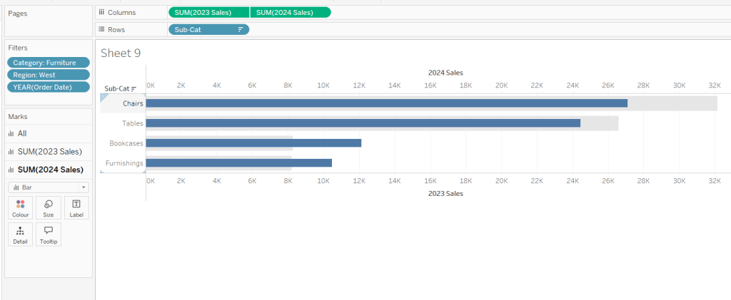
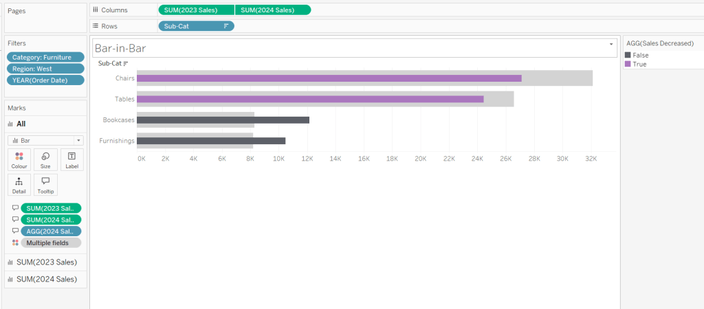
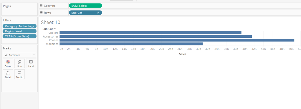
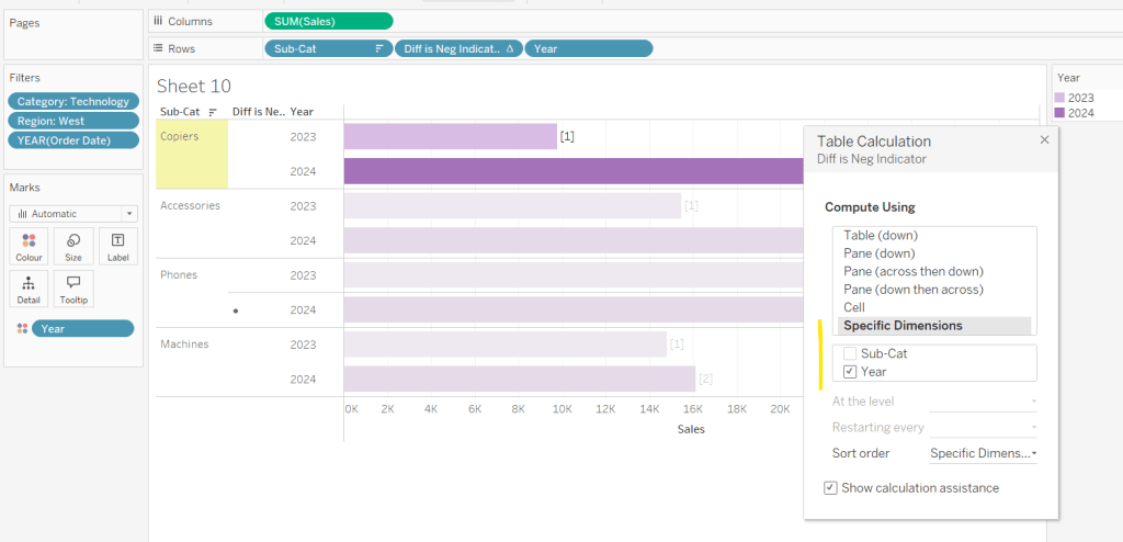
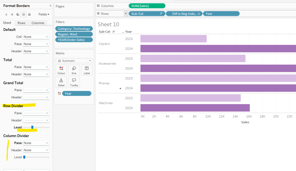
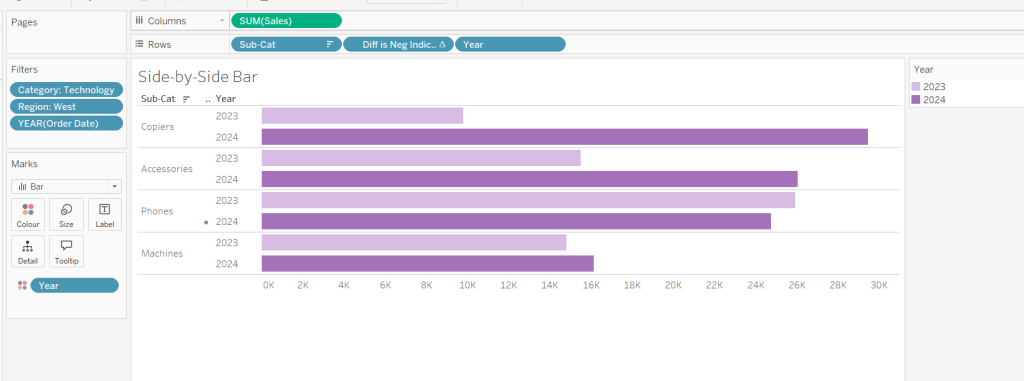
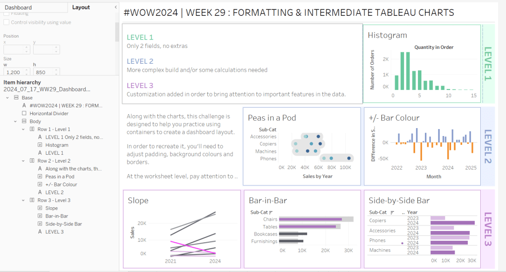


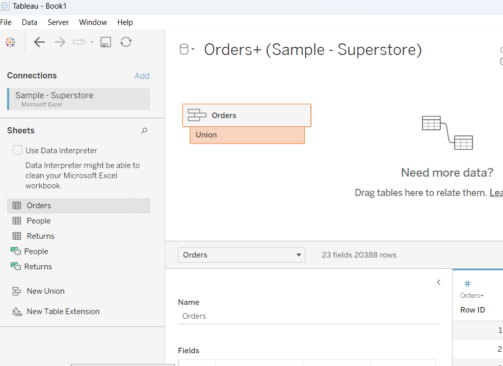
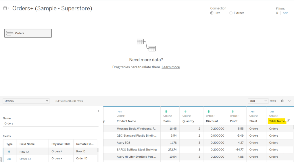

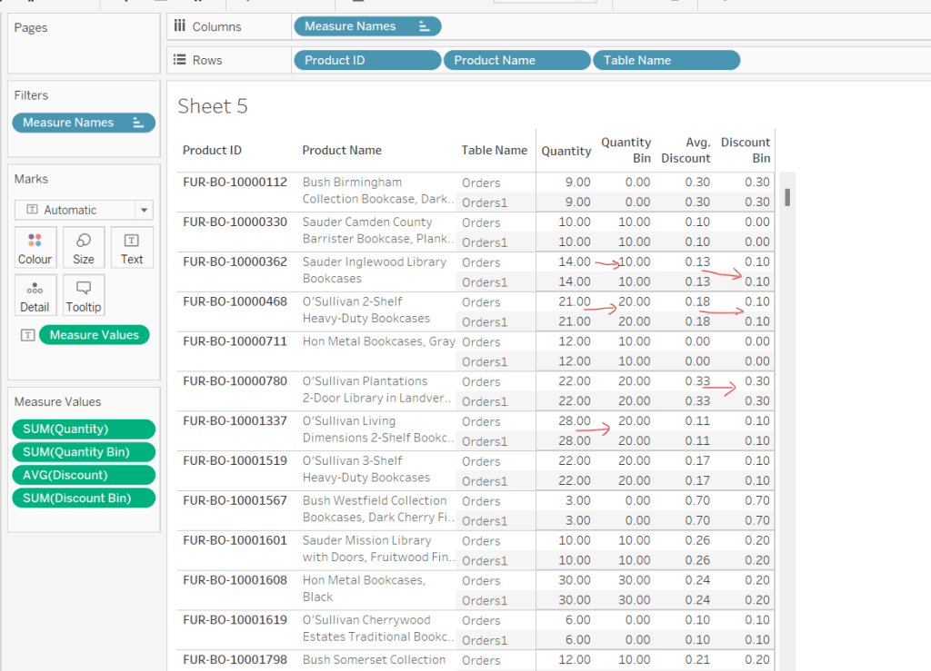
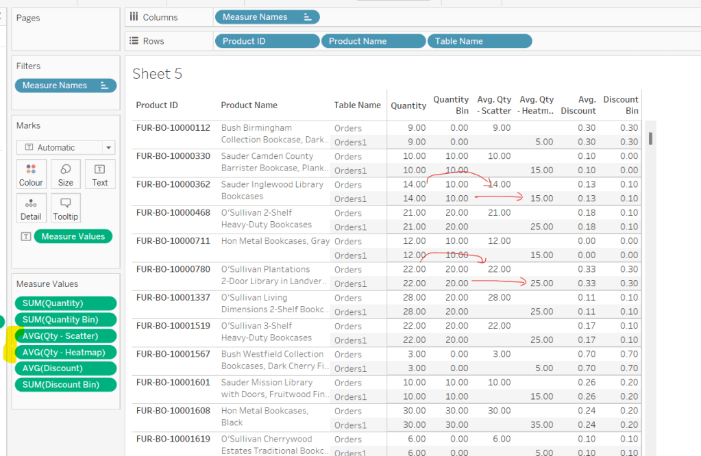
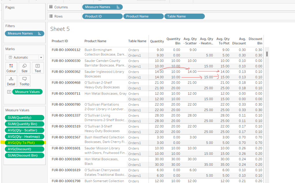
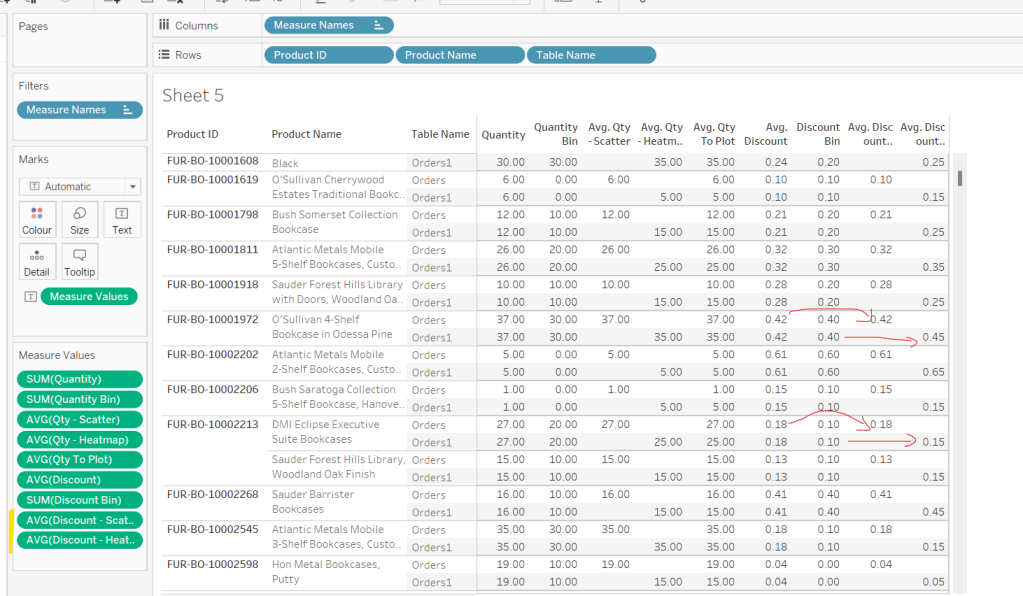
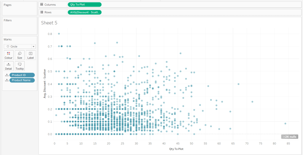
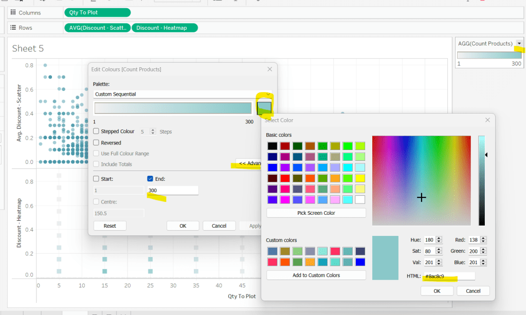
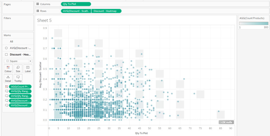
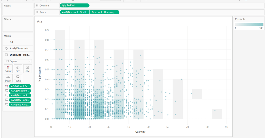


 Donna + DataViz