This week’s #WOW2024 challenge was set by a guest poster, Robbin Vernooij, who wanted us to build a scatterplot with additional features to aid analysis. The main focus was on using Set Actions, so that’s what I used throughout the challenge, although parameters could be also be used.
Modelling the data
I took the simpler route when combining the data sources. After connecting to the Life Expectancy (lex.csv) data source, I deleted all the columns relating to the years except 2022 (Ctl Click to multi select the columns, and then right click and ‘hide’) . I then renamed the column from 2022 to Life Expectancy. The data source just contained 2 fields Country and Life Expectancy.
I then added the Co2 Pcap Cons.csv data source and related it via the Country field. Again I removed all the unnecessary year fields except the 2022 column, and renamed this to Co2 Pcap Cons.
Building the Scatter Plot
On a new sheet, add Co2 Pcap Cons to Columns and Life Expectancy to Rows. Add Country to Detail.
Hide the null indicator.
We need to identify a ‘selected’ country. We could use a parameter for this, but as mentioned above, I’ll use a set.
Selected Country Set
Right click on Country > Create > Set. Select a single country from the list (I chose Russia).
From this we need to determine the Life Expectancy and Co2 Pcap Con values for the selected country, but this value needs to be associated to every Country in the data set (ie every row of data), so we can use a FIXED LoD.
Selected Country Co2
{FIXED:SUM(IF [Selected Country Set] THEN [Co2 Pcap Cons] END)}
Selected Country Life Expectancy
{FIXED:SUM(IF [Selected Country Set] THEN [Life Expectancy] END)}
With these, we then want to define a min and max range for each measure so we can build the reference bands. The tolerance for this range wasn’t mentioned in the requirements, so I checked the solution to ensure I could validate other calculations later on.
Min Co2
[Selected Country Co2] – 1
Max Co2
[Selected Country Co2] + 1
Min Life Expectancy
[Selected Country Life Expectancy] – 4
Max Life Expectancy
[Selected Country Life Expectancy] + 4
Add all four fields to the Detail shelf.
Add a reference band to the Co2 Pcap Cons axis (right click axis > add reference line). Select band and set it to be from the Min Co2 field to the Mx Co2 field.
Repeat the steps for the Life Expectancy axis, to run from the Min Life Expectancy field to the Max Life Expectancy field.
In the example above, I have Russia as the selected country. We now want to identify all the countries that are falling within the bands.
[Life Expectancy]<= [Max Life Expectancy] AND [Life Expectancy] >= [Min Life Expectancy]
And with this, we create another set
Within Band Set
Select the Condition tab, and enter the formula
MIN([Within Co2 Band]) OR MIN([Within Life Expectancy Band])
Add Selected Country Set to Colour, to Size and to Shape. Adjust shape and size to suit. Then add Within Band Set to Detail and then adjust the icon to the left of the pill to the Colour icon, so 2 pills are now on the Colour shelf. Adjust the colours to suit.
Then create
Label – Country
IF [Selected Country Set] THEN [Country] END
And add to the Label shelf. Align bottom centre, and allow labels to overlap other marks.
Hide the Tooltip, Hide all the gridlines and row/column dividers. Format Co2 Pcap Cons and Life Expectancy to 1 dp. Name sheet Scatter or similar.
Building the Average Bar
On a new sheet, add Selected Country Set to Rows. Add Co2 Pcap Cons and Life Expectancy to Columns and change the aggregation of both from SUM to AVG. Manually reorder the In/Out header so Out is listed first. Show the labels. Add Selected Country Set to Colour on the All marks card and adjust accordingly.
Double click into Columns and type MIN(0.0), then move the pill so it’s the first one listed. Change the mark type of the MIN(0.0) marks card to shape. Add Selected Country Set to shape and adjust.
Create a new field
Header Label
IF [Selected Country Set] THEN [Country] ELSE ‘All others’ END
Add this to the Label shelf of the MIN(0.0) marks card. Align the label middle left.
Edit the MIN(0.0) axis to be fixed from -5 to 1 to shift the display to the right
Then remove the axis title, and set the tick marks to None so the axis for this section is hidden
Add Header Label to the Tooltip on the All marks card, and update the tooltip. Remove all gridlines, row & column dividers and hide the Selected Country Set pill on Rows (uncheck show header). Name the sheet Avg Bar or similar.
Building the Count Bar
On a new sheet, add Within Band Set to Columns and lex.csv(Count) to Rows. Add Within Band Set to Colour and Country to Detail. Adjust Colour and tooltip. Name the sheet Count Bar or similar.
Adding the interactivity
Add the sheets to a dashboard and arrange accordingly, Add a dashboard set action
Select Country
On hover of the Scatter chart, target the Selected Country Set. Only allow single selection. Assign values to the set on hover, and retain the values in the set when the selection is cleared.
And hopefully that should be it. My published viz is here.
Erica set this challenge this week, an extension of the classic actual vs target visual that is very common in business dashboards. She provided a customised data set based on Superstore Sales which included some target values.
Building the basic viz
Add Order Date to Filter shelf and restrict to the Year 2023 only. Then add Order Date to Columns and set to the discrete (blue) month level. Add Profit to Rows. Change the mark type to bar.
Add Target Profit to Rows. Change the mark type on the Target Profit marks card to Gantt Bar. Make the chart dual axis and synchronise the axis. Remove Measure Names from the All marks card. Adjust the colour of the gantt bar to grey.
Note – it is possible to add the Target Profit as a reference line. However the width of the line will span the whole width of the ‘space’ allowed for a single month, and can’t be adjusted. Putting Target Profit on its own axis means the width of the bars can differ from the width of the gantt bar which in turn differs from the profit tolerance area we’ll add next.
Adding the tolerance bands
Create a new parameter
pTolerance
Float value defaulted to 0.05 that is displayed as % to 0 dp. Set the range from 0 to 1 with 0.01 increments.
Then create
Target Tolerance Min
SUM([Target Profit]) * (1-[pTolerance])
and
Target Tolerance Max
SUM([Target Profit]) * (1+[pTolerance])
Add both these fields to the Detail shelf on the All marks card. Right click on the Profit axis and Add Reference Line. Add a reference band per cell, which gors from the Target Tolerance Min to the Target Tolerance Max field. Set all Labels & Tooltips to None. Fill the band with a light grey.
Colouring the bars
Create a calculated field
Colour – Bar
IF SUM([Profit]) < [Target Tolerance Min] THEN ‘red’ ELSEIF SUM([Profit]) > [Target Tolerance Max] THEN ‘blue’ ELSE ‘grey’ END
Add this the Colour shelf of the Profit marks card, and adjust the colours to suit. Reduce the opacity of the colour to 85%.
Reduce the Size of the bars slightly, so they are narrower than the Gantt lines.
format to % with 0 dp, and add this field to the Detail shelf of the All marks card.
In addition, format Profit and Profit Target to be $ with 0 dp.
Add Profit, Profit Target, Order Date as a discrete (blue) pill set to the Year level, to Detail too.
Adjust the Tooltip accordingly.
The right click on the right hand Target Profit axis and uncheck show header to hide the axis. Remove all column and row dividers. Remove the title from the Profit axis, and hide the Order Date header label (right click > hide field labels for columns).
Show the pTolerance parameter and test the functionality.
Building the legend
This is a sneaky way to build a legend using the data source available. It relies on using a field that isn’t in use, that has at least 3 dimensions. In this case I chose Region.
Add Region to Columns and exclude West. Right click on the Region field in the data pane and select Aliases. Add an alias for each of the other values to marry up to the legend names.
Manually resort the Regions on the sheet so they are listed in the correct order.
Double click into the Rows shelf and type MIN(1). Edit the axis to fix it to run from 0-1. Add Region to colour and adjust colours accordingly. Reduce opacity to 85% to.
Adjust the height and width of the display and you can see how it starts to look like the required legend.
Hide the axis and remove all gridlines. Adjust the font of the header labels. Hide the Region label heading and stop tooltips from displaying.
The final step is just the then add the two sheets onto a dashboard with the pTolerance parameter displayed too.
This week it’s the Tableau Conference edition – and as I was at #data23, I’m a bit delayed in getting the challenge and solution posted – too much going on and too much sleep to catch up on over the weekend 🙂
It was great to catch up with the #WOW crew in person and to meet so many participants at the social nights out and at the hands on live session too. And thank you for all those who complimented me on this blog – it really does make the time and effort I put into it worthwhile, when I get to hear how much it has helped you all!
Here’s a few pics from the Tableau Conference, and a massive shout out to Chris McClellan, who made me a custom WOW t-shirt!
Ok, enough of the pre-amble, onto the challenge and solution. Lorna set this challenge to recreate what she referred to as a ‘jitterfly’ chart.
Modelling the data
The data needs to be downloaded from data world. This contains multiple files and it was expected to connect to the central_trend_2017_base.xslx file. This file contains multiple sheets. The Population – Females and Population – Males sheets need to be unioned together in the data source canvas.
Drag Population – Females onto the canvas, then drag Population- Males on too, and drop it when the Union option appears beneath the Population – Females
You’ll know you’ve done it right, if you only have a single object in the canvas and the union symbol is displayed
The data displays all years in separate columns – we need to transpose this, so we have a column for Year and a column for the population value.
Click on the first year column (2011), then scroll across to the last year column (2050). Hold down shift and click the last column, and all the columns in between should be highlighted/selected. Right-click on any of the selected columns and select Pivot.
Rename the Pivot Field Names column to Year and rename Pivot Field Values to Population.
To tidy things up a bit, hide the following fields (right click on column and hide) : Sheet, Table Name, Gss Code, Component. Also, change the data type of the Year field to be a number rather than a string. This should leave you with 5 columns
Navigate to Sheet 1 and in the left hand data pane, drag Age from the lower ‘measures’ section to above the line and into the dimensions section. Age isn’t going to be something we aggregate (sum/avg) etc – it is simply a categorical property of the record. This step isn’t critical, but I just like things to be neat :-).
Finally, though it isn’t stated in the requirements, the data relating to District = London needs to be excluded, as it is a summarised total of the other rows. To handle this I added this exclusion as a Data Source Filter, so once applied, I didn’t have to worry about it when I built the chart. Right click on the data source listed on the top left, and select Edit Data Source Filters, then add a condition to exclude the London District.
Creating the calculations
The chart requires a user to select two years to compare – I’ll refer to these as the Primary and Secondary year. We’ll create parameters to enable the selections.
pPrimaryYear
Integer parameter, defaulted to 2033 and displayed in ‘2033’ format (ie no commas). It should allow all other years to be selected (easiest way to get this populated is to right-click on the Year field in the data pane, and Create > Parameter). If you don’t do this, then use the Add values from button to select the Year field to populate the list.
pSecondaryYear
as above, but default to 2023 (the easiest way to create this parameter is to duplicate the first and just amend the name and default value).
With these parameters, we can then create the calculated fields needed to present the relevant values for each year and gender (as hinted by Lorna).
Population – Primary Male
IF [Year] = [pPrimaryYear] AND [Sex] = ‘male’ THEN [Population] END
format this to K with 1 dp
Population – Primary Female
IF [Year] = [pPrimaryYear] AND [Sex] = ‘female’ THEN [Population] END
format this to K with 1 dp
Population – Secondary Male
IF [Year] = [pSecondaryYear] AND [Sex] = ‘male’ THEN [Population] END
format this to K with 1 dp
Population – Secondary Female
IF [Year] = [pSecondaryYear] AND [Sex] = ‘female’ THEN [Population] END
format this to K with 1 dp
popping these into a table as below, you can see the results
The final calculation we need is for the age banding. We can’t use the in-built ‘bins’ function as the final ‘bin’ contains the ‘rest’ and not just 10 values. Also if we used ‘bins’ the ‘labels’ would be based on the data values and not a custom display as we have here.
Age Bracket
IF [Age] <= 10 THEN ‘<=10’ ELSEIF [Age] <=20 THEN ’11-20′ ELSEIF [Age] <=30 THEN ’21-30′ ELSEIF [Age] <=40 THEN ’31-40′ ELSEIF [Age]<=50 THEN ’41-50′ ELSEIF [Age]<=60 THEN ’51-60′ ELSEIF [Age]<=70 THEN ’61-70′ ELSEIF [Age]<=80 THEN ’71-80′ ELSE ’80+’ END
Note – I altered the calculation and label to be <=10 rather than just <10 as is shown in the solution
Building the Viz
On a new sheet, add Age Bracket to Rows, Population Primary Male to Columns and District to Detail. Change the mark type to circle. Manually re-sort the Age Bracket values so <=10 is listed at the top (just drag the value from the bottom to the top).
Drag Population Primary Female onto the canvas and drop it on the Population Primary Male axis when the double green column symbol appears
This will make the values for both male & female display on the same axis, and Measure Names and Measure Values automatically gets added to the viz. But the values are all displaying in the same direction (the positive axis).
To resolve this, double click into the Population Primary Female pill that is in the Measure Values box underneath the marks card and type in *-1 to the end of the pill and press return
The female values will then be displayed in the opposite direction. Adjust the colours of the Measure Names legend to suit.
To make the dots ‘jitter’, that is appear in a random vertical position, we need a measure (green pill) on the Rows so we generate a y-axis.
Now typically when I am creating jitter plots I use the undocumented RANDOM() function which generates a random number between 0 and 1. The function is undocumented, as it only works for some data sources (excel being one). Using RANDOM() was something I mentioned to several attendees of the Live WOW session at Tableau Conference.
However, due to a later requirement, you’ll need to use a different function instead – in this case INDEX(). For clarity I created an explicit calculated field for this
Jitter
INDEX()
INDEX()is a table calculation that creates a unique sequence number from 1 to n for each record in the table partition. In this case the partition is each Age Bracket. Add Jitter to Rows and adjust the table calculation setting so it is computing by District only. Set the fit of the chart to Fit Width to ensure you can see the display better.
Adjust the colour of the marks to 50% opacity.
To handle the detail displayed on the Tooltip we need to create some additional fields for the population values, these ones not split based on gender.
Population – Primary Year
IF [Year] = [pPrimaryYear] THEN [Population] END
format to K with 1 dp
Population – Secondary Year
IF [Year] = [pSecondaryYear] THEN [Population] END
Add Sex, Population – Secondary Year, Population – Primary Year and Population Change to the Tooltip and adjust accordingly.
The coloured bands are based on the average for the ‘primary’ year and sex. Add Population Primary Female and Population Primary Male to the Detail shelf. Double click on Population Primary Female and type in *-1 to ensure you get the relevant negative value.
Right click on the ‘value’ x-axis and Add Reference Line.
Change the option to be a reference band per pane, and set a band to go from Population Primary Female *-1 : Average to a Constant of 0. Ensure no labels/tooltips display, and set the fill colour of the band accordingly.
Add another reference band for the which goes from constant 0 to the Average of Population Primary Male. Adjust fill colour to suit.
Add Population Secondary Male and Population Secondary Female to the Detail shelf. Double click into the Population Secondary Female pill and add *-1 to the end.
Right click on the ‘value’ x-axis and Add Reference Line.
Add a reference line that is the Average of the Population Secondary Female * -1 field. Adjust colour and thickness of line to suit (I used the middle thickness and line coloured at 80% transparency).
Repeat the same to add an average reference line for the Population Secondary Male field.
The final step is to add the age banding label into the centre of the viz.
Double click into the Columns shelf and type MIN(0). This will create a secondary axis with a new marks card. Remove all the pills except District from the MIN(0) marks card. Add Age Bracket to the Label shelf. Adjust the label properties as below – to label the Min/Max per pane; at the District field level, and label the maximum value only.
This positions the label in the same place on each age banding. This works because we have used INDEX() to control the jittering which means the maximum value is always the same for each bracket. If we had used RANDOM() to define the jittering, there would be no guarantee the same maximum value would have existed for every banding.
Reduce the opacity to 0% and size of the circle to be as small as possible on the MIN(0) marks card, and then make the chart dual axis and synchronise the axis.
Finally format the chart by
Hide the Age Bracket column (uncheck show header)
Hide the Jitter axis (uncheck show header)
Hide the MIN(0) axis (again uncheck show header)
Format the Value axis so the title is Population, and the scale is in 0K format and positive in both directions (custom format ,##0,”K”;#,##0,”K”) NOTE wrapping the K in “” ensures the display is retained when publishing to Tableau Public – thank you Deborah for the tip!)
Hide the nulls indicator (right click – hide indicator)
Remove all gridlines, zero line, axis ticks etc
Remove column dividers
Set Row dividers to white with the widest thickness
Set the chart to fit entire view
Add the sheet to a dashboard. Use a text object to display the title and sub-tile which should reference the pPrimaryYear and pSecondaryYear parameters. Float the parameter controls and resize to give the appearance of just the drop down option – this will take a bit of tweaking to get just right, and you may need to edit via Tableau Public to get the positioning right.
It was Sean Miller’s turn to expand on last week’s #WOW2022 challenge, by adding an additional viz to the scatter plot (challenge details here).
The assumption is you should be able to build on the challenge solution you have built in the previous week. My solution to the Reference Box challenge is here. I adopted (and blogged about) a table calc solution. However, the published solution used LoDs. Both methods achieved the desired result, but I decided when starting this challenge, that I would build this ‘extension’ using LoDs too, so anyone who uses the published solution as a starting point, gets help via this blog.
So if you used my previous blog to build the challenge, you’ll need to first create the LoD equivalent of the calculated fields we used (note I did not change the scatter plot viz to use these fields) :
Note – It’s also worth reiterating at this point, that I will be referencing calculated fields/parameters/objects in this blog created as part of my initial challenge.
In order to build the bar chart, we need to categorise each State into a grouping; the selected/highlighted state, the states in the reference box, all other states.
To identify the states in the reference box, we need to use FIXED LoDs to get the value of the Sales and Profit Ratio at the State level.
Sales by State
{FIXED [State]: SUM([Sales])}
PR by State
{FIXED [State]: SUM([Profit])/SUM([Sales])}
We can then use these fields along with the LoDs further above to determine whether a State is in the reference box
In Reference Box?
[PR by State]>=[PR-25th Percentile LOD] AND [PR by State]<= [PR-75th Percentile LOD] AND [Sales by State]>=[Sales – 25th Percentile LOD] AND [Sales by State]<= [Sales – 75th Percentile LOD]
This simply returns a boolean.
Now we can categorise each State
State to Display
IF [Selected State] THEN [State] ELSEIF [In Reference Box?] THEN [State] ELSE ‘Other (median)’ END
And with the above, we can then define the measures we want to show
Sales to Display
{FIXED [State To Display]: MEDIAN([Sales by State])}
PR to Display
{FIXED [State To Display]: MEDIAN([PR by State])}
And with these fields we can now build the bar chart.
Add Selected State to Rows and drag the dimension value, so True is listed before False.
Add In Reference Box? to Rows, and again drag so the True is listed before False.
Add State to Display to Rows
Add Sales to Display to Columns and Sort descending
Add PR to Display to Columns
On the All Marks Card add Selected State to Colour
Then add In Reference Box? to the Detail shelf. Then click on the … icon to the left of the In Reference Box? pill on the marks card, and change to the Colour icon. This should result in 2 fields on the Colour shelf.
Adjust the colours accordingly.
Add Sales to Display and PR to Display to the Tooltip shelf and adjust.
Change the titles of the axis
Remove row banding
Uncheck Show Header against Selected State and In Reference Band?
Hide field labels for Rows against the State to Display column heading
Add this sheet onto the dashboard and you’re done 🙂
Erica Hughes set her first #WOW challenge this week, which is all about reference lines. The intention by the #WOW crew is to use this initial challenge as the basis for the next few weeks, so it’s going to be interesting to see how that works out.
But back to this week. We’re building a basic Sales vs Profit Ratio scatter plot by State, but then need various calculated fields to plot the reference lines and the reference box.
Building the basic chart
Adding the dotted reference lines
Adding the reference box
Making the y-axis symmetrical
Highlighting the selected state
Building the basic chart
First up we need to create our favourite calculated field
Profit Ratio
SUM([Profit]) / SUM( [Sales])
format to percentage with 0 dp.
Create the basic scatter plot as below
Remove all gridlines, zero lines and axis rulers and tick marks.
Adding the dotted reference lines
These lines are the median values for the Profit Ratio and Sales.
Sales – Median
WINDOW_MEDIAN(SUM([Sales]))
format to Custom Currency with 1 dp, $ prefix and display units to Thousands (K).
PR- Median
WINDOW_MEDIAN([Profit Ratio])
format to percentage with 0 dp.
Add both these fields to the Detail shelf, and adjust the table calculation settings of both fields so they are computing by State
Add a reference line to the Sales axis (I do this by right clicking on the axis > Add Reference Line, but you can also drag from the Analytics pane).
Set the reference line to be against the Entire Table, using the Sales – Median field, no label, and the tooltip set to custom as below. Set the line to be dotted.
Apply a similar reference line to the Profit Ratio axis, using the PR – Median value instead.
Adding the reference box
I have to admit, this bit took a bit of trial and error. I knew it was going to involve a combination of bands and lines and colouring above and below, but things didn’t always go to plan. It was this post by Jonathan Allenby that helped.
The block is basically bounded by the 25th & 75th percentile of the Sales and Profit Ratio values. So lets create them
Sales – 25th Percentile
WINDOW_PERCENTILE(SUM([Sales]),0.25)
Sales – 75th Percentile
WINDOW_PERCENTILE(SUM([Sales]),0.75)
Add these fields to the Detail shelf and set the table calculation on both to compute by State.
Add a reference line again to the Sales axis, and this time select Band that goes from the Sales – 25th Percentile to the Sales – 75th Percentile and fill based on the colour stated in the requirements.
Now add a reference line to the Profit Ratio axis. This time select Distribution.
Select the computation to be Percentiles and enter 25 as the value. Set Label, Tooltip and Line to None. Now this is the odd bit… set the Fill to the colour white, then check the Fill Below box, which then seems to set the Fill option to ‘No Fill’. Doing this seems to have the desired effect. Trying this in any other order, or manually selecting the Fill option to be No Fill, just doesn’t seem to work…
Now repeat the process adding another reference line on the Profit Ratio axis, and this time create a distribution for the 75th percentile. This time, after setting the Fill to white, check the Fill Above checkbox. Weirdly this time, the fill on my laptop got set the Grey Light, although it was correctly displaying as white on the screen. I manually changed it to ‘No Fill’.
It feels like there’s something a bit ‘buggy’ with all this, which might explain while my initial attempts were failing. I’ll be interested in knowing if you see this behaviour too (I created on v 2021.4.2).
Making the y-axis symmetrical
This was a ‘bonus’ feature, but is again achieved with a reference line. What we’re looking for here is to understand what is the maximum absolute value so we can determine where to place a hidden reference line – ie if the maximum profit ratio is 20% and the minimum is -30%, the maximum absolute value is 30%, and we’d need a reference line +30%, so the axis extends from -30% to +30%. Conversely if the maximum profit ratio is 40% and the minimum is -25%, the maximum absolute value is 40% and we need a reference line at -40% for symmetry.
I’ve encapsulated all this logic within one field below
Ref Line – Profit Ratio Symmetry
IF MAX(WINDOW_MAX([Profit Ratio]), ABS(WINDOW_MIN([Profit Ratio]))) = WINDOW_MAX([Profit Ratio]) THEN -1*WINDOW_MAX([Profit Ratio]) ELSE -1*WINDOW_MIN([Profit Ratio]) END
The statement MAX(WINDOW_MAX([Profit Ratio]), ABS(WINDOW_MIN([Profit Ratio]))) is returning the maximum of the max and min values (ie MAX(20, ABS(-30)) = MAX(20,30) = 30, MAX(40, ABS(-25)) = MAX(40,25) = 40.
Add this onto the Detail shelf and add another reference line to the Profit Ratio axis, setting it to use the Minimum of the Ref Line – Profit Ratio Symmetry field
Test how the field works, by selecting a few of the State marks towards the top and exclude; the axis should change, but still be symmetrical.
Highlighting the selected state
For this we need a parameter
pSelectedState
string parameter defaulted to Virginia
Then we need a field to identify which state has been captured
Selected State
[State]=[pSelectedState]
which returns a boolean. Change the mark type to Circle and add Selected State to the Colour shelf, and adjust accordingly (add a border to the circle too via the Colour shelf). Also add Selected State to the Size shelf and again tweak.
Once the sheet has been added to the dashboard, create a dashboard parameter action that passes the State field into the pSelectedState parameter on Select of the chart.
The final step to add is to stop all the other marks from ‘fading’ out when a State mark is selected. This is achieved by creating the following calculated fields
True
True
False
False
Add both of these to the Detail shelf of the scatter chart.
On the dashboard, create a dashboard filter action as below, which passes selected fields setting True = False, which can never be true and prevents the mark from being highlighted.
And with that, you should have the desired dashboard. I’m interested to see if this matches Erica’s solution (it’s likely I’ll start with the provided workbook next week, rather than mine, just in case there are some discrepancies – eg I’ve used a lot of table calcs… LoDs may have been possible…)
There’s a lot packed into the challenge this week, which was “set” by Lorna Brown and Erica Hughes to test our Set Action skills. How detailed this blog will go, I have yet to decide… I’ve got a couple of hours to get this nailed, so it could get quite brief as we get towards the end 🙂
I’ve got 6 sheets/charts making up this dashboard, so my intention is to summarise each one, and I’ll define the various calculations that are going to be needed as we go.
The overall summary table
The selected months summary table
The trend line
The donut chart
The top 3 states table
The map
Adding the interactivity
The overall summary table
This challenge is focused on understanding the Sales per month. Whilst its possible to use the built in aggregation features of a date field, I often prefer to create explicit date fields at the level I require, so it’s easier to reference. Therefore, the first field I created for this challenge was
Order Date To Plot
DATETRUNC(‘month’, [Order Date])
This essentially ‘groups’ every order placed in a month to be tagged with the 1st of the month. I custom formatted this field to MMM yyyy (ie Oct 21).
For the overall summary table, I need to capture the total sales of the whole data set, and I use a Fixed LoD calculation for this.
Total Sales
{FIXED: SUM([Sales])}
This field is formatted to $0.00M
NOTE – I actually named this field <space>Total Sales<space> as I want to display the name of the field (the measure name) in the summary table, but the ‘selected months’ summary table also has a Total Sales measure which is a different calculation (see later). Adding the <spaces> is a sneaky way to get two fields with what appears to be the same name. As this field when displayed will be centred, the <spaces> aren’t noticeable.
We also need to get the monthly average sales for the whole data set
Average Sales by Month
AVG({FIXED [Order Date To Plot]: SUM([Sales])})
Format this to to $0.0K
We can now build the summary table by adding Measure Names to the Filter shelf and selecting these 2 fields. The placing Measure Names on Rows and Measure Names and Measure Values on Text. Reorder the measures as required, hide Measure Names on Rows and format the Text as required.
Change the title of the sheet to Superstore Sales, ensure the tooltip doesn’t display and remove all gridlines / row banding etc.
The selected months summary table
The core requirement of this challenge is to make use of set actions, so we’re obviously going to need a set which will contain the dates (months) the user will select on the chart. This set will be based off of Order Date To Plot. Right click on the field > Create > Set. Name it Order Dates To Plot Set and by default, select all the months between Oct 20 to Jun 21 inclusive.
Later I’ll describe how the values of this set will get updated, but for now, we need to get some information relating to the sales in these selected months.
Firstly, we want the total sales for the months in this set.
Total Sales
IF [Order Date To Plot Set] THEN [Sales] END
The default format for this field is set to $ with 0 dp.
Note – this is the other ‘total sales’ field mentioned earlier. This field name has no leading/trailing spaces.
To get the average, I needed a field just to store each member of the set (ie each selected month)
Selected Dates
IF [Order Date To Plot Set] THEN [Order Date To Plot] END
and with this I can then work out
Average Sales
AVG({FIXED [Selected Dates]: SUM([Total Sales])})
The final measure required for this section is the change within the date range, which is basically comparing the value of sales at the first month in the selection with the sales in the final month selected. We need a few fields to get to this.
Firstly, we want to identify the first and last months
Min Selected Date
{FIXED:MIN(IF [Order Date To Plot Set] THEN [Order Date To Plot] END)}
If the date is in the set, then return the date and then take the minimum of all the dates, and store against all the rows in the data. Similarly we have
Max Selected Date
{FIXED:MAX(IF [Order Date To Plot Set] THEN [Order Date To Plot] END)}
Putting this info into a table, you can see how the calculations are working. The values for the Min & Max dates are the same across every row.
Next we need to get the Sales at the min & max points, and spread that value across all rows
Sales at Min Date
{FIXED: SUM(IF [Order Date To Plot]=[Min Selected Date] THEN [Sales] END)}
Sales at Max Date
{FIXED: SUM(IF [Order Date To Plot]=[Max Selected Date] THEN [Sales] END)}
Now we can work out the difference
Change within Date Range
([Sales at Max Date]-[Sales at Min Date])/[Sales at Min Date]
format this to a percentage set to 1 dp
Finally, we need to know the number of months in the set, which is displayed in the title of the monthly summary sheet.
Months in Set
{FIXED: COUNTD(IF [Order Date To Plot Set] THEN [Order Date To Plot] END)}
If the date is within the set, then capture the date, and the count the distinct set of dates captured.
Make this a discrete field (move from the measures section at the bottom of the data pane to the dimensions section at the top (above the line), and add to the tabular view
Now we can build the summary sheet.
Add Measure Names to the Filter shelf and this time filter by Total Sales, Average Sales and Change within Date Range. Add Measure Names to Rows and Measure Values to Text. Reorder the measures.
Format the Total Sales to be in $K, by selecting the Format option from the context menu of the Total Sales pill on the Measure Values shelf (hover on the pill and click the carrot/down arrow that appears – by formatting this way, we’re changing the display of this field for this sheet only).
Add Min Selected Date and Max Selected Date to the Detail shelf and set to be Exact Date. Format both these fields via the pill context menu to be the ‘March 2001’ format
Also add Months in Set to the Detail shelf.
Adjust the title of the sheet as below
Finally you need to set the background of the worksheet to the relevant purple (I used #8074a8), adjust the colours of all the fonts to white and adjust the size/style of the fonts in the table. Remove all gridlines/row banding etc, and you should have something like below
The Trend Line
By this point we’ve built all the calculated fields we need for this chart. This is a dual axis line chart, as we want the colour of the line for the selected dates to be different from the non selected ones, and we want to display a label for the highest sales in the selected timeframe.
Add Order Date to Plot to Columns, and set as a Continuous (green) pill set to Exact Date
Add Sales to Rows
Add Total Sales to Rows
Make the chart dual axis, and synchronise axis.
Adjust the colours of the Measure Names colour legend
On the Label shelf of the Total Sales marks card, set to label the maximum value only
On the All Marks Card, add Min Selected Date and Max Selected Date to the Detail shelf and set to Exact Date.
Right click on the Order Date To Plot axis and Add Reference Line
Create a reference band that starts at the constant Min Selected Date, ends at the constant Max Selected Date, is bounded by dotted lines and shaded between
Hide the Sales and Total Sales axis, format tooltips and adjust the row & column dividers.
Change the title and you should get to
The donut chart
Donut charts are 2 different sized pie charts on top of each other, created using a dual axis chart. On the Rows shelf type in MIN(0). Then type the same next to it. This gives you two axis and two marks cards.
We only care about information related to the selected dates for this chart, so we can add Order Date To Plot Set to the Filter shelf, which by default will just restrict the information to the data ‘in’ the set.
Change the mark type of the 1st MIN(0) marks card to Circle and add Sales to the Tooltip shelf. Adjust the size of the charts/mark.
Change the mark type of the 2nd MIN(0) marks card to Pie and add Sales to the Angle shelf. Add State to the Detail shelf. Sort the State field by Sales descending.
Note – the circles might look the same at this point, but if you hover over the bottom one, you should see that it’s segmented by State.
We need some new fields now to help us identify the top ranking states.
Sales Rank
RANK(SUM([Sales]))
This is a table calculation, so it’s best to see how this field will work in a table view – build one out as below, and set the table calculation on the Sales Rank field as shown
We’re now going to ‘group’ the ranks into the top 3 and everything else
Sales Rank Group
IF [Sales Rank]<=3 THEN [Sales Rank] ELSE 10 END
We can now use this Sales Rank Group field to colour the pie chart. On the 2nd MIN(0) marks card, add Sales Rank Group to the Colour shelf. Adjust the table calculation to compute using State as above, then change the field to be Discrete (blue). Adjust the colours to suit.
Now make the chart dual axis, and synchronise the axis. Adjust the size of the 1st MIN(0) circle to be smaller than the pie. If it’s not showing, right click on the right hand axis and move marks to back. Colour the circle white. Adjust tooltips to suit and hide axis, column/row dividers etc. Update the title. You should have
The top 3 states table
Add Order Date To Plot Set to Filter
Add State to Rows and Sales to Text and sort descending.
Add Sales Rank to Filter and set to At Most is 3. This will just show the top 3 states.
Add State to Text
Add a Percent of TotalQuick Table Calculation to the existing Sales field that’s on the Text shelf (via the context menu of the pill)
Add another instance of Sales back onto the Text shelf
Adjust / format the font size and layout of the fields on the Text shelf
Add Sales Rank to the Size shelf and set to be discrete (blue) and set the mark type to be Text. Adjust the size of the marks – it’s likely it’ll need to be reversed and the range adjusted.
Hide the State field on Rows, adjust the font colours, remove row banding and row/column dividers. You should end up with…
The map
Add Order Date To Plot Set to the Filter shelf
Add State to Detail – this should create a map (edit locations to be US if need be – Map -> Edit Locations menu)
Add Sales to the Colour shelf
Edit the colour range to a suitable purple range ( I set the darkest colour of the range to #6c638f)
Adjust the map layers (Map -> Map Layers) so only the option highlighted below is selected.
Adding the interactivity
Add all the sheets to the dashboard, using vertical and horizontal containers to arrange the relevant layout. Then add a Set Action (Dashboard > Actions > Add Action > Change Set Values). The Set Action should be configured as below :
And fingers crossed, you should now be able to select marks on the trend line and see all the other charts, except the initial summary table, all update. My published viz is here.
Continuing with ‘Community Challenge’ month, it was the turn of Will Perkins to set the challenge for this week; a challenge inspired by Google’s stock tracker.
By interacting with the published solution and reading the requirements, I deduced that I was likely to need 3 sheets – 1 for the Region headings & KPIs, 1 for the trend line chart, and 1 to drive the timeframe selections. The trend line chart looked like it was going to involve a dual axis combining a line and and area chart, along with ‘filled’ reference bands, although exactly how it would work I wasn’t entirely sure initially. Finally, there was going to be some ‘parameter actions’ action along with the ‘true = false’ trick to ensure selected marks didn’t remain highlighted.
But before we can tackle the actual chart build, we need to nail some of the calculations involved.
Identifying the date range to highlight
The intention of the chart is that on initial load, it has highlighted the timeframe for the last 14 days up to ‘today’. As this chart is being built with a static data set, which only has data up to the end of 2021, I chose to ‘hardcode’ my ‘today’ value into a parameter. This is so that in a year’s time when I might look at this again, I won’t be presented with a broken looking viz.
pToday
Date parameter defaulted to 20 Sept 2021
The user also has the ability to highlight/select dates on the chart itself, which will define a start and end date range. So we also need some additional parameters to capture this information.
pStartRange
Date parameter defaulted to 01 Jan 1900
Similarly you’ll need a pEndRange parameter too, also defaulted to 01 Jan 1900.
Later on we’ll define parameter actions which will ‘set’ these values based on user interaction.
With these fields, we can then define calculated fields to store the start and end dates depending on whether we’re using the defaults due to initial load (ie 14 days to today), or a user selected range.
Selected Range Start Date
IF [pStartRange] = #1900-01-01# THEN DATE(DATEADD(‘day’,-14,[pToday])) ELSE DATE([pStartRange]) END
Selected Range End Date
IF [pEndRange] = #1900-01-01# THEN DATE([pToday]) ELSE DATE([pEndRange]) END
We’re going to be plotting Order Date on our axis at the day level, and so to simplify things IMO, I created
Order Date Day
DATE(DATETRUNC(‘day’,[Order Date]))
which I then reference in the following calculated field, which is just to capture all the days within the range selected
Selected Dates To Plot
IF [Order Date Day]>= [Selected Range Start Date] AND [Order Date Day]<=[Selected Range End Date] THEN [Order Date Day] END
We can now start to build out the basic chart
Plotting Order Date Day and Selected Dates to Plot side by side you can see the date axis differ, with only the dates from 06 Sep – 20 Sep 21 displaying on the right hand side. The marks type for Selected Date to Plot is set to Area, and to get the marks to join up, you need to turn Stack Marks Off (Analysis -> Stack Marks -> Off menu).
Defining the Timeframe to Display
We’re going to use another parameter to store the timeframe value
pTimeframe
String parameter defaulted to 6 MONTHS (note the case – it’s simpler to match it to the display format that’s going to be used)
We then need a calculated field to tell us what to do with this value
Timeframe to Display
CASE [pTimeframe] WHEN ‘1 MONTH’ THEN [Order Date Day]>=DATEADD(‘month’,-1,[pToday]) AND [Order Date Day]<= [pToday]
WHEN ‘6 MONTHS’ THEN [Order Date Day]>=DATEADD(‘month’, -6, [pToday]) AND [Order Date Day]<= [pToday]
WHEN ‘YTD’ THEN [Order Date Day]>=DATETRUNC(‘year’,[pToday]) AND [Order Date Day]<= [pToday] WHEN ‘1 YEAR’ THEN [Order Date Day]>= DATEADD(‘year’,-1,[pToday]) AND [Order Date Day]<= [pToday] ELSE [Order Date Day] <= [pToday] END
This field will return true for all the dates that fall within each statement and false otherwise.
Add this field to the Filter shelf and select True.
You can test how the left hand side of the chart is affected by manually typing the different values into the parameter
Colouring the chart
The line and area charts are coloured based on whether dates fall in the selected range and whether the difference between the sales values at the start and end of the selected range is positive or not. We need several more calculated fields to work this out.
We firstly need to capture the min and max dates of the selected area for each region. Now, you initially might think that the Selected Range Start Date and Selected Range End Date fields already have these values. However there isn’t always a sale in every region for these dates. You could argue, that in that case, the sales value for that date should be 0 (ie there were no sales on that day), but to match the solution (and it was easier), we just get the min and max dates within the selected range that have a sales value for each region.
Min Selected Date Per Region
{FIXED [Region]: MIN([Selected Dates to Plot])}
Max Selected Date Per Region
{FIXED [Region]: MAX([Selected Dates to Plot])}
Pop these out into a quick view, and you can see how the dates differ per region compared to the default start & end date values
Now we want to work out the sales value on these dates
Min Date Sales
{FIXED [Region]: SUM(IF [Order Date Day]=[Min Selected Date Per Region] THEN [Sales] END)}
Max Date Sales
{FIXED [Region]: SUM(IF [Order Date Day]=[Max Selected Date Per Region] THEN [Sales] END)}
and then we can work out the difference and the % difference
Range Sales Diff
SUM([Max Date Sales])-SUM([Min Date Sales])
custom formatted to +”$”#,##0.00;-“$”#,##0.00 to show a ‘+’ prefix for positive values
Range Sales % Diff
[Range Sales Diff]/SUM([Min Date Sales])
custom formatted to ▲0.0%;▼0.0%
Now we can compute a field to use to colour the line/area chart
Colour – Trend
IF MIN([Order Date Day]) >= [Selected Range Start Date] AND MIN([Order Date Day])<= [Selected Range End Date] THEN
IF [Range Sales Diff]>= 0 THEN 1 ELSE -1 END ELSE 0 END
If we’re within the selected date range, then test to see if the value is positive (set to 1) or negative (set to -1), otherwise we’re outside the selected date range, so set to 0
Go back to the trend chart and add this field to the Colour shelf of the All Marks card (so it gets added to both sets of marks). Change it to be a discrete (blue) pill and the adjust the colours accordingly. At this point you may want to change the background colour if you’re using a white line. I’m just setting it to a light grey at this point, but eventually it’ll get set to black.
Adding the highlight band
This took a lot of thinking. I knew I’d need a reference band, but it took some time to figure out how to get the backgrounds coloured differently, since you only have the option to fill between the band with one colour.
The trick is to make use of the two date axes we have and to apply a band per pane.
But we need some more fields to make this happen.
Ref Line Start Date -ve
IF [Range Sales Diff]<0 THEN [Selected Range Start Date] END
Ref Line End Date -ve
IF [Range Sales Diff]<0 THEN [Selected Range End Date] END
Add these fields to the Detail shelf of the Order Date Day card and set to be continuous (green). Then add a reference band to this axis, applying the settings as below (note, the Line is a white dotted line, so isn’t showing up in the field setting, though you can see it on the viz).
Because the reference band has been set at the pane level, and the reference line dates are only relevant if the difference is negative, then the band is just showing on one row.
We then do something very similar, but this time we get some dates only if the difference is positive.
Ref Line Start Date +ve
IF [Range Sales Diff]>=0 THEN [Selected Range Start Date] END
Ref Line End Date +ve
IF [Range Sales Diff]>=0 THEN [Selected Range End Date] END
Add these as continuous pills on the Detail shelf of the Selected Dates to Plot card, and add another reference band to this axis instead.
Now you can set the chart to be a dual axis, synchronising the axes, and removing the Measure Names field from the All Marks card which will have automatically been added
This is the core viz, that will need further formatting before its ready to put on the dashboard – remove gridlines, borders etc, set background, remove headers. NOTE– You’ll need to manually re-sort the Regions before the field is hidden.
The KPI table
We need to build a ‘fake table’ for this, by putting Region on Rows and typing MIN(0) on Columns, then adding the Range Sales Diff and Range Sales % Diff fields to the Text shelf. We need an additional field to colour the text though.
Colour – KPI
[Range Sales Diff]>=0
Finally, I capitalised the Region values by using Aliases. This is a quick method when there aren’t many values, but otherwise I would usually create a field with UPPER([Region}).
Once again don’t forget to sort the Regions, and the apply relevant formatting.
The Timeframe Selector
Will states you can use a separate data source for this, so create the list in Excel
and then copy and paste (via the Data > Paste) menu into your workbook
On a new sheet add Date Range to Columns and Date Range to Text. The size and colour of the text differs based on which one has been selected. So create a field
Timeframe Selected
[Date Range] = [pTimeframe]
and add this field to both the Size and Colour shelves. You’ll need to adjust the settings, and hide headers, remove gridlines etc. Try to avoid touching the Text formatting directly, as you might find the Size then doesn’t adjust.
Adding the interactivity
You’ll need to use layout containers to organise all the objects on the dashboard. Then you can add the various dashboard parameter actions needed
Selecting the timeframe
Add a parameter action that on select passes the Date Range field into the pTimeframe parameter
Selecting the date range to highlight
You’ll need 2 parameter actions for this, one that passes the minimum Order Date Day selected into the pStartRange parameter, and the other that passes the maximum Order Date Day selected into the pEndRange parameter.
Deselecting the highlighted marks
By default when you click on a mark/select marks in Tableau, they are highlighted/selected and the other marks are faded, until you ‘click’ again. To stop this from happening I use a ‘true = false’ trick, that has become very common in #WOW challenges, and I’ve blogged many times before.
Create calculated fields
True
True
and
False
False
and add these to the Detail shelf of the All Marks card on the trend line chart.
Then on the dashboard add a Filter action that on select targets the sheet directly, mapping the true field to the false field. As this can never be ‘true’ the filter doesn’t apply, and the marks become unselected.
Repeat the same on the Timeframe Selector sheet.
Hopefully that’s covered all the core points. My published viz is here.
When I was approached by the #WOW crew to provide a guest challenge, I was a little unsure as to what I could do. I primarily work as a Tableau Server admin, so rarely have a need to build dashboards (which is why I like to do the weekly #WOW challenges, to keep up my Desktop skills). Then the next day I was looking at a dashboard I’d built to monitor extracts on our Tableau Servers, and I thought it would be an ideal candidate for a challenge. I also thought it would provide any users of Tableau Server with the opportunity to implement this dashboard in their own organisation if they wished, by sharing with their Server Admins.
As a Tableau Server Admin, you get access to a set of ‘out of the box’ Admin views, one of which is called ‘Background Tasks for Extracts’ which gives you a view of when extracted data sources and workbooks run on the server. However while the provided view is fine if you want to quickly see what’s going on now, it’s not ideal if you want to see how things ran over a longer timeframe – it involves a lot of horizontal scrolling.
Many server admins will have ‘opened’ up access to the Tableau repository, the PostgreSQL database which stores a rich array of data, all about your Tableau Server [see here for further info], and enables admins to extend their analysis beyond the provided Admin views. This site even provides a set of pre-curated data sources to help you get started! These aren’t formally supported by Tableau, but is the brain-child of Matt Coles, a server admin at Tableau (no relation to me though!).
My dashboard doesn’t actually use one of these data sources though. For the challenge, I’ve just created some sample, anonymised data in the required structure. I’ll explain later at the end of the post how to go about converting this to use ‘real’ server data, if you do want to plug it into your own server environment.
Understanding the data
When using Tableau Server, published data sources and workbooks can connect to their underlying data source (eg a SQL Server database, an Excel file etc) directly (ie via a live connection) or via an extract. An extract means that a copy of the data is pulled from the underlying data source and stored on Tableau Server utilising Tableau’s ‘in memory’ engine when the data is then queried. An extract gets added to a schedule which dictates the time when the extract will get refreshed; this may be weekly, daily, hourly etc. Every time the extract runs, a background task is created which provides all the relevant details about that task. The data for this challenge provides 1 row for each extract task that was created between Monday 11th Jan 2021 and Friday 5th Feb 2021. The key fields of note are:
Id – uniquely identifies a task
Created At – when the task was created
Started At – when the task actually started running (if too many tasks are set to run at the same time, they will queue until the server resources are available to execute them).
Completed At – when the task finished, will be NULL if task hasn’t finished.
Finish Code – indicates the completion status of the job (0=success, 1=failed, 2= cancelled)
Progress – supposed to define the % complete, but has been observed to only ever contain 0 or 100, where 100 is complete.
Title – the name of the extract
Site – the name of the site on the server the extract is associated to
Based on the Finish Code and Progress, I have derived a calculated field to determine the state of the extract (to be honest, I think this is a definition I have inherited from closer analysis of the Background Tasks for Extracts Server Admin view, so am trusting Tableau with the logic).
Extract Status
IF [Finish Code] = 1 AND [Progress] <> 100 THEN ‘In Progress’ ELSEIF [Finish Code] = 0 AND NOT [Progress] = 1 THEN ‘Success’ ELSE ‘Failed’ END
Building the required calculated fields
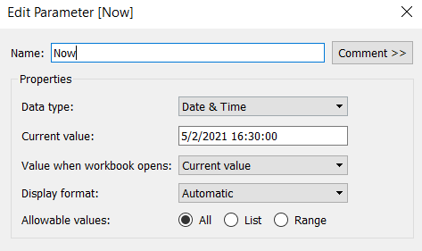
The intention when being used ‘in real life’, is to have visibility of what’s going on ‘Now’ as well as how extracts over the previous few days have performed. As we’re working with static data, we need to hardcode what ‘Now’ is. I’ll use a parameter for this, so that in the event you do choose to plug this into your own server, you only have to replace any reference to the Now parameter with the function NOW().
Now
Datetime parameter defaulted to 05 Feb 2021 16:30
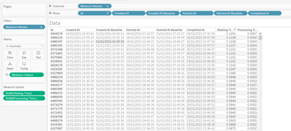
The chart we are going to build is a Gantt chart, with 1 bar related to the waiting time of the task, and 1 bar related to the running time of the task. We only have the dates, so need to work out the duration of both of these. These need to be calculated as a proportion of 1 day, since that is what the timeframe is displayed over.
Waiting Time
(DATEDIFF(‘second’, [Created At], IF ISNULL(Started At]) THEN [Now] ELSE [Started At ] END))/86400
Find the difference in seconds, between the create time and start time (or Now, if the task hasn’t yet started), and divide by 86400 which is the number of seconds in a day.
We repeat this for the processing/running time, but this time comparing the start time with the completed time.
Processing Time
(DATEDIFF(‘second’, [Started At], IF ISNULL([Completed At]) THEN [Now] ELSE [Completed At] END))/86400
As mentioned the timeframe we’re displaying over is a 24 hr period, and we want to display the different days over multiple rows, rather than on a single continuous time axis spanning several days.
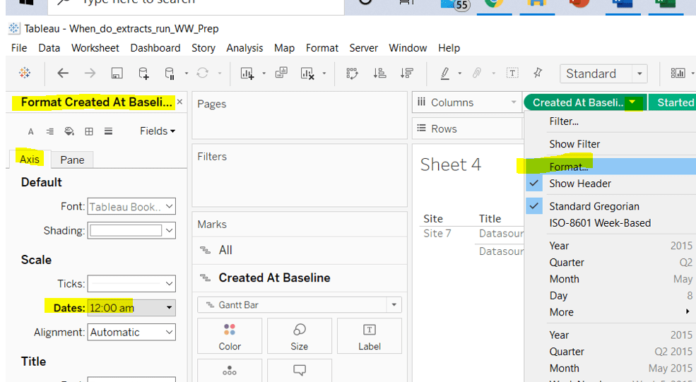
To achieve this, we need to ‘baseline’ or ‘normalise’ the Created At field to be the exact same day for all the rows of data, but the time of day needs to reflect the actual Created At time . This technique to shift the dates to the same date, is described in this Tableau Knowledge Base article.
Putting this out into a table, you can see what this data all looks like (note, I’m just choosing a arbitrary date of 01 Jan 2021, so my baseline dates are all on this date:
Building the Gantt chart
We’re going to build a dual axis Gantt chart for this.
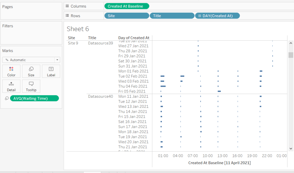
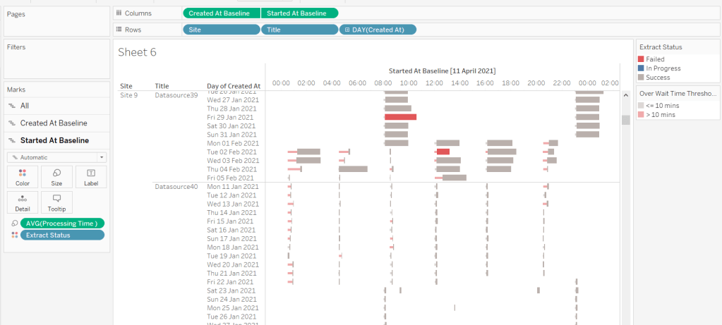
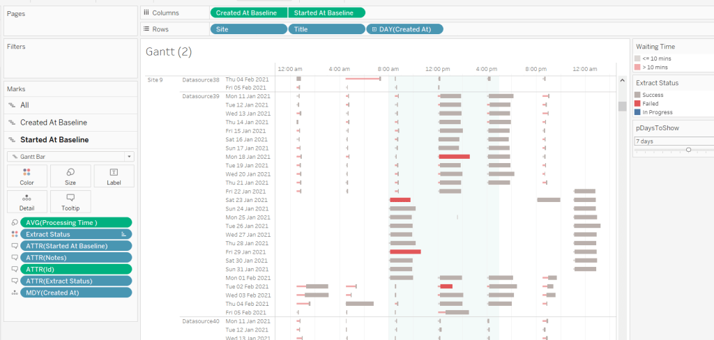
Add Site to Rows
Add Title to Rows
Add Created At to Rows. Set it to the day/month/year level and set to be discrete (ie blue pill). Format the field to custom format of ddd dd mmm yyyy so it displays like Mon 11 Jan 2021 etc
Add Created At Baseline to Columns, set to exact date
Add Waiting Time (Avg) to Size and adjust to be thin
This will automatically create a Gantt chart view
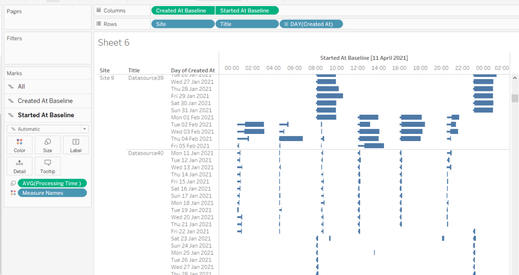
Next
Add Started At Baseline to Columns, set to exact date, and move so the pill is now placed to the right of the Created At Baseline pill
On the Started At Baseline marks card, remove Waiting Time and add Processing Time (Avg) to the Size shelf instead. Adjust so the size is thicker.
Set the chart to be dual axis and synchronise the axes
The thicker bars based on the Started At / Processing Time need to be coloured based on Extract Status. Add this field to the Colour shelf of the Started At Baseline marks card and adjust accordingly.
The thinner bars based on the Created At / Waiting Time need to be coloured based on how long the wait time is (over 10 mins or not).
Over Wait Time Threshold
[Waiting Time] > 0.007
0.007 represents 10 mins as a proportion of the number of minutes in a day (10 / (60*24) ).
Add this field to the Colour shelf of the Created At Baseline marks card and adjust accordingly (I chose to set to the same red/grey values used to colour the other bars, but set the transparency of these bars to 50%).
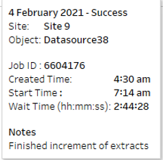
Formatting the Tooltips
The tooltip for the Waiting Time bar displays
The Created At Baseline and Started At Baseline should both be added to the Tooltip shelf and then custom formatted to h:mm am/pm
The Waiting Time needs to be custom formatted to hh:mm:ss
The tooltip for the Processing Time bar is similar but there are small differences in the display,
Formatting the axes
The dates on the axes are displayed as time in am/pm format.
To set this, the Created At Baseline / Started AtBaseline pills on the Columns shelf need to be formatted to h:mm am/pm
Adding the reference band
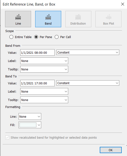
The reference band is used to highlight core working hours between 8am and 5pm. Right click on the Created AtBaseline axis and Add Reference Line. Create a reference band using constants, and set the fill colour accordingly.
Apply further formatting to suit – adjust sizes of fonts, add vertical gridlines, hide column/axes titles.
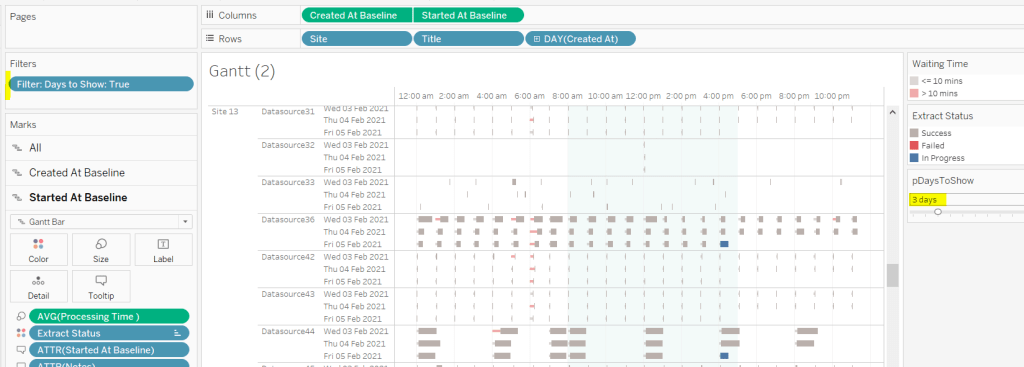
Filtering the dates displayed
As discussed above, when using this chart in my day to day job, I’d be looking at the data ‘Now’. As a consequence I can simply use a relative date quick filter on the Started At field, which I default to Last 7 days.
However, as this challenge is based on static data, we need to craft this functionality slightly differently.
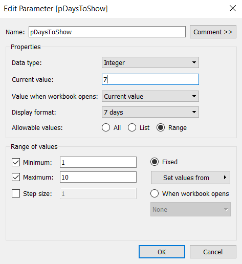
We’re only going to show up to 10 days worth of data, and will drive this using a parameter.
pDaysToShow
An integer parameter, ranging from 1 to 10, defaulted to 7, and formatted to display with a suffix of ‘ days’.
We then need a calculated field to use to filter the dates
Additionally, the chart can be filtered by Site, so add this to the Filter shelf too.
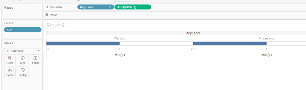
Building the Key legend
Some people may build this by adding a separate data source, but I’m just going to work with the data we have. This technique is reliant on knowing your data well and whether it will always exist.
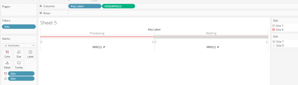
On a new sheet, add Site to the Filter shelf and filter to sites 7 and 9.
Create a new field
Key Label
If [Site] = ‘Site 9’ THEN ‘Waiting’ ELSE ‘Processing’ END
and add this to the Columns shelf and sort the field descending, so Waiting is listed before Processing.
Alongside this field, type directly into the Columns shelf MIN(1).
Edit the axes to be fixed to from 0 to 1. Then add the Site field to the Colour shelf and also to the Size shelf and adjust accordingly (you may need to reverse the sizes). I lightened the colour by changing the opacity to 50%.
Now hide the axes, remove row & column borders, hide the column title and turn off tooltips.
The information can all now be added to a dashboard.
Using your own data
To use this chart with your own Tableau Server instance, you need to create a data source against the Tableau postgres repository that connects to the _background_tasks (bgt) table with an inner join to the _sites (s) table on bgt.site_id = s.Id. Rename the name field from the _sites table to Site. If you don’t use multiple sites on your Tableau Server instance, then the join is not required. The sole purpose of the join is to get the actual name of the site to use in the display/filter.
You should then be able to repoint the data source from the Excel sheet to the postgres connection. You may find you need to readjust some of the colours though.
When I run this, I’m using a live connection so I can see what is happening at the point of viewing, rather than using a scheduled extract. To help with this, I add a data source filter to limit the days of data to return from the query (eg Created at <=10 days), which significantly reduces the data volume returned with a live connection.
Hopefully you enjoyed this ‘real world’ challenge, and your server admins are singing your praises over the brilliance of this dashboard 🙂
Sean Miller provided the challenge for this week, resurrecting a challenge originally set by Emma Whyte in 2017. Revisiting these older challenges is great fun, as often newer product features provide a different way of solving. For me, I also like the fact I know I’ve already solved it once, and have my own work to reference if I get stuck – ha ha!
Sean hinted that this wasn’t a challenge to ‘overthink’ – no table calcs or LoDs required. You need to be able to display average responses per question per university alongside the overall average response for the question. Simply filtering by university isn’t going to cut it, as the quick filter will immediately eliminate all the data that isn’t associated to the selected university, which means you can’t compute an ‘overall average’ without using LoDs.
The key to this challenge is to use a parameter to drive the University selection. Create this by right clicking on the University field -> Create > Parameter. This will create the parameter dialog box, prepopulated with all the university values. Set the default to University of Liverpool.
pUniversity
With this, we can now create calculated fields to store the values associated to the selected university only.
Note 1, there is already field called Sample Size in the data set. The actual name of this field is <space>Sample Size<space> which Tableau sees as a different name. In hindsight I should have just renamed the original field, so I could then have ‘Sample Size‘. Be mindful of this when I refer to the field later; unless I call it out, I’m referring to my version.
Note 2, I chose to apply the AVG aggregation within the calc rather than changing the default aggregation on the pill when added to the view. There was a reason I did this, but I can’t recall what it was, and think it wasn’t necessary in the end….
University Avg
AVG(IF [University] = [pUniversity ] THEN [% Agree] END)
formatted to percentage, 1 dp
We can also then define the overall average for comparison
Overall Avg
AVG([% Agree])
formatted to percentage, 1 dp
and with that can calculate the variance between the two
Delta
([University Avg]) – ([Overall Avg])
This is custom formatted to 0.00%▲;0.00%▼ (I use this site to get the arrow characters)
And then we need a field to define how the mark needs to be coloured
Colour
[Delta]>=0
We can put these all out in a view
Question Number (which I renamed to No) on Rows
Question Text on Rows
Sample Size on Rows (set to be a discrete blue pill)
University Avg on Rows (set to be discrete)
Overall Avg on Rows (set to be discrete)
Delta on Rows (set to be discrete)
University Avg on Columns (continuous green pill)
Change Mark Type to Circle
Add Colour to the Colour shelf and adjust
Now we need to work on adding the various lines and bands on the chart. This is all managed by adding reference lines (or bands).
Drag % Agree to the Detail shelf, and change to be AVG.
The drag the same field % Agree on Detail again, this time change to MIN. Repeat again, and change to MAX.
Right click on the University Avg axis > Add Reference Line. Create a line, per pane using the AVG(% Agree) field.
Add another reference line (by right clicking on the axis again). This time create a band that starts at MIN(% Agree) and ends at MAX(% Agree). Set the Fill colour to light grey.
We need to create some new fields for the quartile values.
Lower Quartile
PERCENTILE([% Agree],0.25)
Upper Quartile
PERCENTILE([% Agree],0.75)
Add both these fields to the Detail shelf again, then add another reference line (band) similar to that above, but referencing the quartile fields. Set the Fill colour to be a darker grey.
Adjust the formatting and set the tooltips and you’ve got the main chart…. well almost…
In the solution, the first column, the question no, is not labelled. I couldn’t figure out how to do this, which is why I relabelled to simply No. I tried various things, including using text boxes as column headings on the dashboard, but the layout just didn’t work.
BUT I’ve now found out how to do it… because I googled, and I didn’t yesterday when I was building 😦 Andy Kriebel explains it all here. He searches for a ‘zero width space’ character on this site , and then copies the resulting ‘character image’ displayed and pastes into the label of a calculated field. Watch the video to see it in action, but I’ve noted the steps here, just as much for my own benefit when I can’t remember what to do in future… I can see this type of feature cropping up often 🙂
The legend utilises a lot of the concepts above, but we don’t what the mark changing with each university selection. So let’s just hardcode
Legend Avg
AVG(IF [University] = ‘Middlesex University’ THEN [% Agree] END)
and we’ll need a dedicated field for the colour
Legend Colour
[Legend Avg] – [Overall Avg] >=0
The legend sheet can then be built just by plotting the Legend Avg pill on the Columns shelf, with a mark type of circle, the Legend Colour on the Colour shelf, and the same pills used in the reference lines above on the Detail shelf.
When adding the reference lines and bands this time, you will need to add labels and format their position.
The quartile band, also has dotted lines indicating the end of the band, which you can apply as part of the band properties. However the quartile band also has one label left aligned, while the other is right aligned. For a single reference band, the labels can either both be formatted left aligned or both right aligned. To resolve this, don’t add a label to the ‘band to’ section. Create another reference line for the Upper Quartile value, and you can then format the label of this independently.
My published via associated to this challenge is here.
My version based on the original challenge from 2017 is here. The requirement was a bit more complicated it would seem, and it looks like I utilised FIXED LODs quite heavily.
Lorna Brown returned this week to set another table calculation based challenge involving a line chart which ‘on click’ of a point, exposed the ability to ‘drill down’ to view a tabular view of the data ‘behind’ the point. This is classic Tableau in my opinion – show the summarised data (in the line chart) and with ‘drill down on demand’. Lorna added some additional features on the dashboard; hiding/showing filter controls to change how the data is displayed in the chart, and a back navigational button on the ‘detail’ list.
The areas I’m going to focus on in this blog are
Setting up the parameters
Defining the date to plot on the chart
Restricting the data to the relevant years
Defining the reference bands
Colouring the marks
Working out the date range for the tooltip
Building the table
Drill down from chart to table
Un-highlight selected marks
Hide/Show filter controls
Add navigation button
Setting up the parameters
This challenge requires 3 parameters.
Select a Date
a string parameter containing the 2 options available (Date Submitted & Date Selected) for selection, which when displayed on the dashboard will be set to a single value list control (ie radio buttons)
Latest X Years
an integer parameter, defaulted to 3, which allows a range of values from 1 to 5.
NOTE – Ensure the step size is set to 1, as this is what allows the Show buttons option to be enabled when customising the Slider parameter control type.
STD
another integer parameter, defaulted to 1, that allows a range of values from 1 to 3
Defining the date to plot on the chart
The Select a Date parameter is used to switch the view between different dates in the data set. This means you can’t plot your chart based on date field that already exists in the data set. We have to create a new field that determines which date field to select based on the parameter
Date to Plot
DATE(DATETRUNC(‘week’, IIF([Select a Date]=’Date Submitted’,[Date sent to company], [Date received])))
The nested IIF statement, is basically saying, if the parameter is‘Date Submitted’ then use the Date sent to company field, else use the Date received field. This is all wrapped within a DATETRUNC statement to reset all the dates to the 1st day of the week (since the requirement is to report at a weekly level).
Note – there was some confusion which field the parameter option should map to. I have chosen the above, but you may see solutions with the opposite. Don’t get hung up on this, as the principal of how this all works is most important.
Restricting the data to the relevant years
The requirement is to show ‘x’ years worth of data, where 1 year’s worth of data is the data associated to the latest year in the data set (ie from 01 Jan to latest date, rather than 12 months worth of data). So to start with I calculated, rather than hardcoded, the maximum year in the data
Year of Latest Date
YEAR({MAX([Date to Plot])})
Then I could work out which dates I wanted via
Dates to Include
[Date to Plot]>= MAKEDATE([Year of Latest Date] – ([Latest X Years]-1),1,1)
In the MAKEDATE function, I’m building a date that is the 1st Jan of the relevant based on how many years we need to show.
So if Year of Latest Date is 2020 and Latest X Years =1 then Year of Latest Date – (Latest X Years -1) = 2020 – (1-1) = 2020 – 0 = 2020. So we’re looking for dates >= 01 Jan 2020.
So if Year of Latest Date is 2020 and Latest X Years =3 then Year of Latest Date – (Latest X Years -1) = 2020 – (3-1) = 2020 – 2 = 2018. So we’re looking for dates >= 01 Jan 2018.
This field is added to the Filter shelf and set to true.
So at this point, our basic chart can be built as
Year on Columns (where Year = YEAR([Date to Plot])), and allows the Year header to display at the top
Date to Plot on Columns, set to Week Number display via the pill dropdown option, and alsoset to be discrete (blue pill). This field is ultimately hidden on the display.
Number of Complaints on Rows (where Number of Complaints = COUNT([XXXX.csv], the auto generated field relating to the name of the datasource).
To get the line and the circles displayed, this needs to become a dual axis chart by duplicating the Number of Complaints measure on the Rows, synchronising the axis and setting one instance to be a line mark type, and the other a circle.
Defining the reference bands
The reference bands are based on the number of standard deviations away from the mean/ average value per year.
Avg Complaints Per Year
WINDOW_AVG([Number of Complaints])
Once we have the average, we need to define and upper and lower limit based on the standard deviations
Upper Limit
[Avg Complaints Per Year] + (WINDOW_STDEV([Number of Complaints]) * [STD])
Lower Limit
[Avg Complaints Per Year] + (WINDOW_STDEV([Number of Complaints]) * -1 * [STD])
Add both these fields to the Detail shelf of the chart viz (at the All marks card level) and set the table calculation of each field to Compute By Date to Plot
This ‘squashes’ everything up a bit, but we’ll deal with that later.
Add a Reference Band (right click on axis – > Add Reference Line) that ranges from the Lower Limit to Upper Limit.
If an Average Line also appears on the display, then remove it, by right clicking on the axis -> Remove Reference Line – > Average
Colouring the marks
I created a boolean field based on whether the Number of Complaints is within the Upper Limit and Lower Limit
Within STD Limits?
[Number of Complaints]<[Upper Limit] AND [Number of Complaints]>[Lower Limit]
Add this to the Colour shelf of the circle mark type, and set to Compute Using Date to Plot. The values will be True, False or Null. Right click on the Null option in the Colour Legend, and select Exclude. This will add the Within STD Limits? to the Filter shelf, and the chart will revert back to how it was. Adjust the colours accordingly.
The Tooltip doesn’t show true or false though, so I had another field to use on that
In or Out of Upper or Lower Limits?
If [Within STD Limits?] THEN ‘In’ ELSE ‘Out’ END
Working out the date range for the tooltip
The Tooltip shows the start and end of the dates within the week. I simply built 2 calculated fields to show this.
Date From
[Date to Plot]
This 2nd instance is required as Date to Plot is formatted to dd mmm yyyy format and also used in the Tooltip. Whereas Date From is displayed in a dd/mm/yyyy format.
Date To
DATE(DATEADD(‘day’, 6, [Date to Plot]))
Just add 6 days to the 1st day of the week.
Building the table
Create a new sheet and add all the relevant columns required to Rows in the required order. For the last column, Company response to consumer, add that to the Text shelf instead (to replace the usual ‘Abc’ text). The in the Columns shelf, double click and type in ‘Company response to consumer’ which creates a ‘fake’ column heading. Format all the text etc to make it all look the same.
Add the Dates to include = true filter.
Also add the WEEK(Date to Plot) field to the Rows shelf, as a blue discrete field (exactly the same format as on the line chart). But hide this field (uncheck Show Header). This is the key linking field from the chart to the detail.
Drill down from chart to table
Create one dashboard (Chart DB) that displays the chart viz. And another dashboard that displays the table detail (Table DB). On the Chart dashboard, add a Filter Dashboard Action (Dashboard menu -> Actions -> Add Action -> Filter), that starts from the Chart sheet, runs as a Menu option, and targets the Detail sheet on the Detail dashboard. Set the action to exclude all values when no selection has been made. Name the action Click to Show Details
On the line chart, if you now click a point on the chart, the tooltip will display, along with a link, which when clicked on, will then take you to the Detail dashboard and present you with the list of complaints. The number of rows displayed should match the number you clicked on
Un-highlight selected marks
What you might also notice, is when you click on a point on the chart, the other marks will all ‘fade’ out, leaving just the one you selected highlighted. It’s not always desirable for this to happen. To prevent this, create a new field called Dummy which just contains the text ‘Dummy’. Add this onto the Detail shelf of the All marks card on the chart viz.
Then on the chart dashboard, add another dashboard action, but this time choose a highlight action. Set the action to run on select and set the source & target sheets to be the same sheet on the same dashboard. But target highlighting to selected fields, and select the Dummy field only
Hide/Show filter controls
Check out this post by The Data School that explains very simply how to work with floating containers to show/hide buttons. When creating in Desktop, the ‘onclick’ interactivity won’t work, you’ll have to manually select to show and hide, but once published to Tableau Public, it’ll behave as desired.
You have options to customise what the button looks like when the container contents are hidden, and what it looks like when they’re shown, via the Button Appearance
Add Navigation Button
On the Detail dashboard, simply add a Navigation object to the dashboard
and edit the settings to navigate back to the chart dashboard, as well as customise the appearance
Hopefully I’ve covered all the key features of this challenge. My published viz is here.