For this week’s challenge, Yoshi got us creating gauge charts using Tableau’s radial viz extension.
Modelling the data
Yoshi provided a version of the Superstore dataset along with a Budget csv. After downloading, I related the 2 files within Desktop using the following relationships pictured below

Building the gauge chart
On a sheet, select the Add an extension option from the mark type dropdown and then select the Radial (by Tableau) option, and click Open on the resulting screen

Add Measure Names to Ring and Measure Values to Angle and then add Measure Names to filter and retain the Sales and Budget options only.

Click Format Extension and then set the options as follows
- Total angle (degrees) : 180
- Starting angle (degrees) : 270
- Ring padding : 30
- Segment padding : 5
- Segment labels : Ring and Angle Values
- Font : size 9
- Centre size (%) : 50
- Show centre label: on
- Automatic font size: on
- Edit colours and select appropriate colours

Adjust the order of the Sales and Budget pills in the Measure values pane if required

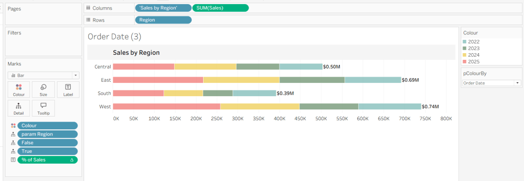
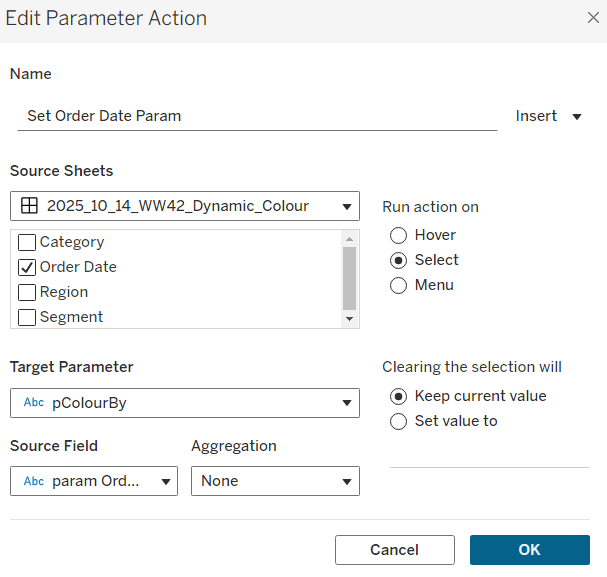
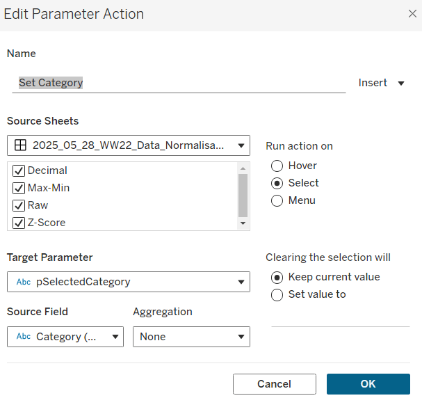
Add Region, Segment, Category and Order Date at the month-year level to the Filter shelf. Set Category to Furniture and Order Date to December 2025.
Format the Measure Values pill on the Angle shelf so that it displays the numbers as $ with 0 dp.

Create a new field
Acheivement %
(SUM([Sales])/SUM([Budget])) / 2
format this to % with 1 dp and add to the Centre shelf. Note, the division by 2 is necessary due to their being 2 measures (and therefore 2 marks) displayed and the number duplicating itself.
Create another field
Tooltip – Achievement %
(SUM([Sales])/SUM([Budget]))
Format this to % with 1 dp and add to the Tooltip shelf along with Sales, Budget and Category. Update the Tooltip to suit. Edit the title to reference the Category field, and then name this sheet Gauge – Furniture or similar.

Then duplicate the sheet. Change the Category filter to Office Supplies and name the sheet Gauge – Office. Repeat to create a version for Technology. So you should end up with 3 sheets, one for each Category. Apply the Region, Segment and Order Date filters to be shared across all 3 workbooks.

Building the bar chart
Create a field called
Sales Rank
RANK(SUM([Sales]))
and change it to be discrete (right click > convert to discrete)
Add Category to Columns and Sales Rank to Rows and Sub-Category to Detail. Set the table calculation associated to Sales Rank to be computing by Sub-Category only.

Double click into Columns and manually type MIN(1) to create a ‘fake axis’. Change the mark type to bar and edit the axis to be fixed from 0 to 1. Widen each row slightly. Then move Sub-Category to Label

Then via the Colour shelf, reduce the opacity to 0% and remove the border

Now add Sales to Columns. and on the Sales marks card, move Sub-Category back to Detail, and rest the opacity to 100%

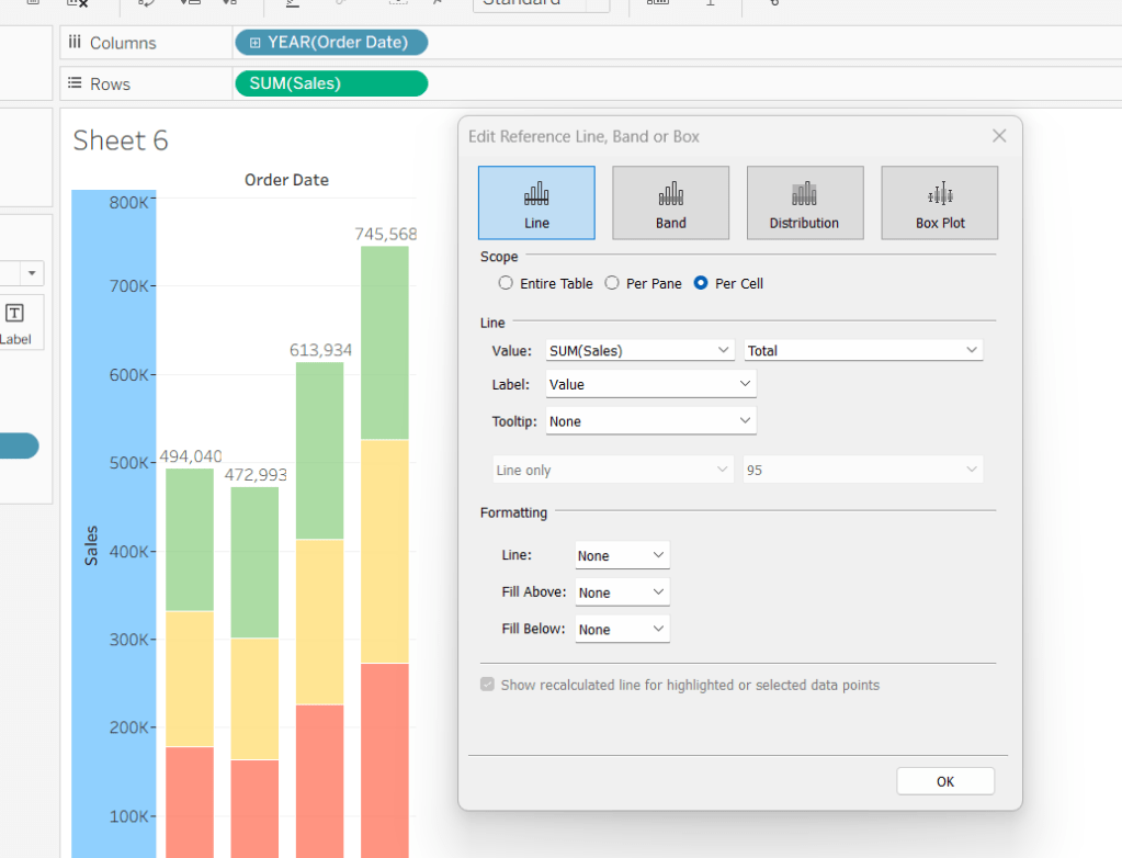
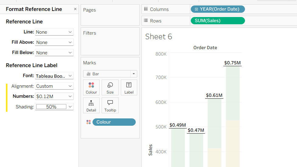
Colour the bars as required. Add Budget to the Detail shelf, then add a reference line to the Sales axis, which shows the Budget per cell as a line with a fill below of light grey.

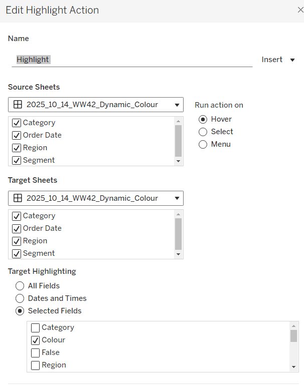
From one the gauge sheets, set the Region, Segment and Order Date filters to also apply to this sheet.
Add Achievement % to Tooltip and adjust the Tooltip on the Sales marks card only. Remove all the text from the Tooltip on the MIN(1) marks card.
Then format the sheet by
- editing Sales axis and removing the axis title
- editing the MIN(1)axis and removing the title and tickmarks
- hide the sales Rank header (right click pill > uncheck show header
- hide the Category header
- remove row & column dividers

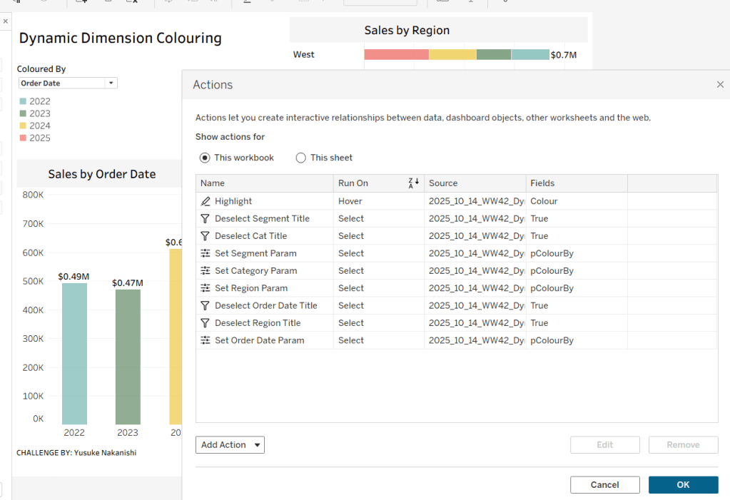
Then add the Gauge sheets into a horizontal container on a dashboard, setting the container to ‘distribute contents evenly’. Add the bar chart underneath, but I ‘floated’ it into position as each gauge chart object takes up more vertical space than necessary (the size of the object doesn’t adapt to the fact you’re only showing half a circle).
My published viz is here.
Happy vizzin’!
Donna