Can you proportionally brush from multiple selections?

For this week’s #WOW2023 challenge, Kyle wanted us to build a viz that used selections on the viz rather than a set of filter controls to show how the sales for those selections were distributed.

This concept is referred to as proportional brushing and makes use of set actions to achieve the results. The complexity added here was the multiple selections being made.

6 sheets make up this dashboard – 1 for each bar chart, 1 for the KPI and 1 for the breadcrumb trail.

Building the basic bar charts

Create 4 sheets, one for each of the Region, Segment, Ship Mode and Sub-Category dimensions. The simplest way is to build one sheet, get all the formatting applied etc, then duplicate and replace the dimension on the duplicated sheet with the new one.

When building the first sheet, place the dimension (eg Region) on Rows and Sales on Columns, sorted descending. Adjust the Sales to be formatted to $ with 0dp. Hide the Sales axis, and format to remove all gridlines/axis lines/ zero lines and row/column dividers. Show mark labels and align centrally. Adjust the font label to 8pt. Widen each column if need be. Hide the dimension label from displaying (hide field label for columns). Adjust the tooltip to suit. Name the sheet based on the dimension.

Then duplicate this sheet, and drag the next dimension, eg Segment, and drop it directly on Region. If done properly, everything should seamlessly update. Re-name this sheet accordingly, then repeat the process until you have a sheet for each of the four dimensions.

Applying the proportional brushing

Create a set for each of the relevant dimensions.

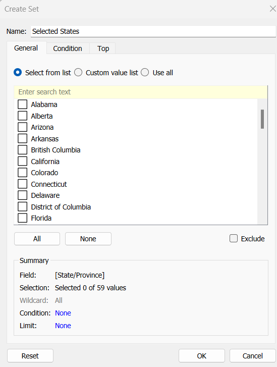
Region Set – right click on the Region field in the data pane and select Create > Set. Select all the options to be in the set.

Repeat and do the same for each dimension, so you end up with Segment Set, Ship Mode Set and Sub-Category Set.

We need to determine the combination of all the values selected in each set. So we need

Is Selected Options

[Segment Set] AND [Ship Mode Set] AND [Region Set] AND [Sub-Category Set]

This returns true for all the records in the data which match the combined selections of the individual sets.

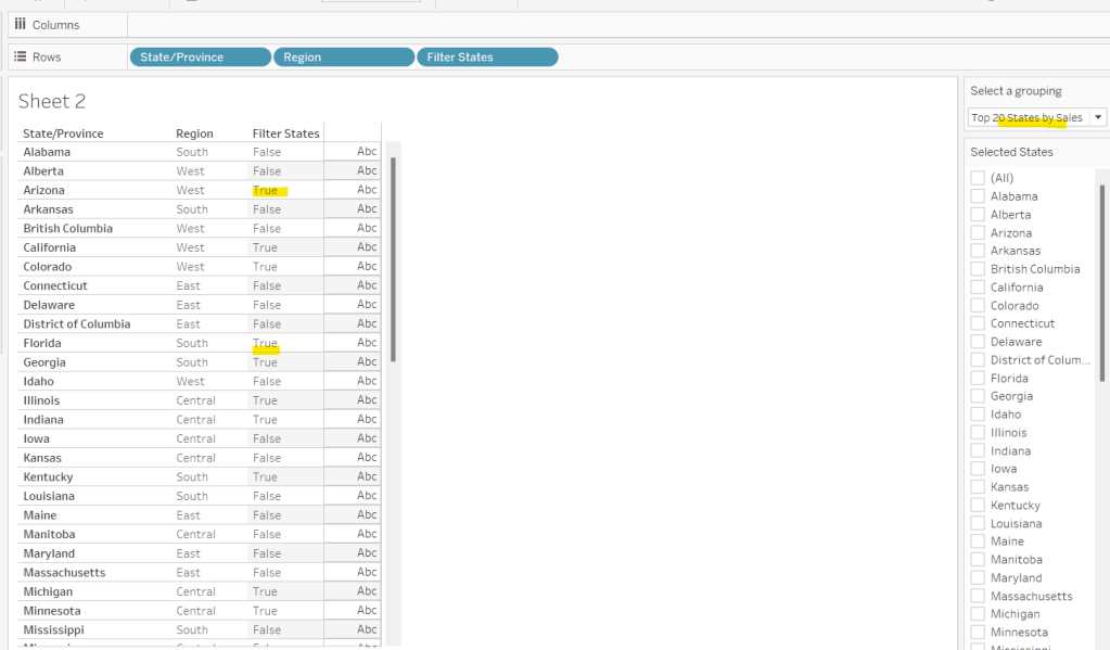
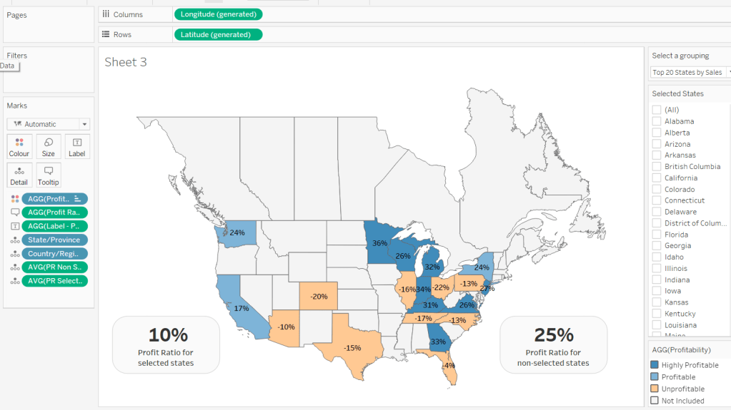
On the Region sheet, add Is Selected Options to the Colour shelf. The right click on each set in the data and and select Show Set, so the set of selections are listed on the canvas.

Change the options so only the Segment Consumer and rthe Ship Mode Standard Class are selected, along with all Region and Sub-Category values. Adjust the colours associated to the True and False values that are now presented

If need be, adjust the tooltip so the Is Selected Options is not displaying, then add the Is Selected Options field to the Colour shelf of the Segment, Ship Mode and Sub-Category sheets. Play with the set selections to see how the bars change. Once you’re familiar with the behaviour, reset all the sets so they all contain all the values.

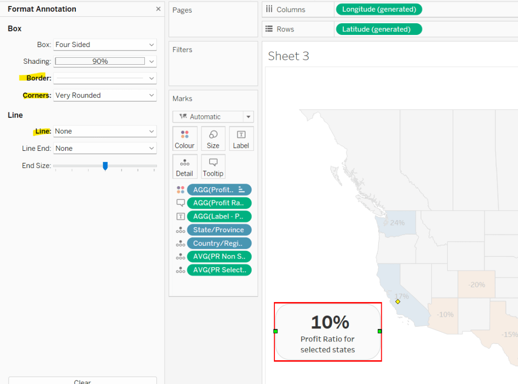
Building the KPI sheet

On a new sheet add Sales to Text. Change the mark type to shape and select a transparent shape (see this blog to get this set up). Adjust the Label to include the text ‘Sales’ and format accordingly. Align middle centre. Add Is Selected Options to the Filter shelf and set to True.

Again, if you adjust the set selections, the value will adjust accordingly.

Building the Dashboard interactivity

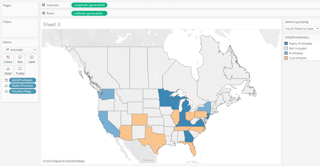
Add the sheets onto a dashboard. I used both vertical and horizontal layout containers to get the objects positioned where I wanted. I also used blank objects set to height/width of 1px and with a black background colour to create the horizontal and vertical divider lines. You can see from the item hierarchy in the image below, how I laid out my dashboard (I like to rename my containers to help understanding)

Now add a dashboard change set values action for each of the 4 bar chart sheets.

Select Region

On select of the Region sheet only, target the Region Set. On running the action (ie clicking the bar), assign values to set, and when clearing the selection (clicking the bar again), add all values to the set.

Note – While not specified in the requirements, I noticed that the breadcrumbing functionality in Kyle’s solution didn’t behave if multiple selections of the same dimension were made – eg 2 regions were selected. I decided to add the requirement of only allowing a single dimension to be clicked (ie the single-select only box is checked).

Create a Select Segment, Select Ship Mode and Select Sub-Category set action using the same principals described above.

Creating the breadcrumb

I’ve added this last, so you understand how we can ensure each set only has either all the values in it, or just 1 value.

To create the breadcrumb, we’re going to build up some strings based on what the state of each set looks like. This involved several calculated fields…. I’m not sure if I’ve over complicated this though..

Anyway firstly, we want to capture the values that have been added to each set, so we need

Regions in Set

IF [Region Set] THEN [Region] END

Segments in Set

IF [Segment Set] THEN [Segment] END

Ship Modes in Set

IF [Ship Mode Set] THEN [Ship Mode] END

SubCats in Set

IF [Sub-Category Set] THEN [Sub-Category] END

The image below shows how each of these fields are behaving based on the set selections – if the value is not selected in the set, the Regions in Set field is Null.

Next we have fields to count how many different values exist in each of these fields.

Count Selected Regions

{FIXED: COUNTD([Regions in Set])}

Count Selected Segments

{FIXED: COUNTD([Segments in Set])}

Count Selected Ship Modes

{FIXED: COUNTD([Ship Modes in Set])}

Count Selected SubCats

{FIXED: COUNTD([SubCats in Set])}

Again you can see from the sheet below, this is counting the number of selections, which is ‘fixed’ (ie the same) for every row.

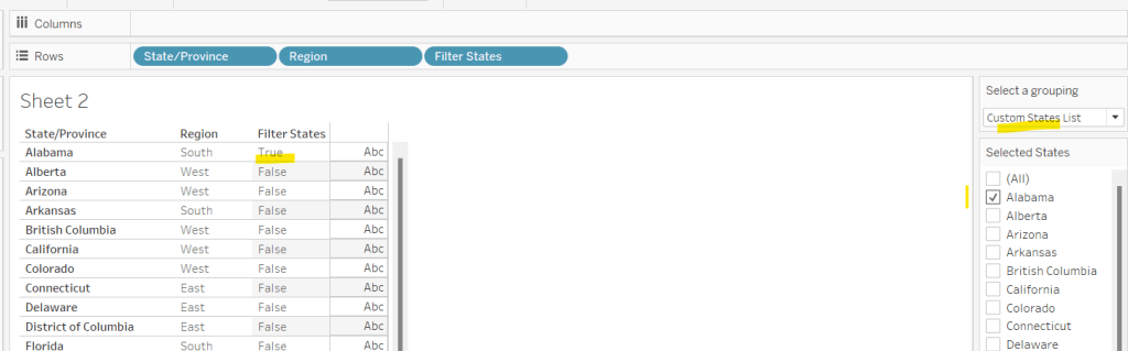
Now, while this is showing 2, as we’ve manually clicked on the set options, in practice when driven from the dashboard, we’re either going to have all values in the set, or just 1. So based on this assumption, we now just want to get the name of the single selection

Selected Region

IF SUM([Count Selected Regions]) = 1 THEN MAX([Regions in Set]) ELSE ” END

If there’s only 1 item in the set, then get it’s value, otherwise return ‘blank’.

Just testing this behaviour, we can see below that with all the Regions selected, the Selected Region field is empty, but with 1 value selected, we show that value.

Create equivalent fields for each dimension

Selected Segment

IF SUM([Count Selected Segments]) = 1 THEN MAX([Segments in Set]) ELSE ” END

Selected Ship Mode

IF SUM([Count Selected Ship Modes]) = 1 THEN MAX([Ship Modes in Set]) ELSE ” END

Selected SubCat

IF SUM([Count Selected SubCats]) = 1 THEN MAX([SubCats in Set]) ELSE ” END

The order of the dimensions displayed in the breadcrumb is fixed, regardless of the order in which you click the options. That is, if you click a Segment then a Region, the breadcrumb will display the <segment> followed by the <region>. But if you click the Region first and then the Segment, the breadcrumb will still display the<segment> followed by the <region>. Based on this, we can create string values for each dimension that differ depending on whether we know there is a selection made against a subsequent dimension (ie should we include the ‘>’ character or not).

Let’s go through in order. Firstly, no selections made

All Segmentations BC

IF [Selected Segment]=” AND [Selected Ship Mode]=” AND [Selected Region]=” AND [Selected SubCat]=” THEN ‘All Segmentations’ END

If all the ‘selected’ values are empty, then all the sets contain all the values, so display ‘All Segmentations’.

If there are selections made, then the dimensions are ordered as Segment > Ship Mode > Region > Sub-Category

Segment BC

IF [Selected Segment]<>” AND ([Selected Ship Mode]<>” OR [Selected Region]<>” OR [Selected SubCat]<>”) THEN [Selected Segment] + ‘ > ‘
ELSE [Selected Segment]
END

If there is only 1 Segment selected and at least 1 of the other dimensions has been selected too, then add the ‘>’ character after the Segment name, otherwise just show the Segment.

Ship Mode BC

IF [Selected Ship Mode]<>” AND ([Selected Region]<>” OR [Selected SubCat]<>”) THEN [Selected Ship Mode] + ‘ > ‘
ELSE [Selected Ship Mode]
END

Similar to above, but this time, we only need to compare with the dimensions that are below Ship Mode in the display hierarchy.

Region BC

IF [Selected Region]<>” AND [Selected SubCat]<>” THEN [Selected Region] + ‘ > ‘
ELSE [Selected Region]
END

There is only one dimension below Region. As Sub-Category is at the bottom of the ordering, we don’t need anything special – the value of the Selected SubCat field will do.

On a new sheet, add All Segmentations BC, Segment BC, Ship Mode BC, Region BC and Selected SubCat to the Text shelf. Change the mark type to shape and change to use a transparent shape.

Adjust the label, so all the fields are ordered correctly and positioned exactly next to each otherwith no spacing/carriage returns between. Align the label middle left.

Show the set controls, and then test the functionality by altering the selections, ensuring either only 1 value or all values are selected

Once you’ve finished testing, ensure all values are selected in all sets.

The add this sheet to the dashboard – I had the title and the breadcrumb in a vertical container, which was the left hand side of a horizontal container

And hopefully that should be it. My published viz is here.

Happy vizzin’!

Donna

Custom Map Analysis

For the final week of Community Month, my colleague, Nik Eveleigh, posed this challenge to apply some tricky filters to a map. Let’s dive straight in!

Identifying the States and Profitability

The core functionality of the map display is driven by a parameter allowing the user to select which set of states they want to analyse, so let’s set this up first.

Select a grouping

string parameter containing 6 entries in the list and defaulted to ‘Top 20 States by Sales’

To identify the top 20 States by Sales, we need to create a Set. Right click on State/Province > Create > Set and use the ‘Top’ option to create the set based on top 20 sum of Sales.

Top 20 States by Sales

To verify this is working as expected, add State/Province to Rows, Sales to Text and sort descending. The add Top 20 States by Sales to Rows and you should see the first 20 rows with In and the rest listed as Out.

To identify the states selected when the ‘Custom States List’ option is selected, we’ll also need another set to store the selections. Right click on State/Province > Create > Set, leave the list of states all unselected and rename the set

Selected States

To verify this is working, on a new sheet add State/Province to Rows and Selected States to Rows too. Then on the context menu of the Selected States pill, choose Show Set to get the list of States displayed. Select the first couple in the list and see the value in the table change from Out to In.

It is this set control filter list that will be used to provide the selection when the appropriate value in the Select a grouping parameter is chosen.

While the sets display In or Out when shown in the table, they are actually booleans with the equivalent of a True or False. We now need to build a boolean field which will encapsulate all the relevant states included based on the parameter option selected.

Filter States

CASE [Select a grouping]
WHEN ‘Top 20 States by Sales’ THEN [Top 20 States by Sales]
WHEN ‘Central Region’ THEN IF [Region] = ‘Central’ THEN TRUE ELSE FALSE END
WHEN ‘Southern Region’ THEN IF [Region] = ‘South’ THEN TRUE ELSE FALSE END
WHEN ‘Eastern Region’ THEN IF [Region] = ‘East’ THEN TRUE ELSE FALSE END
WHEN ‘Western Region’ THEN IF [Region] = ‘West’ THEN TRUE ELSE FALSE END
WHEN ‘Custom States List’ THEN [Selected States]
END

Let’s sense check the workings of this too. On a sheet add State/Province, Region and Filter States to Rows. Show the Select a grouping parameter. Also click on the Selected States field in the left hand data pane and Show Set, so the list of states shows. Ensure all are unchecked. Depending on the option selected in the Select a grouping parameter, then Filter States column should display true or false.

If you select a state from the list, this should only present as True when the Custom States List option is selected

Right, now we know how to identify the states we want, we can start to look at understanding their profitability. Firstly we need to get the profit ration

Profit Ratio

SUM([Profit])/SUM([Sales])

format this to % with 0 dp.

Profitability

IF ATTR([Filter States]) THEN

IF [Profit Ratio] < -0.25 THEN ‘Highly Unprofitable’

ELSEIF [Profit Ratio] >= -0.25 And [Profit Ratio] < 0 THEN ‘Unprofitable’

ELSEIF [Profit Ratio] >=0 AND [Profit Ratio] < 0.25 THEN ‘Profitable’

ELSE ‘Highly Profitable’

END

ELSE ‘Not Included’
END

If the states is one of the filtered ones then work out isn’t profitability ‘bracket’ otherwise report as ‘Not Included’.

Building the Map

On a new sheet double-click on State/Province to automatically generate the map. If the map doesn’t display with US and Canada Edit Locations (via the Map menu) and ensure your settings are as below

Display the Show a grouping parameter and have it set to Top 20 States by Sales. Add Profitability to Colour and adjust colours accordingly.

Click on the Selected States field in the left hand data pane and Show Set, so the list of states shows, then test changing the values in the Select a grouping parameter and see the display change.

Clean the map up by clicking Map -> Background Layers, and then unchecking all the options in the Background Map Layers section displayed on the left hand side.

To label the highlighted state we need

Label – PR

IF ATTR([Filter States]) THEN [Profit Ratio] END

format to % with 0 dp and then add to the Label shelf and set the font to bold.

Add Profit Ratio to the Tooltip shelf and adjust the tooltip.

To display the summary Profit Ratio values for all the filtered states vs those not selected, we need

PR by Filter State

{FIXED [Filter States]: [Profit Ratio]}

and then

PR Selected States

ZN({FIXED:AVG(IF [Filter States] THEN [PR by Filter State] END)})

Custom format this with 0%;-0%;–

This formatting with show values with 0dp for positive and negative values and — when no values exists.

Repeat the process to create

PR Non Selected States

ZN({FIXED:AVG(IF NOT([Filter States]) THEN [PR by Filter State] END)})

and apply the same formatting above.

Add both PR Selected States and PR Non Selected States to the Detail shelf and change the aggregation to Average.

Then click on a state on the bottom left of the map (I chose California) and select Annotate > Mark. Add the reference to the PR Selected States and supporting text into the annotation dialog. The when completed, manually move the annotation to the space to the left of the map. Format the annotation to add a border, round the edges and remove the line. You many need to re-edit the annotation to rec-centre the text.

Repeat a similar process, by annotating a state on the right hand side and referencing the PR Non Selected States field instead.

Finally remove all row & column dividers and hide the map options (Map -> Map Options -> uncheck all selections)

Hiding the Selected States control

In order to control visibility of the Selected States list, we need a boolean field

Custom States Selected

[Select a grouping] = ‘Custom States List’

Once all objects have been added to the dashboard and arranged where you want, click on the Selected States control, so it is selected via a grey border, then on the left hand Layout pane, select the Control visibility using value checkbox and choose the Custom States Selected field

The State list will now only display when the Select a grouping parameter contains the ‘Custom States List’ value.

And that should be it. My published viz is here.

Happy vizzin’!

Can you create a moving average chart with a focus on selected subcategories?

Following the #WOW survey where practice in table calculations was the most requested feature, Lorna continues with the theme in this challenge, where the focus is on the moving average table calculation, plus a couple of extra features thrown in.

Moving average

This is based on the values of data points before and after the ‘current’ point, as defied by the parameters which will need to be created.

pPrior

Integer parameter ranging from 1 to 6 and defaulted to 3. You need to explicitly set the Step size to 1 to ensure the step control slider appears when you add the parameter to the dashboard. This will be used to define the number of data points prior to the current to use in the calculation.

Create an identical parameter pPost to define the number of data points to use after the current one.

With these parameters, we can now create the core calculation

Moving Avg

WINDOW_AVG(SUM([Sales]), (-1*[pPrior])+1, [pPost])

As the requirement states that the ‘prior’ parameter needs to include the ‘current’ value, then we need to adjust the calculation – ie if the parameter is 3, we actually only want to include 2 prior data points, as the 3rd will be the current point itself. This is what the +1 is doing in the 2nd argument of the function.

Lorna has stated that 3 Sub-Categories are grouped to form a Misc category, so we need to create a group off of Sub-Category (right click Sub-Category -> Create -> Group).

Multi-select the 4 options that need to be grouped (hold down Ctrl as you select), and then group, and rename the group Misc.

Now we can check what the calculation is doing. If you add the fields onto the view as below, and set the Moving Avg table calculation to compute using Month of Order Date only (see further below), you should be able to see that each month’s moving avg value is calculated based on the sales value of the set of previous & post months as defined by your parameters. In the image below the Moving Avg for Accessories in June 2018, is the average of the Sales values from April 2018 – Sept 2018.

With this you can start the beginnings of the viz – don’t forget to set the table calc as above.

Colouring the lines

This will be managed by using a set.

Right click on the Sub-Category (group) field -> Create -> Set. Initially select all values. Add this field to the Colour shelf. Additionally, click the Detail symbol (…) to the left of the Sub-Category (group), and select the Colour symbol, so this field is also added to the Colour shelf.

The resulting colour legend will look something like this
Edit the colour legend, then choose Hue Circle and select Assign Palette to randomly assign colours to all the options

To show the set values, click on the context menu of the Sub-Category (Group) field on the Colour shelf, and Show Set.

This will add the list of options for selection

Uncheck All so none are selected, which will change the colour legend to read ‘Out, xxx’. Edit the colour legend again, and control-click to multi select all options, then set to a single grey

Now if you select a few options, the ones selected will be coloured, while the others remain grey

Additionally add the set field onto the Size shelf and make the In option bigger than the Out.

Shading the background

For this we need to create an unstacked area chart with one measure representing the maximum moving average value for the month, and the other representing the minimum moving average value for the month. We’ll need new calculated fields for this:

Window Max Avg

WINDOW_MAX([Moving Avg])

Window Min Avg

WINDOW_MIN([Moving Avg])

If you’ve still got your data sheet available, then move Sub-Category (Group) onto Rows, then add the two newly created fields.

In this case there are ‘nested’ table calcs. You need to ensure the setting related to the Moving Avg is computing by Month Order Date only, but the setting related to the Window Max Avg (or Window Min Avg) is computing by Sub-Category (Group).

If set properly, you should see that for each month the max / min values are displayed against every row.

Back to your chart viz sheet, and add Window Max Avg to Rows. Set the table calc settings as described above, then remove the Sub-Category (group) Set field from the Colour shelf of this measure, and change the Sub-Category (group) to be on the Detail rather than Colour shelf.

Change the mark type to Area, set the Opacity of the colour to 100% and set stack Marks to be Off (Analysis Menu -> Stack Marks -> Off).

Now drag Window Min Avg onto the Window Max Avg axis and drop it when the ‘2 columns’ image appears.

This will change the view so Measure Values is now on the Rows shelf and Window Min Avg is now displayed in the Measure Values section on the left hand side.

Adjust the table calc setting of Window Min Avg to be similar to how we set the Max field. And now drag the fields so Window Min Avg is listed before Window Max Avg. Measure Names will now be on the Colour shelf of this marks card, so adjust so Window Min Avg is white and Window Max Avg is pale grey.

Now make the chart dual axes, synchronise the axes, and set the Measure Values axis to the ‘back’.

Everything else is now just formatting and adding onto a dashboard. My published viz is here.

Happy vizzin’! Stay Safe!

Donna

Can you toggle between AND|OR filtering logic?

Week 49 of #WOW2020 was a guest challenge by Sam Epley to demonstrate the ability to toggle between filtering using AND logic and filtering using OR logic. Sam stated that it had been something he and colleagues had been pondering for a while but v2020.2 provided a possible solution.

So the first thing I did was a quick check on what functionality had been released in v2020.2 which included set controls. I also noticed when examining the published solution, that if I hovered over the Select Values filter controls, a small set icon would appear, which indicated these filters were indeed based on set controls

This blog will focus on

  • Select a Field for Slicer x parameter
  • Select Values for Slicer x filter
  • Building the Logic

Select a Field for Slicer x parameter

I had a slight ‘moment’ with this, until I realised I just had to copy the ╚ character and paste it into the parameter list I created

You’ll need to create 3 instances of this parameter (or create once, duplicate and rename).

Select Values for Slicer x filter

Note – what I describe here will need to be duplicated for each slicer.

There’s a chance I may well have been a bit long-winded in how I went about this, but it worked for me…

First up, I extracted the value selected in the Select a Field parameter, only returning a value if it contained the special ╚ character. So this would return the word ‘Region’ or ‘Segment’ but would return NULL if ‘Location’ or ‘Customer’ had been selected.

Selected Slicer 1

IF CONTAINS([Select a Field for Slicer 1:],’╚ ‘) THEN REPLACE([Select a Field for Slicer 1:],’╚ ‘,”)
ELSE NULL
END

I then needed to ‘map’ this value to the actual field in the data source, so I could get a handle on the actual values associated to the field

Selected Slicer 1 Values

IF [Selected Slicer 1] = ‘Region’ THEN [Region]
ELSEIF [Selected Slicer 1] = ‘State’ THEN [State]
ELSEIF [Selected Slicer 1] = ‘Category’ THEN [Category]
ELSEIF [Selected Slicer 1] = ‘Sub-Category’ THEN [Sub-Category]
ELSEIF [Selected Slicer 1] = ‘Segment’ THEN [Segment]
ELSEIF [Selected Slicer 1] = ‘Ship Mode’ THEN [Ship Mode]
ELSE ‘No Selection’
END

From this I could create a set to store the values, by right-clicking on the Selected Slicer 1 Values field and choosing Create -> Set, and selecting the Use all option.

The values in the set can then be accessible on the sheet foe selection by right-clicking on the set field and choosing Show Set

Building the Logic

To help with this, you can build out a basic view by Region that returns In or Out for each of the sets

As you can see when everything is set to ‘None Selected’, everything is In.

As we change the filter options, you can see the values change to be In and Out

For the AND logic to work, we’re looking for the rows of data where every In/Out column is In.

For the OR logic to work, we’re looking for the rows of data where In exists in at least one column.

However, when there is a No Selection option selected, all values are In the set, and when we’re using the OR logic, we don’t want these.

So we need to identify when No Selection is selected in the filter

Slicer 1 is Not Selected?

[Selected Slicer 1 Values] = ‘No Selection’

and we need this for the other slicers too.

Then we need to build a new calculated field that is going to handle all this logic, which is driven by a pLogic parameter which simply contains the values of AND and OR.

In Combined Set

IF [pLogic]=’AND’ THEN [Select Values for Slicer 1:] AND [Select Values for Slicer 2:] AND [Select Values for Slicer 3:]
ELSE //It’s OR
IF [Slicer 2 Is Not Selected?] AND [Slicer 3 Is Not Selected?] THEN [Select Values for Slicer 1:]
ELSEIF [Slicer 1 Is Not Selected?] AND [Slicer 3 Is Not Selected?] THEN [Select Values for Slicer 2:]
ELSEIF [Slicer 1 Is Not Selected?] AND [Slicer 2 Is Not Selected?] THEN [Select Values for Slicer 3:]
ELSEIF [Slicer 3 Is Not Selected?] THEN [Select Values for Slicer 1:] OR [Select Values for Slicer 2:]
ELSEIF [Slicer 2 Is Not Selected?] THEN [Select Values for Slicer 1:] OR [Select Values for Slicer 3:]
ELSEIF [Slicer 1 Is Not Selected?] THEN [Select Values for Slicer 2:] OR [Select Values for Slicer 3:]
ELSE [Select Values for Slicer 1:] OR [Select Values for Slicer 2:] OR [Select Values for Slicer 3:]
END
END

This field returns a true or false against each row in the data set, and can be used to build the bar chart display.

This covers the most ‘complex’ bit of this challenge – below shows what one of the charts looks like

If you’re not familiar with how to use measure swapping, which is another feature of this challenge, then check out a previous blog I wrote.

I also created a field to add to the Tooltip to show a $ symbol in the event the measure selected was Sum of Sales.

My published solution is here.

Happy vizzin’! Stay Safe!

Donna

Can you find all counties within n miles of a selected county?

I’ve been on annual leave for a few weeks. I’ve managed to catch up on all the challenges but haven’t blogged a solution for a while. It’s been a real struggle to get back into things to be honest – back to work, back to school, back to football clubs for my kids, and I’m wondering where I found the time before 😦

Trying to think about when/if I was going to get this blog out has caused me a bit of stress, which I don’t need, and so I need to change my mindset a bit…try to relax a bit … if I don’t manage to post a blog, just accept it and move on. I’ve also got to try to reduce the time it takes me to blog. I’m a ‘detail’ person, so often end up documenting to such a low level, but for my own sanity, I’m going to have to make an effort to be a bit briefer. I can’t guarantee I’ll stick to this though.. will just have to see how things pan out.

Going forward, I’m going to try to focus on the points that I think are key to the challenge, or those I found a bit tricksy.

So onto this week’s challenge. Sean Miller returned as guest poster with a COVID-19 related distance challenge.

Note – I connected to the provided hyper extract file rather than the csv file.

The core points I’m going to discuss are

  • Identify counties within n miles
  • How to select a county without set actions
  • How to handle ‘All’ counties being selected
  • Colouring based on ‘percentile’ of hospital beds
  • How to only show county borders of counties within selected range

Identify counties within n miles

The number of miles is stored within an integer parameter, n miles, that is defaulted to 100.

A county to act as the ‘start point’ is stored in a set, Selected County, based on the County, State field.

The long/lat coordinates of this selected county need to be captured.

Selected County Lat

{FIXED : AVG(IF [Selected County] THEN [Latitude] END)}

Selected County Long

{FIXED : AVG(IF [Selected County] THEN [Longitude] END)}

By using a FIXED LoD calculation, the values are stored against every ‘row’ in the data set.

With these, the starting point can be determined

Selected County Start Point

MAKEPOINT([Selected County Lat],[Selected County Long])

The position of every other county – the ‘destination’ / end point – also needs to be determined

End Point

MAKEPOINT([Latitude],[Longitude])

With these, the distance between can be computed

Distance

DISTANCE([Selected County Start Point],[End Point],’miles’)

And the counties can then be restricted by

Within n miles

[Distance]<= [n miles]

which can be used as a filter and set to True.

How to select a county without set actions

This is managed via the set control feature; right click on the Selected County set and choose Show Set to display the list of counties with the option to select which ones are in or out of the set. Change the display of the control via the dropdown arrow (top right) to be Single value dropdown which automatically provides as ‘All’ option or the ability to select a single set only.

How to handle ‘All’ counties being selected

When ‘All’ is chosen via the Set Control selector, this has the effect of adding all the State, County values into the set, which means we don’t really have a starting state. So the n miles parameter is essentially redundant. But we need to make the Within n miles filter understand this.

We can manage this by first identifying how many values we have in the set

Count Selected States

{FIXED : COUNTD(IF [Selected County] THEN [County, State] END)}

There will either be 1 or if All is selected, then they’ll be 3000+, and we use the FIXED LoD, so the total is stored against all rows.

We can then update our Within n miles filter to consider this value

Within n miles

([Count Selected States]=1 AND [Distance]<= [n miles]) OR [Count Selected States] > 1

This now returns true if either one State, County is selected and the other records are within n miles OR all the states are selected (the count is > 1).

Colouring based on ‘percentile’ of hospital beds

This caused me a little bit of headscratching. I assumed ‘percentile’ would be based on a percentage of the total num_staffed_beds (note I simply renamed this field to Hospital Beds), associated to the state,counties being displayed (ie within n miles). But after building the calculation I thought, and adding it to colour and choosing the Green-Gold colour range, I didn’t get the same spread as shown in the solution.

I messaged Sean to question whether I’d made the right assumption, but while waiting for a response, I did an online search for “Tableau Percentile Rank”, and quickly spotted that a Table Calculation exists. As you can guess, I don’t use this particular calculation very much at all 🙂

So to colour, add Hospital Beds , and simply add a Percentile table calculation

How to only show county borders of counties within selected range

When working with Maps, you can use the options within the Map Layers menu to select which features of the map should be displayed. One of these options is State/Province Borders, which you might think is what is needed.

However, this will show all the state borders, which is evident if you zoom out a bit, including those for states that don’t have counties within n miles.

This isn’t the requirement – we only want to show the borders of the states which have counties within the desired range. So instead, we don’t want to show any State/Province Borders via the Map Layers. And we’ll utilise a dual axis instead, by first identifying the states that are within n miles

States within n miles

If [Within n miles] THEN [State] END

Duplicate the Latitude (generated) field on the Rows, remove all the fields on that mark, and then add the States within n miles to the Detail shelf. Set the colour of this mark to white, and swap the Latitude (generated) fields if needed, so the States are on the top, as below.

Then make dual axis 🙂

And that’s the key points that I hope will help you solve this challenge. My published version is here, which is available to be downloaded. If there’s anything I haven’t covered that you’re not sure about, feel free to contact me.

Happy vizzin’! Stay safe!

Donna