Kyle set the challenge this week to recreate a drill-down, but with the stipulation that no parameters were to be used. I immediately figured this would be a challenge requiring set actions, and indeed the hint on the splash page of the #WOW site, confirmed this
Building the Viz
After connecting to the data source, create a Set off of the Category field (right click > create > Set). Select a single option eg Technology
Category Set
Create fields
Display Value
IF [Category Set] THEN [Sub-Category] ELSE [Category] END
and
Expand Indicator
IF [Category Set] THEN [Category] ELSE ‘+’ END
Add Category, Expand Indicator and Display Value to Rows and Sales to Columns and press the sort desc button in the toolbar, to sort all the bars . The click the Category pill to add another sort by sales descending.
Hide the Category pill (uncheck show header).
Format the Expand Indicator column, so the text is aligned vertically
Right click on the Expand Indicator text heading displayed in the view and hide field labels for rows. Widen each row a bit, remove all gridlines, remove the Sales axis title (right click axis > edit axis). Add a title to the sheet. Adjust the Tooltip.
Adding the interactivity
Add the sheet to a dashboard, then add a dashboard set action
Select Cat
On select of the viz on the dashboard, target the Category Set, adding values to the set when the viz is clicked (selected), and remove all values when the selection is cleared. Only allow 1 selection at a time to be made.
For #WOW2025 Week 25, Kyle challenged us to make use of Set Actions to recreate a viz where the ‘viz in tooltip’ updates based on the option the user interacts with on the base viz.
Modelling the data
The excel file provided contained 3 sheets which needed to be combined to use for this challenge. My data model looks like this
Attendance is related to Divisions on the fields Tm = Team
Attendance is also related to Record on the fields Tm = Tm.
Building the Base Bar Chart
On a new sheet, add Division to Rows and Attend/G to Columns changing the aggregation to AVG.Sort the data descending.
Change the Colour of the bars to dark grey and show mark labels to display the average attendance per game value. Add W-L% and Est.Payroll fields to the Tooltip shelf and set both to be AVG. Format Est. Payroll to be $ with 0dp. Format W-L% to be formatted to 3dp, but then adjust again and use a custom format to remove the leading 0 (,##.000;-#,##.000)
Format the label to be bold and to match mark colour. Format the row labels, remove the row label heading (right click > hide field labels for rows). Hide the axis and remove all gridlines, axis rulers etc. Update the viz title and name the sheet Bar-Division or similar.
Build the Scatter Plot
On a new sheet add W-L% to Columns and Attend/G to Rows, setting both the use an AVG aggregation, and then add Tm (from the Attendance table) to Detail. Adjust the W-L% axis so it doesn’t always include 0 (right click axis > edit axis> uncheck include zero). Adjust the title of the axis too. Adjust the title of the Attend/G axis too. Change the mark type to circle and increase the size.
We need the chart to show a difference between the marks related to a selected Division and those which aren’t. Create a set from the Division field (right click the field > create > and select NL West.
Add Division Set to Colour and adjust accordingly. Add a dark grey border to the circles. Remove all gridlines and name the sheet Scatter or similar.
Build the Attendance by Team Bar Chart
On a new sheet, add Tm (from the Attendance table) to Rows and Attend/G to Columns, setting the aggregation to AVG. Sort descending. Add Division Set to Colour.
Create a new field
Label Attendance
IF [Division Set] THEN [Attend/G] END
and add to the Label shelf. Format the label so it is bold and set to match mark colour. Hide the row label heading and the axis. Hide all gridlines, zero lines et. Name the sheet Bar-Team or similar.
Adding the Viz in Tooltip
Navigate back to the Bar-Division sheet. Update the Tooltip to reference the Division and the other top level measures. I used a double tab between the headings on one line and again on the values on the next line to make the information line up on hover (even though they look misaligned on the tooltip dialog).
To add each sheet to the tooltip, use Insert > Sheets button in toolbar and select the Scatter sheet and then press tab and select the Bar Team sheet.
Then adjust the text inserted so both filtering sections state filter=”None”. This stops the VIT filtering out by default all the data that isn’t associated to the selection you’re coming from. Adjust maxwidth and maxheight to 350 (I had it set larger, but then it didn’t display properly on Tableau Public, so had to adjust there.
Adding the interactivity
Create a dashboard and add the Bar-Divison sheet. At this point showing the tooltip on each bar will always show the information related to NL West since that was the option selected when we created the set. To fix this, create a new dashboard set action
Set Division
On hover of the Bar-Division sheet, target the Division Set, and assign values to the set. When the selection is cleared, keep set values. Only allow this to be run on single-select only
And now as you hover over different bars, the highlighted circles and bars in the viz in tooltip will change.
For Community Month at #WOW2025 towers, Lorna presented a challenge one of her colleagues had brought to her which they solved together. The need is to identify the top X customers in each year (which may not contain the same set of customers each year), and then present the sales contribution, either as a group or individually compared to the rest. Lorna gave a hint in the challenge that sets would help : “Your job is to figure out the best way to SET this up with the last 3 years dynamically”.
It took me a bit of a while to figure out how to make this work, and at the point of writing, haven’t looked at the solution to know if there was a better way. I ultimately ended up creating 3 sets to fulfil this challenge.
Setting up the parameters
This challenge requires 3 parameters
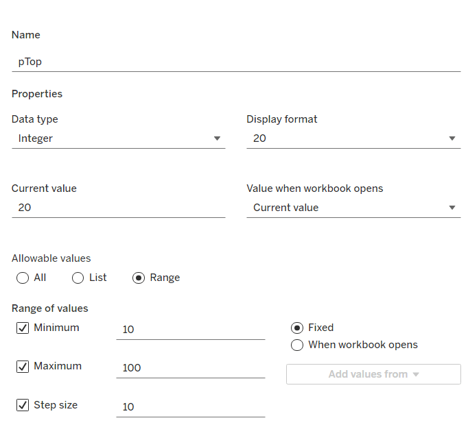
pTop
This identifies how many ‘top’ customers we want to consider. Defined as an integer from 10 to 100, defaulted to 20, that increments every 10 units
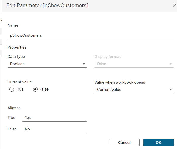
pShowCustomers
Determine whether the top customers’ contributions are displayed individually or as a group. Defined as a boolean, defaulted to False, and aliased to Yes or No
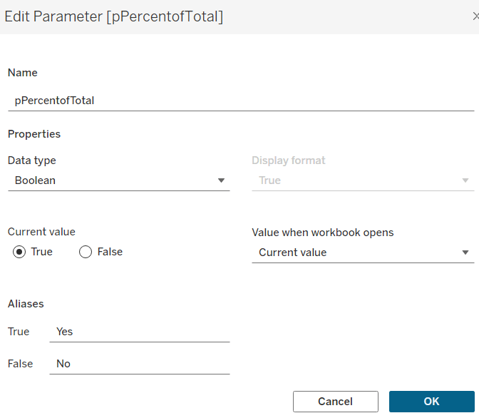
pPercentofTotal
Indicate whether the information is displayed as a % of total sales for that year, or as absolute sales values. Defined as a boolean, defaulted to True, and aliased to Yes or No.
Defining the core calculations
The requirement states to be able to determine the last 3 years ‘dynamically’. For this I created
Max Date
{FIXED: MAX([Order Date])}
to return the maximum Order Date in the whole data set.
We want to be able to restrict the data to the last 3 years, so create
Records to Show
DATEDIFF(‘year’, [Order Date], [Max Date]) <=2
I need to create a set for each of the 3 cohorts – the top customers for the latest year, the top for the previous year and the top for the year before that. For this I first need to determine the Sales for each of those timeframes.
The sales for the current year
Sales – CY
IF YEAR([Order Date]) = YEAR([Max Date]) THEN [Sales] END
The sales for the previous year
Sales – PY
IF YEAR([Order Date]) = YEAR([Max Date])-1 THEN [Sales] END
and the sales for the previous previous year
Sales – PPY
IF YEAR([Order Date]) = YEAR([Max Date])-2 THEN [Sales] END
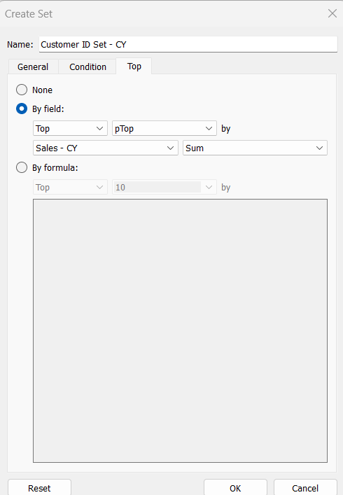
I can then create the sets of customer I need (right click on Customer ID > Create > Set)
Customer ID Set – CY
get the Top number of records using the pTop parameter, and based on the sum of the Sales – CY field
Repeat the same process to create
Customer ID Set – PY
get the Top number of records using the pTop parameter, and based on the sum of the Sales – PY field
and
Customer ID Set – PPY
get the Top number of records using the pTop parameter, and based on the sum of the Sales – PPY field
To verify/understand what we’ve created, on a new sheet
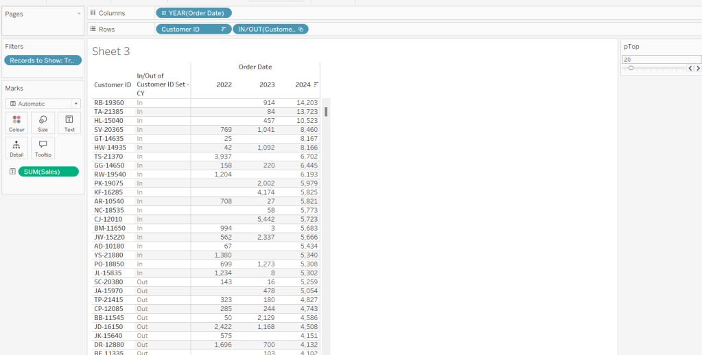
Add Customer ID to Rows
Add Order Date to Columns at the Year level as a discrete (blue) pill
Add Records to Show to Filter and set to True.
Add Sales to Text.
Sort by the 2024 Sales value descending.
Add Customer ID Set – CY to Rows.
You should see the first 20 rows (assuming you haven’t changed the pTop value, display as In
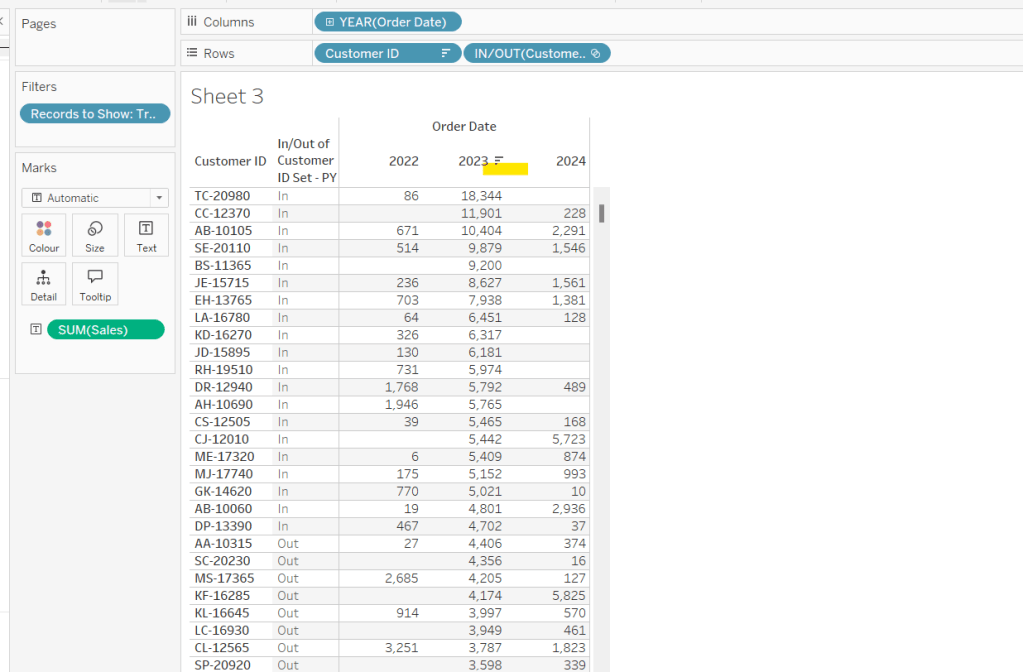
If you now change the sort to sort by 2023 Sales descending, and swap the Customer ID Set – CY with the Customer ID Set – PY, you’ll get the same
So now that’s understood, we want to tag each of our customers based on the year of the order, whether they’re in the top n or not, and whether we want to display the customers individually or not
Group – Detail
IF (YEAR([Order Date]) = YEAR([Max Date]) AND [Customer ID Set – CY]) THEN IF [pShowCustomers] THEN [Customer ID] ELSE ‘Top N’ END ELSEIF (YEAR([Order Date]) = YEAR([Max Date])-1 AND [Customer ID Set – PY]) THEN IF [pShowCustomers] THEN [Customer ID] ELSE ‘Top N’ END ELSEIF (YEAR([Order Date]) = YEAR([Max Date])-2 AND [Customer ID Set – PPY]) THEN IF [pShowCustomers] THEN [Customer ID] ELSE ‘Top N’ END ELSE ‘Other’ END
We’re also going to want to count customers, so need
Count Customers
COUNTD([Customer ID])
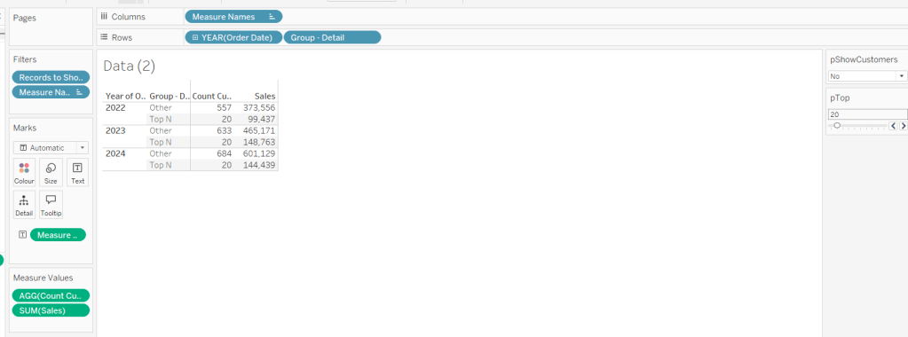
On a new sheet add Order Date at the year level as a discrete (blue) to Rows and add Group Detail to Rows too. Add Records to Display to Filter and set to True. Add Sales and Count Customers into the table. Show the pTop and pShowCustomers parameters
When pShowCustomers is set to No, you should just see 2 groupings per year
When set to Yes, you’ll get the Customer IDs listed
Note – the Sales numbers should reconcile to the solution – the count might not, which I believe is due to the solution counting distinct Customer Names rather than Customer ID.
To finalise the core calculations we need to build the initial viz, we have a different display depending whether we’re displaying the absolute or % Sales values.
Create
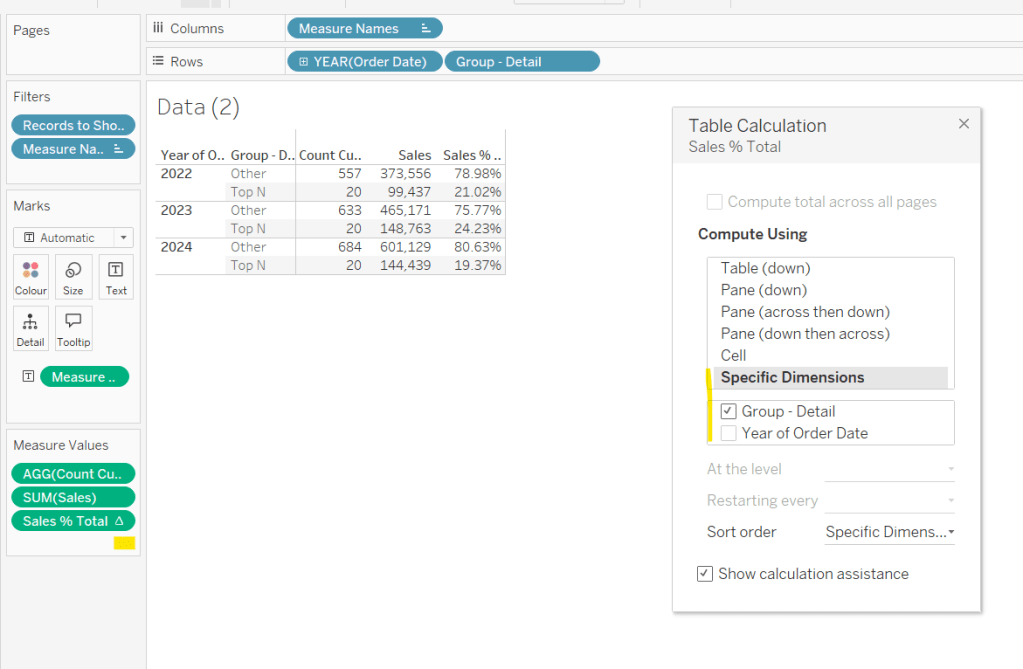
Sales % Total
SUM([Sales]) / TOTAL(SUM([Sales]))
format to decimal to 2 dp and add into table, adjusting the table calculation so it is computing by the Group – Detail only, so the percentage per year is being displayed.
Then we need
Measure to Plot
IF [pPercentofTotal] THEN [Sales % Total] ELSE SUM([Sales]) END
format this to a number to 2 dp (just so you can see it has a value) and add to the table, applying the same table calculation settings. Display the pPercentofTotal parameter and flip between to see the column change.
Building the Viz
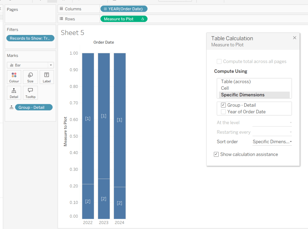
On a new sheet, add Records to Show to filter and set to True. Add Order Date at the year level as a discrete (blue) pill to Rows. Add Group – Detail to Detail. Change the mark type to bar. Add Measure to Plot to Columns and adjust the table calculation, so it’s computing just by Group-Detail.
Ste the sheet to fit width and show the 3 parameters.
Create a new field
Group – Top N
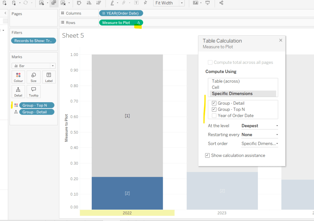
IF (YEAR([Order Date]) = YEAR([Max Date]) AND [Customer ID Set – CY]) THEN ‘Top N’ ELSEIF (YEAR([Order Date]) = YEAR([Max Date])-1 AND [Customer ID Set – PY]) THEN ‘Top N’ ELSEIF (YEAR([Order Date]) = YEAR([Max Date])-2 AND [Customer ID Set – PPY]) THEN ‘Top N’ ELSE ‘Other’ END
and add to Colour, adjusting the colours to suit. You’ll then need to update the table calculation of the Measure to Plot field to ensure Group – Top N is also checked.
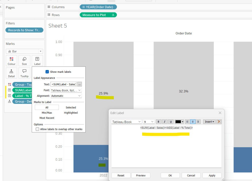
We need to display labels, but these need to differ based what measure we’re showing, and the format is different, so create
Label – % Total
IF [pPercentofTotal] THEN [Sales % Total] END
format this to % with 1 dp and
Label – Sales
IF NOT([pPercentofTotal]) THEN [Sales] END
format this $ K to 1 dp.
Add both of these to the Label shelf and ensure they are listed directly side by side. Only 1 will ever actually display.
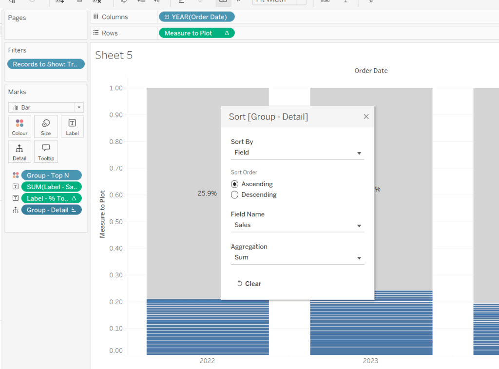
Change the pShowCustomers to Yes, and then add a white border via the Colour shelf. Add a Sort to the Group – Detail pill to sort by Sales ascending.
Add Sales, Sales % Total and Count Customers to the Tooltip shelf. additionally create
Tooltip – Customer
IF [pShowCustomers] AND [Group – Detail] <> ‘Other’ THEN [Customer Name] END
and add this to Tooltip too. Adjust the Tooltip to suit (make sure Sales % Total)is computing by both Group – Top N and Group – Detail so has the correct numbers.
Finally, hide the axis (uncheck show header on the Measure to Plot pill) and hide the Order Date label (right click and hide field label for columns).
Then add the sheet to a dashboard, and arrange the parameters suitably.
It was Yusuke’s turn for this week’s #WOW2025 challenge, posing a twist on a the creation of a highlight table.
Whenever I start a challenge, I take note of what’s going on – I interact with it, move my mouse around to see if there’s any clues. The main takeaway from this, is that I’d need a dual axis so I could have multiple marks cards to style differently – one to be coloured based on the Profit and one to be coloured based on whether the cell was selected or not. So we need to build a table using an axis.
Building the basic table
Add Order Date to Columns and then click the pill to expand the date hierarchy so Year and Quarter are displayed. Add Sub-Category to Rows.
Double click into Columns and manually type MIN(1.0) to create an axis. Change the mark type to bar, increase the size to as large as possible, and edit the axis to be fixed from 0 to 1. Add Profit to Colour and Profit to Label. Adjust the colour scheme as required (I used red-white-blue diverging and reduced the opacity to 70%). Adjust the label font to be grey text.
Widen each row; shrink each column and adjust the row and column dividers to be dashed grey lines. Update the font of the label headings. Adjust Tooltip to suit.
Storing the selected cells
To store the cells that have been selected, we’re going to use Sets. To build this set, click on a cell in the table, and then in the toolbar of the tooltip that displays, click the venn diagram symbol to create set
Name the set Cells Highlighted
Highlighting the selected cells
Each cell in the table we have built is a bar of length 1. We want to use a dual axis to create bars of length 1 only in the cells selected. So we need
Bar Length – Highlighted Cells
IF [Cells Highlighted] THEN 1 ELSE 0 END
We also only want the profit value to be displayed for these cells
Profit – Highlighted
IF [Cells Highlighted] THEN [Profit] END
Add Bar Length – Highlighted Cells to Columns to make a second axis, and a second marks card. Remove both existing Profit pills from this card. and instead change the Colour to black at 100% opacity, and add Profit – Highlighted to Label. Change colour of the Label text, and update the axis to be fixed from 0 to 1.
Make the chart dual axis and synchronise the axis.
Hide the axis (uncheck show header), and hide the Order Date label (right click -> hide field labels for columns)
Update the title of the sheet with the instructions and then add the sheet to a dashboard.
Adding the interactivity
On click, we want to add the cell (if unselected) to the set. For this we need a dashboard set action
Add to highlight
On select, target the Cells Highlighted set, adding values to the set on click, and keeping set values when cleared.
We also want to remove selected cells via a menu option, so create another dashboard set action
Remove from highlight
Display on the menu of the tooltip, and target the set Cells Highlighted by removing values from the set when the menu option is clicked, and keep values when selection cleared.
While these give us the functionality we need, it isn’t the best user experience – we have to click multiple times to get the display due to the ‘default’ behaviour of selected marks being automatically highlighted / non selected marks being faded out.
To resolve this, we need to utilise a couple of techniques blogged about here.
For the marks coloured by profit, we want to disable highlighting using a dashboard filter action and the true/false method.
Create calculated fields called
True
TRUE
False
FALSE
and add to the Detail shelf of the MIN(1.0) marks card only. Then on the dashboard add a dashboard filter action
Now if you click on an unhighlighted cell it should go black immediately. However, if you click on one of the black already highlighted cells, the other cells still fade.
Now we can’t apply the same method to that cell, as we then lose the hyperlink appearing on the tooltip on click. This is because the true/false method ultimately results in the cell being immediately deselected once selected, so the ‘click’ action, which results in the menu option showing, is cleared .
Instead we will use the dashboard highlight action technique also described in the blog.
Create a new field
Dummy
‘Dummy’
Add this to the Detail shelf of the All marks card (or add to both the MIN(1.0) and the Bar Length – Highlighted Cells marks cards). Then create a dashboard highlight action that just targets the Dummy field only, which as it exists in all cells, essentially selects them all.
Highlighting the word ‘colour’ in the title
I just did this by floating a blank object over the text which I set the background colour to black, and then set the object to move backwards. This did mean once I published to Tableau Public, I had to edit the viz online to ensure the object lined up to where I wanted.
The focus of this week’s challenge, set by Yoshi, is showing “detail on demand” using filters.
Defining the calculations
We’re only concerned about current year and previous year, so to simplify this, after connecting to the data source, I added a data source filter based on Order Date to restrict the information to years 2023 and 2024 only.
I then created the following fields
Latest Year
{MAX(YEAR([Order Date]))}
Previous Year
[Latest Year]-1
Sales – LY
IF YEAR([Order Date]) = [Latest Year] THEN [Sales] END
Format to $ with 0 dp
Sales – PY
IF YEAR([Order Date]) = [Previous Year] THEN [Sales] END
On a new sheet, add Category to Columns, and Sales – LY and YoY to Text and format/layout the text as required. Adjust the formatting of the column headings too.
Add YoY to Colour too to match the solution (though personally, if I was doing this for a business need, I wouldn’t do this as some of the text becomes quite washed out).
Building the Sub Category Viz
On a a new sheet, add Category and Sales – LY to Columns and Sub-Category to Rows.
However, you can see that as not every Sub-Category exists in every Category, we get ‘blanks’ in the display, so we need use something on rows that exists for every Category. We can do this using the rank of Sales.
Add Sales -LY to Rows and change it to be a discrete (blue) dimension.
Move Sub-Category to Detail and then apply a quick table calculation of rank to the Sales – LY pill on Rows. Adjust the table calculation so it is computing explicitly by Sub-Category only.
Make the rows a little wider, move Sub-Category to Label. Add Sales -LY to label too. Adjust the format/layout of label and align middle right. Add YoY to Colour.
Add Sales – PY to Detail then add a Reference Line to the Sales – LY axis, that refers to Sales – PY per cell.
Add Latest Year to Tooltip and adjust the text to suit. Finally, hide the Sales – LY Rank row header and the Category column header (uncheck show header) and remove the title of the Sales – LY axis. Add a title.
Building the Product Viz
On a new sheet, add Product Name to Rows and Sales – LY to Columns. Sort by Sales – LY descending. Hide the null value indicator.
Add YoY to Colour. Add Sales – LY to Label. Add Sales – PY to Detail and add a Reference Line as described above. Add Sub-Category to Detail and add Latest Year to Tooltip and adjust. Remove the title of the Sales – LY axis, and hide the Product Name column header title (right click and hide field labels for rows). Add a title.
Filtering the display
The requirement is to be able to ‘filter’ the display based on the Category selected, and in the event not all categories are selected, the Product bar chart should show. Due to this second requirement, just using a standard ‘quick filter’ is a bit tricky – we need a way to understand what has been selected in the filter.
We can use a Set for this. Create a set of categories – right click Category > create > set
Category Set
Select all values
Add this to the Filter shelf of the KPI sheet, and then apply this same filter to the bar chart sheets too (right click the pill on the Filter shelf > apply to worksheets > selected worksheets > select the relevant sheets).
If you select show set, this then displays the input control to select which options are in or out of the set.
To manage the visibility of the Product bar chart, we need to know how many Categories there are in total, and how many Categories are selected. So create
Count Categories
{FIXED: COUNTD([Category])}
And
Count Set Members
{ COUNTD(IIF([Category Set], [Category],NULL))}
Both of these are LODs as we need to reference them in another boolean calculation that will be used to drive dynamic zone visibility.
Not all Categories Selected
{(SUM([Count Categories]) <> SUM([Count Set Members]))}
Building the dashboard
Create a dashboard. The three sheets should be arranged within layout containers. I used a horizontal container, where the left hand column contained a vertical container which in turn contained the KPI sheet on the top and the Sub Category bar chart underneath. The right hand column of the horizontal container contained the Product bar chart.
To control the visibility of the Product bar chart, select the object, then from the Layout tab on the left hand side, select the control visibility using value checkbox, and choose the Not All Categories Selected field.
The bar will initially disappear, but if you then deselect a value in the Category ‘filter’ control, it will reappear.
Added extra
We can also set the Product bar chart to filter if a Sub-Category bar is clicked on. Create a dashboard filter action
Filter Products
On select of the Sub-Category bar chart sheet, target the Product Bar Chart sheet passing all values. Show all values when the selection is cleared.
I set this week’s challenge and I tried to deliver something to hopefully suit everyone wherever they are on their Tableau journey. The primary focus for this challenge is on table calculations, but there’s a few other features/functionality included too.
I love football – all the family are involved in it in some way, so thought I’d see what I could get from a different data set this week. The data set contains the results of matches played in the English Premier League for the last five seasons – from the 2020-21 season to the current season 2024-25. Matches up to the end of 2024 only are included.
As I wrote the challenge in such a way that should allow it to be ‘built upon’ from the beginner challenge, I’m going to author this blog in the same way. I’ll describe how to build the beginner challenge first, then will adapt /add on to that solution. Obviously, as in most cases, this is just how I built my solution – there may well be other ways to achieve the same result.
Beginner Challenge
Modelling the data
The data set provided displays 1 row per match with the teams being displayed in the Home and the Away columns respectively, and the FTR (full time result) column indicating if the Home team won (H), the Away team won (A) or if the match was a draw (D).
The first thing we need to do is pivot this data so we have 2 rows per match, with a column displaying the Team and another indicating if the team is the Home or Away team. To do this, in the data source window, select the Home and the Away columns (Ctrl-Click to multi-select – they’ll be highlighted in blue), then from the context menu on either column, select the Pivot option.
This will duplicate the rows, and generate two new fields called Pivot Field Names and Pivot Field Values. Rename the fields by double-clicking into the field heading
Pivot Field Names to Homeor Away
Pivot Field Values to Team
Creating the points calculation
We need to determine how many points each team gained out of the match which is based on whether they won (3pts), lost (0pts) or drew (1pt). Create a calculated field
Pts
IF [Home or Away] = ‘Home’ AND [FTR] = ‘H’ THEN 3 ELSEIF [Home or Away] = ‘Away’ AND [FTR] = ‘A’ THEN 3 ELSEIF [FTR] = ‘D’ THEN 1 ELSE 0 END
Creating the cumulative points line chart
We want to create a line chart that displays the cumulative number of points each team has gained by each week in each season.
Start by adding Wk to Columns and Pts to Rows as these are the core 2 fields we want to plot. But we need to split this by Team and by season, so add Team and Season End Year to the Detail shelf.
This gives us all the data points we need, but at the moment, it’s currently just showing how many points each team gained per week in each season.
To get the cumulative value, we add a running total quick table calculation to the Pts field.
which gives us the display we need
While we can leave the SUM(Pts) field as is in the Rows, I tend to like to ‘bake’ this field into the data set, so I have a dedicated field representing the running total. I can create this field in 2 ways
Create a calculated field called Cumulative Points Per Season which contains the text RUNNING_SUM(SUM([Pts])). Add this field to Rows instead of just Pts.
Hold down Ctrl and then click on the SUM([Pts]) pill in Rows and drag into the left hand data pane and then release the mouse. This will automatically create a new field which you can rename to Cumulative Points Per Season. The field will already contain the text from the calculation used within the quick table calculation, and the field on Rows will automatically be updated.
Filtering the data
Add Team to the Filter shelf and when prompted just select a single entry eg Arsenal.
Show the Filter control. From the context menu, change the control to be a single value (list) display, and then select customise and uncheck the show all value option, so All can’t be selected.
Format the line
To make the line stepped, click the path button and select the step option
To identify the latest season without hardcoding, we can create
Is Latest Season
[Season End Year] = {MAX([Season End Year])}
The {MAX([Season End Year])} is a FIXED LOD (level of detail) calculation, and is a shortened notation for {FIXED: MAX([Season End Year])} which basically returns the latest value of Season End Year across every row in the data set. This calculation returns true if the Season End Year value of the row matches the overall value.
Add this field to the Colour shelf and adjust colours to suit. Also add the same field to the Size shelf
The line for the latest season is being displayed ‘behind’ the other seasons. To fix this, drag the True value in either the colour or size legend to be listed before the False value. Then edit the sizes from the context menu of the size legend, and check the reversed checkbox to make True the thicker line.
If the thick line seems too thick, adjust the mark size range to get it as you’d prefer
Label the line
Add Season End Year to the Label shelf. Align middle right. Allow labels to overlap marks. And match mark colour.
Create the Tooltip
We need an additional calculated field for this, as we want to display the season in the tooltip in the format 2024-2025 and not just the ending year of the season.
Season Start Year
[Season End Year]-1
Add this field to the Tooltip shelf, and then edit the Tooltip to build up the text in the required format. Use the Insert button on the tooltip to add referenced fields.
Final Formatting
To tidy up the display we want to
Change the axis titles
Right click on each axis and Edit Axis then adjust the title (or remove altogether if you don’t want a title to display)
Remove gridlines and axis ruler
Right click anywhere on the chart canvas, and select Format. In the left hand pane, select the format lines option and set grid Lines to None and axis rulers to None.
Set all text to dark purple
Select the Format menu option at the top of the screen and select Workbook. The under the All fonts section, change the colour to that required
Update the title to reference the selected team
double click in to the title of the sheet and amend accordingly, using the Insert option to add relevant fields.
Intermediate Challenge
For this part of the challenge we’re looking at using a dual axis to display another set of marks – these ones are circular and only up to 1 mark per season should display. As this now takes a bit more thought, and to help verify the calculations required, I’m going to build up the calculations I need in a tabular form first.
Defining the additional mark to plot
On a new sheet add Team, Season End Year and Wk to Rows. Set the latter 2 fields to be discrete (blue) pills. Add Cumulative Points Per Season to Text. Add Team to Filter and select Arsenal.
We need to identify the date of the last match played by each team, so we can use an LOD for this
Latest Date Per Team
{FIXED [Team] : MAX([Date])}
Add this to Rows as a discrete (blue pill) exact date. For Arsenal, the last match was on 27 Dec 2024, whereas for Chelsea it’s 22 Dec 2024.
With this, we can work out what the latest points are for each team in the current season.
Latest Points Per Team
WINDOW_MAX(IF MIN([Date]) = MIN([Latest Date Per Team]) THEN [Cumulative Points Per Season] END)
Breaking this down : the inner part of the statement says “if the date associated to the row matches the latest date, then return the points associated with that row”. Only 1 row in the table of data has a value at this point, all the rest of the rows are ‘nothing’. The WINDOW_MAX statement, then essentially ‘floods’ that value across every row in the data, because the ‘value’ returned by the inner statement is the maximum value (it’s higher than nothing). Add this field into the table.
We’re trying to identify the week in each season where the points are at least the same as the latest points. We’re going to capture the previous week’s points against every row.
Previous Points
LOOKUP([Cumulative Points Per Season],-1)
This is a table calculation that returns the value of the Cumulative Points Per Season from the previous row (-1). If we wanted the next row, the function parameter would be 1. 0 identifies the ‘current row’.
Add this to the table.
We can see the behaviour – The Previous Points associated to 2025 week 18 for Arsenal is 33, which is the value associated to Cumulative Points Per Season for week 17. But we can also see that week 38 from season 2024 is being reported as the previous points for week 1 of season 2025, which is wrong – we don’t want a previous value for this row.
To resolve, edit the table calculation of the Previous Points field and adjust so the calculation for Previous Points is just computing by the Wk field only.
With this we can identify the week in each season we want to ‘match’ against. In the case of the latest season, we just want the last row of data, but for previous seasons, we want to identify the first row where the number of points was at least the same as the latest points; the row where the points in the row are the same or greater than the latest points, and the points in the previous row are less.
Matching Week
//for latest season, just label latest record, otherwise find the week where the team had scored at least the same number of points as the current season so far IF MIN([Is Latest Season]) AND LAST()=0 THEN TRUE ELSE IF NOT(MIN([Is Latest Season])) AND [Cumulative Points Per Season]>= [Latest Points Per Team] AND [Previous Points] < [Latest Points Per Team] THEN TRUE ELSE FALSE END END
Add this to Rows and check the data. In the example below, in Season 2020-21, in week 26, Arsenal had 37 points. The previous week they had 34 points. Arsenal’s latest points are 36, so since 37 >=36 and 34 < 36, then week 26 is the matching week.
Looking at season 2023-24, in both week 15 and 16, Arsenal had 36 points. But only week 15 is highlighted as the match, as in week 14, Arsenal had 33 points so 36 >=36 and 33 <36, but for week 16, as the previous week was also 36, the 2nd half of the logic isn’t true : 36 is not less than 36.
So now we’ve identified the row in each season we want to display on the viz, we need to get the relevant points isolated in their own field too.
Matching Week Points
IF [Matching Week] THEN [Cumulative Points Per Season] END
Add this to the table
We now have data in a field we can plot.
Visualise the additional mark
If you want to retain your ‘Beginner’ solution, then the first step is to duplicate the Beginner worksheet, other wise, just build on what you have.
Add Matching Week Points to Rows to create an additional axis. By default only 1 mark may have displayed. Adjust the table calculation setting of the field, so the Latest Points Per Team calculation is computing by all fields except the Team field.
Change the mark type of the Matching Week Points marks card to Circle and remove Season End Year from the Label shelf (simply drag the pill against the T symbol off off the marks card)
Size the circles
We want the circles to be bigger, but if we adjust the Size, the lines change too, as the Size is being set based on the Is Latest Year pill on both marks cards. To resolve this, create a duplicate instance of Is Latest Year (right click pill and duplicate). This will automatically create Is Latest Season (copy) in the dimensions pane. Drag this onto the size shelf of the Matching Week Points marks card instead to make the sizing independent (you will probably find you need to readjust the table calculation for the Matching Week Points pill to include Is Latest Season (copy)). Then adjust the sizes as required.
Label the circles
Add Latest Points Per Team to the Label shelf of the Matching Week Points marks card. Adjust the table calculation setting, so the Latest Points Per Team calc is computing just by Wk only, so only the latest value displays.
Then format the Label so the text is aligned middle centre, is white & bold and slightly larger font.
Adjust the Tooltip text on the Matching Week Points mark, so it reads the same as on the line mark. You will need to reference the Matching Week Points value instead.
Then make the chart dual axis and synchronise the axis. Remove the Measure Names field that has automatically been added to the All marks card
Remove Label for Latest Season
We don’t want the season label to display for the current year, so create a new field
Label:Season
IF NOT([Is Latest Season]) THEN [Season End Year] END
Replace the Season End Year pill on the Label shelf of the Cumulative Points Per Season marks card, with this one instead.
Final Formatting
To tidy up
Remove right hand axis
right click on axis and uncheck show header
Remove 165 nulls indicator
right click on indicator and hide indicator
Remove row & column dividers
Right click on the canvas and Format. Select Format Borders and set Row and Column Divider values to None
Advanced Challenge
For the final part of the challenge we want to add some additional text to the tooltip and adjust the filter control. As before either duplicate the Intermediate challenge sheet or just build on.
We’ll start with the tooltip text.
Expand the Tooltip Text
For this, we’ll go back to the data table sheet we were working with to validate the calculations required.
We want to calculate the difference in the number of weeks between the latest week of the current season, and the week number of the matching record from previous seasons. So first, we want to identify the latest week of the current season, and ‘flood’ that over every row.
Latest Week Number Per Team
WINDOW_MAX(MAX(IF ([Date]) = ([Latest Date Per Team]) THEN [Wk] END))
This is the same logic we used above when getting the Latest Points Per Team, although as this time the Wk field isn’t already an aggregated field like Cumulative Points Per Season is, we have to wrap the conditional statement with an aggregation (eg MAX) before applying the WINDOW_MAX.
Add this to the table.
And then we need, the week number in each season where the match was found, but this needs to be spread across every row associated to that season.
Matching Week No Per Team and Season
WINDOW_MAX(IF [Matching Week] THEN MIN([Wk]) END)
Add to the table, but adjust the table calculation so the field is computing by all fields except the Season End Year.
Now we have these 2 fields, we can compute the difference
Week Difference
[Latest Week Number Per Team] – [Matching Week No Per Team and Season]
Add to the table. With this we can then define what this means for the text in the tooltip
Less/More
IF [Week Difference]<0 THEN ‘more’ ELSEIF [Week Difference]>0 then ‘less’ ELSE ” END
and also build the tooltip text completely
Tooltip- other seasons
IF NOT(MIN([Is Latest Season])) THEN IF [Week Difference] = 0 THEN ‘It took the same amount of weeks to accrue at least the same number of points as the current season’ ELSE ‘It took ‘ + STR(ABS([Week Difference])) + ‘ weeks ‘ + [Less/More] + ‘ to accrue at least the same number of points as the current season’ END END
Add this to the Tooltip shelf of the Matching Week Points marks card. Adjust the Tooltip to reference the field.
Adjust the Tooltip – other seasons table calculation, so the Latest Points Per Team nested calculation is computing for all fields except Team (this will make the circles reappear)
and also adjust the Latest Week Number Per Team nested calculation to compute by all fields except Team. This should make the text in the tooltip appear.
Filtering by teams in the current season only
We need to get a list of the teams in the current season only, which we can define by
Filter Team
IF {FIXED [Team]: MAX([Season End Year])} = {MAX([Season End Year])} THEN [Team] END
Breaking this down: {FIXED [Team]: MAX([Season End Year])} returns the maximum season for each team, which is compared against the maximum season in the data set. So if there is a match, then name of the team is returned. Listing this out in a table we get Null for all the teams whose latest season didn’t match the overall maximum
We can then build a set off of this field. Right click on the Filter Team field Create > Set and click the Null field and select Exclude
Then add this to the Filter shelf, and the list of teams displayed in the Team filter display will be reduced.
And with that the challenge is completed. My published viz is here.
This week’s #WOW2024 challenge was set by a guest poster, Robbin Vernooij, who wanted us to build a scatterplot with additional features to aid analysis. The main focus was on using Set Actions, so that’s what I used throughout the challenge, although parameters could be also be used.
Modelling the data
I took the simpler route when combining the data sources. After connecting to the Life Expectancy (lex.csv) data source, I deleted all the columns relating to the years except 2022 (Ctl Click to multi select the columns, and then right click and ‘hide’) . I then renamed the column from 2022 to Life Expectancy. The data source just contained 2 fields Country and Life Expectancy.
I then added the Co2 Pcap Cons.csv data source and related it via the Country field. Again I removed all the unnecessary year fields except the 2022 column, and renamed this to Co2 Pcap Cons.
Building the Scatter Plot
On a new sheet, add Co2 Pcap Cons to Columns and Life Expectancy to Rows. Add Country to Detail.
Hide the null indicator.
We need to identify a ‘selected’ country. We could use a parameter for this, but as mentioned above, I’ll use a set.
Selected Country Set
Right click on Country > Create > Set. Select a single country from the list (I chose Russia).
From this we need to determine the Life Expectancy and Co2 Pcap Con values for the selected country, but this value needs to be associated to every Country in the data set (ie every row of data), so we can use a FIXED LoD.
Selected Country Co2
{FIXED:SUM(IF [Selected Country Set] THEN [Co2 Pcap Cons] END)}
Selected Country Life Expectancy
{FIXED:SUM(IF [Selected Country Set] THEN [Life Expectancy] END)}
With these, we then want to define a min and max range for each measure so we can build the reference bands. The tolerance for this range wasn’t mentioned in the requirements, so I checked the solution to ensure I could validate other calculations later on.
Min Co2
[Selected Country Co2] – 1
Max Co2
[Selected Country Co2] + 1
Min Life Expectancy
[Selected Country Life Expectancy] – 4
Max Life Expectancy
[Selected Country Life Expectancy] + 4
Add all four fields to the Detail shelf.
Add a reference band to the Co2 Pcap Cons axis (right click axis > add reference line). Select band and set it to be from the Min Co2 field to the Mx Co2 field.
Repeat the steps for the Life Expectancy axis, to run from the Min Life Expectancy field to the Max Life Expectancy field.
In the example above, I have Russia as the selected country. We now want to identify all the countries that are falling within the bands.
[Life Expectancy]<= [Max Life Expectancy] AND [Life Expectancy] >= [Min Life Expectancy]
And with this, we create another set
Within Band Set
Select the Condition tab, and enter the formula
MIN([Within Co2 Band]) OR MIN([Within Life Expectancy Band])
Add Selected Country Set to Colour, to Size and to Shape. Adjust shape and size to suit. Then add Within Band Set to Detail and then adjust the icon to the left of the pill to the Colour icon, so 2 pills are now on the Colour shelf. Adjust the colours to suit.
Then create
Label – Country
IF [Selected Country Set] THEN [Country] END
And add to the Label shelf. Align bottom centre, and allow labels to overlap other marks.
Hide the Tooltip, Hide all the gridlines and row/column dividers. Format Co2 Pcap Cons and Life Expectancy to 1 dp. Name sheet Scatter or similar.
Building the Average Bar
On a new sheet, add Selected Country Set to Rows. Add Co2 Pcap Cons and Life Expectancy to Columns and change the aggregation of both from SUM to AVG. Manually reorder the In/Out header so Out is listed first. Show the labels. Add Selected Country Set to Colour on the All marks card and adjust accordingly.
Double click into Columns and type MIN(0.0), then move the pill so it’s the first one listed. Change the mark type of the MIN(0.0) marks card to shape. Add Selected Country Set to shape and adjust.
Create a new field
Header Label
IF [Selected Country Set] THEN [Country] ELSE ‘All others’ END
Add this to the Label shelf of the MIN(0.0) marks card. Align the label middle left.
Edit the MIN(0.0) axis to be fixed from -5 to 1 to shift the display to the right
Then remove the axis title, and set the tick marks to None so the axis for this section is hidden
Add Header Label to the Tooltip on the All marks card, and update the tooltip. Remove all gridlines, row & column dividers and hide the Selected Country Set pill on Rows (uncheck show header). Name the sheet Avg Bar or similar.
Building the Count Bar
On a new sheet, add Within Band Set to Columns and lex.csv(Count) to Rows. Add Within Band Set to Colour and Country to Detail. Adjust Colour and tooltip. Name the sheet Count Bar or similar.
Adding the interactivity
Add the sheets to a dashboard and arrange accordingly, Add a dashboard set action
Select Country
On hover of the Scatter chart, target the Selected Country Set. Only allow single selection. Assign values to the set on hover, and retain the values in the set when the selection is cleared.
And hopefully that should be it. My published viz is here.
Erica set this week’s challenge and provided multiple levels specifically aimed a newer users of Tableau. My solution is for Level 3.
Setting up the calculations
First, create a parameter to capture the Sub-Category we care about
pSelectedSubCat
string parameter defaulted to Tables
Create a new field
Is Selected SubCat
[pSelectedSubCat]= [Sub-Category]
then create another field
Product to Display – Step 1
IIF([Is Selected SubCat], [Product Name], ”)
On a new sheet add Sub-Category and Product to Display – Step 1 to Rows. Show the pSelectedSubCat parameter. You will see that the Product rows only show for the Sub Category entered in the pSelectedSubCat parameter
We want to show the average of the product sales for each Sub-Category, so we can create
Add this to Text. By default it will aggregate this value to SUM, change it to AVG. For the rows associated to the selected Sub-Category the value of this field is the same whether its SUM or AVG, as it has been calculated at the level of detail being displayed on the row (Sub-Category and Product Name). For the other rows, by changing the aggregation to AVG we are getting the required value, which is essentially the sum of all sales associated to the Sub-Category divided by the number of distinct products. Sort the Sub-Category pill by the Average of the Sales by Sub Cat & Product field descending
Additionally, sort the Product to Display – Step 1 field the same way
We need to identify the top 5 records for the products associated to the selected Sub-Category. We will use a set for this. Right click on Product to Display – Step 1 > Create > Set
Product to Display Set
Select the Top tab and select the top 5 by formula
AVG(IF [Is Selected SubCat] THEN [Sales by Sub Cat & Product] END)
Add this to Rows and you should get In displayed against the product rows with the highest values
With this we can start to think about the ‘other’ text we need to display, but for this we need a handle on the number of products in each Sub-Category. Create
Count Products Per Sub-Category
{FIXED [Sub-Category]: COUNTD([Product Name])}
Add to Text so you can see the value, and then subsequently we can create
Product to Display – Step 2
IF NOT([Is Selected SubCat]) THEN ” ELSEIF [Product to Display Set] THEN [Product Name] ELSE ‘Other: ‘ + STR([Count Products Per Sub-Category] – 5) + ‘ Products’ END
Add to Rows to see the behaviour
The viz also needs to show an index value against the top 5 rows, so create
Index to Display
IF MIN([Is Selected SubCat]) AND MIN([Product to Display Set]) THEN STR(INDEX()) ELSE ” END
Add this to Rows as a blue discrete pill in front of the Product to Display – Step 2 field. Adjust the table calculation setting so the Sub-Category field is unchecked.
Next, we’re going to need to display a reference line that is the overall average product sales for the Sub-Category. This may sound like it’s what we already have, but that field is at the Sub-Category and Product Name level of detail, and we need to aggregate this back up to be at the Sub-Category level, so we create
Avg Sales by Sub Cat and Product
{FIXED [Sub-Category]: AVG([Sales by Sub Cat & Product])}
which is the average of the field we previous created but per Sub-Category. Pop this into the table to see what is happening. For the rows where the Products aren’t showing, the values match, but for the rows where the Products are displayed, you get the overall average, which is the same for all the rows.
If we now remove Product to Display – Step 1 from Rows (and amend the Index to Display table calc so it is not longer computing by this field too), we should have the data we expect. Format the Sales by Sub Cat & Product field to be $ with 0 dp.
Building the Viz
On a new sheet add Sub-Category, Product to Display Set, Index to Display and Product to Display – Step 2 to Rows and Sales by Sub Cat & Product to Columns and aggregate to AVG.
Sort the Sub-Category pill by the Average of the Sales by Sub Cat & Product field descending and apply the same sort to the Product to Display – Step 2 field. Edit the table calculation of the Index to Display field so it is not computing by Sub-Category.
Create a new field
Colour
IF [Is Selected SubCat] AND [Product to Display Set] THEN ‘Dark’ ELSEIF [Is Selected SubCat] THEN ‘Light’ ELSE ‘Grey’ END
Add this to Colour shelf and adjust accordingly.
Add Avg Sales by Sub Cat & Product to the Detail shelf, then add a reference line based on the Average of this field
Widen each row and from the Label shelf check Show mark labels. From the Tooltip shelf uncheck Show tooltips.
Hide the In/Out Product to Display Set field in Rows (uncheck show header). Format the font and style of the header columns, then hide the header field labels and hide the axis. Adjust the row banding and set all gridlines, zero lines, axis rulers and column dividers to none. Change the title of the sheet.
Test the behaviour by manually changing the value of the parameter.
Adding the interactivity
Add the sheet to a dashboard, then create a parameter dashboard action
Set SubCat
On select of the viz, update the pSelectedSubCat parameter passing in the value from the Sub-Category field.
This week’s #WOW2024 challenge was set by Yusuke, challenging us to create a filter for the line chart, using selections from the bar chart. The main aim was to make it as easy to select months with low sales as it is to select months with higher sales.
Building the bar chart
Create a new field
Monthly Sales
[Sales]
and format to $ Thousands (K) with 0 dp.
Also create
Order Date Month
DATE(DATETRUNC(‘month’, [Order Date]))
Add Order Date Month to Columns at the continuous month level (green pill) and add Monthly Sales to Rows. Change the mark type to Bar and set the size of the bar to as wide as possible. Edit the date axis, and remove the title, then fix the tick marks to start on 1st Jan 2021 with an interval of every 1 year.
Create a set call Order Date Month Set, based off of the Order Date Month field (right click the field > create > set, and select a set of dates). Add Order Date Month Set to the Colour shelf and adjust the colours accordingly. Add a dark grey border to the bars too. Modify the Tooltip to suit.
Create a new field
Max Monthly Sales
{MAX({FIXED [Order Date Month]: SUM([Sales])})}
(for each month, get the sum of sales, then return the maximum of all these).
Add this field to Rows. On the Max Monthly Sales marks card, reduce the opacity to 25% and remove the border (all on the Colour shelf)
Set the char to Dual Axis and synchronise the axis. Remove the Measure Names field from the All marks card.
Hide the right hand axis, remove all row and column dividers. Darken the row gridlines slightly, and add the instructional text as the title of the sheet.
We are ultimately going to make use of set actions to define the dates selected by the user. For this we will need to pass the exact date selected, so add Order Date Month to the Detail shelf of the All marks card as a continuous exact date (green pill).
We’re also going to not want the bars to be ‘highlighted’ when selected, so create fields
True
TRUE
and
False
FALSE
and add both to the Detail shelf of the All marks card.
Building the Line Chart
Create a new field
Selected Sales
IF [Order Date Month Set] THEN [Sales] END
and format to $ Thousands to 2dp.
On a new sheet add Order Date to Columns at the continuous day level (green pill), add Region to Rows and add Selected Sales to Rows.
Change the colour of the line and set line markers (via the colour shelf) and reduce the size of the line. Show mark labels, and set to just label the maximum value per pane.
Adjust the row banding so the band size is set to 1
Remove the column dividers, but set the row dividers to be darker grey. Adjust the row gridlines to be a slightly darker grey. Adjust the title of the Selected Sales axis, and remove the title from the date axis. Format the data axis, so it displays a custom date format of mmm dd. Right click the Region label at the top of the chart and hide field labels for rows.
Create fields
Min Date
{MIN(IF [Order Date Month Set] THEN [Order Date Month] END)}
which will return the date of the earliest month selected in the set and
Max Date
DATE(DATEADD(‘day’, -1, DATEADD(‘month’, 1, {MAX(IF [Order Date Month Set] THEN [Order Date Month] END)}) ))
which finds the maximum month selected in the set (which will be 1st of the max month), adds on a month, and takes off a day to get the last day of the maximum month.
Add these to the Detail shelf as continuous exact dates, and then update the Title of the sheet to reference the fields.
Then create
Tooltip: Date
[Order Date]
and add to the Tooltip and adjust the Tooltip to suit.
Finally, depending how the user selects the dates, there may end up being a break in dates. Right click on the Order Date MonthSet and select Show Set. Adjust the dates, so there is at least 1 unselected value between the dates.
To make a continuous line between the dates, click the context menu against the Selected Sales pill on Rows and select Format. On the options on the left hand side, select Pane and at the Special Values option, select Marks: Hide (Connect Lines).
Adding the interactivity
Put the 2 sheets onto a dashboard. Create a dashboard set action
Select Months
On select of the bar chart, target the Order Date Month Set by assigning values to the set when the action is run, and keeping set values when the selection is cleared.
To stop the bars from highlighting on selected, create a dashboard filter action
Deselect Marks
On select of the bar chart on the dashboard, target the Bar Chart sheet, passing in the fields True = False.
And this should now complete the challenge. My published viz is here.
For those of you who are regular readers of my blog, you’ll know that working with maps and spatial data isn’t something I do often, so challenges like this always start with me feeling a little bit daunted by what’s required.
Side Note – I originally built this challenge using Tableau Desktop v2024.1, but encountered some issues with getting the data on the map updated as I made changes to the selections – the selection changes were visible on other tabular sheets, just not on the map, unless I forcibly refreshed the data source. Recreating in Tableau Desktop v2023.3 was fine. And the version published from v2024.1 to Tableau Public also worked fine on Tableau Public. I have raised this to Tableau via Slack channels I have access to, so if you experience similar issues, that may be why…
Understanding the data and the requirement
I initially spent some time trying to understand how the data matched up to the information I could see on the viz, specifically what was being listed in the Arrival Station selection box.
I found, every Station was associated with a Line, but the Station could be associated to more than one Line. Every Line was associated to a Branch, but again, the Line could be associated with more that one Branch. Picking some specific Stations as an example…
Amersham Station is associated to 1 Line (Metropolitan) which is associated to 1 Branch (Metropolitan Line Branch 0) – so Amersham is associated to 1 Branch
Bank Station is asscociated to 3 Lines (Central, Northern, Waterloo) which in turn are only associated to 1 Branch each – so Bank is associated to 3 Branches
Acton Town Station is associated to 2 Lines (District and Piccadilly); District is associated to 1 Branch which Piccadilly is associated to 2 Branches – so therefore Acton Town is associated to 3 Branches.
The list of possible Arrival Stations is based on the set of Stations associated to any of the Branches the Starting Station is associated to.
So for Amersham, we’re looking for all those Stations on the metropolitan branch 0 Branch
For Bank we’re looking at Stations on the central 0, northern 1 and waterloo 0 Branches
and for Acton Town, we’re looking at stations on the district 0, piccadilly 0 and piccadilly 1 Branches.
So first we need to find a way to
Identify the Starting Station
Identify the Branches the Starting Station is associated with
Identify the Stations associated to these Branches.
Identifying the Arrival Stations
To start with, we need to capture the starting station, which we can do with a parameter
pStart
String parameter which is a List object that populates from the Station field when the work book is opened, and is defaulted to Bank.
For the rest, we’ll build up what we need step by step, so on a new sheet add Branch and Station to Rows and display the pStart parameter.
I’m first going to identify the possible Branches associated to the pStart station, and ‘spread’ this across all the stations in that Branch
Possible Branches
{FIXED [Branch] : MIN(IF [Station] = [pStart] THEN [Branch] END)}
If the Station in the row matches that in pStart, then get the Branch for that row, then ‘spread’ that across all the rows with the same Branch (via the {FIXED [Branch]: …. } statement.
Add this onto Rows and you’ll see the name of the Branch is listed against all the stations associated to the branch that the pStart station is related to
Now we can define a field to capture the stations that have a Possible Branch
Possible Destination Stations
IF NOT ISNULL([Possible Branches]) THEN [Station] END
Add this to Rows too, and stations should only be listed against those rows with a Possible Branch
We can use this field to then create a Set. Right click on Possible Destination Stations > Create > Set
Destination Stations Set
Select Epping from the list displayed
Add the field to the Colour shelf (the Epping row should be coloured IN the set). Then click on the pill on the Colour shelf and select Show Set
The list of possible options in the Destination Stations Set should be displayed. Change the control type to be single value dropdown
Now test the behaviour of the set by changing the value of the pStart parameter eg select Amersham. Epping remains selected but is now contained in ( ) as it’s not a valid value. The other options to select though should all now have changed.
This is the ‘relative values’ only type behaviour required.
Determining the number of stops
While we’re working with a ‘check sheet’, let’s finalise the other calculations we’re going to need to build the final viz; firstly the number of stops between the two selected stations. We’re going to use the Path Order field to help with this.
Firstly, if it’s appearing as a string in the data set, convert it to a numeric whole number field, then add it to Rows between Branch and Station It should be a discrete dimension (blue disaggregated field). A unique number should be listed against each record; this record is effectively an index defining the order of the Stations on the Branch.
Let’s reset the station parameters to start at Bank and end at Epping These stations are on the Central 0 Branch, and Bank is at Path Order 47 and Epping at 61
The number of stations is the absolute difference between these two numbers. To determine this, we need to capture the Path Order for the starting station against every row.
Now, it’s possible that the stations are on multiple branches, so we need to make sure we have a handle on the Branch we care about
Selected Branch
{FIXED: MIN(IF [Destination Stations Set] THEN [Branch] END)}
Get the Branch associated to the selected destination station, and then ‘spread this’ across all rows.
Add this to Rows.
Now we can get the number associated to the pStart station on the Selected Branch, and spread this across every row
Starting Station Path No
INT({FIXED: MIN(IF [pStart] = [Station] AND [Branch] = [Selected Branch] THEN [Path Order] END)})
as well as
Destination Station Path No
INT({FIXED: MIN(IF [Destination Stations Set] AND [Branch]=[Selected Branch] THEN [Path Order] END)})
Add both of these as discrete dimensions to Rows
Then we can create
No. of Stops
ABS([Starting Station Path No] – [Destination Station Path No])
which is just the absolute difference between the two
Identifying the stations between start & end
The final piece of the puzzle, that we’re going to need is just to isolate all the Stations on the Branch that lie between the pStart station and the station in the Destinations Station Set. As this is going to be used to highlight the section of line on the map, I called this
Highlight Line
[Path Order] >= MIN([Starting Station Path No],[Destination Station Path No]) AND [Path Order] <= MAX([Starting Station Path No], [Destination Station Path No])
Here I utilised the rarely used (at least in my case) feature of the MIN and MAX functions, that allows you to supply multiple values and return a single value – the MIN or the MAX of the options provided. So in this case, I want to flag all the rows as being true if the Path Order sits between the Starting Station Path No and the Destination Station Path No. Add this onto Colour instead of the In/Out set and we can see all the rows between the two endpoints are highlighted.
Test by trying different start and ends, so you’re happy how the behaviour is working.
Building the tube map
This did take a bit of time to get right, and I did end up referring to Tableau’s own KB article on creating paths between origin and destination to get some pointers (although I didn’t follow it to the letter…)
Create a new sheet, then create a spatial field
Station Location
MAKEPOINT([Right Latitude], [Right Longitude])
and double click to automatically add the field to the new sheet. Longitude and Latitude fields are automatically generated and a basic layout is immediately visible
Add Branch to Detail then change the mark type to Line.
Add Path Order to Path. The lines should all now join up as expected
Delete all the text from the Tooltip, but ensure Show Tooltip is still enabled.
Set the background of the map to dark (Map menu > Background Maps > Dark). Adjust the Colour of the line to whatever suits (I used #01e6ff)
Add a 2nd map layer – drag Station Location onto the canvas and drop when the Add a marks layer option appears
Change the Mark type of this 2nd marks card to circle, then add Station and Line to the Detail shelf. Change the colour to same as the line and adjust the Size if required. Update the Tooltip as required.
To highlight the stations between those selected, create a new spatial field, just for those stations
Selected Stations
IF [Highlight Line] THEN [Station Location] END
Drag this on to the canvas to make a 3rd marks layer.
Add Branch to Detail, change the Mark type to line and add Path Order to Path. Change the Colour to something contrasting (I chose #ff00ff). Adjust the Size so the line is a bit thicker than the other lines.
To label the start & end station, create
Label – Stations
IF [Station] = [pStart] OR [Destination Stations Set] THEN [Station] END
Add to the Label shelf, and change to be an attribute (rather than dimension) so it doesn’t break up the line. Adjust the font accordingly. I set it to Tableau Medium 8pt bold in white, aligned top centre. All the labels to overlap other marks.
Show the pStart parameter and the Destination Stations Set list (just right click on the field in the data pane on the left and select Show Set – this is now an option as there are fields already on the viz that reference that set). Test the display by changing the options.
Add No of Stops to the Detail shelf, then update the title to reference the field. Set the font to white and align right.
Format the background of the whole worksheet to black, remove row/column dividers. Hide the null indicator field, and remove all map options (Map menu > map options, uncheck all the fields).
The viz should now be ready.
Add it onto a dashboard, which is also formatted to have a black background. Display the pStart parameter and the Destination Stations Set as floating objects. Update the title of each and format the latter so it has a black shading to the body of the control. Remove the ‘all’ option from the arrival station control (customise > uncheck show ‘all’ value).
My published version is here. Hopefully I’ve built it in a way that supports the impending Part 2…