For #WOW2024 Week 6, Sean challenged us to create a viz depicting the top and bottom entries based on a variable set by the user. He instructed that no LoDs (level of detail calculations) should be used, and then also added a bonus to complete the challenge without using sets either (and so hinting that sets would solve the problem). I built both, and will provide the solution for both.
Setting up the common fields
Regardless of the solution, various calculated fields and parameters are required.
pTop
integer parameter defaulted to 12, which is used to drive how many entities to display in our top & bottom cohorts.
For the user to select a month, I first created a new field
Month of Order Date
DATE(DATETRUNC(‘month’, [Order Date]))
and I changed the default sort order of this field to descending (right click the field > default properties > sort > choose descending in the disalog box).
I then created a parameter
pSelectedMonth
date field that selects from a list that is populated when the workbook opens from the Month of Order Date field. Default to July 2021 and format the display to a custom format of mmmm yyyy – having defined the sort order to be descending, the most recent month will be at the top (this wasn’t in the requirements, but is just a useful trick to know).
Now we have a handle on the month we want to report over, we can create
Selected Month Sales
ZN(IF [Month of Order Date] = [pSelectedMonth] THEN [Sales] END)
Return the sales only if the month is that selected, otherwise return 0 (this is what the ZN function will do)
Format this to $ with 0dp.
Previous Month Sales
ZN(IF [Month of Order Date] = DATEADD(‘month’, -1, [pSelectedMonth]) THEN [Sales] END)
Return the sales only if the month matches the previous month to that selected, otherwise return 0.
Pop all these into a table sorted by Difference in Sales ascending to see what it all looks like.
Solution 1 – Using sets
Right click on the State/Province field and create > set
Top States
using the Top condition to get the Top n States where n is the value from the pTop parameter, based on the Difference in Sales field.
and then create another set
Bottom States
using the Top condition to get the Bottom n States where n is the value from the pTop parameter, based on the Difference in Sales field.
Then right click on one of these states and create combined set
Top & Bottom
shows all members in both the Top States and the Bottom States sets
Add Top & Bottom to the Filter shelf. By default only the records ‘in’ either of the sets will display. Modify the pTop parameter to see the list change.
To build the viz
add State/Province to Rows
Add Difference in Sales to Columns and sort ascending
Add Top & Bottom to Filter
Add Colour – Dff > 0 to Colour and adjust accordingly.
Add Selected Month Sales to Tooltip and adjust
Show the pTop and pSelectedMonth parameters
To display the name of the month selected as a column header, create
Selected Month
[pSelectedMonth]
and add to Columns as a discrete (blue) pill at the month-year level. Hide field labels for rows and columns, remove all row/column dividers, zero lines, axis rules & tick marks.
Solution 2 – not using sets
This solution involves using the Rank table calculation
Create a new field
Asc
RANK_UNIQUE([Difference in Sales],’asc’)
and another called
Desc
RANK_UNIQUE([Difference in Sales],’desc’)
Revert back to the data table we built and remove the Top & Bottom set filter. Now add Asc and Desc to the output.
There are now two fields indexing each row; one which starts at 1 and increments, and the other that decrements so the last row is 1. We can now use these to filter just to the records we want
Records to Include
[Asc]<= [pTop] OR [Desc]<=[pTop]
Add this to the Filter shelf and set to True, and we can now see our top 12 and bottom 12 listed
Build the viz exactly as described above, but this time, add the Records to Include field onto the Filter shelf instead.
In 2024 the #WOW coaching crew has extended to include Yusuke Nakanishi (@YusukeNakanish3) and Yoshitaka Arakawa (@yoshi_dataviz) from the Japanese #datafam. This week Yusuke set this challenge asking us to build donut charts that represented when percentages were > 100%.
Building out the calculations
In the data set provided the Self-sufficiency ratio for food in calorie base [%] is a number that represents the actual % value ie 90 means 90%, 196 means 196%. To help me remember that, I formatted the field to be a number with 0 decimal places which had a % suffix.
But building the donut charts we need to ‘normalise’ the figures to represent a percentage out of 100. ie, if the value is 90%, we want 90%, but if the value is 196%, we want 96%. So I created
Self Sufficient %
([Self-sufficiency ratio for food in calorie base 【%】] %100) / 100
and then formatted this to a % with 0 dp.
but I can’t build a donut chart with just this value, I need to know the non self sufficient % too
Not Self Sufficient %
1-[Self Sufficient %]
and formatted this to be a % with 0 dp too.
Let’s put these into a tabular view. Add Prefecture to Rows and Measure Names to Columns. Add Measure Values to Text. Add Measure Names to Filter and restrict to the fields Self-sufficiency ratio for food in calorie base [%], Self Sufficient % and Not Self Sufficient %. Add Fiscal Year to Filters and restrict to FY2018. Sort the data by Self-sufficiency ratio for food in calorie base [%] descending.
You can see those rows where the Self-sufficiency ratio for food in calorie base [%], Self Sufficient % and Not Self Sufficient % is over 100% have a different value for the Self Sufficient %.
Showing the Fiscal Year as a filter the user can select, I can change to FY2019 and also see how these fields are behaving; ie when Self-sufficiency ratio for food in calorie base [%] is also over 200%, I’m getting the ‘remainder’ over 200 displayed ie 216% has a Self Sufficient % of 16%, which is what is needed for the ‘bonus’ challenge.
However, due to the way I’m building, I’m going to able to get the display working for the top & bottom 7 records regardless of year (making the build of the bonus challenge a bit easier).
So with this in mind, I now what to categorise the Self-sufficiency ratio for food in calorie base [%] based on what percentage range the values fall into.
% Bracket
FLOOR([Self-sufficiency ratio for food in calorie base 【%】] / 100)
This gives me values of 0, 1 and 2. By default this field will be created within the ‘measures’ section of the data pane (ie below the line). Drag it into the top section to convert it to a discrete dimension. Alias the values (right click -> Aliases) and set as below:
Then add to Rows.
and with the filter still set for FY2019, we can see the rows are categorised into 3 brackets.
Set the filter back to 2018. Now we want to restrict to the top and bottom 7 records only. For this I use Sets.
Create a set against Prefecture (right click the field > create > set).
Top 7
Top 7 records by Sum of Self-sufficiency ratio for food in calorie base [%]
Then create another set, this time for the bottom 7
Bottom 7
Bottom 7 records by Sum of Self-sufficiency ratio for food in calorie base [%]
Then create a Combined set (right click on one of the sets > create Combined set), that includes all values from both sets
Records to Include
Add this to the Filter shelf. By default it will show the records ‘in’ the set. However based on how the order of operations in Tableau works, this will apply the conditions based on the set first before it considers the year being filtered. Ie it will get the top and bottom 7 records based on the total sum of the Self-sufficiency ratio for food in calorie base [%] field for all the data in the data set, then filter to 2018. It means it could show some records that were in the top 7 overall, but not in the top 7 for 2018. To resolve this, and to ensure the data gets filtered by the Fiscal Year first, we need to add the Fiscal Year pill on the Filter shelf to context (right click pill and Add to Context). The pill will go grey.
Next we need a way to ‘categorise’ which rows are the top and which are the bottom. Add Top 7 to Rows which will split the rows into In or Out. Alias these values so In displays as Top 7 and Out displays as Bottom 7 (right click the text > Edit Alias).
Finally, when we build the viz, we need to ensure the 7 entries for each section align with each other. For this create
Top | Bottom Index
INDEX()
and convert the field to Discrete, then add to Rows before the Prefecture pill. Edit the table calculation so that it is computing based on the Prefecture and % Bracket pills only. This gives us an index from 1-7 for each set.
Building the Top & Bottom 7 Donut chart
On a new sheet, add Fiscal Year to Filter and set to 2018. Add the pill to context. Show the filter. Also add Records to Include to Filter.
Add Top 7 to Rows, then double click into rows and manually type MIN(0) to create a ‘fake axis’. Change the mark type to Pie.
Add Prefecture to Detail and Measure Values to Angle. Ensure only Self Sufficient% and Not Self Sufficient % are the only measures displayed (remove any others by dragging them out of the Measure Values box). Add Measure Names to Colour.
Add Top | Bottom Index to Columns and edit the table calculation so it is just computing by Prefecture. This should now give 7 columns of pie charts.
Add a Sort to the Prefecture pill on the Detail shelf, so it is sorting by the Self-sufficiency ratio for food in calorie base [%] field descending.
Add % Bracket to the Detail shelf, then click on the 3 dot icon to the left, and select the colour icon to add this pill to the Colour shelf as well as the Measure Names pill.
Re-edit the table calculation associated to the Top | Bottom Index pill so it is now also computing by the % Bracket field, so you get back to your correct top & bottom 7.
Adjust the order of the pills on the Colour shelf so that the % Bracket pill is listed before the Measure Names pill. Also adjust the order of the pills in the Measure Values box so Self Sufficient % is listed before Not Self Sufficient %.
Then adjust the colours on the colour legend as below and add a dark border to the marks (via the colour shelf).
Change the year filter to FY2019, and you can adjust the colours for the 200% entries too.
To make the ‘hole’ in the donut, double click into the Rows and add another instance of MIN(0). This will create a 2nd MIN(0) marks card.
On that marks card, move Prefecture from Detail to Label. Remove % Bracket, Measure Names and Measure Values. Add Self-sufficiency ratio for food in calorie base [%] to Label. Change the mark type to circle. Set the Colour of the circle to white. Align the label middle centre, and adjust the format/font to suit.
Set the chart to be dual axis and synchronise the axis. Adjust the Size of the pie chart mark independently from the size of the circle mark, so one is slightly larger than the other.
Finally tidy up the display by hiding the axis (uncheck show header), and the Top | Bottom Index field. Remove all gridlines, zero lines, axis lines/ticks and row/column dividers. Hide the In/Out Top 7 field label heading (right click label and hide field labels for rows. Update the title of the sheet so it references the Fiscal Year field. Change the filter back to 2018. Hide all tooltips.
Building the Legend
On a new sheet double click into Columns and type MIN(0.0). Add % Bracket to Rows. Change the mark type to square and add % Bracket to Colour and Label. Adjust colours to suit and add dark border to shape.
From the donut chart sheet, click on the Fiscal Year pill in the Filter shelf and set to apply to worksheets > selected worksheets and select the sheet you’re building the legend on. This will add the pill to this sheet too and changing the value on one sheet will impact the other.
Edit the axis so it is fixed to start at -0.1 and end at 1. This will shift the display to the left.
Hide the axis, and the % Bracket header column; remove all gridlines, zero lines, row/column dividers. Hide the tooltips.
Both the legend and the donut can now be added to a dashboard, and you’ve completed the main challenge. I chose to add the Fiscal Year filter to the display so the user could switch years if they wished.
The bonus challenge – Building the trellis chart
Because of how I’ve built the above, we’ve already done the hard work to handle the 200%+ data. The challenge here now is just to display all the 47 Prefectures for a given year in a 10 x 5 grid – a trellis.
So to build this, I started with the donut chart already built and duplicated the sheet.
When creating trellis charts, we need to create fields that represent which row and which column each Prefecture should sit in. There’s lots of blogs on creating trellis charts. As we know the number of rows and columns we need, I created
Cols
INT((INDEX()-1)%10)
Take the index of each Prefecture, decrement by 1 and find the remainder when divided by 10. This means the Prefecture with the highest % value at at position (rank) 1 will be positioned in column (1-0)%10 = 0. The Prefecture at position 11 will also be positioned in column (11-1)%10 = 0.
We also need
Rows
INT((INDEX()-1)/10)
Take the index of each Prefecture, decrement by 1 and divide by 10.
Convert both fields to be Discrete.
From the duplicated sheet, remove Top | Bottom Index from Columns and In/Out Top 7 from Rows. Remove Records to Include from Filter. Don’t panic if things look odd!
Add Cols to Columns. Adjust the table calculation to compute by both %Bracket and Prefecture. Specify the sort order to be a custom sort on the field Self-sufficiency ratio for food in calorie base [%] descending.
Now add Rows to Rows and apply the same settings on the table calculation. If all is well, you should have all 47 donuts displaying in the correct order.
Hide the Cols and Rows headings, and you can then add this to another dashboard.
For this week’s #WOW2023 challenge, Kyle wanted us to build a viz that used selections on the viz rather than a set of filter controls to show how the sales for those selections were distributed.
This concept is referred to as proportional brushing and makes use of set actions to achieve the results. The complexity added here was the multiple selections being made.
6 sheets make up this dashboard – 1 for each bar chart, 1 for the KPI and 1 for the breadcrumb trail.
Building the basic bar charts
Create 4 sheets, one for each of the Region, Segment, Ship Mode and Sub-Category dimensions. The simplest way is to build one sheet, get all the formatting applied etc, then duplicate and replace the dimension on the duplicated sheet with the new one.
When building the first sheet, place the dimension (eg Region) on Rows and Sales on Columns, sorted descending. Adjust the Sales to be formatted to $ with 0dp. Hide the Sales axis, and format to remove all gridlines/axis lines/ zero lines and row/column dividers. Show mark labels and align centrally. Adjust the font label to 8pt. Widen each column if need be. Hide the dimension label from displaying (hide field label for columns). Adjust the tooltip to suit. Name the sheet based on the dimension.
Then duplicate this sheet, and drag the next dimension, eg Segment, and drop it directly on Region. If done properly, everything should seamlessly update. Re-name this sheet accordingly, then repeat the process until you have a sheet for each of the four dimensions.
Applying the proportional brushing
Create a set for each of the relevant dimensions.
Region Set – right click on the Region field in the data pane and select Create > Set. Select all the options to be in the set.
Repeat and do the same for each dimension, so you end up with Segment Set, Ship Mode Set and Sub-Category Set.
We need to determine the combination of all the values selected in each set. So we need
Is Selected Options
[Segment Set] AND [Ship Mode Set] AND [Region Set] AND [Sub-Category Set]
This returns true for all the records in the data which match the combined selections of the individual sets.
On the Region sheet, add Is Selected Options to the Colour shelf. The right click on each set in the data and and select Show Set, so the set of selections are listed on the canvas.
Change the options so only the Segment Consumer and rthe Ship Mode Standard Class are selected, along with all Region and Sub-Category values. Adjust the colours associated to the True and False values that are now presented
If need be, adjust the tooltip so the Is Selected Options is not displaying, then add the Is Selected Options field to the Colour shelf of the Segment, Ship Mode and Sub-Category sheets. Play with the set selections to see how the bars change. Once you’re familiar with the behaviour, reset all the sets so they all contain all the values.
Building the KPI sheet
On a new sheet add Sales to Text. Change the mark type to shape and select a transparent shape (see this blog to get this set up). Adjust the Label to include the text ‘Sales’ and format accordingly. Align middle centre. Add Is Selected Options to the Filter shelf and set to True.
Again, if you adjust the set selections, the value will adjust accordingly.
Building the Dashboard interactivity
Add the sheets onto a dashboard. I used both vertical and horizontal layout containers to get the objects positioned where I wanted. I also used blank objects set to height/width of 1px and with a black background colour to create the horizontal and vertical divider lines. You can see from the item hierarchy in the image below, how I laid out my dashboard (I like to rename my containers to help understanding)
Now add a dashboard change set values action for each of the 4 bar chart sheets.
Select Region
On select of the Region sheet only, target the Region Set. On running the action (ie clicking the bar), assign values to set, and when clearing the selection (clicking the bar again), add all values to the set.
Note – While not specified in the requirements, I noticed that the breadcrumbing functionality in Kyle’s solution didn’t behave if multiple selections of the same dimension were made – eg 2 regions were selected. I decided to add the requirement of only allowing a single dimension to be clicked (ie the single-select only box is checked).
Create a Select Segment, Select Ship Mode and Select Sub-Category set action using the same principals described above.
Creating the breadcrumb
I’ve added this last, so you understand how we can ensure each set only has either all the values in it, or just 1 value.
To create the breadcrumb, we’re going to build up some strings based on what the state of each set looks like. This involved several calculated fields…. I’m not sure if I’ve over complicated this though..
Anyway firstly, we want to capture the values that have been added to each set, so we need
Regions in Set
IF [Region Set] THEN [Region] END
Segments in Set
IF [Segment Set] THEN [Segment] END
Ship Modes in Set
IF [Ship Mode Set] THEN [Ship Mode] END
SubCats in Set
IF [Sub-Category Set] THEN [Sub-Category] END
The image below shows how each of these fields are behaving based on the set selections – if the value is not selected in the set, the Regions in Set field is Null.
Next we have fields to count how many different values exist in each of these fields.
Count Selected Regions
{FIXED: COUNTD([Regions in Set])}
Count Selected Segments
{FIXED: COUNTD([Segments in Set])}
Count Selected Ship Modes
{FIXED: COUNTD([Ship Modes in Set])}
Count Selected SubCats
{FIXED: COUNTD([SubCats in Set])}
Again you can see from the sheet below, this is counting the number of selections, which is ‘fixed’ (ie the same) for every row.
Now, while this is showing 2, as we’ve manually clicked on the set options, in practice when driven from the dashboard, we’re either going to have all values in the set, or just 1. So based on this assumption, we now just want to get the name of the single selection
Selected Region
IF SUM([Count Selected Regions]) = 1 THEN MAX([Regions in Set]) ELSE ” END
If there’s only 1 item in the set, then get it’s value, otherwise return ‘blank’.
Just testing this behaviour, we can see below that with all the Regions selected, the Selected Region field is empty, but with 1 value selected, we show that value.
Create equivalent fields for each dimension
Selected Segment
IF SUM([Count Selected Segments]) = 1 THEN MAX([Segments in Set]) ELSE ” END
Selected Ship Mode
IF SUM([Count Selected Ship Modes]) = 1 THEN MAX([Ship Modes in Set]) ELSE ” END
SelectedSubCat
IF SUM([Count Selected SubCats]) = 1 THEN MAX([SubCats in Set]) ELSE ” END
The order of the dimensions displayed in the breadcrumb is fixed, regardless of the order in which you click the options. That is, if you click a Segment then a Region, the breadcrumb will display the <segment> followed by the <region>. But if you click the Region first and then the Segment, the breadcrumb will still display the<segment> followed by the <region>. Based on this, we can create string values for each dimension that differ depending on whether we know there is a selection made against a subsequent dimension (ie should we include the ‘>’ character or not).
Let’s go through in order. Firstly, no selections made
All Segmentations BC
IF [Selected Segment]=” AND [Selected Ship Mode]=” AND [Selected Region]=” AND [Selected SubCat]=” THEN ‘All Segmentations’ END
If all the ‘selected’ values are empty, then all the sets contain all the values, so display ‘All Segmentations’.
If there are selections made, then the dimensions are ordered as Segment > Ship Mode > Region > Sub-Category
Segment BC
IF [Selected Segment]<>” AND ([Selected Ship Mode]<>” OR [Selected Region]<>” OR [Selected SubCat]<>”) THEN [Selected Segment] + ‘ > ‘ ELSE [Selected Segment] END
If there is only 1 Segment selected and at least 1 of the other dimensions has been selected too, then add the ‘>’ character after the Segment name, otherwise just show the Segment.
Ship Mode BC
IF [Selected Ship Mode]<>” AND ([Selected Region]<>” OR [Selected SubCat]<>”) THEN [Selected Ship Mode] + ‘ > ‘ ELSE [Selected Ship Mode] END
Similar to above, but this time, we only need to compare with the dimensions that are below Ship Mode in the display hierarchy.
Region BC
IF [Selected Region]<>” AND [Selected SubCat]<>” THEN [Selected Region] + ‘ > ‘ ELSE [Selected Region] END
There is only one dimension below Region. As Sub-Category is at the bottom of the ordering, we don’t need anything special – the value of the Selected SubCat field will do.
On a new sheet, add All Segmentations BC, Segment BC, Ship Mode BC, Region BC and Selected SubCat to the Text shelf. Change the mark type to shape and change to use a transparent shape.
Adjust the label, so all the fields are ordered correctly and positioned exactly next to each otherwith no spacing/carriage returns between. Align the label middle left.
Show the set controls, and then test the functionality by altering the selections, ensuring either only 1 value or all values are selected
Once you’ve finished testing, ensure all values are selected in all sets.
The add this sheet to the dashboard – I had the title and the breadcrumb in a vertical container, which was the left hand side of a horizontal container
And hopefully that should be it. My published viz is here.
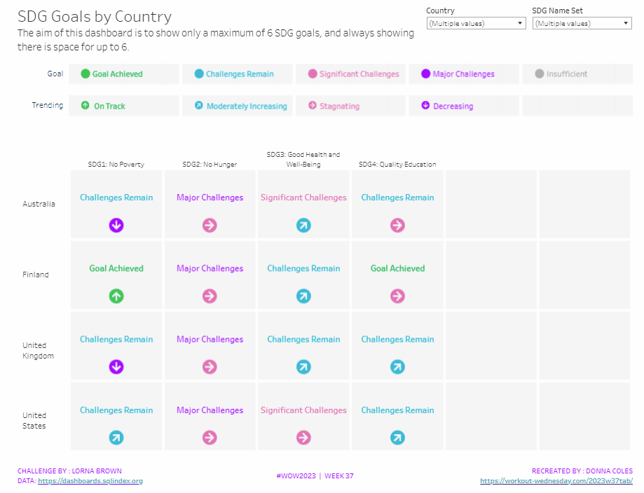
It was Lorna’s turn to set the challenge this week, based on a real world scenario she’s encountered with a colleague. The premise was to be able to show the progress, by country, against a maximum of 6 goals selected by the user. Placeholders for the 6 options had to remain visible at all times (unless the user selected more than 6, in which case a message should appear).
Building the core viz
As Lorna alludes to in the requirements, we will use sets to capture the goals the user can select.
SDG Name Set
Right click on SDG Name > Create > Set. Select up to 4 options.
On a new sheet, add SDG Name Set and SDG Name to Columns, Country to Rows and add Country to the filter shelf, and limit to Australia, Finland, UK & USA. Right click on the SDG Name Set field in the data pane and select Show Set
We need the SDG Name value to only display for the values selected
SDG Name Header Label
IF [SDG Name Set] THEN [SDG Name] ELSE ” END
Add this to Columns before the SDG Name field.
Now we need to always display 6 columns of data, ie in this case, all the SDG Name values In the set and the first SDG Name values not in the set. We will use the INDEX() function to help us label the columns position.
INDEX
INDEX()
Right click this field and Convert to discrete, then add it to the Columns after SDG Name.
Edit the table calculation (click on the triangle symbol on the blue INDEX pill), and adjust so it is computing by Specific Dimensions. This should be all the fields except Country. The columns should be labelled sequentially from 1 to 17.
Add INDEX to the Filter shelf as well. Initially just select 1. Then adjust the table calculation of this field to match above, and once done, edit filter and select values 1 through to 6. This should leave you with 6 columns
Now we have the structure, we can start building the core contents of the table. For this we’ll be using what I refer to as ‘fake axis’.
Double click in the Rows shelf and manually type in MIN(0.2), then double click again and manually type in MIN(0.6). This results in the creation of a MIN(0.2) and a MIN(0.6) marks card on the left hand side.
The MIN(0.2) marks card is going to be used to show the information about how the goal is trending (ie the arrow symbol), while the MIN(0.6) marks card will be used to show the status of the goal (the text displayed). We need new fields for this, so the values only display for the selected goals.
Trend
IF [SDG Name Set] THEN [SDG Trend] END
Goal
IF [SDG Name Set] THEN [SDG Value] END
Click on the MIN(0.2) marks card. Change the mark type to shape. Add Trend to the Shape card. Right click on the Trend pill and change the field from a Dimension to an Attribute.
Doing this stops the field from impacting the table calculation, and you should get back to having 6 columns displayed.
Adjust the shapes using the Arrows shape palette. For the Null value, I set it to use a transparent shape, a custom shape added to my shape palette. See this blog for more information on doing this.
Also add Trend to the Colour shelf. Once again, adjust the pill to be Attribute and then adjust the colours.
Now click on the MIN(0.6) marks card. Adjust the Mark Type to be Text. Add Goal to the Text shelf and change to be and Attribute. Add Goal to the Colour shelf, change to be Attribute and adjust colours to suit. I also adjusted the font to be bold & size 10pt.
Set the chart to be dual axis and synchronise the axis. Edit the axis (Right click on the left hand axis) and fix the axis from 0 to 1.
Hide the axis, the IN/OUT SDG Name Set pill, the SDG Name and INDEX pills (right click the pills and uncheck Show header).
Right click on the Country row label and the SDG Name Header Label column label in the viz and hide field labels for rows/columns.
Right click within the viz to format. Set the background colour of the pane to light grey.
Remove all gridlines, axis rules, zero lines. Set the column and row dividers to thick white lines
Click the Tooltip button on the All marks card, and uncheck show tooltips. Set the viz to Fit width.
Building the Goal legend
On a new sheet, add SDG Value to Columns. Change the mark type to Circle then add SDG Value to Label and Colour. Manually re-order the columns and adjust the colours as required.
Double click in the Columns shelf and type in MIN(0.0). Edit the axis and fix from -0.1 to 0.5 – this will shift the symbols and text to the left.
Adjust the size of the circle shape to suit, and set the font of the label to match mark colour. I also set it to be bold.
Remove all gridlines, axis ruler, zero lines. Set the background of the pane to be grey and the row/column dividers to be thick white lines. Hide the axis and the column headers, and uncheck show tooltips.
Double click into the Rows shelf, and type the text ‘Goal’ (including the quotation marks). Hide the ‘Goal’ label that then displays.
Building the Trend legend
Repeat similar steps for above but add the SDG Trend field to the Colour, Label and Shape shelf. Adjust the shape & colours to those used before.
Handling more than 6 selections
For this requirement, we need to determine the number of items in the set.
Count Set Members
{COUNTD(IF [SDG Name Set] THEN [SDG Name] END)}
and then use this to create some boolean fields
More than 6 Selected
[Count Set Members] > 6
Less than 6 Selected
[Count Set Members] <= 6
Ensuring that less than 6 items are selected, add the Less than 6 Selected field to the Filter shelf of the main table viz and set to True.
If you select more than 6 goals, the viz should disappear.
On a new sheet, double click into the space beneath the marks card where the pills usually sit, and type ‘Dummy’ (with quotes). Change the mark type to shape and set to use the transparent custom shape. Move the Dummy pill to the label shelf, then edit the label and change the text to the error message.
Align the text middle centre and fit to entire view. Uncheck show tooltips. Add More than 6 Selected to the filter shelf and select true (if true isn’t an option, go back to the main viz, and select more options sp the viz disappears, then come back to this sheet and try again).
All the sheets can now be added to the dashboard. Ensure the core table viz and the error sheets are added to a vertical container without the title showings – the charts should expand and collapse as the selections are made – this can be a bit tricky to get right.
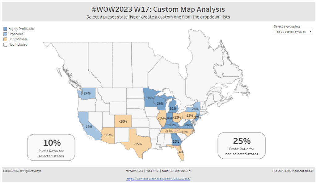
For the final week of Community Month, my colleague, Nik Eveleigh, posed this challenge to apply some tricky filters to a map. Let’s dive straight in!
Identifying the States and Profitability
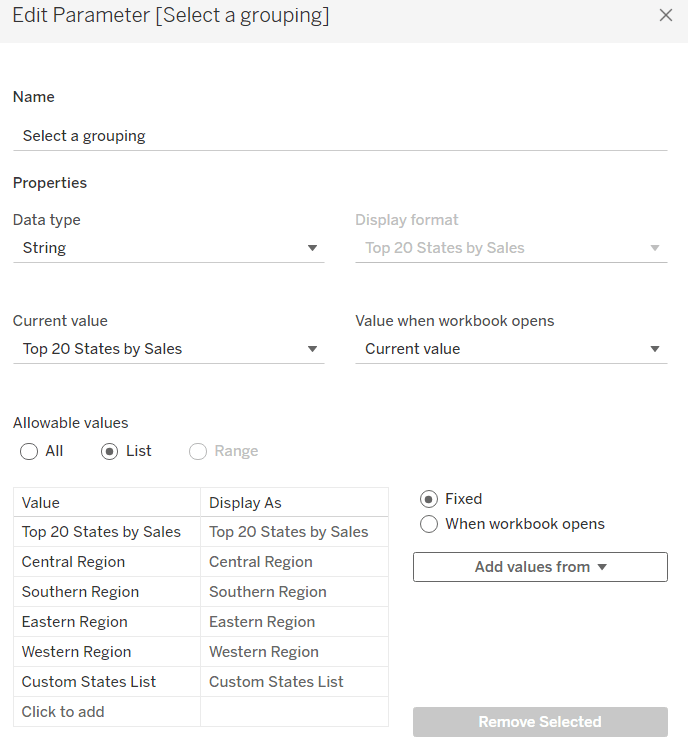
The core functionality of the map display is driven by a parameter allowing the user to select which set of states they want to analyse, so let’s set this up first.
Select a grouping
string parameter containing 6 entries in the list and defaulted to ‘Top 20 States by Sales’
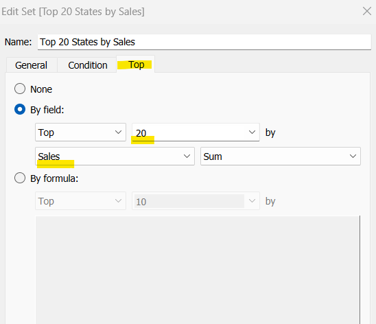
To identify the top 20 States by Sales, we need to create a Set. Right click on State/Province > Create > Set and use the ‘Top’ option to create the set based on top 20 sum of Sales.
Top 20 States by Sales
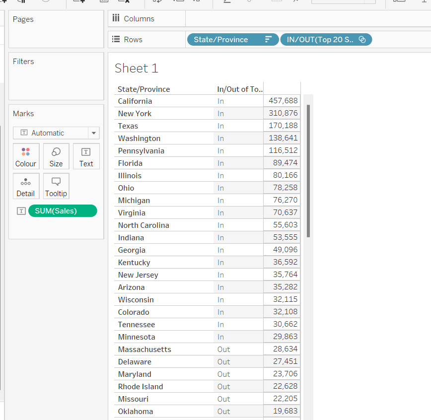
To verify this is working as expected, add State/Province to Rows, Sales to Text and sort descending. The add Top 20 States by Sales to Rows and you should see the first 20 rows with In and the rest listed as Out.
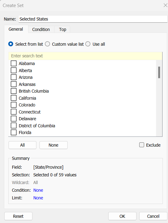
To identify the states selected when the ‘Custom States List’ option is selected, we’ll also need another set to store the selections. Right click on State/Province > Create > Set, leave the list of states all unselected and rename the set
Selected States
To verify this is working, on a new sheet add State/Province to Rows and Selected States to Rows too. Then on the context menu of the Selected States pill, choose Show Set to get the list of States displayed. Select the first couple in the list and see the value in the table change from Out to In.
It is this set control filter list that will be used to provide the selection when the appropriate value in the Select a grouping parameter is chosen.
While the sets display In or Out when shown in the table, they are actually booleans with the equivalent of a True or False. We now need to build a boolean field which will encapsulate all the relevant states included based on the parameter option selected.
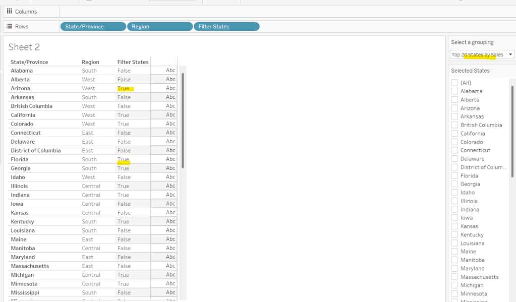
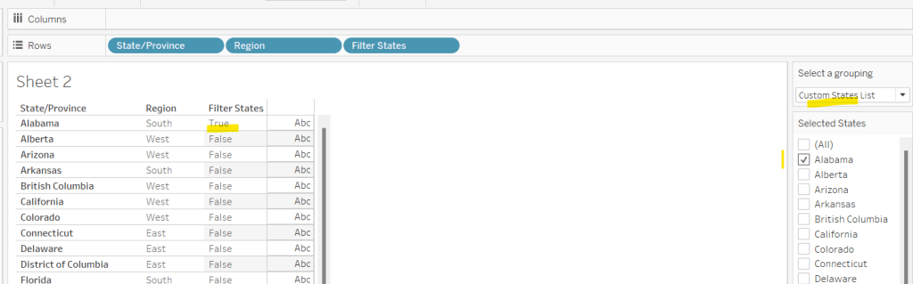
Filter States
CASE [Select a grouping] WHEN ‘Top 20 States by Sales’ THEN [Top 20 States by Sales] WHEN ‘Central Region’ THEN IF [Region] = ‘Central’ THEN TRUE ELSE FALSE END WHEN ‘Southern Region’ THEN IF [Region] = ‘South’ THEN TRUE ELSE FALSE END WHEN ‘Eastern Region’ THEN IF [Region] = ‘East’ THEN TRUE ELSE FALSE END WHEN ‘Western Region’ THEN IF [Region] = ‘West’ THEN TRUE ELSE FALSE END WHEN ‘Custom States List’ THEN [Selected States] END
Let’s sense check the workings of this too. On a sheet add State/Province, Region and Filter States to Rows. Show the Select a grouping parameter. Also click on the Selected States field in the left hand data pane and Show Set, so the list of states shows. Ensure all are unchecked. Depending on the option selected in the Select a grouping parameter, then Filter States column should display true or false.
If you select a state from the list, this should only present as True when the Custom States List option is selected
Right, now we know how to identify the states we want, we can start to look at understanding their profitability. Firstly we need to get the profit ration
Profit Ratio
SUM([Profit])/SUM([Sales])
format this to % with 0 dp.
Profitability
IF ATTR([Filter States]) THEN
IF [Profit Ratio] < -0.25 THEN ‘Highly Unprofitable’
ELSEIF [Profit Ratio] >= -0.25 And [Profit Ratio] < 0 THEN ‘Unprofitable’
ELSEIF [Profit Ratio] >=0 AND [Profit Ratio] < 0.25 THEN ‘Profitable’
ELSE ‘Highly Profitable’
END
ELSE ‘Not Included’ END
If the states is one of the filtered ones then work out isn’t profitability ‘bracket’ otherwise report as ‘Not Included’.
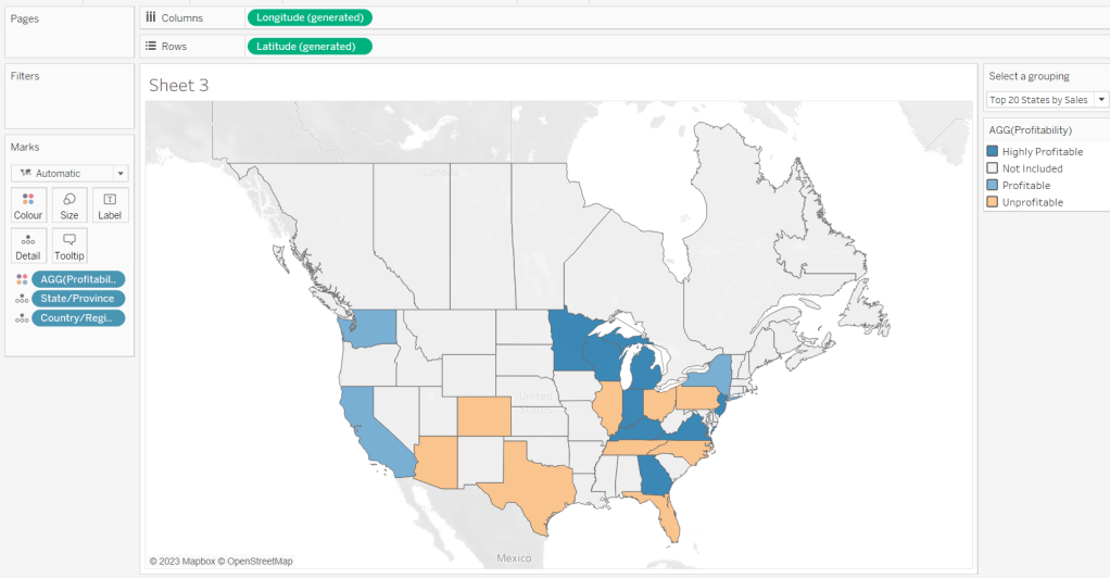
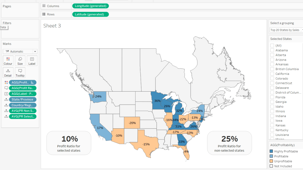
Building the Map
On a new sheet double-click on State/Province to automatically generate the map. If the map doesn’t display with US and Canada Edit Locations (via the Map menu) and ensure your settings are as below
Display the Show a grouping parameter and have it set to Top 20 States by Sales. Add Profitability to Colour and adjust colours accordingly.
Click on the Selected States field in the left hand data pane and Show Set, so the list of states shows, then test changing the values in the Select a grouping parameter and see the display change.
Clean the map up by clicking Map -> Background Layers, and then unchecking all the options in the Background Map Layers section displayed on the left hand side.
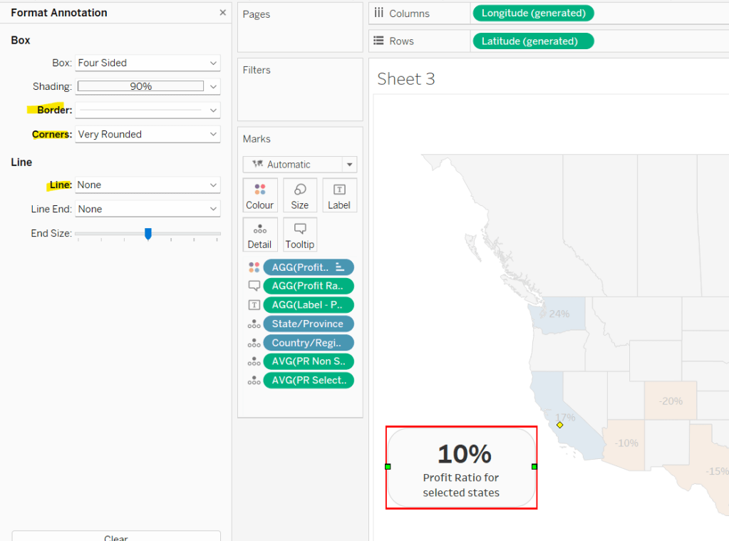
To label the highlighted state we need
Label – PR
IF ATTR([Filter States]) THEN [Profit Ratio] END
format to % with 0 dp and then add to the Label shelf and set the font to bold.
Add Profit Ratio to the Tooltip shelf and adjust the tooltip.
To display the summary Profit Ratio values for all the filtered states vs those not selected, we need
PR by Filter State
{FIXED [Filter States]: [Profit Ratio]}
and then
PR Selected States
ZN({FIXED:AVG(IF [Filter States] THEN [PR by Filter State] END)})
Custom format this with 0%;-0%;–
This formatting with show values with 0dp for positive and negative values and — when no values exists.
Repeat the process to create
PR Non Selected States
ZN({FIXED:AVG(IF NOT([Filter States]) THEN [PR by Filter State] END)})
and apply the same formatting above.
Add both PR Selected States and PR Non Selected States to the Detail shelf and change the aggregation to Average.
Then click on a state on the bottom left of the map (I chose California) and select Annotate > Mark. Add the reference to the PR Selected States and supporting text into the annotation dialog. The when completed, manually move the annotation to the space to the left of the map. Format the annotation to add a border, round the edges and remove the line. You many need to re-edit the annotation to rec-centre the text.
Repeat a similar process, by annotating a state on the right hand side and referencing the PR Non Selected States field instead.
Finally remove all row & column dividers and hide the map options (Map -> Map Options -> uncheck all selections)
Hiding the Selected States control
In order to control visibility of the Selected States list, we need a boolean field
Custom States Selected
[Select a grouping] = ‘Custom States List’
Once all objects have been added to the dashboard and arranged where you want, click on the Selected States control, so it is selected via a grey border, then on the left hand Layout pane, select the Control visibility using value checkbox and choose the Custom States Selected field
The State list will now only display when the Select a grouping parameter contains the ‘Custom States List’ value.
In this week’s challenge, Erica set us the task of building a filter that only contained a subset of the dimension values – ie a set of core values always had to remain in the view, and weren’t available to be filtered out.
Erica advised there were hints available, and that she had solved the problem herself via an existing Tableau Knowledge Base article.
The requirements stated Sets were involved and so I attempted down this path, creating a set to store the ‘core’ cities (as per the requirements), and then using a combined set of all cities and ‘core’ cities to just display the values not in ‘core’. However I couldn’t get things working, so I checked out the hints.
The first hint alluded to 2 sheets, which initially I thought one for the ‘core’ cities and one for the rest, but quickly realised this would only work if there hadn’t been the additional ‘bonus’ requirement to sort the data based on the sales (ie the core cities and the rest could become interspersed in the viz).
So after further fiddling, and unsuccessful ideas, I ended up referencing the KB article and built out a solution. After publishing, my good friend and fellow #WOW participant Rosario Gauna, published her solution which she managed in a single sheet, and in a manner that was much more elegant. So it’s a double solution guide today – what I did based on the KB article and a recreation of Rosario’s solution (so I have this to reference and remind myself if ever I have the need to recreate).
Solution 1 – The 2 sheet solution
Firstly, create a set called Key Cities (right click on City > Create > Set) and select the 5 cities listed in the requirements.
Key Cities
On a new sheet, add State/Province to the Filter shelf and choose Ohio, then add City to Rows and Sales to Columns and sort descending. Add Key Cities to Colour and adjust accordingly.
Call this sheet Sales by City
On a new sheet, add State/Province to Filter and select Ohio, then add City to Rows. Call this sheet FilterSheet.
Duplicate the City field (right click field in the data pane and select Duplicate). This will create a new field called City (copy) in the data pane.
Add City (copy) to the Filter shelf of the Filter Sheet sheet, select the 5 core cities and then check the Exclude checkbox.
Add theoriginal City field to the Filter shelf as well and select All. Show the filter on the sheet, and adjust so it displays Only Relevant Values
The list of options in the filter list should only show the cities in Ohio that aren’t one of the five key states.
Set the City filter to Apply to Worksheets > Selected worksheets and select the Sales by City worksheet
Customise the City filter in the Filter Sheet sheet so that the All option does not display. From the context menu of the City filter control, select Customise and ensure Show ‘All’ Value is unchecked.
Navigate back to the Sales by City sheet and show the City filter values, ensuring all are displayed. This list will include the key cities, but don’t worry. Uncheck a value that isn’t in the list of key cities eg Bowling Green. The city will disappear from the viz, but if you navigate to the Filter Sheet, you should also see the value is unselected in that list too.
This is the filtering behaviour we’re after – selections made to the City filter on the Filter Sheet affect the values in the City filter on the Sales by City sheet.
Now we need to address the sorting.
Again I think I ended up doing something a bit more complicated than needed – check out the sorting described in the 2nd solution, as that would apply here too – it just isn’t what I did at the time.
Firstly, we need a parameter to determine which sort selection to use
pSort
string parameter containing two list entries Key Cities and Sales, defaulted to Key Cities
I decided I wanted to sort by a number, which for Sales was fine, but when Key Cities was selected, I needed to ensure the values for the Key Cities were always greater than the maximum value for the non key cities. For this I needed to get a handle on the value of sales for the non key city that had the largest sales.
Max Non Key Sales
{FIXED : MAX(IF NOT [Key Cities] THEN ({FIXED [State/Province], [City] : SUM ([Sales])})END)}
If the city is not a key city, then get the total sales for each State & City (potential that a city can exist in multiple states, hence the need to declare the State), and then return the max of those.
To see what this is doing, on a new sheet, add State/Province to Filter and select Ohio, then add Key Cities and City to Rows and Sales to Text and sort by Sales descending
We’re looking for the value 8203 as this is the largest sales for the cities not tagged as a Key City.
Add Max Sales Non Key City to the view…. the value doesn’t match what we expected.
This is because a FIXED level of detail (LOD) calculation works across the entire data set, so the fact we’ve filtered by Ohio is being disregarded. To resolve this, set the State/Province field on the Filter shelf so it is Add To Context
This pill will change to grey, and the values should update, as now the LOD is being applied after the context filter has been applied.
With this we can work out a sort field
Sort
CASE [pSort] WHEN ‘Sales’ THEN SUM([Sales]) * -1 ELSE (IF ATTR([Key Cities]) THEN SUM([Sales]) + SUM([Max Sales Non Key]) ELSE SUM([Sales]) END) * -1
END
If we’re sorting by Sales then use the total Sales value * -1, otherwise, if we’re sorting by Key Cities then, if the City is a key city, then add the total sales to the max sales value, otherwise just use the total sales value. Multiple the result by -1. By adding this value, it ensures the values for the Key Cities are always larger than those for the non key cities. The -1 means the sort will be descending.
Test this out, by adding the Sort field as a discrete (blue) field to the Rows of the test sheet we’ve been using above. Ensure the Sort field is listed first, and move the Key Cities field to be third. Show the parameter control, and test switching between the options. The values in the Sort field are always in an ascending order, but the displayed Sales values will be ordered depending on the sort option chosen
Back on the Sales by City sheet, add the Sort pill to the Rows before the City pill, and add the State/Province filter to context.
Hide the Sort field.
The labels need to be displayed inside the bars, so for this we need a dual axis.
Add another copy of Sales to the Columns. On the second Sales marks card, set the option to Show mark labels from the Label shelf. We need the text of the label to be different to the existing bars, so create a duplicate of the Key Cities field, so we have Key Cities (copy) and add this to the Colour shelf of the second marks card. Adjust the colours accordingly to white and black.
Change the mark type of the 2nd marks card to Gantt bar, reduce the opacity of the Colour to 0% and reduce the Size to as small as possible. Adjust the alignment of the Label to left middle, and set the font to be bold and match mark colour.
Make the chart dual axis and synchronise the axis. Set the mark type of the first marks card back to a bar if it changes.
Remove all row and column dividers, and hide the top axis. Hide the City column label too. Edit the bottom axis, and fix to start from 0 and end automatic. Adjust the tick marks to display every 5000 values.
Add this sheet to a dashboard. Remove the colour legends that automatically get added and remove the City filter control too. Leave the sort parameter.
Then add the Filter Sheet as a Floating object and position bottom right. The City filter for this sheet should also automatically display. If it doesn’t show it (click the context menu of the Filter Sheet object > Filters > City).
Change the City filter to be a multiple values dropdown control and set it to be fixed (unselect the Floating option on the context menu).
Now hide the title on the Filter Sheet object and resize to make it teeny tiny, so you can’t see anything
Now you have the core objects needed for a functional dashboard – you’ll just want to take some time moving them into place, and excluding other Cities.
So shout out again to Rosario Gauna, as this is actually her solution!
We’ll build this out in a table first, so we can see what’s going on.
On a new sheet add State/Province to Filter and select Ohio, then add City and Key Cities (the set created above) to Rows. Add Sales to Text.
What we’re going to do is create another set which will just contain the cities not identified as key cities. For this, we need to store against every row (including the key cities) the name of a City that isn’t a key city. For those that already aren’t a key city, that is just its own City name, but for those that are key cities, we want to store a non key city…. sounds confusing right…. let’s build this up.
Firstly, let’s just get those non key cities
Non Key City
IF NOT [Key Cities] THEN [City] END
Add this to the sheet. It shows NULL against all the Key Cities and the City value for all the others
We’re going to use this to set a ‘default; value against the key cities.
Min Non Key City
{FIXED: MIN([Non Key City ])}
Theis returns the value from the Non Key City field which is alphabetically first. Using MAX would work just as well. When we add this to the sheet, we also need to set the State/Province filter to be Add to Context, otherwise we get a City from the whole data set, and not just Ohio.
We can now create a field that will just contain a distinct list of the non key cities
Other Cities
IF NOT [Key Cities] THEN [City] ELSE [Min Non Key City] END
Add this to the sheet
For every City, the Other Cities field contains a non key city value. Now we have this, we can create a set from this field
Other Cities Set
Ensure all values are selected – don’t worry that you can see cities that aren’t relevant at this stage
Add Other Cities Set to the Filter shelf and also add to the Rows shelf next to the Key Cities field. From the context menu of the Other Cities Set on the Filter shelf, select Show Set. The list of non key cities should be displayed. If there’s more than you expect, ensure the control is set to All Values in Context.
If you uncheck Bowling Green from the list, all the key cities and Bowling Green will disappear, but we don’t want this. We only want the row where City=Bowling Green to disappear. For this we need
Records to Keep
[Key Cities] OR [Other Cities Set]
Add this to the Filter shelf and set to True. Remove the Other Cities Set from the Filter shelf (the list should remain). Now if you remove Bowling Green, only that row should disappear, and if you uncheck all, so no city is selected, the key cities should remain
Adjust the display so the rows are sorted by Sales descending (either use the Sort button in the toolbar, or set the sort on the City field).
Then create a field
Sort Order
CASE [pSort] WHEN ‘Key Cities’ THEN [Key Cities] ELSE TRUE END
Add this to the Rows in front of City, and show the pSort parameter (see above for details if you haven’t created this yet). When pSort is set to Key Cities, manually change the order of the values displayed so True is listed before False. The rows are displayed in descending Sales value for each Sort Order Value. When Sales is selected to sort by, the Sort Order is true for all rows.
Now we’ve got all the components needed to build the viz, and you should be able to adapt the steps above to get it to work. The key difference is using the Records To Keep field on the Filter shelf, displaying the members of the Other Cities Set to control the filtering, and managing the sort using the Sort Order field instead.
My workbook showing this solution is published here.
It was Sean’s final #WOW2022 challenge of the year, and he set this task to provide alternative options for visualising time series across dimensions with high cardinality.
I had a play with Sean’s viz before I started tackling the challenge and noticed the following behaviour in addition to the requirements listed, which may or may not have been intentional.
When the cardinality of the dimension to display was more than 1 higher than the top n parameter, and the Show Others? option was set to Group By, the sales value to display was based on average sales rather than sum (as indicated in the requirements), and all the values not in the top n, were grouped under an ‘Other (Avg)’ label. But if the cardinality of the dimension was only 1 more than the top n parameter (so there was essentially only 1 value within ‘other’), then this value would display as itself (ie not labelled ‘other’) and the sales values would be summed rather than averaged (eg if the lines were to be split based on Ship Mode, and the top n was set to top 3 and Show Others? set to Group By, all four ship modes would display with the sum of sales rather than average).
This observation meant some of the calculations were slightly more complex than what I thought they would need to be initially, as I had to build in logic based on the number of values within a dimension.
So with that understood, let’s build the calcs…
Defining the calculations
Firstly we need some parameters
pDimensionToDisplay
String parameter defaulted to Subcategory, with the list of possible dimensions to split the chart by
pTop
integer parameter defaulted to 5
pShowOthers
I used an integer parameter with values 0 and 1 which I ‘aliased’ to the relevant values, defaulted to ‘Group Others’
I then needed to determine which dimension to be used based on the selected from the pDimensionToDisplay parameter.
DimensionSelected
CASE [pDimensionToDisplay] WHEN ‘Subcategory’ THEN [Sub-Category] WHEN ‘State’ THEN [State/Province] WHEN ‘Ship Mode’ THEN [Ship Mode] WHEN ‘Segment’ THEN [Segment] ELSE ‘All’ END
From this, I could then use a Set to determine which of the values would be in the top n. Create a set of off DimensionSelected (right click -> Create -> Set)
Dimension Selected Set
select the Top tab, and create set based on the pTop parameter of Sales
To check this is working as expected, on a sheet, add DimensionSelected and Dimension Selected Set to Rows, add Sales to Text and sort by Sales descending. Show the pTop and pDimensionToDisplay parameters. Change the parameters and observe the results behave as expected.
Now we need to determine how many values are not in the set, ie, how many of the DimensionSelected values display as ‘Out’ in the above image.
Count Non-Set Items
{FIXED:COUNTD(IF NOT([Dimension Selected Set]) THEN [DimensionSelected] END)}
If the entry is not in the set, then return the entry, and the count the number of distinct entries we have. Using the FIXED level of detail calculation, wraps the value across every row.
Now this is understood, we need to work out whether we want to group the ‘non-set’ values under ‘other’
Dimension To Display
IF [pShowOthers]=0 AND NOT([Dimension Selected Set]) AND [Count Non-Set Items]>1 THEN ‘Other (Avg)’ ELSE [DimensionSelected] END
If we’re opting to ‘group’ the values, and the entry isn’t in the set, and we’ve got more than 1 entry that isn’t in the set, then we can label as ‘Other (Avg)’, otherwise, we just want the dimension value.
We use similar logic to determine whether to display the SUM or AVG Sales.
Sales to Display
IF [pShowOthers]=0 AND SUM([Count Non-Set Items]) > 1 THEN AVG([Sales]) ELSE SUM([Sales]) END
Format this to $ with 0 dp.
We can then remove the DimensionSelected from our view, and test the behaviour, switching the pShowOthers parameter
Building the core viz
On a new sheet, add Order Date set to continuous quarters (green pill) to Columns and Sales To Display to Rows and Dimension To Display to Label. Show all the parameters.
Create a new field
Colour
[pShowOthers]=0 AND NOT([Dimension Selected Set]) AND [Count Non-Set Items]>1
add add to Colour shelf, and set colours accordingly.
Add Sub-Category, Ship Mode, State and Segment to the Filter shelf. Show them all, and then test the behaviour is as expected.
Extending the date axis
The date axis in the solution goes beyond 2022 Q4, and means the labels have a bit more ‘breathing space’. To extend the axis, click on Order Date pill in the Columns, and select Extend Date Range -> 6 months.
Then double click into the space next to the Sales To Display pill on the Rows and type MIN(0). This will create a second axis, and the date axis should now display to 2023 Q2
On the MIN(0) marks card, remove the Colour and Dimension To Display pills. Reduce the Size to as small as possible, and set the Colour opacity to 0%. Set the chart to dual axis, and synchronise the axis.
Finally tidy up the chart – hide the right hand axis, remove the title from the date axis, change the title on the left axis. Remove all row and column divider lines, but ensure the axis rulers are displayed. Title the viz referencing the pDimensionToDisplay parameter.
Building the dashboard
When putting the dashboard together, you need to ensure that the filters, parameters and main viz are all contained within a vertical container to ensure the viz ‘fills up’ the space when the controls section is collapsed.
The controls section itself is also a vertical container, which consists of 2 horizontal containers, one of which contains all the filters, and one which contains the parameters.
The layout tab shows how I managed this (I also like to rename the objects to keep better control).
The green Base vertical container is the first container. This essentially contains 3 ‘rows’ – the title, the User Controls vertical container and the viz itself.
The User Controls vertical container, then contains 2 rows itself – the Filters horizontal container (which has a pale grey background colour) and the Fine Tune horizontal container (which has a slightly darker grey background colour).
The User Controls vertical container is then set to ‘hide/show’ by selecting the whole container (click on the object in the item hierarchy on the left), and then selecting Add Show/Hide Button from the context menu. Adjust the button settings as required (I just altered the text displayed on hover) and then position accordingly.
It can take a bit of trial and error to get this right, and to get your containers working as expected. My published viz is here.
Erica provided a set action based challenge this week requiring us to drill down to 2 levels in a hierarchy. I know there’s been similar challenges to this in the past, but I resisted checking them out, and attempted to build from memory. I succeeded – yay! Let’s crack on…
Note – I used the v2022.1 Superstore data that I already had on my laptop so filtered to December 2022. I also connected to the provided tds file rather than the excel instance, as for some reason, the tds includes Manufacturer which the excel file doesn’t.
Creating the main viz
On a new sheet, add Category to Rows and Sales to Columns and display as a bar chart. Add Order Date to Filter and restrict to the latest month/year in the data you have (in my case Dec 2022).
Create a set based off of Category (right click the Category pill > create set) and select a single value (eg Furniture) to be in the set. A field called Category Set should now exist in the data pane.
What we need to do is create a 2nd level in the hierarchy that shows the sub-categories related to the Category in the set, otherwise just display the Category.
2nd Level
IF [Category Set] THEN [Sub-Category] ELSE [Category] END
Add 2nd Level to Rows. Then right click on the Category Set field in the data pane and select Show Set to display the set values in a control on the sheet.
If you manually change the options in the Category Set control, the values displayed in the 2nd Level column will change.
Change the sort of the 2nd Level pill to sort by Sales descending
Create a set based off the 2nd Level field (right click field > create set), and select a single option that is one of the Furniture sub categories (eg Bookcases). A field called 2nd Level Set will be added to the data pane.
What we now need to do is create a 3rd level in the hierarchy that either shows the Category, the Sub-Category or the Manufacturer depending on the options selected in the sets. This is the only field which will actually be displayed on screen.
Display
IF [Category Set] AND NOT([2nd Level Set]) THEN ‘- ‘ + [Sub-Category] ELSEIF [Category Set] AND [2nd Level Set] THEN ‘ — ‘ + [Manufacturer] ELSE [Category] END
If we have a value selected in the Category Set but no value selected in the 2nd Level Set then display the Sub-Category (with some additional text formatting to give the indented effect).
Else, if we have a value selected in the Category Set and a value selected in the 2nd Level Set, then display the Manufacturer (again with additional text formatting and spacing).
Otherwise, display the Category.
Add Display onto the Rows, and then right click 2nd Level Set and select Show Set. Apply a sort to the Display pill so it’s also sorting by Sales descending.
Test the functionality, by changing the options in the set controls. For representative testing, ensure only 1 option maximum is selected in each set, and if an option in the 2nd Level Set is chosen, ensure it’s a Sub-Category related to the value selected in the Category Set.
Once happy, revert the options back to Furniture and Bookcases.
Format the sheet, and adjust the Row Divider so the slider is at the 2nd mark, and set the Column Divider to none.
Remove all gridlines. Then uncheck Show Header against the Category and 2nd Level pills in Rows. And finally, click on the Display title at the top of the column and Hide field labels for Rows.
To colour the bars, we’re going to use similar logic to that used to determine what to display
Colour Bar
IF [Category Set] AND NOT([2nd Level Set]) THEN ‘Sub Category’ ELSEIF [Category Set] AND [2nd Level Set] THEN ‘Manufacturer’ ELSE ‘Category’ END
Add this to the Colour shelf and adjust the colours. Update the tooltip and widen the rows slightly.
We’ve got the viz, now to add the interactivity so the changes happen ‘on click’ rather than via the set controls we’ve displayed.
Adding the interactivity
Create a dashboard and add the viz. Uncheck the options selected in both sets, so no options are selected – this should collapse the viz to just show the 3 Category values. Delete the container that shows the set controls/colour legend.
Create a new set action as below
Category Selected
on select (single selection only) assign the values to the Category Set, and remove all values when selection is cleared.
Create a 2nd set action
SubCat Selected
on select (single selection only) assign the values to the 2nd Level Set, and remove all values when selection is cleared.
Start clicking around, and BOOM! you should get the desired behaviour (note, once you reach the Manufacturer level, you’ll need to click twice on a manufacturer to get the viz to completely reset.
Bonus – building the ‘header’
I deduced from hovering over Erica’s solution that the ‘header’ was made up of multiple sheets, all aligned in a single row in the dashboard. I did have a play to see if I could come up with a single-sheet option, and while I think there is an alternative, it wouldn’t necessarily display exactly as Erica had shown. So I went down the multiple sheet option too.
Firstly we need a sheet to simply display the text >> Category.
On a new sheet, double click in the space below the Detail shelf on the marks card and type the text ‘dummy’. Then drag the ‘dummy’ pill onto the Label shelf, which will automatically change to now be labelled Text. Click on the Text shelf, and the 3dots to open the Edit Label dialog.
Delete the ‘dummy’ field, and replace it with ˃˃ Category. HOWEVER the ˃ symbol isn’t the > character I typed from keyboard. I found the double >> wasn’t retained this way, which I’m putting down to some HTML/XML related encoding that isn’t being handled. Instead I copied the symbol from this page https://www.compart.com/en/unicode/U+02C3 and pasted it into the text window. I then formatted the font size and style and coloured it the relevant blue.
Next we want to create a sheet showing the Category selected. Click on your viz to add a Category to the set (eg click the Furniture bar).
On a new sheet, add Category Set to the Filter shelf (this by default filter to values IN the set). Then add Category to Text and update the Text field as below, adjusting the font size/colour etc as before.
Duplicate this sheet as we can use this as the basis of the >>Sub-Category display.
On the duplicated sheet, update the text field to contain ˃˃ Sub-Category, where again the > is the character pasted. Format/colour the text
Now click on your viz to add a Sub-Category into the 2nd Level Set (eg click the Chairs bar).
On a new sheet, add 2nd Level Set to the Filter shelf (this by default filter to values IN the set). Then add 2nd Level to Text and update the Text field as below, adjusting the font size/colour etc as before.
Finally, once again, duplicate this sheet. Then on the duplicated sheet replace the text with >> Manufacturer instead
Now you have all the components you need. Add all these sheets onto your dashboard using a horizontal container to keep them all together. Apply the grey background shading if required (you’ll need to format the background colour on each worksheet, as well as the various objects on the dashboard.
From interacting with Luke’s published solution, I figured I needed to start by working out some core calculated fields, before I even attempted to build the viz.
Defining the calculations
Firstly, we just need to determine how many distinct products (ie Product Names) in total were ordered per Category and Sub-Category. As the viz we’re building is already at the required level of detail, the calculation we need is simple
Count Products
COUNTD([Product Name])
That’s the easy bit :-)…. we then need to determine how many products are profitable (for the relevant Category & Sub-Category) every year, in each of the 4 years. This is a bit more complex, and requires several steps (at least it did for me).
We need to know what the Profit is for each Product Name in each year. We can use an LoD for this.
Popping this into a table view so we can check what’s going on…
We now need an indicator to know whether each value is profitable (ie +ve) or not. I want to return a 1 if it is and 0/null if not, and then I want to be able to ‘sum up’ all the 1’s, so I can conclude if the total is 4, the product is profitable every year. I need another LoD for this
Is Profitable per Year?
{FIXED YEAR([Order Date]), [Product Name]: SUM(INT([Profit per Product & Year]>0))}
[Profit per Product & Year]>0 returns a true or false, and so when true and wrapped within an INT, will return 1. When this field is added to the above view, it is further aggregated by SUM.
At the Product Name & Year level, it just returns the 1’s, 0’s or <nothing> as expected
but when we remove Year from the table (which is necessary for the viz we’ll be building), this field aggregates….
…and scrolling down we’ll find some rows where the value is 4, which means the Product Name has been profitable for every year.
Using this information, we can then create a Set of these products – Right click Product Name > create > set
Profitable Products
contains the set of Product Names where SUM(Is Profitable per Year?) = 4
Now we can identify the profitable products, we need to count how many there are
Count Successful Products
COUNTD(IF ([Profitable Products]) THEN [Product Name] END)
If the Product Name is in the Profitable Products set, then capture the Product Name, and count the distinct number of them.
And now we can compute the percentage of successful products
Pct. Successful Products
ZN([Count Successful Products]/[Count Products])
ZN means I’ll get a 0 for those cases when there aren’t any successful products. Format this to % with 0 dp.
Let’s see all these values in a different table now to verify we’re getting what we expect :
Great! So this has given us the data we need to build the bar chart part of the viz, but what about the barbell? This is based on profit ratio and all we actually need for this is the standard profit ratio calculation
Profit Ratio
SUM([Profit])/SUM([Sales])
formatted to % with 1 dp.
Building the viz
On a new sheet create a basic bar chart with Category and Sub-Category on Rows and Pct. Successful Products on Columns. Sort descending, label the bars and colour accordingly.
Now add Profit Ratio to Columns, and on the Profit Ratio marks card only..
change mark type to circle
remove labels
add Profitable Products set to Colour and adjust
edit the alias of the values in the colour legend (right click > edit alias)
To create the bar between the circles, add another instance of Profit Ratio to Columns, and on this marks card…
change mark type to line
remove labels
add Profitable Products to Path
change colour to grey
Now right click on the 2nd instance of the Profit Ratio pill in the Columns shelf and select Dual Axis.
(note – if you lose your bars at this point, change the mark type of the Pct. Successful Products mark cards to bar).
Right click on the Profit Ratio axis at the top and synchronise axis, then right click again and move marks to back, then finally, right click again and uncheck show header.
And that’s the core of the viz really. It needs some final formatting to remove column headers, column gridlines and to add row banding. I also chose to make the tooltips more relevant, so in my solution there are some additional fields on the marks cards to provide the relevant details and commentary.
With #TC21 looming next week, Candra’s set this week’s challenge, based on inspiration from past Tableau Conferences – a simple looking, but effective visualisation for understanding profit performance within some pre-established timeframes.
Building the BANs
Identifying Top 5 / Bottom 5 / Everything Else
Building the Chart and Labelling the Bars
Adding the interactivity
Building the BANs
The timeframes we need to report over need to be based on a specific date. In this case it’s the latest date in the data set. If you were using this for a business dashboard, you might be basing it on Today / 1st of the Current Month etc. Rather than hardcode the date I need, I’ve worked out the latest month I want to use by
Set all the Order Dates in the data set to be the 1st of the month, then get the maximum of these dates. So as the last date in the data set is 30th Dec 2021, that’s been truncated to 1st Dec 2021 which is then what this field stores.
I then want to capture the profit values for each month, quarter, year into separate fields, so we have
Month
IF DATETRUNC(‘month’, [Order Date])=[Max Month] THEN [Profit] END
This only stores Profit values for rows where the Order Date is also in December
Quarter
IF DATETRUNC(‘quarter’,[Order Date])=DATETRUNC(‘quarter’,[Max Month]) THEN [Profit] END
This only stores Profit values for rows where the Order Date is in the same quarter as December (ie the 4th quarter which is months Oct-Dec).
Year
IF DATETRUNC(‘year’,[Order Date])=DATETRUNC(‘year’,[Max Month]) THEN [Profit] END
This stores Profit data for rows where the Order Date is in the same year.
All these fields are formatted to be $ with 0 dp.
A basic viz can the be built with Measure Names on Columns and Measure Names and Measure Values on Text. The Measure Names heading is then hidden, and the font and table formatting adjusted so the sheet looks as below.
Note – Naming these fields Month, Quarter, Year rather than Monthly Sales, Quarterly Sales etc, makes this display much easier and also helps with the interaction later.
Identifying the Top 5 / Bottom 5 / Everything Else
We need to be able to identify the Sub-Categories which have the best profits, those that have the worst, and the ‘rest’. We’re going to use Sets to help us with this. However the set entries could change depending on whether we’re looking by month, by quarter or by year. So first we need to create a field that is going to store the particular Profit value we need depending on what time period is being selected.
We need a parameter pDatePart to capture the time frame. This is a string field which is just defaulted to the text ‘Month’.
The interactivity later will set this parameter to the different values.
So now we know the ‘selected’ date part, we need to get the appropriate profit value
Value To Plot
CASE [pDatePart] WHEN ‘Month’ THEN [Month] WHEN ‘Quarter’ THEN [Quarter] ELSE [Year] END
This just uses the values from the 3 measures we created to start with.
So now we can create the sets we need. Right click on Sub-Category > Create > Set and create a set called Top 5 that is based on the Top 5 Value to Plot values
Then create another set in the same way called Bottom 5
With these sets, we can now determine the Sub-Category ‘label’ that will be displayed
Sub-Category Display
IF [Top 5] OR [Bottom 5] THEN [Sub-Category] ELSE ‘Everyone Else’ END
and the grouping that will be used to colour the bars
Sub Cat Group
IF [Top 5] THEN ‘Top 5’ ELSEIF [Bottom 5] THEN ‘Bottom 5’ ELSE ‘Everything Else’ END
Building the Chart & Labelling the Bars
Ok, so now we’ve got the building blocks in place, we can build the chart. You will probably be tempted to build a bar chart (I did to start with), but positioning the labels then became a bit tricksy. When we get to the labels, we’re going to need to use the left and right alignment options. However, when you build a bar chart, if you right align the label, the label will be positioned outside at the end of the bar (even though this seems a little odd with negative values, as it looks to be on the left…).
Right aligned labels
But then we set the labels to be left aligned, the labels appear inside the bar instead, and not outside on the left.
Left aligned labels
So instead, rather than using the bar mark type, we need to build this chart using the gantt mark type, and base the Size on the Value to Plot field.
However, the value being plotted is actually an average value based on the number of Sub-Categories being ‘grouped’ as otherwise the value associated to Everything Else can end up bigger than all the rest. I created the following field
Avg Value To Plot
SUM([Value to Plot])/COUNTD([Sub-Category])
formatted to $ with 0dp.
So now we start building by adding Sub-Category Display to Rows and type in MIN(0) into Columns. Change the mark type to Gantt and add Avg Value To Plot to Size. Add Sub-Cat Group to Colour and adjust accordingly. Sort the Sub-Category Display field by Avg Value To Plot descending.
Now we can’t just label by a single field of the value or the sub-category, as while the ‘automatic’ label alignment option, almost puts the labels in the right positions, there is no way to define an ‘opposite’ to the ‘automatic’ alignment. We need to define some dedicated label fields based on where we want them to display.
Label – Left – Profit
IF [Avg Value To Plot]<0 THEN [Avg Value To Plot] END
If we’re in the bottom half of the chart, we’re going to display the Profit value on the left side.
Label – Left – Sub Cat
IF [Avg Value To Plot]>=0 THEN ATTR([Sub-Category Display]) END
If we’re in the top half of the chart, we’re going to display the Sub-Category Display on the left side.
Add both these fields to the Label shelf and then adjust the label alignment to be left.
To label the other ends, we need to create two further label fields
Label – Right – Profit
IF [Avg Value To Plot]>=0 THEN [Avg Value To Plot] END
Label – Right – Sub Cat
IF [Avg Value To Plot]<0 THEN ATTR([Sub-Category Display]) END
We then need to create another MIN(0) on Columns (easiest way is to hold down control, then click on the existing MIN(0) field and drag it next to itself to create a duplicate. Then on the 2nd marks card, remove the two Label – Left – xxx fields and add the two Label – Right -xxx fields. Change the alignment to right.
The make the chart Dual Axis and synchronise the axis.
Now you can hide the Sub-Category Display header from showing, hide the axis, remove gridlines etc.
Adding the interactivity
Once the two sheets are on the dashboard, you can add a dashboard parameter action which will on select of the KPI/BAN chart, pass the Measure Name into the pDatePart parameter. When the mark is unselected, the parameter value should stay as it is.
And hopefully, you should now have a working viz. My published version is here.