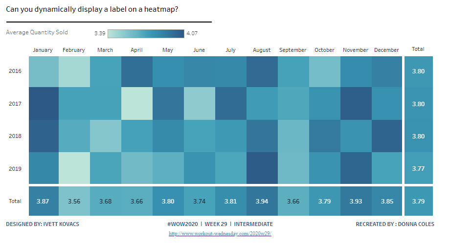
There’s a lot packed into the challenge this week, which was “set” by Lorna Brown and Erica Hughes to test our Set Action skills. How detailed this blog will go, I have yet to decide… I’ve got a couple of hours to get this nailed, so it could get quite brief as we get towards the end 🙂
I’ve got 6 sheets/charts making up this dashboard, so my intention is to summarise each one, and I’ll define the various calculations that are going to be needed as we go.
- The overall summary table
- The selected months summary table
- The trend line
- The donut chart
- The top 3 states table
- The map
- Adding the interactivity
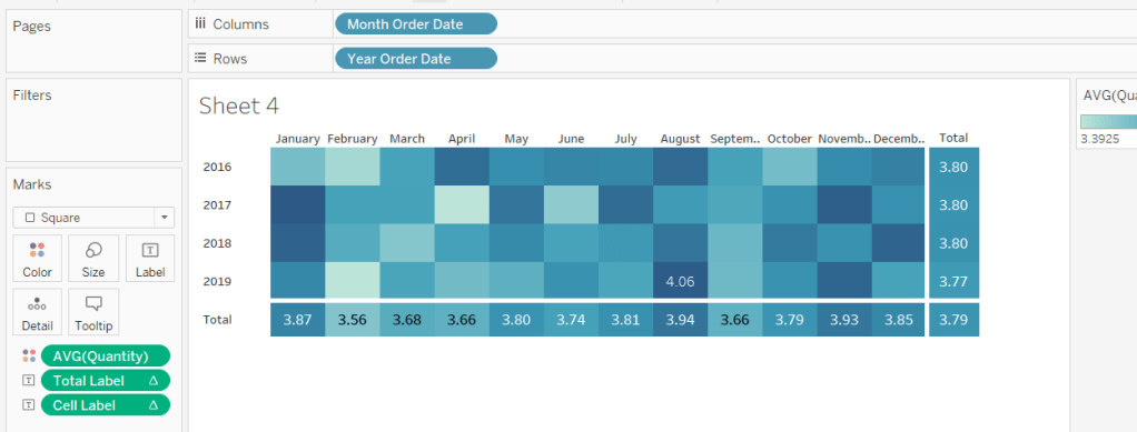
The overall summary table
This challenge is focused on understanding the Sales per month. Whilst its possible to use the built in aggregation features of a date field, I often prefer to create explicit date fields at the level I require, so it’s easier to reference. Therefore, the first field I created for this challenge was
Order Date To Plot
DATETRUNC(‘month’, [Order Date])
This essentially ‘groups’ every order placed in a month to be tagged with the 1st of the month. I custom formatted this field to MMM yyyy (ie Oct 21).
For the overall summary table, I need to capture the total sales of the whole data set, and I use a Fixed LoD calculation for this.
Total Sales
{FIXED: SUM([Sales])}
This field is formatted to $0.00M
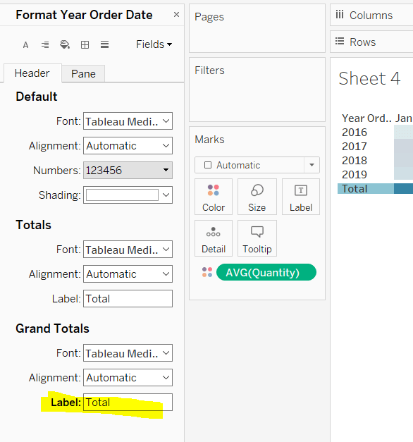
NOTE – I actually named this field <space>Total Sales<space> as I want to display the name of the field (the measure name) in the summary table, but the ‘selected months’ summary table also has a Total Sales measure which is a different calculation (see later). Adding the <spaces> is a sneaky way to get two fields with what appears to be the same name. As this field when displayed will be centred, the <spaces> aren’t noticeable.
We also need to get the monthly average sales for the whole data set
Average Sales by Month
AVG({FIXED [Order Date To Plot]: SUM([Sales])})
Format this to to $0.0K
We can now build the summary table by adding Measure Names to the Filter shelf and selecting these 2 fields. The placing Measure Names on Rows and Measure Names and Measure Values on Text. Reorder the measures as required, hide Measure Names on Rows and format the Text as required.
Change the title of the sheet to Superstore Sales, ensure the tooltip doesn’t display and remove all gridlines / row banding etc.

The selected months summary table
The core requirement of this challenge is to make use of set actions, so we’re obviously going to need a set which will contain the dates (months) the user will select on the chart. This set will be based off of Order Date To Plot. Right click on the field > Create > Set. Name it Order Dates To Plot Set and by default, select all the months between Oct 20 to Jun 21 inclusive.

Later I’ll describe how the values of this set will get updated, but for now, we need to get some information relating to the sales in these selected months.
Firstly, we want the total sales for the months in this set.
Total Sales
IF [Order Date To Plot Set] THEN [Sales] END
The default format for this field is set to $ with 0 dp.
Note – this is the other ‘total sales’ field mentioned earlier. This field name has no leading/trailing spaces.
To get the average, I needed a field just to store each member of the set (ie each selected month)
Selected Dates
IF [Order Date To Plot Set] THEN [Order Date To Plot] END
and with this I can then work out
Average Sales
AVG({FIXED [Selected Dates]: SUM([Total Sales])})
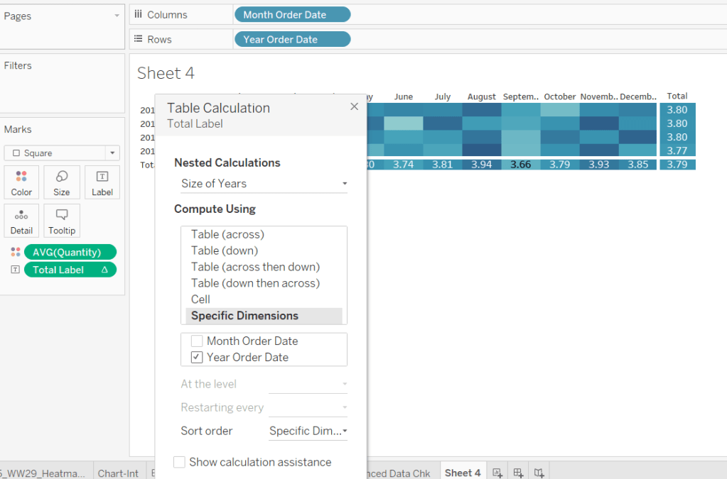
The final measure required for this section is the change within the date range, which is basically comparing the value of sales at the first month in the selection with the sales in the final month selected. We need a few fields to get to this.
Firstly, we want to identify the first and last months
Min Selected Date
{FIXED:MIN(IF [Order Date To Plot Set] THEN [Order Date To Plot] END)}
If the date is in the set, then return the date and then take the minimum of all the dates, and store against all the rows in the data. Similarly we have
Max Selected Date
{FIXED:MAX(IF [Order Date To Plot Set] THEN [Order Date To Plot] END)}
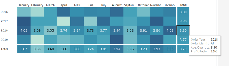
Putting this info into a table, you can see how the calculations are working. The values for the Min & Max dates are the same across every row.

Next we need to get the Sales at the min & max points, and spread that value across all rows
Sales at Min Date
{FIXED: SUM(IF [Order Date To Plot]=[Min Selected Date] THEN [Sales] END)}
Sales at Max Date
{FIXED: SUM(IF [Order Date To Plot]=[Max Selected Date] THEN [Sales] END)}

Now we can work out the difference
Change within Date Range
([Sales at Max Date]-[Sales at Min Date])/[Sales at Min Date]
format this to a percentage set to 1 dp

Finally, we need to know the number of months in the set, which is displayed in the title of the monthly summary sheet.
Months in Set
{FIXED: COUNTD(IF [Order Date To Plot Set] THEN [Order Date To Plot] END)}
If the date is within the set, then capture the date, and the count the distinct set of dates captured.
Make this a discrete field (move from the measures section at the bottom of the data pane to the dimensions section at the top (above the line), and add to the tabular view

Now we can build the summary sheet.
Add Measure Names to the Filter shelf and this time filter by Total Sales, Average Sales and Change within Date Range. Add Measure Names to Rows and Measure Values to Text. Reorder the measures.

Format the Total Sales to be in $K, by selecting the Format option from the context menu of the Total Sales pill on the Measure Values shelf (hover on the pill and click the carrot/down arrow that appears – by formatting this way, we’re changing the display of this field for this sheet only).

Add Min Selected Date and Max Selected Date to the Detail shelf and set to be Exact Date. Format both these fields via the pill context menu to be the ‘March 2001’ format

Also add Months in Set to the Detail shelf.
Adjust the title of the sheet as below

Finally you need to set the background of the worksheet to the relevant purple (I used #8074a8), adjust the colours of all the fonts to white and adjust the size/style of the fonts in the table. Remove all gridlines/row banding etc, and you should have something like below

The Trend Line
By this point we’ve built all the calculated fields we need for this chart. This is a dual axis line chart, as we want the colour of the line for the selected dates to be different from the non selected ones, and we want to display a label for the highest sales in the selected timeframe.
- Add Order Date to Plot to Columns, and set as a Continuous (green) pill set to Exact Date
- Add Sales to Rows
- Add Total Sales to Rows
- Make the chart dual axis, and synchronise axis.
- Adjust the colours of the Measure Names colour legend
- On the Label shelf of the Total Sales marks card, set to label the maximum value only

- On the All Marks Card, add Min Selected Date and Max Selected Date to the Detail shelf and set to Exact Date.
- Right click on the Order Date To Plot axis and Add Reference Line
- Create a reference band that starts at the constant Min Selected Date, ends at the constant Max Selected Date, is bounded by dotted lines and shaded between

- Hide the Sales and Total Sales axis, format tooltips and adjust the row & column dividers.
- Change the title and you should get to

The donut chart
Donut charts are 2 different sized pie charts on top of each other, created using a dual axis chart. On the Rows shelf type in MIN(0). Then type the same next to it. This gives you two axis and two marks cards.

We only care about information related to the selected dates for this chart, so we can add Order Date To Plot Set to the Filter shelf, which by default will just restrict the information to the data ‘in’ the set.
Change the mark type of the 1st MIN(0) marks card to Circle and add Sales to the Tooltip shelf. Adjust the size of the charts/mark.
Change the mark type of the 2nd MIN(0) marks card to Pie and add Sales to the Angle shelf. Add State to the Detail shelf. Sort the State field by Sales descending.

Note – the circles might look the same at this point, but if you hover over the bottom one, you should see that it’s segmented by State.
We need some new fields now to help us identify the top ranking states.
Sales Rank
RANK(SUM([Sales]))
This is a table calculation, so it’s best to see how this field will work in a table view – build one out as below, and set the table calculation on the Sales Rank field as shown

We’re now going to ‘group’ the ranks into the top 3 and everything else
Sales Rank Group
IF [Sales Rank]<=3 THEN [Sales Rank] ELSE 10 END

We can now use this Sales Rank Group field to colour the pie chart. On the 2nd MIN(0) marks card, add Sales Rank Group to the Colour shelf. Adjust the table calculation to compute using State as above, then change the field to be Discrete (blue). Adjust the colours to suit.

Now make the chart dual axis, and synchronise the axis. Adjust the size of the 1st MIN(0) circle to be smaller than the pie. If it’s not showing, right click on the right hand axis and move marks to back. Colour the circle white. Adjust tooltips to suit and hide axis, column/row dividers etc. Update the title. You should have

The top 3 states table
- Add Order Date To Plot Set to Filter
- Add State to Rows and Sales to Text and sort descending.
- Add Sales Rank to Filter and set to At Most is 3. This will just show the top 3 states.
- Add State to Text
- Add a Percent of Total Quick Table Calculation to the existing Sales field that’s on the Text shelf (via the context menu of the pill)
- Add another instance of Sales back onto the Text shelf
- Adjust / format the font size and layout of the fields on the Text shelf
- Add Sales Rank to the Size shelf and set to be discrete (blue) and set the mark type to be Text. Adjust the size of the marks – it’s likely it’ll need to be reversed and the range adjusted.

- Hide the State field on Rows, adjust the font colours, remove row banding and row/column dividers. You should end up with…

The map
- Add Order Date To Plot Set to the Filter shelf
- Add State to Detail – this should create a map (edit locations to be US if need be – Map -> Edit Locations menu)
- Add Sales to the Colour shelf
- Edit the colour range to a suitable purple range ( I set the darkest colour of the range to #6c638f)
- Adjust the map layers (Map -> Map Layers) so only the option highlighted below is selected.

Adding the interactivity
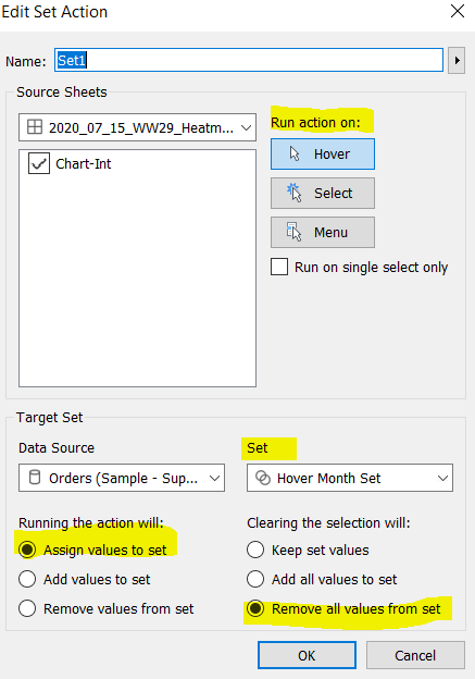
Add all the sheets to the dashboard, using vertical and horizontal containers to arrange the relevant layout. Then add a Set Action (Dashboard > Actions > Add Action > Change Set Values). The Set Action should be configured as below :

And fingers crossed, you should now be able to select marks on the trend line and see all the other charts, except the initial summary table, all update. My published viz is here.
Happy vizzin’! Stay Safe!
Donna