Can you build a dynamic drill down scatterplot in one view?

Retro month continues, with Kyle setting this challenge to recreate Andy Kriebel’s WOW challenge from 2017. A lot has moved on with the product since 2017 and this is a great example of how it can be simplified.

I completed the original challenge (see here) and was having a look to refresh myself… boy! it took a LOT more effort – sometimes I surprise myself that I managed it!

Now that we have parameters and parameter actions, the solution is WAY more simpler.

So let’s crack on…

As alluded to above, we’re going to need a parameter which is going to store the name of the state ‘on click’

pSelectedState

string parameter defaulted to ” (ie empty string)

We also need to display either the name of a State or a City dependent on the value of this parameter

Display Name

IF [pSelectedState] = ” THEN [State]
ELSE [City]
END

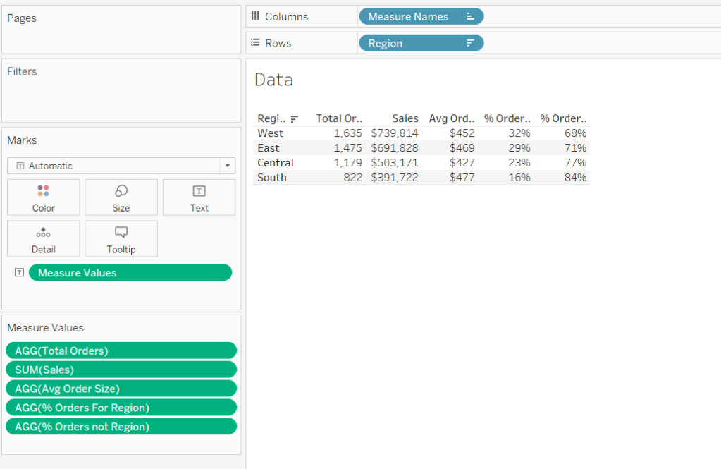
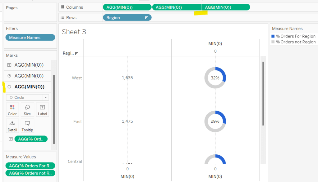
Pop these into a tabular view with Sales and Profit and show the pSelectedState parameter so we can test things out.

When the pSelectedState is empty, a row is displayed per State

but when pSelectedState contains the name of a State (or any text to be honest), a row is displayed per City (note all Cities are displayed, at this point, not just those for the State).

To restrict the list of Cities just to those that match the State in the pSelectedState parameter, we need

Records to Filter

[pSelectedState] = ” OR [pSelectedState] = [State]

Add this to the Filter shelf and set to True. Now the list should be restricted to the Cities in the State.

So lets’ start to build the basic viz.

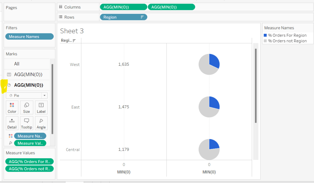
Set the pSelectedState parameter to empty, then add Sales to Columns, Profit to Rows and Display Name to Text. Add Records to Filter To Filter and set to True. Change the mark type to Circle.

Create a new field

Profit Ratio

SUM([Profit]) / SUM([Sales])

format to % with 1 dp and then add this to the Colour shelf.

Add this sheet to a dashboard, then add a dashboard parameter action

Set State

on select of a mark on the scatter plot chart, set the pSelectedState parameter with the value from the Display Name field.

If we now click on a state, the cities should be displayed instead – great! But if we now click a city, we don’t get what we want – boo! This is because the selection of a City has passed the name of the City which is stored in the Display Name field into the parameter, so the scatter is trying to display records relating to a State = City Name which doesn’t exist.

To resolve this, we need to pass a different field into the parameter action

Drill Value

IF [pSelectedState] = ” THEN [State] ELSE ” END

Add this to the Detail shelf of the Scatter plot viz, then update the dashboard action to pass this field into the pSelectedState parameter instead

Reset the pSelectedState parameter to empty string, and then test again – clicking on a state and then clicking on a city should get you back to the states.

And that’s the core functionality achieved with 1 parameter, and 2 calculated fields!

We just need some additional fields to provide the relevant display for the title & sub title

Title text

IF [pSelectedState] = ” THEN ‘by State’ ELSE ‘for ‘ + [pSelectedState] END

Subtitle

IF [pSelectedState] = ” THEN ‘Click a State to drill down to City level’
ELSE ‘Click a City to drill up to State level’
END

Add these to the Detail shelf of the scatter viz, and then update the title of the sheet to reference the fields

Update the Tooltip and adjust the size of the axis fonts, and tidy up the dashboard layout, and you should be good to go!. My published viz is here.

Happy vizzin’!

Donna

Can you visualise orders?

For Luke’s first challenge of 2023, he asked us to recreate this visualisation which showed multiple chart types (donut charts and bar charts) within a tabular layout, all built on a single sheet.

As with most challenges, I’m going to first work on building out the calculations needed to provide the data being presented.

Building the calculations

Firstly we need to identify the number of orders, based on unique Order IDs

Total Orders

COUNTD([Order ID])

and then to get the average order value we need

Avg Order Size

SUM([Sales]) / [Total Orders]

format this to $ with 0 dp.

In order to build the donut chart, we will need two measures for each region; one which shows the % number of orders for that region, and one which shows the % number of orders across the remaining regions.

% Orders for Region

[Total Orders]/SUM({FIXED:COUNTD([Order ID])})

Format this to % with 0 dp

and then

% Orders for not Region

1 – [% Orders For Region]

format this to % with 0 dp.

Pop all these out in a table along with Sales formatted to $ with 0 dp, and Sort the Region field based on Total Orders descending.

Building the table view

Add Region to Rows and sort by Total Orders descending.

All the columns are going to be managed by what I refer to as a ‘fake axis’. Double click into the Columns shelf and type in MIN(0). This will create an axis.

Change the mark type to Text and add Total Orders to the Text shelf. Remove all the text from the Tooltip dialog box.

This is our 1st ‘column’ in the table.

Create another column by adding another instance of MIN(0) to Columns.

Change the mark type of this 2nd MIN(0) marks card to Pie Chart and remove Total Orders from the text shelf.

Add Measure Names to the Filters shelf, and ensure only % Orders for Region and % Orders for not Region are selected.

Add Measure Values to the Angle shelf of the pie chart, and add Measure Names to Colour. Adjust the colours to suit and ensure a white border is added (via the Colour shelf options). Again remove all the text in the Tooltip dialog.

Now add another instance of MIN(0) to Columns.

Change the mark type of this marks card to Circle and set the colour to white. Add % Orders for Region to the Label and align centre.

Now make this Min(0) pill to be dual axis and synchronise the axis. Reduce the size of the circle mark type marks card, so some of the pie chart is visible. Remove Tooltip text again.

Add another instance of MIN(0) for our ‘3rd’ column. Set the mark type to Text and add Sales to the Text shelf, and remove the tooltip text.

For the final column, add Avg Order Size to Columns. Change the mark type to bar. Reduce the size and adjust the Colour to suit. Add Avg Order Size to the Label and remove all tooltip text.

Remove all gridlines zero lines and column dividers. Add row dividers at the highest level so you have a divider per row. Uncheck Show Header on the first MIN(0) pill to hide the axes, and right click the Region column label and Hide field labels for rows.

This gives you the viz you need to add to a dashboard. Use a horizontal container with a blank and 4 text boxes positioned above the viz to provide the label heading to the columns.

OR…

you can do what I did, and having not noticed the comment about the textboxes, used further instances of MIN(0) to make every ‘column’ a dual axis so I could use the axis label for the secondary axis displayed at the top to provide the required labels.

I set the mark type of these additional MIN(0) axis to polygon, and ensured no other pills existed on the marks shelf. The tick marks on all the top and bottom axes had to be set to none, and the title on all the bottom axis had to be deleted.

The benefit of using the text boxes option is that you aren’t left with a ‘blank’ space underneath the chart. However wide your axis is at the top to display the labels, will be repeated as ‘blank space’ underneath the chart too (vote up this idea to prevent this).

My published viz is here.

Happy vizzin’!

Donna

Can you build a beautiful & dynamic bar chart?

Week 2 of #WOW2020 saw Ann post this challenge asking us to create a dynamic bar chart that changed both the measure being reported and the timeframe being reported over, based on user selections.

The measure needed to be displayed as the bar label, which needed to be formatted differently depending on whether it was Sales ($ 0 dp), Profit Ratio (% 1 dp) or Items Per Order (1 dp). Due to this, the label can’t be a single field, as it’s not yet possible in Tableau Desktop to apply number formatting within a calculated field *sigh*.

A couple of calculated fields are needed for the measures

Profit Ratio

SUM([Profit])/SUM([Sales])

and Items Per Order

SUM([Quantity])/COUNTD([Order ID])

The timeframe format displayed also needed to change based on whether the timeframe selected was Last 12 months (MMM’YY eg Apr’19), Last 13 Weeks (Week No) or Last 14 days (mm/dd eg 12/31).

The bar colour needed to reflect the measure selected, and measure selector needed to display a filled or open circle depending on whether the measure was selected or not.

Measure Selector

I realised there were a lot of similarities with the behaviour of the measure selector, and Luke’s challenge from the previous week. I’m not sure if this was intentional or not. As a consequence though, I’m not going to explain how I built the Measure Selector chart, as I utilised exactly the same principles for the Week 1 solution, and I’ve already blogged about it here.

Bar Chart

I built the bar chart on a single sheet, plotting a measure that could change based on selection, against a date field that also changed on selection.

To drive the selection change I needed 2 parameters:

Date Period

A string parameter containing the 3 values available

This parameter was just made available as a drop down for the user to select from on the dashboard.

Selected Measure

This was a string parameter that just stored a piece of text. It was set to the value ‘ Sales ‘ by default, but was changed via a Parameter Action following selection via the Measure Selector chart discussed above.

Note the leading & trailing space in the default value ‘ Sales ‘due to the alias that needs to be set – refer to my previous bog post to understand the relevance

The date field to plot then had to alter based on the Date Period parameter, so the following calculated field was created:

Order Date Truncate

DATE(CASE [Date Period]
WHEN ‘Last 12 Months’ THEN DATETRUNC(‘month’,[Order Date])
WHEN ‘Last 13 Weeks’ THEN DATETRUNC(‘week’, [Order Date])
ELSE DATETRUNC(‘day’, [Order Date])
END
)

This field is essentially storing the date as the 1st of the month, 1st day of the week or specific day level, so when plotted on a chart it can be set to ‘exact date’ and all the orders in the same month/week/day, are all grouped together.

The measure field to plot alters based on the Selected Measure parameter, so the following calculated field is required :

Measure to Show

CASE [Selected Measure]
WHEN ‘ Sales ‘ THEN SUM([Sales])
WHEN ‘ Profit Ratio ‘ THEN [Profit Ratio]
WHEN ‘ Items Per Order ‘ THEN [Items Per Order]
END

Plotting Order Date Truncate on columns as a discrete exact date against Measure to Show on rows with mark type set to Bar, and you can use the parameter to change the number of bars.

But this is showing all the months/weeks/days, so we need to add a filter to restrict to amount of information showing.

Dates to Include

CASE [Date Period]
WHEN ‘Last 12 Months’ THEN [Order Date] >= DATEADD(‘month’,-12,[Today])
WHEN ‘Last 13 Weeks’ THEN [Order Date] >= DATEADD(‘week’,-13,[Today])
ELSE [Order Date] >= DATEADD(‘day’,-14,[Today])
END

This will true or false, and is added to the Filter shelf set to True

Note – [Today] is another parameter that is defaulted to 01 Jan 2020 as per Ann’s requirement.

The field names for the Order Date Truncate isn’t displaying as required though. To fix this, I created

Label:Date

CASE [Date Period]
WHEN ‘Last 12 Months’ THEN LEFT(DATENAME(‘month’, [Order Date Truncate]),3) + ”” + RIGHT(STR(YEAR([Order Date Truncate])),2)
WHEN ‘Last 13 Weeks’ THEN ‘Week ‘ + STR(DATEPART(‘week’, [Order Date Truncate]))
ELSE STR(DATEPART(‘month’,[Order Date Truncate])) + ‘/’ + STR(DATEPART(‘day’, [Order Date Truncate]))
END

which is building the required string to display.

Add this to the Columns shelf next to the Order Date Truncate field, then untick Show Header against the Order Date Truncate field

Next up is the labels to display on top of each bar. This also needs to show something different depending on the measure selected. For this I built 3 calculated fields:

Label: Sales

IF [Selected Measure] = ‘ Sales ‘ THEN [Sales] END

which is formatted to $ with 0 decimal places

Label: Profit Ratio

IF [Selected Measure] = ‘ Profit Ratio ‘ THEN [Profit Ratio] END

which is formatted to % with 1 decimal place, and

Label: Items to Order

IF [Selected Measure] = ‘ Items Per Order ‘ THEN [Items Per Order] END

which is formatted to 1 decimal place

These 3 fields are then added to the Label shelf, and the label text is then edited to ensure all the fields are positioned side by side. Due to the fact only 1 of these fields will ever contain data, it looks as though there is only 1 label showing

Next we need to colour the bars, which is based on Selected Measure which is just added to the Colour shelf. When it’s added though, you only get a single measure in the colour legend at a time, so to set the colours you need to set Selected Measure to be each option of Sales, Profit Ratio, Items to Order (based on what the alias has been set though), either by manually typing into the parameter, or selecting a measure on the dashboard via the Measure Selector chart you built initially.

The tooltip is then set as follows

and once again the Label:xxx measures are all positioned alongside each other as, remember, only one will ever contain any data.

Finally it’s just a case of tidying up the chart – remove the rows & columns, the Measure to Show axis, and the Label:Date label.

The zero line of the rows is set to be a thicker grey line to get the desired display

Once done, the bar chart can be added to the dashboard, and if the Parameter Action on the Measure Selector chart has been set up properly, the bar chart display should change as that chart is interacted with.

My published version of the challenge is here.

Happy vizzin!

Donna