Lorna set this week’s challenge inspired by a challenge first set in 2018 that was a ‘combo’ challenge with Prep : use Prep to generate the data set, then visualise. In this instance, we’re doing all the data calculations in Desktop itself (and adding on a few extra too).
Building out the calculations
We need to find the first purchase date per customer, so we use a FIXED LOD for this (we’ll be using a lot of these 🙂 )
First Purchase Date
{FIXED [Customer ID]: MIN([Order Date])}
We then want, for each customer, then next purchase date, which is the earliest order date, where the date is after the first purchase date
Second Purchase Date
{FIXED [Customer ID]: MIN(IF [Order Date]>[First Purchase Date] THEN [Order Date] END)}
With both these fields we can then get, for each customer, their
First Purchase Sales
{FIXED [Customer ID]: SUM(IF [Order Date] = [First Purchase Date] THEN [Sales] END)}
and their
Second Purchase Sales
{FIXED [Customer ID]: SUM(IF [Order Date] = [Second Purchase Date] THEN [Sales] END)}
and we can get the difference between these
Difference Between Purchases
ABS(SUM([First Purchase Sales]) – SUM([Second Purchase Sales]))
and an indicator about which purchase is higher
Purchase Diff
IF SUM([First Purchase Sales]) >= SUM([Second Purchase Sales]) THEN ‘First Purchase Higher than Second Purchase’
ELSE ‘Second Purchase Higher than First Purchase’
END
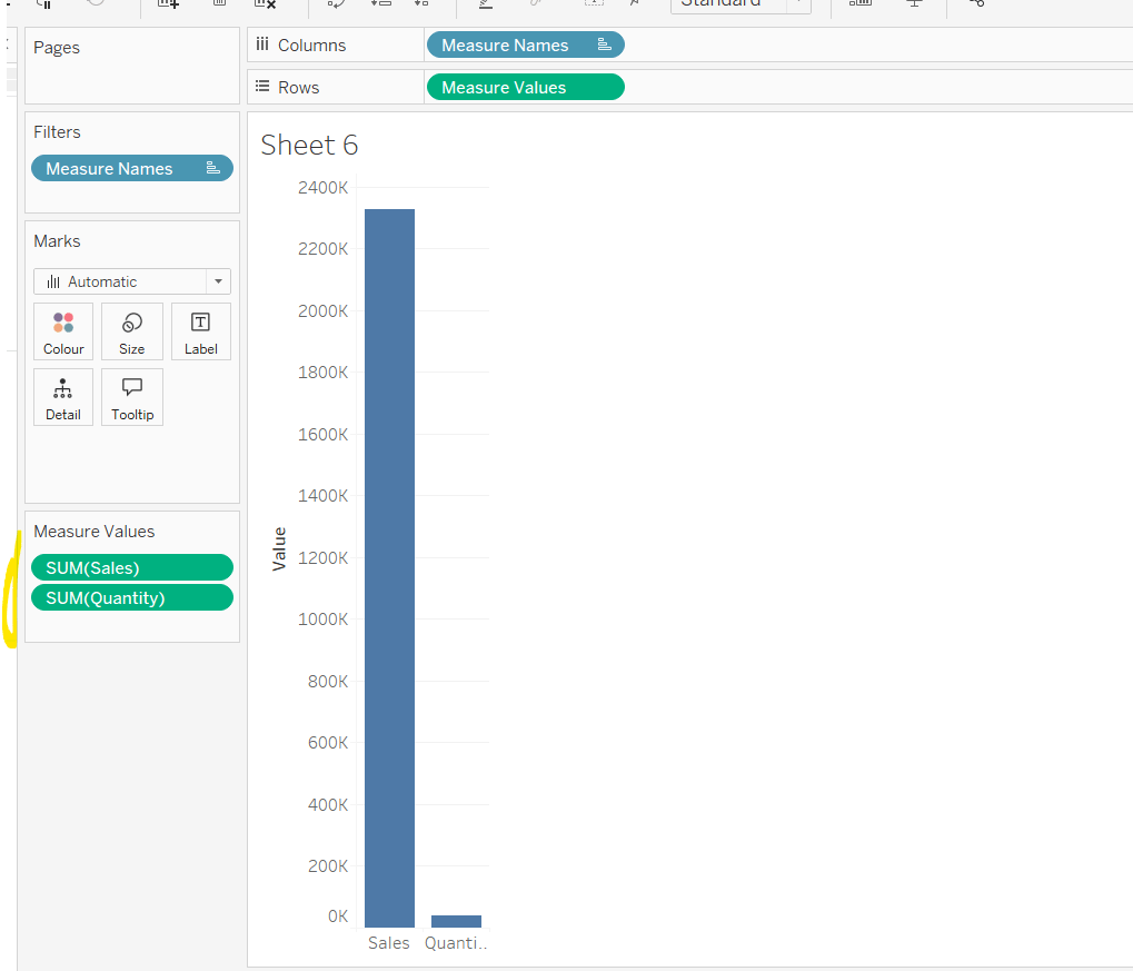
Let’s put all this into a table

To determine the type of outlier, we need more fields. We need to get a value for the average of all the First Purchase Sales
Avg First Purchase Order Value
{AVG([First Purchase Sales])}
note this is a short notation for {FIXED:AVG([First Purchase Sales])} and is an instruction to average across the whole data set, as we want a single value that is the same for all the rows of data. We also need
Avg Second Purchase Order Value
{AVG([Second Purchase Sales])}
Pop these into the table too

and we need to know what the standard deviation is for each value, which again are essentially ‘a constant’ across the whole data set
First Purchase Std
{FIXED :STDEV([First Purchase Sales])}
and
Second Purchase Std
{FIXED :STDEV([Second Purchase Sales])}

And now we can determine the outlier type for each customer
Outlier Type
IF SUM([First Purchase Sales])>=10000 OR SUM([Second Purchase Sales]) >= 10000 THEN ‘High Purchase Outlier’
ELSEIF SUM([First Purchase Sales])> (SUM([Avg First Purchase Order Value])+ (3*MIN([First Purchase Std]))) AND SUM([Second Purchase Sales]) > (SUM([Avg Second Purchase Order Value]) + (3*MIN([Second Purchase Std]))) THEN ‘Outlier’
ELSEIF SUM([First Purchase Sales])> (SUM([Avg First Purchase Order Value])+ (3*MIN([First Purchase Std]))) THEN ‘First Purchase 3STD Outlier’ ELSEIF SUM([Second Purchase Sales]) > (SUM([Avg Second Purchase Order Value]) + (3*MIN([Second Purchase Std]))) THEN ‘Second Purchase 3STD Outlier’
ELSE ‘Within Range’
END
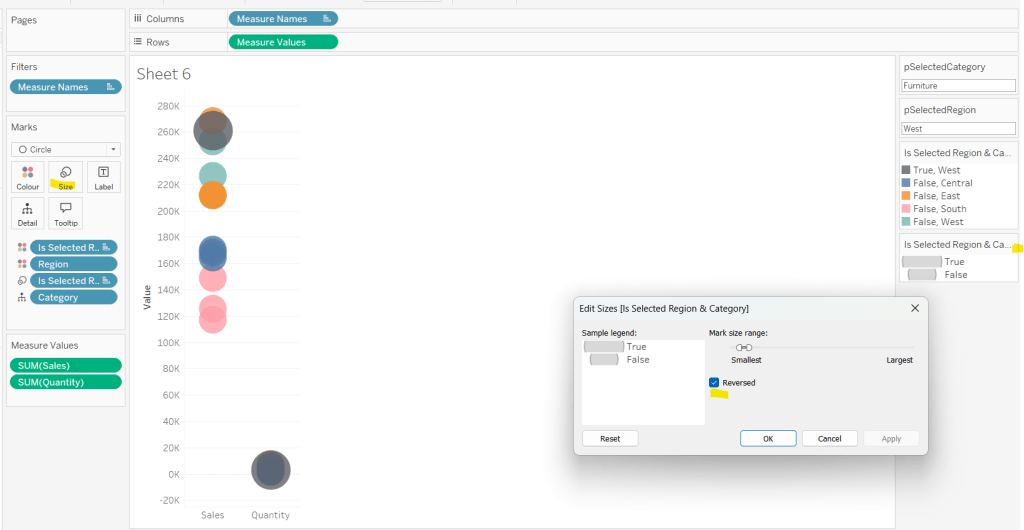
Add the Outlier Type into the table and also add to Filter and show the filter, and do some checks on the different types

We’ve got all the data, now we can build.
Building the chart
ON a new sheet, add First Purchase Sales to Columns and Second Purchase Sales tp Rows. Add Customer ID to Detail. Add Purchase Diff to Shape and adjust accordingly. Hide the null indicator

Add Difference Between Purchases to Size and adjust mark size range to suit

Add Outlier Type to Colour, and then add another instance of Purchase Diff to Detail, then click on the ‘detail’ icon to the left of the Purchase Diff pill on the marks card, and change it to Colour, so 2 pills are on the Colour shelf. Adjust colours to suit.

Add Outlier Type to Filter and show the filter and uncheck the High Purchase Outlier option. Then add Customer Name to Tooltip and adjust to suit.

To make the diagonal ‘reference line’, add another instance of First Purchase Sales to Rows. This creates another marks card. Remove all fields from this card, except Customer ID and change the mark type to Line. Remove all text from the Tooltip for this marks card.

Make the chart dual axis and synchronise the axis.

Format the chart by
- hide the second axis (uncheck show header)
- set the row and column dividers to not display on the header sections (but to display on the pane sections)
- Set background of worksheet to grey, but set the pane background to white

And that should be the build

Create dashboard, and use a horizontal layout container. In the right hand side, add the viz. In the left side, add a vertical container and use text objects to display the information, and add the filter control into this section too. Use a blank object to make a vertical divider, and add a border around the ‘parent container’.

And that should be it. My published viz is here.
Happy vizzin’!
Donna