I referenced this Tableau blog post and downloaded the HexmapPlots excel file included. I then used a relationship to ‘join’ the Sample – Superstore excel file I was using with the HexmapPlots file, joining on State/Province= State
Since I had the other blog post already open, I then followed the steps included to start building the map.
Building the hex map
Add Column to Columns and aggregate to AVG, and add Row to Rows and also aggregate to AVG. Add State/Province to Detail. Edit the Rows axis and set to be Reversed.
Note – it’s possible you may have extra States showing. As I’m writing I’ve realised I’m rebuilding against an extracted data source that has a filter I originally applied as a global filter, which has now been included in the extract. So you may need to add State/Province to the Filter shelf, and set to exclude NULL and District of Colombia. This filter will need to be applied to all sheets you build.
Change the mark type to Shape and select a Hex shape. I already have a palette full of Hex shapes, but the blog post provides a shape to use and add as a custom shape if you haven’t got one. Increase the size of the marks.
Create a new field
Profit Ratio
SUM([Profit]) / Sum([Sales])
format this to % with 1 dp, and then add to the Colour shelf.
Now add a second instance of Row to the Rows shelf and set to AVG again. Set the mark type of this marks card to Map. Remove the Profit Ratio field from Colour on this card too. Assuming your Map location is set to USA, you should have State outlines depicted (Map -> Edit Location).
Set the chart to be dual axis and synchronise the axis. The State shape axis should now be inverted. Independently adjust the sizes of the Hex shape and the state shapes, so the states sit inside the hexagons.
Right click on the right axis and move marks to back. The adjust the Colour of the hex shapes so its around 85% transparent.
Now adjust the Tooltip on the hex marks to match the requirement.
To fill-out the available area, I also chose to fix both the axis (right click axis -> edit axis). The Column x-axis I set to range from 1 – 12, and the Row y-axis, I set to range from -0.9 – 9. Then hide all axis, and remove all row/column gridlines, divider lines, axis lines and zero lines. Hide the 10 unknown indicator, and set the background colour of the whole worksheet to a pale grey.
Building the Line Chart
This is super simple, Tableau 101 🙂
Add Order Date to Columns and set to be a continuous month (green pill showing month-year). Add Sales to Rows. Change the colour of the line to grey. Hide the x-axis and remove all gridlines, dividers, axis lines and zero lines. Set the background colour of the worksheet to None (ie transparent). Update the tooltip.
Building the Scatter Plot
Add Sales to Columns, and Profit to Rows. Add State/Province to Detail shelf and add Profit Ratio to Colour. Change the mark type to circle. Remove all gridlines, row column dividers and axis rulers. Only the zero lines should remain. Adjust the tooltip and set the worksheet background to None (transparent).
Putting it all together
Create a dashboard and set the size as stated. Set the background of the dashboard to pale grey (Dashboard – > Format).
Add the Hex map, and hide the title. Click on the Profit Ratio legend object and set to be floating. Then remove the right hand vertical container. Move the Profit Ratio legend to a suitable location.
Then add a text box as a floating object and use it to create the title. Add both the trend line and the scatter plot charts as floating objects without titles. Just position them as required. You can always use gridlines (Dashboard -> Show Grid) to help you line things up.
Finally add the interactivity.
Add a highlight dashboard action which highlights the hex map and the scatter plot when either of the other is selected ‘on hover’, and just targets the State/Province field.
Then add a Filter action which on hover of the Trend chart, targets the remaining charts.
And hopefully that’s it. My published viz is here.
Week 49 of #WorkoutWednesday2019 was Luke’s last challenge of the year, so following a poll he posted a ‘notably tough’ challenge.
On the face of it, it didn’t look too bad…. I figured it would involve a trellis chart for the small multiples, set actions (for the state selection), and something table calculation related to crack the ranking. Hovering over the state label for each small multiple, I also figured some dual axis was probably at play. The bit that actually looked most tricky to me initially, was displaying the States just as their shapes.
Single State viz
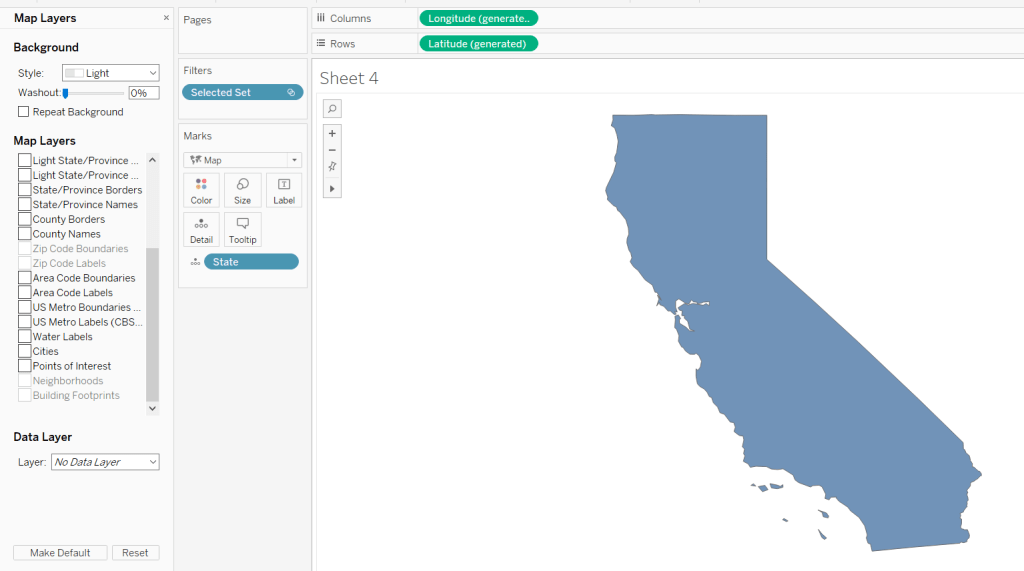
I decided to build the single state viz first. I created a set (Selected State) based off the [State] field, and selected California as the state ‘in’ the set.
I then started to build the viz simply by double-clicking on State (which automatically adds State to the detail shelf, and the automatically generated Long & Lat fields to the rows & columns. I added the Selected State set to the filter shelf, which immediately restricted the data to California, and I changed the mark type to filled Map.
To isolate the display just to the State itself, I figured would be something to do with the various Map Layer options available (menu Map -> Map Layers); I wasn’t sure exactly what but found by unchecking every pre-selected option, I got a ‘clean’ display.
Changing the opacity of the mark colour to 0 and setting the border to red gave me the desired display.
Maybe the State shape wasn’t going to be as much of an issue as I thought….?
The cities needed to be displayed as circular marks, so I knew this would need a dual axis to make this work. I duplicated the Latitude field (hold ctrl as you click and drag the field) and did the following :
changed the mark type of the duplicated field to circle
added City to the Detail shelf
added Sales to the Size shelf
changed the colour of the mark to blue, upped the opacity to 50% and removed the shape border
I then made the chart dual axis and increased the size of the circles to suit.
Finally I added State and Sales to the Label shelf of the Map marks card and adjusted the Label formatting to suit.
Ranking
So the requirement was to show the top 25 states in a ‘grid’ or ‘trellis’ format ordered by the state with the most sales.
However there was a subtlety to this:
the grid should always show 25 states
the selected state should not display in the grid
the overall rank of the state should display, so if the 3rd largest state is selected, the displayed ranking would be 1, 2, 4, 5, 6… up to 26; 3 would be omitted from the list.
The best way to explain how I tackled this, is to show the info in a tabular format.
Firstly, create a table of Sales by State sorting the State by Sales desc
Apply a Quick Table Calculation of Rank to the SUM(Sales) pill. Then edit the table calculation, setting the rank to be unique and fixing the Compute Using to apply over State.
Add the Selected State pill alongside State, and as California is still our selected state, you see we now have two ‘1’s. This is because we fixed the table calculation to State, so its now being applied for each ‘In/Out Selected State’
This is the table calculation we want to use to filter our data to get the ‘top 25’ fields. With ‘California’ selected as being ‘in the set’ and therefore the selected state, we need the next 25 states to the be ones showing in the grid. This being from New York to Oklahoma.
Holding down ctrl and then dragging the Sum(Sales) pill to the filter shelf (ie duplicating the pill), you can set it to show at most 25
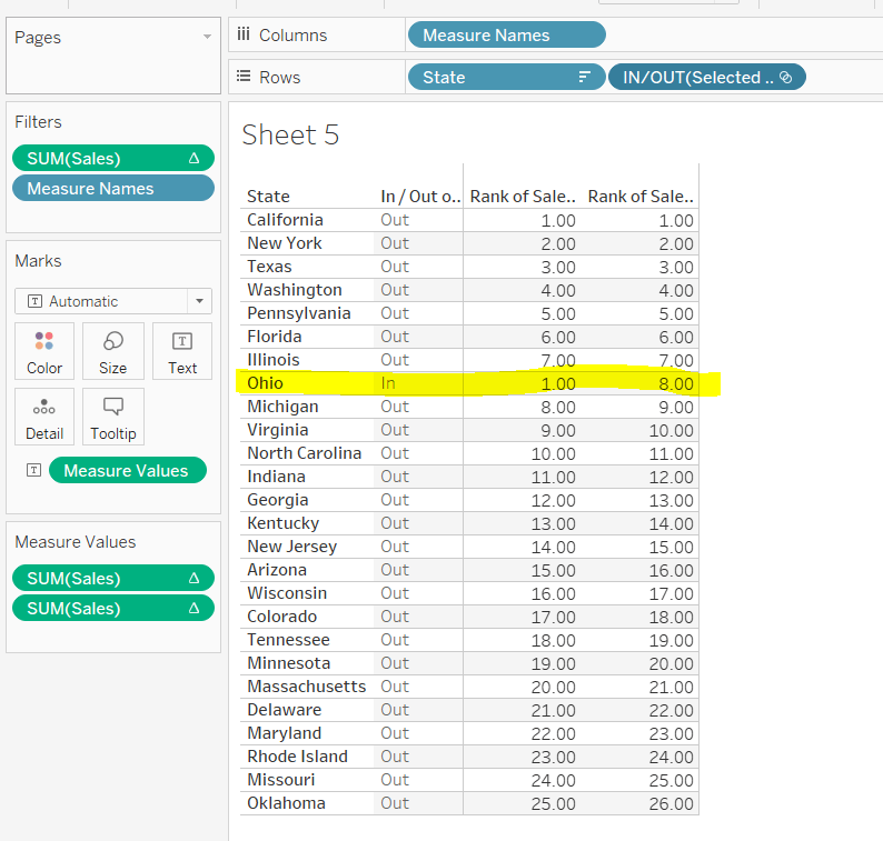
However, the ‘rank’ displayed against each row, isn’t the rank we want to show on the viz. New York is the 2nd largest state, so should be labelled no 2, not no 1 as shown above.
We need another version of the Sales rank. Add Sales back into the chart, and again apply a Quick Table Calculation of Rank.
The 2nd rank is now showing values 1 – 26, and if you edit the table calc, you’ll see it automatically has set itself to ‘table down’ which is actually being applied to both State and the In/Out Selected State. Alter the table calc to be unique and fix it to apply to State & In/Out Selected State, which will ensure the values remain the same regardless as to how you move pills around.
This second rank is what is used to display the ‘overall rank.
Finally, we’ve still actually got 26 states shown, when we only want the 25 states ‘out’ of the set displayed. We simply apply the sneaky trick to ‘hide’ the In (click on the ‘In’, right-click and select Hide).
Change the set value to Ohio for example, and re-show the hidden data (click on In/Out Selected Set pill and Show hidden data). You’ll see Ohio is 8th in the overall rank, but is ‘in’ the set so ranked 1 in the ‘top 25’ filter rank.
When I come to build the map trellis later, it is these table calcs and techniques I will have applied.
Trellis Chart
In this instance we have a fixed number of states to display (25), to show in a 5×5 grid; 5 rows and 5 columns. Each of the 25 states we have needs to be assigned a row number and a column number.
Let’s go back to the tabular display to help with this. With the display just showing the 25 States ‘out’ of the set (by hiding the ‘In’), let’s add INDEX() to the view. INDEX() is a table calculation most often used to number rows. INDEX() is set to compute over the State only (so the numbers 1-25 are listed). Note this is giving the same information as the Sales ranking discussed above, and we could reference the same field, but INDEX() is more generic and referenced in many trellis chart solutions, so let’s stick with that.
What we’re looking to achieve, is the first 5 rows listed, to appear in the 1st row, across 5 columns. Rows 6-10 would be in the 2nd row etc etc. I need to build
Cols
FLOAT(INT((INDEX()-1)%5))
This takes the Index value and subtracts 1, and returns the remainder when divided by 5 (%5=modulus of 5). Storing the final output as a float will become clearer later.
Rows
FLOAT(INT((INDEX()-1)/5))
This takes the Index value and subtracts 1, and returns the integer part of the value when divided by 5. Storing the final output as a float will become clearer later.
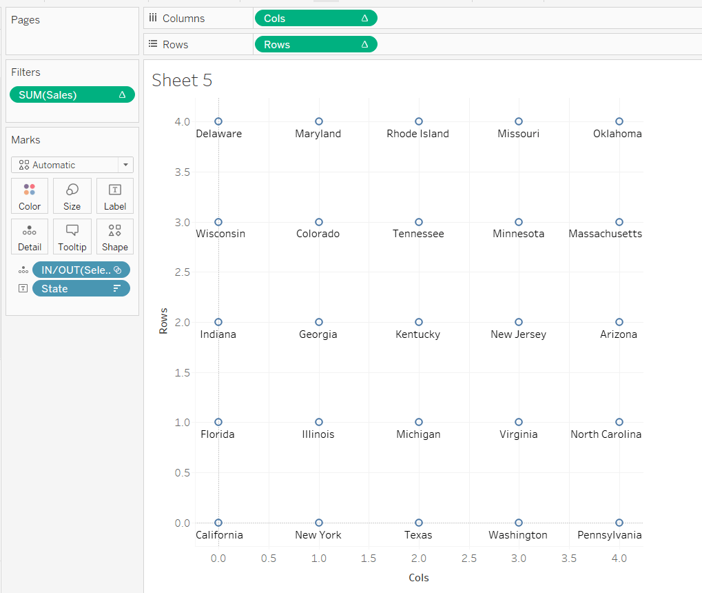
Adding these on to the table, and again setting the table calculation to compute by State only, you get
and if we shuffle the pills around to create the rows & columns, and keep just the pills we need we get
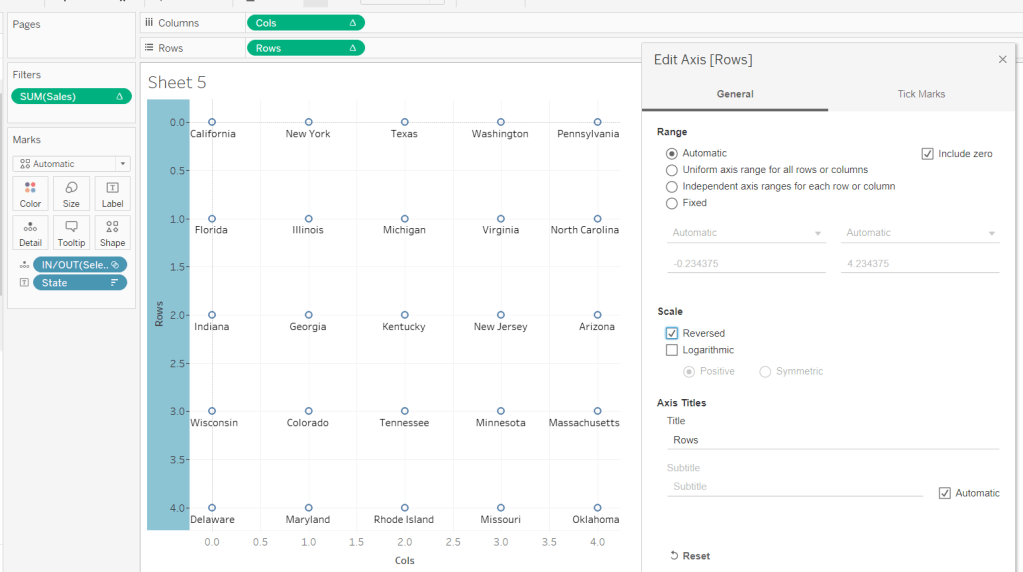
But it’s all upside-down : we need California top left, not bottom left. We can fix this by editing the Rows axis, and reversing it.
Now by simply changing the mark type to Map, we can get the shape states to show – it’s like magic! You’ll need to increase the size to see them properly.
Side note – this was actually quite a revelation; it took some time for me to get to this, having unsuccessfully had views with Lat & Long displayed (as that’s what a map chart always needs right?), resulting in the state shapes being positioned all over the place. Writing this blog and reproducing steps as I type, has made things seem much simpler, than when I was tackling the challenge initially!
As you can see, things aren’t perfect yet, but we’re on the right track. The axis need editing to extend them. Rows is set from -0.5 to 5, and Cols from -0.5 to 4.5 (this is why we needed to set the field to be FLOATs).
The colour of the mark also needs adjusting to match what we did when building the single state viz.
The label positioning isn’t also right, even if you change the alignment, so move the State from the Text to the Detail shelf and don’t show any labels. Then create an additional axis on the rows by duplicating the Rows field to exist alongside, then ‘type’ into the second instance and change to Rows+0.5
Make this dual axis, synchronise and change mark type to Text. Make sure the opacity on the colour is increased back to 100% and adjust the size of the text.
Now it’s just a case of tidying this view to match the requirements; adding additional fields to the Text shelf, removing axis, row/column lines and gridlines etc.
Once done, both the views can be added to a dashboard, and the ‘select state’ interactivity is achieved using a Set Action dashboard action.
And that’s it. As stated I did have some struggles when building initially, but as most things, it’s down to the path you happen to follow. If I’d initially built based on the order I’ve authored this blog, and the tabular views I’ve built to demonstrate techniques, I wouldn’t have had any problem. But it’s all valuable learning experiences and adds to my understanding!