Hot of the press with the release of 2024.3, Sean set this challenge to focus on the ability to use table extensions. As a result you will need at least v2024.3 of Tableau Desktop or Tableau Desktop Public installed. At the point of writing, this challenge cannot be completed on Tableau Public itself via web authoring though.
Build the scatter plot
Format Sales and Profit to be $ with 2 dp. Add Sales to Columns and Profit to Rows and add Customer Name to Detail. Change the mark type to circle, reduce the opacity to around 30%, add a blue border and increase the size of the marks. Format the zero lines to be more prominent. Add Segment to the Filters , select all options, and set to applyto worksheets > all using this data source
Build the table extension
On a new sheet, choose Add Extension from the marks type drop down, and on the add an Extension dialog, select the built by Tableau + Salesforce option and then select the Tableau Table option
Select Open on the next screen, and then select OK to the next dialog box.
Add Customer Name, Order Date (as a continuous exact date – green pill), Sales and Profit to the Detail shelf.
Move your mouse to be in front of the SUM(Sales) heading text, and then click on the sort icon that appears a couple of times to get the data sorted by Sales descending. Double click on the SUM(Sales) heading label and edit the label to just Sales. Repeat with the SUM(Profit) heading label.
Click on the context menu associated to the Sales column and select Format
Set the Formatting Type to be Data Bars and change the Fill colour to green
Format the Profit column to have a Formatting Type of Colour Scale and select a diverging colour palette
Click the Format Extension button on the Marks card shelf or the Table Settings icon on the formatting toolbar to load the Format Extension dialog
Change the options so Show Toolbar is Off, Show Column Filters is On and Show Excel Download is On
Adding the interactivity
Add the 2 objects into a horizontal container in a dashboard. Float the Segment filter control and verify changing the value affects both the scatter and the table.
Then add a dashboard filter action
Filter Table
On select of the Scatter, target the Table passing all fields. Show all values when selection cleared.
And that should be it. Unfortunately as Tableau Public doesn’t yet support the extension, I don’t have my published version to share.
Note – I did have some issues getting the table to ‘fit’ completely into the dashboard. I found if I used my larger second screen, ensured the application was maximised, then it would fit properly. Using the application on my laptop screen, it was sometimes a bit hit and miss. This has been raised to the development team.
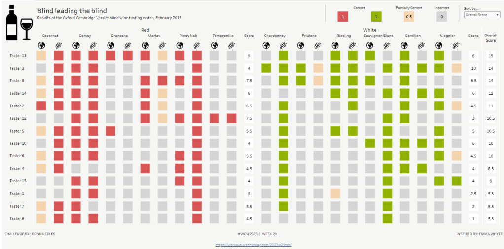
This week, it was my turn to set the #WOW2023 challenge for ‘retro’ month, and I chose to revisit a challenge from May 2017, that was originally set by one of the original ‘founders’ of WorkoutWednesday, Emma Whyte.
The original challenge looked like this :
As I said in the challenge post, I chose this I this challenge as it’s a different type of visual we don’t often see in WOW; it uses a different dataset that interests me – wine!; and as Emma’s website, where she hosted the original requirements for her challenges, is no longer active, it’s possible many won’t know of the existence of this challenge (it pre-dates the current WOW tracking data we have).
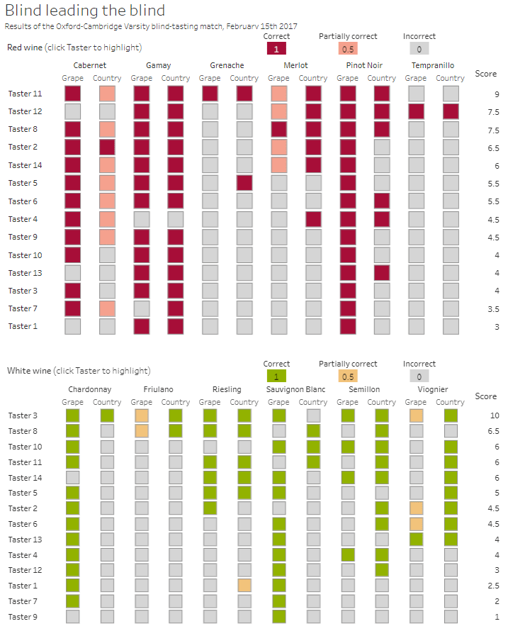
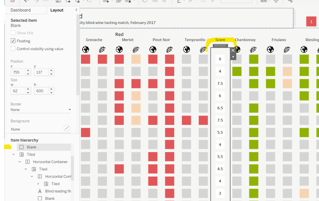
Building the core viz
Firstly, we want to build out the basic grid. For that we need a couple of calculated fields
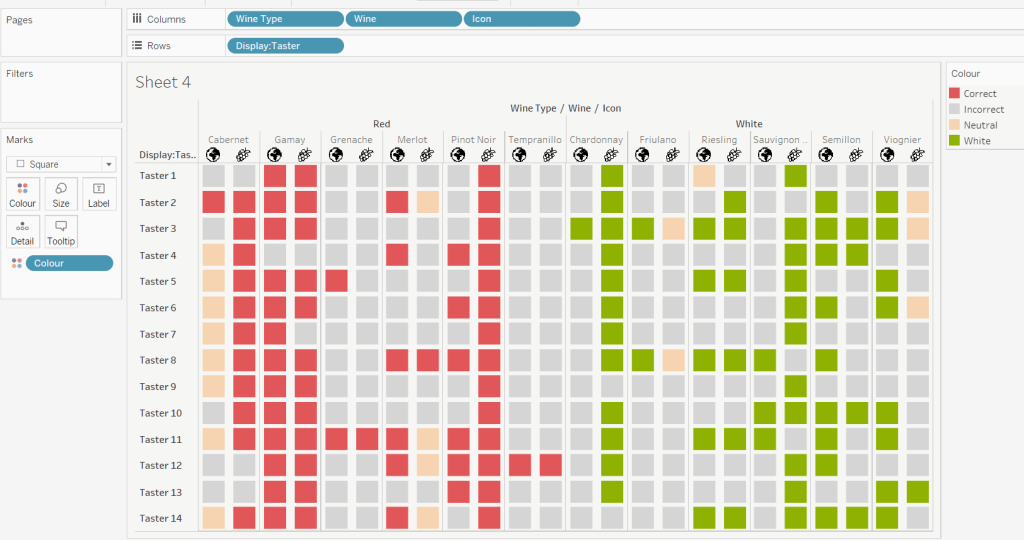
Right click on the Icon field and select Image Role > URL
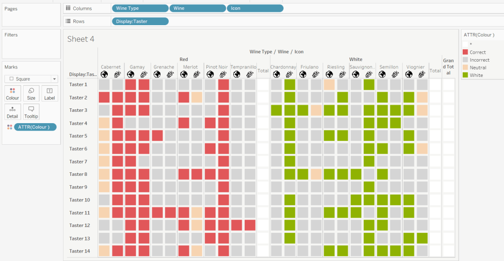
Add Wine Type, Wine and Icon to Columns and Display:Taster to Rows
Change the mark type to square.
Here we’re making use of the image role functionality in the header of the table to display images stored on the web, without the need to download them locally.
Create a new field
Colour
IF [Score] = 1 THEN [Wine Type] ELSEIF Score = 0 THEN ‘Grey’ ELSE ‘Neutral’ END
Add this to the Colour shelf and adjust colours accordingly. Increase the size of the squares so they fill the space better, but still have separation between them.
Set the background colour of the worksheet to the grey/beige (#f6f6f4).
Note – I noticed later on that the colour legend in the screen shots has the words ‘correct’ and incorrect’ rather than ‘red’ and ‘grey’. This was due to an un-needed alias I had set against the field, so please ignore
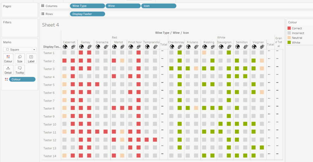
Via the Analysis -> Totals menu, add all subtotals & also show row grand totals. This will make the display look a bit odd initially.
Right-click on the Wine pill in the Columns and uncheck the Subtotals option. This should mean there are 3 additional columns only – a total for each wine type and the grand total.
To get a single square to display in the totals columns, right-click on the Colour field in the marks card area, and change from a dimension to an attribute. The field will change from displaying Colour to ATTR(Colour) and an additional option for * will display in the colour legend – set this to be white
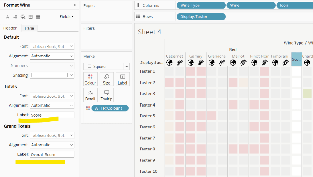
To change the word ‘Total’ in the heading to ‘Score’, right click on the word ‘Total’ and select format. In the left hand pane, change the Label of the Totals section to Score. Repeat for the ‘Grand Totals’ by right clicking on ‘Grand Totals’ in the table, selecting format and changing the label for that too to ‘Overall Score’.
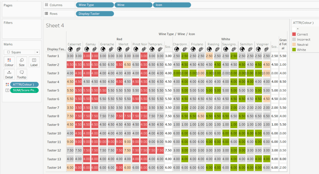
We need to label the totals with the score. For this we first need to get a score for each taster per wine
Score Per Taster
{FIXED [Taster], [Wine Type]:SUM([Score])}
If we just added this to the Label shelf, every square gets labelled with the total, which isn’t what we want.
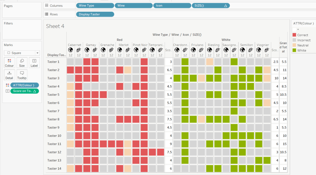
We need to work out a way to just show the label on the total columns only. For this we can make use of the SIZE() table calculation.
To see how we’re going to use this, double click into the Columns and type SIZE(), then change the field to be a blue discrete pill. Edit the table calculation and set the field to compute by Wine and Icon only.
You’ll see that the SIZE() field in the Columns has added the number 12 as part of the heading, which is the count of wines associated to the wine type (ie 12 red wines and 12 white wines). There is no SIZE() value displayed under the total columns, but these actually have a size of 1, so we’re going to exploit this to display the labels (note – this approach wouldn’t work if where was only 1 wine for one of the wine types).
Score on Total
IF SIZE() = 1 THEN SUM([Score Per Taster]) END
Set the default number format of this field to be Standard, which means the result will display either whole or decimal numbers.
Add this onto the Label shelf instead of the other field, and adjust the table calculation as described above to compute by Wine and Icon only.
You can now remove the SIZE() field from the Columns.
Align the scores centrally.
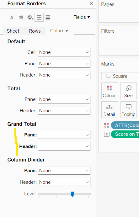
Remove row & column dividers from each cell, and the totals, but set a white column divider for both the pane & header of the Grand Total column.
Format the text for the Wine Type and Wine and Totals fields. Align the text for the Wine field to the Top.
Hide field labels for rows and columns.
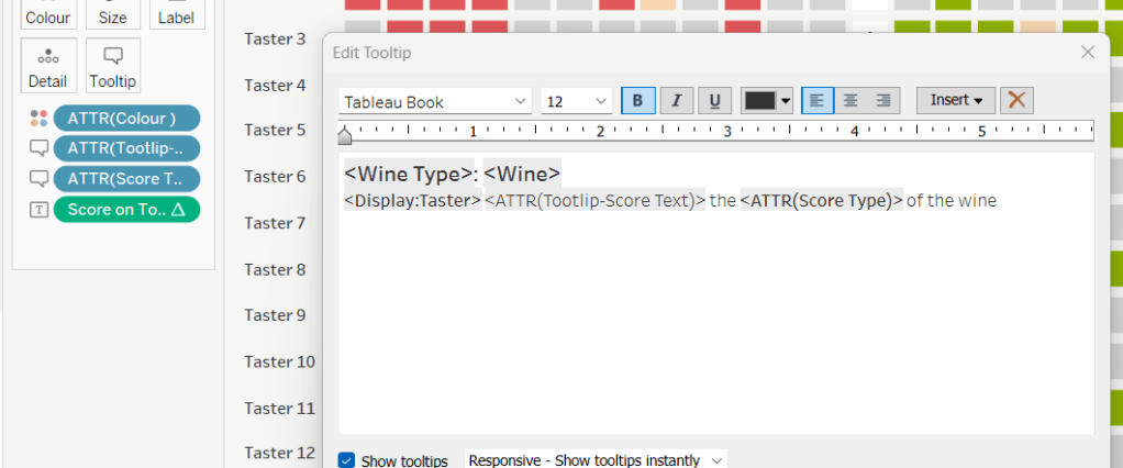
Applying the Tooltip
The text when hovering over each square needs to display different wording depending on the score.
Tooltip – Score Text
IF [Score] = 1 THEN ‘correctly identified’ ELSEIF [Score] = 0.5 THEN ‘partially identified’ ELSE ‘was unable to identify’ END
Add this to the Tooltip shelf along with the Score Type field. Modify the text accordingly
Applying the sort
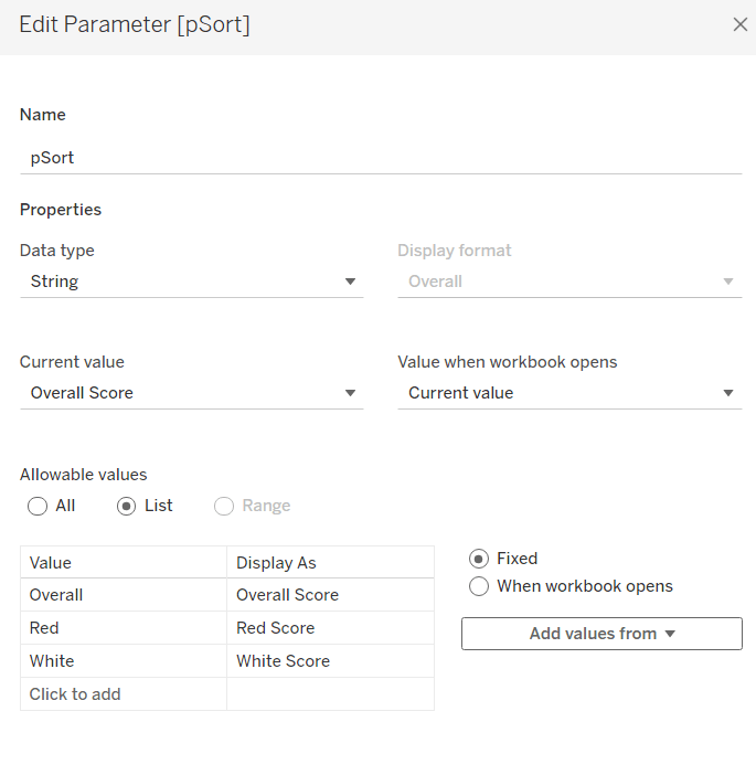
To control the sorting, we need a parameter
pSort
string parameter with list options, defaulted to ‘Overall Score’
and we also need fields to capture the different scores for each type of wine per taster
Red Score
{FIXED [Taster]:SUM( IF [Wine Type] = ‘Red’ THEN [Score] END)}
White Score
{FIXED [Taster]:SUM( IF [Wine Type] = ‘White’ THEN [Score] END)}
Overall Score
[White Score] + [Red Score]
Then we need a calculated field to drive sorting based on the option selected and the fields above
Sort By
CASE [pSort] WHEN ‘Overall’ THEN [Overall Score] WHEN ‘Red’ THEN [Red Score] ELSE [White Score] END
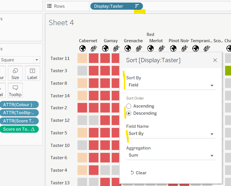
Then right click on the Display:Taster field on the Rows and select Sort, and amend the values to sort by field Sort By descending
Building the legend
I did this using 2 sheets. First I created a new field
Legend Text
IF [Score] = 1 THEN ‘Correct’ ELSEIF Score = 0 THEN ‘Incorrect’ ELSE ‘Partially Correct’ END
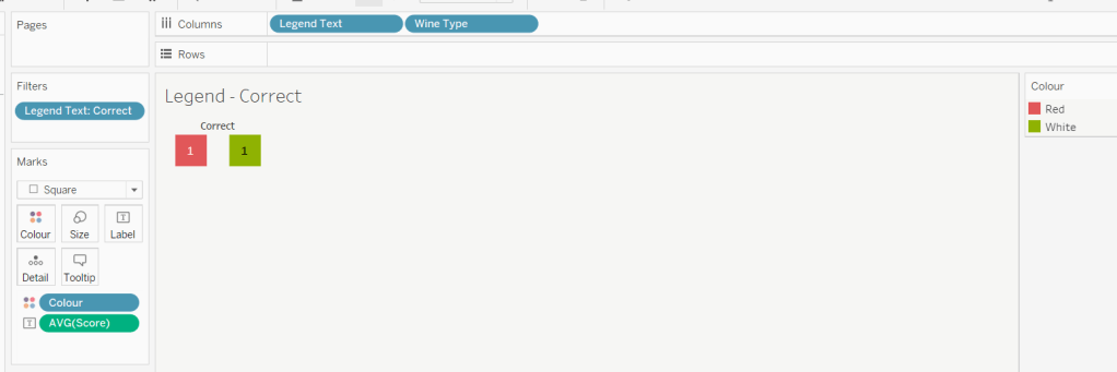
Then I create a viz as follows
Add Legend Text and Wine Type to Columns
Add Legend Text to Filter and set to ‘Correct’
Change Mark type to Square and increase size
Add Colour to Colour shelf
Add Score as AVG to Label and format to number standard. Align centrally
Uncheck show header against the Wine Type field , and hide field labels for columns against the ‘legend Text’ column heading.
Remove all column/row dividers and set the worksheet background colour.
Turn off tooltips
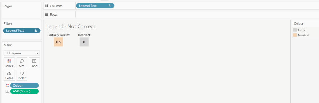
Duplicate the sheet, and edit the filter so it excludes Correct instead. Remove Wine Type from the columns shelf. Reorder the columns.
Building the dashboard
When building the dashboard, I just used a floating image object to add the bottle & glass image in the top left of the dashboard.
I set the background colour of the whole dashboard to match that I’d set on the worksheets too.
To stop the tooltips from displaying when hovering over the Scores, I simply placed floating blank objects over the score columns – this is a simple, but effective trick – you just need to be mindful of the placement if you ever revisit the dashboard and move objects around. I placed a floating blank over the legends too to stop them being clicked on.
This week the challenge focuses on 3 techniques for enhancing a tabular display
Drill Down / Expand to show the breakdown by Year
Custom Header to control sorting
Page Control
I managed this challenge, but it wasn’t without help – I did my research using my friend, Google, and found tutorials to help, so this blog is briefer as you’ll need to read the blogs I reference too 🙂
Drill Down / Expand
There was a similar challenge last year which I blogged about here… or rather I referenced Rosario Guana’s excellent blog here.
The slight difference between this and the current challenge is that on expand/drill down, the Season is being shown in a separate column, rather than within the same one as above. The need for ‘data duplication’ which is referenced in Rosario’s blog isn’t required in this case. The key fields I used to resolve this part of the challenge are
pSelected Player ID
An integer parameter, defaulted to 0
pLevel
An integer parameter, defaulted to 2
Max Level
IIF([pLevel]=1,2,1)
If pLevel is 1 then we’ve already ‘drilled down’, so the max level on display is 2, otherwise we’ve yet to drill down, so the max level on display is 1.
DD Level
IIF([Max Level]=2 AND [Player Id]=[pSelected Player ID],2,1)
If we’ve already drilled down somewhere and you’re on the player we drilled down to, then the drill down level is 2, otherwise it’s 1.
Player ID Arrow
IF [pSelected Player ID] = [Player Id] AND [Max Level]= 2 THEN ‘▼’ ELSE ‘►’ END
If we’ve already drilled down somewhere and you’re on the player we drilled down to, then we want to display the down arrow. I use this site to get the geometric shapes required.
Season Display
IF [pSelected Player ID] = [Player Id] AND [Max Level]=2 THEN STR([Season]) ELSE ” END
If we’ve already drilled down somewhere and you’re on the player we drilled down to, then we want to display the Season otherwise it needs to be blank.
Player ID Display
Player ID
This is just a duplicate field.
The fields are then arranged along with the measures as below
Player ID is hidden (it will used for the sort later). DD Level is added to the Detail shelf, so it can be referenced by the parameter actions.
NOTE – I had to ask as it wasn’t obvious to me, but the Carries measure is essentially the number of records or count of the table, so Avg YPC becomes SUM([Yards])/[Carries].
To complete the drill down, when added to the dashboard, the following parameter actions are required
Selected Player
passes the value from the Player ID field into the pSelected Player ID parameter
Set Level
Passes the DD Level field into the pLevel parameter
For the Measure Rows field referenced, I used the Position field as a field in the data set that contained at least 3 values :
IF [Position] = ‘FB’ THEN -1 ELSEIF [Position] = ‘H’ THEN 0 ELSEIF [Position] = ‘P’ THEN 1 END
I created parameters
pHeader MeasureNames (which is the equivalent of MN Parameter referenced in the blog).
and pHeader Position which is the equivalent of the Category Parameter mentioned
The parameter actions were then set as
Header – Set Sort Measure
passes Measure Names to the pHeader MeasureNames parameter
and
Header – Set Sort Direction
passes the Position field into the pHeader Position parameter
When defining the other variables referenced in the blog, I had an issue with the Measure1 TF field; my version looks like
IF [pHeader MeasureNames ] = ‘Measure1’ AND [pHeader Position] = [Position] THEN TRUE ELSE FALSE END
For the sorting, I created
Sort Measure Value
CASE [pHeader MeasureNames ] WHEN ‘Measure1’ THEN [Carries] WHEN ‘Measure2’ THEN SUM([Yards]) WHEN ‘Measure3’ THEN [Avg YPC] WHEN ‘Measure4’ THEN SUM([TDs]) END
and then Sort
IF [pHeader Position] = ‘P’ //up arrow selected, sort ascending THEN -1 * [Sort Measure Value] ELSE [Sort Measure Value] END
Note – I chose my up and down arrows to behave different from how they are described in the blog. To me clicking ‘up’ suggests a sort ‘upwards’ ie ascending from small to large.
The Sort field is then used to apply the sort to the Player ID field on the table
The exception, was at Step 5 Build the page navigator, I simply created a new sheet called ‘Curr Page’. This referenced 2 calculated fields
Current Page No
[pPage No]
where pPage No is the equivalent of the page number parameter referenced in the blog.
Total Pages
FLOOR({COUNTD([Player Id])}/[pRows Per Page])+1
where pRows Per Page is the equivalent of the rows to show parameter referenced in the blog.
The only other slight addition required to this challenge, was to reset the page control to page 1 if the sorting was changed. This was done by creating a new calculated field
First Page No
1
adding this field to the Detail shelf on the header/sort controls sheet, then adding a parameter action
Reset to Page 1
which passes the First Page No to the pPage No parameter
Fingers crossed, I think I’ve covered the main points for this challenge and highlighted where the blogs might differ. My published viz is here.
This has given some great ideas of how to ‘pimp’ a table. I highly recommend you check out some of Tessellation’s other blog posts on tables :


