In this week’s challenge Yusuke wanted us to ensure filtering by date didn’t actually exclude any dimension values (so null values displayed as 0) and average calculations then accounted for those null value entries too.
Setting up the core data requirements
Yusuke provided a link to a version of Superstore which I used, since the requirements included the Manufacturer field which isn’t in the usual Excel file. I first created the hierarchy of Category > Sub-Category > Manufacturer.
Category Hierarchy
Right-click the Category field and select Hierarchy > Create Hierarchy. Name it Category Hierarchy, then drag Sub-Category and Manufacturer to be positioned under the Category field.

The display shows the number of orders, so we need
#Orders
COUNTD([Order ID])
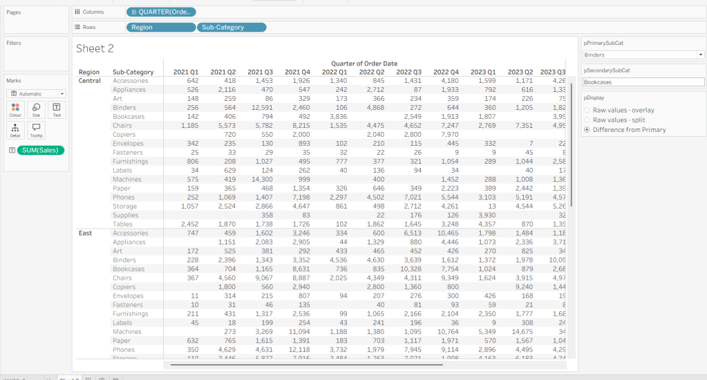
Add Category to Rows and then expand to display Sub-Category and Manufacturer. Add #Orders to Text and add Order Date as a discrete (blue) pill at the Weekday level. This table highlights the ‘gaps’ which we need to display as 0. It also shows us how many rows of data we should always expect regardless of the date being filtered.

A standard ‘quick filter’ on date will just remove the rows that aren’t included in the filter, so we need to handle the date filtering using parameters.
pMinDate
date parameter defaulted to 11 Jul 2025

and
pMaxDate
date parameter defaulted to 23 Jul 2025

with these we create
#Orders in Date Range
ZN(COUNTD(IF [Order Date]>=[pMinDate]AND [Order Date]<=[pMaxDate]THEN [Order ID] END))
Add this into the table, and we can see we still have blank entries.

Now the trick here, which I have to admit I just couldn’t resolve until I looked at Yusuke’s solution, is to create a new field
Index
INDEX()
and add this to the Detail shelf, and all the gaps in the #Orders in Date Range measure will be replaced by 0.

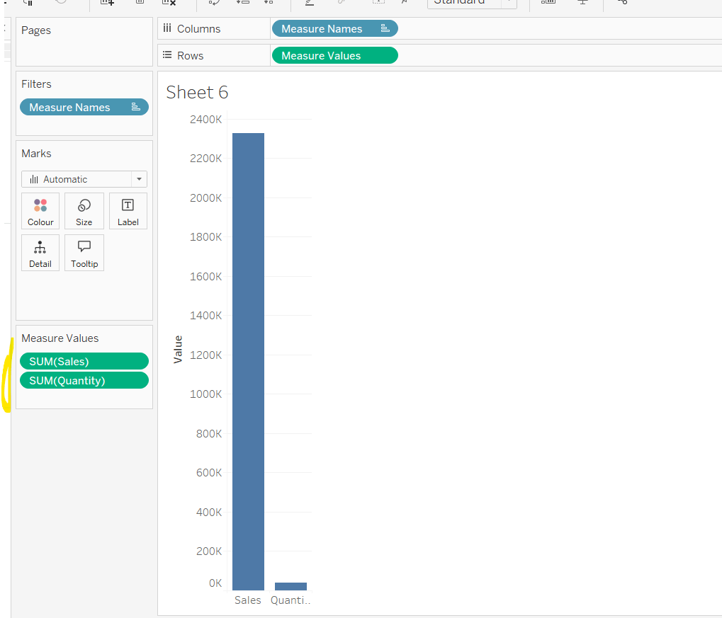
Adding the average
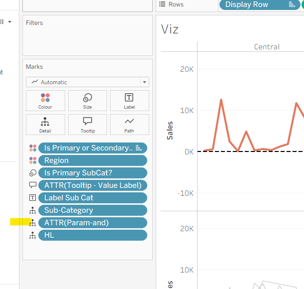
Move the #Orders from the Measure Values section onto Tooltip.
The add column totals (Analysis menu > Show All Subtotals). Then go into the menu again and select Total All Using > Average. You’ll have totals at the Manufacturer level and the Sub-Caetgory level

Right click on the Total label in the Manufacturer column, and Format. In the left hand pane, update the Label to read Avg.

Repeat the same by formatting the Total label against the Sub-Category column.
Now format the numbers displayed by right-clicking on the #Orders in Date Range field on the Text shelf and formatting. In the left hand pane, select the Pane tab and set the format of the Numbers in the Default section to standard and the format of the Numbers in the Totals section to 2dp.

Formatting the rest of the table
Add #Orders in Date Range to Colour. Change the mark type to Square. Edit the Colour palette and select a diverging palette (eg red-blue-white diverging) but set the centre to 0 and check the include totals checkbox.

Format the table, and select the shading tab. Set the Total header to pale orage, and row banding to pale grey at band size 1.

Then select the borders option and set the default options against cell, pane and header to dark grey. Then add thicker orange borders against the totals, and remove row dividers. Add grey column dividers.

Hide the Order Date column heading (right click the Order Date label and hide field labels for columns). Right click the Order Date pill in Columns and format; set the Dates option to display abbreviation

Format the font of all columns to be the same (I used Tableau Medium, black).
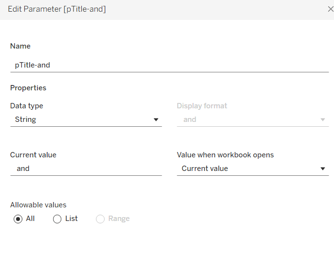
We want to display a * to indicate null values, so create
Number prefix *
IIF(([#Orders in Date Range])=0,’*’,NULL)
Add to the label shelf and adjust the position of the fields on that shelf.
The create
Tooltip – 0 orders
IIF([Number Prefix ]= ‘‘, ‘* No orders found for this period’, NULL)
and add to the Tooltip shelf and adjust the Tooltip to suit. Then add Category to filter and select all options.,

Collages / expand the viz and adjust the dates to test the functionality and display.

Creating the date filter & Apply button
On a new sheet, double click in to the space below the Marks shelves and the type ‘Apply’. Move the field created from Detail to Label. Change the mark type to square, adjust the size to be as large as possible and then set the fit to entire view. Format the Apply label to be centred and larger font.

Add Order Date to the Filter shelf, select range oi dates and enter values from 11 Jul 2025 to 23 Jul 2025. Show the filter, and the add the Order Date filter to context.
Create new fields
Min Date
MIN([Order Date])
and
Max Date
MAX([Order Date])
and add both to the Detail shelf.
Create a new field
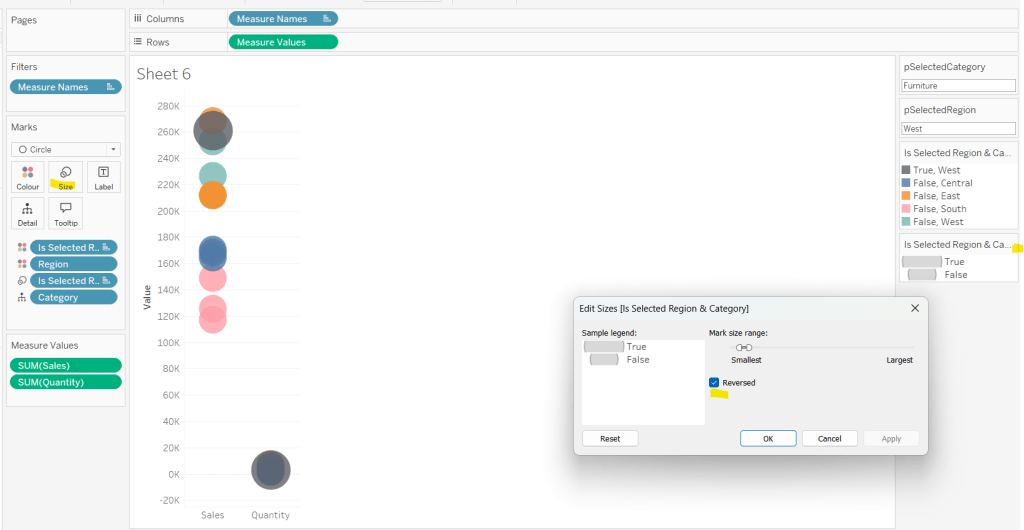
Colour
[Min Date]= [pMinDate] AND [Max Date]= [pMaxDate]
And add to the Colour shelf. Adjust the colour of the true option to pale grey. Then change the value in the Order Date filter, so the colour shows as false and adjust colour to orange. Hide the tooltip.


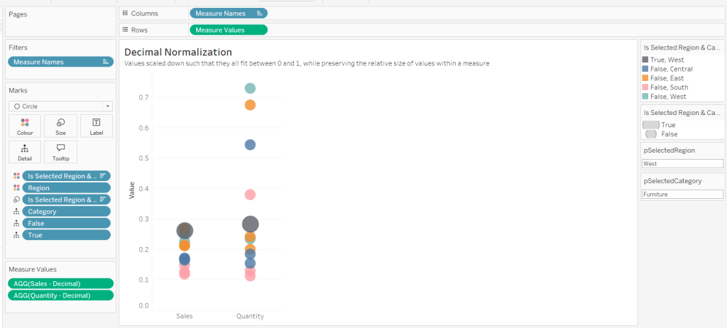
Finally create fields
True
TRUE
and
False
FALSE
and add both to the Detail shelf.
Building the dashboard
Use layout containers with padding to add the table viz and the apply button viz to a dashboard. Show the Category filter for the table viz, and the Order Date filter for the apply button viz. Below is how I arranged my layout containers

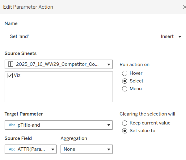
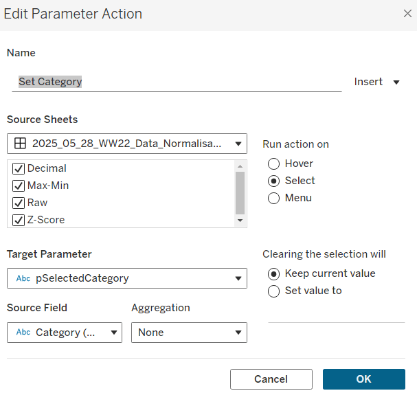
Create the following dashboard actions:
Set Min Date
On select of the Apply Button viz, target the pMinDate parameter passing in the value from the Min Date field.

Set Max Date
On select of the Apply Button viz, target the pMaxDate parameter passing in the value from the Max Date field.
Deselect Button
On select of the Apply Button viz on the dashboard, target the Apply Button sheet directly, selecting the fields True = False.

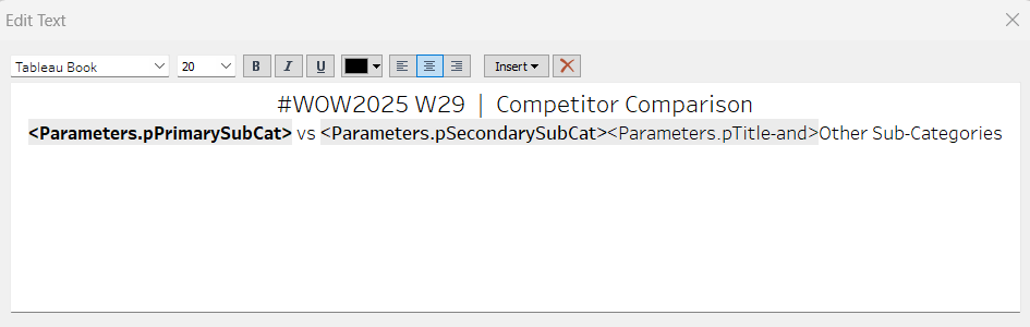
Finally add a floating text box to provide a key for the * indicator.
My published viz is here.
Happy vizzin’!
Donna