Can you build a trellis of Profit Ratio Gauges?

It’s Community Month at #WOW2024 HQ, and for the first challenge, Jack Hineman (a long time participant of WOW) asked us to create gauge charts using map layers. Not only that, he wanted them displayed in a trellis format, with a specific requirement to ensure the number of columns was always >= number of rows displayed. Errr…..

This was tough! I tried to start the challenge one evening and after pouring through Ken Flerlages’s blog post that was referenced, reading the hints, and looking at Jessica Moon’s Tableau Public page referenced, I was none the wiser. The blog post did not mention map layers at all in building a gauge, and was purely mentioned as inspiration for the design of the gauge.

I happen to have some time off work, so reattempted the challenge the next day. After several hours, I got there, somehow! I did another google : “Gauge charts in Tableau” and hit upon this blog, which gave me a few pointers, although most of the time it really was a lot of trial and error based on Jack’s hints, and to be honest I surprised myself that I actually hit all the requirements, except one, without the need to look at the solution.

The one thing I had to look at was the calculations required to get the trellis to always have more columns than rows. My ‘go to’ formula didn’t work. More on that later.

As for my solution… well it’s a solution…. how elegant/efficient it is – who knows. It was something built very much in stages as I tried to get my head around what was being asked. As I rebuild as part of the process I go through when writing this blog, I may find ways of improving what I did to start with. I will do my best to explain what I think is going on, what my thought process was, but apologise in advance if you get to the end of all this, and still don’t have a ‘scooby’ 😦

Strap yourself in! This is going to be a long one!!!!

Modelling the data

Connect to the provided data source and create relationship calculations to relate Manufacturers to Gauge_Definition with 1=1 and Gauge_Definition to Gauge_Points with 1=1 as well.

Understanding the data

Let’s start by looking at the data provided. Jack provided 3 data sets:

Manufacturers

A simplified instance of Superstore just listing Manufacturers with Sales & Profit data.

Gauge Definition

A data set of 1 row essentially containing some ‘constants’ to be referenced within the challenge

  • Gauge Success Amount = 0.15
    • Profit Ratios >= to 0.15 (15%) are deemed successful. This is essentially the Goal indicator value.
  • Gauge Concern Amount = 0
    • Profit Ratios >=0 (but < 0.15) are deemed a concern
  • Gauge Start Profit Ratio = -0.3
    • The left hand point on the semi-circular gauge should indicate a -30% profit ratio
  • Gauge End Profit Ration = 0.3
    • The right hand point on the semi-circular gauge should indicate a 30% profit ratio
  • Gauge Success Pct of Gauge = 0.75
    • 15% Profit Ratio represents 75% of the gauge displayed (ie 0% of gauge = -30% Profit Ratio and 100% of gauge = 30% profit ratio)
  • Gauge Concern Pct of Gauge = 0.5
    • 0% Profit Ratio represents 50% of the gauge displayed.

Gauge Points

This is essentially a template/scaffold to help build the gauge and the various features on the gauge. It defines all the points that need to be plotted and in most cases then connected to create the various ‘shapes’ displayed eg the gauge semi circle for the actual profit ratio and the legend indicator; the small angled rectangle that represents the goal ‘reference line’; the positions for the 3 labels.

To start getting an understanding, let’s just focus on Point Type = Actual and Point Segment ID = Background

This is the data to build the complete grey semi circle of the main gauge. 50 rows represent points on the inner arc of the semi circle (Point Arc = In). They all have a Point Radius = 0.43 (ie the distance from the 0,0 centre position of a circle to the bottom edge of the gauge is 0.43). The other 50 rows represent points on the outer arc of the semi circle (Point Arc = Out). They all have a Point Radius = 0.58 (ie the distance from the 0,0 centre position of a circle to the top edge of the gauge is 0.58). Point Angle Rads defines the angle in radians (rather than degrees) from the circle centre to edge of the circle. The Point ID defines the order to ‘join the dots’ when the points are made into a polygon.

Here’s a diagram to help try and explain the maths we’re going to need to use based on the data we have

For each point on the circle, we will need to identify the x & y position of where the radius intersects the edge of the circle. We know the angle, and we know the radius, so we can use trigonometry to work that out, and then use the MAKEPOINT() function in Tableau to covert that into a spatial/geometric field to use on a map.

Let’s do this in Tableau.

Create field

X

[Point Radius] *SIN([Point Angle Rads])

Y

[Point Radius] * COS([Point Angle Rads])

Note – based on my diagram above, X = a and would be derived from the Cosine of the angle, while Y = o and be based on the Sine of the angle. However, Jack gave hints based on the above calcs which hold true if you adjust the diagram and assume the angle is positioned between the y-axis and the radius, rather than the x-axis and the radius.

Now create the point

Geo

MAKEPOINT([X],[Y])

On a sheet, add Point Type to Filter and set to Actual, and add Point Segment ID to Filter and set to Background.

Double click on Geo to automatically add Longitude and Latitude fields to the sheet.

We have the basics of a semi-circle… not in the right direction, but it’s something… Add Point ID to Detail, then click the Swap Axis button and hey presto…

It appears a bit more ‘ovel’ than circular as the axis aren’t aligned, so don’t worry about this – set the display to Entire View will help. Then change the mark type to Line, move Point ID to Path and then change mark type to Polygon.

We now have a filled semi circle. We’re not going to use this sheet, but hopefully, this has helped a bit with some fundamental understanding.

When building we’re going to be using map layers (and at this point, we can’t add a layer to this sheet). We’ll also be defining calculations based on which feature of the viz we’re focussed on, as we can’t apply filters to the sheet (if you remove the ones applied, it will look a little crazy!). But if you change the Point Segment ID filter to Goal, you’ll get the shape of the goal indicator ‘reference line’.
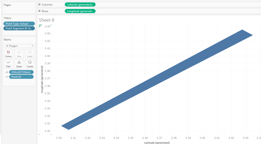
You might want to play around with the filters to examine the behaviour.

Are you still with me…? Take a break, grab a cuppa, we haven’t even started building yet, but I’ll still be here when you get back 🙂

Setting up the map layers

Using Jack’s hints, create a field to help ‘initialise’ the map layers

Zero

MAKEPOINT(0,0)

Double click this to create a basic ‘map’ with a single point.

Then drag another instance of Zero onto the canvas and drop on the Add a Marks Layer section that appears

You’ll now have 2 marks layers, which means whatever we now do, we can always add more.

Building the Gauge Background & Legend layer

Note – in building I ended up with more mark layers than Jack suggested. I’ve subsequently seen other versions but am sticking to what I managed for now.

The first layer I’m going to build is the ‘grey’ semi circle of the main gauge and the coloured legend ‘inner’ semi circle.

I want to identify those points only.

Geo: BG-Legend Layer

IF [Point Type] <> ‘Label’ AND [Point Segment ID] IN (‘Background’, ‘Concern’, ‘Failure’, ‘Success’) THEN [Geo] END

On the Zero marks card, drop this field directly on top of the COLLECT(Zero) to replace it. Add Point ID to Detail, then flip the axis using the switch axis button. Add Point Segment ID to Colour and adjust the colours of the Background, Failure, Concern and Success values to suit.

Change the mark type to polygon, and move Point ID to Path. Name this layer BG & Legend

Building the Actual Layer

Create a new field

Profit Ratio

{FIXED [Manufacturer]: SUM([Profit])/SUM([Sales])}

and format to % with 1 dp.

We need to understand where on the gauge, the Profit Ratio for each Manufacturer falls. We know that the gauge starts at -30% Profit Ratio (ie 0% of the gauge is equivalent to -30% Profit Ratio) and the gauge ends at +30% Profit Ratio (ie 100% of the gauge is equivalent to +30% Profit Ratio). Therefore if the Manufacturer’s Profit Ratio >= 30% it fills 100% of the gauge, anything less needs to be partially through. We can calculate this (using one of Jack’s hints) with

PR % of Gauge

([Profit Ratio] + [Gauge End Profit Ratio]) / ([Gauge End Profit Ratio]- [Gauge Start Profit Ratio])

To then determine the angle in degrees (and again using Jack’s hints), we want to find the proportion of 180 degrees that the PR % of Gauge represents, and then take off 90 degrees based on the gauge rotation.

PR Angle (Degrees)

([PR % of Gauge] * 180)-90

We can then convert this to radians

PR Angle Rads

RADIANS([PR Angle (Degrees)])

This gives us information to help determine a singular point on the gauge we need to ‘draw’ up to. But I want to ‘draw’ a polygon that goes from the left end (-30% mark) to this point, and for this, I need to know all the other points up to that point.

The way I came up with isn’t what Jack did. My result means I don’t get an exactly accurate marker, but it is so close to it’s position, and is ‘good enough’ for the viz type and how it’s being displayed.

To understand what I did, build out a tabular sheet that is filtered to Manufacturer = Hon and Point Type = Actual, and shows Manufacturer, Point Segment ID and Point ID on Rows with Point Angle Rads, Profit Ratio and PR Angle Rads as measures.
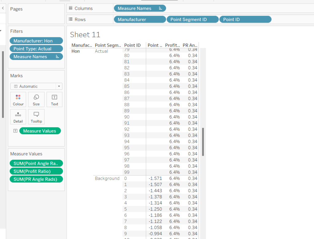
The Profit Ratio for the Manufacturer =Hon is 6.4% which is at an angle of 0.34 radians around the semi circle.

You can also see that while we have values for the Point Angle Radians field associated to the Point Segment ID = Background, we don’t have any for the Point Segment ID = Actual, as this is what we’re trying to find out.

Given that I know that all the Point Angle Radians values associated to the Point Segment ID = Background build a complete semi circle, I figured, to display up to my ‘actual’ Profit Ratio, I just want to get all the points associated to background which are less than the PR Angle Rads value.

PR Point Angle Radians

IF [Point Angle Rads] <= [PR Angle Rads] THEN [Point Angle Rads] END

Pop this into the table, and when you scroll down, you’ll see I’ve only got values in my new field up to where the PR Angle Rads is less
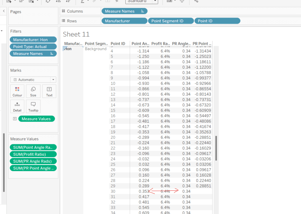
Using this field, I’ll create some new X & Y fields which I can make make into a spatial field

X (actual)

[Point Radius] *SIN([PR Point Angle Radians])

Y (actual)

[Point Radius] * COS([PR Point Angle Radians])

Geo – Actual

IF [Point Type] = ‘Actual’ AND [Point Segment ID] = ‘Background’ THEN
MAKEPOINT([X (actual)], [Y (actual)])
END

On the Zero(2) marks card, Replace the COLLECT(Zero) pill with the Geo – Actual pill by dragging the latter and dropping it directly on the former. Add Point ID to Detail.
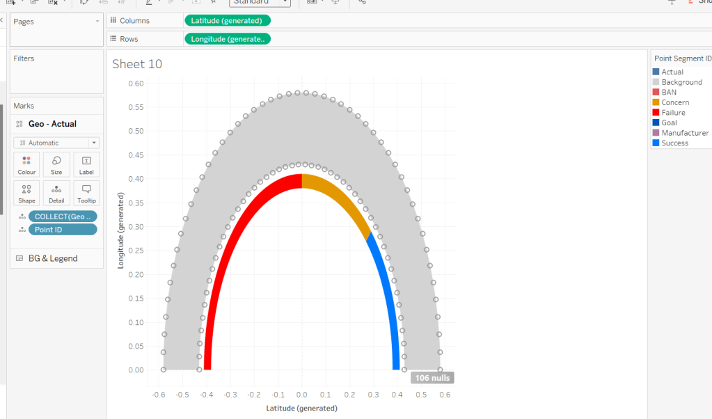
It’s drawing the points for a complete semi-circle, as every Manufacturer is being included. To help get the rest of the display right, for the various permutations, add Manufacturer to filter and filter to Hon, Bush, Logitech and Xerox. Add Manufacturer to Columns too. You should now see the marks stop at various positions around the arc. The filters will be adjusted later when we tackle the trellis.

Change the mark type to polygon and move Point ID to Path. Rename the layer to Actual.
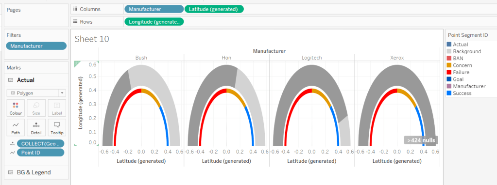
For the colouring, we need to determine the RAG status of each Profit Ratio – where does the PR % of Gauge sit in comparison the constants we know

Actual RAG

IF [PR % of Gauge] <= [Gauge Concern Pct of Gauge] THEN ‘Failure’
ELSEIF [PR % of Gauge] <= [Gauge Success Pct of Gauge] THEN ‘Concern’
ELSE ‘Success’ END

Add this to the Colour shelf and adjust accordingly.

Building the Goal Indicator Layer

Create a new spatial field

Geo: Goal Layer

IF [Point Type] = ‘Actual’ AND [Point Segment ID] = ‘Goal’ THEN [Geo] END

and then drag this onto the canvas and drop on the Add A Marks Layer option.

Change the mark Type to Polygon and add Point ID to path. Add Point Segment ID to Colour and adjust the colour of the Goal value to suit. Rename the layer to Goal.

Building the Label layer

Create a new spatial field

Geo: Labels

IF [Point Type] = ‘Label’ THEN [Geo] END

and then drag this onto the canvas and drop on the Add A Marks Layer option. Add Point Segment ID to Detail. 3 marks should now displayed in the positions we need them

This bit took a bit of time to get right, as I had 3 requirements I wanted to satisfy: 1 – display a text or a numeric field as a label depending on what label I wanted to display (I attempted to have a single ‘label’ field converting numbers to strings with the relevant formatting, but the Profit Ratio % just wouldn’t show how I wanted when converted to string); 2 – adjust the colour of (some) of the labels depending on the RAG status of the profit ratio value; 3 – adjust the size of the Profit Ratio label based on how many gauges were displayed.

I needed several label fields

Label: Goal

IF [Point Segment ID] = ‘Goal’ THEN [Gauge Success Amt] END

formatted to % with 0 dp.

Label: Manufacturer-Fail

IF [Point Segment ID] = ‘Manufacturer’ AND [PR % of Gauge]<=[Gauge Concern Pct of Gauge] THEN [Manufacturer] END

Label: Manufacturer-Concern

IF [Point Segment ID] = ‘Manufacturer’ AND ([PR % of Gauge]<=[Gauge Success Pct of Gauge] AND [PR % of Gauge]>[Gauge Concern Pct of Gauge]) THEN [Manufacturer] END

Label: Manufacturer-Success

IF [Point Segment ID] = ‘Manufacturer’ AND [PR % of Gauge]>[Gauge Success Pct of Gauge] THEN [Manufacturer] END

Label: PR-Fail

IF [Point Segment ID] = ‘BAN’ AND [PR % of Gauge]<=[Gauge Concern Pct of Gauge] THEN [Profit Ratio] END

formatted to % with 1 dp

Label: PR-Concern

IF [Point Segment ID] = ‘BAN’ AND [PR % of Gauge]>[Gauge Concern Pct of Gauge] AND [PR % of Gauge]<= [Gauge Success Pct of Gauge] THEN [Profit Ratio] END

formatted to % with 1 dp

Label: PR-Success

IF [Point Segment ID] = ‘BAN’ AND [PR % of Gauge]>[Gauge Success Pct of Gauge] THEN [Profit Ratio] END

formatted to % with 1 dp

Add all these fields to the Label shelf, and adjust the label so that all are positioned on the same line, with no spaces, and add a carriage return beneath the text. Colour each field accordingly (DO NOT ADJUST THE FONT SIZE).

Change the mark type to text and align the label top centre. Rename the mark type to Labels and Disable Selection

To adjust the size of the labels, create a new parameter which we’ll need for the trellis.

pShowTop

integer parameter, defaulted to 7 which is a range from 5 to 81 with a step size of 1.

Show the parameter.

Create a new field

Label: Size

IF [Point Segment ID] = ‘BAN’ THEN [pShowTop]
ELSEIF [Point Segment ID] = ‘Manufacturer’ THEN 60
ELSE 80 END

We want the size of the BAN label to decrease as the number of manufacturers displayed increases.

Add this filed to the Size shelf as a continuous dimension (green pill, not aggregated).

Edit the Size legend so that sizes vary by range, the range is reversed, and the range starts from 1 to 81. Adjust the mark size range slider to a suitable start and spread.

As you change the value of the pShowTop parameter, the Profit Ratio BAN should adjust in size.

Format Sales and Profit to be $ with 0dp and to display as () when negative, then on all marks cards, add Manufacturer to Detail and Sales, Profit, Profit Ratio and Actual RAG to Tooltip, and adjust Tooltip on all the layers to suit.

Finally remove all gridlines/zero lines/axis ticks and hide the longitude & latitude axis. Hide the null indicator.

Building the Trellis

So now we’ve got the core viz nailed, we need to address the layout, which is to show a gauge for each of the top n manufacturers based on Sales. This means we need to have the gauges indexed/ranked from 1 to n based on total Sales, and then arrange in a grid so that top left is the manufacturer with the highest sales, and bottom right is the manufacturer with the lowest sales. For this we need to assign a row and column number against each manufacturer.

There are multiple blog posts about creating trellis charts. My go to post has always been this one by Chris Love, especially when the requirement is for the trellis to be dynamic (the number of rows/columns can vary) depending on the number of items to be displayed.

However in this instance, using the calculations referenced in the blog doesn’t meet the requirement of ensuring there are more columns than rows. This was an area that got me stumped. As a result, I finished the viz with a version that utilises my ‘go to’ calculations (published here), before then looking at Jack’s solution to get the calculations, which are

Cols Count

//If Rounded value = Value without Round then no remainder, use that number
if SIZE()/round(SQRT(SIZE()),0) = int(SIZE()/round(SQRT(SIZE()),0)) THEN SIZE()/round(SQRT(SIZE()),0)
//Otherwise add 1 to the number of columns
ELSE int(SIZE()/round(SQRT(SIZE()),0)) + 1
END

Size() is reflective of the number of items (in this case Manufacturers) to be displayed… as I write this down, for this specific instance, you could probably replace SIZE() with the parameter pShowTop.

Rowsv2

//For Each Manufacturer, what Row should it be in the Trellis?
//Rank the Manufacturer, Find the Integer portion when dividing by # of Columns
int((INDEX()-1)/ [Cols Count])

Colsv2

//For Each Manufacturer, what Column should it be in the Trellis?
//Rank the Manufacturer, Find the Remainder when dividing by # of Columns
int((INDEX()-1) % [Cols Count])

Make both Rowsv2 and Colsv2 discrete.

Add Rowsv2 to Rows and Colsv2 to Columns. Remove Manufacturer from Columns. It’ll look a bit odd, but be patient.

Edit the Manufacturer pill on the Filter shelf. On the General tab, select None, to remove everything from the filter, then on the Top tab adjust to be based on the top pShowTop by Sales

Now edit the table calculation associated to the Rowsv2 pill, so that it computes by specific dimensions and every field except Point ID is selected. Ensure Manufacturer and Point Segment ID are listed at the top in that order. Set the level to be Manufacturer and apply a custom sort based on Sum of Sales descending

As this is a nested table calculation, select the drop down arrow at the top and apply the same settings to the nested Cols Count field.

Then do exactly the same again for the Colsv2 table calculation settings. If all has been applied successfully, then you should get a grid

where you can then adjust the pShowTop parameter

Hide the Rowsv2 and ColsV2 fields from displaying (uncheck show header). Show the Longitude axis, and fix it to start at 0 but end ‘automatic’. Then hide the axis again (this ensures the arc lands on the row divider).
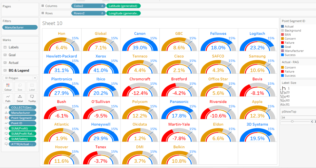
Then add the viz to a dashboard. My published version based on the trellis using Jack’s calculations is published here.

If you’ve made it to the end – well done! It was a bit of a marathon to do the challenge and another to write this blog. I’m sure it’s been quite an effort to read too, but hopefully you’ve learnt something, and I’ll certainly be referencing this again when a map layer and/or gauge based scenario occurs again.

Happy vizzin’!

Donna

Can you build this segmented bar chart?

My #WOW2024 challenge this week, was to recreate this bar chart which displayed the total value in conjunction with the values split by another dimension, in this instance year. It was inspired by Sam Parsons’ film franchises viz.

The viz is built on a single sheet, and only uses 3 fields from the data set, the Order Date the Sub-Category and the Sales value.

Let’s build…

On a new sheet, add Sub-Category to Rows and Sales to Columns and sort by Sales descending. Add Order Date to Colour to build a basic stacked bar chart.

We need to be able to show two bars directly ‘side by side’, but with different properties, so we need to end up with 2 marks cards. The ‘heights’ of the bars need to differ, so we’re going to create a ‘fake axis’ on Rows to help.

Double click into the Rows shelf and manually type MIN(0.5)

Change the mark type to bar. Each bar is now positioned based on it’s specific value (ie not stacked).

To get the bars to be positioned where we want them, apply a Running Total Quick Table Calculation to the Sales pill in the Columns shelf. Then edit the table calculation so that is computes by Year of Order Date only.

Add Sales to the Size shelf, and edit the size to be Fixed and aligned Right. You should now have a stacked bar effect.

Add Sales to Tooltip, then add a Percentage of Total quick table calculation. Edit the calculation so it is computing by Year of Order Date.

Adjust the Tooltip to reference the relevant details (note in the above gif, and my original published version, at some point the labelling went awry and the label was showing the cumulative sales value, and not the value for that year).

So now we’ve managed to build a segmented bar chart in a ‘different way’ by using an axis and the size field. We build on this to get the total bar. As this bar needs to be wider than the segmented bar, double click into the Rows shelf and type MIN(1.5), then from the MIN(1.5) marks card, remove the Order Date field from Colour. We now have 2 bars – 1 segmented and 1 not.

Make the chart dual axis and synchronise the axis, then right click on the right hand axis and move marks to back.

On the Min(0.5) marks card, move Order Date from Colour to Detail. Then on the All marks card, click on the Colour shelf and adjust the colour to suit (I set to #dec7b6) and add a white border.

Adjust the Tooltips on both marks cards so the MIN(1.5) is just showing the Sub-Category and Sales value, while the MIN(0.5) card is showing the Order Date year and % of sales value as well.

Narrow the width of the rows. Hide the right hand and the bottom axis (uncheck show header).

We want to make each pair of bars more distinctive, by providing more space between them. Edit the axis to fix the axis from -0.3 to 1.5.

Now hide the axis, and the Sub-Category column heading (right click label and hide field label for rows). Remove all row/column divider lines, zero lines and gridlines. Set the worksheet background colour (I used #fefaf1). Adjust the colour/style of the Sub-Category labels (I used bold, brown) and align top right.

And ta-dah! this should be your finished viz. My published version is here.

We’re going to building on this in a later challenge (I felt putting it all together in a single challenge might be a bit much), so look out for Part 2 in a few weeks time.

Happy vizzin’!

Donna

Can you create these KPI Cards?

Lorna set a table calculation filled challenge this week to recreate some KPI cards using an aggregated and amended version of the Superstore data set.

Lorna purposefully used a string Period field to define the timeframe to encourage the use of table calculations. No doubt, there are ways you could use string functions/regex to extract the relevant year and month number to come up with a different solution, but I’m going to head down the intended route.

And as with any table calculation based challenge, I find it best to always build out all the calculations I need into a tabular display to start with before building the viz. So let’s get started…

Building out the Calculations

We need to have a handle on more of the data than just that associated to the Period we’re interested in, so we can’t use a simple Quick Filter on the Period field to restrict the data, otherwise we can’t ‘access’ data for the previous period. So to manage which Period we want to focus on, I created a parameter

pSelectedPeriod

string field that uses a list where the values are added from the Period field. Default to P12 Y2022/23

On a new sheet, add Period to Rows and then add the Sales , Profit and Quantity measures to Text. Show the pSelectedPeriod parameter

What we’re going to do is get the values for each measure that is associated to the pSelectedPeriod, and display that value over every row.

Curr Sales

WINDOW_MAX(SUM(IF [Period] = [pSelectedPeriod] THEN [Sales] END))

If the Period matches that in the parameter, then get the Sales value and then use Window_MAX to ‘spread’ that value over every row

Add this to the table, and edit the table calculation to ensure the value is being computed by Period.

Repeat the same for Profit and Quantity

Curr Profit

WINDOW_MAX(SUM(IF [Period] = [pSelectedPeriod] THEN [Profit] END))

Curr Qty

WINDOW_MAX(SUM(IF [Period] = [pSelectedPeriod] THEN [Quantity] END))

If you change the parameter, you should see all the values in the last 3 columns changing to reflect the value from the first 3 columns of the relevant row.

Now we need to get the value from the previous period, ie the data from the previous row

Prev Sales

WINDOW_MAX(IF MIN([Period]) = [pSelectedPeriod] THEN LOOKUP(SUM([Sales]),-1) END)

The LOOKUP function is taking the Sales value from the previous 1 row (-1), and then WINDOW_MAX is once again ‘spreading’ this value across every row. We also need

Prev Profit

WINDOW_MAX(IF MIN([Period]) = [pSelectedPeriod] THEN LOOKUP(SUM([Profit]),-1) END)

Prev Qty

WINDOW_MAX(IF MIN([Period]) = [pSelectedPeriod] THEN LOOKUP(SUM([Quantity]),-1) END)

Add these to the table, and again adjust the table calc settings for every field to compute by Period.

Now we have the current and previous values for each measure, we can work out the % difference

Diff Sales %

([Curr Sales]-[Prev Sales])/[Prev Sales]

Format this to a % with 1 dp

Diff Profit %

([Curr Profit]-[Prev Profit])/[Prev Profit]

Diff Qty %

([Curr Qty]-[Prev Qty])/[Prev Qty]

Add all these onto the sheet, and remember the table calc settings (for these, there are nested table calcs, so make sure both are set properly).

We now need an arrow indicator to display up or down depending on the % value, and this needs to display as a different colour, so we need two fields per measure.

Diff Sales Indicator +ve

IF [Diff Sales %] >= 0 THEN ‘▲’ END

Diff Sales Indicator -ve

IF [Diff Sales %] < 0 THEN ‘▼’ END

I use this site to copy the text symbols from

Diff Profit Indicator +ve

IF [Diff Profit %] >= 0 THEN ‘▲’ END

Diff Profit Indicator -ve

IF [Diff Profit %] < 0 THEN ‘▼’ END

Diff Qty Indicator +ve

IF [Diff Qty %] >= 0 THEN ‘▲’ END

Diff Qty Indicator -ve

IF [Diff Qty %] < 0 THEN ‘▼’ END

Add these to the sheet if you wish too (apply the table calc settings), but you’ll only get a value for one or the other field depending on whether the difference was +ve or -ve. Below I’ve just added the two Sales indicators

The Tooltip displays the value of the two Periods being compared. One of these is in the parameter, but we need to capture the other

Previous Period

WINDOW_MAX(IF [pSelectedPeriod] = MIN([Period]) THEN LOOKUP(MIN([Period]),-1) END)

So now we have all the values we need for the KPIs captured against every row in the dataset. So now we want to just show a single row. It could be the first, it could be the last… based on Lorna’s hint, let’s filter to just show the row related to the pSelectedPeriod value.

Filter Selected Period

[pSelectedPeriod] = LOOKUP(MIN([Period]),0)

Using the offset of 0 with the LOOKUP, returns the value for the row you’re on, so adding this to the FIlter shelf and selecting True, filters the display to the row where the Period matches the parameter. NOTE if you adjust the table calc settings of this field after adding to the filter shelf, you’ll need to reselect the option to filter to True.

As this is a table calculation, the ‘filter’ is applied later in the order of operations, so information about the other rows in the table can be referenced. Filtering just by Period as a quick filter, is essentially a dimension filter and that happens earlier on in the process, meaning the data about the other rows would be inaccessible.

So we have all the fields, now build the cards.

Building the KPI Cards

On a new sheet, double click into Columns and type in MIN(0). Repeat this 2 more times. This gives us 3 axis to build each of the 3 cards.

On the All marks card, add Period to the Detail shelf. Show the pSelectedPeriod parameter. Add the Filter Selected Period to the Filter shelf and set to true (adjusting the table calc and resetting the filter value as required).

Change the mark type of the All marks card to shape and select a transparent shape (see here for more details).

On the first MIN(0) marks card, add Curr Sales, Prev Sales, Diff Sales %, Diff Sales Indicator +ve and Diff Sales Indicator -ve to the Label shelf. Remember to apply the table calc settings for all of the fields!

Adjust the text within the label, so it is formatted and positioned as required and then align middle centre.

On the middle MIN(0) marks card, do similar by adding the equivalent profit fields onto the Label shelf, and then repeat again for the bottom MIN(0) marks card, adding the quantity fields to the Label shelf.

On the All marks card, add Previous Period, Curr Sales, Curr Profit, Curr Qty Prev Sales, Prev Profit, Prov Qty, Diff Sales %, Diff Profit % and Diff Qty % to the Tooltip shelf (remember to set those table calc settings!) Then adjust the Tooltip to display the text as required. I used the ruler to shift the starting position, along with tabs (the tab keyboard button) to ‘try’ to get everything to align, and it works for most circumstances….

Finally format the KPI card

  • Set the worksheet background colour to light grey
  • Remove all gridlines, zero line, axis lines
  • Set the column divider to be a thick white line
  • Set the row divider to be a thick white line
  • Hide the axis

Add the sheet onto a dashboard, and you should be done.

My published viz is here.

Happy vizzin’!

Donna

Top & Bottom Variance

For #WOW2024 Week 6, Sean challenged us to create a viz depicting the top and bottom entries based on a variable set by the user. He instructed that no LoDs (level of detail calculations) should be used, and then also added a bonus to complete the challenge without using sets either (and so hinting that sets would solve the problem). I built both, and will provide the solution for both.

Setting up the common fields

Regardless of the solution, various calculated fields and parameters are required.

pTop

integer parameter defaulted to 12, which is used to drive how many entities to display in our top & bottom cohorts.

For the user to select a month, I first created a new field

Month of Order Date

DATE(DATETRUNC(‘month’, [Order Date]))

and I changed the default sort order of this field to descending (right click the field > default properties > sort > choose descending in the disalog box).

I then created a parameter

pSelectedMonth

date field that selects from a list that is populated when the workbook opens from the Month of Order Date field. Default to July 2021 and format the display to a custom format of mmmm yyyy – having defined the sort order to be descending, the most recent month will be at the top (this wasn’t in the requirements, but is just a useful trick to know).

Now we have a handle on the month we want to report over, we can create

Selected Month Sales

ZN(IF [Month of Order Date] = [pSelectedMonth] THEN [Sales] END)

Return the sales only if the month is that selected, otherwise return 0 (this is what the ZN function will do)

Format this to $ with 0dp.

Previous Month Sales

ZN(IF [Month of Order Date] = DATEADD(‘month’, -1, [pSelectedMonth]) THEN [Sales] END)

Return the sales only if the month matches the previous month to that selected, otherwise return 0.

Format this to $ with 0dp.

and with these, we can then create

Difference in Sales

SUM([Selected Month Sales]) – SUM([Previous Month Sales])

Format this to $ with 0dp too.

And we can also create

Colour – Diff > 0

[Difference in Sales] > 0

Pop all these into a table sorted by Difference in Sales ascending to see what it all looks like.

Solution 1 – Using sets

Right click on the State/Province field and create > set

Top States

using the Top condition to get the Top n States where n is the value from the pTop parameter, based on the Difference in Sales field.

and then create another set

Bottom States

using the Top condition to get the Bottom n States where n is the value from the pTop parameter, based on the Difference in Sales field.

Then right click on one of these states and create combined set

Top & Bottom

shows all members in both the Top States and the Bottom States sets

Add Top & Bottom to the Filter shelf. By default only the records ‘in’ either of the sets will display. Modify the pTop parameter to see the list change.

To build the viz

  • add State/Province to Rows
  • Add Difference in Sales to Columns and sort ascending
  • Add Top & Bottom to Filter
  • Add Colour – Dff > 0 to Colour and adjust accordingly.
  • Add Selected Month Sales to Tooltip and adjust
  • Show the pTop and pSelectedMonth parameters

To display the name of the month selected as a column header, create

Selected Month

[pSelectedMonth]

and add to Columns as a discrete (blue) pill at the month-year level. Hide field labels for rows and columns, remove all row/column dividers, zero lines, axis rules & tick marks.

Solution 2 – not using sets

This solution involves using the Rank table calculation

Create a new field

Asc

RANK_UNIQUE([Difference in Sales],’asc’)

and another called

Desc

RANK_UNIQUE([Difference in Sales],’desc’)

Revert back to the data table we built and remove the Top & Bottom set filter. Now add Asc and Desc to the output.

There are now two fields indexing each row; one which starts at 1 and increments, and the other that decrements so the last row is 1. We can now use these to filter just to the records we want

Records to Include

[Asc]<= [pTop] OR [Desc]<=[pTop]

Add this to the Filter shelf and set to True, and we can now see our top 12 and bottom 12 listed

Build the viz exactly as described above, but this time, add the Records to Include field onto the Filter shelf instead.

Pop these onto a dashboard and job done!

My published viz is here : Set Solution | Rank Solution

Happy vizzin’!

Donna

Can you create donut charts exceeding 100%?

In 2024 the #WOW coaching crew has extended to include Yusuke Nakanishi (@YusukeNakanish3) and Yoshitaka Arakawa (@yoshi_dataviz) from the Japanese #datafam. This week Yusuke set this challenge asking us to build donut charts that represented when percentages were > 100%.

Building out the calculations

In the data set provided the Self-sufficiency ratio for food in calorie base [%] is a number that represents the actual % value ie 90 means 90%, 196 means 196%. To help me remember that, I formatted the field to be a number with 0 decimal places which had a % suffix.

But building the donut charts we need to ‘normalise’ the figures to represent a percentage out of 100. ie, if the value is 90%, we want 90%, but if the value is 196%, we want 96%. So I created

Self Sufficient %

([Self-sufficiency ratio for food in calorie base 【%】] %100) / 100

and then formatted this to a % with 0 dp.

but I can’t build a donut chart with just this value, I need to know the non self sufficient % too

Not Self Sufficient %

1-[Self Sufficient %]

and formatted this to be a % with 0 dp too.

Let’s put these into a tabular view. Add Prefecture to Rows and Measure Names to Columns. Add Measure Values to Text. Add Measure Names to Filter and restrict to the fields Self-sufficiency ratio for food in calorie base [%], Self Sufficient % and Not Self Sufficient %. Add Fiscal Year to Filters and restrict to FY2018. Sort the data by Self-sufficiency ratio for food in calorie base [%] descending.

You can see those rows where the Self-sufficiency ratio for food in calorie base [%], Self Sufficient % and Not Self Sufficient % is over 100% have a different value for the Self Sufficient %.

Showing the Fiscal Year as a filter the user can select, I can change to FY2019 and also see how these fields are behaving; ie when Self-sufficiency ratio for food in calorie base [%] is also over 200%, I’m getting the ‘remainder’ over 200 displayed ie 216% has a Self Sufficient % of 16%, which is what is needed for the ‘bonus’ challenge.

However, due to the way I’m building, I’m going to able to get the display working for the top & bottom 7 records regardless of year (making the build of the bonus challenge a bit easier).

So with this in mind, I now what to categorise the Self-sufficiency ratio for food in calorie base [%] based on what percentage range the values fall into.

% Bracket

FLOOR([Self-sufficiency ratio for food in calorie base 【%】] / 100)

This gives me values of 0, 1 and 2. By default this field will be created within the ‘measures’ section of the data pane (ie below the line). Drag it into the top section to convert it to a discrete dimension. Alias the values (right click -> Aliases) and set as below:

Then add to Rows.

and with the filter still set for FY2019, we can see the rows are categorised into 3 brackets.

Set the filter back to 2018. Now we want to restrict to the top and bottom 7 records only. For this I use Sets.

Create a set against Prefecture (right click the field > create > set).

Top 7

Top 7 records by Sum of Self-sufficiency ratio for food in calorie base [%]

Then create another set, this time for the bottom 7

Bottom 7

Bottom 7 records by Sum of Self-sufficiency ratio for food in calorie base [%]

Then create a Combined set (right click on one of the sets > create Combined set), that includes all values from both sets

Records to Include

Add this to the Filter shelf. By default it will show the records ‘in’ the set. However based on how the order of operations in Tableau works, this will apply the conditions based on the set first before it considers the year being filtered. Ie it will get the top and bottom 7 records based on the total sum of the Self-sufficiency ratio for food in calorie base [%] field for all the data in the data set, then filter to 2018. It means it could show some records that were in the top 7 overall, but not in the top 7 for 2018. To resolve this, and to ensure the data gets filtered by the Fiscal Year first, we need to add the Fiscal Year pill on the Filter shelf to context (right click pill and Add to Context). The pill will go grey.

Next we need a way to ‘categorise’ which rows are the top and which are the bottom. Add Top 7 to Rows which will split the rows into In or Out. Alias these values so In displays as Top 7 and Out displays as Bottom 7 (right click the text > Edit Alias).

Finally, when we build the viz, we need to ensure the 7 entries for each section align with each other. For this create

Top | Bottom Index

INDEX()

and convert the field to Discrete, then add to Rows before the Prefecture pill. Edit the table calculation so that it is computing based on the Prefecture and % Bracket pills only. This gives us an index from 1-7 for each set.

Building the Top & Bottom 7 Donut chart

On a new sheet, add Fiscal Year to Filter and set to 2018. Add the pill to context. Show the filter. Also add Records to Include to Filter.

Add Top 7 to Rows, then double click into rows and manually type MIN(0) to create a ‘fake axis’. Change the mark type to Pie.

Add Prefecture to Detail and Measure Values to Angle. Ensure only Self Sufficient % and Not Self Sufficient % are the only measures displayed (remove any others by dragging them out of the Measure Values box). Add Measure Names to Colour.

Add Top | Bottom Index to Columns and edit the table calculation so it is just computing by Prefecture. This should now give 7 columns of pie charts.

Add a Sort to the Prefecture pill on the Detail shelf, so it is sorting by the Self-sufficiency ratio for food in calorie base [%] field descending.

Add % Bracket to the Detail shelf, then click on the 3 dot icon to the left, and select the colour icon to add this pill to the Colour shelf as well as the Measure Names pill.

Re-edit the table calculation associated to the Top | Bottom Index pill so it is now also computing by the % Bracket field, so you get back to your correct top & bottom 7.

Adjust the order of the pills on the Colour shelf so that the % Bracket pill is listed before the Measure Names pill. Also adjust the order of the pills in the Measure Values box so Self Sufficient % is listed before Not Self Sufficient %.

Then adjust the colours on the colour legend as below and add a dark border to the marks (via the colour shelf).

Change the year filter to FY2019, and you can adjust the colours for the 200% entries too.

To make the ‘hole’ in the donut, double click into the Rows and add another instance of MIN(0). This will create a 2nd MIN(0) marks card.

On that marks card, move Prefecture from Detail to Label. Remove % Bracket, Measure Names and Measure Values. Add Self-sufficiency ratio for food in calorie base [%] to Label. Change the mark type to circle. Set the Colour of the circle to white. Align the label middle centre, and adjust the format/font to suit.

Set the chart to be dual axis and synchronise the axis. Adjust the Size of the pie chart mark independently from the size of the circle mark, so one is slightly larger than the other.

Finally tidy up the display by hiding the axis (uncheck show header), and the Top | Bottom Index field. Remove all gridlines, zero lines, axis lines/ticks and row/column dividers. Hide the In/Out Top 7 field label heading (right click label and hide field labels for rows. Update the title of the sheet so it references the Fiscal Year field. Change the filter back to 2018. Hide all tooltips.

Building the Legend

On a new sheet double click into Columns and type MIN(0.0). Add % Bracket to Rows. Change the mark type to square and add % Bracket to Colour and Label. Adjust colours to suit and add dark border to shape.

From the donut chart sheet, click on the Fiscal Year pill in the Filter shelf and set to apply to worksheets > selected worksheets and select the sheet you’re building the legend on. This will add the pill to this sheet too and changing the value on one sheet will impact the other.

Edit the axis so it is fixed to start at -0.1 and end at 1. This will shift the display to the left.

Hide the axis, and the % Bracket header column; remove all gridlines, zero lines, row/column dividers. Hide the tooltips.

Both the legend and the donut can now be added to a dashboard, and you’ve completed the main challenge. I chose to add the Fiscal Year filter to the display so the user could switch years if they wished.

The bonus challenge – Building the trellis chart

Because of how I’ve built the above, we’ve already done the hard work to handle the 200%+ data. The challenge here now is just to display all the 47 Prefectures for a given year in a 10 x 5 grid – a trellis.

So to build this, I started with the donut chart already built and duplicated the sheet.

When creating trellis charts, we need to create fields that represent which row and which column each Prefecture should sit in. There’s lots of blogs on creating trellis charts. As we know the number of rows and columns we need, I created

Cols

INT((INDEX()-1)%10)

Take the index of each Prefecture, decrement by 1 and find the remainder when divided by 10. This means the Prefecture with the highest % value at at position (rank) 1 will be positioned in column (1-0)%10 = 0. The Prefecture at position 11 will also be positioned in column (11-1)%10 = 0.

We also need

Rows

INT((INDEX()-1)/10)

Take the index of each Prefecture, decrement by 1 and divide by 10.

Convert both fields to be Discrete.

From the duplicated sheet, remove Top | Bottom Index from Columns and In/Out Top 7 from Rows. Remove Records to Include from Filter. Don’t panic if things look odd!

Add Cols to Columns. Adjust the table calculation to compute by both %Bracket and Prefecture. Specify the sort order to be a custom sort on the field Self-sufficiency ratio for food in calorie base [%] descending.

Now add Rows to Rows and apply the same settings on the table calculation. If all is well, you should have all 47 donuts displaying in the correct order.

Hide the Cols and Rows headings, and you can then add this to another dashboard.

My published viz is here: Top & Bottom 7 | Trellis

Happy vizzin’!

Donna

Let’s Analyse New Product Sales

For the challenge this week, Sean wanted us to identify the sales of ‘new’ products compared to previous years. This challenge was born out of a requirement he had at work, where he discovered the definition of a ‘new product’ was different to what he’d assumed.

In this instance, the ‘client’ only cared about comparing sales in the same month across the years. Any sales related to the products outside of the specific month were irrelevant and were to be ignored. A product was then counted as ‘new’ in the first year (of the specified month) that there was a sale.

In this case we are always looking at the month of September (the previous month to ‘today), so if Product X was sold in Sept 2021 and Sept 2023 only, then Product X would count as new in Sept 2021, and only the sales for Product X in Sept 2021 would be included in the subsequent values displayed.

Now I thought I’d nailed my understanding of the requirement, and went ahead building out a tabular view of the data using table calculations, but my final output did not match Sean’s result – in fact it was quite way off. I stepped through my logic, even sharing some samples with Sean to sense check, and we seemed to concur on the products identified as new, so I was incredibly puzzled as to what was causing the value discrepancy.

I messaged my friend, Rosario Gauna, to share my numbers and see what she came up with…. she matched Sean! Doh! I then had to spend time dissecting my solution and Rosario’s to see which products I was/wasn’t counting. Eventually I found the problem….

In using table calculations, I had included all the fields the viz required which included the Segment (Home Office, Corporate, Consumer). This meant that in my logic to identify a ‘new product’, I was counting the product as new in the first year that the product was sold in each Segment – ie if Product X sold in Sept 2022 against Segment Home Office and then sold in Sept 2023 against Segment Corporate, I counted both sales as being ‘new’ as the segment differed. However I only wanted the Sept 2022 sale to count as ‘new’.

With this understood, I tried to revise my initial table calc build, but to no avail. So I opened up a new workbook and started again, this time taking a different track. This is what I’ll blog, but I felt it important to explain how even a requirement I thought I’d understood, could still get mis-interpreted.

Building out the calculations

The first requirement is that we’re only looking at comparing the data for the previous month to ‘today’. If this was being developed for a live business application we’d reference the TODAY() function, but since I want this viz to continue to display on Tableau Public after we hit 2024, then I’m going to use a parameter to hardcode ‘today’.

pToday

date parameter defaulted to 4th October 2023

From this, I can then determine the month we need to compare

Month to Compare

DATEPART(‘month’, DATEADD(‘month’, -1,DATETRUNC(‘month’, [pToday])))

working from right to left (inside to out), this takes ‘today’ and finds the 1st of the month (ie 1st October), then goes back 1 month (ie 1st September), then gets the month number ie 9.

As this returns a number, it automatically is listed in the ‘measures’ section of the data pane (under the line), but I dragged it into the top half as I want the number to be discrete.

I then created

Filter Month

DATEPART(‘month’, [Order Date]) = [Month to Compare]

which returns true for all the orders where the month of the Order Date is in September.

Let’s build up a table so we can start to see what we’re working with

Add Product Name and Filter Month to Rows, Order Date (at the Year level) to Columns and Sales to Text.

In the example above, 3-ring staple pack has sales in September 2022 and in other months in 2020 and 2021, but we don’t care about those months, so this product is counted as new in 2022, with a value of $11.

3M Hangers With… have no sales in September in any year, so we won’t be counting that product at all.

6″ Cubicle Wall Clock has sales in both September 2022 and 2023, so this product will be counted as new in 2022 with a value of $83.

So we can filter the date just to Filter Month = True (move Filter Month from Rows to the Filter shelf).

Now we want to identify the earliest year for each Product Name.

Year First Purchased in Month

{FIXED [Product Name],[Filter Month]: MIN(YEAR([Order Date]))}

Add this onto Rows, and you can see below we’re picking up the right year.

Now we can identify the value of the sales we want to count.

New Product Sales

IF [Year First Purchased in Month] = YEAR([Order Date]) THEN [Sales] END

Only get Sales for the year that matches the minimum year. Format this field to $ with 0 dp.

Adding this in to the table, we can see we only have a value against the first year.

So we’ve identified the sales values of the products we care about. We can now aggregate this at a higher level, and incorporate the other dimensions.

Remove Sales from Text, add Category to Rows and Segment to Columns. Remove Product Name and Year First Purchased in Month.

The viz displays the % of total new product sales by Category per Segment. Right click on the New Product Sales pill and add Quick Table Calculation, selecting Percent of Total. Right click on the pill again and select Compute Using -> Category. Right click on the pill and Format and format to % with 0dp. Add another instance of New Product Sales back into the table.

Now we want to be able to compare the sales for the current year/category/segment against that of the previous year.

Previous Year Sales

LOOKUP(SUM([New Product Sales]),-1)

This looks up the New Product Sales value of the previous (-1) field. Add this field into the table, and right click and Edit Table Calculation. Adjust so the calculation is computing by Year of Order Date only.

You should be able to see that the values from the previous year for each Segment & Category are now displayed against each cell. As there is no data for 2019, there are no values listed for this field against the 2020 fields.

Now we have the values we want to compare in the same ‘row’ of data, we can compute

% Diff From Previous Year

(SUM([New Product Sales]) – [Previous Year Sales]) / [Previous Year Sales]

custom format this to ▲0%;▼0% (use this site to get the images to copy & paste), and add this into the table ensuring the table calculation is set to compute using Year of Order Date only, as you did above.

And now we have all the components needed to build the viz.

Building the bar chart

Duplicate the table sheet, then apply the following steps

  • Move % of Total New Product Sales to Rows
  • Move Category to Colour and adjust accordingly
  • Move New Product Sales and % Diff from Previous Year to Label
  • Remove Previous Year Sales
  • Add another instance of % of Total New Product Sales to Label ( I tend to do this by pressing ctrl, and then clicking on the pill in the Rows and dragging onto Text – this creates a duplicate of the pill and preserves the table calculation settings. Otherwise add an instance of New Product Sales to Label, then add the Percent of Total Quick Table Calculation and ensure the pill is set to compute by Category.)
  • Move Segment to be in front of the Year(Order Date) field on Columns – if this changes the viz display, ensure the mark type is set to bar.

Tidy up the display by

  • removing all gridlines/zero lines etc
  • remove row dividers
  • Adjust title of the y-axis
  • Hide the Segment/Order Date column heading
  • Hide the tooltips

The text and formatting of the labels also needs to be adjusted. We don’t want the ‘vs PY’ text displaying for the 2020 years when there is no difference from previous year.

Label PY Text

IF NOT ISNULL([Previous Year Sales]) THEN ‘vs PY’ END

Add this to the Label shelf and ensure the table calculation is set to compute using YEAR of Order Date only. Then adjust the layout of the label text and the format the size of the text.

Now you can just add to a dashboard!

Happy vizzin’!

Donna

Re-viz: Discovery Dashboard

For the next few Workout Wednesdays, the coaches will be revisiting old challenges – retro month! Erica kicked the month off with this challenge, to recreate Ann Jackson’s challenge from 2018 Week 38. I completed this challenge at the time (see here), but the additions and changes to the visual display Erica incorporated meant I couldn’t just republish it 🙂

So I built it from scratch using the data source from the google drive Erica referenced in the requirements (which I believe may be why my summary KPIs didn’t actually match Erica’s).

There’s a heck of a lot going on in this challenge – it certainly took some time to complete, which may mean this blog becomes quite lengthy… I will endeavour to be as succinct as I can, which may mean I don’t explicitly state every step, or show lots of screen shots.

Setting up the parameters

I used parameters and subsequently dashboard parameter actions to build my solution. Erica mentions set actions, but I chose not use any sets.

As a result there’s lots of parameters that need creating

pAggregate

This is a string parameter that contains the list of possible dimensions to define the lowest level of detail to show on the scatter plot (ie what each dot represents). Default to Sub-Category. Note how the Display As field differs from the Value field.

pColour Dimension

This is a string parameter that will contain the value of the dimension used to split the display into rows (where each row is coloured). This will get set by a parameter action from interactivity on the dashboard, so no list of options is displayed. Default to Segment.

pSplit-Colour

boolean parameter to control whether the chart should be split with a row per ‘colour’ dimension, or just have a single row. The values are aliased to Yes/No

pSplit-Year

another boolean parameter to control whether the chart should be split with a column per year or just have a single column. The values are aliased to Yes/No (essentially similar to above)

pX-Axis

string parameter that contains the value of the measure to display on the x-axis. This will be set by a dashboard parameter action, so no list is required. Default to Sales.

pY-Axis

Similar to above, a string parameter that contains the value of the measure to display on the y-axis. This will be set by a dashboard parameter action, so no list is required. Default to Profit.

pSelectedDimensionValue

string parameter that contains the dimension value associated to the mark that a user clicks on when interacting with the scatter plot, and then causes other marks to be highlighted, or a line to be drawn to connect the marks. This will be set by a dashboard parameter action, so no list is required. Default to <nothing>/empty string.

Building the basic Scatter Plot

The scatter plot will display information based on the measures defined in the pX-Axis and pY-Axis parameters. We need to translate exactly what the measures will be based on the text strings

X-Axis

CASE [pX-Axis]
WHEN ‘Profit’ THEN SUM([Profit])
WHEN ‘Sales’ THEN SUM([Sales])
WHEN ‘Quantity’ THEN SUM([Quantity])
END

Y-Axis

CASE [pY-Axis]
WHEN ‘Profit’ THEN SUM([Profit])
WHEN ‘Sales’ THEN SUM([Sales])
WHEN ‘Quantity’ THEN SUM([Quantity])
END

We also need to define which field will control the lowest level of detail based on the pAggregate dimension

Dimension Detail

CASE [pAggregate]
WHEN ‘Category’ THEN [Category]
WHEN ‘Sub-Category’ THEN [Sub-Category]
WHEN ‘Product’ THEN [Product Name]
WHEN ‘Region’ THEN [Region]
WHEN ‘State’ THEN [State]
WHEN ‘City’ THEN [City]
END

Similarly we need to know which field to split our rows by (the colour)

Dimension Row

CASE [pColour Dimension]
WHEN ‘Segment’ THEN [Segment]
WHEN ‘Category’ THEN [Category]
WHEN ‘Region’ THEN [Region]
WHEN ‘Ship Mode’ THEN [Ship Mode]
END

but as we need different behaviour depending on whether the pSplit-Colour field is yes or no, we need

Row Display

IF [pSplit-Colour] THEN [Dimension Row]
ELSEIF [pColour Dimension] = ‘Category’ THEN ‘All Categories’
ELSE ‘All ‘ + [pColour Dimension] + ‘s’
END

If the parameter is true, then just show the value from the Dimension Row, otherwise display as ‘All Categories’ or ‘All Segments’ or ‘All Regions’ etc.

Similarly, as the columns can be split by years or not, we need

Years

IF [pSplit-Year] THEN STR(YEAR([Order Date])) ELSE ” END

Add the fields to a sheet with

  • Years & X-Axis on Columns
  • Row Display & Y-Axis on Rows
  • Dimension Detail on Detail
  • Dimension Row on Colour
  • Set the mark type to circle and reduce colour opacity
  • Edit the axes, so the titles are sourced from the pX-Axis and pY-Axis parameters
  • Show all the parameters and manually edit the values/change the selections to test the functionality.

Highlighting corresponding marks

Show the pSelectedDimension parameter and hover over a mark in the scatter plot to read the value of the Dimension Detail field. Enter than value into the pSelectedDimension parameter (eg based on what is displayed above, each mark is a Sub-Category, so I’ll set the field to ‘Phones’).

We need to determine whether the value in the parameter matches the dimension in the detail

Highlight Mark

[pSelectedDimensionValue] = [Dimension Detail]

This returns True or False. Add this field to the Detail shelf, then add it as second field on the Colour shelf.

Adjust the default sorting of the Highlight Mark field, so the True is listed before False (sorted descending) – right click on the field > Default Properties > Sort. And ensure the colour fields on the shelf are listed so Dimension Row is above Highlight Mark. If all this is done, then the colour legend show look similar to below, where the Dimension Row is listed before the True/False, and the Trues are listed above the Falses, so the True is a darker shade of the colour.

Add Highlight Mark to the Size shelf and then edit the size legend to be reversed and adjust the sizes so the smaller ones aren’t too small, but you can differentiate (you may need to adjust the overall size slider on the size shelf too).

Making a connected dot plot

Add Order Date at the Year level (blue discrete pill) to the Detail shelf of the scatter plot.

To make the lines join up when the viz isn’t split by year, we need a field

Y-Axis Line

IF NOT [pSplit-Year] AND [pSelectedDimensionValue] = MIN([Dimension Detail]) THEN [Y-Axis] END

This will only return a value to plot on the Y-Axis if pSplit-Year = No and a user has clicked on a mark.

Set the pSplit-Year parameter to No, then add Y-Axis Line to Rows. On the Y-Axis Line marks card, remove Highlight Mark from colour and size and also remove Dimension Row from Colour. Add Order Date at the Year level (blue discrete pill) to Detail. Change the mark type to Line then add Year(Order Date) to Path instead of Detail.

Make the chart dual axis and synchronise the axis.

Play around changing the pSplit-Year parameter and the value in the pSelectedDimension parameter to test the functionality.

Tidy the scatter plot by adjusting font sizes, removing the right hand axis & the gridlines, lightening the row & column dividers, removing row & column label headings. Tidy up tooltips. Add a title that references the parameter values.

Building the Total Marks KPI

Create a new field

Count Marks

SIZE()

and a field

Index

INDEX()

Set this field to be a discrete dimension (right click > convert to discrete)

On a new sheet, add Dimension Row, Dimension Detail and Order Date (set to Year level as blue discrete pill) to the Detail shelf. Add Count Marks to Text. Adjust the table calculation setting of Count Marks so that all the fields are selected.

Add Index to the Filter shelf and select 1. Then adjust the table calculation setting of this field so it is also computing by all fields. Re-edit the filter, and adjust so only 1 is selected. This should leave you with 1 mark. Change the mark type to shape and set to use a transparent shape.

Adjust font size & style, set background colour of worksheet to grey, adjust title, hide tooltips.

Building the X-Axis KPI

For this we need

Total X-Axis

TOTAL([X-Axis ])

Min X-Axis

WINDOW_MIN([X-Axis ])

Max X-Axis

WINDOW_MAX([X-Axis ])

On a new sheet add Dimension Row, Dimension Detail, YEAR(Order Date) to Detail. Add pX-Axis, Total X-Axis, Min X-Axis & Max X-Axis to Text. Adjust all the table calcs of the Total, Min, Max fields to compute using all dimensions listed. Add Index to filter and again set to 1, then adjust the table calc and re-edit so it is just filtered to be 1. Set the mark type to shape and use a transparent shape. Adjust the layout & font of the text on the label. Set background colour of worksheet to grey, adjust title, hide tooltips.

Building the Y-Axis KPI

Repeat the steps above, creating equivalent Total, Min & Max fields referencing the Y-Axis.

Creating the Y-Axis ‘buttons’

We’ll start with creating a Profit button

Create a field

Label: Profit

“Profit”

and

Y-Axis is Profit

[pY-Axis] = ‘Profit’

We will also need the field below for later on

Y-Axis not Profit

[pY-Axis] <> ‘Profit’

On a new sheet double click on Columns and manually type in MIN(1). Add Label: Profit to Text and Y-Axis is Profit to Colour. Change the mark type to bar.

Set the Size of the bar to maximum, adjust the axis to be fixed from 0-1 and hide the axis. Remove all column/row banding, axis line, gridlines etc.

Show the pY-Axis parameter. If the colour legend is set to True (as pY-Axis contains Profit), then adjust the colour to a dark grey. Then change the value of the pY-Axis parameter, which should then display False in the colour legend. Adjust this to light grey. You may need to do this the other way round. Hide tooltips.

Repeat the same process to create separate sheets for Sales and Quantity with equivalent calculated fields (I found the easiest way was to duplicate the sheet and then swap out the fields).

Creating the X-Axis ‘buttons’

Again, just duplicate the above steps but reference the pX-Axis parameter instead.

You should end up with 6 sheets (1 per measure – Sales, Profit, Quantity – per axis), and 18 calculated fields (3 per measure & axis) as a result.

Creating the ‘Select Colour’ buttons

For the Category button, create

Label: Category

‘Category’

and

Colour is Category

[pColour Dimension] = ‘Category’

Build a ‘button’ as a bar chart, using the same principals as above. You will need to show the pColour Dimension parameter to test changing the value to set the different colours.

Repeat the same steps to build 3 further sheets for Region, Segment and Ship Mode.

Building the dashboard

You will need to use layout containers to arrange all the objects in. The main body of the dashboard consists of a horizontal layout container, which contains 3 objects: a vertical container (left column with configuration options), the scatter plot in the middle and then another vertical container (right column with KPIs).

The left hand ‘Configure Your Chart’ vertical container consists of text objects, parameters, the X-Axis ‘button’ sheets, the Y-Axis ‘button’ sheets and the Colour ‘button’ sheets.

For each of the X-Axis and Y-Axis button sheets, a parameter action needs to be created like below

Set Y-Axis to Profit

On select of the Y-Axis Profit sheet (or whatever you have named the sheet), set the pY-Axis parameter with the value from the Label:Profit field.

You should end up with 6 different parameter actions for these fields – 1 per measure per axis .

For each of the ‘Colour’ buttons, a similar parameter action is also required

Set Colour to Category

On select of the Colour-Category sheet (or whatever you have named the sheet), set the pColour Dimension parameter with the value from the Label:Category field.

You should end up with 4 parameter actions like this.

The Y-Axis and X-Axis buttons should only display 2 options at a time, so you can’t select the same measure for both axis.

Assuming Profit is currently selected on the Y-Axis, then select the object that displays the Profit X-Axis ‘button’ and from the Layout tab, set to control visibility using value and select the Y-Axis not Profit calculated field. As the Y-Axis is set to Profit, the Profit X-Axis button will disappear.

Repeat these steps for each of the X & Y Axis button sheets. Note, sometimes it’s easier to select the object via the Item Hierarchy section of the Layout tab.

For the scatter plot, the user needs the ability to select a mark and the others be highlighted/connected depending on the current settings. This needs another parameter action

Select Dimension Value

On select of the scatter plot, set the pSelectedDimensionValue parameter with the value from the Dimension Detail field.

For the right hand KPI nav, the vertical container consists of text objects, and the KPI sheets.

To make horizontal line separators, set the padding on a blank object to 0, the background colour to the colour you want, and then edit the height of the blank object to 2pt.

For the Info ‘button’, add a floating text box containing the relevant text and position it where you want it to display. Give the object a border and set the background to white. Then select the object and choose the Add Show/Hide Button from the context menu. Edit the button to display an info icon when hidden. Ensure the button is also floating and position where you want.

I used additional floating text boxes to display some of the other text information on the dashboard.

No doubt you’ll need to spend some time adjusting padding and layout to get everything where you want, but this should get you the core functionality.

My published viz is here. Phew! that was epic!

Happy vizzin’!

Donna

Can you build a funnel chart?

For my first #WOW2023 challenge, as an ‘official’ part of the #WOW crew, I challenged everyone to build this funnel chart. Inspiration came from a colleague who posed me the challenge of building something similar, ensuring the bars were a single entity when clicked on. In that example we’d just used Superstore data, but it wasn’t really reflective of how a funnel would typically work, so I sourced some dummy sales opportunity data and made the challenge more relevant to a real business scenario.

Building the Funnel Chart

I saw this as a table calculation exercise, though I have subsequently seen solutions that manage it all through LODs. I’ll obviously blog my solution.

Let’s start by getting the core data into a table, so we can see what we’re aiming for

The total value of all the Opportunities is $91.4M. Based on the sales pipeline process and the assumptions documented in the requirements, all of that value will have passed through the first stage – Prospecting.

There is $6.1M still sitting in Prospecting, so when we move onto the next stage, stage 2 -Qualification, the total amount that has passed through will be $91.4M – $6.1M = $85.3M

As there is $6.5M sitting in Qualification, as we move to stage 3, the total amount that has passed through will be $85.3M – $6.5M = $78.7M. A similar pattern repeats for Stage 4, but for Stage 5, Closed Won, the value that has ‘passed’ through that stage, is equivalent to itself.

If we amend the Value field to be a Running Total quick table calculation (and add Value back into the view too), we get

The Running Sum is computing down the table , with the value in each row being the sum of the preceding rows. But this is opposite to what we want. We want Stage 1 to have the biggest value, the total, and the values to get smaller as you look down the table.

To resolve this, edit the table calculation and change the Sort order to custom sort by Minimum Stage No Descending

This results in the running total to sum from the last row (Stage 6) up to the first row (Stage 1), and you can see the value against Stage 1 matches the total for the Value column.

However, this still isn’t quite what we need. While we need to consider the amount for Closed Lost in stages 1-4, we shouldn’t be including it in stage 5, Closed Won.

While excluding the Stage 6 from the view (Stage No on Filter shelf set to Exclude 6) , gives the correct value for Stage 5, we’ve now lost the amount for Closed Lost in the other rows

So, we need some additional calculations to help resolve this.

Amount Lost

{FIXED : SUM(IF [Stage No]=6 THEN [Value] END)}

This just captures the amount of Stage 6 and ‘spreads it across every row of data.

Let’s now get our running total field, baked into it’s own calculation, as this will help with other calcs

Cumulative Value Per Stage

RUNNING_SUM(SUM([Value]))

Replace the Value table calc field with this one, ensuring the table calculation settings are identical to those described above.

Now let’s add the Amount Lost onto the Cumulative Value Per Stage unless we’re at Stage 5, Closed Won

Total Amount Per Stage Inc Lost

IF MIN([Stage No]) = 5 THEN [Cumulative Value Per Stage]
ELSE [Cumulative Value Per Stage] + SUM([Amount Lost]) END

Pop this into the table (checking the table calc settings are as expected) and the total amount now stored against Stage 1, is the total value of all the Opportunities.

Ok, so now we know the values, how do we plot this in such a way that it represents a funnel. I chose to do this by first working out the proportion of the total value that the ‘reverse’ cumulative value represented.

Total Value

{FIXED:SUM([Value])}

meant I could determine

Proportion of Total

[Total Amount Per Stage Inc Lost] / SUM([Total Value])

I formatted this to percentage with 0 dp.

Adding these into the table

If we plotted this information on a bar chart, we’d get this

but we need to ‘centre’ each bar in relation to the first bar to give us the funnel effect. This means we need to shift each ‘bar’ to the right, by half the amount that is the difference between 100% and the Proportion of Total.

Position to Plot

(1 – [Proportion of Total])/2

We can’t represent this with a actual bar chart, but instead we can use a Gannt chart.

  • Stage No to Rows
  • Stage No to Filter and exclude Stage 6
  • Stage to Detail
  • Position to Plot to Columns, adjusting the table calculation as previously described
  • Change mark type to Gantt bar
  • Add Proportion of Total to Size (and verify the table calc is set properly)

Hey presto! A funnel!

To finalise

  • add Stage to Label and align centrally. Make the font bold and match mark colour.
  • add Cumulative Value per Stage to Colour and reverse the colour range (via the Edit Colours dialog)
  • Widen each row a bit.
  • Fix the Position to Plot axis to start at 0 and end at 1 to ensure the funnel is centred exactly.
  • Add Value and Total Amount Per Stage Inc Lost to the Tooltip and adjust the tooltip text accordingly (don’t forget to sense check the table calc settings!).
  • Hide the Position to Plot axis, and the Stage No column. Remove all gridlines, zero lines, axis rulers /row/column banding etc.

Building the KPIs

We need a few calculated fields to store the required numbers

Won

{FIXED:SUM(IF [Stage No]=5 THEN [Value] END)} / [Total Value]

formatted to a percentage with 0 dp.

Lost

{FIXED:SUM(IF [Stage No]=6 THEN [Value] END)} / [Total Value]

formatted to a percentage with 0 dp.

Outstanding

1-([Lost] + [Won])

formatted to a percentage with 0dp.

On a new sheet add Measure Names to Columns and Measure Values to Text. Add Measure Names to Filter and select Total Value, Won, Lost, Outstanding. Manually re-order the columns.

Format Total Value to be a number displayed in millions with 1 decimal place & prefixed with $.

Add Measure Names to Text and adjust the text as required. Align the text to be centred.

Remove the row banding, and hide the column heading.

Then arrange the two sheets on the dashboard, ensuring both are set to fit entire view.

My published viz is here.

Hope you enjoyed this

Happy vizzin’!

Donna

Can you maintain rank?

Kyle set a challenge this week inspired by a chart Ann Jackson demoed at #data22 as part of her Advanced Speed Tips session with Lorna Brown. This was both an in person presentation and available virtually (hence the link to the video above). I couldn’t attend the in person session due to a clash, but I had already watched the session prior to this challenge being set, so I attempted to build from memory without referring back. To find out what to do, you can either watch Ann herself demonstrate via the link above, or read on 🙂

Building the WAR chart

Build a basic bar chart by adding Name to Rows and WAR to Columns

Whilst we could sort the data at this point, we’re going to leave for now, as we want the ‘ranking’ field to define the sort.

Now rather than use the RANK table calculation option, the essence of this being included in a tipping session, is to utilise the INDEX table calculation instead. By using INDEX, we don’t need to create as many fields as if we used RANK. We can reuse the INDEX across all the charts.

So, let’s create that field

Index

INDEX()

Format this to be a number with 0dp and prefixed by #

The INDEX() table calculation simply lists your rows or columns of data from 1 to however many entries there are. The Index can span the whole width/length of the table or can restart at intervals depending how you choose to partition/structure your table. You can also control how the data will be indexed based on how you want it sorted.

Add Index to Rows, then change it to be discrete (blue), and position in front of Name. Edit the table calculation setting so that it is computing using Name and is sorted by WAR descending.

We need to capture the name of a player, so we’ll create a parameter for this

pSelectedPlayer

String parameter defaulted to Ken Giffey Jr.

Show this parameter on the view.

We also need a field to identify whether the row matches the parameter

Is Selected Player?

[pSelectedPlayer] = [Name]

Add this to the Colour shelf and adjust accordingly.

Then re-edit the table calculation so it is computing by Is Selected Player as well.

Note – to prevent having to change the table calculation, the alternative is to make the Is Selected Player field on the Colour shelf an Attribute (just choose this setting from the context menu when you click on the pill).

Additionally add Is Selected Player to Rows before Index., the manually sort that field so True is listed first. This will move the relevant record to the top of the scree, but the rank number will be preserved.

Hide the Is Selected Player field (uncheck Show Header), and Hide Field Labels for Rows.

Adjust row dividers, so the divider is at level 1, and the header is dotted line, while the pane is solid.

Remove column gridlines, but add a column axis ruler.

Show mark labels, set them to be left aligned and the colour to match mark colour. You may need to widen the rows to see the labels display.

Add a border to the bars via the Colour shelf.

Format the Index and Name fields displayed – I used Tableau Regular font size 12, and right aligned the Index field.

Update the tooltip and add a header.

The final step, which we’ll do now, is to add a couple of fields to stop the rows from being highlighted when selected on the dashboard.

Create a field True = TRUE and False = FALSE, and add these fields to the Detail shelf.

Building the Batting Average chart

Create a basic bar chart with Name on Rows and BA on Columns. Add Is Selected Player to Colour and apply border.

Format the BA field using custom formatting of .000;-.000 then show mark labels, and left align and format as you did above.

Add Index to Rows, make discrete and move to be in front on Name. Adjust the table calculation to compute by Name and Is Selected Player and this time adjust the sort to use BA descending.

We now need to filter the data to only show the 5 rows above & below the selected index. First we need to identify them.

Selected Player Index

WINDOW_MAX(IF ATTR([Is Selected Player]) THEN INDEX() END)

The inner IF statement returns the index associated to the selected player. The WINDOW_MAX function then ‘spreads’ this value across all the rows in the data. So we can then identify the records we need

Records to Keep

[Index] >= [Selected Player Index]-5 AND
[Index] <= [Selected Player Index]+ 5

Add this to the Filter shelf and initially select all the values.

Now edit the table calculation settings of this field. It will now contain nested calculations – one related to Index and one related to Selected Player Index. Ensure both are computing by Name and Is Selected Player and both are sorting by BA descending.

Then edit the filter and just select True.

Now apply the tooltip, set the heading and format the headers, remove gridlines, row dividers etc.

Then follow the same steps to create similar charts of the OPS and HR measures, remembering to apply the sorts on the table calculations to the relevant field.

Adding the interaction

Once you have all four sheets built, add to a dashboard. Then create a parameter action to select the player from the WAR sheet.

Select Player

On select of the WAR sheet, set the pSelectedPlayer parameter passing in the Name field.

Then create a filter action to prevent the selection on the WAR sheet from remaining highlighted.

Unhighlight WAR

On selection of the WAR sheet on the dashboard, target the WAR sheet directly and use Selected fields, setting True = False.

Fingers crossed and you should now have a working dashboard. My published version is here.

Happy vizzin’!

Donna

Can you build a reference box?

Erica Hughes set her first #WOW challenge this week, which is all about reference lines. The intention by the #WOW crew is to use this initial challenge as the basis for the next few weeks, so it’s going to be interesting to see how that works out.

But back to this week. We’re building a basic Sales vs Profit Ratio scatter plot by State, but then need various calculated fields to plot the reference lines and the reference box.

  • Building the basic chart
  • Adding the dotted reference lines
  • Adding the reference box
  • Making the y-axis symmetrical
  • Highlighting the selected state

Building the basic chart

First up we need to create our favourite calculated field

Profit Ratio

SUM([Profit]) / SUM( [Sales])

format to percentage with 0 dp.

Create the basic scatter plot as below

Remove all gridlines, zero lines and axis rulers and tick marks.

Adding the dotted reference lines

These lines are the median values for the Profit Ratio and Sales.

Sales – Median

WINDOW_MEDIAN(SUM([Sales]))

format to Custom Currency with 1 dp, $ prefix and display units to Thousands (K).

PR- Median

WINDOW_MEDIAN([Profit Ratio])

format to percentage with 0 dp.

Add both these fields to the Detail shelf, and adjust the table calculation settings of both fields so they are computing by State

Add a reference line to the Sales axis (I do this by right clicking on the axis > Add Reference Line, but you can also drag from the Analytics pane).

Set the reference line to be against the Entire Table, using the Sales – Median field, no label, and the tooltip set to custom as below. Set the line to be dotted.

Apply a similar reference line to the Profit Ratio axis, using the PR – Median value instead.

Adding the reference box

I have to admit, this bit took a bit of trial and error. I knew it was going to involve a combination of bands and lines and colouring above and below, but things didn’t always go to plan. It was this post by Jonathan Allenby that helped.

The block is basically bounded by the 25th & 75th percentile of the Sales and Profit Ratio values. So lets create them

Sales – 25th Percentile

WINDOW_PERCENTILE(SUM([Sales]),0.25)

Sales – 75th Percentile

WINDOW_PERCENTILE(SUM([Sales]),0.75)

Add these fields to the Detail shelf and set the table calculation on both to compute by State.

Add a reference line again to the Sales axis, and this time select Band that goes from the Sales – 25th Percentile to the Sales – 75th Percentile and fill based on the colour stated in the requirements.

Now add a reference line to the Profit Ratio axis. This time select Distribution.

Select the computation to be Percentiles and enter 25 as the value. Set Label, Tooltip and Line to None. Now this is the odd bit… set the Fill to the colour white, then check the Fill Below box, which then seems to set the Fill option to ‘No Fill’. Doing this seems to have the desired effect. Trying this in any other order, or manually selecting the Fill option to be No Fill, just doesn’t seem to work…

Now repeat the process adding another reference line on the Profit Ratio axis, and this time create a distribution for the 75th percentile. This time, after setting the Fill to white, check the Fill Above checkbox. Weirdly this time, the fill on my laptop got set the Grey Light, although it was correctly displaying as white on the screen. I manually changed it to ‘No Fill’.

It feels like there’s something a bit ‘buggy’ with all this, which might explain while my initial attempts were failing. I’ll be interested in knowing if you see this behaviour too (I created on v 2021.4.2).

Making the y-axis symmetrical

This was a ‘bonus’ feature, but is again achieved with a reference line. What we’re looking for here is to understand what is the maximum absolute value so we can determine where to place a hidden reference line – ie if the maximum profit ratio is 20% and the minimum is -30%, the maximum absolute value is 30%, and we’d need a reference line +30%, so the axis extends from -30% to +30%. Conversely if the maximum profit ratio is 40% and the minimum is -25%, the maximum absolute value is 40% and we need a reference line at -40% for symmetry.

I’ve encapsulated all this logic within one field below

Ref Line – Profit Ratio Symmetry

IF MAX(WINDOW_MAX([Profit Ratio]), ABS(WINDOW_MIN([Profit Ratio]))) = WINDOW_MAX([Profit Ratio]) THEN -1*WINDOW_MAX([Profit Ratio]) ELSE -1*WINDOW_MIN([Profit Ratio])
END

The statement MAX(WINDOW_MAX([Profit Ratio]), ABS(WINDOW_MIN([Profit Ratio]))) is returning the maximum of the max and min values (ie MAX(20, ABS(-30)) = MAX(20,30) = 30, MAX(40, ABS(-25)) = MAX(40,25) = 40.

Add this onto the Detail shelf and add another reference line to the Profit Ratio axis, setting it to use the Minimum of the Ref Line – Profit Ratio Symmetry field

Test how the field works, by selecting a few of the State marks towards the top and exclude; the axis should change, but still be symmetrical.

Highlighting the selected state

For this we need a parameter

pSelectedState

string parameter defaulted to Virginia

Then we need a field to identify which state has been captured

Selected State

[State]=[pSelectedState]

which returns a boolean. Change the mark type to Circle and add Selected State to the Colour shelf, and adjust accordingly (add a border to the circle too via the Colour shelf). Also add Selected State to the Size shelf and again tweak.

Once the sheet has been added to the dashboard, create a dashboard parameter action that passes the State field into the pSelectedState parameter on Select of the chart.

The final step to add is to stop all the other marks from ‘fading’ out when a State mark is selected. This is achieved by creating the following calculated fields

True

True

False

False

Add both of these to the Detail shelf of the scatter chart.

On the dashboard, create a dashboard filter action as below, which passes selected fields setting True = False, which can never be true and prevents the mark from being highlighted.

And with that, you should have the desired dashboard. I’m interested to see if this matches Erica’s solution (it’s likely I’ll start with the provided workbook next week, rather than mine, just in case there are some discrepancies – eg I’ve used a lot of table calcs… LoDs may have been possible…)

My published viz is here.

Happy vizzin’! Stay Safe!

Donna