Can you visualise when it gets busy?

It was Yoshi’s first challenge as a #WOW coach this week, and it provided us with an opportunity to develop our data densification and date calculation skills. I will admit, this certainly was a challenge that made me have to think a lot and reference other content where I’d done similar things before.

Modelling the data

Yoshi provided us with an adapted data set of patient waiting times, based on the Healthcare dataset from the Real World Fake Data (#RWFD) site. This provides 1 row per patient with a wait start time and end time. The requirement was to understand how many patients were waiting in each 30 min time slot in a 24hr period, so if a patient waited over 30 mins, or the start & wait time spanned a 30 min time slot, then the data needed to be densified appropriately. Yoshi therefore provided an additional data set to use for this densification, and I have to be honest, it wasn’t quite what I was expecting.

So the first challenge was to understand how to relate the two sets of data together, and this took some testing before I got it right. Yoshi provided hints about using a DATEDIFF calculation to find the time difference between the wait start time (rounded to 30 mins) and the wait end time (rounded to 30 mins).

To work out the calculation required, I actually first connected to the Hospital ER data set and then spent time working out the various parts of the formula required. I wanted to work out what the waiting start time was ’rounded down’ to the previous 30 min time slot, and what the waiting end time was ’rounded up’ to the next 30 min time slot.

Date Start Round

//Rounding down the wait start time

IIF(DATEPART(‘minute’, [Date Start])<30 , DATETRUNC(‘hour’, [Date Start]) , DATEADD(‘minute’, 30, DATETRUNC(‘hour’, [Date Start])))

If the minute of Date Start is between 0 and 29, then return the date at the hour mark, otherwise (if the minute of Date Start is between 30-59) then find the date at the hour mark, and add on 30 minutes. So if Date Start is 23/04/2019 13:23:00 then return 23/04/2019 13:00:00, but if Date Start is 23/04/2019 13:47, then return 23/04/2019 13:30:00.

Date End Round

//Rounding up the wait end time

IIF(DATEPART(‘minute’, [Date End])<30 , DATEADD(‘minute’, 30, DATETRUNC(‘hour’, [Date End])) , DATEADD(‘hour’, 1,DATETRUNC(‘hour’, [Date End])))

If the minute of Date End is between 0 and 29, then find the date at the hour mark, and add on 30 minutes, otherwise (if the minute of Date End is between 30-59) then find the date at the hour mark, and add on 1 hour. So if Date End is 23/04/2019 13:23:00 then return 23/04/2019 13:30:00, but if Date End is 23/04/2019 13:47, then return 23/04/2019 14:00:00.

With this, I was then able to relate the Hospital ER data set to the dummy by 30 min data set by adding a relationship calculation to the Hospital ER data set of

DATEDIFF(‘minute’,
IIF(DATEPART(‘minute’, [Date Start])<30 , DATETRUNC(‘hour’, [Date Start]) , DATEADD(‘minute’, 30, DATETRUNC(‘hour’, [Date Start]))),
IIF( DATEPART(‘minute’, [Date End])<30 , DATEADD(‘minute’, 30, DATETRUNC(‘hour’, [Date End])) , DATEADD(‘hour’, 1,DATETRUNC(‘hour’, [Date End])))
)

(which returns the difference in minutes between the ’rounded down’ Date Start and the ’rounded up’ Date End – you can’t reference calculated fields in the relationship, so you have to recreate)

and set this to be >= to Range End from the dummy by 30 min data set

Let’s see what this has done to the data.

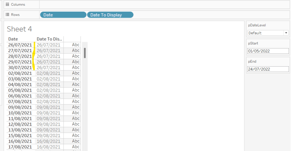
On a sheet add Patient ID. Date Start (as discrete exact date – blue pill), Date End (as discrete exact date – blue pill), Date Start Round (as discrete exact date – blue pill), Date End Round (as discrete exact date – blue pill) and Index (as discrete dimension – blue pill) to Rows and add Patient Waittime to Text.

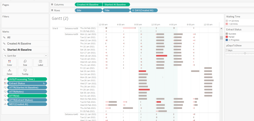
Looking at the data for Patient Id 899-89-7946 : they started waiting at 06:18 and ended at 07:17. This meant they spanned three 30 min time slots: 06:00-06:30, 06:30-07:00 and 07:00-07:30, and consequently there are 3 rows displayed, and the ’rounded’ start & end dates go from 06:00 to 07:30.

Identifying the axis to plot the 24hr time period against

Having ‘densified’ the data, we now need to get a date against each row related to the 30 min time slot it represents. ie, for the example above we need to capture a date with the 06:00 time slot, the 06:30 time slot and the 07:00 time slot.

But, as the chart we want to display is depicted over a 24hr timeframe, we need to align all the dates to the exact same day, while retaining the time period associated to each record. This technique to shift the dates to the same date, is described in this Tableau Knowledge Base article.

Date Start Baseline

DATEADD(‘day’, DATEDIFF(‘day’, [Date Start Round], #1990-01-01#), [Date Start Round])

Add this into the table, you can see what this data all looks like – note, I’m just choosing a arbitrary date of 01 Jan 1990, so my baseline dates are all on this date, but the time portions reflect that of the Date Start Round field.

With the day all aligned, we now want to get a time reflective of each 30 min timeslot. The logic took a bit of trial and error to get right, and there may well be a much better method than what I came up with. It became tricky as I had to handle what happens if the time is after 11pm (23:00) as I needed to make sure I didn’t end up returning dates on a different day (ie 2nd Jan 1990). I’ll describe my logic first.

If the Index is 0 then we just want the date time we’ve already adjusted – ie Date Start Baseline

If the Index is 1, then we need to shift the Date Start Baseline by 30 minutes. However, if Date Start Baseline is already 23:30, then we need to hardcode the date to be 01 Jan 1990 00:00:00, as ‘adding’ 30 mins will result in 02 Jan 1990 00:00:00.

If the Index is 2, then we need to shift the Date Start Baseline by 1 hour. However, if Date Start Baseline is already 23:30, then we need to hardcode the date to be 01 Jan 1990 00:30:00, as ‘adding’ 1 hour will result in 02 Jan 1990 00:30:00. Similarly, if Date Start Baseline is already 23:00, then we need to hardcode the date to 01 Jan 1990 00:00:00, otherwise we’ll end up with 02 Jan 1990 00:00:00.

As the relationship didn’t result in any instances of Index > 2, I stopped my logic there. This is all encapsulated within the calculation

Date to Plot

CASE [Index]
WHEN 0 THEN [Date Start Baseline ]
WHEN 1 THEN IIF(DATEPART(‘hour’, [Date Start Baseline ])=23 AND DATEPART(‘minute’, [Date Start Baseline ])=30, #1990-01-01 00:00:00#, DATEADD(‘minute’, 30, [Date Start Baseline ]))
WHEN 2 THEN IIF(DATEPART(‘hour’, [Date Start Baseline ])=23 AND DATEPART(‘minute’, [Date Start Baseline ])=30, #1990-01-01 00:30:00#, IIF(DATEPART(‘hour’, [Date Start Baseline ])=23 AND DATEPART(‘minute’, [Date Start Baseline ])=0, #1990-01-01 00:00:00#, DATEADD(‘hour’, 1, [Date Start Baseline ])))
END

Phew!

Add this to the table as a discrete exact date (blue pill), and you can see what’s happening.

For Patient Id 899-89-7946, we have the 3 timeslots we wanted: 06:00 (representing 06:00-06:30), 06:30 (representing 06:30 -07:00) and 07:00 (representing 07:00-07:30).

On a new sheet, add Date To Plot as a discrete exact date (blue pill) and then create

Count Patients

COUNT([Patient Id])

and add to Text and you have a list of the 48 30 min time slots that exist within a 24hr period, with the patient counts.

We need to be able to filter this based on a quarter, so create

Date Start Quarter

DATE(DATETRUNC(‘quarter’,[Date Start]))

and custom format this to yyyy-“Q”q

Add to the Filter shelf selecting individual dates and filter to 2019-Q2, and the results will adjust, and you should be able to reconcile against the solution.

Building the 30 minute time slot bar chart

On a new sheet, add Date Start Quarter to the Filter shelf and set to 2019-Q2. Then add Date to Plot as a continuous exact date (green pill) to Columns and Count Patients to Rows. Change the mark type to a bar and show mark labels.

Custom format Date To Plot to hh:nn.

We need to identify a selected bar in a different colour. We’ll use a parameter to capture the selected bar.

pSelectTimePeriod

date parameter defaulted to 01 Jan 1990 14:00 with a display format of hh:nn

Then create a calculated field

Is Selected Time Period

[Date to Plot] = [pSelectTimePeriod]

and add to the Colour shelf, adjusting colours to suit and setting the font on the labels to match mark colour.

A ‘bonus’ requirement is to make each bar ’30 mins’ wide. For this we need

Size – 30 Mins

//number of seconds in 30 mins divided by number of seconds in a day (24hrs)
(30 * 60) / 86400

Add this to the Size shelf, change it to be a dimension (so no longer aggregated to SUM), then click on the Size shelf, and set it to be fixed width, left aligned.

Via the Colour shelf, change the border of the mark to white.

Next, we need to get the tooltip to reflect the ‘current’ time slot, as well as the next time slot. For this I created

Next Time Period

IIF(LAST()=0, #1990-01-01 00:00:00#, LOOKUP(MIN([Date to Plot]),1))

This is a table calculation. If it’s the last record (ie 01 Jan 1990 23:30), then set the time slot to be 1st Jan 1990 00:00, otherwise return the next time slot (lookup the next (+1) record). Custom format this to hh:nn and add to the Tooltip shelf. Set the table calculation to compute by Date to Plot and Is Selected Time Period.

Update the Tooltip as required.

The final part of this bar chart is another ‘bonus’ requirement – to add 2 hr time interval ‘bandings’. For this I created another calculated field

2hr Time Period to Plot

IIF(DATEPART(‘hour’, MIN([Date to Plot]))%4 = 0 AND DATEPART(‘minute’, MIN([Date to Plot]))=0,WINDOW_MAX([Count Patients])*1.1,NULL)

If the hour part of the date is divisible by 4 (ie 0, 4, 8,12,16, 20), and we’re at the hour mark (minute of date is 0), then get the value of highest patient count displayed in the chart, and uplift it by 10%, otherwise return nothing.

Add this to Rows. On the 2nd marks card created, remove Is Selected Time Period from Colour and Next Time Period from Tooltip. Adjust the table calculation of the 2hr Time Period to Plot to compute by Date to Plot only. Remove labels from displaying.

The bars are currently showing all at the same height (as required) but at a width of 30 minutes. We want this to be 2 hrs instead, so create

Size – 2 Hrs

//number of seconds in 2hrs / number of seconds in a day (24 hrs)
(60*60*2)/86400

Add this to the Size shelf instead (fixing it to left again). Adjust the colour to a pale grey, and delete all the text from the Tooltip.

Hide the nulls indicator. Make the chart dual axis and synchronise the axis. Right click on the 2hr Time Period Plot axis (the right hand axis) and move marks to back.

Tidy up the chart by removing row & column dividers, hiding the right hand axis, removing the titles from the other axes. Update the title accordingly.

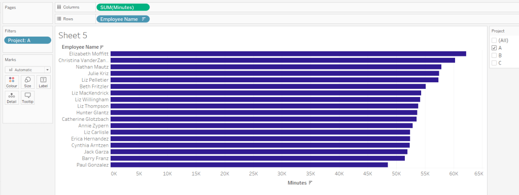
Building the Patient Detail bar chart

On a new sheet, add Is Selected Time Period to Filter and set to True. Then go back to the other bar chart, and set the Date Start Quarter Filter to Apply to Worksheets -> Selected Worksheets and select the new one being built.

Add Department Referral, Patient Id, Date Start (as discrete exact date – blue pill) and Date End (as discrete exact date – blue pill) to Rows and Patient Waittime to Columns. Manually drag the None Department Referral option to the top of the chart. Add Patient Waittime to Colour and adjust to use the grey colour palette. Remove column dividers.

The title of this chart needs to display the number of patients in the selection, as well as the timeframe of the 30 min period. We already have the start of this captured in the parameter pSelectTimePeriod. We can use parameters to capture the other values too.

pNumberPatients

integer parameter defaulted to 0

pNextTimePeriod

date parameter, defaulted to 01 Jan 1990 14:30:00, with a custom display format of hh:nn

Update the title of the Patient Detail bar chart to reference these parameters (don’t worry about the count not being right at this point).

Capturing the selections

Add the sheets onto a dashboard. Then create the following dashboard parameter actions.

Set Selected Start

On select of the 30 Min bar chart, set the pSelectTimePeriod parameter passing in the value from the Date To Plot field.

Set Selected End

On select of the 30 Min bar chart, set the pNextTimePeriod parameter passing in the value from the Next Time Period field.

Set Count of Patients

On select of the 30 Min bar chart, set the pNumberPatients parameter passing in the value from the Count Patients field, aggregated at the SUM level.

With these all set, you should find you can click on a bar in the 30 minute chart and filter the list of patients below, with the title reflecting the bar chosen.

The basic viz itself wasn’t overly tricky, once you get over the hurdle of the calculations needed for the relationship and identifying the relevant 30 min time periods.

My published viz is here. Enjoy!

Happy vizzin’!

Donna

Average Patient Wait Times

Erica set this challenge this week to provide the ability to compare the average wait time for patients in a specific hour on a specific day, against the ‘overall average’ for the same day of week, month and hour.

As with most challenges, I’m going to first work out what calculations I need in a tabular form, and then I’ll build the charts.

  • Building the Calculations
  • Building the Wait Time Chart
  • Building the Patient Count Chart

Building the Calculations

The Date field contains the datetime the patient entered the hospital. The first step is to create a field that stores the day only

Date Day

DATE(DATETRUNC(‘day’,[Date]))

From this I could then create a parameter

Choose an Event Date

date parameter, defaulted to 6th April 2020, and custom formatted to display in dddd, d mmmm yyyy format. Values displayed were a list added from the Date Day field.

I also created several other fields based off of the Date field:

Month of Date

DATENAME(‘month’,[Date])

if the Date is Friday, 10 April 2020 16:53, then this field returns April.

Day of Date

DATENAME(‘weekday’,[Date])

if the Date is Friday, 10 April 2020 16:53, then this field returns Friday.

Hour of Date

DATEPART(‘hour’, [Date])

if the Date is Friday, 10 April 2020 16:53, then this field returns 16. I added this to the Dimensions (top half) of the data pane.

The viz being displayed only cares about data related to the day of the week and the month of the date the user selects, so we can also create

Records to Keep

DATENAME(‘weekday’, [Choose an Event Date]) = [Day Of Date]
AND
DATENAME(‘month’, [Choose an Event Date]) = [Month of Date]

On a new sheet, add this to the Filter shelf and set to True. When Choose an Event Date is Monday, 06 April 2020, then Records To Keep will ensure only rows in the data set relating to Mondays in April will display. Let’s build this.

Add Hour of Date, Day of Date, Month of Date to Rows, and then also add Date as a discrete exact date (blue pill).

You can see that all the records are for Monday and April. And by grouping by Hour of Date, you can see how many ‘admissions’ were made during each hour time frame. Remove Day of Date and Month of Date – these are superfluous and I just added so we could verify the data is as expected.

The measures we need are patient count and patient wait time. I created

Count Patients

COUNTD([Patient Id])

(although the count of the dataset will yield the same results).

Add Count Patients and Patient Waittime into the table.

This is the information that’s going to help us get the overall average for each hour (the line chart data). But we also need to get a handle on the data associated to the date the user wants to compare against (the bar chart).

Count Patients Selected Date

COUNTD(IF [Choose an Event Date] = [Date Day] THEN [Patient Id] END)

Wait Time Selected Date

IF [Choose an Event Date] = [Date Day] THEN [Patient Waittime] END

Add these onto the table – you’ll need to scroll down a bit to see values in these columns

So what we’re aiming for, using the hour from 23:00-00:00 as an example: There are 3 admissions on Mondays in April during this hour, 2 of which happen to be on the date we’re interested in. So the overall average is the sum of the Patient Waittime of these 3 records, divided by 3 (650.5 / 3 = 216.83), and the average for the actual date (6th April) in that hour is the sum of the Wait Time Selected Date for the 2 records, divided by 2 (509.5 / 2 = 254.75).

If we remove Date from the table now, we can see the values we need, that I’ve referenced above.

So let’s now create the average fields we need

Avg Wait Time

SUM([Patient Waittime])/[Count Patients]

Avg Wait Time Selected Date

SUM([Wait Time Selected Date]) / [Count Patients Selected Date]

Pop these into the table

This gives is the key measures we need to plot, but we need some additional fields to display on the tooltips.

Avg Wait Time hh:mm

[Avg Wait Time]/24/60

This converts the value we have in minutes as a proportion of the number of minutes in a day. Apply a custom number format of h”h” mm”mins”

Do the same for

Avg Wait Time Selected Date hh:mm

[Avg Wait Time Selected Date]/24/60

Apply a custom number format of h”h” mm”mins”

Add these to the table.

For the tooltip we need to show the hour start/end.

TOOLTIP: Hour of Date From

[Hour of Date]

custom format this to 00.00

TOOLTIP: Hour of Date To

IF [Hour of Date] =23 THEN 0
ELSE [Hour of Date]+1
END

custom format this to 00.00.

We can now start building the charts.

Building the Wait Time Chart

On a new sheet, add Records To Keep = True to the Filter shelf. Add Hour of Date as continuous dimension (green pill) to Columns and Avg Wait Time Selected Date to Rows. Change the mark type to Bar.

Then add Avg Wait Time to Rows and change the mark type of this measure to Line. Make the chart dual axis, synchronise the axis and adjust the colours of the Measure Names legend.

Add TOOLTIP: Hour of Date From and TOOLTIP: Hour of Date To and Avg Wait Time Selected Date hh:mm to the Tooltip of the bar marks card, and adjust the tooltip accordingly.

Add TOOLTIP: Hour of Date From, TOOLTIP: Hour of Date To, Avg Wait Time hh:mm, Day of Date and Month of Date to the Tooltip of the line marks card, and adjust the tooltip accordingly.

Remove the right hand axis. Remove the title of the bottom axis. Change the title on the left hand axis. Hide the ‘9 nulls’ indicator (right click). Remove column gridlines, all zero lines, all row and column dividers. Keep axis rulers. Format the numbers on the x-axis.

Change the data type of the Hour Of Date field to be a decimal, then edit the x-axis and fix to display from -0.9 to 23.9.

Amend the title of the chart to match the title on the dashboard.

Building the Patient Count Chart

On a new sheet, add Records To Keep = True to Filter, Hour of Date as continuous dimension to Columns and Count Patients Selected Date to Rows. Change Mark Type to Bar.

Right click on the y-axis and edit the axis. Remove the title, and check the Reversed checkbox to invert the axis. Edit the x-axis and fix from -0.9 to 23.9 as before.

Add TOOLTIP: Hour of Date From and TOOLTIP: Hour of Date To to the Tooltip and adjust accordingly.

Set the colour of the bars to match the same blue of the bars in the wait time chart, then adjust the opacity to 50%.

Remove all gridlines and zero lines. Retain axis ruler for both row and columns. Retain row divider against the pane only. Hide the x-axis.

We need to display a label for ‘Number of Patients’ on this chart. We will position it based on the highest value being displayed (rather than hardcoding a constant value). For this we create a new calculated field

Ref Line

WINDOW_MAX([Count Patients Selected Date]) +1

This returns the maximum value of the Count Patients Selected Date field, adds 1 and then ‘spreads’ that value across all the ‘rows’ of data.

Add this field to the Detail shelf. Then right click on the y-axis and Add Reference Line.

Add the reference line based on the average of the Ref Line field, and label it Number of Patients. Don’t show the tooltip, or display any line.

Once added, then format the reference line, and adjust the size and position of the text.

The sheets can now be added to a dashboard, placing them above each other. They should both be set to Fit Entire View. The width of the y-axis on the Patient Count chart will need to be manually adjusted so it is in line with the Wait time chart, and ensures the Hour columns are aligned..

My published viz is here.

Happy vizzin’!

Donna

Dynamic Dates in a Heat Map

Erica set the challenge this week using a custom made dataset. The focus was to handle viewing different aggregations of the dates based on the date range selected, ie for short date ranges seeing the data at a day level, for medium ranges, view at the week level and then at a monthly level for larger ranges. This type of challenge has been set before, but the visual is typically a line chart rather than a heat map. The principles are similar though.

Determining the Date to Display

Each row in the data set has a Date associated to it. For this challenge we need to ‘truncate’ the date to the appropriate level depending on the date range and the date level selected by the user. By that I mean that if the level is deemed to be weekly, we need to ‘reset’ each date to be the 1st day of the week.

To start with, we need to set up some parameters which drives the initial user input.

pStart

Date parameter defaulted to 11/07/2022 (11th July 2022), with a display format of <weekday>, <date>

pEnd

As above, but defaulted to 24/07/2022 (24th July 2022).

pDateLevel

integer with values 0-3 as listed below, with a text Display As. Defaulted to ‘Default’. Note, I am using integers as we will be referencing them in IF statements later, and integers are more performant than comparing strings.

With these parameters, we can then build

Date To Display

DATE(
IF [pDateLevel] = 0 THEN
IF DATEDIFF(‘day’, [pStart], [pEnd]) < 28 THEN DATETRUNC(‘day’,[Date])
ELSEIF DATEDIFF(‘day’, [pStart], [pEnd]) < 90 THEN DATETRUNC(‘week’, [Date])
ELSE DATETRUNC(‘month’, [Date])
END
ELSEIF [pDateLevel] = 1 THEN DATETRUNC(‘day’,[Date])
ELSEIF [pDateLevel] = 2 THEN DATETRUNC(‘week’,[Date])
ELSE DATETRUNC(‘month’, [Date])
END
)

If the pDateLevel is set to 0 (ie Default), then compare the difference between the dates entered and truncate to the ‘day’ level if the difference is less than 28 days, the ‘week’ level if the difference is less than 90 days, else truncate to the month level (which will return 1st of the month). Otherwise, if the pDateLevel is 1 (ie Day), truncate to the day level, if it’s 2 (ie Week), truncate to the week level, else use the month level.

To see how this field is working, add Date and Date To Display to Rows, both as discrete exact dates (blue pills), display the parameter fields, and adjust the values. Below you can see that using the Default level, between 1st May and 24th July, the 1st day of the associated week against each date is displayed.

Building the Bar Chart

This is the simpler of the two charts to build, so we’ll start with this.

Add Employee Name to Rows, and Minutes to Columns. and sort by Minutes descending (just click the sort descending button in the toolbar). Add Project to Filter, select ‘A’ and then show the filter. Adjust the colour of the bars. I used #311b92

We need to restrict the data displayed based on the date range defined.

Dates to Include

[Date]>=[pStart] AND [Date]<=[pEnd]

Add this to the Filter shelf and set to True.

Now, we need to label the bars, and need new fields for this.

Duration (hrs)

FLOOR(SUM([Minutes])/60)

Using the FLOOR function means the value is always rounded down to the relevant whole number (eg 60.5 and above will still result in 60).

Format this field to be 0 decimal places with a ‘h’ suffix

Duration (mins)

SUM([Minutes])%60

Modulo (%) 60 means return the remainder when divided by 60. Format this to be 0 dp.

Add both these fields to the Label shelf, and adjust so the labels are displaying on the same line and are aligned to the left. You may need to increase the width of each row to see them.

Add Project to the Tooltip shelf and update, then remove all gridlines and the axis. Leave the Employee Name column visible for now. We’ll come back to this later.

Building the Heat Map

On a new sheet, add Employee Name to Rows and Date to Display as a discrete exact date (blue pill) to Columns. Add Minutes to Colour and a heat map should automatically display.

Go back to the bar sheet, and set both the Project and the Dates To Include filters to apply to the heat map worksheet as well (right click each pill on the filter shelf -> Apply to Worksheets -> Selected Worksheets and select the other one you’re building).

Then click the sort descending button in the toolbar, to order the data as per the bar.

Add both Duration (hrs) and Duration (mins) to the Label shelf and change the mark type to Square. Adjust the label so it is on the same line and left aligned (I added a couple of spaces to the front of the text so it isn’t so squashed).

Edit the colours of the heat map – I used a colour palette I had installed called Material Design Deep Purple Seq which seemed to match, but may not be installed by default.

Format the main heat map section to have a light grey background by right clicking on the table -> format and setting the shading of the pane only to pale grey

Then adjust the row dividers of the pane to be white, and the header to be pale grey (set the level to the max).

Adjust the column dividers similarly, setting the pane to be white, the header to none, and level to max

Next we want to deal with the column labels. By default they’re showing the date, but we want this to show something different depending on the date level being displayed.

Column Label

IF (([pDateLevel] = 1) OR (([pDateLevel] = 0) AND (DATEDIFF(‘day’, [pStart],[pEnd])<28))) THEN UPPER(LEFT([Weekday],3))
ELSEIF (([pDateLevel] = 2) OR (([pDateLevel] = 0) AND (DATEDIFF(‘day’, [pStart],[pEnd])<90))) THEN ‘w/c ‘ + IIF(LEN(STR(DATEPART(‘day’, [Date To Display])))=1,’0’+STR(DATEPART(‘day’, [Date To Display])), STR(DATEPART(‘day’, [Date To Display]))) + ‘-‘ + UPPER(LEFT(DATENAME(‘month’, [Date To Display]),3))
ELSE UPPER(LEFT(DATENAME(‘month’, [Date To Display]),3))
END

If the date level is ‘day’ or the date level is the default and the start & end are less than 28 days apart, then show the day of the week (1st 3 letters only in upper case).

Else if the date level is ‘week’ or the date level is the default and the start & end are less than 90 days apart, then show the text ‘w/c’ along with the day number (which should be 01 to 09 if the day is < 10) a dash (-) and then the 1st 3 letters of the month in upper case.

Else, we’re in monthly mode, so show the 1st 3 letters of the month in upper case.

Add this to the Columns shelf, then hide the Date To Display field (uncheck show header), hide field label for columns and hide field label for rows. Format the Employee Name field so its a different font (I changed to Tableau Book).

Again play around with the parameters and see the changes to the column label.

Finally, add Project to the Tooltip and update. You’ll need to adjust the formatting of the Date To Display field to get it into <day of week>, <date> format.

Adding to the Dashboard

When you add the two charts to the dashboard, you’ll need to set them side by side within a horizontal layout container. Remove the titles. They both need to be set to ‘fit entire view’, and the width of the heat map chart should be fixed (I set it to 870px), so it retains the space it stays in, even when you only have 1 month displayed.

Once you’re happy the order of the heat map employees matches the order of your bar chart, uncheck show header against the Employee Name field on the bar chart.

To get the bars to align with the heat map, I showed the title of the bar, removed the text and just entered a space. This dropped the bars so they just about aligned. You may need to tweak by increasing the size of the bars slightly.

Finally, you need to move your parameters around. I placed them in a horizontal container, whose background colour was set to pale grey. I then set the objects within to be equally spaced by setting the container to Distribute Contents Evenly.

I then altered the padding of each of the parameter objects to have outer padding = 0 and inner padding = 5 and added a pale grey border surrounding each.

And that should be it. My published viz is here.

Happy vizzin’!

Donna

When do extracts run during the day?

When I was approached by the #WOW crew to provide a guest challenge, I was a little unsure as to what I could do. I primarily work as a Tableau Server admin, so rarely have a need to build dashboards (which is why I like to do the weekly #WOW challenges, to keep up my Desktop skills). Then the next day I was looking at a dashboard I’d built to monitor extracts on our Tableau Servers, and I thought it would be an ideal candidate for a challenge. I also thought it would provide any users of Tableau Server with the opportunity to implement this dashboard in their own organisation if they wished, by sharing with their Server Admins.

As a Tableau Server Admin, you get access to a set of ‘out of the box’ Admin views, one of which is called ‘Background Tasks for Extracts’ which gives you a view of when extracted data sources and workbooks run on the server. However while the provided view is fine if you want to quickly see what’s going on now, it’s not ideal if you want to see how things ran over a longer timeframe – it involves a lot of horizontal scrolling.

Many server admins will have ‘opened’ up access to the Tableau repository, the PostgreSQL database which stores a rich array of data, all about your Tableau Server [see here for further info], and enables admins to extend their analysis beyond the provided Admin views. This site even provides a set of pre-curated data sources to help you get started! These aren’t formally supported by Tableau, but is the brain-child of Matt Coles, a server admin at Tableau (no relation to me though!).

My dashboard doesn’t actually use one of these data sources though. For the challenge, I’ve just created some sample, anonymised data in the required structure. I’ll explain later at the end of the post how to go about converting this to use ‘real’ server data, if you do want to plug it into your own server environment.

Understanding the data

When using Tableau Server, published data sources and workbooks can connect to their underlying data source (eg a SQL Server database, an Excel file etc) directly (ie via a live connection) or via an extract. An extract means that a copy of the data is pulled from the underlying data source and stored on Tableau Server utilising Tableau’s ‘in memory’ engine when the data is then queried. An extract gets added to a schedule which dictates the time when the extract will get refreshed; this may be weekly, daily, hourly etc. Every time the extract runs, a background task is created which provides all the relevant details about that task. The data for this challenge provides 1 row for each extract task that was created between Monday 11th Jan 2021 and Friday 5th Feb 2021. The key fields of note are:

  • Id – uniquely identifies a task
  • Created At – when the task was created
  • Started At – when the task actually started running (if too many tasks are set to run at the same time, they will queue until the server resources are available to execute them).
  • Completed At – when the task finished, will be NULL if task hasn’t finished.
  • Finish Code – indicates the completion status of the job (0=success, 1=failed, 2= cancelled)
  • Progress – supposed to define the % complete, but has been observed to only ever contain 0 or 100, where 100 is complete.
  • Title – the name of the extract
  • Site – the name of the site on the server the extract is associated to

Based on the Finish Code and Progress, I have derived a calculated field to determine the state of the extract (to be honest, I think this is a definition I have inherited from closer analysis of the Background Tasks for Extracts Server Admin view, so am trusting Tableau with the logic).

Extract Status

IF [Finish Code] = 1 AND [Progress] <> 100 THEN ‘In Progress’
ELSEIF [Finish Code] = 0 AND NOT [Progress] = 1 THEN ‘Success’
ELSE ‘Failed’
END

Building the required calculated fields

The intention when being used ‘in real life’, is to have visibility of what’s going on ‘Now’ as well as how extracts over the previous few days have performed. As we’re working with static data, we need to hardcode what ‘Now’ is. I’ll use a parameter for this, so that in the event you do choose to plug this into your own server, you only have to replace any reference to the Now parameter with the function NOW().

Now

Datetime parameter defaulted to 05 Feb 2021 16:30

The chart we are going to build is a Gantt chart, with 1 bar related to the waiting time of the task, and 1 bar related to the running time of the task. We only have the dates, so need to work out the duration of both of these. These need to be calculated as a proportion of 1 day, since that is what the timeframe is displayed over.

Waiting Time

(DATEDIFF(‘second’, [Created At], IF ISNULL(Started At]) THEN [Now] ELSE [Started At ] END))/86400

Find the difference in seconds, between the create time and start time (or Now, if the task hasn’t yet started), and divide by 86400 which is the number of seconds in a day.

We repeat this for the processing/running time, but this time comparing the start time with the completed time.

Processing Time

(DATEDIFF(‘second’, [Started At], IF ISNULL([Completed At]) THEN [Now] ELSE [Completed At] END))/86400

As mentioned the timeframe we’re displaying over is a 24 hr period, and we want to display the different days over multiple rows, rather than on a single continuous time axis spanning several days.

To achieve this, we need to ‘baseline’ or ‘normalise’ the Created At field to be the exact same day for all the rows of data, but the time of day needs to reflect the actual Created At time . This technique to shift the dates to the same date, is described in this Tableau Knowledge Base article.

Created At Baseline

DATEADD(‘day’, DATEDIFF(‘day’, [Created At], #2021-01-01#), [Created At])

And again, we’re going to need to do a similar thing with the Started At field

Started At Baseline

DATEADD(‘day’, DATEDIFF(‘day’, [Started At], #2021-01-01#), [Started At])

Putting this out into a table, you can see what this data all looks like (note, I’m just choosing a arbitrary date of 01 Jan 2021, so my baseline dates are all on this date:

Building the Gantt chart

We’re going to build a dual axis Gantt chart for this.

  • Add Site to Rows
  • Add Title to Rows
  • Add Created At to Rows. Set it to the day/month/year level and set to be discrete (ie blue pill). Format the field to custom format of ddd dd mmm yyyy so it displays like Mon 11 Jan 2021 etc
  • Add Created At Baseline to Columns, set to exact date
  • Add Waiting Time (Avg) to Size and adjust to be thin

This will automatically create a Gantt chart view

Next

  • Add Started At Baseline to Columns, set to exact date, and move so the pill is now placed to the right of the Created At Baseline pill
  • On the Started At Baseline marks card, remove Waiting Time and add Processing Time (Avg) to the Size shelf instead. Adjust so the size is thicker.
  • Set the chart to be dual axis and synchronise the axes

The thicker bars based on the Started At / Processing Time need to be coloured based on Extract Status. Add this field to the Colour shelf of the Started At Baseline marks card and adjust accordingly.

The thinner bars based on the Created At / Waiting Time need to be coloured based on how long the wait time is (over 10 mins or not).

Over Wait Time Threshold

[Waiting Time] > 0.007

0.007 represents 10 mins as a proportion of the number of minutes in a day (10 / (60*24) ).

Add this field to the Colour shelf of the Created At Baseline marks card and adjust accordingly (I chose to set to the same red/grey values used to colour the other bars, but set the transparency of these bars to 50%).

Formatting the Tooltips

The tooltip for the Waiting Time bar displays

The Created At Baseline and Started At Baseline should both be added to the Tooltip shelf and then custom formatted to h:mm am/pm

The Waiting Time needs to be custom formatted to hh:mm:ss

The tooltip for the Processing Time bar is similar but there are small differences in the display,

Formatting the axes

The dates on the axes are displayed as time in am/pm format.

To set this, the Created At Baseline / Started At Baseline pills on the Columns shelf need to be formatted to h:mm am/pm

Adding the reference band

The reference band is used to highlight core working hours between 8am and 5pm. Right click on the Created At Baseline axis and Add Reference Line. Create a reference band using constants, and set the fill colour accordingly.

Apply further formatting to suit – adjust sizes of fonts, add vertical gridlines, hide column/axes titles.

Filtering the dates displayed

As discussed above, when using this chart in my day to day job, I’d be looking at the data ‘Now’. As a consequence I can simply use a relative date quick filter on the Started At field, which I default to Last 7 days.

However, as this challenge is based on static data, we need to craft this functionality slightly differently.

We’re only going to show up to 10 days worth of data, and will drive this using a parameter.

pDaysToShow

An integer parameter, ranging from 1 to 10, defaulted to 7, and formatted to display with a suffix of ‘ days’.

We then need a calculated field to use to filter the dates

Filter : Days to Show

DATETRUNC(‘day’,[Created At]) >= DATEADD(‘day’,([pDaysToShow]-1)*-1,DATETRUNC(‘day’,[Now]))

Add this to the Filter shelf and set to True.

Additionally, the chart can be filtered by Site, so add this to the Filter shelf too.

Building the Key legend

Some people may build this by adding a separate data source, but I’m just going to work with the data we have. This technique is reliant on knowing your data well and whether it will always exist.

On a new sheet, add Site to the Filter shelf and filter to sites 7 and 9.

Create a new field

Key Label

If [Site] = ‘Site 9’ THEN ‘Waiting’ ELSE ‘Processing’ END

and add this to the Columns shelf and sort the field descending, so Waiting is listed before Processing.

Alongside this field, type directly into the Columns shelf MIN(1).

Edit the axes to be fixed to from 0 to 1. Then add the Site field to the Colour shelf and also to the Size shelf and adjust accordingly (you may need to reverse the sizes). I lightened the colour by changing the opacity to 50%.

Now hide the axes, remove row & column borders, hide the column title and turn off tooltips.

The information can all now be added to a dashboard.

Using your own data

To use this chart with your own Tableau Server instance, you need to create a data source against the Tableau postgres repository that connects to the _background_tasks (bgt) table with an inner join to the _sites (s) table on bgt.site_id = s.Id. Rename the name field from the _sites table to Site. If you don’t use multiple sites on your Tableau Server instance, then the join is not required. The sole purpose of the join is to get the actual name of the site to use in the display/filter.

You should then be able to repoint the data source from the Excel sheet to the postgres connection. You may find you need to readjust some of the colours though.

When I run this, I’m using a live connection so I can see what is happening at the point of viewing, rather than using a scheduled extract. To help with this, I add a data source filter to limit the days of data to return from the query (eg Created at <=10 days), which significantly reduces the data volume returned with a live connection.

Hopefully you enjoyed this ‘real world’ challenge, and your server admins are singing your praises over the brilliance of this dashboard 🙂

My published version is here.

If you’ve got any feedback or suggestions on improvements to enhance the viz even further, please do let me know.

Happy vizzin’! Stay safe!

Donna

Can you visualise time in a unique way?

Lorna’s challenge this week focused on how to present time data in a different way. Often visualisations involving time, use line charts to show haw a variable has changed over time. And while these are perfectly valid and serve a very necessary purpose, there are times when other insights can be gained by thinking more creatively. This whitepaper by Andy Cotgreave from Tableau, discusses other ideas too, if you want to explore further.

Anyway, back to the challenge. While not mentioned in the requirements, the Workout Wednesday ‘latest’ page, gave a clue to Lorna’s approach…

..sheet swapping. So this was already in my mind as I started to understand the requirements further. Some did complete the challenge within a single sheet, but my solution guide will involve sheet swapping.

Joining the data

Unlike most challenges, this one involved combining Superstore data with some order time data that Lorna had published. So the first thing necessary was to join the two data sets together, which was achieved with a simple inner join on Order ID

Building the Small Multiple layout

The overall display was a 3 x 4 table of months vs quarters. Each row was identified as a date quarter, which was simply QUARTER([Order Date]). For the Columns I needed to group the months of the years into the values of 1,2 or 3 which required an additional calculation:

Month Column

IF DATEPART(‘month’,[Order Date])%3 = 0 THEN 3
ELSE DATEPART(‘month’,[Order Date])%3
END

% (modulo) gives the remainder of a number when divided by x, so January which is month 1, divided by 3 results in 1; February (2) divided by 3 is 2, which March (3) divided by 3 is 0. But I want March in column 3, hence the logic above.

Plotting Month Column vs QUARTER([Order Date]) and placing the month name on Text you can see the basic layout we’re aiming for:

Determining Hour of Order

The y-axis on the chart is the hour of the order. The Time of Order is sourced from the additional spreadsheet data source we joined to above, and is stored in a string field in the format hh:mm:ss

I chose to get the hour portion of this field by using a bit of string manipulation:

Hour of Order

INT(TRIM( SPLIT( [Time of Order], “:”, 1 ) ))

This is looking at the Time of Order field, finding the 1st occurrence of a colon (:), and splitting off everything up to it. Right-clicking on the Time of Order field and selecting Transform->Custom Split, allows you to define this without writing the calculation directly

However, this will create a string field storing ’05’, or ’16’ etc in a field automatically named [Time of Order – Split 1].

TRIM( SPLIT( [Time of Order], “:”, 1 ) )

However, we need a integer field, so editing and wrapping the above automatically generated calculation with INT(), will change the data type, and ’05’ will become 5. The field is also renamed.

Orders by Day chart

Having known I was going to tackle this using Sheet Swapping, the first chart I decided to tackle was the version by Day.

For each month (each small multiple), a chart of Hour of Order by Day of Month is being displayed, and it’s a dual axis chart, where one axis is being used to present the orange circles when each order was placed, and the other the grey bar showing the range of hours in a day the orders were placed over.

Based on the small multiple display we showed earlier, we need to add Hour of Order to rows and DAY([Order Date]) set as a discrete blue pill to columns.

We now need to

  • reverse the Hour of Order axis
  • change the axis label to Hours
  • fix the axis to display every 5 hours
  • change the mark type to circle

Filter to latest year

Rather than hardcoding to the latest year of 2019, the latest year can be determined by using the Top 1 functionality of the Filter dialog. This means if the data source did change to include 2020, the chart would automatically show the data related to 2020 instead.

Colour & Size by number of Orders

A unique order is identified by Order ID, and it is possible that an order can contain more than 1 row of data, so Number of Records can’t be used. COUNTD([Order ID]) gives the require result. You can either create a dedicated calculated field to store this calculation, or you add Order ID to the Colour shelf, then change to use the Count (Distinct) aggregation

Change the colour range to use the Orange scheme. Then add COUNTD([Order ID]) to the Size shelf as well, either by reproducing the same steps above, or simply duplicating the field already on the Colour shelf by holding down Ctrl as well as clicking on CNTD([Order ID)] on the Colour shelf, and dragging onto the Size shelf.

Adding Month([Order Date]) to the Detail shelf, and the Tooltip can then be created:

<DAY(Order Date)>, <MONTH(Order Date)>

At <Hour of Order> there were <CNTD(Order ID)> orders

Range of Order Hours

I chose to use a different method from Lorna’s solution to present the range of hours in day, utilising a Gantt view instead which is a technique I’ve used many times in the past.

For this I need to identify 3 things : the maximum hour in each day an order was placed, the minimum hour in each day an order was placed, and the difference between the two.

Max Hour Per Day of Month

{FIXED [Order Date]: MAX([Hour of Order])}

Min Hour Per Day of Month

{FIXED [Order Date]: MIN([Hour of Order])}

Time Range Days

[Max Hour Per Day of Month]-[Min Hour Per Day of Month]

On my secondary axis, I then plotted Max Hour Per Day of Month as a Gantt mark type which was then Sized by -1*MIN([Time Range Days])

Setting it to be Dual Axis, synchronising the axis, ensuring the Gantt marks are ‘moved to the back‘, then hiding the 2nd axis, and you have the final chart layout.

Add Trend Line

Click the Analytics tab on the right hand side, and drag Trend Line onto the chart, dropping onto the Linear : Hour of Order lozenge (hard to screen shot this). Then format the trend line to be a dotted, grey line.

Then it’s just a case of tidying up everything; You may need to adjust the size of the marks, remove the text from the tooltip for the Gantt mark, format the font sizes, remove grid lines etc, and get rid of the unwanted headers.

Name this sheet By Day or similar.

Orders by Weekday chart

Start by duplicating the by Day chart you’ve just created, and change the DAY([Order Date]) field in the columns to WEEKDAY([Order Date]).

You’ll notice the Gantt chart is now not working properly, as it’s not spanning the range in all cases (you may need to adjust the size of the marks to see this properly).

This is because the Gantt is based at the day level and now we’re at the weekday level. We need to create some equivalent fields to work at the weekday level :

Max Hour per Weekday per month

{FIXED DATEPART(‘weekday’,[Order Date]), MONTH([Order Date]), YEAR([Order Date]): MAX([Hour of Order])}

Min Hour per Weekday per month

{FIXED DATEPART(‘weekday’,[Order Date]), MONTH([Order Date]), YEAR([Order Date]): MIN([Hour of Order])}

These fields are finding the min/max hour for each weekday, month, year combination.

Time Range Weekdays

[Max Hour PerWeekday of Month]-[Min Hour PerWeekday of Month]

It’s then a case of plotting the Gantt using the Max Hour per Weekday per month field and Size-ing by MIN([Time Range Weekdays]) * -1, following the information detailed above if need be.

Format the Weekday axis

If everything’s been changed correctly, then the Weekday version of the chart should be pretty much there, the only thing that needs tweaking is the axis which is displaying the full name of the days of the week. Right click the axis, and select format and under the Dates section, you can change to ‘Abbreviation’.

Right-click again and choose Rotate Label to get the dates displaying the right way round


and you’ve got your Weekday view – name the sheet by Weekday or similar

Sheet Swapping

On a dashboard, add a container (either vertical or horizontal, it doesn’t matter), and add both the charts to it, hiding the titles of both. Ensure both are set to Fit Entire View, but don’t worry about sizing them any further.

Create a parameter, Time Selector, which is a string listing 2 options: Days & Weeks

Then create another calculated field

Time Selected is Days

[Time Selector] = ‘Days’

which will return true if the parameter is ‘Days’ and false otherwise (ie Weeks is selected).

On the By Day sheet, choose to show the parameter control, and select the option to be Days.

Then add the Time Selected is Days field to the Filter shelf. The only option available for selection will be True. Tick this.

Then switch to the By Weekday sheet and again show the Time Selector parameter. Select the Weeks option.

Then once again, add the Time Selected is Days field to the Filter shelf. The only option available this time, will be False. Tick this.

If you switch back to the By Day sheet, you’ll find that it is now blank. Change the parameter to Days, and the chart will show, but the By Weekday sheet will now be blank.

If you go back to the dashboard, only one of the charts should now be showing. Show the parameter control, and when you change it, you should find the charts being replaced.

It should now just be a case of finalising the look of the dashboard – adding the title, formatting the parameter input and re-positioning it.

My published version of the viz is here.

Happy vizzin!

Donna