Can you create KPI cards with viz extensions?

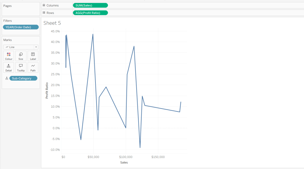
Kyle set the challenge this week to demonstrate the use of some of the free Viz Extensions available for Tableau Desktop and Tableau Public.

Creating the Sales KPI Card

After connecting the Superstore dataset, format the Sales field to be $ with 0 dp. Then on a new sheet, select the Add Extension option from the Marks drop down

In the resulting pop-up window, search for KPI and select the KPI Card (BANs) extension by LaDataViz

then click Open on the resulting window, and OK to the Allow Extension dialog displayed. You will then be presented with details on how to use the extension

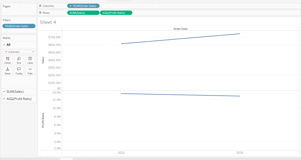
Drag Sales onto KPI and add Order Date to Time, changing the level to a continuous month (green pill).

Then click Format Extension and set each tab as below (I’ve highlighted the options I changed)

which results in

Update the Tooltip as required, then rename the sheet Sales KPI or similar

Creating the Orders KPI card

Create a new field

# Orders

COUNTD([Order ID])

Duplicate the Sales KPI sheet, then add # Orders to KPI instead of Sales. Format the extension so the KPI name is Orders (KPI tab) and remove the $ prefix from the number (Labels tab). Adjust the Tooltip as required and rename the sheet Orders KPI or similar

Creating the Profit Ratio KPI Card

Create a new field

Profit Ratio

SUM([Profit])/SUM([Sales])

and format to % with 1 dp

Duplicate the Sales KPI sheet, then add Profit Ratio to KPI instead of Sales. Format the extension so the KPI name is Profit Ratio (KPI tab) and change the number format style to percentage with 1 decimal (Labels tab). Adjust the Tooltip as required and rename the sheet Profit Ratio KPI or similar

Creating the Filter Control

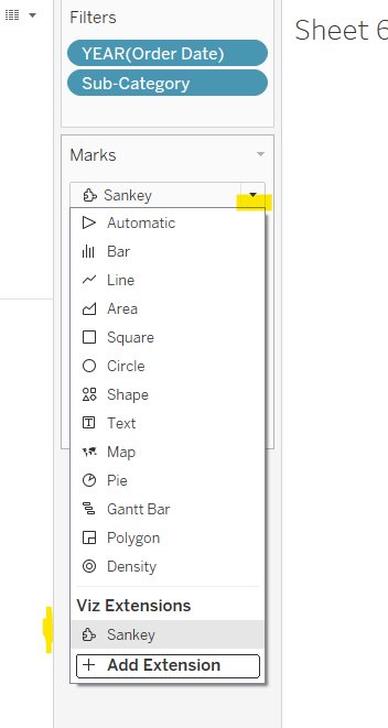
On a new sheet, select the Add Extension from the marks dropdown, and this time when prompted find the Drill Down Filter extension by LaDataViz

Then add Category and Sub-Category to the Detail shelf. Then Format Extension. I just changed the font colour (Label tab) and background colour (sheet tab)

Building the dashboard

Create a dashboard. Format the dashboard to set the background colour – I set it to a mid-dark grey (#666666) via the Format > Dashboard from the menu.

Add a horizontal container, and add the 3 KPI card sheets side by side. Set the container to distribute contents evenly.

For each KPI card object within the container, adjust the outer padding so there’s 10pt around and between each object (depending which object you’re adjusting the left/right padding may be 10 or 5pt), set the inner padding to 5pt, and set the background to match the background you used on the sheets (I used #555555).

Add the Filter sheet as a floating object, position as required and then add the Show/Hide button via the context menu of the object. Move the floating button as required too

Add a dashboard filter action

Filter

On select of the Filter sheet, target the 3 KPI sheets, excluding all values when selection is cleared.

Add any additional dashboard content – title etc, and you should now have a working filterable dahsboard

My published viz is here

Happy vizzin’!

Donna

Data Storytelling with Dynamic Zone Visibility

This week’s community challenge was set by Chiaki to showcase how to use dynamic zone visibility to tell a story. We’ll step through each chart and then how it’s all put together.

Building the line chart

Create a new field

Profit Ratio

SUM(Profit)/SUM(Sales)

and format to % with 1 dp.

Add Order Date to Filter and restrict to Years 2023 and 2024 only.

Add Order Date to Columns as a discrete (blue) pill at the year level. Add Sales to Rows and Profit Ratio to Rows. Format Sales to be $ with 0 dp. Set the screen to Fit Width.

Add Sales to the Label shelf of the Sales marks card. Add Profit Ratio to the Label shelf of the Profit Ratio marks card.

Create a new field

Profit Ratio YoY

ZN([Profit Ratio]) – LOOKUP(ZN([Profit Ratio]), -1)

and format to % with 1 dp. Add to the label shelf of the Profit Ratio marks card

Right click on the 2024 Profit Ratio mark and select Annotate > Mark. Update the text as required and reference the value of Order Date year and the Profit Ratio YoY

Click and drag the annotation to reposition, and then right click on the annotation to format, and adjust the shading to pale orange and add a thick orange border.

Hide the Order Date column heading (right click > hide field names for columns). Add a title and name the sheet Line or similar.

Building the comet chart

On a new sheet, add Sales to Columns and Profit Ratio to Rows. Add Order Date to Filter and restrict to years 2023 & 2024 only. Add Sub-Category to Detail and change the mark type to Line.

Add Order Date to Detail as a discrete (blue) pill at the Year level, and add another instance of Order Date at the Year level to Size.

Add Profit Ratio to Colour. Add Profit Ratio YoY to Tooltip and adjust the table calculation so it is computing by Year of Order Date only.

Update Tooltip as required and then add annotations to the required marks, again making references to the relevant variables. Format as before, add a title and name the sheet Comet or similar.

Building the Sankey chart

On a new sheet, add Order Date as a discrete (blue) pill to Filter and restrict to years 2023 and 20204. Add Sub-Category and restrict to Tables and Binders only.

Create a new field

Profitable

IF [Profit] >0 THEN ‘Profitable’ ELSE ‘Unprofitable’ END.

From the dropdown in the marks card, select Sankey

Then add Profitable, Order Date and Region to the Level shelf in that order. Adjust the Sort of the Profitable pill, so its sorted descending and Unprofitable is listed before Profitable.

Add Profit Ratio and Orders(Count) to the Tooltip and update accordingly. Click Format Extension and set the Level Padding and the Link Padding to 10 each.

Click on the Unprofitable box to highlight it and the subsequent flow. Add a title and name the sheet Sankey or similar.

Controlling the story

Create a parameter

Page

integer parameter from 1-4 where each number is mapped to the relevant text. Default to the text associated to 1.

Create boolean fields

Page >=2

[Page]>=2

Page >= 3

[Page]>=3

Page = 4

[Page]= 4

Building the dashboard

You need to use layout containers to build the dashboard. When using these, it’s often useful to add blank objects to help preserve the type of container you want as you add things in. These then get removed. It can be quite fiddly to get right.

For the main body of the dashboard, the section with the charts in, I started with a horizontal container that then had a vertical container on the left and the Sankey on the right. The left hand vertical container then had the line chart on the top, and another horizontal container beneath it. That horizontal container then had the comet chart on the left and a vertical container on the right, which contained the colour and size legends.

I have a habit of renaming the layout containers in the item hierarchy section, to help me identify each section

The line chart object was formatted to have a grey border, outer padding of 10 and inner padding of 20. The vertical container around the comet chart and it’s legends, was also formatted the same. And the Sankey chart object was also formatted the same.

Add a title section, and show the Page parameter as a single value list. Format this with a grey background.

Click on the layout container that contains the comet chart and it’s legends, and then from the layout tab on the left hand side, check the control visibility using value and select the Page >=2 option.

If you page control is set to 1 (Problem Statement), then this section will now disappear. Set it to the next option for it to reappear.

Click on the Sankey object, and do the same, although this time select the Page >=3 option. Again changing through the page control options, the chart will appear and disappear.

With all three charts displaying, and once you’re happy with your layout, add a floating text box and resize to cover the main chart areas. Add the relevant text, set the background colour to grey with a 97% opacity, so the charts underneath can just be seen. Then set the visibility of this to use the Page =4 option.

Cycle through the page options and see how the display changes. My published viz is here.

Happy vizzin’!

Donna

Let’s play with Table(au) Extensions!

Hot of the press with the release of 2024.3, Sean set this challenge to focus on the ability to use table extensions. As a result you will need at least v2024.3 of Tableau Desktop or Tableau Desktop Public installed. At the point of writing, this challenge cannot be completed on Tableau Public itself via web authoring though.

Build the scatter plot

Format Sales and Profit to be $ with 2 dp. Add Sales to Columns and Profit to Rows and add Customer Name to Detail. Change the mark type to circle, reduce the opacity to around 30%, add a blue border and increase the size of the marks. Format the zero lines to be more prominent. Add Segment to the Filters , select all options, and set to apply to worksheets > all using this data source

Build the table extension

On a new sheet, choose Add Extension from the marks type drop down, and on the add an Extension dialog, select the built by Tableau + Salesforce option and then select the Tableau Table option

Select Open on the next screen, and then select OK to the next dialog box.

Add Customer Name, Order Date (as a continuous exact date – green pill), Sales and Profit to the Detail shelf.

Move your mouse to be in front of the SUM(Sales) heading text, and then click on the sort icon that appears a couple of times to get the data sorted by Sales descending. Double click on the SUM(Sales) heading label and edit the label to just Sales. Repeat with the SUM(Profit) heading label.

Click on the context menu associated to the Sales column and select Format

Set the Formatting Type to be Data Bars and change the Fill colour to green

Format the Profit column to have a Formatting Type of Colour Scale and select a diverging colour palette

Click the Format Extension button on the Marks card shelf or the Table Settings icon on the formatting toolbar to load the Format Extension dialog

Change the options so Show Toolbar is Off, Show Column Filters is On and Show Excel Download is On

Adding the interactivity

Add the 2 objects into a horizontal container in a dashboard. Float the Segment filter control and verify changing the value affects both the scatter and the table.

Then add a dashboard filter action

Filter Table

On select of the Scatter, target the Table passing all fields. Show all values when selection cleared.

And that should be it. Unfortunately as Tableau Public doesn’t yet support the extension, I don’t have my published version to share.

Note – I did have some issues getting the table to ‘fit’ completely into the dashboard. I found if I used my larger second screen, ensured the application was maximised, then it would fit properly. Using the application on my laptop screen, it was sometimes a bit hit and miss. This has been raised to the development team.

Happy vizzin;!

Donna

Can you use the Sankey Viz Extension?

For this week’s challenge, Lorna set the relatively straightforward task of creating a Sankey using Tableau’s Viz Extension. The challenge may not have the complexity/nuances you might sometimes find, but at #WOW HQ, giving you the opportunity to try out new features is one of the key benefits of running this community project.

This blog will be brief:-)

Connect to the data source, and and drag Number from the Dimensions section of the data pane (above the line) to the Measures section (below the line).

On the Marks card, select to Add Extension

in the Add an Extension dialog window, select the Sankey (by Tableau) option which is likely to be the first listed (if not, search for it).

then click Open on the following screen and the marks card will change and give different buttons/shelves

Add Age group to Level. Then add Mode of former study to Level, followed by Level of qualification obtained and then Domicile.

The Levels listed from top to bottom on the marks card is represented from left to right in the Sankey on the canvas.

Add Number to Link to adjust the size of the flows between each Level.

Then press Format Extension and adjust settings as required. I set the Level Padding and the Edge Padding to 10 to increase the spacing between each ‘row’ and ‘column’. I set the colour palette to Purple-Pink-Gray and set the Level Labels font to bold.

I then adjusted the Tooltip to suit and added the sheet to a dashboard. Simples 🙂

Tableau’s documentation on Viz extensions here and my published viz is here.

Happy vizzin’!

Donna