Data Storytelling with Dynamic Zone Visibility

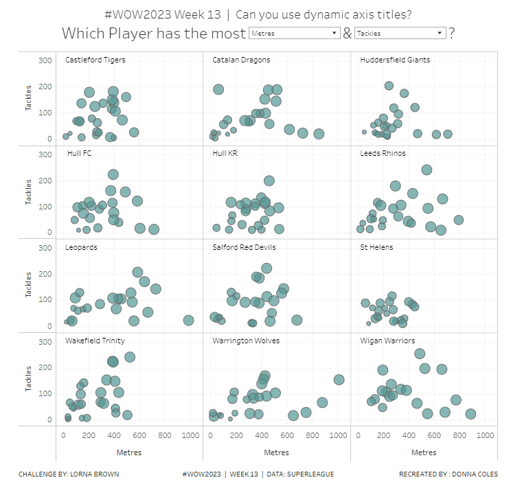
This week’s community challenge was set by Chiaki to showcase how to use dynamic zone visibility to tell a story. We’ll step through each chart and then how it’s all put together.

Building the line chart

Create a new field

Profit Ratio

SUM(Profit)/SUM(Sales)

and format to % with 1 dp.

Add Order Date to Filter and restrict to Years 2023 and 2024 only.

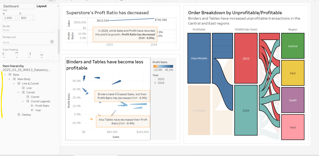
Add Order Date to Columns as a discrete (blue) pill at the year level. Add Sales to Rows and Profit Ratio to Rows. Format Sales to be $ with 0 dp. Set the screen to Fit Width.

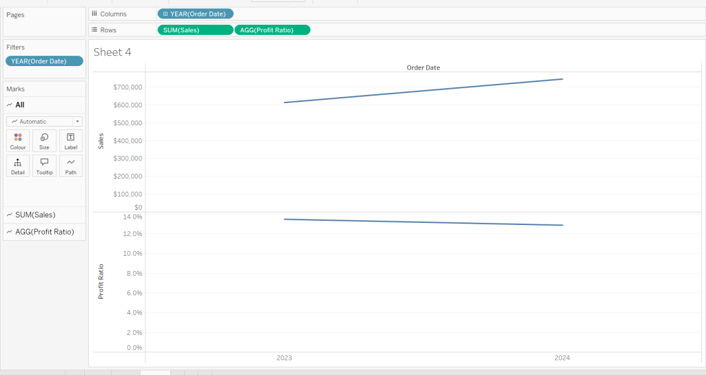
Add Sales to the Label shelf of the Sales marks card. Add Profit Ratio to the Label shelf of the Profit Ratio marks card.

Create a new field

Profit Ratio YoY

ZN([Profit Ratio]) – LOOKUP(ZN([Profit Ratio]), -1)

and format to % with 1 dp. Add to the label shelf of the Profit Ratio marks card

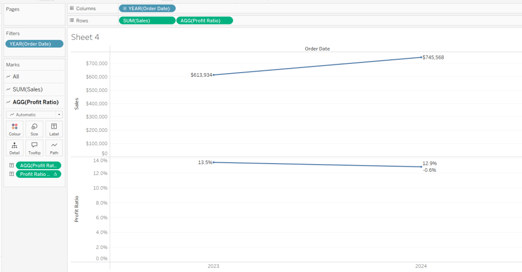
Right click on the 2024 Profit Ratio mark and select Annotate > Mark. Update the text as required and reference the value of Order Date year and the Profit Ratio YoY

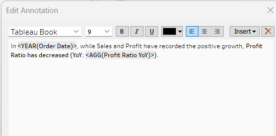
Click and drag the annotation to reposition, and then right click on the annotation to format, and adjust the shading to pale orange and add a thick orange border.

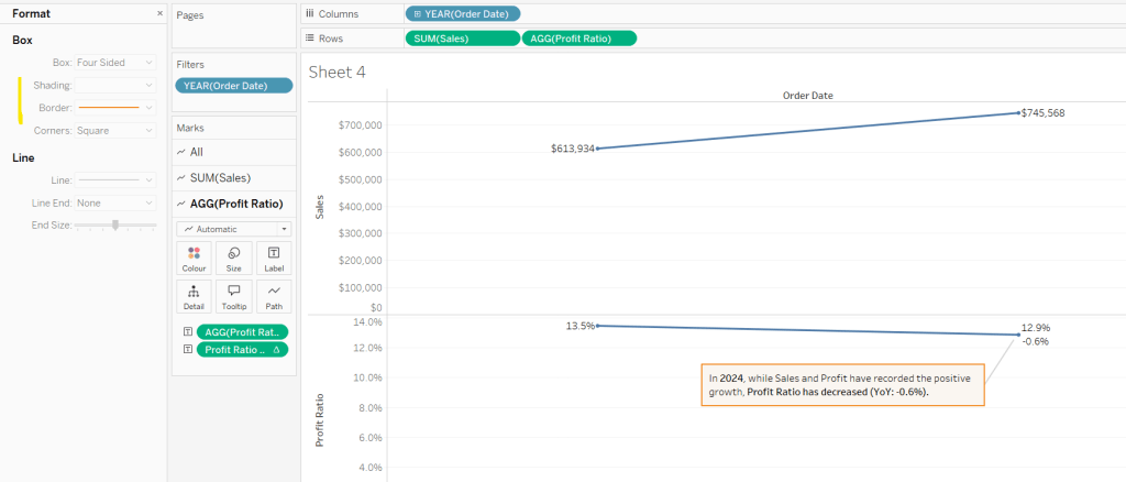
Hide the Order Date column heading (right click > hide field names for columns). Add a title and name the sheet Line or similar.

Building the comet chart

On a new sheet, add Sales to Columns and Profit Ratio to Rows. Add Order Date to Filter and restrict to years 2023 & 2024 only. Add Sub-Category to Detail and change the mark type to Line.

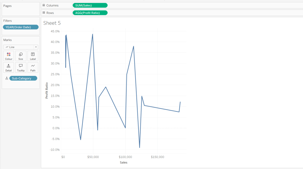
Add Order Date to Detail as a discrete (blue) pill at the Year level, and add another instance of Order Date at the Year level to Size.

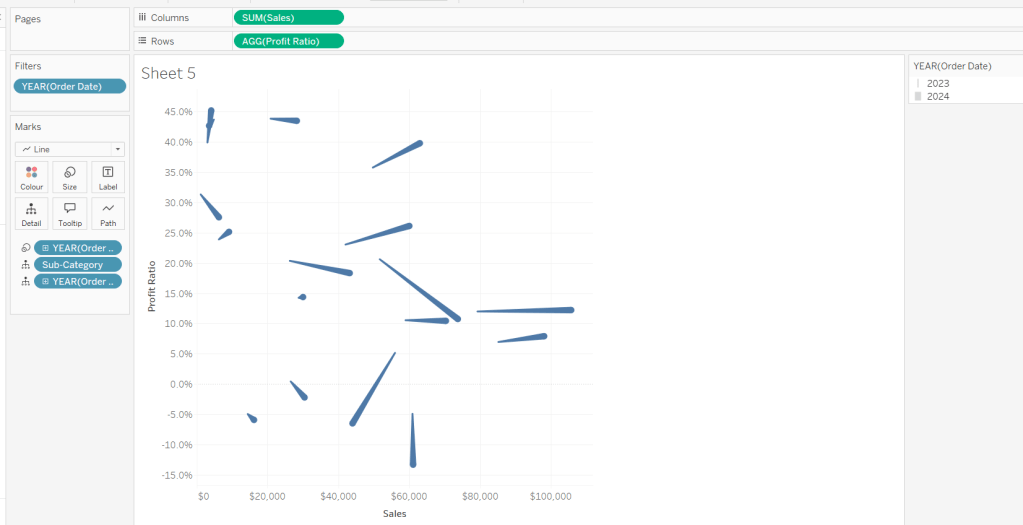
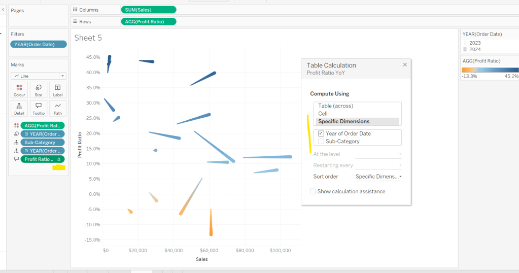
Add Profit Ratio to Colour. Add Profit Ratio YoY to Tooltip and adjust the table calculation so it is computing by Year of Order Date only.

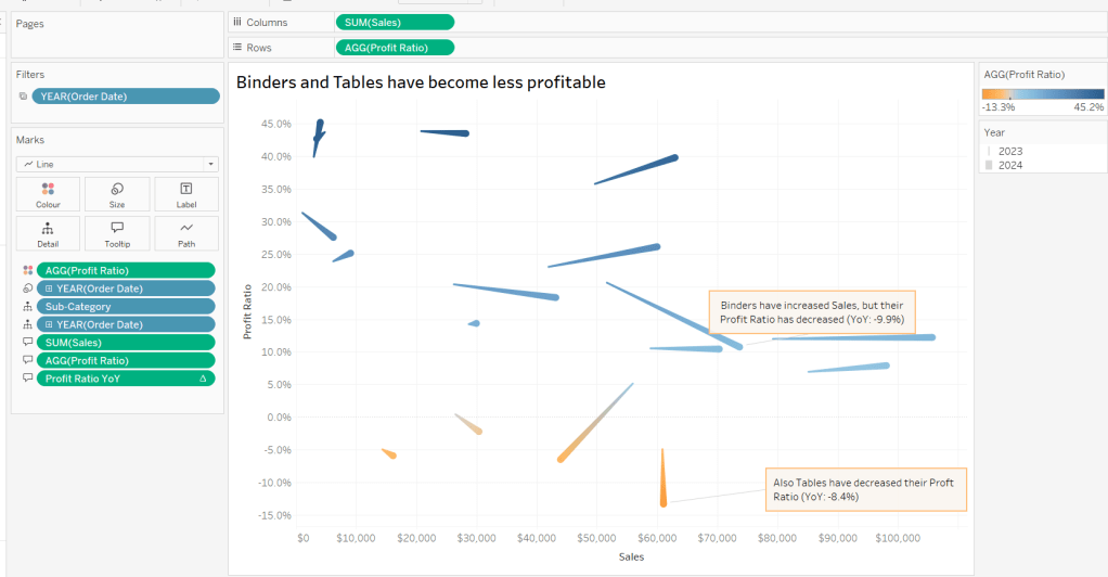
Update Tooltip as required and then add annotations to the required marks, again making references to the relevant variables. Format as before, add a title and name the sheet Comet or similar.

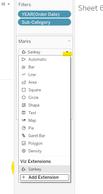
Building the Sankey chart

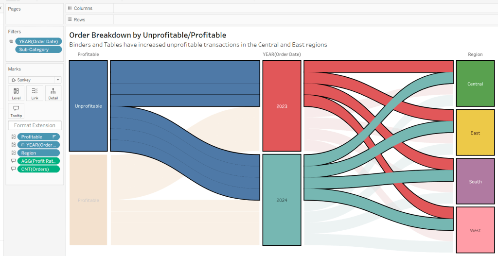
On a new sheet, add Order Date as a discrete (blue) pill to Filter and restrict to years 2023 and 20204. Add Sub-Category and restrict to Tables and Binders only.

Create a new field

Profitable

IF [Profit] >0 THEN ‘Profitable’ ELSE ‘Unprofitable’ END.

From the dropdown in the marks card, select Sankey

Then add Profitable, Order Date and Region to the Level shelf in that order. Adjust the Sort of the Profitable pill, so its sorted descending and Unprofitable is listed before Profitable.

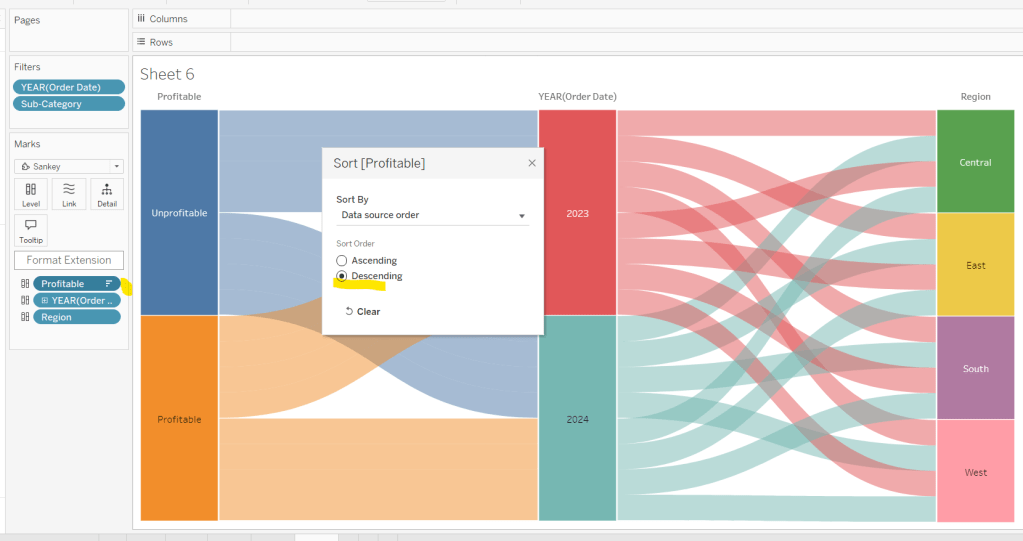
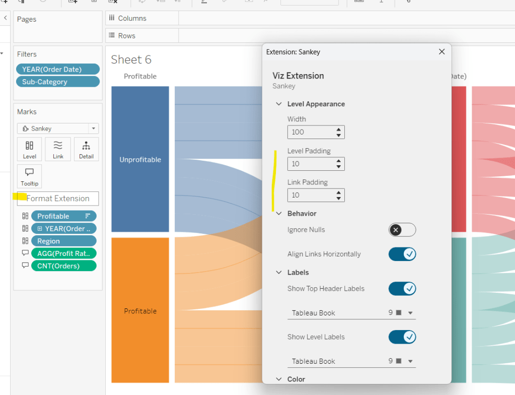
Add Profit Ratio and Orders(Count) to the Tooltip and update accordingly. Click Format Extension and set the Level Padding and the Link Padding to 10 each.

Click on the Unprofitable box to highlight it and the subsequent flow. Add a title and name the sheet Sankey or similar.

Controlling the story
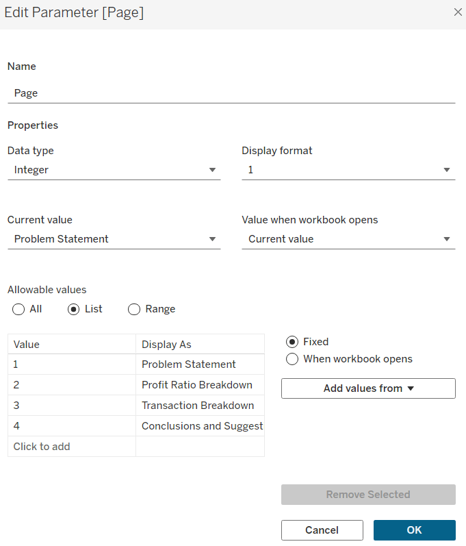
Create a parameter

Page

integer parameter from 1-4 where each number is mapped to the relevant text. Default to the text associated to 1.

Create boolean fields

Page >=2

[Page]>=2

Page >= 3

[Page]>=3

Page = 4

[Page]= 4

Building the dashboard

You need to use layout containers to build the dashboard. When using these, it’s often useful to add blank objects to help preserve the type of container you want as you add things in. These then get removed. It can be quite fiddly to get right.

For the main body of the dashboard, the section with the charts in, I started with a horizontal container that then had a vertical container on the left and the Sankey on the right. The left hand vertical container then had the line chart on the top, and another horizontal container beneath it. That horizontal container then had the comet chart on the left and a vertical container on the right, which contained the colour and size legends.

I have a habit of renaming the layout containers in the item hierarchy section, to help me identify each section

The line chart object was formatted to have a grey border, outer padding of 10 and inner padding of 20. The vertical container around the comet chart and it’s legends, was also formatted the same. And the Sankey chart object was also formatted the same.

Add a title section, and show the Page parameter as a single value list. Format this with a grey background.

Click on the layout container that contains the comet chart and it’s legends, and then from the layout tab on the left hand side, check the control visibility using value and select the Page >=2 option.

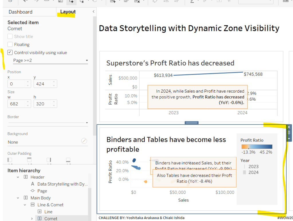
If you page control is set to 1 (Problem Statement), then this section will now disappear. Set it to the next option for it to reappear.

Click on the Sankey object, and do the same, although this time select the Page >=3 option. Again changing through the page control options, the chart will appear and disappear.

With all three charts displaying, and once you’re happy with your layout, add a floating text box and resize to cover the main chart areas. Add the relevant text, set the background colour to grey with a 97% opacity, so the charts underneath can just be seen. Then set the visibility of this to use the Page =4 option.

Cycle through the page options and see how the display changes. My published viz is here.

Happy vizzin’!

Donna

Can you build this segmented bar chart?

My #WOW2024 challenge this week, was to recreate this bar chart which displayed the total value in conjunction with the values split by another dimension, in this instance year. It was inspired by Sam Parsons’ film franchises viz.

The viz is built on a single sheet, and only uses 3 fields from the data set, the Order Date the Sub-Category and the Sales value.

Let’s build…

On a new sheet, add Sub-Category to Rows and Sales to Columns and sort by Sales descending. Add Order Date to Colour to build a basic stacked bar chart.

We need to be able to show two bars directly ‘side by side’, but with different properties, so we need to end up with 2 marks cards. The ‘heights’ of the bars need to differ, so we’re going to create a ‘fake axis’ on Rows to help.

Double click into the Rows shelf and manually type MIN(0.5)

Change the mark type to bar. Each bar is now positioned based on it’s specific value (ie not stacked).

To get the bars to be positioned where we want them, apply a Running Total Quick Table Calculation to the Sales pill in the Columns shelf. Then edit the table calculation so that is computes by Year of Order Date only.

Add Sales to the Size shelf, and edit the size to be Fixed and aligned Right. You should now have a stacked bar effect.

Add Sales to Tooltip, then add a Percentage of Total quick table calculation. Edit the calculation so it is computing by Year of Order Date.

Adjust the Tooltip to reference the relevant details (note in the above gif, and my original published version, at some point the labelling went awry and the label was showing the cumulative sales value, and not the value for that year).

So now we’ve managed to build a segmented bar chart in a ‘different way’ by using an axis and the size field. We build on this to get the total bar. As this bar needs to be wider than the segmented bar, double click into the Rows shelf and type MIN(1.5), then from the MIN(1.5) marks card, remove the Order Date field from Colour. We now have 2 bars – 1 segmented and 1 not.

Make the chart dual axis and synchronise the axis, then right click on the right hand axis and move marks to back.

On the Min(0.5) marks card, move Order Date from Colour to Detail. Then on the All marks card, click on the Colour shelf and adjust the colour to suit (I set to #dec7b6) and add a white border.

Adjust the Tooltips on both marks cards so the MIN(1.5) is just showing the Sub-Category and Sales value, while the MIN(0.5) card is showing the Order Date year and % of sales value as well.

Narrow the width of the rows. Hide the right hand and the bottom axis (uncheck show header).

We want to make each pair of bars more distinctive, by providing more space between them. Edit the axis to fix the axis from -0.3 to 1.5.

Now hide the axis, and the Sub-Category column heading (right click label and hide field label for rows). Remove all row/column divider lines, zero lines and gridlines. Set the worksheet background colour (I used #fefaf1). Adjust the colour/style of the Sub-Category labels (I used bold, brown) and align top right.

And ta-dah! this should be your finished viz. My published version is here.

We’re going to building on this in a later challenge (I felt putting it all together in a single challenge might be a bit much), so look out for Part 2 in a few weeks time.

Happy vizzin’!

Donna

Can you use dynamic axis titles?

Lorna used this week’s challenge to showcase a new feature in Tableau v2023.1 – dynamic axis titles. As you can expect, you’ll therefore need this version of Desktop (or later if you’re reading this in the future ;-)) to complete the challenge.

Modelling the data

Download the file Lorna provided and connect to the 2023 sheet. Lorna hinted that a pivot would help, so in the data source canvas, multi-select all the measures (ctrl-click each column – there are several) then right-click and Pivot.

Rename Pivot Field Names to Measure and rename Pivot Field Values to Value.

Building the Basic Scatter Plot

We need 2 parameters to control the selection of the measures we want to display in the scatter plot. Right click on Measure > Create > Parameter

pMeasure1

string parameter defaulted to Metres, and all the possible other values should be listed

Repeat the steps again to create pMeasure2 which is defaulted to Tackles

To determine the value to plot on the axes based on the selections from the parameters we need

X-Axis Value

IF [pMeasure1] = [Measure] THEN
IF [Value] <> 0 THEN [Value] END
END

Note – the additional nested IF was added as I discovered while playing with the Lorna’s solution that marks didn’t display when the value was zero.

Similarly we need

Y-Axis Value

IF [pMeasure2] = [Measure] THEN
IF [Value] <> 0 THEN [Value]END
END

Add X-Axis to Columns, Y-Axis to Rows, Team Name to Rows and Name to Detail. This will give a basic scatter plot.

Change the mark type to circle, adjust the colour, and reduce the opacity to around 70%. Add a grey border to the circles.

The size is based on the number of games the player has played, so we need

Count Games

COUNTD([Game ID])

Add this to the Size shelf.

Adjust the Tooltip so it references the parameters and the other relevant fields

To change the axis titles, edit the x-axis (right click axis > edit axis) and from the menu arrow next to the word ‘custom’, select the pMeasure1 option.

Repeat the same for the y-axis, but select pMeasure2 instead.

Making the small multiples

For this we need to define which row and column each Team Name should sit in. As we’ve only got 12 teams to work with, and that number is static, and we know we’re working with a 3×4 grid, I’m going to ‘hardcode’ this a bit rather than use more dynamic calculations.

To see what’s going on, on a new sheet add Team Name to Rows. Then create a new field

INDEX

INDEX()

and add this to Rows and convert to discrete. It should provider a counter from 1 to 12 for each Team Name.

Based off this INDEX value we’ll work out which row and colum each team will sit.

Column

(INDEX()-1) % 3

Row

IF [INDEX]<=3 THEN 1
ELSEIF [INDEX]<=6 THEN 2
ELSEIF [INDEX]<=9 THEN 3
ELSE 4
END

Add these to the table as blue discrete pills

Back onto the scatter plot sheet, add Row to Rows as a blue discrete pill, add Column to Columns as a discrete pill, and move Team Name to Detail. Modify the table calculation settings of both the Row and the Column pill so that the calculation is computed using Team Name and Name (in that order) and at the level of Team Name

Hide the Column and Row pills (uncheck Show Header)

Adding the Team Name title

Create a new field

Ref Line

WINDOW_MAX(SUM([Y-Axis Value])) * 1.1

and add this to the Rows. This will create a second marks card. Set the table calcuation of the Ref Line pill to compute using Name and Team Name (in that order).

On the Ref Line marks card, remove the pill from the Size shelf, change the mark type to gantt bar, and reduce the size to the smallest possible, set the opacity to 0%, and border to none.

Add Team Name to the Label shelf, then set to label min/max values, by the X-Axis Value field and Label Minimum value only.

Each team name should only be displayed once. Edit the text of the label and add a few spaces to shift the label across and align it better.

Edit the Tooltip of this marks card, and delete all the text. Now make the chart dual axis and synchronise the axis. Then remove Measure Names from the All marks card, and hide the right hand axis.

Finally remove the 0 lines from displaying, and hide the nulls indicator (right click). Add the chart to a dashboard, and position the parameters as floating objects within the text of the title. I just used spaces within the text to leave room for where I wanted to place the parameterss.

And that should be it. My published viz is here.

Happy vizzin’!

Donna

Can you use multiple mark layers?

Lorna Brown provided a refresher on map layers and spatial calculations for the #WOW2022 challenge this week. You’ll need Tableau Desktop v2020.4 or later to complete this due to the functionality incorporated.

The data set provided contains rows of origin & destination airports including the latitude and longitude values for each.

I found there were some fields in the provided data set which I don’t think should have been there. It meant when I came to naming some of my fields, I had to be more creative due to the existing ones.

We’ll start off by setting up the calculations required.

Firstly we need to create a spatial object out of our Origin and Destination airports.

Origin

MAKEPOINT([Origin Latitude],[Origin Longitude])

Destination

MAKEPOINT([Destination Latitude],[Destination Longitude])

Next we’re going to need to have a line to connect these

Origin-Dest Line

MAKELINE([Origin],[Destination])

We’re going to need ‘buffer’ to define the circle displayed. The size of this is to be defined by the user, so we’ll need a parameter

pBufferSize

integer parameter defaulted to 1000

and with this, we can then define the buffer

Buffer from Origin

BUFFER([Origin],[pBufferSize], ‘miles’)

Finally we need to determine whether the destination airport is within the buffer ‘zone’.

Within Buffer

[Distance (Miles)]<=[pBufferSize]

Note: Distance (Miles) already existed within the downloaded data set. I was expecting to have to calculate the distance myself, given the nature of the challenge. If I had had to create it, I would have used the calculation DISTANCE([Origin], [Destination], ‘miles’)

This is all we need to build the viz. I’m going to start from the top – down ie Origin airport -> Destination airport -> Lines – >Buffer.

On a new sheet, add Origin Airport to Filter and set to LAS. Also add Within Buffer to the Filter shelf and set to True.

Then drag Origin onto the main canvas area and drop it when you see ‘Show Me’ displayed on the cursor. This will automatically add all the required fields into the relevant locations

Change the mark to a circle, increase the size and set the colour to black. Add Origin Airport to Label and Origin Name to Tooltip, and adjust the tooltip accordingly.

This is the first map layer.

Now drag Destination onto the canvas and drop it on the ‘stacked layer’ icon when you get the Add a Marks Layer option appear

This will create a new marks card on the left, and is the 2nd marks layer.

Add Destination Name to the Detail shelf, then change the mark type to square. Add Destination Airport, Origin Airport and Distance (Miles) to Tooltip and adjust tooltip to match.

Finally move the Destination marks card so it is below the Origin marks card. Click on the Destination card and drag to below the Origin card and drop when you see the orange line appear

Now drag Origin-Dest Line onto the canvas and drop it on the ‘stacked layer’ icon when you get the Add a Marks Layer option appear to create the 3rd marks layer. This will add all the ‘spokes’.

Change the colour to grey. Add Destination City to the Detail shelf. Add Origin Name, Origin Airport, Distance (Miles) and Destination Airport to the Tooltip and adjust accordingly. Finally, drag this marks card so that it is now below the Destination marks card.

Final layer now – the buffer zone.

Drag Buffer from Origin onto the canvas and drop it on the ‘stacked layer’ icon when you get the Add a Marks Layer option appear to create the 4th marks layer. Adjust the colour to light grey, and reduce the opacity to suit. Then move this marks card to the bottom, so its beneath the Origin-Dest Line marks card.

And that’s it. Add the sheet onto a dashboard, and show the Origin Airport filter as a Single Value dropdown so only 1 origin airport can be selected at a time. I also customised the control so the All option did not display either. Add the pBufferSize parameter to the display too, and test the viz by changing the size and the airport.

My published version of the viz is here.

Happy vizzin’!

Donna

Do you want to build a simple Sales dashboard?

This week’s challenge was the first challenge to be set by guest author Meera Umasnakar, and is mainly a formatting/layout challenge.

The requirement was to show some month to date / year to date metrics in comparison to the previous month to date, and also work out where the current month might finish.

I took up the challenge on Weds 25th March, and the challenge was dated ‘as at 24th March’. There was nothing in the requirements to indicate whether this was ‘hardcoded’ to this date, or whether it happened to be this date based on the time I viewed (ie it was yesterday, the last full day). In the interest of being ‘flexible’ I therefore chose to design my solution more dynamically. I based my challenge on viewing the data up to ‘yesterday’, where ‘yesterday’ is yesterday’s date in 2019. So if today is 27 March 2020, then the dashboard will be based up to 26 March 2019. Hope that’s clear.

As a result of this, there’s a fair few date calculations involved, so let’s crack on.

Setting up the calculations

I like to build up my calculations so they’re easier to read, rather than nest everything. First up we need

Current Year

{MAX(YEAR([Order Date]))}

The maximum year in the data set (which happens to be 2019 for the data source I’m connected to).

Yesterday

MAKEDATE([Current Year],MONTH(TODAY()),DAY(TODAY()))-1

Fake the date based on today’s date (see discussion above).

Current Month

DATETRUNC(‘month’, [Yesterday])

returns yesterday’s date to be 1st of the month eg 26th March 2019 becomes 1st March 2019

Current MTD Sales

IF DATETRUNC(‘month’,[Order Date]) = [Current Month]
AND [Order Date]<=[Yesterday] THEN [Sales] END

If the order date is between the 1st of the month and yesterday, then capture the Sales value.

We can repeat for profit

Current MTD Profit

IF DATETRUNC(‘month’,[Order Date]) = [Current Month]
AND [Order Date]<=[Yesterday] THEN [Profit] END

Current YTD Sales

IF YEAR([Order Date]) = [Current Year] AND [Order Date]<=[Yesterday] THEN[Sales] END

If the order date is within the latest year, but also less than today, then capture the Sales value.

Again repeat for profit

Current YTD Profit

IF YEAR([Order Date]) = [Current Year] AND [Order Date]<=[Yesterday] THEN[Profit] END

Format all of these to $ with 1 decimal place.

To work out the numbers we need for the previous month, we need some further dates

Yesterday Previous Month

DATEADD(‘month’,-1,[Yesterday])

Just takes 1 month off of yesterday’s date.

Previous Month

DATETRUNC(‘month’, [Yesterday Previous Month])

gets back to the 1st of the previous month’s date.

Previous MTD Sales

IF DATETRUNC(‘month’,[Order Date]) = [Previous Month]
AND [Order Date]<=[Yesterday Previous Month] THEN [Sales] END

If the order date is within the previous month, but only up to the equivalent day of the month (previous month to date), then capture the Sales value.

Previous MTD Profit

IF DATETRUNC(‘month’,[Order Date]) = [Previous Month]
AND [Order Date]<=[Yesterday Previous Month] THEN [Profit] END

Format both of these to $ and 1 decimal place

MoM Sales

SUM([Current MTD Sales])-SUM([Previous MTD Sales])

Month on Month Sales, is just the difference between the two variables.

Similarly for profit

MoM Profit

SUM([Current MTD Profit])-SUM([Previous MTD Profit])

Both these need custom formatting applied

▲”$”#,##0,.0K;▼”$”#,##0,.0K

To get this, use the formatting to set to $ and 1 decimal place, then once set, change the format to ‘custom formatting’, which will display the ‘formatting code’. Then add the ▲▼ symbols. I use this site to get the characters I need.

The final calculation we need to work out is what’s been referred to as the ‘run rate’. This is basically trying to show what the final month sales/profit will be, based on the current rate. This means taking the current MTD Sales/Profit, dividing it by the number days this has been computed over to get an average sales/profit per day. Then this number is multiplied by the number of days in the month. Got it?

So we need to start by working out….

Days in Current MTD

DAY([Yesterday])

This just returns the number of the day.

Days in Current Full Month

DATEDIFF(‘day’, DATETRUNC(‘month’, [Yesterday]), DATEADD(‘month’,1,DATETRUNC(‘month’, [Yesterday])))

This is counting the number of days between the 1st of the month (based on yesterday), and the 1st of the next month.

Run Rate Sales

(SUM([Current MTD Sales])/SUM([Days in Current MTD])) * SUM([Days in Current Full Month])

Run Rate Profit

(SUM([Current MTD Profit])/SUM([Days in Current MTD])) * SUM([Days in Current Full Month])

Format these to $ and 1 decimal place.

This gives us all of the core calculations we need to build the KPIs.

Building the KPI card

This is done on one sheet, and is simply utilising the Text mark type.

By typing in, create a pill MIN(0) on the Rows shelf, and another one right next to it. Change the mark type to Text. This gives you 2 ‘cards’ you can now use. Add the all Sales related calculated fields to the Text shelf of the first card, and the Profit fields to the second card, and just format the font/layout accordingly. Then remove the axis headers, gridlines etc etc.

Building the Sales YoY Bar Chart

To ensure we only have the dates for the last 2 years, up to the current point in time, we need some additional fields

Previous Year

[Current Year]-1

Dates To Include

YEAR([Order Date])>= [Previous Year] AND [Order Date]<= [Yesterday]

Add Dates To Include to the Filter shelf and set to True.

Now build the viz by

  • Sales on Rows
  • Order Date on Columns, set to the Month level only (discrete blue pill).
  • Mark Type = bar
  • Order Date on Colour, set to Year level. Adjust colours to suit
  • Order Date on Size, set to Year level. Adjust size to suit so the latest year is narrower.
  • Set Stack Marks = Off (Analysis -> Stack Marks). This will stop the bars for each year from sitting on top of each other.
  • Format the Order Date axis, so the Month is displayed as 1st letter only.
  • Format the Sales axis so the value is displayed to K with no decimal places.
  • Due to the above, the format of the Sales value on the tooltip is likely to change too. If this happens, duplicate the Sales field, rename it to Tooltip – Sales or similar and format to $ with 0 dp. Add this to the Tooltip shelf.
  • You’ll need to do similar to get a month field for the tooltip. Create a calculated field Tooltip-Month = DATETRUNC(‘month’,[Order Date]) and custom format this to mmm yy. Add this to the Tooltip shelf.

Repeat the same steps to build the YoY Profit chart.

Date Sheet

The final dashboard indicates the date of the report. As my dashboard is dynamic and changes based on the current date, I couldn’t hardcode this. So I built the date to display on another sheet. This means I have 1 more sheet than stated in the challenge.

I simply added Yesterday to the Text shelf and referenced it

Building the Dashboard

Here we get into a bit of container fun! As I did last week, I’ll try to just step through the order you need to place the objects on the dashboard…

  • Add a Text object to store the title.
  • Beneath it, add the Date sheet.
  • To the right of both of these, add another Text object to store the sheet information text which will be displayed top right.
  • Add a Horizontal container beneath all of the above. Set the background of this container to light grey, and Inner Padding to 10 all round
  • Add the KPI sheet into the container and remove the title. Adjust the height of the objects to suit.
  • Now add a Vertical container to the right of the KPI chart. Adjust width to suit
  • Add the Sales YoY chart to the vertical container. Set the background of this object to white, so the title background isn’t grey.
  • Add the Profit YoY sheet below the Sales one. Again set the background of this to white.
  • Remove the container on the right hand side that contains the legends.
  • Add a floating blank object to the sheet. Set the background of this to light grey, and then adjust the positioning and height and width so it’s splitting your KPI card.
  • Finally if you haven’t already, edit the title and summary text appropriately.

And that should be it! My published viz is here.

Happy vizzin’!

Donna