For this week’s challenge, Kyle took the challenge I posted the previous week about building a radar chart with map layers, and used a viz extension to build the chart instead – a stroke of genius!
If you want to use this method within your organisation for use on Tableau Cloud or Tableau Server, you’ll need to factor in licensing costs for the extension, and you also might need to agree access with your security team. The map layer solution I blogged about here, works as part of the product itself.
After connecting to the dataset (I used the Engagement Survey Data – Filled sheet), click Add Extension from the marks card dropdown
search for radar in the resulting Add an Extension dialog, and then select the Radar option by LaDataViz. and then select Open on the resulting screen
The presented sheet will give some prompts to get started, but due to the requirements of this challenge, we need to build some calculations first.
The user need to be able to select the business function (Area) to display, so right click Area and then Create Parameter to create
pSelectArea
string parameter defaulted to Whole Company. As the parameter is created from a field, the list of available options is pre-populated. Delete the Benchmark entry from this list.
We only want the selected Area and the ‘Benchmark’ option to display on the chart, so create
Area to Display
[Area]=’Benchmark’ OR [Area] = [pSelectArea]
Add this the Filter shelf and set to True
The chart displays the ‘Benchmark’ as an area bounded by a dashed line. This is achieved by setting the Benchmark value as a target, so we need to define that value in its own calculation
Target
IF [Area]=’Benchmark’ THEN [Value] END
set this to % with 0 dp.
We also want to isolate the values associated with the selected area too
Selected Value
IF [Area] = [pSelectArea] THEN [Value] END
set this to % with 0 dp too.
Add Themes to the Spokes shelf, Selected Value to the Values shelf and Target to the Target shelf
We’ve got all the info we need, now just to format the display, so select Format Extension and apply the following properties
Radar tab
Line Style = Linear
Fill opacity = 10
Range: uncheck auto, set min =0, max = 1
Marker = None
Expand the Target section, and set Fill Opacity = 2
Grid tab
#Lines = 10
Spacing = 0
Style = Straight
Labels tab
Spokes section : Orientation = Horizontal
Labels section : check the Labels checkbox, Font style = bold
Number format : Style = Percentage
Expand the Axis section, check the Axis Labels checkbox,
Line: uncheck the Show Line checkbox
Number Format : style = percentage
Finally, adjust the Tooltip, and then that should be it – just need to add to dashboard and show the pSelectArea parameter
It’s back to the EFL this week for my #WOW challenge. Once again I’ve tried to provide a multi-level challenge – a version that uses some core skills and features, and a version that just pushes the display a bit further, just for fun. I’ll start with the core build and then use that as the base for the bonus challenge.
Setting up the parameters
The main crux of this challenge is measure swapping, so for this we need a parameter
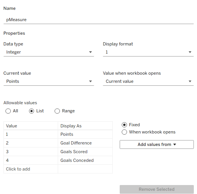
pMeasure
integer parameter listing values 1 to 4 which are aliased as per the screen shot below. Default value is 1 (Points).
Note – you can use a string parameter with the actual words. I just chose to use this method to demonstrate the aliasing ability. Also when referencing this parameter in a CASE statement (which we’ll do shortly), using integer values for comparisons is slightly more efficient than string comparisons.
We also need the user to have the ability to select the team they want to track
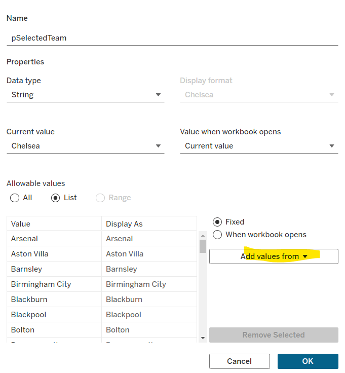
pSelectedTeam
string parameter defaulted to your preferred team (I chose Chelsea). This is a List parameter that is populated from the Team field via the Add values from button
Building the calculations
We need to determine the measure to display based on the parameter selection
Measure to Display
CASE [pMeasure] WHEN 1 THEN SUM([Cumulative Points]) WHEN 2 THEN SUM([Cumulative Goal Difference]) WHEn 3 THEN SUM([Cumulative Goals For]) WHEN 4 THEN SUM([Cumulative Goals Against]) END
We also will need to colour the bars based on the selected team
Is Selected Team
[Team]=[pSelectedTeam]
and we need to sort the data based on best to worst, but need to consider that for Goals Conceded, the higher the value the worse the team is.
Sort Measure
IF [pMeasure] = 4 THEN [Measure to Display]*-1 ELSE [Measure to Display] END
We only want to show teams once they start participating in a Season. For this, we need to identify the team’s 1st season in the EFL
1st Season per Team
{FIXED [Team]: MIN(IF [Cumulative Points] > 0 THEN [Season End Year] END)}
and then we can create a field we can filter on, based on this
Show Team
[Season End Year]>=[1st Season per Team]
We only want to show a label against the 1st team and the selected team, so create
Label to display
IF MIN([Is Selected Team]) OR FIRST()=0 THEN [Measure to Display] END
and finally, we need to display the value of the current season’s measure on the tooltip, as well as the cumulative value, so we need another case statement
Tootltip Measure
CASE [pMeasure] WHEN 1 THEN SUM([Points]) WHEN 2 THEN SUM([Goal Difference]) WHEn 3 THEN SUM([Goals For]) WHEN 4 THEN SUM([Goals Against]) END
Building the core bar chart
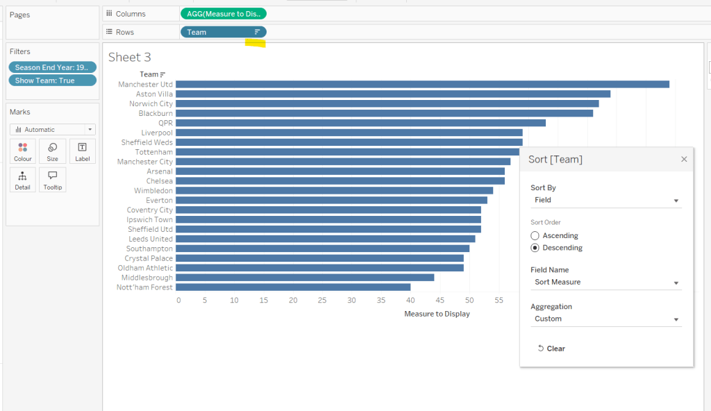
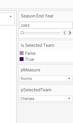
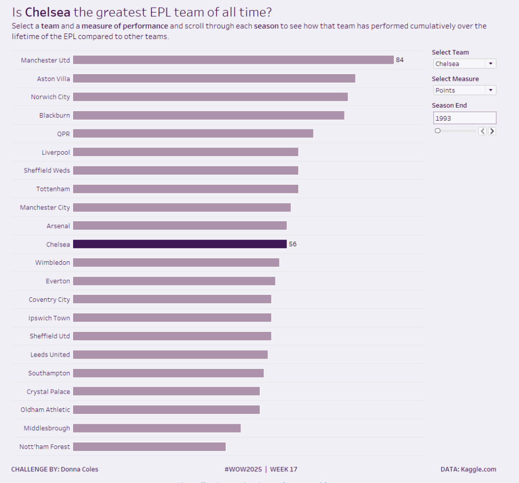
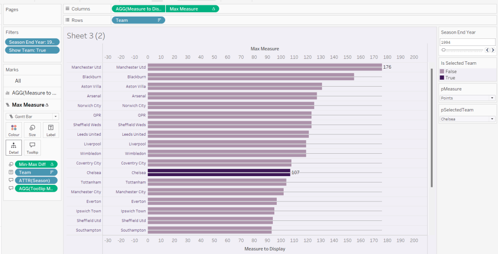
On a new sheet, add Team to Rows and Measure to Display to Columns. Add Season End Year to Filter and select 1993. Add Show Team to Filter and select True. Apply a sort to the Team field to sort by the field Sort Measure descending.
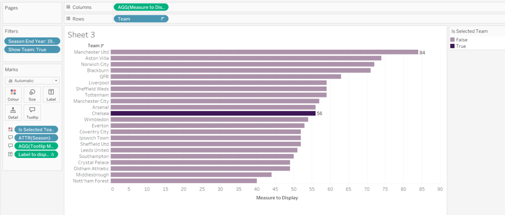
Add Is Selected Team to Colour and adjust accordingly. Add Label to display to Label. Add Season and Tooltip Measure to Tooltip and update accordingly,
Show the pMeasure and pSelectedTeam parameters and the Season End Year Filter. Adjust the Season End Year filter control so that the All option isn’t available and it displays as a single value slider control.
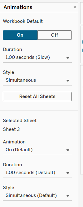
Move the Season End Year filter control on by one value and notice how the chart transitions. Adjust the Animations settings (Format menu > Animations) to be sequential and slow
Finally tidy up the display by
hiding the Measure to Display axis (right click > uncheck show header)
hiding the Team row label (right click > hide field labels for rows)
widen each row a bit
hide gridlines, zero lines, axis rulers and axis ticks
add pale grey row dividers
set the background colour of the worksheet
adjust the font of the row labels – I used Tableau Book 8pt in colour #3e1756 (dark purple)
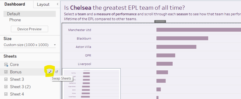
Name the sheet Core or similar and add to a dashboard setting it to Fit Entire View
Add a title to the dashboard that references the pSelectedTeam parameter.
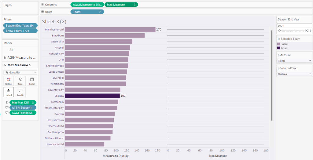
We’re going to use a gantt bar to simulate a central line for each row. This bar needs to extend to the largest measure in the table for every row, so this is the point we’ll plt
Max Measure
WINDOW_MAX([Measure to Display])
Add this to the Columns shelf, and on the Ma Measure markls card that gets added, remove the Is Selected Team from the Colour shelf, and change the mark type to gantt bar.
The bar needs to extend to the 0 or the minimum value in the window (if its less than 0), so we need a field to show the difference between the max and the minimum of 0 or the ‘window min’, but we need to multiple by -1 so the size extends in the right direction.
Max-Min Diff
([Max Measure] – MIN(WINDOW_MIN([Measure to Display]),0)) * -1
Add this to the Size shelf, and then update the size to be as small as possible. Remove Label to Display from the marks card and add a border the same colour as the background to the Gantt bar (via the Colour shelf) to make the line very narrow.
Add Team to the Label shelf and align centre left. Format the label text to be 8pt and dark purple. Then make the chart dual axis and synchronise the axis.
Right click the top axis and select move marks to back. Then hide both axis (right click, uncheck show header) and hide the Team pill on Rows too (again uncheck show header)
Verify the Tooltip on the gantt bar displays the same as on the main bar. If not add the relevant fields and adjust to match.
Tidy up the formatting by removing the row and column dividers. If need be adjust the colour of the Gantt bar to be a paler grey.
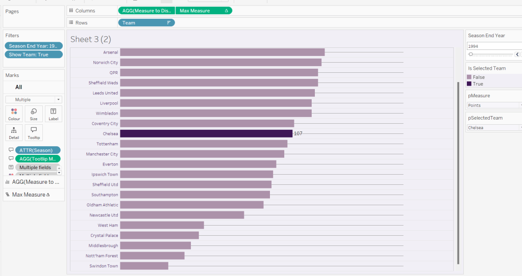
Change the measure value to Goal Difference and adjust the year to 2024 and check the display looks as expected, especially at the bottom – the gap between the label of the team at the bottom and the bar is minimal.
Add the chart to a dashboard – the simplest way is to duplicate the core dashboard and then use the swap sheets feature to quickly swap the main vizzes.
As community month draws to a close, long term participant Deborah Simmonds set us a map based challenge based on TC23 data.
I chose to use the data that was associated to the solution workbook, rather than take the direct source, so bear that in mind if you’re following along.
Examining the data
As there were quite a few fields in the data set which were directly related to the solution, I just wanted to familiarise myself with what I was working with initially. Essentially we have a row per person (Names Full) with the hotel they stayed at (Label Hotels), and how many steps (Steps) they took each day (Date). The details of the convention centre (Label Convention Centre) exist against every row.
The LAT and LON fields contain the location details of the hotels, while Convention LAT and Convention LON contain the location details of the Mandalay Bay Convention Centre.
Names Full already had the logic applied to create names for users based on their User ID if the Name was NULL, so I didn’t need to do anything for that requirement.
We only want to consider records relating to those people who attended ‘In Person’ and who had provided a hotel. Consequently I added the following as data source filters (right click data source -> edit data source filters) to exclude unrequired records from the whole analysis.
Did you attend in person or virtual? : In person
Label Hotels : excludes NULL
Building the BANs
The BANs have 3 metrics – the number of attendees, the number of steps, and the distance in metres (based on the logic that 1 step = 0.75m).
Attendees
COUNTD([User ID])
Distance (m)
[Steps] * 0.75
On a new sheet add Date to Filter as a range of dates and show the filter control. Add Attendees, Steps and Distance (m) so the measures are displayed in a row.
Change the mark type to shape and add a transparent shape (see this blog for more details). Add Measure Names to Label too and then adjust label accordingly and align centrally.
Hide the header row (uncheck show header), remove row dividers and don’t show tooltips. Name the sheet BANs or similar. Adjust the date slider and the values should adjust.
Building the bar chart (viz in tooltip)
On a new sheet add Names Full to Rows and Steps to Columns. Apply the same Date filter (from the BANs worksheet, set the filter to apply to this new worksheet too).
The viz needs to display a reference line showing the overall average of the steps per person across the selected dates, regardless as to whether the records are filtered to a hotel or not.
What do I mean by this… well if I add a standard average reference line to the viz above, the average for the whole table is 78.2k steps.
If I now filter this by a Label Hotel, then the average changes, and I don’t want that – I still want to see 78.2k.
But the average does need to change if the date range changes
This took a bit of effort to get right, but I needed
Format this as a number with 1dp set to the K (thousandths) level
and I also needed to add the Date field on the Filter shelf to context.
So reverting back to the initial view of the bar chart… right click on the Date filter and Add to Context. Add Avg Steps to the Detail shelf. Then add a reference line (right click the Steps axis > add reference line) that displays the Avg Steps with a dark dashed line with a custom label.
Format the reference line to position the label at the top and adjust the font style.
To colour the bars we need
Steps above average
SUM([Steps]) >=[Avg Steps]
Add this to the Colour shelf, change the colours and adjust the opacity to about 75%.
Hide the column heading, and adjust the font size of the names and the axis. Name the sheet Bars or similar.
Building the initial map
I decided to create 2 maps – one for the initial display of all the hotels and the convention centre, and then one for the selected location and buffer.
To plot the hotels on the map I created
Hotel Locations
MAKEPOINT([LAT],[LON])
On a new sheet, add this to the Detail shelf. A map will automatically generate with Latitude and Longitude fields. Change the Mark Type to Circle, then add Label Hotels to Label and align left middle. Edit the map Background Layers (via the map menu) to add Streets, Highways etc to the display
Add Steps, Attendees and Distance(m) to the Tooltip. Add Attendees to the Size shelf and adjust the size to vary by range
Apply the Date filter from the other worksheets to this sheet too. For the tooltip, We need to know about the min and max dates in the range selected. Create
Min Date
MIN([Date])
and custom format simply as dd (the day only)
Also create
Max Date
MAX([Date])
and custom form this as dd mmm yyyy
Add both of these fields to the Tooltip shelf. Adjust the text in the Tooltip and add a reference to the Bars sheet as a viz in tooltip (Insert > sheets > ). Adjust the height of the sheet to be 900.
The viz in tooltip should now display nicely on hover
To add the mark for the convention centre, we need
Conf Location
MAKEPOINT([Convention LAT], [Convention LON])
Drag this onto the map, and drop it when Add A Marks Layer displays
This will create a 2nd marks card. Change the mark type to shape and select the Tableau sparkle image if you have it stored. If not, just use another shape or circle (coloured differently).
Add Attendees to Size and add Label Convention Centre to Label and align left middle. Add Steps and Distance(m) to Tooltip and adjust to suit. Hide all the map options (map menu -> map options -> uncheck all the selections). Name the sheet Map – Initial or similar.
Building the ‘selected’ map
This will use parameters to identify what’s been selected – a hotel or the convention centre, so we need
pSelectedHotel
string parameter defaulted to empty string
and
pSelectedCentre
string parameter defaulted to empty string, just like above
The intention is that either both these parameters will be empty or only one will be populated.
To plot on a map we need
Selected Hotel Location
IF [pSelectedHotel] = [Label Hotels] AND [pSelectedCentre] =” THEN [Hotel Locations] END
and
Selected Centre Location
IF [pSelectedHotel] = ” AND [pSelectedCentre] =[Label Convention Centre] THEN [Conf Location] END
Duplicate the initial map sheet and name it Map – Selection. Show the two parameters and verify both are empty.
On the Hotel Locations marks card, drag the Selected Hotel Location field and drop it straight onto the Hotel Locations field. On the Conf Location marks card, drag Selected Centre Location and drop straight onto the Conf Locations field. Your map shouldn’t display anything…
Manually type ‘Luxor’ into the pSelectedHotel parameter. A mark should display. Adjust the Label of the Selected Hotel marks card so it is larger font, and aligned top middle. Set the colour to orange and remove the halo.
Remove the text from the pSelectedHotel parameter and manually type ‘Mandalay Bay Convention Centre’ into the pSelectedCentre parameter. A mark should display. Adjust the Label of the Selected Centre marks card so it is larger font, and aligned top middle. Remove the halo from the Colour shelf.
To create the buffer circle, we need to define the buffer radius, which is the attendee steps in metres.
Buffer Distance (m)
{FIXED : SUM(IF [pSelectedHotel] = [Label Hotels] OR [pSelectedCentre] = [Label Convention Centre] THEN [Steps] END)} * 0.75
and then we create
Buffer
IF [pSelectedHotel] <> ” THEN BUFFER([Selected Hotel Location], [Buffer Distance (m)], ‘m’) ELSEIF [pSelectedCentre] <> ” THEN BUFFER([Selected Centre Location], [Buffer Distance (m)], ‘m’) END
Add this as another marks layer.
Reduce the opacity on the colour shelf to 0% and set the border to be orange. We don’t want to allow any interactivity with the buffer, so disable selection of the layer, and also move down so it is listed at the bottom of the 3 map layers.
Show the Date filter control and adjust the dates to see the buffer adjusting. Test the behaviour with a hotel too (you may find you want to add some more detail to the background layers of the map).
We will use dynamic zone visibility on the dashboard to decide whether to display the initial or the selected map. To control this, we need
Show Initial Map
[pSelectedCentre]=” and [pSelectedHotel]=”
and
Show Selected Map
[pSelectedHotel]<>” OR [pSelectedCentre]<>”
Adding the interactivity
Create a dashboard, add the BANs and both the map sheets.
Create a dashboard parameter action
Set Hotel
On selection of the Initial Map set the pSelectedHotel parameter passing in the value from the Label Hotels field. When the selection is cleared, reset to ”.
and another parameter action
Set Conv Centre
On selection of the Initial Map set the pSelectedCentre parameter passing in the value from the Label Convention Centre field. When the selection is cleared, reset to ”.
Select the Initial Map object, and from the Layout tab, set the visibility to be controlled by the Show Initial Map field
Then select the Selected Map object, and set the visibility to be controlled by the Show Selected Map field. Only one of the maps should display based on the interactivity.
This is all the core functionality of the map, but Deborah threw in a couple of extra asks…
Building the Distance Legend
We’re using map layers again for this. Create a new field
Zero
MAKEPOINT(0,0)
Add it to the Detail shelf of a new worksheet to create the 1st map layer, then immediately add another map layer, by adding another instance of Zero to the sheet.
Switch the axis, and the map will disappear, and you’ll have axis displayed instead. Change the mark type of the first map layer to circle and colour orange.
Change the mark type of the 2nd map later to circle and colour pale grey with an orange border. Increase the Size of this circle so it appears as a ring around the filled orange circle. Move the 2nd marks layer down to the bottom and disable both marks from being selectable.
Hide the axis and gridlines/zero lines.
Right click on the central circle and annotate point. Don’t enter any text into the annotation box, just click OK. You should get the annotation box with a line.
Move the box so the connector line is horizontal, then format the annotation so the shading is set to none and the line is formatted to be a darker dashed line. Update the title of the sheet.
Building the Size Legend
Apply a similar process to that described above, but this time create 3 mark layers where the mark type is an open circle shape which is coloured blue, and for each layer, the size of the circle is slightly bigger. This time show the zero lines.
Set the background of both the legend sheets to be none (ie transparent), then add them as floating objects onto the dashboard. Use the control visibility feature to only display the Size legend when Show Initial Map is set, and only display the Distance legend when Show Selected Map is set. Set a background against each object of light grey, that is then set to 80% transparency.
With this you should have a completed challenge. My published version is here.
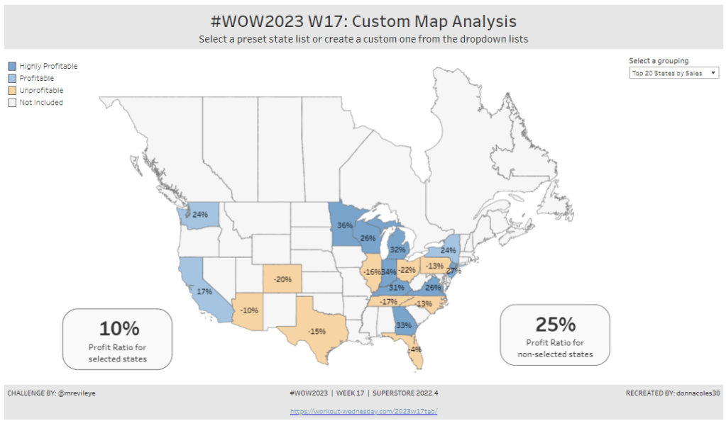
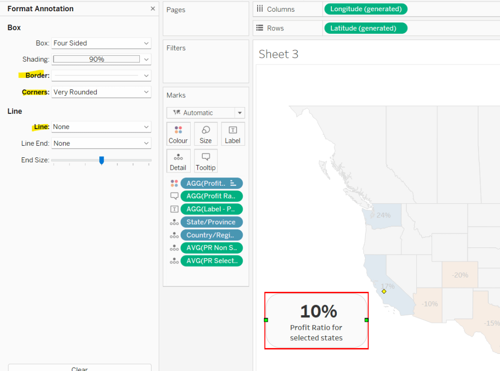
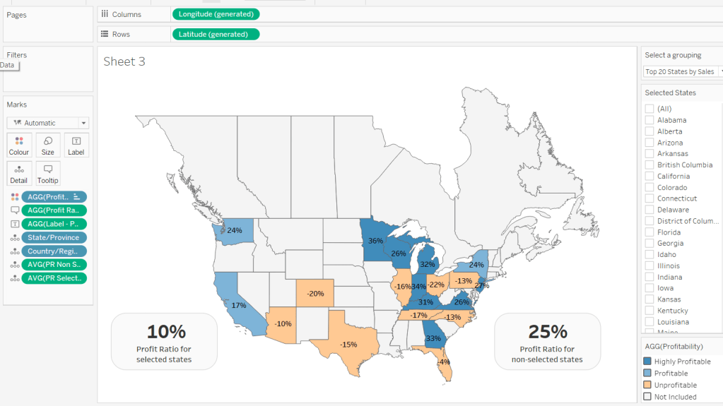
For the final week of Community Month, my colleague, Nik Eveleigh, posed this challenge to apply some tricky filters to a map. Let’s dive straight in!
Identifying the States and Profitability
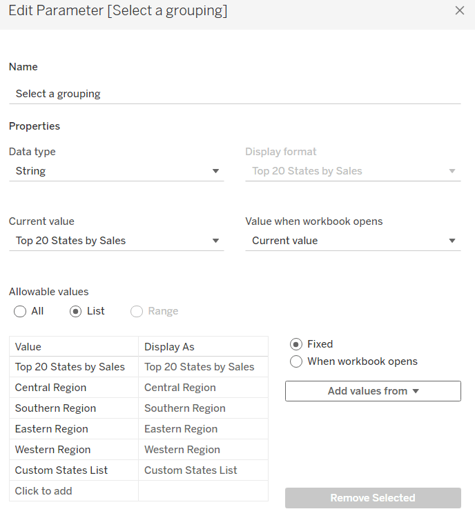
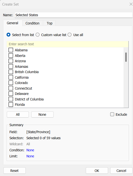
The core functionality of the map display is driven by a parameter allowing the user to select which set of states they want to analyse, so let’s set this up first.
Select a grouping
string parameter containing 6 entries in the list and defaulted to ‘Top 20 States by Sales’
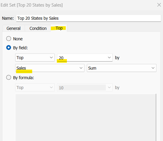
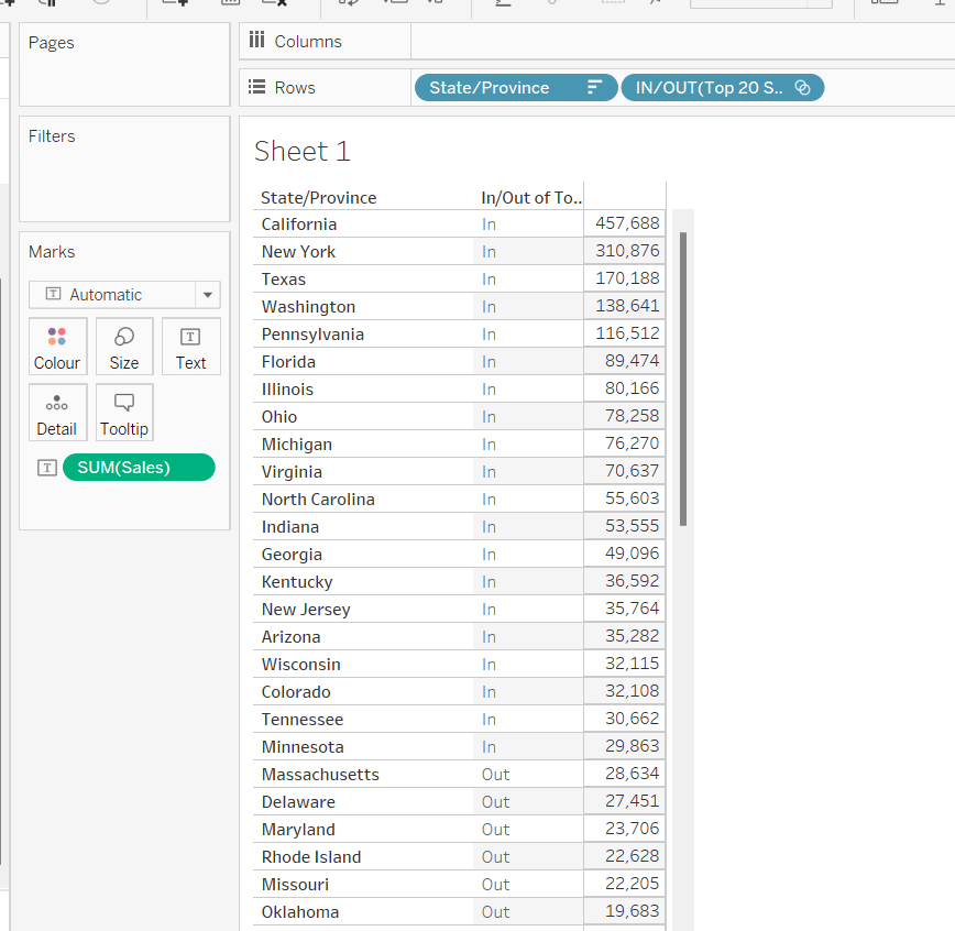
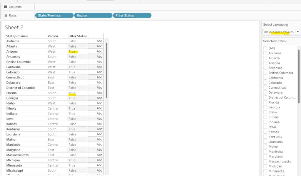
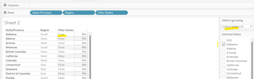
To identify the top 20 States by Sales, we need to create a Set. Right click on State/Province > Create > Set and use the ‘Top’ option to create the set based on top 20 sum of Sales.
Top 20 States by Sales
To verify this is working as expected, add State/Province to Rows, Sales to Text and sort descending. The add Top 20 States by Sales to Rows and you should see the first 20 rows with In and the rest listed as Out.
To identify the states selected when the ‘Custom States List’ option is selected, we’ll also need another set to store the selections. Right click on State/Province > Create > Set, leave the list of states all unselected and rename the set
Selected States
To verify this is working, on a new sheet add State/Province to Rows and Selected States to Rows too. Then on the context menu of the Selected States pill, choose Show Set to get the list of States displayed. Select the first couple in the list and see the value in the table change from Out to In.
It is this set control filter list that will be used to provide the selection when the appropriate value in the Select a grouping parameter is chosen.
While the sets display In or Out when shown in the table, they are actually booleans with the equivalent of a True or False. We now need to build a boolean field which will encapsulate all the relevant states included based on the parameter option selected.
Filter States
CASE [Select a grouping] WHEN ‘Top 20 States by Sales’ THEN [Top 20 States by Sales] WHEN ‘Central Region’ THEN IF [Region] = ‘Central’ THEN TRUE ELSE FALSE END WHEN ‘Southern Region’ THEN IF [Region] = ‘South’ THEN TRUE ELSE FALSE END WHEN ‘Eastern Region’ THEN IF [Region] = ‘East’ THEN TRUE ELSE FALSE END WHEN ‘Western Region’ THEN IF [Region] = ‘West’ THEN TRUE ELSE FALSE END WHEN ‘Custom States List’ THEN [Selected States] END
Let’s sense check the workings of this too. On a sheet add State/Province, Region and Filter States to Rows. Show the Select a grouping parameter. Also click on the Selected States field in the left hand data pane and Show Set, so the list of states shows. Ensure all are unchecked. Depending on the option selected in the Select a grouping parameter, then Filter States column should display true or false.
If you select a state from the list, this should only present as True when the Custom States List option is selected
Right, now we know how to identify the states we want, we can start to look at understanding their profitability. Firstly we need to get the profit ration
Profit Ratio
SUM([Profit])/SUM([Sales])
format this to % with 0 dp.
Profitability
IF ATTR([Filter States]) THEN
IF [Profit Ratio] < -0.25 THEN ‘Highly Unprofitable’
ELSEIF [Profit Ratio] >= -0.25 And [Profit Ratio] < 0 THEN ‘Unprofitable’
ELSEIF [Profit Ratio] >=0 AND [Profit Ratio] < 0.25 THEN ‘Profitable’
ELSE ‘Highly Profitable’
END
ELSE ‘Not Included’ END
If the states is one of the filtered ones then work out isn’t profitability ‘bracket’ otherwise report as ‘Not Included’.
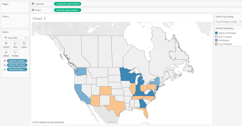
Building the Map
On a new sheet double-click on State/Province to automatically generate the map. If the map doesn’t display with US and Canada Edit Locations (via the Map menu) and ensure your settings are as below
Display the Show a grouping parameter and have it set to Top 20 States by Sales. Add Profitability to Colour and adjust colours accordingly.
Click on the Selected States field in the left hand data pane and Show Set, so the list of states shows, then test changing the values in the Select a grouping parameter and see the display change.
Clean the map up by clicking Map -> Background Layers, and then unchecking all the options in the Background Map Layers section displayed on the left hand side.
To label the highlighted state we need
Label – PR
IF ATTR([Filter States]) THEN [Profit Ratio] END
format to % with 0 dp and then add to the Label shelf and set the font to bold.
Add Profit Ratio to the Tooltip shelf and adjust the tooltip.
To display the summary Profit Ratio values for all the filtered states vs those not selected, we need
PR by Filter State
{FIXED [Filter States]: [Profit Ratio]}
and then
PR Selected States
ZN({FIXED:AVG(IF [Filter States] THEN [PR by Filter State] END)})
Custom format this with 0%;-0%;–
This formatting with show values with 0dp for positive and negative values and — when no values exists.
Repeat the process to create
PR Non Selected States
ZN({FIXED:AVG(IF NOT([Filter States]) THEN [PR by Filter State] END)})
and apply the same formatting above.
Add both PR Selected States and PR Non Selected States to the Detail shelf and change the aggregation to Average.
Then click on a state on the bottom left of the map (I chose California) and select Annotate > Mark. Add the reference to the PR Selected States and supporting text into the annotation dialog. The when completed, manually move the annotation to the space to the left of the map. Format the annotation to add a border, round the edges and remove the line. You many need to re-edit the annotation to rec-centre the text.
Repeat a similar process, by annotating a state on the right hand side and referencing the PR Non Selected States field instead.
Finally remove all row & column dividers and hide the map options (Map -> Map Options -> uncheck all selections)
Hiding the Selected States control
In order to control visibility of the Selected States list, we need a boolean field
Custom States Selected
[Select a grouping] = ‘Custom States List’
Once all objects have been added to the dashboard and arranged where you want, click on the Selected States control, so it is selected via a grey border, then on the left hand Layout pane, select the Control visibility using value checkbox and choose the Custom States Selected field
The State list will now only display when the Select a grouping parameter contains the ‘Custom States List’ value.
I made an attempt to build a solution without referencing Lindsey’s viz, but ended up building multiple sheets and creating multiple calculations, which just ‘didn’t feel right’ – it would have worked, but it just seemed ‘too clunky’ of a solution, so I ended up checking out Lindsey’s viz as a guide. The key to the ‘simpler’ solution involves utilisation of a field in the data that allows the ‘measures’ to be arranged horizontally in a single sheet. I’ll explain further as we get to that section. I also don’t make any use of set actions in my solution. Instead I use parameter actions. So let’s crack on…
To build this solution I need 7 sheets
1 sheet to display the 5 measure boxes with the summary stats per player for each measure
1 sheet per sparkline that is displayed in each box (5 sheets in total)
1 sheet to display the larger line chart at the bottom which changes the measure on selection of a card
Creating the measure calculations
Firstly, we need to set up the measures that are being used throughout this viz. Some are new calculations, some are just renamed fields. I renamed the following fields :
G -> GAMES (formatted to 0 dp)
H – > HITS (formatted to 0 dp)
HR -> HOME RUNS (formatted to 0 dp)
then I created
HITS/GAME
ROUND(SUM([HITS])/SUM([GAMES]),2)
AB/HR
ROUND(SUM([AB])/SUM([HOME RUNS]),2)
Building the measure swap line chart
I’m going to start by building out the line chart at the bottom of the dashboard, as once built and formatted, we can duplicate it to form the basis of the other 5 line charts.
As with any measure swap chart, we need to create a parameter that is going to store the value of the measure that has ben selected to show. In this instance we just need
pMeasure
a string parameter which is defaulted to the value ‘GAMES’
Then we need a field that is going to determine which measure to display based on the parameter value
Value to Display
CASE [pMeasure] WHEN ‘GAMES’ THEN SUM([GAMES]) WHEN ‘HITS’ THEN SUM([HITS]) WHEN ‘HITS/GAME’ THEN [HITS/GAME] WHEN ‘HOME RUNS’ THEN SUM([HOME RUNS]) WHEN ‘AB/HR’ THEN [AB/HR] END
Show the pMeasure parameter, then add Year (as green, continuous pill) to Columns and Value to Display to Rows and Player to Colour. Adjust colours accordingly. Add Year (as blue discrete pill) to the Filter shelf, and exclude 2022, as Kyle chooses not to show this data – probably as its an incomplete year).
Manually change the values in the parameter to HITS, or HITS/GAME etc and check the display changes as expected.
On the Label shelf, select to Show Mark Labels and only label Max/Min values. Modify the colour of the label to Match Mark Colour.
Finally, format the Value to Display field to Number(Standard). This is a format that will automatically display the values as whole numbers or decimals, which is really neat (Note – it’s only while rebuilding the solution to blog that I remembered this and tried it out, so you may see that my published solution has a bit of a convoluted calculation to get the display as I needed).
Edit the Year axis to start at 2000 and end in 2022, and remove the title. Edit the Value to Display axis to not include zero and remove the title. Remove all gridlines.
Finally amend the tooltip, and then edit the title of the sheet to reference the pMeasure parameter.
Building the individual sparkline charts
We need to create a sheet per measure to be used in the sparkline display in the card. To create the first one, duplicate the Selected Measure Trend sheet you just created, then
Uncheck Show mark labels
Uncheck Show Tooltips
Hide the Year axis
Replace the Value to Display pill with the GAMES field (drag the GAMES field from the Dimensions pane and drop it directly on the Value to Display pill, so it is just replaced).
Hide the Games axis
Format to remove all zero lines/axis rulers
Set the worksheet background colour to None (which will make it transparent when we add it to the dashboard later, although you won’t notice anything at this point).
Name the sheet Games Trend or similar.
Now duplicate this sheet, and replace the GAMES pill with the HITS pill. Name this new sheet Hits Trend or similar.
Repeat this process for the HITS/GAMES, HOME RUNS, and AB/HR measures, so you have 5 trend charts.
Building the Measure Selector card
We’re going to use some Tableau trickery to ‘fake’ these cards. We’re looking to build a table of 1 row and 5 columns where each column contains 3 lines of text.
We can’t just use Measure Names & Measure Values split by Player, as we need to create a ‘box’ for each measure with the Players text displayed ‘together’ top left.
So we use some trickery.
Firstly, we’re going to ‘map’ the name of each measure to a Year in the data set which exists for each Player (ie we use the last years and not the first ones).
MetricName
CASE [Year] WHEN 2017 THEN ‘GAMES’ WHEN 2018 THEN ‘HITS’ WHEN 2019 THEN ‘HITS/GAME’ WHEN 2020 THEN ‘HOME RUNS’ WHEN 2021 THEN ‘AB/HR’ END
Then we need to capture the get the set of measures for each player into a dedicated field :
C Measures
IF [Player] = ‘Cabrera’ THEN CASE [Metric Name] WHEN ‘GAMES’ THEN {FIXED [Player]: SUM([GAMES])} WHEN ‘HITS’ THEN {FIXED [Player]: SUM([HITS])} WHEN ‘HITS/GAME’ THEN {FIXED [Player]: [HITS/GAME]} WHEN ‘HOME RUNS’ THEN {FIXED [Player]: SUM([HOME RUNS])} WHEN ‘AB/HR’ THEN {FIXED [Player]: [AB/HR]} END END
P Measures
IF [Player] = ‘Pujols’ THEN CASE [Metric Name] WHEN ‘GAMES’ THEN {FIXED [Player]: SUM([GAMES])} WHEN ‘HITS’ THEN {FIXED [Player]: SUM([HITS])} WHEN ‘HITS/GAME’ THEN {FIXED [Player]: [HITS/GAME]} WHEN ‘HOME RUNS’ THEN {FIXED [Player]: SUM([HOME RUNS])} WHEN ‘AB/HR’ THEN {FIXED [Player]: [AB/HR]} END END
We’re using FIXED LoDs to get the totals of each measure across all years for each Player
You can see below that the numbers highlighted match the numbers per player from the image above
With these calculations, we can now build the ‘card’.
Add Year (blue discrete pill) to Columns, and filter to only show the years 2017-2021. Type in MIN(1) on the Rows shelf. Change mark type to Bar and edit the axis to be fixed from 0-1. Set the Fit to Fit Width.
Add Metric Name, P Measures and C Measures to the Label shelf. Adjust the label so it is formatted with the right colours, and aligned left. I used some extra spaces at the start of each line so that there was a bit of padding.
To colour the bars, we need a further calculated field
Measure is Selected
[pMeasure]=[Metric Name]
Add this to the Colour shelf and adjust accordingly and reduce the opacity to 50%.
Hide all headers/axes, remove all gridlines/axis rulers and format the background colour of the worksheet to None as you did before. Don’t show the tooltip.
Finally we need to create & add a couple more fields to prevent the selected box from remaining highlighted when we click on it. Create fields
True
TRUE
False
FALSE
and add both to the Detail shelf.
Building the dashboard
Now we have the components to build the dashboard. The Measure Selector sheet and the 5 sparkline charts will all be floating objects carefully arranged. It’s up to you whether the remaining objects will also be floating or captured in tiled containers.
The key with the Measure Selector and Sparkline sheet is that all the sparkline sheets should be sent to back, so they are behind the Measure Selector card. This is where the transparency settings help as you can then ‘see through’ the sheet that is on the top.
You should also make sure each of your sparkline sheets are the same height & width and start at the same y position
Adding the interactivity
Once all your objects are placed, add a parameter dashboard action that on select of the Measure Selector sheet will set the pMeasure parameter, passing in the Metric Name field.
Then create a filter dashboard action that will on select of the Measure Selector object on the dashboard, will filter the Measure Selector sheet itself, setting the fields True = False. As this can never happen, the filter doesn’t apply, and the sheet removes the auto highlight that Tableau applies.
Hopefully, you now have a fully functional dashboard with a chart that changes on click of a KPI card in the top section. My published viz is here.
For week 17 of #WOW2021, Sean Miller decided to challenge us with recreating a chart by Nathan Yau (see here for the original). The aim was to recreate within 1 sheet, which I managed to do. So how did I do it? Read on 🙂
The groundwork
Colouring the bars
Adding the year labels
Final formatting
The groundwork
The chart itself follows a straight forward structure of multiple blue dimension fields on Columns with a green measure on Rows similar to this view below based on Superstore Sales data – it’s just formatted a bit more creatively!
The data provided just contains 3 fields : SEX, AGE and 2019 Population. We want to present the 2019 Population measure for the Total SEX only by Year. We need to create the Year field, which is simply
Year
2019-[AGE]
I dragged this into the ‘dimensions’ section of the data pane (above the line).
This allows us to create the basic bar chart required
We now need to define the various fields that we will need to add as additional dimensions on the Columns shelf to create the ‘generation’ data panes.
Generation
IF [Year]<= 1927 THEN ‘Greatest Generation’ ELSEIF [Year]<= 1945 THEN ‘Silent Generation’ ELSEIF [Year]<=1964 THEN ‘Baby Boomer’ ELSEIF [Year] <= 1980 THEN ‘Generation X’ ELSEIF [Year]<=1996 THEN ‘Millennials’ ELSEIF [Year]<=2012 THEN ‘Generation Z’ ELSE ‘Gen Alpha’ END
NOTE – there is a deliberate carriage return in the condition for ‘Greatest Generation’ and ‘Gen Alpha’ which will force the field to ‘wrap’ when displayed.
SUM([Total Population Per Generation]) / TOTAL(SUM([Total Population Per Generation]))
NOTE – to create this field, I originally created a ‘quick table calculation’ against the Total Population Per Generation field which I’d displayed on a view, and then dragged the resulting pill into the measures pane to create the new field with the desired calc.
Let’s put these in a table, so we can then check the values, and see that the 2nd and 3rd columns are the same value for each row associated to a particular generation, which is what we need.
Right, so now we need to determine the rank based on the Total Population Per Generation
Rank
RANK_DENSE(SUM([Total Population Per Generation]))
Format this to a custom number with 0 decimal places, but prefixed with #
When added to the table we get
The intention, is that Rank will be displayed as discrete ‘header’ pill rather than a measure, so let’s move Rank to be the 1st pill on the Rows shelf and change to be discrete.
But we need the Total PopulationPer Generation and % of Total Population fields to be combined into a single pill. So we need to do a bit of string manipulation/ number formatting for this
Total | Percent
STR(ROUND(SUM([Total Population Per Generation])/1000000,1)) + ‘M’ + ‘ | ‘ + STR(ROUND([% of Total Population] * 100,1)) +’%’
This looks complicated, but its because even though you may have applied the relevant display number formatting against the individual numeric measures of Total PopulationPer Generation and % of Total Population, the formatting is not preserved, when converted into a string field, which this field needs to be. So the relevant calculations need to be applied within the field itself.
This outputs the below
Now we need a way to sort the data so the ‘Greatest Generation’ associated to the earliest years is listed first. I did this by determining the minimum date within each Generation.
Min Year Per Generation
{FIXED [Generation], [SEX]: MIN([Year])}
Add this into the view as the first pill in Rows, and the data should automatically sort from lowest to highest
We can now build the viz – duplicate the table sheet, remove Total Population Per Generation and % of Total Population from the Measure Values section. Drag 2019 Population to Columns, then click the swap rows & columns button :
Colouring the bars
The bars are coloured based on each ‘Generation’ pane. You could hardcode this along the lines of ‘Generation = x OR Generation = y or Generation = z etc’ where x, y and z etc are generations of the same colour. This would return true or false, which you can then add to the colour shelf and adjust accordingly.
I decided to be a bit more dynamic, deciding I wanted to set the colour based on whether it was an odd or even pane.
For this I created another ‘rank’ field based on the field I’d used to ‘sort’ the data, the Min Year Per Generation field.
Sort Position
RANK_DENSE(MIN([Min Year per Generation]),’asc’)
If you add this into the data table, you’ll see each section is numbered 1 -7
From this, we can then determine if the number is even (or not)
Sort Position is even number
[Sort Position]%2=0
Add this onto the Colour shelf which will return True or False and colour accordingly.
Adding the year labels
The year labels are achieved by using a dual axis chart, to plot a point for each specific year (based on the Min Year Per Generation field) at some arbitrary value.
Point to Plot Year Label
IF [Year]=[Min Year per Generation] AND [Year]<>1919 THEN 4700000 END
For each ‘min year’ that isn’t 1919, plot a value at 4.7M.
Add this field to the Rows shelf, change mark type to circle, reduce size to as small as it can, and set the colour transparency to 0.
Add Min Year Per Generation to the Label shelf, then change the alignment to vertical.
Now you make the chart dual axis and synchronise the axis. Some of the colours/marks may change, so reset by removing Measure Names from the Colour shelf and changing the mark types bar to bar & circle.
Final formatting
So at this point all the main components are there. It’s now a case of formatting – removing right and bottom axes, removing gridlines. The vertical dashed lines, are column dividers, set at the pane level only.
The solid left hand axis is set via
The text is formatted using the fonts advised in the requirements and sizes adjusted to suit.
Add on a tooltip, and set the background colour of the worksheet and you should be done.
This week’s #WoW2020 challenge was set by Meera Umasankar who once again was tackling the concept of ‘run rate’, but this time with an added twist – only consider the working days (ie the typical Mon-Fri weekdays), rather than every day in the month, the assumption being, this ‘business’ does not trade on weekends. Following on from last week’s challenge, Meera also chose to include a bit of blending to combine actual orders against the plan/target. For this Meera provided a custom dataset which just included a sheet of Actuals by Region for each day in April 2020 up to 23rd April, and Plan by Region for the whole month of April.
As per usual I started by putting together a table of data with the core numbers I was going to need per region : MTD value, Run Rate value, Plan value.
Building the key data fields
Whilst Meera had provided data just for April up to April 23rd, I decided to build this in a way as if the data could change.
Today
{FIXED: MAX([Date])}
This stores the maximum date from the Actuals data source – ie 23 April 2020.
Current Month Only
[Date]>=DATETRUNC(‘month’, [Today]) AND [Date] <= [Today]
When true, this will just consider the records in the Actuals data source that are dated between 1st April & 23 April. As it happens, due to the data provided, this will be everything, but in a typical business situation, you’re actuals would probably contain previous months data too.
MTD
IF [Current Month Only] THEN [Sales] END
Only stores the sales for the month we want to report on.
To get the plan we need to blend to the Plan data source. As the data in the Actual data source is per day, and the Plan is per month, we need to blend the data at the month level. Whilst this can be set in other ways, I like to be explicit when using blending, so in my Actuals data source I created
BLEND – Date
DATE(DATETRUNC(‘month’,[Date]))
This stores the 1st day of the month (1st April 2020) against every row of data.
In the Plan data I created a similar field, which is just essentially a duplicate field of the existing Date field, but by having the same name, it allows the blend joins to be automatically picked up.
Blend – Date
[Date]
Ok, let’s get these 2 measures on a table, to sense check we have the right figures so far :
Add Region to Rows (from the Actuals data)
Add MTD to Text
Add Plan to Text (from the Plan data)
Ensure the blend join links on both Region and BLEND – Date are clicked (due to the minimal data we have, the blend on Region only will work, but it’s good practice to include the date blend too if the Plan data contained different months).
Apply formatting as required to the MTD & Plan numbers
Calculating the Run Rate
Meera defines the Run Rate as being the value of Sales expected to be received in the whole month (the end of month position/forecast), based on the rate of sales so far in the month. So we’re looking to work out average sales made per day, then extrapolate that across the number of days in the month.
However, the twist in this challenge, is to only give consideration to the number of weekdays (ie working days).
As with many things, I chose to use my best friend ‘Google’ to see if it would throw up anything that may help this requirement, and it did, very quickly. There is an existing Tableau KB article that describes exactly how to work out the number of weekdays between 2 dates. You can find it here.
To work out the Run Rate I need
to work out the average Sales per weekday so far
multiply that by number of weekdays in the month
So I need to work out the number of working days between 1st April and 23rd April, and also the number of working days between 1st April & 30th April. I need a fair few calculated fields for all this, which I’ll build up rather than combine altogether.
Start of Current Month
DATETRUNC(‘month’,[Today])
simply truncates to 1st of month.
End of Current Month
DATEADD(‘day’, -1, DATEADD(‘month’, 1, [Start of Current Month]))
Adds 1 month onto start of month, then takes off 1 day to get the last day in the month
Following the steps in the article, I need to adjust these dates if they happen to fall on a weekend.
Start of Current Month (shift to weekday)
IF DATEPART(‘weekday’, [Start of Current Month]) = 1 THEN DATEADD(‘day’, 1, [Start of Current Month]) ELSEIF DATEPART(‘weekday’, [Start of Current Month]) = 7 THEN DATEADD(‘day’, 2, [Start of Current Month]) ELSE [Start of Current Month] END
If the Start of Current Month lands on a Saturday or a Sunday, the start is shifted forward to the following Monday.
End of Current Month (shift to weekday)
IF DATEPART(‘weekday’, [End of Current Month]) = 1 THEN DATEADD(‘day’, -2, [End of Current Month]) ELSEIF DATEPART(‘weekday’, [End of Current Month]) = 7 THEN DATEADD(‘day’, -1, [End of Current Month]) ELSE [End of Current Month] END
If the End of Current Month lands on a Saturday or Sunday, the end is shifted back to the previous Friday.
#Weekdays in Month
MIN( (DATEDIFF(‘day’, [Start of Current Month (shift to weekday)], [End of Current Month (shift to weekday)]) + 1) – (2 * DATEDIFF(‘week’, [Start of Current Month (shift to weekday)], [End of Current Month (shift to weekday)])))
This is working out the number of days between the adjusted start & end dates, then adding 1 to this number. It then works out the number of weeks between the adjusted start & end dates, multiples by 2 (since in every week there are 2 weekend days), and then this number is subtracted from the first.
We then need to repeat this to work out the working days from start to today.
Today (shift to weekday)
IF DATEPART(‘weekday’, [Today]) = 1 THEN DATEADD(‘day’, -2, [Today]) ELSEIF DATEPART(‘weekday’, [Today]) = 7 THEN DATEADD(‘day’, -1, [Today]) ELSE [Today] END
This is our end date, so the date is once again shifted back to the previous Friday if it happens to be a Saturday or Sunday.
# Weekdays from start to Today
MIN( (DATEDIFF(‘day’, [Start of Current Month (shift to weekday)], [Today (shift to weekday)])+ 1) – (2 * DATEDIFF(‘week’, [Start of Current Month (shift to weekday)], [Today (shift to weekday)])))
Now we have these values, we can work out
Run Rate
(SUM([MTD])/[# Weekdays from Start to Today]) * [# Weekdays in Month]
Format this and add to check table
Building the chart
The left hand side of the chart is all text, but to present it as required, we need a fake axis.
From the Actuals data source, add Region to Rows
In the Columns shelf type in MIN(0) to create the fake axis.
Change the Mark Type to Text
Add Region, MTD, Run Rate from the Actuals data source to Text shelf
Add Plan from the Plan data source to the Text shelf (don’t forget to check the blend links)
Make each row bigger if everything all seems a bit squashed.
We’ll come back to formatting these fields later. Let’s now get the bar displayed & target displayed. This is a dual axis combining a bar and a gantt chart. Add to the chart as follows
Add Run Rate to Columns
Change the Mark Type of this measure to Bar
Remove all fields apart from Run Rate from the Label shelf of this card
Change Alignment of the Label to be left aligned
Add Plan to Columns (check the blend links)
Change Mark Type to be Gantt and remove fields from Label shelf of this card
Set to Dual Axis and SynchroniseAxis.
Remove Measure Names from Colour shelf of the Bar and Gantt marks cards
Change Colour of the Gantt Bar (Plan) to black and add a black border to make it a bit thicker
Turn off Tooltips on All marks cards.
Indicating if Plan isn’t going to be met
The bar chart should be red if the Run Rate is less than Plan. The Run Rate on the Text side should also be displayed in red too if it doesn’t meet and black otherwise. We’re going to need some additional fields for this.
Add this to the Colour shelf on the Bar marks card, and adjust the True/False colours accordingly
We can’t conditionally format an individual field in a Text display, so we need to create 2 further instances of the Run Rate field, where only one will ever display.
Run Rate < Plan (red)
If [Run Rate < Plan] THEN [Run Rate] END
Run Rate > Plan (black)
If NOT([Run Rate < Plan]) THEN [Run Rate] END
Format these accordingly, then add to the Text shelf of the Text marks card. Remove the original Run Rate field. You should still only have 1 run rate value displayed per row.
Now we can tidy up the display of this text. Ensure the Run Rate < Plan (red) and Run Rate > Plan (black) fields are on the same line of text with no spaces between, then colour the fonts to match the requirements
Finally, remove axis/row headers, tidy up gridlines etc, and adjust the width of the bars to suit.
Title Sheet
As the title needs to include the date, and to ensure it would be dynamic, I created a simple text sheet to display the title, and set the worksheet background to a light grey.
I then added both sheets to a dashboard, with both set to ‘Fit Entire View’, and titles hidden.
To get the Phone Layout display, I then selected the Phone option, clicked the padlock to Edit layout, and set to Fit all, and made adjustments to suit. The issue you might have though is that while things all look a bit squashed on your laptop display, it actually will render ok when published. This can unfortunately be a bit of trial & error.