Erica set this fun and incredibly useful challenge this week, based on the TC25 talk by Lorna Brown & Robbin Vernooij, to showcase different methods of normalising data when comparing measures which have drastically different scales.
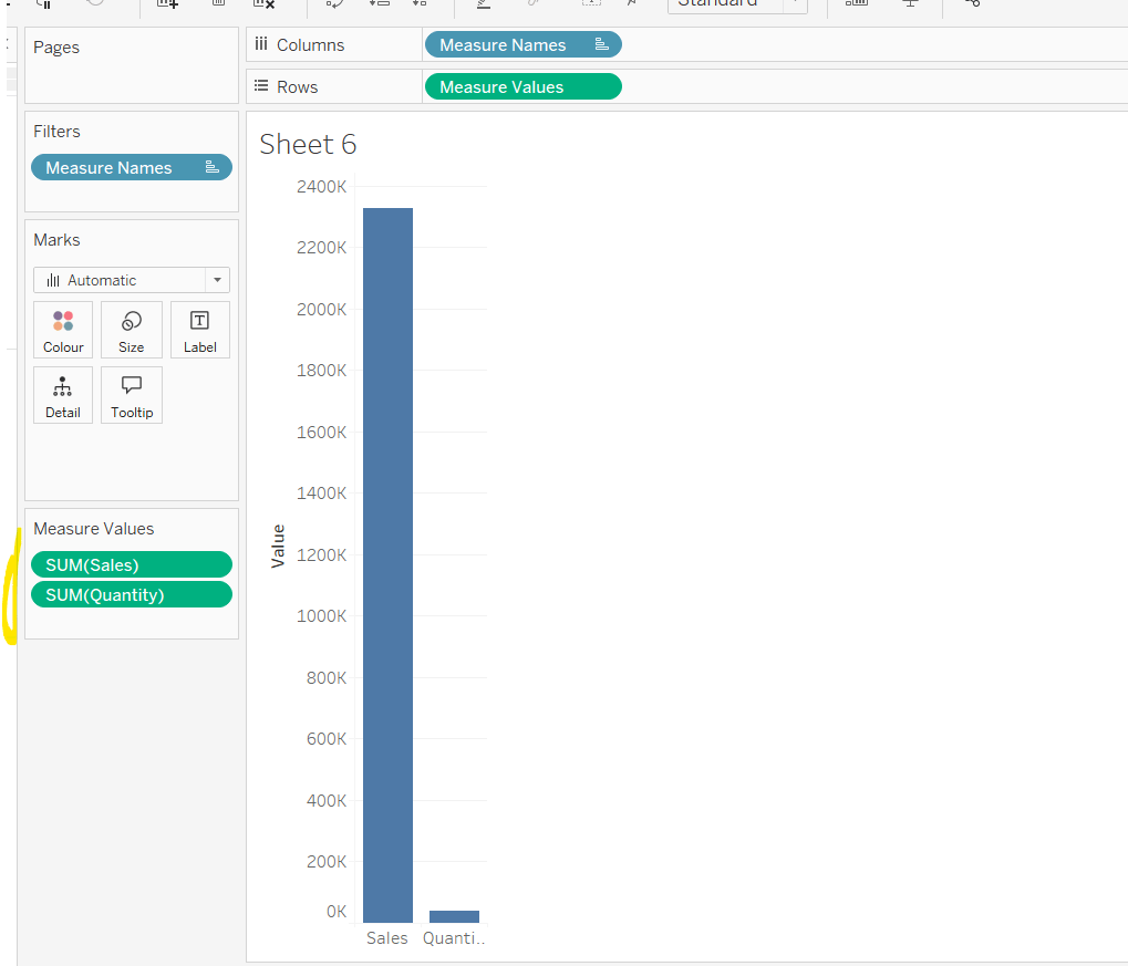
Building the Raw Values chart
Add Sales to Rows. Then drag Quantity on to the canvas and drop the pill on the Sales axis (when you see the ‘2 column’ icon appear). This has the affect of adding the fields onto a shared axis, and the sheet will update to automatically reference Measure Names and Measure Values. Swap Quantity so it is displayed below Sales in the Measure Values section.
Add Region and Category to Detail and change the Mark type to Circle.
I’m going to incorporate the last requirement at this stage, as it helps with the build, so create parameters
pSelectedRegion
string parameter, defaulted to West
pSelectedCategory
string parameter, defaulted to Furntiture
show both these parameters on the sheet.
Create a new field
Is Selected Region & Category
[pSelectedCategory]=[Category] AND [pSelectedRegion]=[Region]
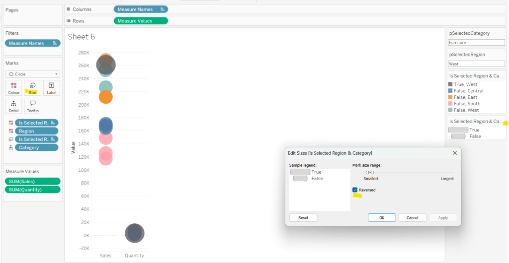
Add this field to Colour, and swap the values in the legend, so True is listed first. Then change the Region on the Detail shelf, so it is also on colour, by adjusting the icon to the left of the pill. Adjust the colours as required and then reduce the opacity on colour to 80%.
Manually update the entry in the pSelectedRegion parameter to each Region, so the True-<Region> colour combination can be updated to the dark grey.
Add Is Selected Region & Category to Size. Edit the size so they are reversed and the range in size is closer than the default. Once done, then manually adjust the dial on the Size shelf.
Show mark labels, selecting the option to only show the min & max values per cell and aligning middle right
Update the Tooltip. Then create fields True = TRUE and False = FALSE and add both of these to the Detail shelf. We’ll need these to disable the default highlighting later (adding now, as for all the other sheets, we’ll duplicate this one, so makes things easier).
Show the caption (Worksheet menu > show caption) and update the caption to reference the website Erica refers to. Then update the title of the sheet, and name the tab Raw or similar.
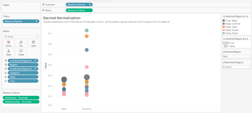
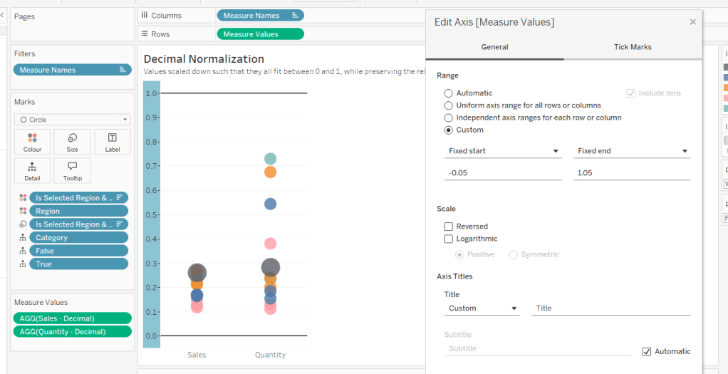
Building the Decimal Normalisation chart
Duplicate the Raw sheet, and name Decimal or similar. Update the title.
Create new fields
Sales – Decimal
SUM([Sales]) / 10^6
Quantity– Decimal
SUM([Quantity]) / 10^4
Drag Sales – Decimal onto the canvas and drop directly over the existing Sales pill in the Measure Values section, so it replaces it. Do the same with the Quantity – Decimal pill. Uncheck Show Labels.
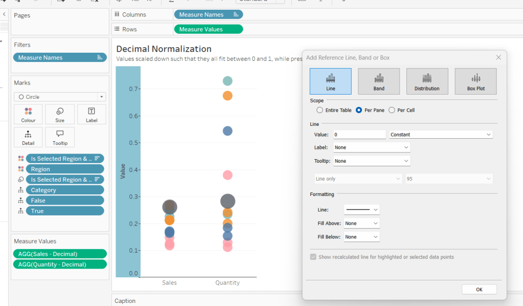
Add constantreference line of 0 that displays as a black solid line at 100% opacity
Repeat and create a constant reference line with value of 1. Edit the axis and fix from -0.05 to 1.05 and remove the axis title.
Update the text in the caption.
Building the Max-Min Normalisation Chart
Duplicate the Decimal sheet and rename Max-Min or similar. Update the title.
Drag Sales – Max-Min onto the canvas and drop directly over the existing Sales – Decimal pill in the Measure Values section, so it replaces it. Do the same with the Quantity – Max-Min pill.
Adjust the table calculation setting for each of the measures so they are computing by Category, Region and Is Selected Region & Category.
Adjust the Tooltip if required. Right click on the bottom column headings and Edit Alias to update the text- you may not be able to rename Sales – Max-Min along xyz… just to ‘Sales’, so you may need to be creative and add spaces eg ‘ Sales ‘ or similar. Update the caption.
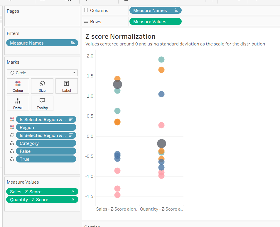
Building the Z-Score Normalisation Chart
Duplicate the Max-Min sheet, and name Z-Score or similar. Update the title.
Drag Sales – Z-Score onto the canvas and drop directly over the existing Sales – Max-Min pill in the Measure Values section, so it replaces it. Do the same with the Quantity – Z-Score pill.
Adjust the table calculation setting for each of the measures so they are computing by Category, Region and Is Selected Region & Category. Remove the reference line for the constant value of 1. Edit the axis, so the range is now Automatic rather than fixed.
As before, adjust the Tooltip again if required, edit the column labels using the alias feature, and update the caption.
Creating the dashboard and adding the interactivity
Add all 4 charts onto a dashboard, using a horizontal container to arrange the charts side by side. From the object context menu on the dashboard, select the option to show the caption
To disable the default highlighting ‘on click’ create a dashboard filter action based on the True/False method described here – you’ll need to create an action per sheet.
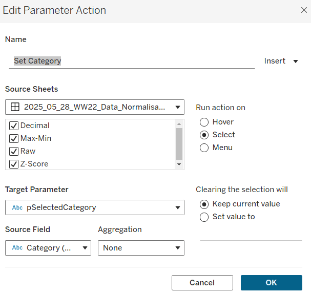
To set the parameters, create a parameter action
Set Category
On select of all the sheets, set the pSelectedCategory parameter passing in the value from the Category field.
Create another similar action called Set Region which sets the pSelectedRegion parameter with the value from the region field.
Finally, add a text section to the top right of the dashboard that references the pSelectedRegion and pSelectedCategory parameters.
Yoshi set this week’s challenge to build a page navigator, but there was so much more in it too, so this could be a bit lengthy 🙂
Note, I’m blogging based on the full ‘advanced’ challenge, to include an ‘apply all’ button as well. I built the following sheets to build this via and I’ll talk through the basics of each of them in turn
List of State names
Bar chart of total State sales
Line chart of monthly State sales
Jitter plot of State sales by order
Navigation page number buttons
Back arrow
Forward arrow
Filter summary
Apply button
Preparing the data
The data being presented is only applicable to the states of the US. In the latest versions of Superstore, information for both Canada and the US is included, so I started by adding a data source filter to include only Country/Region = United States (right click data source -> Add Data Source Filter).
Building the list of State names
Add State/Province to Rows, and apply a sort to sort by the field Salesdescending
Add State/Province to Text and to Colour. Adjust font to be bold and widen each row.
Create a new field
Index
INDEX()
and add to Rows before State/Province. Set the table calculation to be explicitly computing by State/Province. Index is essentially ranking each State from 1 to 49, as we’ve already sorted the listing of the states.
The requirement is to show up to 7 states on a page, so create
Page No
INT(((INDEX()-1) /7)) +1
Set to be a discrete field and add to Rows in front of Index. Again explicitly set the table calculation to compute by State/Province. This shows us which states are on which page.
We’re going to identify the page we’re on based on a parameter
pPageSelected
integer parameter defaulted to 1
Show the parameter, then create a new field
Is Selected Page
[pPageSelected] = [Page No]
Add to the Filter shelf. Initially select All. Then adjust/verify the table calculation is explicitly set to compute using State/Province. Then edit the filter to just show values that are True.
Adjust the pPageSelected parameter to test the functionality.
Hide the Page No, Index, and State/Province field from Rows (uncheck show header). Remove column dividers and don’t show the tooltip. Name this sheet States.
Building the bar chart
Note – to get the labelling and the spacing between the bars, this isn’t a ‘standard bar chart’. This is a technique that has been included in previous WOW challenges.
On a new sheet, add State/Province to Rows and sort by Sales descending. Add Sales to Columns and Add State/Province to Colour. Add a grey border to the bars (via Colour shelf).
Double click into Rows and manually type MIN(1.0) and change the Mark Type to bar. Add Sales to Size, then click on the Size button and adjust the size from Manual to Fixed and align right.
Add Sales to Label and align top left. Adjust the Tooltip. Add Index to the front of Rows and adjust the table calculation to be computing by State/Province.
Add Page No to the front of Rows and adjust to computing by State/Province.
Set the page to Fit Width. Show the pPageSelected parameter and add Is Selected Page to the Filter shelf and set to True. Verify the table calculation is set to compute using State/Province. If not adjust, and then recheck the filter is just showing True value.
Change the parameter to show page 2. You’ll notice the axis has now adjusted from 0 – $80,000 whereas on page 1 it went up to $450,000. We want to retain the axis scale across the pages. For this, create
Max Sales
WINDOW_MAX(SUM([Sales]))
Add this to the Detail shelf and ensure the table calculation is computing by State/Province.
Add a reference line to the bottom Sales axis (right click axis > add reference line) and set it to cover the entire table, using the average Max Sales value. Don’t show any label., tooltip or line
The axis will now have readjusted and display up to 450,000 regardless of the page you’re on.
Adjust the Min(1.0) axis to be fixed from -0.5 to 2 to add some white space around the bars.
Hide both axis, the Page No, Index and State/Province fields in Rows. Remove all gridlines, zero lines, axis rulers & tick marks. Remove column dividers. Add Row Banding.
Name the sheet Total Sales.
Building the line chart
On a new sheet, add State/Province to Rows and sort by Sales descending. Add Index and Page No to Rows too and adjust both table calcs to be explicitly computing by State/Province.
Add Order Date to Columns and adjust to be at the continuous Month/Year level (green pill ). You’ll notice the page numbering & indexes start to look odd – ie multiple states have same index.
Adjust the Order Date field to Show Missing Values, and our numbers are all aligned again.
If we just add Sales to Rows though, the indexes all mess up again due to the there being no values for some points.
To fix this create
Sales to Plot
ZN(LOOKUP(SUM([Sales]),0))
This returns 0 if there is no value for the date / state combination. Add this to Rows instead and adjust the table calculation so it is computing by both State/Province and Month Order Date.
Edit the Sales to Plot axis, so it is displays an independent axis range for each row or column – this makes the records near the bottom show peaks, rather than just a straight line.
Add Is Selected Page to the Filter shelf and set to True. Verify the table calculation is set to compute using State/Province. If not adjust, and then recheck the filter is just showing True value.
Add State/Province to Colour. Adjust Tooltip. Reduce the Size of the line.
Hide both axis, the Page No, Index and State/Province fields in Rows. Remove all gridlines, zero lines, axis rulers & tick marks. Remove column dividers. Add Row Banding.
Building the Jitter Plot
On a new sheet, add State/Province to Rows and sort by Sales descending. Add Index and Page No to Rows too and adjust both table calcs to be explicitly computing by State/Province. Add Sales to Columns and Order ID to Detail. Change mark type to circle.
Readjust the table calc settings of Page No& Index to also include Order ID, but also set the leval at State/Province.
Add State/Province to Colour, and reduce the opacity.
To get the marks to not overlap so much, create a new field
Jitter
RANDOM()
add add to Rows as a dimension. Again adjust the table calcs so Jitter is also included in the settings.
Add Max Sales to Detail and adjust the table calc settings to be computing over all 3 fields – State/Province, Jitter & Order ID.
Add a Reference line to the Sales axis across the entire table, using the average of Max Sales and don’t display any label/tooltip or line.
Add Is Selected Page to the Filter shelf and set to True. Verify the table calculation is set to compute using all fields and at the level of State/Province. If not adjust, and then recheck the filter is just showing True value.
Adjust the Tooltip. Hide both axis, the Page No, Index and State/Province fields in Rows. Remove all gridlines, zero lines, axis rulers & tick marks. Remove column dividers. Add Row Banding.
Name the sheet Sales by Order.
Building the Navigation Number Buttons
On a new sheet add State/Province to Rows and sort by Sales descending. Add Index to Rows and set the table calc to compute by State/Province. Move Index to Columns and State/Province to Detail.
Change the mark type to square and add Index to Label, aligning middle centre.
Create a new field
Colour – Page No
[Index] = [pPageSelected]
and add to the Colour shelf. Verify table calc is set to compute by State/Province. Adjust colours to suit and add a dark border.
We only want to show the indexes relating to the number of pages we have, which in turn is going to be based on what the data has been filtered by. So firstly we want to understand what the maximum number of pages is
Max Pages
IF SIZE()%7 = 0 THEN INT(SIZE()/7) ELSE INT(SIZE()/7)+1 END
If the number of results (ie number of states after filtering has occurred – the SIZE()) is exactly divisible by 7 (%7 = 0) then divide the results by 7 to get the max number of pages, otherwise, increment this value by 1. Eg if 14 results, it’ll be 2 pages, but 15 results will require 3 pages.
Now we know that, we can create
Pages to Show
INDEX() <= [Max Pages]
Add this to the Filter shelf.Set the True, Then adjust the table calc settings to be explicitly computing by State/Province for all nested calcs too.
Re-edit the filter to ensure it just shows True results.
Hide the Index from Rows and don’t show row/column dividers. Don’t show the tooltip. Name the sheet Page Nos.
Building the back arrow
On a new sheet, show the pPageSelected parameter, and change the mark type to Shape.
Create a new field
Show Page Back
[pPageSelected]>1
Add to the Shape shelf. If pPageSelected = 1, then False should display and adjust the shape to use a transparent shape (refer to this blog on how to set this up). Change the pPageSelected parameter to 2 and adjust the shape of the True option to be a filled arrow. Change colour to black.
On the dashboard ,we will need to define what page is being navigated to on click, so we need
Page Back
IF [pPageSelected]>1 THEN [pPageSelected]-1 END
Add this to the Detail shelf as a dimension.
Name the sheet Page Back.
Building the Forward Arrow
This is slightly more tricky than the back arrow, as we need to know how many pages are being displayed to know when we no longer need to show the arrow.
On a new sheet, add State/Province to Detail and sort by Sales descending. Remove the Lat/Long fields that automatically get added and change the mark type to shape. Create a new field
Show Page Forward
[pPageSelected]<[Max Pages]
and add to the Shape shelf. Set the table calc to be computing by State/Province explicitly. Set the mark type for ‘True’ to be a filled arrow and adjust colour to black.
Show the pPageSelected parameter and set to 7. Adjust the ‘False’ option to be a transparent shape.
Once again, on the dashboard, we will need to define what page is being navigated to on click, so we need
Page Forward
IF [pPageSelected]<[Max Pages] THEN [pPageSelected]+1 END
Add this to the Detail shelf as a dimension, and verify table calc is set to compute by State/Province explicitly.
We only want 1 arrow to show at most, so add Index to filter. Set to 1, then adjust table calc so it is set to compute by State/Province explicitly, and then re-edit filter to just select 1 again. Name the sheet Page Forward
Building the Filter Summary
On a new sheet add Category, Segment and Ship Mode to the Detail shelf and change the mark type to polygon..
Edit the Title of sheet and update as required
Name the sheet Filter Summary
Building the Apply Button
The basic outline for this is documented in this Tableau KB article here.
Create a calculated field
Apply
‘Apply Filters’
and add to Rows on a new sheet.
Add Category, Segment and Ship Mode to the Detail shelf and to the Filter shelf (set to All for each). Change the mark type to polygon. Right click the work ‘Apply’ in the column header and select hide field labels for rows.
Right click on the words ‘Apply Filters’ and select Format – set the shading of the header to teal.
As well as applying filters when the button is clicked, the page needs to reset to the first page. For this create
Reset Page 1
1
Add this to the Detail shelf as a dimension.
Adjust the size and colour of the font. Remove row dividers. Set the background of the worksheet to light grey. Remove the Tooltip. Name the sheet Apply Button.
Creating the dashboard
Now we have all the components, we can arrange the objects on a dashboard.
I added the 4 sheets making up the main viz int a horizontal container. All the sheets had the titles hidden, were set to fit entire view and had 0 padding, which gives the illusion of them all being a single viz. I added some outer padding to the container itself.
I used another horizontal container positioned above this one to add text boxes to give the viz headings.
Another horizontal container was placed above the title one. IN the left hand side I placed the Filter Summary viz., and in the right, I added a vertical container.
The vertical container had a blank and then a horizontal container underneath the blank object. The horizontal container then stored the page back, the page nos and the page forward sheets.
Another horizontal container was place above all this and I add the Apply Button sheet. I then moved the 3 filter objects automatically added to the sheet into this horizontal container too. I set the background of this container to light grey
Adding the interactivity
Multiple dashboard actions are needed to get the page to function as required. Now, I did have issues getting somethings to behave as I wanted, and I believe it was something to do with the order in which the actions were added. I can’t prove this… all I know is that I spent a long time trying to figure out why the filters I selected were getting reset when I pressed a page number, but removing all actions and adding again worked…
You need these actions
Apply Filters
Filter action that on select of the Apply Button sheet, targets all other sheets. Clearing the selection keeps filtered values. Category, Segment and Ship Mode should be passed through as selected fields.
Set Page No from Square
Parameter action that on select of the Page Nos sheet, sets the pPageSelected parameter passing in the value from the Index field that is not aggregated. Clearing the selection, keeps the current value.
Reset to Page 1
Parameter action that on select of the Page Nos sheet, sets the pPageSelected parameter passing in the value from the Reset Page 1 field that is not aggregated. Clearing the selection, keeps the current value.
Prev Page From Arrow
Parameter action that on select of the Page Back sheet, sets the pPageSelected parameter passing in the value from the Page Back field that is not aggregated. Clearing the selection, keeps the current value.
Next Page From Arrow
Parameter action that on select of the Page Forward sheet, sets the pPageSelected parameter passing in the value from the Page Forward field that is not aggregated. Clearing the selection, keeps the current value.
With these actions, you should be able to test the functionality, but you will find some fields become greyed out/ need clicking twice. We need to automatically ‘deselect’ them on click. For this I applied the basic principles discussed here.
Create new calculated fields
True
TRUE
False
FALSE
Add both these fields to the Detail shelf of the Page Back, Page Forward, Page Nos, and Apply Button sheets. Then add a dashboard filter action for each sheet.
Deselect Apply
On select of the Apply Button sheet on the dashboard, target the Apply Button sheet itself (ie not the object on the dashboard), passing the selected fields of True = False. Show all values when the selection is cleared.
Repeat the above for the Page Back, Page Forward and Page Nos sheets.
Hopefully with all this you have a fully functioning dashboard. My published viz is here.
It was Sean’s turn to set the challenge this week which included a lots of little details to provide a wealth of different ‘views’ on the same data within a single chart, specifically the change of measure and the change of date granularity.
Building a viz showing the timeline at different levels of granularity based on user selection, is something I’ve done several times in the past, both for other WOW challenges and also in real work situations. So I immediately headed down my ‘usual route’, creating a parameter to identify the level of the date to report at, and a calculated field to display the appropriate level based on the parameter. However, then I noticed that in Sean’s viz, if I changed the date level, the date axis display also changed, sometimes showing <Month Year> format, sometimes <Year Q> etc. Having the axis change like this isn’t something that would work with my ‘usual’ solution. I did ponder this for some time, and the only thought I had was multiple sheets – one for each date part. Sean hadn’t stated how many sheets were needed for the challenge, and it made me wonder if the omission was perhaps deliberate…
Building the Month chart
To start we need to define a parameter to identify the level of date to select
pDateGranularity
string parameter defaulted to ‘month’ with a list of options, which have an alternative display name
We also need to identify the measure we want to show. Before we can define this, we need
Profit Ratio
SUM([Profit])/SUM([Sales])
and
#Orders
COUNTD([Order ID])
We also need to be able to capture the selected measure in a parameter
pMeasure
string parameter, defaulted to PROFIT (note case). A list isn’t needed as the value will be set via an action on the dashboard
so we can then build
Measure to Display
CASE [pMeasure] WHEN ‘SALES’ THEN SUM([Sales]) WHEN ‘PROFIT’ THEN SUM([Profit]) WHEN ‘PROFIT RATIO’ THEN [Profit Ratio] WHEN ‘ORDERS’ THEN [#Orders] END
On a new sheet, add Order Date to Filters and set as a relative date filter to the last 4 years. Add Order Date to Columns as a continuous (green) pill set at the month level, and add Measure to Display to Rows.
Add the Order Date filter to ‘context’ (right click > Add to context) and set it to apply to worksheets > all using this data source. The context is necessary as when it comes to the option to select a date to highlight, only the dates within the timeframe selected should be visible. Show the pMeasure and pDateGranularity parameters.
Edit the Measure to Display axis to change the title to reference the pMeasure parameter instead (right click and edit axis).
Test the values change as expected by changing the text in the pMeasure parameter to SALES or ORDERS or PROFIT RATIO.
To identify a month to highlight, I created
Order Date – month
DATE(DATETRUNC(‘month’,[Order Date]))
and formatted this to a custom format of yyyy-mm
I then created a set off of this field (right click > create > set) and selected a single date 2021-11
Order Date – month Set
In order to make use of the set and its values, the set needs to be on the view. Add Order Date – month Set to the filter shelf. If it doesn’t happen by default, change the option on the pill to Show In/Out of set and then select both In and Out as the filter options (ie all possible values so nothing is actually being filtered).
Then click on the Order Date – month Set pill on the filter shelf and select show set. The list of values in the set should display.
Change the input type of the Set control to be a single value drop down, where the (All) option doesn’t show (via customise) and the option All values in Context is selected
We need to capture the value associated with the date selected
Month Measure to highlight
IF ATTR([Order Date – month Set]) THEN [Measure to Display] END
Add this to the Rows shelf, then make the chart dual axis and synchronise the axis. Adjust the colours of the Measure Names and then make the marktype of the Month Measure to Highlight marks card, a circle, and increase the size.
Hide the right hand axis, remove the title of the bottom axis and remove all row & column dividers. Right click on the nulls indicator and hide indicator.
Call this sheet month chart or similar.
Building the Quarter chart
Go through similar steps to build a chart to display the information at a quarterly level. The field on the Columns shelf should be Order Date set at the continuous (green) quarter level.
You will need a field
Order Date – quarter
DATE(DATETRUNC(‘quarter’,[Order Date]))
and format this to a custom format of yyyy-“Q”q
Use this to create a set off of this field (right click > create > set) and Order Date – quarter Set
You’ll also need
Quarter Measure to highlight
IF ATTR([Order Date – quarter Set]) THEN [Measure to Display] END
Building the week chart
Repeat again.
The field on the Columns shelf should be Order Date set at the continuous (green) week level.
You will need a field
Order Date – week
DATE(DATETRUNC(‘week’,[Order Date]))
and format this to a custom format of yyyy-“W”ww
Use this to create a set off of this field (right click > create > set) and Order Date – week Set
You’ll also need
Week Measure to highlight
IF ATTR([Order Date – week Set]) THEN [Measure to Display] END
Creating the BANs
To start with, we need to create some calculated fields to store the total values for each measure and the ‘highlighted’ vallues
Total Sales
{FIXED: SUM([Sales])}
format to $ with 0 dp
Total Profit
{FIXED: SUM([Profit])}
format to $ with 0dp
Total Profit Ratio
{FIXED: [Profit Ratio]}
format to % with 0 dp
Total Orders
{FIXED:COUNTD([Order ID])}
format to number with 0 dp
and we’ll also need values for the highlighted date
Highlighted Sales
IF ([pDateGranularity]=’quarter’ AND ([Order Date – quarter Set])) OR ([pDateGranularity] = ‘week’ AND ([Order Date – week Set])) OR ([pDateGranularity] = ‘month’ AND ([Order Date – month Set])) THEN ([Sales]) END
format to $ with 0dp
Highlighted Profit
IF ([pDateGranularity]=’quarter’ AND ([Order Date – quarter Set])) OR ([pDateGranularity] = ‘week’ AND ([Order Date – week Set])) OR ([pDateGranularity] = ‘month’ AND ([Order Date – month Set])) THEN ([Profit]) END
COUNTD(IF ([pDateGranularity]=’quarter’ AND ([Order Date – quarter Set])) OR ([pDateGranularity] = ‘week’ AND ([Order Date – week Set])) OR ([pDateGranularity] = ‘month’ AND ([Order Date – month Set])) THEN [Order ID] END)
format to number with 0 dp.
On a new sheet, double click into columns and manually type MIN(0.0). Repeat this 3 more times, so there are 4 instances of MIN(0.0) on the Columns shelf.
On the All marks card, add Measure Names to the Label shelf.
Now right click on Measure Names in the left hand data pane and select Aliases. Alias each of the MIN(0.0) measures to SALES, PROFIT, PROFIT RATIO, ORDERS
The labels on the viz should change
Create a new field
Sales Selected
[pMeasure] = ‘SALES’
On the 1st MIN(0.0) marks card, change the mark type to shape and add Sales Selected to the shape shelf. Use a transparent shape (see here for details) for the False value, and use the provided sparkline image (which you need to add to your shape palette) for the True value (change the pMeasure parameter to SALES for the True option to show). Increase the Size of the shape to around the 3/4 mark.
Add Total Sales and Highlighted Sales to the Label shelf, and then adjust the font position, size and colour accordingly. This is what my label dialog looked like – Measure Names is centred, while the other two fields are right aligned, and the overall alignment is right too.
Adjust the MIN(0.0) axis to be fixed from -0.2 to 1 to give the mark and the text enough space to breathe.
Now repeat the exercise for the other 3 marks cards. You will need the fields
Profit Selected
[pMeasure] = ‘PROFIT’
Profit Ratio Selected
[pMeasure] = ‘PROFIT RATIO’
Orders Selected
[pMeasure] = ‘ORDERS’
and you’ll need to change the value in the pMeasure parameter to get the relevant shape to show or not for each measure
Finally, create fields
True
TRUE
False
FALSE
and add these both to the Detail shelf of the All marks card. We’ll use these to stop the BANs from being ‘highlighted’ on click on the dashboard.
Then remove all row/column dividers and gridlines & zero lines
Building the dashboard
Create the dashboard, and arrange all the objects so the controls/filters are listed in a row at the top, and the 3 charts are arranged side by side underneath.
If you’ve got dates selected for your quarter & week, then in the data pane, right click on the relevant set, edit set and uncheck any option. This should then give you (None) in the dropdowns.
We will use dynamic zone visibility to control which charts & highlight date controls to display. For this we need fields
Show Monthly
[pDateGranularity] = ‘month’
Show Quarterly
[pDateGranularity] = ‘quarter’
Show Weekly
[pDateGranularity] = ‘week’
On the dashboard, select the monthly chart, and then from the Layout tab, select Control visibility using value and choose the Show Monthly field. Set the control visibility for the highlight a month object to also use the Show Monthly field.
Set the control visibility for the Quarterly chart and highlight a quarter object to use the Show Quarterly field, and set the control visibility for the Weekly chart and highlight a week object to use the Show Weekly field.
Create a dashboard parameter action to set the pMeasure parameter on click of the BANs sheet, passing in the Measure Names to the parameter
Set measure
Create a dashboard filter action to stop the BANs from being highlighted ‘on click’
Kyle set a challenge this week inspired by a chart Ann Jackson demoed at #data22 as part of her Advanced Speed Tips session with Lorna Brown. This was both an in person presentation and available virtually (hence the link to the video above). I couldn’t attend the in person session due to a clash, but I had already watched the session prior to this challenge being set, so I attempted to build from memory without referring back. To find out what to do, you can either watch Ann herself demonstrate via the link above, or read on 🙂
Building the WAR chart
Build a basic bar chart by adding Name to Rows and WAR to Columns
Whilst we could sort the data at this point, we’re going to leave for now, as we want the ‘ranking’ field to define the sort.
Now rather than use the RANK table calculation option, the essence of this being included in a tipping session, is to utilise the INDEX table calculation instead. By using INDEX, we don’t need to create as many fields as if we used RANK. We can reuse the INDEX across all the charts.
So, let’s create that field
Index
INDEX()
Format this to be a number with 0dp and prefixed by #
The INDEX() table calculation simply lists your rows or columns of data from 1 to however many entries there are. The Index can span the whole width/length of the table or can restart at intervals depending how you choose to partition/structure your table. You can also control how the data will be indexed based on how you want it sorted.
Add Index to Rows, then change it to be discrete (blue), and position in front of Name. Edit the table calculation setting so that it is computing using Name and is sorted by WAR descending.
We need to capture the name of a player, so we’ll create a parameter for this
pSelectedPlayer
String parameter defaulted to Ken Giffey Jr.
Show this parameter on the view.
We also need a field to identify whether the row matches the parameter
Is Selected Player?
[pSelectedPlayer] = [Name]
Add this to the Colour shelf and adjust accordingly.
Then re-edit the table calculation so it is computing by Is Selected Player as well.
Note – to prevent having to change the table calculation, the alternative is to make the Is Selected Player field on the Colour shelf an Attribute (just choose this setting from the context menu when you click on the pill).
Additionally add Is Selected Player to Rows before Index., the manually sort that field so True is listed first. This will move the relevant record to the top of the scree, but the rank number will be preserved.
Hide the Is Selected Player field (uncheck Show Header), and Hide Field Labels for Rows.
Adjust row dividers, so the divider is at level 1, and the header is dotted line, while the pane is solid.
Remove column gridlines, but add a column axis ruler.
Show mark labels, set them to be left aligned and the colour to match mark colour. You may need to widen the rows to see the labels display.
Add a border to the bars via the Colour shelf.
Format the Index and Name fields displayed – I used Tableau Regular font size 12, and right aligned the Index field.
Update the tooltip and add a header.
The final step, which we’ll do now, is to add a couple of fields to stop the rows from being highlighted when selected on the dashboard.
Create a field True = TRUE and False = FALSE, and add these fields to the Detail shelf.
Building the Batting Average chart
Create a basic bar chart with Name on Rows and BA on Columns. Add Is Selected Player to Colour and apply border.
Format the BA field using custom formatting of .000;-.000 then show mark labels, and left align and format as you did above.
Add Index to Rows, make discrete and move to be in front on Name. Adjust the table calculation to compute by Name and Is Selected Player and this time adjust the sort to use BA descending.
We now need to filter the data to only show the 5 rows above & below the selected index. First we need to identify them.
Selected Player Index
WINDOW_MAX(IF ATTR([Is Selected Player]) THEN INDEX() END)
The inner IF statement returns the index associated to the selected player. The WINDOW_MAX function then ‘spreads’ this value across all the rows in the data. So we can then identify the records we need
Records to Keep
[Index] >= [Selected Player Index]-5 AND [Index] <= [Selected Player Index]+ 5
Add this to the Filter shelf and initially select all the values.
Now edit the table calculation settings of this field. It will now contain nested calculations – one related to Index and one related to Selected Player Index. Ensure both are computing by Name and Is Selected Player and both are sorting by BA descending.
Then edit the filter and just select True.
Now apply the tooltip, set the heading and format the headers, remove gridlines, row dividers etc.
Then follow the same steps to create similar charts of the OPS and HR measures, remembering to apply the sorts on the table calculations to the relevant field.
Adding the interaction
Once you have all four sheets built, add to a dashboard. Then create a parameter action to select the player from the WAR sheet.
Select Player
On select of the WAR sheet, set the pSelectedPlayer parameter passing in the Name field.
Then create a filter action to prevent the selection on the WAR sheet from remaining highlighted.
Unhighlight WAR
On selection of the WAR sheet on the dashboard, target the WAR sheet directly and use Selected fields, setting True = False.
Fingers crossed and you should now have a working dashboard. My published version is here.
As soon as I saw that Candra’s challenge for this week was going to involve Regular Expressions (RegEx), I gave a little groan. RegEx just isn’t my thing 😦 I only ever seem to use them for these challenges, and not in my working life, so have minimal experience. I always think I should focus some time on learning them properly, but other things just end up taking priority. Ho Hum…
So most of my time was spent trying to wrangle the info I needed to identify ‘how many bedrooms’ each property had. I did a bit of googling to try to find the right expressions I think I needed, used the regex101 site to test my expression to find certain patterns of text against some of the data in the Description field, and then tried to plug that into a calculated field in Tableau to extract the data I needed.
But I couldn’t get it to work 😦 I could find matching text using the REGEXP_MATCH function, but when I then tried to use the REXP_EXTRACT functions I couldn’t get anything out…
So I ended up having to look at the solutions that had already been published by the time I started, Candra’s, Lorna Brown’s and Sam Epley’s. I just needed to get my head round what I was obviously doing wrong and give me some pointers. All 3 had slightly different approaches. I absorbed, then closed their workbooks and attempted again from memory. With a lot more trial and error I got somewhere… it isn’t perfect and has some mismatches from the others (but they don’t all match each other either…).
Once I’d got a grouping for each property, the actual Tableau stuff was quite straightforward…
Identifying the ‘Number of Bedrooms’
Building the Histogram
Adding the Average Price
Building the Map
Adding the Interactivity
Identifying the Number of Bedrooms
So the way I approached this, was to try to identify all the various permutations that represented the word ‘bedroom’ and replace it with the word ‘Bedroom’. But one of the options was BR or br, and the Description field contained html markup with the term <br />. I didn’t want all these to become ‘bedroom’, so I got rid of them all first,
Firstly, replace any occurence of <br /> with a space, then replace any occurrence of the text bedroom or br<space> or bdrm or bed or bd or br<comma> or br<forward slash> or rooms with the word Bedroom.
I basically added more options to the or statement (identified by the | separator), as I went on examining the descriptions that were left. Using the LOWER function meant that bedroom or Bedroom or BedRoom etc would all be covered with one option.
Then I attempted to extract the number of bedrooms or identify as a studio
Studio | Beds
IF CONTAINS(LOWER([Desc with Bedroom]), ‘studio’) THEN ‘Studio’ ELSEIF REGEXP_MATCH(LOWER([Desc with Bedroom]),’\d bedroom’) THEN REGEXP_EXTRACT(LOWER([Desc with Bedroom]),'(\d+) bedroom’) ELSEIF REGEXP_MATCH(LOWER([Desc with Bedroom]),’\d bedroom’) THEN REGEXP_EXTRACT(LOWER([Desc with Bedroom]),'(\d+) bedroom’) ELSEIF CONTAINS(LOWER([Desc with Bedroom]), ‘six bedroom’) THEN ‘6’ END
If the revised description contains the word ‘studio’ then assume its a Studio.
Else if the revised description contains a number (\d) followed by 2 spaces then the word ‘bedroom’ then extract the numbers (\d+) that occur before the word bedroom. The brackets around the \d+ is what is used to identify what bit of the matching pattern to extract… this is the bit that I didn’t really know about and why I couldn’t get things to work.
Else if the revised description contains a number (\d) followed by 3 spaces then the word ‘bedroom’ then extract the numbers (\d+) that occur before the word bedroom. This just happened to be another pattern that occurred and meant some records didn’t get picked up by the prior statement. There’s probably a better way of doing this in one statement…
Finally, if the revised description contains the text ‘six bedroom’ then assume the property has 6 rooms.
This logic seemed to get a match against every record although it’s not 100% accurate, but it was close enough given my struggles.
I then wanted to get the rooms grouped
Room Grouping
CASE [Studio | Beds] WHEN ‘Studio’ THEN ‘Studio’ WHEN ‘1’ THEN ‘1 Bedroom’ WHEN ‘2’ THEN ‘2 Bedrooms’ WHEN ‘3’ THEN ‘3 Bedrooms’ WHEN ‘4’ THEN ‘4 Bedrooms’ ELSE ‘5 or more Bedrooms’ END
I planned to use this field as my filter, but in doing so the value listed alphabetically, so Studio ended up at the bottom of the list.
To resolve this I created a parameter which meant I could define the order I wanted :
pBedroomSelector
And then I created a new field to use for the filter
Filter Room
[pBedroomSelector] = ‘All’ OR [pBedroomSelector] = [Room Grouping]
I could then add this onto the filter shelf of the sheets I needed to build, setting the value to True.
Building the Histogram
For this chart, we need to ‘bin’ the Price of each property into groups of $100 ranges. However if we use the built in ‘bin’ function, the field created can’t be referenced in other calculations, and I needed to do this. So instead I determined the ‘lower’ value of the range by
Price per Night Min
FLOOR([Price]/100) *100
Divide the price by 100, round down to the nearest whole integer (so 1.9 will round down to 1), then multiply the result by 100.
And given that, I can then calculate
Price per Night Max
[Price per Night Min]+100
I also created a ‘friendlier’ field to store the number of properties
# of Listings
COUNT([listings copy_listings copy])
which is just a reference to the auto generated field created when you connect to the data source.
With these I can plot the histogram
Price per Night Min on Columns (set to discrete, continuous)
# of Listings on Rows
Mark type of Bar
Size set to be Fixed with a width of 100
Filter Room on the Filter shelf, set to True.
Adjust the colour via the Colour shelf and set a white border
Show the pBedroomSelector parameter
Add Price per Night Max to the Tooltip shelf and set to be an attribute.
Set the Tooltip accordingly and format gridlines, axes labels etc
Adding the Average Price
I wasn’t entirely sure what the average price on Candra’s solution represented, so I chose to go for the average price of the properties in the filtered selection; that is of all the 2-bedroom properties for example, find the average price per night, based on the total price per night of all the properties divided by the number of properties. ie I was looking for these values in the 3rd column.
But I couldn’t simply add the Price field aggregated to Avg to the bar chart. Doing so gave me different values per Price per Night Min grouping.
I just want the value on the grand total line spread across the all the data in the chart. So I created
Window Avg Price
WINDOW_SUM(SUM([Price])) / WINDOW_SUM([# of Listings])
This table calculation, set to compute by Price per Night Min gives the value I want across all rows of data
Add Window Avg Price to the Detail shelf of the histogram, set the calc to compute as above. Then you can add a reference line to the Price per Night Min axis.
Building the Map
To build maps you need fields that are geographic data types. For me, the Longitude field was already set, but I had to manually set the Latitude field (right click -> Geographic Role -> Latitude).
Once done, the map could be quickly built by double-clicking the Longitude field, then double clicking the Latitude field, then adding Name and Listing URL to the Detail shelf, and Price to the Tooltip shelf. Finally set Filter Room = True to the Filter shelf.
I then adjusted the colour of the circles, reduced the opacity to 50% and added a border (all via the Colour shelf).
I also added Area Code Boundaries via the Map -> Map Layers menu to get the map style Candra had used.
Adding the Interactivity
Add the 2 sheets to a dashboard. Each chart can be used to filter each other. This functionality can easily be added by clicking on the context menu of the dashboard object, and selecting Use as Filter. A filter dashboard action will automatically be added. Do this for both charts.
The final requirement, is for a link to the actual listing to be available from the map tooltip. This is a dashboard URL Action (Dashboard -> Actions -> Add Action -> Go to URL). Set as below
The words in the Name field will what is displayed on the tooltip.
The layout requires use of containers, background colours and a bit of padding. This is typically a bit of trial and error to get this right. You can check out my published version here.
At first glance it looked like it would be tricky, and it was! There were many head-scratching moments as I made my way through this, and I couldn’t complete it all without having to look at Ivett’s solution – more on that later.
Understanding the data
First up, a word on the data provided, as the requirements weren’t as clear as I’d have liked.
Ivett provided a small custom data set to build this challenge on
It contains 2 rows for each Sub-Category. The value to be plotted for Review is evident on the challenge – it’s an average. But the aggregation for Revenue & Budget isn’t that obvious, as there is no direct indication on a label or in the tooltip. Should the values be summed or averaged, or a combination of both?
The Profit value in the tooltip is the only clue you have. The Profit value for Tables is -$60, the value for Chairs is $50. From examining the values in the data, the assumption is Profit = AVG(Revenue) – AVG(Budget), so the values to plot for Budget and Revenue need to be averaged.
The assumption is this data set is a combination of a two datasets; one containing the Revenue & Budget per Sub-Category
the other containing the customer reviews
So when it comes to the viz, we’re looking to plot based on the following data
Understanding what numbers I need to be aiming for when doing these challenges is crucial to me to ensure I’m heading down the right path 🙂
Duplicating the Data
The key thing to realise about this chart is that the right hand line is a fake axis; ie not an axis at all, just a vertical line located so that it looks like it is an axis.
What we actually need to do is build a triangle for each Sub-Category, where each point of the triangle is a different (x,y) coordinate. This means we need 3 rows of data per Sub-Category, 1 row to represent each point being plotted.
So for this we need to Union the data twice, so there are 3 instances of the data – drag another instance of the table into the data pane and drop when the Union option appears. Do this twice.
The union duplicates the rows of data, and each set is identifiable by an automatically generated Table Name field containing values WW, WW1,WW2
Defining the points of the triangle
As I said above, we need to build a triangle for each Sub-Category, where each point of the triangle is a different (x,y) coordinate.
At point 1, we’re going to plot our Review value. At point 2, we’re going to plot our Revenue value, and Budget will be at point 3.
From the diagram above, you can see our x coordinates are one of two numbers, either 0 or x1 (ie the x coordinate for the Revenue & Budget points is the same).
The y coordinates vary per measure, and need to be ‘normalised’ to a common scale, as otherwise, the Revenue & Budget figures would be plotted significantly higher than the Review values (you might find this blog by Zen master Jonathan Drummey useful at this point).
When normalising, you’re typically looking to convert your values to a scale from 0-1; this means the values aren’t plotted at their absolute values, but are still plotted in the same relative order to each other ie lowest value at the bottom, highest at the top.
When normalising a set of values from 0 to 1, your lowest value would typically be at the 0 position , with your highest value at the 1 position. To calculate where your value would sit on this scale, you need to know 3 numbers; the value to convert, the maximum value in the range of values to plot and the minimum value in in the range of values to plot. The normalised value is then :
(Current value – min value) / (max value – min value)
ie the difference between your value and the lowest as a proportion of the difference between the whole range.
However, in this instance, I chose to simplify the normalisation, and my method only works due to the values in the example data provided.
Side Note I consider Revenue & Budget to be values that are directly related to each other ie if Budget = Revenue I’d expect them to be plotted at the same point. I therefore chose to normalise these values across the combined range. This gave me different results from the solution, where Budget and Revenue were normalised independently of each other.
The maximum average review value is 5, the maximum value for budget and revenue combined is 100. As 100 is exactly 20 times bigger than 5, I simply chose to normalise the revenue/budget values to be on a scale of 0-5 instead, rather than normalising all values (Review, Budget & Revenue) to be on a 0-1 scale.
First up, we want to identify a position for each point
Path
IF [Table Name] = ‘WW’ THEN 1 ELSEIF [Table Name] = ‘WW1’ THEN 2 ELSE 3 END
Then we’ll create the x coordinate for each point
x
IF [Path] = 1 THEN 0 ELSE 20 END
I’ve just chosen an arbitrary value to plot the 2nd & 3rd points at – could easily have been 1.
Then we’ll create the y coordinate for each point, which is where the normalisation comes in
y
IF MIN([Path]) = 1 THEN AVG([Review]) ELSEIF MIN([Path]) = 2 THEN AVG([Revenue])/20 ELSEIF MIN([Path]) = 3 THEN AVG([Budget])/20 END
Dividing by 20, normalises the values to a scale of 0-5 as discussed above.
Let’s put these values all out in a table, so we can see what’s going on
Building the Polygon Viz
You can see we have 3 points per Sub-Category, so we can plot the x & y measures on a sheet as follows :
Add Min(x) to Rows
Add y to Columns
Add Sub-Category to Detail
Add Table Name (or Path) to Detail
Change Mark Type to Polygon
Change Colour to #666666 with 30% opacity
Tooltips
We need 2 new calculated fields for the Tooltip
Profit
AVG([Revenue]) – AVG([Budget])
formatted to $ with 0 dp
Margin
[Profit]/AVG([Budget])
formatted to % with 1 dp.
Note this will differ from the solution, where I think Ivett inadvertently used SUM(Budget) rather than AVG.
Add these to Tooltip field and adjust text accordinly.
Colouring the Line
To make the line, I created a second instance of y
y2
IF MIN([Path]) = 1 THEN AVG([Review]) ELSEIF MIN([Path]) = 2 THEN AVG([Revenue])/20 END
which just plots 2 points rather than 3.
Add this to Columns next to y, make dual axis and synchronise axis. Things might have disappeared – you need to remove Measure Names from both marks cards. Change the mark type of the y2 card to Line.
You won’t see much difference at this point (or you shouldn’t). We need a field to define the colour
Colour : Line
IF [Profit] < 0 THEN ‘Non-Profitable’ ELSE ‘Profitable’ END
Add this to the Colour shelf of the y2 marks card and adjust to suit.
Labelling the line
On the y2 marks card, add Review (set to AVG) to Label shelf, and move Sub-Category to Label shelf. Set Label to only label Start of Line. Adjust format/layout of Label to suit.
Set the format of Review to Number Standard – this is a format little used, but will display a whole number or a decimal. I discovered this through an Andy Kriebel WoW from a long time ago and is a real gem!
Finalising the viz
To tidy up and get the viz looking like the solution
Format to remove all gridlines
Hide the y2 axis
Hide the ‘4 nulls’ indicator if you have it
Edit the y axis
Fix the axis from 0.5 to 5.25
Add a title
Set axis ticks to none
On the y2 marks card, edit the Colour shelf and change the markers to show to All (this gives the circles on each end of the line)
Change the Min(x) pill to be FLOAT(Min(x)) using the ‘type in pill’ function
Edit the x axis to be Fixed from -0.3 to 19.9
cutting off the end of the axis makes the end circle disappear. This is very sneaky, and I had to see the solution for this!
Hide the x axis
Remove the row divider lines
So we’ve now got the core viz – hooray! But we’re not quite done – boo!
Expand /Collapse
Ivett set the viz to expand to show a column by Sub-Category on click.
This is another requirement I couldn’t get however hard I tried. I duplicated my viz and created a version with Sub-Category on Columns and tried to use Parameter Actions to set a parameter that would control which viz would display using a sheet swap techinque. However when I added the necessary field to the Detail shelf, all the polygons disappeared and I don’t understand why…. I therefore published my first instance of this challenge with a parameter the user controlled to decide which view to show. This is here.
So I had to look at Ivett’s solution to see how she had achieved this, and it involved sets.
Right click on Sub-Category and Create – > Set
Selected Sub-Cats
Don’t select any values at this point.
Create a field
Expand
IF [Selected Sub-Cats] THEN [Sub-Category] ELSE ‘Click to Expand’ END
If there are values in the set, then the set values will be returned, otherwise the text ‘Click to Expand’ will display.
Add this to the Columns shelf, and ‘Hide field labels for columns‘ so the text ‘Expand’ doesn’t show.
A dashboard action will ultimately drive the behaviour, but we can test the display by editing the set and selecting all values.
The view should expand as expected, showing a column per Sub-Category
But the name of the Sub-Category is still displayed on the label, and in the example this isn’t the case. To fix this I created another calculated field
Label: SubCat
IF [Selected Sub-Cats] THEN ” ELSE [Sub-Category] END
which I added to the Label shelf, and adjusted the display to suit.
‘Reset’ the view to show the collapsed version by re-editing the set and removing all values.
How to Read this chart legend
I simply duplicated the main viz, and filtered by Sub-Category = Chairs.
I removed the label, and then used the Annotate Point functionality to add the relevant labels against the points.
Profitable Legend
The Profitable / Non-Profitable legend makes use of our trusted friend MIN(0), with pills arranged as below.
Applying the Set Action
Create a dashboard to the size specified, and just use floating objects to position the text and various sheets.
To drive the expand / collapse function, create a Set Action on the main viz as below, that targets the Selected Sub-Cats set.
Revenue / Budget Label
This is just managed using Text objects on the dashboard, carefully positioned in the right locations. You might need to add additional objects to get the layout required.
The background of the whole dashboard is set to light grey and the sheets and objects need to be set to the same grey or white to get the same presentation.
So fingers crossed, you should have a complete solution now.
My final version (after I peeked at Ivett’s) is here.