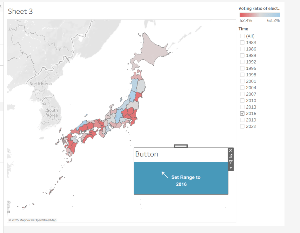
Yusuke set the challenge this week which allowed us to try out a new feature of Tableau – Dynamic Colour Ranges. As a consequence, you’ll need v2025.2 for this.
Setting up the Data for use in a Map
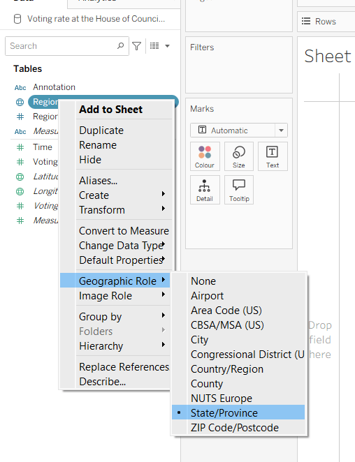
After connecting to the CSV file provided by Yusuke, I had to set the Region field to have a Geographic Role of State/Province
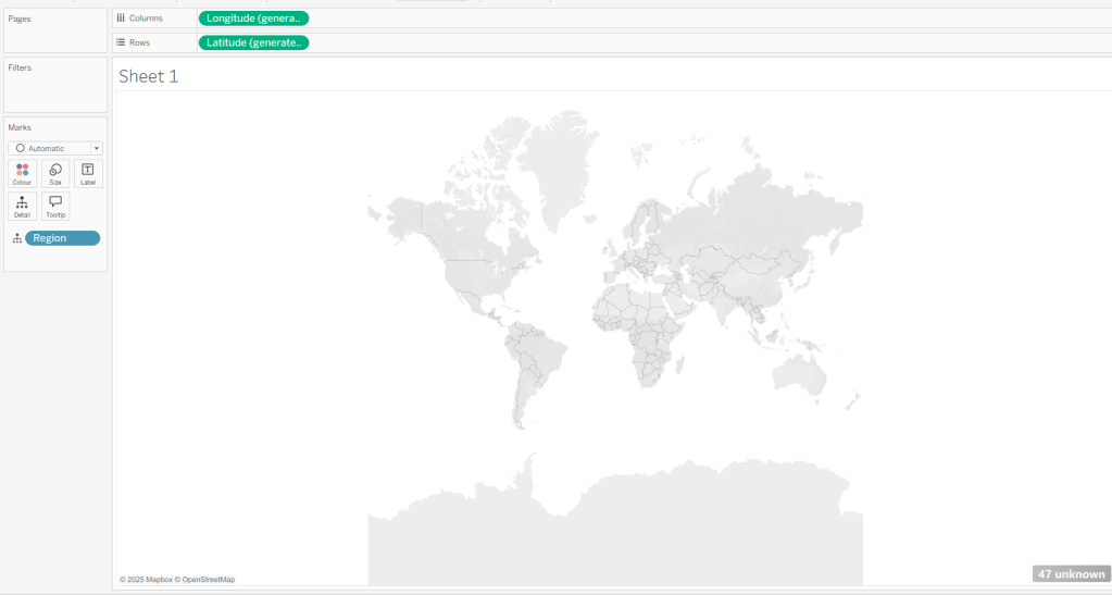
I then double-clicked on Region to generate the map, but due to my location settings, no information displayed.
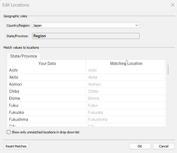
To resolve this, Edit Locations (via Map menu) and change Country/Region to Japan.
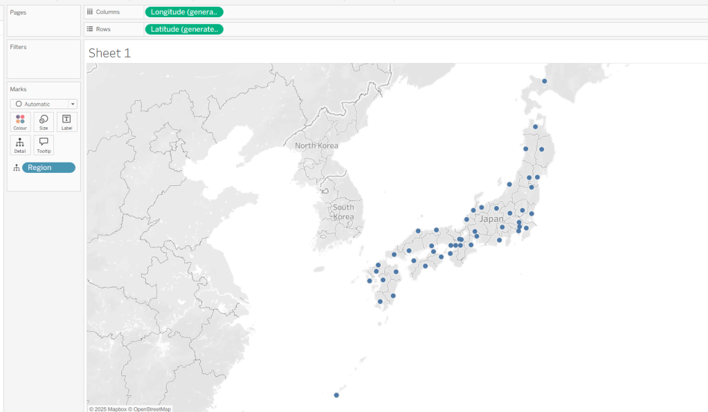
The Your Data – Matching Location fields should then match, and pressing OK presents a map.
Building the Basic Viz
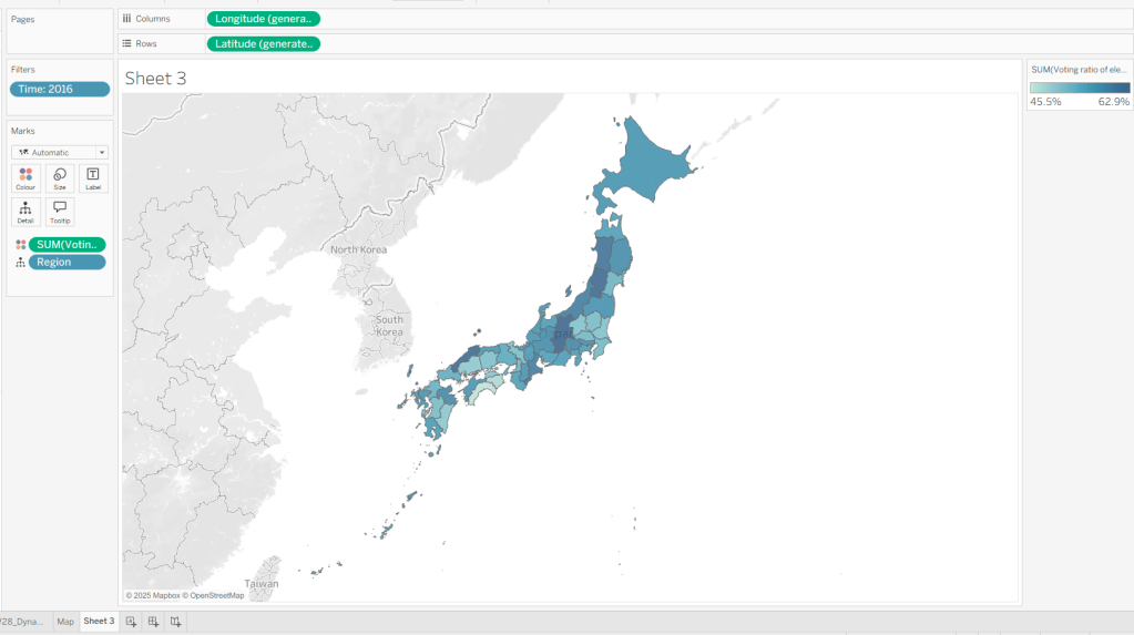
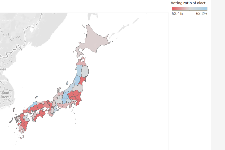
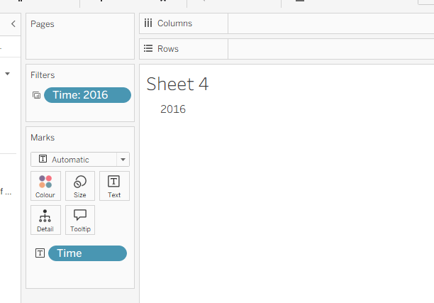
Move Time from the ‘Measures’ section of the Data pane into the ‘Dimension’ section (drag it to be above the line). Format the Time field to be a custom number with 0 dp and to not show ‘,’ as a thousand separator. Then add Time to Filter and select 2016. Add Voting Ratio of election… to Colour. Adjust the Tooltip.
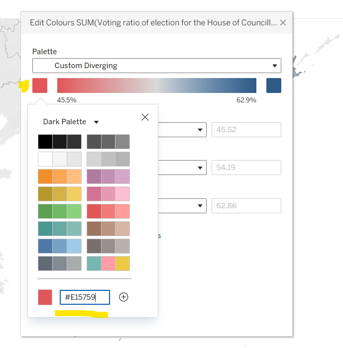
Edit the Colour Legend and choose a diverging colour palette (eg Red-Blue Diverging), then adjust the start and end colours as required
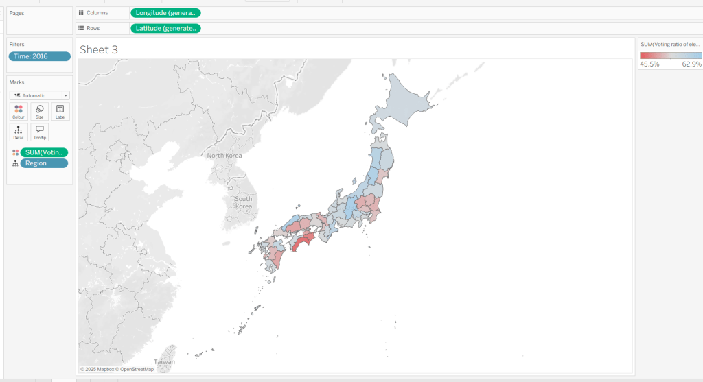
At this point, if you now make a selection on the map, the colours will remain as they are based on the current range
But what we want to happen, is for the colours to reflect a range based on just the selection (dynamic colour range). For this we need to create parameters
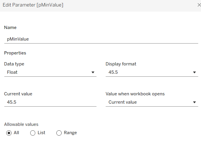
pMinValue
float defaulted to 45.5
pMaxValue
float defaulted to 62.9
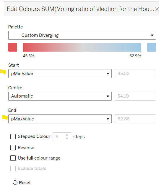
Edit the Colour Legend again, and this time set the Start and End fields to reference the pMinValue and pMaxValue parameters.
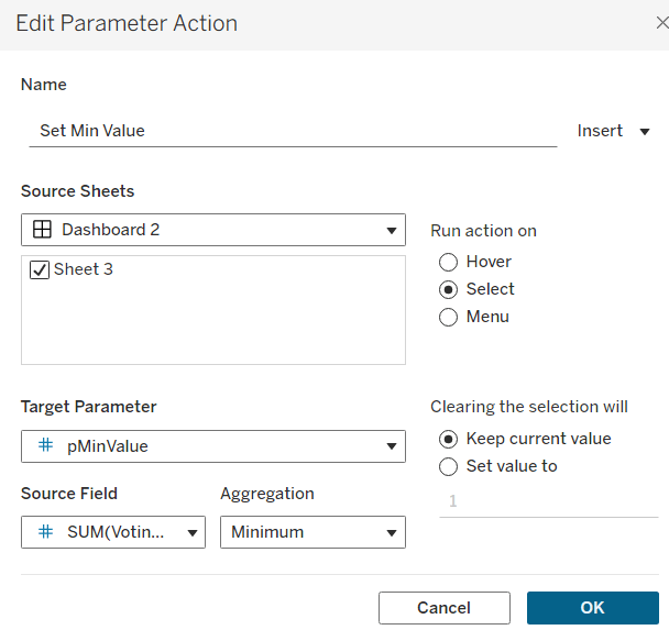
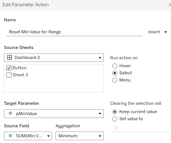
Add the sheet onto a dashboard. Add a dashboard parameter action
Set Min Value
on select of the sheet, set the target parameter pMinValue to the minimum value from the Voting Ratio of election..
Create another dashboard parameter action
Set Max Value
on select of the sheet, set the target parameter pMaxValue to the maximum value from the Voting Ratio of election..
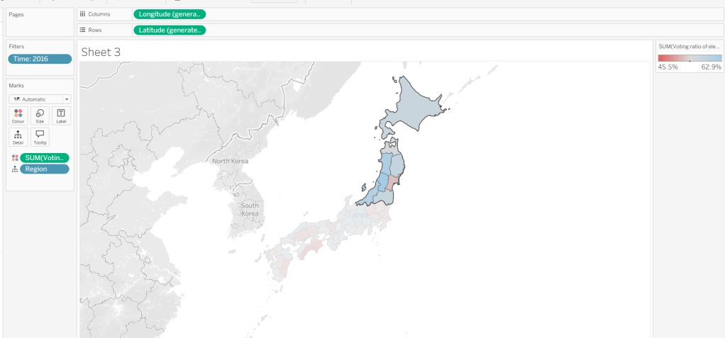
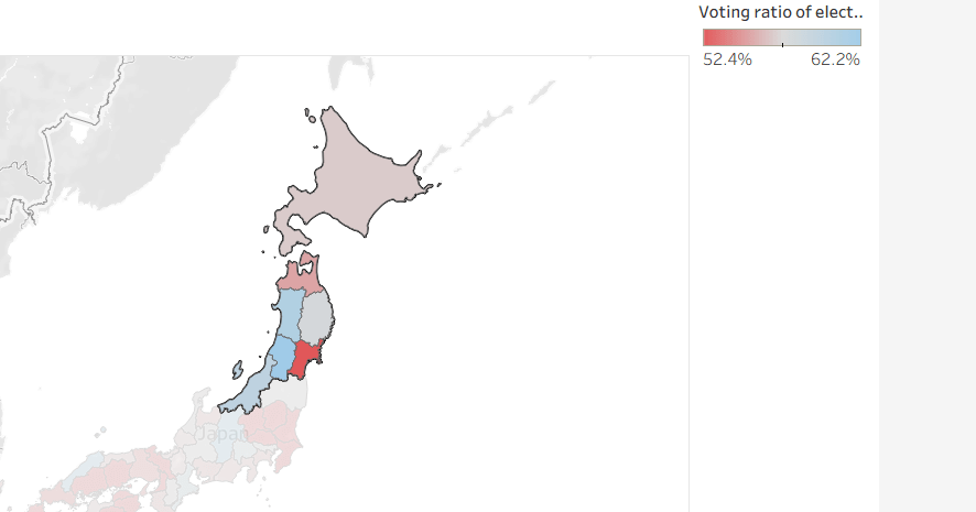
With this you should now find that when making a selection, the colour range is defined by the minimum and maximum values of just the marks selected
However the downside of this, is if you deselect the marks, the range doesn’t reset, and you then see the whole map coloured based on this more restricted range
Bonus – Building a ‘reset button’
On a new sheet, add Time to Text. Go back to the Map sheet, and set the Time filter to apply to ‘selected worksheets’, and select the new sheet you’re working on.
Change the mark type to Shape and choose a transparent shape (see here for details on how to set this up). Set the display to Entire View, then update the text in the Label (I sourced an arrow character from here). Align the text middle centre, set the background of the worksheet to blue and then update the font of the label text to white.
The intention is when the ‘button’ is clicked, we will set the pMinValue and pMaxValue parameters with the smallest and largest values associated to the year selected. His means we need to have some values on the ‘button’ sheet to pass to the parameters. So we need
Min Value for Year
{FIXED [Time]: MIN([Voting ratio of election for the House of Councillors (Single constituencies) %])}
and
Max Value for Year
{FIXED [Time]: MAX([Voting ratio of election for the House of Councillors (Single constituencies) %])}
Add both of these to the Detail shelf. Hide the Tooltip.
Add this sheet as a floating object to the dashboard. Show the Time filter from either the Map or Button sheets.
Add dashboard parameter actions, similar to the ones we did before
Reset Min Value for Range
on select of the Button sheet, set the target parameter pMinValue to the minimum value from the Min Value for Year field
Reset Max Value for Range
on select of the Button sheet, set the target parameter pMaxValue to the Maximum value from the Max Value for Year field.
Now if you ‘click’ the button sheet, the range should reset to the complete range for the relevant year.
Create the Label
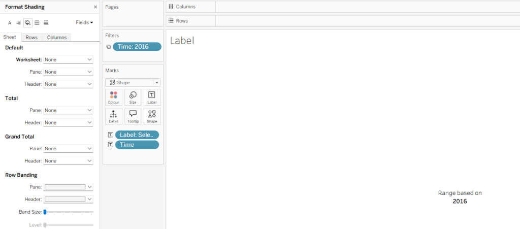
Create a new sheet and add Time to Text. As before set the Time filter from another sheet to apply to ‘selected worksheets’, and select the new sheet you’re working on. Change the mark type to Shape and choose a transparent shape. Set the display to Entire View, and align the text middle centre. Hide the Tooltip.
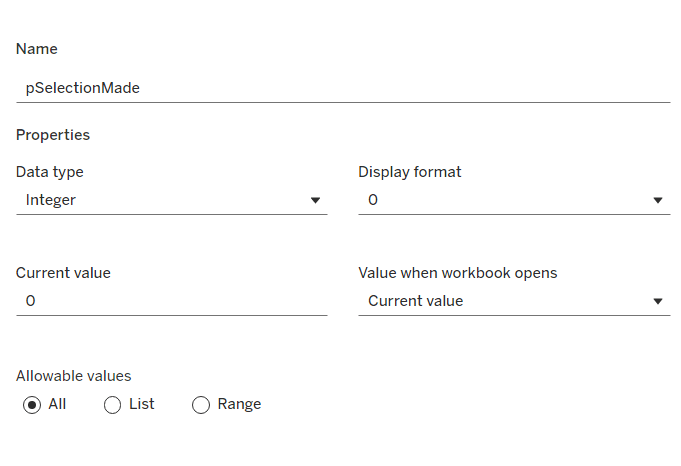
Create a parameter
pSelectionMade
integer parameter, defaulted to 0
Create a field
Selection Made
1
and another field
Reset Selection
0
Move both fields into the Dimension section of the data pane.
On the Map sheet, add Selection Made to the Detail shelf.
On the Reset Button sheet, add Reset Selection to the Detail shelf.
Create a new field
Label: Selection Made
[pSelectionMade]=1 THEN ‘, Selected Prefecture(s)’ END
Add Label: Selection Made to the Label shelf and adjust the text. Set the background of the sheet to transparent (None)
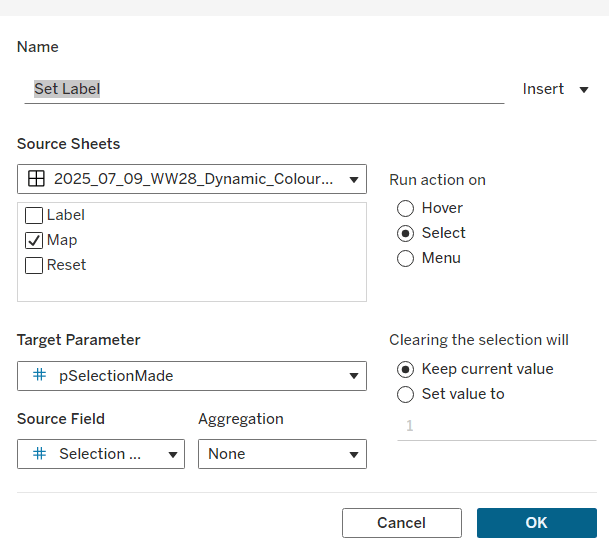
Add the sheet to the dashboard and create the following dashboard parameter actions
Set Label
on select of the Map sheet, set the target parameter pSelectionMade to the Selection Made field, with no aggregation.
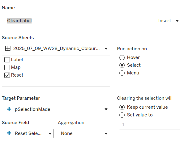
Clear Label
on select of the Reset Button sheet, set the target parameter pSelectionMade to the Reset Selection field, with no aggregation.
Final steps are to then arrange the dashboard as required using floating containers to store the filter, legend, ‘button’ and Label sheets. You’ll also need to change the filter to a single value list and customise so ‘All’ isn’t an option.
Yusuke set this week’s challenge which is pretty tough-going. I got there eventually, but it wasn’t smooth sailing, and had a lot of false starts and changes to calculations throughout to get to the end. I will endeavour to explain where I had difficulties, but some of the calculations I came up with were more down to trial and error ( eg I wonder if this will work…?) rather than a known direction.
Modelling the data
We were provided with a version of Superstore and a State Abbreviations data set. I chose to use the Superstore Excel file I already had. I combined the two data sets in the data source pane using a relationship where State/Province in the Orders table of the Superstore excel file matched with the Full Name field in the State Abbreviations csv file.
As the data was just related to 2024, I added this as a data source filter (Year of Order Date = 2024)
Identifying the month
I decided I was going to use a parameter to select the month to filter. I first created
Order Date MY
DATE(DATETRUNC(‘month’,[Order Date]))
and then created a parameter
pOrderDate
date parameter defaulted to 01 Dec 2024, that I populated as a list using the values from the Order Date MY field. I set the display format to be a custom format of mmmm yyyy
Examining the data
On a new sheet, add State/Province and Abbreviation to Rows and Category to Columns to create a very simple ‘existence table’.
The presence of the Abc in the text table, shows that at least 1 record exists for the State/Category combination during 2024.
We can see some states, such as Arkansas, District of Colombia, Kansas etc don’t have any records at all for some Categories. However, when we look at the viz, we can see markers and labels associated to these Categories. In the image below, Kansas shows markers and labels against Furniture and Technology, when there are no records for these combinations at any point in 2024.
Handling this situation is the reason some of the calculations that follow are more complicated than you might expect.
Building the Trellis/Panel Chart calculations
Now when I built the viz, putting it into a trellis display was the last thing I did, but in rebuilding in order to write the blog, I’m finding that the table calcs needed start to help with the missing marks discussed above.
We need to count the number of States. For this create
State Count
SIZE()
Make this discrete and add to Rows. Adjust the table calculation to compute by State/Province and Abbreviation. 47 should be listed against every row in the column which is the number of rows displayed, and an Abc mark now exists for every State/Category combination.
We’ll also create
Index
INDEX()
make this discrete and add to Rows as well adjusting the table calculation to also compute by State/Province and Abbreviation
This has the effect of providing a counter for every row from 1-47.
We also need a parameter to define how many columns the display will be over
pCols
integer parameter defaulted to 8 which displays a range from 1 – 15 with a step of 1
With these fields, we can now define which row each record will sit on based on the counter for each State (the Index) and the number of columns to display (pCols).
Rows
INT(([Index]-1)/[pCols])
and we can also work out which column each record will sit in
Cols
([Index]-1)%[pCols]
Make both these fields discrete and add to Rows. Verify the table calc setting is as before. Show the pCols parameter, and test changing it and observe how the Rows and Cols values change
Remove State Count and Index from Rows. These won’t be needed in the final viz, as they’re just building blocks for other calculated fields.
Calculating the Profit Ratios
We need two Profit Ratio values – one for each State and Category per month and one ‘overall’ for each State by month
At the State/Category level, create
Monthly Sales
IF [Order Date MY] = [pOrderDate] THEN [Sales] ELSE 0 END
and
Monthly Profit
IF [Order Date MY] = [pOrderDate] THEN [Profit] ELSE 0 END
and from this create
Monthly PR
ZN(SUM([Monthly Profit])/SUM([Monthly Sales]))
custom format this to 0.0%;-0.0%;N/A which will then display the text N/A whenever the value is 0. Add this to the Text shelf.
Some additional State/Province records have appeared at this point with no Abbreviation (null). Filter these out.
To get the Overall profit ratio for the State, I created
State Sales for Month
{FIXED [State/Province]: SUM( IF [Order Date MY] = [pOrderDate] THEN [Sales] ELSE 0 END) }
and
State Profit for Month
{FIXED [State/Province]: SUM( IF [Order Date MY] = [pOrderDate] THEN [Profit] ELSE 0 END) }
and then created
PR for Month
SUM([State Profit for Month])/SUM([State Sales for Month])
and formatted this to a % with 1 dp.
Add PR for Month into the table and then apply a Sort to the State/Province field to sort by PR for Month descending
We’ve still got some gaps – we want to see the PR for Month value populated against every Category which have a profit ratio. For this create
State PR for Month
WINDOW_MAX([PR for Month])
Add this to the table and apply the table calculation to compute by Category only – we now have the overall profit ratio for each State plotted against every Category.
Note – we needed both PR for Month and State PR for Month as the latter is a table calculation and we can’t apply sorting on a table calc.
Building the panel chart
In building this I referred to my own blog post on a previous challenge, as the bar chart we need to build, isn’t a typical bar chart.
On a new sheet, add State/Province, Abbreviation and Category to Rows. Add Monthly PR to Text. Move the Abbreviation pill from Rows to Filters and exclude Null. Sort the State/Province field by PR for Month descending. Show the pOrderDate and pCols parameters.
Add Cols to Columns and Rows to Rows, so it’s the first pill listed. Move State/Province to Detail. Adjust the table calculations of both the Rows and Cols fields to be computing by State/Province and Category (listed in that order), and at the level of State/Province.
To build the bars, we’re using ‘fake axis’ on both the x & y axis to position the marks we want to display. We need
PR Bar Axis
ZN(LOOKUP(MIN(0.0),0))
and
Y-Axis
IFNULL(LOOKUP(MIN(0.5),0),0.5)
As alluded to above, these evolved as I played around to get the behaviour required.
Add Y-Axis to Rows and adjust the table calculation to compute by State/Province and Category (in that order) at the level of State/Province. Edit the axis to be fixed from -1 to 4.
Add PR Bar Axis to Columns. Again adjust the table calculation setting to be as the others. Change the mark type to Bar. Add another instance of Monthly PR to the Size shelf, and then adjust the Size to be Fixed and aligned Left.
Add Monthly PR to the Colour shelf, and adjust the colour legend to be fixed from -1.5 to 1.5 and centred at 0.
Edit the PR Bar Axis axis to be fixed from -1.25 to 1.25, to ensure the bars remain centred aligned regardless of the month selected.
Adjust the Tooltip as required.
Format the chart to remove all gridlines, remove the zero line for rows, and make the zero line for columns more prominent – dashed and darker. Remove all axis ticks. Add dark row and column dividers against the pane only and at the appropriate level so the information for a single State is contained within the boundaries.
Add row banding against the pane only at the appropriate band size and level
Reduce the width of each row, and widen each column to get a ‘squarer’ display.
Now we need to add the State/overall profit square. for this we need to ‘position’ a mark on the viz
Square Point
IF LAST()=0 THEN 0.9 ELSE NULL END
Add this to Columns. Edit the table calculation so it’s just computing by Category, then make the chart dual axis and synchronise axis.
This has created a second marks card, and essentially ‘duplicated’ the information for the ‘last’ Category only in each State.
Change the mark type to square. Remove Monthly PR from Colour and Size and Label . Add State PR for Month to Label and Colour instead. Adjust the table calculations to be computing by Category only. Align the label to be middle centre. Increase the Size of the mark so it’s roughly square.
Adjust the Colour legend of the State PR for Month so it ranges from -1.5 to 1.5 like the other one.
Adding Abbreviation to Label doesn’t work for every cell, so we need
Label – Abbreviation
WINDOW_MAX(MAX([Abbreviation]))
Add to Label and adjust the table calculation to be computing by Category only. Adjust the layout of the Label to match.
Update the Tooltip to reference State PR for Month instead. Hide the null indicator.
Finally hide the axis and the Cols and Rows pills (right click, uncheck show header). Hide the Category column title. Name the sheet.
And that should be the main viz. Add to a dashboard and only show one of the colour legends, renamed accordingly.
Sean chose to revisit the first challenge he participated in as part of retro-month at WOW HQ. Since the original challenge in 2018, there have been a significant number of developments to the product which makes it simpler to fulfil the requirements. The latest challenge we’re building against is here.
Building the KPIs
This is a simple text display showing the values of the two measures, Sales and Profit. Both fields need to be formatted to $ with 0dp.
Add Measure Names to Columns
Add Measure Names to Filter and limit to just Sales and Profit
Add Measure Values and Measure Names to Text
Format the text so it is centrally aligned and styled apprpriately
Uncheck ‘show header’ to hide the column label headings
Remove row/column dividers
Uncheck ‘show tooltip’ so it doesn’t display
Building the map
The map needs to display a different measure depending on what is clicked on in the KPIs. We will capture this measure in a parameter
pMeasure
string parameter defaulted to Profit
Then we need to determine the actual measure to use based on this parameter
Measure to Display
If [pMeasure] = ‘Profit’ THEN SUM([Profit]) ELSE SUM([Sales]) END
format this to $ with 0 dp
Double click on State/Province to automatically generate a map with Longitude & Latitude fields. Add Measure to Display to Colour. Adjust Tooltips.
Remove the map background via the map ->background layers menu option, and setting the washout property to 0%. Hide the ‘unknown’ indicator.
Update the title of the sheet and reference the pMeasure parameter, so the title changes depending on what measure is selected.
Show the pMeasure parameter and test typing in Sales or Profit and see how the map changes
Building the bar chart
Add Sub-Category to Rows and Measure to Display to Columns. Sort descending. Adjust the tooltip.
Edit the axis so the title references the value from the pMeasure parameter, and also update the sheet title to be similar.
Building the dimension selector control
The simplest way of creating this type of control is to use a parameter containing the values ‘State’ and ‘Sub-Category’. But you are very limited as to how the parameter UI looks.
So instead, we need to be build something bespoke.
As we don’t have a field which contains values ‘State’ and ‘Sub-Category’, we’re going to use another field that is in the data set, but isn’t relevant to the rest of the dashboard, and alias some of it’s values. In this instance I’m using Region.
Right click on the Region field in the data pane and select Aliases. Alias Central -> State and East -> Sub-Category.
On a new sheet add Region to Rows and also to Filter and filter to State & Sub-Category. Manually type in MIN(0.0) into the Columns shelf. Add Region to the Label shelf and align right. Edit the axis to be fixed from -0.05 to 1, so the marks are shifted to the left of the display.
We will need to capture the ‘dimension’ selected, and we’ll store this in a parameter
pDimension
string parameter defaulted to Central
(note – although the fields are aliased, this is just for display – the values passed around are still the underlying core values).
To know capture which dimension has been set we need
State is Selected
[Region] = [pDimension]
Change the mark type to Shape and add State is Selected to the Shape shelf, adjusting so ‘true ‘ is represented by a filled circle, and ‘false’ by open circle. Set the colour to dark grey.
Change the background colour to grey, amend the text style, hide the Region column and the axis, remove all gridlines/row dividers.
Finally, we will need to stop the field from being ‘highlighted’ on selection. So create two fields
True
TRUE
False
FALSE
and add both of these to the Detail shelf. We’ll apply the required interactivity later.
Building the dashboard
You will need to make use of containers in order to build this dashboard. I use a vertical container as a ‘base’ which consists of the rows showing the title, then BANs, a horizontal container for the main body, and a footer horizontal container.
In the central horizontal container, the map and the bar chart should be displayed side by side. We need each to disappear depending on the dimension selected. For this we need
Show Map
[pDimension] = ‘Central’
and
Show Bar
[pDimension] = ‘East’
On the dashboard, select the Map object and then from the Layout tab, select the control visibility using value checkbox and select the Show Map field.
Do the same for the Bar chart but select the Show Bar field instead.
Select the colour legend that should be displayed and make it a floating object. Position where you want, and also use the Show Map field to select the control visibility using value checkbox.
Adding the interactivity
To select the different measure on click of the KPI, we need a parameter action
Set Measure
On select of the KPI chart, set the pMeasure parameter passing in the value from the Measure Names field.
And to select the dimension to allow the charts to be swapped, another parameter action
Set Dimension
On select of the Dimension Selector sheet, set the pDimension parameter, passing in the value from the Region field
Finally, to ensure the dimension selector sheet doesn’t stay ‘highlighted’, add a filter action
Unhighlight Dimension Selector
On select of the Dimension Selector sheet on the dashboard, target the Dimension Selector sheet directly, and pass values setting True = False
Hopefully this is everything you need to get the dashboard functioning. My published viz is here.
Lorna Brown set the challenge this week to build this butterfly chart, so called because of the symmetrical display. I’ve built these before so hoped it wouldn’t be too taxing.
The data set isn’t very verbose, fields for gender & year specific values by age bracket
When connecting to this excel file, you need to tick the Use Data Interpreter checkbox which removes all the superfluous rows you can see in the excel file.
Now, I started by building a version that required no further data reshaping, which I’ve published here. This version uses two sets of dual axis, and I use the reversed axis feature to display the male figures on the left. This version required me to float the Population axis label onto the dashboard so it was central. Overall it works, the only annoying snag is that I have two 0M labels displayed on the bottom axis, since this isn’t a single axis. As a result, I came up with an alternative, which matches the solution, and which I’m going to blog about.
Reshaping the data
So once I connected to the data and applied the Use Data Interpreter option, I then selected the Males, 2021 and Females, 2021 columns, right clicked and selected Pivot
This results in a row for the Male figures and a row for the Female figures, with a column Pivot Names indicating the labels for each row. I renamed this to Gender, and the Pivot Values column to Population.
Building the Chart
On a sheet, add Age to Rows and Population to Columns and Gender to Colour. Set Stack Marks Off (Analysis > Stack Marks > Off).
You’ll see that both the values for the Male & Female data is displaying in the positive x-axis. We don’t want this. So let’s create
Population – Split
IF [Gender]= ‘Males, 2021’ THEN [Population]*-1 ELSE [Population] END
Replace the Population pill on Columns with Population Split
So this is the basic butterfly, but now we need to show the Total Population. Firstly, let’s create
Total Population per Age Bracket
{FIXED Age: SUM([Population])}
And then similarly to before, we need to display this in both directions against the Male and the Female side, so create
Total Population Split
IF [Gender]= ‘Males, 2021’ THEN [Total Population per Age Bracket]*-1 ELSE [Total Population per Age Bracket] END
Drag this field onto the Population Split axis until the two green column icon appears, then let go of the mouse. This is creating a combined axis, where multiple measures are on the same axis.
Move Measure Names from Rows to the Detail shelf and then change the symbol to the left, so the pill is also added to the Colour shelf. Adjust the colours of the 4 options accordingly.
Edit the axis and rename to Population. Then Format the axis, and set the scale to display in millions to 0dp
The tooltip needs to display % of total, so we’ll need
% of Total
SUM([Population]) / SUM([Total Population per Age Bracket])
Add this to the Tooltip shelf
We also need the population figures on the tooltip displayed differently, so explicitly add Population Split and Total Population Split to the Tooltip shelf. Use the context menu of the pills on this shelf, to set the display format in the pane to be millions to 2 decimal places. But this time, once set using the Number(Custom) dialog, switch to the Custom option and remove the – (minus sign) from the format string. This will make the values displayed against the Males which are plotted on the -ve axis, to show as a positive number.
Finally, set aliases against the Gender field, so it displays as Males or Females (right click on Gender > Aliases).
Now you have all the information to set the tooltip text.
Now add a title to the sheet to match that displayed, hide field labels for rows, and adjust any other formatting with row/column dividers etc that may be required, and add to a dashboard.
And that should be it. My published version of this build is here.
Ann Jackson’s husband Josh (@VizJosh) set the challenge this week, to build an ‘application’ to help visualise the scale of wildfires; that is when a fire is said to be 5000 acres, you can use the app to view how that compares to an area of the world you may know, so you can really appreciate just how large (or small) the fire is.
I have to hold my hand up here, and say that after reading the requirements several times, I was absolutely stumped as to where to start. We were provided with some ‘data’ to copy which consisted of 5 rows, which I duly copied and pasted into Desktop, but I then like ‘what now….?’ I knew I needed something geographic to build a map, but couldn’t understand the relevance of the 5 rows… I’ve said before I don’t use maps that often, so was unsure whether there was something I needed to do with this data. After staring at the screen for what seemed like an age, I ended up looking at the solution.
The data is just ‘dummy’ data and is just something to allow you to ‘connect’ Tableau to. You can’t build anything in Tableau without a data source. It could just have been 1 row with a column headed ‘Dummy’ and a value of 0. If it had been that, it might have been more obvious to me 🙂
Defining the parameters
Building the map
Apply button
Dashboard Actions
Defining the parameters
Ultimately the ‘data’ being used to build the viz is driven by parameters – the Location selector and the Latitude & Longitude inputs.
pLocation
An integer list parameter that stores values, but displays worded locations – wherever you choose. I opted for my hometown of Didcot in the UK alongside locations Josh had used, mainly so I could validate how the rest of the ‘app’ would work when I came to build it.
pLongitude
Float input, defaulted to the longitude of location 1 (ie Didcot) above.
I just googled Didcot Latitude and Longitude to find the relevant values
Note – Longitude W means an input of -1 * value. Similarly for Latitude S needs to be a negative input.
Then I created
pLatitude
Since we’re talking about parameters, there’s a couple more required, so lets create them now
Acres
Integer parameter defaulted to 5000
pZoom
Integer, list parameter with the values below, defaulted to 2.
Building the map
Now we have some lat & long values (in the pLatitude and pLongitude parameters), we can create some geographic data needed to build a map.
Location
MAKEPOINT([pLatitude], [pLongtitude])
This gives us the centre point which we want to build the ‘fire size’ buffer around. For this we need the calculation JOsh kindly provided :
Acres to Feet
SQRT(([Acres]*43560)/PI())
and then we can create the buffer
Fire Size
BUFFER([Location],[Acres to Feet],’ft’)
Double click on this field and it should automatically create you a ‘map’
Adjust the map ‘format’ via the Map > Map Layers menu option. I chose to set it to the dark style at 20% washout, then ticked various selections to give the details I needed (I added and removed options as I was testing against Josh’s version). I also set the colour of the mark via the Colour shelf to be pale red.
Also, as per the requirement, turn off the map options via Map > Map Options menu, and unchecking all the selections.
So this is the basic map, and you can input different lats & longs into the parameters to test things out.
The zoom had to be x times the size of the circle on the map, so achieved by
Zoom
BUFFER([Location],[pZoom] * [Acres to Feet],’ft’)
Add this a map layer (drag field onto the map and drop onto the Add a Marks Layer section that displays)
This has generated a 2nd circle and consequently caused the background map to zoom out. We don’t want this circle to show, nor to be selected, so on the Colour shelf, set the Opacity to 0%, and the Border and Halo to None. To prevent the circle from showing when you hover your mouse on the map, you need to Disable Selection of the Zoom marks card
Apply Button
On a separate sheet, double click into the space below the Marks card, and type ‘Apply’ into the resulting ‘text pill’ that displays, and then press return.
This will create a blue pill, which you can then add to the Label/Text shelf. Align the text to be middle centre
This view is essentially going to act as your ‘Apply’ button on the dashboard. When it is clicked on, we want it to take the Lat & Long values associated to the place listed in the pLocation parameter, and update the pLatitude & pLongitude parameter values.
For this, we need a couple of extra calculated fields
Location Lat
CASE [pLocation] WHEN 1 THEN 51.6080 WHEN 2 THEN 40.7812 WHEN 3 THEN 51.5007 WHEN 4 THEN 48.8584 END
Note – as before, all these values were worked out via Google as shown above.
Location Long
CASE [pLocation] WHEN 1 THEN -1.2448 WHEN 2 THEN -73.9665 WHEN 3 THEN 0.1246 WHEN 4 THEN 2.2945 END
Add both these fields to the Detail shelf of the Apply sheet.
Dashboard Actions
When you add the 2 sheets to the dashboard, you then need to add parameter actions to set the values of the pLongitude & pLatitude parameters on click of the Apply button
Set Lat
A parameter action that runs on Select of the Apply sheet, setting the pLatitude parameter with the value from the Location Lat field.
You need another action Set Long which does a similar thing by passing the Location Long field into the pLongitude variable.
Finally, you don’t want the ‘Apply’ button to look ‘selected’ (ie highlighted pale blue) once clicked. Create calculated fields True = True and False = False and add both of these to the Detail shelf on your Apply button sheet.
Then add a dashboard filter action that uses Selected Fields and maps True to False
Hopefully, this should provide you with all the core features to get the functionality working as required. Ultimately once I got out of the starting blocks, it wasn’t too bad…
This week’s #WOW challenge was set by Ann primarily to demonstrate the recent 2020.2 release of relationships in Tableau. This is a change to how the data modelling works when combining data together, in this case actual sales data and sales goal (target) data. Ann provided a ‘tweaked’ version of superstore sales data for the actual sales, alongside a custom ‘goals’ data set which provided a sales goal value for each month per Segment and Category (ie the goals data was not as granular as the actual sales data).
Combining the Data
Obviously, to make use of the new relationships feature, you’ll need at least v2020.2.1 installed.
When you add the 2 data sources to the Data Source pane and add the Orders sheet from the Superstore data and then add the Sheet 1 from the Sales Goals data, you’re prompted to add a relationship if matches can’t automatically be found (ie the field names aren’t identical).
I added relationships for the Segment, Category and Month of Order Date fields, which then provides a ‘noodle’ link between the two sets of data
Note – to add multiple relationships, you have to close the field listing to then see the Add more fields option.
With relationships, Tableau is now smarter at how it manages the queries between the data. I’m not going to go into it at length (as there’s plenty of good Tableau documentation on the subject), but I’ll quickly show the difference between this and a traditional ‘join’.
In the Relationships model, if I show Sales and Goal by Month & Segment, the Goal is based on the sum of the rows associated to that Month and Segment that you can find if you looked at the source spreadsheet directly
But if I was using a traditional join with these data sets :
and then presented the same info as above
The Goal data is way off, as it’s being influenced by all the additional rows of data that have been constructed by the join clause.
If we expand to the Category level in each example above (the level at which the Goal data is stored), the Relationship version still shows the correct value
while the Join version is still incorrect, and only changing to an Average aggregation do we get the figure needed
Joining the data requires more work (calculations / knowledge) to ensure the Goal data is reporting correctly at the various levels, whereas the Relationships model ‘just works’.
Building the Table
When I started building the solution, I actually started with the YoY trend chart, but found I had to revisit it (swap a couple of pills about) as I progressed through, so I’m going to start with the table of data itself.
This turned out to be really quite tricksy… it’s just a table right… looks harmful enough…. but Ann had lobbed a few ‘gotcha’ grenades into the mix, that took a bit of head-scratching!
First up, Ann likes to use capitalisation, so I simply renamed the following fields
Category (from Sheet 1 – the Goals data) -> CATEGORY
Segment (from Sheet 1 – the Goals data) -> SEGMENT
Month of Order Date (from Sheet 1 – the Goals data) -> MONTH
Sub-Category (from Orders – the Superstore Sales data) -> SUB-CATEGORY
And I then created a hierarchy called SEGMENT which stored SEGMENT – > CATEGORY -> SUB-CATEGORY.
We also needed to ‘fake’ today so we can show sales to date. The Orders Superstore data set contains data from the start of 2016 to the end of 2019. We needed to pretend ‘today’ was 1st July 2019 and not show any sales beyond the end of the month. So I created the field
Today
#2019-07-01#
and then
ACTUAL SALES
IF DATETRUNC(‘month’,[Order Date])<= [Today] THEN [Sales] END
If we build out the basics of the table
SEGMENT hierarchy on Rows
MONTH (discrete, exact date, formatted to mmmm yyyy) on Rows
Measure Names on Columns and on Filter, filtered to ACTUAL SALES and Goal
Measure Values on Text
MONTH on Filter, set to exclude 2016
we get
and as we expand the hierarchy to the next level, the ACTUAL SALES and Goal adjusts as expected
but when we reach the 3rd level we see a couple of issues
The Goal is showing the values that were displayed at the CATEGORY level, since it isn’t set at any further level. The requirement we have is to show the value ‘No Goal’ instead once we reach this point.
We also have a set of values with a NULL SUB-CATEGORY. This is because there are dates with goal values in the Goals data set, but we have no Sales data for those dates, so a match at the SUB-CATEGORY level can’t be found. We need to remove these records when at this level, and actually only show records where we have ACTUAL SALES, so records from July 2019 onwards should also be excluded.
At this point, I did end up having a sneak look at Ann’s solution. I had an idea of what I wanted to do, BUT I was worried that I may be missing something related to the new data model… that perhaps there was a feature of relationships that I needed to be exploiting as part of this, rather than go down the table calculation route I was heading towards. After all, part of doing these challenges for me is to make use of new features & functions if I can, so I have a reference workbook for future use. I had a read up on the blog posts related to relationships, but couldn’t spot anything obvious, hence a quick check at Ann’s solution…. nope nothing special required in respect of the data model….so instead, we need some additional calculations to help resolve all this.
What we need is some way to identify when we’re at the lowest SUB-CATEGORY level. We’ll start by counting the number of distinct sub-categories we have
# Sub Cats
ZN(COUNTD([SUB-CATEGORY]))
Wrapped in a ZN will return the value 0 when none exist.
Dropping this into the table of data, we can see the 0s for all the future Goal records, and 1 for the rest of the rows, since we’ve expanded to the SUB-CATEGORY level.
If you collapse up to the CATEGORY level, the #Sub Cats count changes, as each row typically contains more than 1 SUB-CATEGORY.
The term ‘typically’ in the above statement though is the reason we can’t assume we’re at the lowest level if the count is 1 though. It is possible for the sales against a particular CATEGORY in a MONTH to only span a single SUB-CATEGORY (Check out Home Office -> Furniture in Jan 2018). So we also need
Max Sub-Cats in Window
WINDOW_MAX([# Sub-Cats])
Which will count the maximum number of SUB-CATEGORY records for each SEGMENT and CATEGORY. In the case of Furniture Sales in the Home Office in Jan 2018, you can see below the count of sub-categories is 1 but the maximum count in the window is 4.
This shows we’re not at the SUB-CATGEORY level, as when we are, the #Sub Cats = Max Sub Cats in Window (ie 1=1)
So with that knowledge we can now derive an alternative field for the goal
SALES GOAL
IF ([# Sub-Cats] = 1 AND [# Sub-Cats]=[Max Sub-Cats in Window]) THEN 0 ELSE SUM([Goal]) END
Remove the original Goal field from the table and add this instead, setting the table calculation to compute by MONTH and you’ll see the SALES GOAL value change from a value to 0 as you expand down to the SUB-CATEGORY level.
So how do we show ‘NO GOAL’ instead of 0? Well this is a bit of a sneaky formatting trick, and one I couldn’t figure out (this step was actually the last thing I changed before publishing).
In my original SALES GOAL calculation I had set the value to be NULL rather than 0 expecting there to be an option to show the NULL values as something else (ie NO GOAL). But the feature I was looking for wasn’t available (maybe I was mistaken about when it appears.. maybe it’s disappeared in 2020.2… I still need to investigate). Anyhow, my alternative was to create a string field to store the value in, but this would make formatting the number quite cumbersome, and I was sure that wasn’t the case.
So I had to check Ann’s solution. Instead of NULL, she had set the value to be 0, and consequently used the following custom number formatting :
“$”#,##0;-“$”#,##0;”NO GOAL”
where the last bit is how to format 0. Very very sneaky huh!
So we’ve worked out how to identify when we’re at the SUB-CATEGORY level, and managed to display ‘NO GOAL’ when at that level, now we need to filter out some of the rows (but only when at this level).
Records to Show
IF [Max Sub-Cats in Window] = 0 THEN FALSE ELSEIF ([# Sub-Cats] = 1 AND [# Sub-Cats]=[Max Sub-Cats in Window]) THEN //at lowest level IF ATTR([MONTH]) < [Today] THEN TRUE ELSE FALSE END ELSEIF [# Sub-Cats] = 0 AND [Max Sub-Cats in Window] = 1 THEN FALSE //still at lowest level but no sales so exclude ELSE TRUE END
This took a bit of trial & error to work out, and there may well be something much more simplified.
Adding this to the table, and again setting to compute by MONTH you can see which rows are reporting True and False. When collapsed to the SEGMENT or CATEGORY level, all rows are True, but the values start to vary when at the SUB-CATEGORY level.
Now, we need to work on the fields to help show us the actual & % difference.
RESULT
IF ([# Sub-Cats] = 1 AND [# Sub-Cats]=[Max Sub-Cats in Window]) THEN NULL ELSE SUM([ACTUAL SALES])-([SALES GOAL]) END
The difference should only show if we’re not at the lowest level. This needs to be custom formatted as
will give me the % difference (format to percentage with 0 dp).
And the final piece of data we need (I think) is to compute a RAG status for each row. This is dependent on some parameters
GREEN (WITHIN X%)
Type Float, set to 0.1 but displayed as a percentage
and similarly
RED (ABOVE Y%)
With these we can work out
RAG
IF ABS([ACTUAL vs GOAL]) > [RED (ABOVE Y%)] THEN ‘WAY OFF TRACK’ ELSEIF ABS([ACTUAL vs GOAL]) < [GREEN (WITHIN X%)] THEN ‘ON TRACK’ ELSEIF ATTR([MONTH])>=[Today] THEN ‘NO COMPARISON’ ELSEIF [SALES GOAL]=0 THEN ‘NO COMPARISON’ ELSE ‘OFF TRACK’ END
If you add all these fields to your table then you can check how they all compare/change as you expand/collapse the hierarchy (make sure you set the compute by MONTH on all fields).
So now we’ve got all the building blocks you can create the actual table.
I’d recommend duplicating the above (and keeping as a ‘check data’ sheet). Then remove the fields you don’t need, and add the Records To Keep = True to the Filter shelf. Format the table appropriately, and add the title so you’re left with
Building the Line Chart
As mentioned above, I started with this chart, but ended up having to revisit it as I found I needed to use different pills that got created as I built the table. There is actually 1 additional field needed, which isn’t obvious until you start playing with the dashboard actions later:
GOAL
IF [SALES GOAL] > 0 THEN [SALES GOAL] END
This is needed so that when we filter by SUB-CATEGORY later and there is no goal, we only get a single line displaying the sales values, rather than also having a line plotted at 0.
MONTH on Filter, excluding Year 2016
MONTH (exact date, continuous) on Columns
Measure Values on Rows and Filtered to ACTUAL SALES and GOAL
Coloured accordingly by Measure Names
Then add TODAY to Detail and add a Reference Line to the MONTH axis, setting it to TODAY, adjusting the format of the line, and setting the fill above colour to grey.
Format the gridlines, tooltips & axis accordingly to match
Barcode / Strip Chart
For this we’re creating a bar chart using MIN(1), and fixing the axis to range from 0-1 so it fills up the entire space as follows
MONTH on Filter excluding Year 2016
MONTH as exact date, discrete (blue pill) on Columns
MIN(1) on Rows
RAG on Colour adjusted accordingly
ACTUAL vs GOAL on Tooltip
Then use the ‘type in’ functionality to create a pill labelled ‘vs Goal’ on the Rows
Creating the Dashboard
I used a vertical container to add the components onto the dashboard, as I used blank objects that are formatted with a black background, 0 padding and a height of 4 to create the horizontal line separators.
The interactivity between the table and the other charts is managed via Dashboard Filter actions.
To get these to work properly though, and in such a way that the selected SEGMENT and/or CATEGORY and/or SUB-CATEGORY can be referenced in the title of the line chart, 3 separate dashboard actions are required, with each one specifying the field to filter by, as follows :
Once these are set up, the associated pills will appear on the Filter shelf of the Line and Barcode charts, and are then available for selection when building the title of the line chart