
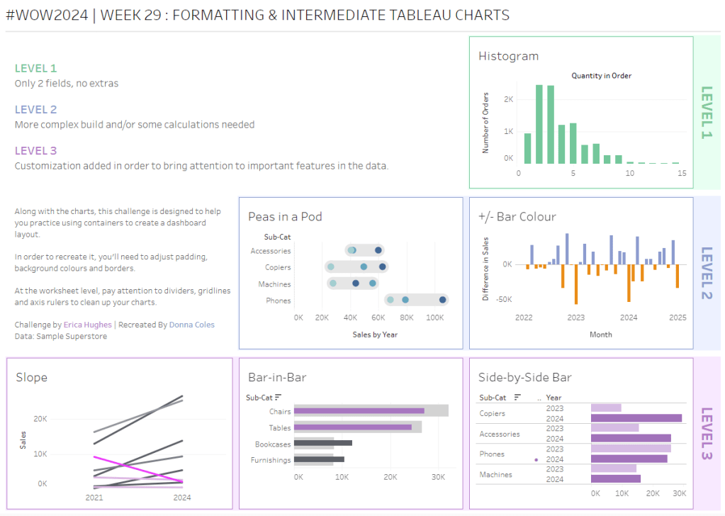
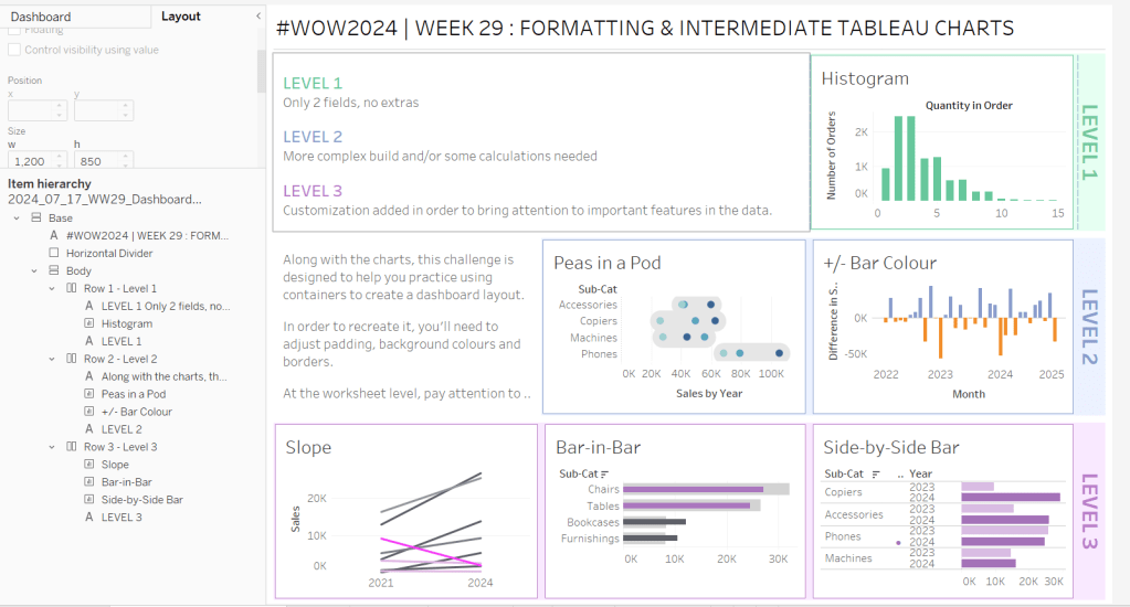
Erica set this week’s challenge, focusing on the ability to compare specific entities against themselves and ‘the whole’ without resulting in a mess of coloured spaghetti. 3 levels of difficulty were provided. As it stated the levels didn’t necessarily follow on from each, I just built (and am therefore blogging about) level 3 – the advanced challenge.
Defining the core parameters
For the user to select the main element they want to analyse we need
pPrimarySubCat
string parameter, that is sourced from a List based on the Sub-Category field when the workbook opens. Default to Binders.
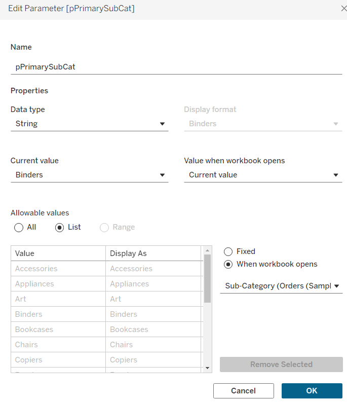
This parameter will be visible to the user to select from a drop down list control.
To capture the secondary element to compare against, we need
pSecondarySubCat
string parameter defaulted to Bookcases.
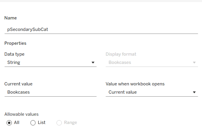
This is just a ‘type in’ field, that won’t ultimately be displayed to the user, but populated via a dashboard parameter action on select of a line in the chart.
To control the different type of display options, we need
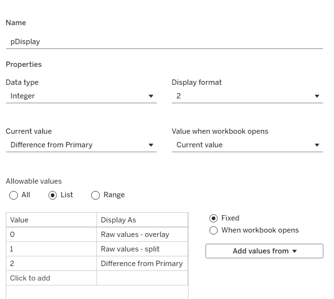
pDisplay
integer parameter sourced from a manual list which aliases the integer values for the displayed text strings. Defaulted to 2 (Difference from Primary)
Defining the additional calculations
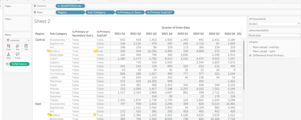
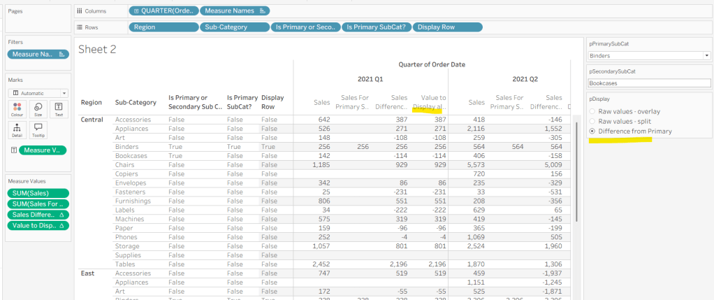
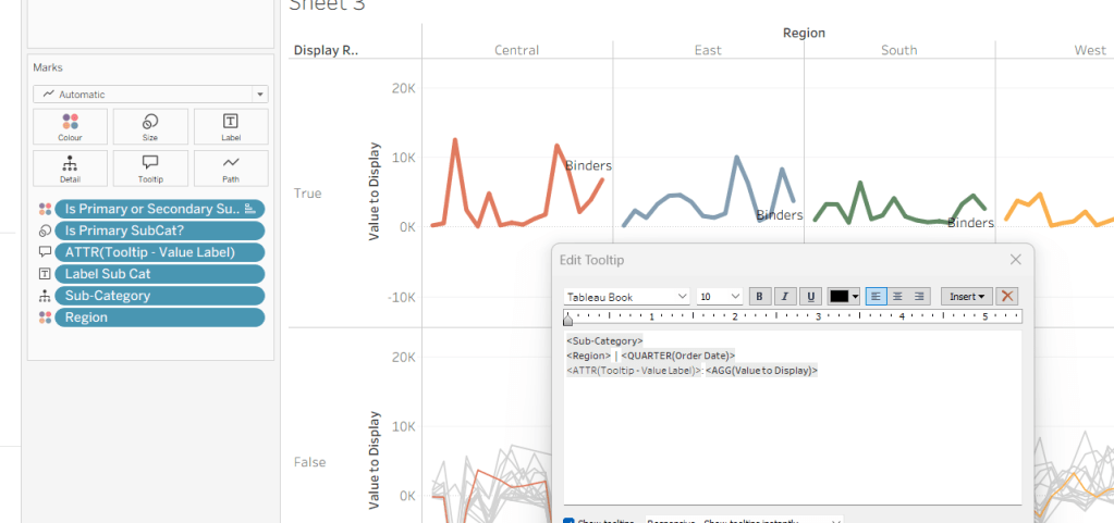
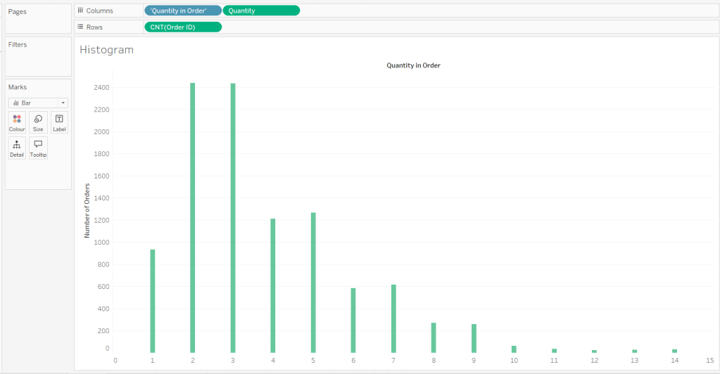
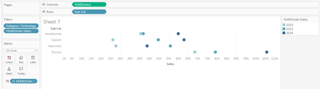
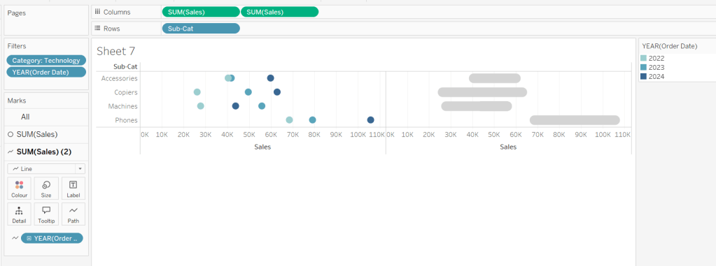
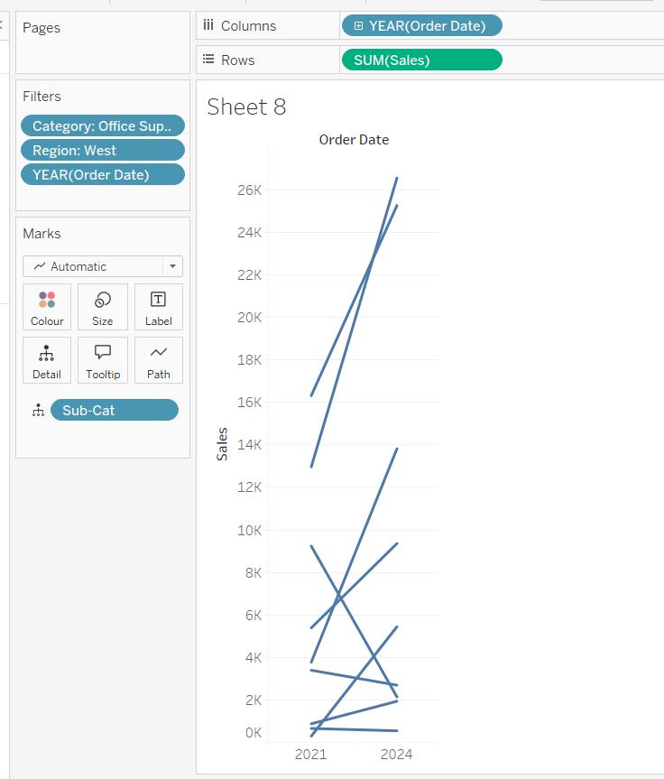
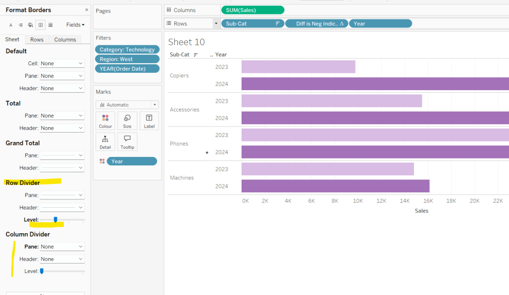
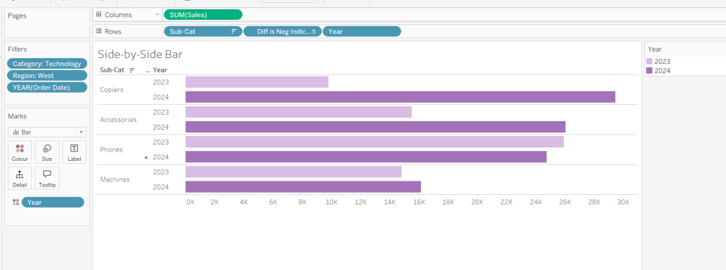
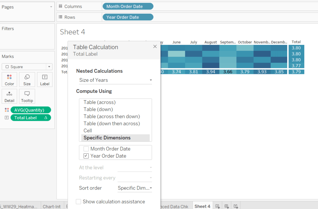
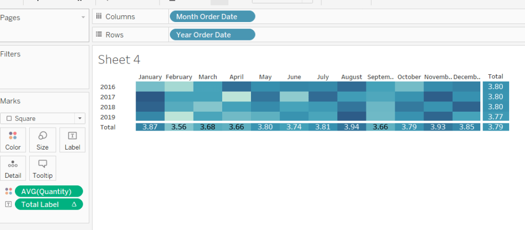
As I often do, we’ll build out a tabular display to determine all the calcs required. On a new sheet, add Region and Sub-Category to Rows, then add Order Date at the Quarter level as a discrete (blue) pill to Columns. Add Sales to Text. Show the 3 parameters created above.
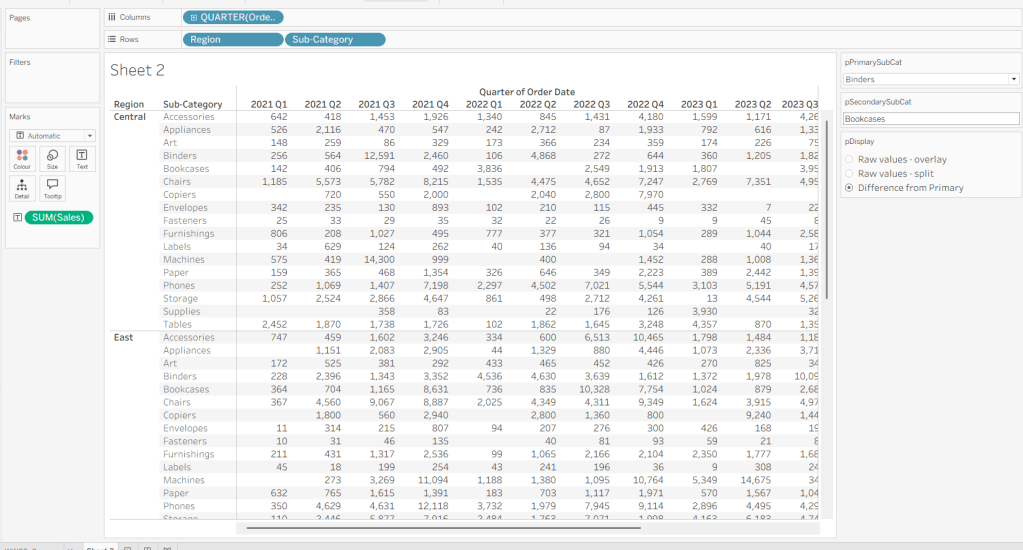
We need to identify which Sub-Categories will be coloured. This is based on whether they are a primary or secondary Sub-Category.
Is Primary or Secondary Sub Cat
[pPrimarySubCat] = [Sub-Category] OR [pSecondarySubCat] = [Sub-Category]
Add this to Rows. Based on existing selections, the rows for Binders and Bookcases should be set to True.

We will also need to identify which is the the Primary Sub-Category only to help determine how many rows are displayed, so create
Is Primary SubCat?
[pPrimarySubCat] = [Sub-Category]
Add to rows. In this case just Binders should be True at this point.
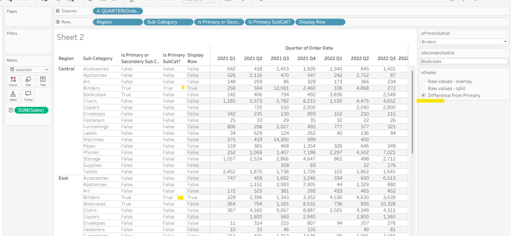
With this field, we can then work out how many ‘rows’ are going to be in our final viz display.
Display Row
IIF([pDisplay] = 0, TRUE, [Is Primary SubCat?])
ie, if the pDisplay parameter is ‘Raw values – overlay’ , then we’ll just display 1 row (so all rows set to True), otherwise there will be 2 rows, split based on whether the Sub-Category is the selected value in the pPrimarySubCat parameter or not.
Add this to Rows, and change the pDisplay parameter to see how this field changes.
We also need to display different values depending on what pDisplay option is selected. When the ‘Difference from Primary’ option is selected, then we need to show the Sales value for the primary Sub Category, but the difference from this value for all others. For this we first need to capture just the sales for the primary Sub-Category
Sales For Primary Sub Cat
IF [Is Primary SubCat?] THEN [Sales] END
Add to the table and adjust Measure Names so it is displayed after the Order Date field. Rows for this column will only have values when the Sub-Category is the primary one selected.
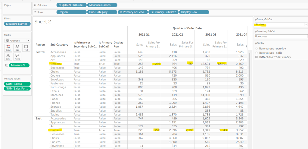
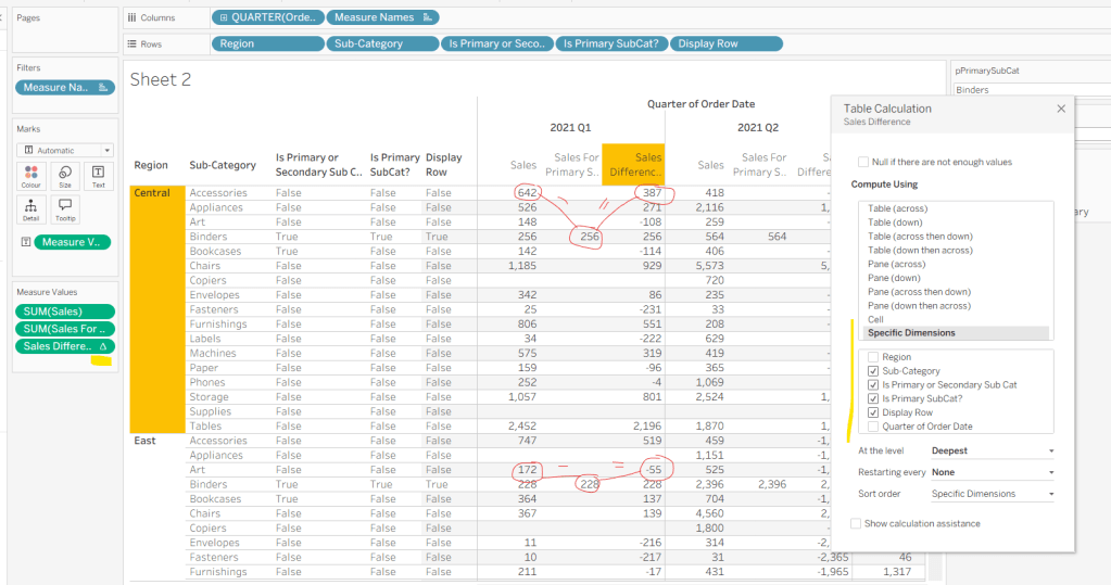
Now we calculate the difference, but only if it’s not the primary Sub-Category; we want Sales in that instance
Sales Difference
IF MIN([Is Primary SubCat?]) THEN SUM([Sales])
ELSE SUM([Sales]) – WINDOW_MAX(SUM([Sales For Primary Sub Cat]))
END
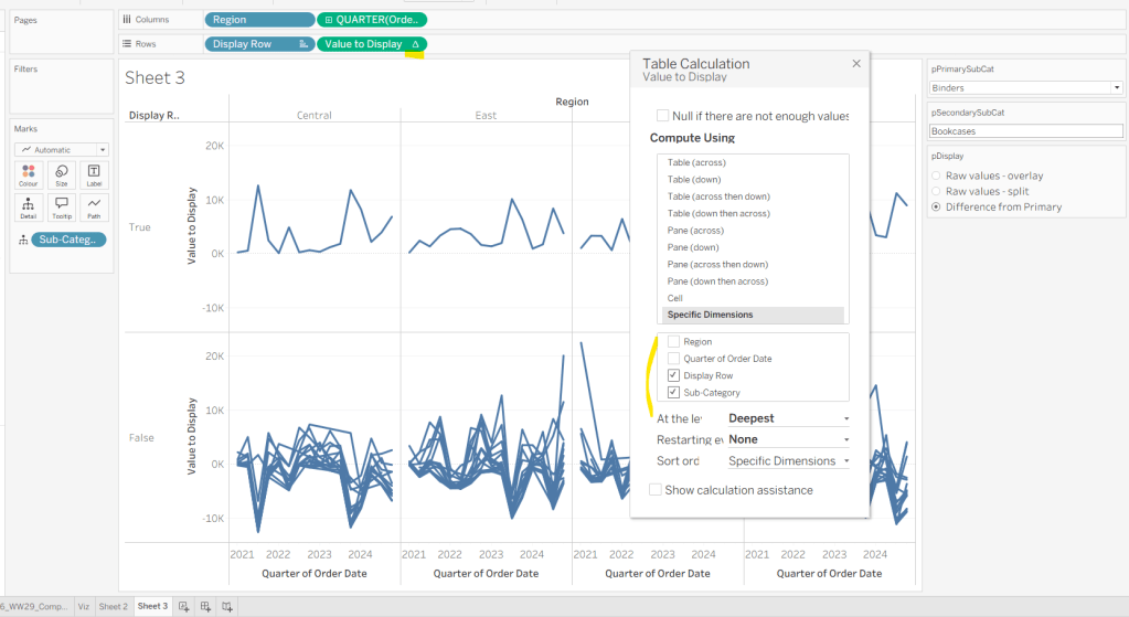
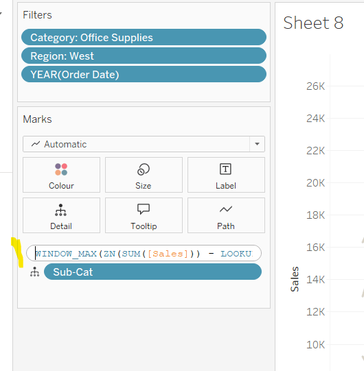
Here we’re using a WINDOW_MAX table calc to essentially ‘spread’ the value in the Sales for Primary Sub Cat column across all rows associated to the Region. Add this to the table, and adjust the table calculation setting of the pill, so it is computing by all fields except Region and Order Date
Finally, we need a field that will decide whether we’re displaying Sales or Sales Difference based on the pDisplay selection
Value to Display
IIF([pDisplay]=2, [Sales Difference ], SUM([Sales]))
Again, add to the table, adjust the table calc as above and then test the output of the field, as you adjust the pDisplay parameter.
While we’re here, we’ll just define another couple of calcs needed for the viz
Label Sub Cat
IF [Is Primary or Secondary Sub Cat] THEN [Sub-Category] END
Used to only display a label for either of the two selected Sub-Categories.
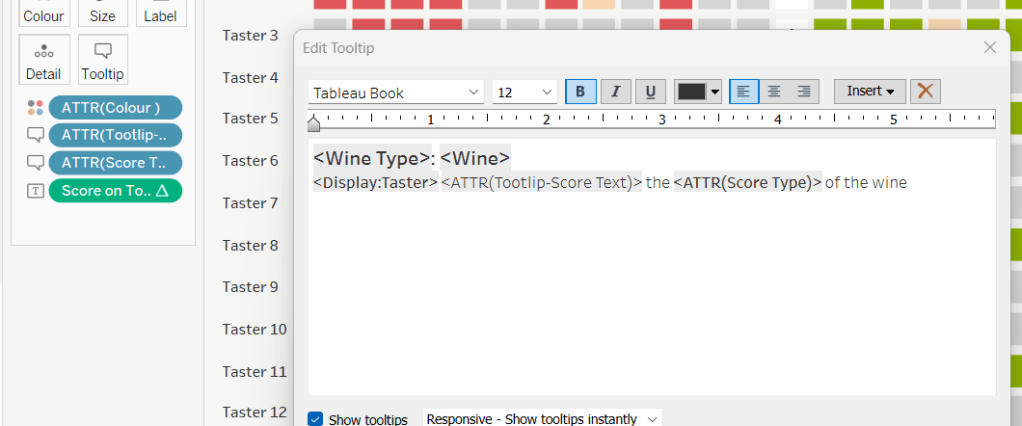
Tooltip – Value Label
IIF([pDisplay]=2 AND NOT([Is Primary SubCat?]), “Difference from ” + [pPrimarySubCat] + ” Sales”, “Sales”)
Will be used on the Tooltip to ensure the correct text is displayed depending on type of display selected.
Building the Viz
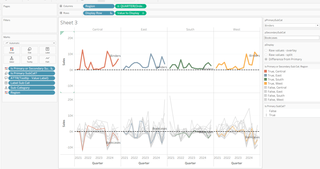
On a new sheet, show the 3 parameters and set them to the defaults (ie Binders, Bookcases and Difference from Primary).
Add Region to Columns, then add Order Date at the Quarter level as a continuous (green) pill to Columns. Add Display Row to Rows and adjust the Sort on the pill to be a manual sort, where True is listed first. Add Sub-Category to Detail, then add Value to Display to Rows and adjust the table calc so all fields except from Region and Order Date are selected.
Add Is Primary or Secondary Sub Cat to Colour. Some lines will disappear, but don’t worry. Then add Region to Detail, and then select the ‘detail’ icon to the left of the pill on the marks shelf, and change it to Colour so 2 pills are now on the Colour shelf. Adjust the table calculation setting of the Value to Display pill to ensure the Is Primary or Secondary Sub Cat field is also now checked – this should make all the lines reappear.
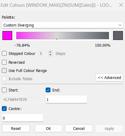
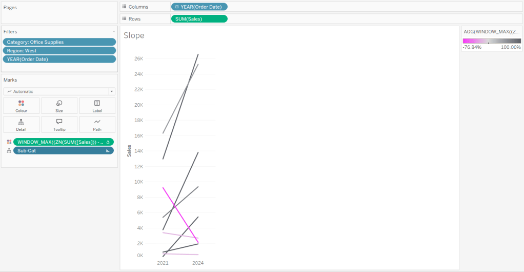
Then adjust the colours in the colour legend so all the entries that start ‘False’ are grey and the others are as required.
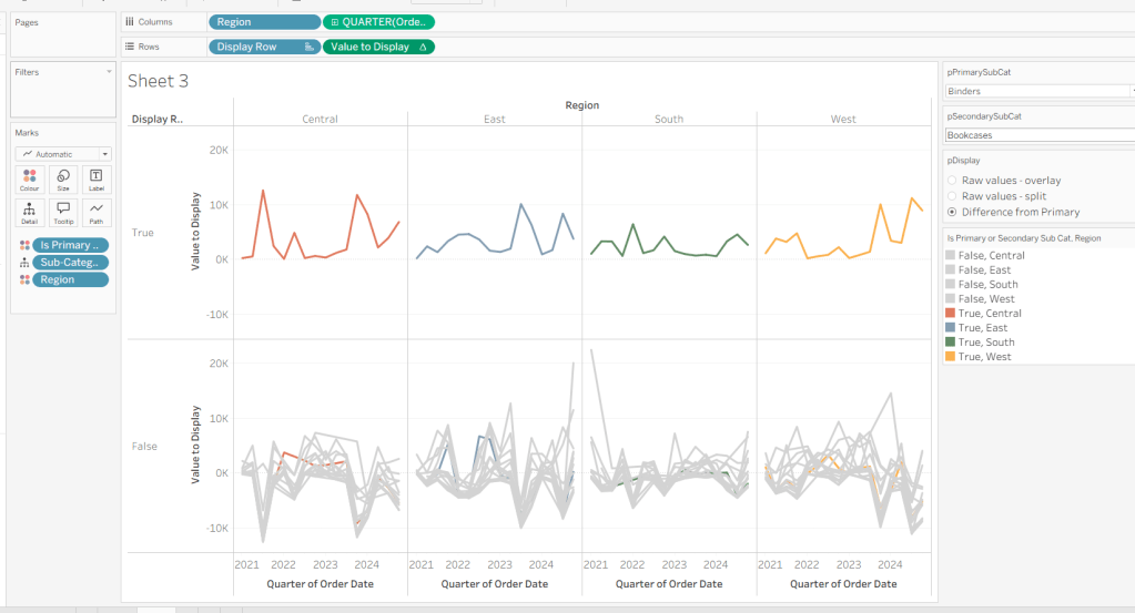
Adjust the sort on the Is Primary or Secondary Sub Cat pill on the marks card, so it is manually sorted with True first. This ensures the coloured lines are ‘on top’ and always visible. Add Is Primary SubCat? to Size shelf. Readjust the table calc on Value to Display again, and then adjust the Size so it is visibly thicker than the rest of the lines, which will probably be by adjusting both the range in the Size legend, and adjusting the slider on the Size shelf.
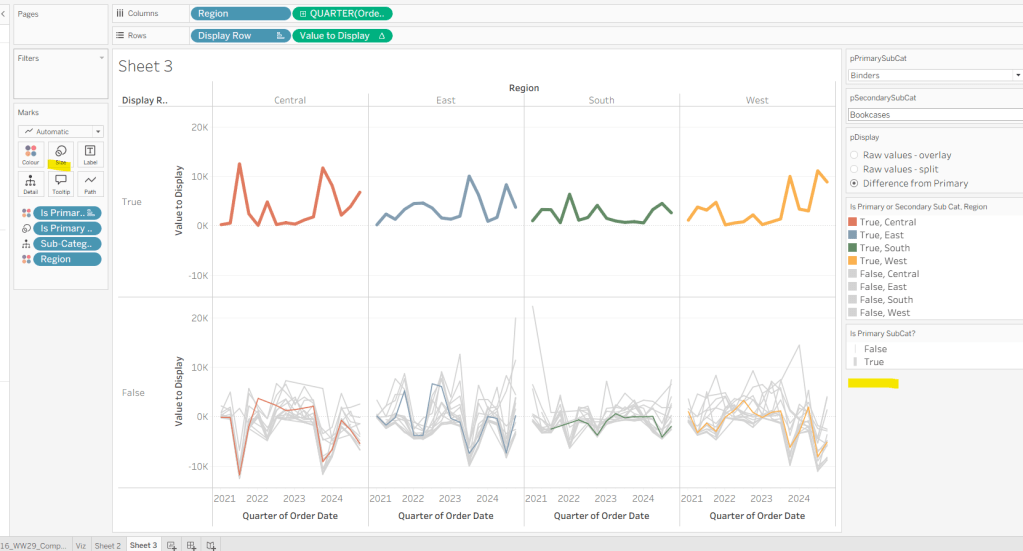
Add Label Sub Cat to the Label shelf (adjust table calc again), and set label to allow labels to overlap other marks. Add Tooltip – Value Label to tooltip and update the Tooltip as required
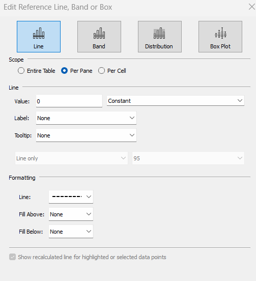
Add a reference line to the Value to Display axis, and set to be a constant of 0 displayed as a black dashed line
Edit both axis to update the axis titles on each, hide the Display Row pill (uncheck show header on the pill) and hide the Region column label (right click > hide field labels for columns).
Building the dashboard
Use layout containers to construct the dashboard as required
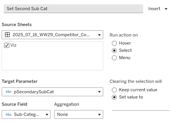
Create a dashboard parameter action to capture the value of the secondary Sub-Category
Set Second Sub Cat
On select of the Viz, set the pSecondarySubCat parameter with the value sourced from the Sub-Category field. When selection is cleared, set it <none>
Clicking one of the grey lines should now change the comparison Sub-Category. But you’ll notice the rest of the unselected lines are ‘faded’ and your selection is ‘highlighted’. We don’t want this to happen. To resolve, create new calculated field
HL
‘Dummy’
and add to the Detail shelf on the viz sheet itself.
Then add a dashboard highlight action
Un-Highlight
On selection of the Viz sheet on the dashboard, target the viz sheet on the dashboard, selecting the HL field only.

As all the marks have the HL ‘dummy’ field associated to them, they all become ‘highlighted’, giving the appearance of nothing actually being highlighted.
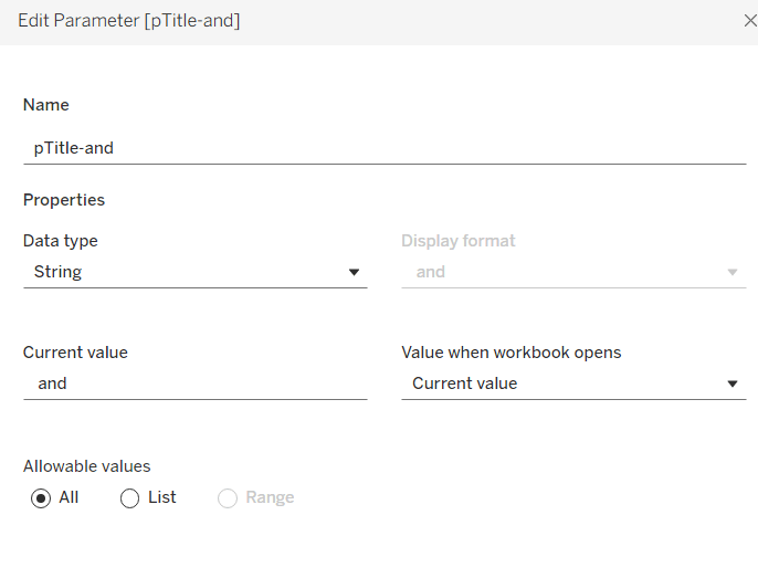
Finally, we need to make the title of the dashboard ‘dynamic’ and reflective of the selections made in the primary and secondary Sub-Category parameters. But the secondary one can be empty, so the text needs to handle this. An additional ‘ and ‘ needs to display if the secondary Sub-Category is set. I chose to use a parameter to help with this, as text objects on a dashboard can reference parameters.
Create a new parameter
pTitle-and
string field defaulted to the text <space>and<space>
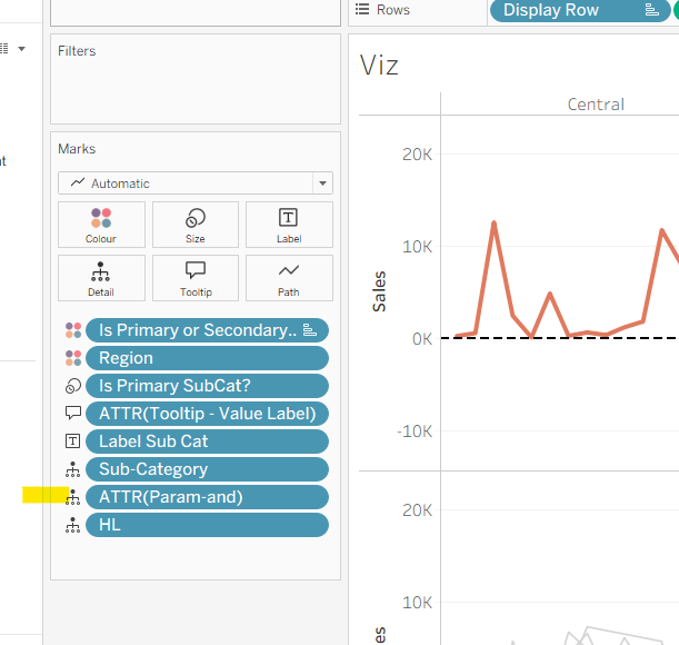
Create a calculated field
Param-and
‘ and ‘
and add to the Detail shelf on the viz. Set it to be an attribute (this won’t impact the table calc).
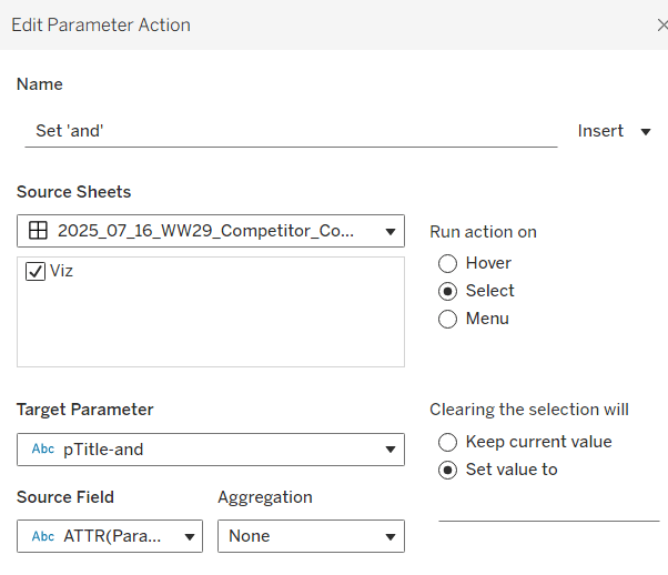
Back on the dashboard, create another dashboard parameter action
Set ‘and’
on select of the Viz, set the pTitle-and parameter passing in the value from the Param-and field. When the selection is cleared, set to <none>.
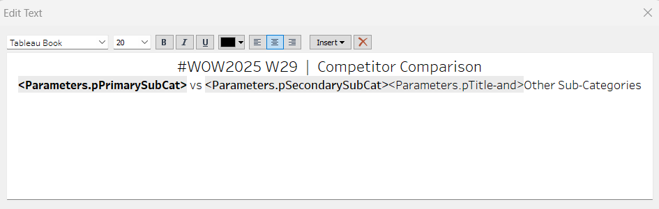
Then create (or adjust) the title text object so it references the relevant parameters (notice the spacing – or lack of – between some of the fields)
And that should be it. My published viz is here.
Happy vizzin’!
Donna


