
It was my turn to set the #WOW2026 Week 30 challenge, and I based it on a viz I started building some time ago, but never finalised. Given Wimbledon has recently finished, I thought it was the perfect opportunity to get this one over the line. There are multiple components to this, so I split the challenge into ‘Levels’ to help people focus on what to work on, if time was limited.
Defining the core calcs
The data provided contains 1 row per match Sinner has played in, and each match is associated to a tournament. While typically matches in a tournament are played over several days, in the dataset the Date field is the same for all matches in a single tournament, so can be used a a unique identifier for a tournament.
The ladder chart is essentially a bump chart where each round in a tournament is ‘ranked’ based on how far into the tournament the round is, where the Final is the highest rank ie 1. So the first step is to assign a ‘rank’/position to each round.
Round Position
CASE [Round]
WHEN ‘F’ THEN 1
WHEN ‘SF’ THEN 2
WHEN ‘QF’ THEN 3
WHEN ‘R16’ THEN 4
WHEN ‘R32’ THEN 5
WHEN ‘R64’ THEN 6
WHEN ‘R128’ THEN 7
WHEN ‘Q3’ THEN 8
WHEN ‘Q2’ THEN 9
WHEN ‘Q1’ THEN 10
WHEN ‘RR’ THEN 11
END
We then need to be able to identify the best round achieved in the tournament
Best Round per Date
{FIXED [Date]: MIN([Round Position])}
We also need to identify the Grand Slam tournaments from other tournaments. I’ve used a set for this. Right click on Tournament > create > set
Is Grand Slam
select the 4 entries : Australian Open, Roland Garros, Wimbledon, US Open

I’ve also created a parameter
pGrandSlamsOnly
boolean parameter, defaulted to True, with the True option aliased as Grand Slams Only and False aliased as All Tournaments

I then created
Filter – Matches
([pGrandSlamsOnly] AND [Is Grand Slam]) OR NOT([pGrandSlamsOnly])
This will return true if either pGrandSlamsOnly = Grand Slams Only (ie is True) AND the tournament is a member of the Is Grand Slam set, or pGrandSlamsOnly = All Tournaments (ie is False)
To ensure only the best round per tournament is shown, I also created
Keep Best Round Only
[Round Position] = [Best Round per Date]
Finally, we need to identify if Sinner was the winner of the match or not. We can determine this by looking for the name Sinner in the text of the Match field which precedes the string ‘d. ‘ . (I assume d. stands for ‘defeated’).
Is Winner
CONTAINS(TRIM(SPLIT([Match], “d.”, 1 )),”Sinner”)
Building the ladder chart
On a new sheet, add Round to Filter and exclude RR. Add Keep Best Round Only to Filter and set to True. Add Filter – Matches to Filter and set to True. Then finally add Surface to Filter and select all options.
Add Date to Columns as a continuous (greed) exact date, and add Round Position as a continuous dimension (unaggregated green pill) to Rows. Edit the y-axis and reverse the axis. Change the mark type to a line and set the path to be a stepped line.

Add Tournament, Rank, Date, Surface and Round to the Tooltip shelf. Adjust the number format of the Rank field so it is a number with 0dp but prefixed with #. Adjust the format of the Date field on the Tooltip to be mmmm yyyy (ie August 2019 format).
Additionally, create a field
Label:Unranked
IIF(ISNULL([Rank]),’Unranked’,NULL)
and add this to Tooltip too, the adjust tooltip as required. Reduce the Size of the line and adjust the colour (I used #7ed0d9). Set the background colour of the worksheet too (I used #f7fcf5)

Add another instance of Round Position to the Rows to make a 2nd marks card. Set the mark type to Shape and add Is Winner to Shape. Increase the mark size. Set shapes accordingly. Add Surface to Colour and adjust to suit (I used colours from the hue circle palette, reduced to 60% opacity). Then make the chart dual axis and synchronise axis.

Add Is Winner to the Size shelf of the 2nd marks card, and adjust sizes to suit too, so the Star is at least as big as the other mark.
Remove all row/column dividers, gridlines, zero lines, axis lines etc.
To make the labelled ‘ladder rungs’, we’re simply adding multiple constant reference lines. Right click the left hand y-axis > add reference line. Add a constant at 10, labelled Q1 with a blue dotted line.

Then format the label so it is aligned in the middle of the line (I reduced font to 8pt) and removed any shading

Then repeat 9 more times for each ‘rung’ 🙂
At the end, hide both the axis (uncheck show header) and remove the x-axis title. Fix the x-axis from 01 Aug 2017 to 01 Jun 2027. The test the filters work as expected.

Building the Viz in Tooltip
On a new sheet, add Date as a discrete exact date (blue pill), Round, Match to Rows. Go back to the Ladder chart and set the Round, Filter – Matches and Surface filters to apply to this worksheet too. Apply a sort to the Round pill, to sort by the Round Position field.

Add Score to the Text shelf. Then double click into Columns and type the text ‘Result’, then right click the ‘Result’ text and hide labels for columns.

Go back to the Ladder chart and update the Tooltip – insert the VIT sheet, and adjust the size /width as required and apply filters to Date & Tournament.

On hover, the list of matches should now display

Building the KPIs
We need a few fields for this
Tournaments
COUNTD([Date])
Matches
COUNT([Sinner])
Note – this is just referring to the automatic sheet row count field
Wins
IIF([Is Winner?],1,0)
Titles
IIF([Is Winner?] AND [Keep Best Round Only],1,0)
Grand Slams
IIF([Is Grand Slam] AND [Is Winner?] AND [Keep Best Round Only],1,0)
On a new sheet, Add Measure Names to Columns and Measure Values to Rows. Remove the measures that aren’t required. Apply the same ‘shared’ filters to this sheet.

Change the mark type to a shape and use a transparent shape. Add Measure Names to Label and arrange labels middle centre, and format as required. Set the worksheet background to match the ladder viz.

Building the strip plot
Create a new field
Within Top 10
[Rank]<=10
On a new sheet, add this to Filter and set to True. Then apply the other 3 shared filters to this sheet.
Add Date to Columns as a continuous exact date (green pill). Fix the axis to the same dates as before 01 Aug 2017 to 01 Jun 2027. Set the Mark type to Circle and add Rank to colour, reversing the range as required so the lower number is darker. Set the circle to have a border and 80% opacity. Add Date, Surface, Tournament and Rank to Tooltip and adjust as required. Remove all gridlines, row/column dividers, gridlines etc and set background colour as before.

The double click into Rows and type MIN(0) to create a y-axis. Then add a 0 constant reference line (as before) but label this Within Top 10. The hide both the x and y-axes.

Building the dashboard
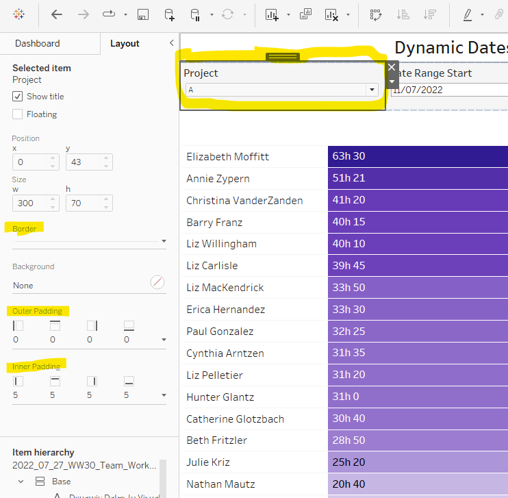
Now you have all the components, they just need to be added to a dashboard. Use layout containers to help with this. To ensure the ladder chart & the strip plot align, arrange these in a vertical container. Both objects should be set to fit entire view and any padding to the left or right of the objects should be identical.
The item hierarchy of my dashboard is below.

My published viz is here.
Happy vizzin’!
Donna






 Donna + DataViz