Can you build a colour-coded filter?

Erica collaborated with Giulio D’Errico for this week’s #WOW2025 challenge, which contained lots of features, though the main challenge was to display filter on Region, which along with the Region name also displayed a KPI indicator that could change based on selection from other parameters.

Defining the parameters

We need 3 parameters for this challenge

pMeasure

strig parameter that lists the two options Profit and Sales; defaulted to Profit.

pProfitThreshold

integer parameter that lists the specified values, defaulted to 2,000

pSalesThreshold

integer parameter that lists the specified values, defaulted to 30,000

Building the core scatter plot

Add Sales to Columns and Profit to Rows and Sub-Category to Detail. Show the 3 parameters.

When pMeasure = Profit, we need to display horizontal reference lines against the Profit axis, and when Sales is selected we need to display vertical reference lines against the Sales axis. We need the following fields to return the user defined thresholds:

Ref – Profit Threshold

IF [pMeasure] = ‘Profit’ THEN [pProfitThreshold] END

Ref – Sales Threshold

IF [pMeasure] = ‘Sales’ THEN [pSalesThreshold] END

We also need to define the average per measure for each region:

Sales Avg Per Region

{FIXED [Region]: SUM([Sales])} / {FIXED: COUNTD([Sub-Category])}

Profit Avg Per Region

{FIXED [Region]: SUM([Profit])} / {FIXED: COUNTD([Sub-Category])}

and then we can create

Ref – Profit Avg

IF [pMeasure] = ‘Profit’ THEN [Profit Avg Per Region] END

Ref – Sales Avg

IF [pMeasure] = ‘Sales’ THEN [Sales Avg Per Region] END

Add the 4 Ref – XXX fields to the Detail shelf. Then add 2 reference lines to the Sales axis; one referencing Ref – Sales Avg (coloured as a purple dashed line at 100% opacity) and one referencing Ref – Sales Threshold (coloured as a black dashed line at 50% opacity). Display a custom label and then format the label to be aligned vertically and coloured based on the relevant line, and with a 0% shading. Set the pMeasure to Sales to make these display.

Then repeat, adding 2 reference lines to the Profit axis instead. Change pMeasure to Profit for these to appear.

Change the mark type to square. Each mark needs to be coloured whether it is above or below the average for the measure selected.

Colour

IF [pMeasure] = ‘Profit’ THEN
IIF(SUM([Profit]) >= SUM([Profit Avg Per Region]),1,0)
ELSE
IIF(SUM([Sales]) >= SUM([Sales Avg Per Region]),1,0)
END

Set this to be discrete and then add to the Colour shelf and adjust accordingly.

Creating the colour-coded filter

The viz needs to be filtered by Region, but the filter displayed needs to show the region name along with an indicator based on whether the average for the region is above the threshold or not. This took a bit of an effort, but I finally managed it.

We need a field to capture the ‘KPI indicator’ based on which measure was selected. It also needs to be computed per region. We need a FIXED LoD for this, and I made use of coloured unicode characters from this site.: https://unicode-explorer.com/ (large yellow circle and large green circle which you can just ‘copy and paste’ into the calculation)

Region Indicator

{FIXED [Region]: (

IF [pMeasure] = ‘Profit’ THEN
IIF(SUM([Profit Avg Per Region])>=[pProfitThreshold],’🟒’,’🟑’)
ELSE
IIF(SUM([Sales Avg Per Region])>=[pSalesThreshold],’🟒’,’🟑’)
END
)}

I then created

Filter – Region

[Region Indicator] + ‘ ‘ + [Region]

Add this to the Filter shelf, select all values and show the filter. If you change the pProfitMeasure to Profit and pProfitThreshold to 6,000, you’ll see the KPI indicators change.

Format the Tooltip

The tooltip requires several calculated fields to be created. Certain fields only need a value based on the pMeasure and others have conditional formatting (different colours) applied. For the tooltip, I created all these fields:

Tooltip – Measure Value

IIF([pMeasure]=’Profit’,[Profit],[Sales])

Tooltip -Threshold

IIF([pMeasure]=’Profit’, [pProfitThreshold], [pSalesThreshold])

Tooltip – Measure Value Above Avg

IF [Colour] = 1 THEN SUM([Tooltip – Measure Value]) END

Tooltip – Measure Value Below Avg

IF [Colour] = 0 THEN SUM([Tooltip – Measure Value]) END

Tooltip – Above text

IF [Colour] = 1 THEN ‘above’ END

Tooltip – Below text

IF [Colour] = 0 THEN ‘below’ END

Label – Region

IIF(COUNTD([Region])>1, ‘All regions’, MIN([Region]))

Add all these fields to the Tooltip. Update the Tooltip to reference the fields and the pMeasure parameter, colouring the text as required. Some of the fields will only display based on the filters selected, so they get places side by side with no spacing.

Finalise the viz by updating the title to reference the pMeasure and the Label – Region field. Remove all gridlines, axis rulers, zero lines etc. Colour the background of the sheet to pale blue.

Building the Overall Indicator

For the bonus challenge, we need to display an indicator that is green if all the regions are green and yellow if at least 1 region is yellow.

On a new sheet, add Region and Region Indicator to Rows and show the 3 parameters.

We’re going to create a field that will return 1 if the Region Indicator is yellow and 0 otherwise.

Region Indicator – Is Below

IIF( [Region Indicator] = ‘🟑’,1,0)

Set to be discrete and add to Rows. Change the pProfitThreshold to 6000 to see the flag change.

Create

Overall Region Indicator

IIF(WINDOW_MAX(MAX([Region Indicator – Is Below]))=1,’🟑’, ‘🟒’)

This says, if the maximum value of the rows ‘in the window’ is 1, then display a yellow indicator, else green. Add to Rows, and adjust the pProfitThreshold to see the behaviour.

Create a field

Filter – Index = 1

INDEX() = 1

Add to Filter shelf and set to True

Move Region to Detail. Remove Region Indicator and Region Indicator – Is Below. Adjust the table calculation setting of Overall Region Indicator to compute using Region only, and do the same for the tableau calculation on Filter – Index = 1 (re-edit the filter after changing, so only True is selected).

Note – originally I used a transparent shape mark type and displayed the indicator as a label, but after publishing to Tableau Public, the indicator became distorted, so I adjusted how this was built.

Set the mark type to circle and add Overall Region Indicator to Colour. Adjust to be green or yellow, depending on the colour of the KPI indicator (you’ll need to change the pProfitThreshold value to ensure you set the colour for both the yellow and green options).

Finally create

Tooltip – Overall Indicator

IIF([Overall Region Indicator]=’🟒’,’All regions meet the ‘ + [pMeasure] + ‘ target’, ‘At least one region does NOT meet the ‘ + [pMeasure] + ‘ target’)

Add this to Tooltip and then set the background colour to pale blue.

Building the dashboard & adding dynamic zone visibility

Using layout containers, add the viz to a dashboard. Use a horizontal layout container to arrange the parameters, the Region filter and the Overall Indicator sheet. I used a floating text object to display the ‘legend key’ again copying come unicode characters from the website referenced earlier.

Then create 2 new boolean calculated fields

Is Profit

[pMeasure] = ‘Profit’

Is Sales

[pMeasure] = ‘Sales’

Select the Sales Threshold parameter object, then update the visibility so it only displays if Is Sales is true (via the Layout > Control visibility using value option)

Repeat the same for the Profit Threshold object, but reference the Is Profit field instead.

Now as you switch the measure between Sales and Profit, the relevant threshold parameter will display. My published viz is here.

Happy vizzin!

Donna

Can you build a Measure Names Waterfall?

I’ve been on my holibobs, so haven’t blogged a solution for a few weeks. It’s been a bit of a struggled to get my head re-engaged to be honest, as I’m sure you can all relate to.

Anyway this week’s challenge was set by Sean, to produce a waterfall chart depicting specific measures without any pivoting.

I had a little bit of an initial struggle with this… firstly I assumed from the title of the challenge that I would need to be using Measure Names/Measure Values, and secondly, as nothing was mentioned, that I just had to use the data provided. This is how far I got…

but I couldn’t figure out how to get the sizes of the gantt bars inverted for some of the measures…

So I had a bit of a Google, and came across this video by one of our old WOW alumni, Luke Stanke. It made use of a scaffold data source which basically provide placeholders for each of the specific measures we want to display. Sean hadn’t explicitly said we’d need a scaffold, but then he hadn’t explicitly said we couldn’t use one either… so I had a quick peak at his solution, and I found he had used one.

So I went about recreating the challenge just by following Luke’s video. As a result, this blog won’t be as detailed, but I’ll detail the core information needed.

The scaffold data set

I created a simple excel sheet on 1 column called Points with values 1 to 5 listed.

This was then related to the Financials.csv data Sean provided using a relationship calculation of 1=1 as demonstrated in the video.

The calculations

4 calculations are created in the video

Label

CASE [Point]
WHEN 1 THEN ‘Gross Sales’
WHEN 2 THEN ‘Discounts’
WHEN 3 THEN ‘Net Sales’
WHEN 4 THEN ‘COGS’
WHEN 5 THEN ‘Profit’
END

Start

CASE [Point]
WHEN 1 THEN 0
WHEN 2 THEN [Gross Sales]
WHEN 3 THEN 0
WHEN 4 THEN [Gross Sales] – [Discounts]
WHEN 5 THEN 0
END

Value

CASE [Point]
WHEN 1 THEN [Gross Sales]
WHEN 2 THEN [Discounts] * -1
WHEN 3 THEN [Gross Sales] – [Discounts]
WHEN 4 THEN [Cogs] * -1
WHEN 5 THEN [Profit]
END

format this to $, millions with 2 dp.

Colour

SIGN(SUM([Value]))

convert this to discrete

Note on the date field

When I connected to the csv, I found the dates were being displayed to me in the UK format so a date in source of 06/01/2024 was reporting as 6th Jan, when it was intended to represent 1st Jun. There’s probably something I could have done with regional settings etc, but the quickest way for me to resolve as create

Date Adjust

MAKEDATE(YEAR([Date]), DAY([Date]), MONTH([Date]))

which just transposed the month & day and gave me the dates expected.

Building the Viz

Add Date to Filter, select Month-Year and select May 2024. Add Label to Columns and apply a Sort to sort by Point ascending. Add Start to Rows and change the Mark type to Gantt

Add Value to Size and Colour to Colour and adjust colours to suit

Add Value to Label and adjust font to match mark colour and increase size and style, Set the sheet to Entire View. Uncheck Show Tooltip.

Double click into the Rows shelf and type SUM([Start]) + SUM([Value]). This will create a second marks card. Change the mark type of this to line and remove all fields from the marks card shelf. Set the line type (via the Path shelf) to stepped and manually adjust colour to black.

Set the chart to dual axis and synchronise axis, then right click on the right hand axis and move marks to back.

Finally tidy the display up by hiding both axis, removing row & column dividers, hiding the Label title (right click and hide field label for columns) and formatting the Measure Name labels to a larger, darker font style.

Add fields Country, Product and Segment to the Filter shelf, then add to a dashboard.

My published viz is here.

Happy vizzin’!

Donna

Can you build a dashboard for pre-aggregated metrics?

For the challenge this week, Kyle asked us to recreate the visualisation above using an adapted version of Superstore which had a customer count metric for 3 dimensions (Category, Segment and Region) along with ‘no’ dimension (null) pre-aggregated at a Yearly or Monthly Level.

By this I mean that, at a Yearly level, when the date was 1st Jan 2019 say, a row of data existed for the (distinct) customer count of all the combinations of the 3 dimensions and null. In total 80 rows for the one date.

As the data was pre-aggregated, it made no sense to say the customer count for Technology is the sum of all the rows where Category = Technology and this would mean data was being double counted.

Pivoting the data also wouldn’t yield the desired result. So the aim of this challenge was to be able to identify the relevant rows of data that needed to be displayed based on the options selected by the user.

Building the calculations

Parameters will be driving the user selections, so these need to be set up

pDateGrain

string parameter with a list of 2 options: Monthly and Yearly. Defaulted to Monthly.

pColour

string parameter with a list of 4 options : Category, Region, Segment, None. Defaulted to Segment

Similarly, create pXAxis and pYAxis parameters similar to above, but default both to None.

On a new sheet build a tabular view with

  • Table Names, Category, Segment and Region on Rows
  • Order Date set to discrete (blue pill) exact date on Columns
  • Customer Count on Text
  • Show all 4 parameters created

The rows of data need to be filtered by Table Name (as defined by the pDateGrain parameter) and a combination of Category, Segment and Region based on the options selected in the other 3 parameters.

To filter by the Table Name we need

Filter – Date Grain

[pDateGrain] = [Table Names]

Add this to the Filter shelf and set to True.

Change the pDateGrain parameter to Yearly as there is less data to see/check.

Based on the options selected in any of the other 3 parameters, we need to find matching rows.

For example, if pColour is Segment and the other parameters are None, we are looking for the rows where the Segment column is not null, but the Region and Category columns are (we would be after the same rows if pXAxis was set to Segment, and the other parameters were None or, if pYAxis is Segment and the other parameters were None).

In this case, we’re looking for 3 rows of data – those highlighted below

If instead any two of the parameters were set to Segment and Category and the other None, then we’d be looking for rows where Segment is not null, Category is not null and Region is null. This would be 9 rows in total (a snippet of which is shown below).

We also need to deal with scenarios where all three parameters were set to something different, or all set to None as well as handle if multiple parameters are set to the same thing.

Now to do this, I ended up building a single field to use as filter that contains all the scenarios. As I was building it up, I figured there should be a slicker way, and there is (check out Kyle’s solution), but if your brain is wired the same way as mine, then you’ll end up with this

Filter Rows to Include

IF [pColour] = ‘None’ AND [pXAxis] = ‘None’ AND [pYAxis] = ‘None’ THEN
//no options selected
IF ISNULL([Region]) AND ISNULL([Category]) AND ISNULL([Segment]) THEN TRUE END
ELSEIF (([pColour] <> ‘None’ AND [pXAxis] = ‘None’ AND [pYAxis] = ‘None’) OR
([pColour] = ‘None’ AND [pXAxis] <> ‘None’ AND [pYAxis] = ‘None’) OR
([pColour] = ‘None’ AND [pXAxis] = ‘None’ AND [pYAxis] <> ‘None’)) THEN
// one of the 3 options selected, so work out which dimension
IF [pColour] = ‘Category’ OR [pXAxis] = ‘Category’ OR [pYAxis] = ‘Category’ THEN
IF ISNULL([Region]) AND ISNULL([Segment]) AND NOT ISNULL([Category]) THEN TRUE END
ELSEIF [pColour] = ‘Segment’ OR [pXAxis] = ‘Segment’ OR [pYAxis] = ‘Segment’ THEN
IF ISNULL([Region]) AND NOT ISNULL([Segment]) AND ISNULL([Category]) THEN TRUE END
ELSEIF [pColour] = ‘Region’ OR [pXAxis] = ‘Region’ OR [pYAxis] = ‘Region’ THEN
IF NOT ISNULL([Region]) AND ISNULL([Segment]) AND ISNULL([Category]) THEN TRUE END
END
ELSEIF (([pColour] <> ‘None’ AND [pXAxis] <> ‘None’ AND [pYAxis] = ‘None’) OR
([pColour] <> ‘None’ AND [pXAxis] = ‘None’ AND [pYAxis] <> ‘None’) OR
([pColour] = ‘None’ AND [pXAxis] <> ‘None’ AND [pYAxis] <> ‘None’)) THEN
// two options selected, so work out which dimensions we need
IF ([pColour] = ‘Category’ OR [pXAxis] = ‘Category’ OR [pYAxis] = ‘Category’) AND ([pColour] = ‘Segment’ OR [pXAxis] = ‘Segment’ OR [pYAxis] = ‘Segment’) THEN
IF ISNULL([Region]) AND NOT ISNULL([Segment]) AND NOT ISNULL([Category]) THEN TRUE END
ELSEIF ([pColour] = ‘Category’ OR [pXAxis] = ‘Category’ OR [pYAxis] = ‘Category’) AND ([pColour] = ‘Region’ OR [pXAxis] = ‘Region’ OR [pYAxis] = ‘Region’) THEN
IF NOT ISNULL([Region]) AND ISNULL([Segment]) AND NOT ISNULL([Category]) THEN TRUE END
ELSEIF ([pColour] = ‘Segment’ OR [pXAxis] = ‘Segment’ OR [pYAxis] = ‘Segment’) AND ([pColour] = ‘Region’ OR [pXAxis] = ‘Region’ OR [pYAxis] = ‘Region’) THEN
IF NOT ISNULL([Region]) AND NOT ISNULL([Segment]) AND ISNULL([Category]) THEN TRUE END
//or the two options selected are the same dimension
ELSEIF ([pColour] = ‘Category’ OR [pXAxis] = ‘Category’ OR [pYAxis] = ‘Category’) AND ([pColour] = ‘Category’ OR [pXAxis] = ‘Category’ OR [pYAxis] = ‘Category’) THEN
IF ISNULL([Region]) AND ISNULL([Segment]) AND NOT ISNULL([Category]) THEN TRUE END
ELSEIF ([pColour] = ‘Segment’ OR [pXAxis] = ‘Segment’ OR [pYAxis] = ‘Segment’) AND ([pColour] = ‘Segment’ OR [pXAxis] = ‘Segment’ OR [pYAxis] = ‘Segment’) THEN
IF ISNULL([Region]) AND NOT ISNULL([Segment]) AND ISNULL([Category]) THEN TRUE END
ELSEIF ([pColour] = ‘Region’ OR [pXAxis] = ‘Region’ OR [pYAxis] = ‘Region’) AND ([pColour] = ‘Region’ OR [pXAxis] = ‘Region’ OR [pYAxis] = ‘Region’) THEN
IF NOT ISNULL([Region]) AND ISNULL([Segment]) AND ISNULL([Category]) THEN TRUE END
END
ELSE //all three selected, but they could be all the same dimension or 2 of the three the same
IF ([pColour] = ‘Category’ OR [pXAxis] = ‘Category’ OR [pYAxis] = ‘Category’) AND ([pColour] = ‘Segment’ OR [pXAxis] = ‘Segment’ OR [pYAxis] = ‘Segment’) AND ([pColour] = ‘Region’ OR [pXAxis] = ‘Region’ OR [pYAxis] = ‘Region’) THEN
//all three different
IF NOT ISNULL([Region]) AND NOT ISNULL([Segment]) AND NOT ISNULL([Category]) THEN TRUE END
ELSEIF ([pColour] = ‘Category’ OR [pXAxis] = ‘Category’ OR [pYAxis] = ‘Category’) AND ([pColour] = ‘Region’ OR [pXAxis] = ‘Region’ OR [pYAxis] = ‘Region’) THEN
IF NOT ISNULL([Region]) AND ISNULL([Segment]) AND NOT ISNULL([Category]) THEN TRUE END
ELSEIF ([pColour] = ‘Category’ OR [pXAxis] = ‘Category’ OR [pYAxis] = ‘Category’) AND ([pColour] = ‘Segment’ OR [pXAxis] = ‘Segment’ OR [pYAxis] = ‘Segment’) THEN
IF ISNULL([Region]) AND NOT ISNULL([Segment]) AND NOT ISNULL([Category]) THEN TRUE END
ELSEIF ([pColour] = ‘Region’OR [pXAxis] = ‘Region’ OR [pYAxis] = ‘Region’) AND ([pColour] = ‘Segment’ OR [pXAxis] = ‘Segment’ OR [pYAxis] = ‘Segment’) THEN
IF NOT ISNULL([Region]) AND NOT ISNULL([Segment]) AND ISNULL([Category]) THEN TRUE END
ELSEIF [pColour] = ‘Category’ OR [pXAxis] = ‘Category’ OR [pYAxis] = ‘Category’ THEN
IF ISNULL([Region]) AND ISNULL([Segment]) AND NOT ISNULL([Category]) THEN TRUE END
ELSEIF [pColour] = ‘Segment’ OR [pXAxis] = ‘Segment’ OR [pYAxis] = ‘Segment’ THEN
IF ISNULL([Region]) AND NOT ISNULL([Segment]) AND ISNULL([Category]) THEN TRUE END
ELSEIF [pColour] = ‘Region’ OR [pXAxis] = ‘Region’ OR [pYAxis] = ‘Region’ THEN
IF NOT ISNULL([Region]) AND ISNULL([Segment]) AND ISNULL([Category]) THEN TRUE END
END

END

Blimey! A bit monolithic I know, but it just grew organically as I tried out the different scenarios step by step. Unfortunately the above doesn’t copy over the formatting nicely, as there are nested (tabbed) IF statements which makes it (a bit) easier to read.

Suffice to say, I’m not going to walk through step by step, but it’s checking for all the different permutations are discussed above, and marking the relevant rows as True. This field can then be added to the Filter shelf and set to True.

Kyle’s solution, essentially replaces this one calculated field, with 3 calculated fields – 1 per parameter – which are all then added to the filter shelf. It’s much neater πŸ™‚

So now we’ve identified the rows we want based on parameters, but there is also the ability to filter the rows further based on the values of the Category, Segment or Region.

Add each of the 3 fields to the Filter shelf and select the All option, then show the filters on the view. For each of the Category, Segment and Region filters, set the option to show Only Relevant Values. This will prevent the NULLs from showing as an option when the relevant dimension is listed as one of the parameter selections

As you can see from the above image though, Region is only showing Null, and this is because in the example above, Region isn’t selected as an option for the pColour, pXAxis or pYAxis parameters. When it comes to the dashboard, we don’t want the Region filter to be visible in this case. To help with this, we need 3 further calculated fields.

Show Filter – Region

[pColour] = ‘Region’ OR [pXAxis] = ‘Region’ OR [pYAxis] = ‘Region’

This returns True if one of the 3 parameters contains the value ‘Region’. Similarly, create Show Filter – Category and Show Filter – Segment fields.

The final calculated fields we need are to help build the ‘cross tab’ view.

X-Axis

CASE [pXAxis]
WHEN ‘Category’ THEN [Category]
WHEN ‘Region’ THEN [Region]
WHEN ‘Segment’ THEN [Segment]
ELSE ”
END

Y-Axis

CASE [pYAxis]
WHEN ‘Category’ THEN [Category]
WHEN ‘Region’ THEN [Region]
WHEN ‘Segment’ THEN [Segment]
ELSE ”
END

Colour

CASE [pColour]
WHEN ‘Category’ THEN [Category]
WHEN ‘Region’ THEN [Region]
WHEN ‘Segment’ THEN [Segment]
ELSE ”
END

Now we’ve got all the fields needed to build the viz.

Building the viz

The quickest way is to duplicate the sheet we’ve built, as all the filters need to apply, so

  • Duplicate the sheet
  • Remove all the fields from Rows
  • Change the Order Date field on Columns to be continuous (green pill)
  • Add X-Axis to Columns
  • Add Y-Axis to Rows
  • Move Customer Count to Rows
  • Add Colour to the Colour shelf.
    • Adjust the colours to suit.
    • Change the value of the option in the pColour parameter, and readjust the colours. Repeat so that colours are set for Category, Segment and Region.
  • Add Colour to the Label shelf

Remove all gridlines, axis and zero lines. Remove the Y-Axis and X-Axis row/column labels by right clicking the text and selecting Hide field labels for rows/columns. Edit the Order Date axis (right click axis -> Edit) and remove the axis title.

Add Order Date to Tooltip and format it to the ‘March 2001’ date format. Adjust the tooltip as below

Hiding the filters

Add the viz to a dashboard and arrange the parameters and filter controls in the relevant location. I used layout containers to help with the organisation.

Select the Category filter and on the Layout tab, select the Control visibility using value checkbox and select the Show Filter – Category field.

Repat the same steps for the Region and Segment filters, selecting the equivalent calculated fields.

And that should be it. My published viz is here.

Happy vizzin’!

Donna

Let’s build a Marrimeko Chart!

Sean set the challenge this week and went retro, revisiting a challenge from 2017 originally set by Emma Whyte to build a Marrimeko chart.

Hang on… a what chart? Marrimeko…???

A good place to understand what a Marrimeko chart actually is, is this blog post by Tableau Visionary & Ambassador, Jonathan Drummey. This leads onto this post which explains the steps to help build.

The main concept of this type of chart is to show part-to-whole relationships across two variables at once.Β  In the above for each job title, we have a split vertically based on proportion by gender; but the proportion of people with each job title is also being represented horizontally by the width of the β€˜bars’. Both the x and the y axis are up to 100%.

I was actually around when the original challenge was set, so have my solution from then already on my Tableau Public profile. But it was a long time ago, with an older version of Tableau, so I built this from scratch (using the referenced blogs as a quick refresher). This blog will take you through the steps I took (which actually didn’t end up that different from the last time).

The data

The data set isn’t very large and contains all the information we will need, but not quite in the structure we might expect

The Sub-Type = Total field contains the % we will need to define how the width of the bars should be split (all the Total values add up to 100% or just about).

Whereas the combination of the Sub Types of Male and Female define how the height of the bars should be split (Male + Female = 100% for each Job Type).

So when we come to build, we ideally want to ‘filter out’ the Sub-Type = Total field, but we still need to retain this information to build the viz.

We need to get the % values associated to each Total row to be reflected against the Male/Female rows.

We’ll create an LoD for this

Job Type Percentage

{FIXED [Job Type]: SUM(IF [Sub-Type] = ‘Total’ THEN [Percentage]END )}

format this to % with 0 dp

If we pop the data out into a tabular format as below and add Sub-Type to the Filter shelf so it excludes the Total row, we can see we have essentially transposed the values which were stored against the Total row into it’s own column.

Building the Marrimeko chart

As stated above, the Job Type Percentage field defines the width of the bars we’ll be displaying. But before we can get to the point, we also need to define where on the x-axis each mark should be positioned. This too is based on Job Type Percentage, but is the cumulative value.

On a new sheet add Job Type to Rows, Filter by Sub-Type to exclude Total, and add Job Type Percentage to text. Sort by Job Type Percentage descending.

Now add a Running Total Quick Table Calculation to the Job Type Percentage field, and the cumulative values will display.

It is these values we need to plot on the x-axis.

Duplicate the sheet.

Edit the table calculation against the Job Type Percentage field, so that it is explicitly set to compute using Job Type. This is important to ensure the calculation is retained regardless as to where we put the pill on the canvas.

Now move this pill from the Text shelf to Columns, and change the mark type to Gantt Bar. Move Job Type from Rows to the Detail shelf. Reapply the Sort to the Job Type field so its sorting by Job Type Percentage descending

The markers for the Gantt should all be positioned at the correct position.

Now add Percentage to Rows and change the mark type to Bar.

Add Job Type Percentage to the Size shelf, then click on the shelf, and change to be Fixed and aligned Right.

Now add Sub-Type to Colour. Manually drag the values in the COlour legend to re-order (so Male is listed first) and adjust colours to suit.

Ta dah! The crux of the chart.

Now to add the ‘bells and whistles’.

The chart is labelled, but only for the Entry Job Type. We need a calculated field to manage this.

Label: Sub Type

IF [Job Type] = ‘Entry’ THEN [Sub-Type] END

Add this to the Label shelf, and set to Show Mark labels. If it doesn’t show (like it didn’t on mine), change the field to be an attribute (I need to do a dig on why this is required… I think it’s something to do with the table calcs….).

I tried to use the alignment setting of the label to set to ‘top left’, but while they would left align they wouldn’t move to the top. I manually moved them instead – simply click on the label and when the cursor changes to a cross, drag the label to the desired position.

Do this for both labels, and adjust the formatting of the label too (I set it to 12pt bold).

Remove all gridlines, axis lines, zero lines etc.

Add a 50% reference line on the y-axis. Right click on the Percentage axis ->Add Reference Line. Add a table level constant of 0.5 which is a thin dotted grey line that is almost invisible (due to the colour selected).

Hide the axes (uncheck show header).

The tooltip has a minor nuance in that it refers to ‘Women’ & Men rather than Male & Female, so we need a field for this

Gender

CASE [Sub-Type]
WHEN ‘Female’ THEN ‘Women’
WHEN ‘Male’ THEN ‘Men’
END

Add this to the Tooltip shelf and adjust the tooltip accordingly.

Labelling the axes

The final viz has labels on both the x and y axis, but these are all managed by text/image objects positioned ‘cleverly’ on the dashboard. It’s a bit of trial and error to get everything aligned as required.

To label the Job Type, I used a horizontal container, positioned beneath the chart, with several text objects, some of which had the text rotated.

The Equal Proportions and Less Equality text are both floating text objects. I saved an ‘arrow’ image from the internet and added a floating image object too.

My published viz is here.

Happy vizzin’!

Donna
When do extracts run during the day?

When I was approached by the #WOW crew to provide a guest challenge, I was a little unsure as to what I could do. I primarily work as a Tableau Server admin, so rarely have a need to build dashboards (which is why I like to do the weekly #WOW challenges, to keep up my Desktop skills). Then the next day I was looking at a dashboard I’d built to monitor extracts on our Tableau Servers, and I thought it would be an ideal candidate for a challenge. I also thought it would provide any users of Tableau Server with the opportunity to implement this dashboard in their own organisation if they wished, by sharing with their Server Admins.

As a Tableau Server Admin, you get access to a set of ‘out of the box’ Admin views, one of which is called ‘Background Tasks for Extracts’ which gives you a view of when extracted data sources and workbooks run on the server. However while the provided view is fine if you want to quickly see what’s going on now, it’s not ideal if you want to see how things ran over a longer timeframe – it involves a lot of horizontal scrolling.

Many server admins will have ‘opened’ up access to the Tableau repository, the PostgreSQL database which stores a rich array of data, all about your Tableau Server [see here for further info], and enables admins to extend their analysis beyond the provided Admin views. This site even provides a set of pre-curated data sources to help you get started! These aren’t formally supported by Tableau, but is the brain-child of Matt Coles, a server admin at Tableau (no relation to me though!).

My dashboard doesn’t actually use one of these data sources though. For the challenge, I’ve just created some sample, anonymised data in the required structure. I’ll explain later at the end of the post how to go about converting this to use ‘real’ server data, if you do want to plug it into your own server environment.

Understanding the data

When using Tableau Server, published data sources and workbooks can connect to their underlying data source (eg a SQL Server database, an Excel file etc) directly (ie via a live connection) or via an extract. An extract means that a copy of the data is pulled from the underlying data source and stored on Tableau Server utilising Tableau’s ‘in memory’ engine when the data is then queried. An extract gets added to a schedule which dictates the time when the extract will get refreshed; this may be weekly, daily, hourly etc. Every time the extract runs, a background task is created which provides all the relevant details about that task. The data for this challenge provides 1 row for each extract task that was created between Monday 11th Jan 2021 and Friday 5th Feb 2021. The key fields of note are:

  • Id – uniquely identifies a task
  • Created At – when the task was created
  • Started At – when the task actually started running (if too many tasks are set to run at the same time, they will queue until the server resources are available to execute them).
  • Completed At – when the task finished, will be NULL if task hasn’t finished.
  • Finish Code – indicates the completion status of the job (0=success, 1=failed, 2= cancelled)
  • Progress – supposed to define the % complete, but has been observed to only ever contain 0 or 100, where 100 is complete.
  • Title – the name of the extract
  • Site – the name of the site on the server the extract is associated to

Based on the Finish Code and Progress, I have derived a calculated field to determine the state of the extract (to be honest, I think this is a definition I have inherited from closer analysis of the Background Tasks for Extracts Server Admin view, so am trusting Tableau with the logic).

Extract Status

IF [Finish Code] = 1 AND [Progress] <> 100 THEN ‘In Progress’
ELSEIF [Finish Code] = 0 AND NOT [Progress] = 1 THEN ‘Success’
ELSE ‘Failed’
END

Building the required calculated fields

The intention when being used ‘in real life’, is to have visibility of what’s going on ‘Now’ as well as how extracts over the previous few days have performed. As we’re working with static data, we need to hardcode what ‘Now’ is. I’ll use a parameter for this, so that in the event you do choose to plug this into your own server, you only have to replace any reference to the Now parameter with the function NOW().

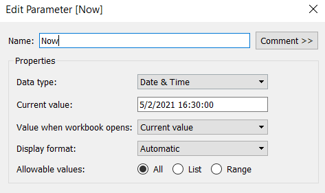
Now

Datetime parameter defaulted to 05 Feb 2021 16:30

The chart we are going to build is a Gantt chart, with 1 bar related to the waiting time of the task, and 1 bar related to the running time of the task. We only have the dates, so need to work out the duration of both of these. These need to be calculated as a proportion of 1 day, since that is what the timeframe is displayed over.

Waiting Time

(DATEDIFF(‘second’, [Created At], IF ISNULL(Started At]) THEN [Now] ELSE [Started At ] END))/86400

Find the difference in seconds, between the create time and start time (or Now, if the task hasn’t yet started), and divide by 86400 which is the number of seconds in a day.

We repeat this for the processing/running time, but this time comparing the start time with the completed time.

Processing Time

(DATEDIFF(‘second’, [Started At], IF ISNULL([Completed At]) THEN [Now] ELSE [Completed At] END))/86400

As mentioned the timeframe we’re displaying over is a 24 hr period, and we want to display the different days over multiple rows, rather than on a single continuous time axis spanning several days.

To achieve this, we need to ‘baseline’ or ‘normalise’ the Created At field to be the exact same day for all the rows of data, but the time of day needs to reflect the actual Created At time . This technique to shift the dates to the same date, is described in this Tableau Knowledge Base article.

Created At Baseline

DATEADD(‘day’, DATEDIFF(‘day’, [Created At], #2021-01-01#), [Created At])

And again, we’re going to need to do a similar thing with the Started At field

Started At Baseline

DATEADD(‘day’, DATEDIFF(‘day’, [Started At], #2021-01-01#), [Started At])

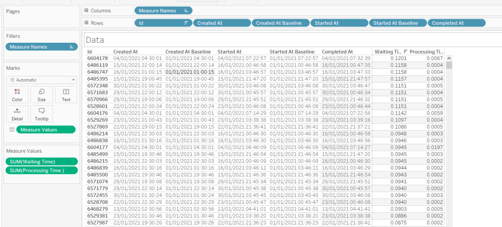
Putting this out into a table, you can see what this data all looks like (note, I’m just choosing a arbitrary date of 01 Jan 2021, so my baseline dates are all on this date:

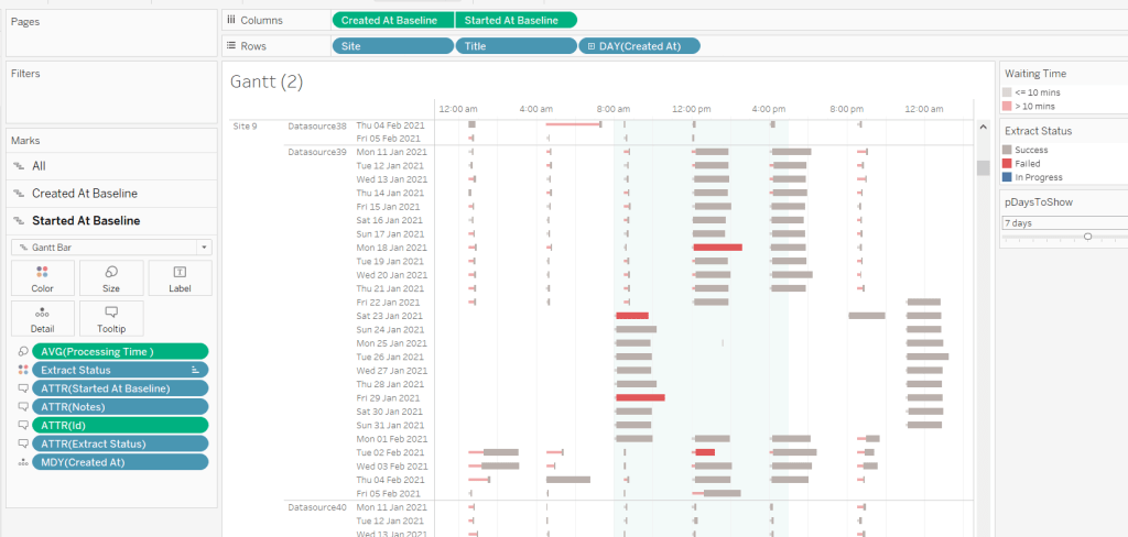
Building the Gantt chart

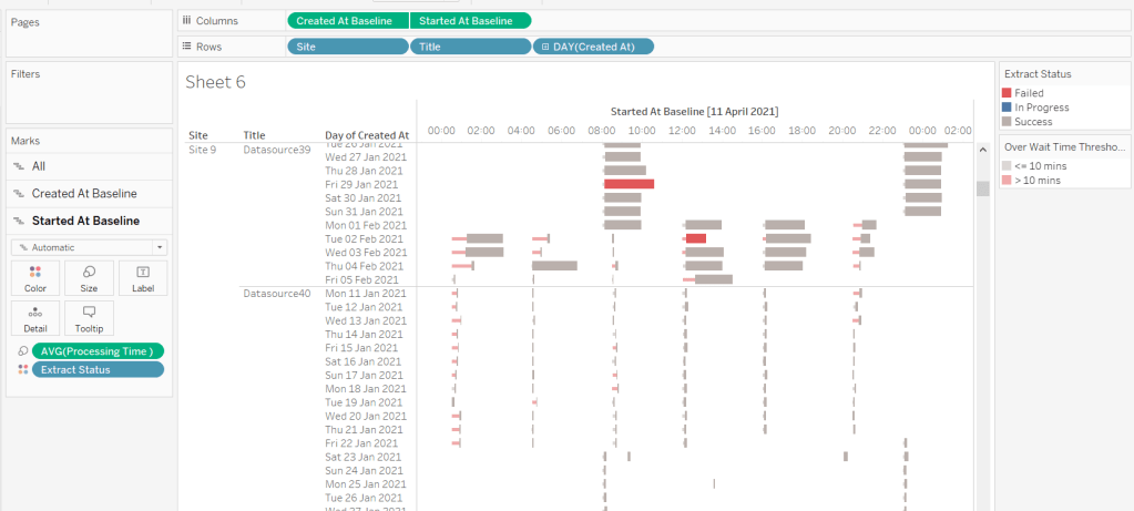
We’re going to build a dual axis Gantt chart for this.

  • Add Site to Rows
  • Add Title to Rows
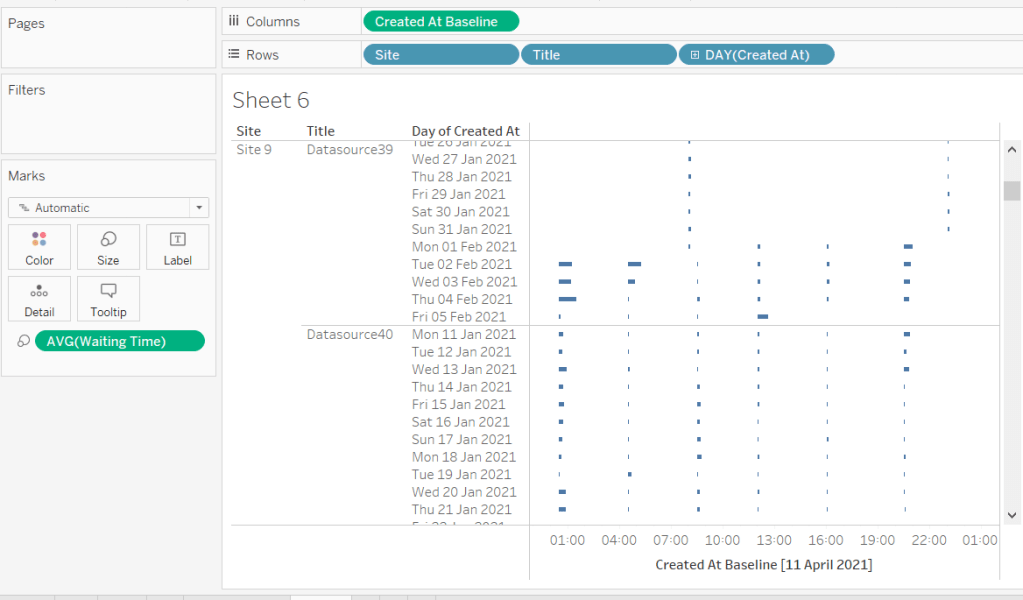
  • Add Created At to Rows. Set it to the day/month/year level and set to be discrete (ie blue pill). Format the field to custom format of ddd dd mmm yyyy so it displays like Mon 11 Jan 2021 etc
  • Add Created At Baseline to Columns, set to exact date
  • Add Waiting Time (Avg) to Size and adjust to be thin

This will automatically create a Gantt chart view

Next

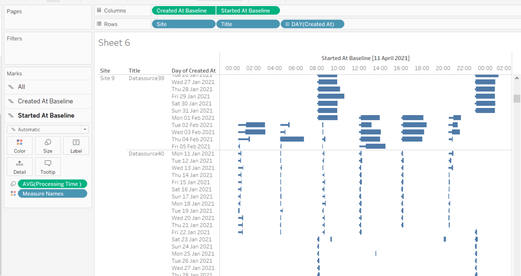
  • Add Started At Baseline to Columns, set to exact date, and move so the pill is now placed to the right of the Created At Baseline pill
  • On the Started At Baseline marks card, remove Waiting Time and add Processing Time (Avg) to the Size shelf instead. Adjust so the size is thicker.
  • Set the chart to be dual axis and synchronise the axes

The thicker bars based on the Started At / Processing Time need to be coloured based on Extract Status. Add this field to the Colour shelf of the Started At Baseline marks card and adjust accordingly.

The thinner bars based on the Created At / Waiting Time need to be coloured based on how long the wait time is (over 10 mins or not).

Over Wait Time Threshold

[Waiting Time] > 0.007

0.007 represents 10 mins as a proportion of the number of minutes in a day (10 / (60*24) ).

Add this field to the Colour shelf of the Created At Baseline marks card and adjust accordingly (I chose to set to the same red/grey values used to colour the other bars, but set the transparency of these bars to 50%).

Formatting the Tooltips

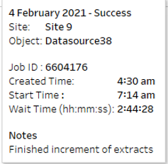
The tooltip for the Waiting Time bar displays

The Created At Baseline and Started At Baseline should both be added to the Tooltip shelf and then custom formatted to h:mm am/pm

The Waiting Time needs to be custom formatted to hh:mm:ss

The tooltip for the Processing Time bar is similar but there are small differences in the display,

Formatting the axes

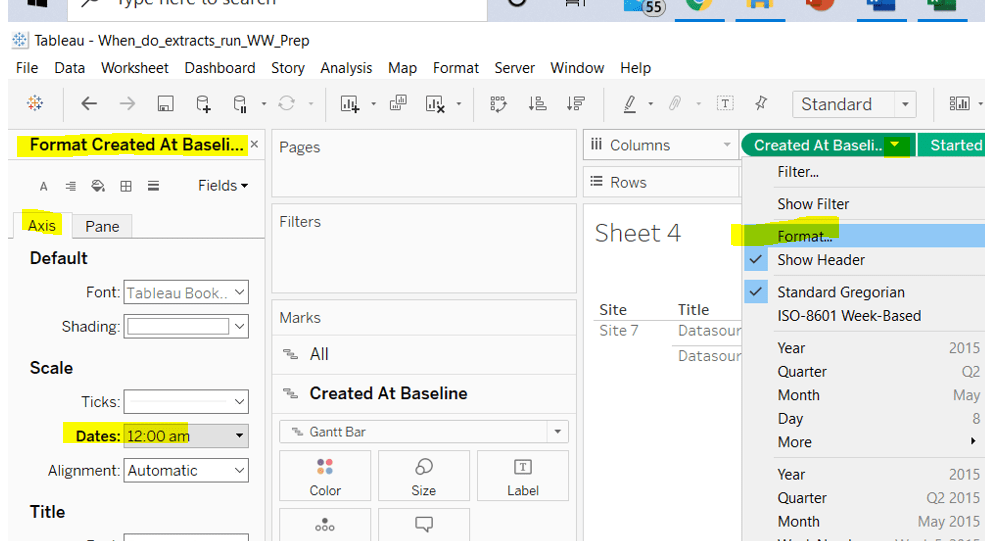
The dates on the axes are displayed as time in am/pm format.

To set this, the Created At Baseline / Started At Baseline pills on the Columns shelf need to be formatted to h:mm am/pm

Adding the reference band

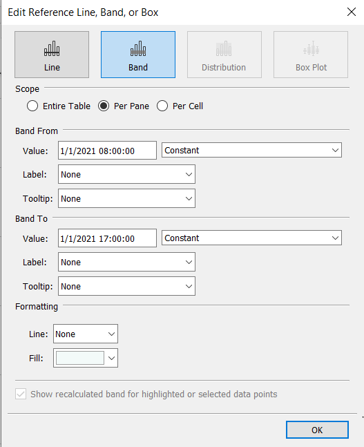
The reference band is used to highlight core working hours between 8am and 5pm. Right click on the Created At Baseline axis and Add Reference Line. Create a reference band using constants, and set the fill colour accordingly.

Apply further formatting to suit – adjust sizes of fonts, add vertical gridlines, hide column/axes titles.

Filtering the dates displayed

As discussed above, when using this chart in my day to day job, I’d be looking at the data ‘Now’. As a consequence I can simply use a relative date quick filter on the Started At field, which I default to Last 7 days.

However, as this challenge is based on static data, we need to craft this functionality slightly differently.

We’re only going to show up to 10 days worth of data, and will drive this using a parameter.

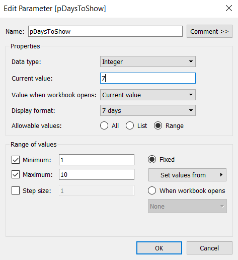
pDaysToShow

An integer parameter, ranging from 1 to 10, defaulted to 7, and formatted to display with a suffix of ‘ days’.

We then need a calculated field to use to filter the dates

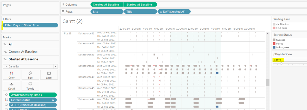
Filter : Days to Show

DATETRUNC(‘day’,[Created At]) >= DATEADD(‘day’,([pDaysToShow]-1)*-1,DATETRUNC(‘day’,[Now]))

Add this to the Filter shelf and set to True.

Additionally, the chart can be filtered by Site, so add this to the Filter shelf too.

Building the Key legend

Some people may build this by adding a separate data source, but I’m just going to work with the data we have. This technique is reliant on knowing your data well and whether it will always exist.

On a new sheet, add Site to the Filter shelf and filter to sites 7 and 9.

Create a new field

Key Label

If [Site] = ‘Site 9’ THEN ‘Waiting’ ELSE ‘Processing’ END

and add this to the Columns shelf and sort the field descending, so Waiting is listed before Processing.

Alongside this field, type directly into the Columns shelf MIN(1).

Edit the axes to be fixed to from 0 to 1. Then add the Site field to the Colour shelf and also to the Size shelf and adjust accordingly (you may need to reverse the sizes). I lightened the colour by changing the opacity to 50%.

Now hide the axes, remove row & column borders, hide the column title and turn off tooltips.

The information can all now be added to a dashboard.

Using your own data

To use this chart with your own Tableau Server instance, you need to create a data source against the Tableau postgres repository that connects to the _background_tasks (bgt) table with an inner join to the _sites (s) table on bgt.site_id = s.Id. Rename the name field from the _sites table to Site. If you don’t use multiple sites on your Tableau Server instance, then the join is not required. The sole purpose of the join is to get the actual name of the site to use in the display/filter.

You should then be able to repoint the data source from the Excel sheet to the postgres connection. You may find you need to readjust some of the colours though.

When I run this, I’m using a live connection so I can see what is happening at the point of viewing, rather than using a scheduled extract. To help with this, I add a data source filter to limit the days of data to return from the query (eg Created at <=10 days), which significantly reduces the data volume returned with a live connection.

Hopefully you enjoyed this ‘real world’ challenge, and your server admins are singing your praises over the brilliance of this dashboard πŸ™‚

My published version is here.

If you’ve got any feedback or suggestions on improvements to enhance the viz even further, please do let me know.

Happy vizzin’! Stay safe!

Donna
Can you find all counties within n miles of a selected county?
I’ve been on annual leave for a few weeks. I’ve managed to catch up on all the challenges but haven’t blogged a solution for a while. It’s been a real struggle to get back into things to be honest – back to work, back to school, back to football clubs for my kids, and I’m wondering where I found the time before 😦

Trying to think about when/if I was going to get this blog out has caused me a bit of stress, which I don’t need, and so I need to change my mindset a bit…try to relax a bit … if I don’t manage to post a blog, just accept it and move on. I’ve also got to try to reduce the time it takes me to blog. I’m a ‘detail’ person, so often end up documenting to such a low level, but for my own sanity, I’m going to have to make an effort to be a bit briefer. I can’t guarantee I’ll stick to this though.. will just have to see how things pan out.

Going forward, I’m going to try to focus on the points that I think are key to the challenge, or those I found a bit tricksy.

So onto this week’s challenge. Sean Miller returned as guest poster with a COVID-19 related distance challenge.

Note – I connected to the provided hyper extract file rather than the csv file.

The core points I’m going to discuss are

  • Identify counties within n miles
  • How to select a county without set actions
  • How to handle ‘All’ counties being selected
  • Colouring based on ‘percentile’ of hospital beds
  • How to only show county borders of counties within selected range

Identify counties within n miles

The number of miles is stored within an integer parameter, n miles, that is defaulted to 100.

A county to act as the ‘start point’ is stored in a set, Selected County, based on the County, State field.

The long/lat coordinates of this selected county need to be captured.

Selected County Lat

{FIXED : AVG(IF [Selected County] THEN [Latitude] END)}

Selected County Long

{FIXED : AVG(IF [Selected County] THEN [Longitude] END)}

By using a FIXED LoD calculation, the values are stored against every ‘row’ in the data set.

With these, the starting point can be determined

Selected County Start Point

MAKEPOINT([Selected County Lat],[Selected County Long])

The position of every other county – the ‘destination’ / end point – also needs to be determined

End Point

MAKEPOINT([Latitude],[Longitude])

With these, the distance between can be computed

Distance

DISTANCE([Selected County Start Point],[End Point],’miles’)

And the counties can then be restricted by

Within n miles

[Distance]<= [n miles]

which can be used as a filter and set to True.

How to select a county without set actions

This is managed via the set control feature; right click on the Selected County set and choose Show Set to display the list of counties with the option to select which ones are in or out of the set. Change the display of the control via the dropdown arrow (top right) to be Single value dropdown which automatically provides as ‘All’ option or the ability to select a single set only.

How to handle ‘All’ counties being selected

When ‘All’ is chosen via the Set Control selector, this has the effect of adding all the State, County values into the set, which means we don’t really have a starting state. So the n miles parameter is essentially redundant. But we need to make the Within n miles filter understand this.

We can manage this by first identifying how many values we have in the set

Count Selected States

{FIXED : COUNTD(IF [Selected County] THEN [County, State] END)}

There will either be 1 or if All is selected, then they’ll be 3000+, and we use the FIXED LoD, so the total is stored against all rows.

We can then update our Within n miles filter to consider this value

Within n miles

([Count Selected States]=1 AND [Distance]<= [n miles]) OR [Count Selected States] > 1

This now returns true if either one State, County is selected and the other records are within n miles OR all the states are selected (the count is > 1).

Colouring based on ‘percentile’ of hospital beds

This caused me a little bit of headscratching. I assumed ‘percentile’ would be based on a percentage of the total num_staffed_beds (note I simply renamed this field to Hospital Beds), associated to the state,counties being displayed (ie within n miles). But after building the calculation I thought, and adding it to colour and choosing the Green-Gold colour range, I didn’t get the same spread as shown in the solution.

I messaged Sean to question whether I’d made the right assumption, but while waiting for a response, I did an online search for “Tableau Percentile Rank”, and quickly spotted that a Table Calculation exists. As you can guess, I don’t use this particular calculation very much at all πŸ™‚

So to colour, add Hospital Beds , and simply add a Percentile table calculation

How to only show county borders of counties within selected range

When working with Maps, you can use the options within the Map Layers menu to select which features of the map should be displayed. One of these options is State/Province Borders, which you might think is what is needed.

However, this will show all the state borders, which is evident if you zoom out a bit, including those for states that don’t have counties within n miles.

This isn’t the requirement – we only want to show the borders of the states which have counties within the desired range. So instead, we don’t want to show any State/Province Borders via the Map Layers. And we’ll utilise a dual axis instead, by first identifying the states that are within n miles

States within n miles

If [Within n miles] THEN [State] END

Duplicate the Latitude (generated) field on the Rows, remove all the fields on that mark, and then add the States within n miles to the Detail shelf. Set the colour of this mark to white, and swap the Latitude (generated) fields if needed, so the States are on the top, as below.

Then make dual axis πŸ™‚

And that’s the key points that I hope will help you solve this challenge. My published version is here, which is available to be downloaded. If there’s anything I haven’t covered that you’re not sure about, feel free to contact me.

Happy vizzin’! Stay safe!

Donna