After connecting to the data, add Team to Rows and Timestamp as a continuous (green) pill at the Day level to Columns. Create a new field
Call Count
COUNT([synthetic_call_center_data.csv])
and then add this to Rows.
Add Timestamp to Filter, and select relative date. Set the options to Last 3 weeks, and then additionally check the anchor relative to check box and enter 23 Dec 2024. This is because the data set only goes up to the end of December 2024. Not setting this field will apply the date filter based on ‘today’ so it’s unlikely anything will appear.
(Note – you may also need to update the date properties of the data set to ensure a week starts on a Sunday to get matching numbers: right click the data source and select the date properties option).
To add a marker to the last point, create a field
Call Count – Most Recent
IF LAST()=0 THEN [Call Count] END
Add this to Rows and adjust the table calc setting so it is computing specifically by Day of Timestamp only. By default it was doing this via the Table (across) option, but I tend to always prefer to always explicitly fix what the calculation is computing over, as it won’t then matter where I then move that field too if I choose to change the layout of the viz.
Set the mark type on the Call Count marks card to line, and then adjust the colour to grey and reduce the size. Set the mark type of the Call Count – Most Recent marks card to circle, set the colour to blue and increase the size. Hide the null indicator (right click > hide).
Set the chart to dual axis, synchronise the axis and then remove the Measure Names field from the All marks card.
remove both the axis titles (right click axis > edit axis), hide the right hand axis (right click, untick show header), and format to remove the column divider from the header section only.
Now we’ve got the core display, we need to create the following fields
No. of Calls
WINDOW_SUM([Call Count])
Highest Call Vol
WINDOW_MAX([Call Count])
Lowest Call Vol
WINDOW_MIN([Call Count])
Avg Call Vol
WINDOW_AVG([Call Count])
format this to a number with 0 dp
Calls this period
WINDOW_MAX([Call Count – Most Recent])
the window_max is required here, as the data set we’re displaying at the day level, has 2 values – the latest value and null. We only want to return 1 value, which is the maximum of these.
Previous Period
WINDOW_MAX(IF LAST()=1 THEN [Call Count] END)
LAST()=1 returns the value of the next to last record, and the window_max is again applied, as the nested IF clause will return null for all others records.
Period Var
[Calls this period] – [Previous Period]
Add each of these fields, one by one, to Rows following the steps below
Add to rows (it will automatically display as a green continuous pill).
change to discrete (right click on the pill and select discrete – the pill will turn blue and move to before the green pills)
Explicitly set the table calc to be computing by Timestamp (as above)
Once, you should have something that looks like this
but I noticed, that the display in the solution is sorted based on the total number of calls and not by Team, so add a Sort to the Team pill to sort by Call Count descending
Update the Tooltip if you wish, and then add the viz to a dashboard, floating the Timestamp filter.
For this week’s #WOW2024 challenge, I asked the community to rebuild this unit chart depicting the medals won each day by country. I built this out while the Olympics was on, curating the data myself, so there is a chance it may not match ‘official’ records (some events got delayed, some medallists may have since been disqualified or reinstated).
Creating custom shapes
The challenge requires a set of custom shapes representing the sports. Download all the image files from the Olympic Sports directory here and save them into a new folder in your …\My Tableau Repository\Shapes directory (as discussed here).
Building the viz
Add Day as a discrete (blue) pill to Columns. Change the mark type to Shape and add Event to Shape. Choose the Olympic Sports shape palette you created above (click reload shapes if it isn’t visible), then click Assign Palette. As the images are named exactly as the events are, they should all match without the need to manually assign each shape to the event. Also note, doing this step first, ensures all events are listed and assigned.
Add Country to Filter and select Great Britain. Show the filter and change to a single select drop-down and customise so you can’t select the ‘All’ option.
You can immediately see the basic layout we’re after. However, as we ned to display shapes and circles to represent the medal types, we need to use a dual axis chart. But at this point there is no axis.
Change the Day field on Columns to be continuous (green). This gives us a axis, but the marks for each event are on top of each other.
Create a new field
Index
INDEX()
Add to Rows and adjust the table calculation to compute by Event.
Edit the Index axis and set it to be reversed. Then add Medal, Country and ID to Detail (to ensure distinct marks are displayed), and readjust the table calculation of the Index field to also compute by these fields as well.
Add Event Detail, Athlete and Notes to the Tooltip shelf, and adjust accordingly.
If you change the Country filter to another entry, eg Albania, the display won’t show every day as they only won medals on days 15 & 16. They only won 1 medal on those days too, so the y-axis has also altered. We don’t want this to happen – the ‘frame’ of the display should remain regardless of the country selected. To resolve this, change the data type of the Day field to Number (decimal) (right click field > change data type). Then edit the Day axis and fix from 0.5 to 16.5 – changing the data type means we can fix using decimal numbers which means we don’t get 0 and 17 displayed on the axis.
To fix the height of the chart, we could ‘hardcode’ it as well, but while the number of days in an Olympic Games cycle is always static for cycle, the maximum medals won per day could change – so if I wanted to reuse this chart on a set of data for a different Olympic Games, I’d have to find out what the max was to hardcode. So instead, we’ll make this dynamic using a nested LoD calc.
{FIXED Day, [Country]: COUNT([Daily Medal Winners])} returns the count of medals per day per country
{FIXED Country: MAX(<code above>)} then returns the max number of the above per country
then the outer (FIXED: MAX()} statement gets the maximum of all of these
Add this to the Detail shelf, then add a Reference Line to the Index axis that shows the average of this field, and doesn’t display any line or values, or tooltips. The axis should extend.
If you select other countries, the axis should remain the same.. until you choose USA and it moves to show 20, as the maximum number of medals in one day has been hit.
Again we don’t want this causing any shift in the ‘frame’. So to resolve, double click into the Max Medal Count field and type + 1 at the end, so the reference line is actually 1 higher. The 20 is still visible, but now it’s visible for all countries. This axis won’t be displayed anyway, but now it won’t shift at all either. Chang the
Now the main framework is in place, we can add the ‘medals’. Add another instance of Day to Columns. On the Day(2) marks card, change the mark type to circle then add Medal to Colour and adjust accordingly. I used bronze: #ce8451, silver: #b3b7b8, gold: #edc948 and the reduced the opacity to 50% and added a dark grey border. Re-order the values in the colour legend and then edit the table calculation on the Index pill again, and ensure Medal is listed first. This should make any bronze medals won on a day be listed at the top, followed by silver and then gold
NOTE – I noticed at this point, that adjusting the Index meant I lost the reference line, so I had to reapply.
Make the chart dual axis and synchronise the axis. You may need to make adjustments to the size of each of the marks cards so the event shapes are within the circles, but this is probably best done after you’ve added to the dashboard.
Hide all gridlines, zero lines, axis rulers and row & column dividers. Hide the Index axis (uncheck show header). Edit the bottom Day axis, delete the title and set the tick marks to None for both major & minor tick marks. Edit the top axis and hide the title. Increase the font of the top axis labels.
Finally we need to show the count of the medals each day. Create field
Count Medals by Country Per Day
{FIXED Day, [Country]: COUNT([Daily Medal Winners])}
then
Label: Medal per Day
IF INDEX()=SIZE() THEN SUM([Count Medals By Country Per Day]) END
Add this to the Label shelf of the ‘circles’ marks card, and adjust the table calculation so it’s computing by all fields except Day and that Medal is listed at the top. The label should display underneath the last circle.
Format the font to be a bigger/bolder style and explicitly align bottom centre, then add to a dashboard and that should be it.
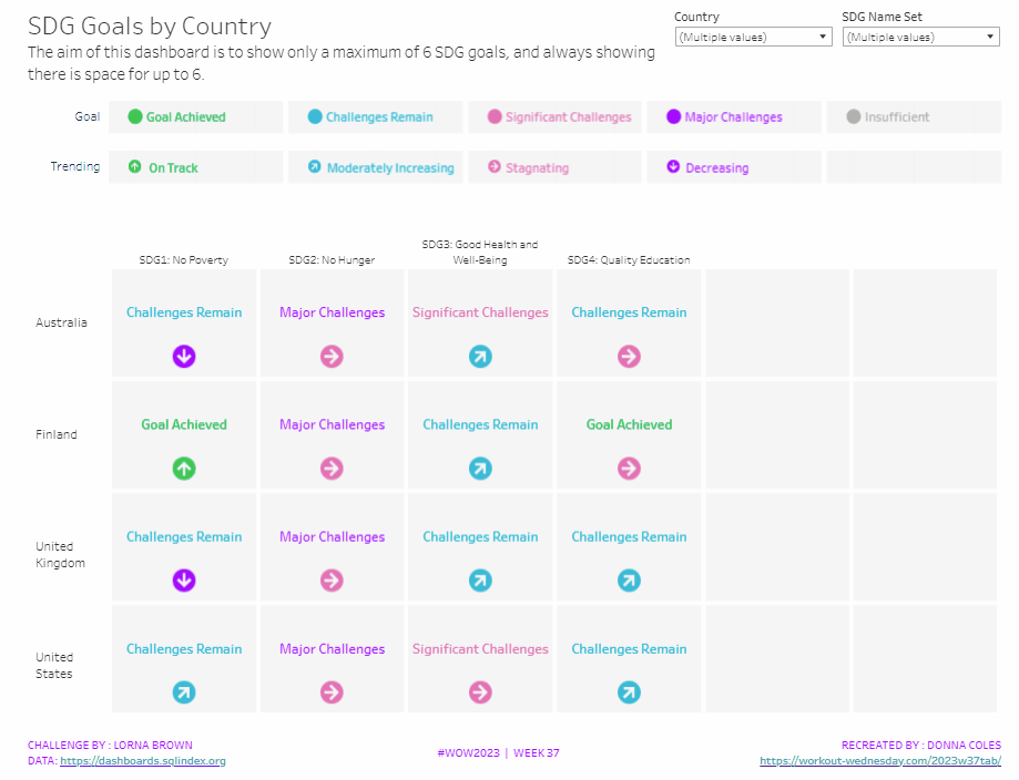
It was Lorna’s turn to set the challenge this week, based on a real world scenario she’s encountered with a colleague. The premise was to be able to show the progress, by country, against a maximum of 6 goals selected by the user. Placeholders for the 6 options had to remain visible at all times (unless the user selected more than 6, in which case a message should appear).
Building the core viz
As Lorna alludes to in the requirements, we will use sets to capture the goals the user can select.
SDG Name Set
Right click on SDG Name > Create > Set. Select up to 4 options.
On a new sheet, add SDG Name Set and SDG Name to Columns, Country to Rows and add Country to the filter shelf, and limit to Australia, Finland, UK & USA. Right click on the SDG Name Set field in the data pane and select Show Set
We need the SDG Name value to only display for the values selected
SDG Name Header Label
IF [SDG Name Set] THEN [SDG Name] ELSE ” END
Add this to Columns before the SDG Name field.
Now we need to always display 6 columns of data, ie in this case, all the SDG Name values In the set and the first SDG Name values not in the set. We will use the INDEX() function to help us label the columns position.
INDEX
INDEX()
Right click this field and Convert to discrete, then add it to the Columns after SDG Name.
Edit the table calculation (click on the triangle symbol on the blue INDEX pill), and adjust so it is computing by Specific Dimensions. This should be all the fields except Country. The columns should be labelled sequentially from 1 to 17.
Add INDEX to the Filter shelf as well. Initially just select 1. Then adjust the table calculation of this field to match above, and once done, edit filter and select values 1 through to 6. This should leave you with 6 columns
Now we have the structure, we can start building the core contents of the table. For this we’ll be using what I refer to as ‘fake axis’.
Double click in the Rows shelf and manually type in MIN(0.2), then double click again and manually type in MIN(0.6). This results in the creation of a MIN(0.2) and a MIN(0.6) marks card on the left hand side.
The MIN(0.2) marks card is going to be used to show the information about how the goal is trending (ie the arrow symbol), while the MIN(0.6) marks card will be used to show the status of the goal (the text displayed). We need new fields for this, so the values only display for the selected goals.
Trend
IF [SDG Name Set] THEN [SDG Trend] END
Goal
IF [SDG Name Set] THEN [SDG Value] END
Click on the MIN(0.2) marks card. Change the mark type to shape. Add Trend to the Shape card. Right click on the Trend pill and change the field from a Dimension to an Attribute.
Doing this stops the field from impacting the table calculation, and you should get back to having 6 columns displayed.
Adjust the shapes using the Arrows shape palette. For the Null value, I set it to use a transparent shape, a custom shape added to my shape palette. See this blog for more information on doing this.
Also add Trend to the Colour shelf. Once again, adjust the pill to be Attribute and then adjust the colours.
Now click on the MIN(0.6) marks card. Adjust the Mark Type to be Text. Add Goal to the Text shelf and change to be and Attribute. Add Goal to the Colour shelf, change to be Attribute and adjust colours to suit. I also adjusted the font to be bold & size 10pt.
Set the chart to be dual axis and synchronise the axis. Edit the axis (Right click on the left hand axis) and fix the axis from 0 to 1.
Hide the axis, the IN/OUT SDG Name Set pill, the SDG Name and INDEX pills (right click the pills and uncheck Show header).
Right click on the Country row label and the SDG Name Header Label column label in the viz and hide field labels for rows/columns.
Right click within the viz to format. Set the background colour of the pane to light grey.
Remove all gridlines, axis rules, zero lines. Set the column and row dividers to thick white lines
Click the Tooltip button on the All marks card, and uncheck show tooltips. Set the viz to Fit width.
Building the Goal legend
On a new sheet, add SDG Value to Columns. Change the mark type to Circle then add SDG Value to Label and Colour. Manually re-order the columns and adjust the colours as required.
Double click in the Columns shelf and type in MIN(0.0). Edit the axis and fix from -0.1 to 0.5 – this will shift the symbols and text to the left.
Adjust the size of the circle shape to suit, and set the font of the label to match mark colour. I also set it to be bold.
Remove all gridlines, axis ruler, zero lines. Set the background of the pane to be grey and the row/column dividers to be thick white lines. Hide the axis and the column headers, and uncheck show tooltips.
Double click into the Rows shelf, and type the text ‘Goal’ (including the quotation marks). Hide the ‘Goal’ label that then displays.
Building the Trend legend
Repeat similar steps for above but add the SDG Trend field to the Colour, Label and Shape shelf. Adjust the shape & colours to those used before.
Handling more than 6 selections
For this requirement, we need to determine the number of items in the set.
Count Set Members
{COUNTD(IF [SDG Name Set] THEN [SDG Name] END)}
and then use this to create some boolean fields
More than 6 Selected
[Count Set Members] > 6
Less than 6 Selected
[Count Set Members] <= 6
Ensuring that less than 6 items are selected, add the Less than 6 Selected field to the Filter shelf of the main table viz and set to True.
If you select more than 6 goals, the viz should disappear.
On a new sheet, double click into the space beneath the marks card where the pills usually sit, and type ‘Dummy’ (with quotes). Change the mark type to shape and set to use the transparent custom shape. Move the Dummy pill to the label shelf, then edit the label and change the text to the error message.
Align the text middle centre and fit to entire view. Uncheck show tooltips. Add More than 6 Selected to the filter shelf and select true (if true isn’t an option, go back to the main viz, and select more options sp the viz disappears, then come back to this sheet and try again).
All the sheets can now be added to the dashboard. Ensure the core table viz and the error sheets are added to a vertical container without the title showings – the charts should expand and collapse as the selections are made – this can be a bit tricky to get right.
Kyle set the challenge this week, revisiting his favourite topic – baseball. The aim was to build what I’ve often referred to as a ‘rocket chart’, as it charts progress from a single ‘launch’ date/point. However having had a quick google, I can’t see any other reference to this being used for this type of chart….no idea where it came from <shrug>.
Anyway, the requirement was to compare the profiles of when home runs (HRs) had been accumulated over the course of a player’s career, restricting to just the players who are in the all-time top 10. These players hadn’t necessarily played during the same years or even decades, so there was a need to baseline the information according to the days since they started. Kyle also threw in the requirement that this was to be an LoD based challenge only, with no use of table calculations.
Build the basic chart
As mentioned above, we first need to ascertain how many days have passed between when the player hit their first home run, and the subsequent dates. We use a FIXED LoD to work out the minimum date per player
Min Date Per Player
DATE({FIXED [Player] : MIN([Date])})
And with that we can the work out the number of days that have passed
Days Since Min Date
DATEDIFF(‘day’,[Min Date Per Player], [Date])
And with this, we can quickly build out the main crux of the chart. Add Days Since in Date to Columns, and change to be a continuous dimension. Add Career HR to Rows and amend the aggregation to use AVG rather than SUM, as I found there looked to be duplicate records for some dates for the same player. Add Player to Detail.
Colouring the lines
Kyle provided a custom colour palette to use based on the team colours of the player. I updated by preferences.tps file with this data, and closed and reopened Tableau Desktop to ensure it picked it up. For more information on working with custom colour palettes see this Tableau help article.
Along with the player colours, we also need to identify which player has been selected.
For that we need a parameter to define who the selected player is
pPlayer
string parameter using a List where the values are added from the Player dimension. this causes the default to be set to Albert Pujols.
Show the parameter on the display.
We can now create
Is Selected Player?
[Player] = [pPlayer]
which will return a boolen true/false.
Kyle stated that we should be able to set the colours without having to manually click against every Player|T or F combination.
Now I managed this when I first built my solution, but in writing this blog and trying to replicate the steps, I’m not getting the same behaviour. So I have managed to come up with another way. The gif below hopefully demonstrates, but I’ll list the steps too.
Move the Player pill from Detail onto Colour
Edit the Is Selected Player field to just return True (use // to just comment out the original calculation)
Add Is Selected Player to the Detail shelf, then click the detail icon to the left of the pill and change it to Colour. This is a way to get multiple pills on the Colour shelf. Dragging will just replace the field being used for colour.
The colour legend dialog box should display a list of <Player>, True entries (if the legend isn’t displaying go to Worksheet > Show Cards > Reset Cards – you may then have to add the parameter to the display again).
Edit the colour legend, select the MLB HR Top 10 colour palette and click Assign Palette. This will automatically assign the relevant colour to each entry, since they were added based on alphabetical order.
Re-edit the Is Selected Player field, so it is back to [Player] = [pPlayer].
The entries in the colour legend will now only list one <Player>, True entry and the rest all false.
Edit the colour legend, and multi-select (ctrl-click) all the False entries, and then select the lightest shade of grey from the Seattle Grays palette. This should give you the desired display.
Select Alan Rodriguez from the parameter control. Both Albert, False & Alan, True should now be coloured. Edit the colour legend again and manually set the Albert Pujols, False entry to the same grey shade.
Now if you select any other player, only 1 line should be coloured, and it should be coloured to the corresponding player’s colour.
Setting the Tooltip
Add Season HR to Tooltip and change the aggregation to AVG. Add Date to Tooltip too and set it to be an Attribute. Amend the tooltip accordingly.
Adding the highest season HR indicator
Firstly we need to determine what the maximum Season HR value is per player
Max Season HRPer Player
{FIXED [Player]: MAX([Season HR])}
With this, we then want to get the corresponding Career HR value for that same time.
Career HR | Max Season HR
IF [Season HR] = [Max Season HR Per Player] THEN [Career HR] END
Add this field to Rows and change the aggregation to Avg.
Set to Dual Axis, Synchronise Axis and then set the mark type to Circle. Adjust the size of the circle mark slightly if need be.
Labelling the lines
On the Line marks card, add Player and Career HR to the Label shelf. Adjust the aggregation of Career HR to Avg. Edit the label, so only line ends are labelled. Adjust the font size to something quite small, and set the colour to Match Mark Colour.
Finally remove all gridlines, row & column dividers, and hide the axis. Title the chart.
When added to a dashboard, I then used a floating text object for the introductory text and positioned the parameter as a floating object underneath the text.
It’s Community Month over at #WOW HQ this month, which means guest posters, and Kyle Yetter kicked it all off with this challenge. Having completed numerous YoY related workbooks both through work and previous #WOW challenges, this looked like it might be relatively straight forward on the surface. But Kyle threw in some curve balls, which I’ll try to explain within this blog. The points I’ll be focussing on
YoY % calculation for colouring the map
Displaying the circles on the map
Restricting the Date parameter to 1st Jan – 14th July only
Showing Daily or Weekly dates on the viz in tooltip
Restricting to full weeks only (in weekly view)
YoY % calculation
The data provided includes dates from 1st Jan 2019 to 21st July 2020. We need to be able to show Current Year (CY) values alongside Previous Year (PY) values and the YoY% difference. I built up the following calculations for all this
Today
#2020-07-15#
This is just hardcoded based on the requirement. In a business scenario where the data changes, you may use the TODAY() function to get the current date.
Current Year
YEAR([Today])
simply returns 2020, which I could have hardcoded as well, but I prefer to build solutions as if the data were more dynamic.
CY
IF YEAR([Subscription Date]) = [Current Year] THEN [Subscription] END
stores the value of the Subscription field but only for records associated to 2020
PY
IF YEAR([Subscription Date]) = [Current Year]-1 THEN [Subscription] END
stores the value of the Subscription field but only for records associated to 2019 (ie 2020-1)
YoY%
(SUM([CY])- SUM([PY]))/SUM([PY])
format this to a percentage with 0 decimal places. This ultimately is the measure used to colour the map. CY, PY & YoY% are also referenced on the Tooltip.
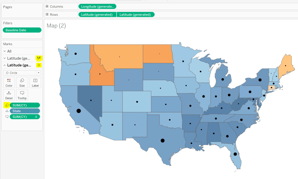
Displaying circles on the map
This is achieved using a dual axis map (via a second instance of the Latitude pill on Rows). One ‘axis’ is a map mark type coloured by the YoY% and the other is a circle mark type, sized by CY, explicitly coloured black.
The Tooltip for the circle mark type also shows the % of Total subscriptions for the current year, which is a Percent of Total Quick Table Calculation
Restricting the Date parameter to 1st Jan – 14th July only
As mentioned the Subscription Date contains dates from 01 Jan 2019 to 21 July 2020, but we can’t simply add a filter restricting this date to 01 Jan 20 to 14 Jul 20 as that would remove all the rows associated to the 2019 data which we need available to provide the PY and YoY% values.
So to solve this we need a new date field, and we need to baseline / normalise the dates in the data set to all align to the same year.
Baseline Date
//set all dates to be based on current year MAKEDATE([Current Year], MONTH([Subscription Date]), DAY([Subscription Date]))
So if the Subscription Date is 01 Jan 2019, the equivalent Baseline Date associated will be 01 Jan 2020. The Subscription Date of 01 Jan 2020 will also have a Baseline Date of 01 Jan 2020.
We also want to ensure we don’t have dates beyond ‘today’
Include Dates < Today
[Baseline Date]< [Today]
Add Include Dates < Today to the Filter shelf, and set to True.
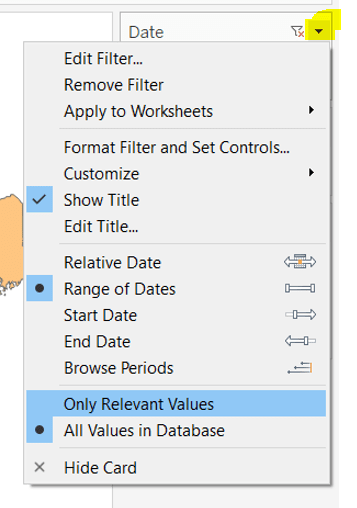
Add Baseline Date to the Filter shelf, choose Range of Dates , and by default the dates 01 Jan 2020 to 14 Jul 2020 should be displayed
Select to Show Filter, and when the filter displays, select the drop down arrow (top right) and change to Only Relevant Values
Whilst you can edit the start and end dates in the filter to be before/after the specific dates, this won’t actually use those dates, and the filter control slider can only be moved between the range we want.
The Baseline Date field should then be custom formatted to mmmm dd to display the dates in the January 01 format.
Showing Daily or Weekly dates on the viz in tooltip
The requirements state that if the date range selected is <=30 days, the trend chart shown on the Viz in Tooltip should display daily data, otherwise it should be weekly figures, where the week ‘starts’ on the minimum date selected in the range.
There’s a lot going on to meet this requirement.
First up we need to be able to identify the min & max dates selected by the user via the Baseline Date filter.
This did cause me some trouble. I knew what I wanted, but struggled. A FIXED LOD always gave me the 1st Jan 2020 for the Min Date, regardless of where I moved the slider, whereas a WINDOW_MIN() table calculation function caused issues as it required the data displayed to be at a level of detail that I didn’t want.
A peak at Kyle’s solution and I found he’dadded the date filters to context. This means a FIXED LOD would then return the min & max dates I was after.
Min Date
{MIN([Baseline Date])}
Note this is a shortened notation for {FIXED : MIN([Baseline Date])}
Max Date
{MAX([Baseline Date])}
With these, we can work out
Days between Min & Max
DATEDIFF(‘day’,[Min Date], [Max Date])
which in turn we can categorise
Daily | Weekly
IF [Days between Min & Max]<=30 THEN ‘Daily’ ELSE ‘Weekly’ END
We also need to understand the day the weeks will start on.
Day of Week Min Date
DATEPART(‘weekday’,[Min Date])
This returns a number from 1 (Sunday) to 7 (Saturday) based on the Min Date selected.
Using this we can essentially ‘categorise’ and therefore ‘group’ the Baseline Date into the appropriate week.
Baseline Date Week
CASE [Day of Week Min Date] WHEN 1 THEN DATETRUNC(‘week’,([Baseline Date]),’Sunday’) WHEN 2 THEN DATETRUNC(‘week’,([Baseline Date]),’Monday’) WHEN 3 THEN DATETRUNC(‘week’,([Baseline Date]),’Tuesday’) WHEN 4 THEN DATETRUNC(‘week’,([Baseline Date]),’Wednesday’) WHEN 5 THEN DATETRUNC(‘week’,([Baseline Date]),’Thursday’) WHEN 6 THEN DATETRUNC(‘week’,([Baseline Date]),’Friday’) WHEN 7 THEN DATETRUNC(‘week’,([Baseline Date]),’Saturday’) END
Ideally we want to simplify this using something like DATETRUNC(‘week’, [Baseline Date], DATEPART(‘weekday’, [Min Date])), but unfortunately, at this point, Tableau won’t accept a function as the 3rd parameter of the DATETRUNC function.
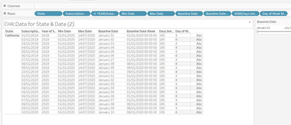
Let’s just have a look at what we’ve got so far
Rows for California only showing the Subscription Dates from 01 Jan 2019 – 10 Jan 2019 and 01 Jan 2020 to 10 Jan 2020. Min & Max date for all rows are identical and matches the values in the filter. The Baseline Date field for both 01 Jan 2019 and 01 Jan 2020 is January 01. The Baseline Date Week for 01 Jan 2019 – 07 Jan 2019 AND 01 Jan 2020 – 07 Jan 2020 is 01 Jan 2020. The other dates are associated with the week starting 08 Jan 20202.
So now we have all this information, we need yet another date field that will be plotted on the date axis of the Viz in Tooltip.
Date to Plot
IF [Days between Min & Max] <=30 THEN ([Baseline Date]) ELSE [Baseline Date Week] END
If you add this field to the tabular display I built out above, you can see how the value changes as you move the filter dates to be within 30 days of each other and out again.
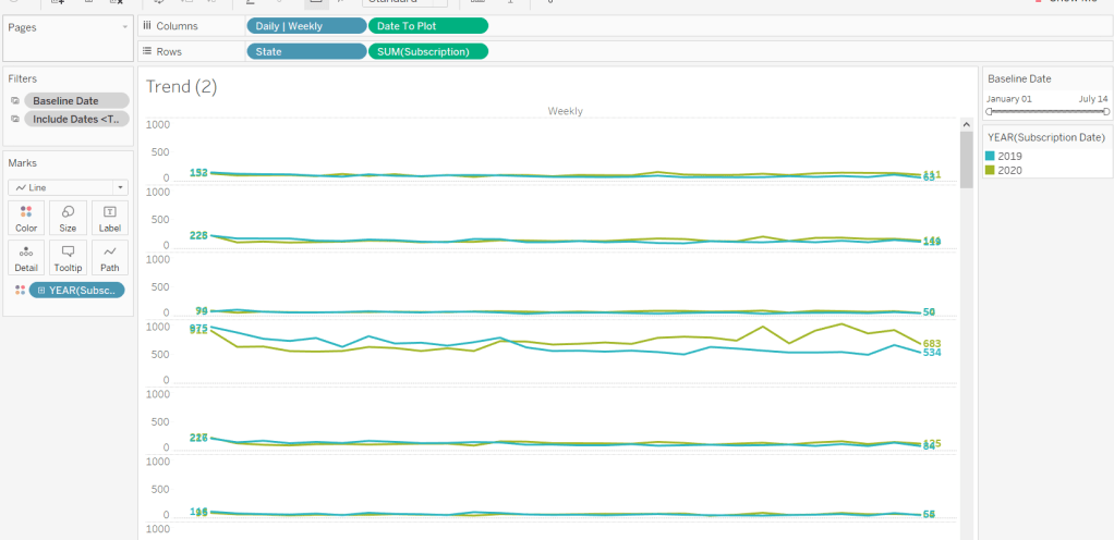
When added to the actual viz, this field is formatted to dd mmm ie 01 Jan, and then is plotted as a continuous, exact date (green pill) field on the Columns alongside the Daily | Weekly field, with State & Subscription on Rows. The YEAR(Subscription Date) provides the separation of the data into 2 lines.
Restricting to full weeks only (in weekly view)
The requirements state only full weeks (ie 7 days of data) should be included when the data is plotted at a weekly level. For this we need to ascertain the ‘week’ the maximum date falls in
Max Date Week
CASE [Day of Week Min Date] WHEN 1 THEN DATETRUNC(‘week’,([Max Date]),’Sunday’) WHEN 2 THEN DATETRUNC(‘week’,([Max Date]),’Monday’) WHEN 3 THEN DATETRUNC(‘week’,([Max Date]),’Tuesday’) WHEN 4 THEN DATETRUNC(‘week’,([Max Date]),’Wednesday’) WHEN 5 THEN DATETRUNC(‘week’,([Max Date]),’Thursday’) WHEN 6 THEN DATETRUNC(‘week’,([Max Date]),’Friday’) WHEN 7 THEN DATETRUNC(‘week’,([Max Date]),’Saturday’) END
so if the maximum date selected is a Thursday (eg Thurs 11th June 2020) but the minimum date happens to be a Tuesday, then the week starts on a Tuesday, and this field will return the previous Tuesday date (eg Tues 9th June 2020).
And then to restrict to complete weeks only…
Full Weeks Only
IF [Daily | Weekly]=’Weekly’ THEN [Date To Plot]< [Max Date Week] ELSE TRUE END
If we’re in the ‘weekly’ mode, the Date To Plot field will be storing dates related to the start of the week, so will return true for all records where the field is less than the week of the max date. Otherwise if we’re in ‘daily’ mode we just want all records.
This field is added to the Filter shelf and set to true.
Hopefully that covers off all the complicated bits you need to know to complete this challenge. My published solution is here.