Dynamic Dimension Colouring

For this week’s challenge, Yusuke asked us to provide a solution to allow charts to be coloured by different dimension, but he sprinkled a few extras in just for good measure 🙂

Defining the parameter

The key driver here is going to be the use of a parameter to define the dimension we need to colour by.

pColourBy

string parameter defaulted to Order Date, listing the 4 options as below

We then need a field that uses this parameter to define the actual dimension we’ll colour by

Colour

CASE [pColourBy]
WHEN ‘Order Date’ THEN STR(YEAR([Order Date]))
WHEN ‘Region’ THEN [Region]
WHEN ‘Category’ THEN [Category]
WHEN ‘Segment’ THEN [Segment]
END

Building the Order Date chart

On a new sheet, add Order Date to Columns and Sales to Rows. Change the mark type to Bar and add Colour to the Colour shelf. Adjust the colours to suit, set the opacity to 70% and add a white border. Show the pColourBy parameter.
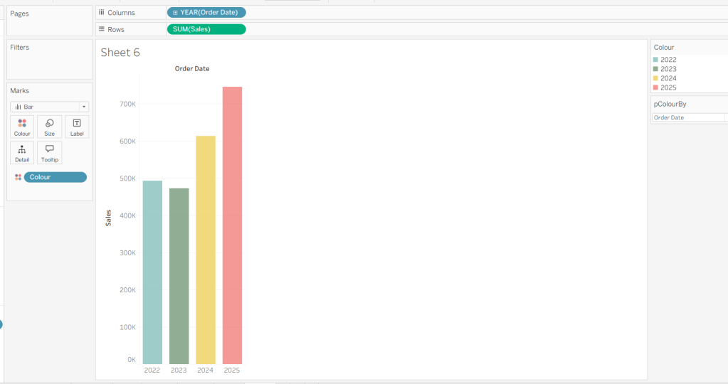
Change the options in the pColourBy parameter and each time readjust the colours as you wish.

Add a reference line to the Sales axis that displays the value of Total Sales per cell
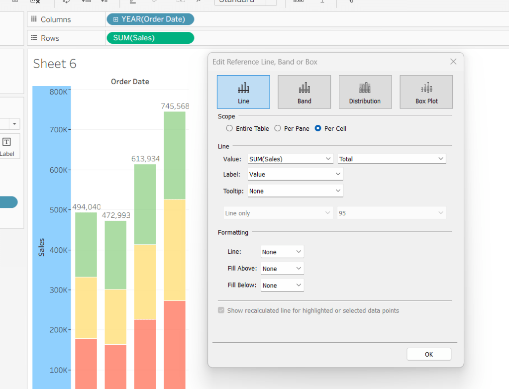
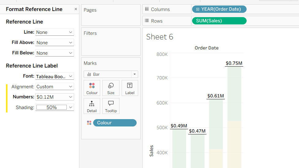
Format the reference line to format the displayed number in $M and bold font, and align top middle.
Create a new field

% of Sales

IF SUM([Sales]) / TOTAL(SUM([Sales])) <> 1 THEN SUM([Sales]) / TOTAL(SUM([Sales])) END

and format to % to 1dp. This will only display a value if its not 100%.

Add this to the Label. Adjust the table calculation setting so it is computing by the Colour field only.
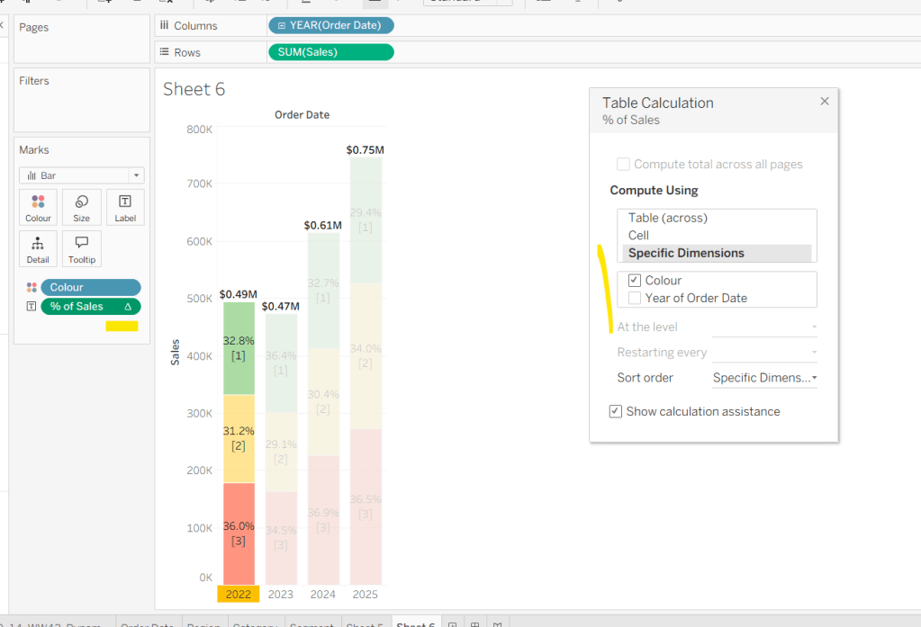
Adjust the Label so the font is bold and the label only appears when Highlighted. Then update the Tooltip as required.

Although not explicitly called out in the requirements, I noted that if Yusuke clicked on the chart title, it reset the dimension to colour by. To deal with this we need to create

param Order Date

‘Order Date’

Add this to the Detail shelf.

We also need to ‘fake’ the title to be part of the chart itself (so it’s clickable). Double click into the Columns and manually type ‘Sales by Order Date’ and position the pill created before Order Date.

Right click on the column label (the text in darker font) and hide field labels for columns. Then right click on the column label to format – set the font to 12pt and bold, align left and shade the background to light grey. Increase the width of the column heading.

Then right click on the corner whitespace next to the heading just created, and format. Apply a light grey shading to the corner too.
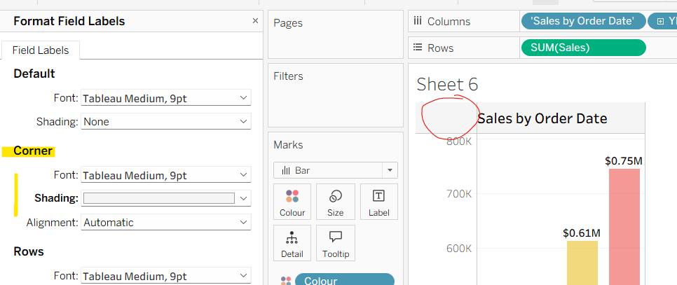
If the ‘title’ is clicked, we don’t want it to be ‘highlighted’/’selected’. For this we will need fields

True

TRUE

False

FALSE

Add both of these to the Detail shelf.

Finally tidy up by removing the axis title, adjusting the font of the axis labels (I made them a bit darker), and removing row & column dividers. Name the sheet Order Date or similar.
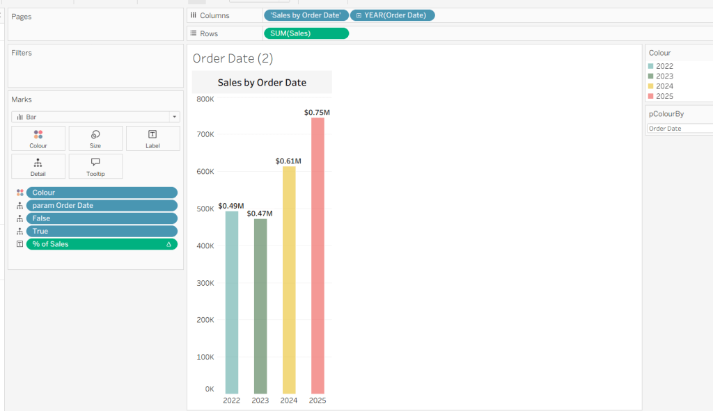
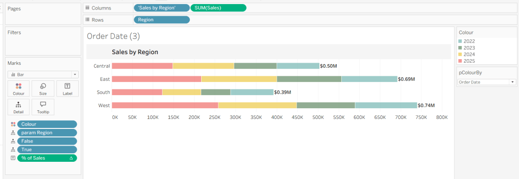
Building the Region chart

Duplicate the Order Date chart and then click the option in the menu to swap axis so we have a horizontal bar chart.
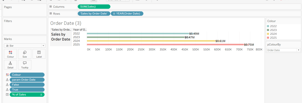
Move the ‘Sales by Order Date’ pill from Rows to Columns and update the text to become ‘Sales by Region’ instead. Drag the Region pill and drop it directly over the Order Date pill on the Rows so it replaces it and all references to the field are replaced too. Widen the rows.

Right click on the ‘Region’ text in the column heading and hide field labels for rows. Format the reference line to align middle right.
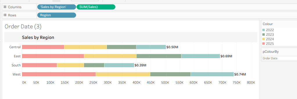
Create a new field

param Region

‘Region’

and add this to the Detail shelf instead of the param Order Date field. Name the sheet Region or similar
Building the Category Chart

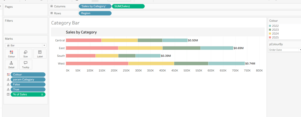
Duplicate the Region chart, and go through similar steps described above so the ‘title’ is Sales by Category and a new field

param Category

‘Category’

replaces param Region on the Detail shelf.
Building the Segment Chart

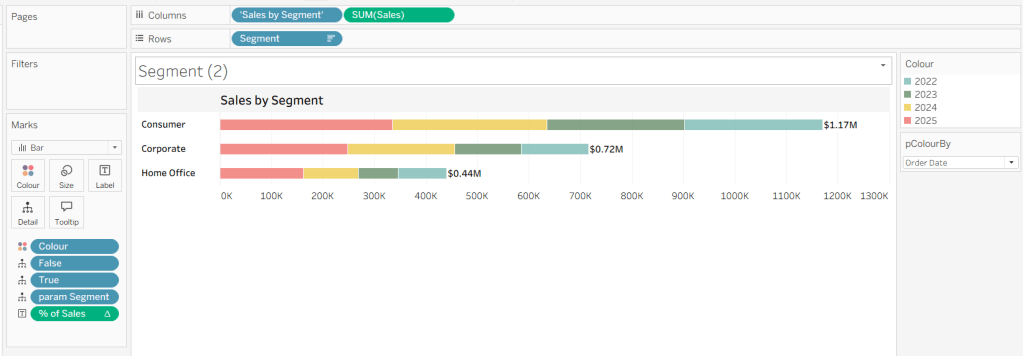
Repeat as above, this time setting the ‘title’ to Sales by Segment and a new field

param Segment

‘Segment’

replaces param Region on the Detail shelf.
Adding the interactivity

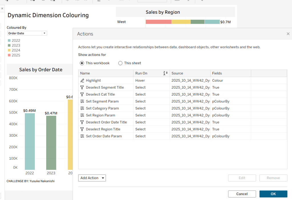
Add the sheets to a dashboard using layout containers and padding to organise as required. Then create the following dashboard actions

Highlight Action : Highlight

On hover of any of the charts on the dashboard, target all other charts, highlighting based on the Colour field only.
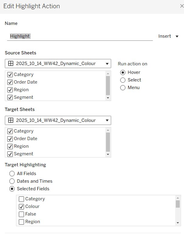
This action makes all the % labels appear when the mouse cursor is moved over the bars.

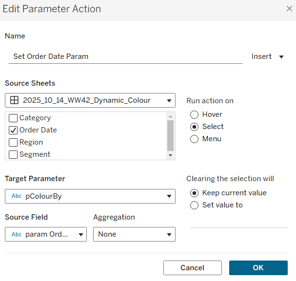
Parameter Action : Set Order Date Param

On Select of the Order Date sheet, set the pColourBy parameter with the value from the param Order Date field.
Parameter Action : Set Region Param

On Select of the Region sheet, set the pColourBy parameter with the value from the param Region field.

Parameter Action : Set Category Param

On Select of the Category sheet, set the pColourBy parameter with the value from the param Category field.

Parameter Action : Set Segment Param

On Select of the Segment sheet, set the pColourBy parameter with the value from the param Segment field.

These actions change the value displayed in the pColourBy parameter when the ‘title’ of the charts is clicked on.

Filter Action: Deselect Order Date Title

On select of the Order Date sheet on the dashboard, target the Order Date worksheet directly, passing the selected values of True = False. Show all values when selection is cleared.

Filter Action: Deselect Region Title

On select of the Region sheet on the dashboard, target the Region worksheet directly, passing the selected values of True = False. Show all values when selection is cleared.
Filter Action: Deselect Category Title

On select of the Category sheet on the dashboard, target the Category worksheet directly, passing the selected values of True = False. Show all values when selection is cleared.

Filter Action: Deselect Segment Title

On select of the Segment sheet on the dashboard, target the Segment worksheet directly, passing the selected values of True = False. Show all values when selection is cleared.

And once these have all been applied, you should have a functioning dashboard. My published version is here.

Happy vizzin’!

Donna

Let’s play with Table(au) Extensions!

Hot of the press with the release of 2024.3, Sean set this challenge to focus on the ability to use table extensions. As a result you will need at least v2024.3 of Tableau Desktop or Tableau Desktop Public installed. At the point of writing, this challenge cannot be completed on Tableau Public itself via web authoring though.

Build the scatter plot

Format Sales and Profit to be $ with 2 dp. Add Sales to Columns and Profit to Rows and add Customer Name to Detail. Change the mark type to circle, reduce the opacity to around 30%, add a blue border and increase the size of the marks. Format the zero lines to be more prominent. Add Segment to the Filters , select all options, and set to apply to worksheets > all using this data source

Build the table extension

On a new sheet, choose Add Extension from the marks type drop down, and on the add an Extension dialog, select the built by Tableau + Salesforce option and then select the Tableau Table option

Select Open on the next screen, and then select OK to the next dialog box.

Add Customer Name, Order Date (as a continuous exact date – green pill), Sales and Profit to the Detail shelf.

Move your mouse to be in front of the SUM(Sales) heading text, and then click on the sort icon that appears a couple of times to get the data sorted by Sales descending. Double click on the SUM(Sales) heading label and edit the label to just Sales. Repeat with the SUM(Profit) heading label.

Click on the context menu associated to the Sales column and select Format

Set the Formatting Type to be Data Bars and change the Fill colour to green

Format the Profit column to have a Formatting Type of Colour Scale and select a diverging colour palette

Click the Format Extension button on the Marks card shelf or the Table Settings icon on the formatting toolbar to load the Format Extension dialog

Change the options so Show Toolbar is Off, Show Column Filters is On and Show Excel Download is On

Adding the interactivity

Add the 2 objects into a horizontal container in a dashboard. Float the Segment filter control and verify changing the value affects both the scatter and the table.

Then add a dashboard filter action

Filter Table

On select of the Scatter, target the Table passing all fields. Show all values when selection cleared.

And that should be it. Unfortunately as Tableau Public doesn’t yet support the extension, I don’t have my published version to share.

Note – I did have some issues getting the table to ‘fit’ completely into the dashboard. I found if I used my larger second screen, ensured the application was maximised, then it would fit properly. Using the application on my laptop screen, it was sometimes a bit hit and miss. This has been raised to the development team.

Happy vizzin;!

Donna

Can you proportionally brush from multiple selections?

For this week’s #WOW2023 challenge, Kyle wanted us to build a viz that used selections on the viz rather than a set of filter controls to show how the sales for those selections were distributed.

This concept is referred to as proportional brushing and makes use of set actions to achieve the results. The complexity added here was the multiple selections being made.

6 sheets make up this dashboard – 1 for each bar chart, 1 for the KPI and 1 for the breadcrumb trail.

Building the basic bar charts

Create 4 sheets, one for each of the Region, Segment, Ship Mode and Sub-Category dimensions. The simplest way is to build one sheet, get all the formatting applied etc, then duplicate and replace the dimension on the duplicated sheet with the new one.

When building the first sheet, place the dimension (eg Region) on Rows and Sales on Columns, sorted descending. Adjust the Sales to be formatted to $ with 0dp. Hide the Sales axis, and format to remove all gridlines/axis lines/ zero lines and row/column dividers. Show mark labels and align centrally. Adjust the font label to 8pt. Widen each column if need be. Hide the dimension label from displaying (hide field label for columns). Adjust the tooltip to suit. Name the sheet based on the dimension.

Then duplicate this sheet, and drag the next dimension, eg Segment, and drop it directly on Region. If done properly, everything should seamlessly update. Re-name this sheet accordingly, then repeat the process until you have a sheet for each of the four dimensions.

Applying the proportional brushing

Create a set for each of the relevant dimensions.

Region Set – right click on the Region field in the data pane and select Create > Set. Select all the options to be in the set.

Repeat and do the same for each dimension, so you end up with Segment Set, Ship Mode Set and Sub-Category Set.

We need to determine the combination of all the values selected in each set. So we need

Is Selected Options

[Segment Set] AND [Ship Mode Set] AND [Region Set] AND [Sub-Category Set]

This returns true for all the records in the data which match the combined selections of the individual sets.

On the Region sheet, add Is Selected Options to the Colour shelf. The right click on each set in the data and and select Show Set, so the set of selections are listed on the canvas.

Change the options so only the Segment Consumer and rthe Ship Mode Standard Class are selected, along with all Region and Sub-Category values. Adjust the colours associated to the True and False values that are now presented

If need be, adjust the tooltip so the Is Selected Options is not displaying, then add the Is Selected Options field to the Colour shelf of the Segment, Ship Mode and Sub-Category sheets. Play with the set selections to see how the bars change. Once you’re familiar with the behaviour, reset all the sets so they all contain all the values.

Building the KPI sheet

On a new sheet add Sales to Text. Change the mark type to shape and select a transparent shape (see this blog to get this set up). Adjust the Label to include the text ‘Sales’ and format accordingly. Align middle centre. Add Is Selected Options to the Filter shelf and set to True.

Again, if you adjust the set selections, the value will adjust accordingly.

Building the Dashboard interactivity

Add the sheets onto a dashboard. I used both vertical and horizontal layout containers to get the objects positioned where I wanted. I also used blank objects set to height/width of 1px and with a black background colour to create the horizontal and vertical divider lines. You can see from the item hierarchy in the image below, how I laid out my dashboard (I like to rename my containers to help understanding)

Now add a dashboard change set values action for each of the 4 bar chart sheets.

Select Region

On select of the Region sheet only, target the Region Set. On running the action (ie clicking the bar), assign values to set, and when clearing the selection (clicking the bar again), add all values to the set.

Note – While not specified in the requirements, I noticed that the breadcrumbing functionality in Kyle’s solution didn’t behave if multiple selections of the same dimension were made – eg 2 regions were selected. I decided to add the requirement of only allowing a single dimension to be clicked (ie the single-select only box is checked).

Create a Select Segment, Select Ship Mode and Select Sub-Category set action using the same principals described above.

Creating the breadcrumb

I’ve added this last, so you understand how we can ensure each set only has either all the values in it, or just 1 value.

To create the breadcrumb, we’re going to build up some strings based on what the state of each set looks like. This involved several calculated fields…. I’m not sure if I’ve over complicated this though..

Anyway firstly, we want to capture the values that have been added to each set, so we need

Regions in Set

IF [Region Set] THEN [Region] END

Segments in Set

IF [Segment Set] THEN [Segment] END

Ship Modes in Set

IF [Ship Mode Set] THEN [Ship Mode] END

SubCats in Set

IF [Sub-Category Set] THEN [Sub-Category] END

The image below shows how each of these fields are behaving based on the set selections – if the value is not selected in the set, the Regions in Set field is Null.

Next we have fields to count how many different values exist in each of these fields.

Count Selected Regions

{FIXED: COUNTD([Regions in Set])}

Count Selected Segments

{FIXED: COUNTD([Segments in Set])}

Count Selected Ship Modes

{FIXED: COUNTD([Ship Modes in Set])}

Count Selected SubCats

{FIXED: COUNTD([SubCats in Set])}

Again you can see from the sheet below, this is counting the number of selections, which is ‘fixed’ (ie the same) for every row.

Now, while this is showing 2, as we’ve manually clicked on the set options, in practice when driven from the dashboard, we’re either going to have all values in the set, or just 1. So based on this assumption, we now just want to get the name of the single selection

Selected Region

IF SUM([Count Selected Regions]) = 1 THEN MAX([Regions in Set]) ELSE ” END

If there’s only 1 item in the set, then get it’s value, otherwise return ‘blank’.

Just testing this behaviour, we can see below that with all the Regions selected, the Selected Region field is empty, but with 1 value selected, we show that value.

Create equivalent fields for each dimension

Selected Segment

IF SUM([Count Selected Segments]) = 1 THEN MAX([Segments in Set]) ELSE ” END

Selected Ship Mode

IF SUM([Count Selected Ship Modes]) = 1 THEN MAX([Ship Modes in Set]) ELSE ” END

Selected SubCat

IF SUM([Count Selected SubCats]) = 1 THEN MAX([SubCats in Set]) ELSE ” END

The order of the dimensions displayed in the breadcrumb is fixed, regardless of the order in which you click the options. That is, if you click a Segment then a Region, the breadcrumb will display the <segment> followed by the <region>. But if you click the Region first and then the Segment, the breadcrumb will still display the<segment> followed by the <region>. Based on this, we can create string values for each dimension that differ depending on whether we know there is a selection made against a subsequent dimension (ie should we include the ‘>’ character or not).

Let’s go through in order. Firstly, no selections made

All Segmentations BC

IF [Selected Segment]=” AND [Selected Ship Mode]=” AND [Selected Region]=” AND [Selected SubCat]=” THEN ‘All Segmentations’ END

If all the ‘selected’ values are empty, then all the sets contain all the values, so display ‘All Segmentations’.

If there are selections made, then the dimensions are ordered as Segment > Ship Mode > Region > Sub-Category

Segment BC

IF [Selected Segment]<>” AND ([Selected Ship Mode]<>” OR [Selected Region]<>” OR [Selected SubCat]<>”) THEN [Selected Segment] + ‘ > ‘
ELSE [Selected Segment]
END

If there is only 1 Segment selected and at least 1 of the other dimensions has been selected too, then add the ‘>’ character after the Segment name, otherwise just show the Segment.

Ship Mode BC

IF [Selected Ship Mode]<>” AND ([Selected Region]<>” OR [Selected SubCat]<>”) THEN [Selected Ship Mode] + ‘ > ‘
ELSE [Selected Ship Mode]
END

Similar to above, but this time, we only need to compare with the dimensions that are below Ship Mode in the display hierarchy.

Region BC

IF [Selected Region]<>” AND [Selected SubCat]<>” THEN [Selected Region] + ‘ > ‘
ELSE [Selected Region]
END

There is only one dimension below Region. As Sub-Category is at the bottom of the ordering, we don’t need anything special – the value of the Selected SubCat field will do.

On a new sheet, add All Segmentations BC, Segment BC, Ship Mode BC, Region BC and Selected SubCat to the Text shelf. Change the mark type to shape and change to use a transparent shape.

Adjust the label, so all the fields are ordered correctly and positioned exactly next to each otherwith no spacing/carriage returns between. Align the label middle left.

Show the set controls, and then test the functionality by altering the selections, ensuring either only 1 value or all values are selected

Once you’ve finished testing, ensure all values are selected in all sets.

The add this sheet to the dashboard – I had the title and the breadcrumb in a vertical container, which was the left hand side of a horizontal container

And hopefully that should be it. My published viz is here.

Happy vizzin’!

Donna

Can you use Tableau to estimate Aaron Judge’s home run trajectories?

It’s community month still for #WOW2022, and this week saw Samuel Epley set this challenge to visualise the home run trajectories of Aaron Judge.

I had a little mini-break to Rome this week, so was hoping I was going to be able to get this week’s challenge done and dusted on the Tuesday evening if it landed early enough, as I wasn’t going to be around.

It did land on the Tuesday for me, but wow! it was not going to be easy! I managed to build the KPIs & the scatter plots on the Tuesday evening, and knowing I didn’t have much time, just chose to use the Home Runs stats data set only. I knew these charts weren’t going to need any data densification, so found this approach simpler.

I’m afraid I’m still constrained by time at the moment, so this post isn’t going to be the detailed walkthrough you might usually expect – sorry! I’m just going to try to pull out key points from each chart.

KPIs

I built this on a single sheet, using Measure Names and Measure Values.

I used aliases on the Measure Names (right click -> Aliases) to change the label you can see displayed ie the Distance pill is aliased to ‘Average Distance’

I also custom formatted the various numbers and applied suffixes to display the unit of measure

Note – to To get the degree symbol, I typed Alt+ 0176

Scatter Plots

I built the Exit Velocity by Distance scatter plot first, and completed all the formatting & tooltips. Then I duplicated the sheet to form the basis of the other scatter plots, and just swapped the relevant pills as needed.

For the ball shape, I loaded the provided images as custom shapes into my shapes repository. I then just created the following calculated field to use as a discrete dimension I could add to the Shape shelf

Ball Shape

[HR Number]%9

It’s not as completely randomised as perhaps it should be, but it looks random enough on the display.

The Pitcher in the data is in the format <Surname>, <Forename>, but on the tooltip it needs to display as <Forename> <Surname>, so I just used a transformation on the Pitcher field to split the field based on the comma (right click Pitcher -> Transform -> Split). This automatically created 2 fields I could use on the Tooltip.

I also noticed a very subtle wording change in the tooltip based on whether the match was Home or Away. If Home, the tooltip read ‘New York Yankees vs. <Opposition>’ otherwise it read ‘New York Yankees at <Opposition>’. I used a calculated field for this logic

TOOLTIP: vs or at

IIF([Location]=’Home’,’vs.’, ‘at’)

The Trajectory Plot

OK, so this was the hardest part of this challenge, and mainly due to getting your head round the physics involved, as so many of the calculations are dependent on each other.

I’m generally pretty confident with my maths, but this was complex, especially with the force calculations for the y-axis. Samuel stated that both gravity and drag impacted the Y-axis calcs, but it wasn’t clear to me how both these forces should be applied (a bit of trial and error and I ended up adding them within the formula).

By the time I came to tackle this challenge, Samuel had already posted a video walkthrough, which can be viewed here and is another reason why I’m not going down to the nth degree in this post.

My suggestion is to watch Samuel’s video and/or feel free to download my workbook. I built my workbook independent of Samuel’s video, so there may be steps/calculations that differ.

However, I have tried to number my calculations in the order in which I created them, so you can hopefully follow the thought process. I have also left a CHK:Data sheet in the workbook, which I used to sense check what I was doing.

All the table calculations in the CHK:Data sheet are just set to the default ‘table down’ as I have filtered the sheet to a specific Home Run (HR Number = 1) only (ie I didn’t change any of the table calc settings as I added the pills to the sheet).

However, when you build the main trajectory chart, you have multiple HR Numbers in the view, so all the table calculations must be set so that calculations are only working for each HR Number. This means that any table calc (and any nested calculations) need to have all the fields except HR Number checked

When using the Pages shelf, which isn’t something I’ve ever really had to do before, you need to Show History and adjust the various settings to get the trail lines to show

To rotate the ball (the bonus option), you need another field to use on the Shape shelf. I had lost the will to live a bit by this point, so used the formula from my friend Rosario Gauna’s solution.

Rotation Shape

STR(IIF([14-Start Position Y m] <= 0, 0,
(MIN([Time Interval]) * 1000 / 25) % 9))

Note – when you add this to the Shape shelf, and select your baseball palette, just then use the Assign Palette button to automatically assign a ball to a number – this will get them into the correct order, without you having to do it one by one.

Finally, when adding the reference average lines, be sure to set the scope to per pane rather than table, otherwise you’ll end up with the wrong figures.

I think I’ve pretty much covered all the ‘little’ points that I came across that may trip you up, aside from all the tricky calcs of course!

My published workbook is here. I hope what I’ve written is enough for you to build it yourself. I think I’d still be here next year if I tried to do anything more fully! I’m off for a lie down now!

Happy vizzin’!

Donna

Can you use set actions to create a reference date range?

There’s a lot packed into the challenge this week, which was “set” by Lorna Brown and Erica Hughes to test our Set Action skills. How detailed this blog will go, I have yet to decide… I’ve got a couple of hours to get this nailed, so it could get quite brief as we get towards the end 🙂

I’ve got 6 sheets/charts making up this dashboard, so my intention is to summarise each one, and I’ll define the various calculations that are going to be needed as we go.

  • The overall summary table
  • The selected months summary table
  • The trend line
  • The donut chart
  • The top 3 states table
  • The map
  • Adding the interactivity

The overall summary table

This challenge is focused on understanding the Sales per month. Whilst its possible to use the built in aggregation features of a date field, I often prefer to create explicit date fields at the level I require, so it’s easier to reference. Therefore, the first field I created for this challenge was

Order Date To Plot

DATETRUNC(‘month’, [Order Date])

This essentially ‘groups’ every order placed in a month to be tagged with the 1st of the month. I custom formatted this field to MMM yyyy (ie Oct 21).

For the overall summary table, I need to capture the total sales of the whole data set, and I use a Fixed LoD calculation for this.

Total Sales

{FIXED: SUM([Sales])}

This field is formatted to $0.00M

NOTE – I actually named this field <space>Total Sales<space> as I want to display the name of the field (the measure name) in the summary table, but the ‘selected months’ summary table also has a Total Sales measure which is a different calculation (see later). Adding the <spaces> is a sneaky way to get two fields with what appears to be the same name. As this field when displayed will be centred, the <spaces> aren’t noticeable.

We also need to get the monthly average sales for the whole data set

Average Sales by Month

AVG({FIXED [Order Date To Plot]: SUM([Sales])})

Format this to to $0.0K

We can now build the summary table by adding Measure Names to the Filter shelf and selecting these 2 fields. The placing Measure Names on Rows and Measure Names and Measure Values on Text. Reorder the measures as required, hide Measure Names on Rows and format the Text as required.

Change the title of the sheet to Superstore Sales, ensure the tooltip doesn’t display and remove all gridlines / row banding etc.

The selected months summary table

The core requirement of this challenge is to make use of set actions, so we’re obviously going to need a set which will contain the dates (months) the user will select on the chart. This set will be based off of Order Date To Plot. Right click on the field > Create > Set. Name it Order Dates To Plot Set and by default, select all the months between Oct 20 to Jun 21 inclusive.

Later I’ll describe how the values of this set will get updated, but for now, we need to get some information relating to the sales in these selected months.

Firstly, we want the total sales for the months in this set.

Total Sales

IF [Order Date To Plot Set] THEN [Sales] END

The default format for this field is set to $ with 0 dp.

Note – this is the other ‘total sales’ field mentioned earlier. This field name has no leading/trailing spaces.

To get the average, I needed a field just to store each member of the set (ie each selected month)

Selected Dates

IF [Order Date To Plot Set] THEN [Order Date To Plot] END

and with this I can then work out

Average Sales

AVG({FIXED [Selected Dates]: SUM([Total Sales])})

The final measure required for this section is the change within the date range, which is basically comparing the value of sales at the first month in the selection with the sales in the final month selected. We need a few fields to get to this.

Firstly, we want to identify the first and last months

Min Selected Date

{FIXED:MIN(IF [Order Date To Plot Set] THEN [Order Date To Plot] END)}

If the date is in the set, then return the date and then take the minimum of all the dates, and store against all the rows in the data. Similarly we have

Max Selected Date

{FIXED:MAX(IF [Order Date To Plot Set] THEN [Order Date To Plot] END)}

Putting this info into a table, you can see how the calculations are working. The values for the Min & Max dates are the same across every row.

Next we need to get the Sales at the min & max points, and spread that value across all rows

Sales at Min Date

{FIXED: SUM(IF [Order Date To Plot]=[Min Selected Date] THEN [Sales] END)}

Sales at Max Date

{FIXED: SUM(IF [Order Date To Plot]=[Max Selected Date] THEN [Sales] END)}

Now we can work out the difference

Change within Date Range

([Sales at Max Date]-[Sales at Min Date])/[Sales at Min Date]

format this to a percentage set to 1 dp

Finally, we need to know the number of months in the set, which is displayed in the title of the monthly summary sheet.

Months in Set

{FIXED: COUNTD(IF [Order Date To Plot Set] THEN [Order Date To Plot] END)}

If the date is within the set, then capture the date, and the count the distinct set of dates captured.

Make this a discrete field (move from the measures section at the bottom of the data pane to the dimensions section at the top (above the line), and add to the tabular view

Now we can build the summary sheet.

Add Measure Names to the Filter shelf and this time filter by Total Sales, Average Sales and Change within Date Range. Add Measure Names to Rows and Measure Values to Text. Reorder the measures.

Format the Total Sales to be in $K, by selecting the Format option from the context menu of the Total Sales pill on the Measure Values shelf (hover on the pill and click the carrot/down arrow that appears – by formatting this way, we’re changing the display of this field for this sheet only).

Add Min Selected Date and Max Selected Date to the Detail shelf and set to be Exact Date. Format both these fields via the pill context menu to be the ‘March 2001’ format

Also add Months in Set to the Detail shelf.

Adjust the title of the sheet as below

Finally you need to set the background of the worksheet to the relevant purple (I used #8074a8), adjust the colours of all the fonts to white and adjust the size/style of the fonts in the table. Remove all gridlines/row banding etc, and you should have something like below

The Trend Line

By this point we’ve built all the calculated fields we need for this chart. This is a dual axis line chart, as we want the colour of the line for the selected dates to be different from the non selected ones, and we want to display a label for the highest sales in the selected timeframe.

  • Add Order Date to Plot to Columns, and set as a Continuous (green) pill set to Exact Date
  • Add Sales to Rows
  • Add Total Sales to Rows
  • Make the chart dual axis, and synchronise axis.
  • Adjust the colours of the Measure Names colour legend
  • On the Label shelf of the Total Sales marks card, set to label the maximum value only
  • On the All Marks Card, add Min Selected Date and Max Selected Date to the Detail shelf and set to Exact Date.
  • Right click on the Order Date To Plot axis and Add Reference Line
  • Create a reference band that starts at the constant Min Selected Date, ends at the constant Max Selected Date, is bounded by dotted lines and shaded between
  • Hide the Sales and Total Sales axis, format tooltips and adjust the row & column dividers.
  • Change the title and you should get to

The donut chart

Donut charts are 2 different sized pie charts on top of each other, created using a dual axis chart. On the Rows shelf type in MIN(0). Then type the same next to it. This gives you two axis and two marks cards.

We only care about information related to the selected dates for this chart, so we can add Order Date To Plot Set to the Filter shelf, which by default will just restrict the information to the data ‘in’ the set.

Change the mark type of the 1st MIN(0) marks card to Circle and add Sales to the Tooltip shelf. Adjust the size of the charts/mark.

Change the mark type of the 2nd MIN(0) marks card to Pie and add Sales to the Angle shelf. Add State to the Detail shelf. Sort the State field by Sales descending.

Note – the circles might look the same at this point, but if you hover over the bottom one, you should see that it’s segmented by State.

We need some new fields now to help us identify the top ranking states.

Sales Rank

RANK(SUM([Sales]))

This is a table calculation, so it’s best to see how this field will work in a table view – build one out as below, and set the table calculation on the Sales Rank field as shown

We’re now going to ‘group’ the ranks into the top 3 and everything else

Sales Rank Group

IF [Sales Rank]<=3 THEN [Sales Rank] ELSE 10 END

We can now use this Sales Rank Group field to colour the pie chart. On the 2nd MIN(0) marks card, add Sales Rank Group to the Colour shelf. Adjust the table calculation to compute using State as above, then change the field to be Discrete (blue). Adjust the colours to suit.

Now make the chart dual axis, and synchronise the axis. Adjust the size of the 1st MIN(0) circle to be smaller than the pie. If it’s not showing, right click on the right hand axis and move marks to back. Colour the circle white. Adjust tooltips to suit and hide axis, column/row dividers etc. Update the title. You should have

The top 3 states table

  • Add Order Date To Plot Set to Filter
  • Add State to Rows and Sales to Text and sort descending.
  • Add Sales Rank to Filter and set to At Most is 3. This will just show the top 3 states.
  • Add State to Text
  • Add a Percent of Total Quick Table Calculation to the existing Sales field that’s on the Text shelf (via the context menu of the pill)
  • Add another instance of Sales back onto the Text shelf
  • Adjust / format the font size and layout of the fields on the Text shelf
  • Add Sales Rank to the Size shelf and set to be discrete (blue) and set the mark type to be Text. Adjust the size of the marks – it’s likely it’ll need to be reversed and the range adjusted.
  • Hide the State field on Rows, adjust the font colours, remove row banding and row/column dividers. You should end up with…

The map

  • Add Order Date To Plot Set to the Filter shelf
  • Add State to Detail – this should create a map (edit locations to be US if need be – Map -> Edit Locations menu)
  • Add Sales to the Colour shelf
  • Edit the colour range to a suitable purple range ( I set the darkest colour of the range to #6c638f)
  • Adjust the map layers (Map -> Map Layers) so only the option highlighted below is selected.

Adding the interactivity

Add all the sheets to the dashboard, using vertical and horizontal containers to arrange the relevant layout. Then add a Set Action (Dashboard > Actions > Add Action > Change Set Values). The Set Action should be configured as below :

And fingers crossed, you should now be able to select marks on the trend line and see all the other charts, except the initial summary table, all update. My published viz is here.

Happy vizzin’! Stay Safe!

Donna

Can you build a Strava workout calendar?

For 2020 Week 42, the #WoW founder, Andy Kriebel, returned with a challenge to reproduce the Strava training calendar. Compared to some challenges recently, this looked to be quite straight forward; Andy threw in some specific requirements to test certain features – ie no data modelling and no LoDs.

I’ve been doing #WorkoutWednesday challenges since they first started, so I know that Andy is a stickler for formatting and layout – points not necessarily listed as a requirement, just expected as part of the challenge to reproduce. I kept my fingers tightly crossed when I published that I’d got all the finer details, but alas, Andy still found fault – my month summaries weren’t right aligned (my bad – missed that little nuance completely), and my bars had borders on them… Andy must have eyes like Superman to have seen that, as it wasn’t obvious. It also wasn’t a setting I’d intentionally added. I later found out that adding a particular type of pill to the Detail shelf caused borders to automagically be added… There’s always something to learn when Andy’s about!

So onto the challenge – as with previous weeks, I’m going to try to focus on the areas that may be a bit trickier / newer to some rather than detail the complete build step by step.

  • Using the data sets – blending
  • Building the calendar grid
  • Ensuring a 0 measure value is displayed for missing days
  • Adding the monthly hours summary
  • Building the BANs
  • Year Filter control
  • Remove highlighting
  • Setting the colour of the Calendar chart background

Using the data sets – blending

Andy was very specific that the 2 data sets provided should be used separately and not joined in any via the data pane.

This meant the data sources would need to be blended (further detail on this is here). Blending used to be one of the only ways within Tableau you could combine data together.

When blending, the number of rows in your output will never be more than the number of rows in your primary* data source. If there are multiple matching rows in the secondary data source, then the results will be aggregated in the display.

* whatever data source the first pill you add to your canvas comes from, will be the primary, and is denoted by a small blue icon by your data source. Secondary data sources are denoted by a small orange icon.

In the case of this challenge, we had a data set containing a list of dates (1 row per day from 01 Jan 2014 up to 31 Dec 2021), along with Andy’s Strava activity, containing a row for each activity recorded, which included the date time the activity occurred. This data could vary in that there could be multiple activities on the same day, and equally days when no activity occurred at all.

So the Calendar data set is our primary data source, as we need to show a bar on the calendar chart for every day of the year, regardless if there’s any activity. The Activity data set is our secondary data source. The number of hours, number of activities etc can all be aggregated from this data set.

When blending data sources, especially on dates, I prefer to create explicit calculated fields that define the fields I want to blend on. So in the Calendar data source I created

BLEND: Date

[Date]

essentially just a duplicate of the existing Date field, and in the Activity data source, I also created

BLEND: Date

DATE([Date Time])

Note the fields are spelled exactly the same, so Tableau automatically uses them as the linking fields when the view is built.

If you now do the following

  • Add the Calendar.BLEND: Date field to the Filter shelf, and select the Year = 2020,
  • Add Calendar.BLEND: Date as an exact date to Rows
  • Add Activity.BLEND: Date as an exact date to Rows
  • Add Activity.Seconds to Text

You can see that fields from the secondary data source have an orange icon by them; and that there are Null/missing values for the records from the secondary data source as these were the days when there was no activity recorded. You can also see a red link icon against the BLEND: Date field in the left hand data source pane, as this identifies how the two data sets are being matched.

Building the calendar grid

The calendar is essentially a ‘small multiple’ layout with each month being positioned in a particular row or column. To build out this layout we need to define the row number and the column number. There are many ways to build a dynamic small multiple grid which can flex based on the number of items you might be trying to organise, but for the purpose of this exercise, we can keep it simple. We’re working with 12 months that are to be displayed in a 4 x 3 grid layout. Create the following calculated fields in the Calendar data source.

Rows

IF MONTH([Date])<=4 THEN 0
ELSEIF MONTH([Date]) <=8 THEN 1
ELSE 2
END

Cols

(MONTH([Date])-1)%4

I make both of these to be dimensions rather than measures by dragging them above the line on the left hand data source pane. If you build out the view as below, you can see how these calcs are working

As we want to show a mark for every day in the month, we need to add the day of the month from the Calendar data source to Columns. Drag Calendar.BLEND: Date to Columns, then select the drop down to change to the Day date part

We need to show the amount of time in hours rather than seconds. In the Activity data source, create the field

Hours

([Seconds]/60)/60

and drag this onto the Rows, and change the mark type to bar. If need be re-add the YEAR(BLEND: Date) = 2020 to the Filter shelf. Now add Calendar.BLEND: Date as an exact date to the Detail shelf. You should now have

where you can see the gaps in the days where no activities took place, and if you hover vertically, you should find that the days of the month are vertically aligned – ie 30th Jan aligns with 30th May etc.

Ensuring a 0 measure value is displayed for missing days

With the above we displayed the Activity.Hours field, but if you hover over the day when there is no activity, nothing displays on the tooltip rather then 0.

To fix this, create a calculated field in the primary Calendar data source

Hours

ZN(SUM([Sheet1 (Activities Summary)].[Hours]))

This is basically just referencing the field in the secondary blended data source, but wrapping in a ZN() function means it will display 0 when no match can be found

Use this field from the primary data source instead on the calendar viz.

Adding the monthly hours summary

The requirements meant Andy expected the summary to be displayed within the same sheet as the daily calendar viz.

For this I used an old friend MIN(0) to create another axis, which is placed on the Rows in front of the Hours measure.

What I now plan to do is set this axis to be Text and plot the month, monthly hours, and the word ‘hours’ at a specific point to the right of the each cell – I’m choosing day 28 – you might want to experiment and choose a different day.

First up though, I need to build some fields to plot.

Month Name Abbrev

IF DAY([Date]) = 28 THEN
UPPER(LEFT(DATENAME(‘month’,[Date]),3))
END

Hours in Month

IF MIN(DAY([Date])) = 28 THEN
WINDOW_SUM([Hours])
END

LABEL: Hours

IF DAY([Date]) = 28 THEN ‘HOURS’ END

Month

DATE(DATETRUNC(‘month’,[Date]))

Add Month as an exact discrete date to Detail and the other 3 fields to the Text shelf of the Min(0) marks card (change the mark type to Text if you haven’t already done so). Alter the table calculation setting of the Hours in Month field to compute by all fields except Month

Building the BANs

These use a similar concept as above, by using 3 instances of MIN(0) placed side by side on the Columns shelf and set to the Text mark type. This creates 3 marks cards which you can then add the relevant measures and text on.

The measures are all coming from fields in the primary data source that reference measures in the seconday data source ie

# Activities (in Activity data source)

COUNT([Activity ID])

# Activities (in Calendar data source)

ZN([Sheet1 (Activities Summary)].[# Activities])

#Miles (in Calendar data source)

ZN(SUM([Sheet1 (Activities Summary)].[Miles]))

Year Filter Control

All the sheets you are building need to be filtered by the same BLEND: Date field from the Calendar data source (set the filter to Apply to all worksheets).

When this field is added to the dashboard, you can customise it so the All values does not show and the slider control also doesn’t display

Remove highlighting

To stop items on the dashboard from highlighting when they are clicked on, I use a trick that has been probably been the ‘most used trick of #WOW2020’ 🙂

In the primary data source, create a field called True which contains the value TRUE and a field False containing the value FALSE. Add both these fields to the Detail shelf of each sheet you don’t want highlighting on.

On the dashboard, create a Filter URL action for the each sheet that goes from the sheet on the dashboard to the sheet itself, and passes selected fields setting true = false. As this condition will never be true, then there is nothing to ‘filter’ so the marks don’t highlight. This needs to be repeated for each sheet on the dashboard, so I had 3 filter dashboard actions.

NOTE – a consequence of adding the True and False fields to the Detail shelf on the bar sheets, was that it caused a border to be added around the bars.

This wasn’t something I noticed, as it isn’t at all obvious, but Andy called it out!

Setting the colour of the Calendar chart background

You need to format the sheet and set the fill colour of the Pane rather than the whole sheet to grey.

There’s obviously a lot of other formatting settings to apply to get rid of all the row/column borders and gridlines etc, but this was a slight difference that I wanted to call out, as ended up with a ‘border’ on my dashboard that wasn’t required when I set the whole worksheet background.

Right, I think that’s about it for this week! Thanks for the fun challenge Andy – great to have you back!

My published viz is here.

Happy vizzin’! Stay Safe!

Donna