After connecting to the data, add Team to Rows and Timestamp as a continuous (green) pill at the Day level to Columns. Create a new field
Call Count
COUNT([synthetic_call_center_data.csv])
and then add this to Rows.
Add Timestamp to Filter, and select relative date. Set the options to Last 3 weeks, and then additionally check the anchor relative to check box and enter 23 Dec 2024. This is because the data set only goes up to the end of December 2024. Not setting this field will apply the date filter based on ‘today’ so it’s unlikely anything will appear.
(Note – you may also need to update the date properties of the data set to ensure a week starts on a Sunday to get matching numbers: right click the data source and select the date properties option).
To add a marker to the last point, create a field
Call Count – Most Recent
IF LAST()=0 THEN [Call Count] END
Add this to Rows and adjust the table calc setting so it is computing specifically by Day of Timestamp only. By default it was doing this via the Table (across) option, but I tend to always prefer to always explicitly fix what the calculation is computing over, as it won’t then matter where I then move that field too if I choose to change the layout of the viz.
Set the mark type on the Call Count marks card to line, and then adjust the colour to grey and reduce the size. Set the mark type of the Call Count – Most Recent marks card to circle, set the colour to blue and increase the size. Hide the null indicator (right click > hide).
Set the chart to dual axis, synchronise the axis and then remove the Measure Names field from the All marks card.
remove both the axis titles (right click axis > edit axis), hide the right hand axis (right click, untick show header), and format to remove the column divider from the header section only.
Now we’ve got the core display, we need to create the following fields
No. of Calls
WINDOW_SUM([Call Count])
Highest Call Vol
WINDOW_MAX([Call Count])
Lowest Call Vol
WINDOW_MIN([Call Count])
Avg Call Vol
WINDOW_AVG([Call Count])
format this to a number with 0 dp
Calls this period
WINDOW_MAX([Call Count – Most Recent])
the window_max is required here, as the data set we’re displaying at the day level, has 2 values – the latest value and null. We only want to return 1 value, which is the maximum of these.
Previous Period
WINDOW_MAX(IF LAST()=1 THEN [Call Count] END)
LAST()=1 returns the value of the next to last record, and the window_max is again applied, as the nested IF clause will return null for all others records.
Period Var
[Calls this period] – [Previous Period]
Add each of these fields, one by one, to Rows following the steps below
Add to rows (it will automatically display as a green continuous pill).
change to discrete (right click on the pill and select discrete – the pill will turn blue and move to before the green pills)
Explicitly set the table calc to be computing by Timestamp (as above)
Once, you should have something that looks like this
but I noticed, that the display in the solution is sorted based on the total number of calls and not by Team, so add a Sort to the Team pill to sort by Call Count descending
Update the Tooltip if you wish, and then add the viz to a dashboard, floating the Timestamp filter.
Sean set this table calculation based challenge this week. The key to this was for the reference line & bands to change if any of the non-date related filters were change, but for the values to remain constant regardless of the timeframe being reported. Based on this, I figured a table calculation filter would be necessary for the timeframe filter, as these get applied at the end of the ‘order of operations’.
I used the data set Sean provided in the challenge, to ensure I would get the same values to verify my solution. After connecting to the dataset, I did set the date properties on the data source so the week started on a Sunday, again to ensure the numbers aligned (in the UK, my preferences are set to Mondays).
Building out the calculations
Since we’re working with table calcs, I’m going to build the calcs into a table first, so we can verify the figures are behaving. Start by adding Order Date to Rows as a discrete (blue) pill at the Week level. Then add Sales.
Create a new field
Median
WINDOW_MEDIAN(SUM([Sales]))
and add this into the table. The value should the same for every row.
Create a new field
Std D
WINDOW_STDEV(SUM([Sales]))
and add this too – again this should be the same for every row.
But we want to to show the distribution based on +1 or -1 standard deviations, so create
Std Upper
WINDOW_AVG(SUM([Sales])) + [Std D]
and Std Lower
WINDOW_AVG(SUM([Sales])) – [Std D]
and add these to the table.
Each mark needs to be coloured based on whether it is greater than the upper band, so create
Sales above Std Upper
SUM([Sales]) > [Std Upper]
and add to the table on Rows
Add Category, Sub-Category and Segment to the Filter shelf, and show the filters. Adjust them to see that the table calculation fields change, although still remain the same across every row.
To restrict the timeline displayed, we need a parameter
pWeeks
integer parameter defaulted to 18
Show this parameter on the canvas. Then, to identify the weeks to keep, create a new field
Index
INDEX()
and convert it to discrete, then add to Rows to create a ‘row number’ for each row.
But, I want the index to start from 1 from the end of the table, so adjust the tableau calculation on the Index field so that is it computing explicitly by Week of Order Date and is sorted by Min Order Date descending
The first row in the table is now indexed with the greatest number, and if you scroll down, the last row should be indexed with 1.
With this we can now created
Filter – Date
[Index]<=[pWeeks]+1 AND [Index]<>1
I was expecting just to have [Index}<=pWeeks, but Sean’s solution excluded the data associated to the last week, I assume as it wasn’t a full week, so the above calculation resolved that.
Add this to the Filter shelf and set to True.
Changing the value in the pWeeks parameter only should adjust the number of rows displayed, but the values for the table calculated fields shouldn’t change.
Building the viz
On a new sheet, add Order Date as a continuous (green) pill at the week level to Columns and Sales to Rows.
Add another instance of Sales to Rows. Change the mark type of the Sales(2) marks card to circle. Make the chart dual axis and synchronise axis.
On the All marks card, add Median, Std Upper and Std Lower to the Detail shelf.
Add a reference line to the Sales axis, referencing the Median value. Set it to be a thicker darker line.
Then add another reference line but this time set it to be a band and reference the Std Lower and Std Upper fields, selecting a pale grey fill.
On the Sales(2) marks card, add Sales above Std Upper to the Colour shelf, and adjust to suit. Add a border to the circles. If required, adjust the colour and size of the line on the Sales marks card too.
Add the Category, Sub-Category and Segment fields to the Filter shelf, and show the filters. Show the pWeeks parameter. Then add Filter-Date to the Filter shelf. Adjust the table calculation as described above, then re-edit the filter to just show the True values
Finally tidy up by
remove row and column dividers
hide the right hand axis (uncheck show header)
edit the date axis and delete the title
Then add all the information to a dashboard and you’re good to go!
Erica set this fun and incredibly useful challenge this week, based on the TC25 talk by Lorna Brown & Robbin Vernooij, to showcase different methods of normalising data when comparing measures which have drastically different scales.
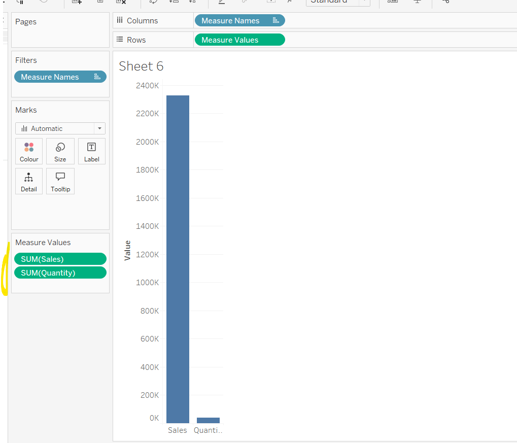
Building the Raw Values chart
Add Sales to Rows. Then drag Quantity on to the canvas and drop the pill on the Sales axis (when you see the ‘2 column’ icon appear). This has the affect of adding the fields onto a shared axis, and the sheet will update to automatically reference Measure Names and Measure Values. Swap Quantity so it is displayed below Sales in the Measure Values section.
Add Region and Category to Detail and change the Mark type to Circle.
I’m going to incorporate the last requirement at this stage, as it helps with the build, so create parameters
pSelectedRegion
string parameter, defaulted to West
pSelectedCategory
string parameter, defaulted to Furntiture
show both these parameters on the sheet.
Create a new field
Is Selected Region & Category
[pSelectedCategory]=[Category] AND [pSelectedRegion]=[Region]
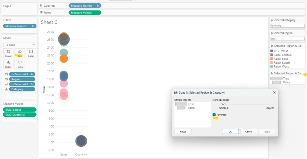
Add this field to Colour, and swap the values in the legend, so True is listed first. Then change the Region on the Detail shelf, so it is also on colour, by adjusting the icon to the left of the pill. Adjust the colours as required and then reduce the opacity on colour to 80%.
Manually update the entry in the pSelectedRegion parameter to each Region, so the True-<Region> colour combination can be updated to the dark grey.
Add Is Selected Region & Category to Size. Edit the size so they are reversed and the range in size is closer than the default. Once done, then manually adjust the dial on the Size shelf.
Show mark labels, selecting the option to only show the min & max values per cell and aligning middle right
Update the Tooltip. Then create fields True = TRUE and False = FALSE and add both of these to the Detail shelf. We’ll need these to disable the default highlighting later (adding now, as for all the other sheets, we’ll duplicate this one, so makes things easier).
Show the caption (Worksheet menu > show caption) and update the caption to reference the website Erica refers to. Then update the title of the sheet, and name the tab Raw or similar.
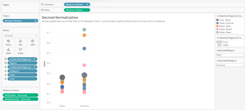
Building the Decimal Normalisation chart
Duplicate the Raw sheet, and name Decimal or similar. Update the title.
Create new fields
Sales – Decimal
SUM([Sales]) / 10^6
Quantity– Decimal
SUM([Quantity]) / 10^4
Drag Sales – Decimal onto the canvas and drop directly over the existing Sales pill in the Measure Values section, so it replaces it. Do the same with the Quantity – Decimal pill. Uncheck Show Labels.
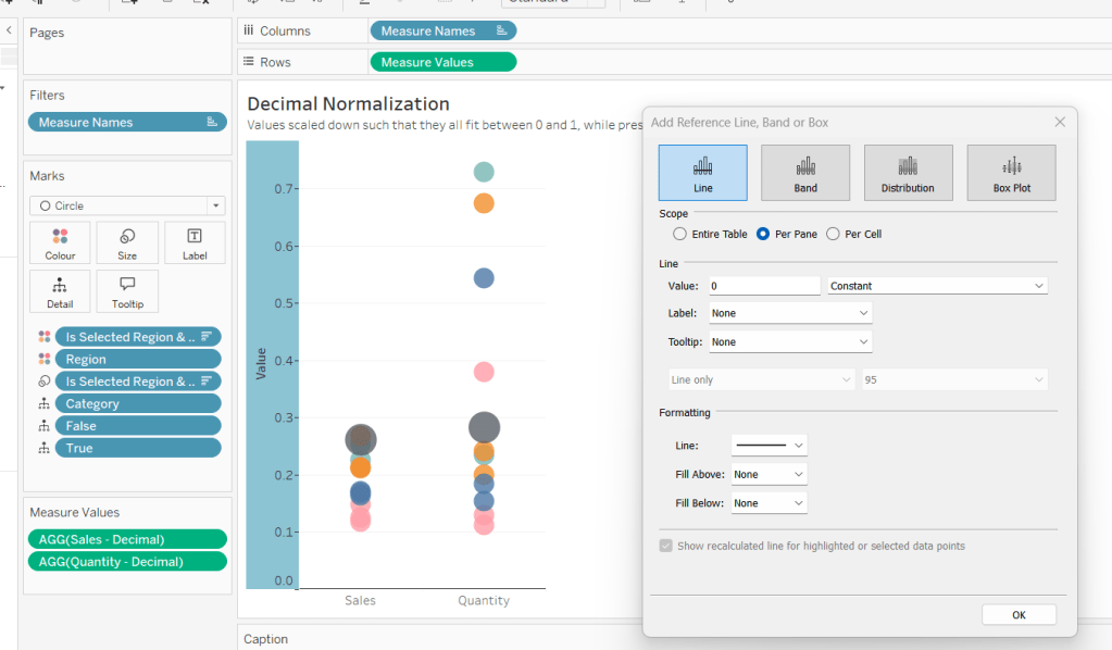
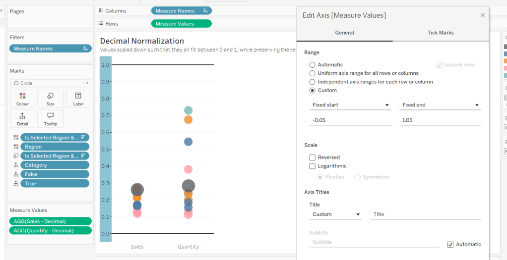
Add constantreference line of 0 that displays as a black solid line at 100% opacity
Repeat and create a constant reference line with value of 1. Edit the axis and fix from -0.05 to 1.05 and remove the axis title.
Update the text in the caption.
Building the Max-Min Normalisation Chart
Duplicate the Decimal sheet and rename Max-Min or similar. Update the title.
Drag Sales – Max-Min onto the canvas and drop directly over the existing Sales – Decimal pill in the Measure Values section, so it replaces it. Do the same with the Quantity – Max-Min pill.
Adjust the table calculation setting for each of the measures so they are computing by Category, Region and Is Selected Region & Category.
Adjust the Tooltip if required. Right click on the bottom column headings and Edit Alias to update the text- you may not be able to rename Sales – Max-Min along xyz… just to ‘Sales’, so you may need to be creative and add spaces eg ‘ Sales ‘ or similar. Update the caption.
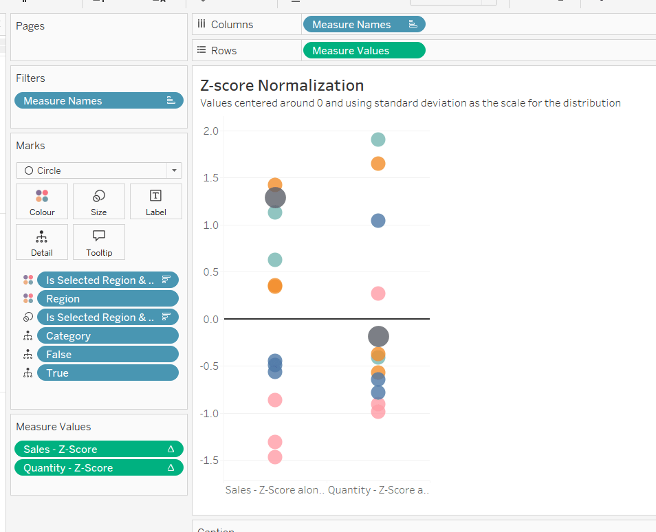
Building the Z-Score Normalisation Chart
Duplicate the Max-Min sheet, and name Z-Score or similar. Update the title.
Drag Sales – Z-Score onto the canvas and drop directly over the existing Sales – Max-Min pill in the Measure Values section, so it replaces it. Do the same with the Quantity – Z-Score pill.
Adjust the table calculation setting for each of the measures so they are computing by Category, Region and Is Selected Region & Category. Remove the reference line for the constant value of 1. Edit the axis, so the range is now Automatic rather than fixed.
As before, adjust the Tooltip again if required, edit the column labels using the alias feature, and update the caption.
Creating the dashboard and adding the interactivity
Add all 4 charts onto a dashboard, using a horizontal container to arrange the charts side by side. From the object context menu on the dashboard, select the option to show the caption
To disable the default highlighting ‘on click’ create a dashboard filter action based on the True/False method described here – you’ll need to create an action per sheet.
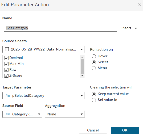
To set the parameters, create a parameter action
Set Category
On select of all the sheets, set the pSelectedCategory parameter passing in the value from the Category field.
Create another similar action called Set Region which sets the pSelectedRegion parameter with the value from the region field.
Finally, add a text section to the top right of the dashboard that references the pSelectedRegion and pSelectedCategory parameters.
It was Luke’s turn to set the #WOW2023 challenge this week and he chose to focus on remaking a visualisation relating to the change in the Antarctic Sea Ice, inspired by charts created by Zach Labe.
The challenge involved the use of extensive calculations, which at times I found hard to validate due to the steps involved in reaching the final number, and only having visibility of the final number on hover on a point on the chart. If it didn’t match, it became a bit of a puzzle to figure out where in the process I’d gone wrong.
Getting the data for the faded yearly line charts was ok, but I ended up overthinking how the decade level darker line chart was calculating and couldn’t get matches. Anyway, after sleeping on it, I realised my error, and found I didn’t need half the calculations I’d been playing with.
So let’s step through this. As we’re working with moving averages, we’re looking at using table calculations, so the starting point is to build out the data and the calculations required into a tabular form first.
Setting up the calculations
I used the data stored in the Google sheet that was linked to in the challenge, which I saved down as a csv file. After connecting to the file, I had separate fields for Day, Month and Year which I changed to be discrete fields (right click on field and Convert to discrete).
We need to create two date fields from these fields. Firstly
Actual Date
MAKEDATE([Year],[Month],[Day])
basically combines the 3 separate fields into a proper date field. I formatted this to “14 March 2001” format.
Secondly, we’ll be plotting the data on an axis to span a single year. We can’t use the Actual Date field for that as it will generate an axis that runs from the earliest date to the latest. Instead we need a date field that is ‘normalised’ across a single year
Date Normalise
MAKEDATE({max([Year])}, [Month], [Day])
the {max([Year])} notation is a short cut for {FIXED: MAX([Year])} which is a level of detail (LoD) expression which returns the greatest value of the Year field in the data set. In this case it returns 2023. So the Date Normalise field only contains date for the year 2023. Ie if the Actual Date is 01 Jan 2018 or the Actual Date is 01 Jan 2020, the equivalent Date Normalise for both records will be 01 Jan 2023.
Let’s start to put some of this out into a table.
Put Year on Columns, and Date Normalise as a blue (discrete) exact date field on Rows. Add Area(10E6M2) to Text and change to be Average rather than Sum (in leap years, the 29 Feb seems to have been mapped to 01 March, so there are multiple entries for 01 March). This gives us the Area of the Ice for each date in each year.
We need to calculate the 7 day moving average of this value. The easiest was to do this is add a Moving Average Quick Table Calculation to the pill on the Text shelf.
Once done, edit the table calculation, and set so that is average across the previous 6 entries (including itself means 7 entries in total) and it computes down the table (or explicitly set to compute by Date Normalise).
It is best to create an explicit instance of this field, so if you click on the field and press ctrl while you drag and drop it into the data pane on the left hand side, you can then rename the field. I named mine
Moving Avg: Area
WINDOW_AVG(AVG([Area (10E6M2)]), -6, 0)
It should contain the above syntax as that’s what the table calculation automatically generates. If you’re struggling, just create manually and then add this into the table instead.
Add Area (10E6M2) back into the table too. You should have the below, and you should be able to validate the moving average is behaving as expected
Now we need to work out the data related to the ‘global’ average which is the average for all years across a single date.
Average for Date
{FIXED [Date Normalise]: AVG([Area (10E6M2)])}
for each Date Normalise value. return the average area.
Pop this into the table, and you should see that you have the same value for every year across each row.
We can then create a moving average off of this value, by repeating similar steps above. In this instance you should end up with
Moving Avg Date
WINDOW_AVG(SUM([Average For Date]), -6, 0)
Add into the table, and ensure the table calculation is computing by Date Normalise and again you should be able to validate the moving average is behaving as expected
Note – you can also filter out Years 1978 & 1979 as they’re not displayed in the charts
So now we have the moving average per date, and the global moving average, we can compute the delta
Ice Extent vs Normal
[Moving Avg: Area] -[Moving Avg Date]
Format this to 3 dp and add to the table. You should be able to do some spot check validation against the solution by hovering over some of the points on the faded lines and comparing to the equivalent date for the year in the table.
This is the data that will be used to plot the faded lines. For the bolder lines, we need
Decade
IF [Year] = {max([Year])} THEN STR([Year]) ELSE STR((FLOOR([Year]/10))*10) + ‘s’ END
and we don’t need any further calculations. To verify, simply duplicate the above sheet, and then replace the Year field on Columns with the Decade field. You should have the same values in the 2023 section as on the previous sheet, and you should be able to reconcile some of the values for each decade against marks on the thicker lines.
Basically, the ‘global’ values to compare the decade averages against are based on the average across each individual year, and not some aggregation of aggregated data (this is where I was overthinking things too much).
Building the viz
On a new sheet add Date Normalise as a green continuous exact date field to Columns, and Ice Extent vs Normal to Rows. Add Year to Detail and Decade to Colour. Adjust colours to suit and reduce to 30% opacity. Reduce the size to as small as possible. Add Decade to Filter and exclude 1970s. Ensure both the table calculations referenced within the Ice Extent vs Normal field are computing by Date Normalise only.
Add Actual Date to the Tooltip and and adjust the tooltip to display the date and the Ice Extent vs Normal field in MSM.
Now add a second instance of Ice Extent vs Normal to Rows. On the 2nd marks card that is created, remove Year from Detail and Actual Date from Tooltip. Increase the opacity back up to 100% and increase the Size of the line. Sort the colour legend to be data source order descending to ensure the lines for the more recent decades sit ‘on top’ of the earlier ones.
Modify the format of the Date Normalise field to be dd mmmm (ie no year). Adjust the Tooltip as below
Make the chart dual axis and synchronise the axis. Remove the right hand axis.
Edit the axis titles, remove row and column dividers and add row & column gridlines.
Adding the labels
We want the final point for date 18 June 2023 to be labelled with the actual Area of ice on that date and the difference compared to the average of that date (not the moving average). I create multiple calculated fields for this label, using conditional logic to ensure the value only returns for the maximum date in the data
Max Date
{max([Actual Date])}
Label:Date
IF MIN([Decade])=’2023′ AND MIN([Actual Date])=MIN([Max Date]) THEN MIN([Max Date]) END
Label: Area
IF MIN([Decade])=’2023′ AND MIN([Actual Date])=MIN([Max Date]) THEN AVG([Area (10E6M2)]) END
Label:Ice Extent v Avg for Date
IF MIN([Decade])=’2023′ AND MIN([Actual Date])=MIN([Max Date]) THEN AVG([Area (10E6M2)]) – SUM([Average For Date]) END
Label:unit of measure
IF MIN([Decade])=’2023′ AND MIN([Actual Date])=MIN([Max Date]) THEN ‘MSM’ END
Label: unit of measure v avg
IF MIN([Decade])=’2023′ AND MIN([Actual Date])=MIN([Max Date]) THEN ‘MSM vs. avg’ END
All these fields were then added to the Text shelf of the 2nd marks card and arranged as below, formattign each field accordingly
And this sheet can then be added to the dashboard. The legend needs be adjusted to arrange the items in a single row.