Sean set this table calculation based challenge this week. The key to this was for the reference line & bands to change if any of the non-date related filters were change, but for the values to remain constant regardless of the timeframe being reported. Based on this, I figured a table calculation filter would be necessary for the timeframe filter, as these get applied at the end of the ‘order of operations’.
I used the data set Sean provided in the challenge, to ensure I would get the same values to verify my solution. After connecting to the dataset, I did set the date properties on the data source so the week started on a Sunday, again to ensure the numbers aligned (in the UK, my preferences are set to Mondays).
Building out the calculations
Since we’re working with table calcs, I’m going to build the calcs into a table first, so we can verify the figures are behaving. Start by adding Order Date to Rows as a discrete (blue) pill at the Week level. Then add Sales.
Create a new field
Median
WINDOW_MEDIAN(SUM([Sales]))
and add this into the table. The value should the same for every row.
Create a new field
Std D
WINDOW_STDEV(SUM([Sales]))
and add this too – again this should be the same for every row.
But we want to to show the distribution based on +1 or -1 standard deviations, so create
Std Upper
WINDOW_AVG(SUM([Sales])) + [Std D]
and Std Lower
WINDOW_AVG(SUM([Sales])) – [Std D]
and add these to the table.
Each mark needs to be coloured based on whether it is greater than the upper band, so create
Sales above Std Upper
SUM([Sales]) > [Std Upper]
and add to the table on Rows
Add Category, Sub-Category and Segment to the Filter shelf, and show the filters. Adjust them to see that the table calculation fields change, although still remain the same across every row.
To restrict the timeline displayed, we need a parameter
pWeeks
integer parameter defaulted to 18
Show this parameter on the canvas. Then, to identify the weeks to keep, create a new field
Index
INDEX()
and convert it to discrete, then add to Rows to create a ‘row number’ for each row.
But, I want the index to start from 1 from the end of the table, so adjust the tableau calculation on the Index field so that is it computing explicitly by Week of Order Date and is sorted by Min Order Date descending
The first row in the table is now indexed with the greatest number, and if you scroll down, the last row should be indexed with 1.
With this we can now created
Filter – Date
[Index]<=[pWeeks]+1 AND [Index]<>1
I was expecting just to have [Index}<=pWeeks, but Sean’s solution excluded the data associated to the last week, I assume as it wasn’t a full week, so the above calculation resolved that.
Add this to the Filter shelf and set to True.
Changing the value in the pWeeks parameter only should adjust the number of rows displayed, but the values for the table calculated fields shouldn’t change.
Building the viz
On a new sheet, add Order Date as a continuous (green) pill at the week level to Columns and Sales to Rows.
Add another instance of Sales to Rows. Change the mark type of the Sales(2) marks card to circle. Make the chart dual axis and synchronise axis.
On the All marks card, add Median, Std Upper and Std Lower to the Detail shelf.
Add a reference line to the Sales axis, referencing the Median value. Set it to be a thicker darker line.
Then add another reference line but this time set it to be a band and reference the Std Lower and Std Upper fields, selecting a pale grey fill.
On the Sales(2) marks card, add Sales above Std Upper to the Colour shelf, and adjust to suit. Add a border to the circles. If required, adjust the colour and size of the line on the Sales marks card too.
Add the Category, Sub-Category and Segment fields to the Filter shelf, and show the filters. Show the pWeeks parameter. Then add Filter-Date to the Filter shelf. Adjust the table calculation as described above, then re-edit the filter to just show the True values
Finally tidy up by
remove row and column dividers
hide the right hand axis (uncheck show header)
edit the date axis and delete the title
Then add all the information to a dashboard and you’re good to go!
Erica set this fun and incredibly useful challenge this week, based on the TC25 talk by Lorna Brown & Robbin Vernooij, to showcase different methods of normalising data when comparing measures which have drastically different scales.
Building the Raw Values chart
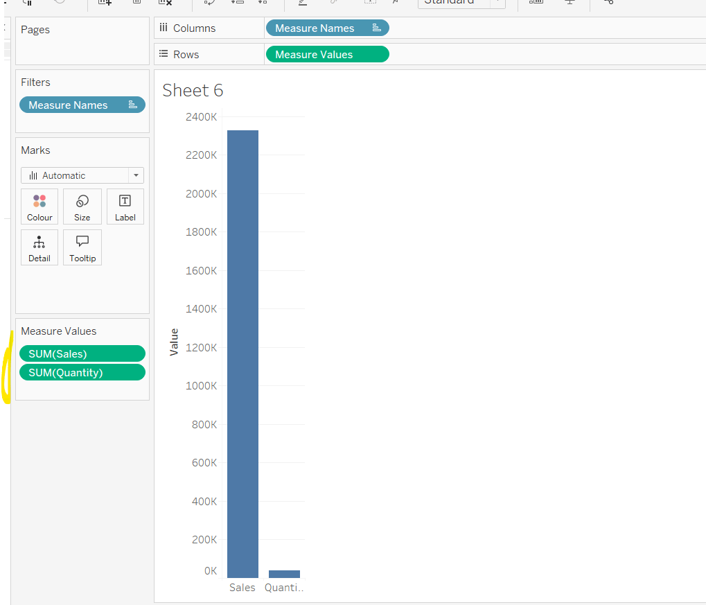
Add Sales to Rows. Then drag Quantity on to the canvas and drop the pill on the Sales axis (when you see the ‘2 column’ icon appear). This has the affect of adding the fields onto a shared axis, and the sheet will update to automatically reference Measure Names and Measure Values. Swap Quantity so it is displayed below Sales in the Measure Values section.
Add Region and Category to Detail and change the Mark type to Circle.
I’m going to incorporate the last requirement at this stage, as it helps with the build, so create parameters
pSelectedRegion
string parameter, defaulted to West
pSelectedCategory
string parameter, defaulted to Furntiture
show both these parameters on the sheet.
Create a new field
Is Selected Region & Category
[pSelectedCategory]=[Category] AND [pSelectedRegion]=[Region]
Add this field to Colour, and swap the values in the legend, so True is listed first. Then change the Region on the Detail shelf, so it is also on colour, by adjusting the icon to the left of the pill. Adjust the colours as required and then reduce the opacity on colour to 80%.
Manually update the entry in the pSelectedRegion parameter to each Region, so the True-<Region> colour combination can be updated to the dark grey.
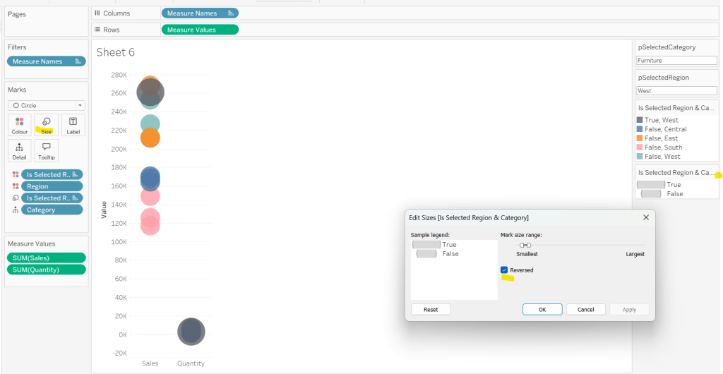
Add Is Selected Region & Category to Size. Edit the size so they are reversed and the range in size is closer than the default. Once done, then manually adjust the dial on the Size shelf.
Show mark labels, selecting the option to only show the min & max values per cell and aligning middle right
Update the Tooltip. Then create fields True = TRUE and False = FALSE and add both of these to the Detail shelf. We’ll need these to disable the default highlighting later (adding now, as for all the other sheets, we’ll duplicate this one, so makes things easier).
Show the caption (Worksheet menu > show caption) and update the caption to reference the website Erica refers to. Then update the title of the sheet, and name the tab Raw or similar.
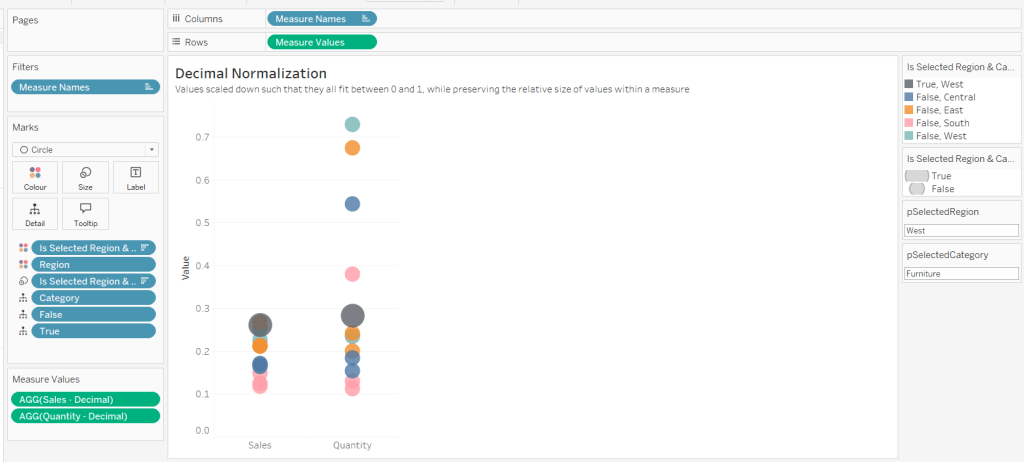
Building the Decimal Normalisation chart
Duplicate the Raw sheet, and name Decimal or similar. Update the title.
Create new fields
Sales – Decimal
SUM([Sales]) / 10^6
Quantity– Decimal
SUM([Quantity]) / 10^4
Drag Sales – Decimal onto the canvas and drop directly over the existing Sales pill in the Measure Values section, so it replaces it. Do the same with the Quantity – Decimal pill. Uncheck Show Labels.
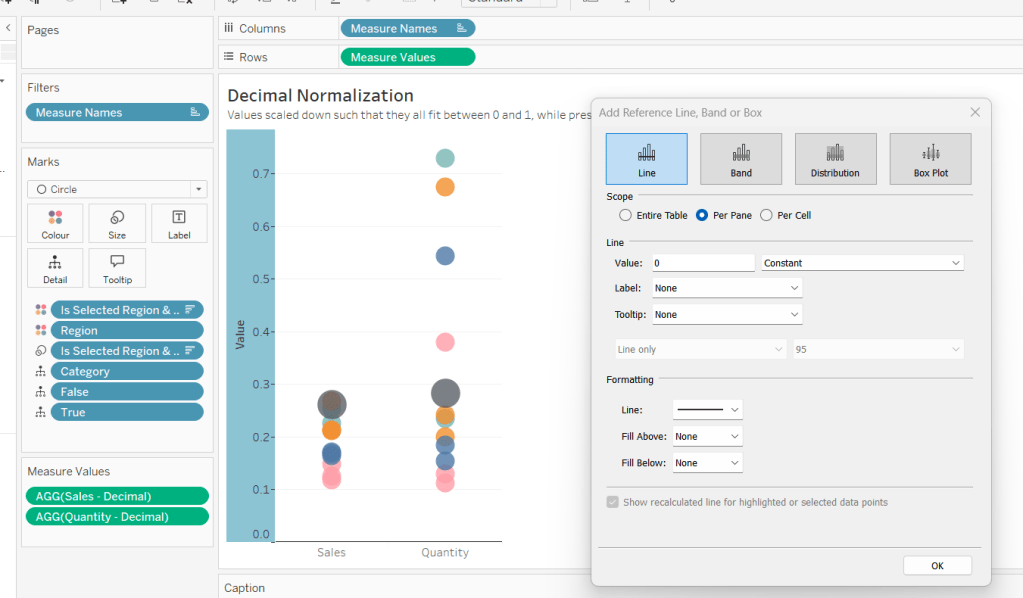
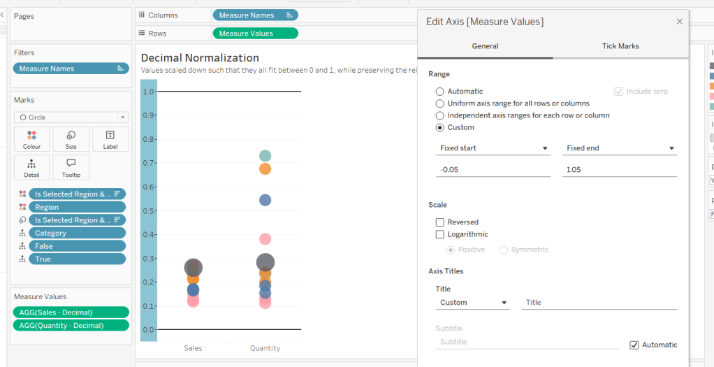
Add constantreference line of 0 that displays as a black solid line at 100% opacity
Repeat and create a constant reference line with value of 1. Edit the axis and fix from -0.05 to 1.05 and remove the axis title.
Update the text in the caption.
Building the Max-Min Normalisation Chart
Duplicate the Decimal sheet and rename Max-Min or similar. Update the title.
Drag Sales – Max-Min onto the canvas and drop directly over the existing Sales – Decimal pill in the Measure Values section, so it replaces it. Do the same with the Quantity – Max-Min pill.
Adjust the table calculation setting for each of the measures so they are computing by Category, Region and Is Selected Region & Category.
Adjust the Tooltip if required. Right click on the bottom column headings and Edit Alias to update the text- you may not be able to rename Sales – Max-Min along xyz… just to ‘Sales’, so you may need to be creative and add spaces eg ‘ Sales ‘ or similar. Update the caption.
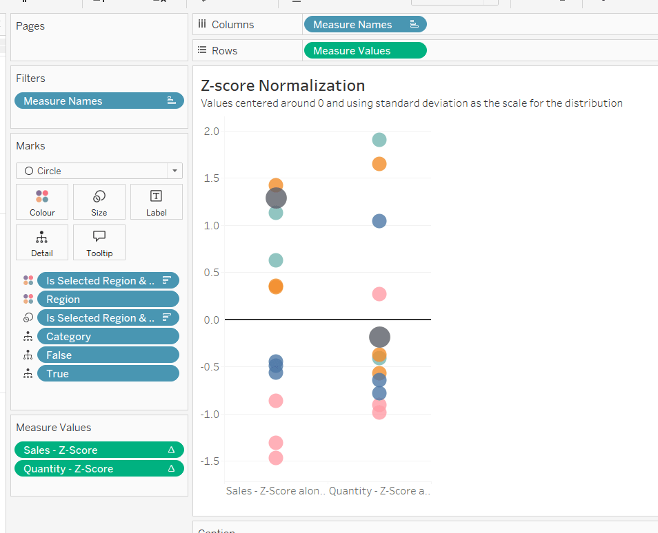
Building the Z-Score Normalisation Chart
Duplicate the Max-Min sheet, and name Z-Score or similar. Update the title.
Drag Sales – Z-Score onto the canvas and drop directly over the existing Sales – Max-Min pill in the Measure Values section, so it replaces it. Do the same with the Quantity – Z-Score pill.
Adjust the table calculation setting for each of the measures so they are computing by Category, Region and Is Selected Region & Category. Remove the reference line for the constant value of 1. Edit the axis, so the range is now Automatic rather than fixed.
As before, adjust the Tooltip again if required, edit the column labels using the alias feature, and update the caption.
Creating the dashboard and adding the interactivity
Add all 4 charts onto a dashboard, using a horizontal container to arrange the charts side by side. From the object context menu on the dashboard, select the option to show the caption
To disable the default highlighting ‘on click’ create a dashboard filter action based on the True/False method described here – you’ll need to create an action per sheet.
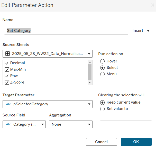
To set the parameters, create a parameter action
Set Category
On select of all the sheets, set the pSelectedCategory parameter passing in the value from the Category field.
Create another similar action called Set Region which sets the pSelectedRegion parameter with the value from the region field.
Finally, add a text section to the top right of the dashboard that references the pSelectedRegion and pSelectedCategory parameters.
Lorna Brown returned this week to set another table calculation based challenge involving a line chart which ‘on click’ of a point, exposed the ability to ‘drill down’ to view a tabular view of the data ‘behind’ the point. This is classic Tableau in my opinion – show the summarised data (in the line chart) and with ‘drill down on demand’. Lorna added some additional features on the dashboard; hiding/showing filter controls to change how the data is displayed in the chart, and a back navigational button on the ‘detail’ list.
The areas I’m going to focus on in this blog are
Setting up the parameters
Defining the date to plot on the chart
Restricting the data to the relevant years
Defining the reference bands
Colouring the marks
Working out the date range for the tooltip
Building the table
Drill down from chart to table
Un-highlight selected marks
Hide/Show filter controls
Add navigation button
Setting up the parameters
This challenge requires 3 parameters.
Select a Date
a string parameter containing the 2 options available (Date Submitted & Date Selected) for selection, which when displayed on the dashboard will be set to a single value list control (ie radio buttons)
Latest X Years
an integer parameter, defaulted to 3, which allows a range of values from 1 to 5.
NOTE – Ensure the step size is set to 1, as this is what allows the Show buttons option to be enabled when customising the Slider parameter control type.
STD
another integer parameter, defaulted to 1, that allows a range of values from 1 to 3
Defining the date to plot on the chart
The Select a Date parameter is used to switch the view between different dates in the data set. This means you can’t plot your chart based on date field that already exists in the data set. We have to create a new field that determines which date field to select based on the parameter
Date to Plot
DATE(DATETRUNC(‘week’, IIF([Select a Date]=’Date Submitted’,[Date sent to company], [Date received])))
The nested IIF statement, is basically saying, if the parameter is‘Date Submitted’ then use the Date sent to company field, else use the Date received field. This is all wrapped within a DATETRUNC statement to reset all the dates to the 1st day of the week (since the requirement is to report at a weekly level).
Note – there was some confusion which field the parameter option should map to. I have chosen the above, but you may see solutions with the opposite. Don’t get hung up on this, as the principal of how this all works is most important.
Restricting the data to the relevant years
The requirement is to show ‘x’ years worth of data, where 1 year’s worth of data is the data associated to the latest year in the data set (ie from 01 Jan to latest date, rather than 12 months worth of data). So to start with I calculated, rather than hardcoded, the maximum year in the data
Year of Latest Date
YEAR({MAX([Date to Plot])})
Then I could work out which dates I wanted via
Dates to Include
[Date to Plot]>= MAKEDATE([Year of Latest Date] – ([Latest X Years]-1),1,1)
In the MAKEDATE function, I’m building a date that is the 1st Jan of the relevant based on how many years we need to show.
So if Year of Latest Date is 2020 and Latest X Years =1 then Year of Latest Date – (Latest X Years -1) = 2020 – (1-1) = 2020 – 0 = 2020. So we’re looking for dates >= 01 Jan 2020.
So if Year of Latest Date is 2020 and Latest X Years =3 then Year of Latest Date – (Latest X Years -1) = 2020 – (3-1) = 2020 – 2 = 2018. So we’re looking for dates >= 01 Jan 2018.
This field is added to the Filter shelf and set to true.
So at this point, our basic chart can be built as
Year on Columns (where Year = YEAR([Date to Plot])), and allows the Year header to display at the top
Date to Plot on Columns, set to Week Number display via the pill dropdown option, and alsoset to be discrete (blue pill). This field is ultimately hidden on the display.
Number of Complaints on Rows (where Number of Complaints = COUNT([XXXX.csv], the auto generated field relating to the name of the datasource).
To get the line and the circles displayed, this needs to become a dual axis chart by duplicating the Number of Complaints measure on the Rows, synchronising the axis and setting one instance to be a line mark type, and the other a circle.
Defining the reference bands
The reference bands are based on the number of standard deviations away from the mean/ average value per year.
Avg Complaints Per Year
WINDOW_AVG([Number of Complaints])
Once we have the average, we need to define and upper and lower limit based on the standard deviations
Upper Limit
[Avg Complaints Per Year] + (WINDOW_STDEV([Number of Complaints]) * [STD])
Lower Limit
[Avg Complaints Per Year] + (WINDOW_STDEV([Number of Complaints]) * -1 * [STD])
Add both these fields to the Detail shelf of the chart viz (at the All marks card level) and set the table calculation of each field to Compute By Date to Plot
This ‘squashes’ everything up a bit, but we’ll deal with that later.
Add a Reference Band (right click on axis – > Add Reference Line) that ranges from the Lower Limit to Upper Limit.
If an Average Line also appears on the display, then remove it, by right clicking on the axis -> Remove Reference Line – > Average
Colouring the marks
I created a boolean field based on whether the Number of Complaints is within the Upper Limit and Lower Limit
Within STD Limits?
[Number of Complaints]<[Upper Limit] AND [Number of Complaints]>[Lower Limit]
Add this to the Colour shelf of the circle mark type, and set to Compute Using Date to Plot. The values will be True, False or Null. Right click on the Null option in the Colour Legend, and select Exclude. This will add the Within STD Limits? to the Filter shelf, and the chart will revert back to how it was. Adjust the colours accordingly.
The Tooltip doesn’t show true or false though, so I had another field to use on that
In or Out of Upper or Lower Limits?
If [Within STD Limits?] THEN ‘In’ ELSE ‘Out’ END
Working out the date range for the tooltip
The Tooltip shows the start and end of the dates within the week. I simply built 2 calculated fields to show this.
Date From
[Date to Plot]
This 2nd instance is required as Date to Plot is formatted to dd mmm yyyy format and also used in the Tooltip. Whereas Date From is displayed in a dd/mm/yyyy format.
Date To
DATE(DATEADD(‘day’, 6, [Date to Plot]))
Just add 6 days to the 1st day of the week.
Building the table
Create a new sheet and add all the relevant columns required to Rows in the required order. For the last column, Company response to consumer, add that to the Text shelf instead (to replace the usual ‘Abc’ text). The in the Columns shelf, double click and type in ‘Company response to consumer’ which creates a ‘fake’ column heading. Format all the text etc to make it all look the same.
Add the Dates to include = true filter.
Also add the WEEK(Date to Plot) field to the Rows shelf, as a blue discrete field (exactly the same format as on the line chart). But hide this field (uncheck Show Header). This is the key linking field from the chart to the detail.
Drill down from chart to table
Create one dashboard (Chart DB) that displays the chart viz. And another dashboard that displays the table detail (Table DB). On the Chart dashboard, add a Filter Dashboard Action (Dashboard menu -> Actions -> Add Action -> Filter), that starts from the Chart sheet, runs as a Menu option, and targets the Detail sheet on the Detail dashboard. Set the action to exclude all values when no selection has been made. Name the action Click to Show Details
On the line chart, if you now click a point on the chart, the tooltip will display, along with a link, which when clicked on, will then take you to the Detail dashboard and present you with the list of complaints. The number of rows displayed should match the number you clicked on
Un-highlight selected marks
What you might also notice, is when you click on a point on the chart, the other marks will all ‘fade’ out, leaving just the one you selected highlighted. It’s not always desirable for this to happen. To prevent this, create a new field called Dummy which just contains the text ‘Dummy’. Add this onto the Detail shelf of the All marks card on the chart viz.
Then on the chart dashboard, add another dashboard action, but this time choose a highlight action. Set the action to run on select and set the source & target sheets to be the same sheet on the same dashboard. But target highlighting to selected fields, and select the Dummy field only
Hide/Show filter controls
Check out this post by The Data School that explains very simply how to work with floating containers to show/hide buttons. When creating in Desktop, the ‘onclick’ interactivity won’t work, you’ll have to manually select to show and hide, but once published to Tableau Public, it’ll behave as desired.
You have options to customise what the button looks like when the container contents are hidden, and what it looks like when they’re shown, via the Button Appearance
Add Navigation Button
On the Detail dashboard, simply add a Navigation object to the dashboard
and edit the settings to navigate back to the chart dashboard, as well as customise the appearance
Hopefully I’ve covered all the key features of this challenge. My published viz is here.